
Ahoy, squirts! Quint here with the latest installment of Fortune and Glory, our tribute to the 30th Anniversary of Indiana Jones and the Temple of Doom.
This one focuses on the poster art surrounding the movie. Below you'll find all sorts of foreign posters and different US one-sheets plus some rare unused concepts and comps straight from the Lucasfilm archives.
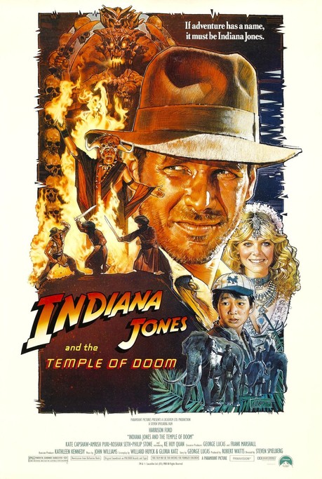
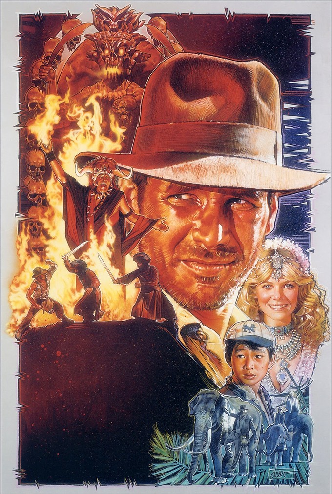
All that is anchored by a new interview I conducted with the one and only Drew Struzan, whose Temple of Doom poster art is definitely in the running for my all-time favorite movie art.
Let's start with Mr. Struzan as we discuss his work on this iconic image:
Quint: We talked once before about your work on the whole and I believe you said the Temple of Doom poster you did was requested so late in the game that there wasn't much back and forth with the studio. Am I remembering that right or am I pulling that out of my butt?
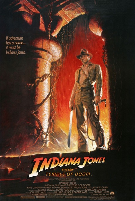
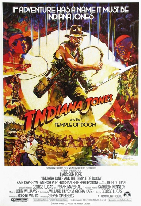
Drew Struzan: Temple of Doom... was that the one that came out with (a poster of Indy) standing at the top of the steps?
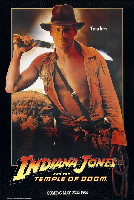
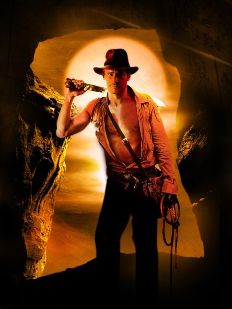
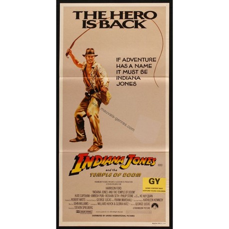
Quint: Yes. There was that poster and the teasers were the “Trust Him” posters where he's looking straight out at the viewer with a sword kind of cocked over his shoulder.
Drew Struzan: You're reminding me of stuff I've forgotten altogether. I do sort of recall that the movie had released and the (top of the steps) poster had released, obviously. I don't know why, but it had been out for a week or two and I got a call and they wanted me to do my take on the poster.
It was actually not through Lucasfilm. It was through an advertising agency that gave me a lot of work. They said give me a comp on Temple of Doom. I did. I don't know who I sent it to since they didn't call me direct, whether it was Lucasfilm or Paramount, but they liked it and said go ahead and do it, we want it ASAP.
No changes, nothing. That was extremely rare. Having to do it in a day wasn't rare at all, but no changes was. (laughs) I did it in just a couple of days as I recall and made very few changes of my own. I liked the design, so I kept it the way I designed it. They went with it and that became the main poster.
There's nothing to it, but it is my example of “See what happens when they don't change things and it looks the way I designed it?” I like the way it came out and it looks that way because they didn't bother me.
Quint: Had you seen the film prior to doing the poster?
Drew Struzan: No. That would be very unusual.
Quint: Wow, so you did the poster without having seen the movie. Crazy. I assume they sent you stills to work with then.
Drew Struzan: I don't recall, but that's the standard. How would I know what they look like without them, so I'm sure I had a number of them.
Quint: That blows my mind a little bit because that poster perfectly captures the tone of the tone of a movie you haven't seen!
Drew Struzan: I've always kind of been that way. I've seen movies and I know what they're about. Especially Indiana Jones. I had seen (Raiders), so I knew what it was about. I knew what an adventure film was about. I did do a new kind of designing for that poster. Once I had done Temple of Doom they said that's what they wanted Indy to look like from now on. I guess I hit it on the nose for them as well. Between you liking it, me liking it and them liking it, I got a home run there!
But that's how it was. Very seldom did I ever get to see the film before I started work on it. I depended on the still photography to get the spirit and the feeling of the film. Having seen Indy before, I depended on it being the same character with the same feeling and the same emotions, so I just went for it. Fortunately at the time they were still making real Indy movies, so... (laughs) If you know what I mean. It worked out really well and remains one of my favorites. It's one of the prettiest posters I've eve made, I think.
Quint: It's gorgeous. In total agreement with you. Did you eventually see the movie?
Drew Struzan: Oh yeah, eventually. It's funny... despite what all those baby whiners said, I thought it was beautiful. I thought it was a wonderful movie.
Quint: It's one of my favorites. It's funny how all the parents groups at the time were so worried about their kids and the kids themselves thought it was the coolest movie ever.
Drew Struzan: They don't give children enough respect. Shoot, I have a five year old and a three year old here and they understand it better than I do! They're learning life. Show them the truth! I hate films that lie to kids. I loved it because it was true.
Quint: You can only really earn a big happy ending if the characters are put through hell a little bit and people forget that kids like being scared. At least I did.
Drew Struzan: It's a classic movie. The hero goes through hell and comes to the other side a better man for it. What more could you ask?
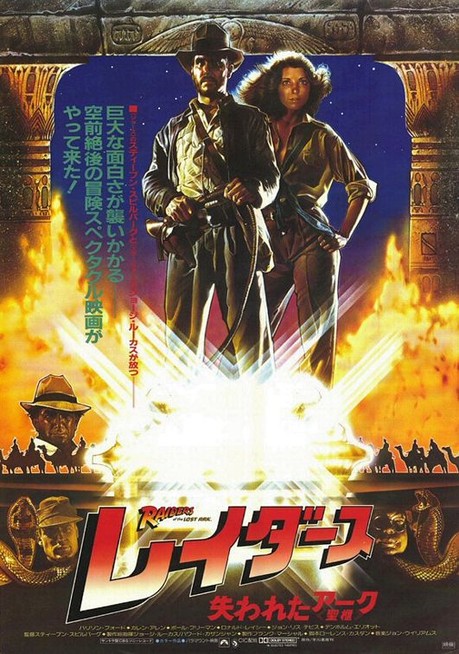
Quint: You did a Raiders poster as well, but it was used primarily for foreign use, right?
Drew Struzan: Richard (Amsel) did the domestic art and I did the rest of the world, which they call the foreign art!
Quint: So, your art got seen by more people is what you're saying.
Drew Struzan: Well, likely it has been. It's at least caught up over the years.
Quint: That art didn't feature Harrison's face as much, right.
Drew Struzan: It's Indiana Jones and Karen Allen sort of above the Ark of the Covenant and it's glowing like it's this big holy box.
Quint: You mentioned that Temple of Doom was the first time you tried out a new design style and correct me if I'm wrong, but that style seems to have become your trademark look... montage style with terrifically realized depictions of the the characters interspersed. So, you attribute that to being able to truly go from your gut and not have to start out with some studio template?
Drew Struzan: That's a way of putting it.
Quint: (laughs) When you were designing and painting did you try a few things and then backtrack or did the comp pretty much come out exactly as the poster ended up.
Drew Struzan: I don't know if you've ever seen pictures of the comp, but it looks 99.5% exactly like the finished painting.
I did one concept and they liked it. It was the simplest poster I've ever painted in so far as being involved with businessmen and non-artistic people. They didn't bother me a bit. They just let me go. George liked it and Harrison loved it, so what can I say?
Quint: George liked it enough to buy it!
Drew Struzan: Oh yeah.
Quint: You told me to go visit the museum up at Forest Lawn because it was on loan from his collection and I'm so glad I went. As much as I loved the poster before, in person it floored me. It's an amazing piece. It's so vibrant in person. I wish more people could see it that way.
Drew Struzan: That's why I requested it for the museum in the first place. That's why one is called a poster and the other is called a painting or art! It's to scale and the right color, the right glow. Composition is everything. There's just something about seeing the hand painted technique that makes it more human, makes it more real, makes it more personal. Anything handmade does that for me. Painting is probably the height of that.
The one thing a movie doesn't have is a technical translation, but a painting is an object, a real thing. That's why I do it because I really love it.
Quint: I hope you keep doing it for many years to come. I know you now pretty much just take the jobs that you really want to do, but I hope we get a bunch more from you, man. Even if it's just you putting out stuff that hasn't seen a printed form, like the stuff you do with the Mondo guys. I hope you keep at it, man.
Drew Struzan: Well, I don't know. Everybody gets old! I'm surprised you didn't ask the question of the day.
Quint: Does that question have to do with a galaxy far, far away?
Drew Struzan: Yeah, everybody asks me about that! Since you're on the subject of continuing to work...
Quint: You caught my sneaky roundabout attempt to see if you were doing the Episode VII poster!
Drew Struzan: I have to tell you what I'm telling everybody else: when I know, you'll know. (laughs)
Quint: Every indication is that JJ is trying to recapture the feel of the original trilogy I've heard he restarted ILM's model division, he's shooting on film, he's making the focus the original cast members... It'd stand to reason they'd want an art poster and not some photoshop job. Nothing quite cements that era of movie magic like a poster of yours, so I'd be shocked if they didn't ask you back.
Drew Struzan: Well, put that in writing because what the people think and what their government thinks is two different things.
Quint: Done and done.
Drew Struzan: Then, when I say “No, thank you,” everybody's going to sigh.
Quint: Nooo! It was all a set up!
Drew Struzan: (laughs)
Quint: Well, thank you for taking the time to talk to me. I apologize for being a pest about it, but I'm a huge fan of your work and I couldn't imagine doing a series about how awesome Temple of Doom is without including some words from you about your iconic poster.
Drew Struzan: Thank you very much. That's very kind. It's nice to be known, but it's even better to be remembered!
That's it for Mr. Struzan, but I'm not done with Temple of Doom posters. Not by a long shot! Let's look at some rare stuff straight from the Lucasfilm vault, shall we?
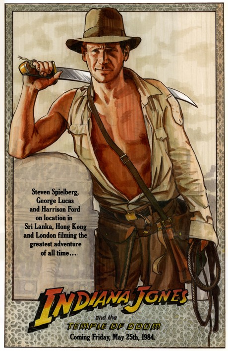
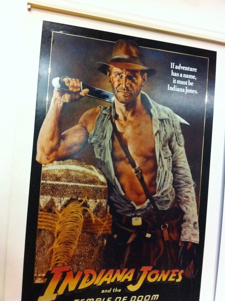
Artist Chris Hopkins did the famous Trust Him teaser poster. I'm going to run the one-sheet first and then some mock-ups, a concept painting and then the finished raw art:
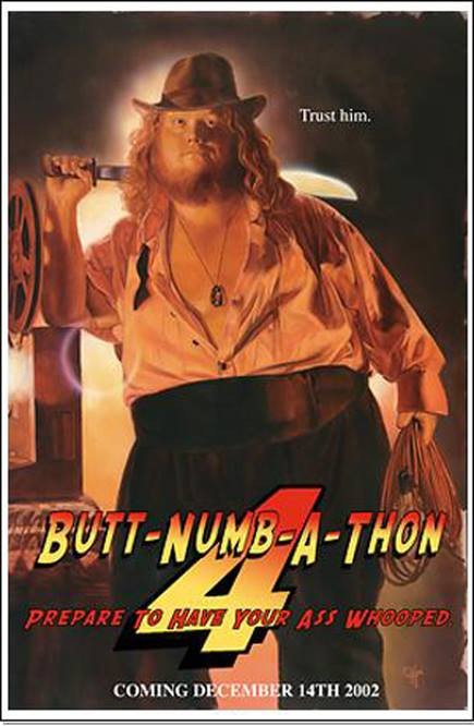
Very cool stuff, right? Want to know something even cooler? Harry was able to get Chris Hopkins to do a spoof of that above poster for a BNAT one year. It's true! See:
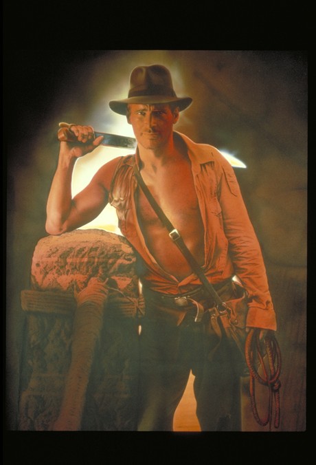
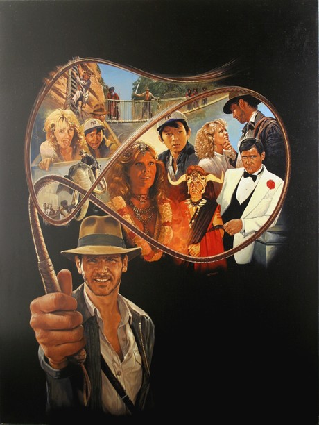
Here's Bruce Wolfe's raw original painting for the main one-sheet art. Prepare yourselves, I'm using the super big version:
I bet that one looks absolutely stunning in person. Already that image above is so much richer than the copy of a copy printed version on the poster.
I'm not sure what this one is, but I expect it was key art for something around the time, either an unused poster concept or for a tie in book/game/something.
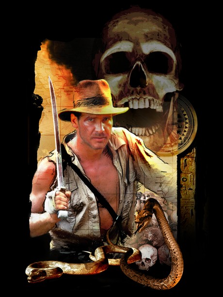
UPDATE: Drew Struzan confirms the below image is indeed his work, so that could have been what a Drew Struzan Temple of Doom poster looked like!
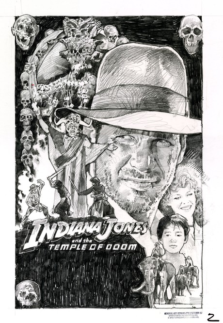
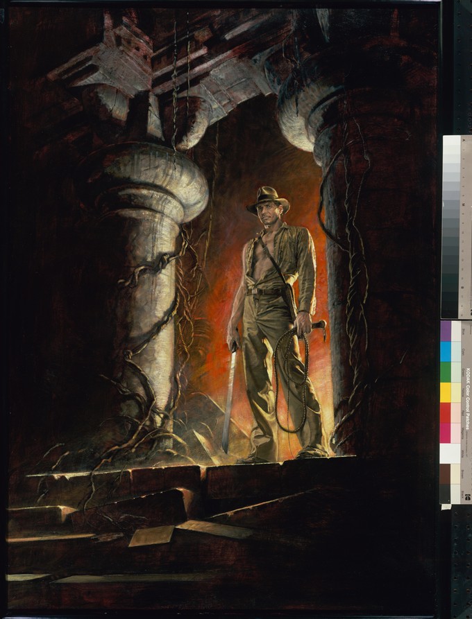
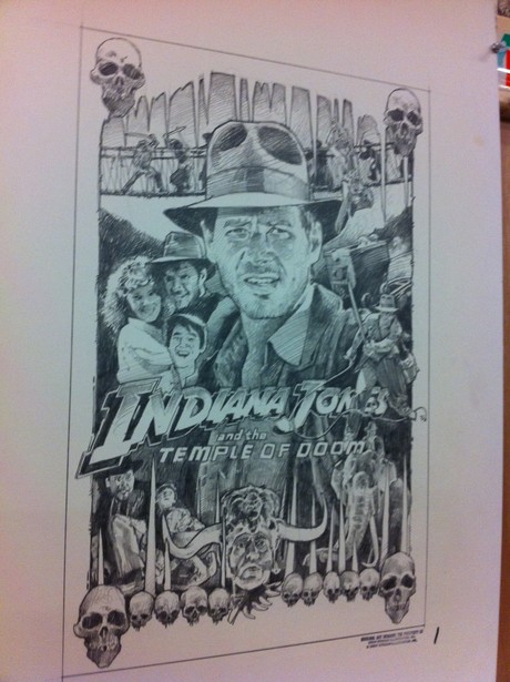
Here's one more unused Temple of Doom poster concept that I saw when I was lucky enough to have toured the Archives at Skywalker Ranch. It's very Drew Struzan-y and judging by the 1 next to it (and the 2 next to the comp that eventually became Struzan's iconic poster) I'd say this is very possibly his first pitch. I'm not 100%, but it makes sense. I'll try to get confirmation, but in the meantime check this out
Amazing stuff. Everybody be sure to thank Lucasfilm for being so generous with their material and letting me include it. Thanks, Lucasfilm (especially Chris Argyropoulos, Mickey Capoferri and Lynne Hale).
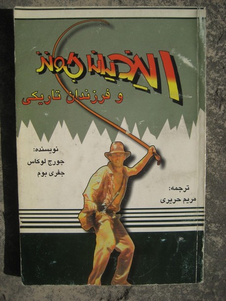
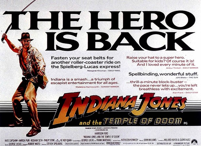
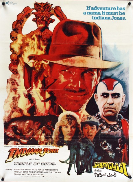
Now I'm going to run a series of different art from the movie that grabbed my eye. Most of them are poster art, but the first one is the cover of an Iranian Temple of Doom book that I just thought was cool.
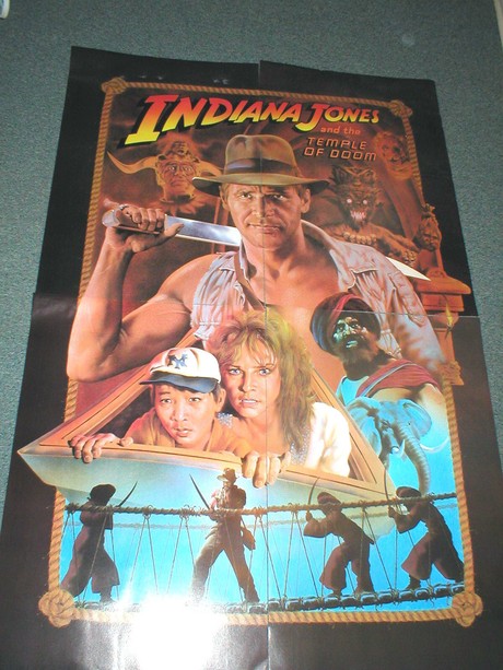
Here's the US subway version of the stairs poster:
The UK quad:
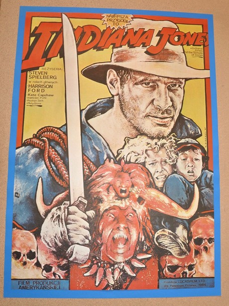
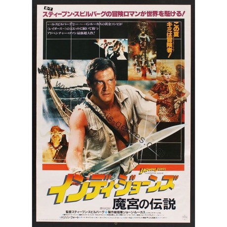
Some crazy Polish posters, followed by Japanese, German and Pakistani posters:

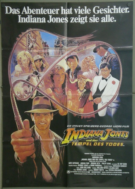
Quick update: A collector who bought the original German art from the above poster emailed in with an image of the physical art. Thanks, Thomas! Art by Graham Reynolds.
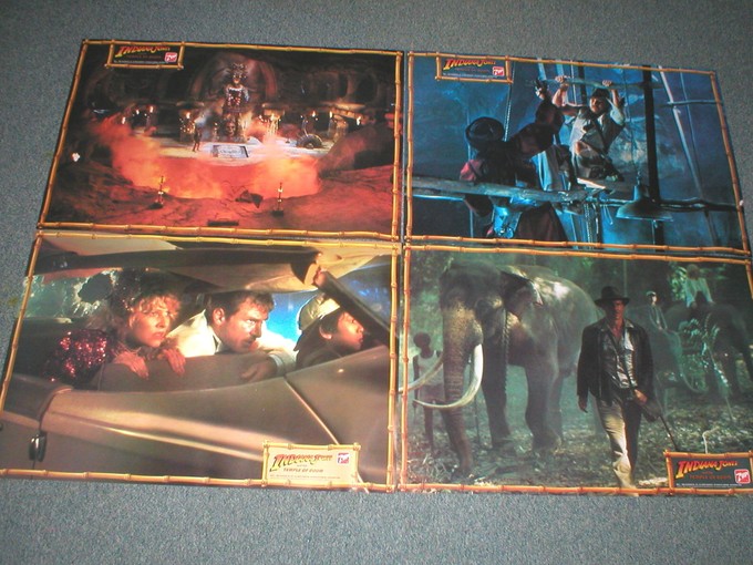
The next piece was a fold out poster with some lobby card-like images printed on the back:
Here's an alternate ToD poster followed by the last of the badass foreign art: Australian daybill poster, a crazy Czech poster and a beautiful French poster.
There you go. The latest Fortune and Glory done and done. Still have a ton of fantastic material coming up for all my fellow Temple of Doom true believers. Stay tuned!
-Eric Vespe
”Quint”
quint@aintitcool.com
Follow Me On Twitter
