
| Issue #31 | Release Date: 10/26/11 | Vol.#10 |
Secondly, always endeavoring to try new things here at AICN COMICS, not only do we have another installment of John Ary’s Comics Podcast here at the top of the column, but myself and a few of the @$$holes (Optimous Douche, Matt Adler, and Johnny Destructo) got together and gabbed a bit for a mini roundtable on a few choice comics this week. It’s something we’re experimenting with and if it goes over well, it might become a regular feature. So if you can’t get enough of our reviews, but are tired of all of that readin’, I suggest you sit back and listen to our Podcast care of Johnny Destructo’s Poptards at the end of the column!
Here’s John Ary with his Comics Podcast featuring reviews of Uncanny X-Men #1, Hawk and Dove #3 and The Legend of Oz: The Wicked West #1!
Now enjoy the rest of the AICN COMICS @$$Holes reviews!
(Click title to go directly to the review)
Advance Review: HEART #1
AQUAMAN #2
Advance Review: AMAZING SPIDER-MAN #673
SALEM’S DAUGHTER #1-3
Advance Review: BATMAN: NOEL HC OGN
SPIDER ISLAND: CLOAK & DAGGER #3
Advance Review: RACHEL RISING #1
COMIC AND FANTASY ARTISTS'S PHOTO REFERENCE: COLOSSAL COLLECTION OF ACTION POSES
Advance Review: WITCH DOCTOR #4
CHOPPER #1
Advance Review: A FLIGHT OF ANGELS HC OGN
FLY #5
ANNIHILATORS: EARTHFALL #2
@#$$Hole Comics Podcast #1!
 Advance Review: In stores today!
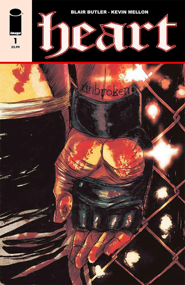
HEART #1
Writer: Blair ButlerArt: Kevin Mellon
Publisher: Image Comics
Reviewer: Ambush Bug
One of the things I love about comics is that you can really tell any type of story you want in this medium. Though it’s still mostly dominated by superheroes, now more than ever you can find comics in just about every variety, spanning all genres, and doing them in a manner of vitality few other forms of entertainment can even hope to achieve. That said, one of the toughest genres to tackle in comics is the sports comic. Generally, the main reason is obvious: those who read comics are not often the athletic type. Now, I don’t want to start pissing folks off and I don’t want folks in the TBs to start telling me how many push-ups they can do to prove their athletic fortitude. Let’s just say that by taking in many a con the average comic book reader is…not so fit.
Then again, that’s probably the reason you see so many exaggerated body types represented in comics, so the sports comic may be more successful than I originally thought (see, I’m contradicting myself in the span of one paragraph). That said, if all of the sports comics out there were as well written as HEART is, superhero comics would have some tough competition. As is, HEART reads like a graphically illustrated version of ROCKY with a bit of THE FIGHTER tossed in for good measure, as a young man attempts to find his place in the world through a UFC style fighting match. This story has enough grit and punch to put any comic to shame, making you root at the right times while offering a glimpse at the humanity underneath all of the machismo.
The most impressive aspect of this book which oozes with Ultimate Fighting testosterone is that it’s written by a woman, Blair Butler, though I shouldn’t be surprised as the G4 reporter has been reading, reviewing and studying comics for ages. Having met Ms. Butler at a few of the cons I’ve attended, I have to say I’m surprised at how formidably she writes from the perspective of a knuckle busting brawler. That said, whether the writer is male or female has nothing to do with it in the end. It’s an enthralling and humanistic drama she’s telling--one filled with a whole lotta what the title says: HEART.
I know there are some folks out there who shy away from black and white books, but I urge you to give HEART a try. The artist, Kevin Mellon, has a scratchy style not unlike a Klaus Janson, which highlights the kineticism of the characters within the panel rather than the detail. I liked the way Mellon focused his ink on the abrupt impact of fist to face, body to floor, and movement of muscle. This is a comic about action, and his style of bold, powerful lines mixed with delicate linework is perfect for this type of powerful story dripping with impact and emotion.
HEART is a comic worth taking a chance with. It ain’t superheroey, it ain’t colored, and it ain’t your run of the mill comic. What it is is some powerful reading.
Ambush Bug is Mark L. Miller, original @$$Hole / wordslinger / reviewer / co-editor of AICN Comics for over nine years. Mark is also a regular writer for FAMOUS MONSTERS OF FILMLAND and will be releasing FAMOUS MONSTERS first ever comic book miniseries LUNA in October (co-written by Martin Fisher with art by Tim Rees) You can pre-order it here! Support a Bug by checking out his comics (click on the covers to purchase)!


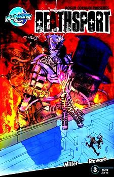
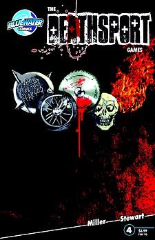


THE DEATHSPORT GAMES’ Facebook Page
FAMOUS MONSTERS PRESENTS LUNA: ORDER OF THE WEREWOLF’s Facebook Page
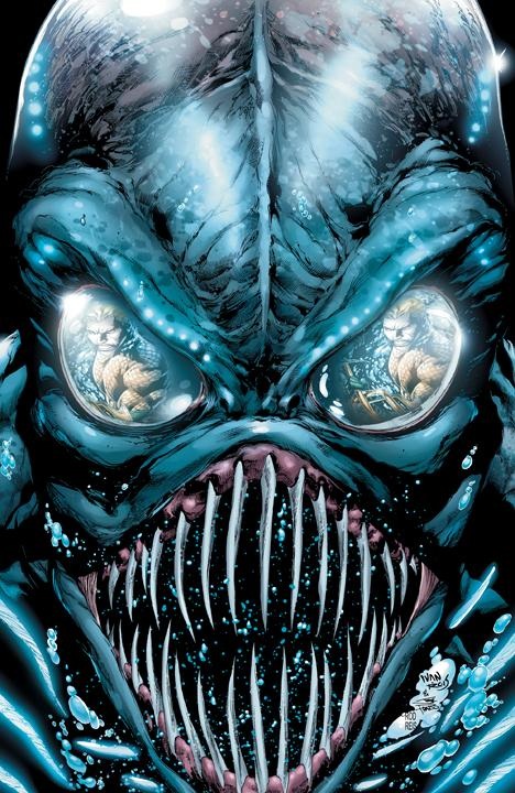
AQUAMAN #2
Writer: Geoff JohnsArtist: Ivan Reis
Publisher: DC Comics
Reviewer: Humphrey Lee
There are certain rules, I have categorically decided (okay, that’s a lie, it just came to me about 20 minutes ago and I’m running with it--sue me) when it comes to a new Geoff Johns joint. One is that, despite belief to the contrary, he’s going to show you that a character previously thought to be “bland” is, in fact, what the kids refer to as “dope” (well, okay, I still don’t buy it with Hal, but even Michael Jordan missed a big shot or two). The second thing he’s going to do is come up with a creative jaunt that, eh, may be a little “plot light” but still gets you coming back with tons of action and the aforementioned personality beats. Three is how that action is going to be gorgeous because he’s fucking Geoff Johns and gets the best penciling talent. And the last thing about a Geoff Johns hit is that you’re probably going to want to read it or you should at least be trying it. AQUAMAN here is no exception to these rules.
The element of these first two issues that I’ve liked so much is the patented Johns method of picking out parts of a character that can be more or less construed as “cheesy” and telling you why it’s really cool, or making you care. The first issue it was focusing on Arthur’s human heritage as he tries to relax on the seaside, taking in human customs, just trying to get some fish and chips. In this issue, it’s all about stature. Aquaman isn’t some guy who talks to fish; he’s a fucking king. It isn’t some “orange shirt” he’s wearing; it’s fucking Atlantean Battle Armor and gets the job fucking done. He’s not schtupping some “mermaid,” he’s fucking a water goddess! Obviously, writers have focused on this in the past with lines about how he controls 70% of the earth and lives in such dangerous depths, but sometimes subtlety is overrated and badassery needs to do the talking.
Now, as for the second and third beats I lined up there about a Geoff Johns book this particular issue really starts to ramp up. The creatures from “The Trench” make themselves fully apparent in this issue and it is an absolute feeding frenzy, literally. Mysterious, frenzied and plenty of challenging fodder for Aquaman to rip through, the Trenchers are absolutely disgusting and an interesting foil for the man in the orange and green. They are legion and from the deep sea, which leaves them open for all sorts of play with underwater mythos and will probably make for an opening for Arthur’s relationship with the Atlanteans as I can see a war brewing. For now, have trident, will eviscerate is the call of the day and it is all gloriously rendered at the pencil of Ivan Reis.
Right now this is a textbook Johns book which is, y’know, what I imagine we’re all here for. Yeah, right now the plot is “Aquaman stab things good!” but I’m sure we’ll get some sort of payoff with the Trench as it relates to the Aquaverse. Pretty pictures and elevating Arthur above “fish guy” are the current priority and it’s paying dividends in those regards. For the time being, revel in the pretty pictures and the character bits, stay for inevitable saga to unfold.
Humphrey Lee has been an avid comic book reader going on fifteen years now and a contributor to Ain't It Cool comics for quite a few as well. In fact, reading comics is about all he does in his free time and where all the money from his day job wages goes to - funding his comic book habit so he can talk about them to you, our loyal readers (lucky you). He's a bit of a social networking whore, so you can find him all over the Interwebs on sites like Twitter, The MySpaces, Facebookand a blog where he also mostly talks about comics with his free time because he hasn't the slightest semblance of a life. Sad but true, and he gladly encourages you to add, read, and comment as you will.
 Advance Review: In stores today!
AMAZING SPIDER-MAN #673
Writer: Dan SlottArtist: Stefano Caselli
Published by Marvel Comics
Reviewed by Johnny Destructo
I feel like I've been one of Dan Slott's biggest Spidey-supporters ever since he took over AMAZING SPIDER-MAN, but even I was having a tough time with SPIDER ISLAND: the multi-issue, multi-series crossover that's been plaguing the Marvel Universe for the past couple months. To be fair, of all the Spider Island tie-ins, I enjoyed the main Spidey book the most, but that's not saying much, considering I found myself napping on the other minis. I wasn't interested in The Queen. I wasn't interested in The Jackal (considering the headaches he caused me and so many others during the 90's CLONE SAGA) and I made the decision that I just don't like Humberto Ramos' work on Spidey--it's a little too angular and a little too busy for my taste. So disinterested was I that for weeks the issues stacked up and I didn't bother to getting around to reading them until, oh, about an hour before writing this.
The story ended last issue and that was fine; Spidey saved the day, Spider-Island was cured, Kaine was human again (mostly) and The Queen got her teeth knocked through her brain. I was happy to see it end so that we could get on to whatever was next. And here it is! The Epilogue of SPIDER ISLAND is finally on shelves, and there's a lot in here to enjoy. From here on out, I'm giving the SPOILER ALERT. If you don't want to know what happened in this issue, skip to the next review--just know that I really enjoyed this issue and think you should pick it up!
SPOILER ALERT.
SO...Manhattan is nekkid. Like, really nekkid. Of course, for no reason whatsoever, even though people were mutated at a molecular level, after being cured, certain people still have everything they had before, like Carlie's Spidey tattoo. Why not? If I can bother to go along with the ride that the entire city became Spiders, how can I argue with their return to normal?
Kaine isn't quite the evil d-bag he once was, is completely cured of his degenerative clone breakdowns, his scarring is gone and in fact, he looks exactly like Peter again, but with longer hair. Part of me hates that they returned to the Clone Saga stuff, but part of me is intrigued. The only problem I had with the original story was that it went on far too long and that it was written during someone's sit-down on a potty. Maybe this new Kaine stuff will be ok. Though, really? They're still going with the Scarlet Spider handle? Blargh. That doesn't bode well, but I'll still check it out, since I'm contractually obligated to buy anything with Spider in the title.
The once homicidal/suicidal maniac Eddie Brock is the hero of NYC. And who said redemption was impossible? Where is this going to go? It would appear that Anti-Venom is no more, since he used up all his...ahem...Anti-Venom to cure NYC, and there's already a Venom running around. What's next for Brock?
Carlie dumps Peter after figuring out that he's Spider-Man, and oh yeah, the weird-ass spell that Doctor Strange put on Peter, wherein no one could figure out that he was Spider-Man? GONE. Pete's secret identity is once again going to be constantly in jeopardy. Thank Odin they got rid of that spell. I like that Petey got his secret ID back, but I also like the idea that he needs to work to keep it a secret, and that's what I liked so much about Carlie as Pete's girlfriend! There was a scene a while back where Parker had his web-fluid makin's out on his coffee table, and didn't bother to put it away when Carlie came over, and she wondered why Pete would be making a home-made adhesive. I really loved that Pete was dating someone almost as intelligent as he is. And of course, now that the spell is up, she immediately put two and two together, like any mildly S-M-R-T person would. I respected that she was an intelligent woman who could hang in Pete's league, but that means that she'll figure it out and leave, and that sucks. I was really starting to like her. I'm really hoping that she isn't gone for good.
My favorite is the last page, though. A really simple but moving image that actually made me utter an "aww". Slott can handle the big action, the big pseudo-science and the moving moments with aplomb. You've done it again, sir.
I don't think that my distaste for the majority of SPIDER ISLAND had anything to do with Slott's involvement. I attribute the majority of it to Marvel having to make a huge deal and a huge amount of money out of it with extraneous minis. I'm so worn out on events that I immediately bust out the geek-trademarked exasperated sigh/eye-roll, (or sigh-roll, if you will.) but dammit if I didn't close the book with a smile.
JD can be found hosting the PopTards Podcast, drawing a weekly webcomic, discussing movies, comics and other flimflam over at www.poptardsgo.com, graphically designing/illustrating for a living, and Booking his Face off over here. Follow his twitter @poptardsgo. His talkback name is PopTard_JD.
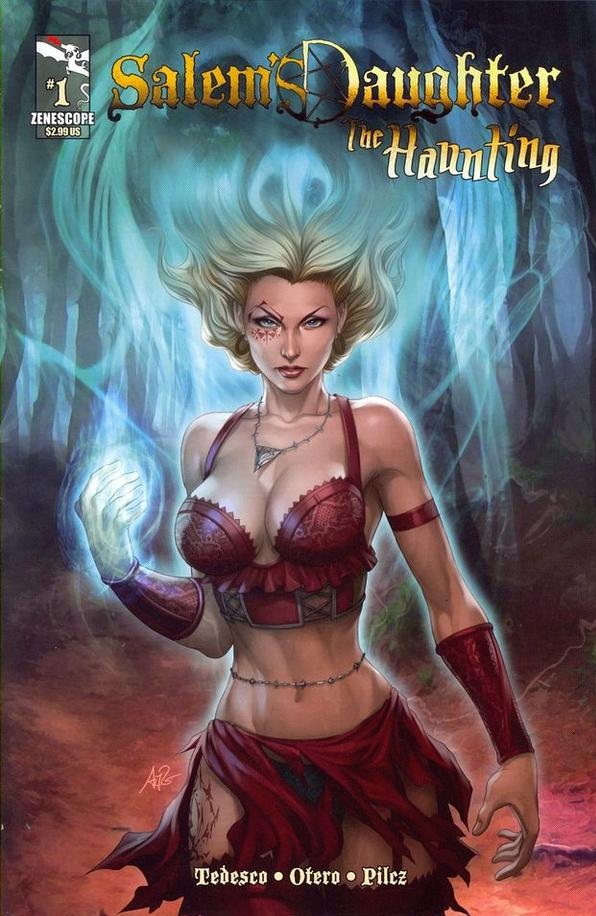
SALEM’S DAUGHTER: THE HAUNTING #1-3
Writer: Ralph TedescoArtist: Allan Otero
Publisher: Zenescope Entertainment
Reviewer: Lyzard
Before I begin, let me make a few things clear. When I began to review SALEM’S DAUGHTER: THE HAUNTING #3, the only prior experience I had with the character of Anna was from reading issues #1 and #2 from THE HAUNTING series. It wasn’t until halfway through the third issue that I even knew that THE HAUNTING was not the first appearance of this character. In the middle of #3, Anna makes a reference to “what happened in Salem.*” The second asterisk on the page leads to a note that says: See SALEM’S DAUGHTER: THE AWAKENING #1 for more back story on Anna.” Now, I did not know at the time whether THE AWAKENING was the true first appearance of Anna, but I assumed with a title like THE AWAKENING it would be. Not until nearing the end of writing this review did I do any research on the comic, because I felt that my experience with the comic would be similar to that of others. By which I mean, never having read or heard of THE AWAKENING, but merely becoming interested due to a review or word of mouth.
You know of the film THE HAUNTING IN CONNECTICUT, which will soon be followed by THE HAUNTING IN GEORGIA and THE HAUNTING IN NEW YORK? They all have a similar plot device, a haunted house that begins to terrorize its inhabitants based on the egregious actions of the former tenants. Well, this comic could have easily been titled SALEM’S DAUGHTER: THE HAUNTING…IN PENNSYLVANIA. The only difference would be that this comic is a period piece. Of course, I prefer this comic to the 2009 horror film.
Another film the comic resembles (but only in the first issue) is THE EXORCIST. Near the end it resembles the last third of the classic William Friedkin adaptation. I’m not griping about the lack of originality, because THE EXORCIST (at least the first one) has amazing concepts that you can’t really blame anyone for wanting to borrow. Luckily for the creators of SALEM’S DAUGHTER, the story continues on after this lifted plot point and no longer follows any of the rest of THE EXORCIST storyline.
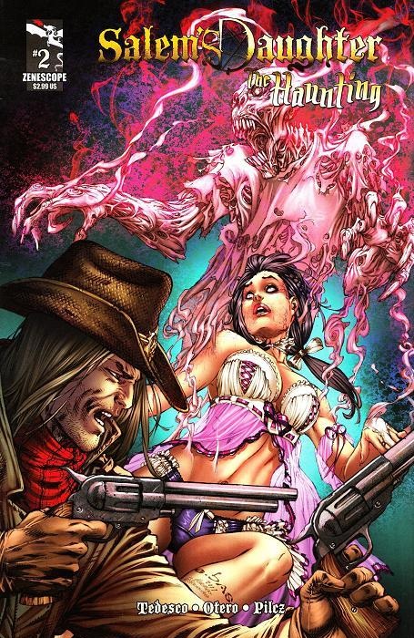 In issue #3, Anna uses her special powers to free her friends from a burning church. Serendipitously, no one beside her companion Braden saw her use of magic. Determined to get to the bottom of the haunting that has spread from the house, Anna takes the advice of Lettia, who she met in earlier issues, to explore the basement of the house. That is where Anna finds answers to the cause of the haunting and realizes the severity of the situation.
I did have several problems with the comic. The story is strong and so is the artwork (more about that later), but the historical accuracy of the comic was off-putting for me. A year is never given, and though the setting is made clear, I always felt like the story took place more in the Midwest than on the East Coast. The town had a more Western feel than I felt was accurate for the setting. However, I’m not a historian, so who am I to question the artist.?br>
Speaking of which, the artwork truly impressed me. At first I thought that the characters looked too clean, more out of a 2-D animated movie. Roland Pilcz’s colors seemed too bright for a comic that I thought would be more of a horror piece (though it contains supernatural elements, scares are not the focus of the comic). But there was a moment about 3/5ths of the way through the first issue that contained a full page drawing of Father Thomas that gave me a glimmer of hope for what could be achieved by artist Allan Otero, colorist Roland Pilcz, and art director Anthony Spay. The last page of the comic, another full page drawing, was vibrant and full of energy. This use of the entire page proved to be where the art team shined and there are examples of this throughout the series.
At this point in the review, I finally looked up some info on SALEM’S DAUGHTER. Turns out I was right and that THE AWAKENING was the first appearance of Anna Williams and Braden Cole. The five issue series contains the backstory on these two characters. However, I do not feel it necessary for those that wish to read THE HAUNTING to waste time seeking out the first five issues. Even without the extensive backstory, I was still able to follow and enjoy the new series. I’m not saying that you shouldn’t try and find THE AWAKENING; I’m just saying you don’t need to read it before getting to THE HAUNTING.
Lyzard is actually Lyz Reblin, a senior screenwriting major with an English minor at Chapman University. Along with writing for AICN, she has been published twice on the subject of vampire films.
 Advance Review: In stores today!
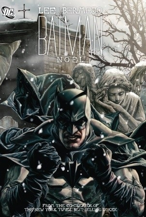
BATMAN: NOEL HC OGN
Writer & Artist: Lee BermejoPublisher: DC Comics
Reviewer: Optimous Douche
When readapting coveted tales like “A Christmas Carol” it’s easy to fall into the traps of either being too derivative, too silly or in many cases both. When trying to meld the Batman mythos into this lauded fiction the slippery slope of homage becomes even more perilous.
Despite the deluge of previews in the back of our favorite monthlies, I really didn’t have a sense of BATMAN NOEL. I knew it was about a bag-man on the run from Batman, I knew that bag-man was most likely Bob Cratchit, and I knew without a doubt that Bermejo’s art was simply a sight to behold. But I already knew Bermejo’s virtues with a pencil from his past work. The real surprises in BATMAN NOEL would be whether A) Bermejo is as adept with a keyboard as he is a drawing board and B) can something new be wrought from tying into the world of the Bat.
Without reservation I can say yes and fuck yes.
Make no mistake, this is a “A Christmas Carol.” There are four “specters” that visit Scrooge throughout one magical night to show him the error of his ways. Scrooge in this instance is Batman, but instead of hoarding money, Batman’s miserly ways are of the soul. His complete distancing from humanity is the ball & chain he carries. As expected, each “specter” carries a different message on why this is no way to live one’s life.
I keep putting “specter” in quotes because Bermejo sets an early precedent that Bruce is in a fever haze induced by pneumonia. This allows the events of the books to transcend past reality without firmly setting the precedent that he’s talking to actual ghosts. It’s the type of device that will allow the continuity curmudgeons of the world to rejoice. Speaking of continuity, this is clearly not the “New 52.” The proof is in the fact that Bruce’s first ghost is Jason Todd, who eerily and expertly takes on the Jacob Marley role.
Unlike “A Christmas Carol,” Bruce knows the other ghosts as well. Catwoman serves to tell Bruce of the man he was, a man who imbibed their game of cat and bat with an almost pubescent zeal. Next up, Superman shows Bruce that his war on crime is not always appreciated – even by those that seem eternally grateful. I don’t want to ruin too much, but this was my favorite scene simply for the choice of party that they eavesdropped on. It’s a Judas one would never expect. Future comes to us in the form of the Joker. Again, though, this is a metaphorical glimpse of the future instead of an actual representation. Given the evolution of story since Dickens originally produced his classic piece, I would say this metaphorical approach has far more impact than some hokey literal representation of time’s passage.
Of course we can’t forget Cratchit and Tiny Tim, but here is where I would say the story slammed into what we know. I wouldn’t go so far as to say derivative since Bermejo did add his own narrative flair to their piece, but this was very very familiar territory.
I look at Bermejo’s art and the name Alex Ross comes to mind, but I also know there are a ton of Alex Ross haters out there who I don’t want to ostracize with these words. Even though I don’t agree, one of the chief complaints I hear against Ross’ work is that it’s not kinetic enough. Well then, consider Bermejo your kinetic Ross. This story consumes the page with stillness when supposed to and jumps into high action at all of the right spots.
I generally abhor holiday issues of any comic, but Bermejo has simply created an instant classic with BATMAN NOEL that is larger than any holiday and should be imbibed as soon as it hits the shelves.
Optimous has successfully blackmailed fellow @$$Hole BottleImp into being his artist on Average Joe. Look for Imp's forced labor on Optimous brain child in mid-2011 from COM.X. Friend Optimous on FaceBook to get Average Joe updates and because ceiling cat says it's the right thing to do.
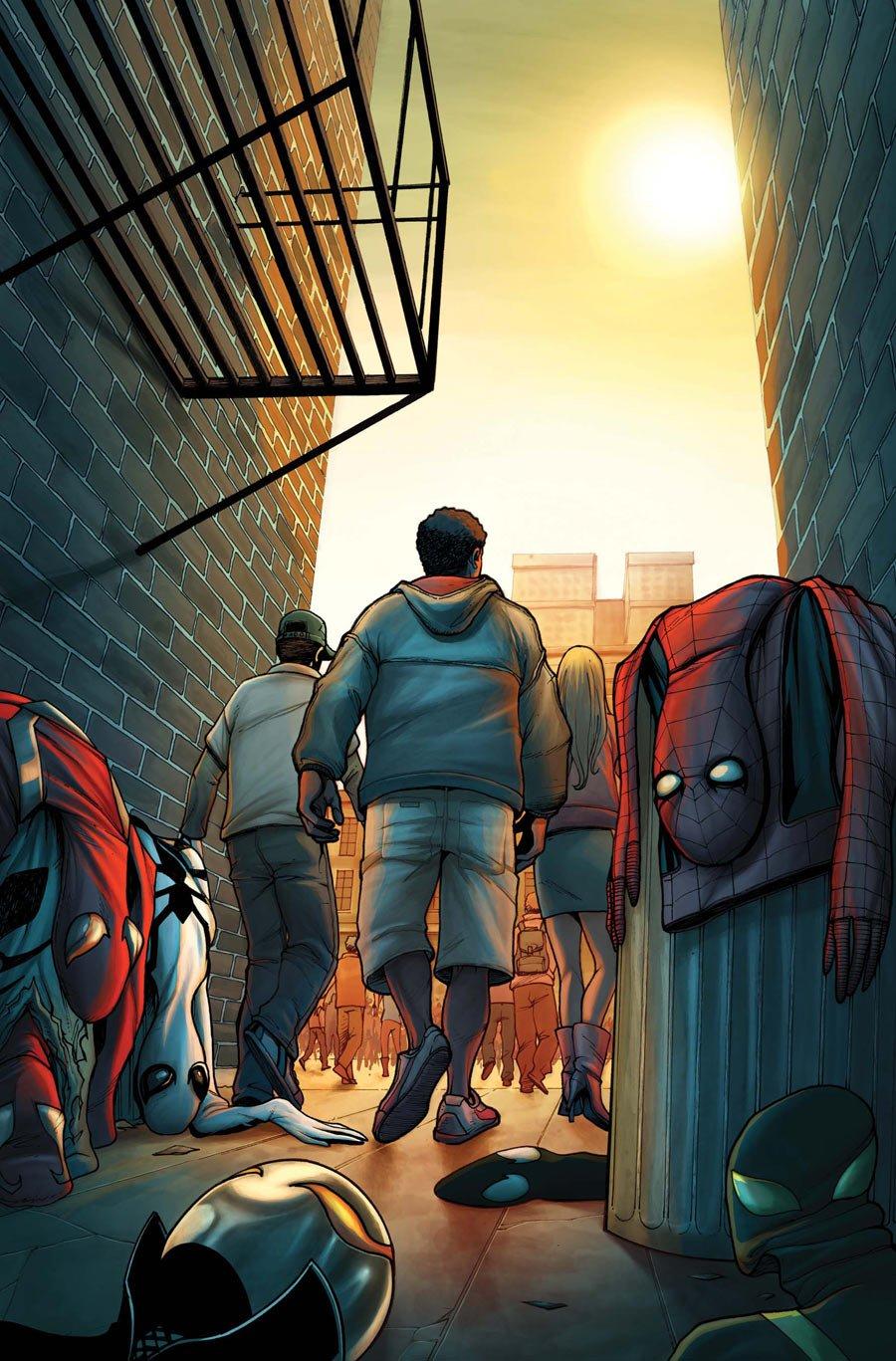
SPIDER ISLAND: CLOAK & DAGGER #3
Writer: Nick SpencerArt: Emma Rios
Publisher: Marvel Comics
Reviewer: Henry Higgins is My Homeboy
The old change up.
Writer (3/5): If anything, I'm slightly disappointed. Writer Nick Spencer has spent much of this miniseries writing a consistently entertaining and enjoyable story with SPIDER ISLAND: CLOAK & DAGGER. Its strengths are still evident, just as strong as the others. The dialogue is fast and flows well, selling the two characters. Mister Negative, while not as good as he's been, does come off well. Spencer, to his credit, keeps the book brisk and good.
However, occurring in the final portion of the book we have the obvious set up for a CLOAK & DAGGER follow up, which proves slightly problematic, as it detracts from the rest of the story. Think IRON MAN 2; the set up for future events slightly detracts from the whole of the tale. It slows the pace dramatically, which is unfortunate. And in exchange for an extended preview, the conclusion feels rushed, rottening some of the general story line.
This miniseries just did not finish strong, which is a shame. It's a great miniseries, with a weak ending.
Art (5/5): Rios is simply, brilliantly, utterly fantastic. Take for example, the scenes of Dagger in the air. The power trade just looks beautiful. While there are moments of the art seeming slightly off (primarily in small facial scenes), it's more than made up for by the wide shots of Cloak and Dagger kissing. Their meeting in the sky is one of the most beautiful things I've seen in a Marvel comic in recent memory.
The small movements, the grand actions, the small scenes of facial reactions....it just looks good.
Best Moment: The art. Oh fuck, the art.
Worst Moment: The ending is weak, especially compared to the stellar rest of the series.
Overall (4/5): Why did this fall through in the end? It was really good (and still is), but it doesn't end as well as it could have.
 Advance Review: In stores this week!
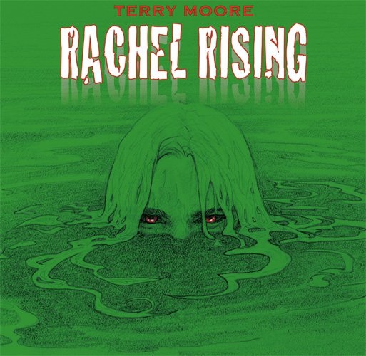
RACHEL RISING #3
Writer/Artist: Terry MoorePublisher: Abstract Studio
Reviewed by Johnny Destructo
Terry Moore has perfected his art, his storytelling…you know what, he's perfected the comic book. I loved STRANGERS IN PARADISE, so much so that I've repurchased many of the trades because I've never gotten them back after lending them to friends, converting them into readers. But I'll be honest: every time I hand the first chunk of books to people I insert the caveat "It starts off a little silly at first, but when it gets going, you'll love it." I really enjoyed ECHO, and used a similar warning when lending out the trades. Friends have said, "Yeah, I tried the first couple of issues, but got bored" and I've had to coax them a touch. "Stick with it, totally worth it by the end. It gets really interesting." With this series, there is no caveat, there is only excellence.
Our protagonist, Rachel, has indeed risen. From out of the ground, from out of the woods, from out of death. Her eyes are red and black (I *think*?) and she's sporting a scar from the cause of her death around her throat. Make no mistake, this isn't the sometimes cutesy STRANGERS IN PARADISE, or the Sci-Fi themed ECHO. This is a horror/thriller/slasher comic, and it's awesome. I'm only 3 issues in and I would already love to see a movie or show based on this, because it's already so strong. I don't want to spoil any of the first 3 issues because I KNOW that way too many of you aren't reading this yet, but you should be. Just know that it has horror, the supernatural, a creepy child, what appears to be an anti-cupid, and murder. Lots of murder.
My ONLY complaint is that this series isn't in color, and that's only for clarification's sake. I love Terry Moore's crisp black and white art. Everything has a different texture, a different feel, so there's never any trouble with the depth of field or telling things apart. Nothing ever bleeds together unless he means it to. It's also loose enough to feel cartoony, while accurate enough to keep us in the real world. But as I stated above, I'm not entirely sure what her eyes are supposed to look like. I think they're black and red, but I'm not entirely sure. Maybe even if it was done SIN CITY style, where it's black and white with one other color? But that's a tiny complaint.
What else do you need to know? Rise off your ass and buy this book!
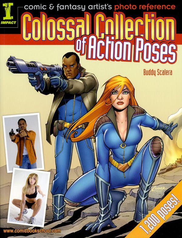
COMIC AND FANTASY ARTISTS'S PHOTO REFERENCE: COLOSSAL COLLECTION OF ACTION POSES
Compiled and written by: Buddy ScaleraPublished by: Impact
Reviewed by: superhero
When I was a young'n I thought that all illustrators created all of their images completely out of their heads. I thought that artists just knew how to draw the powerful and graceful figures that adorned their canvasses, sketchbooks, comic pages, etc. unassisted. I thought it was all taken from memory. It was a constant frustration to me as a child how I'd be unable to replicate super-heroic poses as skillful as those of many of my favorite artists. It wasn't until I got older that I realized that at some point, almost all of them had engaged in some sort of life drawing class to teach them how to observe and record the human figure. I also realized that many artists were also using photographic reference to help them with certain aspects of their art. I'll never forget when I made that first realization…it blew my mind as a kid. I remember thinking "That's not cheating???"
As a grown up I now know it certainly isn't cheating in any way, shape, or form. I'm sure there are many great comic artists out there who never need to use photo reference all that much but there are a healthy dose of us out there who benefit greatly from the assistance of a photograph or having a family member strike a pose for us. I'll admit to not using that particular method enough in my own cartooning work…which is probably some of the reason I'm not always completely satisfied with the results. This is why I'm very grateful to Buddy Scalera for this fantastic book, which is aptly named COMIC AND FANTASY ARTISTS'S PHOTO REFERENCE: COLOSSAL COLLECTION OF ACTION POSES.
Truth to tell, this book is a combined edition of Mr. Scalera's previous artists reference books: COMIC ARTIST’S PHOTO REFERENCE: PEOPLE AND POSES, COMIC ARTIST’S PHOTO REFERENCE: WOMEN AND GIRLS , and COMIC ARTIST’S PHOTO REFERENCE: MEN AND BOYS. If you have, like I do, any of these previous editions you’ll know what to expect from this book. It’s a collection of some of the best action poses you’re going to find in any book at this affordable price. This giant volume has most, if not all, of the poses in his previous books and is a terrific deal for anyone who needs help with sculpting their action heroes and heroines on the page. Each page is just filled to the brim with models staged in different action stances that are guaranteed to assist anyone wanting to bring some type of realistic dynamism to their comic book pages. I already had COMIC ARTIST’S PHOTO REFERENCE: PEOPLE AND POSES and I was impressed with the amount of useful photography that was in that book. With COMIC AND FANTASY ARTISTS'S PHOTO REFERENCE: COLOSSAL COLLECTION OF ACTION POSES I was just absolutely gobsmacked by how many helpful images were in this tome. There are just tons of shots of people of all different sizes leaping, punching, kicking and whatever else people do in comic books. This book is a smorgasbord of useful photography for any kind of artist who doesn’t have 24/7 access to a life model…which means most of the known world.
But not only do you get all of this photography, you also get some small tutorials from professional comic artists who guide you through how they would use an individual pose. You’d think that using photo reference would be self-explanatory but it always helps to see how other artists do things and these tutorials can be useful…especially when they come from the likes of Terry Moore and Amanda Conner. These segments are a welcome addition that you don’t really get in the other books that Scalera has published.
The only gripe that I would have with this release would be that it doesn’t include a CD with all of the images that were in the book. The aforementioned other volumes that contain much of the original photography in this publication all had a disc that had the pics on them, so if you wanted to actually have a library of images to choose from on a laptop, tablet or mobile phone you could just take the disc and put the photos on your device for easy reference. That’s what I did with the images I got from COMIC ARTIST’S PHOTO REFERENCE: PEOPLE AND POSES and it’s been helpful on more than one occasion. I understand that this book might have cost more with the inclusion of a disc but I think it was part of the appeal of previous releases, especially in this world of portable media. Still, this book is a great reference tool even without the inclusion of a disc. It’s a terrific aid that any aspiring or professional comic book artist would be lucky to have.
Discovered as a babe in an abandoned comic book storage box and bitten by a radioactive comic fan when he was a teenager, superhero is actually not-so mild mannered sometime designer & cartoonist, Kristian Horn of Los Angeles, California. Some of his work can be seen at www.kristianhorn.com and check out his blog at www.parttimefanboy.com. You can check also out his webcomic at www.babybadass.com, which is currently in development.
 Advance Review: In stores today!
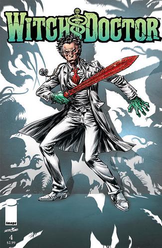
WITCH DOCTOR #4
Writer: Brandon SeifertArt: Lukas Ketner
Publisher: Image Comics
Reviewer: Ambush Bug
With a winning premise and some fantastic ideas at play, WITCH DOCTOR has by far been one of my favorite miniseries of the year. Writer Brandon Seifert and artist Lukas Ketner inject a heavy dose of fun to their Dr. Morrow, a somewhat unhinged practitioner of mystical medicine. Though this could have come off as a lite-calorie DR. STRANGE rip-off, Seifert and Ketner rely on fresh ideas, exciting concepts, and fun twists on old standbys to make WITCH DOCTOR a series to be reckoned with.
I have to admit, though, by the time issue #3 came around, I was feeling a little left out in the cold. Up until that issue, we were inundated by strange shit and quirky mannerisms at every turn, but there was very little by way of character going on with our cast. I started to get that Grant Morrison feeling, that Seifert had that certain something that made him come up with these ingenious ideas, but the stories lacked any character for me to latch on to. That type of story with big ideas can be fun to read for an issue or two, but without a character to make me feel as a reader in the story, I lose interest quick.
But Seifert must have sensed this because right around issue three, he has one of his characters say the thing I was beginning to think when his everyman character, Eric Gast, says in so many words, “Enough is enough! Stop this madness and explain some of this shit to me!!!” And that’s what Seifert did using Dr. Morrow as his mouthpiece. I won’t spoil the secret origin of the universe according to WITCH DOCTOR, but it’s a doozy and surprisingly gives Morrow a little character as well. As soon as issue three revitalized my investment in this comic by injecting character into its characters, I was set and ready for issue four to wrap up the issue, reinterested in what was going to happen to our paranormal paramedic.
Issue #4 of this series is more of the same. And by that, I mean more of the same exciting ideas (there’s a mystic medical board reviewing Dr. Morrow’s license to cast medical spells), some exciting sequences (as Morrow and Gast battle sub-sea creatures bent on propogating with human women and take over the world), and some comedic takes on medical and action movie tropes (Morrow’s scalpel—which is actually a giant sword—gets stuck into things like Excalibur when stabbed by the untrained hand and must therefore be slashed). The logic of this final issue is wonky, combining science with mysticism making it work in the way only a comic book could. But this is another fine issue, assuring that WITCH DOCTOR will have a safe spot on my pull list whether it comes back as a one-shot, miniseries, or ongoing.
Mention where mention is due: Lukas Ketner’s designs continue to dazzle as his updated and creative takes on classic monster and mystical creatures fill each and every page. Not only is this book one of the more entertaining reads, it’s also a feast for the eyes, giving the reader a whole lot and more to dine on while the reader is laughing and overwhelmed by the fun and cool ideas this creative team creates in every issue of WITCH DOCTOR.
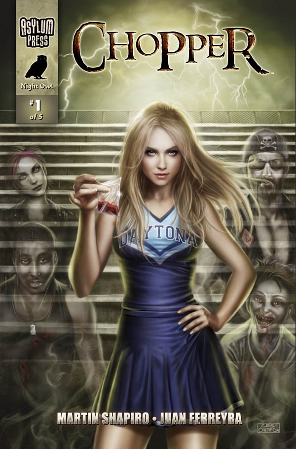
CHOPPER #1
Writer: Martin ShapiroIllustrator: Juan Ferreya
Publisher: Asylum Press
Reviewer: Mr. Pasty
I can’t believe I’m saying this, but, Get to da CHOPPER! Yes, a played-out PREDATOR cliché opens this review because I, your beloved pasty-faced critic, am telling you to pick this one up for your own good. First and foremost, because it’s a kick-ass comic book and we can never have too many of those. Second, because it re-imagines THE LEGEND OF SLEEPY HOLLOW, and who among us doesn’t love the tale of the headless horseman? That was one scary son-of-a-bitch when I was a kid, but I stopped being afraid of him quite some time ago, not because I’m aging faster than Donovan post-false grail, but because there’s no way some galloping specter would make it 500 yards on my block without getting crushed by the number nine bus. Trust me, I have the dead pets to prove it.
Anyway, CHOPPER has resurrected he-who-has-no-head, with Martin Shapiro giving him an updated look for 2011. This ain’t colonial times, son, and our evil genius traded in his horse for a hog. Move over GHOST RIDER, there’s a new two-wheeled badass in town and he’s riding (duh) a chopper. He’s also using that wheat-cutting tool that I can never identify and am too lazy to Google. You know the one I mean, the blade that slack-jawed farmhand swings in PINK FLOYD’S “Learning To Fly” video. Anyway, he shows up at the most inopportune times to start cuttin’ heads off. And when I say “inopportune,” I mean, “Just as you got a handful of cheerleader tit under the high school bleachers.”
CHOPPER takes place amongst our younger population and if your teenage years were anything like mine, you’ll be able to appreciate the amount of sex and drugs that take place in this Daytona teen scene. Not that I was ever getting any, but I knew it was going on and sure wished I was “in” enough to disrespect myself like all the cool kids did. Such is the case in our fictional setting in Daytona Beach, Florida, brilliantly constructed through lush illustrations by Juan Ferreya. Christina, our protagonist, is a hot-ass cheerleader who also deals drugs on the side. Unfortunately those drugs are the gateway to the CHOPPER, who shows up and flays you just as the rush sets in. What a killjoy! Or is it just a bad trip that causes each person getting high to act out these crimes themselves? Being issue numero uno, it’s too soon to tell, but I like the idea of having alternate possibilities. I also like that it’s established without feeling gimmicky. This is a great looking book that’s sewn together with a tight script, one that plays just the right note: not too serious but just serious enough.
The first issue of CHOPPER is everything an introductory book should be. It establishes characters, motives and environment in such an effortless manner that any and all exposition flows within the natural timeline. Nothing kills a book faster than the dreaded halt in action so a character can ask “Okay, now tell me one more time, why are we trying to disarm this bomb?” “Well, Jim, because…” Nope, none of that crap here. The only killing in this book is done by the two-wheeled wraith, who just so happens to show up during Daytona’s “Bike Week.” Talk about convenient! That’s like the original headless horseman showing up in Louisville during the Kentucky Derby. I mentioned our antagonist being the slayer in this book, but he’s nothing compared to the team of Shapiro and Ferreya. They’re killers too because they killed it with this comic and if you have any respect for the dead, you’ll check this one out. It’s bloody awesome. Literally!
Web heads who can’t get enough of Mr. Pasty’s word vomit are encouraged to watch him operate as Nostradumbass over at MMaMania.com here. Love, hate and Mafia Wars requests should be directed here.
 Advance Review: In stores today!
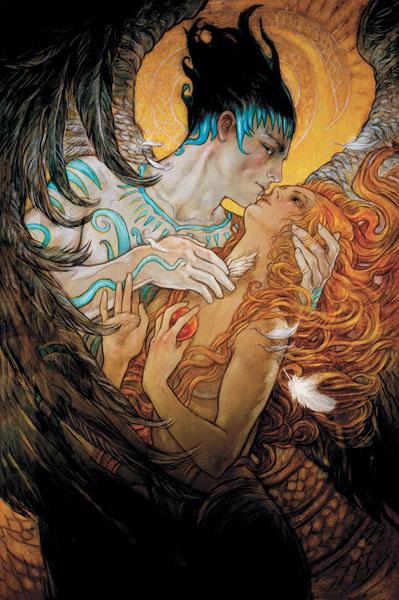
A FLIGHT OF ANGELS HC OGN
Writers: Holly Black, Louise Hawes, Bill Willingham, Alisa Kwitney, Todd MitchellArtist: Rebecca Guay
Publisher: DC Vertigo
Reviewer: Optimous Douche
If SUPERMAN is the strength of comics, A FLIGHT OF ANGELS is the soul.
There’s no false advertising in the title of this book, but it’s far from the migratory patterns of God’s soldiers. Guay, with a little help from her comic luminary friends, explores the flights of fancy of angels through time, and how they have for better or worse touched and changed humanity.
The soulless have not had this much soul since LUCIFER. And like Carey’s opus to the Silver City, these angels are the best representations of humanities’ virtues and foibles despite the fact they can never truly understand the human condition.
However, where this book takes a sharp left turn from LUCIIFER is that A FLIGHT OF ANGELS is a literal orgy of artistic splendor. I had to check the book’s credits many times to ensure that there weren’t six artists on this book instead of writers. That’s usually a negative comment, but thanks to the solid story structure this is the type of book that begs to switch between artistic styles. I’m just flabbergasted that Guay pulled off this feat solo. The visual styles make you feel less like you’re walking through the story and more like a museum of the world’s finest paintings have jumped off the walls to perform the story for you.
Starting in a bleak landscape (made bleaker by Guay’s use of light charcoals) the world of the magical scampers between the shadows of the world of man. In this world live old witches, doe eyed centaurs, faerie kings and lovelorn nymphs. They represent the might and meekness of this side-step from our reality, content to go about their daily deeds and misdeeds…until an Angel falls upon them. When pressed what to do with this unconscious form, the royalty in the group suggest a tribunal where each mystical being makes their case on whether the angel should live or die.
Here is where the story truly (pardon the pun) takes flight. Once the tribunal is set, our mystical creatures share their experiences with angels through the ages. As not to spoil the splendor of this book, because again the splendor is truly in the art work, I will say that these are some of the most heartbreaking stories I have ever read. Even when they start out well, it’s clear that man and angel will end their dalliances in suffering for one or the other. We learn about original sin, and how angel and man both lost in that arrangement; another vignette explores man’s fear of death and how staving off the inevitable becomes death in and of itself; in one of my favorite pieces we learn about angel bounty hunters, very much a “who watches the watchmen” type tale; and there’s more, but again, the book should do the talking.
I also want to give a huge shout out to the lettering in this book. Again, I will invoke LUCIFER for comparison even though A FLIGHT OF ANGELS does it tem times better. Each character and story had their own unique form. I was most impressed, though, by the story that takes place somewhere in Western Europe. The quasi-Cyrillic lettering was just enough to make you take pause and set tonality without inhibiting the reading experience.
I’ll fully admit I skimmed thru the art to get this review out the door, but make no mistake I will go back. Why? Because for the sake of expedience I treated the two pages splashes, the rich tapestry of different styles, like they were two dollar whores. Don’t make the same mistake I did, imbibe every rich detail of every panel. That exercise alone makes A FLIGHT OF ANGELS worth the price of admission. The cleverness and emotional depth of the stories is icing on the cake.
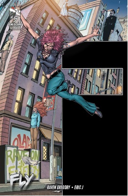
FLY #5
Writer: Raven GregoryArt: Eric J
Publisher: Zenescope Entertainment
Reviewer: Ambush Bug
FLY is a fantastic series by Raven Gregory about the thrill of flying. Though drugs and superpowers have been mixed before, Gregory does so in a manner that is both literal and emotional all at once. Issue five wraps up the FLY miniseries, ending with a promise of more to come. FLY #5 is the ultimate confrontation between Eddie, a somewhat doltish, but good intentioned guy who happens upon a serum which grants a person the power of flight. In order to help a damaged girl, Danielle, whom he has feelings for, he introduces her to the drug, hoping the liberating feeling of flight will awaken a glimmer of hope in her. Instead, she becomes drunk with the power. This issue wraps up the confrontation between Eddie and Danielle by going back to where their relationship all began before ending it dramatically.
Though there is a bit of dues ex machina-ing going on with a fix-all serum used in the climax of this issue, it’s not too out of the ordinary given that this is a story about a flying drug. That said, Gregory pulls off for touching wordplay as one man and one woman who once loved each other wonder where all of that disappeared. It’s a heartbreaking read.
Artist Eric J shows a versatility that not many possess as he switches style as the narrative shifts from past to present. Eric J’s past shots are more influenced by manga with big eyed children full of adventure and wonderment. J’s present panels are much more dramatic and scratchy. In some places, J’s work reminds me of early Whilce Portacio, whose work I admire quite a bit. J’s skill and range shows that he is an artist to be reckoned with.
If you missed FLY, you should look for it in trade most likely to be released soon. Finishing this last issue of this current miniseries, even though this issue ends on a somber note, I felt fully entertained from page one to page last.

ANNIHILATORS: EARTHFALL #2
Writers: Dan Abnett & Andy LanningArt: Tan Eng Huat
Publisher: Marvel Comics
Reviewer: Humphrey Lee
Sad to say, I’m not feeling this mini from the Abnett and Lanning connection as I did the previous volume.
ANNIHILATORS: EARTHFALL #2 is kind of a classic case of, I think, the uber-powerful characters, especially of the low tier variety tend to have little in the way of personality. And, really, what this current congregation has, outside of Quasar, is not really shining through. Between that and this issue being a classic case of “heroes fighting under a misunderstanding” and more of the Universal Church of Truth, which has dragged out too much as a plot thread in this corner of the Marvel U, I’m kind of longing for the NOVA and GUARDIANS OF THE GALAXY days.
The Rocket Raccoon and Groot backmatter is killing it, though, and the main story is also properly rife with enough balls out action to be worthwhile. I’m getting withdrawal from the mixing of personalities and “oh fuck can we even handle this” situations that made these Marvel Cosmic jaunts so great.
’HOLES COMICS PODCAST #1
Let us know what you think of the Podcast and if you want to hear more of the Holes rambling about comics on Poptards in future AICN COMICS columns!
Proofs, co-edits & common sense provided by Sleazy G
Check out AICN COMICS on Facebook and Comixpedia.org!