
| #25 | 11/10/10 | #9 |
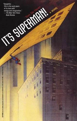
IT’S SUPERMAN! Novel
Written by: Tom DeHaven Publisher: Reviewed by: superhero
Note: This is a review for a novel. That is, a book without pictures. It’s not a comic book. It was also first published in 2005…so it’s been out for a bit. I just happened to pick it up in the past month or so and was so impressed by it that I thought it deserved a writeup.In the past couple of weeks there’s been a lot of hubbub about J. Michael Straczynski’s SUPERMAN: EARTH ONE. Some of the talk, even in the AICN talkbacks, has been about whether Superman as a character could possibly be relevant at all in this day and age. I haven’t had the chance to pick up Earth One yet so I can’t speak to it but I will say that if you have any doubts about the ability of the character of Superman to speak to you then you need, need, to pick up IT’S SUPERMAN!
Author Tom DeHaven takes Superman back to his Depression era roots in the pages of this great adaptation of Clark Kent’s early years. DeHaven crafts a world that is part Steinbeck and part “Smallville”…although to compare this book to Smallville is to do it a disservice. Every character here is a fully developed, realistic individual which is something that “Smallville”, in all its ten years, has been unable to deliver. I’ve never, ever in all my years of reading Superman comics come across such a perfectly sculpted characterization of Clark Kent as I’ve read here. What we have in these pages is a truly human Superman. One who feels, thinks, doubts without that whiny emo quality that seems to have overtaken the Man of Steel since John Byrne re-invented the character back in 1986.
In IT’S SUPERMAN we’re reintroduced to most of the old Superman mythos in a unique and refreshing way. Sure, we’ve all seen Superman in the 1930’s…after all, that’s when the character made his debut. But DeHaven crafts a world built from nostalgia and historical fact that makes the debut of a character like Superman feel plausible in his 1938. IT’S SUPERMAN presents a young man who was born with powers beyond mortal men and really has absolutely no idea what to do with them, especially in a world that he doesn’t feel has a need or place for him. This isn’t the cocksure hero smashing through walls. This is a young man who isn’t quite sure how far his powers will go. Will bullets bounce off him? Can he pick up a car? Clark Kent doesn’t know and the beauty of this book is in following him along his journey of discovering not only his powers but himself and his place in the world. It’s the first time I’ve read a young Superman story and believed, actually believed, that, yes, this is actually the way it could have happened. This is how a young kid from a podunk town in Kansas could become one of the most iconic heroes in modern fiction.
But discovering Clark’s journey is only a small part of the IT’S SUPERMAN! pie. Tom DeHaven fleshes everyone out and gives every single character room to breathe and grow. For the first time I feel like I truly understand where the character of Lois Lane is coming from. For years she’s played either the damsel in distress or the ball-busting wife to the Man of Tomorrow. In IT’S SUPERMAN! I think I’ve finally read a version of Lois Lane that’s a fully realized person on the page. DeHaven has done what seventy five years of comic writers have failed to do: make Lois Lane really interesting.
And don’t even get me started on Lex Luthor. DeHaven creates one of the best versions of Lex Luthor I’ve ever read. This is no cardboard cutout villain. Again, DeHaven takes what has come before and expanded on it and fleshed it out in such a way that it seems almost new. We have a Luthor here who is on quest for power but not in a blind and stupidly arrogant way. He’s intelligent, controlling, quirky and lethal…but he’s human as well. He’s not some megalomaniacal mad scientist goon that’s plagued the pages of the Superman books for years. He’s an actual person with understandable, yet flawed, motivations.
But what’s truly great about all of the characters inhabiting DeHaven’s book is that you never, ever feel that any of them overshadow the main character: Clark Kent. I can’t tell you how many times I’ve been frustrated with the Superman comics in that so many writers take the focus off of the main character because they have no idea what to do with him. For so many years there have been stretches where it seems like Superman is a guest star is in his own book. Tom DeHaven manages to avoid that pitfall while expertly building up everyone around the future Superman without eclipsing him. This book is definitely about how Superman came to be and the events that would lead him to become a hero in a time when the world needed to believe in one so badly.
Now before you run out to find this book I have to warn you purists out there that IT’S SUPERMAN! does take certain liberties with elements of Superman’s world, the biggest one being that there is no Metropolis; instead Clark Kent ends up in New York City. I had no problem with it because, quite honestly, I’ve always thought of Metropolis as a silly convention and always wondered why DC didn’t just make Superman’s grown up stomping grounds New York when they re-vamped the character in ’86. But if the thought of Supes living in NYC is the sort of thing that makes you apoplectic then maybe you might want to avoid this book together. There’s a lot of what I considered small tweaks which I actually found refreshing but if you’re a traditionalist then they may just drive you up a wall. I won’t even bother telling you about the costume’s origins…it may make some of the more inflexible fans out there just lose their minds altogether.
Another thing to warn readers about is that birth of Superman doesn’t really happen up until the end of the book. If I haven’t been clear about that aspect of the book I should say it now: this novel does not have knock down drag ‘em out fights with Brainiac in it. It’s about what makes Clark Kent become Superman. What makes a young man with the powers of a god put on a costume and fight the good fight. The reasons IT’S SUPERMAN! presents are a bit more complex than truth, justice and the American way but they are just as pure hearted and inspirational as those words that Christopher Reeve spoke in 1978. Even though it takes place back in the 1930’s, IT’S SUPERMAN showed me that what makes Superman great are values and ideals that are universal whether it’s 1938, 1978, or 2010.
When I finished this book I had tears in my eyes. Because for the first time, in a long time, I believed in a hero that inspired me so much when I came out of a movie theater as a boy and believed a man could fly. IT’S SUPERMAN! didn’t make this cynical comic book fan believe a man could fly but it did make a grown man believe in Superman again.
Discovered as a babe in an abandoned comic book storage box and bitten by a radioactive comic fan when he was a teenager, superhero is actually not-so mild mannered sometime designer & cartoonist, Kristian Horn of Los Angeles, California. He's been an @$$hole for three years. Some of his work can be seen at www.kristianhorn.com and check out his blog at www.parttimefanboy.com.
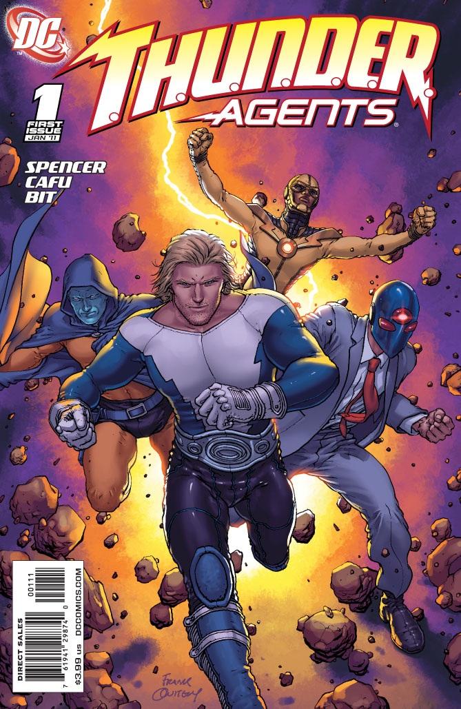
T.H.U.N.D.E.R. AGENTS #1
Writer: Nick Spencer Art: Cafu Yu Publisher: DC Comics Reviewer: BottleImp
I’ll be honest: I know next to nothing about the original T.H.U.N.D.E.R. AGENTS series. I knew that it was a mash-up of the standard superhero fare with the 1960’s spy/secret agent craze, and that it was created by famed artist Wally Wood, but beyond that, I was ignorant. Why, then, did I pick up the first issue of this revival? Not due to any nostalgia (which will surely be the impetus for some older comic book fans), and not based on the creative team (I’m unfamiliar with both writer Spencer and the art team, led by the singly-monikered Cafu). No, I think it’s because of the costumes. Even though I was never a fan of AGENTS, I did see enough examples of art depicting the characters through the years to develop a fondness for their costumes. Simple, combining the basic sleekness of Silver Age design with a slight technological edge—to me, these represent the best of superhero visual design. And when I saw the excellent Frank Quitely cover depicting the revamped Agents in their iconic uniforms, I had to pick this comic up. But unfortunately, snazzy uniforms can carry a series only so far…I have the feeling that just as many readers will be turned off by this issue as will be intrigued by it, and the dividing factor will be the reader’s familiarity (or lack thereof) with the concept behind the T.H.U.N.D.E.R. Agents. Spencer drops the reader right in the middle of the plot without a set-up, and compounds the confusion by bouncing between two different timeframes (actually THREE, if you count the first two pages of the comic, but since we never hop back to that intro time period, I’m going to let that one slide). To top it all off, by the end of the issue the reader still knows next to nothing about the protagonists—not their names (civilian names, though in one case not even a codename), not their personalities, not their powers, and not even how they came to work for the Agency. In fact, the most concrete information about the Agents is passed on through the little text block that accompanies the logo at the bottom of the credits page. If you didn’t know anything about Wood’s original series or the short-lived revival that occurred in the 1980s, you’re going to feel a little left out here…unless you do your homework on Wikipedia, like I did. Even though I know that this title will be bought mostly by those who remember the old comics, or at least know of the characters, I’m still surprised to see such a blatant alienation of new readers. I’d write this revival off already, except that one thread running through this premiere issue hints at this series’ promise.
Part of what makes T.H.U.N.D.E.R. AGENTS unique as a superhero concept is that the powers given to the protagonists come with a price—and I’m not just talking “with great power comes great blah blah blah…” here, I’m talking a concrete, physical price: the powers will eventually kill the Agents. And the Agents know it. This leads Spencer and Co. to ask the question, “What kind of person would take up the responsibility of these abilities, knowing that by doing so, he signs his own death sentence?” This is an avenue that has not often been explored in the comic book world; the only example that comes to mind is Marvel’s STRIKEFORCE: MORITURI from the ‘80s, which also dealt with the fatal effects of superhuman abilities. By focusing not only on the slam-bang heroics of the superheroes but also on their psychological states, this series has the potential to join the ranks of those comics that make the reader care first and foremost about the person beneath the spandex.
This premise is the saving grace that has the potential to hook new readers who might be unfamiliar with the series’ background and otherwise turned off by the scattershot narrative of this first issue, but it’s not the only positive. The artwork is clean, competent and readable—Cafu is adept at both the action scenes and the talky parts. Sometimes the faces end up looking a little flat, mostly due to the minimal linework, but even on these panels the emotion of the characters is easy to read through gesture and expression. The redesigns of the Wally Wood costumes are simple yet elegant, and retain the fun, four-color feel of the originals. And even though there’s more talk and less action in this comic than I would have expected, the last page money-shot of the hopefully-soon-to-be-named T.H.U.N.D.E.R. Agents running straight out at the reader is a great piece of superhero iconography.
So this series definitely won’t be for everyone, and the overly convoluted plotting of this first issue might even turn off fans of the classic AGENTS. I’m going to hope that Spencer will do less time-hopping and more forward-plotting and stick with this series for a little while. The promised psychological aspect is enough for me to come back next month and (hopefully!) meet the protagonists. Plus, those costumes are just so darn cool.
When released from his Bottle, the Imp takes the form of Stephen Andrade, an artist/illustrator/pirate monkey painter from the Northeast. You can see some of his artwork here. He’s given up comics more times than he can remember. But every time he thinks he's out, they pull him back in.
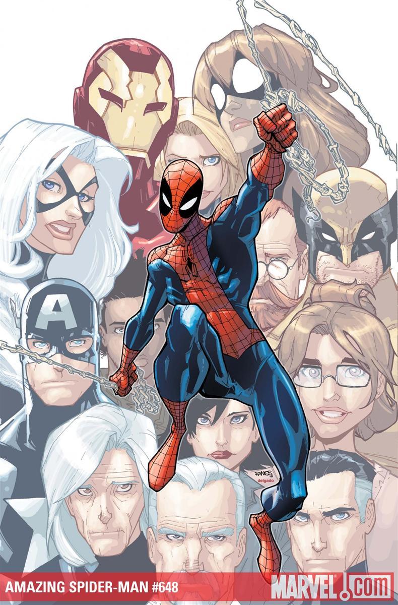
AMAZING SPIDER-MAN #648
Writer: Dan Slott Artist: Humberto Ramos Publisher: Marvel Comics Reviewer: KletusCasady
Take a deep breath…”Brand New Day” has passed, you don’t have to pay $12 bucks a month for Spider-Man, and OMD is just an afterthought…breathe…it’s been explained ….BUT BUT…no…no…it’s over, let’s move on…BUT HOW DID AUNT MAY….no Kletus…remember what your therapist said. OMD is over and you must move on...just ONE QUestaGGhh…MEPHISTOISQUESADAAAAGHHHHHHNOOO!Whew…huhh…huh…I’m okay…having trouble swallowing huh huh ok, ok…sip of water…I’m alright….I’m ok.
Dan Slott has taken over as regular writer for SPIDER-MAN and I applaud that decision; he was the best writer out of the 20 that were on SPIDER-MAN…not mention he’s actually funny in real life so his jokes don’t seem forced and well….not funny(Bendis). This issue was actually really good and reminded me of the 80s era Spider-man that I grew up with and still love. Supporting characters are really important to this comic and it seems as though Slott’s making a conscious effort to bring back that aspect of Spider-man. I think supporting characters are needed in a comic like this because it helps ground Spider-Man and gives him a realistic link to the world as we know and without it, he just becomes another super-powered guy that we can’t relate to. His new job opens up a world of possibilities from villains to heroes to new equipment.
I really really wish Marcos Martin was doing the art…but I can’t/won’t win ‘em all. The art is ok. I’m not really a fan of Ramos, although I do feel like his CIVIL WAR: WOLVERINE was pretty good. In my opinion, the action is really the worst part of his art; you’d think that with his style that action would be his forte, but the action scenes just look cluttered and it’s hard to tell what’s going on. I think Chris Bachalo does a very similar graffiti inspired art style but it just looks a lot better and flows a lot easier.
Ramos’s scenes where nothing is happening actually look great but who the hell wants to see that?!?! Looking at the art for SPIDER-GIRL (the first back up I’ve read in a while…damn good too!), I was baffled as to why she’s getting better art than Spidey but I don’t make those decisions so whatevs.
I saw Slott at a weird comic convention in Weston, Fl where most of the kids (all) had little to no interest in comics, as they were all dressed as random obscure manga characters. Peelander-Z playing was one of the highlights of this convention (oh yeah and the random characters in Harry Potter that only have half a frame of screen time were there too). In the clearing towards the back of this tennis court sized convention room, behind an old rickety folding table, I locked eyes on Dan Slott, he seemed bummed and I was one of the few people who came up to him and said I was digging his work on Spider-man (this was around the time of “New Ways to Die”), we shook hands and he seemed really appreciative, and even though no one knew who he was…he was still there …so props to you Mr. Slott!
The new AMAZING SPIDER-MAN is off to a good start and despite my dislike for the art, I’m actually looking forward to the next issue (I know, right!?!). I like this direction Spidey is taking and hopefully Slott can pull Spider-man back up to his rightful place as one of the top comic book characters out there, regardless of what happens with the movies.
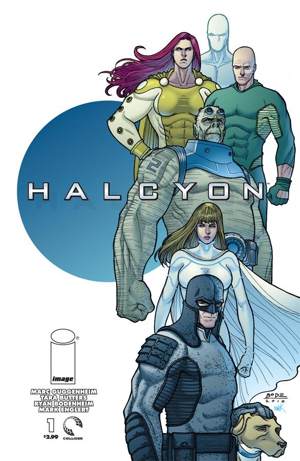
HALCYON #1
Writers: Marc Guggenheim & Tara Butters Art: Ryan Bodenheim Publisher: Image Comics Reviewer: Humphrey Lee
Unsurprisingly, because they typically put out top-notch stuff material. CHEW, SKULLKICKERS, and I’m hoping for good things out of 27 out in the near future to say the least for their lineup. Surprisingly though, I really did not see any sort of pre-debut buzz for the latest Marc Guggenheim joint, HALCYON, a new take on the superhero comic by a man who has written some pretty darn good ones. Well, crank up the hype machine at least one modest notch (I have no preconceptions that I have anything more than a modicum of “book pimping mojo”), because I think we have something really cool on our hands here. Well, I liked it at least…If I were to be extra analytical, because that’s exciting, I would say my enjoyment of this book is threefold. First and foremost, I’m a sucker for the proverbial “high concept.” HALCYON’s is a world where the superheroes have “won.” Well, they are about to win, as we find out throughout the book and the world’s greatest analogs (admittedly a semi-drawback to this kind of work, but you learn to deal) that the crime they are fighting is reducing in numbers. Slowly at first, but now drastically, the world HALCYON polices is seeing aggression dropping across the worldwide playing field, a blessing for sure, but one with a troubling uncertainty surrounding it. It also has a lot of interesting mechanics at play if you read the book for yourself and take in all the details and characters and so on.
Anyway, the real reason I think I dug on this as much as I did was because it was adult superheroes being superheroic. While not as brutal (yet) or as “rock star” about their jobs as the group I’m about to name drop, the way these characters handled business felt very AUTHORITY to me. The first sequence see of this book we see Halcyon’s resident super soldier getting down and dirty in the desert trying to put a fist sized hole in Al Qaeda by putting one in Bin Laden himself. We see the resident gadget-adorned scourge of the night quickly and efficiently beating down some thugs with no brooding or fanfare. There’s some speedster action and Superman-like giant robot bashing (except in this book Superman has tits) and so on. No nonsense, no “I’m back from the dead now and don’t fit in” or whatever BS mainstream superhero drama; evil needs its ass kicked and these peeps kick it. It’s honestly kind of refreshing and I hope the majority trend for the book, no matter how complex the overlaying plot I mentioned above may get.
And the last thing that I really latched onto and convinced me to pre-order: It dun look purty. I goddamn loved Ryan Bodenheim’s work on RED MASS FOR MARS and thought he was destined to become the next big name on, I dunno, the third THOR book as he broke into the Big Two. Thankfully he’s here and his extra detailed, very tight lines are in all their glory. It really is some great superhero art: very kinetic, very “impactful” with its, well, impact when the fists fly and the property damage adds up and so on. And I appreciate a man who makes the most with what he has, as Bode is a conservationist with the space, putting just enough detail into the background to set the stage and framing the action and talking bits, but not going so overblown with cramming so much into the page that I can start to assume this book will be showing up a month late religiously. It’s just how I like my superhero art, just like HALCYON is how I like my superhero comics: fresh, energetic, with a smacking of familiarity.
Now, of course, all this gushing could be for naught and the river of promise I think HALCYON has may reduce itself to a trickle – that goes for any new title obviously - but for now I think this is something that should get some eyes on it. I like the characters, analogs though they mostly be so far, and I like how Guggenheim is presenting them and, of course, love the hitch of the book. It reads real well, looks to have a future rife with new takes on well-tread tropes to be played with, and it looks bloody gorgeous. Buy it. It’s a good comic and I want it to be around for a while. And I promise if you do I won’t sneak by your place and Michael Vick your pets. Deal? Deal… Cheers…
Humphrey Lee has been an avid comic book reader going on fifteen years now and a contributor to Ain't It Cool comics for quite a few as well. In fact, reading comics is about all he does in his free time and where all the money from his day job wages goes to - funding his comic book habit so he can talk about them to you, our loyal readers (lucky you). He's a bit of a social networking whore, so you can find him all over the Interwebs on sites like Twitter, The MySpaces, Facebookand a Blogger Account where he also mostly talks about comics with his free time because he hasn't the slightest semblance of a life. Sad but true, and he gladly encourages you to add, read, and comment as you will.

THANOS IMPERATIVE #6
Writer: Dan Abnett and Andy Lanning Artist: Miguel Sepulveda Color Artist: Jay David Ramos Publisher: Marvel Comics Reviewer: Rock-Me Amodeo
Holy Crap! It’s over! That was…that was…Sigh… It’s over. Rats…
If you missed this, you really missed it. I haven’t read much lately, but the Abnett/Lanning cosmic corner was always something to pull me back in, without fail. And this issue was certainly the capstone of years of hard work. I can’t say it affected me as much as Jean Grey’s death in the Blue Area of the moon (mostly because I’m not a teenager anymore) but I was definitely mouthing a wistful “damn…” under my breath as I turned the last page.
There have been so many crossover events (read: almost every one of them) that took us for a wonderful ride, but when the end came, we were all looking around going, “is that it?” Maybe because there weren’t a ton of superfluous one-shots or self-serving ancillary series (if I find out someone was specifically responsible for nixing any sort of FRONT LINE: THE THANOS IMPERATIVE, I will send that man, woman or child a gift card) so the action had to stay focused on the main series.
Don’t get me wrong, I loved REALM OF KINGS and most of its tie-ins, but there’s something to be said for the old-fashioned miniseries done right.
And boy, was this ever. Seeing Galactus in full kick-butt mode was nothing short of thrilling. Wondering how everyone would react to Thanos being…well, THANOS, was just plain old fun. Watching Nova get his full power set on and shredding his opposition was a hoot. And the swash-buckley heroism at the end… No gentle nuances here, though there was enough room to weave some interpersonal development and interaction.
***SPOILER ALERT***
Now I know no one stays dead, not even Bucky (though I still continue to pin my hopes on Dr. Druid beating the odds and remaining breath-challenged). So I’m relatively certain we will see one of my favorite characters of the last few years back to fighting form. That knowledge didn’t take away from the punch of the ending. I know Star-Lord and Nova died in the same noble fashion, but Nova is too good, too noble, too powerful, and too darn interesting to stay dead. His combination of impulsiveness in the middle of action, and his attention to protocol and respectfulness in his professional relationships – combined with the raw power he commands – makes him one of the best characters in this, or any, corner of the Marvel Universe.
*** END SPOILER ALERT***
Sepulveda is an interesting artist, able to bring the subtleties of human emotion on almost every face he draws, yet equally adept and cosmic-level craziness. No matter how big or small the scope, he seemed to nail it. I would love to see him come back for whatever Abnett and Lanning have in store for us next.
I know there is an EPILOGUE slated, and nothing I know of past that, but I sincerely hope this isn’t the last series from the part of the cosmos.
Rock-Me Amodeo is a daytime computer guy and nighttime all kinds of things. He’s also probably the only guy ever to write a book and a movie still hoping he might someday break into comics.
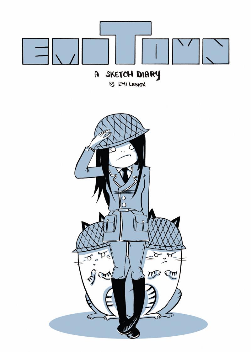
EMITOWN OGN
Author: Emi Lenox Publisher: Image Comics Reviewed by Johnny Destructo
I haven't met Emi, but I imagine, much like most of the people who sit down to enjoy her autobiographical comic EMITOWN, I would LIKE to. As a part-time cartoonist myself, I have developed lots of art-crushes on lots of artists, I'm not ashamed to say. Chynna Clugston Flores (SCOOTER GIRL, BLUE MONDAY), Becky Cloonan (DEMO, EAST COATS RISING), Christine Norrie (HOPELESS SAVAGES, BREAKING UP), and Liz Prince (WOULD YOU STILL LOVE ME IF I WET THE BED) to name a few. And don't get me wrong, these are ART-crushes. I really enjoy their art and looking at their stuff makes me want to work harder at what I do. The fact that they are all hopelessly adorable females in real life has nothing to at all to do with it. Ok, maybe a lil’ bit. As a cartoonist, how does a guy read their stuff and NOT think "how cool would it be if I was dating a really talented cartoonist and we had matching drafting tables and occasionally she would include me in her work?" Which brings us to Emi and her self-named town. Even Jamie S. Rich, who wrote the intro for her book, hangs out with her and can't help wondering if he'll make the cut for her autobiographical cartoon-musings.From the music references, to admitting to being self conscious about drawing in front of people, to being deathly afraid of bears...I relate to it ALL! Well, maybe not to buying dresses for weddings. Or her love of boxing and UFC...but to dive through this girl's diary and see her conflicted about what pens to ink with (choose the brush pen, Emi! Brush pens rule!), spinning around in her cubicle while pretending to shoot lasers from her fingers, or to see her working out matters of the heart, it's all endearing and easy to relate to.
It's very easy on the eyes, all done in black ink with blue shading, and the layout is different then what I'm used to as well, which is nice. Each entry is a page with panels and thoughts just splayed out almost willy-nilly. It's spotted with different notes about her day, reminders to herself and anything else she damn well felt like writing and drawing. Even when she doesn't feel like writing and drawing, she writes and draws about THAT. There are also just the occasional illustrations of random stuff, where you can tell she's really flexing her cartooning skills and drawing people in more realistic ways. (There's a particular one, of Batgirl pulling off her mask, that I Photoshopped into being my desktop wallpaper.)
Some people don't really appreciate autobiographical comic strips, but every so often, I kinda fall in love with one and it inspires me to head over to my drafting table and get some drawing done. Right now, THIS is that comic. All in all, this is a GREAT series to check out if you have any interest in autobiocomics, or charmingly self-conscious female cartoonists!
JD can be found hosting the PopTards Podcast, discussing movies, comics and other flimflam over at www.poptardsgo.com, graphically designing/illustrating for a living, and Booking his Face off over here.
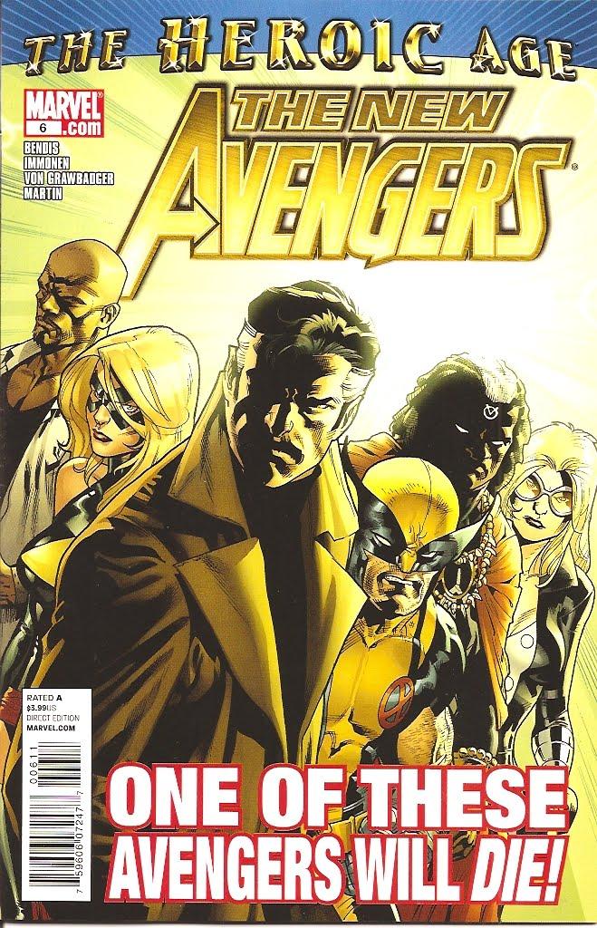
NEW AVENGERS #6
Writer: Brian Michael Bendis Art: Stuart Immonen Publisher: Marvel Comics Reviewer: Henry Higgins is My Homeboy
Well, that was fast.Okay, every review of this and the other AVENGERS books I've done, I've brought up the same point regarding Bendis’ strengths and weaknesses, especially regarding big moments like the one in this opening story. But, to Bendis' credit, this one is a bit different. Whether it was good or not is open for debate, but at the very least, you leave this issue of NEW AVENGERS, feeling you've read something new, rather than the vaguely familiar.
Writing: (3/5) The issue plays out decently for the most part and even strays from Bendis’ usual routine. His writing here is good, if unremarkable in the dialogue department. Nothing stands out, but there's nothing remarkably bad. During the course of the comic, Bendis makes another established hero into a villain (Daniel, please don't end up like Roy Harper), and that's annoying as all hell. On the other hand, seeing someone Bendis took a real liking too die very quickly is a bit entertaining and new. For every Luke Cage, we have two Hoods. It's nice to know he does have the ability to move past his favorites. While the issue has some very nice moments (Wolverine, anyone?), there are some bits that just grate on me, such as Daniel turning that soon.
Art: (5/5) Immonen, being Immonen, is just utterly, utterly awesome. There's not much else to say. What do you want from me? Wolverine's magic duel which cites all of the terrible things that have happened to Logan, the design of the first few pages with the Avengers slowly teaming their powers up together, Doctor Voodoo's final blow (even if the scene itself isn't that good) are just spectacular looking. God damn. Such a fantastic looking issue. There's not any subpar moment in the book artistically.
Best Moment: Wolverine as the magical avatar is such a cool looking moment.
Worst Moment: I liked Daniel Drumm. Fuck.
Overall: (4/5) Bendis goes about this issue a bit differently than usual, which is appreciated. And while it all doesn't work, Immonen makes up for it.
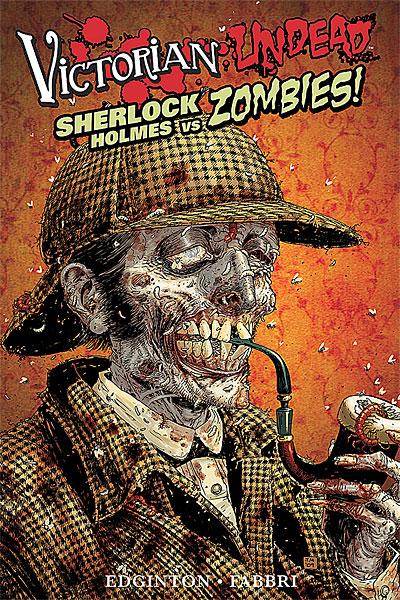
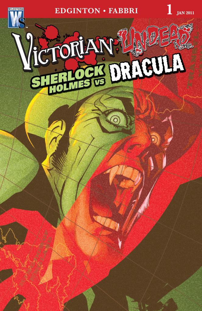
VICTORIAN UNDEAD: SHERLOCK HOLMES VS. ZOMBIES TPB VICTORIAN UNDEAD: SHERLOCK HOLMES VS. DRACULA #1
Writer: Ian Edington Artist: Davide Fabbri Publisher: DC Wildstorm Reviewer: Optimous Douche
Zombies…zombies…zombies…you can’t eviscerate a screaming lady these days without one of these shufflers groaning over you for some tasty entrails treats. WALKING DEAD does it well, but let’s be honest: WALKING DEAD is a character exploration of life after the apocalypse more than a “slap hero x inside the husk of a zombie” like we’ve been getting say from a company whose name rhymes with Schmarvel. Thankfully someone at DC took note of this trend, because VICTORIAN UNDEAD is a character exploration first and a story of the undead second. Now, of course the character is one of the most famous names in fiction, Sherlock Holmes, but under Edington’s hand the melding of these two genres (the detective story and the monsters that make us go eek in the night) comes together as naturally in these volumes as comic villains and monologuing.I’ll admit my knowledge of Sherlock Holmes is like most modern Americans: a few forced reads in high school of Doyle’s original work sprinkled in with some late night TV viewing of the Basil Rathbone classic movies. While I always loved the fact Holmes was a true detective and could ferret out the most learned conclusions from the smallest of details, these past works were laborious to traverse, for me at least. I pretty much hate anything and everything written prior to the 20th century. This shit was all well and good for a time period when people had three choices for entertainment--read, procreate or churn butter--but in today’s world traversing volumes of explanatory text is a bigger turn-off than midget porn – and to offer context, midgets fucking terrify me. The old movies are laughable in this day and age. Again, great for the time period when any movie technology was viewed with magical wonder by our simian forefathers, but most of the conveyances used in that time from music to shot setting have become trite in today’s Technicolor world. Despite these grievances, though, as a man who simply loves good stories I can’t deny the pull a well crafted Sherlock Holmes tale has over me. As we sit in a collective detective drought while Batman has been traversing the time stream, VICTORIAN UNDEAD reignites the kindling of deduction and wits over sheer brute force…and yeah, there are a fuckload of zombies to boot.
What I loved most about this series is that Edington didn’t sacrifice any of Doyle’s original flourish, but this being the comic medium with the need to keep everything in tidy word balloons saved me from having to traverse too much flourish to convey a scene. I love having my vocabulary challenged without making a book too much work to get through and Edington struck just the perfect balance. Yes, I had to hit the ol’ Intertubes a few times to look things up, but even if I didn’t go through that anal exercise the story still made perfect sense.
The true spirit of this book lies in the story, though. This is not your traditional Zombie tale. There’s a reason for these undead beings that plague late 19th century London and with all things Sherlock, the rationale for the undead’s existence is grounded in true science fiction. Not science fact, science fiction. Think the difference between “Star Wars” and “Star Trek”: the former doesn’t try to explain jack shit, things merely are, where with Roddenberry’s brain child he uses everything we know about science today and extrapolates the future on those grounded principles. Likewise with this version of Sherlock Holmes, the book opens with a meteor strafing London forty years prior to the true start of the tale. As the name implies the meteor starts rising the cockney dead faster than a Tim Burton film. Of course we don’t learn the exact cause for this uprising until almost the end of the book, but once this meteor’s effects are explained I definitely got a sense of “OK, that’s plausible…ish.” If you want a clue before reading the book, look into why we paid so much attention the meteor that was found in the Arctic tundra a few years back.
Edington also gets huge props in my book for pitting Holmes against (spoiler alert) his arch nemesis Moriarty, but it’s a Moriarty we have never seen before. We’ve always known Moriarty is pure evil, but Edington delivers a creep factor with this zombie back-drop that Doyle could have never imagined.
Even though I could truly care less about zombies, Holmes and Watson’s sleuthing…Edington’s brisk dialogue and Fabbri’s honorarium to the classic iconography of Holmes (while never aping ) artwork kept me turning every page waiting with baited breath for the conclusion.
But wait…this story doesn’t end once the zombies are eradicated. Oh and not to spoil things, but the eradication of the zombies is one of the ballsiest moves I have ever seen in comics.
Just when I thought VICTORIAN UNDEAD would die with WildStorm, a continuation of Holmes hit the shelves last week with VICTORIAN UNDEAD: SHERLOCK HOLMES VS. DRACULA. Considering I read this a few short days after finishing SHERLOCK VS. ZOMBIES, I was tickled pink to see the events of the first book directly referenced in the opening pages of the new title. Again, with how Holmes eradicates the zombies in the first tale, those events create a very different London than what we are used to and by Edington continuing with that idea it takes Holmes in a fresh direction yet unseen in any medium. So how does this new book hold up to the first? Tough to say since one was the complete story and this one is just getting its sea legs. All of the elements I enjoyed from the first are in place, though, and actually this issue gave me insight into a stylistic choice that I was ready to lambast in the first series. Fabbri continually kept placing certain panels in what I affectionately dub “the Liefeld void.” It’s that inexplicable phenomenon of when a perfectly good conversation forces the entire background to leave the scene. I think Liefeld does it out of laziness and I was ready to shackle Fabbri with the same tag, but then I looked at what Fabbri created in every other panel and I saw a stark difference to Liefeld. Even when Liefeld did draw a background it was usually a thatch work of suckitude. Fabbri can draw backgrounds quite well, though, and does so for 98% of the title. So why these voided panels then? Well…it’s elementary my dear reader. It’s an artistic form of punctuation. In each of these panels the characters speaking are driving the plot forward. Sometimes the smallest details are the easiest to be overlooked when a panel is shrouded in artistic eye candy. So Mr. Fabbri, my apologies for at first thinking the worst.
Even if you are lukewarm to both Sherlock Holmes and zombies (or Dracula for that matter), but enjoy a good detective story that hasn’t been whored out to Hollywood to sell other movies (oh ya I’m looking at you Downey and Law), you need to give these books a whirl. And don’t make the same mistake I did in thinking these will be similar to the Jane Austen undead novels floating around; these stories of Holmes are reverent while still being wholly fresh, fun and original.
Optimous has successfully blackmailed fellow @$$Hole BottleImp into being his artist on Average Joe. Look for Imp's forced labor on Optimous brain child in mid-2011 from COM.X. Friend Optimous on FaceBook to get Average Joe updates and because ceiling cat says it's the right thing to do.
Advence Review: In stores later this month!
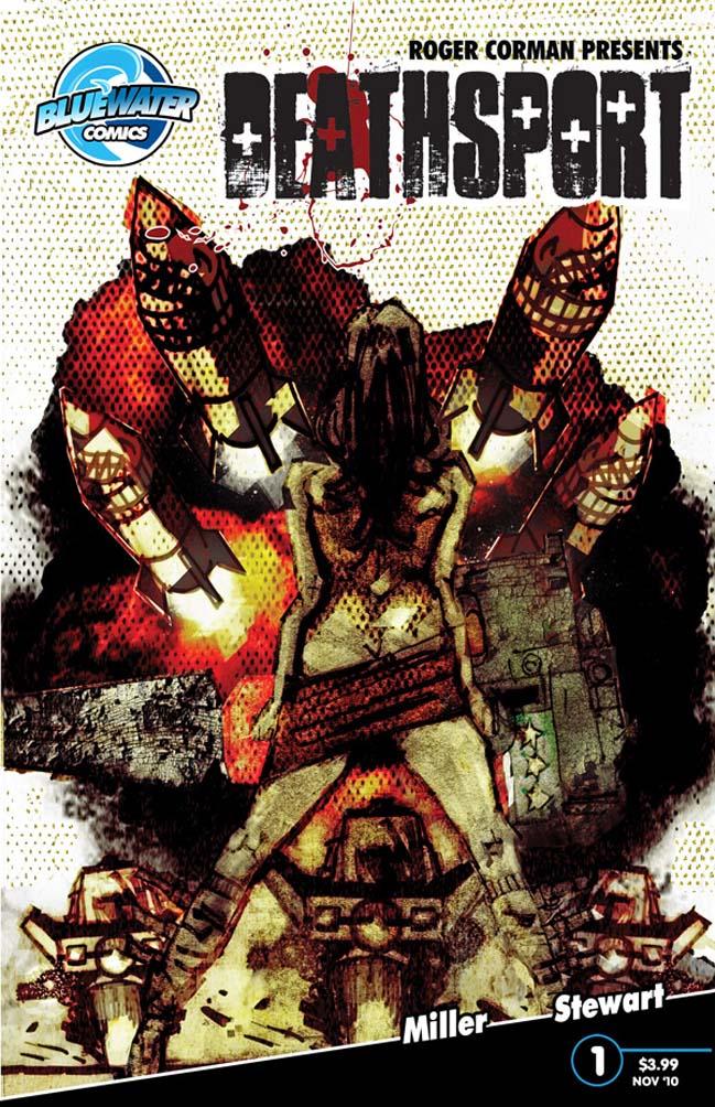
THE DEATHSPORT GAMES #1
Writer: Mark L. Miller Art: Roy H. Stewart Publisher: Bluewater Comics Reviewer: Mr. Pasty
Hello, this is Killian. Give me the Justice Department, Entertainment Division.I loved THE RUNNING MAN. Yeah, it was a little hokey with Dynamo, Buzz-Saw and Sub-Zero, but Fireball was a bad motherfucker. And the story, about what human beings were capable of in total survival mode, was one I found to be very compelling (after stripping away the layers of machismo -- and Maria Conchita Alonso’s bad acting). Apparently I wasn’t the only one, as Bluewater has unveiled THE DEATHSPORT GAMES, featuring three college kids who done messed up real good and landed in the hands of the Chinese government. As expected, U.S. officials have demanded their release, and will get it, just as soon as the unlucky three participate in THE DEATHSPORT GAMES. Winners go home. Losers join the stray dogs on the menu at a local eatery. What are THE DEATHSPORT GAMES? A series of physical and mental challenges for “Contestants” that must be overcome and completed while maniacal “Sportsmen” try to stop them. Think GYMKATA with lots of fried rice.
Of course no gladiator-style game would be complete without an arena full of howling fans and several billion bloodthirsty viewers watching from home. The big question I had going into GAMES was whether or not the contestants were really as innocent as they claimed. Were they criminals? Or wrongly accused and simply abducted for better ratings? By not establishing a motive or a clearly defined set-up, writer Mark L. Miller has added an additional layer of intrigue to his story. Should I be cheering for them in their quest for freedom? Should I be rooting against them so they can get what they deserve? I also like that Miller provides his characters a few moments of self-doubt and awareness. Because we start right at the beginning of the GAMES, it’s a quick but effective way to open them up to the reader without killing the story’s pacing. Little news snippets fill in the gaps as they would for a home viewer and Miller spares us the lame duck flashbacks and heroic monologues. These guys are in the shits. They know it, we know it, and now it’s time to find out who makes it through the series in one piece.
Stories like that appeal to me just as THE RUNNING MAN did and just as AMERICAN GLADIATORS did two years after that, although people tend to be a bit braver when they know the worst that can happen is a tennis ball to the nads. Then came BATTLEDOME. It was AMERICAN GLADIATORS for the “Attitude Era” and a show I actually qualified for. Unfortunately the high-paying job that was offered to me before my acceptance was not interested in having me take off for a month to get my @$$ kicked for fifty grand and a new Corvette. So I took the job, got fired a year later and spent the next twelve months wondering “What if?” My point is that GAMES was able to re-ignite those competitive fires simply by creating a page-turning pressure cooker that appeals to the inner competitor in all of us. Put most guys in a room full of other guys and they’ll do that mental survey: “Okay, let’s see, I could kick his ass, his ass, not him holy shit he has huge arms, okay his ass, his ass…” It’s the same reason why we shadow box after watching ROCKY or kick our way through a sheet of balsa wood after a Jet Li movie. Ever wonder how well you’d perform if your life depended on it?
THE DEATHSPORT GAMES was easy to digest, but not without its problems. Unfortunately the ugliness of the art just follows you through the story like that cloud of dirt that follows Pig-Pen. I kind of get the gist of where Stewart was going with his pencils, but so many panels feel rushed and hurried into place. Some of the angles are a bit jarring and I wasn’t sure what was supposed to be style and what was just left incomplete. THE DEATHSPORT GAMES tells a good story with likeable characters but needs to make improvements in its visual appeal. Death is not pretty, and neither is DEATHSPORT, but I still recommend it based on the strength of its premise and entertaining delivery. Check it out and see for yourself.
Web heads who can’t get enough of Mr. Pasty’s word vomit are encouraged to watch him operate as Nostradumbass over at MMaMania.com here. Love, hate and Mafia Wars requests should be directed here.
AMAZING SPIDER-MAN #647-648
Writer: Fred Van Lente, Zeb Wells, Marc Guggenheim, Joe Kelly, Mark Waid, Bob Gale, Dan Slott (#647), Dan Slott (#648) Art: Max Fiumara, Michael Del Mundo, Graham Nolan, Paul Azaceta, Karl Kesel, J.M. Ken Niimura, Adam Archer (#647), Humberto Ramos (#648) Publisher: Marvel Comics Reviewer: Henry Higgins is My Homeboy
New Quo.Finally done with “Brand New Day”, the Spider-Man team sets up the series new direction in AMAZING SPIDER-MAN #647 which centers on setting up the new status quo, while issue #648 centers on catching up with the rest of the story. Neither issue is notably good or bad, but they do lack some of the new story energy you'd expect, which is never a good sign.
AMAZING SPIDER-MAN #647: A sort of epilogue to “Brand New Day”, issue #647 settles a few issues from the last few stories. And while it doesn't do everything brilliantly, it does most things well enough.
Writing: (3/5) Writing-wise, the issue moves decently enough with some segments (notably the costume scene that opens the issue up) are vastly underwhelming. But there are some parts of the book I'm a huge fan of. Having Vincent back is a little annoying, but he does bring two cool elements to the table: firstly, the Goblin Clan. Now, normally I'd hate the idea of a Green Goblin cult/gang, if I didn't choose to see it as Marvel moving a bit closer to SPIDER-GIRL. Hey, I can dream if I want. It also gives us a scene that reminds us yes, Harry used to be a super villain. Maybe don't mess with him. The other big changer from this issue is Carlie Cooper moving from interest to actual girlfriend. Now, I have mixed feelings on this. I don't hate Carlie with the same intensity most of the fan community does. Yes, I'd gladly trade her for Mary Jane and yes, I'm anxious to see MJ back in the comic. But in the interim, I know Peter needs a girl. And Carlie presents a lot more potential stories than other characters might. Having Peter date a cop might make for some interesting storylines at least. Though it could still turn out to be a shit decision, we'll have to wait and see. Apart from that, the issue is mostly mundane. The dialog is decent, but nothing memorable. It's a very average issue.
Art: (3/5) Max Fiumara provides a good issue. The issue is very uneventful, with one action sequence, but he does a good job with it. For the finale of “Brand New Day” I'd like to see more on the action side of things. The issue takes a definite upswing, however, with the beginning of Harry’s Halloween farewell party. The costumes and little bits are inspired--the best being Flash and by far, Harry. It's an incredibly clever sight gag, and Harry and his child’s Dok Ock costume are utterly fantastic ideas. On the other hand, Carlie is out of proportion during the party, and it can be incredibly distracting.
Best Moment: Harry’s costume.
Worst Moment: Carlie's proportions.
Overall: 3/5
AMAZING SPIDER-MAN #648: The start to a new direction, this issue is very very VERY hit and miss. It will appeal to very specific fans. I may not be the writing’s biggest fan, but I love the art.Writing: (2/5) I really wanted to like this issue. I really did. This issue strives to set up the series’ new direction, and even though it's an expanded issue, it's still trying to do too much too fast--the new Sinister Six, the Venom symbiote, Peter's new job, Hobgoblin, Kingpin. Everything is done incredibly fast and then pushed aside. It would have been nice for some expansion on at least some of it. While they're all interesting ideas, there's so little to them. The writers don’t seem to commit to one idea. Along with that, much of the interpersonal events are regulated to the background or maybe even just a few mentions (bye, Michelle). The issue does have some great small moments, such as Peter being very good at last minute plans against Doctor Octopus. And his science interview and job are fantastic. Always nice to see his Spidey knowledge put to good use.
Art: (4/5) Ramos is one of those artists where you either adore his style or really don’t. I fall into the former category. It's stylistic, it's full of life (which is vital when it comes to Spider-Man), and it's bright. I love art you can immediately recognize, and this is some of the best. Spider-Man in motion here seems to be the most fluid he ever has been. The New Avengers all move with such speed and action. It's just fantastic. And the designs on characters such as Hobgoblin are amazing. Ramos does draw up weird faces sometimes, especially during Peter's interview. And some of the poses throughout involving his body are a bit off and draw the eye in a bad way.
Best Moment: Hobgoblin!
Worst Moment: Some of Peter’s jokes are horrid.
Overall: 3/5
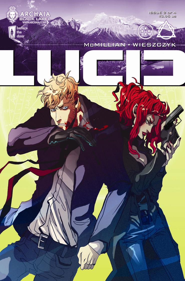
LUCID #2
Writer: Michael McMillian Artist: Anna Wiezczyk Publisher: Archaia/Black Label Reviewer: Lyzard
I covered the first issue of LUCID for another outlet, finding it too fast-paced and difficult to follow. I was hoping the nature of the first book was merely to catch the notice of our attention deficit disorder generation and that the rest of the series would settle down and focus more on character after setting up the world. This, sadly, is not the case. LUCID #2 continues at break-neck speed, constantly introducing new elements to the world that the reader has to keep up with, and losing character intrigue to narrative.LUCID #2 picks up, well, I’m not really sure. It isn’t an immediate follow up to the first issue, but the book doesn’t make it clear as to exactly how much time has passed between LUCID #1 and #2. While the first book dealt with a dimensional rift and the creatures that poured out because of this (hmm, where have I heard that before), LUCID #2 tells another unoriginal tale: stopping the assassination of our country’s President. It is up to our hero, Agent Matthew Dee, to make sure no magical being lays a hand on President Monday.
The artwork by Anna Wieszcyzk didn’t seem consistent to me. The rough hard lines of some panels were changed to smoother, less sharp, jagged lines in others. I felt this most in the characters’ faces, which seemed to be the most inconsistent for me. The drawings are rarely smooth though, which gives the book a refreshing feel to it.
I think the fault in the work comes from the dialogue, or writing in general. I did not know when I read the first issue of LUCID that the writer and creator was Michael McMillian, the actor probably best known as Reverend Steve Newlin from “True Blood”. Now I’m not going to say actors cannot write. Dan Futterman wrote the extraordinary screenplay to “Capote” and I’m sure there are other actors out there too that have made the jump from the limelight to the light of a Luxo lamp. The problem with the writing is that there is just too much information coming across. Unlike some comics, there is no prologue catching the reader up on what occurred in the previous book. Yet there are also few, if any, allusions in this book to what happened prior. Previous characters such as Agent Gygax have been completely ignored and new characters introduced without context. I’m not saying that all of these mistakes are because McMillian is an actor; I would never be so essentialist. But it is clear that he is a new writer, full of brilliant ideas but not strong in executing them.
I’m not at all interested in following up on this comic because I’m not connected to these characters. There has been little chance or time to get to know them. What makes a great story isn’t just creating a whole new world, but characters grounded in reality. Think how relatable “Star Wars” is despite the fact that none of us will ever fly the Millennium Falcon. I feel that LUCID does not have this empathy or feeling of knowing how the characters think or feel.
Lyzard is actually Lyz Reblin, a film student at Chapman University. Lyz’s love for comics stems from an internship at Dark Horse Entertainment as a freshman, which may explain why some of her favorite comic book writers are Gerard Way and Steve Niles. You can find her on Facebook, but only if you follow her band: Castle Town Convicts (possibly a Zelda reference?).
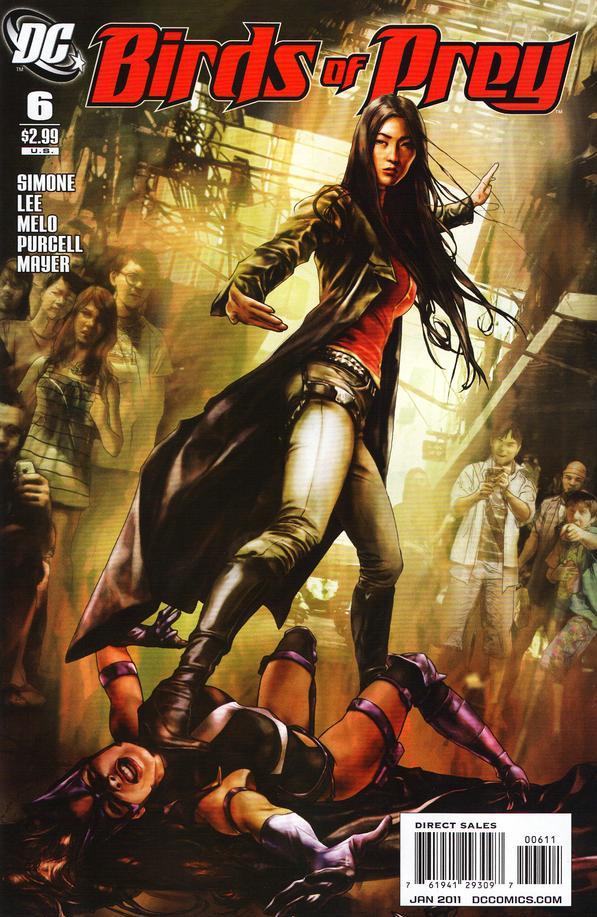
BIRDS OF PREY #6
Writer: Gail Simone Artist: Alvin Lee and Adriana Melo Inker: Jack Purcell and JP Mayer Publisher: DC Comics Reviewer: Rock-Me Amodeo
It’s always a privilege to review a Simone book. They’re never dull, and with the BIRDS, that’s doubly true. It’s rare that I’m jarred out of one of her stories to an extent where I have to go, “Uhn… no. Not buying it.” And I DID really enjoy the story! But I couldn’t always stay inside it.This was ostensibly the second part of a two-parter, but really, it’s the last chapter of a six part story, the saga of the Silk Sister. After killing her brothers (the deadly Silk brothers, from one of the best laid-out arcs EVER, in the first BIRDS OF PREY run, also written by Simone) the Silk Sister has come to wreak her unholy vengeance on Black Canary. In the process, with much of this happening off-camera, so to speak, Canary has come to Thailand and become a “White Canary”, in her own fashion, and…
Ah, craps. I was trying to warm up to this, but I should just get down to it. I really liked it, but it felt rushed. The whole arc. And while I understand that the best place to start a story is as close to the end as possible, one STILL has to take one’s time getting there. I’m used to the well-textured Simone plots that deliver along each step of the way, then REALLY deliver at the end. And this… it’s like unleavened bread. The parts were mostly there, they just didn’t have time to set properly.
Let’s start with Dinah’s conversations with the “students.” She calls them by first names. They call her “mistress.” The tone feels like they’ve been working together for months, or at least weeks. And Dinah’s initial tone with the Birds, at the end of the last issue, was extremely formal. But the fact is, Dinah probably hadn’t put boots on the ground more than a day before the rescue attempt. If Dinah had been gone a month or two, the tone would have been perfect. Perfect! But all this and Dinah’s utter despair, in 24 hours? Uhn… no.
Along those same lines, Huntress’ frequent observations on Dinah’s state of mind, how Dinah is normally the heart of the Birds: “I think we may have lost that Dinah.” Given how fast everything has happened, it come across more melodramatic than dramatic.
Also, the Deus Ex Student that comes to the Birds’ rescue and lets Dinah find Sin? I’m sure she had her reasons, but even though it was foreshadowed in the cab ride over, it seemed awfully arbitrary and convenient. Why did she do it? We don’t really have time to find out.
Same with Shiva: one minute, she’s in a fight to the death. Next minute, she’s wiping blood out of her eyes and praising Huntress and giving her a cool nickname. Yes, I know Shiva wasn’t happy about a fight she didn’t want. I’m not saying the respect wasn’t earned. And the fight was well done. But it felt like someone said, “Oh, wouldn’t it a cool moment if Huntress earned Shiva’s grudging respect after being pummeled?” And there it was. Plop. Great moment, but undersold.
And so on: “Wouldn’t it be a cool moment if Dinah seemed absolutely defeated by the time Zinda and Huntress show up?” Plop. There it was. I mean, it would be nice if we could have seen Dinah trying to figure out a way to find Sin, call in one of her MANY super-powered friends to do so, etc. But despair was what the plot required; we don’t have time to show it, so let’s just get Huntress to say it. And say it. Maybe we’ll forget Dinah’s only had TWO DAYS to sink to the depths of whatever.
I felt like I was being told what I should be feeling, and I think that was because we just didn’t have time to be shown these things. And at those times, it seemed like the story was being sold to me…not told to me. It was a good story. But some of the moments seemed forced.
I’ll let go of little inconsistencies like Zinda being stabbed almost through the heart, but no mark of it on her ample and frequently displayed cleavage. Or the fact that we hear about Hank’s remarkable new recuperative powers, but 48 hours later, he’s still in a hospital bed, while chest-stabbed Zinda is duking it out in the streets of Bangkok.
As far as art goes, well, it’s a far cry from the visual feast of the first four issues, but not bad. A few times the women seemed interchangeable except for hair color or costume, but not bad to look at.
Let’s be clear: BIRDS OF PREY and SECRET SIX will be at the top of my pull list as long as Simone is writing them. It’s probably unfair to Gail that my standard for her is set higher than others. But I hope, now that the initial arc is over, this title can settle back into the funky, brilliant, exciting and well-paced groove that I have come to appreciate.
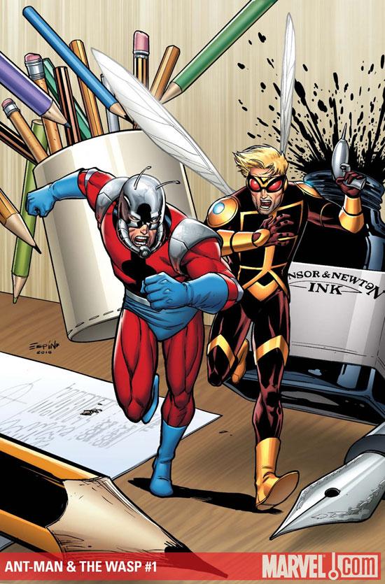
ANT-MAN & THE WASP #1
Writer: Tim Seeley Art: Tim Seeley Publisher: Marvel Comics Reviewer: KletusCasady
When I first saw that this book was coming out I scoffed--that’s right, scoffed--at its existence. I couldn’t think of two people that I’d rather see less in a comic book. Not to mention when I originally saw it, I thought it was a MARVEL ADVENTURES book. Not that there’s anything wrong with that, just not my cup of tea (although the Spider-Man one is pretty entertaining…a lot better than AMAZING has been lately). Then I saw the preview page and my interest was piqued...not sold…but piqued. After flipping though this issue when it came in, I was immediately thrilled with what I found. A book that not only absorbs the current state of the Marvel Universe and makes you want more of each character but has multiple laugh out loud moments…not to mention the art is great too.Basically, the story in this book is that one of these guys fucks up by trying to prove his worth, involves the other guy in the fuck up…thus causing the team up of Marvel’s premier fuck ups to fix the original fuck up…got that? I know what you’re saying, “Who gives a fuck about Ant-Man & Wasp?!?” and I understand this thought but bear with me here. First of all this book is written by Tim “HACK/SLASH” Seeley, and if you haven’t read HACK/SLASH, you should definitely take a look at. It’s a fun wholesome coming of age tale of a girl who kills serial killers for a living…’nuff said.
If you can’t tell from the ANT-MAN & WASP title, this a team up book. Akin to those great buddy cop movies of the 80s like LETHAL WEAPON, 48 HOURS, or TANGO & CASH (my personal fave), where the two partners hate each other, have polar opposite personalities, but are both good at what they do, so they end up kicking ass and killing everyone by the end of the movie leaving only charred bodies and bullets to tell the story or what happened all whilst making great quips at each other’s expense. Fun is what I’m describing and this book is chock full of it. It was a pleasant surprise to me that someone like Seeley who hasn’t really done too much with Marvel in the past could come in and write a book that sits very comfortably in the current