| #22 | 10/20/10 | #9 |
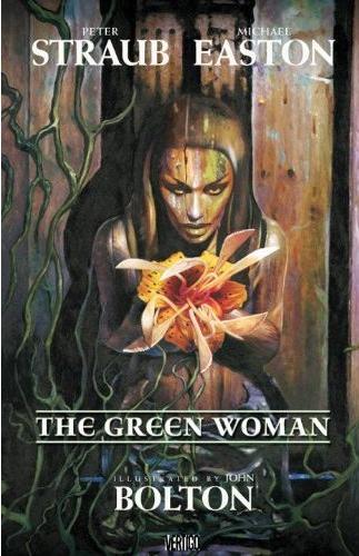
THE GREEN WOMAN HC OGN
Writers: Peter Straub & Michael Easton
Artist: John Bolton
Publisher: Vertigo/DC Comics
Reviewed by Professor Challenger
“You could call this the last act. Hell, you could call it the encore, it's pretty much the same to me.”
-- Fielding “Fee” Bandolier
Vertigo has released THE GREEN WOMAN just in time for Halloween and it's a treat for fans of mature horror stories. Full of graphic gore and violence throughout, this book is not for the faint of heart. This is a serial killer story, so any reader needs to know that up front. For whatever reason, we seem as a culture to be fascinated by the insidiously macabre nature of the serial killer. Neil Gaiman made use of it in SANDMAN, Hannibal Lector has practically become the adult "boogey man" go to for evil, and DEXTER thrives as the ultimate anti-hero juggling life as a father and also as a man who fetishistically needs to kill people. So, yes, we are fascinated by serial killers. In THE GREEN WOMAN, Straub and Easton resurrect a serial-killer character Straub created in his "Blue Rose" trilogy of books (KOKO, MYSTERY, and THE THROAT). Fielding "Fee" Bandolier was believed dead at the end of THE THROAT, but as THE GREEN WOMAN makes explicitly clear a number of times...writers are never to be trusted with telling the truth. And in Straub's case, the implication is that the apparent death of Fee was just that -- apparent.
Anyone who wants to read of the final fate of Fee needs to read THE GREEN WOMAN. Which begs the immediate question for fans of graphic novels: do you need to read the "Blue Rose" trilogy first to enjoy THE GREEN WOMAN? The answer is a resounding "No." In fact, prior to reading THE GREEN WOMAN, I had only read Straub's GHOST STORY and his 2 collaborations with Stephen King. But I have now picked up the "Blue Rose" books to read as a result of THE GREEN WOMAN. Similar to Easton's manner of storytelling that I recognize from his SOUL STEALER graphic novel, THE GREEN WOMAN is non-linear storytelling. So, the reader needs to commit to the book as Straub and Easton let all the puzzle pieces that are shuffled around come together by the end to finish with a complete picture of each character's place and purpose in the universe.
At a glance, the plot is your standard hackneyed plot of the tortured cop on the trail of a serial killer who then gets drawn into the twisted mind of the killer. There's so much more, however, to this book than mere plot. In fact, most plots, when culled to their base concept, are rarely original. What matters in fiction is how that plot unfolds. Bob Steele is the cop. Fee Bandolier is the killer. The "Green Woman" is a pub that provides the location that bookends this story. "She" is also personalized by the image of the "Green Woman" carved into the wall and her stunning beauty and dark eyes pierce the soul (if he has one) of Fee. Her image haunts him as much as his lost love. But the "Green Woman" does more than just haunt...she tempts...she entices...she embodies the perfect representation of the darkest thoughts of man. By jumping back and forth through Fee's life, we gain insight into his repulsive, yet charismatically appealing nature. There was a time when he basically experienced joy in his "calling," but now he's getting old, he's getting tired, and like a once great hunter wolf....he is lashing out and he's losing satisfaction in his actions because within him he feels the pull to accept that his time is nearly at an end.
There is a malevolent force at work here that transcends just a mere "man's inhumanity to man" type of story. Fee survives because evil thrives within him. Steele is pushed into a heroic role he does not desire nor is he capable of fulfilling. Both are pulled down into the depths of hell within themselves and they leave a trail of horror behind them always trekking toward...the "Green Woman." In the end, both Steele and Fee confront whatever "reward" their lives have earned them. And the "Green Woman"? I swear there is just a hint of self-satisfied smile as Fee's story comes to an end...but the spirit that drove him has taken root once again.
Gruesomely beautiful art by John Bolton tells the story visually with his unmatched ability to deliver images that are hauntingly sensual and brutally horrific without any sense of choppiness to the storytelling. Bolton's panels are at times starkly sexual and other times darkly introverted and emotional. I am sure this story could be told as prose, but for me the visuals accompanying this story allow it to unfold emotionally rather than intellectually. It is one of the benefits of graphic novels by their very nature. Reading prose requires an intellectual process first before it can connect with the heart. Art, however, evokes a visceral reaction first and then the intellectualizing can begin. In a book like THE GREEN WOMAN, the art is what hits first, therefore the first reaction is emotional and the text is taken in after that. Bolton, like all great painter-storytellers, understands this need to draw in the reader/viewer emotionally. There is a lot of blood and gruesome imagery, but it all serves the feeling of the moment and the story overall. Bolton's all-important choice of the face of the "Green Woman" is a beauty with a timeless sense of perfection but a burning wickedness behind her eyes. Bolton's art here is a masterpiece and along with the writing, THE GREEN WOMAN should satisfy any fan of intelligent and grisly psychological horror.
“Prof. Challenger” is secretly Texas artist Keith Howell and he resides in the Austin area and thinks his costume idea of “Vampire Wal-Mart Greeter” is going to be a huge success this Halloween and take the country by storm.
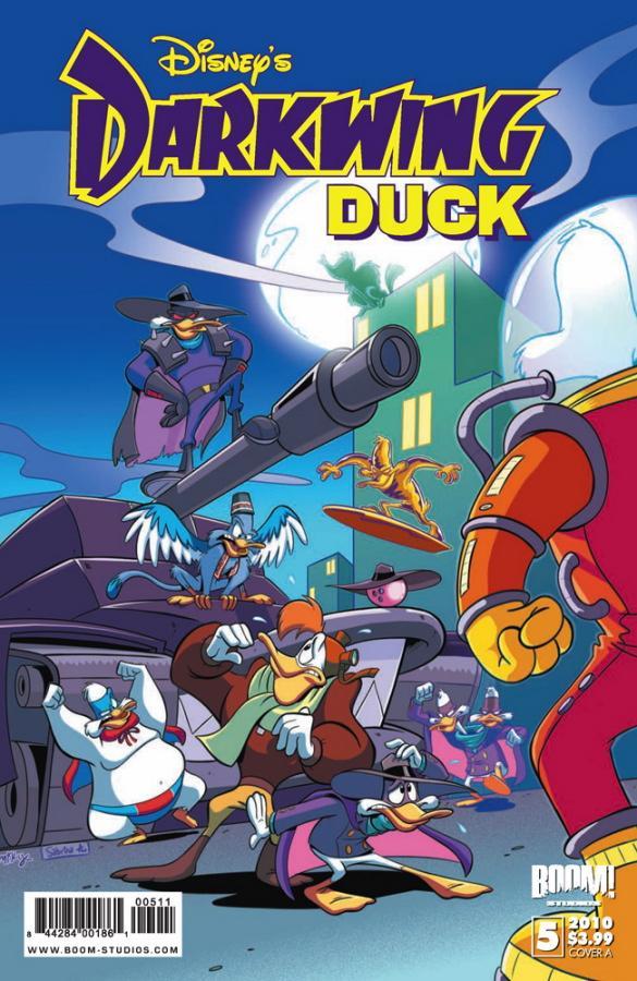
DARKWING DUCK #5: CRISIS ON INFINITE DARKWINGS
Writer: Ian Brill
Artist: James Silvani
Publisher: BOOM! Studios
Reviewer: Lyzard
Darkwing Duck! Let’s get dangerous! Ah yes, childhood memories abound. Just hearing his name causes his theme song to play in my head. Reading this comic was like traveling back in a time machine, to a day when there was no Facebook or (ugh) Jonas Brothers. It seemed like a simpler, happier, more carefree time, but that was probably because I was still in elementary school. Enough reminiscing. The point is, the comic DARKWING DUCK lives up to my memory of the show. However, there are two problems with that assumption. I have not seen the show in years so I do not know whether the show still stands up or whether or not I remember it correctly. That aside, I believe DARKWING DUCK holds up on its own.
DARKWING DUCK #5 takes place after the four issue series THE DUCK KNIGHT RETURNS, which was intended to be the end of the comic, like the four issue series that was done back in 1991 (thank you Wikipedia). CRISIS ON INFINITE DARKWINGS (which unless it’s a reference to another title really should be CRISIS OF INFINITE DARKWINGS) starts off after Darkwing Duck has saved St. Canard from Taurus Bulba. But trouble looms on the horizon as another one of DW’s nemeses, Negaduck, has teamed up with Magica de Spell.
The first thing readers will notice is the numerous amounts of references to pop culture featured in the comic. For instance, one of the covers features Negaduck cutting through the cover saying “Heeeeeeeere’s Negsy!!!” A nice throwback to “The Shining”, and of course Johnny Carson of the Tonight Show. There is also the character named Mr. Poe, who just happens to be a raven. I could point out more, but then what would be the point in your buying the comic?
The point would be you could see the artwork. The show translates very well onto the page. All the myriad of colors is attention grabbing and reminds readers of the Disney cartoon. That being said, there were some flaws in the drawings. Artist James Silvani seemed to be obsessed with the hunch shoulder look, as almost every character stands like this at some point.
As for the dialogue, I can really hear the voices of the characters coming through. Launchpad McQuak is a bit too smart, however, compared to his TV persona. I could never see him using the word “restructuring.” The rest of the comic is wordy at times and some of the jokes fall flat. Despite this inconsistency in the quality of humor, a majority of the comic works.
Overall, I highly enjoyed DARKWING DUCK. It is a great comic for people of my age who grew up on the cartoon, or for those younger then I who are being introduced to the “Purple Powerhouse of Principle” for the first time. The older crowd probably will find it cheesy and over the top. However, I first heard of the comic from some Dark Horse pals of mine at Comic-Con in San Diego. If they can enjoy it, then maybe other adults (not just young adults) will find some fun in reading it too.
Lyzard is actually Lyz Reblin, a film student at Chapman University. Lyz’s love for comics stems from an internship at Dark Horse Entertainment as a freshman, which may explain why some of her favorite comic book writers are Gerard Way and Steve Niles. You can find her on Facebook, but only if you follow her band: Castle Town Convicts (possibly a Zelda reference?).
In stores in today!
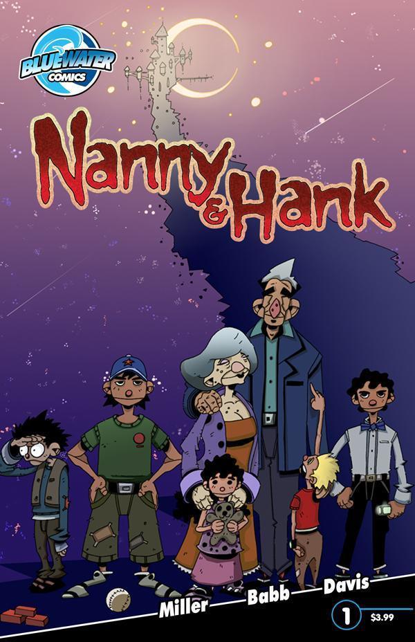
NANNY & HANK #1
Writer: Mark L. Miller
Art: Steve Babb
Publisher: Bluewater Comics
Reviewed by: superhero
It’s not often that I come across a vampire idea that seems original to me. Granted, the idea of sparkly vampires walking around in daylight seemed pretty unique but walking around in daylight sort of cancels out the concept of a vampire to me so I don’t know if I’d consider the TWILIGHT “vamps” original. Then again, I’ve never read the TWILIGHT books or seen the movies so I can’t judge TWILIGHT too harshly. I’m only going by what I’ve heard…but what I’ve heard doesn’t sound too good.
When Ambush Bug a.k.a Mark L. Miller gave me a slight hint about what NANNY & HANK might be about at Comic Con about a year ago I just know that my instant reaction was “Now, that sounds interesting.” Back then, it was just an idea that he was trying to see if he’d develop with someone else and as we all know, ideas tend to fall apart and not necessarily manifest into art as cool as the initial thought that spawned them. I’m happy to say that NANNY & HANK is a great first issue that’s got me reacting as positively as I did when Bug first started a sentence with, “It’s about…” almost a year ago.
What’s it about? Well, ever since the LOST BOYS it seems that almost every new vampire that’s come down the pipe has been one of the B.P.’s…the Beautiful People. They’re all young and toned and hot and…well, you get the idea. It makes it seem that almost every vamp has been turned in the prime of their lives. When they were at their best. Almost every modern vamp (with an exception of a couple here or there) just looks like they are forever 21…ready to pose for the next Abercrombie and Fitch catalog at the drop of a hat. But what if…what if you were turned when you were in your golden years? What if you were made into a bloodsucker at age sixty, seventy, or eighty? What would that be like? Would it, for lack of a better term, suck or would it be like revisiting your youth all over again?
 This is the idea that seems to be at the heart of NANNY & HANK and it’s one that is really fascinating to me. As a culture, we’re obviously obsessed with youth and most fiction that involves any kind of immortality basically freezes its subjects in their late teens to early twenties. But what if you were stuck at an age when you were supposed to be starting to think about the end of your life rather than just beginning it? What would that be like? That’s a great question and it looks like one that’s going to be explored in the pages of NANNY & HANK.
Miller does a great job of setting us up with this first issue. In so many vampire dramas, the person that the vampire was before they are turned is ignored. Their history is gone the moment they are changed, like they never had a life before they were switched. With an elderly vampire it’s impossible to ignore the life that came earlier…because they’ve already lived so much of it. It’s because of this that NANNY & HANK comes across so well. By making the two leads an elderly couple settling into their sunset years we are able to imagine two full lives lived and it makes the book very touching and sweet when they interact with each other. In much of the vampire lore that I’ve read many of the vamps were people with not much to lose or with little desire to deal with the lives they were leading. In NANNY & HANK we’re given two people who obviously love each other and have a stake in each other’s lives. They enjoy their lives together which, to me, makes them unique in vampire fiction. It’s the lead characters that make NANNY & HANK such an interesting read and Miller should be congratulated for fleshing them out so well. There are some great character bits in this book and it makes the story all the more believable. This is the most poignant vampire story I’ve read in a while…if ever.
I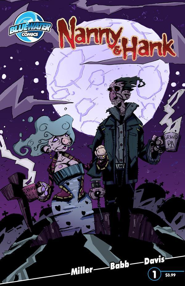 It’s a poignancy that’s almost lost, however, because of the artwork. Don’t get me wrong…I love this artist’s work. I’m just not sure that it’s the right style for this book. Steve Babb’s style is cartoony and original but some of the key emotional moments tend to get a bit lost with the flair that Babb adds to his pages. The art style of NANNY & HANK is bit more style than substance. It doesn’t take away from the story completely; I just felt that there were some moments that could have been better served with a more straightforward artistic approach. But make no mistake, Babb is a fantastic cartoonist. His style is like nothing I’ve ever seen and at the very least his pages pop. The mix of artwork and color in NANNY & HANK make for some really nice looking visuals.
So all in all NANNY & HANK is more than worth reading. Not only is the story original but the artwork is as well. NANNY & HANK is all around a different kind of vamp book and if you ask me that’s a good thing.
Discovered as a babe in an abandoned comic book storage box and bitten by a radioactive comic fan when he was a teenager, superhero is actually not-so mild mannered sometime designer & cartoonist, Kristian Horn of Los Angeles, California. He's been an @$$hole for three years. Some of his work can be seen at www.kristianhorn.com and check out his blog at www.parttimefanboy.com.

DCU HALLOWEEN SPECIAL 2010 One-Shot
Writers: Billy Tucci, Joe Harris, Alex Segura, Vinton Heuck, Bryan Q. Miller, Brian Keene
Artists: Billy Tucci, Lee Garbett, Kenneth Loh, Dean Zachary, Trevor McCarthy, Stephen Thompson
Published by: DC Comics
Reviewed by: BottleImp
Here we are again, another Halloween, another Halloween special, and once again I’m forking over my picture of Abraham Lincoln in hopes that the creative teams at DC will inject a little horror into the standard superhero mix. This time around they wisely nixed the one and two-page filler material and focused on just six stories. But once again, the end result is a rather mild collection of tales that don’t count for much in the scares department. Here’s the rundown:
“Batman in: Trick for the Scarecrow” Billy Tucci, who wrote and illustrated my favorite segment of last year’s special, returns with a story that turns the tables on Batman’s foe The Scarecrow and has the “Master of Fear” held prisoner by a couple of kids dressed up as—you guessed it—the Caped Crusader. It’s a very “cute” story, and if the art had been handled in a similar style the whole thing would have come crashing down as a saccharine-sweet mess. But Tucci’s realistic drawing style and the limited color palette elevate the story to a level of maturity and save the reader from diabetes, making this entry charming rather than cloying.
“Batman and Robin and I…Vampire! in: Robin the Vampire Slayer” Excellent art by Lee Garbett in this chapter that pits the contemporary Dynamic Duo against a vampire cult, but at the end of the story I was left feeling a little cheated. Aside from the splash page of Robin staking one of the undead, the vampires themselves are relegated to the backgrounds of the panels, and what might have been a more traditional horror story is instead a superhero fight scene that just happens to involve vampires. But for what it is, the story is well-told and has nice drawings, so I guess I can count this chapter as one of the successful ones.
“Flash and Frankenstein in: Time or Your Life!” This is a weird one. First off, unlike Batman, the Flash does not easily lend himself to supernatural and/or horror elements. Second, Frankenstein shows up, the Flash fights with him in the obligatory fashion, then out of nowhere it’s revealed that another character is in actuality a life-sucking vampire-demon-thing. Then Frankenstein kills her with a shotgun and just walks away and the Flash just lets him go, while the dead vampire-demon-thing (which has morphed back into human form) is being cradled by her stunned boyfriend. I know that she was draining people’s life force or whatever, but that’s still some pretty cold shit… you’d think the Flash (especially this incarnation of Barry Allen—the POLICE scientist) would at least try to uphold some sense of due process. It’s a strange mix of characters and situation that just doesn’t feel right. Kenneth Loh’s artwork is decent, but the blame has to be laid on writer Alex Segura for his bafflingly bizarre choices.
“Wonder Woman & Deadman in: A Night to Remember” The situation is standard horror mixed with standard superhero stuff: Felix Faust is summoning a horrifying monster into the world, and Wonder Woman and Deadman have to stop him. I’ve gotta give points to writer Vinton Heuck for making the monster Lovecraftian in a subtle way (Faust chants, “KOOTOOLOO” at one point), but overall this segment feels lackluster, and I’m sorry to say that it’s because of Dean Zachary’s drawing (along with Guy Major’s coloring). The style of rendering color over pencils to mimic a painted look can work and has worked in other instances, but here the combination falls flat. Zachary’s pencils are a little too rough, and a bigger problem is that at times it’s difficult to decipher the action happening on the page. So not terrible, but not great, either.
“Teen Titans & Klarion The Witch Boy in: Medusa Non Grata” This is my favorite segment of this year’s One-Shot, a fun Halloween romp featuring the Titans’ Miss Martian and Blue Beetle crossing paths with a trick-or-treating Klarion. Writer Brian Q. Miller makes the encounter suitably goofy without falling into the trap of becoming cheeseball (although Klarion’s cat familiar thinking, “I can haz ur soul?” comes dangerously close to skirting that line), and Trevor McCarthy provides complementary kinetic artwork to go along with the action. Plus, you’ve gotta love the fact that one of the trick-or-treaters that unwittingly helps resolve the fight is dressed as Alex DeLarge from A CLOCKWORK ORANGE.
“Superman and The Demon in: Fears of Steel” The last entry in this anthology sees The Demon Etrigan coming to Superman’s aid as the Man of Steel is tormented by his greatest fears, caused by a minor demon trying to steal Superman’s soul. Brian Keene’s story is good, and Stephen Thompson’s artwork is good, but this is something that I’ve seen done before more effectively in both comics and the JUSTICE LEAGUE cartoon. It would have been nice to see the creative team push the envelope a bit more—maybe go in a more horrific direction with the depiction of Superman’s visions—but I suppose that they wanted to stay with a more all-ages feel.
All in all, I guess that last sentence I wrote sums up the entire One-Shot. The overall tone is fairly benign and suitable for all ages of readers. Unfortunately, that means that (much like last year), the HALLOWEEN SPECIAL fails to deliver any real thrills or chills. But meet me further down the column and I’ll show you some comics that capture the Halloween spirit that WON’T set you back five bucks a pop.
When released from his Bottle, the Imp takes the form of Stephen Andrade, an artist/illustrator/pirate monkey painter from the Northeast. You can see some of his artwork here. He’s given up comics more times than he can remember. But every time he thinks he's out, they pull him back in.
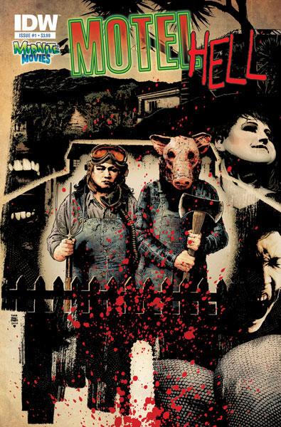
MOTEL HELL #1
Writer: Matt Nixon
Art: Chris Moreno
Publisher: IDW Publishing
Reviewer: Ambush Bug
Imagine my surprise when I saw a MOTEL HELL comic book was coming out soon when I looked at the upcoming releases at my local comic shop. As shown above, I hold the 1984 film in high regard. It was officially on my radar. So as I was zombie-ing around the booths in the Artist’s Alley at this year’s New York Comic Con, my ears perked as I passed Chris Moreno’s booth which sported a pic of a pig-headed chainsaw wielder in plaid. Upon further investigation, I found out Chris was the artist on the new MOTEL HELL comic. But he wasn’t at the booth! I lingered for a bit, until finally, the guys next to Moreno’s told me that he was signing copies of MOTEL HELL at the IDW booth. Well, I screamed “Thanks!” as I high-tailed it to the IDW booth for my copy of the book.
Moreno and writer Matt Nixon were at the booth. I chatted with both for a bit and we all geeked out about their chance to write a modern take on the cult horror classic. The two seemed to have a deep love of the film and I was looking forward to reading it when I got home from the con. Sure as shit, MOTEL HELL #1 was the first comic I read when I got back to my Bug Abode and it turns out it wasn’t a bad read.
The basic premise of the story follows a group of people who receive an invitation to a spa and resort in wine country sent by Farmer Vincent Smith, the creator of a delectable wine that no one knows the secret ingredients of (you know where this is going, right?). Anyway, a group of pretty annoying folks are gathered together and we are introduced to Farmer Vincent and his portly sister Ida. Vincent has a cruel streak as exemplified in a scene straight from the film as Vincent scares the piss out of a pair of girls by screaming in their faces. The first issue ends ominously as our group of soon to be fritters spot the silhouette of a figure wearing a pig’s head and carrying a chainsaw.
Though this comic didn’t blow my socks off, it did have a lot of the elements that worked in the MOTEL HELL movie like the aforementioned scene where Vincent scares the children. The iconic look of Vincent in the final scenes of the original is utilized to full effect in this issue and there looks to be a promising set up for some of the other cool stuff from the film to make appearances in future issues of this four part series.
Some of the scene transitions are a bit jarring. Scenes change pretty quickly in this issue with not even a “Later” caption box to help set the timeline for the reader. The story is simple enough that I never lost my place in the story, but as one location changed to another, I found myself looking back to see if a page stuck together as I read through it a few times.
The characters are somewhat flimsy here, but hell, they were in the film, so I can’t complain about that much. You end up kind of giving a shit about the reporter sent to investigate the secrets of Farmer Vincent’s “special” wine, so the story does its job in establishing a protagonist to follow.
The amazing cover by Tim Bradstreet isn’t really fair to interior artist Chris Moreno. Moreno’s art is definitely good and creepy, but Bradstreet is a modern master of mood and dread. It made me long for a Bradstreet drawn series. But again, Moreno does a great job, especially in the creepy scenes toward the end as the danger looms closer in the shadowy form of a pig’s head and a chainsaw.
Though not as good as the original, MOTEL HELL #1 from IDW does a good job of capturing a lot of the elements that made the original film unique while placating my hunger for more of the cult classic, at least until the new film can finally be made. The first issue is in stores now!
Ambush Bug is Mark L. Miller, original @$$Hole / wordslinger / reviewer / co-editor of AICN Comics for over nine years. Support a Bug by checking out his comics (click on the titles for purchasing info)!
MUSCLES & FIGHTS VOL.3 & MUSCLES & FRIGHTS VOL.1.
VINCENT PRICE PRESENTS: THE TINGLER #1 and #2
(interview, interview, preview, & review)
VINCENT PRICE PRESENTS #20 WITCHFINDER GENERAL
(preview, review, in stores now!)
NANNY & HANK miniseries #1, #2, #3, and #4
(interview, interview, interview, preview, & review, in stores October 2010!
Check out the NANNY & HANK Facebook Page!)
Zenescope’s upcoming WONDERLAND ANNUAL 2010 (in stores in October!)
THE DEATHSPORT GAMES miniseries #1, #2, #3, and #4
(in September Previews Order #SEP 100860, in stores in November 2010!
Check out THE DEATHSPORT GAMES Facebook Page!)
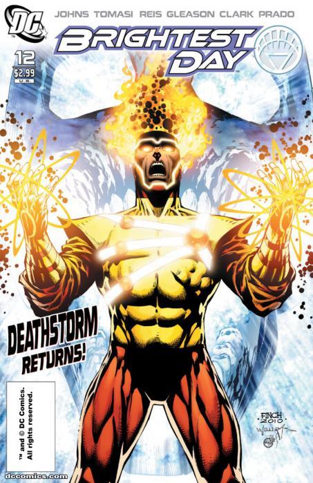
BRIGHTEST DAY #12
Writers: Geoff Johns & Pete Tomasi
Artists: Gleason, Clark, Reis. Tomasi
Publisher: DC Comics
Reviewer: Optimous Douche
I received a hell of a lot of flak for my review of BRIGHTEST DAY 11. My concern was that the issue was trying to spin too many plates at one time, making all of the little experiences seem like no experience at all, just a lot of cool brouhahas with nothing under the surface. I’m sticking to what I said; if an issue forces me to down a bottle of Ritalin to feel calm afterwards, there’s something wrong there. However, I will also admit the issue was focused on two of my least favorite resurrected characters – Aquaman and Firestorm. So, perhaps I was a little harsher than necessary.
Issue 12 brings some nice mea culpas and a return to a fully fleshed idea. At the close of issue 11, we will all remember a patch of greenery on the surface of Mars shaped in the form of the White Lantern emblem accompanied by the ominous narrative box, “Mars Rise.” And as indelible link sauce will prove, that was my favorite part of the issue.
Without missing a beat Issue 12 starts where 11 ended and we get to see one of my favorite DC characters, Martian Manhunter, being “seduced” by the only other surviving Green Martian, the lovely and oh so evil M’Kay…sorry was watching South Park…I mean D’Kay. This is truly Jonn Jonzz’ issue, with only two small one-page diversions to check in on the whereabouts of 80s cover band Deathstorm , and a very tender moment between Dove and Deadman (I really hope these kids hook up just for the alliteration alone).
D’Kay is playing some fun mind games with the green Superman; after all isn’t that how telepaths should do battle? Why throw punches when you can wound someone’s soul? On the surface it looks like D’Kay is looking to restart the Martian population with ol’ MM, but methinks there will be far more nefarious motives that will surface as this sadistic seduction continues to play out.
There were quite a few nice touches in this issue (but again keep in mind I am a 25 year fan of Martian Manhunter). The opening scene with a candlelight dinner inside J’onn’s Pyramid of Solitude would have been trite if not for two reasons: one, both of these aliens struggled for years to try and be human, so it’s understandable our customs would become their customs, and there was a huge freaking plate of Oreos smack-dab in the middle of the table. Like most psychotic women, D’Kay sets every emotional and physical trap she can to lure J’onn into her web of copulation to restart the Martian race (of course Darwin is spinning in his grave right now gasping the words gene diversity, but let’s not worry about the grandkids yet).
Doing what Johns (not J’onzz) does best, we get a wonderful moment of ret-con where we finally learn just how the hell another Martian ended up in the universe. The dialogue here was sharp, witty and poignant -- essentially nothing short of what I would expect with two master wordsmiths at the helm. More importantly the entire interchange was given enough page space and real estate to breathe, something I have truly been missing in past issues of this series. Sometimes we need more than two pages to truly build tension--at least I know I do. A few great mind games later, including a tussle with the trinity, and J’onzz is left in a state of confusion and bewilderment believing his wife and son are once again alive.
My interest is truly piqued on whether Mars will become a habitable planet at the close of this thing--one can only hope. It would be a nice shot in the arm for existing DC continuity.
The only point of confusion in this issue and yes, this is also a carryover from issue 11, is how the fuck are the Black Lanterns back? Somehow Deathstorm (breaking the law, breaking the law) was able to heft the immoveable White Lantern and resurrect the already resurrected coveted 12 as Black Lanterns. Again, I’m going to go into fantasy mode here and roll with it in the hopes that more answers are on the way.
I know it’s hard to convey such epic scope in 22 pages, but please remember guys--a few extra pages focused on a single story is drawing the line between loving and loathing at this point, at least for me.
Optimous has successfully blackmailed fellow @$$Hole BottleImp into being his artist on Average Joe. Look for Imp's forced labor on Optimous brain child in mid-2011 from COM.X. Friend Optimous on FaceBook to get Average Joe updates and because ceiling cat says it's the right thing to do.
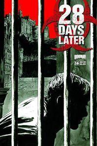
28 DAYS LATER #16
Writer: Michael Alan Nelson
Art: Alejandro Aragon
Publisher: BOOM! Studios
Reviewer: Henry Higgins is My Homeboy
Spin off comics, while always a lucrative avenue, have really come into their own over the past few years. Where there was once just a small rack led by five different ALIEN and PREDATOR mini series, now there seems to be a comic spin off for most television series and films. One of the most apt adaptations has been 28 DAYS LATER, a natural fit for a continuing series. Taking place between the end of 28 DAYS and the beginning of 28 WEEKS, the series focuses on Salena reentering the rage-infested British countryside as a guide for a quickly dwindling number of American reporters. A little over a year old, the series has been consistently good, and has showcased a very impressive willingness to subvert itself. It's one of the few series out there where you honestly don't know what to expect next month. This issue is just as good, but not as good as some of the past ones.
Writing (4/5): The main character of the series has been Salena, who for some unseen reason has reverted back to her cold self from the start of 28 DAYS. Salena remains your ideal horror story heroine, cold and calculating, but with a heart buried very very very very deep. It's brilliant reading a story where the hero isn't a complete prat. The other major player is Clint, the lead reporter and the resident everyman for this story. His evolution continues to be interesting, as he clings to reason and the like, even in times of duress. He plays off the newest character, The King, well. The King, the latest in a line of good antagonists, provides something new for the characters - someone who's actually benefited greatly from the infection. It's an interesting turn, as his punishment for Salena. The Mannequin. Well just...just fuck. I realize it could seem narmy to some people, but it's a brilliant little plot device. Just...fuck. While some of the issues dialogue is weak (the little twat named Angus slows everything down), stuff like the Mannequin are good enough to make up for it.
Art (3/5): Alejandro Aragon has a knack for doing grand scenes and attacks, but his faces lack consistency sometimes. Seeing how this is primarily a talking head issue, you can assume who is who. Whenever the book focuses somewhere not on someone's face, it looks great. The King looks good sometimes, and the Mannequin is utterly heartbreaking, but Raj and Clint don't really work. Very hit and miss.
Best Moment: The Mannequin. Fuuuuuuuuuck.
Worst Moment: Angus. I hate this stock character every time he appears.
Overall (4/5): I wish more people would find this book. It's a consistently good read.

7 DAYS FROM HELL #1
Writer: Bryan Edward Hill & Rob Levin
Artist: Phil Noto
Publisher: Top Cow
Reviewer: Lyzard
For those unaware of what Top Cow’s Pilot Season is, as I was a few months ago, let me enlighten you. Pilot Season is a competition in which teams of artists and writers create a one-shot comic that if it wins by audience vote will become an on-going series. Essentially, the comics have to grab you within the first issue or else you’ll never find out what happens in the next book. I reviewed CROSSHAIR for another website and was less than impressed by the Manchurian Candidate rip-off. So going into 7 DAYS FROM HELL I didn’t expect much. Despite my lack of expectations, I wasn’t blown away by the comic, but it was not nearly as bad as CROSSHAIR.
The story for 7 DAYS FROM HELL is fairly simple. An assassin, John Bishop, is killed while on the job and lands in hell, but a demon wishes to help him and offers John a deal. He has one week to kill a target (by pulling a Dexter: killing supposed bad guys) and if he succeeds he won’t go back to hell. However, he’ll have to keep on this cyclical path until God forgives both him and the demon. Good luck with that.
With a basic concept, I feel you need interesting characters to create drama. John Bishop is not completely rounded out, but he isn’t flat either. He doesn’t want to be a “man who kills children” and we are given a bit of his history and drive through a flashback. Mandy, the demon, on the other hand, is a mystery. The reader learns very little about her. Sure, she was once an angel that fell and now seeks redemption, but this is hardly original. Just think of NANCY IN HELL.
As for the art, it is simple like the story. The style is minimalistic, but I think it works. The comic is violent but not gory. Neither is the sex explicit. Clearly, Phil Noto believes that less is more. The amount of colors reflects the artistic choice. Though I got used to the lack of detail in the comic, the breaking of the fourth wall seemed off to me. There are numerous panels in which characters look directly at the reader. But they are not used to address the reader or for irony’s sake.
At the end of the book there is a preview of ECHOES #1. The creator of 7 DAYS FROM HELL should be happy that this was added to the end of the comic, because it makes his story look that much better. ECHOES is confusing both in story and artwork. There is one page that literally has a panel in the center of two pages, covering drawings and making it difficult to follow. I wish I could tell you what ECHOES #1 was about, but I can only guess that it’s about a son coming to terms with his dying dad’s actions.
7 DAYS FROM HELL isn’t an extraordinary comic, but it isn’t a bad one either. Nonetheless, when in a competition where you only get one chance to impress the readers, I feel that you need a much stronger introduction. 7 DAYS FROM HELL simply lacks anything special or original.

AZTECA: CIUDAD PARADISO #1
Writer: Enrica Jang
Art: Jhazmine Ruiz
Publisher: Red Stylo Media
Reviewer: Mr. Pasty
Remind me never to go to Mexico. If heading south of the border is anything like it’s portrayed in AZTECA, then I’m likely to be humiliated, sodomized and left for dead. I should probably be used to it by now as a reviewer for AICN, but at least here I can do it from the comfort of my own home. AZTECA has a great premise: “Set in Mexico, about a vigilante serial killer, Nicho, who believes he can stop the world from ending in 2012. Instead of killing innocents, Nicho stalks criminals and drug cartel soldiers, killing them in ritualistic human sacrifice as blood offering to forgotten Aztec gods.”
Here’s the problem. I only know that because I read the press notes prior to writing my review. Without it, I’m not sure how committed I would be to the story after wrapping up the first issue, which seems to be nothing more than a series of chapters that showcases how close innocent people come to getting unspeakable horrors inflicted on them before a hooded hero swoops in and chops up their assailants. It was reminiscent of that scene in the movies where a bad guy is pointing the gun at his victim, a gunshot is heard and then the bad guy falls to reveal a hero behind him with a gun of his own after making it just in the nick of time. I hate to pull the old “rinse and repeat” routine but the narrative seemed to be stuck on a loop, skipping after every intervention. I also have a problem with Nicho’s ability to show up in so many different places at just the right time. At least Bruce Wayne had the bat signal.
I guess my frustration with the story is that it doesn’t really do anything other than draw a distinct line between who’s corrupt and who isn’t in the CIUDAD PARADISO. If you’re keeping score at home, every city official is dirty while Nicho and the townspeople are “good.” Yes, Nicho is a Mexican slap-chop, but this is comics and killing evil scum still makes you a good guy. But there is a marked difference between “good” and “interesting.” Like Nicho, DEXTER is a serial killer that preys on other killers, but it’s not the killing that makes him so complex. It’s his life outside of the murders that people want to see. So too, do I want to know more about Nicho, but all I got was a funky symbol drawn in blood that credits him for the kill.
What is AZTECA? It’s a book born from a great premise with solid art that suffers from stunted execution. And believe me, I’m all for slow playing your hand, but in today’s crowded comic book landscape, you rarely have more than one issue to sell the reader on where you’re going or why they should care. Should they? I saw nothing that indicated Nicho’s urgency towards the 2012 countdown or even a nod to the Aztec Gods that he’s trying to appease. In fact, if I was coming in cold, I wouldn’t even know that either of those things mattered. Without them, AZTECA becomes nothing more than your standard vigilante hero type of book and that’s a shame, because it has the potential to be so much more.
Web heads who can’t get enough of Mr. Pasty’s word vomit are encouraged to watch him operate as Nostradumbass over at MMaMania.com here. Love, hate and Mafia Wars requests should be directed here.

SCARY GODMOTHER HC OGN
Writer/Artist: Jill Thompson
Publisher: Dark Horse Books
Reviewed by Professor Challenger
“Anybody who's all about monsters an' spiders an' candy is the perfect girl for me. Besides...you're never too old to be a new friend.”
– Jimmy
For ghouls and goblins of all ages, Jill Thompson's gorgeous new SCARY GODMOTHER book collection has hit the stands to usher in the Halloween season. Dark Horse has beautifully packaged Thompson's first four SCARY GODMOTHER children's books into a large hardback evocative of the classic MOTHER GOOSE book...complete with a “This Book Belongs to ____” plate on the checkerboard endpapers. SCARY GODMOTHER collects in one volume: “Scary Godmother”, “The Revenge of Jimmy”, “Mystery Date”, “The Boo Flu”, and adds in the short story “Tea for Orson.” Also included in this package are lots of treats including Thompson's initial sketch work for the characters, some of the original covers, and her character expression sheets for the animated specials developed for Cartoon Network based on her first two SCARY GODMOTHER books.
Fans of Thompson's comic book work may only be familiar with her Scary Godmother character through the series of comic books with the character. So, this book is an opportunity to encounter her in a different type of format that really gives Thompson's lush watercolor art the focus. And each story is a joy to read. Thompson really understands how to tap into that wonderfully open spirit of childhood and craft stories that will connect with anyone. The bottom line as to why I recommend this book so much is simply how much FUN they are. They bring a smile to your face and a chuckle to your throat as you read it. You can't help it. My own daughter is 13 years old and was instantly drawn to the cover when she got in the car after her gymnastics class. “What's that?” she asked with a crinkle of her nose. I replied “Check it out. I bet you will love it.” And needless to say, she didn't put it down until she had read the entire book and declared she “loooooooovvvvvvves SCARY GODMOTHER....especially Bug-A-Boo!” She just about jumped out of her skin with excitement when we came across a DVD copy of the “Scary Godmother: Jimmy's Revenge” animated special. Guess what daddy bought and we are waiting to watch together on Halloween night?
Scary Godmother is basically the patron saint of Halloween. She is the guardian of the spirit of Halloween and she comes onto the scene in these books to protect sweet innocent little Hannah Marie from the “monsters.” As each story progresses, Hannah Marie, her cousin Jimmy, and her friends become increasingly more familiar with Scary Godmother and all her friends who live with her on the “Fright Side”. The sweet-natured characters that populate the “Fright Side” include the closet skeleton, Mr. Pettibone, the ghostly cat Boozle, and the monster under your bed, Bug-A-Boo. Harry is a scene-stealing werewolf and Hannah Marie quickly becomes best friends with Orson, the bespectacled boy vampire.
Thompson's character designs are appealing with that slight creep factor that makes them all feel right for Halloween. I love the consistency in design elements that run through all her illustrations...including the cute curly-cue element that shows up everywhere including the logo design. In the age of digital art, I am particularly drawn to Thompson's colorful washes and brushed textures in the color work. I especially enjoy how she is willing to let the watercolors flow and absorb into the paper softening and stylizing many elements such as the moon in the night sky. Never a perfect circle, she lays down the deep purples and blues of the night sky around the moon but never makes the effort to tighten it up. I love that choice and she makes many confident artistic choices like that in her storytelling. She has the experience and the eye to always know the most effective (whether dramatic or comedic) way to communicate the scene to the reader.
Even though these stories were designed for book form rather than comic form, she is essentially working with a large-form panel design. So, the fan of comics and graphic novels should have no problem with her approach here. In fact, they may see this as a chance to expand their thinking as to what can be accomplished within the panel-to-panel style of story.
Halloween is the time for tricks and treats, and Jill Thompson's SCARY GODMOTHER is a treat that even beats finding a full-sized Snickers in your trick-or-treat bag.

THE BROADCAST OGN
Writer: Eric Hobbs
Artist: Noel Tuazon
Publisher: NBM Comics Lit
Reviewer: Lyzard
October 30th this year is the 72nd anniversary of Orson Welles’ radio dramatization of H.G. Well’s WAR OF THE WORLDS. Though the amount of panic this radio broadcast caused has become hyperbole, it is a story that has become part of our media culture. I have a recording of Orson Welles reading BRAM STOKER’S DRACULA, and I can tell you that it is one of the most frightening things I have heard. Welles has such charisma and talent that I can see how his performance of War of the Worlds caused fear and chaos for some.
The comic, THE BROADCAST, takes advantage of the tales of hysteria caused by the CBS show. In a small, rural Indiana town the lives of several of the farm folks are altered when a power outage prevents them from learning that the program is, in fact, a hoax. The chaos of their lives is heightened by the imminent threat of Martians.
What THE BROADCAST does best is create stories we, the reader, are interested in. There is more to this story than Orson Welles’ fictional reading, which is merely a background for the main action. The true A story is focused on the tension between the farmers and the rich man that “saved” them. Times are tough and few are as well off as Mr. Shrader. One of the farmers’ sons, Gavin, wishes to marry Mr. Shrader’s daughter. Of course, Mr. Shrader feels that there is too much of an economic divide between the young adults. Another B story is that of the African-American Marvin, whose appearance in the area is filled with mystery. The tension grows to a peak when a storm knocks out the power right in the middle of the radio broadcast. Paranoia and bedlam follow, but as Sartre said, “hell is other people,” not Martians.
The characters are well developed. You get a feeling of their pasts, without the use of too many flashbacks. Technically the story is done as a partial frame story, where the comic starts off at one point of time, then flashes back to another time for the majority of the comic, before returning to its starting point and continuing on. There is plenty of mystery and suspense involved, which is slowly unraveled with remarkable pacing.
I just wish the artwork were as good as the story. Don’t be fooled by the cover, the art on the front is nothing like the rest of the comic. I said RYDER IN THE STORM had storyboard quality. I take that statement back. THE BROADCAST looks exactly like a detailed storyboard, from the black and white colorization to the pencil strokes. The problem with this is that at first it is hard to distinguish characters. For instance, I did not know Marvin was black until we saw him for a second time. In the beginning, I merely thought he was in shadow. This art style could have been chosen so as not to take the reader away from the story. A stylized look would not have fit the tone of the comic. A realistic design is necessary to backup the feel of the book.
Overall, Eric Hobbs takes an interesting approach to the tale THE BROADCAST. He could have made it pathetic that these characters did not pick up on the three warnings given in the broadcast that it was a hoax. But instead, he plays up the irony, and does not make them appear as fools, but as humans. It’s long, at 175 pages, but it does not take as long as you would expect to read. There is minimal dialogue; most of the time the writer and artist choose a visual storytelling approach rather than on the nose, explicit wording.
For some radio stations, it is a Halloween tradition to re-play Orson Welles’ WAR OF THE WORLDS broadcast. If a station near you doesn’t play it, try picking up this comic. It’s just as good.
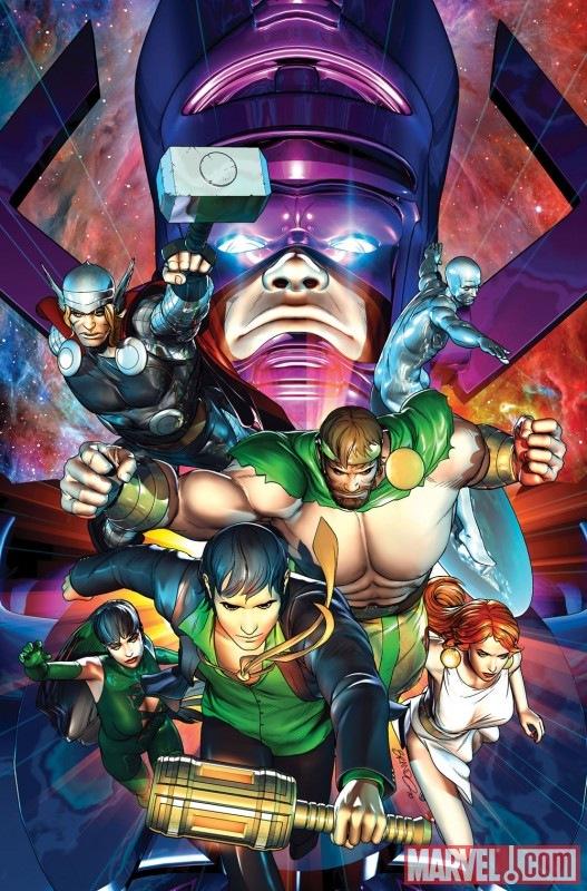
CHAOS WAR #2
Writers: Greg Pak & Fred Van Lente
Art: Khoi Pham
Publisher: Marvel Comics
Reviewer: Henry Higgins is My Homeboy
And just like that, I remember why INCREDIBLE HERCULES was one of my favorite titles in recent history. This issue of Hercules' new event plays off of the concept of having the greatest gods in the Marvel universe teaming up, and it's a thrill to read. The book improves on last week’s opening issue in both art and writing, and reads as an event should read.
Writing (5/5): This issue is able to juggle the appeal found in INCREDIBLE HERCULES with your basic big event book and manages to do it expertly. The removal of the various heroes from the plot to give way to the God Squad is necessary, but is done well. It also lets the Gods take over, and gives an excuse to showcase Hercules' new power. It's a well done sequence, and highlights up Hercules’ new power level. The scene in hell is brilliant, with the return of one of my favorite dead gods (oh Ares, it's nice to have you back), and a nice reminder of the Chaos King’s last battle with the Greek pantheon. Hercules' recruitment drive is fun as all hell to read; instead of doing the usual sodding "Oh, we must recruit the greatest of the gods, so let's just start with my contacts list", it instead starts with Eternity and ends with Galactus. It's such a great moment. But it's also nice to see that Hercules is back to being Hercules. One of my problems with the last issue was that Hercules didn't always read like Hercules. But here, he's back with his old smirk and laugh. There were no weak scenes. The book is a fun read.
Art (4/5): Khoi Pham, while not the best Hercules artist, is still fantastic here. While some of the art in the beginning (especially Hebe) is very unflattering, the art improves over the course of the issue. Thor saving falling planes looks great, and it all builds up to the awesome moment of Eternity and Galactus appearing. The art is, for the most part, good with expressive faces, and interesting designs as with Hercules and equally good with big moments such as the arrival of Galactus and the coming of the dead. It's not perfect, but it comes close.
Best Moment: Recruiting Galactus. Goddamnit that's awesome.
Worst Moment: The cover. That's just....that's just ugly.
Overall (5/5): This is everything I was hoping for, and more.
Every comic shop has them… battered long boxes jam-packed with dog-eared titles ranging from forgotten heroes of the 1970s to multiple copies of chromium-covered “collector’s item” comics from the Big Bust of the 1990s. But if you are patient, and dig deep enough, you just may find something special…
Greetings once again, kiddies! It’s your old pal BottleImp here, ready to dust off some decayed flesh from the old bones that I’ve unearthed whilst digging through the moldy old boxes down at the local cemetery… er, I mean, local comic shop. Hope you’re in the mood for cheap thrills, ‘cause I’ve got some terrifying treasures that won’t cost you an arm and a leg. Let’s delve in, shall we?
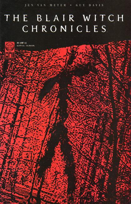

THE BLAIR WITCH PROJECT One-Shot (1999)
THE BLAIR WITCH CHRONICLES #1-4 (2000)
Oni Press
BLAIR WITCH: DARK TESTAMENTS One-Shot (2000)
Image Comics
Remember how huge THE BLAIR WITCH PROJECT phenomenon was? Books, fake television documentary specials, a sequel film (that apparently nobody but me liked) and these comic book tie-ins. Rather than simply re-hash the movie, the people at Oni made the smart decision to instead write stories AROUND the film, stories that fill in some of the ancillary details surrounding the Blair Witch legend, or stories that simply added to the so-called “history” of the Blair Witch curse. Jen Van Meter writes all the Oni stories and does a great job of capturing that sense of growing unease and terror that works so well in the film. The Image One-Shot, an exploration of the Rustin Parr character by writer Ian Edington and artist Charlie Adlard, is slightly less effective, in my opinion. Edington’s style is a little more straightforward, and misses that blurred sense of reality and fiction that the movie and Oni titles possess. Even so, all of these comics make a great complement to the film and should be relatively easy to find in the bargain bin.
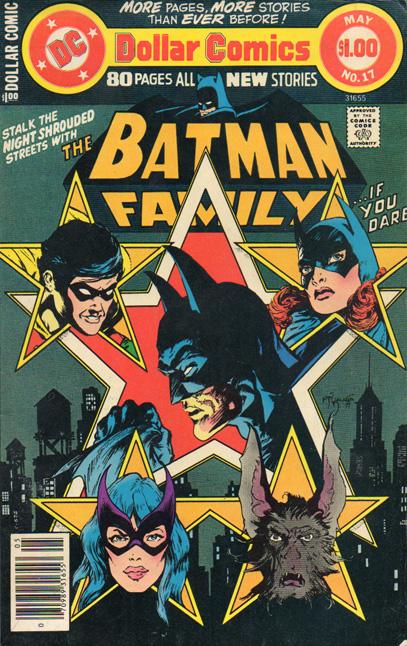
THE BATMAN FAMILY Volume 4 #17 (1978)
DC Comics
The Batman is one of those characters that is very easily nudged into the realm of horror—the use of fear as a weapon, the tragic past, the psychological aspect that permeates not only Batman but nearly his entire Rogues Gallery; the combination of these qualities easily lends itself to darker sorts of stories than, say, the average Superman comic. By far, one of the best examples of The Batman as Horror Comic is in the feature story of this anthology title. “Scars,” written by Gerry Conway and drawn by Jim Aparo, finds Batman and a college-age Robin tracking missing Gotham City celebrities to a carnival freakshow, where these beautiful people are twisted and deformed by a man who calls himself “Scar.” It seems that Scar was once one of these beautiful people, until his face was irreversibly ruined by an accident during a football game. Driven insane, Scar decided to take revenge upon the world by twisting beauty into ugliness. The story draws to a close with a TWILIGHT ZONE-like twist ending which enhances the overall sense of horror. Sure, there’s still some goofy superhero stuff in here—a visit from the Earth-2 Huntress, and Batman hanging out in full costume at the carnival without anyone really paying attention to him—but at this point in publication, Batman was still getting back in touch with his dark side after the long period of goofy 1950s and ‘60s comics, so those small touches can be forgiven. And as a bonus, this issue also includes an amazing Michael Golden back-up story featuring The Demon and Man-Bat trying to stop demons from possessing newborn children, so this comic is chock full of horror-tinged goodness and definitely worth picking up if you spot it in your local long boxes.
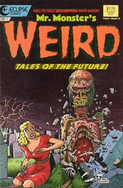
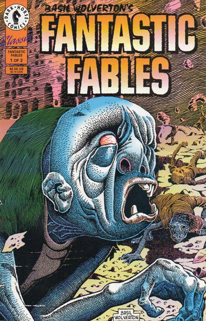
MR. MONSTER’S WEIRD TALES OF THE FUTURE #1 (1987)
Eclipse Comics
BASIL WOLVERTON’S FANTASTIC FABLES #1 (1993)
Dark Horse
These comics reprint some of the extraordinary work of Basil Wolverton, an artist who is probably most well known for his humorous strips like “Powerhouse Pepper” and his sci-fi “Spacehawk.” Most of the stories reprinted here are nominally science fiction, but all of them are marked by a strong sense of horror; it’s almost as if the EC science fiction comics mated with their horror titles and birthed some unholy amalgamation. Wolverton’s drawing style is a huge part of the creepy feel—his use of solid blacks and meticulous, textural hatched lines, combined with his knack for drawing the grotesque, imbue the panels with an air of eeriness and dread. You can see Wolverton’s influence in Richard Corben’s work, especially in the way Corben also chooses to ink in that tactile, hatched line. Corben fans should check out these cheap reprint comics and discover one of the lesser-known masters of the horror genre.