| #7 | 7/8/10 | #9 |
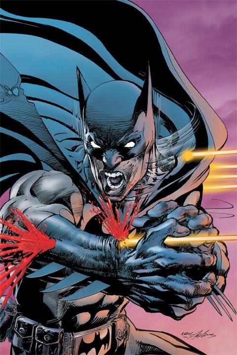
BATMAN ODYSSEY #1
Writer & Artist: Neal Adams
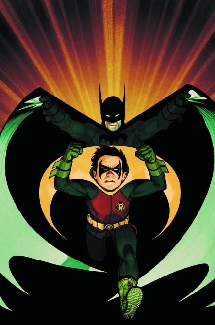
BATMAN & ROBIN #13
Writer: Grant Morrison Artist: Frazer Irving Publisher: DC Comics Reviewer: Optimous Douche
A few months ago I interviewed Mike Uslan, a man that not only knows comics (teaching the only college accredited course on comics out there), but also knows Batman in every sense of the character (makes sense since he has been a producer on every Batman film from Burton to Nolan). Even though we were supposed to be focused on the new directions for ARCHIE, the conversation evolved into an exploration of brand diversification in all comic titles. To paraphrase, today’s comic audience is an eclectic demographic grab-bag. For the first time in comic history you have multiple generations all wanting a piece of comic goodness each week. So how does a company fulfill the story expectations of different generations, while still adhering to the essence of the character and dare I say some semblance of continuity? I think DC cracked the nut with last week’s bat offerings of BATMAN ODYSSEY, which is a gorgeous homage to a time that was, and BATMAN & ROBIN, which is the finest crafted comic book being delivered by and for the ADD generation.Unfortunately the Internuts are going to shit on BATMAN ODYSSEY. They will spew their verbal vitriol as they half-heartedly read the book while at the same time playing their Xbox, skyping grandma in Florida and downloading their weekly diet of apps that they won’t be using a month from now.
And in response I give a high and hearty fuck you to those naysayers. You scoff at this book, because you don’t understand this book. You see I know how you read, because I am you. Yes, I sit on that ADD cusp between Gen X and what came after. I read my books each week amidst a cacophony of other “entertainment” trappings. And usually we can get away with this laissez faire form of information absorption because the modern comic book only requires 1% use of our already minuscule percentage of accessible brain power. BATMAN ODYSSEY is not your average book though. It’s showing what the silver age story tellers can create with modern tools. After the first few pages I turned off Red Dead Redemption, closed my laptop, and simply immersed myself into what was a glorious labor of love for a time that is no more.
BATMAN ODYSSEY is simply gorgeous in presentation. Gotham City has not felt this alive and real in a long-time, which can all be attributed to the painstaking detail that Adams throws into each and every panel he draws. Right from the very first close-up of Bruce Wayne, as he recounts to a very young Dick Grayson his error in thinking on a gun being more fearful than a bat costume, you can count the hairs on Bruce’s arm, you can make out small details in the background of the Batcave, you can see his expression of disappointment in himself for his miscalculations. At first I thought this page was a fluke; hook me now so I don’t pay attention to later. But every panel in this book whether big or small is meticulously crafted to portray a holistic scene. I can’t fathom how long it took Adams to draw this book, but I’ll tell you, I feel the same way about this title as I do about the work of Frank Quitely. I would rather wait for sporadic moments of genius than be deluged with a constant barrage of timely mediocrity.
So what about the writing? Well, this is where we see the stark difference between the modern day and silver age. Normally I’m the first to lambast the old-timers for relying heavily on the convention of narration bubbles, those usually annoying telegraphs of thought that articulate everything from the current action to what the character had for breakfast. I ripped Claremont a new one when he took over EXILES for this, mainly because it was an old style shoe-horned into a modern book with modern characters. BATMAN ODYSSEY though is set in a different time and the book has no history. Even though it’s not implicitly stated, I truly felt this book was sitting somewhere circa the late 70s. Everything from the style of the Batmobile, to the age of Dick Grayson, to the mention of a gas crisis (never mind on that one I guess) screamed Carter era America. Also, Bruce is a different man; I wouldn’t call him jovial, but he is certainly not the mean-spirited, Miller inspired Bruce that weaned my generation.
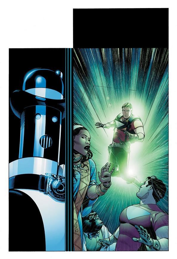
If I had one compliant, I will say there was sort of a forced scene with Man-Bat in the Batcave. I understand it serves as necessary exposition for what’s to come, but it really was a bitch-slap of a moment that felt a bit forced. Also, I can’t figure out for the life of me why Dick Grayson is wearing the Tim Drake Robin outfit. Perhaps we are looking at an Elseworld, if so cool I’ll let it go. Dick’s outfit always was a big bucket of suck so there’s no real loss here.
I gained a new appreciation for what was with this title. If you look beyond the “telegraphing” nature of the narration bubbles, you can actually glean insight into the inner-workings of the character. Just so long as the art supports this wordy portrayal of the action and is not just some dippy stick figure standing in a void it actually serves as a delicious a compliment.
Now, let’s get back into continuity with good ol’ BATMAN & ROBIN. Just when I think this title has reached its zenith in awesomeness, Morrison is somehow able to elevate it into a new plane of existence. The cover alone will make long-time bat fans giggle with delight as Douche Way…I mean Damian Wayne, is about to clobber the Joker with the “crowbar of Robin retribution.” When you get into the interior panels and he actually does start wailing on the Joker I could feel the hairs on the back of my neck stand on end for this payback that has been 25 years in the making.
I’ll fully admit the first three pages of this book have me utterly befuddled. Thomas Wayne setting up the killing of his wife and child, payoffs to Chill, debauchery abounds. If someone can explain it to me please do: I’m all ears (well actually eyes, since I would rather you write me). If it’s a holdover from R.I.P. please give me a bogey on knowledge, I was one of the haters. Once we get past this dream/reality/hallucinogenic mind fuck, the story takes off in one of our favorite Gotham haunts, Arkham Asylum.
The Sexton Oberon mystery is solved (it was the Joker) and the eclectic cast of villains we have met over the past 12 issues (Pyg, Flamingo etc..) were no more than pawns in what could be the joker’s greatest psychopathic game to date.
Pathogenic DNA viruses aside (great concept I just don’t want to ruin everything), what was truly spectacular in this book were the one-liners. Dick more revered than Bruce by the G.P.D. When Damian is locked up with the Joker people are more concerned about the Joker’s safety, and a car ride with Dick and Gordon that was one of the best conversations in BATMAN to date.
Some will be put off by Frazer’s watercolor approach to art, but not being an art snob I didn’t mind it. It was a refreshing change. Does it work as well outside of a Victorian setting? Probably not, but it is still accomplished and most certainly original.
I had a great time under the cowl this week (obviously) and I’m predicting now that the events in BATMAN over the next year will dethrone the reign of the Green Lanterns.
Optimous has successfully blackmailed fellow @$$Hole BottleImp into being his artist on Average Joe. Look for Imp's forced labor on Optimous brain child in mid-2011 from COM.X. Friend Optimous on FaceBook to get Average Joe updates and because ceiling cat says it's the right thing to do.
Another Look at BATMAN: ODYSSEY #1
Writer & Artist: Neal Adams Publisher: DC Comics Reviewer: KletusCasady
“This is new. Feels like a cigarette boat.” “Unfortunate name. but, yeah. same-same.” “No. Hey, right! I got. I like it. I love it! It’s mine! God…”Last week someone politely asked, “please review BATMAN: ODYSSEY Kletus, I yearn for your opinion on the return of one of DC’s most celebrated artists and I would NEVER use sarcasm to get what I want, not only that but I appreciate the reviews you guys do here on a weekly basis,” and me being the kind, gentle, loving, good looking soul I am, I said “damnit…I’ll do it!” The first thing I’ll mention is that I was not impressed by the preview pages of B.O. that DC had added to the back of their comics. It didn’t grab me but I was curious as to why Batman was brandishing dual pistols and that was really the extent of my interest in this book. For the most part, when “a legend” comes back to a title that they drew or wrote over twenty years ago, it rarely warrants all the hype surrounding it…sorry, it’s true. I know there are a few exceptions to every rule but a lot of times shit just doesn’t work. I’m sorry to say this may be one of those times. In the immortal words of Arsenio Hall this book is filled with things that make you say “hmmm…”
This book is frustratingly confusing. I’m not sure if this was done on purpose but damn, between the dialog and the jumbled panels I was really lost. My first point of confusion was in the Batcave. Kirk Langstrom the Man-Bat just swoops in, picks up Robin, and flies off…all this happens in front of Batman who is unfazed by all of this as he’s giving Robin a lecture about guns, so Robin is answering his questions whilst being flown around the Batcave by Man-Bat. No explanation as to how he got in there or why the fuck he’s flying Robin around…hmmm. Then Batman & Robin get called away to foil a Riddler scheme but Batman chooses to ignore it and go to the pier instead…hmmm. Now why the fuck would Batman ignore a threat from the Riddler robbery in progress, couldn’t people be dying or some shit? Not only that but Batman scolds the Man-Bat for being, well, Man-Bat form, tells him to take the serum to change back but then leaves him ALONE in the Batcave to take the serum by himself…hmmm. Plus another Man-Bat type figure is just hanging out in the Batcave after B & R leave…WTF?!? Isn’t there security in that piece or what? The dialog had me thinking I had missed something on the previous page but really shit was just disjointed as hell and sometimes just weird, “There’s time for talk and there’s time to grab the family jewels, shut up and ride the wind”…this is Robin quoting a phrase that Batman (I guess) frequently says…hmmm. I’d believe that in Frank Miller’s Batman but it was just out of place here and it happens a couple times where dialog/actions just jump out of nowhere and you’re like…why did he say/do that? The artwork was good, no doubt about that, aside from a few panels being a little jumbled together. My problem with it though is that it looked as though he drew it with the intention of it being on the old style comic book paper. It kind of looks like those bad transfers of old story lines that Marvel puts in to trades (MAXIMUM CARNAGE TP) that look blurry at parts not to mention a lot of the detail gets lost. That being said I still think the artwork was good, I just think it would have looked a lot better on non glossy paper which is probably true for a lot of old school artists.
Neal Adams has achieved more in his lifetime than I will in two, thus I mean no disrespect with this review…but B.O. just didn’t do it for me. I had a hard time understanding a lot of things in this book, like the ending; who are those people and why is shooting a car filled with hydrogen a cliffhanger? Was there something important in the car? I just have too many questions and not ones that make me curious about the next issue. Like why, when Batman said he was going to the other side of the pier to contain the baddies, did Jim Gordon deem it necessary to get on the bullhorn and loudly announce what Batman’s plans were? Hmmmm. Anyway, the art was definitely good but not really my cup of tea. It’s kind of a mix between Jim Aparo’s facial expressions and Joe Kubert’s line work but nothing is as sleek as what Jim Aparo would do, being that in most of the panels the subjects were in the foreground masking what was behind them. I guess if you have one of those “I’ll buy what ever Neal Adams does” attitudes like I do for Jim Lee than you probably have already bought it, read it, liked it, bagged and boarded it and are pissed at this review but it’s my story and I’m sticking to it. In the words of the random cliffhanger pier bad guy, “Blow! Blow to hell!!”
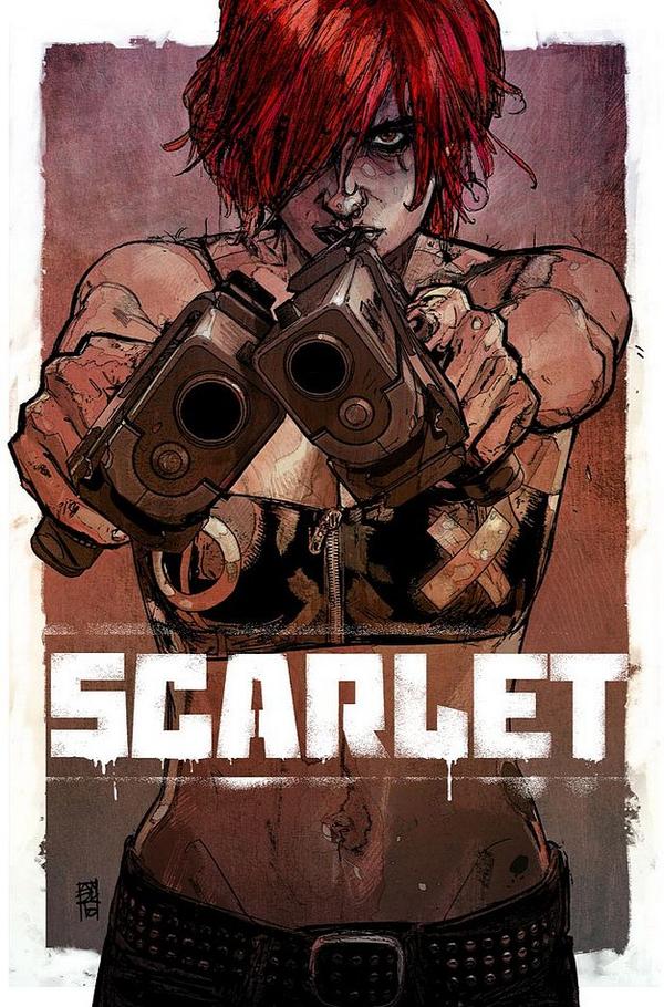
SCARLET #1
Writer: Brian Michael Bendis Artist: Alex Maleev Publisher: Marvel Icon Reviewer: Johnny Destructo
The world is broken. You know this. I know this. Scarlet knows this. We all have this knowledge in common.Scarlet? Well, Scarlet is doing something about it.
...and I can't wait to see what she does next.
Bendis, for all of his snark, still seems to wonder how he is where he is in the comics industry. It's because of his fearlessness with experimentation. He never seems content to just write comics a certain way, but is always flexing the medium to see what sticks. Sometimes it works and sometimes it doesn't, and that's ok. The guy gets a lot of flak from this corner of the internet, even from me (see my AVENGERS #1 review) and I'm sure this book will be no exception. I can see that it's not going to be many people's particular brand of tea, but me? I'm drinkin' it up.
There are a couple different narrative themes going on. One, in the word balloons is Scarlet's dialogue. The stuff that the fictional people around her can hear. Two, in the rectangular word balloons are her words to us, the readers. Then there are the quick cut scenes catching us up on her life, which, in my head play like something out of “Snatch” or “Requie, For A Dream”. And then there's the inclusion of a newspaper article about the story she's telling us. And it all works perfectly. People new to the comics medium may need to study UNDERSTANDING COMICS by Scott McCloud first, but to the seasoned comics reader, these all blend together well.
At first, when Scarlet starts talking about the broken world and how her parents should have warned her and blahblahblah, it felt a little whiny and immature. Like high school I'm-gonna-paint-my-nails-black-and-rage-against-the-machine (what machine?) I-dunno,-any machine (like a vending machine?) I-dunno,-man! A-machine-that-I'm-gonna-rage-against! Stop-harshing-my-buzz! kind of angst. And I had my doubts. But then she tells her story. And it's difficult not to put myself in her place and feel what she's feeling, and understand exactly what it is she wants to do. Cause I think a lot of us want to do the exact same thing.
As for the art, I wish Maleev would convey something besides the static, motionless, traced-over-a-photograph sort of feel. It's not bad, it's just that most of the panels feel "staged". And the Photoshop textures are a bit much. It pulled me out of the story time and time again. Also, a quick note regarding the variant cover by Mike Deodato. There are characters that need to be in sexy poses, in tight clothes. Scarlet doesn't feel like one of those and seeing her portrayed that way takes something away from the character. Leave that sort of pin-up for Velocity or Lady Death or something.
Overall, a great first issue that I'm really looking forward to continuing. Scarlet has some stuff she wants to tell me, and I can't wait to hear it.
JD can be found hosting the PopTards Podcast, discussing movies, comics and other flimflam over at www.poptardsgo.com, graphically designing/illustrating for a living, and Booking his Face off over here.
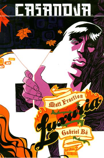
CASANOVA: LUXURIA I
Story: Matt Fraction Art: Gabriel Bá, Fabio Moon Publisher: Image Comics Reviewer: Majin Fu
I missed CASANOVA when it was originally released, so I was looking forward to finally seeing what all the fuss was about. Matt Fraction is a writer with huge potential to surprise and astonish, no matter what character he is writing (ahem, Thor). I am also a huge fan of Gabriel Bá, so expectations were high. Happily, this did not disappoint. The book features the first two issues of the original story re-colored, plus an additional 8 pages of back-up featuring art by Gabriel Bá’s brother, Fabio Moon. There are also several pages of retrospectives in the back, courtesy of Matt Fraction. With all that material, this is definitely a dense book that earns its four dollar price tag.Caution: Minor spoilers ahead.
Matt Fraction crafts a story with equal parts absurd action and personal discovery, featuring alternate timelines, sex robots, and a secret agent who looks suspiciously like Dum Dum Dugan. There is a lot happening, but Fraction arranges everything with a flow akin to music, complete with rhythm and multiple climaxes, so you never lose momentum. While you may be able to spot a few influences, like the previously mentioned Dum Dum, most of the material is so wacky that I can’t imagine it being anything other than wholly unique. I won’t spoil anything in case you still haven’t checked it out, but suffice it to say this story will show you at least one thing you probably never saw before.
I may not have read the original stories, but I saw some of the art, so I can tell you how beautiful Bá’s work is now that it gets the full color spectrum treatment. This is a trippy story, and the heightened visuals make the story pop and fizzle appropriately, like when Casanova is falling from one dimension into another. The original color scheme is also kept during a flashback to focus on the personal issues of the protagonist. It’s a subtle narrative twist that pays homage to the original art, while also making the additional colors feel like more than just a gimmick.
Bá’s style here is looser than his recent work UMBRELLA ACADEMY, and especially DAYTRIPPER (or is that all Fabio Moon’s work?), but no less expressive. There is a good balance between chaos and character development with transitions that are not quite fluid, but suit the style of the writing. There is also a lot of variety in the size of panels to maintain the story’s high energy. The images and lettering blend seamlessly in the comic in a strange way that really helps the comic flow. Also, the fonts get a little small at times depending on who is narrating, or what is happening within the panels. It’s a refreshing twist from the more generic layouts that influences the way you read and your eyes move along the page.
The 8-page story at the end helps to flesh out the main story and give the issue a happy ending. Fabio Moon’s visuals are as stunning as they are fun. His more slice-of-life style coupled with some creative layouts help to capture the sensations inherent to the story. Work like this is definitely preferable to a preview when it comes to justifying the extra dollar. I am tremendously grateful to Icon for giving me so many reasons to jump into the zany world of CASANOVA, and will be sticking around to see what happens next. Matt Fraction and Gabriel Bá have created a comic that is supremely energetic and unique. If you missed it the first time and you like your comics on the psychedelic side, pick CASANOVA up and give it a look.
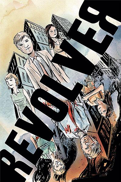
REVOLVER OGN
Writer/Artist: Matt Kindt Publisher: DC Vertigo Reviewer: Humphrey Lee
Before I gush all over this book – and oh there will be gushing – I would implore all interested in this book to check out the Q&A session I had with writer/artist/all around creative guy Matt Kindt yesterday in the AICN comics section. At the least it turned out to be a great look into the creative process of a true talent of the medium, at the most it will be a good precursor for all that aforementioned gushing. Fact of the matter is, the man knows how to use the comics medium for all it’s worth and his newest work, REVOLVER, exemplifies this.REVOLVER is a book about a lot of things, but at its foremost it’s a book about one’s station in life. The book’s protagonist, Sam, is one of those types that are just barely getting through life. Hates his job, hates the monotony of his life, hates his boss --basically he’s like 99% of us. Then the world goes to hell. Bombs drop, disease starts running rampant, chaos chaos chaos. Until Sam wakes up the next day that is, and everything is back to its terrifyingly tedious state.
This is just one of a plethora of elements at play in REVOLVER. The switch back and forth from a world where Sam and a handful of coworkers have to do everything to survive back to one where he almost wishes he was under fire instead of furniture shopping with his girlfriend Maria perpetuates his drastic desire for change, no matter how severe. It is almost “Fight Club”-ish in nature; once Sam has a taste of life-threatening adrenaline everything else becomes insignificant and muted. The widespread panic and fear everyone seems inundated with daily, the lies, the lack of coherent information in a world seemingly gone mad – sounds almost like any given day of the week but is taken to the nth degree here but also never feels overbearing. It’s great human drama with that proper smack of relevancy to push its weightiness.
And while REVOLVER uses a bunch of thematic elements, it plays with media elements as well. There’s a monochromatic scheme in effect that shifts its color palette each time Sam switches back to the other side. It’s a simple idea but it works wonders in adding to the atmosphere being projected. There’s also a cool little effect down at the bottom of the page, as the page numbering is inserted into essentially a news ticker, putting extra emphasis on the media saturation theme I mentioned earlier. It’s all these little plays on the comic form, the way all these little aspects come together to flesh it out conceptually, that make REVOLVER (and really any Kindt book) such an involving read as Sam’s unusual plight plays itself out over two realities.
Wrapping this up, I’m going to say this is easily the best thing I have read so far this year from the world of comic books. Admittedly, it’s not perfect; some of the character relationships do kind of play themselves out predictably and there’s a villainous conflict within that unfolds and resolves itself rather quickly in its second half. But these are minor gripes overall given what the book does right. It’s introspective, topical, it looks gorgeous from a design and art standpoint and on and on and on. It’s a Matt Kindt book, and if that means nothing to you, well, that’s a shame. Like Sam, you probably need to go out on a limb and break up some complacency (at least with your comic buying). And REVOLVER is a great place to start the growing process.
Humphrey Lee has been an avid comic book reader going on fifteen years now and a contributor to Ain't It Cool comics for quite a few as well. In fact, reading comics is about all he does in his free time and where all the money from his day job wages goes to - funding his comic book habit so he can talk about them to you, our loyal readers (lucky you). He's a bit of a social networking whore, so you can find him all over the Interwebs on sites like Twitter, The MySpaces, Facebookand a Blogger Account where he also mostly talks about comics with his free time because he hasn't the slightest semblance of a life. Sad but true, and he gladly encourages you to add, read, and comment as you will.
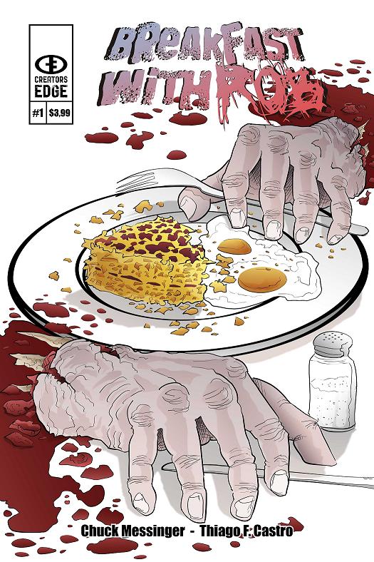
BREAKFAST WITH ROB #1
Writer: Chuck Messinger Art: Thiago F. Castro Publisher: Creator’s Edge Press Reviewer: Mr. Pasty
It was with great effort that I forced myself to consider having BREAKFAST WITH ROB, a new offering from the gang at Creator’s Edge Press. To be blunt, I’ve read so many fucking zombie comics that I could smell the stench of undead failure before I even cracked the cover. What is there left to say? What avenues remain unexplored? My issue with the zombie genre is that comics, like movies, don’t really know what to do with the walking dead because they make such one-dimensional antagonists. That means writers have to make up for their deficiencies in appeal by lumping them together en masse. The end result is an anemic narrative riddled with barnacles of uninspiring dialogue and gaudy pin-ups that all-too-conveniently make their appearance when the writer runs out of things to say besides grahhh or gurrrrr. You know it’s bad when you start wishing they would go back to using Nazis as the default bad guys.About three pages in I realized that writer Chuck Messinger must feel exactly the same way I do. How can I be sure? Well, from reading BREAKFAST WITH ROB, it seems quite apparent that he was fed up with the zombie treatment as a device to sell books and set out to do this thing justice. Why was NIGHT OF THE LIVING DEAD such an amazing movie? The same reason the RESIDENT EVIL flicks are the fromunda cheese of modern cinema. It’s not about the zombies. Nor is it about the body count. It’s about survival. Not just survival, but the desperation to hold on to your humanity in a world that has betrayed you. Now, what’s a more compelling story, turning into a fully-armed Duke Nukem and DOOMing your way to a happy ending? Or trying to use your wits to survive while making difficult choices about what sacrifices must be made in order to stay alive?
Messinger wisely chooses the latter. His greatest strength is his ability to show restraint. One of the more memorable scenes in Hitchcock’s THE BIRDS is early on in the movie when a single bird flies head first into the door of a house. The actors kind of give each other that “What the fuck was that all about?” look and the story just keeps on chugging. There’s a similar moment here and I enjoyed the tease, mostly because it follows another one of Hitch’s rules of suspense: I knew what was coming, but the protagonist didn’t. Then it became a waiting game. When are the zombies going to show up? What is the root cause? How’s it going to end?
Discovering the answers to some of those questions is what makes BREAKFAST WITH ROB such a joy to read. The characters converse like real people, the action is believable and the end reveal is extremely satisfying. You could say the artwork is crudely drawn, but I think it compliments the book instead of detracting from it. Then again, I find the old stop-motion creatures of Ray Harryhausen far superior to the sterile creations of today’s CGI. I’m strongly recommending BREAKFAST WITH ROB. It’s not just a loyal treatment of the zombie genre, it’s one of the finest comics you’ll read all year.
Web heads who can’t get enough of Mr. Pasty’s word vomit are encouraged to watch him operate as Nostradumbass over at MMaMania.com here. Love, hate and Mafia Wars requests should be directed here.
TOM STRONG & THE ROBOTS OF DOOM #2 (of 6)
Story: Peter Hogan Art: Chris Sprouse Publisher: America’s Best Comics Reviewer: Majin Fu
(Minor spoilers ahead, but if you know TOM STRONG, you probably already knew the plot didn’t you?)Boy, they really don’t make ‘em like this anymore. Really, TOM STRONG is a celebration of pulp fiction at its core. In fact, the connection is addressed between two Toms in this very issue. These stories are all about taking something cemented in the past and molding it into something new, but familiar. What keeps the stories from getting dull is the consistency of quality from the book’s creators. Like its hero, this comic is solid, yet able to leap unflinchingly into the past.
Another reason for this comic’s success is the tremendous presence of a very effective villain. Albrecht Weiss is Tom Strong’s son, raised by his mother Ingrid after she stole his semen in his sleep. Albrecht is a twisted reflection of what his father could have been under different influences. He resembles Tom in his intellect and strength, but being a Nazi puts him at the other end of the moral compass. By issue one, he had already conquered the entire world under the Nazi banner and killed all of Tom Strong’s old family, even reprogramming his faithful robot!
And what would a pulp comic be without some giant robots? The Dero are the key to Albrecht’s plot, as he explains in this issue. The first half of the book is dedicated to Albrecht sharing his exploits like any classic villain would, putting a spotlight on the merciless robots from the title. The Dero are truly an intimidating nemesis, and Albrecht makes it clear just how capable they are, if you make the right compromise. The deal Albrecht makes with them was one of my favorite parts of this issue, and has implications of more exciting action to come.
Both Albrecht and the Dero prove to be so competent that Tom Strong’s only hope for the future is to escape to the past. As a result, the latter half of the story is more of a retrospective on Tom Strong’s family. BOOSTER GOLD used a similar plot structure recently, and it works just as well. Looking back on their pasts allows these heroes to notice things they may have missed before, making for quiet character moments that contrast nicely with the bombastic first half. For example, I was annoyed by Solomon in the first issue, but when he appears later in the story, there is a simple exchange between him and Tom Strong that speaks a great deal about their relationship.
Chris Sprouse continues to illustrate the adventures of Tom Strong with as much clarity, precision, and pacing as he did all those issue ago when Alan Moore was writing. Every page and panel is deliberate and nothing ever feels extraneous or implicit. Alternative Toms are a staple of the series, and the concept is once again presented here. Sprouse rises to the challenge of making two versions of the same character look distinct (Tom has hardly aged for decades), embellishing each Tom with just enough details to distinguish one from the other.
At around 22 pages in length and featuring a preview for a comic featuring vampires in ancient Rome, justification for the four dollar price tag depends on your judgment of the comic’s quality, and the degree to which you enjoy these characters. Tom Strong is pure, unpretentious pulp fiction, complete with Nazis, robots, talking chimps, and time travel, but the characters are fleshed out and the presentation is so utterly professional it propels the book above its inspirations. The plot moves at a slower pace, and the preview hardly justifies the price tag when the story is normal length, but this is a great comic worth any pulp fan’s reading time.
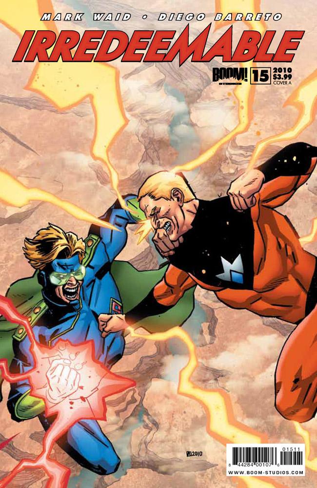
IRREDEEMABLE #15
Writer: Mark Waid Artist: Diego Barreto Published by: BOOM! Studios Reviewed by: BottleImp
For a long while, reading IRREDEEMABLE has been akin to taking a particularly unpleasant medicine. Every month I choked down the bitter tincture of pages and pages of boring backstory and bland visuals in hope that the medicine would finally take effect, and the next month would find this title back to showing signs of life, full of the piss and vinegar that had characterized IRREDEEMABLE at its birth. Well, no need to rinse the taste out of my mouth this month, because the recent steady recuperation of this series has culminated in a comic that crackles with as much tension and excitement as that instantly-addictive first issue.I could still nitpick and bitch about how long it took Waid and Co. to get back to this level of interest, and how I wish that the background and character details that took up so many boring issues could have been better integrated with the advancement of the plot, but hey…I’m going to focus on the present instead of dwelling on the past. And presently, this series kicks ass. The Plutonian takes on his former teammates the Paradigm in a no-holds-barred rematch that manages to show the reader just how powerful this rogue superman is while making it clear that he is not invincible—it may take the combined power of three heroes and one mercenary villain, but the Plutonian’s power can be countered, if only in a tenuous stalemate. Along with the energy blasts, fisticuffs and all-around mayhem, Waid also sneaks in some character and plot development. Why couldn’t he have been doing the same with all those boring—
No—focus on the present, Imp.
Bette Noir is emerging as the focal character of this superhero soap opera. As a pseudo-Black Canary clone, she doesn’t have much to speak of in the flashy powers department, but as the reader sees more of her in action, it becomes clear that Bette is perhaps the strongest player in terms of spirit. Her guilt complex over not stopping the Plutonian before he went on his murderous rampage has given what was originally seen as a rather one-dimensional character an almost Shakespearean depth. Waid also writes Bette as having a little more going on upstairs than most of her cohorts, as she is the only member of the Paradigm who views the inexplicable return of Samsara (in reality, the Plutonian’s Braniac-like nemesis Modeus) with more than a little suspicion. The Plutonian might be the one for whom this series is named, but it’s looking more and more like Bette Noir will be its hero.
I also have to point out an aspect of Mark Waid’s writing that shines as a beacon of quality in comparison to the narrative caption-laden scripts that have unfortunately become the rule rather than the exception (see my review last week of Bill Willingham’s work on JSA). Waid knows when to shut the fuck up and let the story tell itself. As opposed to the horrible “tell, don’t show” mentality that makes writers feel they need to cram as much textual information into every possible panel (regardless of whether or not said information is actually aiding the plot—most of the time, it ain’t), Waid knows that more power is conveyed by the pure imagery of the Plutonian and Survivor beating the tar out of each other. He knows that showing Qubit’s stealthy machinations does more to show the reader that Qubit is one smart feller rather than if he had given us text blocks declaring his intelligence. Waid shows, he doesn’t tell, and for that I salute him.
Even after praising this issue, I remain wary. I know, I said that I was going to be positive and concentrate on the present, but I can't help also being apprehensive about the future. After all, it can’t be a superhero slugfest every month, and there’s bound to be some more issues devoted to filling in the blanks. I’m hoping that Waid can still manage to keep this same level of suspense throughout the rest of this series (however long it may run… I can’t fathom that this storyline can continue indefinitely), because I’ve finished taking my medicine, and I don’t want a relapse. ‘Cause I really, REALLY didn’t like that medicine’s taste.
When released from his Bottle, the Imp takes the form of Stephen Andrade, an artist/illustrator/pirate monkey painter from the Northeast. You can see some of his artwork here. He’s given up comics more times than he can remember. But every time he thinks he's out, they pull him back in.

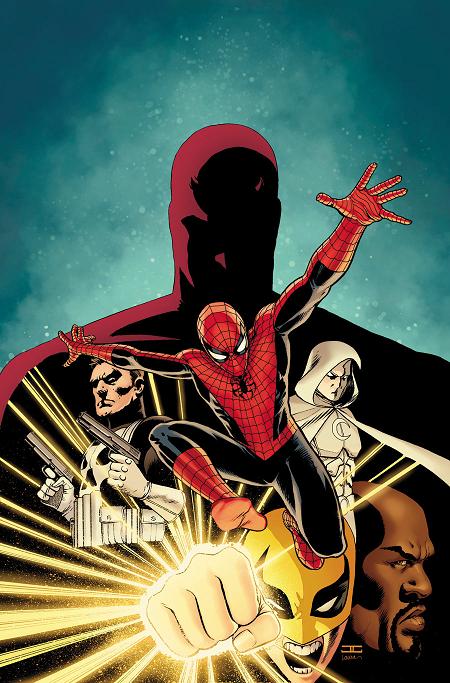
SHADOWLAND #1 Marvel Comics
File this under the “too soon to tell” category. There’s a lot of fun stuff in this book, but not enough for me to pass verdict. With only Power Man, Iron Fist, Bullseye, and Daredevil having a chance to shine here, the cover featuring Spidey, Punisher (sans Franken, thank god), and my fave Moon Knight is a bit misleading. But writer Diggle has set a pretty nice stage and given his penchant for writing great action yarns in the past, I’m willing to stick with this miniseries to see what is to become of Daredevil’s new dark reign over the city of New York. Liked the cliff-hangery ending, though I doubt it sticks. - Ambush Bug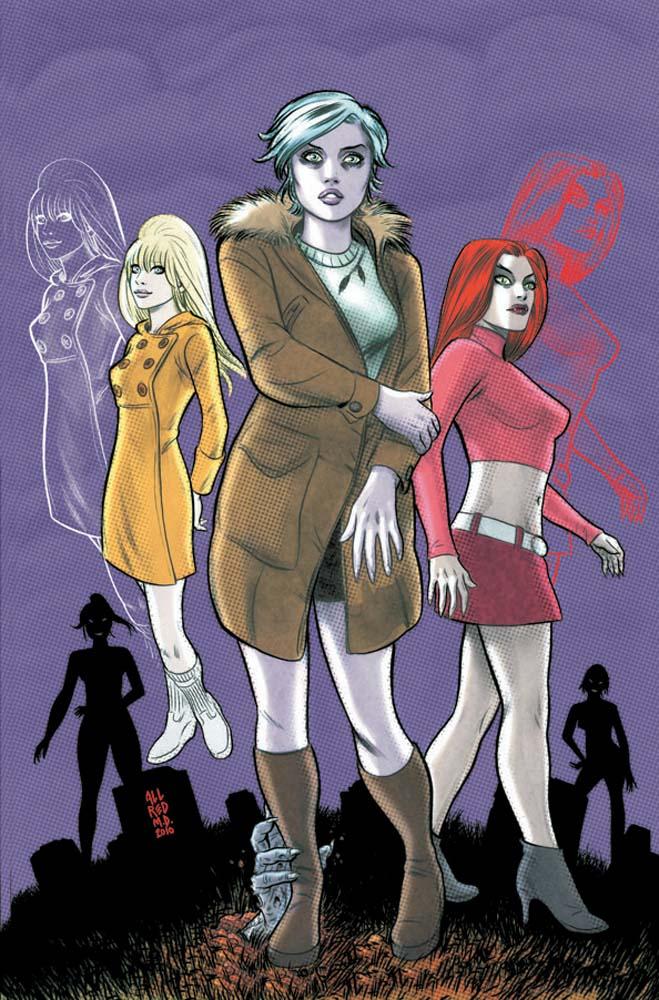
IZOMBIE #3 DC Vertigo
My adoration of team Allred’s kitschy pop art and Roberson’s great work on CINDERELLA made me buy issue one of iZombie; it truly had nothing to do with the word zombie in the title. Sorry, I’m just not a zombie…zombie (you know if you write it enough times the word really starts to sound silly). And truly the reason I am still with this book at issue 3 has nothing to do with the undead. Even Roberson’s twist on this genre by making the lead character a sentient zombie (unless she doesn’t feed on brrraiiinnnnsss) with a day job and the unique ability to absorb the memories of her favorite sustenance is not why I read this book. I can’t even say it’s the mystery of a dead man and new vampires in the Northwestern town setting of this book is what has me coming back. So why I am here? Roberson hands down is one of the best writers of strong and smart female characters that can embrace their femininity without ever transcending into objectification. It’s a rare talent. I thought it was a fluke when I read CINDERELLA; I guess I was wrong. You want zombies, dead 1960s movie stars, vampires and some great dialogue, iZombie is here waiting. - Optimous Douche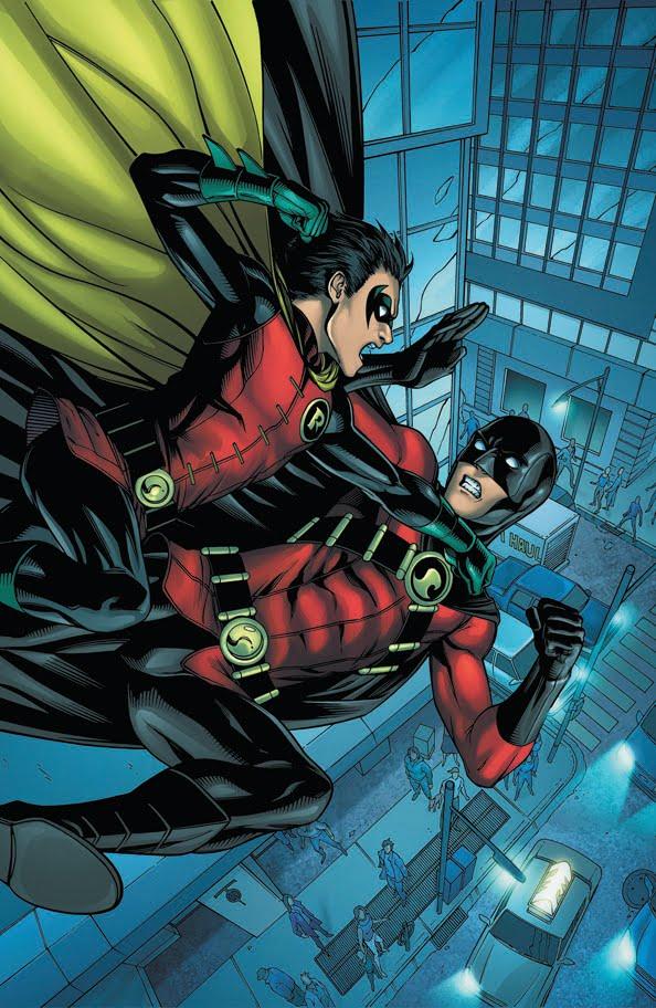
RED ROBIN #14 DC Comics
Since issue one, RED ROBIN has slowly become one of my favorite mainstream DC comics. Chris Yost did a pretty fine job of reintroducing Tim Drake as this new Red Robin and making sure he didn’t get lost in all of the limelight the new Robin and Batman team was getting. Now Fabian Nicieza is writing this book and Fabs knows his Bat-Family. This issue has Tim and Damian squabbling again, but here, it’s not Damian being a brat, but someone who has been genuinely hurt. Damian shows an all too human side in this book, while Tim (who has always been one of the more “human” heroes) seems to be hardening up more and more as he gets comfortable in his role as Red Robin. Tim’s doing Batman better than Bruce himself here and making the same type of mistakes he did. The writing is crisp and quick. And longtime Bat-fans will enjoy the three Robins (Tim, Dick & Damian) battling it out and interacting like a deliciously dysfunctional family. - Ambush Bug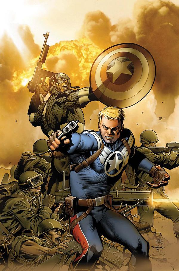
STEVE ROGERS: SUPER-SOLDIER Marvel Comics
In a natural evolution from STEVE ROGERS: CAPTAIN AMERICA (which is what the CAP series by Bru was called up until Bucky-Cap took over), we now begin STEVE ROGERS: SUPER-SOLDIER. Bru has established Bucky as Cap and whattayouknow? Everybody kinda likes him. So...the logical next step in the saga of Steve Rogers is figure out a way to utilize him as “former” Capt. America. And Marvel has thrown their weight of support behind the idea and Steve is now a presence all over the Marvel U. And now he is featured in his own solo book – a series that should be read and enjoyed by anyone who considers themselves of fan of Capt. America. Steve is the ultimate American espionage agent for the modern age and this first issue featuring him in his new role is tied directly into his origin story from the Golden Age. This is a smart and taut action comic book with a character that is in the midst of his own definitive storytelling period. Brubaker has taken an icon and made him a character to care about and to be interested in. Solid art by Eaglesham, an attractive cover, and a reprint of Cap's very first appearance (thankfully with no obvious p.c. tinkering; i.e., Steve is even shown smoking a pipe in one panel) make this a solid jumping on point for anyone looking for a good monthly fix of espionage, thrills, and character. - Professor Challenger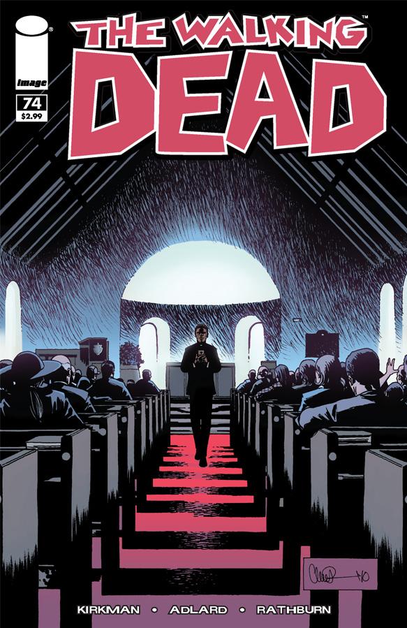
THE WALKING DEAD #74 Image Comics
Though this was another “talky” issue of THE WALKING DEAD, it definitely was a tense read. Kirkman has taken us this far down the rabbit hole with Rick and all of the other Walking Dead in his crew that seeing them interact with this new community of seemingly regular folks is fascinating in itself. This group of survivors is so damaged that even in the face of paradise, the trauma they’ve experienced won’t allow them to feel safe. Kirkman seems to be having a good time in this arc, unveiling tiny snippets of ugliness from both Rick and his Company and the residents of this new community. I’m still unsure who is on the level. Is Rick just paranoid and going to turn out to be the monsters of this arc? Or are there secrets in this community that give relevance to Rick’s paranoia? All I know is, I’m glued to this book when I pick it up at the store and can’t wait for the next installment as soon as I put it down. - Ambush Bug
SWEET TOOTH #11 DC Vertigo
Mutant animal babies, a post-apocalyptic barren America, an innocent deer boy raised in the woods juxtaposed by a hardened mercenary bad ass with a grudge against life. If you’re saying “WTF”, or if you’re over thirteen “what the fuck,” it’s OK. You are sane, you passed the test. I felt the same way when I stared at and passed by this book on my comic shop shelf for about seven or so months. Despite all the adoration and accolades heaped upon SWEET TOOTH, it just looked insanely ridiculous and weird for weird’s sake. Thank God for a slow “regulars” week a few months ago though and that sweet $1.00 first issue price, because without those two things I would have missed out on one of the most endearing and moving tales in comics right now. I‘m usually a dialogue man when it comes to comics I enjoy, but Lemire is the first writer/artist that has truly made me appreciate the power of silent scenes in a comic. He also proves that when done well they can move a story along better than loquacious word balloons. Lemire doesn’t just work in this medium, he respects and embraces it. I usually grow impatient with books that draw out their purpose, but if Lemire can keep owning the moments of this book, I really don’t give a shit if I ever learn why children are animal hybrids and the world went kaput. - Optimous Douche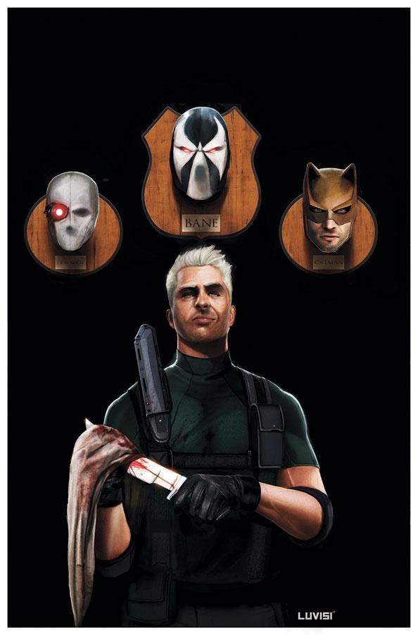
SECRET SIX #23 DC Comics
Though this may be a fill in story set out of current SECRET SIX continuity, Gail Simone writes the shit out of this issue giving each member of the team a moment to shine. I loved every panel of this issue. The premise is pretty simple; a bunch of Richie Riches hire the Six to come out to an island for an assignment only to find themselves the targets in a reimagining of “The Deadliest Game.” But Gail’s execution and attention to character is what sparkles here as cool scene after cool scene fills every panel. If anyone doubts that SECRET SIX is one of the best books on the shelves, pick up this one and done issue and lap it up. The art by newcomer RB Silva is absolutely fantastic too, adding to the cool. Clean crisp lines and dynamic poses and panels. Silva is an artist that needs more work and I’ll be looking for his name in the credits from now on. - Ambush Bug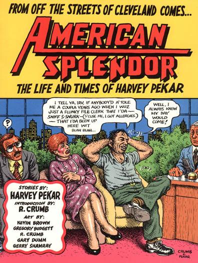
R.I.P. Harvey Pekar
By Ambush Bug
Folks, I’m not going to sit here and try to be cool and say I’ve read a ton of Harvey Pekar’s comics, because honestly, I haven’t. I do know that the man was an important part of modern comics. And being the Indie Jones guy here on AICN Comics, I’m a bit embarrassed to say I haven’t read any of his books since he was one of the original independent voices in comics.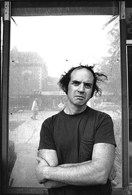 I do know from his many appearances on the David Letterman Show that he was a man with a unique view of the world and one who was never afraid to speak his mind. In the interviews I’ve read with him and all of the soliloquies being lobbed around the web after his passing a few days ago, he seemed to be lauded as a no bullshit visionary who’s honestly made him both famous and got him into trouble in equal portions.
If anything, after hearing of Mr. Pekar’s passing, it’s going to prompt me to do something I should have done while the man was still alive; seek out his comics and read them. And you all should too. If the word I hear about Pekar’s works is true, I’m going to enjoy the hell out of them.
Rest in Peace, Mr. Pekar. Comic book-dom is short one more visionary.
Ambush Bug is Mark L. Miller, original @$$Hole / wordslinger / reviewer / co-editor of AICN Comics for over nine years. Check out his ComicSpace page for his entries in Cream City Comics’ MUSCLES & FIGHTS VOL.3 and MUSCLES & FRIGHTS VOL.1 anthologies. Bug was interviewed here & here (about AICN Comics) and here & here (on his VINCENT PRICE PRESENTS: THE TINGLER comics). Bug’s latest comic is VINCENT PRICE PRESENTS #21: WITCHFINDER GENERAL (available in May’s Previews Order # MAY100828) on sale in July. Fanboy Radio recently interviewed Bug about it here. Bug was also interviewed here & here about his upcoming original vampire miniseries NANNY & HANK (available in June's Previews Order #JUN100824) due out in August.