
| #20 | 9/19/07 | #6 |
Hey everyone, Vroom Socko: here, welcoming you to another edition of AICN Comics. I wanted to remind everyone in the Northwest that this weekend is the Stumptown Comics Fest, the 29th and 30th at the Lloyd Center Doubletree in Portland, Oregon. Yours truly will be in attendance on the 29th, so if you're at the show and see a large man in a battered fedora stalking the floor, come up and say hello. Oh, and people like Mike Allred, Peter Bagge, Phil Foglio, Jamie S. Rich, and Matt Wagner are going to be there too.
Oh, and Bug wanted me to tell you guys that the Fox Atomic’s THE NIGHTMARE FACTORY “Send in Your Nightmares” Contest winners will be announced next week!
Enjoy the reviews!
BUFFY THE VAMPIRE SLAYER: SEASON EIGHT #6
Writer: Brian K. Vaughan Artist: Georges Jeanty Publisher: Dark Horse Comics Reviewer: Squashua
This site, Ain't it Cool News, is one of the many web-shrines to Joss Whedon. To the majority of our reviewers, the man can do no wrong: Buffy, Angel, Firefly, Serenity. It's all good shit and we love him for it. We love him so much that the more observant site visitors may have noticed that reviewers who aren't your regularly scheduled AICN Comics @$$holes have come out of the woodwork to review his BUFFY: SEASON EIGHT issues. And Whedon's book gets the hell praised out of it, which it rightly deserves. The comic is excellent material that brings back many good memories.Or at least, it should.
You see, it seems that, as with a television series, not everything is under the direct control of the creator/director. Mr. Whedon could do nothing about the unjust cancellation of his (and our) beloved Firefly, and I'm sure the executives / brass have had a hand in toning down more than a few plots. Hell, the series was forced to jump networks. And I'm sure the censors may have given him some shit regarding proper wardrobe maintenance during any hot, lesbian Willow scenes. Applying that same sense of logic to the comic medium, there's probably not much Joss could have done about Georges Jeanty's pencils for the Brian K. Vaughan-scripted Faith arc of his BUFFY SEASON EIGHT.
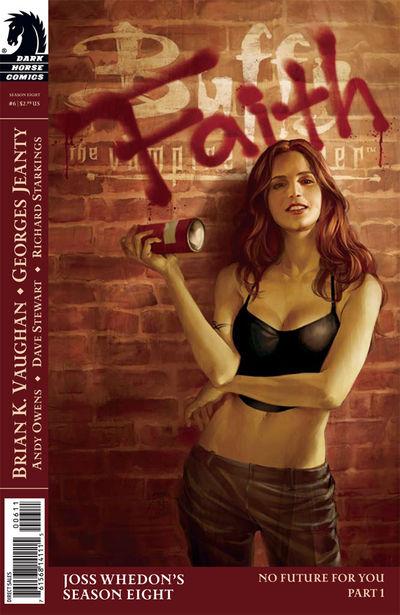
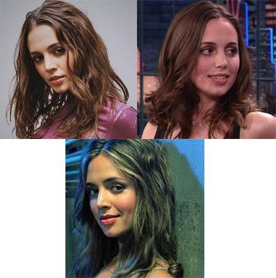
Georges Jeanty. I have nothing against the artist; his backgrounds are pretty and he appears to take notice of the appropriate details. Plus, he draws a mean Giles, but there is something to be said for his interpretation of Faith. Now, before we go on let’s get something straight: Sarah Michelle Gellar portrayed Buffy and Eliza Dushku was Faith, but if you really need to whittle it down, Buffy was a hot cheerleader-y blonde, and Faith was a hot, tomboyish brunette. Yes, the actresses are the models for the characters and when you go to a comic medium, the actor is no longer involved and the art must take on that life for itself, but that doesn't mean you should skew from the basis of the character design. Faith is a hot tomboyish brunette that looks a lot like Eliza Dushku, as depicted on the cover of this issue, thusly:
Faith is NOT Democratic Presidential Candidate and Former First Lady Senator Hillary Rodham Clinton on a bad day.
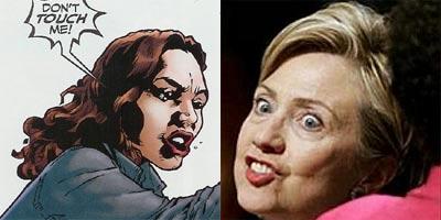
What the fuck was Jeanty thinking? Where in the world could he have possibly come up with this? That's not Faith. That's a hag. And if you aren't yet convinced, here are a few more renderings du jour:
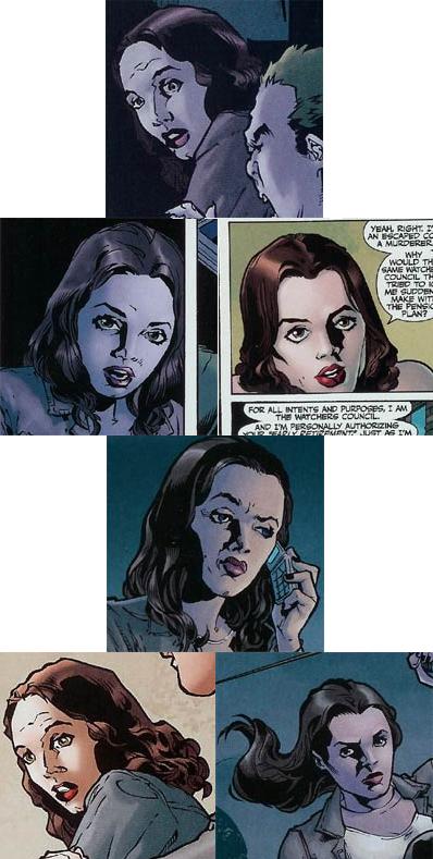
She looks like a retarded Betty Boop, and that's saying something for Betty Boop. Faith's forehead here is tremendous. I know that it was easy to be confused because they were both on the CW, but Alexis Bledel did not play Faith; that chick was Rory Gilmore. Maybe it was a comic book property that threw Jeanty, as she did go brunette for the part, but Kate Bosworth (Lois Lane, Superman Returns) was also not Faith.

Now I'm not saying either of them isn't hot. No way would I kick either of these girls out of bed, but I'll be damned if you shouldn't wear sunglasses when you're out with those noggins at the baseball game; those fuckers'll blind you. They should team up and aim their skulls at the sky for a few days and we might reflect away enough of the sun's rays to curb global warming for a few more years.
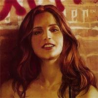
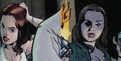
Jeanty blew a good opportunity to impress with this issue. Here's Y: THE LAST MAN, EX MACHINA, and now LOST writer Brian K. Vaughan for a guest spot and Jeanty just pissed away his main character. I understand it's not Joss Whedon and therefore it's obviously not necessary to give 100%, but there is no reason for Faith to have been so freaking fugly. Sure, there are a couple times when she has a nice "good from far, far from good" look, and I will say that a couple panels do the Dushku some justice:
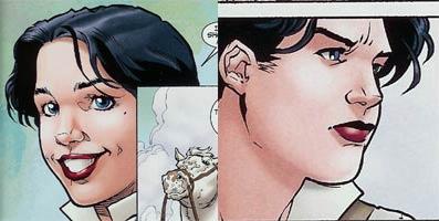
I'm mostly disappointed because I have evidence that Jeanty can draw hot chicks. Look at the new evil rich bitch slayer nemesis that Vaughan introduces in this issue. She's equally cute and yet dashing in a manly sort of way. Like Faith should have been.
And the couple page "What's Buffy Doin'?" section? Well, out of the five panels she shows face in, only one shows her with a blatant case of Down syndrome. On the other hand, Xander looks just fine. Now, you might be thinking I didn't do my research, but I do believe I have discovered what the problem is here. A simple GIS (that's what "the kids" on "the net" are calling a "Google Image Search" these days) against "Eliza Dushku" turned it up. You see, it stems from using a single head shot as source material, making a piss-poor sketch of that shot, then only using the sketch for future reference rather than go online and find additional source material.
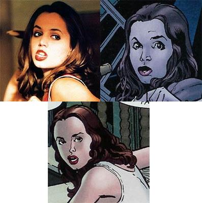
I'm not saying Georges Jeanty needs to go all "Greg Land" on us, but if he's having such a hard time drawing an attractive girl in an attractive fashion, maybe he shouldn't be drawing attractive girls. And that's completely wrong to say because from his website, it's pretty obvious he can and has drawn up more than a few hot babes. Maybe he just doesn't know how to find additional reference material. I understand that if one did GIS "Dushku", the first couple images that show up are from a celebrity porn site, but I'm sure Jeanty is enough of a professional to bite his lower lip long enough to click past that one for more sample headshots. Here are a few I found that could have been used. Maybe next time. Try not to disappoint me again.
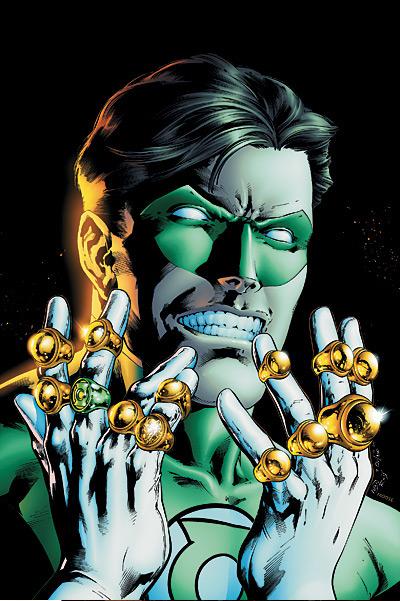
GREEN LANTERN #23
Written by Geoff Johns Art by Ivan Reis and Oclair Albert
TALES OF THE SINESTRO CORPS PRESENTS PARALLAX
Written by Ron Marz Art by Adriana Melo Published by DC Comics Reviewed by Stones Throw
To me, one of the most unpleasant features of today’s mainstream comics is the culture of event storytelling and overblown hype. Last week’s talkbacks focused on the crazy marketing of the 90s, but the way books are sold and advertised at the moment is hardly better. Since Marvel and DC are too lazy to make a serious effort to re-gear their books towards new fanbases, they have to resort to energizing the existing one with crossovers, most of which appear outside of the ongoing books. It seems each new story is the event that’ll change everything for good and every solicitation copy is legally required to contain either “ground-breaking”, “earth-shattering”, “rocketing” or “rocketing to its earth-shattering, ground-breaking conclusion” – no matter how little ground-breaking or, um, rocketing is done inside the pages. With such over-selling it’s little wonder that most events crash like a chunk of Starheart (geddit?) rather than exploding like the press departments would have us believe.Take Bendis’ SECRET INVASION for example. It’s not even coming out until next year, but it’s already being hyped as yet another event to change the Marvel Universe forever. It’s a Skrull story! The second-oldest Marvel plot in existence! If it’s so good, why not do it as an arc in NEW AVENGERS and save us all the extra money and hassle, huh? (Eh, I’m probably just sore that Vroom Socko articulated…loudly…a lot of what I wanted to say in last week’s TALES FROM THE CREVICE.)
With all that in mind, I find it pretty ironic that the two best recent event stories have conversely been the least-hyped – ANNIHILATION at Marvel and SINESTRO CORPS WAR at DC. SINESTRO CORPS in particular is that rare event where the buzz and success has come almost completely from the fans, with minimal attention from the publisher - - who instead chose to focus on AMAZONS ATTACK…jerkstores! To me, it’s been the way events should be handled - - in the main character’s own book, with a few relevant tie-ins (I’ve never really been one for a whole issue based on the bit where Hulk swatted Ghost Rider aside in WORLD WAR HULK), building on stuff that’s been plotted out for a while and lastly, deserving of the title “event”. Fittingly for a force of 7,200 Green Lanterns, this shit is MAJOR. Does anyone actually care about where the hell Ray Palmer actually is? Thought not, but DC’s basing entire miniseries around it. CIVIL WAR was a quarrel between heroes, and should have stayed that way given a writer and editors who actually understood Marvel. Meanwhile, GREEN LANTERN has been knocking my socks off so consistently I’ve had to invest in a yellow pair (geddit?). Johns isn’t afraid to give us the biggest scope possible and he’s proving it right now. The Sinestro Corps aren’t fighting for a planet or galaxy, but the entire multiverse – all 52 Earths and realities. I’ve been particularly impressed with how, even after the wow-factor of the opening one-shot, Johns has managed to consistently raise the stakes in each subsequent issue. #23’s cliffhanger that the Sinestro Corps followed Hal and the Lanterns back to Earth, setting the stage for one hell of a brawl between the JLA, the GL Corps and the Sinestro Corps is a doozy, and the Guardians of the Universe rewriting the Book of Oa to grant the power to kill is suitably chilling. Reis and Oclair are knocking the pages out of orbit too (See? Space theme). It may not be as flashy as Ethan Van Sciver’s work but it’s classic superhero stuff that never slips up in the action sequences.
 Granted, it’s not a perfect read. If anything, given the fast pace Johns may have missed out on some good impending doom stuff, but then it’s nice to see a writer trust his artists to establish atmosphere for once. Hal’s opening narration in last week’s issue, saying how he never found horror movies scary but that he did find MY BEST FRIEND’S WEDDING terrifying, WHILE fighting the Sinestro Corps’ book keeper is pretty unintentionally hilarious. I doubt the story’s the stuff of classics, but it is a monthly comic that’s upstaging practically every event book out there, and with the notion of an “emotional power spectrum” - where the Green Lanterns’ will-powered green rings and the Sinestro Corps fear-powered yellow rings come in - Johns is providing some of the best GL concepts since Alan Moore wrote those back-up “Tales of the Green Lantern Corps” stories in the 80s.
The bad news is that after the first few issues sold out many times over DC have now realized what a good thing they’re sitting on and so we get four one-shots spotlighting the villains, beginning with Parallax, the fear entity that made Hal Jordan go balooey back in the grim ‘n’ gritty 90s and is now in possession of Kyle Rayner (this is a plot point moderately ruined by COUNTDOWN continuity, in which Kyle’s seen alive and well after these events). I can’t say I share fellow @$$es preference for Kyle over Hal (who I’ve always had some sympathy for, if only because of his cool costume and the fact that he’s the superhero I look the most like…not too many brown-, longer-haired heroes), but I do like him as a character. He’s certainly the most relatable Lantern, given that he lacks their usual qualities of stoicism and fearlessness. With regard to this issue, normally I stick well away from any such tie-ins, which are generally and unsurprisingly money-motivated, but you expect me to provide you with intelligent insights, recommendations and witticisms on the week’s most-discussion worthy comics, don’t you? Bastards.
Sadly, I can’t say this issue breaks any rules. While not a bad read, it’s still inevitably, and kind of hilariously given that it’s limited to taking place inside Kyle’s head, unnecessary. It’s kind of nice to see what’s going on in Kyle’s mind, but it was done more quickly and ably in the main title. Hopefully future installments can feel more relevant with villains more in need of the spotlight, but they’ll need a more imaginative formula. GREEN LANTERN at the moment is a shining (I’m making PUNS, see!!) example of how to structure an event, but if you want my advice, let these tie-ins “escape your sight”. (Oh, I give up.)
WORLD WAR HULK #4
Writer: Greg Pak Art: John Romita Jr. (pencils), Klaus Jansen (inks) Publisher: Marvel Comics Reviewer: Ambush Bug
There’s been an awful lot of time spent discussing the phrase “illusion of change” recently. Joey Q dropped this phrase quite a few times during this year’s Chicago WizardWorld while talking about fan reactions to changes to the status quo, specifically in some of the discussions on Spider-Man and whether or not getting married was a mistake storywise for the character. The “illusion of change” means that writers of iconic characters who have been around since before most of us were born and more than likely will be kickin’ it long after we ourselves have kicked the bucket must concentrate on making “stories that matter” (another common catch phrase these days) suggesting changes in the characters without making them so unrecognizable that they lose the iconic elements that make them so recognizable to the masses (comic collecting or otherwise). This, my friends, is a sticky pickle for comic book writers these days and I fear that the Bobby and Cindy see-saw match between “the illusion of change” and “stories that matter” is going to be the death of comics as we know it.Ok, maybe I’m being a bit dramatic. But as long as these two catch-phrases are tossed out there, there’s going to be some debate and that’s what I’m here for.
My problem with the whole “stories that matter” line is that it’s bullshit.
No matter what happens to Spidey, he’s always going to be a hard luck hero full of worry and angst.
No matter what happens to the Hulk, he’ll always be walking down that lonely road with the lonely music playing.
Captain America will always stand for truth, justice, and the American Way…and he’ll be Steve Rogers.
See what I’m getting at?
Lately, especially at Marvel, there have been some big changes. At least, that’s what the powers that be at the House of Ideas would like you to think. In actuality, there has been an awful lot of bullshitting going on (aka that good ol’ “illusion of change”). In recent months, we’ve seen Spidey so mad he could KILL! We went for issues of Spidey hoppin’ around tossing out threats because his dear Aunt May had been hurt culminating in a big battle between Kingpin (the man behind Aunt May’s sudden case of lead poisoning) and Spidey. In that battle, Spidey comes close to killing the Kingpin, but of course, stops short and cops out saying “I could have killed you…remember that.” To me, it was a cop out. Did I want to see Spidey kill? Of course not. Then again, I didn’t want to see him ranting and raving for months, ultimately lying to himself and others saying that he would, only to do what I knew he would do in the end. To me, that’s misleading and painting our hero as anything but.
Enter WORLD WAR HULK. Hulk returns from exile to find the Illuminati who sent him away and he’s so mad he could KILL! He says it clear as day, and numerous times, as this WORLD WAR HULK event has been drawn out way too long with numerous unneeded crossovers. And as recently proven in the last issue of INCREDIBLE HULK, Hulk ain’t gonna make good on the whole killing thing either. Again, I don’t want to see the Hulk kill. But I don’t want to see all of this time dedicated to something that, in the end, he simply will not do.
This, my friends, is “the illusion of change” at its most base and cheapest level. This is the writer telling us there is something that will happen to the character, leading us to believe that this change will happen, beating it over our heads with the notion, only to switch gears completely at the last minute.
Now, maybe...
Just maybe…
I’d buy that type of story once in a year, but this has happened with two of Marvel’s most recognizable characters in the same summer mere months between the two stories. To me, that’s a bit lazy, storytelling-wise.
And what does this say of our heroes? That they can’t go through with what they say they are going to do? That they are blowhards? Cowards who don’t know themselves? Weak characters who aren’t as heroic as we thought they were? Do we really need to tear down these heroes; making them chumps if they don’t back up what they say or, even worse, making them villains if they actually do?
Spidey won’t kill intentionally.
Hulk won’t kill intentionally.
Cap’s not dead or won’t be for long.
All of these are truths.
“The illusions of change” like these are obvious and not really keeping to the concept. “The illusion of change” is something that should apply to the fact that Franklin Richards will probably never grow up. That Aunt May will probably never die. That Peter Parker will never be a millionaire without worry or Bruce Banner will never truly be left alone. “The illusion of change” is a challenge for every comic book writer to make a story seem relevant while not changing the iconic status of the character. Telling us a character is going to do something and then switching gears isn’t really talented storytelling. It’s the cheapest way of creating an illusion. It’s a lie. Building an entire storyline around something that isn’t going to happen is a waste of my time.
WORLD WAR HULK #4 itself? Not a bad issue if you ignore the above mentioned “illusion of change” thing. The Hulk has captured (not killed) the Illuminati and pits them against each other in a gladiatorial arena. The Illuminati are faced with victims from their past in a mock-trial. Rick Jones shows up for, like, the gabillionth time urging the Hulk to ease down. Oh, and the most annoying character of the Marvel U, the appropriately yellow-costumed Sentry, finally makes his move. It’s an action packed issue. All of the WWHULK-proper issues have been. One with a whole lot of fun mayhem, but it just took a whole heck of a time to get to and had a whole lot of unnecessary crossovers driving the point home, through the garage, and into the backyard. All of this hemming and hawing about the Hulk’s bloodlust… The guy could have just said he was going to smash them and he wouldn’t have seemed like such a chump.
I can’t fault the writers at Marvel. “The illusion of change” is a tough thing to do. I just feel that they should have tried a bit harder instead of centering the story on something that so obviously will not happen. Does anyone think that ANY of the Illuminati will die? Anyone?
Maybe I’m wrong. Maybe the Hulk will kill. And then maybe he’ll lose all appeal to me and become less of a misunderstood monster and more of something I just don’t feel like reading about on a monthly basis. Given the way the Spidey story ended, I can only hope that all of those promises of death are hollow, but even if that’s the case, it lessens the character of the Hulk for me as well.
I’m looking forward to seeing how writer Greg Pak paints himself out of this corner. WORLD WAR HULK started out with a big big bang (I loved the first issue), but I feel as if it would have been better suited as a mini-event and not spread out so much over the Marvel U and it definitely would have been better if less import was placed on whether or not the Hulk is a killer and maybe a little more weight to the notion that he might have some heroic qualities.
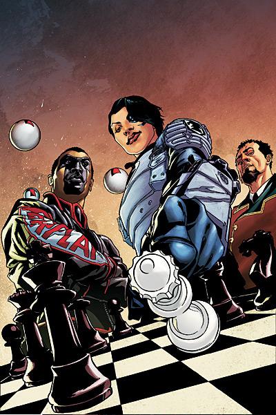
CHECKMATE #18
Writer: Greg Rucka Penciler: Joe Bennett Publisher: DC Comics Reviewed by Humphrey Lee
CHECKMATE to me has been a standing glimmer of hope in the DCU since its inception. What I mean is that despite the fact that its launch was based purely out of the ashes of DC's last major cross-line event, INFINITE CRISIS, the book itself has stood pretty much on its own two feet since. Besides the three issues that recently just crossed over with THE OUTSIDERS, this title has been pretty much left to its own devices to take its cast and setting and to develop the organization inside the book as its own entity. That gives it free reign to borrow whatever storylines from the more sprawling stories going on in the DCU as it pleases, without being forced to be a deliberate part of them complete with "Such and such Presents" banner in attempts at lame sales grabs. Without having to shoehorn unnecessary plots inside the book it's been an extremely entertaining ride, filled with all the twists and turns, intrigue and deception, politics and violence that you'd expect from the man who brought us QUEEN & COUNTRY. And I'm excited to see that this "Fall of the Wall" story arc has taken what this title has established for itself and kicked it all up a notch...As you can imagine by the title of this arc, Amanda Waller has been a bad little girl, but what do you expect from the former head of the SUICIDE SQUAD? The best part of this book for the past year or so has been watching the game of Cat and Mouse developing inside the Checkmate organization between Waller and her very limited amount of allies as she pulls dirty black op after black op and how she wriggles out from underneath full implication in said action. Obviously now it's time for things to come to a head, but there's a lot more going on than just the hammer falling down on the one woman who gives even Batman a run for his money in strategy.
First thing, seeing some of the Secret Six getting pulled into this makes me happy. Obviously something had to give since Deadshot tows the line between both teams, but having one member appear in this book (even if it is just Scandal Savage) gives me hope that more might follow since I'd hate to see that team fall to the wayside simply because Gail Simone isn't writing them at the moment. I also like how August General in Iron from the Great Ten (created by Grant Morrison and introduced in 52) has been inserted into the book, further developing at least a little a contingent of characters that haven't really made any sort of impact anywhere despite being given a solid bit of face time in such a popular title. Given the perils Checkmate has had with the Chinese government in the past it'll be interesting to see where this goes both politically and power wise given that it is a rather large super powered team we're dealing with here.
All this, plus a pretty big doozy of a cameo guest appearance at the end of this issue, and I can only imagine where this arc is going to go. All these threads and there's only been one issue of the arc. Apparently Rucka besides being such a force when it comes to stories of political intrigue is also an expert juggler as well...
Helping with the task of taking such an intricate and tightly paced story is Joe Bennett on art who, quite frankly, is easily one of the most underrated artists working today. Honestly, with the exception of an issue of 52 here and there I don't think I've ever seen him put on a book that sold in the Top 40 and that's a downright shame. His art has one of the most amazing senses of flow I've seen in comic book art. Everything is so perfectly fluid, from the layouts of his panels and the movement in his characters between those little black bars that separate them, he always infuses so much momentum in each page. I hope he becomes a more permanent fixture on this title because if anything could possibly elevate something with such a high bar of quality as CHECKMATE it would be more Bennett art.
This isn't an easy book to hop onto if you're just starting, but a little extracurricular knowledge in the DCU could help since there's a lot of familiar faces here. It's well worth the effort because the subject matter at hand in this book is some of the best use I've ever seen in a comic book title (not that it's a particularly popular theme in most comics). But this book has a lot of what makes a good read: top notch action, distrust and subterfuge, terse and sometimes playful dialogue, and even the occasional hit of romance and camaraderie. If you're feeling a little burnt out by DC's current direction with the already overdrawn COUNTDOWN series and its unending number of tie-in mini's and one shots but you still want to submerse yourself in it in a more indirect manner, CHECKMATE is your refresh button. It's also something to check out if you just plain like good comics... there's always that, right?
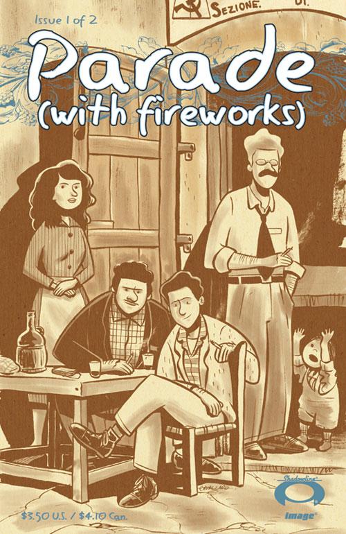
PARADE (WITH FIREWORKS) #1
Story and art by Mike Cavallaro Published by Image, but you can read it here Review (with comments) by Stones Throw
Some rave reviews on the Bendis Board (home of fans looking to worship writers, writers looking to be worshipped, and Gail Simone) led me to this two issue miniseries, a web comic that got picked up by Image but is available FREE online. Not sure how the writer/artist is going to make any money this way, but hey, the story’s just a click away. Instant fame and big two contracts closely await, right?The book’s not a bad one. I’m a big history fan and I consider myself to be pretty knowledgeable, but I admit that Italy post-World War One is a blank spot. This comic dramatizes the mounting tensions between communist and fascist sympathizers pretty ably, though. I liked the way the historical context eases its way into the story but slowly grows into something major. I also admired the subtle, understated tone of the words. Cavallaro displays a lot of storytelling skill with the medium, both in his writing and art.
But…
It has problems. Pretty big ones. The art is simply beautiful, at once detailed and remarkably simple (I especially dug a panel with kids in costume playing outside a church), but there are times when it just seems inappropriate for the story that’s being told. I’m not saying I can’t handle a more cartoony style on a book like this – and generally speaking I loved it - but, especially in the faces, the art at times completely subverts the understated tone established by the writing. There’re a few characters who are evidently supposed to be tough badasses everyone’s nervous around, but the animation-like style just makes them look silly, with angular mustaches and goofy mouths.
The story itself is a slow build to an act of violence, but to me its economy, which would otherwise be admirable, robbed it of a lot of power. The only character we get to know in any substance is the lead, a young war vet who tried to make a new life in America but is back in Italy and feeling pretty unhappy, so the impact when one guy meets an unfortunate end is negligible. I suppose it shows how violence can spring out of nowhere, but if the writer had taken some time to get us better acquainted with who the characters actually are it would have been a lot more powerful. Similarly, the mindset of the lead character and the montage of WWI, as well as the “figurative imagery” of him feeling trapped, would be original and powerful if they hadn’t been done better and earlier in comics by WAR STORIES and MAUS, just to name two examples.
Maybe my criticisms will be addressed in #2, the first few pages of which have already been posted at the link above. For now it’s a cautious recommendation, based on the excellent art and skilful use of history, with a “must try harder” on the character work.
MARVEL COMICS PRESENTS #1
Writers: Marc Guggenheim, Kathryn Immonen, Stuart Moore, Rich Koslowski and Nelson Artists: Dave Wilkins, Stuart Immonen, Clayton Henry, Andrea Di Vito, and Nelson Publisher: Marvel Comics Reviewer: Sleazy G
I’m a longstanding fan of comic book anthologies. I was one of the people who got a kick out of the ACTION COMICS weekly experiment back in the 80’s (a weird-assed SECRET SIX full of the handicapped! DEADMAN! BLACKHAWKS! Hell, I hardly ever even had to read about Superman at all!), and I’ve stuck through them all the way up to the lamented THE ESCAPIST quarterlies. So when I heard Marvel was gonna take another run at the format, I figured it’d be right up my alley.And it is, in many ways. Short little blasts of story that hit the ground running—no time for BS exposition, after all. Get in and get out is the only possible approach when you’ve got eight pages or so to tell your tale. And it definitely works here, don’t get me wrong—just to a lesser degree with some of the stories than others. The only real problem is that with the ongoing stories started in this issue it felt like they were just barely taking off and they were already ending. There’s nothing worse than chugging along, turning the page, wanting to see what’s coming next--only to find an ad followed by the first page of the next arc.
Some stories handle it fairly well, others less so. Case in point: the Patsy Walker/Hellcat story. Stuart and Kathryn Immonen are obviously having a ball with this character. We’ve got pages that reference her early career in the 50’s as a model, we’ve got her swinging through Chinatown dressed in yellow, we’ve got her getting ready for a date, we’ve got her recalling being married to the son of Satan (but not *that* Satan, some other demon who happened to have the same name—kinda like there’s more than one guy named Stanley, I reckon) and so on--a brief, concise reminder of the many phases the character’s gone through without getting too bogged down in the messy details. And then, on the last page or two, BAM! A bunch of different versions of Patsy all at once! What the hey is—
--aaaaand scene.
That’s a pretty deft handling of the page limitations, if you think about it: intro the character, have some action shots swingin’ through town, run through half a dozen outfits, introduce a crazy mystery, and you’re out. The whole thing is eye-catching to boot, and it comes off really well.
The story on Weapon Omega? I gotta be honest: I hated this character without having read a damn thing about him by virtue of his genesis in the “who let the short bus kids actually drive the short bus?!?” train wreck that has been DISASSEMBLEDHOUSE OF M/NEW AVENGERS/OMEGA FLIGHT/ WHATEVERTHEHELL. Really? You absorbed the powers of hundreds of people? And then you came back from the dead cuz you’re Mag—oh, wait, no, you’re the other super-powered being who absorbed the leftovers from Wanda’s spell, right? The one nobody cared about, who showed up and immediately killed off a well-loved gang of quirky characters so you could stand around and mope like a pussy? AWESOME. I’m in.
That being said, I was surprised by what a good job Rich Koslowski did with the story. It’s full of action, it moves well, USAgent gets to act like a dick (yay!) but isn’t at all wrong for doing so (more yay!), and again there’s a mystery (albeit a more gruesome one) introduced. For a story arc I initially didn’t give a shit about, this one also makes decent use of the limitations and managed to pique my interest. One major sticking point, though: Marvel needs to be a helluvalot more careful about ad placement in this book, far more so than with both. The previous story ends, then we get one page of the Omega story featuring a new character. Then we get an ad, followed by the second page—but it doesn’t pick up where the first page left off. It feels completely disjointed, to the point where I actually flipped back to see if my issue was missing a page or something. This kind of thing can really hurt an anthology—when there’s only eight pages, you have to be careful where the breaks are or it really throws off the flow.
As for the Vanguard tale that leads off the book…it doesn’t quite click for me. It looks pretty good, and it does set up a mystery. But to be honest, I don’t even remember who Vanguard is, and I have no idea who the miniature character who only appeared in a few panels unexplained was. I mean, it’s not Ant Man because the costume’s all wrong, but I got nuthin’. And there’s something about a simple black-and-white sketch of a Watcher in such a richly painted and realistic-feeling world that struck me as funny, but I don’t know if it was intentional or not. This one might have potential, but it didn’t click for me as well as the other two ongoing stories. Of course, I’ll still give it a few weeks before I make up my mind, but it doesn’t work as well in anthology format for me.
There are two stories that work far better here, than the rest, though, and they’re both standalones. Since they’re not setting anything up or laying any groundwork, they can just say their piece and then move on. They know exactly what they want to accomplish and do it with an admirable efficiency that is in no way a detriment. They’re both fine examples of the short story form and how it can be put to effective use in comic anthologies.
The Spider-Man tale from Stuart Moore told here is clearly intent on mocking DC’s current restoration of the multiverse, as an alternate-universe Spidey-bot appears, warning of impending doom for thousands of worlds if Peter Parker doesn’t join him. Peter begrudgingly tags along, only to face a room full of one weird variation after another on himself. The character designs and ideas are fun, the looming threats a bit ridiculous, and the idiotic cross-talk between the different Spider-men and –women and –lizards and –umbrella spiders and what not is entertaining. Just when it’s getting all out of hand, and you’re thinking “but the Marvel U doesn’t work like this!”, it all wraps up. Or does it? Nah, it really does, and it’s a lot of fun without taking itself too seriously. That Stuart Moore could turn in both the kind of work he did here and in the recent PUNISHER CHRISTMAS SPECIAL shows a depth and range that many of today’s writers could learn from.
Closing the book out we get a tale of the Thing from Nelson told from the perspective of his girlfriend Alicia Masters. I don’t read the FF right now, so I don’t know where their relationship stands, but this one clearly fits into the “classic” era when they were still dating. It’s pretty close to perfect, too. Alicia talks about the way others see Ben and how differently she feels about him than anybody else, and she shows how well she understands Ben’s feelings. It’s a short but sweet story, and while it might seem cloying when spread over a full 22 pages it’s really quite effective at this length. It’s a perfect example of what can be accomplished when a writer stays focused on their message, and it’s the kind of FF story we don’t get enough of any more.
So the final vote? Buy it. There’s two really solid standalones and a few ongoings that show promise. It’s one of the better mainstream Marvel U first issues I’ve read in a while, it features familiar and less known characters alike, and it’s pulling from quite the talent pool. Time will tell for sure, but so far MARVEL COMICS PRESENTS is off to a strong start.
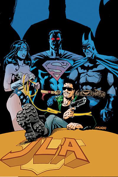
JLA / HITMAN #1
Writer: Garth Ennis Artist: John McCrea Publisher: DC Comics Reviewer: Squashua
Buy this book right now if you haven't already, as it is the comic book equivalent of deep-fried, chocolate-covered gold.If you have never heard about or read HITMAN, you've have missed out on the greatest of DC's unknown series of the late 1990's; a book better than CHASE, AZTEK, RESURRECTION MAN and MAJOR BUMMER combined (though the RESURRECTION MAN / HITMAN crossover was totally tits). Hitman was the only significant "hero" to make his way out of the god-awful "Bloodlines" event, a crossover only slightly less significant than "Millenium" and just a tad more memorable than "Genesis" (no, not the one with Phil Collins).
"Hitman", which is not really his super-hero name, but his profession, is Tommy Monaghan, a Gotham City criminal who debuted in an issue of THE DEMON and received x-ray vision and mild telepathy from the bite of an alien. In his 60 issue series, which has been incompletely collected into trade paperbacks (only up to #28 and even then they're impossible to find), Garth Ennis took all the violence and comedy that he couldn't fit into PREACHER, which he was also doing at the time, and made one of the most memorable books to hit the shelves. Tommy had run-ins with every level of the super-hero community, from the aforementioned Etrigan the Demon and Resurrection Man to the top tier of the JLA itself: Batman, Superman and...Green Lantern Kyle Rayner.
JLA / HITMAN is told as a story related from Clark Kent to a researcher investigating the sordid history of Tommy Monaghan, the actual tale taking place after Tommy's Eisner Award-winning encounter with Superman in issue #34 but probably immediately before his infamous cameo during the JLA tryouts in JLA #5 and definitely before the body count started to rise in his own title. Bloodlines aliens are detected on a space shuttle, and as the "least lame" Bloodline survivor, Tommy is brought to the Watchtower in order to analyze his blood to see how best to approach the shuttle crew. But before Tommy can be sent back home after his donation to the cause, shit goes down and everybody loses his or her super-powers. Ennis is known to be predisposed against super-abilities, admitting after the fact to forgetting that Tommy even had super-powers in his own series, so he's already set the scene up perfectly for his style of madness. Here's betting the next issue is going to involve a lot of gunplay.
What I really love in this book is the emphasis on characterization for the era this story was set, especially the animosity shown by Wally West towards newcomer Kyle Rayner. Among the blatant guffaws, there are a few sly jokes, such as the scene with Wonder Woman serving everyone coffee (though she acts 100% the warrior woman later in the issue), or Tommy confirming he's lost his x-ray vision while offhandedly staring at her ass. This has been, by far, my favorite read in the last few months, and it's a shame that Ennis despises super-powers so much, because he seems to know just how to make the JLA tick. I know that I should probably mention the art, but it's John McCrea, who was the primary artist for the original series and therefore this simply makes this missing and essential Hitman issue a true return to form.
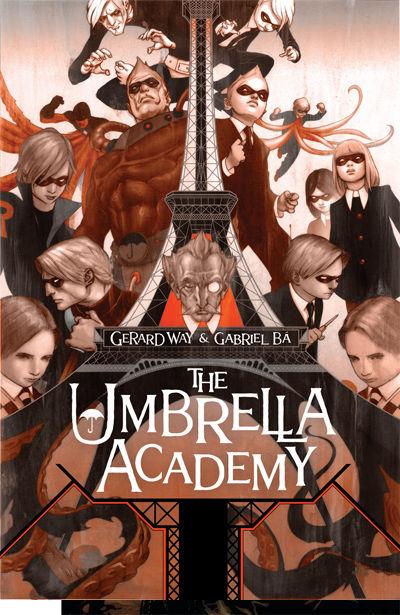
THE UMBRELLA ACADEMY: APOCALYPSE SUITE #1
Writer: Gerard Way Art: Gabriel Ba Publisher: Dark Horse Comics Reviewer: Ambush Bug
I don’t think I am in the minority when I say that I scoffed a bit when I heard about this comic. I’m not what you would call a real My Chemical Romance fan and I am not a fan of vanity projects altogether where a “name” in one arena uses his name recognition and usually that alone in order to “break into” another area of entertainment. I browsed through THE UMBRELLA ACADEMY sampler that was released last Free Comic Book Day, but for the life of me, I don’t remember it leaving an impression. In retrospect, I think I only skimmed the issue since I didn’t think I would be checking out the miniseries when it came out anyway.All I have to say is that after reading the first issue of this book, I will most definitely be digging out that sampler issue for a second read.
Well, ok, I’ll say a little more.
THE UMBRELLA ACADEMY #1 knocked my socks off. I can’t really recall the last time I picked up a book and was so unbelievably surprised at how good it actually was, but it happened here. Maybe it was my initial hesitation to give this book a chance given that the writer, Gerard Way, is the idol of emo kids everywhere. Yeah, actually that’s probably it. But coming from this jaded comic fan, THE UMBRELLA ACADEMY is one of those comics that exemplifies cool in every panel.
There’s been a sort of movement of late with Warren Ellis’ NEXTWAVE and Jeff Parker’s AGENTS OF A.T.L.A.S. and I’ll even throw BPRD, HELLBOY, and THE GOON into the mix where a group of characters or an individual is thrown into one completely batshit crazy situation after another. It’s a sort of gonzo-adventurism that is a nice vaccine to the tried and true, ho-hum-drum decompressed storytelling trend that has been dying out recently (thank god). Instead of dissecting every single movement and nuance of a character in a story that takes four issues to walk across a room, the new trend seems to be throwing the heroes into one crazy situation after another. This “throw some batshit against the wall and see what sticks” mentality is refreshing. And it’s ever present in this first issue of THE UMBRELLA ACADEMY.
Issue one is filled from cover to cover with interesting twists and ideas. A while back, forty-three children were born to mothers who showed no signs of pregnancy. Entrepreneur, scientist, and space alien Sir Reginald Hargreeves AKA The Monocle adopted as many of the children as he could, forming the Umbrella Academy in order “to save the world, of course.” Since then, The Monocle has been training his seven children, who he affectionately named numbers 00.01 through 00.07 for threats to earth such as “The Day the Eiffel Tower Went Berserk” which is the title of this issue. After a fun battle with the Eiffel Tower, we flash forward twenty years later to see the grown up kids learning that their mentor has died and the group, which seems to have disbanded, is forced to reform for the funeral. We follow one of the children, dubbed Space Boy, who lives on the moon and astronauts around in a suit that makes him look like a gorilla.
And that’s just the tip of the kookified iceberg. What makes this all the more special is that the story is told in a sincere manner. Whereas NEXTWAVE was often very acidic and AGENTS OF A.T.L.A.S. had a tongue firmly in cheek mostly of the time, THE UMBRELLA ACADEMY has a sincerity and sweetness to it. Maybe it’s because the team is made up of kids or that some of the kids were somewhat mistreated because of their power or lack there of, but there is a melancholy and sometimes gloomy charm, not unlike stories by Edward Gorey, that permeate throughout.
That charm is intensified by the expressive and vivid artwork by Gabriel Ba. Ba’s work can be compared to Guy Davis and Mike Mignola, but there’s a bit more of a fluidity to his shapes and forms. The characters are definitely cute, but have an air of sadness like the aforementioned Gorey artwork. The simple palette of colorist Dave Stewart adds to the simplistic, yet iconic tone of the art. Ba also does a bang up job of grounding the crazy stuff, giving enough attention to details of the weird such as the gorilla spacesuit and the animated Eiffel Tower to make them seem realistic within the panel.
This book was a complete surprise. If you like the band My Chemical Romance, you’ll be happy to know that Gerard Way seems to be talented in the comics-writing arena as well. Don’t like My Chemical Romance? That’s ok. This book has nothing to do with it. Me, I was taken aback at how good this book was. It was a treat to read. I’ll be sure to track down that Free Comic Book Day book for a re-read and I’ll be eagerly anticipating the rest of this six-part miniseries as well.

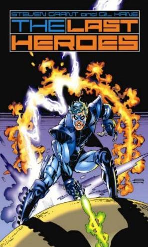
THE LAST HEROES HC
Written by Steven Grant Art by Gil Kane Published by iBooks Reviewed by Stones Throw
While acquainting myself with @$$Hole HQ (nice and spacious, has a kind of odd smell) I wandered past the newb-restricted areas and into what I’ll call “the Secret Depths of the @$$Holes”. Probe a few things (ahem) and whadda ya know, thru the time portal comes this message from a guy identifying himself as “the Last @$$Hole”.Greetings, Ancient One. Let me consult my memory implants. You are one of the late 00s inductees...Rock-me Amodeo?
Um…no. Stones Throw.
Forgive me. I can see you’re much better-looking than he. These are dark days for the universe. The Book of @$$ prophesizes that Headgeek the Planet-Sized One is soon to stir from his slumber of eons, creating a gravitational shift that will shortly destroy Earth-AICN. While preparing for imminent non-existence, I took time to scan the Glorious Archives and noticed an oversight that has not been corrected. THE LAST HEROES, a hand-held web comic by Gil Kane and Steven Grant never received a review.
Hm. Tell me more.
Certainly, Your Exaltedness. In the latter days of the 20th century, tactile comic books experienced an increase in popularity as a result of earlier books being sold for small amounts of money. Into this period of holofoil covers and free trading cards came EDGE from Malibu Comics, intended by creators Steven Grant and Gil Kane to be 3 four-issue miniseries presenting the last word on superheroes. Unfortunately, before vol. 1 #4 could be released, the market had crashed, and the legendary Gil Kane eventually died of cancer. Custodian of the forgotten comics iBooks published a hardcover collection of the first four issues of EDGE in 2004, under the name THE LAST HEROES, presumably so customers would mistake it for WATCHMEN. In the foreword, writer Steven Grant expresses his desire to progress with Albert Moore’s idea of realistic superheroes. Fortunately, these comics are the type that only one of 11 Earth-Years would find realistic. In truthfulness, they resemble the brain-forms of one of such age. The SQUADRON SUPREME-like heroes, unfortunately titled the Ultimates (though they predate the series of the same title from Mackerel comics, as well as similar concepts such as celebrity superheroes that influence fashion) are a result of genetic engineering and exist in a world without supervillains.
What is impressive about the book is that there are no clear heroes or villains, and not simply in the heroes-have-ambiguous-qualities tradition. The professor simply wishes to push human evolution forward and eliminate out-dated phenomena such as war and disease, but has a tendency to speak like a mad scientist and wear bow ties. Edge is fighting for protection of liberties and humanity, but kills an Ultimate in the primary sequence. The Ultimates do traditional superhero stuff but don’t till fields.
The book is set apart by the paper-scratchings of Gil Kane, without which it is unlikely it would be fourteen triloquads as readable. Kane, I believe, is one of the optimum artists when it comes to action, which is gloriously proven in the lengthy, spectacular action sequences towards the end. He also excels at creating a unique, vibrant atmosphere on each page that plants the reader in the events. The book is an odd hybrid of darker 90s deconstruction and Bronze Age sensibilities, but worth pointing out to your primitive readers.
He then mumbled something about his son and a rocket ship and phased me the book. Just as I was settling down to pull some thoughts out of my ass, the other @$$Holes caught up with me and escorted me to my classes in Talkbackers & Trolls: Retorts & Witticisms and Not Imitating Other Reviewers. Suffice it to say, although it’s definitely not for everyone I enjoyed the book!
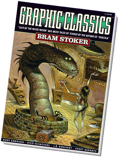
GRAPHIC CLASSICS VOLUME SEVEN: BRAM STOKER (Second Edition)
Writer: Bram Stoker Publisher: Eureka Productions Website: Graphic Classics Reviewer: Squashua
Welcome to another in the seemingly perpetual series of Squashua reviewing GRAPHIC CLASSICS trades. And yet again, I'm introduced to an author I have both heard about and never read: Bram Stoker. It says here in the bibliography that Mr. Stoker (his porno name) held degrees in both law and mathematics, but spent most of his time as the manager of a theatre in London. Want more, go check out his wikipedia entry, this isn't a history lesson.I had no idea the guy did anything beyond "Dracula". I guess it's a good example of him getting pigeon-holed: when one's work gets so famous it out-shadows everything else. Per my previous GRAPHIC CLASSICS reviews, I'll take each story as they hit. This is the second edition, touting 48 new pages; as I don't have the first edition, early adopters have to figure out what's missing on their own.
“Interior Illustrations”
Artists: Mitch O'Connell, Michael Manning, Maxon Crumb, Spain Rodriguez There is some spectacular interior artistry sprinkled throughout these pages; from the incredibly hot vampire sisters from Dracula about to do their thing, to some sort of Incan / Aztec historical bloodsucking, and the depiction of a grim graveyard staking, the arbitrary filler art in this book is much better than it should be, and literally begs to be appreciated. And I don't say that sort of thing lightly.
”Dracula” Adapter: Rich Rainey Artist: Joe Ollmann Raise your hand if you read LEAGUE OF EXTRAORDINARY GENTLEMEN, but pretended you knew who leads were as though you had actually read the source material. Yeah, I had no idea either. Only really pretentious people that you wanted to beat with baseball bats knew that information. Well, it turns out that this is Mina Harker's story. You know, the one who was a vampire. Dracula comes across much better here than it did in that movie with Neo, the kleptomaniac from "Heathers" and the old guy who wore two giant white cocks on his head. Man, I hope the publisher uses that line to advertise his book. The art is slightly animated, larger heads on thin bodies, not quite Bratz-esque in depiction, but this works fine for the tale. Dracula is truly the best story in this volume, and at a whopping 47 pages, takes up the most real estate, which it rightfully deserves.
”The Vampire Hunter's Guide” Adapter: Tom Pomplun Artist: Hunt Emerson This is some sort of outtake from Van Helsing's guide to vampires, with each of the ten strengths and weaknesses accompanied by a silly illustration that is not to the tone of the text, which is written in a form of olde English. These four pages are not to my liking and unfortunately come off as filler.
”The Judge's House” Adapter / Artist: Gerry Alanguilan As a child, I used to own a record of Vincent Price doing a radio show iteration of this tale, a classic ghost story about staying alone overnight in a house where you are obviously not wanted. The faces rendered here are lifelike and chilling to say the least.
”The Bridal of Death” Adapter / Artist: J. B. Bonivert This. This is my favorite story, and it's probably because it feels very Lovecraftian to me (sorry kids, but I'm going there again), with an ancient Egyptian mummy and ritual, some sort of ghost and possession, and a possible instance and discussion of reincarnation. It gives off a very "Strange Case of Charles Dexter Ward" vibe. The art comes off as a sloppy iteration of Mike Mignola, which actually needs to be taken as a huge compliment because I really felt that it was appropriate for the story at hand.
”Torture Tower” Adapter / Artist: Onsmith Jeremi Wow. Even back in the late 1800's, Bram Stoker wrote a story about a classic (at least, to us now) "hyuk-hyuk" inconsiderate North American tourist in Europe. I had been under the impression that our complete disregard for any form of respect of other cultures had been something born of the 1950's Disney culture, onward. Wow. My eyes have been opened. The story is passable, with the antagonist getting his just desserts in a particularly gruesome Bram Stoker-ian fashion. The artwork is classic cartoonish Onsmith Jeremi style. A little research turned up the original title for this story as "The Squaw."
”The Wondrous Child” Artist: Evert Geradts One of these things is not like the others... and "The Wondrous Child" is it. The story of two young siblings who speculate about their new baby brother, then fall asleep in a cave (under the auspices of a possibly opium-induced haze) and share a dream sequence involving their interactions with a magical baby who acts like the second coming. It is presented in a story (non-comic) format with accompanying illustrations in a beautiful style I can only refer to as "island art". I've seen the style before, and have located a copy of an image from the story on the artist's website. The book is black and white, but based on the website, the art was probably originally done in color, which is a shame - contrary to my prior belief, black and white evidently does have its price.
”Lair of the White Worm” Adapter: Tom Pomplun Artist: Rico Schacherl This is a somewhat convoluted supernatural story about an Australian man who moves to Europe, finds romance, and crosses a very evil woman. The tale sort of meanders at times and tends to hand out information rather than reward it, but that's the fault of Stoker and not Pomplun. Graphically, everything is nearly perfect except for the two brunette female leads, both of whom are almost so similar in style that one is easily mistaken for the other. In the end, the story is entertaining enough that it makes up for its minor faults. Plus, there's a panel with a hot naked chick on a sofa (her naughty bits are appropriately covered).
GRAPHIC CLASSICS BRAM STOKER is very worth getting for anyone interested in a few good horror stories, and it's quite appropriate as a gift for a teenager, especially considering that Halloween is coming up. The book is not romantic like GOTHIC CLASSICS, but more in line with what I imagined GOTHIC CLASSICS would be. At twelve bucks for 144 b/w pages, it's a bargain.
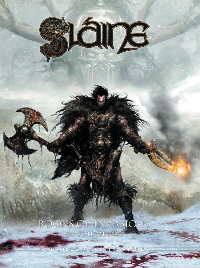
SLAINE: BOOK OF INVASIONS VOL. 3 2000AD
My pick for last year’s best artist for our annual @$$ie Awards, Clint Langley, is back with his battle-axe swinging berserker, Slaine. This is quite simply the best of the best when it comes to fantastic imagery and beautiful panels and images. Langley’s work can be seen on the covers of the latest ANNIHILATION: CONQUEST – WRAITH miniseries, but those covers pale in comparison to the level of eye-poppingly good images that decorate each and every panel of this book. The story itself by Pat Mills is the strongest I have read so far in the BOOK OF INVASIONS series. It’s a tightly woven chase as Slaine pursues Odacon, the leader of the parasitic demons which possess humans and rest like humps on the backs of their victims. These creatures are highly detailed and are the stuff that would give H.R. Geiger nightmares. All muscles and joints and fleshy flaps, these demons have taken over much of Slaine’s protected lands. Through this volume, Slaine lays waste to this infestation of demons, culminating with a brutal horse chase on the very edge of the ocean. The second story of this volume is a twisted tale that could have sprouted from the head of Tim Burton, then surprisingly turns into a mystery tale featuring Slaine and his son. Fun stuff; a barbarian mystery. Both stories are done by Mills and Langley. I shit you not, Langley’s manipulation of imagery has to be seen to be believed. Many of the panels look like movie stills from films with the biggest of budgets and the most gruesome effects. Horrific and beautiful at the same time, it’s a downright crime that Langley’s art has not been witnessed by more people. I can’t wait to see what Langley has planned in the future, but in the meantime, pick up the latest volume of SLAINE for the eye-goodness of it all. – Ambush Bug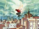
GROOVE JUNCTION #1 Astrobrain Comics
This book seems to have ambitious plans, but what really turned me on to this one was the coinciding storylines of how two heroes bump into each other. Seeing these two characters on this collision course was a nice way to tell a solid story. There’s some very cool psuedo-science going on about a city powered by Ambient Energy. The science of it all is explained just enough, yet left mysterious enough to pique my interest. This book left me asking questions; the right questions, mind you. The kind of questions that make me want to seek out issue two to see how all of these threads come together. An interesting and promising first issue. – Ambush Bug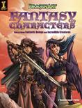
DRAGONART FANTASY CHARACTERS: HOW TO DRAW FANTASTIC BEINGS & INCREDIBLE CREATURES
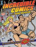
INCREDIBLE ARTWORK WITH TOM NGUYEN: THE ULTIMATE GUIDE TO CREATING KICK ASS COMIC ART
Impact Books
These two art books will help any fledgling artist learn the tricks of the trade. Both books go over the fundamentals all good comic book artists should know, but then the two books diverge into more specified topics.Despite the fact that the picture of Tom Nguyen on the intro page of the book is pretty fricking (and probably unintentionally) hilarious with Tom posing in a tank top attempting to look like a bad@$$ in front of three scantily clad female models, after you finish tittering at that pic, you are in store for a pretty in-depth tutorial of what to do and not to do while drawing comic book characters. Most of the book focuses on the human form, with Tom going into more detail about placement of panel and comp