| #16 | 8/15/07 | #6 |
Hey folks, Ambush Bug here, still sifting through the submissions for our HARBINGER: THE BEGINNING contest. We promise to announce the winners in next week’s column and apologize for the delay. In the meantime, enjoy some reviews.
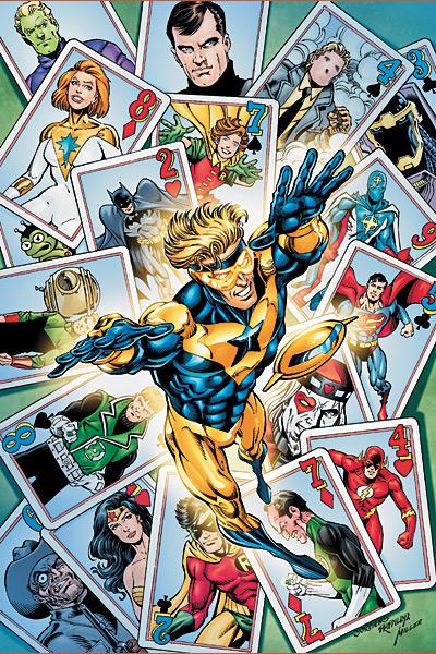
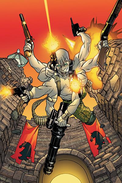
BOOSTER GOLD #1
Writers: Geoff Johns & Jeff Katz Art: Dan Jurgens (layoouts) & Norm Rapmund (finishes) Publisher: DC Comics Reviewer: Ambush Bug
First and foremost, although solicited as such, I refuse to call this book THE ALL-NEW BOOSTER GOLD, simply because although it may be a new series, this is the same old Booster Gold that some of us know and love and some of us love to hate.And thank god for that.
Now that I got that out of the way, I have to get something else off my chest.
I hate time travel stories. Most of the time they are convoluted and all of the time, to quoth the bard, “They make my head hurt, Stretcho.” All of the talk about the fabric of reality and rifts in time and the rules of non-interference and the whole “step on a prehistoric bug and then Hitler wins the war” stuff just leaves me with a look on my face that alternates between befuddlement and apathy. If you’ve been reading comics for a while, you’ve experienced stories about time travel before. In 52, I have to admit, Booster Gold’s arc entertained me, but when I saw that he was going to have his own series after the end of that maxiseries, I wasn’t very interested in picking it up because it looked as if time travel was going to be an integral part of the series.
I was (and still am) a fan of Giffen & DeMatteis’ JLI (there’s a shocker, did my name give it away?) and Booster was one half of one of the best pairings in comics. So I was torn about this book, but as usual, my love for the character won and I bought the book despite the time-altering themes.
I’m glad I took the chance. BOOSTER GOLD #1 is simply overflowing with story. A good story at that. Booster is one very fleshed out character with quite the history in the DCU. Johns & Katz offers a few nice pages of recap to help the reader familiarize themselves with the character (as every first issue should), but he doesn’t stop there. Only about a page or two and the audience is caught up so that Johns & Katz can get on with their story. It’s a story filled with information and adventure. There are a lot of mysteries and thrills. And quite a lot of time dedicated to character development with some panels left for some “aww, cool!” moments as well.
Yet this is a time-travel story and at the beginning, I clearly stated that I hated time-travel stories. So what makes this one so cool to make me change my mind?
I think I liked this book because Booster is a likable guy. He’s the anchor that kept me interested throughout. Johns and Katz have set up quite a moral dilemma for Booster in this issue. The character has a complete arc all in one issue where he is faced with a decision, is forced to make another one, and owns up to responsibility (with a few terms of his own, mind you). It was nice to see Booster in the spotlight lit by writers who understand (and actually seem to like) the character.
Also, Booster is a likable hero. That’s not too common these days, folks. I’m sick of seeing dark and brooding. I’m sick of decompression or one-note squeaky cleaners. How about a real guy who makes mistakes, but at the end of the day, he wants what’s best for himself and others? That’s what Booster is and it makes him stand out from the pack, in my book.
Dan Jurgens’ artwork has always been something I’ve enjoyed. I’m not a huge fan of his writing, but the guy definitely is talented in the art department. He’s got a clean and classic style; one that understands the shift from one panel to the next and communicates the message clearly. In stories with "out there themes" such as time travel, you need some grounding in order to understand what’s going on. An artist with a looser style would destroy that anchor.
So despite the fact that I like my comics more on the realistic, real life action oriented side, I dug this book for it’s likable and three-dimensional hero and it’s solid art foundation. Johns has produced yet another great monthly read with a hook that really makes you root for the protagonist. With this book, the possibilities are endless and for the first time, I am enjoying a time travel book.
Who’da thunk it?
CAPTAIN AMERICA #29
Writer: Ed Brubaker Artists: Steve Epting and Michael Perkins
CAPTAIN AMERICA: WAR AND REMEMBRANCE TPB
Writer: Roger Stern Artists: John Byrne and Josef Rubinstein Publisher: Marvel Flag-waving: stones_throw
So there I was sitting at my computer. I'd only just hit "send" on my review of DAREDEVIL #99 when Ambush Bug teleports in. Apparently you gotta register if you want to talk trash on the internets these days. So after being forced into the "Junior @$$holes Initiative" (and man, these tights sure do chafe) I was given my mission statement: a deadline to prove myself and meet the @$$hole standards. If I don't meet requirements I'm stripped of all independent thought and made to read every press release on Newsarama. Shudder. So welcome, tired and frustrated talkbacker, to the first installment of STONES THROW'S AUDITION PROCESS SPECTACULAR!First up is CAPTAIN AMERICA #29. I was digging CAPTAIN AMERICA. Those first 14 issues probably number alongside some of the all time great runs on a Marvel character. Then they went and killed the guy (always a pretty dumb move no matter how well it's handled, which in the case of #25 was very well indeed) and now Cap is kind of the Bucky angst book. With some moping from Sharon Carter. And Tony Stark sitting at his desk.
Okay, I'm being a little harsh. In the hands of Ed Brubaker, Steve Epting and Michael Perkins the title's still one of the best-written and drawn Marvel books each month but damned if after the breakneck pace of the first twenty or so issues and the curveball of Cap's death the last few haven't been just a little dull. I can't even fault slow pacing: the problem is we've gotten a whole lot of build up but pretty much zero pay-off, especially when you consider we've been following this plot since #1. The Red Skull's obviously planning something cool but it's been left to the supporting characters to wander around on the outskirts of the plot and involve themselves now Steve Rogers is gone. It's all felt just a tad inconsequential and I can't shake the feeling that if the ensemble was cut down to a more manageable size with more of a plot through-line and less of the quick cuts style the recent developments could've happened in about half the space. Do we really need four pages just to tell us the Black Widow is also following Bucky? (Wait, what the hell am I thinking? They've got to stretch it out so Steve Rogers' return coincides with the movie.)
Anyway, issue 29 is pretty much more of the same, although it looks like we're finally in store for some pay-off next issue as the Winter Soldier comes face-to-face with the Red Skull. My guess is this will all read great in trade form but since Cap's coming out in single issues Bru's gotta start giving us some meat in between all the build-up. Oh, and I'd kinda like to see Captain America punch the Red Skull while I'm still young. Doesn't have to be much. I'll settle for a slap. You'll get on that? Thanks.
 So while I wait for the monthly CAPTAIN AMERICA to hurry the hell up and get to the devil shit I've been scratching my Cap urge with the nine-issue stint on the title by Roger Stern and John Byrne, handily collected in trade paperback form by Marvel (I know, it came out a few weeks ago but give me a break, I just started here). Not being lucky enough to have read a lot of these characters' classic stories first-hand I appreciate Marvel's efforts to release them in trade paperback and ESSENTIAL format. Sure, a lot of them seem opportunistically scheduled around major events and movie releases but a little's better than nothing. As for the comics themselves, what can I say? It's beautiful. Byrne's art kills -- never too flashy, just selling the moment and telling the story flawlessly. Stern uses tools like thought balloons and narrator's captions to great effect in quick and confident service of the story. These are tales that could only be told in comic book form. If I have a complaint it's that Cap as a struggling artist is something of a stretch - he doesn't get an army pension?
The issue that most people know this run for is CAPTAIN AMERICA #250, in which Cap is nominated by a third party as Presidential candidate. (There's an interesting letter page column by Stern reprinted in which he explains how the issue was borne from an idea to have Cap actually win the Presidency, EX MACHINA-style.) Sure enough, it's a pitch-perfect treatise on Captain America, his character and his relevance to America - the ideal, the dream and the reality. (And I got some wry enjoyment out of Iron Man's advice to Cap to stay out of politics.) Of course, this being a different time it's wrapped up in seventeen pages and followed by a kick-ass two-parter in which Cap and Batroc the Leaper battle an insane Mr. Hyde about to crash a natural gas tanker into the New York docks. Aahhhh...
ARMY@LOVE #6
Writer: Rick Vietch Artist: Rick Vietch Inker: Gary Erskine Publisher: DC Vertigo Reviewer: Rock-Me Amodeo
I read this book when it debuted, a few months ago, because someone had done their pre-release homework and managed to get a few reviews from some major publications. I respect that effort. Not every review was glowing, but most were willing to give it the benefit of the doubt since the “satire” was so over the top.Well, we’re 6 months in, and if this book had any direction at all, it’s gone like Paco Lipsync (the fictional group responsible for the obnoxiously ubiquitous “Little Speedboat” ditty, killed last issue.) As I try to make sense of this story, I feel like Josh in the boardroom scene in “Big,” looking at the building that turns into a robot.
“I don’t get it.”
“Well, Rock-me, if you had read your industry breakdown, you would see that our success in so-called ‘mature’ books that have gratuitous nudity, blow things up and are labeled high-brow satire have climbed from 27 percent to 45 percent in the last 2 years. There, that might help.”
“Oh. I still don’t get it.”
“What don’t you get, Rock-me?”
“Well, it satirizes a war that we’re still in. It features a ton of unlikable characters with whom I cannot, nor would I want to, empathize. And since all the characters are generally deplorable, I really can’t even keep track of them. But worst of all, it just blurs from one boring subplot to another, and no one really does anything. What’s so fun about that? That’s not any fun!”
I get the fact that people will satirize things in order to affect change. I have no problem with people mocking the military – I’m ex-Army, and people have the freedom to form their own opinions, and this is a GOOD thing. Some of the concepts, like the Momo club and all that, are kinda clever. I guess.
But in this issue, Switzer prances naked for no particular reason before reconciling with her husband. Allie is being drop shipped into Abfragistan, or whatever they’re calling it. Healey needs his phone back and gets hit in the head by Jenan’s father. Needhawk and Blanche are going to take the fall for Loman’s fire. Pomona gets a manservant who happens to be studying for some kind of priesthood, so naturally she takes him to the lingerie and bondage shop. Royden and Flabbergast talk about Switzer for a few pages. Switzer and Loman reconcile in the bedroom for a few more pages, like we care. And Allie meets Attila the Bigamist…the sad thing is, it’s not even as interesting as this paragraph sounds.
The artwork is good, and most of the men and women are recognizable without having their names flashed in the same panel. There’s just so dang many of them, and I haven’t even named ALL the characters. And I have no idea where this book is going, except out of its way to flash some T&A, make almost every person in it as reprehensible as possible and sell some more issues to all the people who feel that boobs + profanity + anti-war sentiment = intellectual.
But it’s really the emperor’s new satire, and it feels very forced. Is there a big overreaching statement in here? I don’t get it. Is there an overreaching plot? I don’t see it. Is there any particular character with whom I should bond? I don’t want it.
Maybe I’m just slow. Maybe what this book needs is a big prehistoric insect that could pick up a car and crush it in its claws. But I just don’t see anything going on with this title. I mean, it’s duller than AQUAMAN, for crying out loud. Unless Veitch finds something of merit to say, I don’t see this book lasting more than another 6 or 10 issues, tops.
TERROR INC. #1 (of 5)
Writer: David Lapham Artist: Patrick Zircher Publisher: Marvel MAX Reviewer: Sleazy G
I can’t claim any prior knowledge of the protagonist of TERROR INC. as I didn’t buy his brief series a decade and a half ago. I didn’t know anything about the character other than that he had to take parts off of dead people and attach them to his body to avoid rotting apart. Could be fun, could be creepy, could suck—you never can tell. Then I saw some of the preview art of him as a biker looking dude willing to kill people with whatever was in arm’s reach, and I thought, well, maybe this’ll be a nice little action/horror property, so why not give it a shot? A sort of Punisher crossed with Hellstorm thing could be kinda cool. And you know, it kinda is.I don’t know how much of Terror’s backstory here is the same as the original, so I don’t know who to attribute it to, but it’s pretty kickass. We’ve seen similar ideas before in places like “Highlander”, but still—a guy who’s been around since the Roman Empire who’s done nothing but kill people for a couple thousand years definitely qualifies as a semifinalist in the Asskicker Regionals. Throw in a demonic curse, a need to replenish your body parts with those from the freshly dead, an eternal bond to a loved one, and a hard-drinkin’ wiseassed personality and you’ve got all the ingredients for a good time.. And we get one here, from the classic origin flashbacks to modern-day government agency double-crosses to a hot married sidekick/caretaker (what’s her deal, anyway?) to Terror ending up in what could certainly be considered dire straits. There’s plenty going on here, and the issue moves along at a good pace. It manages not to get too bogged down in the early exposition, and lots of stuff gets blown to hell by the end of the book.
I have to say this is one of the better mainstream titles Lapham has done recently. I was a little underwhelmed by his work on THE SPECTRE (one of my favorite characters since I was a little kid) and I found his BATMAN material hit or miss. At first I wasn’t quite sure why I liked this better, but then it hit me: it’s the narrative. When writing the other two characters he did a third person narration in the caption boxes, and it felt a little overdone. It was trying so hard for that noir thing, but it felt forced and over the top, and it often distracted me or took me out of the story. Here, though, it’s being narrated by Mr. Terror himself, and it works much better. When coming from a character’s perspective instead of Random Omniscient Narrative Force #37, the book is much easier to get invested in and it feels a lot more natural. Definitely an improvement, and it makes the book a lot more fun to read.
Patrick Zircher also does a great job with the art. Sure, drawing a skull wearing wraparound shades is cool and iconic, but it doesn’t really tell you if an artist can stretch. But when you see a goat’s leg grafting itself to your protagonist, or somebody equally at home drawing medieval battles or a gunbattle in a hotel room, things are looking up. There’s one panel in particular of an armored knight on a horse, in the rain, against a black sky, full of arrows...I mean, just a handful of colors in use but patterns and design in the panel are perfect. A smaller, quieter moment than many in the book, but one that really stood out both times I read the issue. To me, those panels are a much better indicator of an artist’s talent than the big splash pages, because it shows how much the artist cares about the little things and the way his panels play off one another. Zircher definitely impresses here, and I’ll be keeping an eye out for more from him.
This is a purchase I made with a little hesitance, because I didn’t know the character and wasn’t sure if I’d care for the writing. TERROR INC. managed to win me over pretty quickly, though, and that can be chalked up entirely to the quality of the team working on the book. I definitely like the tactic Lapham is taking here and Zircher’s doing a great job. With no prior sense of connection to the character at all I already find myself wondering about his past and supporting cast, and I’m definitely looking forward to the rest of the miniseries.
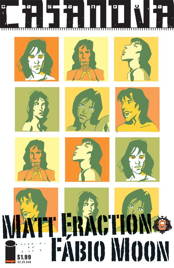
CASANOVA #8
Writer: Matt Fraction Artist: Fabio Moon Publisher: Image Reviewer: stones_throw
(A darkened room. Soon after deciding to step outside of my usual buying habits I'd already found myself in trouble.)STONE'S THROW (ST): Do you expect me to talk?
HORATIO DARCLAW, HEAD OF HAIRPIN (Hush-hush Association Involved in wRong-doing, Privacy (Invasion of) and Nefariousness): Yes, Mr Throw! Specifically about this CASANOVA #8, a 16-page pamphlet published by Image Comics.
ST: ...
HD: I can assure you you'll not be so tight lipped once your genitalia is excised from the rest of your body, my friend. Begin the laser! Now talk - what was the issue about?
ST: Nng! You've got the wrong man! I don't know anything!
HD: Your resolve is impressive. You did read this comic, yes?
ST: Grrargh! Yes, but...
HD: What? Tell me!
ST: It's...it's batshit insane and pretty incomprehensible, you despicable fiend!
HD: I see. What more do you know? You'll have to talk quickly.
ST: Gnnn! Well, it seems to be a pastiche of the espionage genre, particularly hi-tech stuff like NICK FURY, AGENT OF SHIELD. They're calling it "album two" of CASANOVA, even though it's really just issue 8. The pages are blue instead of green and contain some very impressive artwork by Fabio Moon. There's a column in the back where writer Matt Fraction explains that it's based on personal experience but I just took that as writerly bullshit, what with all the exploding birds and multi-armed females! There's also a vaguely intriguing jump forward in time in the last few pages. That's all I know, I swear!
HD: Moon? Fraction? Obviously aliases. No comic book makers have such cool names. One more thing before you wave goodbye to your reproductive glands. Should I read this comic?
ST: Hhrrr! I suppose it resembles some of the work of Grant Morrison without so much of a heart! If you have a taste for crazy concepts and artwork but don't mind the absence of a coherent story behind it, this is for you! It's only $1.99 too! Now let me go! Please!
HD: Interesting. I shall peruse this publication while your tallywadger is burnt to a crisp, although in order to increase enjoyment it may be wise to read some earlier issues, currently collected for your convenience in hardcover by Image.
ST: Yaaarrgh!

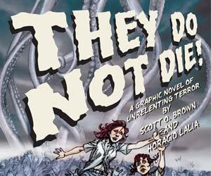
THEY DO NOT DIE! Online Serial
Writer: Scott O. Brown Art: Horacio Lalia Link: Link: http://theydonotdie.ambrosiapublishing.com/
CLOCKWORK CREATURE: CHAPTER ONE
Story and art: Kyle Strahm Link: http://clockworkcreature.ambrosiapublishing.com/2007/04/02/clockwork-creature-chapter-one-page-1/ Publisher: Ambrosia Publishing Reviewer: Ambush Bug
 Ambrosia Publishing is serializing their stories first and collecting them at a later date, which to me is an interesting trend in online comics and one that piques my interest regarding the pros and cons of this method of selling online comics. Some may argue the futility of publishing online and expecting a profit if one can read the story for free by following a link. Others can argue that, as with the rise in sales of trade paperbacks, comic book consumers like to buy collections of their favorite stories, even though they’ve bought the individual issues. If the comic book public is willing to pay money for a trade of a comic they have already read, wouldn’t it make sense that they would also pay the same money for a collection of online serializations?
But that’s a debate for another time or maybe one that can be continued in the talkbacks.
In the meantime, Ambrosia Publishing has a pair of properties being serialized online at the moment. Both are early on in their storylines, but this offers one a chance to experience the fun from the beginning.
THEY DO NOT DIE! is only seven pages into the storyline, but in those few pages, the creators definitely got my attention. There looks to be some sort of Cthulhu-ian beastie in the hills of Northern Alabama and it’s got an appetite for young souls. The story introduces a pretty young thing named Meg who looks to be integral to the plot. The panels remind me of a story one would read in an old HOUSE OF MYSTERY or EC Horror book, with artwork sporting thick dark lines and exaggerated facial expressions. There is a classic feel to this story, one that holds mystery. Like I said, there haven’t been many pages published, but the ones that are up make me want to read more. I look forward to seeing where this one is going. This story will be collected and sold by Ambrosia in early 2008.
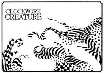 CLOCKWORK CREATURE simply blew me away. It’s a fast read, with a lot of splash pages and silent panels, made all the more of a brisk read by the intensity of the story playing out. Artist/writer Kyle Strahm shows off his craftsmanship with vivid and surreal panels. Often times, the panels don’t have borders and the stark black and white images leap off the page (or in this case, monitor). This is one of the best and most original horror tales I have read in quite some time.
An entire first chapter is complete (ringing in at 49 pages). If the story of FRANKENSTEIN had an all night orgy with Clive Barker’s NIGHTBREED and invited Tim Burton’s A NIGHTMARE BEFORE CHRISTMAS in for sloppy seconds, the unholy offspring might look something like this story. Basically it is a story of a misunderstood beast and a town that is manipulated by a stranger to take it down. Not much by way of backstory is offered (I’m sure that will be dealt with in subsequent chapters), but the lack of knowledge of these characters is integral to the way this first chapter plays out. CLOCKWORK CREATURE has my highest recommendation. A trade paperback of CHAPTER ONE is available now at the Ambrosia website.
Both of these online stories are worth checking out. Again, I have to remind you guys that many times I write up a review of a book and give a recommendation, leaving it up to you guys to seek it out in your comic shop or from the publisher. Not so in dot.comics. All you have to do is click on the above links to enjoy these reads. It’s free and only a click away, so there’s nothing stopping you from trying it out and maybe you too will feel the urge to continue to check the sites for upcoming pages and even buy the compilations. This is a pair of stories well worth checking out.

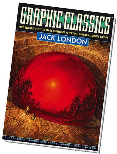
GRAPHIC CLASSICS: JACK LONDON - VOLUME FIVE (Second Edition)
Writer: Jack London Publisher: Graphic Classics Reviewer: Squashua
Jack London. To many, the name represents adventure, nurtures excitement, inspires exploration, and feeds a desire to tear up one's roots and move to Alaska. To me, "Jack London" is something the Sons of Liberty did back in the 1700's. Yes, yet again I prove to be the uneducated heathen you all know me to be, having weaned myself on the teats of the comic book industry, rarely cracking any book beyond those assigned to me in English class or the odd Lovecraftian tome.Considered the most popular author in America in the early 1900's, writer Jack London traveled the world and led many lives: war correspondent, socialist spokesperson, sailor, prospector, hobo, rancher, thief, cavalier, and acrobat. He wrote exciting, inspiring and tragic tales from these experiences, many of which are related in this volume via the traditional GRAPHIC CLASSICS comic format, supplemented with artist and writer biographies. The cover is a beautiful Jim Nelson rendition of "The Red One", depicting an eerie gigantic red orb hidden deep in a jungle. This second edition has more than 50 new pages over the first edition; I'm not quite sure what constitutes new material, so those of you with an earlier edition will have to keep an eye out. As with my previous GRAPHIC CLASSICS reviews, I'll hit each story individually.
“Meet Jack London” Writer: Mort Castle Artist: Roger Langridge "The function of man is to live, not to exist." Peppered with dialogue from the writings of Jack London himself, this unique single-page introduction provides a background for our adventurer / reporter / writer, letting you know for certain that he didn't just sit on his ass at his computer and review comic books all day. Jack led an exciting life and lived by a credo that maintained it as such. He probably even had "the sex" once or maybe even twice.
“The Red One” Adapter: Tom Pomplun Artist: Mark A. Nelson "It glowed and iridesced in the sunlight as if gleaming up from underlay under underlay of red. " The proverbial pulp tale which drew me to this volume in the first place, "The Red One" deals with Bassett, an explorer obsessed. There's a low reverberation resonating from deep in the jungle, drawing him towards it, and ultimately, his fate. Jack weaves a tale of desire and promise, never fully revealing the mystery, but leading us on in the same manner that Bassett is led. The illustrations are realistic in nature, keeping this classic story of science fiction appropriately grounded. I could imagine H.P. Lovecraft enjoying this read.
“Jan, the Unrepentant” Adapter / Artist: Hunt Emerson "We ain't gonna hurt yeh, 'r anythin’ like that -- jes' want to hang yeh, that's all..." Silly and irreverent, Jan has to deal with his three Yukon cohorts who want to hang him after he murdered their mutual acquaintance over an unexplained argument. The art is just as goofy as the antics are, as these four gentlemen fight and argue in classic Popeye-style in an attempt have Jan meet justice at the end of a rope. But stuck in an icy wasteland and without a tree in sight, will Jan swing from the hangman's noose or will he get away with murder? It makes for an entertaining, brief, and appropriately cartooned tale.
“To Kill a Man” Adapter: Rod Lott Artist: Kostas Aronis "She ached to grip the revolver in one swift movement, yet she was not sure, and withdrew her hand." A well-to-do woman has to handle a break-in at her mansion, and the robber himself. Does she lose grace when doing so, or has she never had any to begin with? A dark tale about thievery and deceit, ultimately my least favorite story here. The art started off interesting, as a set of silhouettes and lines, but then detail crept in, and basic design I had appreciated became less so.
“Just Meat” Adapter / Artist: Onsmith Jeremi "Pardners is always knifin' each other." Yet another yarn of thieves and trust comes to a head, but in a heck of a lot more entertaining fashion than "To Kill a Man". I guess I prefer comedy to drama. The art is extremely animated, in a good way.
“The Wit of Porportuk” Adapter: Tom Pomplun Artist: Arnold Arre "Old Porportuk continued grudgingly to advance money, and with every advance, he looked upon El-Soo with a more possessive eye, and felt bourgeoning within him ancient fires." One of the longest tales presented here, "The Wit" is the story of El-Soo, a young woman taken from safe haven and thrust into her father's world, a Native American culture she was unaccustomed to, and a debt owed to ancient Porportuk that weighed heavy on his shoulders, a burden El-Soo was subsequently forced to carry. She struggles to keep her head above water, but as with most of the London stories I've read so far, there's always a dark and tragic undertone. A heavily manga-influenced art style was used here, which ended up being an excellent choice for presentation.
“The Handsome Cabin Boy” Adapter: Trina Robbins Artist: Anne Timmons "But eating of the captain's biscuit, her color did destroy, and the waist did swell of pretty Nell, the handsome cabin boy." "The Handsome Cabin Boy" is about two rich fancy boys from - get this - San Francisco (surprise, surprise), who bet one couldn't fool the other as to the gender of an undisclosed subject. The bet recipient later meets a bumbling cabin boy who is a girl in disguise and he falls for her. Cue a predictable ending, but probably not so much for those of you who lived in the early 1900's when this sort of trick was considered "clever" and "new" and you walked to school in the snow both ways uphill. The art is appropriately effeminate for this totally gay story. And by "totally gay", I mean that in the most eighth grade Junior High interpretation possible. The story is accompanied by the music and lyrics to the traditional sea chantey, "The Handsome Cabin Boy", which is actually amusing in its own regard.
“That Spot” Adapter: Antonella Caputo Artist: Nick Miller "There was no getting rid of him. Steve and I began to get superstitious about that dog!" Of all the writings in this volume, "That Spot" benefited the most from having accompanying artwork. Originally a humorous cautionary tale regarding two Klondike partners abused by a troublesome sled dog, the artist has punctuated every story beat with a panel depicting various mutt-derived antics as well as those of the protagonists. The art not only compliments, but also fully enhances the comedy that is merely evident in the text. This rendition of "That Spot" is a prime example why the GRAPHICS CLASSICS method of presenting tales in a comic format works as a medium.
“War” Artist: Peter Kuper "Only here and there were thickets, easily avoided, while he encountered winding, park-like glades where the cattle had pastured in the days before war had run them off." Taking a break from the comic format, "War" is presented in novel form with two accompanying full page and one quarter-page graphics. The art is extremely fitting for this short story set in a non-specific country during an unspecified time of war, which simply serves to drive home the idea that no good deed goes unpunished.
“The Francis Spaight” Adapter / Artist: John W. Pierard "The Francis Spaight sheered; in an instant, her leerail was buried 'till the ocean was level with her hatch-combings..." A true tale retold by Jack London, this anecdote of desperation and hunger on the high seas made me add "bring children along" as part of the checklist next time I go deep-sea fishing. The sketchy art is appropriately grim and crazed for this most tragic story.
“How I Became a Socialist” Artist: Spain Rodriguez A two-page essay accompanied by an illustration of a man having climbed out of the Social Pit, "How I Became a Socialist" tells the story of a man who has come to the realization that he has done much, but accomplished nothing. Much like this very comic book reviewer. Thanks, Jack London!
“Moon-Face: A Tale of Moral Antipathy” Adapter / Artist: Milton Knight In a yarn involving hillbilly retribution, "Moon-Face" is John Claverhouse, a man whose illegal nightly fishing activities and eternal optimism keep his neighbor, our protagonist, awake and perpetually angry. Overtly vicious and vindictive antics ensue as the neighbor tries every method to rid himself of Claverhouse. The art consists of extremely goofy caricatures, making this a light-hearted story "Tom and Jerry"-esque in nature.
“A Thousand Deaths” Adapter / Artist: J. B. Bonivert The final entry is a grim tale of scientific horror as the victim of a mad scientist who has learned how to bring the dead back to life must die and be revived over and over again. With the concept of a form of defibrillation being performed on humans in fiction, years before it's time, I was all set to enjoy "A Thousand Deaths", but it ends abruptly, as though Mr. London did not know how to finish it properly, and with that I was very disappointed. Bonivert skillfully renders scientific formulae and concepts, as well as properly evoking the horrors of the victim's situation and his ultimate solution.
This probably isn't the right forum for it, but I believe educators should take a serious look at these sorts of books (Marvel Illustrated is producing similar products), as they would definitely make reading a less "sour pill" for those kids who would otherwise pick up a Cliff's Notes. Even though I paged through enough of them (and wrote the requisite book reports), I know I'd have been up for reading comic adaptations of the sorts of books assigned to me during English class; classics such as "Sounder", "Of Mice and Men", "The Glass Menagerie", "Lord of the Flies" and "The Outsiders". Even these days, I'd pick up a George Orwell ("Animal Farm" / "Nineteen Eighty-Four") or Greek Classics (Virgil / Homer / Aeschylus) volume in an instant. In all, I am again impressed with the sheer volume of material that Graphic Classics has packed within this trade, and though there are a couple of stories I am ambivalent about, they don't diminish the overall value of the product ($11.95 for 144 b/w pages). Recommended for those who desire adventure.
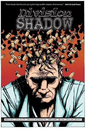
DIVISION SHADOW TPB Self published by Patrick Meany
Ambitious is the word I would use to describe this project. And when I say project, that’s what I mean. Not until this story came to an end did I fully understand the scope and appreciate what this book was trying to say. Without giving too much away, it tells a story about the same central material from various different angles offering pieces of a puzzle that comes together only in the end. I admit, I had my suspicions throughout reading the trade, but upon completion of this one there were many “ah-ha!”’s passing my lips. At times, I found this book somewhat hard to follow mainly due to the variation of art styles. Three artists tell this story, each centering on a different set of characters. DIVISION SHADOW is the name of a top secret government organization that dates back to the beginning of the American colonies, but this book focuses more on how this all-encompassing organization affects the people tied to it. This book is at its best when focusing on the personal drama and hardships the central characters go through. Adultery, crime, cancer, death, abandonment, sense of duty towards family vs. dedication to one’s occupation; all of these issues are dealt with in this complex patchwork quilt of a story. Although not all of the artwork worked for me, I did find it to do an effective job of emphasizing the drama taking place. Again, out of all of the words I could use to describe this book, “ambitious” is what fits best. I read the first issue of this series quite a while ago. It was stapled together loosely and the pages were a bit uneven. This trade, though, is slick and professional. The creators of this title seem to have come a long way in tightening their product and their ambitious goals were, for the most part, a success. – Ambush Bug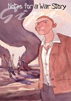
NOTES FOR A WAR STORY OGN First Second
Shaping up to be my favorite publisher of the year, First Second offers yet another heartfelt tale from the enormously-talented Gipi, an Italian artist and writer who blew me away with the resonant GARAGE BAND, released earlier this year, and has now scattered my atoms with the simple tale of three kids who were dealt the awful hand of growing up in a war-torn Balkan country. This is a tale of survival as these innocent young men are forced to do what they can with basically nothing in order to live in this chaotic environment. The rise and fall of this trio of likable characters is a heartbreaking thing to witness as they get involved with the military and organized crime. The story is told from the perspective of one of the more innocent boys which makes the tale all the more pressing when things go awry. Gipi’s imagery is simplistic and scratchy, yet conveys exactly enough detail to offer the perfect picture of the events unfolding. The clever use of word balloons give voice not only to the characters but also to inanimate objects around them that speak just as loudly, such as money thrown onto a table with force and saying “Pronto.” Conveying urgency and the importance of the all-mighty buck. This book is filled with little details such as this as it follows these boys who are forced to grow up too soon by the bombs and militia that tear through their homeland. It’s a political commentary, yes, but more so it is a story with a huge beating heart and with imagery that will last long after you’ve put the book down. Highly recommended. – Ambush Bug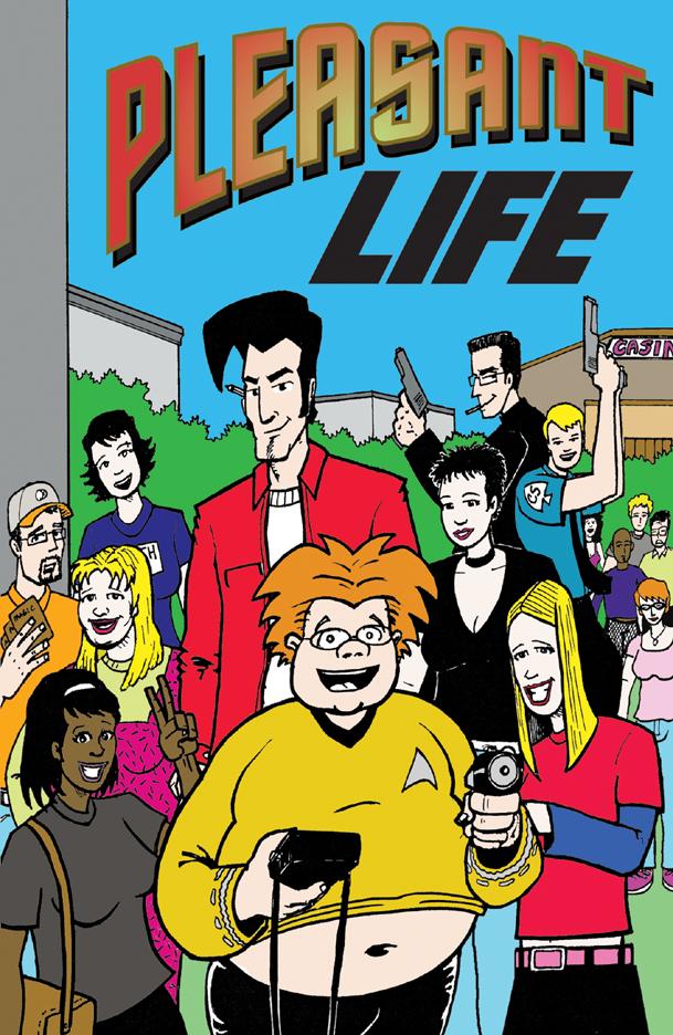
PLEASANT LIFE #1 Idiothead Studios
This slice-of-life issue focuses on the beginning of the senior year of college for a group of kids. I remember my senior year. It was fun and scary and exciting. This book does a good job of capturing those feelings and giving them a place to shine. There is an offbeat subplot about a hard-nosed police officer in search of a casino robber that didn’t really fit in with the rest of the story for me. The real life stuff going on was much more interesting and more thought out, but I must admit, the chase scenes did punch up the entire read with a little gratuitous action. This book shines, though, when focusing on the more intimate thoughts and feelings of these soon-to-be graduates, and shines in ways that outweigh any criticisms I have for other aspect of this book. – Ambush Bug
MONSTER ATTACK NETWORK OGN Ait/Planet Lar
This book is a bit of a change from the other books I have read from Ait/Planet Lar, but it shares the same attention to fine storytelling. This drama set in a world where giant monsters attack on a frequent basis was a fun yarn. The blasé way the main characters do battle with these big beasts was thoroughly entertaing to witness. The art is loose and I have to admit, at times, I was a bit at a loss as to what was happening in some of the tighter panels, but when artist Nima Sorat pulls back in the large panels, they are quite a sight to behold. There is a real VENTURE BROTHERS feel to this comic with overly-muscular men and sultry babes battling giant things science and nature shouldn’t have spawned. There’s a lot of fun in between the covers of this book and it’s a welcome change from some of the more serious or fact-based books from Ait/Planet Lar. – Ambush Bug
YOUR ROUND PRESENTS: TEQUILA #1 Olive Press
Now, here’s a concept I can get behind! Each issue of YOUR ROUND PRESENTS: centers on different liquors. This book houses three short stories, all focusing on that tempestuous substance, Tequila. Drinking stories. We’ve all told them. They usually start out with the phrase, “Man, I will NEVER touch so-and-so-liquor EVER AGAIN!” Then the reason why is told between shots of said alcoholic beverage. The three tales presented here are such tales. Not all involve getting hammered, but all star that famous worm-bottomed drink that has been the occupant of many a shot glass that I have paid for and glugged. Story one, “Hustle”, was a nice little yarn about a con involving a drinking contest and the God of Tequila. The black and white art by Declan Shalvey is reminiscent of Cully Hamner and Tony Harris, with heavy darks highlighting simplistic details and facial expressions. I swear, story two, “Say a Prayer For Me” stars our very own @$$Hole Sleazy G or someone who looks and acts just like him. It’s about a grumpy guy who hates posers at bars and hates the typical mainstream aspects of going out and getting hammered. It was fun to watch this curmudgeon huff from one angry bar situation to the next. This Harvey Pekar-like tale of survival is brought to you by Bob Byrne. The final tale is a POV lil’ ditty mapping out the events of one alcohol-filled night. Future issues will focus on other liquors. Being a whiskey man, myself, I can’t wait until the bartender serves that issue up. Recommended for drinkers or those who are curious about drinking. – Ambush Bug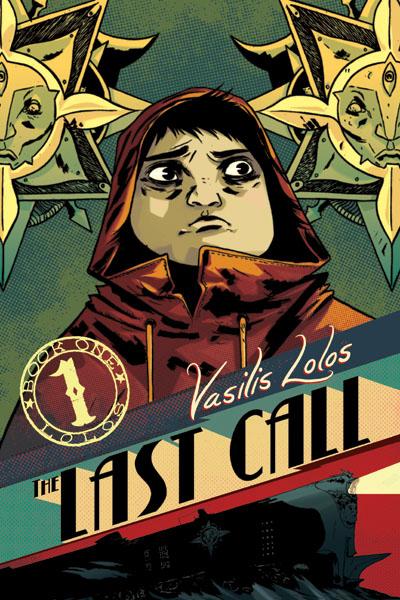
THE LAST CALL VOL.1 Oni Press
Comic-book-dom is rife with ALICE IN WONDERLAND riffs, but usually it’s just a retread of the same old story, idolizing specific “cool” elements, in the end, churning out something looking more like a Hollywood remake or a lip-synched song. It’s not often that people borrow certain elements of classic tales and take off in their own direction with them. Vasilis Lolos is a creator that does this in THE LAST CALL and the result is pretty spectacular. The story follows two delinquent boys as they sneak out of their homes, steal their parents’ car, listen to death metal, and go on a joyride. These guys are definitely headed for trouble, but what they don’t know is that the trouble they are in for is otherworldly. Suddenly, in the middle of nowhere, the car stalls and they find themselves riding on some sort of train; destination unknown. Did the boys die? Did they fall through the looking glass? Are they dreaming? Don’t know. But the imaginative adventures they get into in this first volume shows that writer/artist Lolos is one creative and warped dude. From bubble gum dispensing witches to talking shadows and superstars with scales, the boys find themselves running into all sorts of creatures and dangers as they flee through the cars of the train to escape the Conductor, who is after them because they don’t have tickets. This book is fast paced and Lolos has a firm grasp on how to convey tension and fear with little or no words, relying on skewed panel angles and the looks on his characters stylized faces to convey the message. Lolos is a Greek artist. His work has a non-American/non-manga style to it that is a welcome change from the norm. The characters and panels are fluid and the even-set structure of the page (common with a lot of American and manga comics) is discarded in favor of more creative ways to tell the story. Start to finish, this is one solid read. – Ambush Bug
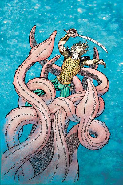
AQUAMAN: SWORD OF ATLANTIS #55 DC Comics
Last time I checked in with this comic, I told you all that the book had circumnavigated around the world of suck back to being almost entertaining to watch in a train-wreck sort of way. This book still has that same quality this month, but writer Tad Williams dives head first into Lake Exposition and only comes up for air when 40 or 50 words are crammed into each and every word balloon. Look, I understand the guy is a writer and new to the comics medium. That’s what the editors are for: to let the writer know when they may be over-writing or trying to cram way too much info into one panel or one word balloon. I don’t know about you guys, but when I look at a page and see the entire page filled with text with artwork trying its damndest to peek around the big white word-filled bubbles, I immediately lose interest. It shows that the writer knows nothing about the medium or how to convey a story through text and images. The word balloons in AQUAMAN look as if they are filled with lead on each and every page, bogging down an already tired story. This issue has four to five villains and all are given about 500 words of dialog to speak on one single page. The villains go on and on to the point of parody, but the writer seems to be missing the joke and is deathly serious about the whole thing. This month’s JLA features a commentary by someone who looks to be the original Aquaman. Here’s hoping that with the upcoming end of this title and reintroduction of Aquaman to the new BATMAN AND THE OUTSIDERS, we will be seeing the return of the one true Aquaman and get rid of the bottom-feeder that has been starring in his comic for the last year. – Bug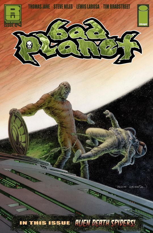
BAD PLANET #2 Image Comics/Raw Entertainment
Although terminally late, this was a hell of a second issue of this series. I think I remember the premise of this series; a pair of spaceships filled with alien creatures (an alien Noah’s Ark) crash lands in both Africa and Washington DC, and I’m pretty sure I remember digging the hell out of the first issue, but it was so long ago, I can’t be sure. This issue, though, was pretty damn cool and the recap on the inside cover helped fill in all the questions I had. I was a bit disappointed that in this Noah’s Ark, the only creatures to show up so far have been man-eating space spiders. Don’t get me wrong, the spiders look cool and cause quite bit of awe-inspiring havoc (building nests out of mass graves, slicing people into ribbons with their crab-like appendages), but a single species of spider does not an ark make. Despite that, the art is a sublime treat from Tim Bradstreet, James Daly III, and Lewis Larosa. I know it is a cliché to compare horror art to Wrightson, but…it looks like Wrightson, which is a compliment in my book. Doesn’t help that Wrightson did the cover. – Bug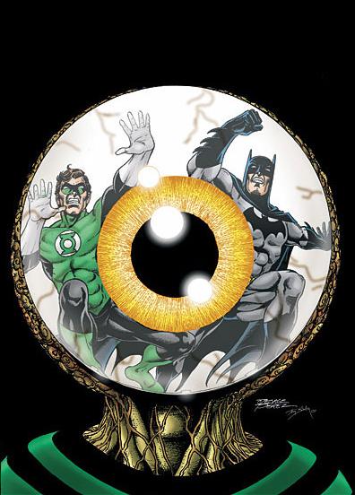
THE BRAVE AND THE BOLD #6 DC Comics
The most consistently enjoyable superhero book on the stands wraps up its first arc in damn cool fashion. George Perez and Mark Waid on top form with a ton of fun characters (even the Endless from SANDMAN!). Pick it up, stupid. – stone’s_throw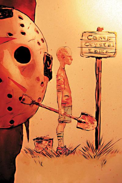
FRIDAY THE 13th: PAMELA’S TALE #2 DC Wildstorm
This was a real treat to read. Mark (MANHUNTER) Andreyko shows his writing chops by filling in the gaps of the history of the one who started all of the Crystal Lake murders in the first place; Pamela Voorhees. Although it is a breezy history, told in two issues, there is quite a bit of information provided that not only respects the mythology of the films, but adds to it and makes it a more personal and worthwhile read. For years, I have been wishing for someone to come along and take the FRIDAY THE 13th property seriously and raise it to a level of storytelling that was only touched upon in the films. I have WildStorm to thank for making these wishes a reality. PAMELA’S TALE is better than the source material and I hope Wildstorm keeps these F13 stories coming. – Bug
BATMAN #667 DC Comics
JH Williams returns to provide art for my favorite Batman comic since...uh, Paul Dini's first issue of DETECTIVE last year, which he also drew. Maybe he should draw every comic; then I'd have zero complaints. Batman, Robin and the International League of Heroes (too cool) are stranded on an island with a creepy big bad somewhere in the house. It's not particularly original but it is a situation that exploits Batman's best qualities. Grant Morrison's best so far. – stone’s_throw