
Ahoy, squirts! Quint here. Last Tuesday I ventured from my shitty little LAX area hotel to Playa Vista where Jon Favreau has set up his IRON MAN offices.
I had visited this particular location once before when I walked around the ruins of Oliver Stone's WORLD TRADE CENTER (Click here to read that report!). The place is loaded with history, on a large piece of land once used by Howard Hughes to build the Spruce Goose. The hanger there is forkin' huge and, interestingly, made completely of wood since it was built during the war and no steel could be spared.
The offices are in these little structures that remind me of portables from junior high... or a built out trailer. Quite unassuming for a movie as high profile and massive as IRON MAN.
Once I got past the security guard, I was waved in by Favreau's friendly and beautiful assistant, Karen. I was pretty early, so I took a seat outside of Favreau's office next to a 3 foot tall clay maquette of Iron Man himself. After a few minutes of trying not to stare too obviously at the maquette while chatting with Karen and Peter Billingsley's equally beautiful and friendly assistant, Laura, Favreau arrived.
After a quick handshake he pointed to the maquette and asked how I liked his "decoy." It was one of the first maquettes based almost 100% on Adi Granov's IRON MAN design. Less bulky, more streamlined... high cheek-bones on the helmet. They loved having it around, but it wasn't what IRON MAN was going to look like in the film. If I wanted to see the design they were going with... I had but to enter Favreau's office.
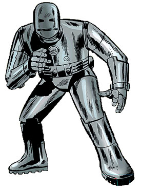
He led me into his office where I saw some pretty pieces of production art, including the Mach 1 design (ie Grey Suit) and the classic Red and Gold design. Let's start with the Mach One. Here's a picture of the classic comic version of the armor:
I saw 2 pieces of art on the Mach One. One was a character study, three figures lined up giving a front, back and side view of the suit.
The chest-piece and helmet are very recognizable. It's not quite the classic grey suit, but it's very close. The helmet is flat and round, like a half of a Tylenol, with eye slits and a mouth slit cut into it. The chest is very much classic Iron Man, with the glowing centerpiece. The joints were hastily welded, as they would have been if welded in secret.
In the comics, Tony Stark was in Vietnam seeing how Stark Industries could help the American war effort when he was injured and taken prisoner. He was forced to build weapons with another prisoner, a brilliant physicist Yinsen, with a piece of shrapnel dangerously close to his heart. On the down low Yinsen helps Stark build a chest plate to keep him alive, which evolves into a makeshift suit of armor to help him escape his captors.
Vietnam is replaced with Afghanistan in the film. I brought up this change from the original comic and Favreau said he wouldn't make a change unless he felt like he needed to. He said keeping it to the comic book origin would require him to make a period film, which is not what he wants to do. I do know that Yinsen is still in the movie, though Favreau wouldn't spill on who was playing him. If they're placing this in Afghanistan I was thinking a perfect Middle Eastern version would be Omar Sharif. I didn't even float that idea out to Favreau, so don't go spreading it around as fact... pure dream casting on my part, but wouldn't it be great?
The radical differences with the grey suit were bulkier arm and leg pieces. Favreau said he wanted to make sure that the fantastic in this film is grounded and a realism brought to all aspects... In other words, he doesn't want to make a cartoon. The trick is sticking close to the source material while achieving that grounded realism. It seemed like Favreau embraced the fun, actiony aspect, but he wants to keep people involved... help them suspend their disbelief a little. In the case of the grey suit, he wanted to make it look like something you could covertly build in a prison (cave, in this case) under the watchful eyes of your captors. Well, if your captors had you building bombs in your cell, but you know what I mean.
One of the more detailed pieces of production art I saw was of the Grey Suit Iron Man hulking down a cave, catching a group of his captors by surprise. The look of terror on their faces (in the art) was great. Iron Man, in the Grey Suit, looked a little bigger than I imagined, with him being at least a couple feet taller than the Afghani captors, the suit backlit making it look more monstrous as it stalks down the cave.
I was later walked through the cave set, one of the first nearly completed sets built in the Spruce Goose hanger. It'd estimate it at being maybe 150-200 yards long, one giant room with movable branches, forks in the cave. There was only one room of any size and that's where we entered. This is the room where Stark and Yinsen are put to work. It was a giant, rounded cave room, tools littered about. It was still under construction, the set dressing not complete, but it looked good already. I particularly liked the addition of two round, metal vents in the cave ceiling, just poking out of the rock.
Favreau promised much flame-throwing (from an arm-mounted fuel tank) and much steel on flesh beat-downs while bullets ricochet off the Grey Suit during this escape. He also said that Stan Winston hasn't finished the Red and Gold armor, but he has finished the Grey Armor and Favreau had just seen it in action, fully practical, and said it looked amazing.
The two other black and white production art pieces I saw (by the incredibly talented Ryan Meinerding) were also very impressive. So impressive that I told Favreau it's kind of a pity he's shooting in color because the tone of the images are that striking. However, with a brilliant cinematographer like Matthew Libatique (Aronofsky's go-to since PI... he also shot PHONE BOOTH, EVERYTHING IS ILLUMINATED and INSIDE MAN) and just to see that beautiful Red and Gold armor sparkle... I'm sure I won't cry too long about the never-to-exist black and white Iron Man movie.
The other two pieces of black and white art: One was of Tony Stark, wearing very mechanic-like clothes, balancing about 2 feet off the ground, testing out the rocket boots in a parking garage. The boots were big, but not outlandish, with large rubber tubes connecting the boots to a belt-piece. In these pieces of art, Tony had a goatee, by the way. (Having now seen ZODIAC, the art is very close to the goatee Downey has in that movie.)
The other was probably my favorite piece of art that I saw on the visit. It wasn't an action piece, but it really captured the character of Tony Stark and gave the armor that icon stature it deserves. This piece of art was set in Stark's cluttered lab... although it looked more like an auto repair garage. Tony Stark is sitting, reaching under a tangle of wires wearing a wife-beater... sweat from exertion, covering his body, smudged grease on his clothes and skin.
Hanging above him is the Red and Gold suit, built only from the waist up, thick chains connected to the ceiling attached at the shoulders. Thick rubber hoses spill out of the suit, like guts as Stark reaches up, connecting something or other. This just struck me as real. Stark wasn't a scientist in a cold lab. He looked more like a 50s mechanic working on an engine hanging above him. He was dirty, his work-place cluttered.
Favreau said that in these super hero movies you don't ever get to see the construction of the suit. I mentioned BATMAN BEGINS as taking a good, realistic avenue of compiling a suit. He agreed, but said even then they pretty much just pull it out of storage and slap a coat of paint on it. Here, Stark's armor is as much a representation of the man as it is a piece of cool looking tech and Favreau believes it's important to see the nuts and bolts of the creation.
The color piece I saw of the Red and Gold armor was an early design by Adi Granov featuring Iron Man flying in front of 2 US jets, assisting in some attack. The suit looked like an amalgam of the suit I grew up with (ie the '80s design) and the newer, sleeker suit. The face was more aerodynamic, the big anime-ish cheekbones of the newer designs gone. It's not completely smooth, of course, but just not as exaggerated. It wasn't radically different in any way. It was Iron Man.
Phil Saunders was the other artist whose work I was shown on the visit. I only saw a couple pieces of his work, the rest hidden in a room with a sign from Marvel proclaiming: NO QUINT ALLOWED. Saunders' work was in color and was a design of Stark's home on the ocean. It was very retro cool. It's modern, but looks like some pop-art home of the '60s. Something that would feel right in a Brad Bird film. I saw some other pieces of work from both Saunders and Meinerding, but I'll talk about that in a minute.
Let's go through some newsworthy gems learned on this trip:
- The biggest and best news is that this film is one of three. That's right. Favreau is building a three-film arc, with all the actors signed for all three of them. The impression I got was that he's going to make this first one fairly stand-alone, but containing threads that will be continued in future films, throwing in little hints at what's to come, some set-ups that will pay off later in the story. I don't know if screenwriters Hawk Ostby, Mark Fergus(CHILDREN OF MEN), Matt Hollowway and Arthur Marcum are scripting all three or just have a detailed outline for the next couple of movies, but I like that they're already thinking ahead.
-This three picture plan has been planned since the beginning and played a large role in casting... I don't know if it'll be in the first film (I'm guessing not), but Jim Rhodes as played by Terrence Howard WILL be War Machine and that was a key factor in casting Howard. In fact, Favreau said he loved hearing the speculation when Howard was first rumored, people already accepting him as Tony Stark. He's a great actor and a commanding one. He'll be able play through the armor.
-Another departure from the comic has Tony Stark based on the West Coast instead of the East Coast. Favreau said that was mainly a stylistic choice. He said we're used to seeing SPIDER-MAN swinging through New York and the Fantastic Four flying between New York buildings. He didn't want IRON MAN to fall into that familiar pattern.
That's about all I saw on my visit... at least IRON MAN related. I mentioned previously that I saw some more artwork from both Saunders and Meinerding. Favreau called them in and had them bring along a portfolio of their work for JOHN CATER OF MARS.
The pain of losing the project was obviously still fresh for Favreau, but he seemed happy John Lassetter and Pixar/Disney had it. He didn't know what they were going to do with it, but speculated on a great animated version being made. He said he would have had to MoCap a good deal of the movie if he had made it and noted that animation seems to be going in that direction with BEOWULF and films like MONSTER HOUSE.
The artwork, in short, was breathtaking. Edgar Rice Burroughs' world was realized beautifully. I saw everything from Carter on horseback escaping the Indians to Tars Tarkas towering over Carter, easily double his size. They realized the Tharks as more human that I imagined, but without a nose. The tusks protruded from the joints in the jaw, not the mouths, which I thought was an interesting way of approaching it. The eyes, brow and mouth were human. The expressive parts of the face. Favreau wanted the performance to show through the computer effects, find that soul in the pixels that the best CG work can do.
Most of the art was from Meinerding, who did the black and white pieces for IRON MAN. His work was black and white here, too. I freaked out a little when he said he works 100% in computer because the art looked painterly... kind of an Alex Ross mixed with Frank Frazetta. Meinerding's John Carter looked great. Very stoic, young... heroic.
I asked who Favreau was going after for John Carter before the plug was pulled. He looked a little hesitant to say, but then spilled that he wanted Eric Bana, which I think would have been a fantastic choice.
Saunders art was in full color and was more landscape than character or action driven, but his concept of Mars and the cities on Mars was amazing. He envisioned an obsidian-like landscape, but instead of black glass rock it was variations on red glass. Sharp and curving natural glass structures were semi-transparent at different light points. The majority of the swords and daggers were made of this beautiful red glass, with metal being extremely precious on the planet, so only a few metal swords exist.
There was a city (Helium) built completely out of this material, giant glass buildings stretching out to the heavens, refracting light in different shades and hues.
It would have been absolutely beautiful and it's a shame we won't see that movie.
As of my visit, Favreau was trying to find out the legality of making the art public. I hope he can work it out. If the film can't be made, at least the vision of the film should be seen by us geeks.
That's about it. Everything I saw was better than I expected and I expected good things. I hope the flick lives up to the art and the excitement I witnessed. Thanks for sticking with me through this big ol' report. I'm finally back home after over 3 weeks of film festivals... I have some Sundance interviews to transcribe and a few Santa Barbara FF movies left to review before the fun really begins... I just found out I'm going to the New York Comic Con where I'll be moderating a HOSTEL 2 panel as well as interviewing a legend and a personal idol of mine. Good stuff on the horizon, squirts. 'Til then this is Quint bidding you all a fond farewell and adieu!
PS: Here's an interview with Mark Fergus (screenwriter) over at Flmlvr's favorite site, JewReview.net... if you want more Iron Man info!!
-Quint
quint@aintitcoool.com
