
Ahoy, squirts! Quint here. The BFG is the next film from our greatest living populist director, Mr. Steven Spielberg, and the word so far on the movie is stellar. It got a standing ovation at Cannes and reviews out of the fest are calling it wonderful.
I would expect nothing less, not just because it's Spielberg, but because the film marks the reunion of the director and his ET screenwriter, Melissa Matheson, who sadly passed away after turning in her draft.
And it seems to me that the creative team behind the movie and the marketing itself is fully embracing that connection. Here's the new poster:
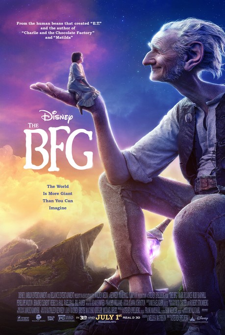
Not only do they namecheck ET in the text on the poster, there's a deeper connection as well. Something triggered in my memory when I saw this image. It was familiar to me and it didn't take long for me to lock on why. This is the exact same color palette as John Alvin's almost-used poster art for ET that later became the basis of the more familiar fingers-touching ET one-sheet.
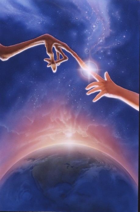
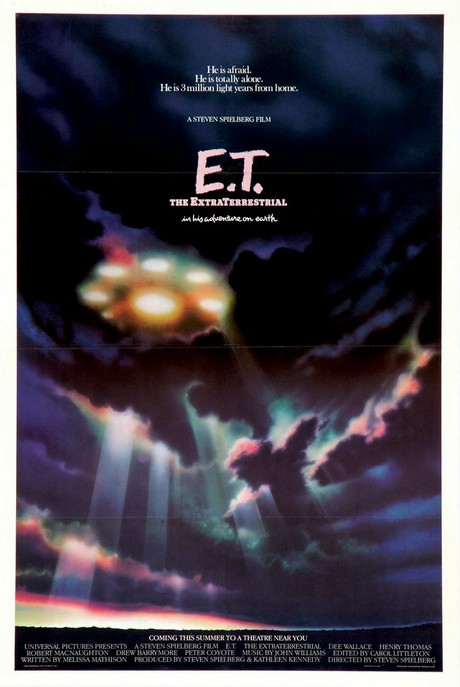
I know that sounds like a stretch, but that pink/purple/blue palette was used prominently in the marketing for ET. The most noteable usage was in the teaser poster (below), but in most material released after the movie came out which featured ET himself this was temperature of the colors.
Just a nerdy observation, but I think it's a cool way to tie together two of Spielberg's movies.
In case you missed the new trailer for The BFG I've gone ahead and embedded it below. Enjoy!
-Eric Vespe
”Quint”
quint@aintitcool.com
Follow Me On Twitter
