
(Click title to go directly to the review)
POWER MAN & IRON FIST #1
SNOWFALL #1
HUCK #4
AVENGERS #5
CRY HAVOC #1
DOC SAVAGE: THE SPIDER’S WEB #3
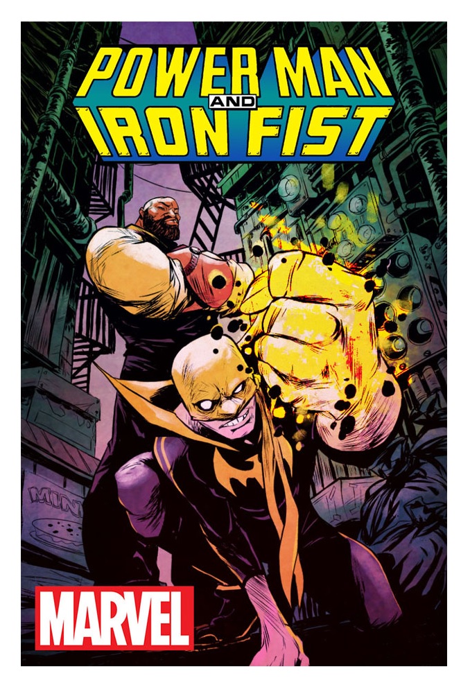
POWERMAN & IRON FIST #1
Writer: David WalkerArtist: Sanford Greene
Publisher: Marvel Comics
Reviewer: Masked Man
Marvel’s first odd couple, Power Man and Iron Fist, is back! Two characters who had a strong fan base, but not enough to sustain solo serie,.sSo Marvel though the combination of those fans would be able to sustain a book--and they were mostly right (maybe DC should combine Blue (Jaime) Beetle with Mr. (Michael) Terrific). We haven’t really seen this pair together since the 90s. The last POWER MAN & IRON FIST book featured Victor (Power Man) Alvarez (the guy in the ULTIMATE SPIDER-MAN cartoon), but this time the original, Luke Cage, is back with Danny Rand for some street-level action.
Writer David Walker, the man who brought Shaft back to life at Dynamite, was clearly a fan of the original series, as he uses that history here. You see, Luke and Danny are coming together for some unfinished business from the original series. Best of all, Walker keeps the script light and breezy, even though it is built on (gasp) continuity.
To a degree I’ve always had a problem with Power Man--mainly because he never embraced the superhero concept, so I never fully embraced him. Nowadays he takes a back seat to his wife Jessica Jones (I blame Bendis, since he created Jones). Their daughter and relationship now helps in preventing him from being a hero too (just see this issue), so it falls to Danny to be the ‘let’s get the band back together’ guy. Never had an issue with the kung fu/superhero concept of Iron Fist.
Artist Sanford Greene has been floating around for a while but has yet to make a big splash. Along the way he’s been developing an energetic and cartoony style, getting broader and rougher as he goes, which is nice in the fact that it’s different, but until he starts taking the same approach to his storytelling and panel layouts (i.e. some unconventional angles and action for his unconventional figures), I don’t think his work is as strong as it should/can be. Also, Power Man is just looking too old and Dad-like to me as opposed to Danny (ok, enough with me whinnying about Luke Cage, right?).
Now let’s wrap this up with some spoilers. So their old office manager, Jenni Royce, was just released from prison for killing her douchebag boyfriend Crime-Buster II (see the old series). Feeling guilty about it all, Luke and Danny go to meet her and end up doing a favor for her: getting her grandmother’s necklace back from Spider-Man villain Tombstone. Luke tries to talk it out with Tombstone, but it soon turns into a brawl and Jenni has her necklace back. Plot twist, or rather the magical necklace Black Mariah told her to get!
So lots of fun, a good clever script, fun art, tons of love for these characters and their history, and while I was expecting a Mr. Incredible/Frozone feel to the book, turns out it has a much more Butch Cassidy/Sundance Kid feel to it. For a book about two guys who don’t want to be superheroes, Walker and Greene pretty much crushed it.

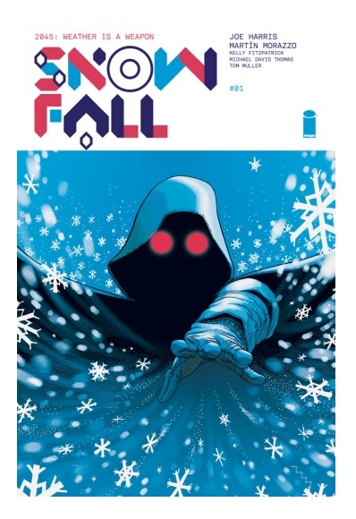
SNOWFALL #1
Writer: Joe HarrisArtist: Martin Morazzo
Publisher: Image Comics
Reviewed by Humphrey Lee
Despite a growing fatigue in this particular election cycle, I’ve considered myself a bit of a political animal for a good half my life now. This first evolved from a teenage love of punk rock that mostly involved my enjoyment of loud and fast songs about drinking with friends and burning things down. What things, you may ask? Well, all of the things, of course! Admittedly, back then it was all about getting the aggression out because, y’know, hormones, but that tempered an interest in how the world works, the systems we build, and where those systems either need some spackle and a fresh coat of paint to sustain longer or a sledgehammer to bring them down. I still love my punk and maintain a little bit of an in your face attitude about the high importance issues, but have ultimately found a little restraint to be more beneficial to overall discourse than a full frontal assault. That is why a book like SNOWFALL here from Image Comics can leave me feeling a bit trepidatious about the issues it is slinging, even if I’m in its camp.
SNOWFALL is all about that collapsed future: a world where by 2035 our climate has done gone all fucky and the humans responsible for it find themselves living in a sanitized, corporate-run world. The world dried up, droughts occurred, Mel Gibson got a three movie deal depicting the fallout of such a state of affairs, and it seems a sanitized version of history is in place after the collapse. It is pretty much every Armageddon-foretelling climate change believers’ vision of the future: a world where caution about what could happen to the world fell victim to greed and apathy, and the perpetrators swooped in as “saviors” in the end. In that regard, SNOWFALL reads almost somewhat rote at first but, wisely (and a bit nihilistically), Harris and company change the vision a bit from the norm with “good guys” that may not be any better than the establishment.
While the first several pages of SNOWFALL give a caption box exposition of what I laid out above, we see events taking place in upstate New York that set off some explosive events. Snow comes down from the sky for the first time in ten years and, like the circumstances that made this impossibility, this miracle looks to be manmade. That is the twist that somewhat saves SNOWFALL from itself--this idea of a self-titled “White Wizard” that can control the weather to make such an effect in the middle of a tale that looks a little textbook in its totalitarianism. This White Wizard is both the x-factor of this world and of the book as a whole, given the murky circumstances around his intentions and actions. In a world where information is disseminated in its most sterile form, the cloaked figure known as the White Wizard represents chaos and who knows what else? Revolution, maybe, or just terror wrapped in revolution’s flag.
That will, hopefully, be at the heart of this social hot button of a tale: that blurred line of freedom or terrorism. That’s definitely the most interesting aspect of SNOWFALL and can make it stand out from being just another us versus them story reflecting real life issues. The White Wizard represents a wrench in the works of the Cooperative that runs things, but it may not be just because he is a rallying point against their establishment, it may be because he’s (or she’s) just a pure agent of chaos. Whatever mythos surrounds this character and their actions when the world first goes on tilt in 2035 and what they are doing presently reemerged in 2045 looks to be the shape of SNOWFALL, and that is probably the best thing going for it because it is what promises to set this story of social collapse apart from similar tales. I can state with much adamancy that it was the driving factor of what enjoyment I derived from this overall promising though somewhat uneven debut that had a bit of that “look at what we’ve wrought” force-feeding of a world collapse of our doing.
And while SNOWFALL I feel stumbles a bit out the gate before finding its footing with the script, the artwork similarly takes a little warming up, as the decimated future is not punless. I really like Martin Morazzo’s designs and he sets a great tone with his layouts and details, but it feels like it took several pages to find some consistency with his figures. Some facial expressions look oddly misshapen or elongated, as do the limbs on their bodies. Overall it looks really nice, and there’s some great detail in the work, but some flaws make themselves apparent up front. And that’s a good way to sum up SNOWFALL and wrap this up, methinks: it’s a work that definitely has its merits but takes a bit to differentiate itself and give you a hook with some juicy new bait you find yourself caught on. Both aspects of this work have really strong material present, but it takes until the end for it to fully emerge. Like a lot of the Image premieres I’ve been exposed to in recent months, I’m interested in what I’m seeing here, but not completely sold on the overall forecast. The weatherman is calling for sunshine and cloudless skies, but it’s easy to see things getting murky fast if wind switches the wrong direction on us.
Humphrey Lee has been an avid comic book reader going on fifteen years now and a contributor to Ain't It Cool comics for quite a few as well. In fact, reading comics is about all he does in his free time and where all the money from his day job wages goes to - funding his comic book habit so he can talk about them to you, our loyal readers (lucky you). He's a bit of a social networking whore, so you can find him all over the Interwebs on sites like Twitter, The MySpaces, Facebookand a blog where he also mostly talks about comics with his free time because he hasn't the slightest semblance of a life. Sad but true, and he gladly encourages you to add, read, and comment as you will.
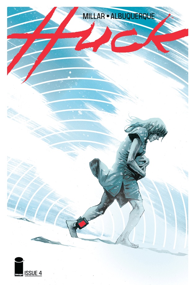
HUCK #4
Writer: Mark MillarArtist: Rafael Albuquerque
Publisher: Image Comics
Reviewer: Masked Man
The kinder gentler Mark Millar continues his latest “hey, Hollywood--make this into a movie” series, HUCK. For those not in the loop, Huck is another take on Superman--that is, if Superman is a little slow and works at a gas station in a small town. The people of the town have kept Huck’s superpowers a secret--until a newbie spills the beans.
First off, I want to give a shout out to colorist Dave McCaig. His painterly style really elevates Albuquerque’s sketchy work. It’s a bit hard to tell but I assume, like with Tim Sale, Albuquerque is laying down ink washes and McCaig is turning them into full color masterpieces, so Albuquerque owes McCaig a steak dinner. The two together give a great feel and style to this low key superhero affair.
Storywise, as usual Millar is fleshing this story out like a movie script as we efficiently move through scenes revealing plot points. And as we hit the fourth issue, plot twist! On the good side, Millar is still aware he is writing a comic book, and the single issue stands strong enough on it’s own for being a chapter in a larger story.
Getting to the spoilers, Huck has hooked up with his long lost brother and learns the truth about his past. Turns out their mother has powers like her boys. Living in Russia, she was snatched up by the government to help them start ye olde super soldier program. But just like an action movie from the 80s, she makes her escape while pregnant with the boys. Making her way to America, she gave up the boys so they all could hide better. But since Huck has the non-Superman power of being able to locate things, thanks to his brother Tom knowing her name, he manages to find their mom. Then--PLOT TWIST!!! Can you guess it?
To a certain degree there is not much to these characters, aside from Huck being a sweet guy, as Millar has yet to give us anything to really like about them. Again, like certain scripts, they are just clichéd characters in a movie, although I did enjoy the growing buddyship between Huck and his brother Tom. The plot also moves at a brisk pace to prevent you from getting bored.
For the most part I think Millar is doing a good job with this; not quite his usual tale. It’s a fine read, but like what killed the kinder gentler heroes in the first place, he has yet to do anything interesting with Huck yet, and it might (I said might) get boring if he’s not careful.
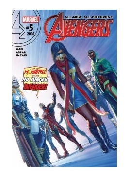
AVENGERS #5
Writer: Mark WaidArtist: Mahmud Asrar
Publisher: Marvel Comics
Reviewer: Masked Man
The All-New All-Different AVENGERS, combining Marvel’s most trendable characters, really gets into the Vision mess with this issue. As we saw in the AVENGERS #0 preview, The Vision removed his emotion processor as past emotions seemed to be gumming his perception. Previous issues hinted at trouble, and this one goes full bore into trouble.
Now, whether or not The Vision has gone evil or is just trying to achieve some non-evil goal through immoral means remains to be seen. One also wonders if he is being manipulated by the mysterious Mr. Gryphon. Previously, The Vision demanded that young Nova owed him a favor (mafia style). Spoiler time--now with a hologram projector upgrade, The Vision has incriminated the young Ms. Marvel and gotten her fired from The Avengers. Nova decides he has seen enough and goes afterTthe Vision, getting himself benched from the team as well. As The Avengers then go off to handle an upgraded Equinox, The Vision seemingly attacks Captain (Falcon) America and (Jane) Thor, setting up a very bad and very old school cliffhanger for Thor. And the truth behind Mr. Gryphon is revealed- no spoiler, but damn, this character again? I have yet to read a good story with this guy and he is massively overused, IMHO.
The highlight of the issue is easily Vision’s malintentions. Just what is up with that creepy android as he dismantles The Avengers? Likewise, the scenes with Ms. Marvel and Nova are very nice. Well, the fan fiction bit with Ms. Marvel was the low point of the issue. For someone as skilled as Waid, it seemed kinda forced and too much trying to be hip with the kids.
New artist Mahmud Asrar does a fine job with this issue. While Marvel hasn’t really gotten the talent on THE AVENGERS that DC has gotten on the JUSTICE LEAGUE, I would say Asrar is better than average with this superhero comic art thing. His figures are nice, and the action and storytelling are well done. His time with the X-Men has probably helped him manage so many characters on a page and in a panel.
THE AVENGERS isn’t quite a barn-burner, but there are a lot of good things moving around in it. I hope it continues to improve and get better with each issue.
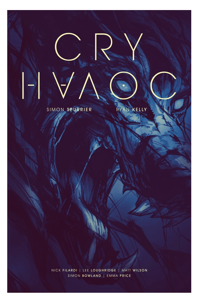
CRY HAVOC #1
Writer: Simon SpurrierArtist: Ryan Kelly
Publisher: Image Comics
Reviewed by Humphrey Lee
I like unorthodox. Well, mostly. I’m not exactly one who thinks that the only way to live a life is to always find something to shake it to its core each day out of some vain attempt to feel alive. You can have your base diving or your need to strap your pants holding up device around your neck during some special “me time” in order to really tap into primal energies or whatever. Over here, I’m the kind of guy who likes to mix things up by popping a new craft beer a few times a week, or finding new variations of workouts to shock my body out of the norm, or different ways to call the furry cannonball that is my cat fat. Mixing things up is good, twisting the norm is good, and you don’t always have to take things to the nth degree to make an impression. But just because you don’t take things to extremes to be out of the ordinary does not always mean you’ll succeed at getting your ideas across.
CRY HAVOC, the new Image Comics joint by writer Si(mon) Spurrier, artist Ryan Kelly, and a trifecta of the industry’s most reputable colorists, goes a little bit experimental in its debut. The approach it takes runs a gamut of timeframe shifts while utilizing this assemblage of comic book shade throwers to each render one of the periods. The subject matter at hand in the midst of this colorist carousel is a rather young gal named Louise, who if you would take the typical phrasing around this comic book title and “let slip the dogs of war” after crying your havoc, you would surmise that Louise either has a war problem or a dog problem. Turns out actually, it’s both.
You can essentially put this together from the first panel of the book, depicting a battered Louise in a wooden cage with a rather gangly and clawed arm propping her up as an off-frame voice somewhat taunts her. Except you can’t quite yet finish off that line of thought because after that first page, which is a flash forward, you get to trip back to the past and a movement from some Lee Loughridge coloring work to Nick Filardi, which means going from the dirtier and darker tones of the former to a lighter and shinier coat at the hands of Filardi. This means that when you see Louise again in the timeframe of the past she appears much more vibrant, especially in her blue with silver-tipped shoulder length hair, as opposed to the way more black and even shorter hair she has in the opening frame, which immediately sets off some confusion as to whether they’re even the same character because these color changes are just different enough, and the exposure to this character already so brief enough, that it makes you wonder if they’re the same person--especially when you go from one shot of this person in a muddy, wooden cage to another of her visiting her zookeeper girlfriend at the local animal habitat to drop her off a sandwich.
That is somewhat what I was alluding to at the end of the opening paragraph here about not always succeeding at getting ideas across, because these shifts in perspective can be a little jarring because they end up being in such extreme relation to each other as you first encounter them. The first shift from the later part of the story as the narration lets us know in the first panel of the past of Lou visiting her hyena-observing girlfriend (a set up that ends up being pretty on the nose as we get more input into the overall story of CRY HAVOC) ends up being a little confusing because of the transfer in coloring and a little lack of clarity as to who is who. The next shift, from that beginning time point of Lou at the zoo, makes way into her strapped into a heavy duty military helicopter that is making some stray goats into pulp for fun. More insight into the overall plot of CRY HAVOC is dropped here, as this other sequence with its own coloring scheme (this time done by Matt Wilson) as she sits back somewhat uncomfortably while some very hard-looking people that look to be sporting some extraordinary senses are talking at her. This diverted flow of the storyline only ends up being a little awkward, because not only does she look out of place here but the exposure we had to her at the zoo did not really leave the impression of Lou as being the grunt type. Another shift back to the beginning definitely reveals this to be the case.
Now, the brunt of all of that makes it sound like CRY HAVOC is a bit of a hot mess, but it is most certainly not, though it takes a bit of a clumsy first read to snap everything into place. After that initial scan through the time juxtaposition these stages of Lou’s life make a bit more sense, but at the same time they come with an odd course of items that have you scratching at your head a bit as you wait for more issues to come, because as things would play out from that helicopter sequence, Lou is most certainly not the foot soldier type. She was a musician who had a very sudden and traumatic experience with a glowing-eyed wolf thing while playing her violin out in the street one day for some practice and a few pennies, which makes the course of Lou’s life events of lesbian musician trying to make ends meet becomes infected with some werewolfiness and then ends up working with some supernaturally powered task for of some sort to find herself locked up in a cage by some rogue commander by the name of Lynn Odell at the end. And it’s not that any of these tidbits and insights into the life path of Louise are in any way disinteresting or off-putting; it’s just that getting there the first time (and subsequently locking that all into place with a follow-up reread) presents oneself with a lot of questions.
Questions are a good thing, though, most times. They mean you want to know more and indeed I do with this book, so far. Mainly it’s that leap from Beginning to Middle that evokes the most curiosity. Louise going from uncomfortable rookie soldier to being in the hands of this Lynn Odell is not exactly a big jump in logic, though it definitely causes you to wonder what happened to all those big, gruff men and women she traveled to this war zone with, but that jump from somewhat timid and struggling musician with her girlfriend into werewolf-charged soldier leaves a lot of area to wonder just what the hell happened to her life. Once you get the pattern of CRY HAVOC down you find that Lou is a pretty easy character to latch on to for that reason; she’s very identifiable in her old, simple life and then is placed in these extraordinary circumstances that are seemingly beyond her, kind of like any good superhero origin tale. It’s just that getting to that point at the end of the first read is a bit shaky and maybe could have gone off a little bit better in the unorthodox manner it played out.
The one constant here is definitely the art chores by the deft hand of Ryan Kelly and that trio of coloring experts. I know that I said the initial shift of colors led to a bad jump into this book because they raised a bit of the confusion, but it had nothing to do with the actual composition of the skills at hand—it’s just the suddenness of the turn made things a bit awkward. Each coloring style really does wonders to add a different look and texture to what Ryan Kelly presents us penciling-wise. I’ve always liked Kelly’s art, it being a very soft line style that he packs a lot of detail and expression into, especially since he’s never been shy about loading up a panel with modifiers to really push the energy. It works really great on more personal tales that really want the focus to come from the trials and tribulations of the lead and I think CRY HAVOC, in the end, wants to be that kind of story. It looks like there will be some machine guns and “wolf magic” along for the ride; so be it.
CRY HAVOC takes some work to fully wrap your head around but I feel at the end that that effort is worth it. And it’s not that my problems with this debut revolved around that extra energy being put toward the book but that the brainpower expelled to do so seemed to be a bit unnecessary due to the execution. Once everything is laid out I feel like the overall picture presents itself as something interesting, but damn there will need to be a lot of following up to help pay it all off. Just the mysterious life path that Louise ends up following to get to the self-appointed End chapter of the book is a lot of leaping, and seeing those events unfold in future installments could easily make or break this book. The art is very pretty and the rotating colorist scheme really does set this book apart a bit, but that is also a gimmick that needs to be used wisely or it could inadvertently have some detrimental effects here as I noted happening just two pages into this series premiere. I am on board, though, at least for an arc, to see if all the creative talent on this book from Spurrier on down through Kelly and the shade gang can build off the momentum this book does have by the time it closes. I’m always down for some havoc crying; now it’s time to see what kind of war these dogs are waging.
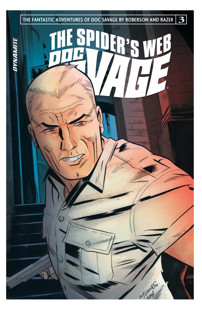
DOC SAVAGE: THE SPIDER’S WEB #3
Writer: Chris RobersonArtist: Cezar Razek
Publisher: Dynamite Entertainment
Reviewer: Masked Man
The Man of Bronze Doc Savage’s newest adventure continues to roll along, as our hero keeps researching into the past to help with a modern problem.
It seems that someone has gotten ahold of an earthquake device, and Savage and team are trying to put the pieces together of how and why, so he’s been revisiting old case files to see where the threads lead. Off the cuff, I kinda wish Roberson was revisiting actual old stories of Doc Savage instead of making up old adventures to fit this current plot, although one of the reasons for doing this is to showcase this new take on Doc Savage.
What do I mean by new take? Well I’m not talking about something as drastic as giving him a robot body (see DC’s Shadow). But as he did in Dynamite’s first Savage miniseries, Roberson has created a whole history for the character, from his beginnings in the 1930s to today. This includes getting new teammates every decade or so, as they grow old but he does not. It also gets into the evolution of his pro-humanity organization, from a single floor in the Empire State Building to the global Red Cross/Apple Computers entity that it is today.
In this issue Doc does a brain scan on a former thug (if you will) of the long-lived evil organization Arachne, which in the 1970s (old James Bond jumpsuits, everyone) was trying to remodel the world with a nuclear war. This leads Doc to believe there is a singular mastermind behind what Arachne has been doing all this time.
Doc Savage under Roberson is kind of a double-edged blade. On one level all this history of the character is very cool and enriching. On the other (to be mean), this is all history out of his butt. It’s not like reading about DC’s original JSA, which actually has history you can look up and read. It also gets a bit muddy with a new team in every flashback, some of whom are grown-up kids of the older teams. That said, the slow investigating of a mystery with action-packed flashbacks has been a good read.
Artist Cezar Razek does a good job trying to bring a sense of flair to all these panels of people in business suits talking, although he does get a bit inelegant with his figures and backgrounds from time to time. But all of his faces are well rendered to be individualistic, and he always makes an effort to draw some cool cars from the time period of the flashback.
So far THE SPIDER’S WEB is a bit dry compared to Roberson’s first Doc Savage tale, so while it’s a decent read, I’m hoping he can kick it up a notch before it ends and make all this flashback meandering worth it.
Proofs, co-edits & common sense provided by Sleazy G
 Want more in all things Geek?
Check out our friends at PoptardsGo for podcasts, reviews, and more!
 And if you still need more geek in your life, check out Part-Time Fanboy for more geeky goodness on comics, movies, and more!
Finally, check out AICN COMICS on Facebook and Comixpedia!