
(Click title to go directly to the review)
Advance Review: SANDMAN OVERTURE #1
VELVET #1
SAMURAI JACK #1
Indie Jones presents GOD THE DYSLEXIC DOG V1 TPB
JUSTICE LEAGUE #24
Advance Review: THE FOX #1
SAVAGE WOLVERINE #10
CONAN & THE PEOPLE OF THE BLACK CIRCLE #1
Advance Review: FABLES ENCYCLOPEDIA V1 HC
PRETTY DEADLY #1
Indie Jones presents PULP #1
CYBORG 009 V1 OGN
T.H.U.N.D.E.R. AGENTS #3
Advance Review: CREDENCE OGN
Raiders of the Long Box presents Halloween Comics!
 Advance Review: In stores today!
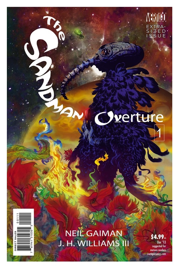
SANDMAN OVERTURE #1
Writer: Neil GaimanArt: JH Williams III
Publisher: DC Vertigo
Reviewer: Optimous Douche
I came into Gaiman's brain child completely ass backwards through all the spin-off titles like DEATH, LUCIFER and even Jill Thompson's adorably macabre THE LITTLE ENDLESS STORYBOOK before I ever read SANDMAN proper. When the book came out I was in high school and my comics needed to reflect my real life desires like weed, girls and driving fast--thank you, Marvel and Image. That switch of soulfulness, the desire to peel back the universe and dissect all of its icky intricacies, still hadn't matured in my brain. You need that, let's call it self-actualization, to truly understand all the subtle layers of SANDMAN. Gaiman's personification of humanity's drives and desires caressing the main DC universe is a wonder to behold. If you get it, SANDMAN not only makes us think about our existence, but it also forces our favorite heroes to do likewise.
I've since rectified my mistake. I'm three volumes into SANDMAN right now and I'm balls deep with the third volume because I'm reading the over-sized annotated edition. SANDMAN OVERTURE, though, welcomes you whether you’ve read any of the prior iterations. This new volume gives you all of the required information if the Endless have never been in your comics repertoire, while at the same time welcoming back old readers with a marvelous facelift.
Where has Sandman been since we’ve last seen him? It thankfully doesn’t matter, meaning the past volumes still awaiting me are a surprise in the making. Actually, the first part of the book doesn’t even focus on our Sandman, but a piece of sentient flora bearing a strange black and white resemblance to our sleepy anti-hero. This lone plant burns inside The Dream, becoming no more and obliterating the prospect of dream for all denizens of this strange world.
That’s right--our Endless don’t control the fates and machinations of existence for all planets. Instead, each self-aware species in the galaxy has their own version of the Endless to keep them company at night, during death and to guide them on their course through destiny. This first chapter ends in sorts where it began, with a convening of all Sandmen, Sandplants and Sandgiants trying to suss out the fate of their fallen brother.
We get hints and inklings throughout the book on where the arc is headed, like a newly redesigned Death – now more Victorian than Marilyn Manson. Her goal is to give her brother Sandman his final fate, if only he weren’t being transported willy-nilly across the galaxy and planes of existence. Her tete-a-tete with Destiny is charming and apropos to highlight her casualness and his constant lamenting of inaction. After all, if destiny just is, then Destiny will be just is as well.
The Corinthian has also made a comeback. His ocular cavities are still chompers and he continues to defy his dream state to bring murder to the real world. Again, though, Sandman is transported away before he can undo what he has wrought upon the world.
In my way-back travels of SANDMAN, I’m only as far as Sam Keith’s work. I didn’t think another artist could tackle this book, especially not one as polished as Williams. I was wrong. Every page of this book is a pinup waiting to adorn your walls. From the subtle moments with The Corinthian to the grandeur of the cosmos and beyond, Williams simply outdid himself upon on every page. Gaiman is a man of many words, yet somehow Williams found a way to let every page breathe through the abandonment of confining panels and other comic conventions.
My words can’t do this book justice. For every moment I anemically truncate, Gaiman expounds with a poetic air. Destiny doesn’t simply introduce himself; he uses the page to convey the pain of his all-knowing yet do nothing existence. The death of flora Sandman is tragic and sublime, and again only takes up one page. Every page of SANDMAN OVERTURE is as haunting as it is engaging – exactly what one would expect from a dream of a comic.
Optimous Douche has successfully blackmailed BottleImp to draw purty pictures for his graphic novel AVERAGE JOE coming out in 2013 from COM.X. When not on Ain’t It Cool, Optimous can be found talking comics and marketing on robpatey.com and just marketing on MaaS360.com.
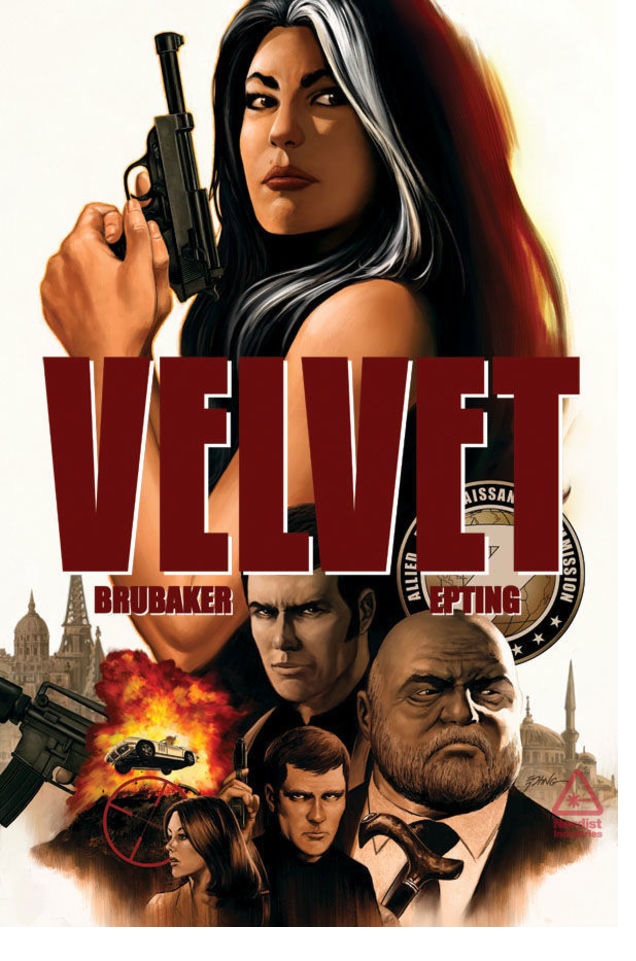
VELVET #1
Writer: Ed BrubakerArtist: Steve Epting
Publisher: Image Comics
Reviewer: Humphrey Lee
As I have stated here many, many, oh so many times before, a significant portion of my comic book purchasing dollars and reading time goes to product based solely on creative team. Some folks, like Mr. Brubaker here, are on the top end of the list, which means the majority of the time I do not even look at the solicit text for their book; I just add it to the order list. Hence why Image gets so much of my monies, because they are the current place to be for creative people I love to support with my dollars that aren’t going to the essentials, like food, making my cat happy, rent, making the cat fatter, or $1200 in car repairs because CARS ARE THE FUCKING DUMBEST GODDAMN MONEY SINK PIECES OF SHIT EVER!!!…anyway. So, all I really knew about VELVET is that it was a book about a woman and probably spies because that’s the vibe I got from the cover. And, because I’m not some elitist dipshit who, after being a part of a fan base of a medium that was socially shunned for fucking decades, is now deciding to very vocally shun or even mock an entire gender base for also being highly interested in the same medium now that it has attracted some more mainstream appeal and acceptability, was pretty down with this. Because, really? Goddamn really? Years and years of being downtrodden for enjoying the odd D&D campaign and really, really being into SECRET WARS and now that we’re getting billion dollar movies about the fucking AVENGERS we’re going to put out the “No Girls Allowed” sign like some goddamn “Dennis the Menace” cliché? Because, what, some deep-rooted resentment that stewed and stewed over the fairer sex, stemming from feeling like they were also a part of the shunning crowd because all you really wanted was one of them to like you and your comics and other geek shit and now that they not only do, but they’ve embraced it to the point where they are dressing the part – and god forbid looking sexy while doing it – and *gasp* even writing them, you need to do fuckfaced things like tell them they’re “trying too hard” or ripping up their comic they just got mass-published in front of your also narrow-minded constituents to pander to them? Instead of just being happy that there are more people in the geek fold and they just happen to have breasts, exquisite breasts (not being sexist, just quoting “Anchorman” here)? Seriously, grow the fuck up…<br.
…
So, yes, VELVET has a female lead and is indeed a book about spies. Retro spies in that late 60’s vibe of everything being very deep cover and hush hush, though everyone seems to be in the “swing” of it, if you catch my drift. What really drew me in as I started reading – besides Steve Epting’s artwork, which oozes that espionage aesthetic with how it moves and plays with light and shadow – is how the writing parcels out the world and plays with the tension its plot commands. VELVET starts with the absolutely worst situation that could smack a spy organization such as its ARC-7 with, the death of an agent, and then lays the thriller groundwork. Most of this cement-laying revolves around Velvet Templeton’s place in the organization and somewhat downplaying who she is and what she’s capable of doing. Obviously, given her titular status you expect her to be an asset of some high value, and Brubaker and Epting play this up by really touting her stateswomanly stature as her and her business attire and shock of grey hair mixes with the directors, agents, and secretarial pool alike. By the end of the issue, though, when she’s putting the point of her foot and the heel of her palm into various body parts as she takes on a handful of her now-former coworkers, it’s not a surprise she’s unleashing such an inner badass, but we are definitely given some misdirection as to what her value to ARC-7 really was.
The atmosphere, meticulousness of pace, and flow of VELVET are really the selling point here. I feel like I say it a lot when it comes to these pilot issues, but quality world-building is key. The level to which we are going to get immediately invested is correlated to how much the world begs to be invested. VELVET gives us all the things we love about that genre but never feels like it’s pandering. We immediately feel the wounds of the death of Agent Jefferson Keller, or “Agent X-14” in shadow title, and the pride of the organization that is ARC-7, so as to know how seriously it is going to take the investigation into his inexplicable demise. The book also channels the freewheeling sexiness of the early 70’s and that “swinging” nature of this type of people that would dodge bullets and hide in the shadows, though it more relegates it to reminiscing about flings in the secretarial between them and the agents than it does by throwing go-go dancers at us en masse. There’s not much action in the book, but when it hits it does so like a judo chop from hell, reminding you that this is the creative crew that brought us one of the best CAPTAIN AMERICA runs to ever exist and which excelled at its fisticuffs as well as its own brand of espionage. It’s definitely the payoff of this issue as that is the transition point for Velvet, where we see her go from a desk jockey into someone you just do not fuck with in the literal blink of an eye.
Closing this off and kind of bringing back the rant I decided to diservice this review with at the beginning, VELVET is a book about female ass-kickery, sure, but the revelation, as always, is that it does not hinge the whole story on Velvet being a living weapon and looking for acceptance from the boys club. It is a super-smooth “who can you really trust”-style thriller that just so happens to have a strong female lead. She has the same strengths and flaws as any character; a sense of loyalty and service and dedication mixed in with the penchant for danger and impulsiveness you’d expect from someone in this profession--not to mention some emotional naiveté she reminisces about here and there. Let’s call her what she really reminds me of, and that’s an older, somewhat more wizened and less substance-abusive Tara Chace in a throwback and sexier/nostalgic era. And quite frankly, if the solicit I never actually read basically pitched me that, I’d have been in for a few hundred pennies no doubt. Instead, I saw the names Brubaker and Epting and the Image banner and made that financial decision just as readily. I suggest you do too, unless all you see here is some “Grrrl power!” that you for some reason take issue with and that does not actually exist. Then I don’t know what to tell you, really, except that you’re trying too hard bro. Cheers…
Humphrey Lee has been an avid comic book reader going on fifteen years now and a contributor to Ain't It Cool comics for quite a few as well. In fact, reading comics is about all he does in his free time and where all the money from his day job wages goes to - funding his comic book habit so he can talk about them to you, our loyal readers (lucky you). He's a bit of a social networking whore, so you can find him all over the Interwebs on sites like Twitter, The MySpaces, Facebookand a blog where he also mostly talks about comics with his free time because he hasn't the slightest semblance of a life. Sad but true, and he gladly encourages you to add, read, and comment as you will.
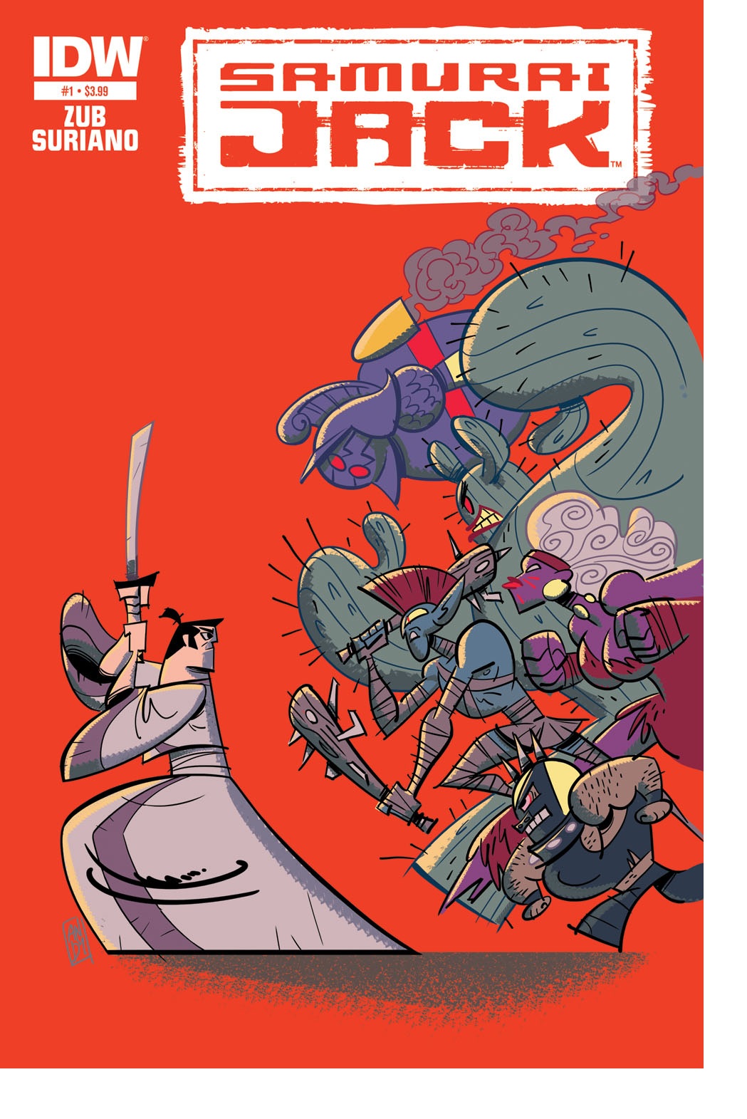
SAMURAI JACK #1
Writer: Jim ZubArt: Andy Suriano
Publisher: IDW Publishing
Reviewer: Anna Pederson
It might be hard for me to be a little unbiased about a series that I held so dear in my childhood; that I’ll be inclined to like the story no matter what. Flip-side, I believe my history with “Samurai Jack” as a cartoon also made me picky about the script in general. To my relief, Jim Zub upheld my impeccably high standards for cartoons turned comics and I am very excited to read more, and here’s why:
It wastes no time. What could have taken a full episode to disclose, Zub did in two pages. He set up the story of how a Samurai called Jack was forced into a dystopian future by the evil demon Aku. The future is now under the control of Aku, and Jack is on a journey to retrieve the threads of time that will allow him to travel back through time to kill Aku and save the future. Zub did this in two pages.
A solid blend of comedy and action: this was arguably the highlight of the show, and the comic follows similarly. There’s little dialogue from Jack, thus mostly relying on the supporting characters to provide the classic one-liners. Jack still gets in a last word, though, when doing battle.
Speaking of doing battle…
The action sequences (!): the art is done by Andy Suriano, who did the original character development on the television show. It’s often hard for some people to make the transition from static character designs to full-on action sequences, but Suriano takes the original feel of the title and combines it with classic manga inking. It feels fast paced, but in the right way where I’m not confused about what’s going on, but I’m not wondering what the point of the fight is.
It’s easy to say that this book will be formulaic, and every issue will be Jack locating a magic thread of time and having to beat people up to get it. That’s not to say an action-heavy book is a bad thing, but the creative team has to be a little more, well, creative in coming up with additional characters and B plots to keep things from becoming stale. Thankfully, they already have some material to work with, but the most fun to be had with this title will be seeing all the new directions in which they take the story.
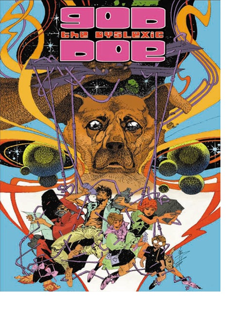

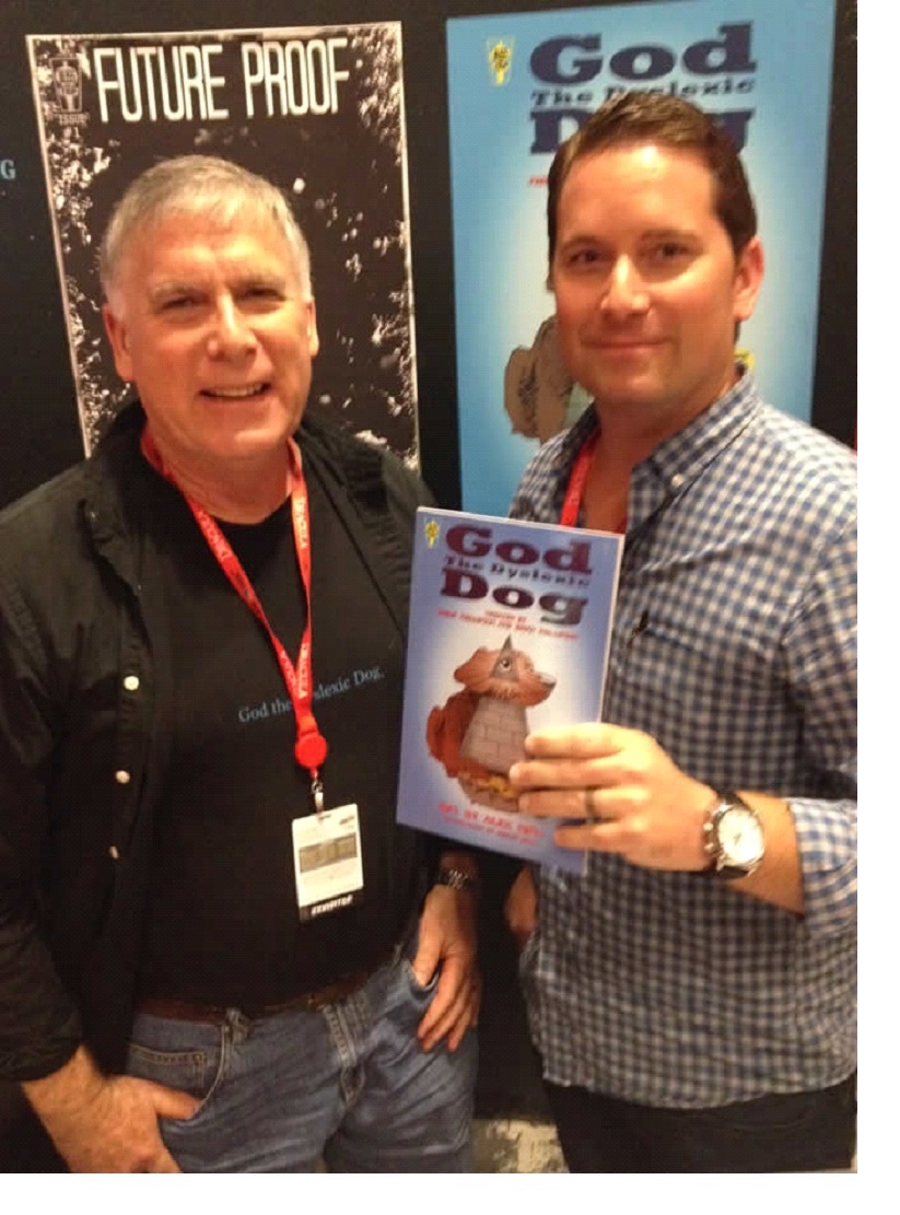
GOD THE DYSLEXIC DOG V1 OGN
Writers: Brian & Phillip PhillipsonArtist: Alex Nino
Publisher: Bliss on Tap
Reviewer: Optimous Douche
Not the book I thought I was getting. That isn’t a bad thing, but it certainly threw me when the headspace I set aside for this title required a completely different piece of gray matter.
I met the Phillipson creative team at New York Comic Con 2013. The boys caught my attention on my first walkthrough of the main floor, because as much as I hate to admit it, I’ll read anything and everything about dogs. The retriever is my spirit guide, if you don’t believe me throw something and watch me go (just please don’t fake). When I asked the guys what the book was about they simply said “A dyslexic boy adopts a dog.” I thought I was in heaven: dogs and a cavalier attitude towards learning disabilities – sold!
GOD THE DYSLEXIC DOG is so much more, though…I think. I’ll be honest, I’m not 100% sure I get this book. I know it’s much more than what the Phillipson men described, but I also admit some of it went above my usual competent understanding of the esoteric.
At the beginning of the universe, God just is. We gave God form, because quite frankly he lives to serve us with more desire than we pay tithing to him. The Gods that came after from Egyptian to Roman were similar constructs of us, never existing without yet having always been because we dreamt of them.
 Dog is just one other vessel of our desire to understand, but also lives among us. In the beginning God and dog were one until God abandoned this universe leaving Dog in charge, yet also a slave to the lesser Gods that came after. Call it hubris, call it human nature, whatever you want to call it--both God and Dog are locked away from us until the age of science rears its ugly head. Of course, the main perpetrator of this shift from blind faith to seeking faith in facts is a man named Pavlov. As Pavlov seeks to control dogs he is also attempting to quell the spirit of all, even the deities who once could exist without proof or fact to substantiate them. Like dog, science now controls God as well.
There’s also great talk of inversion in this title, which is where the whole dyslexic thing comes from. God is the servant and the master as is doG. Again, I think….like I said, this book is heady.
Nino is the prefect artist to get it. Like this week’s SANDMAN, Nino gives the page ample room to breathe by abandoning the traditional panel in favor of a kaleidoscope of imagery. There’s nothing real in this book, and the art reflects that abandonment in kind. One is left to interpret the cacophony of images as much as we are left to translate what the text means to us. Yes, there’s dog who is always distinguishable, and characters from Pandora to a little boy who takes over Pandora’s box and thus dog, but even they are constructs more than real tangible things.
At the end of the day, if you find yourself tiring of the traditional linear narrative you will love GOD THE DYSLEXIC DOG. If you’re just a dog lover who often finds the writing of cats like Morrison too out there, you will need to steer clear. If theology, the belief of divinity in animals and a good head scratcher are what keeps you engaged, then order GOD THE DYSLEXIC DOG today.
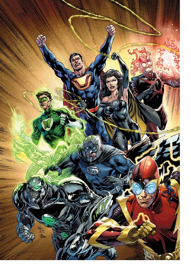
JUSTICE LEAGUE #24
Writer: Geoff JohnsArt: Ivan Reis (pencils), Joe Prado/Oclair Albert/Eber Ferreira (inks)
Publisher: DC Comics
Reviewer: Henry Higgins is My Homeboy
Ultraman To The Rescue!
I have not much cared for the Nu52. I've said it before, I'll say it again, and I'll say it forever - It is not very good. Aimless, devoid of humour or heat, the entire line (save for a few notable stand-outs) has suffered. So why do I keep reading it? A little morbid curiosity, with a dash of brand loyalty and hope that, hey, maybe it'll get better. FOREVER EVIL, a crossover that immediately follows the last crossover from a month before, has been going on for a little bit now, and it just has draaaaaagged. The slew of tie-ins failed to leave a lasting impression, with dull characters and forgettable plots. Except for JUSTICE LEAGUE. JUSTICE LEAGUE is a comic I haven't enjoyed since before FLASHPOINT. I actually enjoyed this last issue, however, Geoff Johns delving into the origin of Ultraman. It's a neat exploration of an "evil" Superman, and it actually adds a good deal of depth to him and, by extension, Superman.
The opening seven pages of the comic center around a twisted origin story, where a married couple on Krypton murder the other fleeing Kryptonians to ensure their son's survival. But there's a dark edge to the act, a sneering Jor-IL commenting on how weak his infant son is. He's not powerful, not strong enough to avenge his parents. It's not that act of a loving father, but a selfish man demanding vengeance. As the planet crumbles, Lara and Jor don't embrace but reiterate their hatred for each other. The twisted mirror Johns is presenting is fascinating, but it doesn't take too long. All considered, the segment just takes seven pages, and is a strong declaration about the character. Ultraman isn't cackling or just "evil Superman", but has an actual motivation. He chose to embrace only his Kryptonian ideology, choosing to see Earth as beneath him. He doesn't understand charity, empathy--only the strong and the weak. It's a wonderful parallel between him and Superman's compassion for his fellow man, and one that makes him stand out amongst a team of mustache-twirling costume changes that is the rest of the Syndicate.
Ultraman goes to the Daily Planet, and oooooooooo, it's well done. Ultraman arrives at The Daily Planet, looking for Jim Olsen. Instead, he finds Jimmy, who doesn't do well against him. Ultraman does terrible things, never raising his voice, his eyes shrouded in shadow. Ivan Reis does wonderful work throughout the issue, but this scene is ominous and dark without feeling overwhelming. Well, save one scene of the genuinely creepy sequence being interrupted by the threat of rape (because "super rape" is a superpower every villain in DC seems to have), which doesn't gel with the rest of the scene. But it's followed by a terrified Lois calling out for Superman, and Ultraman shooting it down with a glare and two sentences. And, again, Johns uses it to express a core tenet of Superman - Jimmy tearfully begs Ultraman to spare the rest of the paper staff, which "disappoints" Ultraman. This Jimmy is "weak", sickening to Ultraman.
The actual plot of the book takes a step to the right for a brief character study, but it comes back with force when Grid (ugh), a big player who had apparently died (yay), returns to sucker punch Ultraman and start a fight between the two, Ultraman excited to test his strength. It's wonderful.
So…I liked an issue of NU52 JUSTICE LEAGUE. I'm shocked. Please keep it going like this. Prove me wrong, DC, prove me wrong.
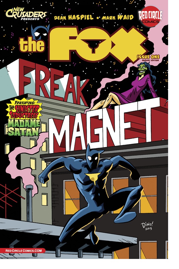 Advance Review: On Sale Today!
THE FOX #1
Plot and Line Art: Dean HaspielScript: Mark Waid
Publisher: Red Circle/ Archie Comics
Reviewer: BottleImp
In a time when the majority of superhero comics are grim and edgy in an attempt to be relevant, when Christopher Nolan and David Goyer have managed to bamboozle moviegoers and critics into believing that dreary and plodding equals sophisticated and mature, and when one of the head honchos at DC has bluntly stated that the comics they publish are aimed solely at the 30-40 year old demographic, how wonderfully refreshing it is to find a superhero comic that deliberately eschews all this nonsense and embraces the notion of FUN. I’ve previously lauded the folks at Red Circle Comics for their excellent NEW CRUSADERS series, a comic book that combines the best classic aspects of the genre with modern storytelling savoir-faire. Now Red Circle has released their second title in the Crusaders universe (for lack of a better term), and here’s the good news for all you readers who like their superheroes a little less gritty: THE FOX is even more of a fantastically fun roller coaster ride.
This first issue (subtitled “Freak Magnet”) introduces the reader to Paul Patton, Jr., a photo-journalist who initially donned the costume of The Fox in order to attract the attention of criminals. Patton would then take photos of the action and sell them to the papers—-kinda like your friendly neighborhood Arachnid-Person, just without the heavy emotional baggage. Oh, and also without the powers. Just a normal (albeit very athletic) guy, out looking for a juicy story. Trouble is, once the weirdness starts to find The Fox, it never seems to stop--hence this premiere issue in which our intrepid and inquisitive hero gets tangled up with an immortal demon named Madame Satan, tied up and interrogated by some hired goons, and finally pressed into service of the otherworldly Queen of Diamonds in the cliffhanger ending. Just another day in the life of a superhero.
Dean Haspiel and Mark Waid have put together a comic that effortlessly channels the way-out-there feeling of classic Jack Kirby stories, distilled and injected it into the dimensional, real-world feel that marked Marvel’s best Spider-Man stories, and dressed it all up with exuberant, energetic art that combines the cartoony dynamism of Bruce Timm with the offbeat, funky stylings of Mike Allred’s MADMAN comics. Allen Passalaqua’s simple but effective coloring never feels forced or clutters up the economical linework, but adds just the right amount of tone to make the figures pop from the page. Waid even manages to make the script touch upon contemporary and relevant issues without (gasp!) resorting to making the character dark and dirty or having the hero break a villain’s neck.
(Well, that’s actually a lie, ‘cause the Fox does in fact snap Madame Satan’s neck, but she gets better right away, so I’m pretty sure it doesn’t count. Plus nobody screams “NOOOOOOOO!” into the camera.)
If there’s one publisher out there that actually seems to want kids, not 30-year-olds, to pick up comic books and be enthralled by the joyful sense of fun that the best of the medium instills, it’s Red Circle. And if there’s one title out there that sums up that wonderful reading experience, it’s THE FOX. But don’t just take my word for it—-check this great comic out for yourself. Go have fun!
When released from his bottle, the Imp transforms into Stephen Andrade, an artist/illustrator/pirate monkey painter from New England. He's currently hard at work interpreting fellow @$$Hole Optimous Douche's brainwaves and transforming them into pretty pictures on AVERAGE JOE, an original graphic novel to be published by Com.x. You can see some of his artwork here.
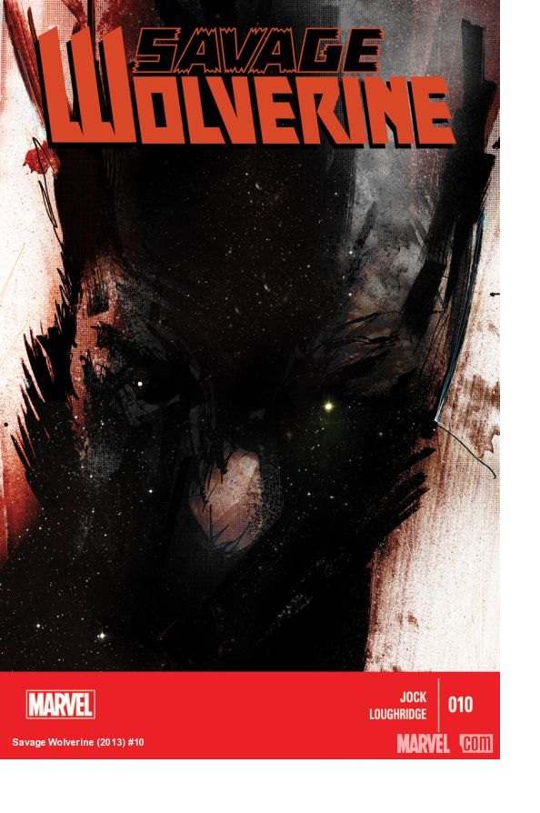
SAVAGE WOLVERINE #10
Writer: JockArtist: Jock
Publisher: Marvel Comics
Reviewer: The Kid Marvel
So for those that paid attention to the last review I did for SAVAGE WOLVERINE #9, you have some background on my expectations for Jock’s turn at the SAVAGE WOLVERINE helm and where the story’s at. For those who did not and are just checking in, I’ll give a brief summary of what brings us to SAVAGE WOLVERINE #10.
Basically, Logan has been mysteriously transported to an alien planet when he wakes up and falls off a spaceship, landing at this unknown location. He has no idea where he is currently at, what happened, or any idea of what’s going on. Logan is doing all he can do by surviving off the land until he can find some clues to his location and what led up to this. Wolverine then stumbles upon a random child who was sent to track him and is in some way created from Logan, with very minimal information given, ending with this child revealing there are more individuals like him.
So with that short catch up, we get to issue ten which reveals even less than the first part of this arc. Wolverine and the mystery child have been traveling around this mysterious planet, just doing what they can to survive. Jock adds in some diaglogue, basically just personal back and forth until a ship flies overhead. Wolverine and this child then hitch a ride onto the ship but are quickly discovered. Once discovered, Logan fights and kills these soldiers or aliens. Again, no real details or information being given on what’s occurring, before a lot of panels of artwork with little to no story dialogue. The last soldier kidnaps the mystery child, using him in his escape away from Wolverine; however, this is to no avail. Wolverine hops on the escape pod the soldier used and stabs him through the front panel, sending Wolverine and the child hurtling towards the ground landing in what appears to be a lab, ending SAVAGE WOLVERINE #10.
I have to be blunt at this point: Jock’s arc on SAVAGE WOLVERINE sucks. I had hoped after reading his first issue that things would get better as it went along, believing that Jock was going to build his story piece by piece, slowly and gradually picking up. However, the story pace is just as slow as, if not even slower than, when it started. I know it’s only been one more issue but from SAVAGE WOLVERINE #9 and #10, nothing has really changed. The story has made almost no progress, and as a reader I still have no sense of anything. Build-up stories are suppose to build, becoming bigger and better as they go along, snowballing into its conclusion. However, there is no building whatsoever; it’s just flat. How am I supposed to enjoy a story when I don’t even know what I’m reading about? So instead of enjoying a series I really liked, I’m now bored and lost as far as Jock’s writing goes.
As for Jock’s artwork, since he’s doing both art and story, it’s good but I just don’t like the gritty sci fi feel when I’m reading a Wolverine comic. Jock is a great artist, and his art for SAVAGE WOLVERINE is quality, but for a different story and different character. With art, just because it’s good doesn’t mean it works for the series, story, or character. If I was reading WALKING DEAD and the characters were Chibi, it wouldn’t hold the same weight as something darker and grittier for the story. The same goes for if I was reading Dr. Seuss and the art looked like something out of SPAWN: while possibly cool, it just doesn’t fit or belong for that particular place and reading experience. Jock’s art for SAVAGE WOLVERINE would work for other stories. However, this is supposed to be SAVAGE WOLVERINE, not a scene from Tatooine in Star Wars. I know art is all about trial and error and thinking outside the box. In this case, it just doesn’t work, at least for me.
I would personally not recommend buying this unless you’re a fan of Jock’s art, because the story so far is not worth the $3.99 for the book. There are better things to buy with your five dollars. While I did rip the book, I’m going to give it one more issue before it gets axed from my comic box. I really do hope that Jock’s story, once complete or further along, turns into something more enjoyable. I loved the previous teams and arcs of SAVAGE WOLVERINE, so hopefully the future issues pick up again, or at least return to glory once Jock’s run is over.
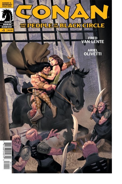
CONAN AND THE PEOPLE OF THE BLACK CIRCLE #1
Adapted by: Fred Van LenteArtist: Ariel Olivetti
Publisher: Dark Horse Comics
Reviewer: Masked Man
Back in 1934 Robert E. Howard wrote the Conan novella “The People of the Black Circle”. In 2013 Fred Van Lente has adapted the story for Dark Horse, with comic book painting star Ariel Olivetti. I love me some Conan, and the whole sword and sorcery genre, so I always check out the latest Conan books to see what's going on. Once I saw Ariel Olivetti was painting the pages, Dark Horse had a sale!
Where Alex Ross is the Norman Rockwell of comic books, Ariel Olivetti is the Boris Vallejo. Sure his figures are realistic, but he has no desire to paint real people. Just check out the massive form of muscles that is Conan on page 18. With his heroic painting style, Conan is a natural subject for Olivetti--it's kinda surprising it hasn't happened sooner. So while the script is good and all, Olivetti's work is the main reason to buy this book. Just good storytelling with bad@$$ figure work, although Olivetti is starting to use some cheap, cheesy computer gimmicks as well. Backgrounds are often photographs or 3D models of castles, and not well-integrated with his painted elements. Now I'm sure he did this to fit the budget and deadlines of the project, but if he couldn't really get them to work, I wish he just left the backgrounds painting sketches. It just would have looked so much better. Still, cheap effects aside, this is still a damn good looking book!
As I mentioned, this is an adaption of an original tale by Howard himself (do I really have to say that Mr. Howard created Conan?). Not only that, but it's considered one of his best novellas, as it's more than just Conan steal, Conan kill, which is a common trap for pulp fiction novellas. Conan of course does all that, but Howard got into more worldbuilding with this story and raised the stakes of the conflict, too (world domination). In the first issue here, Conan is full-on rogue, as he is the leader of a group of barbarian tribes, some of which are about to be executed by their more civilized neighbors, the Peshkhauri, for theft. Conan, of course, has to prevent this from happening, so when he meets with the King's sister Devi, he figures kidnapping her for a trade would be the easiest solution. Little does Conan know the King was just killed by the Black Seers of Yimsha via black magic, and that kidnapping his sister just dropped him right into the whole mess. Van Lente does a good job fleshing out the political goings on and handling the characters of Conan and Devi, so he should be able to write an effective adaption worthy of the source material.
If you enjoy your slice of barbarian pie with a good helping of great art, this is the book for you. Even as a passing fan of Conan, you'd be sorry to let this one pass you by. This definitely looks like keeper.
Learn more about the Masked Man and feel free check out his comic book CINDY LI: THREE OF A KIND and CAPTAIN ROCKET at www.Toonocity.com
 Advance Review: In stores today!
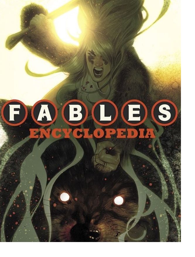
FABLES ENCYCLOPEDIA VOL.1 HC
Writers: Jess Nevin, Bill Willingham, Mark BuckinghamArtist: Mark Buckingham
Publisher: DC Vertigo
Reviewer: Optimous Douche
Confession time: this is only the second compendium book to ever grace my thousands upon thousands deep collection of comics. My memory is fair, and since I’ve always owned source material I always figured why bother. My other compendium is FABLES-related as well; I loved James Jean’s covers, so I bought that collection book simply to ogle them without sullying the individual issues. It’s a nice picture book, but only has a fraction of the insight, heart and clear creator love that occupies the FABLES ENCYCLOPEDIA.
What amazed me most about this meaty tome is just how far the characters have progressed in the past ten years. Emotional growth can only be measured by reading the book, but stately titles and the literal “where were they then” and “where they are now” can be easily referenced as long as you know the alphabet. Actually, I take that back. With the color commentary provided by WillingBuck, you do get a modicum of the characters’ feelings through the voice of their new Gods.
I wouldn’t recommend reading this in a linear fashion; every stinking character to grace the FABLES pages is in here. These footnote characters, while serving a purpose over the years, are truly red shirts. Unless you have a Germanic folklore fetish they will easily be forgotten and you’ll miss the meat. Instead, start with your favorite characters and you will quickly find yourself traipsing into and across these ancillary figures simply to reach the next impactful character on your list.
Jess Nevins truly did her homework here. There were many times I thought “That character must be made up.” Baba Yaga would be a good one for most. For me, I knew this insane witch well with my Slavic upbringing. Leave it to pollocks to come up with a witch that rides around in a mortar and pestle. Sigh…other characters like Mister (not Master) Dark weren’t made up, either; he was merely an amalgam, similar to Jack of Fables. Nevins peels apart the old tales to find the true source of each character. Did you know Ozma was supposed to be a brunette? I didn’t. They made her blonde because there were already too damn many mousey browns on the page.
WillingBuck did no homework for this book, but I’ll grant them a rest given their ten years of dedication. Instead the boys kick back and give their personal insight behind each character. Flycatcher’s first name is made up, and they never planned for him to be King. Prince Charming was Buckingham’s least favorite character to draw. Pinocchio’s overhaul was also a Buckingham add because he wanted to add an air of toughness to his boyish visage (I guess the cigar wasn’t enough). Speaking of Pinocchio, the wood nymphs that served as Gepetto’s guard popped Buckingham’s full frontal nudity cherry. I could go on, but I won’t since there’s a book for that. These are just a few of the hundreds of stories inside. I’m sure I’ve lost all FABLES fans at this point, since they went over to Amazon to buy the book, but I would be remiss if I didn’t mention the icing on the cake. To keep this from being a too tex- heavy affair, each page of words is accompanied by a page from past issues of FABLES. They didn’t do it for every character, but many get a nice remember-when moment.
FABLES ENCYCLOPEDIA reminds me of the first time I fired up Encarta: it made learning and remembrance a joyous and fun experience.
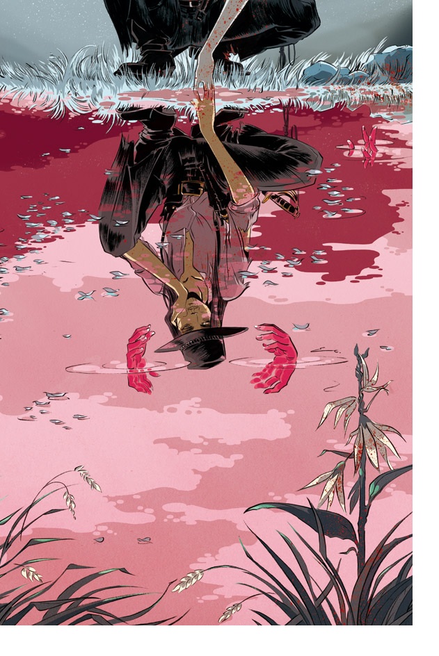
PRETTY DEADLY #1
Writer: Kelly Sue DeConnickArt: Emma Rios
Publisher: Image Comics
Reviewer: Anna Pederson
It had only been out for one day, but the new Image title PRETTY DEADLY #1 from writer Kelly Sue DeConnick and artist Emma Rios had already set the comics world ablaze after the rip that was heard around the world--the Twitter world, at least. Short recap: a retailer at Comics Ink in LA disliked this book so much, which he stated was “psychobabble, pretentious, bad writing and meandering”, he then allegedly ripped the comic up in front of customers as to save them from buying it. A sale is a sale, I guess. But this started an hours-long discussion that spanned from criticism to women in comics to the nature of success to Brian Wood.
But regardless of this hullabaloo, I had already read the issue and was well on my way to forming my own opinions of this book without the persuasion of others.
The most striking piece of the story started with the narration--a butterfly asking a dead bunny to regale him with a tale, which when paired with panels that reflected emotions of the scene being portrayed, rather than step by step action, left me with a chilling opening sequence that comics rarely do. It’s clear the DeConnick is tapping into a poetic side of her storytelling as evidenced by the origin story of our soon-to-be main character Ginny, as retold by a traveling blind man an his companion, a girl in a vulture cloak. They spin a bard-like tale of the Ginny, the daughter of death, to a crowd in a small western town that is reminiscent of a Sergio Leone film. DeConnick’s ability to move from the narration to the colloquial speak of the characters is impressive, as she doesn’t forget that a story taking place around the 1800’s shouldn’t have characters speaking like they have 2013 college educations. Rios’ work during the travelers’ tale is particularly gripping, as her use of collage-like panels heightens the scene to a visceral quality while we see the past and the present simultaneously.
Frequently in number #1 issues, I’m dismayed when characters are introduced without a trace of how we’re supposed to feel about them. But without the speed of film, we often draw our own conclusions of who new characters are when we meet them. This is not to say DeConnick and Rios hold our hands, but they don’t leave us to unnecessary guesswork. But two notable entrances are with Sissy the vulture girl, who plays up the magical realism aspect of the story by appearing to literally fly into the book, and with Alice, who with a slow and methodical entrance into a brothel looks like she’s gearing up to be one of the most badass characters yet. I’m very excited to see how she plays out.
The overall buildup to the mythical appearance of Ginny in the last page to me felt very cohesive, and like there was a guiding line that directed each page of this issue, rather than just disjointed worldbuilding to set up the series.
If Gabriel Garcia Marquez was asked to write a comic book that incorporated classic South American magical realism with fierce and powerful kung-fu swiftness, he may have written PRETTY DEADLY. It’s truly impressive how well the words and pictures of this book work together to achieve a feeling of comprehensive and emotional storytelling. After reading this issue, I got goosebumps. And after reading the very personal back-up pages by DeConnick at the end, I got inspired.
Suffice to say, I completely disagreed with the retailer who literally tore this book a new one, except for maybe wanting to eat this book to hopefully gain some of the creative teams magical powers. Talent works that way, right?
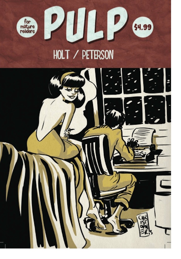
PULP #1
Writer: Jeremy HoltIllustrator: Chris Peterson
Publisher: Self Published
Reviewer: Mr. Pasty
Something unusual happened when I finished reading PULP. I had to go back and read it again. That's not what I was expecting from a graphic novel that clocks in at just 24 pages. In fact, I even went back and read it a third time to fully grasp what I had experienced. I knew after the first shot I had read something great; I just wasn't sure how to process it. I took a break and went back in with fresh eyes on the third run through, and by that time was fully able to appreciate what was in front of me. Part of that has to do with the method in which Jeremy Holt delivers his narrative. I know the term “non-linear” is bandied about to describe books like this, but it has become such a throwaway label these days I'm not in any big hurry to implement it. PULP almost feels like a dream, in that everything is just happening all around you, all at once.
It's impossible to talk about the plot with any serviceable details that don't spoil the book, so I'll avoid them as best I can. I went in blind and I was glad I did; however, I'm wondering if a story about an obsessive writer who is isolated from the “real” world was better understood by its own kind, since most of my days are comprised of being an obsessive writer who is isolated from the “real world.” I'd say I've been averaging about 3,000 words a day for the last six years and there have been times where I have been unable to distinguish between real memories and live blogs I've written. Was I actually there? Did that happen to me? Or was that something I wrote? Granted, it only takes a few seconds to discern between the two, but it can be a frightening experience when you lose track of what's real and what's imagined. That's not because I'm a nutjob, mind you, but rather because I'm overworked. If I take a 20-minute break or slam a Sam Adams in the middle of my shift (I work from home), I'm right as rain. But the point is, I'm empathetic to those cats who lose touch with reality because they forgot to get some sunshine or fell out of touch with the human race.
That's probably why PULP was such a jarring experience. Trying to tell a story in just 24 pages with limited dialog is a daunting task. Forget about building suspense, establishing a payoff, pacing and everything else that's part and parcel of a good book; I'm just talking about nailing a good story. 24 pages? You need talent for that. Fortunately, Holt has enlisted his creative equal for this endeavor in Chris Peterson, who shoulders his half of the responsibility for making PULP the go-to example for why indie books can be as good as anything from the big-name assembly lines. The author describes it as a film noir type of tale, probably to establish a visual and get your attention, but I'm throwing that in the non-linear pile because the artwork is so much more. I'm surprised at how much emotion Peterson is able to extract using such a limited palette, and the way he understands the power of human facial expressions is a triumph. I can't say enough good things about this book and how harmoniously both writer and illustrator work in tandem. PULP isn't a book you read, it's a book you experience.
Web heads who can’t get enough of Mr. Pasty’s word vomit are encouraged to watch him operate as Nostradumbass over at MMaMania.com here. Love, hate and Mafia Wars requests should be directed here.
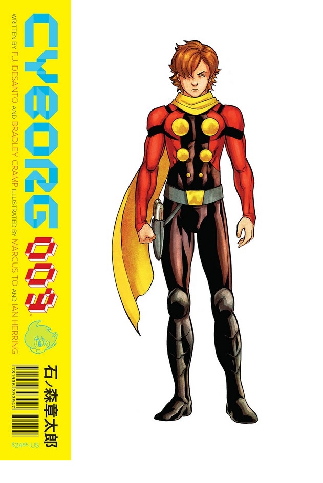
CYBORG 009 V.1 OGN
Writers: FJ DeSanto & Bradley CrampArt: Marcus To
Publisher: Archaia Entertainment/ BOOM! Studios
Reviewer: Ambush Bug
Recently released from Archaia is a modern take on a classic anime/manga series, CYBORG 009. I have to admit that I know very little about the original incarnation of this property, but I do know that this modern take is instantly accessible and a fun read for what looks like all ages. It’s hard to entertain both adults and kids alike, but here, writers FJ DeSanto and Bradley Cramp do so with ease.
CYBORG 009 is a gorgeous hardcover from a company that makes a habit of churning out gorgeous hardcovers. Presentation-wise, this book is a sizable read, with an awesome see-through slipcover that serves as a cover for a series of overlays which dissect the lead character (Cyborg 009) from exterior, to muscle, to technology, to the mysteries that lie beneath the man-machine’s surface. It’s a cool interactive way to present this book and some fun to have before you even crack open the cover.
The story itself starts with a bang, as Cyborg 009 wakes mid-battle to find himself ordered by his creator to take on his 8 predecessors. The tides quickly turn as 009 finds himself feeling kinship to the other ‘borgs and joins them on run from the lab they’ve been birthed from. Thus begins an odyssey as the nine cyborgs and one of their creators band together to stop the organization what put them together in the first place. It’s a globe-spanning tale that leads from Japan to Russia and beyond, and one that has limitless possibilities by the time this book ends.
If there’s one complaint I had about CYBORG 009, it’s that while 009 and maybe his “love interest” 003 are given time to develop as characters, the other seven man-machines are only given about a paragraph’s worth of exposition in regards to personality, history, and powers. Surely future volumes will delve deeper into these back-up characters, and if this book leaves me wanting to know more about these other characters, I guess that’s a good thing. As is, DeSanto and Cramp go the Claremont route and characterize the various members of this team of man-bots through foreign accents and a variety of notable powers. It’s an old school way of doing things, but an effective one.
All of this comes from the talented pencils and inks of Marcus To, who straddles the manga and American comic book influences effortlessly, bringing a less cartoony aspect to the characters while still maintaining its historic roots in the medium. Die-hard fans might be frustrated with the modernized look, but these are subtle changes and should make more fans than lose them.
Looking for a fun book about robots on the run? CYBORG 009 fits the bill, and I hope there are more volumes of this series to come.
 Ambush Bug is Mark L. Miller, original @$$Hole/wordslinger/writer of wrongs/reviewer/interviewer/editor of AICN COMICS for over 12 years & AICN HORROR for 4. Mark’s written comics such as THE TINGLERS & WITCHFINDER GENERAL, DEATHSPORT GAMES, NANNY & HANK (soon to be a feature film from Uptown 6 Films), Zenescope’sGRIMM FAIRY TALES Vol.13 & UNLEASHED: WEREWOLVES – THE HUNGER and a chapter in Black Mask Studios’OCCUPY COMICS. FAMOUS MONSTERS’ LUNA: ORDER OF THE WEREWOLF (co-written with Martin Fisher) will be available soon in trade. Mark also wrote the critically acclaimed GRIMM FAIRY TALES PRESENTS THE JUNGLE BOOK and its follow up THE JUNGLE BOOK: LAST OF THE SPECIES! Follow Ambush Bug on the Twitters @Mark_L_Miller.
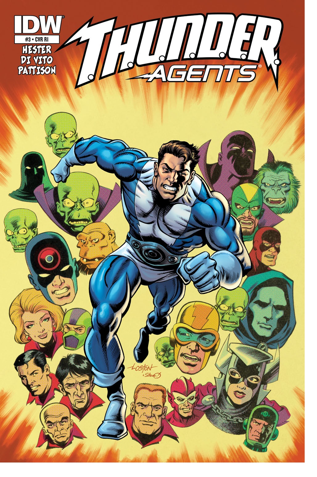
T.H.U.N.D.E.R. AGENTS #3
Writer: Phil HesterArtist: Andrea Di Vito
Publisher: IDW Publishing
Reviewer: Masked Man
Why, it seems like only yesterday DC was trying to make a go of the old Tower comic book heroes. Ok, it was two years ago! Unlike DC, Phil Hester and IDW aren't looking so much to update and modernize the T.H.U.N.D.E.R. Agents--just to tell some good stories. Now, of course some updating is taking place: it all takes place in the 21st century, more detailed origins, etc., etc., but it's definitely not as heavy-handed as DC's approach was, which I applaud, because not every updated character needs to be turned into a hip 20-something non-white homosexual robot. On the flip side, the main draw of the original T.H.U.N.D.E.R. Agents wasn't the characters, but their co-creator Wally Wood. Anyway, just like the Mighty Crusaders, someone is always willing to dig them up hoping that this time they will be successful.
Mirroring the first T.H.U.N.D.E.R. AGENTS comic from the 60's, Len Brown is given the mighty density-increasing belt and becomes Dynamo, jumping right into battle with the Iron Maiden. Unlike the the 60's comic, it seems Iron Maiden and the T.H.U.N.D.E.R. Agents have been butting heads for a while and Dynamo is the only newcomer to the party. As the main character, Dynamo is interesting enough, as he also acts as our guide to the T.H.U.N.D.E.R. Agents’ world. In all I'd have to say Hester is doing a good job here. He's building the T.H.U.N.D.E.R. Agents’ world and getting on with all the T.H.U.N.D.E.R. Agents action at the same time (in case you're curious, I am sooo copying and pasting T.H.U.N.D.E.R. Agents as I type this). As for the next big character, Iron Maiden, Hester again handles her well as a typical cool, evil villain. Now, while Hester is doing a good job putting this superhero team back on the map, it is a little formulaic: typical government bureaucracy, fun with henchmen, superhero banter, and the evil master villain. I wish Hester was pushing the superhero spy angle more (As the T.H.U.N.D.E.R. Agents stands for The Higher United Nations Defense Enforcement Reserves) to give the story more color. Oh, it has the government angle, but not the cool spy angle, though Hester did add some spice in the form of mysterious power sources, evil gods and cults. The last rock I'll throw at the story is the pacing--just typical modern comic book decompression. The first three issues have pretty much been the same scenario: fighting Iron Maiden in the underground base. Issues #2 and #3 could have been easily combined into one issue. Mind you, the first issue which got Dynamo to go from zero to hero was much better.
Speaking of good things about this comic book, how about Andrea DiVito's artwork? I've been a fan of DiVito's work ever since Marvel's ANNIHILATION. He's just a great superhero artist: clean, bold, good-looking figures and good with action scenes, though I did find his work a little lazy in this issue. Maybe it has to do with the location of the story, but it was page after page of dull boring steel grey walls for background. Just no imagination. Thankfully the rest of it looks great, so the overall look of the book is still d@mn fine. Rom Fajardo's bold coloring job helps the book look great too (though you think he could have added a little more color to the backgrounds).
While there is always room for improvement, IDW's T.H.U.N.D.E.R. AGENTS has been a good ride. And if you're fed up with all the NEW 52 or are just tired of 'nothing ever being the same again', T.H.U.N.D.E.R. AGENTS is probably the book you've been looking for.
 Advance Review: Available this Friday!
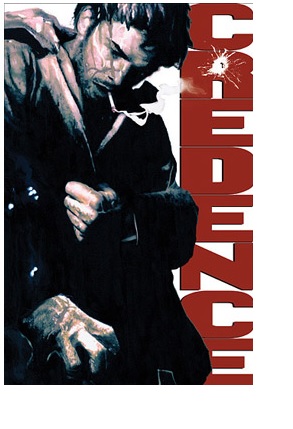
CREDENCE OGN
Writer: Michael EastonArtist: Steven Perkins
Publisher: Blackwatch Comics
Reviewer: Professor Challenger
“Sometimes being a depraved bastard works out and you end up in bed with the only woman you’ve met in a long time that actually makes you feel something other than regret.” ~ Danny Credence
From glen to glen, and down the mountain side
The summer's gone, and all the flow'rs are dying
'Tis you, 'tis you must go and I must bide.
The cover of the new graphic novel CREDENCE, by writer Michael Easton and artist Steven Perkins, sports a quote from the director of the classic BAD LIEUTENANT film favorably comparing that Harvey Keitel vehicle with this excursion into the seedy underbelly of gritty noir. The comparison is apt. Both stories detail a darkly disturbed police officer's spiral into a self-indulgent excess of pleasure and pain and his murky pathway into a sort-of spiritual redemption. Along the way, the reader of CREDENCE will encounter profanity, pain, sadism, sex, and death. There's humor to be found, but it is the blackest of humor and not the type to laugh out loud at but wince in discomfort over.
I have a profound love of the medium of the comic book (or graphic novel, for those of us trying to sound more enlightened). Yes, the medium co-opted by grotesquely overinflated biceps on superheroes and helium balloons in place of breasts on superheroines can also be a breeding ground for works that do more than excite and titillate pubescent teens and the Peter Pan-syndromed. Telling a story with the enmeshment of static visual images and text has evolved in many quarters into literature, without any academic need for a dismissive "Graphic Novel" qualifier. MAUS or BLANKETS, for example, are simply works of literature that succeed both textually and visually.
Now, I'm not going to go so far as to put CREDENCE into the same sphere as those two works--this is not that sort of story--but it has the flavor of something seeking and achieving a deeper impact than simple escapism. It’s just one more example of Easton pushing the medium beyond the boundaries of the box of public expectations. His previous works have done this as well. The SOUL STEALER trilogy is one of the most profoundly moving stories I've ever read. THE GREEN WOMAN was a fine piece of psychological and supernatural horror (co-written with Peter Straub, with painted art by CREDENCE cover artist John Bolton). Easton excels at delivering the inner darkness of human depravity while finding subtle ways to pierce the shadow with the sharp light of beauty.
In the character of Danny Credence we have a man who is the sum of a hard life, told cinematically and dramatically by beginning the story with essentially the peak of the climax of this story and then rewinding to get the reader up to speed before picking back up with the action and moving us toward the final act. And what a kick-off: it's about as shocking as you can get for a film or a novel. In fact, from the opening page to the final page I found myself reading CREDENCE but playing it through in my head as a film. It delivers the goods like a solid police drama, but with a deeper spiritual resonance of how the bad choices we make drive the direction of our lives. Pay attention as you read CREDENCE and see how Danny is not as bad as he believes himself to be. It goes back to his father and the way his father raised him with this misguided notion of what it means to be a "man" and no real understanding of morality. To him, being a policeman makes you a "good" guy but yet he feels compelled (perhaps out of immature child rebellion) to conduct himself contrary to that very role he has embraced. And that's the core of Danny Credence's crooked path to redemption. He has no real sense of self. It's why he can't really give himself to a love relationship. It's why he can't find happiness or satisfaction. It's why his job is what defines him. He is seeking himself, fearless in the face of danger but terrified of his own darkness. As Carl Jung once wrote, "The unconscious is not just evil by nature, it is also the source of the highest good: not only dark but also light, not only bestial, semi-human, and demonic but superhuman, spiritual, and, in the classical sense of the word, 'divine.'" And ultimately, the story becomes Credence's dance with the Divine.
Credence is a cop. The best cop. Because, as I said, being a cop is all he has to define himself. He has a broken marriage that ended in divorce and attempts to maintain his parental relationship with his son. His wife has gone from an emotionally abusive marriage with Credence to a physically abusive rebound. Credence's asshole father is doing time in prison because Credence turned him in. So you have these added onion layers on top of his anger and confusion as a cop. And just when he thinks he has hit rock bottom and can't get any lower, he comes face to face with an evil that shocks even him. It is this person that allows Credence to see past his own self-loathing to allow his innate goodness to finally shine in most unexpected ways.
Readers aren't going to particularly like Credence as a person, this cop who indulges himself in drug, drink, and sex, but we do find ourselves coming to care for and root for him. This is why this dense and lengthy unfolding of the story serves the character well. By the time we return to the sequence that opened the story we now understand what is happening. Where we began the story with suspicion and distrust, Easton has paced the story just right so that now Credence has earned our respect. We are emotionally invested in his journey.
I'm not going to spoil the final act of the story, but it struck me quite deeply. I interpret it metaphorically as an ending that implies some degree, finally, of eternal happiness for Credence. However, I see in the promotional materials that this may not be a stand-alone book. This story certainly stands on its own merits, but my curiosity is piqued as to where it could go from here because I trust Easton's ability to tell stories that resonate with me on levels that others often don't.
Steven Perkins does an exceptional job crafting the visuals for CREDENCE, keeping the images black and white while peppered with stylistic panache where it almost seems like every page is spattered with blood. He tackles the feel of the darkest of film noir without going into excessive exaggeration. There's a surreal touch to his work that serves the material well, but a gritty realism grounding it as well. Perkins achieves a balance that is not easy, and especially so when telling a story sequentially.
I enjoy peering into my own darkness sometimes. This is where great literature is a true asset to self-understanding -- allowing us to vicariously peek into our own hidden corners of perversity and pain safely. This is where CREDENCE works for me, and if you are inclined towards these darker types of stories, I would recommend you give it a try.
And all my grave will warm and sweeter be
And then you'll kneel and whisper that you love me
And I shall sleep in peace until you come to me.
I'll simply sleep in peace until you come to me.
And I shall rest in peace until you come to me.
Oh, Danny boy, oh, Danny boy, I love you so.
CREDENCE is available now for pre-orders with a release date of November 1, 2013.
Prof. Challenger is Texas artist and writer, Keith Howell. You can read his stuff here and over at profchallenger.com. You can also get in on the ground floor of his new endeavor, "Everything I Ever Needed to Know I Learned from Comic Books" here.
It’s that time of year once again, when the spirits of the dead rise to walk among us, and your old pal BottleImp resurrects some of his favorite fiendish comic book cadavers from their resting places in the dusty corners of the comic store bargain boxes. This year brings us some old bones, some more recent horrors, and a little taste of the strange and unusual. Shall we?
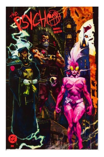 THE PSYCHO #1-3 (1991), DC Comics
Writer James Hudnall spins a tale of a world in which the atomic bomb was never created and World War II was won when America unlocked the key to giving people superhuman powers. Fast forward to the present, when these superpowered individuals (known as Freelance Costumed Operatives, or more colloquially “Psychos”) serve as soldiers, enforcers and terrorists across the world. When CIA operative Jake Riley becomes embroiled in an international conspiracy, his girlfriend kidnapped and possibly killed, Jake does the only thing he can to survive: become one of the Psychos. Though this miniseries is more or less a political thriller with science fiction and superhero overtones, an element of horror is threaded throughout each issue. This is mostly due to the fantastic painted artwork by Dan Brereton, who drapes the Psychos—many of whom have been transformed into animalistic creatures by their power enhancements—in spatters of color and tone that manage to capture both the comic book and horror movie aspects of the story. Brereton’s work here is later echoed in his more horror-skewed series THE NOCTURNALS, but his artwork in THE PSYCHO harmonizes with Hudnall’s twisty, turny plot in a way that is both action-packed and nightmarish. Definitely pick this series up if it crosses your path.
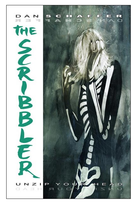 THE SCRIBBLER OGN (2006), Image Comics
Let’s come back to a more recent comic that your old pal the Imp missed the first time around. Much like the series above, Dan Schaffer’s THE SCRIBBLER is a mashup of genres, but throughout this graphic novel the overall tone is one of horror. Set in a high-rise apartment building that serves as a halfway house for recovering mental patients, THE SCRIBBLER’s protagonist is a young woman named Suki, who is going through an experimental shock-therapy treatment to cure her of her multiple personalities. As some personalities fade, however, there is one that seems to be growing stronger…and taking control. Science fiction, horror and, yes, even superheroics are blended into an intriguing story that reminds me of some of the genre-bending films of David Cronenberg, with ink wash artwork that varies in execution from photorealism to almost abstract expressionism—kind of like the early work by Dave McKean on books like BLACK ORCHID. Like I said, I missed this one when it first hit the stands, but I’m glad that my excursions to the comic book boneyard unearthed THE SCRIBBLER.
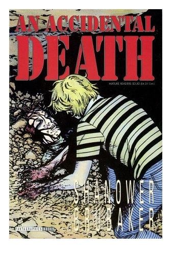 AN ACCIDENTAL DEATH One Shot (1993), Fantagraphics Books
Let’s take a break from the supernatural and look at horrors that hit much closer to the real world. Writer Ed Brubaker and artist Eric Shanower tell a story of murder, friendship and betrayal in AN ACCIDENTAL DEATH. The comic takes place on an American naval base in 1978, where two Navy brats, Charlie and Frank, are caught up in circumstances surrounding a young girl’s death. Though Frank maintains that the death was an accident, clues soon come to light that begin to suggest to Charlie that his friend had more to do with the death than he admits. Told from Charlie’s point of view, AN ACCIDENTAL DEATH is both deeply personal and strangely clinical, a juxtaposition of emotions aided by Shanower’s precise black and white linework that adds a sense of photorealism to the story. No ghosts or goblins, but horrors are here that are much more believable, and thus much more disturbing.
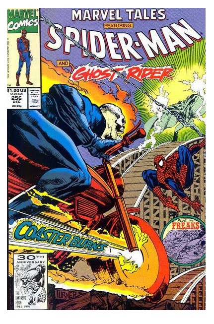 MARVEL TEAM-UP #91 (1979), reprinted in MARVEL TALES #256 (1991), Marvel Comics
I always like to include some superhero horror in my Halloween lineup, and this year’s spot goes to ol’ webhead himself, the spectacular Spider-Man. Spidey goes up against a bewitched Ghost Rider in the story “Carnival of Souls!” written by Steven Grant with pencils by Pat Broderick. Horror elements are there on almost every page, from the villain Moondark the Magician stealing souls with his mystical orb to the eerie grinning skull of the Ghost Rider as he hurls hellfire at our webslinging hero. This is one of those great single-issue stories that I wish they wrote more of today, and a great comic book to dust off for the spooky season. If you want a real scare, go for the reprinted version and check out the backup story that features the best (and by best I mean worst) of Rob Liefeld-style ‘90s artwork, along with a script written by a young man named Dan Slott.
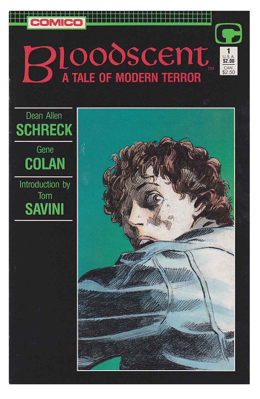 BLOODSCENT #1 (1988), Comico
The 1980s comic book landscape was littered with horror comics—many of them only premiere issues that never made it to #2—and the quality of these books tended to range from mediocre to downright awful. But every once in a while a diamond emerges from the pile of coal, and such is the case with BLOODSCENT. Dean Allen Schreck writes a dark tale of a hunter turned hunted, of a serial killer who is in turn stalked by unseen stalkers. It’s a well-told story with a neat “Twilight Zone”-type twist at the end, but what really makes BLOODSCENT stand out is the remarkable artwork by Gene Colan. Colan’s fluid pencils and innovative page designs, heightened by the subtle coloring work by Steve Oliff, give the story a dreamlike quality that escapes most horror comics. It’s a beautiful book…and made even more interesting when you look at it alongside another Gene Colan book from the same period: the head-scratchingly baffling.
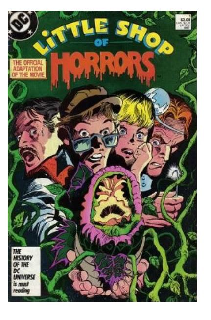 LITTLE SHOP OF HORRORS #1 (1987), DC Comics
Weird. Just plain weird. I mean, why make a comic book adaptation of a movie musical when you can’t adapt the music? That’s right, DC published an official comic book version of the Rick Moranis LITTLE SHOP OF HORRORS film, and they didn’t even use any of the song lyrics! But you know what they did get? They got acclaimed horror artist Gene Colan to draw the damn thing! It’s a strange match that doesn’t quite work as either a funny book (much of the humor from the film is lost in translation) or a serious horror story (it’s still based on LITTLE SHOP OF HORRORS). And while Colan’s page designs are still dynamic, his version of Audrey II lacks the personality of the film’s. Just goes to show that not all mediums are easily interchangeable, and even the talents of a top-notch artist can’t save a bad idea from being a bad idea.
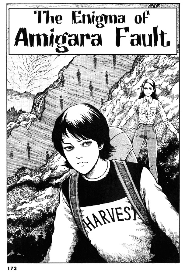 THE ENIGMA OF AMIGARA FAULT (2002), Shogakuken
This is a bit of a cheat for me, since I didn’t come across this manga horror gem through my usual means of sifting through moldy long boxes. But when a friend sent me a link to this short comic written and drawn by Junji Ito (and originally published in the second volume of his GYO comic book), I knew I had to include it in this year’s horror roundup. The story centers on the Amigara Mountain in Japan, where a fault caused by an earthquake has revealed hundreds of human-shaped holes in the side of the cliff. Even stranger, people can recognize holes that are their own silhouettes, and they begin to feel the strange compulsion to walk into their own holes and into the mountain itself. Though reading the panels right-to-left was a little distracting at first (your old Uncle Imp is not generally a manga man), I was soon enthralled by this dark and bizarre tale. The surreal oddness of David Lynch meets the cosmic horror of H.P. Lovecraft in a short story that is sure to linger in your mind long after you’ve finished reading. Why not try it yourself?
Until next year, kiddies—keep digging for those creepy cheapies!
Proofs, co-edits & common sense provided by Sleazy G
 Find out what are BLACK MASK STUDIOS and OCCUPY COMICS here and on Facebook here!
 Want more in all things Geek?
Check out PoptardsGo and on Facebook here!
 Get your copy of highly-anticipated anthology TOME by 44FLOOD today!
Check out AICN COMICS on Facebook and Comixpedia.org!