

(Click title to go directly to the review)
Advance Review: WOLVERINE #1
NEMO: HEART OF ICE ONE-SHOT
STORMWATCH #18
Indie Jones presents HELHEIM #1
AGE OF ULTRON #1
Advance Review: BATMAN #18/BATMAN & ROBIN #18
Indie Jones presents THE DEVIL’S POOL #0
JUDGE DREDD: THE COMPLETE BRIAN BOLLAND LIMITED EDITION
2 Takes on SUPERIOR SPIDER-MAN #5
Advance Review: IT CAME #1
 Advance Review: In stores this week!
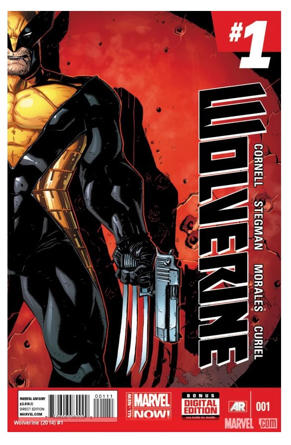
WOLVERINE #1
Writer: Paul CornellArt: Alan Davis (pencils), Mark Farmer (inks)
Publisher: Marvel Comics
Reviewer: Ambush Bug
Those of you who listen to our podcast know I’m not a mutant kind of guy. And by default, I’m really not a Wolverine guy. For the most part, the reason why I’m not really keen on Wolverine is the same reason I dislike mutant books, I feel the character is way too overexposed. So really, for the last ten years, I really don’t know what’s been going on with Wolverine and his mutant cohorts. But I decided to check out this new issue of WOLVERINE to see what I’ve been missing.
Though I wouldn’t call this book groundbreaking or a must read, it is a solid story and it gets what I think is the main thing that needs to be gotten in a WOLVERINE book and that is Wolverine’s character. Paul Cornell does a great job of capturing the nobility that is often forgotten by a lot of people who only write Wolverine in his badass berserker murderer mode and forget the noble savage aspect of him, especially when it comes to children. In this issue, we open with Wolverine somewhat incapacitated by some kind of alien ray, blown in half and healing quickly. Even in this state, he reaches out to help a child caught in a hostage situation involving his father. Though there’re no super villains and not one end of the world scenarios, this proves to be a pretty intriguing issue, well paced by Cornell. All in all, this FEELS like the Wolverine I knew and thought was cool. Badass enough to take the pain as his healing factor kicks in while still doing what is right and heroic.
Art wise, it doesn’t get much better than Alan Davis. His clean imagery and rounded faces makes for straight forward, no frills comic booking. The lines are all the more crisp with Davis’ longtime inking companion mark Farmer. The two artists deliver what looks like a classic comic, though still delivering on big moments like having a car slam into Wolverine or Wolvie diving, claws out at an attacker. There are other artists more detailed or more inclined to deliver expansive jaw dropping panels, but Davis and Farmer simply do rock solid work from page one to last.
I don’t know if I’m into this story enough to get the next issue, but I do know if you’re a fan of Wolverine, this is going to be right up your alley. With an artist who captures a classic looking Logan and a writer who seems to understand what’s important about the character, this new series seems to be in capable hands.
 Ambush Bug is Mark L. Miller, original @$$Hole/wordslinger/writer of wrongs/reviewer/interviewer/editor of AICN COMICS for over eleven years & AICN HORROR for two. He has written comics such as VINCENT PRICE PRESENTS THE TINGLERS & WITCHFINDER GENERAL, THE DEATHSPORT GAMES, & NANNY & HANK (soon to be available on iTunes and soon to be made into a feature film from Uptown 6 Films). He has co-written FAMOUS MONSTERS OF FILMLAND’s first ever comic book LUNA: ORDER OF THE WEREWOLF (to be released in 2013 as a 100-pg original graphic novel). Mark wrote the critically acclaimed GRIMM FAIRY TALES PRESENTS THE JUNGLE BOOK last year from Zenescope Entertainment & look for his exciting arc on GRIMM FAIRY TALES #76-81 released August-December 2012. Mark will be writing GRIMM FAIRY TALES PRESENTS THE JUNGLE BOOK: LAST OF THE SPECIES to be released in February-June 2013. Follow Ambush Bug on the Twitter @Mark_L_Miller.
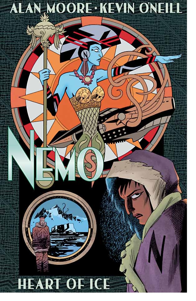
NEMO: HEART OF ICE ONE-SHOT
Writer: Alan MooreArtist: Kevin O’Neill
Publisher: Top Shelf Productions/Knockabout Comics
Reviewer: BottleImp
A number of years ago—before the publication of THE LEAGUE OF EXTRAORDINARY GENTLEMEN: THE BLACK DOSSIER, even—I remember seeing an advertisement for a forthcoming LOEG one-shot featuring Mina Murray and Alan Quatermain assisting Randolph Carter in a case set in H.P. Lovecraft’s haunted town of Arkham. The mashup of HPL’s tentacled monsters and Alan Moore’s team of Victorian heroes was comic book gold to me, being an ardent fan of both the League and the Old Gent from Providence. That eagerly-anticipated issue was never produced. Instead, Moore folded his Lovecraft-inspired ideas into a humorous text piece for inclusion in THE BLACK DOSSIER, and that (I assumed) was the end of it.
I was tremendously excited, then, when I saw that this new LOEG One-Shot would be bringing those two worlds together again in a major way. HEART OF ICE is the story of Captain Nemo’s daughter Janni Dakkar, last seen in the first book of the CENTURY miniseries, and her desire to elevate herself above being a mere pirate. The new Captain Nemo attempts to prove her worthiness of her father’s name and complete the expedition that drove him insane: the exploration of the unknown lands of the Antarctic. This leads Janni into realms of horror and madness unknown to her and her crew, but some of which is familiar to this reader. There are creatures that are evocative of the Morlocks from H.G. Wells’ “Time Machine.” There is the ghostly white figure from Edgar Allan Poe’s “Narrative of Arthur Gordon Pym.” And naturally, Nemo and her crew finally come to the end of their quest, to a place of horror that was itself inspired by the aforementioned Poe Novella: Lovecraft’s unearthly “Mountains of Madness.”
This inclusion of Lovecraft’s mythos into the already vast pantheon of LOEG’s “Blazing World” results in some of Kevin O’Neill’s finest work to date. There are, of course, the usual cartoonish characters filling out the backgrounds of the comic panels, and I’m sure that each one is meant to be either a representative from some literary work or an ancestor of the cast of “Eastenders.” But if there was ever a perfect subject matter for O’Neill’s distinctive style, is certainly must be the non-Euclidean geometry and the amorphous Shoggoths that populate Lovecraft’s Antarctic city. The climax of this book, liberally lifted from Lovecraft’s novella, allows O’Neill to put to page what Lovecraft never explicitly revealed to his readers, and the end result is fantastic.
Moore abandons the sprawling timeline of his last LOEG work in favor of a more streamlined plot, and it’s a move that makes NEMO a much more accessible read. Sure, there are still names from late 19th- and early 20th- century literature that Moore drops in the story, forcing me to go to the trusty wikipedia to look them up (though not all of them—I was able to place Frank Reade Jr. and his “Steam Man of the Prairies,” Ayesha from H.R. Haggard’s “She” and Charles Foster Kane from Welles’ film), but the focus of the plot remains on the new Captain Nemo’s desperate attempt to succeed where her father failed. The fast pace of the book hearkens back to the first two volumes of the LOEG stories, before Moore began inundating his shared universe with an overabundance of references to the Blazing World (the abundant sexual exploits that had become a mainstay of nearly every previous LOEG book are mercifully absent here as well—thankfully, Moore realized that not every story requires two or more characters fucking to make it interesting).
That’s not to say that HEART OF ICE is merely an action/adventure story; though the adaptation of “At The Mountains Of Madness” has all the requisite scares, monsters and chases that keep the plot moving, Janni Dakkar’s ultimately failing ambition can be seen as an allegory for these classic works of literature from which Moore is borrowing. In Janni’s (and I’m going to assume the writer’s) view, her exploits and all the exploits of second- and third-generation adventurers pale before the wonders accomplished by the men of her father’s generation. I’m going to go out on a limb here and suggest that Alan Moore is criticizing the modern writers of fantastic fiction, perhaps suggesting that the amazing bursts of imagination achieved by Verne, Wells and the other pioneers of science fiction can never be equaled by those who came after. The newer generations are either imitators of past greatness or, at the very least, are merely traveling along the trail that more innovative minds blazed for them.
Whether or not you like to search for metaphor in your comics, HEART OF ICE doesn’t suffer from having the burden of allegory applied to it. Moore and O’Neill have created a great addition to the rich world of the LEAGUE OF EXTRAORDINARY GENTLEMEN and have developed Janni Dakkar into a richly nuanced character that stands strong along with the other complex and deeply human members of the Victorian super group. And I finally got my League Lovecraft story!
When released from his bottle, the Imp transforms into Stephen Andrade, an artist/illustrator/pirate monkey painter from New England. He's currently hard at work interpreting fellow @$$Hole Optimous Douche's brainwaves and transforming them into pretty pictures on AVERAGE JOE, an original graphic novel to be published by Com.x. You can see some of his artwork here.
STORMWATCH #18
Writer: Peter MilliganArtist: Will Conrad
Publisher: DC Comics
Reviewer: Optimous Douche
GOD DAMN IT, WILL SOMEONE PLEASE SAVE STORMWATCH?????
I hold an unabashed love and adoration for the STORMWATCH and AUTHORITY of yore – even the bad times. They were more than a JUSTICE LEAGUE pastiche; they made sense with their totalitarian control of the world and eventually the omniverse. In an age where our systems and infrastructure continue to fail and disappoint us, the thought of the world’s most powerful beings helping us fix the problems just makes sense.
With this history in mind I gleefully started buying Stormwatch’s first integration into DC continuity at the launch of the New 52. Well, first I did get sucked in by the PR. STORMWATCH promised to be the shadow organization that would answer the question “Who watches The Watchmen”, or Justice League in this case. Old favorites like Jenny Quantum, the dynamically gay duo, city-talking Jack Hawksmoor and Martian Fucking Manhunter would serve to clandestinely protect…everything.
And then the book came out. Instead of an exercise of who watches the Justice League, we got a book filled with more immature prats than the Justice League themselves – which is really really hard to pull off since the Justice League was suffering from some serious dain bramage in the first two arcs. We got some swordsman mother fucker, who wields…goddamn swords. This is like recruiting a special Olympiad for the real Olympic team. Jenny Quantum is virtually non-existent. We’ve learned more about the Engineer’s crotch than her prowess with machinery, and we have been subjugated to the Rachel/Ross “will they, won’t they” antics of Apollo & Midnighter. Their final coming together this issue was about as surprising as Brooke Shields getting knocked up in BLUE LAGOON since THEY’RE THE ONLY TWO GAY HEROES IN THE WORLD!
Jack Hawksmoor had a promising start; I liked the approach of each city having a tangible form and his interactions with these old souls. Sadly, we haven’t seen that for about 12 issues. I don’t even know where he’s at now, to be honest. Martian Manhunter completely said “fuck this noise” and we never saw him again until the recent JUSTICE LEAGUE OF AMERICA. Finally, The Carrier (whom I consider to be a character) is now less mobile than Mama Boo Boo.
Two other areas where the book showed promise was tracing back the team’s origin to the Demon Knights and this whole concept of Shadowlords being Stormwatch’s ultimate keepers. Two very cool concepts which seemed to vanish moments after they were mentioned.
Want to know the plot right now? I read it and I still can’t answer the question. All I can say with certainty is it’s almost over.
So why do I keep riding this hot mess month after month? Because like an abused housewife I believe it can get better. Also, if we walk away, books will only get cancelled — not fixed.
Since any moron with fingers can complain about a title, I like to be a special brand of moron that proactively tries to fix the situation, even if it falls on deaf ears.
FIX 1: Remember from whence you came – The great thing about these old AUTHORITY characters is that they weren’t tied to one boring old universe. They rode The Bleed with reckless abandon, and as a result fought God and Cthulhu incarnate. Remember that little thing called the multiverse that was reborn at the end of FINAL CRISIS? No? It’s OK, I don’t blame you. After all, we’ve only seen three of the worlds since that event took place. Wouldn’t it be cool if STORMWATCH not only watched the prime JUSTICE LEAGUE, but every damn JUSTICE LEAGUE ever imaginable?
FIX 2: Arrogance is OK when warranted – Another thing that made the old AUTHORITY great was their uncompromising assuredness in…well…everything they did. Midnighter knows every move, Jenny can manipulate the very fabric of the universe, Jack controls every city, Engineer every machine, and Apollo is a freaking god. START ACTING THE PART, GUYS! We have enough fallible heroes; let’s see some folks unwavering in their decisions and beliefs for a change.
FIX 3: When in Rome, stop watching it burn: Let’s assume my first fix becomes a reality (it won’t, but let’s assume). I would never say Stormwatch should stay away from Earth Prime, but when here, it’s time to be large and in charge. Use your clandestine super base in the sky to smack around the whelps of the New 52. Sit high atop your self-righteousness and give a good goddamn when the heroes of Earth Prime act like fucktards--you know, like they’ve been doing for the past 18 months.
Petty squabbles, convoluted origins and a complete lack of story cohesion are not STORMWATCH. My forgiveness will only last one more arc, guys; Mr. Starlin needs to make it a good one. For the record, I don’t fault Milligan--this blame goes right on the shoulders of editorial for choosing to mire this tale in a lackluster introduction-laden affair.
Optimous Douche has successfully blackmailed BottleImp to draw purty pictures for his graphic novel AVERAGE JOE coming out in 2013 from COM.X. When not on Ain’t It Cool, Optimous can be found talking comics and marketing on robpatey.com and just marketing on MaaS360.com.
HELHEIM #1
Writer: Cullen BunnArtist: Joelle Jones
Publisher: Oni Press
Reviewed by Humphrey Lee
Vikings: let’s talk about them. I think we all know deep down that this is the best of genre obsessions geeks tend to have such as zombies, pirates, ninjas, etc. How can anyone not love these blade-wielding, bitter cold surviving, mead chugging badasses of history? They have all those characteristics we enjoy in our history as well as our fiction (like the aforementioned zombie pirate ninjas) between their survivalist natures, hardcore attitudes, and their simple desire to have a warm fire and bed, maybe a woman (or man) or two, and a bellyful of booze. Yet it seems we do not really get that many takes on them in the world of comic books, or at least not to my liking as a fan of the genre and the medium. Thankfully Cullen Bunn - a man whose other creator-owned works THE DAMNED and THE SIXTH GUN show he’s a man of the genre himself – also felt these bearded hard asses needed some more representation as well and decided to do some genre mixing while he was at it too.
Overall the summation of this debut of HELHEIM is, yes, blood on the snow and the thrill of survival, but what I really enjoyed about it was how straightforward things were until they weren’t anymore. Essentially, the execution of this book as it lets you know what it really is was pretty stellar. The issue opens with a hectic pace as Rikard – our presumed lead and your rather standard Norseman with his flowing blonde hair and grizzled beard – and some of his fellow villagers are on the run from some scraggly-looking bastards and their pack dogs. Obviously much blood is shed, but it’s all about how events flow with this book. Mystically elements are introduced from the get go as Rikard sees a disturbing vision of himself, leaning casually on his sword and with blood flowing from his eyes. It becomes easy to not dwell on this because obviously this is our lead, right, and while this has dire implications for the future, of course there are some rabid fucks that need put down. We’ll get to this ill omen in due time, the brunt of the matter being that time comes due about sixteen pages later.
Yeah, the cover probably should have been a giveaway to me, but in the world of comics we live in today I’m still kind of stunned when creators get right to the point instead of taking their sweet time. I figured this “inevitable fate” would be something we build up to over the span of a couple issues, not the culmination of twenty pages of running from raiders, raiders dying, raiders FUCKING RISING AGAIN AS SKELETON WARRIORS!! and then Rikard being Queen of Hearts’ed as his head is lopped off in front of the piece of red-haired hotness he was trying to protect, Bera. That’s what I was really getting to when I mentioned “event flow” last paragraph; we go from Rikard on the run from these savages to Rikard at home killing them off to them being undead to Rikard being dead himself in the span of eighteen pages, all the while Bunn is dropping little pieces of exposition that flesh out relationships and give some context to this version of a Nordic tale. There’s some exposition dropped about corpses disappearing and a witch being responsible for the savages at their gates to set up this more supernatural Viking tale, but the tight pace and exciting action keep those tidbits more as background noise. That’s why it’s all so easy to just focus on the fighting and death and not really put two and two together until we see a reanimated (and 500% more beefy) Rikard as sewn together by Bera herself.
Going forward, I do believe more world building is in order—a slower pace to maybe give us some time to absorb this take on the environment and develop a rapport with some of the characters – like Rikard’s farther, Kirk – or just get some history on who Bera really is, what this witch wants with her and so on. I’m also highly curious as to how Rikard is going to be handled from here on now that he’s become a piece of patchwork. Is he going to be just a mindless automaton now? Because I'll say that is a really bold direction to go with a lead character, and honestly one of my few reservations going forward from this stellar debut. Between the rather gritty and grimy art (that I have to admit I didn’t quite expect stylistically from Joelle Jones given my previous exposure to her stuff) and the storytelling it and Bunn’s script brings to life in this book, the only thing I feel is really lacking at the moment is some characters on which we can latch. There isn’t that Drake Sinclair as from THE SIXTH GUN up front here outside of Rikard that we feel a pull toward, which is why I’m extremely curious as to how he gets handled going forward, but Bunn and Jones deserve time to conjure up some folks we can put our enthusiasm behind in due time. And due time is definitely time worth waiting for, I’m going to wager, given what I’ve seen Bunn and Jones create previously and what this first issue of HELHEIM brought to the table. If you like genre-blending storytelling and that adrenaline pop that comes from axes and swords wooshing through the air to create stylish-yet-arty puffs of red spray on power white fields, then you’ll probably love HELHEIM. Cheers…
Humphrey Lee has been an avid comic book reader going on fifteen years now and a contributor to Ain't It Cool comics for quite a few as well. In fact, reading comics is about all he does in his free time and where all the money from his day job wages goes to - funding his comic book habit so he can talk about them to you, our loyal readers (lucky you). He's a bit of a social networking whore, so you can find him all over the Interwebs on sites like Twitter, The MySpaces, Facebookand a blog where he also mostly talks about comics with his free time because he hasn't the slightest semblance of a life. Sad but true, and he gladly encourages you to add, read, and comment as you will.
AGE OF ULTRON #1
Writers: Brian Michael BendisArtist: Bryan Hitch
Publisher: Marvel Comics
Reviewer: Masked Man
So it's finally here: the much talked-about AGE OF ULTRON. Brought to you by Marvel's master of big, Brian Michael Bendis, and one of the best artist in the business, Bryan Hitch. There is a lot to love about this line up: Avengers, Bendis, Ultron, Hitch--a little like the relaunch of the Justice League, Johns, big 5, Lee, Darkseid. Question is, will it go the same way. I'm sure Marvel hopes so, because Justice League sold tons of issues.
Now if you like Hawkeye, well, my friend, this book is for you, because about 20 of its 30 pages are Hawkeye on a solo mission—though, like The Owl, I too wonder why Hawkeye is still using his bow and arrow in this post-apocalyptic world. I mean, he had no problem lobbing a grenade at some thug blowing his head off and he pretty much killed everyone he shot with the bow- he even has pistol crossbows(!). I'm sorry, but at that point, what is the point of not using guns? He wasn't even using trick arrows (except for a Macgyver-inspired one). All rather odd, which kinda sums up this first issue. Because in 30 pages all it states is that Ultron rules the world and the heroes are clueless (check it out, I did that in one sentence). It doesn't even explain how Spider-Man got captured, and looking at who captured him--how the heck did they do it?!? Spider-Man could whip them all blindfolded with one arm tied behind his back. I suppose the word I'm looking for is 'lacking'. The book is lacking any information on what is happening, and therefore leaves my interest in the book lacking as well. It seems like Bendis may be playing 'hide the plot', something Geoff Johns does all the frick'n time. I assume they think it helps sales, but I'd wager it makes people bored and kills sales. I mean, I bought the book, I'm down with the whole Avengers, Bendis, Ultron, Hitch line-up. But regardless of how cool Hawkeye's rescue mission was (and it was cool), without any context of what's going on, it's all rather pointless action. Why was that rescue mission so important that Bendis had to spend two thirds of the book on it?
On the other hand, Bryan Hitch did an awesome job this issue. Kudos to Paul Neary (always a great inker) and Paul Mounts (colorist), who really help sell the overall look of the book. From the slick metal-foiled cover to the slick metal-foiled back cover, these guys really brought their A-game. Mind you, it's mostly massive amounts of rumble with a giant 'Genom' building in the background. It's a shame Hitch won't be able to draw the whole series, because his figure drawing, story-telling and action scenes are all top notch. So for Hitch alone, this is a book to buy.
On a side note, what is up with all the useless pages popping up in comics, I suppose mostly in Marvel? This book has three (perhaps five) pointless pages in it. One, a repeat of the cover on page one. Two, the title page on page three that some how couldn't be combined with the two page title spread on pages four and five (then there's another two page spread on pages six and seven that arguably serve no purpose). Three, yet another title page on page 35! As a reader I don't feel like this is extra value, just pointless pages. One kick @$$ two page title spread would have been fine. In my humble opinion (hope you don't mind I wrote that out), Marvel should sell ads on those pages! Seriously, I'm all for ads in comic books. It would lower the cost of the book (that's real value to me!), makes Marvel more money and prevents Hitch from wasting his time drawing pointless pages so he can do more books. Seriously, what wrong with my plan?
Back to the issue at hand, Bryan Hitch really brought the wood here in this first issue, though, BMB looks like he is still trying to get his engine started. Here's hoping he can catch up to Hitch and finally knock out a great Marvel crossover.
So have you read the Masked Man's comic book CINDY LI: THREE OF A KIND at www.Toonocity.com? Why the hell not, it's free!
 Advance Review: In stores today!
BATMAN #18
Writer: Scott SnyderArt: Andy Kubert
BATMAN AND ROBIN #18
Writer: Peter TomasiArtist: Patrick Gleason
Publisher: DC Comics
Reviewer: Optimous Douche
Whose 4’ 6” and got fucked by their Mother harder than Oedipus? Too soon to Damian’s death? Just wait, you ain’t seen nothing yet.
Before we get into what I consider to be BATMAN’S egregious misstep, we’ll start this review on the positive note with BATMAN & ROBIN 18. Tomasi and Gleason deliver some of their finest work to date and a lesson on the brilliance of simplicity and surprise. No gimmicks like Nuff’ Said’ or any major marketing hoopla allowed the unique delivery of this wordless mourning to completely floor me.
That’s right, no dialogue, no thought bubbles nor nary a call-out box sully this fine tale of a BATMAN unhinged by grief. From the mansion to the streets of Gotham Tomasi’s pacing and Gleason’s purty pictures perfectly lament the loss of a son and a savior. As Alfred cleans the mansion of Master Damian’s last visages while choking back tears, Bruce goes into what can only be described as a fugue state of anguish. Even though the physical pictures of Damian have been tucked away and draped over, every step Bruce takes Damian’s specter walks with him – even sliding down the bat pole.
Once out of the mansion the ultra-violence goes into high gear, Bruce is going to make the world as well as a very famous light pole on crime alley pay for the loss of his child. The one montage page of this night of terror is worth the price of admission alone.
To put the icing on this delicious cake, Tomasi pulls one final heart string. Titus, the Bat-Dog, became as integral to Damian’s existence as his “Tt” verbal tick. He was Robin’s Robin and is left in a house that is now emotionally bankrupt. When a comic makes me feel this much while breaking conventions, it gets an extra mylar bag to keep it safe for the ages.
Now for BATMAN 18. First off, it’s a fine issue. I like Harper Row as a character; she entranced me with her Tim Drake style of sleuthing out BATMAN’S black boxes a year ago and his identity this issue. I like her Brother and I now like her jailbird father as an antagonist. What I can’t abide though is lack of commitment. Through "Death of the Family" and now Robin’s demise we’ve been promised a razing of the Bat’s spirit.
As a character born of tragedy, it’s a necessity for BATMAN to go through times of solitude. His existence since the start of the New 52 has been pretty shiny happy in contrast to past epochs. So as much as I will miss Damian I was ready for a period of a darker BATMAN. Well, thank God I read BATMAN & ROBIN first this week, because even though there are moments of brutality from Bruce this issue they are tempered by Harper’s reappearance.
Again, if this issue came a year from now there wouldn’t be one shadow of criticism cast upon it. Snyder does a great job showing a Bruce once again obsessed with his mission and Mr. Kubert is a welcome change to keep the art style fresh. Harper’s Father is sadistically horrific to her and her Brother. When Bruce isn’t being consoled by Harper his sadistic and exhaustive rage is utterly appropriate given his recent losses. And the moments with Harper, stupendous! Especially when Bats punches her through a fence.
Snyder has emphatically stated that Harper is not the new Robin, but does a sidekick by any other name kick less side? I don’t care if there’s a new Robin…someday. I also think Harper would be a fine choice to don the red and green…someday. But despite Damian’s small stature he cast a large and deep shadow over the Bat universe – a shadow that shouldn’t have light cast upon it yet. We all need to live in the shadows for a while, a place of centering solitude. This is especially true for the Dark Knight.
With the recent announcement of Year Zero exploring the time before time, six years ago, I fear Damian’s mourning will be no more than a month long affair. There’s some wisdom to still be found in ageing grunge acts. This moment is already lost, but when the next favorite son falls I implore DC to heed the words of Pearl Jam and "Just Breathe".
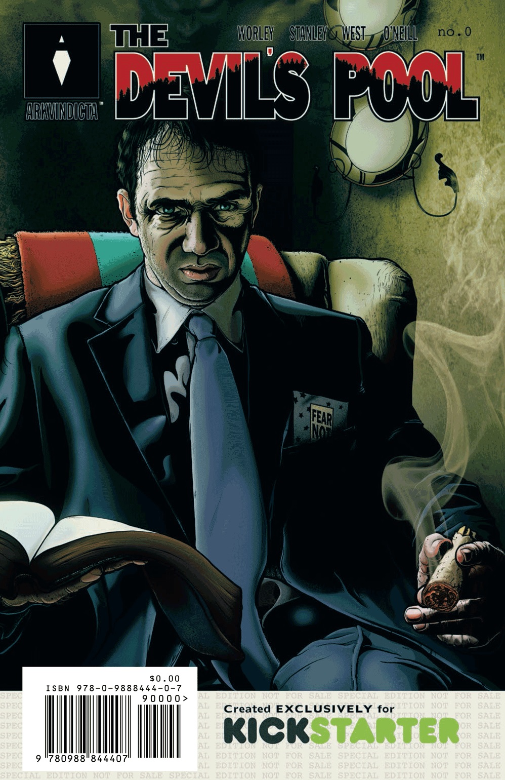
THE DEVIL’S POOL #0
Writer: Jeramie Worley and Chris StanleyIllustrator: Linda Lisa West
Publisher: Ark Vindicta Development and Publishing
Reviewer: Mr. Pasty
THE DEVIL’S POOL opens with a husky, balding Missourian named Benton Carver getting the snot beat out of him by a posse of slack-jawed yokels rambling on about “righteous men” and “wrath and fury.” It was kind of like pledging for the local frat house, only in Carver’s case, you don’t get to keep both your eyes. Apparently, he done screwed up real good, having tried to oppose the local hick syndicate in a half-assed attempt at avenging his sister’s death. He fails, of course, or there would be no book and no tale of revenge, which is where I assume we’re headed after the main protagonist gets thrown into a massive sinkhole known as, yep, you guessed it, THE DEVIL’S POOL (TDP). And what fun would a bottomless pit be if there was nothing at the bottom to welcome you?
So I get a few pages in and I couldn’t shake that feeling I get when something seems awry. You know, that “Da fuck is going on here?” feeling. Turns out, there’s something about the illustrations that goes beyond the usual approach of “draw this, ink that.” I didn’t do any research heading in, because that just ruins the experience for me and as a reviewer0 I like to go in blind, as if I saw it spinning on the wire rack and made an impulse buy. Following its digestion, I took a look at the creative process involved with getting this book into print and lo and behold, there it is. TDP uses real actors, who are photographed while acting out the story. Those shots are then shipped off to the artist to be converted into illustrations while preserving the emotions of real people--an “expensive and grueling process,” according to creator Jeramie Worley. No doubt.
The big question is, does it work? Well, that depends. As far as the story and overall narrative, it’s a bit early to tell. This is issue #0, so we’re getting the jump-off point for what promises to be a complex story of supernatural revenge, but the jury is still out on how well Worley and assistant writer Chris Stanley will deliver. From what I’ve seen thus far, the future looks bright. As for the illustrations, I found them distracting at first, but settled in after a few pages. I think it helps that TDP is not your traditional comic book in that there are no superheroes in tights talking tough and leaping over tall buildings in a single bound. That shouldn’t matter, as a good story transcends any genre, but I hope the primary focus is on actual storytelling and not how pretty the book looks (and it is pretty). I don’t know what lies in store for Carver (or readers) in the next couple of issues, but I can definitely say I’m interested enough in TDP to stick around to find out.
Web heads who can’t get enough of Mr. Pasty’s word vomit are encouraged to watch him operate as Nostradumbass over at MMaMania.com here. Love, hate and Mafia Wars requests should be directed here.
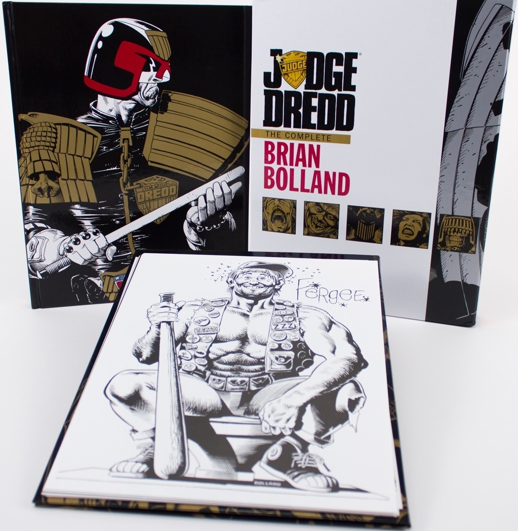
JUDGE DREDD: THE COMPLETE BRIAN BOLLAND LIMITED EDITION
Writer: Alan GrantArt: Brian Bolland
Publisher: IDW Limited
Reviewer: Russ Sheath
I've got to say that it’s impossible not to gush enthusiastically over the fan-friendly output of IDW Limited. An imprint of, surprise, IDW, the IDW Limited team take the cream of their original and licensed output and present it with a fan-pleasing twist in the form of their red, black or blue label products.
With JUDGE DREDD: THE COMPLETE BRIAN BOLLAND LIMITED EDITION, the craftsmen at IDW have taken the recently-released COMPLETE BRIAN BOLLAND' oversized HC that came out in April and, with a sprinkle of the IDW Limited magic, created a tome worthy of a place in the Hall of Justice.
The first thing that grabs you, or that you grab, is the slipcase. The case has a weight and build to it that stands apart from HC slipcase editions from other publishers. I have a number of pricy slipcase editions on my shelf, and the build of some of these can betray the price paid and the quality of the work within. No such issue with JUDGE DREDD: THE COMPLETE BRIAN BOLLAND LIMITED EDITION, as the law is firmly enshrined in a case that would take a Lawgiver or a rabid fan to destroy.
On the slipcase exterior is Dredd himself, immortalised not in silver but in gun metal grey; the metallic inks are striking and you know that something special is encased within. Encased within are two hardcovers--the book itself and a portfolio encapsulating 12 lithographs. Each litho showcases a scene from Brian Bolland’s legendary take on Dredd, and the metallic gold on black inks on the portfolio cover are as striking as the 12 lithographs within.
As a kid and not living near any comic book store I only had the newsstand, and collected editions of comics to sustain my fascination. My first ever encounter with Dredd in one of those newsstand editions is gloriously reproduced as a lithograph when Dredd ironically slams his fist through the gated helmet of Judge Fear and a Dredd deals out his unique brand of justice--classic Dredd! And I was hooked.
Dredd Vs. Fear is an image that sucked me in and opened my eyes to a whole world and became a coming of age moment in my romance with comic books. How could I not frame and display this iconic image above my desk? As I browse this mighty tome I realize just how many iconic images Brian Bolland has contributed to the history of the character.
The evolution of Bolland's take on Dredd matches the evolution of the character himself, because no one has contributed so much to the look of the character beyond Dredd co-creator Carlos Ezquerra. In his first work on the character, the story “Mega City 5000”, we experience a much rougher, less refined styling to Dredd in Bolland's work. As his time with the character extends Bolland's is an interpretation that adapts and evolves through classic Dredd stories such as “The Cursed Earth” saga. “The Day The Law Died” is where we really begin to see the Dredd that we recognize today as Bolland developed the style that took Dredd through some of his most revered adventures.
The quality of both the book and the reproduction is also worthy of note. Where the majority of Bolland's work for 2000AD was in black and white and printed on newspaper quality stock (as were many British comics of the era), the IDW Limited team have done a fantastic job of reproducing a body of work almost 40 years old.
That the work was in black and white aids this process tremendously, and in contrast the few colored pages in the book really stand out. The reproduction of the color instantly ages the work; however, this isn't a negative. It is to IDW's credit that they allowed these sections to be reproduced in a way that reflects the coloring technology of the time, and while those color plates do date the art they also firmly establish the legacy and origins of the work.
For long-term fans of Dredd, this truly is an all encompassing, near 250 page collection by one of the foremost artists to put their stamp on Judge Dredd. Readers could ask for no more from this print run that is limited to only 325 editions, so you should snap it up now before it is gone forever.
From the co-signatures of Brian Bolland and Dredd co-creator John Wagner to the coffee table-adorning magnificence of the slipcase, you will be torn between wanting to preserve the lithographs or have them framed. The end result of this masterful edition is what can only be described as the ultimate, must own package for fans of Bolland, of Dredd or simply enthusiasts of truly great comics. JUDGE DREDD: THE COMPLETE BRIAN BOLLAND LIMITED EDITION represents the first in a line of offerings reprinting the works of the definitive Judge Dredd creators in limited edition hardcover and can be ordered here.
You can follow Russ Sheath's blog Russwords here and @russellsheath on Twitter here.
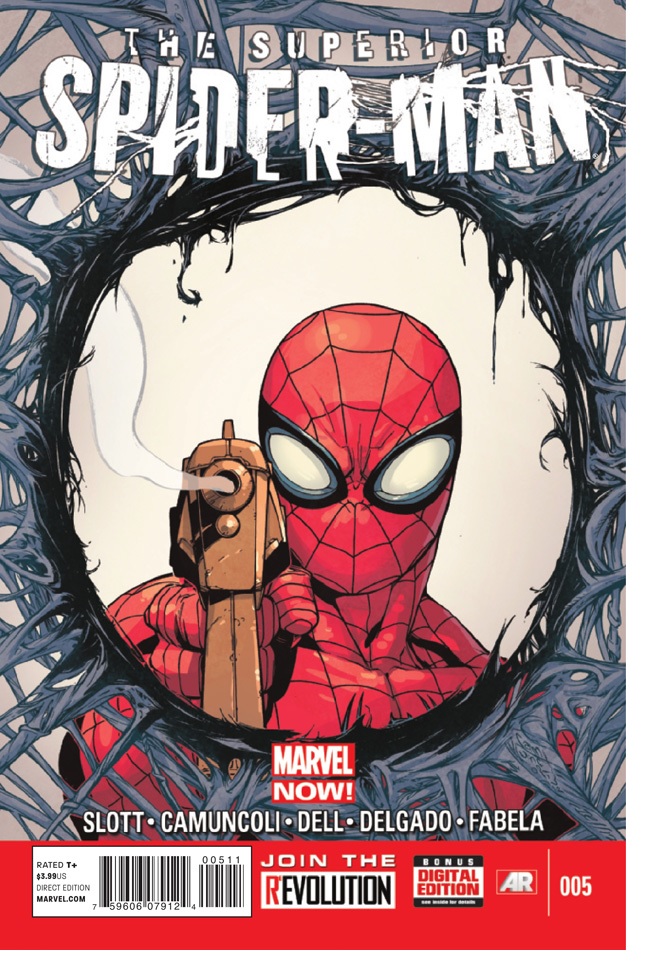
SUPERIOR SPIDER-MAN #5
Writer: Dan SlottArt: Giuseppe Camuncoli
Publisher: Marvel Comics
Reviewer: Henry Higgins is My Homeboy
That…I Mean, Yeah, I Suppose That Works.
So, SUPERIOR SPIDER-MAN. I’ve had incredibly mixed feelings about you. I think you have the potential to be one of the more interesting looks at Peter’s character (by relegating him to an observer role and letting a well-intentioned villain be Spider-Man). On the other hand, please stop having Otto desperately trying to sleep with Mary Jane. Up until this point (well, apart from ASM #700, which I actually enjoyed), I’ve been losing faith in the title, seeing brief sparks of real intrigue be overwhelmed with Otto ruining Peter’s life. I was starting to wonder if the title was ever going to reach the level I was hoping for.
Then issue five came out.
Using Massacre as a springboard, the issue is able to focus on just how Otto’s methods as Spider-Man differ from Peter’s, and it creates an incredibly intriguing contrast between the two. As Massacre is roaming the city, Otto redirects his various “spider-botstm” to locate him. This gives him the opportunity to begin a new friendship with a science tutor, something Peter simply wouldn’t have time to do – he’d be too busy not thinking of the cameras around the city idea and would just be swinging around, hoping for a lead. It’s all part of this new characterization of Otto. He is trying to do good by the world, but he still has a cold, detached view on things. Peter would never think to call the cops during some big brawl with Venom, because it would endanger the cops and this is something Peter can do so Peter has to. Otto instead just calls them for assistance, not only having some expendable back-up but also helping solve that age old problem of “oh no, the police think SPIDER-MAN is the real VILLAIN!!!” story beat we’ve all read a thousand times. Otto’s lack of empathy (remember, he only decided to follow in Peter’s footsteps because he was forced to relive all the struggles Peter did) has him considering how insignificant saving a few lives is in the grand scheme of things, but then a woman tearfully thanks him and he’s at a loss for words. Peter cares about everyone he can save, but Otto is honestly surprised by the real emotion that follows saving a life. Peter yells at Otto to save a child; he does, but immediately yells at himself because saving the child alerted Massacre to his presence. It honestly feels like a diabolical villain trying to be a hero, realizing just how stupid super heroes sometimes have to be to save lives, and just straight up not liking that. All his personal changes to Spider-Man ‘s modus operandi remove that sheer heroism and empathy that Peter has, and replaces it with effective, unfeeling logic. He really is a “Superior” Spider-Man, but does that really make him a better Spider-Man? Isn’t Spider-Man defined as one of the best of the heroes partly because of his sheer determination to save any and everyone he can, himself or the situation be damned? The logical conclusion to the fight with Massacre should be obvious from the get go, and it’s the obvious conclusion to the argument – cold logic says that Otto is making the right decision. But is he? It’s everything I wanted from this story. It’s moving the ongoing plot forward, while also having a one off Spider-Man adventure, while also creating an engaging conversation about Spider-Man and, by extension, super heroes in general. Kudos, Slott. This is actually pretty good.
His other elements of the issue are good as well, finally letting us see Otto relaxed around someone. It’s great having an opportunity to see a less sleazy protagonist for a time, and it helps humanize him greatly. Otto’s own transformation has been enjoyable so far as well, still being Otto but trying something less monster-y. The Massacre subplot is…I’m not really going to go into that one. I don’t know how I feel about that still. It’s, much like Otto, a very easy way to make Massacre worthy of the end, but still, it feels cheap and unnecessary.
All of this is wrapped up in Camuncoli’s consistently engaging artwork. His little acting beats during Otto’s dinner are spot on and entertaining, only really matched with Peter’s ghost swinging beside Doc Ock--a beautiful shot of the two.
Listen, everybody who has started to proclaim Slott as a serious contender for “worst person ever”. We knew Peter wasn’t going to die. We all know he’s coming back. This is only temporary. And while it’s here, it’s sparking a debate about superhero ethics and reminding us why Peter is such an amazing character.
Read it. Just give it a chance.
SUPERIOR SPIDER-MAN #5
Writer: Dan SlottArt: Giuseppe Camuncoli
Publisher: Marvel Comics
Reviewer: Mighty Mouth
An Octopus By Any Other Name Is Just As Deadly.
Issue #5 of SUPERIOR SPIDER-MAN makes it exceedingly clear that the comic community shouldn’t forgive Dan Slott for killing off Peter Parker… they should be thanking him.
At the onset it’s easy to understand how one might feel that the whole death of Peter Parker in AMAZING SPIDER-MAN #700 was simply another half-baked, tiresome gimmick to sell comics. When I first learned of Slott’s intentions to ditch Peter Parker and replace him with Otto Octavius, I threw up in my mouth a little. Nevertheless, as the story progresses it is proving to be so much more than just another death and inevitable return story.
Issue #5 features the return of the murdering psychopath called “Massacre”, who recently escaped from holding and of course celebrates by mowing down innocent civilians. This infuriates both Swayze-Peter and Spider-Otto and the hunt is on. Otto’s criminal past provides him with a certain intuitiveness that makes him incredibly effective in tracking down bad guys, and even Parker himself is impressed with some of Ock’s crime-fighting techniques. Meanwhile, Massacre approaches a high-powered executive with the most insidious of propositions: to commit a bloodbath while wearing a rival company’s logo. When Spider-Otto and Massacre do throw down, the line is crossed, and the people of New York, they love the web-slinger for it.
Dan Slott is breaking new ground and taking Spider-fans on a journey they could never experience in a typical Spider-Man comic. SUPERIOR SPIDER-MAN #5 succeeds in thrusting the story forward. This issue not only offers an analysis of personal ethics and choices, but it begets the question: do our beliefs empower us, or are they a merely a prison created of our own design?
Issues 4 & 5 of SUPERIOR have been handled by artist Giuseppe Camuncoli. There is nothing terrible about his artwork; he does a decent job rendering Spider-Man and even understands how to lay out panels. I think the problem I have with Camuncoli’s work rests in his characters facial expressions; everyone’s just looks so unrelentingly stoic. Still, comics readers have surely suffered far worse.
I’m not going to lie; I too was agitated by the ending of ASM#700. But given Slott’s track record, I decided I would give SUPERIOR SPIDER-MAN an open-minded chance before I joined the huddled masses of insipid fanboys calling for Slott’s disappearance. After five solid issues, I can honestly say I’m glad I hung in there and look forward to seeing the fallout that’s sure to follow this issue.
 Advance Review: In stores soon!
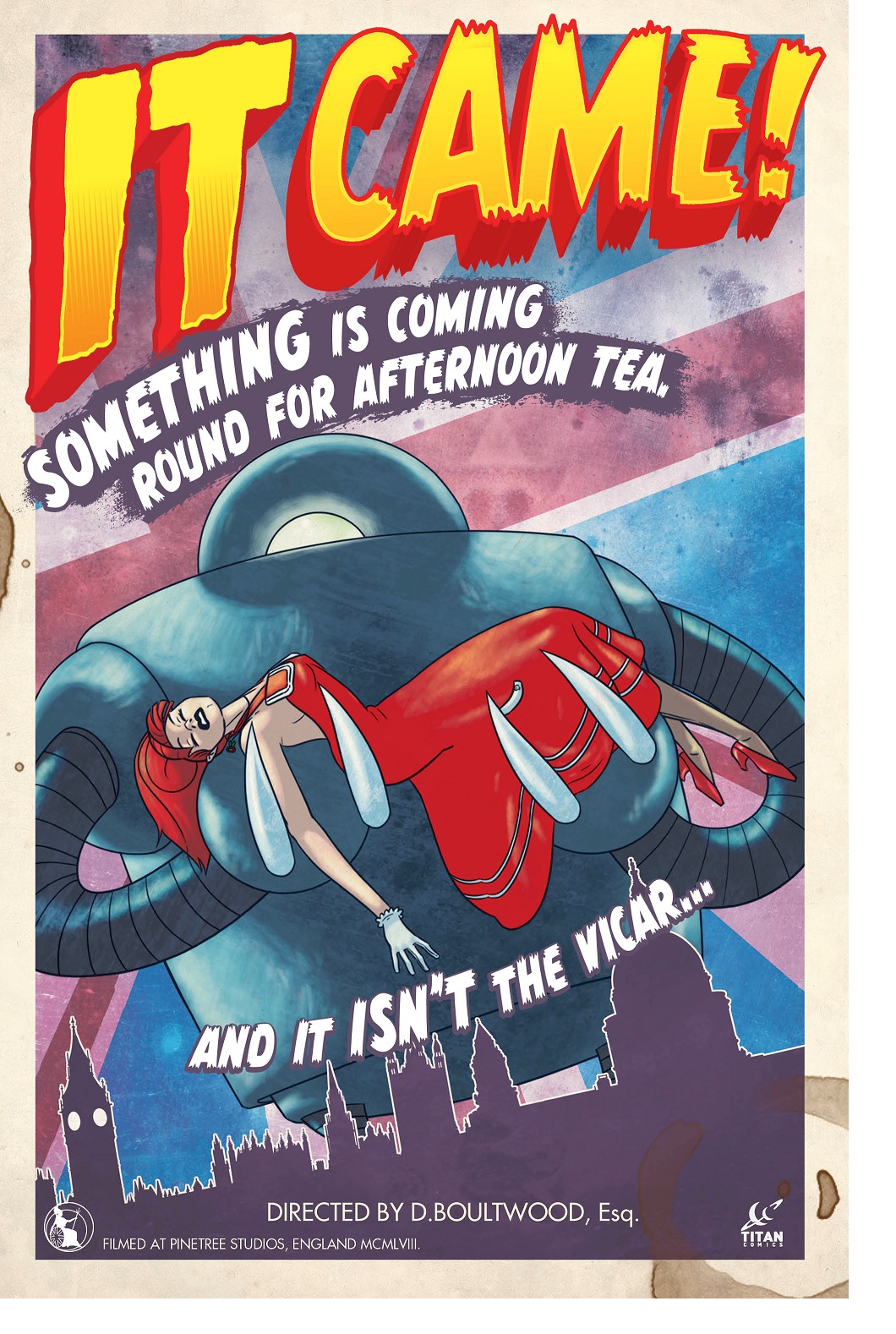
IT CAME #1
Writer & Artist: Dan BoultwoodPublisher: Titan Comics
Reviewer: Optimous Douche
IT CAME…on my face! IT CAME…that’s what she said! IT CAME…and all I got was this lousy T-shirt!
I open this review with these Catskill favorites not to make myself laugh (OK, maybe a little), but more so to make the point you must be ready to read IT CAME with tongue surgically grafted to cheek.
Like most Gen Xers, I’m a big “Mystery Science Theater 3000” fan. Black and white B-movies that normally wouldn’t receive one minute of my attention were watched in full thanks to the sarcastic second track served up by Tom, Crow, Mike and/or Joel. IT CAME delivers 1950’s B-movie hyperbole drama through the cynical lens that knows half of what the characters are saying is complete and utter bullshit, but what’s important is the characters buy the bullshit, and as a reader you can’t help but abandon all of your own logic in the process (a little like “Star Trek”).
SCIENCE! Whenever an alien threat or creature from the black lagoon needed to be obliterated or sent back from whence they came, ubiquitous and ethereal science is always the weapon of choice. What kind of science? Stop asking such ridiculous and impertinent questions with your 1970’s future sensibilities. Back in the 1950’s scientists could dabble in and wield all four of the earth’s natural elements with such aplomb that no fantastical contraption was beyond their powers of conjuration or nemesis beyond thwarting.
Our wielder of Science in IT CAME is the obliviously misogynistic Dr. Brett Boy. As a graduate of the Space Institute, and noteworthy Speaker of the Space Consortium, Brett is the ideal candidate to deal with, say, a giant robot from space tearing up the English countryside. Thank goodness, because that’s the plot of IT CAME. That’s it. Again, though, just like you wouldn’t watch a B-movie these days for twists or surprises, you don’t read IT CAME for the big A-HA moment. You read it to see a time that once was and how laughable the sensibilities of our grandparents’ generation have become. Especially when crafted by Boultwood’s deft pencil.
What would misogyny be without an ingénue to be misogynistic with? Filling this role is Boy’s travel companion, the spinster Doris Night. At twenty-eight years old and suffering from the infliction of being penisless, Boy explains the world and universe to Night before the monster attack begins. Why are they driving around the English countryside together? It was the 1950’s and that was simply the norm. Women who were entering their menopausal late twenties would do anything to get a man, including listening to a dissertation on the heliocentric nature of our solar system – because, as Boy explains, all suns revolve around ours.
The art is in lock-step with the other homages and parodies of this title. From cover to cover (literally) everything fits together more perfectly than LEAVE IT TO BEAVER and Ovaltine. Boultwood’s choice of blue hue colors instead of straight black and white is a perfect copy of the degradation expected after celluloid reaches the age of sixty. Accompanying the main panels are also two delightful ads for famous Fifties products that most people won’t even look twice at these days, much less imbibe.
My only “critique" of IT CAME (and pay attention to the quotes here) is that it's very British. No, I don't mean it comes with bad teeth. Much of the humor was grasped by my Optimous mind because I had a lot of British friends growing up and I live on a steady diet of BBC programming (hell, I love the British so much, my graphic novel is being published in the Motherland). I'm not saying you have to BE British to enjoy IT CAME; some of the jokes and words, though, might fly over your Americentric head.
This is another stellar piece for the new TITAN comics imprint; they are taking bold chances with stories while remembering the cardinal rule – comics should be fun. Sorry for the early tease, but this one doesn't drop until August. Make sure to tell your retailer to order it in the April edition of Previews or risk feeling the wrath of science.
Proofs, co-edits & common sense provided by Sleazy G
 Find out what are BLACK MASK STUDIOS and OCCUPY COMICS here and on Facebook here!
 Want more in all things Geek?
Check out PoptardsGo and on Facebook here!
 Get your copy of highly-anticipated anthology TOME by 44FLOOD today on their Kickstarter!
Check out AICN COMICS on Facebook and Comixpedia.org!