

| Issue #10 | Release Date: 7/4/12 | Vol.#11 |
(Click title to go directly to the review)
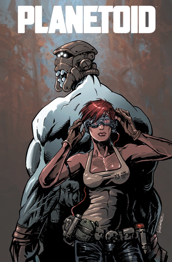
Advance Review: PLANETOID #2
WARLORD OF MARS #19
DIAL H #3
LEAGUE OF EXTRAORDINARY GENTLEMEN CENTURY 2009 #1
Advance Review: UNDERWATER WELDER OGN
ACTION COMICS #11
THE BOYS #68
AVENGERS VS X-MEN #7
Advance Review: FAIREST #5
 Advance Review: In stores later this month!
PLANETOID #2
Writer & Artist: Ken GaringPublisher: Image Comics
Reviewer: Optimous Douche
There is absolutely no reason PLANETOID should work. The story of a stranger in a strange land who crashes into the center of a galactic battle has been covered from Heinlein to broken Heymans in space porn. Oh yea, and “Star Trek”.
But what Garing lacks in concept originality (this is not a fault--I challenge anyone to come up with a story that can’t be traced back to another), he overcompensates for in delivery and execution. PLANETOID is a book of few words, but each one carries an emotional resonance that embodies the human spirit of survival. The art is not photorealistic, but thanks again to Garing’s immense talent this technological wasteland and ecological nightmare of a planet comes alive with every passing panel.
Each week a plethora of people reach out to Ain’t It Cool looking for review love for their wares, especially during this most holy week of comicdom. About 4% of them are truly worth the $3.99 price tag creators put on them. Out of that 4% an even smaller fraction are original and differ enough from already established material to hold my interest very long. In service to comics, we try to find nuggets of gold in each indie book and if none can be found, we generally just walk away saving our vitriol for the comic publishers we know who can take the hit. Every once in a while, though, a book comes along from an indie publisher that begs the question “why is this person not signed to a company that could give them a broader audience?” This was my feeling last February after reviewing PLANETOID 1. Back then it was just Garing self-publishing and putting the book out wherever he could find some love. Flash forward six months and this little book that could is now signed with Image Comics. This not only proves my instincts correct, it gives us all the hope that publishers are looking for new talent to keep our favorite hobby alive.
As I said, the concept of PLANETOID is simple: in the distant future war has torn the universe asunder. The Colonial humanoids have drawn clear lines of demarcation against an alien race called the Ono Mao. In issue one a lone pilot lands on a desolate planetoid controlled by the Ono Mao. Here is where Garing’s apt skill at making space exciting first presented itself. Even in space, stories are about people; Garing made the crash landing of our protagonist Silas as heart-thumping and perilous as the first time I drove my car over a cliff. Switching back between space scene and cockpit made me care what happened to this man; Garing also proved in very few panels he has a panache for pacing that takes many creators years to perfect.
Once on planet, we see how vast Garing’s imagination truly is. If anyone has ever seen an abandoned coal mine, quarry or an old field, you know they are haunted places. Places where the earth has simply been stabbed and left to die with a decrepitation that takes an eternity and blankets the air. Now imagine an entire planet that has been stabbed, sucked of life and left to rot. That’s PLANETOID.
However, only living on one planet and valuing life as we do, we never make the miners or the oil workers stay behind after the resources are spent. The future is not so kind to humanity, since the Ono Mao who harvested this planet and enslaved humans to help don’t understand or care about humanity. Imagine the species we would become on an entire planet that looks like Newark, New Jersey. The Ono Mao only care about cost and efficiency and it was simply easier to abandon this planetoid than move the workers. It’s almost as if the Ono Mao are the evolution of the modern CEO and CFO.
During issue one Silas explores the planetoid with the help of his sentient comm link and happens upon an old man who helps him. That dude is gone by issue two, so we won’t dwell.
Issue two sets Silas on a new adventure to find more humans, the possibility of civilization and hopefully technology to get his future ass off this rock. Again, Garing simply owns scope in this issue making each derelict piece of machinery just one more manufactured mountain for Silas to climb. Garing also ratchets up the danger in this issue, making every left behind automaton from the Ono Mao as lethal as the few indigenous life forms left on the planetoid.
We also start to see Silas’ softer side in this issue as he wins over the heart of a lone survivalist whose parents died and left her to fend for herself since childhood. She’s saucy and feisty now, but I imagine that will soften under Silas’ charms. Also, it doesn’t hurt that Silas fights off a squadron of automatons and is pledged fealty by a gang of nomads. Chicks dig power.
Obviously I can’t say enough about PLANETOID, but those that know my review style understand I succumb to verbal diarrhea when I either truly hate or in this case love a title. PLANETOID and SAGA have proven there’s an insatiable thirst for space right now, but only if it’s put into capable hands like Garings.
Optimous has successfully blackmailed fellow @$$Hole BottleImp into being his artist on Average Joe. Look for Imp's forced labor on Optimous brain child in mid-2012 from COM.X. Friend Optimous on FaceBook to get Average Joe updates and because ceiling cat says it's the right thing to do.
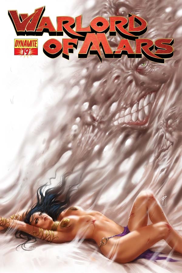
WARLORD OF MARS #19
Writers: Arvid NelsonArt: Stefano Martino
Publisher: Dynamite Entertainment
Reviewer: Masked Man
With the “The Gods of Mars” adaption complete (still wish they gave it seven issues, as it was a bit cramped in six), Nelson starts another original tale to be a bridge until the next book adapation, “The Warlord of Mars”. Nelson had done this earlier, placing an original story in-between “A Princess of Mars” and “The Gods of Mars” adaptations.
Now, what a find in Stefano Martino--this is my first time seeing his work and I’m impressed. I understand he’s worked on some other small books, but wow, this guy is prime time. He has great figure work, which is solid and light at the same time. His faces are clean, detailed and expressive. His backgrounds have enough detail to give the story weight and work well with his figures. His storytelling is dynamic and clear, too. An extra bonus for Dynamite is that he inks his own pencils, so no wimpy artwork here. Editors should take note of this guy--good stuff!
Plot wise, John Carter and the Red Men of Mars have conquered the Black Men of Mars (or the First Born), who have now revealed a doomsday device. So it’s up to John, his son Carthoris and his colorful group of Martian friends to stop them from using it. Not being hampered by another adaptation, Arvid Nelson has much nicer pacing here. A really nice set-up to the two part story, “Worms of Mars”, it scores a 3 out 4.
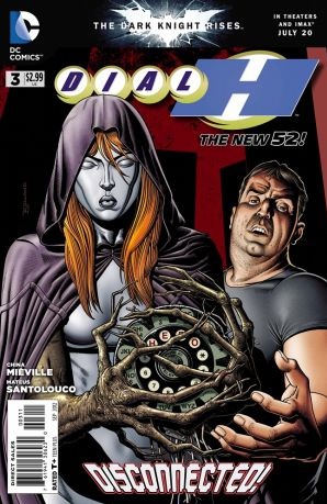
DIAL H #3
Writer: China MiévilleArtist: Mateus Santolouco
Published by: DC Comics
Reviewed by: BottleImp
DIAL H is one of those rare cases—and I’ve only had this happen a few times, including not just comics but books and movies as well—when I can’t say that I actually like the story, but I’m intrigued enough to keep coming back to it. China Miéville has taken the childlike wish-fulfillment concept of DC’s original DIAL “H” FOR HERO series and twisted it into a bizarre, semi-surreal nightmare of dark powers gone amuck. Like a David Lynch project, each installment pulls the curtain back a little more on the mystery, and with each new glimpse the mystery only gets stranger.
Take this issue, for example—the reader learns that the mysterious red-haired and masked Manteau who showed up last issue to help Nelson out of a jam has her own dial, and can also use it to assume new superpowers. Unlike Nelson, however, Manteau manages to subdue each dialed-up identity beneath her own, making sure that her own mind never gets lost beneath these bizarre identities. And speaking of those identities, we also find out that every time a new identity is dialed up, it’s not simply a matter of gaining superpowers. Miéville reveals that each identity has a life and memories all its own. Does this mean that the dial is plucking these identities from other worlds? From alternate realities? Or is it something else entirely? And as for why a seemingly simple (and almost shockingly archaic to younger readers, I’m sure) rotary phone dial is able to call forth such incredible beings, Manteau hints that the answer lies with a mysterious man known only as “O,” who somehow had inspired the breakthrough work of scientists such as Alexander Graham Bell and Thomas Edison.
It’s little tantalizing tidbits of information such as these that make this series so maddeningly intriguing. Miéville’s storytelling style and marked sense of the surreal recalls the kinds of stories that Grant Morrison was writing for DC back in the ‘80s. DIAL H’s blend of mystery and wonkiness (like Nelson’s flash-sideways of Boy Chimney fighting the Rake Dragon with Open-Window Man and the Eavesdropper and other members of Team House—trust me, you have to see it to know what I’m talking about) is a direct descendent of the kind of strangeness that Morrison cultivated in his runs on DOOM PATROL and ANIMAL MAN. Surrealism is not to be seen much in the standard superhero comics put on the stands today, so I’m giving Miéville (and the editors at DC who support this series) extra credit for bringing something different to the table, at the very least.
The artwork here is a perfect match for the script, as Mateus Santolouco has a drawing style that falls neatly in the cracks between realism and cartoonish stylization. His slightly rough inking style and skewed facial expressions remind me of the EC work of “Ghastly” Graham Ingels, giving the innocent notion of becoming a superhero a horrific edge that dovetails nicely with the darker tones of the storyline.
It appears from this issue that Miéville is tying in this new series with events or characters from the original DIAL “H” series. Now, I have no knowledge of the old comic apart from the title and core concept. But the mere fact that this new series is interesting enough to make me want to go back and find out more about the history of the power-granting rotary dial should imply that DIAL H is doing something right. Like I said, I’m not sure that I “like” this series yet—I wouldn’t call myself a fan, in other words—but I am intrigued enough by this strange mystery that I want—no, I HAVE—to find out what happens next. And if nothing else, I’d want to support any comic that tries to bring a little good old-fashioned weirdness back to the stands.
When released from his bottle, the Imp transforms into Stephen Andrade, an artist/illustrator/pirate monkey painter from New England. He's currently hard at work interpreting fellow @$$Hole Optimous Douche's brainwaves and transforming them into pretty pictures on AVERAGE JOE, an original graphic novel to be published by Com.x. You can see some of his artwork here.
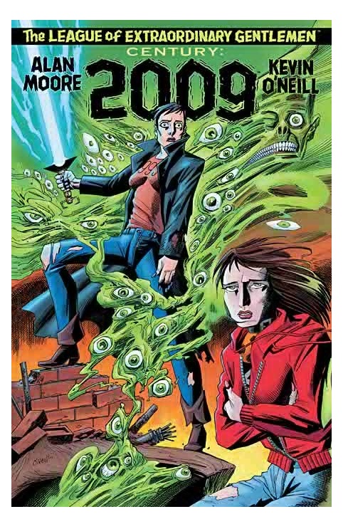
THE LEAGUE OF EXTRAORDINARY GENTLEMEN: CENTURY: 2009
Writer: Alan MooreArtist: Kevin O’Neill
Publisher: Top Shelf Productions
Reviewer: MajinFu
Over the course of their long career, members of the League have foiled plots to ignite global war, averted Martian invasion, and endured countless other hardships as their story progressed through the centuries, shifting cultural personas like a kid changing his dirty underwear. Now they have dwindled to a dismal few and the Antichrist has been born, grown up and is now at large somewhere in north London. Can the League stop the Antichrist from ending the world as they know it? Do they really even want it to keep going?
In a world where property rights have become more important than a character’s integrity and fictional figures make the transition to film only to never return to their literary roots, how can the League cope with a lack of moral fiber? It’s interesting to me that after all the great nemeses they have battled in the past, the greatest enemy the League has ever faced is the progression of time itself. Sure, folks like Orlando can deal with it because they’re immortal so maybe they’re just kind of built to deal with the trauma, although the haunting introduction will tell you that’s not really the case. But Mina and Allan are literary figures that very much embody the spirit of the era from which they emerged, a fact that gives them strength in this last volume.
If you’re reading this you’ve probably got an opinion on Alan Moore and you’re either passing on this, chewing at the bit to read it, or you’ve already consumed the whole thing like the ravenous beasts you all really are. In other words, you’ve probably made up your mind about this comic and nothing I say is going to change your opinion. So instead of simply reviewing the work, I would just like to discuss some different aspects of the book and hopefully get a discussion going about it in the talkbacks. I’ll leave that up to you though, ya animals.
First of all, Kevin O-Neill’s work on this book is visually consistent with the rest of the series; by that I mean it looks brilliant Although the appearance of several key figures (as well as the world itself) has changed drastically since last seen, the spectacle of such acute line work remains the same. When I first jumped into the series it took me awhile to get acclimated with his somewhat square-faced style but I’ve warmed up to it heartily over the years. Calling it archaic would be an insult to the illusionary flow of the book. It’s just magical. O’Neill has a talent for illustrating highly emotive and sympathetic characters without compromising the unwavering design palette demanded by the story. The result is a universe populated by familiar faces that still appear to be living in a society on the verge of collapse. This is probably the one facet of the book we can all agree on. If you need any more convincing than that, just turn to any one of the pages where Prospero appears with his entourage in tow and just try not getting jarred into the narrative by the sudden explosion of pictorial power.
The art also captures the inherent creepiness of 2009 rather well. The story moves at a rather brisk place, with a fairly simple plot and number of memorable introductions. The reveal of the Antichrist is especially unnerving, and O’Neill’s scratchier style lends itself well to this scene. Likewise, the composition creates an eerie atmosphere that permeates all the way to the book’s climactic conclusion. Perspective shifts dramatically to such a degree that is could be jolting, but instead results in a seamless reading experience. The plot is almost perfectly paced, like a modern graphical sonnet perhaps because it was designed with a 21st century audience in mind, perhaps not. Every graphic detail in this book lends itself well to the author’s seemingly cynical views of the modern world, but what is a cynic if not an idealist scarred by prolonged disappointment? I’m beginning to think this book is biographical.
That’s not to say this book is all gloom, doom and objectionable interior design. If anything, it’s the most humorous entry in the series since Mr. Hyde strolled down the burning streets of London with a twirl of his cane and a song in his heart. As I’ve said before, the plot is fairly simple, which gives the primary players more room to breathe and interact, making for a nice build up. A majority of the book is spent on members of the League idling around in an apartment making tea for each other, practically wailing over how much the world is changing around them. The pace never slows, though, and every page has at least one highly humorous visual gag or spot of real honest humanism, like Orlando retrieving her sword, or a robbery in the background, that will both keep you entertained and help slightly to alleviate the darker tone.
One of the most thought-provoking features of the story as a whole is seeing how these characters that actually stand for something deal with a world that no longer has time or space for their ethical values. In a way, it is the most autobiographical volume of the series to date, depicting Moore’s own disillusionment with the modern world in a manner that is humorous, and a little tragic. Some may argue that it’s not that simple, calling it a story about stories and the way fiction and characters evolve and reflect our society. Anyway, it’s a revival and celebration of reflexive media, and in my book that makes it art.
In the end, Moore and O’Neil show that they can face the cynicism of their contemporaries with a wink and a nudge into the realm of absurdity, with a finale that literally storms out the deus ex machina. It’s an appropriate conclusion to a book that has never shied from real applications of magic or spirituality, resulting in a book that feels enchanting and is particularly heartfelt. But that’s just one fan’s humble opinion. What did you think?
 Advance Review: In stores July 25th!
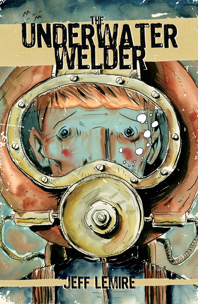
THE UNDERWATER WELDER OGN
Writer/Artist: Jeff LemirePublisher: Top Shelf Productions
Reviewer: The Dean
Jeff Lemire takes fatherhood pretty seriously. I remember reading Bill Cosby’s “Fatherhood” when I was like eighteen for some odd reason, and being really excited about one day being a dad - nothing but endless anecdotes of my crazy children to entertain my friends, family, or maybe even a capacity crowd or two! But those were my more selfish days, I suppose, and I now have a more responsible and aptly terrified view of parenthood which Lemire’s work suits much better, though it still ends with the more somber reassurance that fatherhood can and will be the most rewarding endeavor of any man’s life. THE UNDERWATER WELDER continues this artistic examination of being a dad and concurrently explores themes of pressure, obsession, and isolation, all while maintaining an unparalleled level of excellency that easily makes this one of, if not the best, works to come out this year.
With THE UNDERWATER WELDER, Lemire tells the story of Jack Joseph, who took up the titular profession through some inescapable draw of supposed destiny. Joseph’s father was an underwater welder, and after disappearing one fall night, he leaves his son Jeff with nothing but questions and a romanticized idea of up the job that makes little use of his college education. With a newborn on the way, the mystery and lingering frustration of his dad’s disappearance proves to be more pressure than Jack can handle, and he decides to seek answers at the site of an eerie underwater encounter he had days before. There’s plenty more plot to delve into, but to go any further would rob you of a one-of-a-kind experience that’s best absorbed deliberately, and with as clean a palate as possible going in. The introduction from Damon Lindelof sets the mood perfectly and gives you all you really need to know before losing yourself in this one, stating “you are about to read the most spectacular episode of ‘The Twilight Zone’ that was never produced.”
The story comes together very methodically in a such a way that you just know you’ll have to reread it to catch what you missed the first go ‘round, but to be perfectly honest, a reread is pretty unnecessary when a story sticks with you as much as this one does. It’s often said of great music that it’s as much about the notes you don’t play as those you do, and I think the same can be said of great writing. Wordy is not a word I’d use to describe your average Jeff Lemire script, and it’s those moments of silence that bring the haunting “Twilight Zone” quality to THE UNDERWATER WELDER, and make the sparsely used words all the more effective and memorable. Even more impressive, perhaps, is the amount of depth his characters exhibit in such few words – even the unborn baby seems to have a character arc via its father, and Jack’s story is so fully realized that it’s difficult to consider any character “minor.”
But where a good book would fill these quiet moments with narration, we comic book fans can consider ourselves lucky that instead, we get the work of artists like Jeff Lemire. With LOST DOGS, his work was raw, powerful, and entirely unique – the occasional red in its otherwise black and white color scheme was just enough to announce the arrival of a new artist on the scene, but the simple blacks and whites of ESSEX COUNTY seemed a more personal and engrossing approach for the stories within. With THE UNDERWATER WELDER, Lemire provides a few water colored gray accents in his pages, and the characters seem crisper and more detailed than they’ve been in his past work. It’s unfortunately rare to see an artist markedly improve themselves after a certain level of success in this medium, but Lemire has gotten better with each comic book or graphic novel he puts out, and his capabilities as a graphic story teller are exercised here as well. There’s a bit of a French influence, with a number of 8-12 panel pages that either make up a traditional narrative sequence, or break up an otherwise full page splash, but Lemire experiments with a few two-page splashes as well, which have a powerful effect on the story, and generate pause and reflection at a few key points– memories seem to flow from (or into) the characters through screen-capped panels in certain displays, capturing significant events in Jack’s life, almost as if we’re witnessing his life flash before his eyes.
THE UNDERWATER WELDER is very much classic Lemire, but when innovation and enhancement is becoming such a staple of his work, it’s hard to imagine he’ll ever seem antiquated. This one is an obvious labor of love that emits a masterful level of skill both learned and inherent from every panel. There are a number of elements in here that make his latest an essential read for comic fans, but above all else it might be that there’s just no one else like Lemire right now in modern comics, and it’s refreshing to see a writer/artist so comfortable in his own voice so early on. This is a pretty clear frontrunner for me for ‘Best of 2012’ so far, but while it may still be too early to call that race, THE UNDERWATER WELDER is at least the best in what was already an impressive line of work from Jeff Lemire.
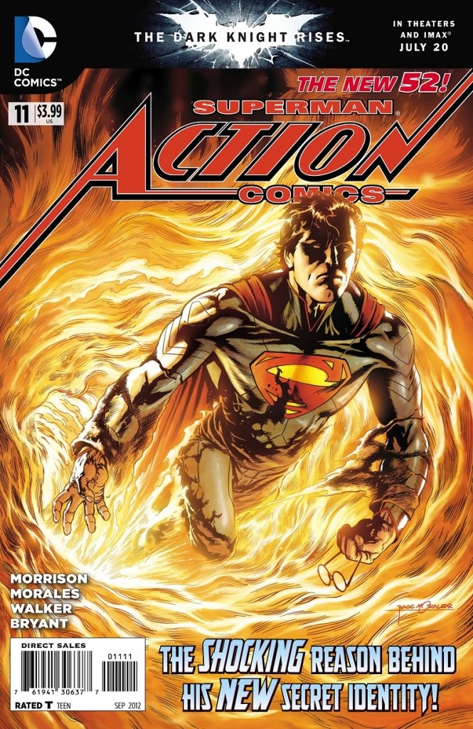
ACTION COMICS #11
Writer: Grant MorrisonArt: Rags Morales and Brad Walker
Publisher: DC Comics
Reviewer: Masked Man
It’s been a while since I checked out ACTION COMICS; I originally dropped out after issue 4. The writing was too messy and cramped. Time has passed, and being a fan of both Grant and Rags, I thought I’d check in. Well, it’s still pretty darn messy. Grant is still pushing out ideas faster than a momma rabbit pushes out baby rabbits. While the writing has improved, it’s still missing a whole lot of pacing and context.
Stan Lee has a famous line about every comic being someone’s first. So it wouldn’t kill you to put some context in each issue so everyone knows what’s going on. Case in point--was the first scene of this comic a flashback? Superman was wearing his t-shirt and jeans look, something I thought he hadn’t done in five years. But there’s no mention of this being a flashback or any reason given why he’s not wearing his blue ‘union suit’. So I don’t really understand the context of the scene to the story. Then we have a team-up with Batman, some kind of star-child, a look into Johnny Clark’s new life (yeah--did you know Clark Kent is dead and Superman is now Johnny Clark, fireman?), Superman wondering if he made a mistake letting Kent die, a pair of disturbed hamsters, the alien museum, the multitude, the holy crap moment of Lois Lane, Metalek, the end of life as we know it (not sure if it’s related to any of the things I’ve mentioned), and the spaceman (who I assume is the New 52’s Captain Comet). All jammed into 20 pages--whew!
To be fair, Grant does a reasonably good job keeping this all together. But he doesn’t have to. I assume his contract with DC isn’t up in four months, so I don’t get the need to ramrod every crazy awesome idea he has in each issue. Grant, buddy, slow down, get some more context into your scenes, and have them link together as opposed to chop, chop, chop, chop. Is it really important to have the reader try and figure out where a scene is taking place while reading the first page of the scene? What’s so wrong with a text box stating where we are, and perhaps relating it to the previous scene? I’d love to see the editor of a book do something more than just fire a creator because of something they wrote in their blog. But as Dick Cheney said, you fight with the army you have, not the one you want.
Ultimately, ACTION COMICS is just too jumbled, with not enough time given to characters and events to have them really resonate with readers. Oh, there’s a back-up story too, but I can’t really say much more about it, except that it’s there. So ACTION COMICS scores a 1 out of 4.
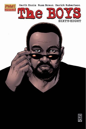
THE BOYS #68
Writer: Garth EnnisArt: Russ Braun
Publisher: Dynamite Entertainment
Reviewer: Henry Higgins is My Homeboy
Family Falling Out
I talk about THE BOYS a lot. It may have been a while since I’ve gone off about it online, but my friends and family will not shut up about me needing to shut up about THE BOYS. It’s one of the most well done, inventive, sardonic, simply brilliant comics I’ve ever had the pleasure to read. Even its down points are grand compared to most of the industry, which I think is better today than it has almost ever been. As the series comes to a close in two months, I thought it prudent to talk about the latest issue, which HOLY FUCKING MOSES.
Writing: (5/5) Ennis produces one of his strongest scripts to date here, with each character getting a chance to shine appropriately. The cast, which has expanded more and more over the series, has had its focus moved back down to just the main cast. As the team discusses what to do with Butcher, they all remain painfully true to themselves, and it becomes apparent very quickly what end is coming. That doesn’t detract from it all, especially where M. M. and Butcher are concerned. As the two friends now turned against one another converse, there’s a lightness to it, a familiarity. But once the brawl breaks out, the relationship hasn’t changed. M.M. is livid with Butcher, in the way only a best friend could be. It’s wonderful, playing into Ennis’s strengths as a writer, while also simultaneously giving closure to a certain theatre of the story. I won’t go on much longer (because if I don’t keep it fairly short, this will go on forever), but Ennis has never been better.
Art: (5/5) It’s hard to image a series known for its spectacle and grandeur showing off the best art yet in a relatively conversation-based issue, but Russ Braun and Tony Aviña make every single thing in this issue stand out. Every face conveys so much raw emotion so beautifully, from the opening page framed around a mental Frenchie, to the heartbroken Butcher at the close. The conversation between The Boys on Butcher’s recent activity jumps out, and honestly feels like the reader is watching a film, full of wonderful actors.
Which isn’t to say the action beats aren’t also wonderful. There’s a wonderful two page sequence about what becomes of a number of the supes, and it’s equally horrifying and satisfying. Then there’s the end. The end…I’m not going to reveal anything. I spoil enough stuff, so I’d rather not divulge anything about this one. Suffice to say, it’s powerful, heartbreaking, and totally expected. Braun brings weight to each panel, and Aviña just reinforces it with a palette of vivid colouring whenever necessary. Simply marvelous.
Best Moment: The ending. I read that on a plane, and I’m not ashamed to say I may have made the “No Fly” list with my visceral reaction to it.
Worst Moment: ...I got nothing.
Overall: (5/5) Fantastic. Bloody fucking fantastic. I love this series more than PREACHER. And that’s…that’s saying something.
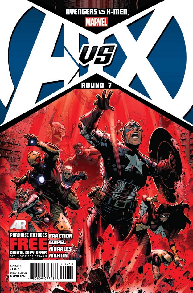
AVENGERS VS X-MEN #7
Writers: EverybodyScript: Matt Fraction
Art: Olivier Coipel
Publisher: Marvel Comics
Reviewer: Masked Man
Marvel’s lead in to Marvel Now! continues as the Phoenix Five are out to shut down the Avengers. I’ll start the review with some more praise for Olivier Coipel. Coipel has such an elegance to his work, he has really elevated this crossover event to something special (despite the qualms we might have over the logic of the story). Though I’m curious, how old is Hope? Coipel is drawing her like she’s 13-15, but John Romita Jr. and Frank Cho drew her like she’s 18-21. Not being a long time X-Men reader, I don’t know which is more accurate.
Ok, let’s get into the story. The Phoenix powered Cyclops, Emma Frost, Namor, Colossus, and Magik (who are all basically omnipotent) have met their match in the Scarlet Witch. This is where I have to break and say “Really? The Scarlet Witch?” Am I the only one tired of her being the most powerful being in all creation? I mean, Thor and Dr. Strange are worthless against the Phoenix Five, but Scarlet Witch can just stand there and she hurts them. Seems to me Thanos needed the Infinity Gauntlet to do the things she does. Well, moving along, the story is fairly entertaining. As the Phoenix Five have trouble with the Scarlet Witch, they start to disagree and fracture. Nothing like failure to test a team’s cohesion. This sets up two big confrontations in the next issue--one with the Avengers and one with Cyclops!
I like the K’un Lun angle to this, how an ancient kung-fu legend ties into the whole Phoenix saga, though when you consider the actually history of the Marvel Universe, you wonder where they were when Jean Grey was the Phoenix. It’s pretty clear that Hope is going to live up to her name.
Lastly, Hawkeye just can’t catch a break in these big events, can he? Sure sucks to be him, though I’d really like to get a description of the arrow he shot at Emma Frost. If Thor’s hammer does nothing, but one arrow from Hawkeye can bring the pain, I feel an explanation is in order.
Overall the series is getting better, but it’s still too flawed to be anything but fair, scoring a 2 out of 4.
 Advance Review: In stores this week!
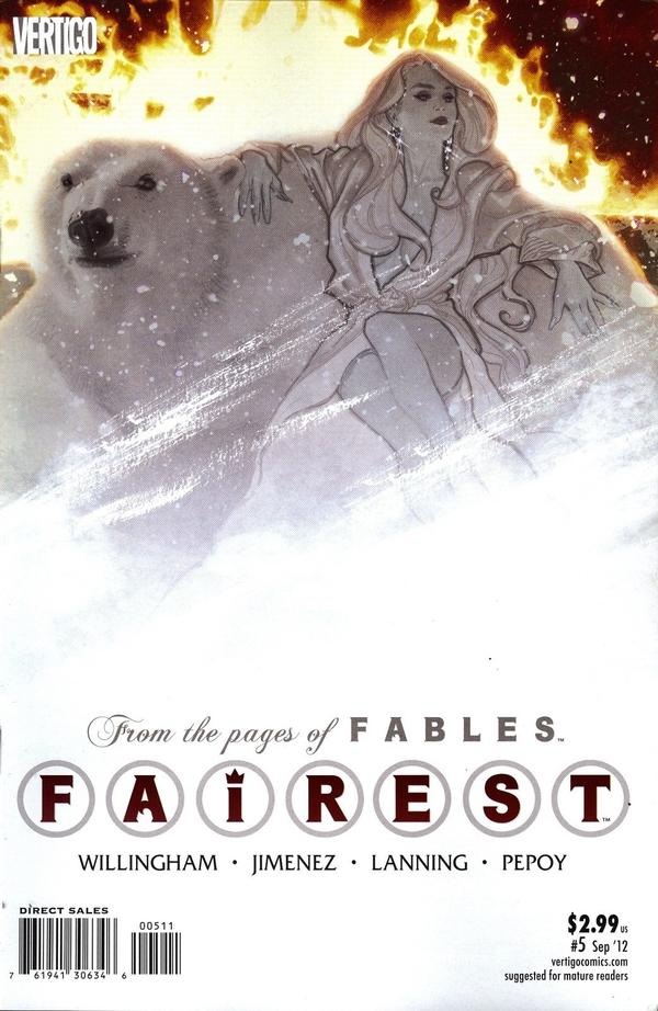
 FAIREST #5
Writer: Bill WillinghamArtist: Phil Jiminez
Publisher: DC Vertigo
Reviewer: Optimous Douche
“Mirror, mirror, on the wall--who’s the FAIREST of them all?” Well, it ain’t Snow freaking White, that’s for sure. Actually, you won’t see hide nor noir hair of Miss White within this first tale focused on the lovely ladies of the FABLES universe.
Some will call this latest spillover from the FABLES universe a money-grab, and I don’t fault them for their misunderstanding. Comics collectors are like abused children; for years we have been forced into spin-off titles that have slightly impactful but very loosely tangential ties to the main stories we love. Some are good stories in and of themselves, but more often than not we buy them merely so we’re not lost when the next main issue comes out. Yet still we continue to buy. Let me say now, FAIREST is our Mr. Drummond. No more bitches slap in Harlem my little Arnolds. FAIREST doesn’t force you into anything, because it merely offers another look at the FABLES universe. If you read FABLES and not FAIREST I think you’re a moron, but you won’t ever be lost inside FABLES if FAIREST doesn’t hit your pull box.
Now, if you enjoy Willingham’s take on Grimm fairytale characters forced to live in our mundane (or mundy as they call it) world, there’s nothing about FAIREST you won’t like. Again, it’s not necessary, but at the end of the day are any comics truly “necessary”?
When this series was announced with the other new Vertigo offerings, SAUCER COUNTRY and NEW DEADWARDIANS, I was hooked on concept alone: put the women of FABLES like Snow White and Beauty in their own story arcs about untold times during the run of FABLES or any time before. It’s a concept that worked swimmingly over the past two years with Fabletown’s own spy extraordinaire, Cinderella, and as a fan of that series I was absolutely ready to take an inch wide mile deep view of other FABLES characters. The fact that it’s the women folk is an added bonus for us red-blooded American males.
For arc one, which will draw to a close next issue, Sleeping Beauty is the FABLES femme du jour. Now, while it helps to have some context on what happened to Sleepy before issue one, Willingham and crew do enough exposition to get you caught up. FABLES fans will remember that Sleeping Beauty was the Fat Man and Little Boy that helped to end the Great War against the Emperor (or Gepetto, as we all know him). By pricking her finger she was able to put herself, the Emperor’s general the Snow Queen, and all of the Goblin hordes into an eternal state of slumber. Well, eternal for as long as her ruby red lips remained unkissed by a handsome prince.
So a kiss awakens Beauty, but sadly her Prince is Ali Baba, The Prince of Thieves. While the banter between Beauty and Baba is more priceless than all of the episodes of “Moonlighting” and “Cheers” combined, what really won me over is Baba’s reluctant sidekick the Bottle Imp. The Imp isn’t the reluctant one, in case you were wondering; Baba got saddled with him thinking he was stealing the bottle of an actual genie. Instead he got a leftover spy from the Great War who was sent to monitor and report back the strange Mundie world. So the only true value to Baba is that the Imp “knows stuff.” To us readers, though, the Bottle Imp serves as a wise-cracking cacophony of pop culture references that bridges FABLES speak with our own world – and he’s fucking hilarious to boot.
I’m not going to tell you how this tale plays out, except that nothing you would expect to happen actually happens. Also, the reading of a Willingham book is the real true joy. He’s a writer that goes beyond cool concepts and simply makes every moment worth reading. Plus Jiminez’s art is simply gorgeous: from grand battles to quieter character moments, the man shows why he has had such a long and illustrious career. Not every artist works on a FABLES books as we learned with the slew of Buckingham replacements after the Great War ended.
If you ever wanted to try FABLES, but found it daunting to jump into a book after the 100+ issue mark, then give FAIREST a whirl. While FAIREST is five issues in, you shouldn’t have a problem getting back issues and I guarantee (which I rarely do with my opinions) that every reader will find something to enjoy within its fairest pages.
Proofs, co-edits & common sense provided by Sleazy G
 Find out what are BLACK MASK STUDIOS and OCCUPY COMICS here and on Facebook here!
 Want more in all things Geek?
Check out PoptardsGo and on Facebook here!
 Get your copy of highly-anticipated anthology TOME by 44FLOOD today on their Kickstarter!
Check out AICN COMICS on Facebook and Comixpedia.org!