

| Issue #8 | Release Date: 6/20/12 | Vol.#11 |
(Click title to go directly to the review)
Advance Review: GET JIRO Vol.1
STAR WARS: DARTH VADER AND THE GHOST PRISON #2
NEXT MEN: AFTERMATH #44
THE SHADOW #4
UNCANNY X-MEN #14
TWISTED DARK VOLUME III
MARS ATTACKS #1
GRIM LEAPER #2
AVENGERS VS X-MEN #6
MASTERS OF THE UNIVERSE #1
CHEAP SHOTS!
 Advance Review: In stores this week!
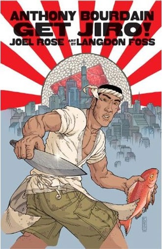
GET JIRO Vol.1
Writers: Anthony Bourdain & Joel RoseArtists: Langdon Foss & Jose Villarrubia
Publisher: DC Vertigo
Reviewer: Optimous Douche
Let me be emphatically clear here, you must be a pure foodie to “truly” get GET JIRO. When I say foodie, I’m not referring to the unwashed masses who love to stuff their pie holes with chicken wings and Big Macs. You people are not foodies, you’re merely selfish gluttons who will become a problem for tax payers as you eat yourself towards immobility.
A foodie relishes the purity of the eating experience, a foodie takes hours to eat not minutes, and a foodie treats a meal like great sex. Foodies know that preparation is the foreplay and eating the meal should be a slow deliberate process that engorges all of the senses of sight, smell, taste (obviously), and texture on the tongue.
I’m a foodie bystander, Mrs. Douche though, a foodie to the extreme. Each night she literally takes 3 hours to craft our meals from all corners of the world (we’re on a heavy Israeli kick right now). Part of this appreciation comes from watching GET JIRO co-author, Anthony Bourdain, on his show No Reservations. Most food shows make me want to kill myself or the people on screen, I’m looking at you and your Dolly Parton hair-don’t Paula Deen. But Bourdain is something special: like yours truly, he’s a lanky mother-fucker from Jersey that spitfire’s sarcasm with an ease that transcends to art. While Mrs. Douche enjoys the food, I laugh with hilarity as Bourdain goes to exotic ports of call where the local see Bourdain’s sarcastic comments as sincerity because they just don’t get the concept; these are places like China, Iceland, the Mediterranean and the American Mid-West. But for all of his quips he also has a sincere love of food, which he articulates in poetic prose that makes the writer in me squeal with delight.
Bourdain is hilarious, and his dry, dark, cynicism permeates every page of this tale where foodie culture is stretched to delicious hyperbole. I’ve reviewed a ton of these books “by” celebrities in my five years of comic reviewing and I can’t think of one where I felt any involvement from the celebrity other than slapping their name on the book. GET JIRO is a true collaborative effort from a man that loves food and an accomplished team of comic experts. Honestly, I would expect no less from Vertigo.
The setting is future Los Angeles, where the city has been split into a very Berlin cordoning off of the haves and have-nots complete with Check Point Charlies to ensure the two classes never mingle. For example, buses that traverse between the two zones will not make stops in the elite inner circle for fear of the riff raff tainting their perfect culture. In this imagined future, food, not drugs, serve to give people their pumped up kicks. And of course where there’s a vice, there’s a kingpin of that vice or gangsta as all the kids say…12 years ago.
In the world of GET JIRO there are two lords of the kitchen. First up is Bob, an embodiment of the Emeril Lagasse’s corporatization of food combined with Don Corleone tactics to keep that coveted place. Bob is an ecological disaster waiting to happen as he flies in food from anywhere and everywhere with little concern for things like the extinction of the food he is preparing. On the other side of the fence is the aptly named Rose, who embodies the Whole Foods local organic approach to ingredient procurement. But don’t let Rose’s hippy ways fool you. Any zealot, even a hippy, can be dangerous when their ideals supersede their basic love of humanity.
In the middle of this war is our eponymous hero JIRO (I feel a limerick coming on). JIRO lives in the other section of the city, the outer ring, basically the Wild West of food and also where people go for their cheap fix. Except JIRO is no mere smack pusher. When we meet this sushi chef extraordinaire we begin to truly see the Bourdain influence in the book. When a customer walks into JIRO’s sushi bar and orders a California Roll, JIRO slices his head clean off. This is the ultimate in foodie humor, ordering a California Roll at a sushi bar is an insult to the chef on par with ass banging his mother while pouring sugar in his gas tank.
JIRO also serves as the catalyst for food lessons, like plate and food color balance, the right tools for the right job (i.e. cutlery) and a shit ton of recipes are hidden amongst the various dialogue bubbles if you’re smart enough to glean them. Now of course the cutlery is used for more than cooking, like the aforementioned decapitation, as JIRO becomes the focal point of obsession for the two gang lords. They want JIRO on their team and they will get him at any cost.
Beyond the cooking, GET JIRO also gets what comic folks like. I attribute all of the high action, swift panel movement and tight dialog to Rose (the other co-author, not the character). Plus, the art in GET JIRO is simply exquisite. Those of you reared in the 70’s will immediately recognize the line work of Foss from HEAVY METAL magazine. I imagine Bourdain had a heavy hand in this selection given the music choices he picks for No Reservations. Regardless, it’s a wonderful choice. Foss makes cooking as equally action packed as all of the blood baths when the gang rivalry truly starts to fire up.
I’ll admit, I chuckled when GET JIRO hit my doorstep. Even with the Bourdain seal of approval I was dreading this reading experience. The plot felt contrived and way too high concept on first inspection. But GET JIRO really works. Again, foodies will get the most out of this title, but that’s not to say that every traditional comic element isn’t set to the highest standards.
If you love food and comics, getting GET JIRO is a no-brainer. If you just love comics and have a low willing suspension of disbelief, watch a few episodes of Bourdain, gain an appreciation for how intricate true food preparation truly is, and then get GET JIRO.
Optimous has successfully blackmailed fellow @$$Hole BottleImp into being his artist on Average Joe. Look for Imp's forced labor on Optimous brain child in mid-2012 from COM.X. Friend Optimous on FaceBook to get Average Joe updates and because ceiling cat says it's the right thing to do.
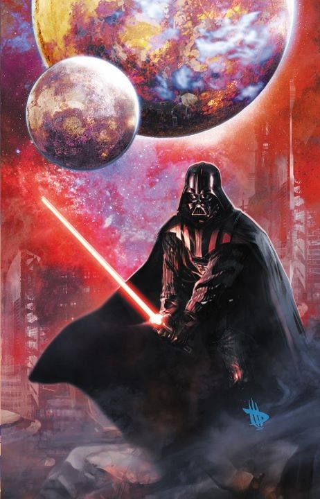
STAR WARS: DARTH VADER AND THE GHOST PRISON #2
Writer: Haden BlackmanArtist: Agustin Alessio
Publisher: Dark Horse Comics
Reviewer: The Dean
I’d say I have a pretty decent familiarity with the extended Star Wars universe - I played through Shadows of the Empire on the 64 several times as a young Dean, and I’ve read a handful of the books, including the great Thrawn trilogy. With what I have experienced of Star Wars off its beaten path on the silver screen, I’ve noticed one permeating truth that reveals itself in many of these tales: there are a lot of people out there who can write a better story with these characters than George Lucas can. I don’t harbor the fervent hate for the man that a lot of fans do after the prequels and constant changes made to his original trilogy, but I do think he’s a much better idea man than he is a writer, and STAR WARS: DARTH VADER AND THE GHOST PRISON is exactly the type of story I wish Lucas could have told in his prequels.
The first issue of this five part story opens with the graduation of the first class of imperial officers, and spends the majority of the issue getting to know the graduating class’s valedictorian, Laurita Tohm. Tohm is soon ordered to Grand Moff Tarkin’s fleet where he’s assigned to a secret project, but a massive attack on the academy and other imperial locations disrupts these plans before he can enjoy this privileged assignment. At the end of the first issue, we learn that these attacks were largely an inside job, and by the end of the second we find out who was behind it all. In DARTH VADER AND THE GHOST PRISON #2, Tohm is faced with a decision to make while in the middle of this sudden battle on Coruscant: join the developing rebel alliance against the Emperor, or stay the course on his path to Imperial command.
There’s really a lot to love in this series so far, and quite a few interesting ideas are explored early on that really flesh this universe out even more than it already is - maintaining the Emperor’s powerful image while in a weakened state after an attack, the influence and morale boost Vader brings despite his nefarious reputation, and the development of the Empire in general through a graduating class of officers are all fun ways to grow and evaluate this period of history in the Star Wars universe. What I found most enjoyable about these past two issues, however, is that Haden Blackman makes allegiance to the Empire rational, and enticing. The pros and cons of fighting this war for the Empire are inferred right away, as it’s mentioned that though Imperial forces are indeed large, command of an entire galaxy is an almost impossibly ambitious endeavor. But Vader and Palpatine, through power both suggested and displayed, warrant much more confidence in this task than any other duo in the galaxy might, and the chance to work alongside such names as theirs or Tarkin’s is incredibly impressive on a resume should they wind up crushing the rebellion, as all early indications suggested they would.
If I’m honest with myself, if I were to witness Darth Vader arrive on a battlefield and start turning the tables on what would otherwise have been an easy victory for the rebels, I’d probably be ordering a Vader jersey and putting a Galactic Empire pennant up in my room pretty fast. This is especially true if Vader’s appearance on the battlefield were as heroic and inspiring as Agustin Alessio draws it in the first issue! These are the types of scenes I wish we had more of in the prequels, and Alessio’s been making the most of it so far. His work has an airbrushed reality quality that fits the series well, and he blends the worlds of both trilogies perfectly so that it looks like a very believable transition into the darker atmospheres we see in A New Hope. While it’s an unbelievable pain to do almost anything on the Dark Horse app, it was a joy to navigate through his work digitally, and the frustration of the all too frequent page freeze was lessened due to the quality of the art I was stuck on.
STAR WARS: DARTH VADER AND THE GHOST PRISON is an easy recommendation for anyone even loosely familiar with Star Wars, and a must read for any fan. My only complaint involving this series so far is that we never got to see stories as fun as these make it to the big screen, but I’m perfectly content to have my fix delivered in my preferred medium, especially when delivered by storytellers as talented as Blackman and Alessio. If you’ve never ventured outside of the movies before, this is a great opportunity for you to see what you’ve been missing from Dark Horse and others, who for decades now, have been successfully expanding on George Lucas’ galaxy far, far away.
NEXT MEN: AFTERMATH #44
Writer & Artist: John ByrneColor Artist: Ronda Pattinson
Publisher: IDW Publishing
Reviewer: BottleImp
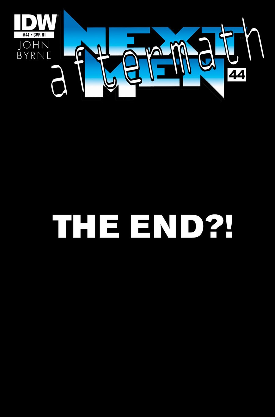
The cover blurb of this issue—indeed, the entire cover—simply reads: “THE END?!”
And after reading this issue my first thought was: “Oh please let it be so.”
I discovered John Byrne’s NEXT MEN series fairly recently, having culled the entire run of his original series from various bargain boxes in dribs and drabs over a period of months. And for the most part, I enjoyed it. Even though I felt that Byrne’s artwork wasn’t quite up to the standard I had come to expect from him (more on that later), I thought that he was genuinely bringing something new to the comic book landscape that was still dominated by the standard superhero fare. Soon after I had completed my NEXT MEN collection it was announced that Byrne was going to be completing his unfinished series with IDW, and I made certain to pick up this new chapter in the story that, at the time, was still fresh in my mind.
That clarity of the NEXT MEN storyline was quickly clouded over with each subsequent issue of this new IDW run. What was once an intricate (yet easily comprehendible) plot surrounding the existence of super-powered individuals in a real-world setting became a tangled web of alternate timelines, multiple versions of the same characters, characters lost in time and space (and meaning)—in short, NEXT MEN became a clusterfuck. And this clusterfuck has seemingly culminated with this issue, as some of the aforementioned plot points have been (somewhat) resolved by revealing that a character from earlier in the series has been using her power to warp reality and bring together a whole slew of people and places that have existed, will exist someday, and have never existed outside the world of fiction. At least, that’s what I think may have happened. Frankly, I’m not quite sure what the hell is going on in this comic, and I’ve got a feeling that I’m not alone.
A while back I read an interview with John Byrne, written after he had completed his original series but well before this new IDW run. In the interview Byrne stated that he would like to return to the world of the Next Men, and that he had the whole story of how the series would end planned out in his head. This, I think, is the main problem with the new NEXT MEN run that has made the series such a mess. John Byrne has been living with this story in his head for so long that he’s forgotten that the job of the comic book writer is to write comics that are actually able to be read, understood and enjoyed by people other than the writer. I’m sure that Byrne has no trouble discerning all the various plot threads and alternate timelines from one another because he already knows what they’re supposed to be—but we readers have no such luxury of built-in familiarity with every nuance of the book, so we need a little more info, John! Especially when you take the artwork into account…
As I said, Byrne’s art on NEXT MEN has never quite reached the level of quality that had expected from the man’s previous work. A lot of this has to do with Byrne inking his own pencils on NEXT MEN—I’ve always felt that his best work was in collaboration with outside inkers, most notably Terry Austen, who gave Byrne’s pencils added depth and a more dramatic sense of light and dark. Here, Byrne’s artwork is sketchier, with little to no attention paid to lighting, so everything winds up feeling flat and sort of… overexposed. Combine this quality with the unfortunate fact that Byrne’s faces all look nearly identical, and you have a comic that not only feels flat, but also winds up having a generic quality to the pages. The final nail in the visual coffin is the unwaveringly bland coloring by Ronda Pattison. Just as Byrne has provided next to nothing in terms of lighting direction, Pattison has followed suit with flat, drab colors that sap whatever dynamic energy the pages might have had.
 So if NEXT MEN is so confusing, boring and bland, why the hell do I keep buying it? It’s that goddamn “completist” mentality—the little gnawing at the corner of my brain that demands that I own the complete run of this goddamn series no matter how goddamn much I’m sick of reading it.
“THE END?!” God, I hope so... if for no other reason than to save me from myself.
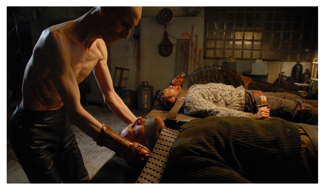
Editor’s note: For an alternative review from superhero, see the image to the right.
When released from his bottle, the Imp transforms into Stephen Andrade, an artist/illustrator/pirate monkey painter from New England. He's currently hard at work interpreting fellow @$$Hole Optimous Douche's brainwaves and transforming them into pretty pictures on AVERAGE JOE, an original graphic novel to be published by Com.x. You can see some of his artwork here.
THE SHADOW #3
Writer: Garth EnnisArtist: Aaron Campbell
Publisher: Dynamite Entertainment
Reviewer: Masked Man
I have to say I’m fairly impressed with Garth Ennis so far. He’s managing to pull off a straight adventure story quite well. Ennis sometimes lacks talent when he’s not writing something depraved, like his very boring Dan Dare. Mind you, he’s peppering the story with as much a-hole behavior as he can, but the story isn’t succeeding because of. So while his villains are quite crass, they fit well in the pulpy adventure world of the Shadow. Just as Ennis’s Lamont Cranston (aka The Shadow) can come off like a dick; it’s more that he’s a very driven and focused man. Cranston’s goals are more important than the feelings of those around him- and rightly so. So Ennis is getting to be himself and write a darn good adventure story as well.
Unlike a typical Shadow adventure, this one doesn’t take place in New York. Here, The Shadow is traveling back to his Asian roots, on a pre-WWII mission for the government and perhaps the world as well. As some super weapon fuel hangs in the balance and the typical WWII government players are running around. Assuming that it’s not just plutonium, I’m very curious to what it is and how everything will play out. I’m also curious to how the villains factor into the Shadow’s past, and why poor Margo Lane puts up with the Shadow. As with the first two issues, Ennis is doing a good job of balancing plot with action. So while the plot moves along, the Shadow does some ass-kicking as well. Though I would like to see more of the Shadow patented invisibility.
Aaron Campbell does a fine job with the art. He does a great job laying out panels and filling them with back grounds fitting of the time period. His inking could be smoother, because his pages can get too messy sometimes. Overall his style works well on The Shadow, just like the other pulp like comics he’s done. Mind you, Campbell is definitely not the kind of guy I want to see on the Justice League. I also feel Campbell proves what I’ve said before about Dynamite’s artists, if they can’t finish their own work then they probably shouldn’t be on a Dynamite book. So the Shadow gets a solid 3 out of 4.
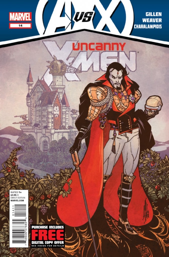
UNCANNY X-MEN #14
Writer: Kieron GillenArt: Dustin Weaver
Publisher: Marvel Comics
Reviewer: Henry Higgins is My Homeboy
Sinister Turn Of Events.
As with most crossovers, it’s time for some tie-ins. For the most part they’ve been fairly hit or miss (I can’t be the only one who’s ecstatic that Iron Fist is apparently going to be important down the line). None of them have really stood out, but none of them have been that bad. Well, until this week. UNCANNY X-MEN #14 plays on the new status for Mr. Sinister, which… well, is sort of the best Mr. Sinister I’ve ever read. Gillen takes one of the most absurd characters in X-Men canon, and has found a wonderful direction for him.
Writing: (5/5) Gillen writes a truly entertaining Sinister, the kind of character who knows he’s a super villain, and loves it. Because, seriously, who doesn’t love a castle? It’s wonderfully over the top, in the best way you can imagine. Sinister loves being an elaborate antagonist, spending most of the issue speechifying to one of his various clones. He has a society of himself copied thousands of times, redcoats equipped with laser guns, and a zoo full of X-Men clones. But the best part of the story isn’t the fantastic elements, it’s the universal appeal. It follows on Gillen’s X-Men storylines, it ties in well to AVENGERS VS X-MEN, and it works as a stand alone piece, all off the strength of it’s lead character.
In twenty pages, Gillen burns through a very big story, and it never feels rushed. It’s well paced and brilliantly done, taking a story that could have been issues long and condenses it well. The unnamed protagonist is strongly written and tragically defiant, playing his role with fervor. His final monologue manages present an interesting dichotomy, and it’s up to the reader who’s ultimately right, Sinister of the anarchist.
Art: (5/5) Weaver and Charalampidis mesh together brilliantly, complimenting one another constantly. Weaver manages to give each Sinister a certain look and individuality, which is all the most impressive seeing how everyone is the basically the same character. Each face is full of emotion and action, and it all looks wonderful.
The art mashes Victorian Britain with elaborate castles and mad scientist labs. It all works well, each setting bright and well placed. There are no flaws with it, it looks great.
Best Moment: ‘Is the accent genetic?’ “Of course not. It’s trained, because it’s folksy and charming.”
Worst Moment: Some elaboration on what the protagonist was going to do to Sinister would have been nice.
Overall: (5/5) One of the best self contained issues I’ve read in a while. It’s fantastic.
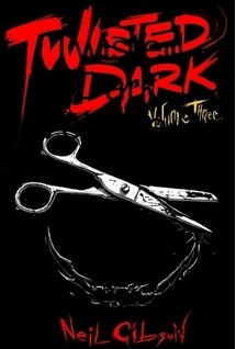
TWISTED DARK VOLUME III
Writer: Neil GibsonArtists: Lots
Publisher: Neil Gibson Comics
Reviewer: Optimous Douche
I very rarely come back to the proverbial well on creator owned pieces. I’ll be honest; the quality for the price point very rarely matches up. If I’m going to dump $3.99 on a creator-owned piece they damn well better bring the same level of quality as their big house brethren. Even the ones that don’t price the same as Marvel and DC need to be exceptional to become an integral part of my pull pile; Optimous has a day job and only so much time to spend with the funny books.
Not to toot my horn, but the fact I have chosen to dip the tip into the fertile womb of TWISTED DARK stories for the third time is a testament in and of itself to Neil Gibson’s demented brain child. I read a shit load of comics each week, yet whenever Gibson chooses to infiltrate my Dropbox with another one of his deeply dark concoctions I push aside my usual spandex faire to see what ways Neil can make me abandon all hope for the human condition.
TWISTED DARK relies on the vignette approach to storytelling, which is perfect for the prevailing case of ADD that we all seem to suffer these days. Gibson takes everything from ancient proverbs to quotes from TV and upends your expectations of what those words might mean. Filled with dark art to accompany the equally dark tone of the stories, Gibson is like a modern day Rod Serling, if Rod was raised by The Gimp from PULP FICTION and Octomom.
In the first volume of TWISTED DARK, each story had a twist. Don’t take twist lightly though, since M. Knight Shamalamadingdong has all but destroyed the word since THE SIXTH SENSE. Gibson’s twists were surprising and always appropriately dark has he peeled back the layers of May/December romances, mass consumerization and childhood suicide.
For volume II of TWISTED DARK, Gibson made the egregious, but fortunately not fatal, mistake of trying to please the fans versus satiating his own artistic thirst. The result was a more of a black comedy lens on life that had impact, but not as much as the first volume.
For volume three of TWISTED DARK, Gibson has taken his lessons of the past by infusing humor without becoming heavy handed. Also, the need to perpetually have a twist has allowed him to focus more on compelling stories than simply going for the shock effect. I’m glad, this gives the series a new sustainability and allows the reader to stop trying to figure out the damn puzzle and just enjoy the sick and twisted ride.
Gibson was a little miffed at my first two reviews; my verbose nature gave away the goods a little too readily leaving little surprise for readers once they actually traversed the book. My justification was that it was the journey that was important, not the destination. So for this review I have decided to write a limerick about each vignette, hoping my weak sauce poetry will inform without completely showing the cock under the kimono.
Growth: A quote from Plato opens this piece, about the nourishment of the soul from which we all feast. Wisdom and betrayal are all found inside, but in the end we see that we all shall die. Loyalty is a lesson we all must learn, because betrayers will be left in the hot sun to burn.
The Love of My Life: Cupid’s arrow becomes a lance of fire, when we ignore love’s true desire.
Drink Driving: To trust in authority is truly wise, except when we follow these edicts blind.
Hitting Back: Gents think twice before you tap that ass, especially if you scorn another lass.
Silent Justice: Be wary of those that you might call friend, the greed of man can bring it all to an end.
Career Choice: The seeds of youth blossom strongest, especially when germinated in darkened closets.
Perfection: The line between dedication and obsession can often be blurred, especially in a world where never a kind word is heard.
The Bid: Bonjour monsieur, your money is no more.
Abandoned: Perception is reality a wise man once said, and who can blame us when the world is much better in our heads.
Lifeboat: Be careful when choosing between life and death, in the end, only one is left.
Peace & Quiet: A parent’s love is a true and rare find, if only children weren’t so selfishly blind.
All right, lame limericks aside, Gibson brings the goods as a story teller and no review can truly bring to light the joy macabre one can get from traversing TWISTED DARK. I only have one caution for Gibson, let your talent blossom slowly. Even the greatest of concepts need solid art to sell in comic form. It feels like in the mad dash to get stories out the door, the art becomes more and more minimalistic with each volume. Not all stories, just a select few. Some minimalism is fine, but too much feels like cutting corners. Don’t cut corners Neil, comic gold takes time and patience and you are sitting on a fucking gold mine with TWISTED DARK.
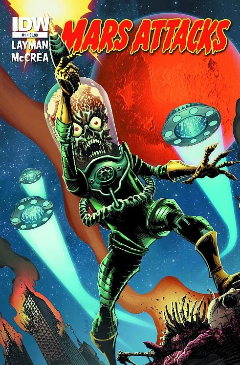
MARS ATTACKS #1
Writer: John LaymanArtists: John McCrea
Publisher: IDW Publishing
Reviewer: Masked Man
Ok, two weeks ago I made a crack about a comic that had nine different covers- well shut my mouth, because this book has 57(!) different covers. Not so sure how I feel about it, because I get. IDW used the original 55 trading cards for most of the covers, which is kinda cool. Though I got a bit of a lame one (I know, sour grapes here). And, of course they are selling sets of all 57 covers in a nice box for $200 (a savings of $28 by the way). Again cool, but then a bit lame at the same time. What is just cool, is the original trading card art gallery in the first issue. So you can check out all 57 covers in thumbnail form- nice. Let’s move on to the story itself now.
First, a big hats off to John Layman, who not only wrote but lettered the issue as well. Nice to see writers getting their hands ‘dirty’ with the actual page production. I’d like to see more of that. Now this first issue is a bit of a set-up issue, but Layman manages to write it in a very clever way. He creates an alien incident back in 1962, which appears to have set the ground work for the ‘Mars Attacks’ in 2012. Chapters are presented like the old cards- “Incident in Orbit” and “A Freak Occurrence”. Which I really like, and hope they continue with- adds a little zip to a typical comic format. There’s no humor here- like Tim Burton’s movie, which is fine. Though being too dark and grim would be a mistake, since the original cards are so grim they are laughable. In any case Layman’s first issue is a straight action story.
The art work is quite good as well, as John McCrea draws some mean looking Martians. He’s a little cartoony looking with the humans, but it works well. As I believe Mars Attack should have some fun to it. His work here reminds me of Joe Staton’s work. Which is good and bad, as I find Joe’s (and John’s) work a little too stylized and sharp looking at time. So John is a good fit for this comic- though I am curious where that laser blast came from between the Martian’s legs on page 18.
So it’s nice kick off to the return of MARS ATTACKS. I can’t wait to see the full invasion start next month, as this issue scores a 3 out 4.
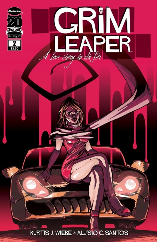
GRIM LEAPER #2
Writer: Kurtis WiebeArtist: Aluisio C. Santos
Publisher: Image Comics
Reviewer: Humphrey Lee
If there is anything this AICN gig has more or less shown me since I started it’s that every once and a while you’re going to be a shill for someone. There’s always going to arise a creator whose material hits you the right way and becomes prolific enough that you find yourself with plentiful excuses to hype them up (though obviously there’s the whole “integrity” thing where you still have to call the work as it is with the proper critical analysis). Right now it seems that the person whose work keeps drawing my eye is Kurtis Wiebe who, with GRIM LEAPER here, has again presented some quality entertainment for the third straight title I have tried of his.
What have really got me interested in Wiebe’s works have been premises that seem both familiar and fresh. GREEN WAKE an otherworldly tale of purgatory with almost a Cowboy Bebop sense of style and underlying “hipness” to its melancholy. PETER PANZERFAUST is essentially Peter Pan and the Lost Boys meets World War II France, which is a hell of a setting to work those characters into. And now we have GRIM LEAPER, which feels to me to be a love story ala Quantum Leap, but also where Sam Beckett is doomed to die Final Destination style with the body he inhabits before moving on. At the minimum this series has thus far been a hilarious exercise in gory pratfalls whilst also being one of the more fucked up cases of “boy meets girl” since FIGHT CLUB.
That’s really where my digging of Wiebe’s work has come from is that not only is he hitting with some really cool premises but the books are, what’s the word? Good. Yeah, that’s it. Besides the ridiculously over-the-top deaths - creative enough in their own right – there has been a really intriguing character arc for Lou Collins as he Wylie Coyote’s his way through the resurrection process. Where the first issue was more a jaded coming to terms with his situation before meeting Ella, a leaper like him, to become a bright spot in the process. This issue is more an introspection on the implications of Lou’s situation between the odds of finding another person in the same situation as but what the leaping process means as, essentially, he’s driving people – y’know, those things with friends and families and pets and stuff – around temporarily until they die in some horrific manner. Up until now it really has not meant much to him other that being kind of a shock, but now it’s a bit of a Debbie Downer realizing that someone is going to (most times) lose someone they care about.
Speaking of executing, Aluisio Santos’ art is a pretty perfect pairing for the book in that cartooning way of being very detailed and expressive but also exaggerated in all the right ways. It really sells the ooey gooey awfulness of the deaths while simultaneously drawing the chuckle you’d get watching a Robert Rodriguez death sequence ala Machete. It also gets you to the right spot for the parts that are supposed to resonate more, like when Lou jumps into his first body that has a loving wife waiting for him at home and starts to dread the inevitable just a touch. That dash of dread also sets in when I realize how much I’m enjoying this book but, like one of Lou’s Leaps, know that time is drawing near. But it seems there’s always another Wiebe experience coming around and, given the precedent I’ve seen so far, is worth the leap of faith.
Humphrey Lee has been an avid comic book reader going on fifteen years now and a contributor to Ain't It Cool comics for quite a few as well. In fact, reading comics is about all he does in his free time and where all the money from his day job wages goes to - funding his comic book habit so he can talk about them to you, our loyal readers (lucky you). He's a bit of a social networking whore, so you can find him all over the Interwebs on sites like Twitter, The MySpaces, Facebookand a blog where he also mostly talks about comics with his free time because he hasn't the slightest semblance of a life. Sad but true, and he gladly encourages you to add, read, and comment as you will.
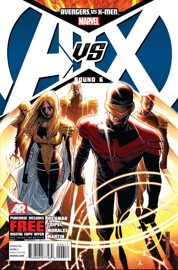
AVENGERS VS X-MEN #6
Writer: Various (Script by Jonathan Hickman)Art: Olivier Coipel (pencils), Mark Morales (inks), Laura Martin (colors)
Publisher: Marvel Comics
Reviewer: MajinFu
Until now I have largely ignored Marvel’s latest event. Senseless slugfests don’t interest me (unless they involve the Sub-Mariner) and the arbitrary reasons for the two teams to quarrel distilled any interest I might have had in the event.
That all changed when I learned Olivier Coipel was taking over art duties for the latest issue. He is one of those great comic artists that can capture the intimate character eccentricities as well as the otherworldly moments that event comics demand, and I’ve been a fan since first discovering his run on THOR with J. Michael Straczynski. So I knew the book was going to look awesome, and indeed it does. Thanks to inks by Mark Morales and colors by Laura Martin, the whole thing just pops. The images in this book, including a couple of splash pages depicting the war machines of the world being simultaneously dismantled are truly awe-inspiring and really convey the epic scope of the story. Luckily, the actual narrative isn’t half-bad either.
The plot of this issue is fairly simple: now empowered by the divided energy of the Phoenix Force, the X-men have set about improving the world in almost every way imaginable, even addressing the leaders of the world with a plea for world peace. It’s inspiring stuff, the perfect antithesis to all the senseless violence and lack of progress that has plagued the Marvel Universe for centuries. As the mutant community sets about improving the globe, the Avengers are left twiddling their thumbs waiting for the consequences of all that monumental change. I was delighted to see two of my favorites, Beast and Black Panther, abandon the group, because let’s be honest, right now the Avengers look like a bunch of tools, and it doesn’t look like that’s going to stop anytime soon.
There’s also a brief aside involving the lost city of K’un-Lun that has me wishing Coipel had been involved with Immortal Iron Fist a few years back, but that’s another story. I just love how he draws Lei-Kung the Thunderer!
So in terms of event comics, this is one of the greatest single examples of the form in over a decade, even with Cyclops’ embarrassing costume change. Still, the book has one true flaw: formatting. The problem first rears its ugly head following a brief introduction where Charles Xavier is welcomed back to Utopia by his friend Magneto. This leads directly into an advertisement you’ve probably seen before on the third page for the “Farmer’s Insurance Group” as well as some movie called “The Avengers.” The whole thing is presented in comics form and while I take no beef with the ad itself, its terrible placement within the story is jarring, utterly killing the flow at the beginning of the narrative.
Another issue that doesn’t necessarily affect the quality of the book but may hinder the flow of your reading is the presence of the mysterious “AR” in the corner of several of the comic’s most crucial panels. Following this issue’s cliffhanger you learn that AR stands for “Augmented Reality,” an app for your cell phone from Marvel which allows you to check out all kinds of supplemental materials. Call me old-fashioned, but I believe a comic book should be able to stand on its own merits, and littering a book with superfluous crap just makes me feel like you’re distracting from some kind of inherent flaw within a book.
Despite my nitpicking, I enjoyed this book a great deal. It’s positively full of lush imagery, an intriguing dynamic between the two teams, and a vision unlike most anything I’ve seen in this kind of event before. The additional pages also aptly justify the hefty price tag. Prior to reading this issue my interest in AvX was nonexistent, but now I just might give the next issue a shot.
MASTERS OF THE UNIVERSE #1
Writer: Geoff JohnsArt: Howard Porter
Publisher: DC Comics
Reviewer: The Writing Rambler
As I perused through this week’s choices I noticed that on Thursday, in my handheld Digital comic shop, there appeared a first issue of MASTERS OF THE UNIVERSE. I remember reading a while back that DC was going to launch a miniseries based on my beloved childhood toys but for some reason this digital exclusive slipped under my radar. Apparently this first issue is a prologue to the print version which will be a 6 issue miniseries this July.
I have mixed feeling about this story and it’s mainly because there is really no story at all. What you have here is basically just a very brief backstory and introduction of a new character to the universe. The character of Sir Laser-Lot (a knight from Eternia’s past apparently originally created by Geoff Johns when he was a small boy) really doesn’t do much other than introduce himself and even that feels rushed. This issue seemed more like one of the old mini comics that were included with the original toy line than anything else. Had this book been included as a freebie with the purchase of a Sir Laser-Lot figure (which is being released as a San Diego comic Con exclusive if I’m not mistaken) it would have been just fine but because its being sold as a standalone issue (even at the very fair price of 99 cents) I can’t give it my full support.
Johns doesn’t even do a bad job with the backstory despite it being rushed just to include the character into current continuity. I actually enjoyed the small snippet of Eternia’s past we get to see but again it’s all glossed over to bring the character into He-Man and Skeletor’s world. Some folks might see this whole character creation by Johns as a huge narcissistic move on his part being the high role he holds at the company but I can’t knock the guy. He’s a fan living out his dreams and believe me if I had Johns’ pull there would definitely be a new character introduced called Ram-Bler, the evil bearded cousin of Ram-Man, so I don’t think it’s fair to hate on him for taking advantage of an opportunity.
The art in the book, by Howard Porter, is top notch. I really loved how he visually handled Eternia’s past as a wild place of beasts and shadowy woods. I would love to see several books based on the world he paints here instead of just skipping ahead to the current “He-Man timeline”. Overall his art was my favorite part of the story with the exception of the last page (SPOILER ALERT) where we have a cameo from a handful of the most popular MASTERS OF THE UNIVERSE villains. I just cannot understand his reasoning for interpreting some of the characters the way he does, especially what I can only describe as Skeletor and Doomsday’s secret lovechild. That last page just completely left me with a bad taste in my mouth even though its job was to hook me for the rest of the series.
While nowhere near the caliber of release as we have been getting with the weekly digital exclusives for LEGENDS OF THE DARK KNIGHT, I still enjoy seeing DC using the digital platform to promote new projects at a fair price. MASTERS OF THE UNIVERSE is one of those franchises that we as fans have been dying for someone to make into something more than just a bunch of cool characters with really cheesy names. I had hoped this new comic series would be the start of that, but from what I’ve seen in this prologue issue, it’s not. I’ll give the series a chance because its limited and I honestly just have fun with this universe but I really hope DC decides to finally make MASTERS OF THE UNIVERSE into something special because the fans deserve it.
You can follow The Writing Rambler on his blog here and follow on Twitter @Writing_Rambler !
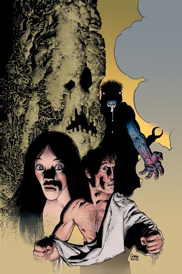 RAGEMOOR #4 (of 4)
Dark Horse Comics
I really enjoyed this chilling series about a sentient castle that manipulates its inhabitant to obey its every ominous whim. Strnad crafts a story that is full of surprises and some truly creepy revelations. The supposed lord of the domain, Master Herbert is flushed through a gauntlet of emotions as he and his servant Bodrick struggle with the ramifications of their actions in the previous issues. Richard Corben realizes every detail of the story with disturbing detail, including the first panel of the fourth page of this comic, which shows a dinosaur battling a tentacle monster from another world. If that doesn’t get you interested in reading this excellent series, I don’t know what will. - MajinFu
 BATMAN BEYOND UNLIMITED #5
DC Comics
I was really happy that the BATMAN BEYOND universe wasn’t tossed aside by DC when the whole “New 52” thing happened; the world of the future Batman created by Bruce Timm, Paul Dini and others was just too damn cool to ignore. So I’m glad that it’s still getting attention with this series, especially given the quality of this issue. The main story, written by Adam Beechan and drawn by Norm Breyfogle, shows the life of a down-on-his-luck thug in the Neo-Gotham slums, tying his tale in with the origin of this future version of Batman and, with a clever twist, the origin of the original Dark Knight. Breyfogle’s art is a perfect match for this title; his exaggerated poses and slightly cartooney faces bridge the gap between the original animated series and the comic book adaptation wonderfully well. The back-features—an origin of the future Justice Leaguer Warhawk and the beginning of a storyline featuring an older Superman of the future—offer deeper looks into this barely-explored future DC Universe. This comic is highly recommended for the Batman fan, and required reading for fans of the groundbreaking cartoon upon which it was based. -Imp
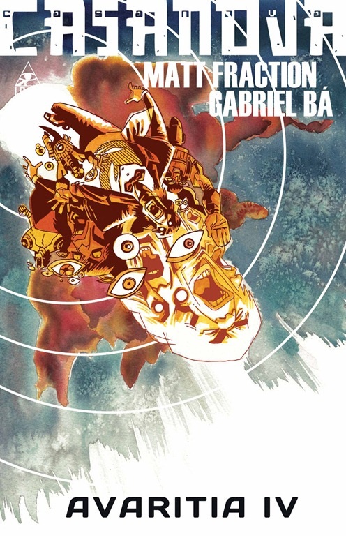 CASANOVA III: AVARITIA #4
Marvel Comics
Another month has nearly passed, another sensational arc of Casanova has wrapped. Ever get the feeling you were watching someone else’s fever dream? That’s what reading this book is like, only the colors are more vivid and the plot is a little more confusing. I’ll admit I can barely recall what happened last issue. Hell, I can hardly tell what’s going on in this one, but that’s exactly what makes this series so damn good. Every issue is like a new piece of this ornate puzzle that is the life of Casanova, super-spy and cosmonaut extraordinaire. Cover to cover, this is the best damn book I read this week, and it was a damn good week. “But Fu,” you cry, “What about the price hike? Is it really worth shelling out the extra dough?” To which I reply, “ABSO-FUGGIN’-LUTELY.” For five bucks, you get thirty-six pages of glorious story stretching across the expanses of time and spice in multiple dimensions, and no advertisements to be found. Like Matt Fraction says in the letters column, “we’re putting out sixty percent more book for just twenty-five percent more cost…” This is how I wish Marvel published all their stories, and I can’t recommend it more highly. - MajinFu
Proofs, co-edits & common sense provided by Sleazy G
 Find out what are BLACK MASK STUDIOS and OCCUPY COMICS here and on Facebook here!
 Want more in all things Geek?
Check out PoptardsGo and on Facebook here!
Check out AICN COMICS on Facebook and Comixpedia.org!