

| Issue #6 | Release Date: 6/6/12 | Vol.#11 |
(Click title to go directly to the review)
Advance Review: SILK SPECTRE #1
EXTERMINATION #1
EARTH 2 #2
THE ALMIGHTIES #1
BEFORE WATCHMEN: MINUTEMEN #1
PROPHECY #1
AVENGERS VS X-MEN #5
NIGHT STALKER #1
LEGENDS OF THE DARK KNIGHT #1
Advance Review: SPIDER-MEN #1
 Advance Review: In stores this week!
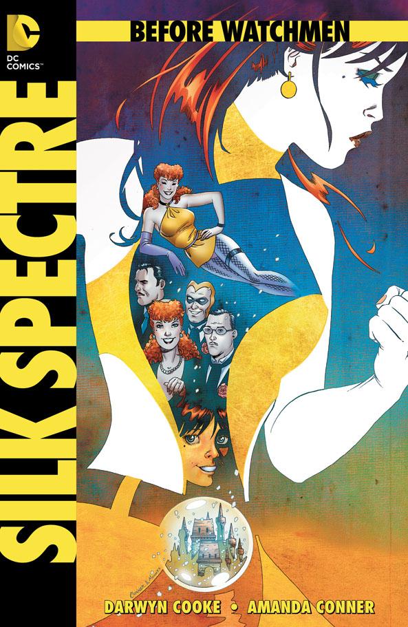
BEFORE WATCHMEN: SILK SPECTRE #1
Writer: Darwyn CookeArtist: Amanda Conner
Publisher: DC Comics
Reviewer: Optimous Douche
I was harsh on last week’s BEFORE WATCHMEN: MINUTEMEN because the original WATCHMEN was much more than a comic to me. Not only was it was my introduction to superhero-based comics (being the first book I ever picked up off the spinner rack), but more importantly it was my introduction to the fallibility of adults. My parents and the superfriends I watched in cartoons were the paradigms of perfection, protectors sans personal struggles or demons, or at least so it seemed to a young cherub-faced Optimous.
So when BEFORE WATCHMEN was announced, I had a very specific idea in mind on what these stories would deliver. I wanted to see the crusty emotional scabs brought to light in WATCHMEN ripped clean. I wanted to see the wicked slices to the psyche that incited the megalomania of Dr. Manhattan, the self-loathing of Night Owl, the schizophrenia of Rorschach, the delusions of grandeur in Ozymandias, and last but not least the mommy and daddy issues of Silk Spectre. No, I did not like MINUTEMAN because I simply don’t care about the golden age ancillaries in the original book, with of course the exceptions of Sally Jupiter and The Comedian, who were essential plot drivers. And even then I only want to see those characters in relation to how they affected their Silver Age “children.” Well, wishes do come true, because SILK SPECTRE is exactly what I wanted. It is the inch wide, seven mile deep exploration of just how tortured Laurie Jupiter was by the shortcomings of a woman who never should have been a mother.
SILK SPECTRE is personal for me, and I imagine with the clarity and honest truth that was inside these pages it’s personal for Cooke as well. If you’ve never had the splendor of a crazy cougar in your family count your blessings. I have not been so lucky. Neither was Laurie Jupiter, the Silk Spectre. The crazy cougar which eventually evolves into the senile sabertooth is a woman that places all of their value in their physical appearance and vaginal fortitude. Their career path is one of grabbing as much attention as possible before the crows feet start around the eyes and that troublesome belly pooch turns into a full-on flat tire. Since we all decay over time, it’s safe to say that 99% of these women also live in a perpetual state of delusion, thinking spanx and make-up will serve as distractions to the deluge of nubile young 21 year olds entering the bar each year. Sally Jupiter, the original gal-pal of the Minutemen, is one such crazy cougar. Now, if the world were fair these women would be sterilized. More often than not, though, their chosen “profession” has the unfortunate side effect of reproduction. If they have a boy, cool--generally their daddy issues tend to lean towards glorifying a son. If you’re a daughter of one of these wastes of a soul, your life is now going to be spent in a state of perpetual embarrassment and on the receiving side of loathing simply because you remind them of what they no longer are.
We got wafts of this cancerous relationship in the original WATCHMEN, but since Laurie was cresting past her prime as well during the original book, we only saw snippets of just how embittered Sally Jupiter was towards her only daughter. SILK SPECTRE is the full realization; as Laurie is about to turn eighteen and take on the world we truly see just what a horrid and petty woman Sally Jupiter was. Sure, one can blame Sally’s shortcomings on The Comedian’s rabid libido and lack of sexual harassment training standards of the time, but ultimately life is about choices. You choose to be good or bad, no matter what life throws at you, and Sally simply chose wrong.
Laurie is a good kid in the closing school days of 1966. Her academics and athletic prowess set her above all other girls in her class. Aside from exploring Sally’s home troubles, Cooke also brilliantly plays with the rampant racism of the time by pitting her against all of the blonde WASPS at her private school. As we all know, Sally Jupiter changed her name from Juspeczyk to hide her Polish background. Well, you can change the name, but in a time before copious amounts of plastic surgery ethnic features still remained. These blonde pretties play wonderful secondary antagonists as Laurie tries to return the passes of the hunky Greg on the school athletic field. Laurie’s charms eventually win out and Cooke uses this newfound love as the impetus to drive the rest of the book forward.
Back on the home front, Sally continues to live vicariously through Laurie, even offering to help take Greg off Laurie’s hands since she’s too busy with super hero training (creepy). In the ultra-creepy category and the final straw that breaks Laurie’s back, Sally stages a fake rape in their home to “test” Laurie’s skills.
Eventually Laurie and Greg decide to do what most people in the 60’s did--leave behind convention and the expectations of parents to find freedom on the road. It’s a glorious set-up for the shit storm we know Laurie’s life is about to become--just enough optimism to lift the heart without ever transcending into Hallmark levels of schmaltz and romanticism.
Rounding out the issue, Conner is a genius with the art. Every angle, every close-up, all perfectly lend to that balance of optimism and betrayal within the book. In moments of sheer imagination, Conner takes us inside Laurie’s head with surreal cartoon renditions of Laurie’s thoughts--a devil on wheels when Sally hits on Greg or a trip above the moon when Greg kisses one of Laurie’s training bruises.
If the rest of the BEFORE WATCHMEN offerings are as good as this issue, even the naysayers or Alan Mooreinites will not be able to ignore this series. If they do, they are only hurting themselves.
Optimous has successfully blackmailed fellow @$$Hole BottleImp into being his artist on Average Joe. Look for Imp's forced labor on Optimous brain child in mid-2012 from COM.X. Friend Optimous on FaceBook to get Average Joe updates and because ceiling cat says it's the right thing to do.
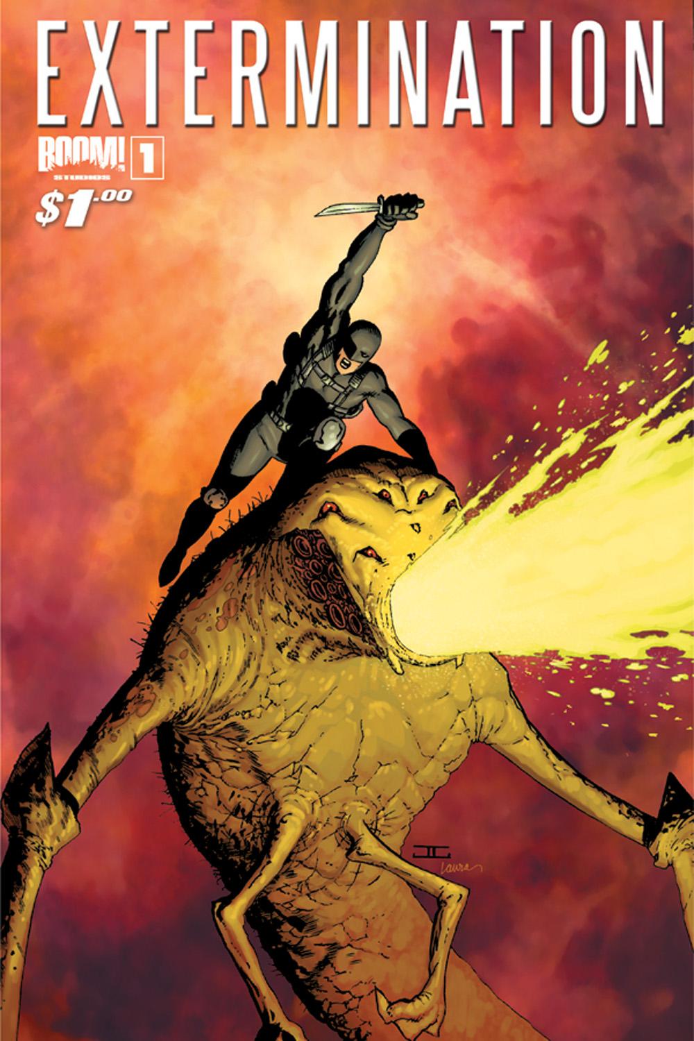
EXTERMINATION #1
Writer: Simon SpurrierArtist: Jeffery Edwards
Publisher: BOOM! Studios
Reviewer: Masked Man
What could get you more excited about a new comic book than nine different covers?!? Ok, that was snarky, but seriously--nine different covers to choose from? Seems like it could take longer to choose the cover you want than to read the issue--but eventually you’ll get to Spurrier’s story.
EXTERMINATION seems to affirm my belief that every comic book writer has a story in them to screw with the superhero concept. Mark Waid has IRREDEEMABLE, Garth Ennis has THE BOYS and Mark Millar has dozens! And to be honest, they are never terribly unique, as it’s usually some form of Superman and Batman. I know they are the archetypes but come-on, a little more originality would nice. Every one of of them doesn’t have to be “what if Superman or what if Batman…”
Here Spurrier uses Batman, ala Nox. The twist is, an alien holocaust has occurred and life as we know it (or life as a person living in a superhero world would know it) is over- thought zombie apocalypse meets “Road Warrior”. Now Nox and his arch-villain, The Red Reaper, are the only two left alive. So they are trying to team up and figure out how this all happened, what they can do to survive, and if they can reverse it. With shades of “Lost”, the book uses flashbacks to show us what was going on before everything went to hell. I assume these will eventually explain what happened. The crux of the issue is a debate about the superhero code against killing--they are facing a zombie/alien apocalypse here. The outcome of this debate is where Spurrier maybe on to something interesting and could prevent EXTERMINATION from becoming another typical screw with superheroes concept comic. Overall, Spurrier does a good job of putting this together and fleshing out his two main characters.
As for Jeffrey Edwards’ artwork, this is my first time seeing his work and in some ways it reminds of Chuck Wojtkiewicz, from his JUSTICE LEAGUE AMERICA days. His overall drawing skills are good, but his storytelling could use some work. He comes off as a little green to me--not quite ready for DC or Marvel, if you know what I mean.
If you are interested in the concept, you should check it out. But like many first issues which are still trying to find their footing and audience, EXTERMINATION #1 scores a 2 out of 4.
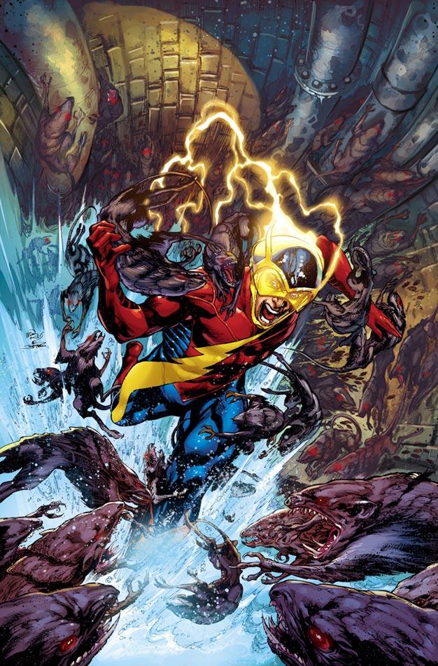
EARTH 2 #2
Writer: James RobinsonArtist: Nicola Scott
Publisher: DC Comics
Reviewer: Humphrey Lee
EARTH 2, I think, represents an odd duck in the world of comics right now. It’s representing the sole alternate universe for the DCU after an almost decade-long stint where I think even the freaking Smurfs had one. But that’s not the oddity surrounding it that I’ve noticed. What’s odd about this book, what seems to be a weird itch for people, is that even though it gets pretty much solid-to-good (even great) marks from everyone that reads it (and I’m about to give it more in the following space), pretty much everyone also bitches about the “necessity” of this book. Apparently we are at that point: the one where we can’t just enjoy a book we admit is good because we have reservations about it existing in the first place. Being good, in and of itself, is not a valid reason for being, it seems.
I get the desire to be a bit knee-jerk on something that looks to be superfluous; I mutter to myself when there’s a sixth AVENGERS title showing up, I did it when the Ultimate Universe reared its head—hell, I do it when I see seven Bat-titles, and Batman is probably my favorite superhero. It’s what fandom does to us. But this book is good--deal with it. Now, all that said, I found this issue to be a little less exciting than the first, despite there being a lot more hype around it. It’s a bit more lulling after the “whiz-bang!” the first issue showcased with its final conflict for DC’s Trinity as they faced Steppenwolf and the Apokaliptian forces. This particular issue is a weird, uneven split of being half more talky talk between Mercury and Jay Garrick, the insertion of one Mr. Terrific to this world and introduction of its (maybe) current one, and then, yes, Alan Scott being “teh gay.” The emphasis of what events play out and for how long I think kind of made it easy to gloss over a couple pages of Garrick stuff when you can tell there’s going to be a lot to cover in this series and would like to see things move more. Honestly, if there were ever a case for one of these “New 52” books to be $3.99 with the extra pages, this is it.
Now, to get to that trifold breakdown of what went on in this book, I have to say I was mostly pleased despite my reservations about development time I expressed above. Michael Holt coming to this reality and facing off against Terry Sloan, who may be a bad guy, is honestly a bit more shocking a turn of events for reveals of this new version of JSAers than the Alan Scott deal, which, yeah, I guess we can talk about. All I really have to say about Alan Scott being here, queer, and, uh, kind of big and goofy about it is, eh, makes sense to be honest. Look, if you’re going to commit to this book and the idea of “this is it, we’re redoing these sixty year old characters in modern times” then the energetic, go-getting, handsome mid-thirty-something media mogul being gay sounds about right. Other than that, I think there was still too much time spent on the Jay and Mercury interaction, I still think I’m fine with the new Flash getup except that helmet is very Alan Scott and it’s absurd the classic one was not kept, and someone needs to tell James Robinson that parkour is soooo 2007.
Change is jarring; I get it. The “New 52” hasn’t been a complete success from a quality standpoint across the board; I understand that too. But EARTH 2 is neither of those two points in that it is handling its changes at a smooth, well-narrated (and maybe a tad bit talky) pace and is rather sweeping (and fantastically illustrated) as it goes. Am I going to miss the classic, elder statesman versions of these characters that – let’s be real here – most of us probably fell in love with in the past 15 years via Geoff Johns, James Robinson, and David Goyer’s JSA? Of course. But those books still exist – may not “count” but still exist – and, take it from a guy who has been rereading all those books these past couple weeks due to EARTH 2 here, that schtick gets old (no pun intended) and occasionally convoluted quick and its whole direction eventually was emphasizing the new blood. Well, now what was old is new again and as far as I’m concerned it’s working so far. If it turns to shit then give it shit back. But until then, I think the guy who has done his damndest with these characters for roughly twenty years now deserves the benefit of the doubt.
Humphrey Lee has been an avid comic book reader going on fifteen years now and a contributor to Ain't It Cool comics for quite a few as well. In fact, reading comics is about all he does in his free time and where all the money from his day job wages goes to - funding his comic book habit so he can talk about them to you, our loyal readers (lucky you). He's a bit of a social networking whore, so you can find him all over the Interwebs on sites like Twitter, The MySpaces, Facebookand a blog where he also mostly talks about comics with his free time because he hasn't the slightest semblance of a life. Sad but true, and he gladly encourages you to add, read, and comment as you will.
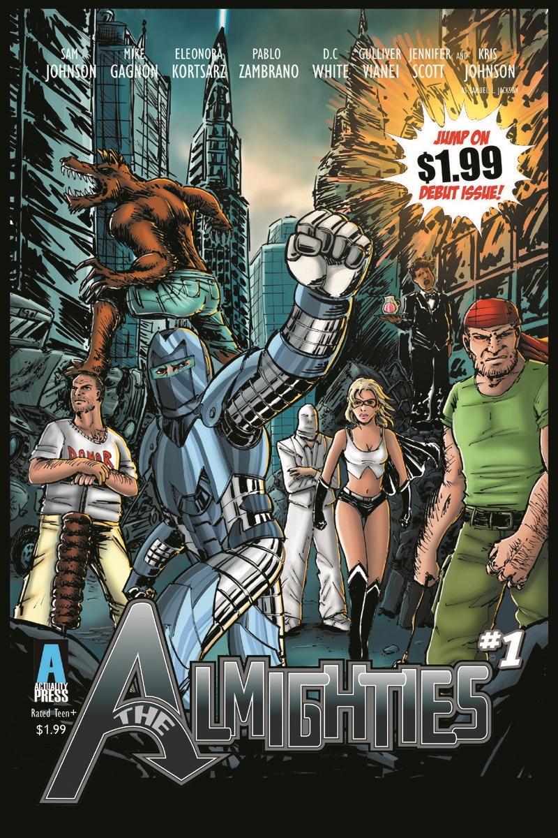
THE ALMIGHTIES #1
Writing: Sam Johnson & Mike GagnonArt: Eleonora Kortsarz, Pablo Zambrano, & D.C. White
Publisher: Actuality Press
Reviewer: Matt Adler
THE ALMIGHTIES might be described as an Avengers parody, in the sense that it's a team of diverse superheroes who come together to combat various threats. But one gets the sense that the Avengers connections are mostly there to take advantage of the current zeitgeist; this is really just a superhero parody in general. The team consists of Maxi-Tron, an Iron Man archetype; Nite Fang, a smartass British werewolf; Ms. F, a liberated feminist with the power set of Ms. Marvel but a backstory more resembling the Invisible Woman; Mason, a hardcase in the Wolverine/Punisher mold; and Stefanos, the comic relief.
There are a lot of enjoyable bits scattered throughout this comic. During the team's roll call, Nite Fang has the amusing habit of announcing identifiable character traits after each member's name is called, much to his teammates' chagrin. Ms. F seems like a character with potential--given how often female characters in comics are relegated to second status next to their male counterparts, I think a lot of mileage can be gotten out of a female superhero who's simply had enough of being oppressed and uses every chance she gets to make her point. Stefanos is probably the standout character here--you've got to love a kebab-shop superhero who goes into battle armed with meat on a stick, and leaves at crucial moments because he has to "put the fries on."
The plot of the issue could use some work; even for a parody, the menace here is somewhat ridiculous and cliched. The other weakness of the book lies in the art; there are three artists working on this book, and the rendering of the characters, as well as the action scenes, makes it clear that they're pretty new to their craft, which is not unusual for an indie book. With time, I'm sure they'll develop their skills further.
Overall, it's an entertaining book with some interesting ideas, and plenty of room to develop them. I'll be interested to see what Johnson, Gagnon, and Co. do with these characters next.
THE ALMIGHTIES #1 is published by Actuality Press, Rated Teen+, and is available at www.indyplanet.com and www.thealmighties.com in $3.99 regular and Variant editions. The $1.99 Digital Edition is available now at www.graphicly.com and www.wowio.com.
Matt Adler is a writer/journalist, currently writing for AICN among other outlets. He’s been reading comics for 20 years, writing about them for 7, and spends way, way, too much time thinking about them, which means he really has no choice but to figure out how to make a living out of them. He welcomes all feedback.
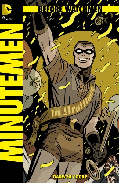
BEFORE WATCHMEN: MINUTEMEN #1 (of 6)
Writer and Artist: Darwyn CookeBased on characters created by Alan Moore and Dave Gibbons
Publisher: DC Comics
Reviewer: BottleImp
By now I’m sure everyone out there knows about the murky morality surrounding DC’s decision to publish these new WATCHMEN prequels without the involvement-—much less approval-—of original series writer Alan Moore. So I’m not going to belabor the point; I’ll just say that I felt a little guilty in reading this comic, and even more guilty for finding things about MINUTEMEN that I really liked. The appeal of this title (especially in comparison with the other forthcoming prequel series) is the combination of Golden Age superheroes and Darwyn Cooke’s vibrant, dynamic drawing style. I have a deep fondness for the comic book characters from the 1930s and ‘40s; there’s something magical about the costumes that range from simplistic to flat-out gaudy, the code names that are utterly without irony, and the overall sincerity of their adventures. Even these mystery men and women that were created by Moore and Dave Gibbons in the 1980s tap into two-thirds of that magic (especially since they were modeled on similar Golden Age archetypical templates. As for the sincerity factor…well, that’s a bit different, since one of the goals of WATCHMEN was to look at a man who puts on tights to beat up criminals and see what would motivate him to do so. And this one element, so crucial to the entire theme of the groundbreaking graphic novel, is absent from MINUTEMEN.
Those expecting to find an exploration of the dark and nasty underbelly lurking beneath the colorful costumes that Alan Moore hinted at in the pages of WATCHMEN may be in for a bit of a surprise. Cooke, it seems, has chosen to show the reader the other side of that coin, as seen through the eyes of the original Nite Owl. Fans of the original graphic novel will remember that the first few chapter breaks were punctuated with excerpts from Nite Owl’s tell-all biography, “Under the Hood,” which gave brief sketches of the Minutemen team along with details (both flattering and unsavory) about their private lives. But the first pages of MINUTEMEN have Nite Owl, his book completed, reflecting on the brighter side of his past. “I found the act of writing seemed to purge me of the darker aspects of my secret life,” his narrative captions read. “The dark parts fall farther and farther away from my line of sight… From here, in my empty apartment, I can only see the good.” The rest of the issue is not so much a story, but an introduction (or re-introduction, as the case will be for the majority of readers) to the cast of characters, as seen through Nite Owl’s rose-colored domino mask.
The most frustrating aspect of this issue is that Cooke has written some of the Minutemen in ways that dovetail nicely with the source material, while other characters seem to fly wide of Moore’s original intentions. The characters here that seem most satisfyingly written to us fans of the original book are the ones that Moore and Gibbons barely devoted any time to. Dollar Bill, the bank-sponsored mystery man, and Captain Metropolis were near-blank slates (although close readers of the chapter-break texts of WATCHMEN will have gleaned more about Captain Metropolis than can be seen from the comic pages alone), so Cooke’s depictions here work fine. Characters who were slightly more prominent in the original include Hooded Justice, the Silhouette and the Mothman. The version of Hooded Justice shown in MINUTEMEN matches the descriptions in “Under the Hood,” so no problem here. The Silhouette is a little more nebulous, since in the original graphic novel her only defining characteristics are her dislikability and her lesbianism. Cooke gives her more motivation by making a backstory involving her escaping the Nazi occupation of Austria and seems intent on making her into a far more heroic character than she ever appeared to be in WATCHMEN. He appears to be doing the same for the Mothman, turning Byron Lewis’ alcoholism and eventual breakdown into a result of the character’s heretofore-unrevealed bravery. So there are some small changes here, but nothing too deviant from the source material.
Then there are the three most prominent Minutemen: Nite Owl, The Comedian and the Silk Spectre. I actually like what Cooke has done in showing the Silk Spectre’s early career; Moore had made it pretty blatant that her superheroing was done as a way to garner publicity for a possible film career, and Cooke’s depiction of her “foiling” a staged robbery (and the subsequent bribing of the local police for their complicity) is right in step with the Sally Jupiter of WATCHMEN. Nite Owl fares okay in his segment, though the Daredevil-like acrobatics that Cooke puts the character through seem out of step with the grounded, down-to-earth approach of the original book. That’s nothing compared to the way that Cooke shows The Comedian, though. The Comedian is perhaps the most complex character of the original graphic novel, a dichotomy of savage sadism and unexpected depth of feeling. I get the idea that Cooke is trying to latch on to this idea for his depiction of The Comedian’s early career, but the end result is that his version of the character is simply batshit crazy, coming across more like the Joker than the Comedian. It’s a bizarre choice for the character, and one that totally jarred me out of a comic which I was up until that point guiltily enjoying.
There’s no denying it; Darwyn Cooke is a helluva good artist, and his retro style is perfectly matched for these WWII-era mystery men. If these characters were public domain property or even from DC’s own roster of Golden Age superheroes, I’d have no problem with this issue. But the Minutemen were part of one of the most important graphic novels ever written, a comic book series that was constructed to be read like a novel, not an ongoing serial format in which these characters-—no matter how minor their role in the novel-—could be recycled and rehashed for years and years’ worth of stories. If I were to pick up MINUTEMEN without having had any prior knowledge of its source material, I’d say that there’s a pretty good chance that I’d unequivocally love it. But let’s be honest-—anyone who will read this comic will have read WATCHMEN, and no matter how good Cooke’s words and art may be, MINUTEMEN can never touch the level that the original graphic novel achieved.
WATCHMEN is a complete work of art in itself. Anything attempting to supplement it is just gravy. Sorry, Darwyn.
When released from his bottle, the Imp transforms into Stephen Andrade, an artist/illustrator/pirate monkey painter from New England. He's currently hard at work interpreting fellow @$$Hole Optimous Douche's brainwaves and transforming them into pretty pictures on AVERAGE JOE, an original graphic novel to be published by Com.x. You can see some of his artwork here.
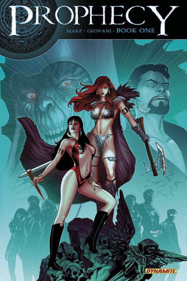
PROPHECY #1
Writer: Ron MarzArt: Walter Giovani
Publisher: Dynamite Entertainment
Reviewer: Henry Higgins is My Homeboy
Mark Your Calendars…
It’s actually pretty surprising to find out that Dynamite has never done a major crossover. As a publisher, they have been producing some of the most iconic independent characters in comics (Red Sonja and Vampirella), along with some of the most well known characters in fiction (Sherlock Holmes and Dracula), among others. Personally, I’m amazed it hadn’t happened before. But it’s probably a blessing it hasn’t, because then we might not have gotten this story. PROPHECY is a fast paced, well structured first issue, clipping by at a solid pace. It’s definitely the kind of first issue you want from an event book.
Writing: (4/5) I have never really followed too much of Dynamite’s stuff, popping in every once in a while if something strikes my fancy. Crossovers usually dictate a strong understanding of the past events and the characters to get what’s going on, but not here; rather, you can read this comic and still enjoy it immensely, without ever having read a Red Sonja book. It’s all a credit to the writing of Ron Marz, who makes each character sparkle with some new level of individuality.
The story jumps between three distinct time periods, and introduces three new players into each era. In Victorian England, Sherlock Holmes investigates a break in/murder. In the 600s, the villainous Kulan Gath is hunted down by Red Sonja. In the present day, the recently arrived Sonja finds herself positioned against Vampirella. Each beat is well done and succinct, going for a different mood. The Sherlock sequence is the weakest, if only for its slightly rushed feeling. I hope Marz returns to these two, as having a bit more room with the characters could improve the tone greatly. The Aztec scenes are the most memorable, breezing by and giving just enough information to glean what’s happening. Marz manages to compress the beats with ease, leaving the characters room to flesh out the scene. The present day scene falls into a tried and true comic book moment (heroic misunderstanding leads to fight), but the brawl is short and sweet.
Art: (4/5) Giovani does a remarkable job differentiating between the various eras, as does Lucas. Sherlock Holmes is met with a drab building, dull colours, and cold expressions. In Yucatan, the settings are bright and expressive, with each character brightly showing off some new emotion. In the modern day, the entire scene is punctuated by the bright moonlight, which does a marvelous job of giving everything a sort of motion and life. The art rarely falters, each face and motion being deliberate and clear. The only scene that is really lacking is, again, the Sherlock Holmes scene. It feels slightly rushed, and the faces aren’t as defined and sleek as the rest of the book. Apart from that, however, the art manages to impress throughout.
Best Moment: The splash page of Sonja and Gath falling through time.
Worst Moment: Some of the faces in Sherlock Holmes.
Overall: (4/5) An enjoyable first issue, and a great way to suck in new readers.
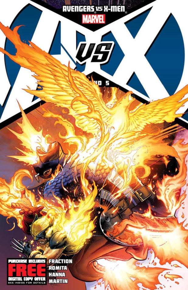
AVENGERS VS X-MEN #5
Writer: VariousArtist: John Romita JR.
Publisher: Marvel Comics
Reviewer: Masked Man
As we near the halfway point of Marvel’s grand crossover, a curve ball has finally been thrown. Which on some level might not be the coolest thing ever, but at least it’s a curve ball. Which is nice, since the promised smackdown between the Avengers and X-Men has been lacking. I should mention I’m talking solely about A VS X, not the tie-ins. To me, everything hinges on the main book. So if the main book is lame, I’m not going to buy a bunch of tie-ins in hopes of making it better--I’ll just drop the book. Thankfully A VS X isn’t lame, though it hasn’t quite won me over to buy any tie-ins yet.
Now yes, the Avengers have been fighting the X-Men, but there hasn’t been any real pacing or progression, just relatively random pictures of characters hitting each other. Wolverine can gut Captain America one moment and then the next, Cap’s in tip-top shape to take on Gambit or Cyclops. This is the major weakness of most comic book fights--they have no weight, so they come off as meaningless, and A VS X unfortunately is no exception.
Back to the issue at hand: the dreaded Phoenix force has arrived! So now the heroes have been given an enemy, besides themselves, so I’m curious to see how this will play out. Though, is the whole Avengers vs. X-Men angle of the story over? I hope not, since that was the selling point of the whole series. Plus I’d like to see some more true conflict between the teams. Like in the first issue Cap and Cyclops were on the verge of debating whether or not the Avengers have ever been on the side of the X-Men. To me, that is very interesting! I’d love to see that get developed more and have the fights grow out of it.
Unfortunately, as with the “Secret Invasion”, I feel Marvel maybe missing an opportunity to do something really cool here (in the “Secret Invasion”, I felt it would have been more interesting to watch the Skulls carry out their secret invasion, rather than just read another Skrull vs. superhero fight). But as I said, the game board has just changed, in a rather unpredictable way, so I think things could get rather interesting soon.
As to the artwork, I find that John Romita Jr. (as he was in THE AVENGERS) is merely illustrating this book, as opposed to drawing the hell out of it. He did brilliant work on ETERNALS and even on WORLD WAR HULK, but nowadays he seems to be just getting the work done. He does have flashes of brilliance here and there, but for the most part there’s not much to get excited about.
So A VS X #5 still sits between nothing bad and nothing great, so it scores a 2 out of 4.
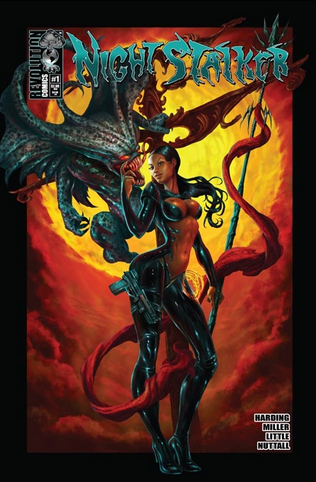
NIGHTSTALKER #1
Writer: Orlando HardingArtist: David Miller
Publisher: Revolution Comics
Reviewer: Optimous Douche
Differentiation. In the sea of #1’s that are flooding the comic market, differentiation is the key element to see an issue crest from the fairly easy to accomplish #1 issue to the coveted issue #2.
NIGHTSTALKER on the surface seems to bask in a level of sameness. It’s a concept very baked in the SPAWN mold. Take unruly demons escaped from hell and stick some bounty hunters on their fiery asses to send them back down.
Now, where NIGHTSTALKER surprised the living shit out of my Optimous bowels was the small but very effective gender change of our traditional hellion hunters from strapping men to very realistic ladies. Also, I’m enamored with the fact that not one whitey can be found within these pages. Yes, someone has found a way to write colored super heroes without electrical powers and the need for an Ebonics dictionary. Dare I say, these hunters in heels are some of the most real characters I’ve read when they could have easily transcended into a deep trap of racial and gender tropes. These women kick ass and are smart, sassy and classy in the process.
Now, here’s the really cool part. After the two ladies discuss their recent captures over an afternoon lunch in a “How I Met Your Mother” backwards story style, their next hunt sends them after time demons. This takes the tale to Club 54 circa 1977. I couldn’t stop reading after this point. The atmosphere, the jive turkey talk, the short skirts and go-go boots, all gave this book a vibe which I have yet to truly see in comics – not just indie comics.
I can’t urge Harding and Miller enough to really explore this direction of demon hunting through time further. Both of these guys have all the right stuff from an execution standpoint; they just need the hook. And I think they have it; now that the exposition is done, it’s time to see the NIGHTSTALKER protect our mortal souls and the time stream.
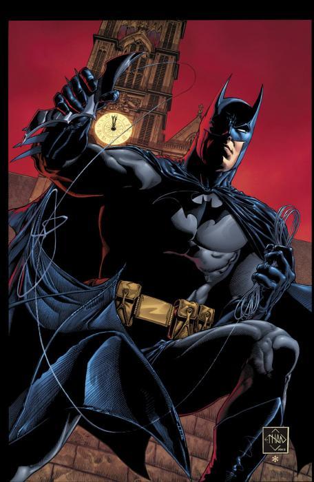
LEGENDS OF THE DARK KNIGHT #1
Writer: Damon LindelofArtist: Jeff Lemire
Publisher: DC Comics
Reviewer: The Dean
I have an idea – take LEGENDS OF THE DARK KNIGHT and its policy of telling unique, self-contained stories that feature a variety of talented artists and writers, and apply it to everything, always, for the rest of my life. I developed this idea shortly after finishing the debut of the “digital first” incarnation of the series last week and realizing that this was easily the freshest Batman tale I had read in quite some time. There’s obviously a place for continuity in comics, and while its confines are often cited as a hindrance to creativity, it can just as easily be argued that the parameters they provide inspire a growing, evolving narrative for these otherwise ageless characters. What cannot be argued is that every run on a character isn’t a home run, and when the only exposure we get once a month is some uninspired garbage that banks on obsessive devotion to monthly titles, an alternative like LEGENDS OF THE DARK KNIGHT can make all the difference in a comic fan’s life.
Fortunately for Bat-fans, the majority of bat-products out there right now are fantastic, and Damon Lindelof spins as great a yarn as Snyder or Tomasi are piecing together in their titles, but Lindelof finishes his in one issue. The greatest contribution a series like this can have in the life of a character is in providing those quick “what if?” scenarios, taking risks in expanding on or deviating from established traits. With LEGENDS OF THE DARK KNIGHT #1, we get Bruce as an angry drunk, sitting in the dark (of course!), contemplating his allies’ weaknesses and his absence of any. Alfred, tired of his master’s cockiness, brooding, and poor grammar, begins to argue the contrary stating that “everyone has a vulnerability.” The rest of the issue, depending on how you look at it, is either filled with absurd, uncharacteristic contradictions, or invigorating detours that make both Batman as well as the Bruce/Alfred relationship feel new and unpredictable.
What I love about Lindelof’s Alfred in this story is that he’s very much Bruce’s father, and not just in the sense that he’s the man who raised him. There’s a level of drive, stubbornness, and willingness to do whatever it takes that is typically exclusive to Bruce in many other stories, but here, it appears likely that a lot of these classic Batman traits were a direct result of Alfred’s own pursuit of perfection, and the higher expectations he imposes on himself and others. Despite its simplicity and brevity, this issue is filled with enough genuine content to work a senior thesis around, and while Lindelof’s script goes a long way here, Jeff Lemire’s art deserves half the credit at least.
I’m not an artist, and I’ll never understand how the truly great ones do it, but Jeff Lemire has that rare, natural ability to infuse every single face he draws with a lifetime’s worth of backstory. To the untrained eye, I’d say a good 75% of the artwork on comic book shelves looks much the same, but Lemire’s style is noticeably different, and I’m not sure the general public would respond well to his art on a superhero title for any longer period of time, but that’s exactly why I’m so thrilled that this series exists now – it gives writers and artists who may never otherwise get a chance to work on these A-list characters a shot at bringing their unique styles and visions to a wider audience. There’s a page here that really stood out for me which I paused for a good three to four minutes on before remembering there was more story left: while Batman tries to figure out who could be behind the trap he found himself in, the usual cast of villains pops into his head. As usual, the villain at the front of the line is the Joker, but he’s drawn like no Clown Prince I’ve ever seen before. Most artists have adapted the look of Joker as this sort of mutated monster with a face so distorted in its exaggerated features and permanent grin that it’s barely recognizable as human anymore - some do it better than others, but it loses its impact when you see the same trends over and over. Well, Lemire takes it a step back and gave me the feeling that I was seeing the Joker for the first time again. This is simply a ghost-faced man with green hair that looks like he hasn’t slept in about a month and a half, and it’s a far eerier look than any other recent interpretation that seems to try just a little too hard. I’d give anything to see this Joker’s story told, but like I said, with Lemire’s raw talent, a lot of that story is right there in that one drawing.
In case it isn’t obvious already, I’m happily deeming this one a must read. I would love it if every hero could get a series outside of continuity like LEGENDS OF THE DARK KNIGHT’s, but I could never be so bold as to hope they can all live up this level of quality. You’ll finish this issue in mere minutes, but like any good story, I promise it’ll stick with you for much longer. With any luck we’ll see the pairing of Damon Lindelof and Jeff Lemire a lot more in the future, but for now, I’m more than happy with the story we’re given, and can’t wait to see what other tales we’ll be treated to in this series’ future.
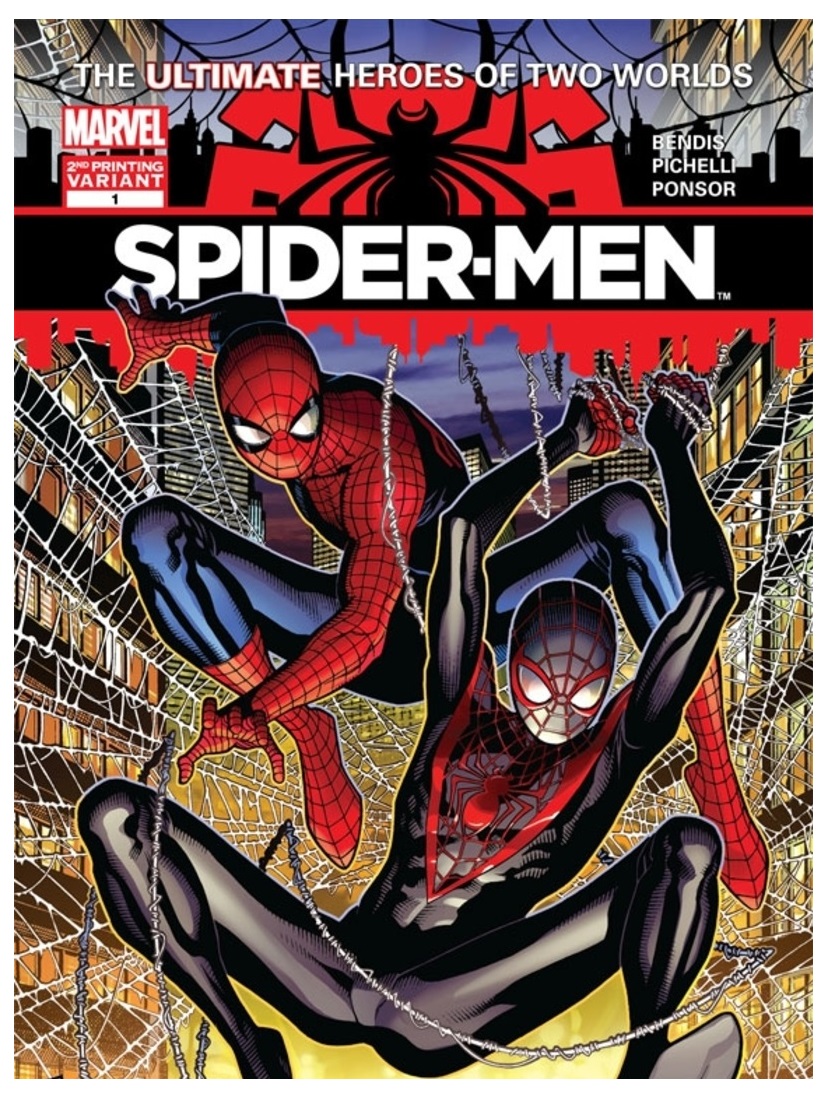 Advance Review: In stores today!
SPIDER-MEN #1
Writer: Brian Michael BendisArt: Sara Pichelli
Colors: Justin Ponsor
Publisher: Marvel Comics
Reviewer: Johnny Destructo
Is it necessary to tell you that during my recent cancer remission scare, one of my passing thoughts of "things to be thankful for to stay positive about my upcoming doom" was “Well, at least I lived long enough to see Spider-Man swinging around on the big screen”?
No, but maybe it will help illustrate what a nerd-tastically big fan I am of the character.
Really, JD? That's how you're going to start your review? CANCER? Man, wotta downer.
Ok, ok. I was just making a point. And that point was I love me some Spidey! You know who else I love? I love me some Brian Michael Bendis. That man can write the boogens out of a Spidey book, and I've been contacting him on a daily basis, asking him to write an ongoing Spider-Man 616 title. Ok, not so much "contacting him" as "mumbling to myself", but you get it. Another inappropriate amount of affection goes towards the amazing illustrations of Sara Pichelli. Damned if Pichelli isn't my favorite artist working for the entirety of Marvel at this moment. I cannot, for the life of me, think of a more exciting comic book team to create a Spider-Man comic right now.Yah, we get it. You're enthusiastic. It's getting annoying. Wipe the baby-brew off your pudgy manstomach and tell us what you think of the damn book!
Well, bodiless italic voices...I'll tell you. The book is good. Is the book great? No. Not YET. One of the problems is that I WANT MORE! But is it really a problem that it's so good that I'm whining that it wasn't long enough? Probably not.
This book has three segments: 1. Pete spewing baby-brew all over his six-pack'd manstomach about how much he loves NYC and being Spider-Man (which I would also do all the time forever if I had his powers) 2. Fighting in front of an inter-dimensional portal (which you just KNOW is going to take him to the Ultimate Universe) 3. Hey, he's in the Ultimate Universe (and within seconds of being in a major metropolitan area, accidentally runs into Miles Morales). Is it entirely possible that Peter could have spent literally a month in Manhattan without once running into Miles, let alone Miles in costume? Yes. But hey, suspension of disbelief. Despite the fact that it's slim pickins story-wise, not once did the pacing lag, nor did the issue feel light. I read the entirety of the issue with a smile on my face.
Sara's art here is, as always, amazing. Insanely detailed and realistic with a hint of cartoon. Just the buildings in the backgrounds must have taken a month to put together! The body language throughout is full of personality, and there isn't a single panel that feels static. The whole book is moving. There was one tiny oopsie with the physicality of a scene that confused me. At one point Mysterio is pinned under Spidey with an elbow on his throat and in the next panel, Spidey has been...thrown off? Not only does Peter have the proportionate strength, speed and agility of a spider, but he can't really be unstuck from a spot that he's sticking to, and Mysterio shoves him off? MYSTERIO? Seems a little improbable, but that's just a quibble. Everything else was spot on, and I loved it.
Awright, now sum it up and let us get on with our lives.
This is a first issue that serves to dip our brain-toes in story water and to whet our appetites for more. It's done its job and more. I can't wait for part 2!
JD can be found hosting the PopTards Podcast, drawing a weekly webcomic, discussing movies, comics and other flimflam over at www.poptardsgo.com, graphically designing/illustrating for a living, and Booking his Face off over here. Follow his twitter @poptardsgo. His talkback name is PopTard_JD. He is also now co-hosting another Comic Book discussion show on Party934.com alongside Bohdi Zen. They discuss comics and play music, check it out live every Saturday from 4-5pm.
Proofs, co-edits & common sense provided by Sleazy G
 Find out what are BLACK MASK STUDIOS and OCCUPY COMICS here and on Facebook here!
 Want more in all things Geek?
Check out PoptardsGo and on Facebook here!
Check out AICN COMICS on Facebook and Comixpedia.org!