
| Issue #38 | Release Date: 12/7/11 | Vol.#10 |
(Click title to go directly to the review)
Advance Review: THE RAY #1
SWAMP THING #4
EVERLAST OGN
G.I. JOE #8
X-CLUB #1
RED LANTERNS #4
Advance Review: THE STRAIN #1
THOUGHT BUBBLE ANTHOLOGY #1
AMAZING SPIDER-MAN #675
SACRIFICE #1
ACTION COMICS #4
Advance Review: CARNAGE USA #1
AICN COMICS Podcast!
 Advance Review: In stores today!
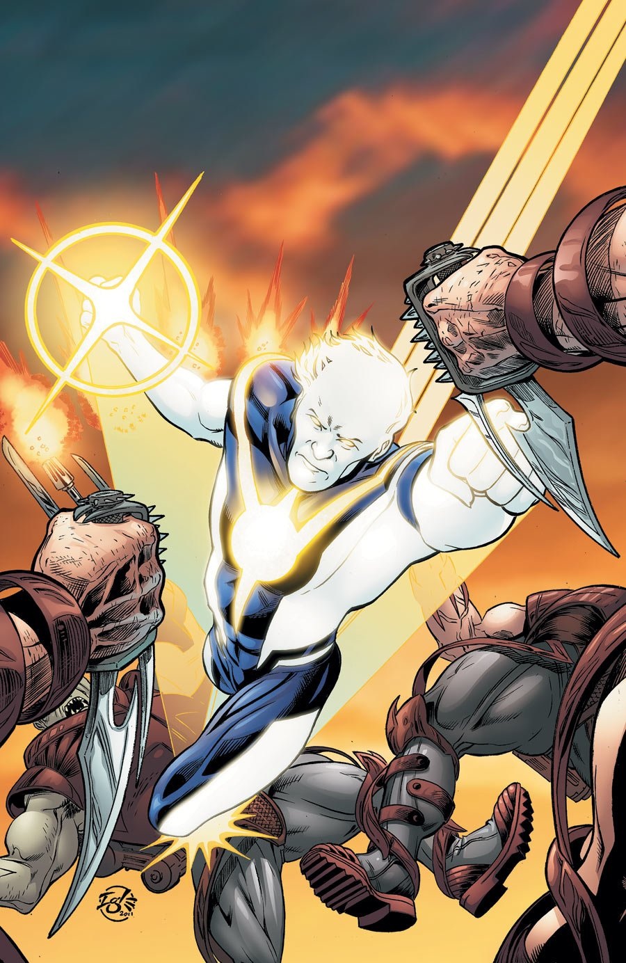
THE RAY #1
Writers: Justin Gray/Jimmy PalmiottiPenciler: Jamal Igle
Inker: Rich Perrotta
Publisher: DC Comics
Reviewer: Johnny Destructo
Huh. Well that was actually pretty fun! There's a pull quote for the back of the book, DC marketing team: "Surprisingly, I didn't hate it! - Johnny Destructo" You can go ahead and use that if you want. I should be honest: I don’t know anything about the previous incarnations of The Ray, but then...I have a feeling most of you are with me on this. This super-hero never really jumped off the shelves and into my pull-list, but with Gray and Palmiotti at the helm I figured I would take a peek.
There is a lot to like about this book...the main character isn't white, which automatically makes me curious, (it's actually a pretty diverse cast) he's constantly naked despite what you think you see and his parents are adorable hippies (think Ben Stiller's parents from Meet The Fockers). There's a punch that goes through the back of someone's head, which I always enjoy, there's reference and use of something specific from Batman continuity and interesting uses of his light powers. I like his inability to dress and the secret ID thing. Our boy can manipulate light, which manipulates what you see, so of course he can make himself look like anyone he wants. I hope they explore that further. I like the Quantum & Woody chapter titles, or for those who don't remember the brilliant Q&W series, think Scott Pilgrim.
It isn't all whipped cream bikinis though, there are some negatives. We spend faaaar too much time inside the head of our main character Lucien. There are ten hefty thought boxes on the first 2 pages alone. Another gripe? The cover has nothing to do with the interior, except for the fact that The Ray is featured. He's fighting giant flying squids on the interior..but why? I do love that most of the issue is character-driven and we spend time getting to know our cast, but I could have used just a touch more danger and a little less inner monologuing. Also, The Ray seems to be throwing light discs that look like Nerf frisbees?
The art by Jamal Igle is pretty strong, if not amazingly dynamic and I like some of the details he lays down on the page. When Lucien first meets a couple of girls after transforming, the red-head's shirt is doing that thing where the buttons are a little taut, allowing the viewer to see ever so slightly into her shirt. Nice touch. About the colors though. The palette by Guy Major, a fellow who's work I really enjoy, isn't quite bright enough for a book about a fella made of light. I think about the lighting effects that Rod Reis is doing over in Aquaman right now, and just the shimmering effects that he puts into Arthur's chain-mail armor, and I think that sort of attention could be made here.
This is a fun, if not particularly ground-breaking or memorable first issue, but Gray and Palmiotti have their work cut out for them if this title is going to go the distance. The Ray as a character amongst the icons in the DCnU just doesn't feel like a mainstay. I guess that's why this is a 4 issue mini-series.
Also: "The Light Of Vengeance Strikes"? Gah.
When not hosting the Poptards Podcast at www.poptardsgo.com, fist-bumping his own nethers, & discussing movies, comics and other flimflam here, JD is graphically designing/illustrating/inking for a living, hanging with the @$$holes and Booking his Face off over here. Follow his twitter @poptardsgo. His talkback name is PopTard_JD. He is also now co-hosting another Comic Book discussion show on Party934.com alongside Bohdi Zen. They discuss comics and play music, check it out live every Saturday from 4-5pm.
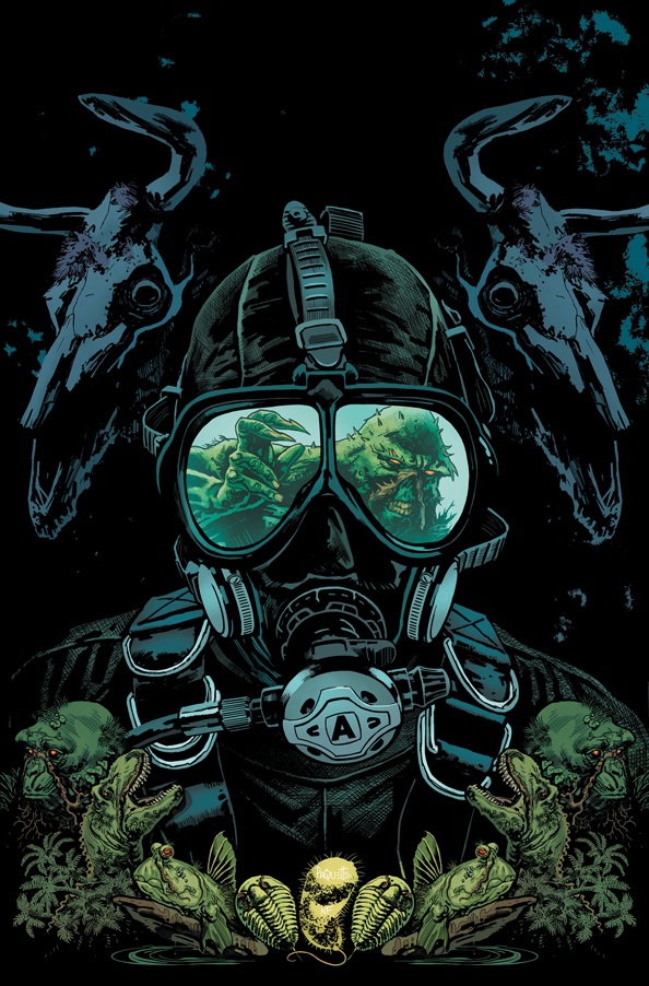
SWAMP THING #4
Writer: Scott SnyderArt: Marco Rudy, Sean Parsons, Michael Lacombe, and David Baron
Publisher: DC Comics
Reviewer: The Dean
SWAMP THING has to be a difficult character to write. His ventures outside comics showed the public that he’s kind of a silly B-movie monster or children’s cartoon at best, while his legacy within the comic book community consists of one of the finest runs of all time from one of comics’ greatest writers. The reinvigorated comic buyer or “New 52” crowd would likely pass on the leafy action hero they remember (if they remember him at all), while long-time fans will hold any new series up against the impossibly high standards of the Moore/Bissette years. So are we getting B-movie mediocrity, or an attempt to recreate the lauded 80’s saga? Lucky for us, it’s neither! Snyder’s been building on Moore’s SAGA OF THE SWAMP THING and creating a sequel that’s fresh, feeling nothing like Moore at his best, but everything like Snyder at his, with issue 4 continuing the trend.
While the separation of Alec Holland from SWAMP THING is Snyder’s greatest distinction from most previous runs, issue four of the new series is proving that the separation of Abby from Swamp Thing is where the real drama lies. This type of dynamic of course is nothing new, but the forbidden love angle enforced by the Parliament of Trees is being played so well that any prepackaged predictability that comes with such a story is nearly lost – I have a good feeling they’ll wind up together, but I’m not sure how or when, and I certainly wouldn’t put any money on it. By no means is this a “when will they get together?!?” romance, though, and the nightmarish opening in the diner should probably prove this to you. It’s just one of the many reasons you should be buying this monthly, along with the epic ethereal battle hinted at between this and ANIMAL MAN. What’s particularly thrilling about this inevitable crossover is that in doesn’t feel like an inevitable crossover. Snyder gives us a SWAMP THING issue every month, not some prelude, and the merge is natural. While this issue’s greatest development came from the Parliament of Trees regarding the Green, Red, and Rot history, there’s plenty here including the Abby and Alec relationship to feed future storylines, leaving you encouraged that a SWAMP THING series will exist once this conflict is resolved. The only concern I have so far is the Parliament becoming too exposed in these first four issues. Like the Joker’s or Wolverine’s origins, some things are just better left a mystery, and while it is still far from being ruined, too much exposition or defiance from Alec could weaken this pivotal device.
Taking Yanick Paquette’s place as penciller for issue 4 while he was in the bathroom is Marco Rudy. If you’re not watching the bylines, you’re probably not going to notice, but it’s just as beautifully drawn and laid out as the past three issues have been, including one of, if not my favorite panel of the series to date: the Abby and Alec, Rot and Green yin-yang. Also of note was the impressive opening diner sequence featuring William Arcane, a mistaken order, and the appropriate punishment. Rudy conveys a real sense of terror in the faces of the patrons, with even the layout contributing to the overall danger of the scene, contrasting nicely with the more traditional and comforting Alec and Abby sequences. Paquette should be back for issue 5 if you really miss him, though a suspension is in order for one of the dumbest Superman faces ever drawn in the series’ debut issue.
SWAMP THING #4 appears to bring the placesetting to a close, as we now have Alec’s stance on his relationship with Abby against the Parliament’s wishes, and a clearer understanding of the upcoming struggle. The issue is fully satisfying, but leaves me itching for issue 5 to see both what Alec and Abby discover about each other, and to see what horrors they find William’s been leaving in his wake. As long as Snyder can avoid further trips back to the Parliament, and continues to grow the interesting plot points he’s already established, SWAMP THING will remain one of the top comics out there today.
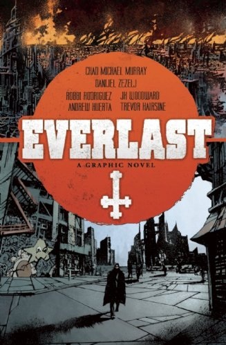
EVERLAST OGN
Writer: Chad Michael MurrayArtists: Danijel Zezelj, Robbi Rodriguez, Andrew Huerta, J.K. Woodward, Trevor Hairsine
Publisher: Archaia
Reviewer: Megan Adler
Growing up watching Chad Michael Murray in television and movies, I’ve always been a fan of the actor. So I was intrigued to learn that he was writing his own graphic novel, and curious to see what he could do with it. I have to give credit where credit is due; he’s serious about the writing thing, unlike a lot of other celebrity comics where they basically lend their name and let someone else do the heavy lifting. He even takes a shot at writing a short prose piece at the end of this book, which to me says he’s really trying to stretch his creative muscles.
The end-of-the-world scenario with heroes struggling to save innocent lives is one we could get in any comic book mega-event, but the twist here is the religious theme that Murray brings into the story; in the introduction (which I recommend reading after the story, as it gives away an important plot point), he explains that his inspiration was a visit by a religious proselytizer who warned of the end times, and claimed that only 144,000 people would be saved (it’s not mentioned, but this would appear to be a Jehovah’s Witness). Accordingly, Murray’s protagonist Derek Everlast (oddly enough, he’s not a boxer) is on a mission to save people, but rather than going door to door, preaching the gospel, he prefers to stalk people across the city streets, wearing a trenchcoat and shooting anyone who gets in his way. That’s probably a bit more exciting.
Murray is building his own mythology here, as Everlast is part of a group of those in the know, trying to save the chosen few and bring them to “Haven”, a seeming pocket dimension that can only be reached by travelling a few miles underground. It’s a neat reversal, having the place of salvation be below rather than above. There’s an extended segment early in the story which cites the various philosophers and academics throughout history who postulated the existence of a habitable environment beneath the earth, but that feels kind of unnecessary here. It’s a fantasy story, so we’re either going to suspend our disbelief or we’re not; we’re certainly not going to be persuaded further by scientific theories that were thoroughly debunked a hundred years ago.
The story brought the song “God’s Top Ten” by INXS to mind…the idea of a select list of people chosen by a higher power. This presents us with one of the compelling dilemmas of religious belief in predestination: how can God simply know ahead of time who is worth saving? Does that mean that no matter how good a person is in their life, if they haven’t been chosen ahead of time, they’re doomed? It’s exactly this dilemma that the story revolves around, giving our protagonist serious doubts about his mission, and giving his opponents credibility. It’s an effective tool in getting us to connect with these characters; by not having them deal in absolutes, readers are able to identify with them, and they seem like people in our own lives who wrestle with these questions too. Of course, there is the added tension that these are not merely philosophical questions here; actual salvation, who survives and who will perish, is at hand in this story, and there is a ticking clock counting down to the end times.
Five artists worked on this book: Danijel Zezelj, Robbi Rodriguez, Andrew Huerta, J.K. Woodward, and Trevor Hairsine. Murray explains in the introduction that his goal is to provide a different style for each of the main characters in the book, and while that’s an interesting idea, the lack of consistency and clarity means it doesn’t always work.
Zezelj provides a dark and gritty vision of the world, as seen through Everlast’s eyes. The story then turns its focus to Melissa, a young girl he is trying to save, and this sequence is portrayed in a more cartoony style by Rodriguez. Huerta then comes on to portray the world through the antagonist’s eyes, and while Murray says that he was going for a somewhat jarring effect with his segment, it really takes you out of the story. By this point, the main characters have all been introduced, so when their portrayal differs so wildly in this sequence, it really makes it hard to follow. And I must confess, I’m just not a fan of Huerta’s style. The story closes with J.K. Woodward portraying the world through the eyes of Naomi, the woman Everlast has fallen in love with. Woodward’s work is beautiful, but there are some clarity issues here as well; it was difficult to understand what happened in the climactic moment. Trevor Hairsine illustrates flashback moments throughout the book, and his clean and clear style was the right choice to handle those, as clarity is even more essential when you’re dealing with flashbacks.
The conclusion leaves room for Murray to do more with this character and concept, and I’d be interested to see where he goes with it. The end of the world, and what comes next, is such a prominent theme in our culture, yet there aren’t many comics that really address the moral questions that people struggle with when considering the matter. Murray tackles that head on here. My one proviso would be to urge Murray to select a single artist, with strong and clear storytelling abilities, for Everlast’s next outing; not only will it be better for the reader, but a close one-on-one collaboration with an artist can take a writer and his story to even greater heights.
X-CLUB #1
Writer: Simon SpurrierArtist: Paul Davidson
Publisher: Marvel Comics
Reviewer: Optimous Douche
Sometimes the stupidest names can accomplish the greatest of feats. I look at you, Lady GaGa, Segway and now X-CLUB. I almost walked past this title on name alone. Even though my favorite X-Scientists adorned the cover, I couldn’t help but wonder if this title was a better name for a place to get lap-dances, beer and herpes instead of sciencey and snarky fun. Once inside, though, my misgivings subsided, because this tale of the scientists that have primarily lived in the subterranean layer (not many layers when your refuge is a floating asteroid) of Utopia is a great example of what a comic can be when it decides not to pander to the lowest common denominator.
The X-universe has always exhibited bigger and brawnier sci-fi muscles than most comics on the shelves, and X-CLUB takes this mantra to the nth degree. This fucker is loaded with the pseudo-science pontificating that separates fans of Star Trek from those of Star Wars, and usually causes a divide between Ellis fans and non-fans.
Speaking of Ellis, does anyone else think that Dr. Nemesis is Ellis in comics form--a man with an intellect that’s sharp and a tongue that is razor sharp? I guess it was the obligatory editorial bubbles describing the primary players that made me think of this; Nemesis is described as “Science Bastard.” Of course, he’s not the only focal point of this book; we also have Kavita Rao, the hot geneticist who the editorial bubbles dub lackey; Madison Jefferies, who the bubbles dub as “Intuitive Cybersmith”, but whom I still call Forge; and Danger, who has a really long editorial bubble, but who I call Data with tits.
I would remiss in this review if I didn’t mention the plot at some point, but it really is just standard fare when held against Spurrier’s spot-on characterization of the X-CLUB and the post-Schism mutant universe. Apparently, private industry is the future of space and Ross Perot is alive and well. In an effort to cut costs and save on jet fuel, Ross (not really –but you get my intent) decides to recruit the X-Men to get Magneto to lift the orbital portion of the world’s first space elevator into the stratosphere. Everything goes to plan until it doesn’t. The Atlanteans are pissed about more garbage floating in their ocean, the orbital rig is…well…rigged, and when Danger tries to jack in she is overtaken by a super computer virus. It’s an accomplished way to set palpable danger on both the book’s fronts, but I would be lying if I said it set my nether regions on fire with originality.
What I really loved about this issue aside from the X-CLUB’S discomfort during the press conference for the station was that this is the first book where I felt the true power of Schism. Scott Summers is in a PR gamble to give mutants a better name and also take a few pot shots at Wolverine’s East Coast X-Men. Is it douchey? Absolutely! But it also works on more levels than just the jab. I’m finding it very refreshing to see the X-Men take a diversion from the doom and gloom of the past year. This needs to be a time of rebuilding and I give creators full carte blanche to let their fun flags fly.
While this issue was good, there’s an opening sequence that completely baffles me. Set in WWII, the book opens with the heroes of that time fighting Nazis at sea. I get who the players are and it probably all ties back somehow to Dr. N’s Golden Age roots, but I’ll be damned if I could figure out what this vignette has to do with this tale aside from both occur on water. I hope this is a mystery that pays off and not an editorial gaffe of placing the wrong pages in the wrong book.
All in all, if you like X-Men, then you’ll love X-CLUB. If you haven’t been with the X-Men in awhile, this will probably leave you flat unless you’re like me and will imbibe any morsel of science fiction you can get in comics these days.
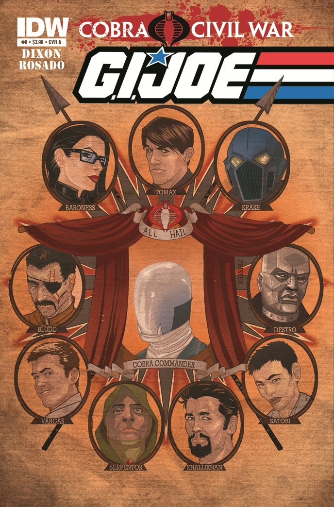
G.I. JOE #8
Writer: Chuck DixonArt: Will Rosado
Publisher: IDW Publishing
Reviewer: Ambush Bug
I am not embarrassed to say that reading IDW’s GI JOE stories is the next best thing to the imaginative and intricate stories (in my mind) that I came up with as a child playing with the toys while using the living room furniture as dangerous terrain. In my mind, these battles were perilous, the situation was dire, and the tone was deadly serious; basically, it was everything the movie version of this property that landed last year was not. Seeing the new trailer for GI JOE: RETALIATION, I must admit it looks like a lot of fun, but still it’s GI JOE-lite compared to the desperate battles between good and evil I had with my toys as a child. Because I take my GI JOE-ing seriously, I am a huge fan of IDW’s treatment because it does the same. This comic is done by folks who treat this as a military comic first and a kiddie toy comic last. Characters are constructed. Characters evolve. Characters die. First and foremost, this is a war comic.
Now, I know looking back at the GI JOE cartoon immediately dissipated the cloudy recollection of nostalgia I had for the property. It wasn’t as serious as I thought and the toys themselves devolved into much goof after the fifth or so wave, but that doesn’t matter. In many ways, this comic has evolved with me as a reader, offering up a more sophisticated take on the Joes as characters in their never ending battle with the forces of COBRA.
For about the last eight or so months, IDW has undergone an ambitious storyline, linking all three monthly GI JOE books after Cobra Commander was assassinated at the end of the second COBRA miniseries. Restarting the whole line with new #1 issues, Chuck Dixon took on the main GI JOE book as well as a book highlighting series star SNAKE-EYES, while Mike Costa handled the insidious task of depicting the seedier side of the JOE universe in a monthly COBRA book. The storyline linking them all together was the “Cobra Civil War” saga, an expansive story with many twists and turns in which COBRA’s secret council puts together a contest; the COBRA operative successful at killing the most Joes wins the spot as new Cobra Commander. Just the construct of this contest made the fanboy in me giggle. No, it’s not as hokey as the Joes running across the globe in search of conqueror DNA to make Serpentor (a storyline from the old cartoon), but it is, in many ways, fun in its simplicity.
With this simple concept, many twists and turns came about as each competing member of COBRA was more than formidable at terror, meaning many losses for the Joes. By the time this issue came about, the race was neck and neck with outcome anyone’s guess. Even in this, the eighth issue of GI JOE, the tide turns a few times as to who finally slips on the mirrored visor of Cobra Commander. I won’t spoil who it turns out to be, but having stuck through the entire journey, I can say that I am happy with the new Commander. Of course, immediate plans to dispose of the new leader are being made by the losers who are still a part of COBRA, but it wouldn’t be COBRA without a little back-stabbing.
I thought the art in this issue was actually pretty good, although I have to say that the one detriment to all three GI JOE series is that the art could be handled better. Though I’ve been a fan of Will Rosado since his work on GREEN ARROW close to twenty years ago, I don’t know where he’s been. His inclusion into the GI JOE comic is a step in the right direction and since he worked with writer Chuck Dixon on those old issues of GREEN ARROW, he seems to have a good rapport with translating Dixon’s exciting tales of espionage and warfare to life.
As is, Chuck Dixon has constructed an especially twisty issue with false resolutions, a definite decision made, and the threat of devious things to come. For the last year, COBRA has been handing GI JOE their balls, with the team serving mainly as points for COBRA agents to check off on their rifle butts. I’m hoping we see a couple of wins in the Joe corner soon. As much as I love it that Dixon and Costa have made COBRA a more believable and capable threat to the Joes, they are in danger of making the Joes out to be inferior. I’m hoping some of the cool little quirks Max Brooks added to some more obscure Joes in last year’s GI JOE: HEARTS & MINDS miniseries will make the Joes have a more interesting roster.
I like it that IDW is taking their GI JOEs seriously. It’s the kind of GI JOE I’ve been wanting to see for years and lately it’s been kicking a lot of ass. Big props to the fun scratch-off cover revealing the new Commander; of course, being the collector that I am, I would never do such a thing, but still, it’s a fun idea.
Ambush Bug is Mark L. Miller, original @$$Hole / wordslinger / reviewer / co-editor of AICN Comics for over nine years. Mark is also a regular writer for FAMOUS MONSTERS OF FILMLAND and has just released FAMOUS MONSTERS first ever comic book miniseries LUNA (co-written by Martin Fisher with art by Tim Rees) You can pre-order it here! Support a Bug by checking out his comics (click on the covers to purchase)!


(Just announced: NANNY & HANK is soon to be a major motion picture from Uptown 6 Productions!)
THE DEATHSPORT GAMES’ Facebook Page
FAMOUS MONSTERS PRESENTS LUNA: ORDER OF THE WEREWOLF’s Facebook Page
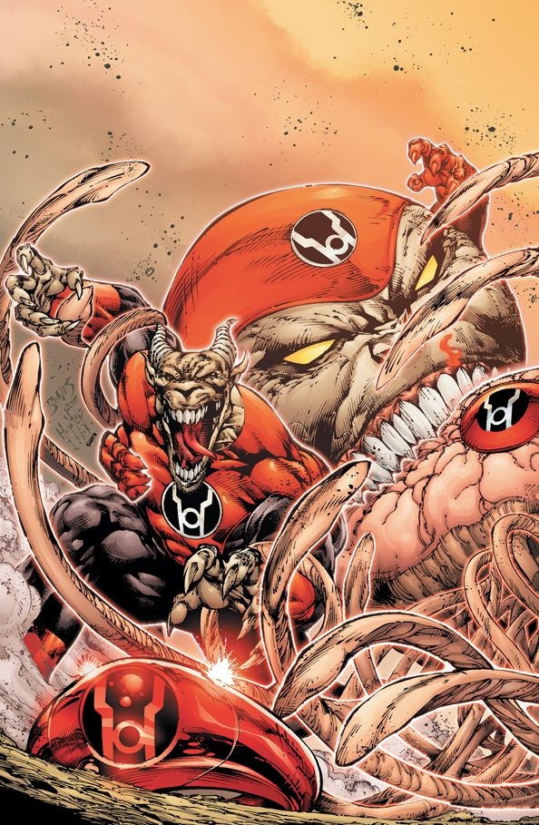
RED LANTERNS #4
Writer: Peter MilliganArt: Ed Benes/Diego Bernard
Publisher: DC Comics
Reviewer: The Writing Rambler
It’s tough the first time you find a flaw in someone you love. It’s like the walls around you have been shattered and you’re forced to realize that despite how you feel about this person they’re no longer perfect. The gleeful dreamlike euphoria is over and though you still sincerely love them, you realize much like all good relationships, your future is now going to require a lot of work on both parts. This is the state in which I come to you this week, where I find myself still faithfully pledged to the Red Lantern Corps, but with issue #4 I can recognize some serious work is going to need to happen if this series is going to survive.
It’s funny how when this series was first announced most naysayers’ biggest gripe was what they assumed would be a brainless series based on a Corps who just ran around killing like rage-filled animals. To both them and fans alike, surprise--this couldn’t have been further from the truth. Instead what we’ve had so far is an almost Hamlet-like quality that been given to the main character of Atrocitus, but sadly this is now becoming a major flaw for the series. I loved seeing Atrocitus mulling over the roots of rage and how it can be used for justice across the universe, but now that were 4 issues in it’s starting to get a little boring. While I think Peter Milligan is really trying to create something special and unique with the RED LANTERNS book, in this issue it feels like he’s just putting all of his ideas on the pages as quickly as possible without really thinking it through. Issue 4 is extremely choppy and jumps back and forth from Atrocitus’ internal thoughts, to flashbacks of other main Corps members, to a developing story on Earth, and then back to Atrocitus’ distrust of his newly christened second in command. It’s a ton to take in for one issue, and while I’m still a fan of all of the stories being presented I just wish Milligan would pick one to focus on for now.
On the more positive side I am still completely in love with what Ed Benes is doing to give the RED LANTERNS a fantastic look. With each issue he seems to get more into his groove and is able to deliver a group of characters who are both horrific but somehow loveable as well (for some reason I just look forward to the day when I can purchase a Zilius Zox plush toy). His work is especially good when he’s drawing the Lanterns themselves on their home planet. Something about the red and black color scheme just looks so good, though at times it makes some of the flashbacks and quick jump to Earth in the story look a little less polished--but still, fantastic work overall.
As we head towards a 5th issue/month of this series I really hope the pace will pick up and we’ll finally get some of the action that everyone assumed would be the focal point of this series. There was some promise in the final panel of this issue that at least made it seem like the story will start to progress, but I’m hoping once the action starts there will still be people around to read it. RED LANTERNS, the time is now for you to step up and be the awesome book I know you can be; just do it quick, because while I have no problem being one of the few still totally in love with this series, my having it at the top of my pull list alone will not keep it in production.
You can follow The Writing Rambler on his blog here and follow on Twitter @Writing_Rambler !
 Advance Review: In stores this week!
THE STRAIN #1
Writer: David LaphamArtist: Mike Huddleston
Publisher: Dark Horse Comics
Reviewer: Optimous Douche
Reading this graphic novel adaptation of Del Toro and Hogan’s regular sans pictures novel about the disease of vampirism, I was reminded of exactly what makes for good horror – anticipation. When done well, the impregnated silences before the bite, slash or evisceration are the true moments of dread and terror in a well crafted horror story. And this inaugural issue of THE STRAIN is just that: the hush before the cacophony of the entire world collectively slurping from one another’s necks.
I much prefer walking blind into comic adaptations of materials from other mediums. I will always gladly sacrifice context and the inevitable compare/contrast thoughts in my head for the invigoration that comes from traversing new material. So to those of you horror aficionados that want to know how things changed from the book, you have my deepest apologies--this will not be that kind of review. What I can provide, though, is the assurance that Lapham took the vampire concept to new heights of breathless anticipation without showing one damn fang in 22 pages, yet all along delicately sowed the seeds of massacre to come.
Obviously, the originality of THE STRAIN can’t be attributed solely to the comic. I’ll gladly praise Lapham and Huddleston for execution, but the concept of looking at vampirism as a disease goes directly to Del Toro, and I’m sure true horror experts would be willing to debate whether Del Toro gets full inception rights on this concept. However, I know this is the first time I’ve seen an outbreak of vampirism handled with such real world practicality and authenticity.
THE STRAIN lives in two times. The first is Romania in the early 20th century, where a grandmother tells her young grandson, Abraham, a wives’ tale about a giant man who was once kind and benevolent until an accident transformed him into a monster. She speaks of how the man who once cared for children one day began to take them from the village never to be seen again. While she’s using this story as an attempt to get the young man to eat more of his wretched peasant soup, it’s clear the story holds more credence than a simple scare tactic for good behavior.
Flash forward almost 100 years to modern day America. I applaud Lapham for skipping the easy-out editorial bubble to give us this time and place. Instead, he uses shocking concepts like dialogue and story to draw us out of yesteryear and introduce Ephraim, a middle-aged man attempting to get his life in order after a messy divorce. Ephraim tries desperately to spend a weekend of video games and baseball with his son until all of his communication devices spring to life about a dead plane on the tarmac at JFK airport (that’s NYC for the geographically challenged). As a member of the Center for Disease Control, Ephraim is called in to inspect this darkened plane and discover why it sits in complete darkness with all of the window shades drawn. We don’t learn the complete mystery, but we learn that all of the passengers are dead save three of them and the plane contains a mysterious and ornate coffin in the cargo hold.
Television serves as a wonderful device in comics to help transcend space/time and provide a connective tissue between story threads. Just as Lapham used the innocence of childhood to connect Romania and the modern day, the television coverage of the plane inspection helps jump us back to a now elderly Abraham who is watching the events at JFK unfold. Kudos to the creative team for using the wretched peasant soup as the opening shot in this scene to let us know that we are now looking at an older version of Abraham.
I’m also in love with Huddleston’s art; he transcends beyond the black and white buckets of real or cartoony. Each panel feels like it belongs in a comic, but at any minute could jump into the real world with ease. He’s light on lines, but still rich in detail. At the end of the day good comic art boils down to focus. Huddleston knows exactly where to draw the reader’s eye so the story moves forward, yet also paints a complete scene. This is a gift.
I’m hooked. From Del Toro’s concept to Lapham’s execution of the story, THE STRAIN makes vampirism feel as real as TRUE BLOOD--perhaps more so since our central characters don’t look like they just walked off the red carpet at the Golden Globes.
Optimous has successfully blackmailed fellow @$$Hole BottleImp into being his artist on Average Joe. Look for Imp's forced labor on Optimous brain child in mid-2012 from COM.X. Friend Optimous on FaceBook to get Average Joe updates and because ceiling cat says it's the right thing to do.
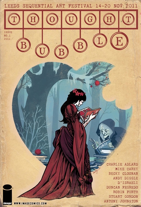
THOUGHT BUBBLE ANTHOLOGY #1
Writers/artists: VariousPublisher: Image Comics
Reviewer: MajinFu
The THOUGHT BUBBLE is an annual comics art festival which occurs in Leeds, England. This comic was the first comic anthology released to commemorate the festival, and is being distributed by Image. Proceeds will be donated towards Barbado’s, a charity which helps troubled youth in the UK. It includes work from several of the top winners from this year’s Northern Sequential Art Competition, as well some big names working in the industry today. It’s a big sucker too, about twice the size of a normal comic but still reasonably priced at four bucks, so without further ado let’s crack this baby open and see what we got!
Okay, wow. The year’s not quite over, but this comic is in serious contention for best single issue of the year. Top to bottom, cover to cover it’s a beautiful book that most any reader can pick up and appreciate. This is one of those rare, magical comics that you can hand to most anybody with the slightest inkling of interest in sequential imagery and they will probably find something to like. Most of the stories are only a page long and a majority of them are great examples of how to pack a riveting story with compelling characters into a fairly condensed format.
Fans of WALKING DEAD will enjoy Charlie Adlard and Antony Johnston ’s “Wasteland Rat Trap.” It’s a quick peek at a dirty desolate world, with excellent lettering by Pete Doherty. This is a textbook example of setting a mood and telling a story in a single page, all with cinematic precision.
Duncan Fegredo’s autobiographical “Not So Secret Origins” acts as a meditation on the artist’s stellar career that really made me want to check out more of his work. I only know him from his work on HELLBOY, but his work on THE WILD HUNT, THE STORM, and THE FURY knocked my socks off.
“November in the North of England” by Andy Diggle & D’Israeli is a time travel tale with a hilarious twist.
“A Thief’s Tale”, by Robin Furth and Mark Rutter, tells the story of a man attempting to rob the gods of their eternal youth. It’s a simple story but with a wonderful use of color by Frank Besant.
One of my personal favorites, “The Timeless Genius of Leonardo” by Mike Carey, M.D. Penham, and Andrew Tunney, details the many accomplishments of the Renaissance man in a mere two pages. The story builds nicely to an absurdist crescendo, with some excellent imagery that helps to capture the hyperbole of the account.
“Battle of the Wild Horses of Antrobus”, by Gavin Ross, is a surreal story that humorously details a man losing his title during an annual holiday: another good use of color, with a slow build to ridiculousness.
“The Very Best” by Sally Jane Thompson is another one of the highlights of the book, showcasing a hot breath contest during a chilly day: some excellent whimsical visuals here that convey a sweet moment.
“Let’s Go Fly a Kite” captures a moment of simple beauty, with some unique visuals by Will Morris.
“The Penultimate Month” by Raymond Mak is a humorous take on deadlines I had no trouble sympathizing with, even if I found the art a little lacking.
“First Run” by Amy Evans presents a daring escape in a world that resembles an anthropomorphic police state. It’s an obtuse piece that could be read many different ways, I think.
“Tick Tock” by Kryistyna Baczynski shares a page with “Trip to the North” by Matt Jeret and Julia Scheele. Both are superb works of art from creators who visibly have a sense of their craft, and both concern the particulars of a brief moment in time.
Stuart Gordon and Tulia Lotay adapt “The Hound,” a short story by H.P. Lovecraft about a haunted gravedigger. The longest story in the book at four pages, it’s a spooky tale with especially detailed art by Lotay that captures one man’s dark descent into madness.
“She’s Not Coming” by Alice Summerscales is a sweet, simple story of teenage angst that showcases a young creator’s excellent understanding of composing a comic page.
Finally, there’s “November in the North” by the young Sophie Kamlish, a half page story told at first from the perspective of a dog but ultimately extending to encapsulate the rest of the family, a story that is fascinating both for its sprawling, time-jumping narrative and its scrawling visuals.
For those of you keeping score, that’s fourteen individual stories, all elegantly composed their own way. Also, from an editorial viewpoint, the execution is very good, with an informative table of contents page that can point readers to websites where they can find more work from the creators. Then there’s that gorgeous cover by Becky Cloonan, who is also the artist for the upcoming CONAN THE BARBARIAN, one of my most anticipated books for next year! Readers may have noticed I tend not to write a lot of negative reviews, simply because I get so much more out of sharing the comics I truly enjoy. This is one such example, exhibiting excellent work all around that no comics or art fan should miss.
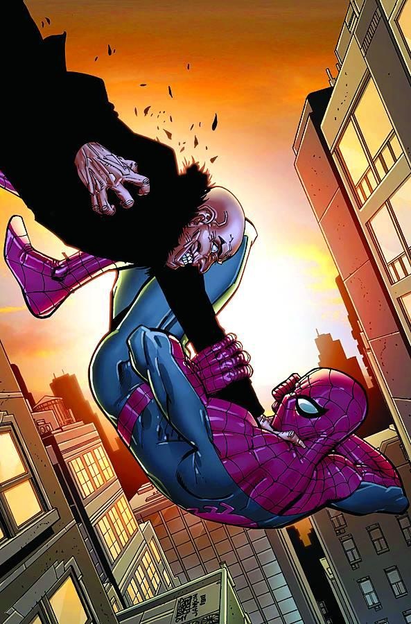
AMAZING SPIDER-MAN #675
Writer: Dan SlottArt: Giuseppe Camuncoli
Publisher: Marvel Comics
Reviewer: Henry Higgins is My Homeboy
Flock Of Seagullables
(That is an awful thing to write. I apologize)
“Spider-Island” was, overall, a great success. A thoroughly fun Spider-Man story, with a good mix of lighthearted Spider-Man antics, and a certain epic scale, incorporating all the things one would want to see in a Spider-Man storyline. Its followup, centering on a gang of mini-Vultures, did not start strong. But the second part manages to focus enough on the fun interactions within that universe to keep the pace of AMAZING fast and fun.
Writing: (3/5) To be frank, and I believe I've said this before, I love Dan Slott's contributions to the Spider-Man series. It's fast, fun, and thoroughly enjoyable. Slott has really found a sweet spot within his characterization of Peter. His dialogue is fast and entertaining, while remaining consistent with the general aspects of his character. It's one of the more consistent Spider-Mans I've seen in while. The supporting appearances (specifically Carlie) are likewise spot on. It's a solid story when it focuses on those strengths.
The villains, on the other hand, are a little lacking. The gang of flyers are rather ridiculous, and continue to be completely uninteresting. Vulture's machinations in the background to set up these attacks are engaging. It's nice to see someone like Vulture moving into a more advisory role, setting up possible new villains. But towards the climax, the story changes pace and reveals Vulture as a major threat. He's received a major power boost (ala “The Gauntlet” from earlier in Slott's run), but it feels very empty. There's not much done with him in this story. He simply appears, shows off his new abilities, and then runs away. It's slightly anticlimactic, especially following the great pacing of the run overall.
Art: (4/5) Camuncoli feels (at least to me) reminiscent of Marc Silvestri, and in a good way; He makes for good comics. The comic, for most of its time, looks good. The framing is great, facilitating the fast pace of the issue. The action (when it appears) is brisk, while remaining easy to follow. It's very good at establishing those moments.
Where it is spotty is in the smaller details. The faces feel inconsistent at times, especially Peter's. Some are very expressive and good, but others (especially Mary Jane) are hit with this blank stare throughout the issue. They just remove the reader from the story drastically. It's a little disappointing, because most of the art is great.
Best Moment: The Peter/Carlie scenes.
Worst Moment The Vulture Jr. Gang.
Overall: (3/5) Not quite the flourishing follow-up to “Spider-Island” I was expecting, but good.
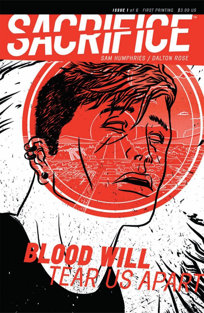
SACRIFICE #1
Writer: Sam HumphriesArtist: Dalton Rose
Publisher: Self published at TFAW.com
Reviewer: KletusCasady
“I will hang your balls from a tree.”
Since this was the first time I was directly asked by a writer to do an advance review, I said to myself, “Shit! What if I don’t like it and give it a shite review…does that make me an asshole for giving my honest opinion on a comic?!? That’s what I’m supposed to do, right?!?” Well, don’t worry folks, Ol’ Kletus will always be true and tell the readers how he really feels…even if it makes him seems like jerk. Luckily…I really liked this comic, and thank you Sam Humphries for giving me something good to review and not forcing the iron hand of Kletus Tiberius Cassidy to do something he may (or may not) feel bad about. Anyway…this book has great art and a fun unique story.
I really think that anyone who browses this comic will be drawn in enough by the art to gives this comic a chance. It’s kind of similar to Mike Allred’s work on MADMAN. The colors are very vibrant but not in an overwhelming way, and the people have a weird distinctive look to them (not a bad thing). Some of the art actually reminds me of J.H. Williams III’s work on PROMETHEA and BATWOMAN. This isn’t to say that the art looks anything like those two books, but it has a very similar feeling, where some of it is just a straightforward translation of the story but also has sequences that read more like dream. Which is also very similar to how this story plays out, weaving in between the real world and our protagonist’s dreamlike state.
This story follows Hector, who is a somewhat normal dude who has recently escaped from a psychiatric hospital and suffers from very intense seizures; the catch is, when these seizures come on he is seemingly transported to…well, I don’t want to give too much away, but that’s when the coolness begins. In these transitions from the “real world” to the dream state is where the art really shines and it’s these splash pages that really remind me of BATWOMAN. The art really takes a life of its own on these pages, where it’s not only creating a cool art piece but showing us a sequence of events relevant to the story. This dream state allows two different stories to run concurrently and also gives us two conflicts to deal with, which grabbed my attention early on in the issue. The story is engaging and doesn’t waste time with lengthy explanations; it drops you in and takes you on a fun ride that had me wondering what the hell was going on, but not in a bad way. It’s not that I couldn’t understand the story; I just wanted to find out more, which kept me anxiously turning pages. The story is not written in a way that a lot of #1 issues are written where they attempt to explain everything to you up front, leaving the issue to read more like an info-dump than something you read for enjoyment.
I saw that this comic is supposed to have something to do with Joy Division (post punk band from England in the early 70s), but other than the lead singer Ian Curtis and our protagonist Hector both suffering from epilepsy, I can’t find any other connections. I also have never really listened to the band, although I am familiar with the name, so I may be missing something else that may have to do with lyrics or themes of albums.
I think anyone who’s a non-superhero person and reads mostly indie books should check this out…actually, anyone who is into odd sci fi-ish stories that don’t beat you over the head with its science should find this book enjoyable. The art in this book is great and will grab anyone’s attention with its vibrant coloring and cool layouts. Pete Toms should get some recognition here, because the colors in this book are fantastic and really pop off the page, especially when we hit the “dream state”. Now, I don’t know if this is actually a dream quite yet; I’m just describing it as that as to not give away exactly what happens when Hector’s epileptic fit is triggered, but rest assured, it’s cool. Also this issue apparently already sold out at the distributor level, so if you’re even slightly interested you should pick it up ‘cause there’s probably not going to be a lot of these floating around, plus this book is self published by Sam Humphries, which is badass and worth noting. Bottom line…this book has great charm, it’s funny, interesting, and the art is really good.
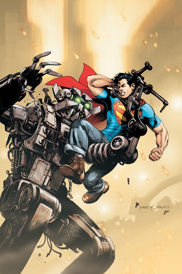
ACTION COMICS #4
Writer(s): Grant Morrison & Sholly FischArtist(s): Rags Morales & Brad Walker
Publisher: DC Comics
Reviewed by Humphrey Lee
More than any writer I’ve ever covered in my tenure here, Grant Morrison is always the one with the most caveats to touch on when creating content on his work. This is all for obvious reasons, for course. The man is unpredictable in that you never know how often, if ever, he’s going to play a story straight or tangent off into the uber-metaphysical, psychedelic, metacommentary, or however you want to describe the borderline surreal turns he tends to take with his work, even of the mainstream variety. So that’s why my opinion on ACTION COMICS here has been tentative, because I was wary that things might get weird, or at least riffy, as his highly excellent ALL STAR SUPERMAN did with Silver Age tropes. Four issues in now, it looks like I can firmly say this book is going to be pretty indulgent but that any of those (mostly) made up adjectives I used earlier will not necessarily apply.
Over the top may be the best terminology to slap on this, in that it looks like some of his character takes and story elements are reaching near-caricature levels. And y’know what? I actually dig that stuff. I am actually enjoying a Superman that is equal parts brass, altruistic, and headstrong to go against a Lex Luthor back to his megalomaniacal best. There is also a nice middle ground here with the riffing as Morrison, who has never been shy about playing up pop culture, is in full on modernization mode as far as the ideas of social media and commentary go, but also having a Silver Age feel with the villainy here being more conducive of the era. I mean, there’re Terminauts here; that about says it all.
There is a lot of this book that jives with me, though. The elements above go a long way toward my derived entertainment. I am also glad that Morrison is so willing to throw a lot of characters into the mix right away for reestablishment, especially those that always seemed to fall to the wayside during the pre-reboot times, like John Corben and Steel. And I think Rags Morales is a perfect choice on art chores for this, between its expressiveness and kinetic movement it depicts in the actions sequences that get pretty indulgent. The book just moves, and the art more or less epitomizes this. Hell, in many ways that would actually be somewhat damning of a Morrison work as you expect some of the randomness I briefly described to rear its head at least a little, but given what the man is capable of and what this title is currently doing, things are actually somewhat tame for now, and I think it’s better that way.
Something else that I think is better the way it was in this issue is that we are actually getting something for that extra dollar the cover has listed in the price. I’ve been very critical of other companies that decided to add a dollar AND lose two pages from the page count number that has been standard for pretty much as long as I’ve collected comics. Even if this is a big hype book with an AAA creative crew it would be hypocritical to not be, well, critical of the fact that this book has only had 20 pages and some production material the past couple issues. Thankfully someone at DC realized this and we are at least getting back-up stories again to help fill in some gaps.
At the same time, I think the current divergence this book is about to have – an interlude of two issues before returning to the current cliffhanger – could have been a better use of this backspace for three issues now so as to not completely break the flow of this storyline, but I guess that’s all subjective until we actually know what this material is. Either way, as long as that extra dollar is justified (and yes, I know that actual quality can be a justification in and of itself) I think we are moving in the right direction. Honestly, I think that is what could be said of the book itself; it’s moving in the right direction. It’s giving backstory, reintroducing character often and is actually fairly reigning itself in on indulgence to the point where I think it’s debatable it’s doing this too much so. End of the day it’s a solidly built and (to me) enjoyable comic that, while it may not be wowing as much as could be expected, is not going off kilter as it could be as well. Given the horror show the latter theoretically entails, I’ll gladly take the former, especially at a price-to-content ratio that has properly righted itself.
Humphrey Lee has been an avid comic book reader going on fifteen years now and a contributor to Ain't It Cool comics for quite a few as well. In fact, reading comics is about all he does in his free time and where all the money from his day job wages goes to - funding his comic book habit so he can talk about them to you, our loyal readers (lucky you). He's a bit of a social networking whore, so you can find him all over the Interwebs on sites like Twitter, The MySpaces, Facebookand a blog where he also mostly talks about comics with his free time because he hasn't the slightest semblance of a life. Sad but true, and he gladly encourages you to add, read, and comment as you will.
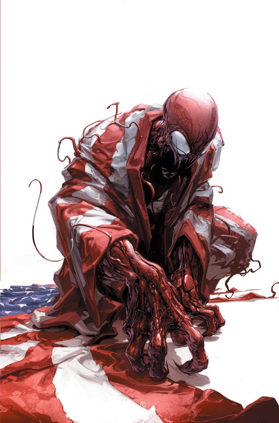 Advance Review: In stores this week!
CARNAGE U.S.A. #1
Writer: Zeb WellsArt: Clayton Crain
Publisher: Marvel Comics
Reviewer: Johnny Destructo
Anyone who knows me (or stalks me on the internet to make disparaging remarks about my personal life) can tell you that I lervs me some horror movies. They're my favorite flavoring of popcorn and I munch that bunch-a-crunch like nobody's business. Now, I know that fanboys give Carnage a hard time, but I've always kind of liked the lil' scamp. He's what Venom could have been if he wasn't so damned popular and Marvel decided to over-saturate the market and try to make Eddie Brock a good guy or...um... *ahem* Lethal Protector". Blergh. I like that Cletus Kasady is a Venom with no conscience, or morality to speak of. The man likes to hurt and kill people for no reason. That's what makes a villain truly scary to me. One that believes in something is scary enough, but one that doesn't believe in anything? Terrifying. He is Marvel's version of Freddy Krueger. He'll make bad jokes for his own benefit while slicing you to meat-strips and I dig him for that.
,br>Last year, Carnage had a self-titled mini-series by the same team of Wells and Crain, and it was ok. Not amazing, but ok. In it, the symbiote was used to help create ...cybernetic limbs...for people? Cletus, despite being ripped in friggin' HALF by the Sentry, is ok now because he has a...cybernetic lower half? It brought back characters from the Maximum Carnage crossover that sucked back in the 90s? Ok, maybe last year's mini wasn't that good in retrospect. But this one has some wicked creepy stuff in it, and I'm digging it so far.
Enter the sleepy lil town of Doverton, Colorado, cause Kasady sure did. Enter it, that is. The town, I mean. And after he entered that town? Shit got REAL, as the kids like to say, with their hippity-hop and their zippy little mopeds. There are other little elements that remind me of films like The Crazies, or Slither, or Invasion Of The Body Snatchers. I really liked the creepy "alien invades small town" vibe and frankly wished they had stuck with that a little longer. Stuff escalated really quickly here and it looks like it's only going to get crazier as it goes, so I would have appreciated a slower, creepier build.
There is some humor in here as well, obviously. If you've been reading Zeb Wells' other book Avenging Spider-Man, you know this boy can do the funny. I never realized how maybe not everyone in the Marvel Universe would LOVE The Thing, with all his Clobbering This and Yancy Street That, but it makes sense that not all heroes have to love each other, and the dialogue here was pretty entertaining.
I've never really been a fan of the overly digital style of Clayton Crain, but I think it's starting to grow on me. He really does a beautiful job on things like the Carnage symbiote and the freckled Kasady, but his costuming really needs some work. The super-heroes in this book look really rushed, especially Wolverine for some reason. It looks like the final Photoshop Layer for Wolvy wasn't clicked on before going to print or something. And HOLY HELL, The Thing looks TERRIBLE. He's just the Sugar Golden Crisp version that they made for the Fantastic Four movies, but covered in squiggles that are supposed to be rocks (I assume). But hey, his symbiote looks great! This was a really creepy start to what I hope is going to be a fun and entertaining 5 issues.
AICN COMICS PODCAST #7
Looks for more of the Holes rambling about comics on Poptards in future AICN COMICS columns!
Proofs, co-edits & common sense provided by Sleazy G
Check out AICN COMICS on Facebook and Comixpedia.org!