| Issue #30 | Release Date: 10/19/11 | Vol.#10 |
(Click title to go directly to the review)
Advance Review: SPACEMAN #1
X-MEN #1 20th Anniversary Edition
BATMAN #2
30 DAYS OF NIGHT #1
FEAR ITSELF #7
MASTERNEVER & THE FLOW OF DEATH Collector’s Preview
Advance Review: FLASHPOINT HC GN
GRANDPA WON’T WAKE UP OGN
Raiders of the Long Box looks at Halloween Horrors!
 Advance Review: In stores today!
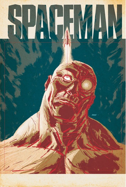
SPACEMAN #1
Writer: Brian AzzarelloArtist: Eduardo Risso
Publisher: DC Vertigo
Reviewer: Optimous Douche
Dibbing an advance for SPACEMAN (ahhh-ahhh...better than the Nightman...ahhh-ahhh...champion of the sun – karate and friendship for everyone). - Douche
I might get kicked out of the @$$hole clubhouse for revealing our double secret dibbing system, but since I never thought I would dib this book based on the preview way back during Free Comic Day, I feel like I need to publish my dib as penance for my lack of faith in the Wonderful Wizard of Azz.
I’ve loved pretty much everything Azzarello has spouted from his glorious brain, so it was with great anticipation I ripped into the Free Comic Day preview of SPACEMAN. I mean, what’s not to love? It’s Azzarello and space - a geek’s orgasmic nirvana. But when I read the preview, there was no space and SPACEMAN, if he was a man, was certainly more Cro-Magnon than Homo Sapien. The book was basically a monkey man who talked funny sailing a barge around what looked like a sunken city. Risso’s pencils were dystopian glory, but god damn if I could figure out what the book was about.
Well, what a difference six months and context can make. I‘m going to stick my neck out here and say that with SPACEMAN Azzarello has created a future imperfect on par with TRANSMETROPOLITAN. Don’t misunderstand me here; SPACEMAN is a different experience than TRANSMET, but just like TRANSMET Azzarello extends our dreams, ambitions and foibles of today and extrapolates them into a not-so-far away future imperfect.
Here’s the deal (and forgive me if I slip into SPACEMAN speak – I am truly taken with the hybrid language of L33T, Texting and colloquial English Azzarello leveraged for this book): in the nearzee morrows, we realize that travelling to the big bitch Mars would turn normal peepzees’ skeletons to puddin’. So, what’s the big bads in Washington’s to do except make better humans. I’ll tell you, this part of the book made me thrilled to see the USA manufacturing stuff again. Sadly, though, the world literally drowns in its own hubris shortly after this program takes off, leaving the world simply struggling to survive on terra-aqua as opposed to reaching for the stars.
Grounded for life, SPACEMAN--or as his tormentors/friends call him, Orson--sets up camp in one of the city buildings that are above water and becomes a garbage scourer. It sounds simple, but the most brilliant ideas often are. What amazed me most about Azzarello’s vision was that even though the world has become a much darker place to live in, where a good living consists of dredging up scrap metal from the now underwater vestiges of civilization, entertainment is still paramount in our lives as is the all mighty dollar…or I guess should say credit.
Even though SPACEMAN’S floor is strewn with garbage in this aquatic shanty town, he is still able to jack into the very progressively thinking version of the future net. Here is where Risso’s art work comes alive as Orson connects nodes from his tomorrow iPad on to his tongue, his brain and other nerve clusters so he can have a few minutes of rapture with a future camwhore.
Azzarello also takes some much deserved pot shots at our star fucker culture and highlights what fuckers stars can be. When we aren’t focused on Orson the book shifts to the beautiful people who I assume live inland since their front doorstep isn’t a river. Two stars that like to adopt babies from underprivileged nations have had a child kidnapped. Two very sassy and cool beat cops are investigating whether the baby heist was a PR stunt or for realzee. This side story collides with SPACEMAN’S as the closing tension of the book. I won’t give away the hows and whys, but it’s good – damn good.
I’m never one to argue with creative genius, but I will argue marketing “genius” any day of the week. I am eternally grateful this book landed in my lap; otherwise I never would have looked twice at SPACEMAN based on the previews at the beginning of the year. And I would have been denying myself. I usually tell people that disagree with my reviews to avoid the books I recommend (I know I shouldn’t have to say it, but I have had to a lot), but I won’t in this case. I think there’s something for everyone in this book and since it’s coming out at the introductory price of $1.00, you really have nothing to lose.
Optimous has successfully blackmailed fellow @$$Hole BottleImp into being his artist on Average Joe. Look for Imp's forced labor on Optimous brain child in mid-2011 from COM.X. Friend Optimous on FaceBook to get Average Joe updates and because ceiling cat says it's the right thing to do.
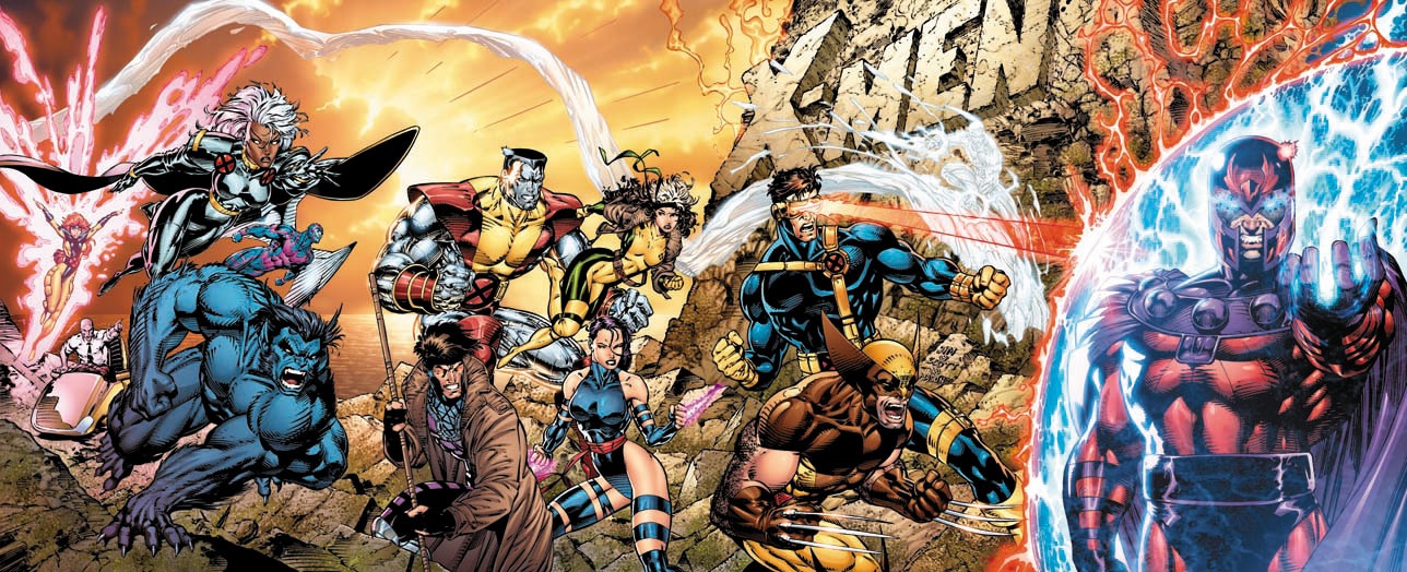
X-MEN #1 20th Anniversary Edition
Writer: Chris ClaremontArt: Jim Lee
Re-Colouring: Tom Mason
Publisher: Marvel Comics
Reviewer: Russ Sheath
A lot has changed in the 20 years since Jim Lee and Chris Claremont broke sales records with X-MEN Issue #1. 8 Million record-breaking sales later and the last 20 years of Jim lee’s career charts many of major highlights of the comic book industry. The birth of Image Comics and the creation of WildStorm, Jim Lee’s own Image imprint, WildStorm's subsequent sale to DC and most recently Lee taking the co-publisher reins of DC Comics and the launch of New DC.
Jim Lee has been on the forefront of the industry, guiding and shaping it, and to mark the 20 years since the launch of the record-breaking X-MEN #1 Marvel have released a 20th anniversary edition of the book that launched Jim Lee into comics mega stardom. Recoloured by Tom Mason and using computer colouring techniques that didn’t exist when published in 1991, the book retains that trademark Jim Lee magic but with a modern take that really propels a 20 year old book into 2011. With re-colouring projects it’s easy for the colourist to go too far into the digital realm, and often the desire to add digital effects or additions overshadows the magic that was present in the original art. In X-MEN 1 Mason skilfully blends the new pallette with Lee’s existing art in a way that not only enhances the original art but the overall storytelling. In a way that we often take for granted with modern computer-coloured books, Mason adds a sense of depth, light and perspective to Lee’s art that really offers a new dimension to the story and to each panel and if you compare the original book and the newly coloured version, I challenge you not to be impressed. Equally impressive is the restraint shown in the recolouring. It would have been easy to add digitally enhanced effects or even new graphics, but the new colouring does nothing more than enhance Lee’s art, because lets face it, its Jim Lee! What could there be to possibly add? A wisp of smoke, a sunset, the crimson glow of the danger room control centre are all given new depth and atmosphere, and it’s the environments that really benefit from this remastering. Essentially this anniversary edition is a re-mastered, updated special edition for the blu-ray generation.
Of course, as with any special edition, the fan boys demand more and in this instance it’s the realization that the one thing missing from the book is a director’s commentary from the team behind the book, Chris Claremont and Jim Lee. With Lee now Publisher at DC Comics we may never see him return to the characters that launched his career into the stratosphere or hear him comment on the magic that came together to make this book, which is a real shame given the book’s place in comic history.
So, should you go out and buy a 20 year old book?
Without a doubt!
As an introduction for new comic fans to the world of the X-Men (even though much has changed in that world over 20 years) there is no better book in my opinion and I hope this sees the start of Marvel ‘remastering’ more of their classic books, maybe as a trade or hardcover of entire runs. Of course, not every artist’s work will hold up to the process and it’s testament to Jim Lee’s art that it holds up so well 20 years later. Jim’s style has, of course, been refined and perfected over the years but the core is still there. Compare JUSTICE LEAGUE to X-MEN and I challenge you to not see how Lee as an artist has grown in ability and skill, but it’s all still there in X-MEN #1. As much as I would like to awaken your sense of nostalgia for a comic 20 years old, more so I urge you to look at this with fresh eyes and as whole new reading experience.
You can follow Russ Sheath's blog Russwords here and on Twitter here.
BATMAN #2
Writer: Scott SnyderArt: Greg Capullo
Publisher: DC Comics
Reviewer: MajinFu
What do you expect from a really good BATMAN comic? In today’s world of multiple Batmen there are so many different versions of the character that it can be hard to put a thumb down on what appeals to a larger audience. Is it the detective work, the sidekicks, the villains, or do readers just like seeing him bash that superstitious and cowardly lot we know as criminals? Fans and new readers have preconceived notions thanks to Batman’s many appearances across different media.
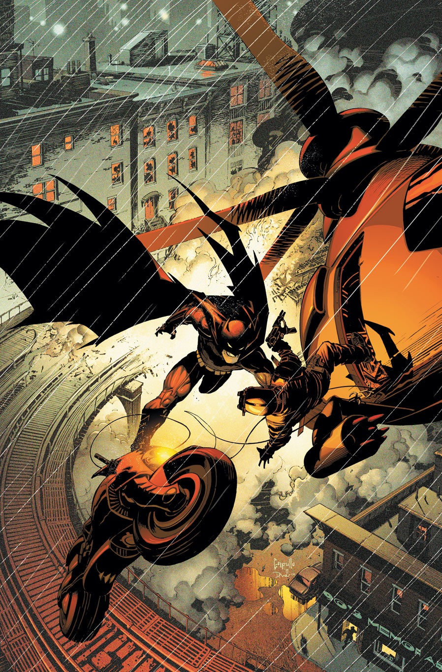
BATMAN #2 plays off of these expectations in a wonderful way that continues to embellish the mythos of Gotham City and the Batman while never losing a sense of momentum or excitement. It’s not the be-all, end-all Batbook some claim it to be, but as a respectable yarn for the mainstream readers looking to get into superhero comics it’s practically perfect.
The issue begins with another lesson in Gotham’s architecture. It may seem like trivia at first, but it plays into the story later in a way that is almost predictable, but is still executed fairly well thanks to the bombastic art. Gotham’s history, both of its people and its buildings, will obviously be coming into play throughout Snyder’s run and this Bat-fan could not be more pleased. The best writers to take a stab at the Batman legend have always left their personal stamp on the character. Hopefully, future readers can latch onto some of the ideas Snyder presents here, as some of them, like the hologram autopsy and the Council of Owls, are very intriguing. It’s always nice to see a writer who can bring a fresh perspective to an old formula, and from the looks of it Snyder has a great deal more crafty ideas in store.
Greg Capullo has a cartoony style immediately distinguishable from the new 52. However, it can also make for difficult reading at times. For one thing, Bruce Wayne and new potential mayor Lincoln March look almost identical, except for their differences in hairstyle. Some of the close-ups were also a bit distracting and drew away from the dialog when they should have been making it more compelling. Besides my nitpicking, Capullo is an asset to this book, using the space on the page to aptly pace the book and create a sinister sense of foreboding throughout the issue.
I’ll be the first to admit the story presented here isn’t exactly original. Batman has been challenged countless times by similar foils. However, if you’re looking for a book that honors the history of Batman while pushing the legend into new creative territory, this book just might have something you’ll like.
30 DAYS OF NIGHT #1
Writer: Steve NilesArt: Sam Keith
Publisher: IDW Publishing
Reviewer: Ambush Bug
Hard to believe that the successful property 30 DAYS OF HIGHT has never been an ongoing series until now. I always thoughts the concept, though high, was a good one. Stripping away all romanticism from the concept of vampires, Niles recreated the modern vampire to be more akin to blood sucking sharks in the snow than anything else. I guess in a time when the market is permeated with twinkling tween dream vamps, its as good a time as any to show the grungier side of vampirism.
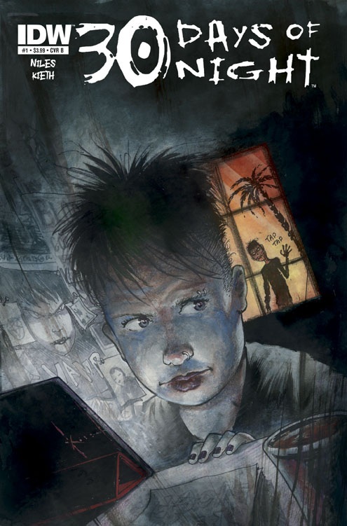
In this first issue, Niles introduces us to Alice Blood, a plucky young punk-slash-female Spider Jerusalem type in search for the truth behind the rumors of vampires. Anyone following the series of miniseries knows that these vampires have been under the radar for ages and don’t like those who want to expose them to the world, setting Alice and the vamps at odds. A decent set-up for an ongoing. The threat of these vamps is already well established from previous minis, but a new motivation seems to be occurring as American vamps attack a foreign council of bloodsuckers. A lot of this issue serves as setup for what looks to be a promising series with the vamps suffering from infighting as well as threats from this reporter. All nice fodder for Niles to explore.
Sam Keith does a pretty fantastic job here with the visuals. His highly stylized approach give an unnatural feel to every page. The scenes of the vampires shine with Keith making the toothy maws the highlight in every panel. Occasionally, though, it appears Keith seems rushed with some pages feeling unfinished. Though some of the pages are hit and miss, there is far more good than bad here. Some of the panels with Alice Blood are gorgeously realized and Keith adds terror by giving this issue a limited and washed out palette, making everything feel as if covered by the shadows of nightfall.
If you’re a fan of vampires or the original 30DON series, Niles and Keith seem to have something that will definitely satiate your thirst. Can’t wait to read more issues in this series.
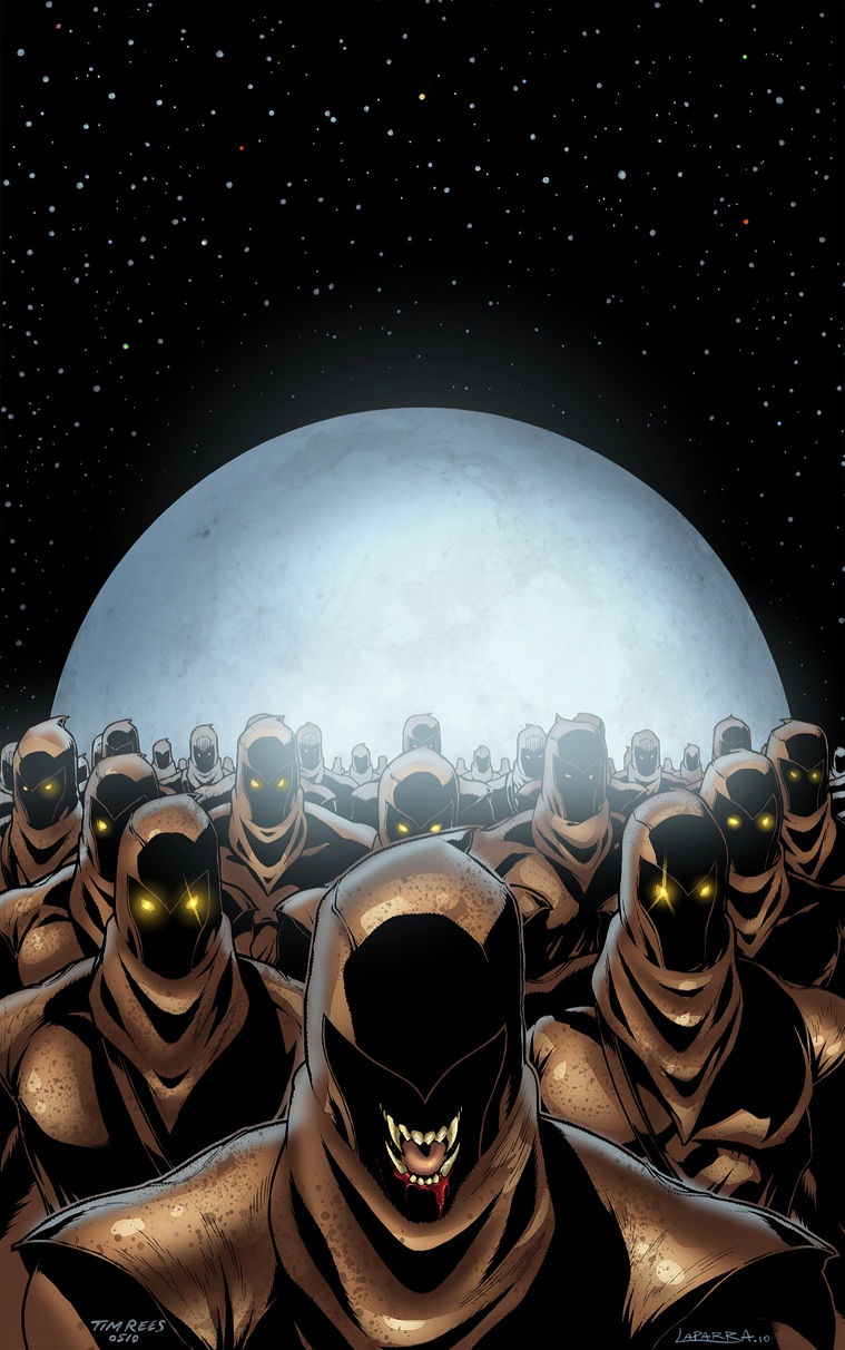 Ambush Bug is Mark L. Miller, original @$$Hole / wordslinger / reviewer / co-editor of AICN Comics for over nine years. Mark is also a regular writer for FAMOUS MONSTERS OF FILMLAND and will be releasing FAMOUS MONSTERS first ever comic book miniseries LUNA in October (co-written by Martin Fisher with art by Tim Rees) You can pre-order it here! Support a Bug by checking out his comics (click on the covers to purchase)!




THE DEATHSPORT GAMES’ Facebook Page
FAMOUS MONSTERS PRESENTS LUNA: ORDER OF THE WEREWOLF’s Facebook Page
FEAR ITSELF #7
Writer: Matt FractionArtist: Stuart Immonen
Publisher: Marvel Comics
Reviewed by Matt Adler
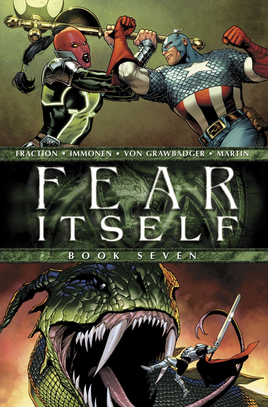
I haven't read the first 6 issues of FEAR ITSELF. So why am I reviewing the 7th, and final issue? Well, inspired by Jim Shooter's recent comic reviews, I want to examine it from the "every issue is someone's first" perspective. We all know that sales are down from past events; FEAR ITSELF just isn't drawing the readers that events like this used to. Is it accessible enough? Can someone who hasn't been immersed in recent Marvel continuity pick it up and be engaged right away? Let's find out.
The first two pages have Captain America blasting away with automatic weapons. That isn't the Captain America I know; that seems more like USAgent, perhaps. Cap does get a couple of good moments, particularly when he's shown wielding Thor's hammer (Cap has previously been shown to be one of the few mortals worthy of lifting it). Sin, the daughter of the Red Skull, is involved in the action, but she really seems like window-dressing, superfluous to the story. You could take her completely out of this issue and not miss her at all. I suppose she's there to give Captain America some connection to the story, but it doesn't really work; it still comes across strictly as a Thor/Asgard story, much like SIEGE.
Tony Stark brings back magical weapons from Asgard to arm the heroes against the big bad, and they get new costumes in the process. This also comes across as unnecessary and forced; it almost screams "We need new action figures! Asgardian battle mode armor for all the heroes!" Wolverine with all the random spikes and Spider-Man wielding blades look particularly ridiculous. I'll admit Tony's new armor looks pretty bad-ass, though. The big bad is known as "The Serpent", who is apparently Odin's long lost brother out for revenge. Throughout the issue, it's hinted that he has some relationship to the Midgard Serpent whom we've seen in Marvel Comics before, but the connection is never explained.
Thor's dialogue throughout the battle is pretty perfunctory, seemingly drawn out of a random Thor phrasebook, but it beats some of the more cringe-inducing lines from the other characters. This very much feels like Fraction doing his Bendis impersonation, with Spider-Man interjecting little asides under his breath, Black Widow shouting "Who's next? Who's next?" and coming from Iron Fist, "I'm sorry, I don't speak giant skank." Odin especially feels out of character. He's never had as much of an attachment to Earth as Thor, but with lines like "Today, we raze Midgard!" and "To Midgard and to slaughter!" he comes across as a mindless savage, rather than the regal, wise ruler we’ve seen to date.
I won't spoil the end except to say that it's a bit anti-climactic; after all that world-shattering business, we get the usual scene of Cap saying "We'll rebuild." Of course they will. The story is followed by teasers for several new series, which unfortunately often feels like the sole purpose of these events. The Mark Bagley/Andy Lanning art on THE FEARLESS teaser is very good I must say; they make a good team. Aaron's INCREDIBLE HULK #1 teaser is interesting, but it still feels like been there, done that. The BATTLE SCARS teaser is completely ineffective in that it gives no clue as to what the series is about or why we would be interested in checking it out. The DEFENDERS teaser is... well, it's The Defenders. You already know if you're interested in it or not, and past history doesn't suggest a long future for it, but who knows.
Overall, I can't say I'm surprised that people seem to be losing interest in these events. In planning these out, Marvel seems to be forgetting to give us a real reason to care about these characters and what happens in their lives. It really just comes down to one big conflagration after another, and ultimately, if you're not invested in the character's lives, if you don't see them as real people whose lives are affected by the turmoil, what does it even matter?
Matt Adler is a writer/journalist, currently writing for AICN among other outlets. He’s been reading comics for 20 years, writing about them for 7, and spends way, way, too much time thinking about them, which means he really has no choice but to figure out how to make a living out of them. He welcomes all feedback.

MASTERNEVER & THE FLOW OF DEATH Collector’s Preview
Writer: Nigel ClarkeArt: Various
Publisher: Gotham Zoetrope
Reviewer: MajinFu
Kung-fu comics are sadly a rare breed in the world of sequential imagery. Sure, we got our Shang Chis and our Iron Fists but where are the classic chopsocky books of yesteryear? Nigel Clarke obviously felt the same way, so he set out to make a book to satisfy those looking for a little more high kick in their comics.
The most interesting part about the book is the lack of dialogue or word captions. Instead, you’ll have to check out the audio links at masternever.com to listen to the story unfold. Some of the cues and descriptions don’t match up with the pages, which is awkward, but it brings a lot of life to the book. The pacing is also a little slow, as descriptions and the writing structure slow down the reading, sometimes to a crawl. Besides that the sound design is perfect, moving from softer Chinese string music to hardened hip-hop beats as the story shifts from one time period to another. The descriptions are apt and there are plenty of background sounds for atmosphere like rain and traffic. Also, and perhaps more importantly, the sounds for the fight scenes are spot-on, giving the art a nice companion.
Which brings me to the art; for this project, Clarke enlists several artists, each one only illustrating a page or two. The result is a book with a scattered visual style that works okay, even if the storytelling techniques are pretty lacking. There are a few nice touches, like the drawing of a girl in Chinatown and a few of the action scenes are staged nicely, but it’s still a lackluster presentation of what is otherwise an easy read. However, the black and white inks do give the book a vintage feel that is well-suited to the book, even when some of the inks look a bit rushed or unfinished.
It’s a bit formulaic, and there’s not much here than a hint of what’s to come, but I was still reasonably entertained by this book. It’s got an amateur appeal new creators will find inspiring and the soundtrack companion on the comic’s website really gives it a leg-up. For what it’s trying to accomplish, this book does okay and I recommend this to anyone who has a taste for martial arts stories. The art could still use a lot of work, and the story honestly leaves a lot to be desired, but it does my heart good to see someone setting out to tell the story they want to tell, how they know it should be told. Unlike many mainstream books, this comic is bleeding passion from its pages, which easily sets it apart from the pack. There is a free preview on the previously mentioned website, so check it out!
 Advance Review: In stores today!
FLASHPOINT HC GN
Writer: Geoff JohnsArtist: Andy Kubert
Publisher: DC Comics
Reviewer: Optimous Douche
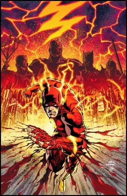
Reading this hard cover of FLASHPOINT, the event to end all events in the DC Universe, I had a grand epiphany. DC offered two ways to imbibe this view of DC during end days and I have a belief based on vast message board research that fan reaction directly correlated to how far down the rabbit hole you decided to fall.
Some merely read the main five FLASHPOINT issues compiled in this hardcover. They have my pity, because while as accomplished as the main story was, it merely scratched the surface of the rich tapestry that was woven with the one-shot and three issue miniseries that created the larger FLASHPOINT universe.
FLASHPOINT was chock full o’ fun, dystopian and in most cases despondent versions of our favorite DC characters. Wonder Woman and Aquaman battling for world control, Thomas Wayne as the Batman after his son Bruce was killed in crime alley, Cyborg as America’s greatest hero (this one still makes me chuckle a little--I guess any port in a storm, but has anyone ever heard of an electromagnetic pulse?), Superman as a kept man inside a bunker in Metropolis. And of course we can’t forget The Flash as our compass of normalcy in this grand adventure, but let’s be honest the most interesting parts of Flash have always been the constellation of characters that surround him. So don’t get me wrong, FLASHPOINT proper is great comic booking, but it is also a massage without the happy ending. You get the what, but miss this why. For those with limited times and budgets I don’t fault you; for everyone else you are doing yourself a disservice by not buying the miniseries that took the deep dive into the concepts that titillated you during FLASHPOINT.
It took this read through to have this grand revelation because I bought 90% of the side stories. Were I a casual reader, I would probably wonder why Wonder Woman and Aquaman were so @$$ed up at one another. Sure you can just go with it in FLASHPOINT proper since this is primarily Barry’s story as he tries to reestablish the correct reality, but knowing the why makes the impact of the fights and conflicts so so so much better.
After reading the hardcover, I also now know why those that only read FLASHPOINT proper said they felt only the last few pages of book five “mattered” when the Flash created the divergent timeline that is the New 52. I don’t fault these folks; were I to only read those five issues I would probably feel the same. You were looking to the destination instead of enjoying the scenery during the ride, and the scenery does go whizzing by in the five main issues of FLASHPOINT.
For those that have trade waited for FLASHPOINT, have avoided all coverage of FLASHPOINT and live without an internet connection (basically my grandmother), here’s the deal in a nutshell: FLASHPOINT is really about the Flash, despite all of the other goings on that seemed to steal the thunder from the main story. I won’t spoil why FLASHPOINT happened; just know that the Reverse Flash created this alternate reality to untether his existence from the Flash. It’s the sort of paradox fakey science we love as comic geeks. In typical Butterfly Effect fashion the event Reverse Flash changed also changed the rest of the world in domino style. As I mentioned before, Aquaman and Wonder Woman are at war after their political marriage is marred by assassination; this separation throws both of their races into a global conflict that causes the Amazons to make the United Kingdom their home and technically the Atlanteans make the rest of Europe their new home by drowning it. While this is the conflict to introduce us to the cavalcade of alternate versions of the Shazams, the Secret Seven and new characters like The Outsider, Barry Allen (the lone person to remember the world that was) truly tethers himself to Thomas Wayne as they try to correct things back to the reality that was. While it takes the Flash awhile to convince Thomas, the depression of the reality and the hope for a reality where his son might have lived makes Thomas come along for the ride without much fight.
For me, the interactions between Barry and Bruce are where the book truly sings. The scenes where Barry tries to get his Flash powers by torturing himself…I mean, recreating the experiment that gave him his powers--were where Kubert’s art truly came alive. Also, at the end of the tale, when reality resets itself and Barry plays transdimensional messenger to bring Bruce Wayne a letter from the Father he never got to know. This moment was truly the ground floor of the New 52 as well. Since FINAL CRISIS Batman has been an entity, an enigma shrouded in symbolism and high ideals, not a man. With one tear from his eye, I knew that we would be getting Bruce back as well as The Batman.
I’m really hoping that the upcoming MULTIVERSITY (I say upcoming even though it has been promised for years--I’m starting to finally hear some real tangible chatter) treats FLASHPOINT as one of the possible 52 alternate earths. Part of the supplemental material in the back of the hardcover, aside from art sketches and alternate covers, was a map of the FLASHPOINT world dividing the lines of territory control. There’s some cool stuff on that map that I know wasn’t covered in FLASHPOINT and I’m pretty sure none of the minis that supplemented the main tale.
For now FLASHPOINT is over, and even though inconsequential to the new canon, so were books like ARMAGEDDON 2001, which I covet to this day. A good story is sometimes simply a good story and FLASHPOINT was a damn good one.

GRANDPA WON’T WAKE UP OGN
Writer: simon max hillArtist: Shannon Wheeler
Publisher: BOOM! Studios
Reviewer: Lyzard
You know the phrase “don’t judge a book by its cover?” That idiom is perfect for the book GRANDPA WON’T WAKE UP. The back of the book features an “about the author” segment where writer simon max hill admits to writing GRANDPA WON’T WAKE UP “for people who keep a children’s book on their coffee table in case of emergency.” That, along with the rest of the bio for both simon max hill and artist Shannon Wheeler, gives a clear sense of the style of humor one will interact with when reading GRANDPA WON’T WAKE UP.
Though approximately forty pages long, GRANDPA WON’T WAKE UP takes less than five minutes to go through. It is designed as a children’s picture book. However, its dark, morbid content reminds me of Edward Gorey’s work such as THE GASHLYCRUMB TINIES: OR, AFTER THE OUTING. Yet the artwork is not gothic. In that way GRANDPA WON’T WAKE UP will remind readers of the comic strip THE PERRY BIBLE FELLOWSHIP. The drawings are bright, colorful, fun… and morbid.
The plot to GRANDPA WON’T WAKE UP is incredibly simple. One morning, two children come to wake up their grandfather. But no matter what they do, whether it is making loud noises or adorning the geriatric “somnambulist” in Nazi paraphernalia, they can’t seem to wake up their grandfather. At first their methods to awaken him are ordinary, but as the book continues their devices grow increasingly bizarre.
The rhyming writing is incredibly simple with nearly half of the story being the same repeated line “but Grandpa won’t wake up.” It is the absurdity of the other portion of the writing that creates the humor in this story. From hanging Grandpa from a tree, to attempting to summon an Elder God to wake him up, simon max hill provides plenty of scenarios to spark Shannon Wheeler’s imagination.
GRANDPA WON’T WAKE UP’s creators are two men with a sense of humor some would describe as sick, twisted, and off the wall. After reading their book, I can’t say I’d disagree. As for the purpose that simon max hill had for writing GRANDPA WON’T WAKE UP, well, let me just say I feel sorry for anyone that in case of “emergency” hands this book off the coffee table to any kid. How would you like to have to explain Nazis, occultism, and death all in one night?
Lyzard is actually Lyz Reblin, a senior screenwriting major with an English minor at Chapman University. Along with writing for AICN, she has been published twice on the subject of vampire films.
Every comic shop has them…battered long boxes jam-packed with dog-eared titles ranging from forgotten heroes of the 1970s to multiple copies of chromium-covered “collector’s item” comics from the Big Bust of the 1990s. But if you are patient, and dig deep enough, you just may find something special…
BottleImp here. Halloween is here once again, so that must mean it’s time for your old pal BottleImp to dust off some of the dry old bones I’ve dug up from the catacombs of the comic shops. But this year, boys and ghouls, I’m in the mood for something a little lighter…something a touch less dreadful and disturbing and a touch more delightfully demented. So let’s look at some frightfully fun comics that’ll make for devilishly good reading, shall we?
 CLIVE BARKER: THE YATTERING AND JACK OGN (1993)
Eclipse Graphic Novels
Clive Barker is a name that has become synonymous with a very specific subgenre of the larger horror field; his works usually feature graphic violence and gore mixed with sado-masochistic imagery and often bizarre sexual subtext. Thanks in large to “Hellraiser,” Barker has become the king of the S&M horror yarn. So what a pleasant surprise it was to discover a used copy of this comic book adaptation of YATTERING, a story that showcases a side of Clive Barker that is rarely seen in the majority of his fiction: a sense of humor. The titular duo consists of a minor demon (the Yattering) and a human (Jack Polo) whom the Yattering is commanded to torment into madness and despair. Trouble is, no matter what the Yattering does to his victim (from minor annoyances like preventing Jack from turning the key in his front door lock to more insidious deeds such as killing Jack’s cats), Jack remains utterly indifferent to his oppressor. The Yattering is the one driven to the brink of insanity, and in his desperation for success the demon escalates his tricks to more and more dangerous levels. This story had been previously (and rather poorly) adapted for the 1980s television series “Tales From the Darkside,” but Barker gets the star treatment with this graphic novel. Steve Niles adapts the original prose nicely to fit the medium, while still keeping Barker’s distinct tone intact, while John Bolton provides beautifully painted pages that capture both the otherworldliness of the demonic entities and the down-to-earth absurdities of Jack’s blasé reaction to it all. This graphic novel also includes a second Barker adaptation by Niles, Fred Burke and artist Hector Gomez, “How Spoilers Bleed.” None of the rare Barker humor to be seen in this grim story of natives of the Amazon taking revenge on the white men who are tearing down the rainforests in the name of profit. It’s a well-done comic, but the theme is nothing new to the horror field, whereas the title story’s blend of horror and humor is much more memorable.
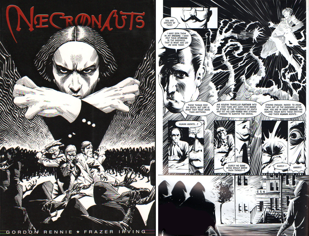 NECRONAUTS TPB (2003)
2000 AD, Rebellion
Even with the magic of modern technology, it’s quite difficult to find out about comic books in other parts of the world unless you know what you’re looking for. Luckily my local comic shop recently scored some previously owned books from the other side of the pond, and nestled in between copies of JUDGE DREDD I found NECRONAUTS. Originally published in serial format in 2000 AD, this book follows the adventures of escape artist Harry Houdini, weird fiction writer H.P. Lovecraft, author and spiritualist Sir Arthur Conan Doyle and chronicler of the mysterious Charles Fort as they attempt to save the world from the terrifying monstrosities that lie beyond the living world and beneath the spiritual plane. There’s definitely a little bit of a LEAGUE OF EXTRAORDINARY GENTLEMEN vibe going on here (though the obvious difference is that the NECRONAUTS cast is comprised of actual historic persons rather than literary creations), but writer Gordon Rennie’s story is much more straightforward than LOEG, a slam-bang mix of adventure and horror that captures more of the “Raiders of the Lost Ark” kind of feeling. The thing about this book that really caught my eye (aside from the inclusion of one of my favorite horror writers as a cast member) was the incredible black and white artwork by Frazer Irving. Irving works in a mix of inking styles that evoke the feeling of pulp magazine illustrations of the time in which the book is set; there are some meticulously rendered pages that look like pure Virgil Finlay and others that bring to mind the looser brush and pen work of Joseph Clement Coll. At other times Irving’s lush brushwork reminds me of the best horror work of Bernie Wrightson, while still other pages have the stark, deceptively simple quality of Frank Miller’s early SIN CITY comics. All these influences and homages meld perfectly into a gorgeous book that is as much fun to simply look at as it is to read. Those of you here in the States who are fans of black and white books and probably didn’t know that NECRONAUTS existed would do well to try to get a copy from those lucky Brits.
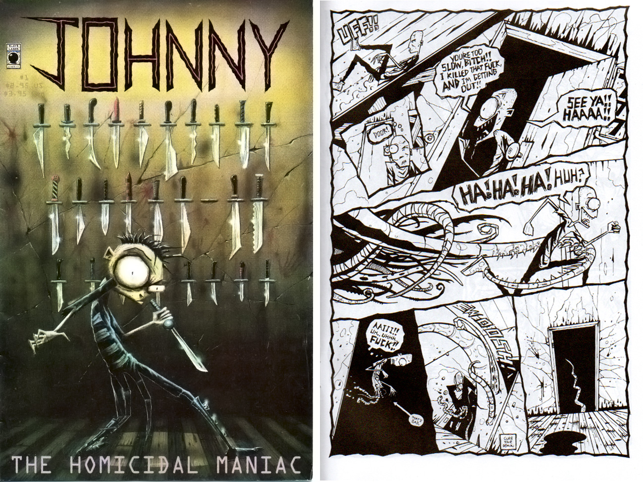 JOHNNY THE HOMICIDAL MANIAC #1-7 (1998)
Slave Labor Graphics
Goofy? Quite often. Over-the-top cartoonish (and not-so-cartoonish) violence? Yep. Full of diarrhea jokes? Unquestionably. JOHNNY THE HOMICIDAL MANIAC, the brainchild of Jhonen Vasquez, is all of these and more. This comic is a fascinating study in contradictions. Full of quasi-pretentious musings on existence and the futility of life while enjoying a good poop joke, embracing the black-clad Goth counterculture whilst simultaneously giving Goths a virtual wedgie, dripping with horrific acts of violence rendered in a bouncy, joyous manner—JTHM ends up being a ridiculously fun guilty pleasure. The series has violent mood swings between satire and pathos, but always seems to leave me smiling even when each issue ends with a portrait of despair. And all absurdities aside, Vasquez’s distinctive black and white style really manages to capture moods of pure horror when he wants to. Issue #5 in particular features a tentacled abomination that would feel right at home plopped in the middle of any Lovecraft story. Of course, even in the midst of such shiver-inducing terror, there are the essential poop jokes. The best thing about this series? Since Slave Labor went through about eleventy-million printings to stock the shelves of every Hot Topic in America, these comics pop up in bargain boxes across the country with almost frightening regularity.
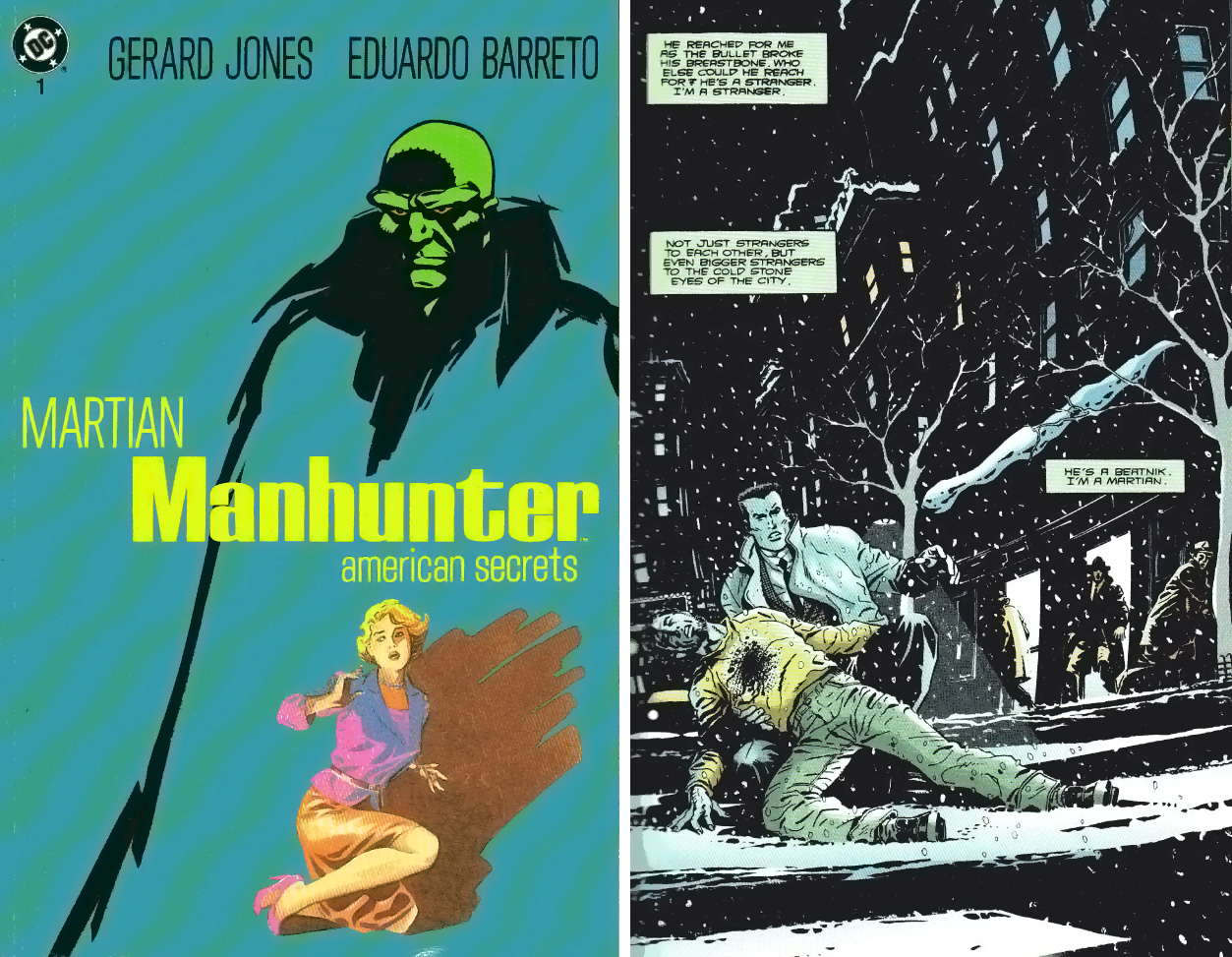 MARTIAN MANHUNTER: AMERICAN SECRETS #1-3 (1992)
DC Comics
It doesn’t always work, but sometimes a traditional superhero gets put into a horror-movie situation and the end result is something really intriguing. Such is the case with this three-issue “prestige format” miniseries, which finds J’onn J’onnz, the Manhunter from Mars, pitted against a conspiracy involving Communism, Beatniks, lizard-headed shape-changers, and the music industry. Set in the 1950s (when J’onnz was still new to Earth), AMERICAN SECRETS puts a dark spin on the post-WWII years, as the Martian is drawn into a mystery that seems to indicate sinister hands are involved in shaping the new American way of life. Writer Gerard Jones puts his knowledge of this era to good use as he uses the flipped coin of Pleasant Valley suburbia and the Beat Poetry counterculture to create a feeling of unease and tension between the bright, happy world seen on television and the dark underbelly, both rendered brilliantly by Eduardo Barreto--one of the medium’s most underrated artists, in my opinion. Barreto draws the lizard-men as convincingly as he does the thinly-veiled stand-ins for Elvis Presley and William M. Gaines, all in a manner which evokes both the brightly-lit suburbs and the smoky noir coffeeshops of the 1950s. AMERICAN SECRETS is a little bit “Invasion of the Body Snatchers” with a dash of David Lynch thrown in for good measure, and well worth picking up should you happen upon it.
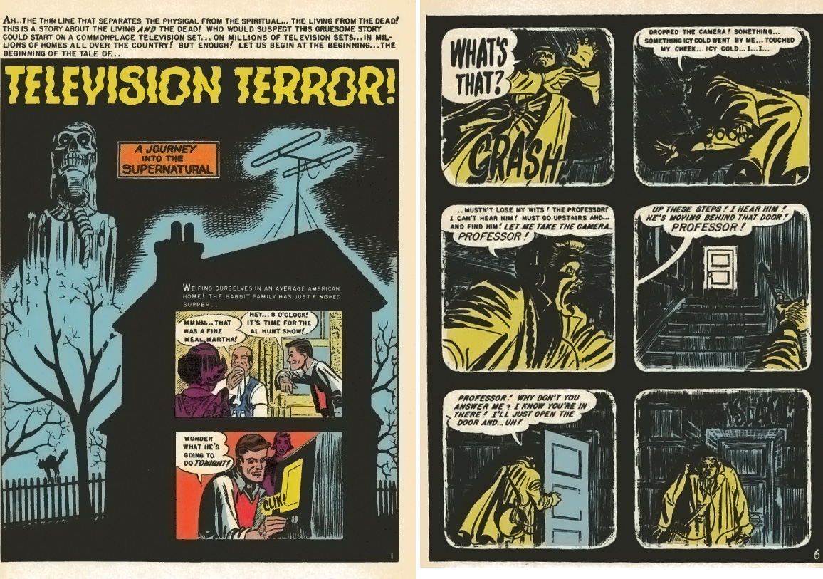 Finally, I’d like to wrap up this year’s Halloween round-up by showing how truly groundbreaking and ahead of the game the folks at EC Comics were back when they created the medium of horror comics. The “found footage” style of horror movie that was so popularized by “The Blair Witch Project” has been in resurgence lately, whether you look at films released direct-to-video or in the theaters (as I write this, “Paranormal Activity 3” is number one at the box office with a weekend take of over $50 million). But for those of you who think that this shaky-cam style of movie-making is a relatively new conceit, I would point you towards the story “Television Terror!” which first appeared in HAUNT OF FEAR #17 in 1950 (or for those of you who would rather not shell out beaucoup bucks to read it, you’ll find the same story in the Russ Cochran reprint edition HAUNT OF FEAR #3, from 1994—a lot easier to find in the bargain boxes). This issue is from the early period in EC horror, before the introduction of the Crypt-Keeper, Vault-Keeper and the Old Witch, and before the comics became more over-the-top in their depictions of blood and gore and tongue-in-cheek in execution. In this tale, the reader watches the relatively new medium of television along with the average American family, as TV personality Al Hunt explores a real haunted house, capturing the experience on his state-of-the-art mobile television camera. Sound familiar? Just as in the aforementioned movies, the viewer (reader) is limited to seeing only what the camera sees, and just as in the films, the viewer (reader) is only shown suggestions of the horror rather than a full-on look at the spectacle. The similarities in mood created by the movies and this brief, seven-page story are uncanny, with a tightly-written script by Bill Gaines and Al Feldstein and the expert panel compositions by Harvey Kurtzman giving the same dread-inducing punch as the best Hollywood movie. Sixty years later, and EC is STILL the groundbreaker in horror—even if it is in a whole ‘nother medium.
That’s it for this year, kiddies—happy hunting and pleasant screams!
When released from his bottle, the Imp transforms into Stephen Andrade, an artist/illustrator/pirate monkey painter from New England. He's currently hard at work interpreting fellow @$$Hole Optimous Douche's brainwaves and transforming them into pretty pictures on AVERAGE JOE, an original graphic novel to be published by Com.x. You can see some of his artwork here.
Proofs, co-edits & common sense provided by Sleazy G
Check out AICN COMICS on Facebook and Comixpedia.org!
