
| Issue #29 | Release Date: 10/19/11 | Vol.#10 |
(Click title to go directly to the review)
Advance Review: SPACEMAN #1
DEADPOOL MAX II #1
DAMMIT, I SWALLOWED ANOTHER ONE! OGN
JUSTICE LEAGUE #2
Advance Review: THE VAULT #3
UNCANNY X-MEN #544
GODZILLA: GANGSTERS & GOLIATHS #5
Advance Review: INCREDIBLE HULK #1
AICN COMICS’ John Ary Comics Podcast!< /a>
 Advance Review: In stores today!
SPACEMAN #1
Writer: Brian AzzarelloArtist: Eduardo Risso
Publisher: DC Vertigo
Reviewer: Johnny Destructo
And here I thought 100 BULLETS was a chore to read! Oopha. Don't get me wrong, 100 BULLETS was brilliant and a WHOLE lot of fun, but Azzarello does have a certain style of word-play that works great sometimes but doesn't work so well for everything (BATMAN: BROKEN CITY, anyone?). In SPACEMAN, his newest work with other 100 BULLETS alums Risso and Johnson, he has come up with a form of verbal short-hand for his characters to use that takes some getting used to. And why NOT? It's a bright, shiny, glorious future, minus all the bright shining and the gloriousness, so of course we as Americans have mangled up our language something fierce. It seems to be following the logical progression of our speech evolution (or devolution, depending on your view).
It's interesting to me that Azzarello's fictional future follows a sort of pattern. NASA has gone down the evolutionary ladder to create a man-ape that can weaher the harsh environments of space, and the language of this same future utilizes a speech pattern that comes across sounding more like caveman speak. There seems to be a theme of delving into the past in order to affect the future.
At any rate, as with any Azzarello offering, there is a certain bit of word play that comes ingrained in the work. During a conversation Orson has with a hooker, when he gets a little too chatty, she asks if this session is going to be sexy times or talky times. He says "It's a make me feel better time", to which she replies "and who FEELS you better than me?" This is one of Azzarello's signature moves. Much like many pencilers that I can recognize by the linework, you could probably hand me any Azz works without revealing who wrote it, and I would still be able to tell from all the clever word-play.
Risso is one of those artists as well. He has a signature style that is unmistakable and he just draws the hell out of every book he does. This is no exception--so much so that after reading it, I immediately went back to eye-hump the artwork panel by panel.
This is an insanely original world that Azzarello and Risso have created and I can't wait for the next one. If you are worried that you'll be signing up for another 100 issues, per 100 BULLETS, have no fear--this is only a 9 issue maxi-series. Oh, and this first issue is only $1. Just buy it already!
PS. Does anyone else immediately see the word "Spaceman" and hear Tracey Jordan from “30 Rock” pronouncing it "Spa-che-men"? No? Just me? Ok.
JD can be found hosting the PopTards Podcast, drawing a weekly webcomic, discussing movies, comics and other flimflam over at www.poptardsgo.com, graphically designing/illustrating for a living, and Booking his Face off over here. Follow his twitter @poptardsgo. His talkback name is PopTard_JD.
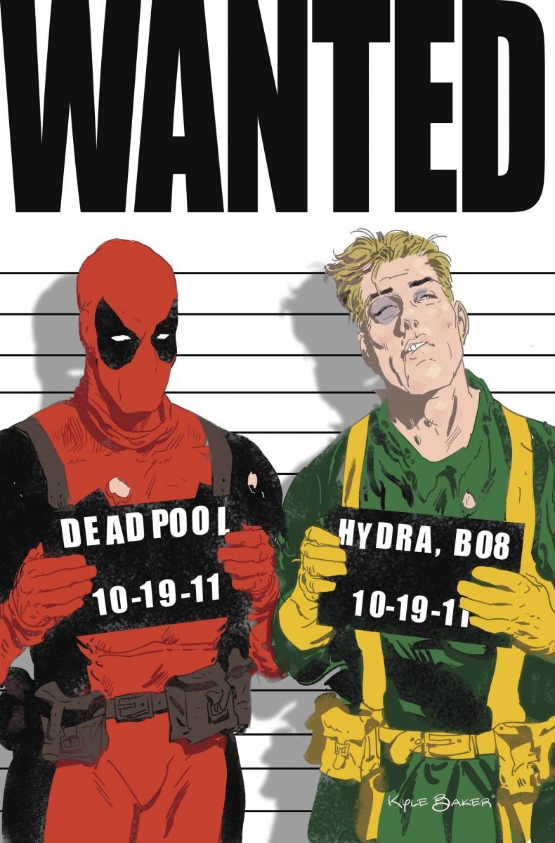
DEADPOOL MAX II #1
Writer: John LaymanArt: Kyle Baker
Publisher: Marvel Comics
Reviewer: MajinFu
Since the debut of DEADPOOL MAX last year, the glut of extraneous Deadpool comics has drifted away like leaves to the wind. Luckily for readers, one of the only titles remaining which prominently features the character (besides the excellent UNCANNY X-FORCE, of course) is DEADPOOL MAX. Released a mere three weeks after the last issue and continuing almost exactly where the last series left off, Deadpool and his partner (formerly known as Hydra Bob) are now on the run from the government while continuing their quest to behead the illusive Hydra organization.
As the new “#1” indicates, this is a fresh jumping on point for new readers. If you haven’t been keeping up with the series so far, the characters lay everything out pretty clearly in the first few pages of the book. Really, it’s a simple story that is only complicated by the fragile psyches of the two leads, so you should have no trouble catching up if you’re a newbie. John Layman keeps the dialogue refreshingly simple, especially in the first few pages, by having the two leads investigate using a single word: “Hydra.” It’s goofy and repetitive but it somehow worked for me. The best part of the book is definitely the church scene, featuring a preacher sporting a monkey on his shoulder, spouting a story he claims is “privileged information.” This of course leads into a hostage situation thanks to Lady Taskmaster and her Hydra boys, and did I mention there’s a monkey?
The first two--no, four—no, six pages of this comic are depraved, maybe even a little crazy, yet they perfectly encapsulate the themes and tone of this book. Artist Kyle Baker manages to capture the absurdist quality of his leads while utilizing a variety of styles when necessary, from photo cut-outs to the many quizzical expressions of the people in the church scene. This book simply would not rock as hard without him bringing Layman’s hilarious script to life.
But I do have one little problem with this book. At twenty pages in length, separated by several redundant and tiresome advertisements, this book is simply not worth four bucks. It was a fairly entertaining read with quite a few laugh-out-loud moments but not enough to justify the extra dollar. Hell, if this were three dollars I’d be heartily recommending it to kids on the street with a clear conscience. As it is currently priced I cannot recommend it to anyone but the financially sound. I’m sick of overpriced comics and I’m not going to support the practice, even when it’s used on a well-executed book like DEADPOOL MAX. So thanks for the laughs DP (via Layman), but as long as you’re asking me to blow more money than I have to spend I’m done with you.
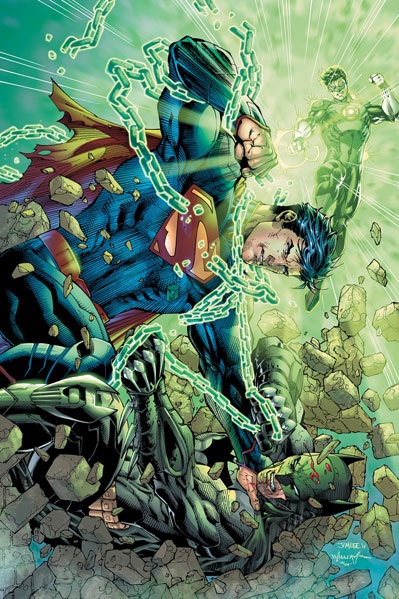
JUSTICE LEAGUE #2
Writer: Geoff JohnsArt: Jim Lee
Publisher: DC Comics
Reviewer: The Writing Rambler
DC’s New 52 Flagship book returns with its second issue in JUSTICE LEAGUE #2, and despite my own headaches with the continuity in the book (more on that in a few) it’s still a decent follow up to DC’s main launch title.
Geoff Johns balances this issue really well in several areas. He keeps it action-packed and story driven but also finds the time to properly interweave Flash’s (Barry Allen) “introduction”, as well as furthering Cyborg’s origin story. There’s something really enjoyable about watching these characters come together in an environment where superheroes are not embraced and are still mostly viewed as costumed vigilantes. The story is only exemplified by the beautiful work of Jim Lee. I for one like the new look of Superman in particular and feel like he exemplifies power a hundred times more now than he did in the past (looking forward to the flaming arrows from some of you for that one). Lee’s artwork reminds you that at any moment Superman could probably kill everyone on the page if he really needed to and I think that fact has been glossed over with Superman’s character for too long in lieu of always making him more of a boy scout with powers (side note: this fact has always caused arguments I’ve often had with friends because Superman’s character depiction has always led me to take Batman’s side in a fight, even though logically Superman should clearly win, hands down. So thanks Jim Lee for making my side of this argument harder to defend…damn you, sir, damn you).
My one big problem with this book is really a problem with the whole New 52 in general. This is supposed to be the main book in the New 52 and yet when I read it I feel like it’s taking place in an entirely different world than any other of the 51 choices I was given last month. I get that it’s set 5 years in the past, and I have no problem enjoying the buildup of how the characters will get caught up to their modern day counterparts, but it just really feels removed from everything else in the DCU right now.
In talking with other fans about The New 52 in general, it was funny how many of us when discussing our favorite books had forgotten that Justice League was part of it. Kind of a weird sign when your biggest book is not the most discussed (despite it being in its 4th printing at the moment). Couple that with the fact that other books involving Batman, Superman, Green Lantern etc. are taking place either in the past or the present (which would be the future in respect to the JUSTICE LEAGUE timeframe) and you create a pretty tricky timeline for all the new fans this reboot is supposed to be bringing in. Despite all of my feelings that the company has too many different timelines happening at once, JUSTICE LEAGUE on its own is a good book and hopefully in time these continuity issues (and there are A LOT of them) will get ironed out as the series progresses.

DAMMIT! I SWALLOWED ANOTHER ONE! OGN
Written and Illustrated by Kit LivelyPublisher: BearManor Media
Reviewer: superhero
There are some things in life that are just hysterically wrong. They shouldn't exist but they do and they still make you laugh. When you see something that can be classified like this you have to wonder, is there something inherently off about me? Is there something that is wrong with me, that I find stuff like this so incredibly funny?
That's the feeling I had when reading this collection of Kit Lively's cartoons. There is so much funny material in here that shouldn't make me laugh. There’s stuff in here that I should see as a little bit weird. But I don't think it's weird. I think it's brilliant and funny with a capital "F".
The truth of the matter is that, yes, I do think some of the cartooning in here is a bit off the rails but it doesn't keep it from being humorous. Oh, who am I kidding? Kit Lively's cartoons made me laugh out loud more than once and if that makes me a demented freak then so be it! I mean, c'mon, there's a cartoon in here about The Cookie Monster trying to sneak a woman a date rape drug in one of his cookies. C'mon! That's comedy gold! And that’s just the beginning of the madness contained in this book.
The cartoons in DAMMIT! I SWALLOWED ANOTHER ONE! are fantastic. While I don't think that Lively's drawing skills are particularly the best I've seen, I have to say that he gets his point across in spades. His limited drawing skills don't keep him from being funny. Damn funny. Which is the most important thing in a collection of humor cartoons, after all. And, let's face it, limited drawing skills never stopped any other cartoonist from being fantastically successful, so why should it stop Lively?
The closest thing I can compare Kit Lively’s stuff to is The Far Side. But this is a Far Side with a slightly more naughty and provocative edge. I’d call it The Far Side’s Dark Side. These comics were not meant to be seen in the daily newspaper and because they are freed from the restraints of said periodicals they are able to touch on subject matter that Gary’s Larson’s strip was never able to address. As far as I’ve always been concerned Larson was a genius but it’s good to know that in Kit Lively I’ve found Larson’s somewhat more incendiary twin. If Larson is Bill Cosby then Lively is Richard Pryor. They seem to me to be two different sides of the same coin. If you were a fan of The Far Side but can take that sort of material with a bit of bite then I’d highly recommend DAMMIT! I SWALLOWED ANOTHER ONE!
Discovered as a babe in an abandoned comic book storage box and bitten by a radioactive comic fan when he was a teenager, superhero is actually not-so mild mannered sometime designer & cartoonist, Kristian Horn of Los Angeles, California. Some of his work can be seen at www.kristianhorn.com and check out his blog at www.parttimefanboy.com. You can check also out his webcomic at www.babybadass.com, which is currently in development.
 Advance Review: In stores today!
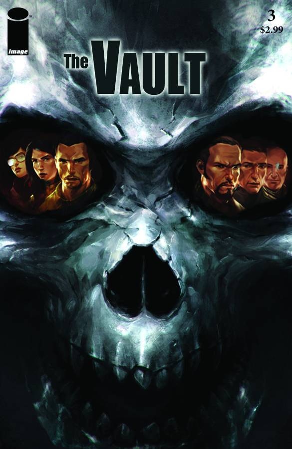
THE VAULT #3
Writer: Sam SarkarIllustrator: Garrie Gastonny
Publisher: Image Comics
Reviewer: Mr. Pasty
THE VAULT comes from the same creative team behind the Arthurian legend re-imagining CALIBER, which I did not read, but found it prudent information for this review for those of you with a wider subscription base than me. What I can tell you is that THE VAULT reads cleanly and looks gorgeous, but caused sort of a Doppler shift in my attention in that I was picking up speed in issue one, became locked in for issue two, then slowly started to detach by the end of issue three. A disappointment? No, but something that could have been much, much more.
Any story named THE VAULT, as you would expect, centers around a vault (duh)--perhaps more importantly, what’s in the vault. I know when I think of the word vault, I immediately think of that steel behemoth at my local bank that houses more cash than I’ll see in ten years. I also think of how hard it must be to penetrate when they close for the night. So too, do our protagonists in this story have to find a way into the vault they’re after. Aside from being encased in sludge, it’s buried deep underwater in a remote location that has mysterious ties to the pyramids of Giza, as well as some other archeological preserves. A team is assembled to try and retrieve it and with that comes the usual cast of characters, including the scientist, the scholar, the translator, the heavy, the investor, and the robot. In fact, the slow build is what I found to be the most compelling aspect of this entire series.
Sarkar spends a great deal of time getting the reader comfortable with his characters and locations. I like that. He also doesn’t drop a lot of historical jargon and finds a nice way to give you just enough information to get up to speed without turning it into a lecture. Aside from money, everyone has their own personal motives for being on this expedition and I was looking forward to exploring them as the narrative progressed. They eventually find the vault when lo and behold, the untold riches they were expecting turn out to be junk jewelry--all except for one: a sarcophagus that thermal imaging reveals contains a strange figure. Should they get it back to the lab like one team member suggests? Of course they should. But then there would be no story.
Instead, the vault is opened on the ship, with consequences akin to that of opening the Ark of the Covenant. That’s where THE VAULT abandons its intrigue (and wonderful palette) and turns into FRIDAY THE 13TH: JASON TAKES MANHATTAN. Big scary monster mutilates hapless victims on a giant boat. He can’t be killed and can’t be stopped, but he can slowed down with a stone that has some ancient gobbledygook carved into it. Meh. Issue number three seemed rushed and its panels hurried into place. I felt an odd disconnect between the final offering and the two that preceded it. I invested into characters for no other reason than to get a reaction from me once they’re offed? Hard not to feel kind of used in that sense. And Sarkar killed his own pacing at the end, far worse than his monster ever could, with some ham-handed send-off between two team members that may or may not have been secretly in love. The only set-up to that scene was a quick “Oops, I’m walking in on you after a shower” angle which, aside from gratuitous side-boob, served little purpose. THE VAULT started strong, became likeable and engaging, but the cat-and-mouse chase at the end, which of course like any monster story is not the “real” end, was largely unsatisfying. In fact, I had almost wished they left that damn thing in its casket and just taken in back to the lab.
Web heads who can’t get enough of Mr. Pasty’s word vomit are encouraged to watch him operate as Nostradumbass over at MMaMania.com here. Love, hate and Mafia Wars requests should be directed here.
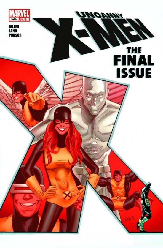
UNCANNY X-MEN #544
Writer: Kieron GillenArtists: Greg Land & Jack Kirby
Publisher: Marvel Comics
Reviewer: Optimous Douche
My feelings on this final issue of the X-MEN (until next week’s issue of X-MEN) made me understand what it must feel like to be bi-polar. Actually this whole closing “event” has had me sandwiched between loving and loathing. Just as I waffled on an issue to issue basis during SCHISM (loving the beginning and less so the ending), I was on a page by page basis for this “final” issue of UNCANNY X-MEN.
For anyone confused by the artistry on the this book, fear not: no one dug up Jack Kirby and used his hand like a Jim Henson muppeteer. And here is where I can say without reservation that the book succeeds. From the opening page harkening back to the X-Men’s first adventure (i.e. The Kirby art) to Land’s more modern day styling, the art was beautiful and apropos.
Now for the story. This didn’t feel like an end or a beginning. Perhaps I’m too accustomed to the DC version of endings: take one big event that is the end of everything and then start over like no one ever knew one another. In that light UNCANNY 544 is merely an interlude ending the turmoil on Utopia and, as we saw in SCHISM, a return to Graymalkin Lane for half of the team. Perhaps I feel unfazed by this end because we have seen it before. Starting way back in the 80s the X-family has splintered on many many occasions, probably the most notable being the split in the early 90s when Jim Lee’s X-MEN was released. Plus, everyone has seemed to hate and shun Scott Summers at one point or another, so when Bobby is giving his petulant good-byes throughout this issue, always running through my mind was the fact that these two will back together at one point or another.
Now, what did work on one level was how Gillen chose to drive the narrative. We see the Kirby art in the beginning because Gillen decides to break the fourth wall…in a sense. Oh, and we are entering spoiler country so beware. Apparently Mr. Sinister, the diamond forehead albino who has been manipulating the X-gene throughout history, has also been chronicling the adventures of the X-Men and in comic book form...well, book form…well, mathematical lineage trees….well, all of the above. And while I loved this approach in the beginning, with the campy silver age characters spouting dialogue about the current state of the X-Men, there were times it all seemed a little too Dr. Evil for my tastes. Throughout the issue, it’s a ping pong back and forth between Sinister describing the history of the X-Men and then flashing to the present day mess-o-shit. Again, it was fun in comic form, but after that when we finally get to see Sinister, it felt like a little too much monologing.
I think Gillen had his hands tied as for meeting the grand expectation of a final issue and this not being a final issue. X-MEN was the third book I started collecting and I just kind of expected more from what should be the end back when I was a wee Douche. Even after I graduated college and had the scratch to go back and buy all the books before I was born, I knew this trip would end one day, I just didn’t think it would end with the brunt of the book having Scott being told he’s an epic Opticock.
However, with a reboot happening by the time you read this, with Sinister being reborn as…Sinister with a different haircut and clothes, I say again this is not a FINAL ISSUE as we would be led to believe by the 35 point font type on the cover. It’s really just another issue, neither good nor bad, merely “meh”.
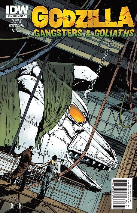
GODZILLA: GANGSTERS & GOLIATHS #5
Writer: John LaymanArt: Albero Ponticelli
Publisher: IDW Publishing
Reviewer: MajinFu
After four issues, the story finally concludes with the monster mash Godzilla fans have been waiting for.
Alberto Ponticelli knows how to frame the monsters in a way that captures the scale and magnitude of their brawl without ever losing the vision of the fight. Layman’s script, while tying things up a little too cleanly for my taste, is serviceable. Considering how laid back previous issues were, it does feel a little rushed, but I’ll forgive that because in terms of monster spectacle this book delivers!
In the end, we are left with a new status quo concerning Mothra that could lead to some interesting new developments, but that is a story for another time. For now, kaiju fans will be happy to know this book sends off the big lizard with a wink and a smile.
What more could you ask for?
 Advance Review: In stores today!
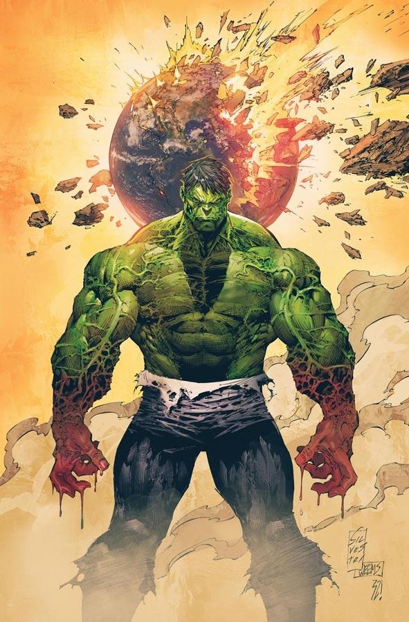
INCREDIBLE HULK #1
Writer: Jason AaronPenciler: Marc Silvestri
Pencil Assists: Michael Broussard
Inkers: Joe Weems, Rick Basaldua, Sal Regla
Publisher: Marvel Comics
Reviewed by Johnny Destructo
I consider myself a fan of Jason Aaron, for sure. Even though I don't always hang with every single thing he writes, the bits that I like, I LOVE. Like 16-year-old-dry-hump-till-I-blister kind of love. PUNISHER MAX is one of my favorites and if you aren't reading SCALPED, you deserve to be taint-pummeled. Besides that, you have to admit, that Jason Aaron can grow a HELLuva beard. That thing is unnatural and potentially a gateway to a hell dimension, and it makes me afraid of him.
That said: there wasn't much in here that I found myself really excited about. I'm afraid I'm going to spoil most of the happenings of this issue for you, so if you don't want to know ANYthing about this book then skip to the better written reviews below. Now, I'm not going to spoil the end, since I thought that was pretty cool, but everything else is fair game. Be warned. Now, what is it I'm going to spoil? The Hulk fights some monsters. The Hulk has *finally* found himself a place where he can live in peace. Where he is no longer a freak. Where he no longer has to bother with pesky human bein - ohwaittheyfoundhim. Yup. The first 4th of the book: monster fighting. Second 4th of the book, being content, but not believing that he'll be content for long. Third 4th: humans show up and literally fight him for no reason other than getting him to take them seriously. They couldn't just walk up and say "Hulk, we need your help." Instead they attack him and make him mad and THEN say "Hulk, we need your help." Buh-whaaa? Granted, it ends on a mysterious and interesting note, which makes me curious about issue 2, but I think it would have been better served if the first 3/4 of the book wasn't just a smattering of Hulk clichés.
And why did it take 5 people to draw this book? It took 2 pencilers, 3 inkers and THEN it went to the colorist. I'm always curious about the behind-the-scenes of something like this. The issue feels rushed, and the amount of people involved doesn't help that notion. It looks nice enough, in a sketchy kind of way, but absolutely everything is drawn with the same lines. Scaly exterior of an underground monster, drawn the same as the soft, wet, fleshy interior of that monster's mouth, drawn the same as the rocky caverns that serve as the setting, and the robots that show up to fight the Hulk. Everything is made up of so many individual lines and so much cross-hatching, it all looks like it's made of hay. Except Amanda Von Doom's butt. That looks like a butt.
I have enough faith in Jason Aaron that I'm not so worried about where this is all going--I'm definitely going to check out issue #2--but I just wish I had a better experience with #1.
Hey folks, Ambush Bug here. We’re trying something new this week. I know podcasts are all the rage these days and while an @$$Holes Podcast is in the works, friend of the @$$Holes John Ary is putting together his own mini comic review podcast from his local comic shop The Gatekeeper in Topeka, Kansas with comic shop owner Dustin Dean. Here’s what John and Dustin have to say about a few select books hitting the shelves today. Take it away, John!
Look for more podcasts in the coming weeks!
Proofs, co-edits & common sense provided by Sleazy G
Check out AICN COMICS on Facebook and Comixpedia.org!