
| Issue #24 | Release Date: 9/21/11 | Vol.#10 |
(Click title to go directly to the review)
Advance Review: SUPERMAN #1
HELLRAISER #5
NIGHTWING #1
X-MEN: SCHISM #4
Advance Review: AQUAMAN #1
FEAR ITSELF: FEARSOME FOUR #4
NEW YORK FIVE TPB
ROAD SIGN HANK & THE ALIENS #2
Advance Review: I, VAMPIRE #1
 Advance Review: In stores today!
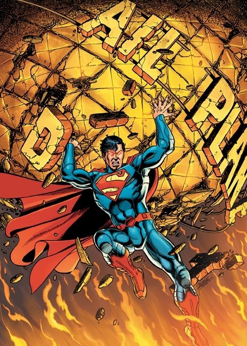
SUPERMAN #1
Writer: George PerezArtist: Jesus Marino
Publisher: DC Comics
Reviewer: Optimous Douche
Spoiler alerts should be a given on this site, but for the next sentence I would feel small pangs of guilt without even a friendly heads-up. So, heads up! The Daily Planet is no more...but that’s not the spoiler.
The true spoiler is that the Planet was not destroyed by an alien invasion force or the brash reckless actions we saw Superman engage in during his training days two weeks yet five years ago in ACTION #1. No, the Planet was destroyed by time and the heavy heaping of reality everyone was clamoring for when the new Clark Kent went into the newspaper business.
The Planet, like so many papers, networks and websites, is now part of Galaxy Media, a synergized multi-media empire run by a baddie we’ll all remember from the past, Morgan Edge. Print is not dead, however, as we learn multiple times throughout this issue. A leaner Perry White is still helming the old gal, to still serve those that want the deep dive instead of just the fluff. Perry did lose one ace up his sleeve, though, as Lois Lane now serves as the Executive Vice President of new media within this conglomerate of information. Another nice shift and nod to days gone by was that Lois was apparently helming the nightly news instead of letting her pretty face fester behind a typewriter prior to the acquisition. I wondered what made her qualified for this new gig; this one sentence helped waylay those misgivings.
This issue was truly for those that feel Superman’s supporting characters are just as important as the Big S himself. While we get glimpses of Supes and his alter ego Clark, this was really an issue about how media thrives and helps drive the story of Metropolis.
Action is plentiful, from the decimation of the old Planet building to a baddie made of fire that interrupts the gala announcing Galaxy’s rebranding to the Global Planet News Network (hmmm…if Fox continues to gobble things up they should steal this name), but this really is the story of how stories will be made and reported by the supporting characters in Superman’s life.
Perez knows how to write a comic, but also seems to have a deep understanding of the wired age we all now live in. As the action unfolds and Superman battles the fire-shooting entity plaguing Metropolis, we get two sides to the story. One story is the new age sense of immediacy, driven by the dialogue and the action on the page. This is the “what” of the story, as we watch Lois maneuver news choppers and Jimmy tweets from ground level. As for Perry White’s deep dive, this is all Superman/Clark’s recounting of events, the feeling behind the story, the detail, the “why.”
While I was most impressed with the refreshing of Superman’s pals, I fully admit part of this coverage is my personal bias. In hindsight, equal amount of time was given to Superman thwarting a hijacked tanker full of chemicals and of course the aforementioned fire beast. I would imagine these moments didn’t resonate in Technicolor detail because these felt aimed at the kiddie demographic. When Superman is ready to drop the hijacked tanker in the river, the bad guy in the passenger seat reminds Superman that it would poison the water supply. Not as reckless as he was in ACTION, but it’s a pretty stupid move and moment when you think about it. Would a bad guy really care about the water supply, especially if he was about to die? I don’t think so. But kids probably appreciate those hand-held steps towards logic and reason.
On a side note, if you have any problems trying to figure out the demographic for a book in the new DCU (although I think the dialog and art are pretty good indicators), simply look at the ads in each book. While some could still argue the content, the media buy is apparent. You’ve entered a kid book when the ads are for Hot Wheels instead of real cars or an X-Box driving game. This isn’t a new strategy; it’s just way easier to distinguish when you’re banging through 13 issues a week one right after the other.
Clark also gets some nice screen time, and this is definitely more for the adults reading the book. We get to see a few flashbacks of him fighting with Lois about her selling out to “the man” and a sad walk away at the end of the issue after Clark stops in on Lois and catches her in post coital bliss with her bohunk boyfriend. Perez, with the help of Merino’s pencils, perfectly captured that we are back into the Clark and Lois game of cat and mouse. I really don’t lament the loss of their marriage in the new DCU; I always found the hunt to be far more engaging than the kill.
I applaud DC for keeping the Superman titles under control. The five year earlier approach in ACTION versus the present day Clark in SUPERMAN serve as a fine pairing to show the evolution of a hero in power, skill and overall maturity. I’m having a hard time right now seeing the need for four BATMAN titles. I know the corporate answer would be some are for kids, some are not (again, look at the ads). I would argue, though, fans looking for synergy in the titles might be slightly put off by this approach. On the SUPERMAN side, while the titles don’t blend, I don’t think they were ever really meant to. Instead this is a continuation, one title presenting the steps that led to the conclusions in the other titles. The SUPERMAN world is also one now where fans new and old, young and not-so-young, can come to a common ground to talk about the superhero that started it all.
Optimous has successfully blackmailed fellow @$$Hole BottleImp into being his artist on Average Joe. Look for Imp's forced labor on Optimous brain child in mid-2011 from COM.X. Friend Optimous on FaceBook to get Average Joe updates and because ceiling cat says it's the right thing to do.
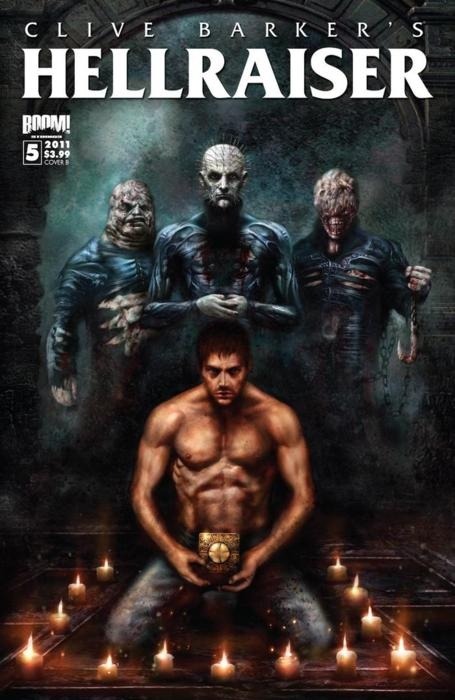
CLIVE BARKER’S HELLRAISER #5
Writers: Clive Barker & Chris MonfetteArt: Jesus Hervas
Publisher: BOOM! Studios
Reviewer: Ambush Bug
This first chapter of the new arc called “Requiem” spins directly from the previous one, as Kirsty Cotton seeks out the Cenobites for redemption while Pinhead longs to end his Cenobiting days having grown tired of all of those hooks and tortures. So far, this is by far my favorite series coming from BOOM! Since it appears the cinematic efforts can’t seem to harness the genius that was the first two HELLRAISER films, it’s good to see the mythos done right in comic book form. As BOOM! has done with 28 DAYS LATER, they’ve continued the story with capable writers and artists who can capture the terrors so well done on the silver screen.
This new issue is filled with everything that made the original HELLRAISER film great. The horror is perverse and kills are operatic, walking the fine line between beauty and disgust. Kirsty and Pinhead face off in the barn of a man much like Frank in the films, is unworthy of the Cenobites’ interest, but skilled in summoning them. Pinhead is much more interested in Kirsty, who it looks like he is training to be his replacement while he seeks out a new life on Earth. Pinhead’s path to humanity and Kirsty’s spiral into the inhumane is laced with irony and the type of conflict that can’t help but be intriguing.
The best part about this issue is the use of the hooked chains, which has been handled amazingly in the last few issues as well. They whip around and provide dynamic linework, signifying the actions of the inscrutable Cenobites. Artist Jesus Hervas does a fantastic job of using the chains as extensions of the Cenobites, who usually just kind of stand there looks like creepy statues. Leonard Manco, who started this series, did a lot of great establishment grit to make this a gruesome feeling book. Hervas continues in the same manner, but has a much more restrained hand. Hervas’ skill with the pen does Barker’s world well and though I love Manco’s art, I feel it lacked the tiny details that made the Cenobites so iconic in the first place. Hervas is able to capture those details without making it completely crisp and clean looking.
HELLRAISER is in capable hands at BOOM! with Chris Monfette collaborating with the creator of HELLRAISER, Clive Barker, showing us such new sights while artist Jesus Hervas tears our eyes apart with his vivid and dangerous imagery. This is an all around great series that no fan of the films should miss.
 Ambush Bug is Mark L. Miller, original @$$Hole / wordslinger / reviewer / co-editor of AICN Comics for over nine years. Mark is also a regular writer for FAMOUS MONSTERS OF FILMLAND and will be releasing FAMOUS MONSTERS first ever comic book miniseries LUNA in October (co-written by Martin Fisher with art by Tim Rees) Order Code: AUG111067! Support a Bug by checking out his comics (click on the covers to purchase)!


Check out NANNY & HANK’s Facebook Page
Check out THE DEATHSPORT GAMES’ Facebook Page
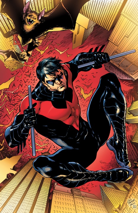
NIGHTWING #1
Writer: Kyle HigginsArt: Eddy Barrows
Publisher: DC Comics
Reviewer: The Writing Rambler
The BATMAN world that exists inside the overall DCU is without question one of the best developed areas with the most unique stable of characters throughout it. Dick Grayson aka NIGHTWING (aka the original Robin) is one of those characters that deserves his own continuous title and I was happy to know that DC would be giving us NIGHTWING #1 as part of their “relaunch” books.
NIGHTWING is presented as a starting point for new readers despite the BATMAN universe being one of the few DC areas that is still mostly unchanged after the end of FLASHPOINT. Kyle Higgins does his best to get into Dick’s head (yeah, I’m giggling at my poor choice of words too) and present to us the person that he has developed into. Everything is still there from the growing up in the circus and the tragedy that thrust him into his life as ROBIN and NIGHTWING, right up until his recent run as BATMAN himself. It seems that the theme of this book is going to be a fully matured and established NIGHTWING who can hold his own against Gotham’s worst while living up to the mantle of BATMAN whether he’s wearing the costume or not. While not too much happens in the issue it’s easy to forgive when this is clearly all set up for bigger things to come. The book spends much of its time have NIGHTWING narrate his own story internally and I personally enjoyed it, especially seeing him visit the traveling circus where his story first began and the emotions it elicits in him. The only real low point of the issue is the villain we’re given, who I wouldn’t have minded that much if he weren’t basically a Wolverine knock off. I’m not sure what’s happening in these “all new #1’s” DC is giving us but so far the new villains have been craptastic (I know it’s not a word, but it should be) to say the least.
Eddy Barrows does a great job on the artwork in the book as he presents Gotham in the dark, murky way we know but still maintains a difference between NIGHTWING and BATMAN’s personalities through the perception of the city he creates. One thing I will note about the art that may be a sore point for some is that I love and fully endorse NIGHTWING’S costume change. While it’s much less of a change than some of the other DCU costumes that have caused public outcry (cough, cough, Superman, cough cough) I think it was a good move for the “relaunch” of the character. It’s simple, clean and the only major change is the color scheme from black/blue to black/red. As simple as it is I think it helps represent the evolution the character has gone through and visually tells us that Dick’s return as NIGHTWING is a step forward in his development and not just him returning to being NIGHTWING simply because Bruce is back to wear the BATMAN cowl fulltime.I’m not sure what plans DC has for this series in the long run but what I do know is that I like NIGHTWING a lot and unlike some of the NEW 52 I’ve read I actually look forward to picking up the next issue.
You can follow The Writing Rambler on his blog here and follow on Twitter @Writing_Rambler !
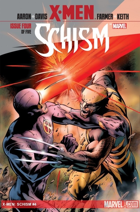
X-MEN: SCHISM #4 (of 5)
Writer: Jason AaronArtist: Alan Davis
Publisher: Marvel Comics
Reviewer: KletusCasady
Friends, how many of us have them,
Friends, the ones we can depend on,
Friends, before we go any further let’s be…
-Whodini
A major problem I had with CIVIL WAR was that I never really believed that Iron Man & Captain America, after being friends and colleagues for 15- 20 plus years (conservatively), after saving each others lives a countless amount of times, would be ready to damn near kill each other in a matter of weeks over a piece of legislation. I just didn’t buy it and it kept me from enjoying that series. I know this is a personal hang up but whatevs. So when the advertisements for SCHISM came out I almost had a similar feeling BUT this relationship between Cyclops and Wolverine has been boiling badly under the surface for decades. I found it a lot more reasonable that these two would come to blows, especially with the added amount of pressure mutant kind has been under as of late…plus Cyclops is a dick.
I know there’s a lot more going on in this story than those two fighting but I think the point of this series is to show that unfinished business can come back and bite you in the ass (and the X-Men have a lot of loose ends). The ass biting in this series mostly comes from Kade Kilgore, head of the new Kiddie Hellfire Club, that’s now run by a bunch of smart ass brats that weren’t spanked enough as children…sorry, but Aaron wrote these lil’ bastards to be unlikable and they sure as fuck are exactly that. Unfortunately, they are also extremely smart and have once again turned the public opinion against mutants, causing most countries to reactivate their sentinels--one of which came from a techno-organic bomb that formed a ‘hyper conductive electromagnetic’ metallic beast that gathers its structure from…well…I’m not telling you all that but this Sentinel is a badass killing machine and is descending upon Utopia and can you kids guess what happens when it gets there?
***SPOILER*** Our conflict between ol’ Scott and Logan comes for a very good and logical reason: Wolverine feels as though the vets should handle this threat, leaving the newer younger members to flee, whilst Cyclops believes everyone should stay and help out rather than running (which could lead to more running) regardless of the threat level. This conflict was really less about the immediate moment and more about the different ideologies of two long term members of the X-Men. Both sides have a point here and with Wolverine & Cyclops’s rocky relationship, I find this fight pretty damn believable. There is one thing that Cyclops says that I was really surprised to hear him say out loud; I mean, I know Scott’s a dick, but damn, dude. This comic is written really well, the dialog is great and this series has never felt rushed or stalled like some major events as of late.
While I wish they would have stuck to one artist (Chris Pancheco), Alan Davis does a great job on art here. The really important thing in this issue was the conveyance of emotion. This issue needed tons because we’ve got everything from fear, to confusion, to anger, rage, surprise, etc. and all these emotions are rendered perfectly. You could read this issue with no words and still get the gist of what everyone is feeling, which just adds to the emotional texture of this book. Even though I wasn’t a fan of his artwork originally, Alan Davis has changed ol’ Kletus’s mind and now I hope to see him on other stuff soon (Dr. Strange?!?)
This issue is pretty damn good. I think the fisticuffs was a little overhyped, because it’s not like they’re tearing each other to shreds or anything, but it’s still a good fight. Regardless of that, this series has been pretty awesome. I’m not sure why but much like Daredevil (used to be), I love seeing the X-Men with their backs against the wall, being put through the wringer once again. Jason Aaron spins a hell of a tale here that has a good pace and definitely has me wondering what’s happening next (I guess I kind of already know because of all the solicits). Alan Davis does a damn fine job on art and makes it very easy for the reader to grasp what these characters are feeling. Great story, great art…pick this shit up!
 Advance Review: In stores today!
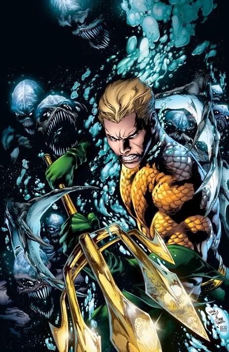
AQUAMAN #1
Writer: Geoff JohnsArt: Ivan Reis (pencils), Joe Prado (inks)
Publisher: DC Comics
Reviewed by Johnny Destructo
Interior, Night. 16 Year Old Johnny Destructo is laying on his bed, reading some comics and blaring either Public Enemy or Circus Lupus. A mysterious, geeky figure vrrrps into the room. "JD! I'm YOU! You from the future! The year 2011! I've come back in time to see your face when I tell you that I write for AICN, and this week, I hated a Frank Miller book and loved an Aquaman book!"
Young Johnny, unphased, replies: "Balderdash! I don't believe you for a second. Frank Miller is amazing and Aquaman is lame. I'll never like Aquaman! I'll never be like you, old man! And waitaminnit. All the cool stuff you could have time-traveled to see, and you came back in time just to tell me that? Man. What a loser."
Old Johnny, filled with shame, chokes out "I ...but...SHUT UP! At least future you has had sex! With a woman!", and with that, sobbing, vrrrps back to the future.
Geez o man, teenagers are jerks. But despite 16 year old me's inability to comprehend it, I did, indeed love AQUAMAN #1. But JD, you might say: I've known you since you were knee-high to a grasshopper, and you've always hated Aquaman. And you would be right, nameless old friend that I've never met, I HAVE always hated Aquaman. Never once have I found him interesting or engaging as a character. I was almost interested with the whole Sub-Diego thing awhile back, when they sank all of San Diego, but within 2 issues, I was gone again. Strangely, though, Johns does something here that works: he brings him into OUR world for just a little bit. Not only is the character considered by many to be a laughing stock in our real world, Geoff has even the DC populace tease and taunt WaterFella right to his face! It's pretty blatant and just damn RUDE, and even the COPS join in, but there's something endearing about seeing Arthur deal with this sort of thing. It certainly makes him more human and relatable.
Arthur thwarts a bank robber get-away, he stops into a joint for a bite to eat, he talks, he makes a decision and a new threat is introduced. In retrospect, not much actually "happens" in this issue, but it certainly didn't feel that way when I was reading it. It's (ahem) packed to the gills. Not only did I enjoy every word bubble, but ...
I poured over every glorious panel of artwork. Ivan Reis may be one of my top ten comic artists working right now. Alan Davis meets Neal Adams meets Mark Bright, with a little something special tossed in. He doesn't over-do it with extraneous line work (see David Finch), and it isn't what I would call "flashy", unless you consider solid story-telling, dynamic compositions and a mastery over anatomy and backgrounds "flashy." Even if I didn't care for the story or words, I would probably still buy this issue as a "how-to" art book.
But dammit, I don't care what anyone says, not even Young JD, I just might love Aquaman! Seriously though, don't tell anyone.
JD can be found hosting the PopTards Podcast, drawing a weekly webcomic, discussing movies, comics and other flimflam over at www.poptardsgo.com, graphically designing/illustrating for a living, and Booking his Face off over here. Follow his twitter @poptardsgo. His talkback name is PopTard_JD.
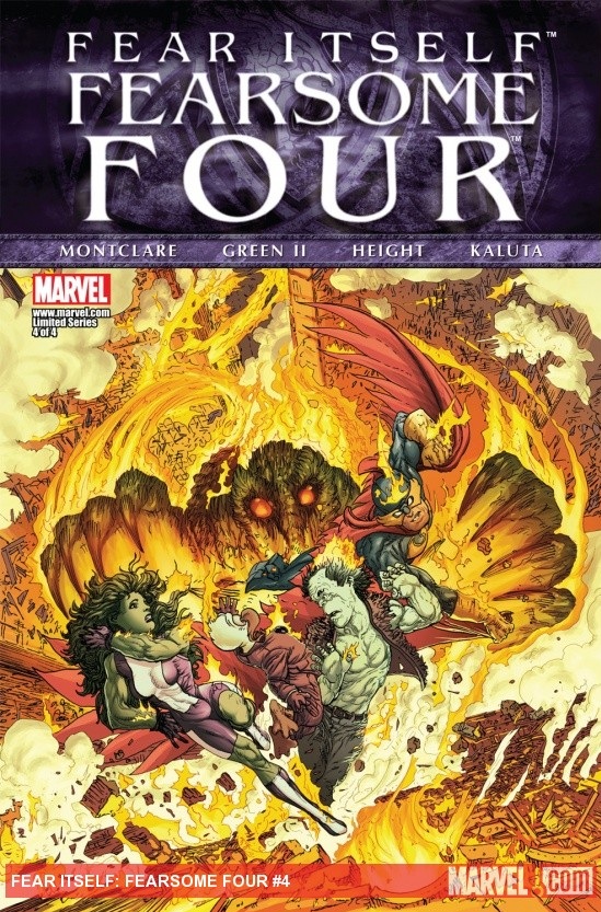
FEAR ITSELF: FEARSOME FOUR #4 (of 4)
Writer: Brandon MontclareArt: Tim Green, Ray-Anthony Height, Rick Ketcham & Michael Wm. Kaluta
Publisher: Marvel Comics
Reviewer: MajinFu
“Burn verily monster! There is no room for you in our world.”
In theory, this should have been one of my favorite comics of the summer. I love Man Thing and Howard the Duck both, She Hulk is one of my favorite female heroines while Nighthawk is a character who always struck me as a sort of faux-Batman, and I love my off-kilter vigilantes. Also, what begrudged outcast doesn’t love the Frankenstein monster? Man Thing overloading on the fear caused by Fear Itself is a great idea with a lot of potential as well. With this final issue I can safely say it was a nice premise, but it suffered a lot from poor execution, culminating in each member of the foursome facing their fears individually. What could have been a potent character study instead only skims the surface of what makes these characters tick, leaving this reader feeling cold.
The dialog sometimes works, maintaining Howard’s signature swag. It mostly serves as a means of exposition, which is awkward when this is supposed to be the finale to a mini-series. Do we really need every member of the team explaining how Man Thing’s powers work when it’s right there on the summary page? No, of course not, but the writer and editor of this book seem to have a lack of faith in the reader, resulting in wasted space that would have been better spent on some heartfelt character studies. In retrospect, they seemed to have thrown everything and the kitchen sink into this book in an attempt to please readers, but instead left me wondering if this even had a point at all other than to squeeze more money out of this week’s flavor of the month. None of these characters benefitted from the events of the series and everything is returned to its original status quo. This wouldn’t bother me as much if the whole venture didn’t seem like such a pointless, predictable exercise.
The idea of using four artists to illustrate all four issues was an interesting one, and the characters’ appearances changing every page worked with Man Thing’s reality altering powers, but in the end it just looks sloppy. The comic doesn’t bother to distinguish which artists illustrated what pages, so I’ll just say most of it looks okay, and the colors in particular are excellent, thanks to Michael Wm. Kaluta. The problem is most of the characters vary slightly in appearance with each rendition, to a distracting degree. Like the writing, there are slight moments of competence, but not enough to make this really gel as a story.
The team facing their fears should be the most powerful part of this story, but instead it comes off as the most ridiculous and false. Everything from Darkhawk resisting the urge to beat the crap out of some hooligans to She-Hulk being the last living hero is covered, but none of these scenarios felt particularly important to the characters, nor are they handled with any kind of subtlety. Frankenstein imagining a mob of Marvel’s finest, all donning their signature peasant outfits of course is as ridiculous as it sounds. In the end, this does nothing for these characters and it’s a shame, since this book had a lot of potential.
It’s really quite sad seeing what’s happened to Howard by the end of this story. He’s a character for whom I have always had a deep appreciation, and to see him reduced to a simple loner/mouthpiece for the writer left me feeling cold at the end. I always sympathized with Howard, so it makes sense that my sorrow would parallel his own by the end of the book. Still, this was a poor tie-in to an even colder event comic and fans of these characters deserve better.
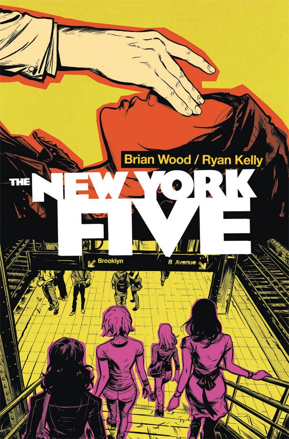
NEW YORK FIVE TPB
Writer: Brian WoodArtist: Ryan Kelly
Publisher: DC Vertigo
Reviewer: Optimous Douche
One seems to be the predominant number grabbing the DC fanbase attention right now. While I’m enjoying the spectacle of rebooted spandex as much as the next comic fan, but I’ll say that this week I was entranced with the number five, specifically THE NEW YORK FIVE.
NEW YORK FIVE reminds us that the best comics are about the human experience, and that these moments don’t always need fantastical settings and circumstances to serve as the spoonful of sugar to make the writer’s observations go down more smoothly. An engaging story is always an engaging story, no matter what medium is used to tell it.
I had trepidation going into this collected volume about the lives of four freshman females at NYU. See…right there… I had to stop myself during that sentence from writing the words femme fatales. I’m so used to the traditional comic hook of making women embody man’s greatest fears and desires about the fairer sex, I had to remind myself that Wood delivered a cast of characters that are as real as they come. No killers, no latent mutant powers, simply an exploration of the most tumultuous periods in our existence, the first year away from home. Yes, the focus is set specifically on the college experience, but themes of first love, family dynamics and the discovery that our failings also serve as our greatest armor are themes that transcend the “have and have not” delineation of higher education.
NEW YORK FIVE is a follow-up to NEW YORK FOUR, but it’s a sequel that can easily stand on its own merit. I didn’t read NEW YORK FOUR, but that didn’t stop me from easily jumping into the lives of these four roommates and the little girl lost that occupies the stoop of their apartment. There’s also a sixth character in NEW YORK FIVE that deserves as much credit as the roommates and their vagabond: New York City its self. Wood knows New York inside out. If his book DMZ wasn’t proof enough since it looks at New York through a dystopian lens, naysayers will be easily convinced of his knowledge after reading NEW YORK FIVE. As a card carrying member of the bridge and tunnel crowd coming in from Jersey for so many years, NEW YORK FIVE made me realize that I truly am an immigrant to this majestic town. As the book moves from locale to locale, it’s clear that each location was meticulously selected to match the theme of each character’s struggles in life. Wood gleefully breaks the fourth wall to spoon feed us readers on why these locations were selected before diving into each scene. It was jarring at first when held against how naturalistic every other element in the book comes across, but by the end I not only appreciated these moments, I couldn’t wait for the next little factoid bubble to pop up and teach me what I don’t know about a city I thought I knew so well.
So what was it about the NEW YORK FIVE that made them so compelling I was able to breeze through the entire five issue trade in one sitting? After all, I’m not a woman and as I mentioned before, far from a native of the city that never sleeps. It boils down to authenticity and not trying to write a book about women. I knew each of these girls, slept with some, stayed just friends with others, but each in their own way embodied someone I knew from my own first year at college. There are no insipid conversations about shoes or make-up. If those bastions of narcissism did crop-up they were quickly swatted away by true problems. Riley, the sheltered text addict that stays connected to millions through social media, but can’t seem to make the one connection she wants in life with her estranged sister. Ren, the girl that a thousand guys in college would die to be with, but only has eyes for the forbidden fruit of the much older man. Merissa, the one who wants to break free, but harbors so many home problems she is constantly distracted. Olive, the hanger-on who is not in classes yet always seems to be where the student action is. Last and certainly not least by standards was Lona. Lona was me in female form, a person who never cracked a book in high school, yet breezed through with honors. And like Lona, when I got my first bad grades I immediately misplaced my blame on external circumstances rather than pointing it at myself where it belonged. Now this being drama and all, I didn’t go so far as to stalk my professors in an attempt to ruin their reputation, but I thought about it.
I guess that’s the true beauty of NEW YORK FIVE: while I related to Lona, someone else will pick another girl…or perhaps the scumbag Frank…or perhaps the doctor that interviews these girls as part of their job dissecting SAT tests from across the country. The menagerie of characters is bountiful and will hit home to anyone that professes having a soul.
The average comic fan will not appreciate this book, which is a shame. I’m not judging, I just know the male dominated comic audience splinters and ultimately dwindles when books start to explore feelings instead of plots to destroy New York with shark missiles. Since I’ve always enjoyed the melodrama provided by shows like “Felicity,” NEW YORK FIVE was right up my alley. Especially since the dialog, writing and cinematic visuals provided by Kelly far outstrip the quality of any teen drama being churned out by the CW or Fox. Quite honestly, I don’t know how some producer hasn’t picked this up yet and slated it for next season. Wood makes the humanity and palpable and Kelly draws the city with a unique beauty – scars and all.
Dare I dream for a NEW YORK SIX? No, because there simply is no other year like freshman year. To see where these girls ultimately end up once their freshman dream bubbles burst would be more disappointing than knowing what actually happened to Tony Soprano.
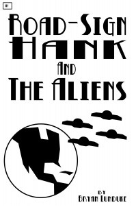
ROAD-SIGN HANK AND THE ALIENS #2
Writer: Bryan LundukeArt: Bryan Lunduke
Publisher: Self-published
Reviewer: Lyzard
I commonly complain about superfluous text in some of the comics I review, but from now on I should specify my problem with such run-on writing. My beef is not with the amount of dialogue or description but with the quality of such words. When a page is filled with box after box of text, I feel like I am reading a book rather than a “comic” book. But that is not necessarily a problem. As long as the standard of writing is enough to entertain, then why should I care?
ROAD-SIGN HANK AND THE ALIENS #2 is filled with extended descriptions and knows it. Not only is the self-referential quality one of the finer points of the series, but the humorous writing makes the reader want to read every last word, instead of being tempted to skim.
It does seem logical for a comic book that lacks detail in the artwork to make up for it with the writing. But that makes it sound like the artwork does not live up to the writing. Not true at all. Undeniably, the art is as simplistic as can be. I wouldn’t be surprised if Bryan Lunduke used elements from Clip Art to aid in the creation of his comic book. But despite the fact that there is no colorization at all within the series, merely outlines and silhouettes of buildings, objects, and people, the reader still gets a sense of each characters’ personality. Credit for this must go to the writing as well, but one must not forget the art work. Going along with the self-reflexive nature of ROAD-SIGN HANK AND THE ALIENS as pointed out in this issue, the Zaxaconians do have “super-duper, mean looking eye.”
Also, in this issue, the adventures of Hank continue. Now locked up with his dog, Arnie, Hank must find a way to rescue his girlfriend, Penny. Meanwhile, back on Earth, Hank’s friend, Stanley, is attempting to message Hank in order to tell him that the Zaxaconians have abducted the entire population of Earth (with the exception of Stanley, poor Stanley). So while Stanley attempts the improbable task of contacting his best friend, back on Zaxacon 5 it seems that it is up to Arnie to save the day.
For the most part, ROAD-SIGN HANK AND THE ALIENS #2 was much the same as presented in the previous issue, with one exception. There are references, historical, literary, and pop throughout the comic. Luckily, none of these references appear to date the series, a common problem with using current, standard references. Years from now, who will know who Justin Bieber was (I do hope the answer is no one)?
If I were to describe ROAD-SIGN HANK AND THE ALIENS to a friend, they might find the concepts of using basic artwork as a conceit or, since many of my friends are in the arts, lazy. But they would be wrong on both counts. Bryan Lunduke does not rest or depend on the fact that his style of artwork is purely based on road-signs; he takes advantage of this and backs up the pictures with hilarious text.
Lyzard is actually Lyz Reblin, a senior screenwriting major with an English minor at Chapman University. Along with writing for AICN, she has been published twice on the subject of vampire films.
 Advance Review: In stores today!
I, VAMPIRE #1
Writer: Joshua Hale FialkovArt: Andrea Sorrentino
Publisher: DC Comics
Reviewer: Ambush Bug
I’ve been waiting not-so-patiently for I, VAMPIRE #1 to drop. Having been a huge fan of writer Joshua Hale Fialkov’s for quite a while, this foray into mainstream horror looked to be interesting. Fialkov’s past projects have dealt with more human horrors with TUMOR, ECHOES, and ELK’S RUN. I was curious to see how he would handle the more fantastical powers of the vampire. Fialkov’s strengths lie in his ability to convey personal horror and fear. His characters are faced with dire situations and a lot of the conflict involves one’s sense of reality. In I, VAMPIRE, we follow Anton Stanton, a vampire with a soul and a lot of angst for what his species has done to the human race. He’s tried hard to protect the world from his own kind, but a woman from his past, Mary, wants the opposite.
There’s a lot to set up in this issue, but this is a pretty simple premise of good vs. evil. Mary and Anton flirt across countrysides and cityscapes ethereally, all the while exemplifying the various powers a vamp in the DCU has. Seems every version of a vampire has to be somewhat different and in the DCU, the sun doesn’t necessarily kill a vamp, it just negates its powers. This leads to a much more gruesome way of disposing of the bloodsuckers—beheading. Fialkov structures this issue perfectly, as we flit between time and space finding a lot about this relationship the vamps once had and the impending war between the species. Too many vampire stories are similar in story—either it’s about a love that can never be or an experimentation in sexuality. Though Mary often acts as seductress toward Anton, the steadfastness of Anton’s character makes this story a bit of a break from the norm.
Andrea Sorrentino offers imagery comparable to Jae Lee. Though occasionally she forgets about backgrounds, her wispy and delicate penworks add a haunting tone to the story. Her designs of the vamp in bat and wolfen form are inspired and the stuff of some of the coolest vamp fiction. Fialkov’s picked a winner to make this horrific tale come to life.
Though it’s been a while since DC has made horror work, with a fully capable scripter and a terrifically terrifying artist, I, VAMPIRE could be one to look out for. Though this is very much a set up issue, the showcase of moody artwork and the strength of the narrative structure hold it back from feeling like a throwaway story setting up for the real story. In the end, I didn’t feel like this was a retelling of an Anne Rice romanticized version of bloodsuckers or a dumbed down version for the tweens like TWILIGHT. This is sophisticated adult horror that feels like a good vampire story should.
Simply put: I likey I, VAMPIRE.
Proofs, co-edits & common sense provided by Sleazy G
And check out AICN COMICS’ New Facebook Page!!!