| Issue #21 | Release Date: 9/7/11 | Vol.#10 |
A. Bug back again! Here’s our second full column of reviews! Enjoy!
(Click title to go directly to the review)
Advance Review: ULTIMATE ALL NEW SPIDER-MAN #1
THE BOYS #58
ANIMAL MAN #1
MONSTER HUNTERS’ SURVIVAL GUIDE CASE FILES: SASQUATCH One Shot
Advance Review: SUICIDE SQUAD #1
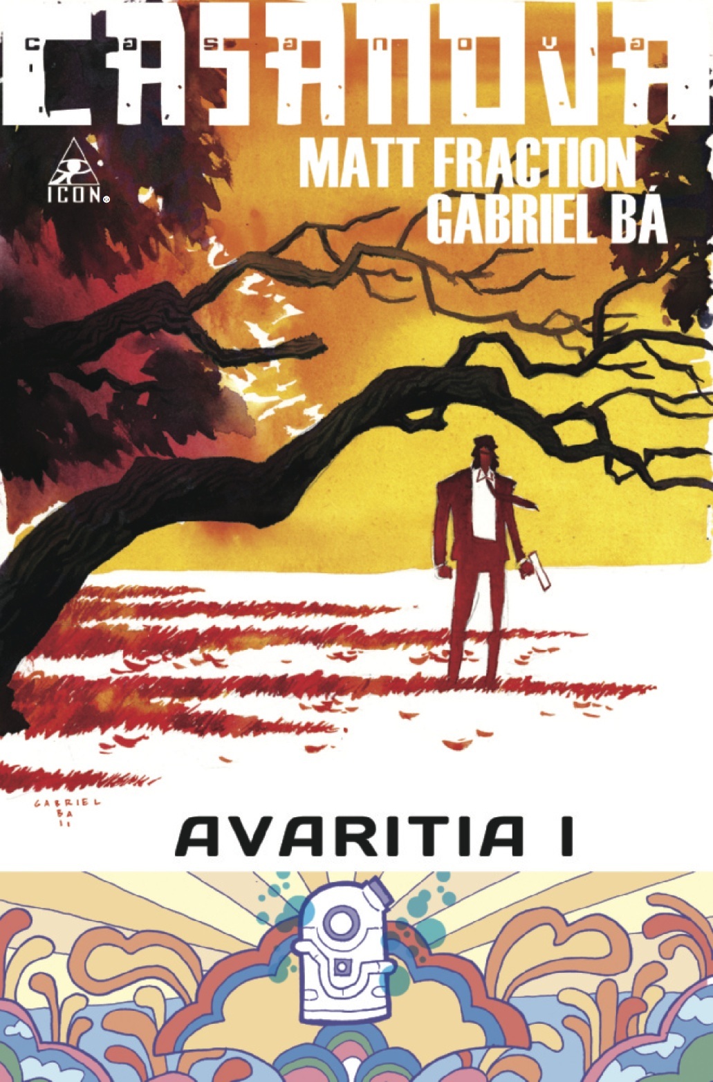
CASANOVA III AVARITIA #1
MEN OF WAR #2
DINOSAURS ARE DEAD Book
HAWK & DOVE #1
Advance Review: MORIARTY: THE DARK CHAMBER Vol.1
BATWING #1
CHEAP SHOTS!
 Advance Review: In stores today!
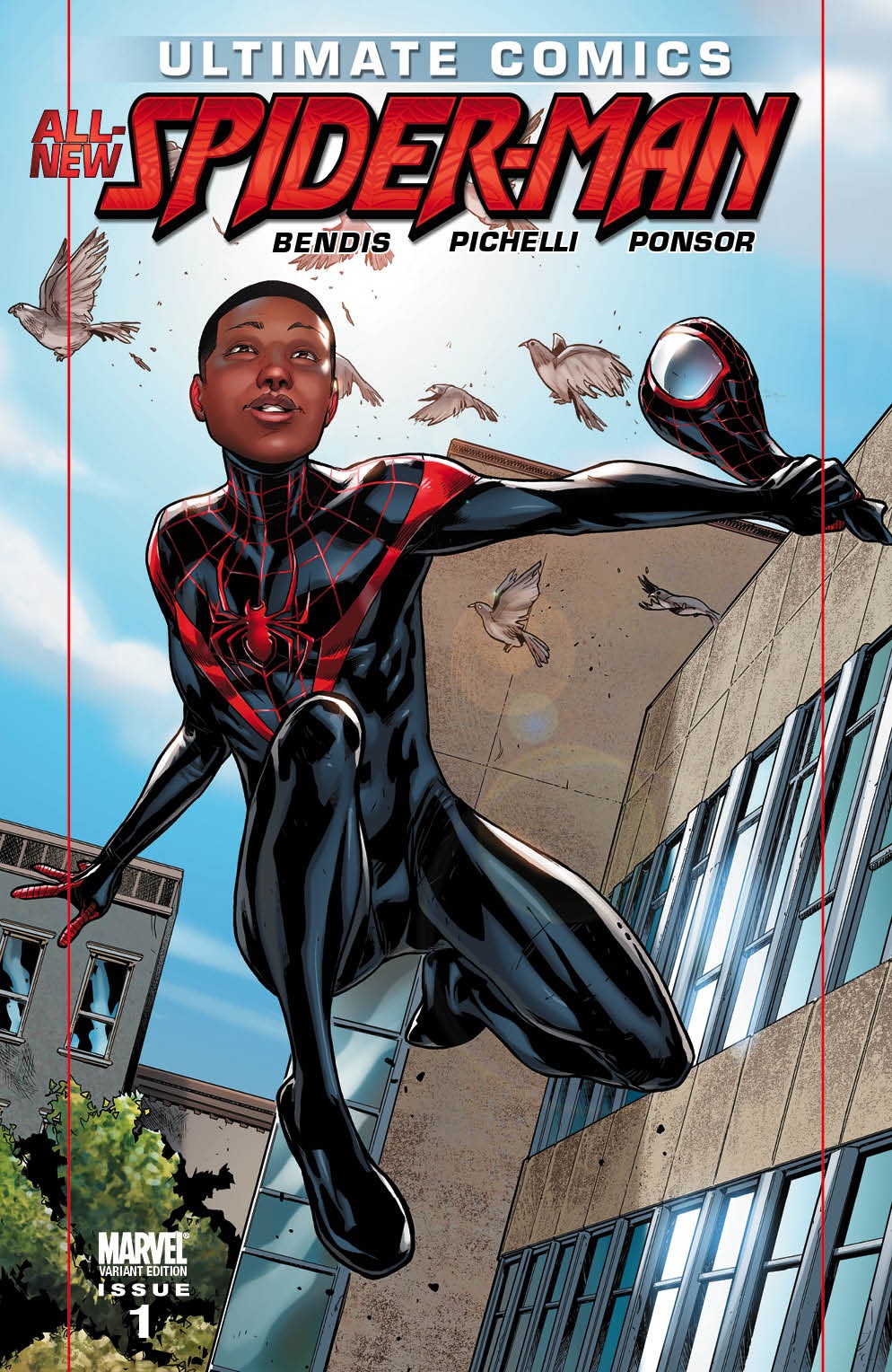
ULTIMATE ALL NEW SPIDER-MAN #1
Writer: Brian Michael BendisArtist: Sara Pichelli
Publisher: Ultimate Marvel
Reviewed by Johnny Destructo
You know what I love? Comics. You know what I really love? THIS comic. In a month that has been overrun by the New 52 over at DC, it's a nice change of pace to be excited for a Marvel comic.
I have received more then my share of snarkitude for championing change in super-hero comics, but finally, here it is. At least it's a start! If you fear change, this isn't for you. And that's ok. There is a really fun Spider-Island story that you can enjoy over in the 616, filled with the characters you know and love. And granted, this one has a familiar face or two as well, but for the most part, we're spending our time with The Morales, a family that I'm really enjoying.
And yes...surprise, surprise: they are multi-ethnic. Now, I'm going to take a quick detour regarding the race issue, but I think this is important to know where I'm coming from as a reader and a reviewer. If you don't want to hear it, skip to the next paragraph. Over the past couple of weeks, I've witnessed a lot of folks complaining about this particular change being allegedly fueled by politically correct intentions, or some sort of ridiculous affirmative action. These people are racists, and should kick themselves in the shin. In the letters column of this very issue, a person writes in claiming that this was made purely "for the sole reason of diversity." Listen, if Marvel can change the 616 Peter Parker's web-source from mechanical shooters to organic, all because of a movie, why can't they make changes for something as culturally important as diversity? We recently did a Diversity In Comics podcast, and a majority of the African American participants recount PETER PARKER: SPIDER-MAN #35 (wherein a small boy imagines Spidey as a black man) as one of their favorite Spidey stories. Why? Because it spoke to them, and addressed the idea that not every iconic super-hero has to look like a loaf of Wonder or else have electrical powers. And I'm aware that this new series will probably continue to break the internet in half, but there isn't anything about this issue that I don't love!
I love that this story starts the same way that the original Ult Spidey started: in a lab. I love the reference to the lottery in this issue. Here Miles is the winner of not one, but two lotteries. The number 42 shows up in both of these instances, non-surprisingly (See also: Hitchhiker's Guide). The Morales family have applied for and are attending a drawing to see if their son can get into The Brooklyn Visions Academy. He is randomly chosen from a list of over 700 applicants. This lottery evokes the same feeling I get for how Brian Michael Bendis chose the next Spider-Man. It's as if Bendis had his finger hovering over hundreds of different families in the Ultimate Marvel Universe, closed his eyes and picked a family at random to be the new main family for his series, then decided to just write how that could have happened. It's as if he is saying Spider-Man is supposed to be the Everyman of comics, so let's make that more literal. This isn't a kid who also just happens to be a genius level intellect, who can conveniently create web-shooters and spider-tracer technology for himself. Let's see what would happen if one of us regular citizens got the bite.
So far, I like this kid. I like that he actually seems like a 13 year old boy. I've seen these kids walk in and out of my shop. Sure, there are the obnoxious kids that come in and cause a ruckus, but there's also the reserved, quiet kids that just need to break out of their shell. That spend most of their time being talked AT by adults, rather than talked TO. This is Miles, at least in this first issue. He even has some of Peter Parker's inherent guilt. When he wins the school lottery, instead of mooning everyone, his first concern is all the other kids who DIDN'T win. He's not without his faults though, as he immediately goes to get away from his parents by hanging out with his disowned Uncle Aaron, who's clearly considered to be a bad influence. That's all I'm really going to say about the actual events of this book, though. I'd like you to enjoy it as it unfolds.
I will say that watching it unfold as penciled by the insanely talented Sara Pichelli is a glorious experience. She is already on my list of favorite pencilers and is only getting better. Her facial expressions convey emotions even on a subtle level, she isn't afraid of nicely detailed establishing shots, and her figures are natural and expressive. Oh, I should also mention that I love the new redesign of the costume as well. Snazzy get-up, that. The colors by Justin Ponsor are beautifully executed as well. His shading is soft but effective and I really like the way he does his highlights on various skin-tones. Very nice work here.
Optimous Douche emailed me and asked "Does the kid Spidey out at all in this issue?" To which I say...kinda? No, he doesn't don the suit, but there is a nice surprise regarding his Ssider powers.
I feel like this has been a love-fest, and I almost wish I had something negative to say, but dammit, it's pretty, pretty awesome.
Oh, wait! knew there must be something I didn't like about this experience. I don't know if Quesada's little brother works for a plastic bag company or something, but Marvel: knock it the hell off with the poly-bagged issues. This isn't the mid-90's. Seriously. Knock it off.
JD can be found hosting the PopTards Podcast, drawing a weekly webcomic, discussing movies, comics and other flimflam over at www.poptardsgo.com, graphically designing/illustrating for a living, and Booking his Face off over here. Follow his twitter @poptardsgo. His talkback name is PopTard_JD.
THE BOYS #58
Writer: Garth EnnisArt: Russ Braun
Publisher: Dynamite Entertainment
Reviewer: Henry Higgins is My Homeboy
The Preverbal Fan…
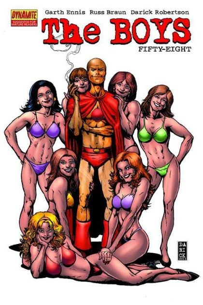
THE BOYS, after a fairly weak history lesson, has returned to its proper standing near the top of the quality scale. This past story has been setting up the long awaited confrontation between the Seven and the Boys, and Ennis does not disappoint.
Writing: (5/5) THE BOYS remains one of the most amazing titles being released now, and this book returns to the golden standard. The story focuses on the last moments of peace before the inevitable confrontation. The book jumps through various subplots with a certain speed, never really spending much time on any individual beat. But Ennis manages to make each scene feel packed enough to have an entire issue devoted to it. The pacing is crisp with enough depth to it that it never feels like a waste. The multiple story lines all converge in interesting and intriguing ways, and none of the book feels slow.
Following a well written scene between Hughie and Butcher's interrogation, the book shows some of the files the Boys have against the Seven. The scene works extremely well, revealing more of the Seven that we didn't know, while also reminding us that Hughie really is in the wrong line of work. The further look into Homelander continues to sink farther and farther into his twisted psyche and takes story in a very interesting direction. Even when he's not on the page, Homelander remains one of the most despicable, revolting, and unique villains in comics.
The few pages before the climax are simply stunning, making you realize that this next story isn't going to be a simple end to the arc. The next issue may be the comic I'm most excited to see right now.
Art: (5/5) It's so rare to see art compliment writing just right. Sometimes the art is good, but just not right for the story or the style of the writing. Braun turns out a marvelous comic, telling the story perfectly. His faces, his short action beats, his establishing shots, everything looks great. The framing, especially during Hughie's time reviewing the files, is simply great. There's not much to say, beyond this is fantastic art.
Best Moment: The ending.
Worst Moment: ...really, nothing.
Overall: (5/5) This is how you set up a story, Ennis! One hell of an issue.
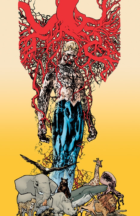
ANIMAL MAN #1
Writer: Jeff LemireArtist: Travel Foreman
Publisher: DC Comics
Reviewer: Optimous Douche
It took a reading of the newly transformed yet somehow familiar ANIMAL MAN to finally figure out the Lemire secret sauce. See, I love Lemire’s work on SWEET TOOTH; his tale about post-apocolyptic human/animal hybrids provides mystery, intrigue and a sense of heart that simply needs to be experienced to understand its true beauty. I also heard great things about his ESSEX COUNTY TRILOGY, and I still feel a bit empty inside having never read it. But then there was SUPERBOY. I didn’t hate it, but I was also far from elated. I actually felt nothing.
Given my proof points I could only come to the conclusion that Lemire is a genius in his own worlds, but in-continuity simply wasn’t his bag.
Oh, how wrong I was. Lemire can write action, Lemire can write in continuity. Lemire just needs the right character and the freedom to let his ideas and voice flow through. SUPERBOY carried too much baggage and too many editorial mandates to clean up the convolution of the past for Jeff to truly own the character.
ANIMAL MAN, however, is the character Jeff was meant to write. I also selected ANIMAL MAN as one of my top picks in the new 52 simply because of its stark contrast in character to…well…pretty much every other title in the DCU new or old.
First and foremost Buddy Baker is an out of the closet hero. His time as a stunt man prior to gaining his animal-channeling powers made his face well-known (yes, even hidden behind goofy goggles) where it seems every other hero, with probably the exception of Guy Gardner, works tirelessly to hide who they are so they can actually have a personal life outside of their caped adventures. Speaking of personal lives, this is where the book really hit home for me. Buddy Baker lives in actual “domestic bliss” with his wife of ten years and their two children. Bliss in quotes, because as any married man will gladly attest, we’re happy, but there is countless strife that comes with cohabitation. And that’s where the book starts off…
Buddy’s been out of the grand-scale superhero game for a few years now, content to get his stuntman and acting career off the ground. Sure, he helps folks from time to time, but being a superhero is not how he files his W-2. After a wonderful little interlude between Mr. and Mrs. Man about the state of their finances, the issue kicks in with the action.
Buddy gets notice of a hostage situation in the kid’s cancer ward at the local hospital. Given the grand scale of action bleeding out of the new 52, this might sound somewhat mundane, but here is where Lemire and Foreman show their immense aptitude with the comics medium. Buddy’s transformation into the right animal almost stopped time. There was something truly magical in this gigantic full page splash of Buddy’s innards and the wispy images of the animals he runs through to help him either dodge or stop the bullet. Again, this is one of those pages that has to be experienced rather than reading my lame description.
Of course Buddy, thwarts the attackers’ attempts and in the process shows that he is just a genuinely good soul.
I’ll be honest, my knowledge of ANIMAL MAN’s adventures prior to the reboot is sparse, but for now consider me hooked. Lemire and Foreman did an amazing job with this issue and set a nice mystery in place for a larger ongoing story centered on ANIMAL MAN’s daughter and the carcasses of dead animals. Intrigued? Good!
Optimous has successfully blackmailed fellow @$$Hole BottleImp into being his artist on Average Joe. Look for Imp's forced labor on Optimous brain child in mid-2011 from COM.X. Friend Optimous on FaceBook to get Average Joe updates and because ceiling cat says it's the right thing to do.
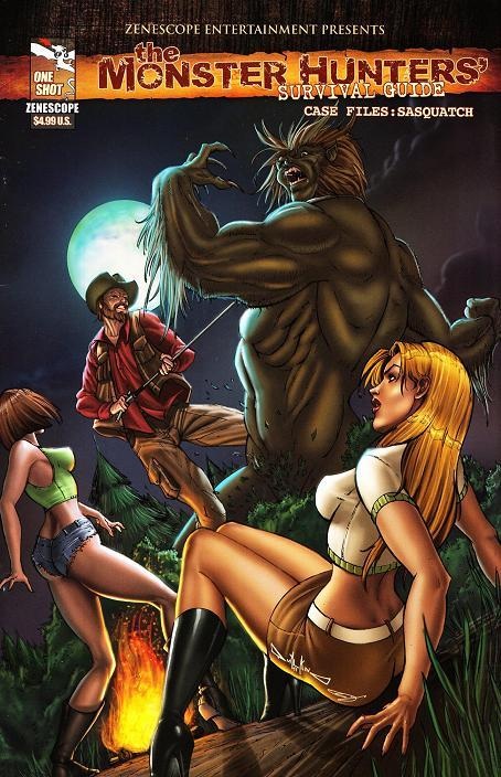
MONSTER HUNTERS’ SURVIVAL GUIDE CASE FILES: SASQUATCH One Shot
Writers: Joe BrushaArt: Anthony Spay & Isaac Goodheart
Publisher: Zenescope Entertainment
Reviewer: Ambush Bug
Those who read my other regular column on AICN (AICN HORROR) know that I am a Bigfoot fanatic. Though I’ve never seen the creature myself, I gobble up everything and anything about the creature: films, TV shows, books, and yes, comics! Well, our pals at Zenescope have put together quite a one shot under the MONSTER HUNTER SURVIVAL GUIDE title, which basically follows the adventures of a monster hunter by the name of J.P. Russ who has a knack for running into creatures of the monstrous type and knows how top deal with them when he does.
The story is pretty straight forward and ripped from the headlines (if you read the supermarket tabloids, that is). Basically, Bigfoot kidnaps a young female camper and a group of locals and our expert monster hunter aim to find out why. Right from the beginning, this doesn’t smell kosher for JP Russ. Bigfoot are usually pretty peaceful and rarely engage in interactions with humans. I like the way writer Joe Brusha sprinkles in factoids that Sasquatch enthusiasts like myself know through multiple viewings of Discovery and SyFy Channels reality shows. The kidnapping itself is pretty harrowing with more than a good portion of gore to let the readers know that this is no Harry from HARRY & THE HENDERSONS. This is a savage beast. As the story progresses, we find out the reason why this particular Bigfoot is so eager to terrorize humans. We also get a chilling look into Sasquatch culture toward the end.
The art is equally well done, splitting the art duties are Anthony Spay & Isaac Goodheart; both fully capable of plotting a scene to maximum intensity. There’s a really nice panel done by Spay depicting the finding of a Bigfoot print. This is a tough scene to pull off, but Spay does it well. The later scenes done by Goodheart show the Sasquatch in a terrifyingly powerful light. This is just a good looking comic all around.
MONSTER HUNTERS’ SURVIVAL GUIDE CASE FILE: SASQUATCH is a One Shot not to miss for Bigfoot enthusiasts. Not only does it pay attention to the mythos, but it builds upon it and makes this a horror story while still casting the mysterious creature as both sympathetic and powerful.
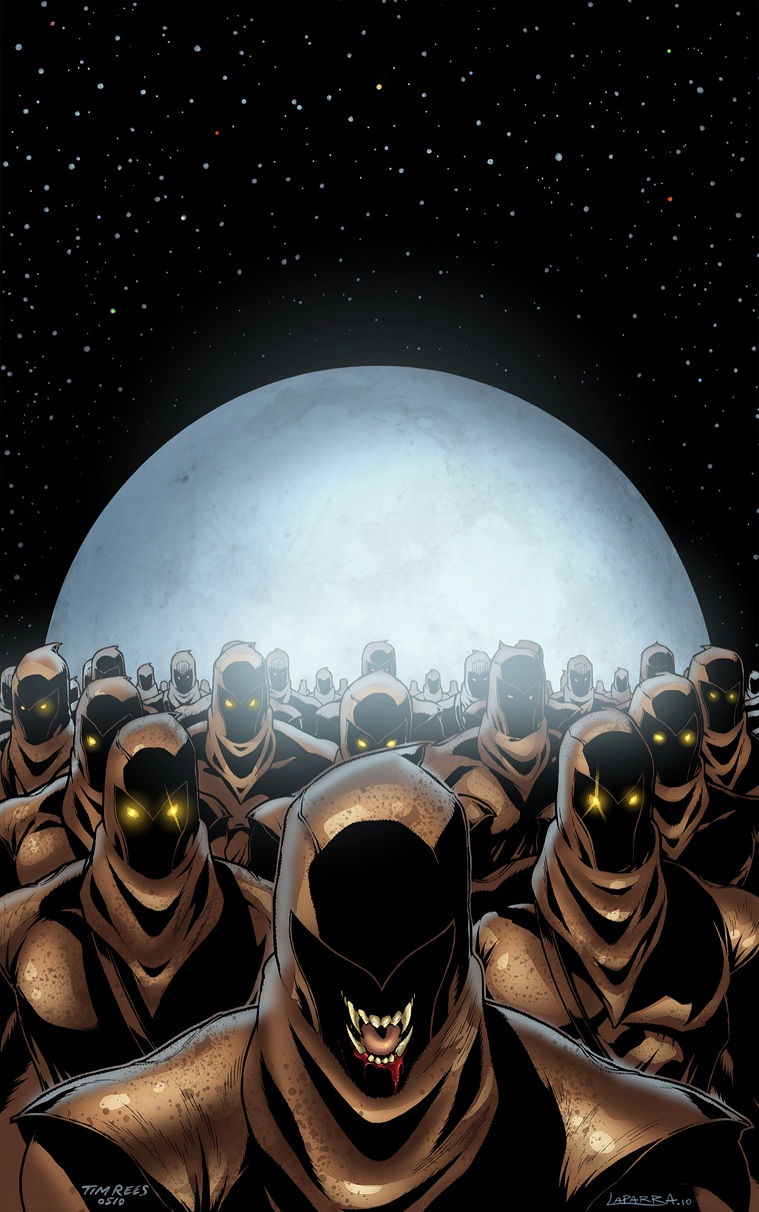 Ambush Bug is Mark L. Miller, original @$$Hole / wordslinger / reviewer / co-editor of AICN Comics for over nine years. Mark is also a regular writer for FAMOUS MONSTERS OF FILMLAND and will be releasing FAMOUS MONSTERS first ever comic book miniseries LUNA in October (co-written by Martin Fisher with art by Tim Rees) Order Code: AUG111067! Support a Bug by checking out his comics (click on the covers to purchase)!




Check out NANNY & HANK’s Facebook Page
Check out THE DEATHSPORT GAMES’ Facebook Page
 Advance Review: In stores today!
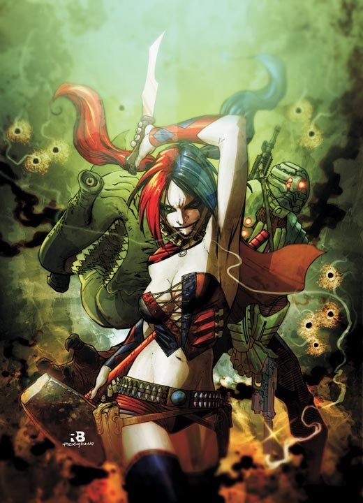
SUICIDE SQUAD #1
Writer: Adam GlassArtists: Federico Dallocchio, Ransom Getty, Scott Hanna
Publisher: DC Comics
Reviewer: Optimous Douche
Torture, insanity and a Kobayashi Maru: sign me up.
I’ll admit my dalliances with SUICIDE SQUAD have always been few and far between, but I have had a long-standing admiration for their no-nonsense leader Amanda Waller since she was shoehorned into the insanity that was the mid-80s JUSTICE LEAGUE. Amanda was the voice of reason in an asylum of spandexed insanity, but unlike her counterpart Martian Manhunter, Amanda never gave any wry smiles in the closing panel. She didn’t find the antics of Booster and Beetle loveable--simply inept. There was no way she could work forever on this title and realizing that, Amanda was given her own team, a team just as serious and grave in nature as Amanda herself.
The premise for SUICIDE SQUAD remains the same as before: take the worst of the worst and use them for the missions where you don’t want to waste real heroes or missions real heroes would never take on due to pesky little nits like civilian casualties and property damage.
Everything else, though, is all new DCU. I would say that even though Amanda Waller only appears in one panel, she gets my award for most drastic aesthetic revamp in the reboot. No, they didn’t plate her pant-suit in body armor, but she is also no longer a walking carbohydrate. This Amanda is more Angela Bassett than Mama from “Good Times.” Again though, she only appears in one panel. This issue is all about the loony toons that make up her new elite SUICIDE SQUAD.
Like I said in the beginning, this issue has more blood and mayhem than any other DC title to date. Is it a Garth Ennis book? No. But for those of us with a sensitive palate this was more than enough. To watch Harley Quinn, Deadshot, King Shark and El Diablo being eaten alive by rats and hooked up to car batteries clearly delineates this book into the non-kid friendly category. Tell the wee ones to stick with JUSTICE LEAGUE for their team based rah-rahs.
To give away why these cats are being tortured would give away a delicious surprise that we’ve seen before in movies and television, but still has that “gotcha” effect for me at least. What Glass does rather exceptionally, though, is recount how the villain made their way onto SUICIDE SQUAD. Harley Quinn’s story was probably the most emotional for me.
While on Harley Quinn, there has been a great deal of back and forth about her new choice of attire. It’s a little more emo and bares a lot more skin than her old leotard. Personally, while I thought the old outfit was fitting, I will never disparage the continuing trend in fashion to cover less and bare more (especially when it comes to the ladies). In all seriousness though, girls dress differently since Harley was created so many years ago. This is a natural progression of time and I’m A-OK with it. Plus I love the messy Heath Ledgering of her white face. She’s crazy; her make-up should be more sloppy than a fifty year old bar whore on a bender - it just makes sense.
From the art side you would barely know that there are three pencilers at work here. There were differences, but none that pulled me completely out of the action. And the opening scene work is simply gorgeous in the brutal sense of the word.
All in all I’m hooked on this new team and salivating for the next mission that they are literally being dropped into for issue 2.
CASANOVA III: AVARITIA #1
Writer: Matt FractionArt: Gabriel Bá
Publisher: Marvel ICON
Reviewer: MajinFu
“When did all this turn out to be my fault?”
Imagine a book that works like a meticulously crafted puzzle box and reads like a James Bond fever dream. That’s CASANOVA, and as the title implies, this is the beginning of a dark new chapter for the spatiotemporal explorer. Now working as an agent of E.M.P.I.R.E. for his alternate dimension dad, Casanova is forced to erase the wake left by his earlier adventures, meaning he basically has to destroy other universes.
Matt Fraction does a great job of keeping the script light and tight and presenting a layered story through different planes of dialogue and thought patterns. This might make the book sound cluttered or confusing, but it’s not. There is a mysterious undercurrent that weaves into your mind as you read the book and that’s all part of the fun. One page in particular, depicting a montage of universal destruction (including one where everybody’s a Looney Tune) is especially indicative of what this book is all about. It’s crazy, it’s funny, and if you’re only reading it one way then you’re missing out. This is the kind of comic that encourages a second (or possibly third) reading, usually improving each time. Sounds tedious, but it’s not, because the story is gripping, the characters are compelling, and the art is gorgeous.
Yeah let’s talk about that art. Gabriel Bá’s signature style is on full display here, and it’s bigger and sexier than ever. The stylized characters and more surreal visual moments enhance both the humor and horror of the story. There are also moments of true beauty, and thanks to Cris Peter’s colors, the whole thing is dripping with atmosphere. I have enjoyed watching the palette of this book expand with its publication, and this issue is no exception. It is simply stunning work.
So in a week filled with rebooted spandex and farm boys with capes, don’t be afraid to turn to a darker, more complex side of comics where nothing is as it seems and everything is temporary. I’ll admit this first issue is not especially friendly to new readers, but that just means you have to check out the first two arcs so you will know what’s going on, which is practically foreplay. This is a gorgeous comic, the kind of story that could only possibly be told with words and pictures, and a good argument for the power of the medium.
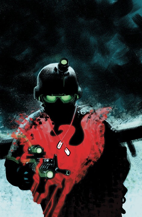
MEN OF WAR #1
Writer: Ivan Brandon (Story1), Jonathan Vankin (Story 2)Artist: Tom Derenick (Story 1), Phil Winslade (Story 2)
Publisher: DC Comics
Reviewer: KletusCasady
Huh…This comic kind of seems out of place in the new 52. Not that it doesn’t deserve a spot, but from working in a comic shop the last few years (and this may just be regional), I haven’t really seen a demand for more war books on the shelves. I don’t know, maybe DC knows something I don’t…naaaah, doubt it.
The first story is about the grandson of the original Sgt. Rock and his squad running into a slight hiccup during their latest mission. The best part of this part of the book comes where Rock’s being questioned about why he chooses to fight on the front lines rather than make Sergeant and keep himself safe. The whole time I kept thinking, ‘this guy is really similar to Captain America’ mostly because of his steadfast loyalty to the service and his no nonsense way of answering his superiors’ line of questioning. This comic had me up until an unknown super being starts flying around out of nowhere, only because it made these soldiers slowly parachuting to the ground seem somewhat less significant once we realize that there’s a super powered being getting involved. It’s not a bad read at all but I kind of wish these soldiers, including Corporal Rock, would have been a little more established before we just jump straight to superhero time. I was hoping for a story about the trials and tribulations of folks in the military rather than soldiers running from what looks to be Superman (just a guess though).
The art is ok, very similar to the art in BATMAN: ARKHAM CITY by Carlos D’Anda which isn’t my favorite style but I didn’t hate it. This story wasn’t bad but I’m not sure it’s enough to bring me back BUT if this story is going to be about Rock getting revenge on the super being that killed his fellow service men…well, that’s something I’d like to see.
The second story is a more straightforward war tale that involves a platoon (not sure, I’m bad with military terms) trying to draw a bead on a sniper, which is always a great tension builder. In comics, it works great because all you have to show is a bullet whizzing by coming from any direction, a sniper in an unknown location, a few well placed ‘BLAMs’ and it can capture that pinned down feeling one would experience in that situation. I enjoyed this story more which may have been because it’s what I was expecting from this book. It’s a pretty straight forward in-combat tale but the interactions between the soldiers makes this story pop a little more than the last one.
The art work is great; it’s very similar to Mitch Brietweiser and little bit similar to Gabriel Hardman (who is killing it on HULK right now). All of these artists have a good amount of sketchy line work that gives the art an added dimension. For example, look at the soldiers’ clothing as they move; every fold in the soldiers’ pants is shown….well, that sounds bad but I’m leaving it…(soldiers’ clothing is what I meant) but it really helps visualize the movements that a character makes during certain actions. This story was good and what I was looking for when I initially picked this book up and the art is really great.
Overall this book wasn’t bad but I doubt this is going to be an issue that folks are going to be talking about around the water cooler (do people still do that?), at least not yet.
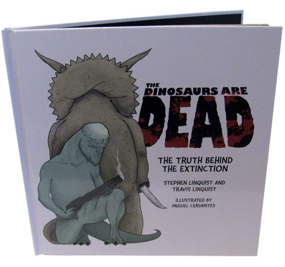
DINOSAURS ARE DEAD Book
Writers: Stephen & Travis LinquistArtist: Miguel Cervantes
Publisher: Dinosaursaredead.com
Reviewer: Optimous Douche
Yes, we all know that dinosaurs once walked the earth. The existential questions of how long ago they lived (depending on your religious orientation) and exactly what did them in (depending on how many different Discovery programs you have watched) are questions left for once we finally discover time travel. Until then, all we have is the best conjecture our little brain masses can imagine.
Personally, I like the approach conjured up by the Cousins Linquist, but then again I’m their demographic. On the surface DINOSAURS ARE DEAD appears to be standard children’s fare, which made me seriously question team Linquist’s footprint at this year’s comic con. Yes, comic con is no longer for comics, but to start dabbling in children’s books is a splintering more evil than a Horcrux for this venerable event.
After reading DINOSAURS ARE DEAD all became clear; there is no saccharine sweet message about dinosaurs living on in museums and our imaginations; in fact, this book doesn’t have any lessons to teach despite its parable shaped packaging and artwork.
No, DINOSAURS ARE DEAD is the forbidden fruit of the Phineas and Ferb set. Kids will want to pluck this book off the shelves. For starters, it’s about dinosaurs. Since “Jurassic Park” most kids can write the word pterodactyl before their own names. And as I mentioned, the artwork and size of this book can easily be mistaken for actual child bedtime fodder. But it’s not…oh dear God it’s not.
DINOSAURS ARE DEAD is one part WALKING DEAD, one part “Pulp Fiction” and it is utterly filthy.
However, this title illuminates an air of originality in that the filth is presented in the sing-songy tonality of most children’s fare. It’s hard to quantify this tonality, but if you have ever read a Little Golden Book you’ll know what I mean. It doesn’t rhyme, but there is a cadence that is defiantly geared towards the ears of a child even if the words themselves are not for the ears of a child…or adults with any level of puritanical leaning.
To provide too much detail will kill half the humor of this title. Just know that dinosaurs didn’t die from the big asteroid as we once believed, but rather transformed the reptiles of yore into the undead. That is except one lone dinosaur, Danny, and his gal pal, Trixie.
Danny and Trixie are forced into a battle for survival and this is where the book shines. There were times I’ll admit I was drawn out of the book, but mainly for my own prejudices. I enjoy the concept of anamorphous creatures. What I didn’t love is the societal overlay that went with it. Whenever the book would cut over to a broadcast from Dinosaur News or Trixie and Danny would wield guns to escape the dinozombies as opposed to just using their own cunning I was reminded of the ABC series “Dinosaurs,” which I absolutely loathed.
This is a small nit, though, and I fully realize it’s a personal prejudice. Cervantes plays with the pages with a child’s imagination, even when drawing dinosaurs like the Homosaurus. It’s all cute without sacrificing the impact of extinction’s dire nature. All in all I would like to see more from this team, but I’m also going to offer them a challenge. Cut back slightly on the potty mouth or find a way to offer a counter-balance with some of the characters. The best comedy is always unexpected, and every joke works best in threes.
HAWK & DOVE #1
Writer: Sterling GatesArtist: Rob Liefeld
Published by: DC Comics
Reviewed by: BottleImp
“You can’t judge a book by its cover.”
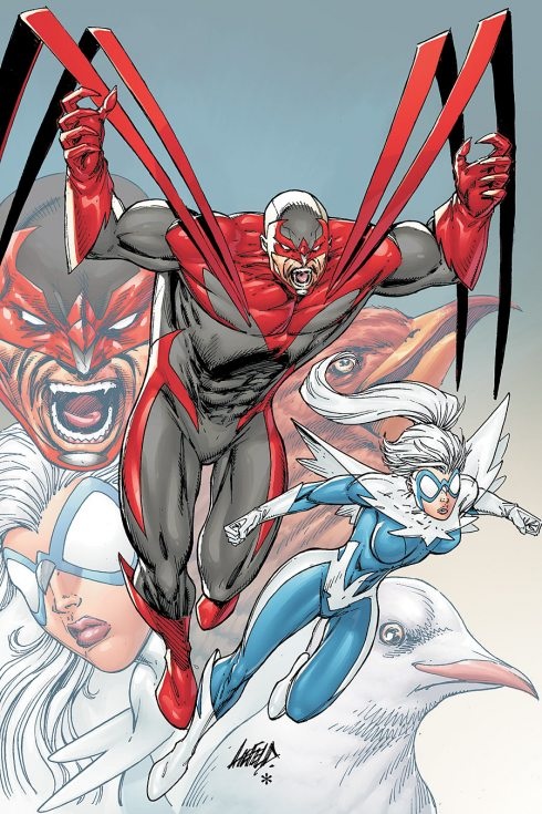
As firmly entrenched in our consciousness this proverb may be, I’m pretty sure that most of us have at one time or another passed judgment on interior qualities based upon outward appearances. And let’s face it, when it comes to the comic book medium, all readers to some degree make their decisions on which comics to buy based on what their covers look like. Granted, there are times when the cover image may be misleading or may not accurately reflect the substance of the actual issue. And then there’s HAWK & DOVE. HAWK & DOVE #1 may very well be the best repudiation of that hoary old proverb ever to grace the comic racks. Using the specially marked cover image I’ve provided here, let’s go down the line together and see what this image tells us about what we’ll see inside, shall we?
A. Ah yes, the old Rob Liefeld staple—the gape-mouthed grimace. The fact that this expression is featured on this cover not once but twice on one half of our titular duo is a pretty good indication of the multitude of times you’ll find people spouting this look on the pages inside. Also featured prominently within are the other signature Liefeld looks: the gritted-teeth grimace, the gritted-teeth sort-of-a-frown-but-not-really-a-frown, and the variation on the gape-mouthed grimace, the gape-mouthed look of what is intended to be shock. No subtle emotive expressions here, folks.
B. Everyone always knocks on Liefeld for his handling of the foot in his drawings (there are whole blogs devoted to the subject, I’m sure) but his treatment of the lower extremities is nothing compared to the punishment he inflicts upon hands. Often you’ll see Liefeld’s figures sporting gnarled, ungainly paws such as the ones Hawk is sporting here. What you will also find inside is that these hands, though they may be meant to perform simple tasks of grasping other objects (such as plane controls, bunched shirts, and zombified necks), are never drawn in a way as to make holding such objects possible. Essentially, Liefeld can’t be bothered to draw how two objects interact in the material world, so he just scribbles one on top of the other in hopes that the reader will get what’s supposed to be happening.
Oh, and I’d just like to mention how much I love the attitude of Hawk’s hands on the cover—it’s less of a menacing pose, and more of a cranky old man telling the no-good teenagers to get off his lawn.
C. Notice anything weird about those pointy things that shoot off from Hawk’s pecs and fold over into some sort of feather/cape thing? Like how they are affixed to his chest at totally random, asymmetrical points? Yeah, that’s pretty much par for the course inside, and not just Hawk’s cape thingy. There is a general lack of continuity in Rob Liefeld’s drawings that would make Ed Wood proud. Aside from the cape, there are the other costume details such as the pinstripe lines on Hawk’s head, the cut-out shapes on his gloves, the collar of Dove’s cape and that little beak shape on the bridge of Hawk’s nose that vanish and reappear from panel to panel. On the cargo plane that the duo are attempting to rescue from terrorists, the pilot’s seat goes from having no armrests to having armrests, then vanishing completely only to reappear a few pages later, sans armrests once more. The plane’s controls go from being a U-shaped yoke to a sort of a squared-off steering wheel. The zombie-like monster Hawk fights on the plane first appears wearing sporty metallic gloves, but is later bare-handed. A police officer from Washington D.C.’s special crimes unit has his hair parted on opposite sides from one page to the next. And my personal favorite: Hawk reverts to his alter ego of Hank Hall and is having a heart-to-heart with his dad, who is apparently getting dressed to go out somewhere. When we first see him, Hank’s dad is looking in a mirror as he ties his necktie. Two pages later, he’s fully dressed in his tuxedo—complete with BOW TIE! There’s a big difference between making the occasional goof and sheer laziness.
D. Liefeld fans will always defend his grossly lacking anatomical expertise as a stylistic choice, but that implies that the man knows how the human muscular system is assembled and chooses to blatantly ignore it in defiance of all natural law, and isn’t that even worse than saying that the man can’t draw people? The swivel-biceps on Hawk and glued-on legs on Dove make me think that Liefeld uses G.I. Joes and Barbie dolls as reference rather than doing a little research on how muscle groups actually interact with each other. Sadly, these perversions of nature continue within the comic.
E. See how Hawk’s foot and Dove’s leg seem to just graze each other, sharing for a moment a single line between them? That—when two objects touch without overlapping—is what is known as a tangent. Tangents are a bad thing in art because they tend to flatten out the space; when it becomes unclear as to where objects are in relation to each other in terms of depth, the eye loses the illusion of seeing a three-dimensional image and is jarred back to seeing a flat, two-dimensional plane. Tangents abound in HAWK & DOVE, as do other awkward compositional elements that result from Liefeld’s seeming aversion to having things overlap. Just look at the strange, almost-touching-but-not-quite elements of Dove’s hair and Hawk’s cape-feathers. And don’t get me started on Dove’s bizarre hairstyle and the many laws of physics which seem to be bending in order to allow her to wear it like that…
F. Finally, I’d like to talk about the importance of an artist doing research in order to accurately render the images he or she must draw. I’ll give Liefeld credit for this; he must have felt very shaky about his ability to draw a dove, because it looks like he actually took the time to find out what a dove really looks like for his cover drawing. However, it also appears that Rob Liefeld was supremely confident in his knowledge of a hawk’s anatomy, ‘cause he most definitely did NOT supplement his memory with any real-world reference. The “hawk” looks less like a hawk and more like Woody Woodpecker to me. And once again this lack of research also makes its way into the interior of the comic, most noticeably in Liefeld’s depiction of the hijacked cargo plane. I must invoke Ed Wood yet again, as Liefeld’s drawing looks about as accurate as the plane set from “Plan 9 From Outer Space,” what with the non-existent control panels, office furniture pilot chairs and the expansive, windshield-like glass dome over the cockpit.
All this adds up to some of the worst artwork I’ve ever seen in a professionally published comic book. And the thing that really pisses me off about this is that Liefeld somehow gets a pass on it from DC’s editors! Let’s face it, if an aspiring comic artist were to show a portfolio to an editor for a critique and the artwork within was on the same level as the artwork for HAWK & DOVE, there is no way in hell that the editor would say, “Wow! Looks great, come on in and have a bunch of money!” At the very least, the kindest, most Archie Goodwin-esque pro would encourage the applicant to go back to the basics and work on stuff like anatomy and perspective (though not evidenced on the cover, Liefeld’s understanding of perspective is just about what you’d expect from his tenuous grasp on the human form). Yet Rob Liefeld turns in the same crap and gets paid for it. He’s done it—like Ed Wood (again), Rob Liefeld has achieved the “so-bad-it’s-good” cult status. Unlike Wood, he was just lucky enough to attain it while still alive.
Frankly, the choice to reintroduce the characters of Hawk & Dove to the comic-reading public—and the chance to bring in new readers while doing so—has been badly muddled by DC’s inexplicable decision to hand the artistic duties to a bona fide hack like Liefeld. Yes, he has history with the characters…but I thought that the “New 52” was meant to be a look ahead to the DC Universe of the 21st Century, not a regression to the worst the 1990s had to offer. Though Sterling Gates’ story is nothing extraordinary so far at this early point in the series—he offers a simplified, cut-and-dried retelling of the Hawk & Dove origin while adding a little bit of personality conflict between the two—it definitely deserves a better chance to be read than the one given here. It deserves a better artist than Rob Liefeld.
It used to be kind of funny to look at Rob Liefeld’s work, but seeing all the amazing artwork on the comic book stands month after month makes me realize that there’s nothing funny about paying money to laugh at the poop-flinging monkey at the zoo when there is true artistry to be appreciated in the museum around the corner.
So make sure you judge a book by its cover this month, and don’t waste your time or money on this sack of monkey shit.
When released from his bottle, the Imp transforms into Stephen Andrade, an artist/illustrator/pirate monkey painter from New England. He's currently hard at work interpreting fellow @$$Hole Optimous Douche's brainwaves and transforming them into pretty pictures on AVERAGE JOE, an original graphic novel to be published by Com.x. You can see some of his artwork here.
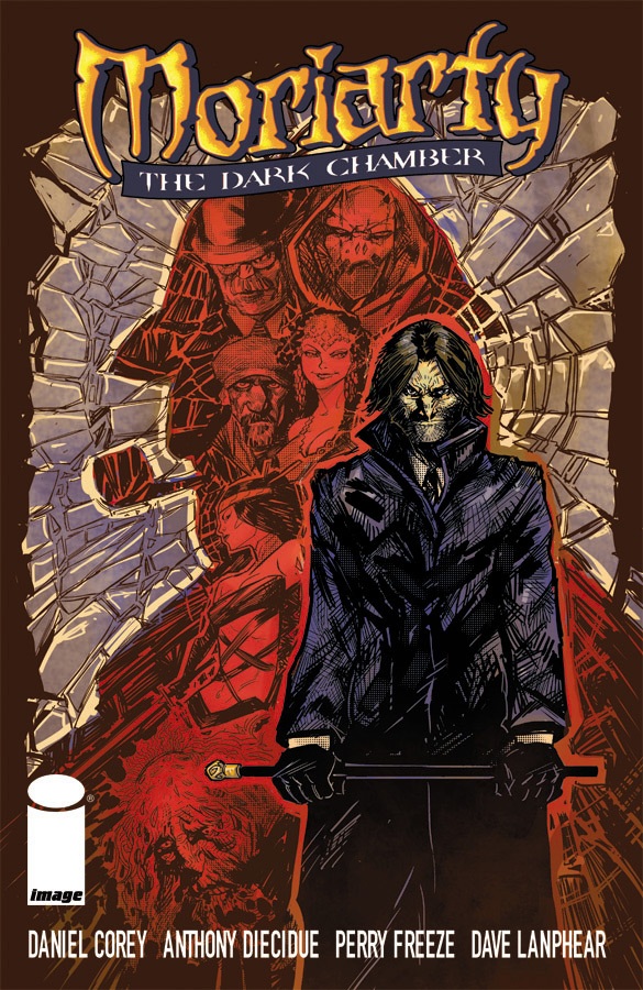 Advance Review: In stores today!
MORIARTY: THE DARK CHAMBER Vol.1
Writer: Daniel CoreyArtist: Anthony Diecidue
Publisher: Image Comics
Reviewer: Mr. Pasty
I remember growing up in the late seventies and early eighties, trying to keep myself entertained while living in “the sticks” of rural New Jersey. Of the thirteen or so television channels I had, one of them was PBS, which gave me a bunch of wacky British shows that seemed ass-backwards in comparison to their stateside counterparts (with the exception of the gloriously epic “Benny Hill”). With that in mind, it should come as no surprise that I never had a taste for Sherlock Holmes. I had trouble getting past that phallic pipe and dopey plaid hat. Never mind that it was true to its era, all I saw was Bentley from THE JEFFERSONS dressed in my Nana’s drapes. It wasn’t until I was older and got bored of the muscle-bound action heroes who carried chain guns and bagged hot chicks that I began to develop an appreciation for the complexity found in literary supermen.
And who was waiting for me when I did? Yep, ol’ Sherlock Holmes himself. I don’t know if it was the gadgets and gizmos, the deductive reasoning, or the way he was able to carry himself like a badass despite not being a physically imposing bloke, but he was terrifically fleshed out by Sir Arthur Conan Doyle and the benchmark for character-driven detective stories. Is it outrageous to think he was Batman without the latex? It’s elementary, my dear Robin. And now that I have my segue let’s mention the Joker, who was the caped crusader’s foil for many moons. Is he not, in his own right, worthy of examination? He is, just as Moriarty is, the criminal mastermind that was the “bane” of Holmes’ existence. That’s what writer Daniel Corey is banking on and whether or not he succeeds may depend largely on your interest in the Holmes saga. What initially drew me into the book was the idea of Moriarty in a world where Holmes no longer exists, which I think is just as compelling as a world survived by the Joker but not Batman, Lex Luthor but not Superman, etc.
In MORIARTY: THE DARK CHAMBER, Holmes is dead but his memory is not, and our resident bad guy must now embark on a mission that draws him back into the detective’s world against a new set of villains -- which leads me to my one criticism of the book: Moriarty is the criminal mastermind responsible for the death of Holmes, but now he becomes the hero, stripping away some of his appeal (to me) on a macro level. I won’t go as far as to say it hurts the story because it doesn’t. Corey does a wonderful job of honoring Doyle’s commitment to character development and his narrative is sharp and polished. So too, are the illustrations of Anthony Diecidue, whose blocky and often scratchy panels emulate a forgotten world of mystery and intrigue. I enjoyed reading MORIARTY even if I longed for the days where I could boo and hiss at his very existence, but he is a worthy main event protagonist who delivers an entertaining read through the mind of Corey and pencil of Diecidue. You don’t need to be a Holmes fan to enjoy this book (but it certainly doesn’t hurt) and if you have the chance to check it out, do so, you won’t be disappointed.
Web heads who can’t get enough of Mr. Pasty’s word vomit are encouraged to watch him operate as Nostradumbass over at MMaMania.com here. Love, hate and Mafia Wars requests should be directed here.
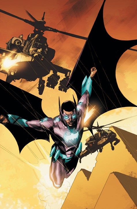
BATWING #1
Writer: Judd WinickArtist: Ben Oliver
Publisher: DC Comics
Reviewer: Optimous Douche
I am your personal Jesus. Because I will gladly hang on the cross and allow the comic community to pelt with me stones for what I’m about to say: BATWING was a batfuckingtastic ride of thrills, mystery and action.
Look, I’m totally guilty of pre-judging this book like all the rest of you. I made my fair share of derogatory statements when this title was announced: “Batwing--a phrase that now means something other than when your testicles sweat-fuse to your inner thighs.” “Will Batwing have enough energy for crimefighting solely from Sally Struther’s scraps?”
But the God’s honest truth is whether you think the name is silly or that BATMAN INC from which this title spawned was a mistake, Judd Winick has more than effectively established a comic character on a continent that was mainly owned by Marvel up until now.
First off, the art in BATWING is gorgeous and again reminiscent of that other comic company. Oliver is like a delicate Simone Bianchi. Basically the same painted goodness, with a far more precise and distinguishable end product. And this is not just a stylistic preference (Though I do love me my paint sets), Oliver knows exactly how to move action on a page with inventive angles with more than appropriate close-ups that bring each character into three dimensional beings.
I was next enamored with the fact that BATWING is working both sides of the system. For years Batman has a tenuous relationship with the Gotham PD--sometimes the golden child and other times hated for doing their job without sticky wickets like due process. Despite Batwing’s new set of vast resources courtesy of Bruce Wayne’s Wings Across the World program, David Zavimbe kept his day job as a part of the newly formed Tinasha Police Department. When Batwing busts up a drug ring in the beginning of the book, he is able to carefully leave behind key evidence for his fellow policemen to find. This also goes for policewomen, since it seems we already have a love interest brewing in fellow officer Kia Okuru. Don’t worry, there’s no mushy romantic stuff; this is more of a premonition than an overt sell for Batwing to have a girlfriend. Is he playing the system? Perhaps, but let’s remember this isn’t America.
No, Batwing is fighting against a system where corruption is wielded with guns instead of back-room handshakes and on paper as it’s done in America. When one warlord dies it seems there are three more to take his place. In fact, this is the center of Batwing’s first case. I’ll say I wasn’t surprised by this move, but that is not a criticism. I would much rather see real-world problems being addressed over some kind of made-up threat that has zero resonance in our lives or the invention of a rogues gallery for the sake of a rogues gallery.
Winick has also done a great job playing within the new DCU mythology. When an African philanthropist turns up as part of a slaughter pile by the drug cartel, the newly installed Batcomputers discover that this man was also part of Africa’s version of the Justice League, which has unfortunately disbanded in the five years since superheroes showed up on earth.
Finally, the end of this issue was SPECTACULAR. I never saw it coming, and neither did David, as the last panel shows us in exquisite splattering gore.
BATWING is definitely not part of the DC kid friendly movement like JUSTICE LEAGUE; this is a brutal and gritty depiction of what a man pushed to the edge will do to save the nation he loves.
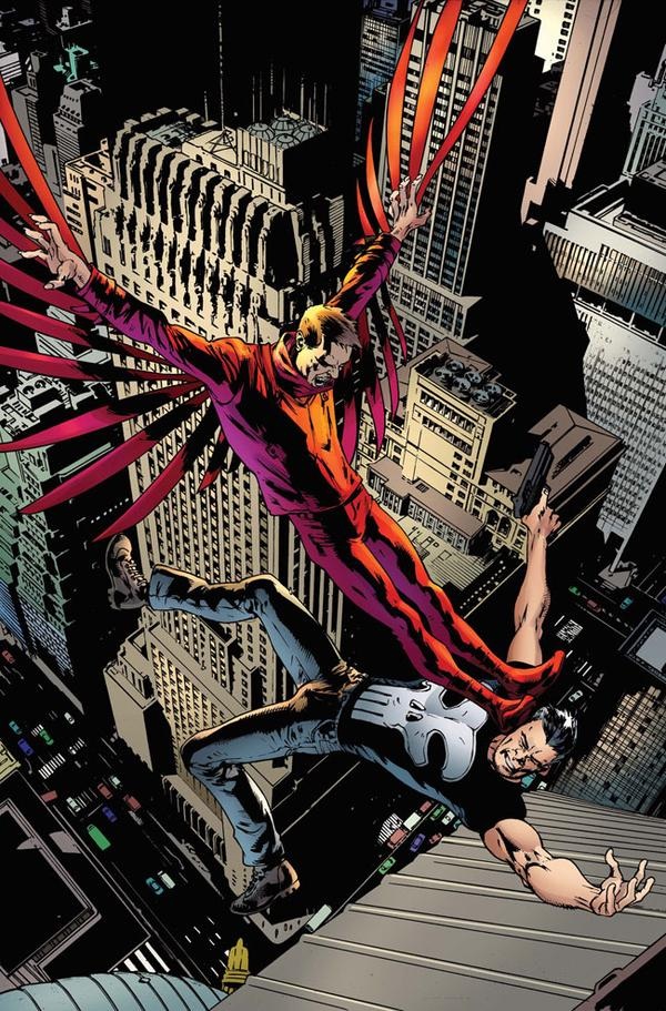 PUNISHER #3
Marvel Comics
After an impressive first issue, I’m finding Greg Rucka’s take on Frank Castle to be a bit tiring. In this issue, Frank barely utters a word, which is probably what Frank would do if he were real and fighting a costumed criminal like the Vulture (who in this new incarnation doesn’t have much of a vocabulary either). The problem is, this approach of making the supporting cast of characters the central focus of the book and casting Frank as a force of nature with machine guns was done before when Ennis first jumped onto the book. Rucka’s approach is much more conservative and less over the top compared to Spacker Dave, but at the same time, his supporting characters aren’t particularly interesting. So we have an uninteresting cast watching a hero and a villain (both with limited vocabulary) fight it out. I trust Rucka. He’s a fantastic storyteller, but making Frank a force rather than a character is not cutting it for me. - Ambush Bug
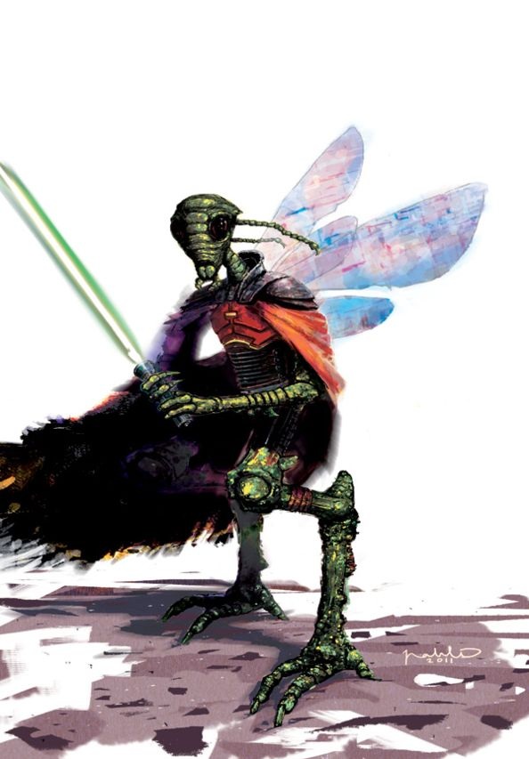 STAR WARS: DARK TIMES - OUT OF THE WILDERNESS #2 (of 5)Dark Horse Comics
What do Star Wars fans want from new stories? In a post-prequels world it’s a question that has become more difficult to find a clear answer for. Do you flood the plot with Jedi and Sith lightsaber battles or do you make a more levelheaded space-junker your main focus? Taking place in the prequel universe before the Battle of Yavin, this comic finds a nice compromise between the wonders of space travel and the intrigue of the Force, but its main problem lies with pacing. While the first issue took off like a rocket, this one is obviously here to put the pieces in place for the next big conflict. That doesn’t mean it’s not entertaining, though. The characters are rich with personality and provide some laughs, especially the cheery H2 droid. The Emperor reprimanding Darth Vader is always funny, and we are introduced to a new Jedi named Beyghor Sahdett, who aptly slays some storm-er, clonetroopers. Dass Jennir fans will also be pleased to hear that a big focus of the book is on him and his exploits through a desert world. Douglas Wheatley’s art is unbelievably precise, and he illustrates the hell out of Darth Vader. The world is filled with little details that help bring the universe to life. The tone and mood of Star Wars is preserved here and you can practically see the screen swipes in the transition between scenes. It’s too bad the story suffers from the decompressed writing style, but this is still good enough to have me looking forward to the next issue. - MajinFu
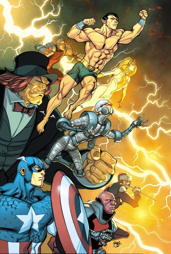 THUNDERBOLTS #163
Marvel Comics
This was a fun “Nothing will ever be the same!” issue of THUNDERBOLTS with Jeff Parker writing the hell out of these characters as he’s done so for months now. With the addition of the Underbolts (especially Mr. Hyde and Centurius), Parker has filled this book with some genuinely interesting personalities to deceive and fight one another. Last issue, a handful of T-Bolts escaped the Raft and figured out a way to get past the nanobite security system they have pumping through their veins. Turns out their plan didn’t play out perfectly. This issue’s twist is full of potential with the T-Bolts facing a whole new moral dilemma and the opportunities for them to rise to heroic greatness or sink to the depths of villainy all the more dire. It’s also a fun jumping on point for those who haven’t been following. All in all, with the winner cast, creative writing, and awesome art by Kev Walker, THUNDERBOLTS continues to be one of Marvel’s strongest titles. - Ambush Bug
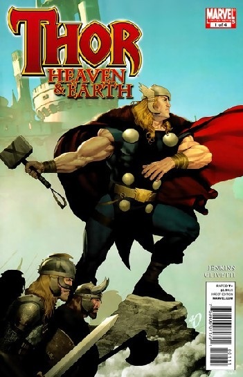
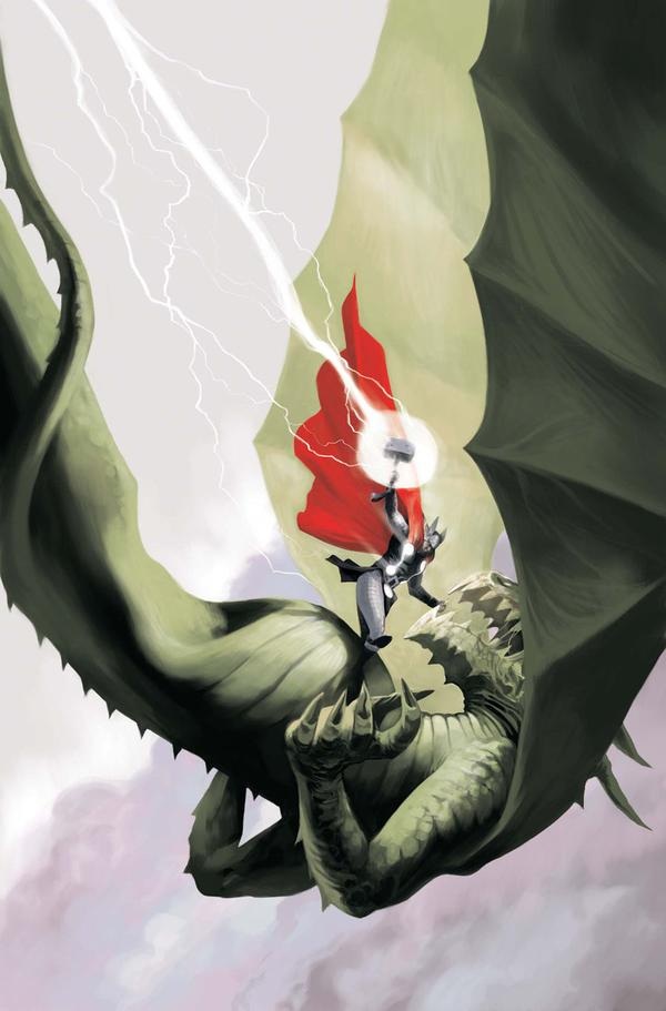 THOR: HEAVEN & EARTH #1-4 Miniseries
Marvel Comics
This four issue miniseries is actually a series of one-shots loosely tied together by the theme of lies we tell ourselves. Paul Jenkins writes each issue and succeeds most of the time in conveying the message of the day. In many ways, this mini can be compared with JMS’ recent “Walkin’ the Earth” SUPERMAN story where Supes confronts the problems of the common man. Though a couple of the tales take place in Asgard, the bulk of the mini deals with Earthen issues. Issue one is talk-heavy with the bulk of the issue focusing on a moral debate between Thor and a captured Loki who proves that everyone lies in order to survive. Jenkins drives the point home with a bit of redundancy toward the end, but the issue is elevated due to Ariel Olivetti’s artwork. Issue two, Thor tries to save a group of people taken hostage by a bomber who has lost his son and wants Thor, a god, to bring him back. This issue, drawn capably by Mark Texiera, is the preachiest of them all as Thor rants for pages about ecology. Ever wonder what a Thor played by Al Gore would sound like? Read this issue. Issue three comes off much better as a quieter tale, ironically with a bit less sermonizing as a preacher on his deathbed questions that if Thor exists, what does that mean for his religion? This is by far my favorite of the four issues because it doesn’t offer easy answers and gives some great moments of character for both Thor and the preacher. Finally, we’re treated to a story about a dragon that guards a hill and a group of Vikings and Norse gods that trespass on its land and battle it. The issue comes off as a bit too moralistic, but is definitely well drawn (especially the extended dragon battle scenes) by Lan Medina. All in all, I found this miniseries to be a bit confounding and preachy in theme, but it isn’t without its storytelling highpoints and it also serves as a showcase for some great artists. - Ambush Bug
Proofs, co-edits & common sense provided by Sleazy G
And check out AICN COMICS’ New Facebook Page!!!
