

| Issue #10 | Release Date: 6/29/11 | Vol.#10 |
(Click title to go directly to the review)
Advance Review: CRAWL TO ME #1
WITCH DOCTOR #1
UNCANNY X-MEN #539
Advance Review: GLADSTONE’S SCHOOL FOR WORLD CONQUERORS #3
EMERALD WARRIORS #11
THE GOON #34
IRON AGE #1
GUERILLAS VOL. 1
BATMAN INCORPORATED #7
dot.comics presents TALES OF A CHECKERED MAN Webcomic
 Advance Review: In stores July 13th!
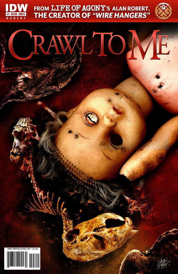
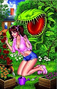
CRAWL TO ME #1
Writer / Artist: Alan RobertPublisher: IDW Publishing
Reviewer: Ambush Bug
I haven’t read Alan Robert’s WIRE HANGERS series, but after reading this first demented issue of his latest miniseries CRAWL TO ME, I definitely think it’s something I should check out. Much like Joshua Hale Fialkov’s sinfully overlooked miniseries ECHOES from a few months ago, CRAWL TO ME plays with reality as seen though what might be a very sick mind.
Though this is definitely an issue guilty of set-up-itis, the story that does occur hooked me. Ryan is walking his dog along a snowy countryside when he notices the police advancing toward a neighboring home. An altercation between the police and the elderly creepy pedophile neighbor takes place and Ryan finds himself caught in the middle of it. Turns out Ryan and the pedophile have somewhat of a history.
Or maybe they don’t.
Soon we find out that Ryan is a sick individual, in need of medication and the reality we just witnessed may or may not have happened. Whether it happened or not doesn’t really matter because Robert’s writing grabbed me by both ears and pulled me in.
For the most part, my enthrallment is due to the fantastic art—done by Alan Robert as well. Robert combines sketchy, yet haunting imagery reminiscent of Sam Keith, then Photoshops it to add more grim layers to each panel which makes it closer to looking like a Ben Templesmith joint. That’s some pretty impressive company to be compared too, and each and every moody page is both gorgeous and terrifying as even the most mundane images take on a horrifying tone.
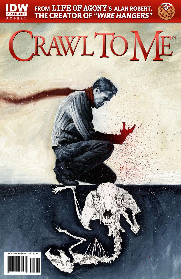 This trip through dementia seems to be just beginning and I’m hooked from the get go. Alan Robert definitely has a gift for making each panel a step closer to the abyss. So while I wait for issue two of CRAWL TO ME to drop, I’m seeking out WIRE HANGERS to whet my thirst for more of Robert’s twisted words and works. All this and another mesmerizing variant cover by SILENT HILL artist Menton J. Matthews III (see right) that is both iconic and seems to have a life of its own and morphs every time you look at it. I highly recommend CRAWL TO ME for those who like spine-tingling trips down the rabbit hole.
Ambush Bug is Mark L. Miller, original @$$Hole / wordslinger / reviewer / co-editor of AICN Comics for over nine years. Support a Bug by checking out his comics (click on the covers to purchase)!


Check out THE DEATHSPORT GAMES’ Facebook Page
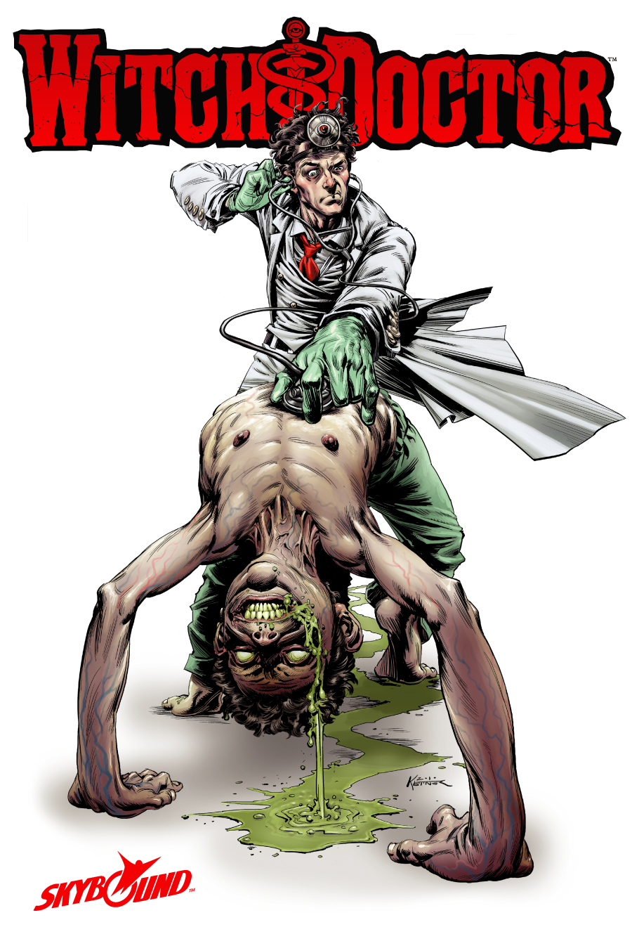
WITCH DOCTOR #1 (of 4)
Writer: Brandon SeifertArtist: Lukas Ketner
Color Artist: Sunny Gho
Published by: Image Comics / Skybound
Reviewed by: BottleImp
Though my first love of the comic book genres has always been and will always be the exploits of the spandex-clad superheroic, horror comics place a close second. So whenever I see a new horror-slanted series on the racks, I have to pick up the first issue and see if the material is able to satisfy that lingering hunger for the strange and unusual. For a comic book of this nature to be successful in my eyes, it needs to either be: A) so far over the top in its depiction of carnage and mayhem as to be blazingly shocking, B) able to instill a genuine sense of dread and fear in the reader, or C) bringing some new twist to the genre that makes the book stand out from the other horror titles in publication. Well, WITCH DOCTOR doesn’t meet my first two criteria too well, but it definitely satisfies the third.
The comic’s protagonist is Doctor Vincent Morrow, a medical practitioner who specializes in the supernatural. Assisted by his assistants Eric Gast (a former paramedic who serves as the “everyman” character and reader’s surrogate, as most of the magical occurrences are as new to Gast as they are to the reader) and “Penny Dreadful” (in appearance a young girl, but in reality some sort of demonic creature herself), Dr. Morrow diagnoses demonic possessions as well as everyday trauma, using a blend of magic and pseudoscientific devices. The familiar medical jargon and hardware that we’ve all seen used ad nauseum on various primetime television hospital dramas is mixed with fantastic gobbledegook in a way that comes across fresh and fun. Seifert expertly balances humor and horror in this issue as we see Dr. Morrow’s somewhat jaded, blasé attitude towards the demonic elements that send other men screaming for the hills. EC Comics pioneered this sort of tongue-in-cheek mixture with their classic TALES FROM THE CRYPT stories, and it’s great to see that same tone on display in this series.
Another characteristic that sets this comic apart from most of the current horror-themed books is Ketner’s drawing style. Most artists today either tend towards minimal line work and smoothly rendered forms (mostly on the superhero side of the medium) or else more distorted or abstracted forms with heavier hatchings and inking (as seen more in the horror genre). Ketner’s work, however, is a throwback to the late 1960s and early ‘70s, with bold inked lines hatched to delineate and model naturalistic forms. The inking is reminiscent of the work of Neal Adams and Dick Giordano, of Gray Morrow, even of Frank Frazetta’s inked work (both his own and over Al Williamson) from those decades. This style gives a unique look to the comic that makes WITCH DOCTOR feel more like a reprint of a story from EERIE or CREEPY than a brand new publication—and I mean that in a good way, seeing as how those magazines set such high standards from black & white comic art. In fact, I almost wish that this series WERE in black & white. I’m not bad-mouthing the colors; Gho’s palette of earthy greens and brown (with the occasional fleshy pinks and reds thrown in for contrast) are a fitting match for the plot and give an appropriate air of dinginess and decay to the Doctor’s creepy clinic. But Ketner’s linework is so evocative of those classic monster mags that I would love to see that connection made even stronger.
The one potential drawback that I see this early on in the series is that so far, characterization is minimal at best, and plot is all. Obviously, a good plot is key to successful storytelling, but if WITCH DOCTOR is going to continue beyond this initial miniseries, more work will need to be done to give more dimensionality to the Doctor and his assistants. Otherwise, this concept could fall into the trap that has snared some television dramas (even a certain medical drama on FOX that Seifer notes was an influence on his writing); namely, that the stories devolve into a “strange-case-of-the-week” pattern in which the protagonists become mere puppets going through the motions of the story without adding anything to the drama by way of their own individual personalities.
Yes, I know that this is just the first issue of the series and that’s a snap judgment on my part, but what can I say? I always tend to look on the downside, and when I see a series like WITCH DOCTOR that has the potential to be something really, really good, there’s a part of me that expects to be let down. But since this first issue does NOT disappoint, I’m interested to see what happens next. Fellow fans of those aforementioned classic horror mags and the EC comics that birthed the genre should not miss this promising new miniseries.
When released from his bottle, the Imp transforms into Stephen Andrade, an artist/illustrator/pirate monkey painter from New England. He's currently hard at work interpreting fellow @$$Hole Optimous Douche's brainwaves and transforming them into pretty pictures on AVERAGE JOE, an original graphic novel to be published by Com.x. You can see some of his artwork here.
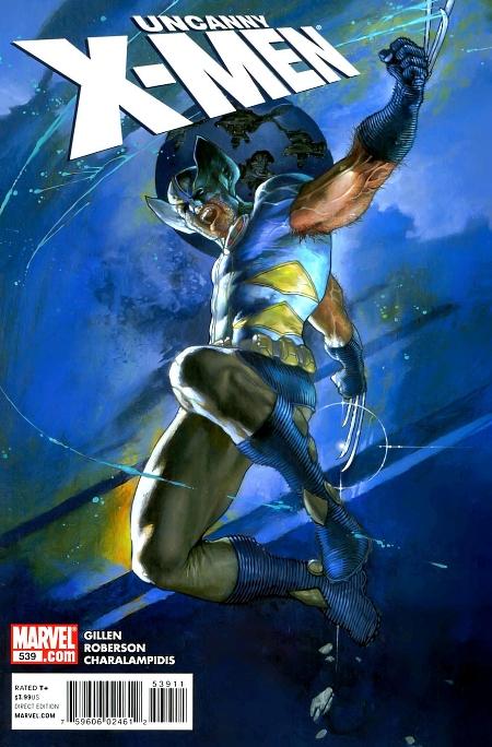
UNCANNY X-MEN #539
Writer: Kieron GillenArt: Ibraim Roberson
Publisher: Marvel Comics
Reviewer: Henry Higgins is My Homeboy
Logan's Hope.
With Schism coming soon, the X-Men books have entered a small lull as of late. UNCANNY, for example, takes this time to look at Hope and her relationship with Wolverine. But that's not the part of the issue that I enjoyed thoroughly. It also provides a surprisingly good look into Hope herself, and how the world around her sees her.
Writing: (4/5) I typically like Gillen, especially his work on S.W.O.R.D. and his Ares one shot during “Dark Reign”. I have mixed feelings about “Generation Hope”, but I think he does a good job of writing the title character. He makes her an interesting character, and surprisingly relatable. One of my favorite parts about “Second Coming” was her characterization (the angry young woman who spent her life at war), and Gillen has maintained an interesting arc with that. She maintains the hardened characteristics, but is clearly trying to be normal with the other girls. But it doesn't feel right. When Hope is fighting off soldiers later and taunting her captors as her nose is cut off, that's when Hope feels natural. And that's a very cool idea for the "messiah". It's not one usually taken, but the idea that the Messiah is more at home in violence than peace interests me. And it'd be nice if Gillen continued on that route. Hope is unsure of herself with the other girls, but seems at home next to Wolverine. It's a nice touch that I appreciated a great deal.
Wolverine also adds a nice, if expected, touch to the story. He's avoiding Hope because, if she goes mental, he'll be the one to put her down. It's another use of the "Wolverine is the hero who will kill" tact, one I'm growing tired of. But here it's played well. It almost reads like the stories of soldiers with new recruits. He doesn't make friends with them because he doesn't expect them to survive long. Wolverine having that attitude is a nice point, if expected.
The story proper is predictable above all else, but enjoyable. It's nice to see someone reference the Crimson Commando, a character I remember reading about as a kid, but he proves uninteresting during the story, not really offering much in terms of threat or suspense. The book only really hits those two beats when he begins to disfigure Hope, but of course she'll be fine. The story isn't bad, just predictable.
Art: (4/5) Roberson delivers some good art this issue, especially during the few action beats of the issue. The shots and angles are well done, and they give the story a real sense of urgency. Nothing feels out of place here--faces, poses, or angles. It's a very solid book art wise.
The only real problem with it I think is consistency. I did like the touch of Hope's beatings healing when she's around Wolverine without ever pronouncing it, but other things struck me as odd. Time of day, the Crimson Commando's look, the small things that always bother me. But it's not enough to really ruin anything for me.
Best Moment: The characterization of Hope.
Worst Moment: A VERY predictable story.
Overall: (4/5) I do rather hope Gillian and Roberson stay on X-Men. I enjoyed this issue, and would like to read more from them.
 Advance Review: In stores this week!
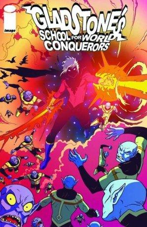
GLADSTONE’S SCHOOL FOR WORLD CONQUERORS #3
Writer: Mark Andrew SmithArtist: Armand Villavert
Publisher: Image Comics
Reviewer: Optimous Douche
Smith is like the Pixar of comics. His first outing, THE NEW BRIGHTON ARCHEOLOGICAL SOCIETY, and now GLADSTONE’S use children as the protagonists, but make no mistake Smith is not a children’s writer.
I had some concerns about GLADSTONE’S; would Smith be able to ride the hook of a school for child villains beyond the expected tropes? The answer is yes. While the expected is firmly imbedded, like classes about evil alchemy and phys ed exercises that involve pummeling super hero dummies instead of pull ups, Smith has also created a complex universe for the school to reside in.
In Smith’s world villains and heroes have come to an arrangement, an armistice that recognized neither side could exist without the other. Both sides also understand that everyone loses if the pendulum of power swings too far to one side. It’s an interesting concept, especially when you throw in the fact there are parties on both sides that disagree with this arrangement and will do anything to dissolve these unions. It becomes even more interesting when you add in the fact that the children of the world don’t learn about this truce until they come of age. It puts the reader in an interesting place. On one hand you want the battles to be real because the kids of Gladstone’s (who despite being villains to be, you do kind fall in love with) believe with a demented childlike innocence in the villainous virtues of the world. On the other hand you know that the hero and villains are contractual bedfellows more than enemies, and Smith makes these pre-fight meetings downright hilarious, especially if you’ve been reading comics forever. The best way to describe the experience is like seeing Santa Claus at a strip club; he doesn’t belong, but the juxtaposed symbolism can’t help but make one laugh.
Smith also uses this issue to further develop the relationships of GLADSTONE’s cool clique (all right maybe not cool, but at least our central characters). The relationships range from Disney afternoon crushes, too some pretty heavy baggage of parent’s in prison and children adrift without any moral compass, hell even one that points south is better than nothing. This is one of those two-level cases where the book works best.
Kids will see peers, while the wisdom of age lets adults enjoy the book with a sense of nostalgia for the happy times and a pity for the less than happy moments.
With only three issues Smith has created a cast of original characters, a world that is complex and original yet familiar to anyone who has ever read a comic, and started a journey that has more than enough interesting tangents to carry the book for arcs to come.
Optimous has successfully blackmailed fellow @$$Hole BottleImp into being his artist on Average Joe. Look for Imp's forced labor on Optimous brain child in mid-2011 from COM.X. Friend Optimous on FaceBook to get Average Joe updates and because ceiling cat says it's the right thing to do.
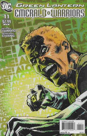
GREEN LANTERN EMERALD WARRIORS # 11
Writer: Peter J. TomasiArt: Bernard Chang
Publisher: DC Comics
Reviewer: The Writing Rambler
I wasn’t sure what to expect this week when I picked up GREEN LANTERN EMERALD WARRIORS # 11. My nervous system is still somewhat reeling from the one-two punch of having three issues of WAR OF THE GREEN LANTERNS released on the same day about a month ago and then a few weeks later being mentally abused by the GREEN LANTERN film. After hearing of release delays for the WAR OF THE GREEN LANTERNS finale I wasn’t sure what we would actually be getting in the issue. Originally advertised as the beginning of WAR OF THE GREEN LANTERNS: AFTERMATH storyline, this book is actually nothing more than a “one shot” Guy Gardner adventure, which in no way is a bad thing.
The story is pretty basic. Guy is headed for some well-deserved R&R but gets called in on a mission to help a dignitary’s ship, he reluctantly accepts and from there trouble ensues. It’s as simple as that. The story is quick and even wraps itself up nicely by the end of the issue. There’s no start of a 10 part arc or a cliffhanger ending to keep you coming back next issue. It’s classic comic book storytelling. For a fan of GREEN LANTERN and Guy Gardner in particular this is exactly the reason you read comics. Guy’s attitude and cocky swagger is on full display and it really reminds you of why this hot-tempered honor guardsman is such a fan favorite.
 The art in the book is much like the story in general--simple and to the point. Bernard Chang does a good job telling the story through the visuals. It’s nothing groundbreaking or something that goes against the grain; it’s just quality artwork that serves its purpose. There is also some solid artwork on the variant cover (which seems to be what they would have gone with had this actually been a WAR OF THE GREEN LANTERNS tie in).
While I can fully understand someone feeling duped into buying this book because they were expecting some info/closure on a storyline they’ve already invested themselves in, it still doesn’t justify saying this is a bad issue. The fact is that larger storylines get delayed and sometimes there needs to be filler. That’s exactly what we have here. There’s no denying that this issue was either an old story that was sitting around waiting to be used or something that was quickly put together to fill a gap, but that in no way means it lacks quality. I’m looking forward to what the future holds for GREEN LANTERN in general and I can’t wait to see how WAR OF THE GREEN LANTERNS ends, but for now I happily enjoyed this story, as I always think there’s room to see Guy Gardner’s personality on display.
You can follow The Writing Rambler on his blog here!
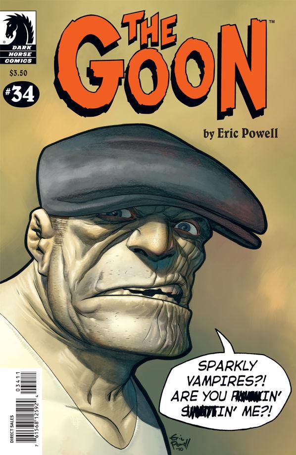
THE GOON #34
Writer / Art: Eric PowellPublisher: Dark Horse
Reviewer: Ambush Bug
From issue one and even before that, I’ve been a die hard GOON fan. I’ve seen somber Goon, goofy Goon, ongoing story Goon and done-in-one Goon. All of them have been damn fine entertainment through the years, but a while back (I think it was when the last issue of THE GOON was released, maybe) I made the observation that I felt that the Goon character had sadly run its course. It seemed that the Goon is one of those stuck in amber sort of fellas. Not changing much and only limited by the amount of crazy shit Eric Powell can throw at him. Although some of the more serious works featuring the Goon proved to be impressive as hell, seeing Powell return to the done-in-one, gross-out serial style seemed kind of a let down after the CHINATOWN & THE MYSTERY OF MR. WICKER Hardcover. But as much as I love the more serious-toned Goon, I have to admit, after being away for a while, it’s good to see Goon doing what he does best in this issue; kicking ass and taking names.
Just cracking open this issue made me smile and though it may be cheap, easy, and even a little late humor, the Goon taking on sparkly vampires was the kind of fun I’ve come to expect from Powel and his Goon. Powell himself (through his alter ego, the Goon) is first to admit that this issue couldn’t be all about kicking the dicks in of multiple twinkling vampire boy-toys. There’s got to be more than that. And there is. The Goon and his orphan supporting cast take on a possessed tween girl in this one as well. Seeing the ornery orphans convince the Goon into prying himself from a football game at the bar to help them out with the soul-sucking tween is a lot of fun and by the time the Goon shows up to take on the creepy teenie bopper, he’s goot and lit, which adds another layer of fun to this mile-high hogie of goodness in comic book form.
Powell’s art continues to be the strong point in this issue. Whereas his stories seem to be a bit lacking in depth and he may be digging toward the bottom of his bag of tricks when it comes to laughs, Powell’s art continues to improve with rich shades and gorgeous shapes of the macabre kind. It would be interesting to see Powell team up with a twisted writer to see if they could add some depth to the character and the mythos. Someone like David Lapham let loose on the Goon-iverse would be too cool to imagine and open the character up to potential no one knew it had. THE GOON #34 is strong in that absence makes the heart grow fonder, I guess. Goofy, one-and-done Goon is better than no Goon at all.
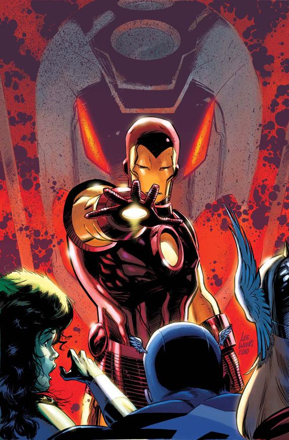
IRON AGE #1
Writers: Christos Gage (first story), Rob Williams (second story)Art: Lee Weeks (first story), Ben Oliver (second story)
Publisher: Marvel Comics
Reviewer: KletusCasady
My buddy Ken came into the shop and we usually chat about comics, mostly about artists (this guy knows every book a particular artist has ever worked on--it’s pretty amazing, really) and he asked me if I had noticed the weird alternate future that has been popping up in different books. I said no. He went on to explain that in CAPTAIN AMERICA REBORN, Steve Rogers had seen an alternate future where weird robots seemingly had taken over the world (I probably missed that detail cause I wasn’t that into the story); I looked through the comic and sure enough there it was. Next, he mentioned that in INVINCIBLE IRON MAN right before SEIGE, Tony Stark whilst he was in his coma-like state was having vivid dreams about these weird robots repeatedly attacking an excavation site that Stark Senior and Stark Junior had been working on (that I remembered). Then in the AVENGERS when they went into the future there was a time line that had STEVE’S VISION then ULTRON WAR soon after…hmmmm curious indeed (I’m not sure if all this is related, but it might be). I think this series is meant to kick start those events but it’s kind of weird because it seems way under the radar; maybe MARVEL is trying to sneak a mini event under our noses…but don’t fret, Kletus is on the case!
So we start off with the current Tony Stark approaching the lovable drunk Tony Stark in the past…wait, what?!?! This IS issue number one right…let’s make sure I’m not missing any pages…nope….I’m not drunk either sooo….WTF?!?! I rarely ever read the synopsis in the front of Marvel books, I feel like during the course of the comic if I can’t figure out what got us in the situation I’m reading about, then the writer isn’t doing their job to the best of his or her ability. I don’t read the lead up one-shots either (i.e. IRON AGE OMEGA, or whatever it was called) for the same reasons--I shouldn’t HAVE to. The Avengers have been in the time stream so much that I should be used to it but I can’t help but think of Doc Brown (or Time Cop) and his very specific instructions on the past…basically don’t fuck with shit in the past or bad things will happen, simple enough BUT apparently that concept doesn’t really apply to some comics unless it serves the story somehow. Anyway, we pick up in the past with our current Tony Stark attempting to get help from the Avengers (circa mid 80s?) in collecting pieces of Dr. Doom’s time machine in hopes of stopping a plot from a guy in a comic I didn’t read.
What really makes this comic for me is Lee Weeks. He’s one of my favorite artists at Marvel and anytime he pops up I buy. There’s so much emotion in his pages between the great use of shading and the variance of panel layout, there’s a lot to love about his art. Christos Gage does a good job with the story here but I just wish he hadn’t assumed that everyone already read the prequel to this comic. There are definitely some things to like about this issue besides the art, though. Tony arguing with himself about being a drunk while trying to resist the temptation to drink is pretty good. The Avengers fighting Hank Pym’s greatest/worst achievement looks and plays out fuckin’ great. This story has a really good old school feel to it and Gage does a great job of taking us to that time period with the internal/external dialog from the Avengers. The first half of this book is pretty damn fun and looks great.
The second half doesn’t really have the sense of urgency of the first half or Lee Weeks or Christos Gage. I think what’s going on is that Iron Man is going through the past but hitting specific points that operate around a particular storyline. In this case, He’s in England with Captain Britain and I get the feeling something outside of IRON AGE is going on but I’m not that familiar with CAPTAIN BRITAIN’S past so I didn’t get the references. This story suffers from having to come after a stellar team like Gage & Weeks. It’s like a local band having to play after Metallica or The Misfits in the early 80s, no matter how good American Ritual’s cover of House of the Rising Sun is…they probably won’t be holding a candle to those bands. This story does have some good points such as Tony trying to charm the uhh…Dominatrix (did I read that right?!?!) and the art isn’t bad either it’s similar to Adi Granov but not nearly as smooth. Ben Oliver also did the artwork for FLASHPOINT: HAL JORDAN but his art looks a lot better there.
This issue suffers because it assumes you’ve read the prequel, which I hadn’t. Yeah I know there’s a recap but if there’s one thing I agree with Dan Didio about, is that a comic should inform you every issue as to what the hell is going on with out a lengthy recap. This issue did fill you in to some degree but this “issue #1” is so far into the story, you can’t help think that you missed multiple important pieces of information that are crucial to this story. The first story is leaps and bounds better than the second and being as such, there’s really no reason the first story couldn’t have come after the second story…make sense?!? Y’know, a ‘save the best for last’ type of deal.
Honestly I would have preferred Gage & Weeks (I love me some Lee Weeks!) to be the sole team on this book and if that was the case I’d say emphatically “BUY THIS NOW!” but since that isn’t the case I’d say if you have some extra dough you might want to take a gander at this book mostly for the first story (which IS the bulk of the book). I’m not sure the purpose of it, is it setting up next summer status quo altering, earth shattering, everything will be different (then the same again) event? Or is this just a li’l mini jam to keep the event gremlins happy? Either way there’s some fun stuff in this book but I’m not sure I can convince ya’ll to spend $5 for an issue that while it says #1 on it, obviously isn’t the beginning of this story.
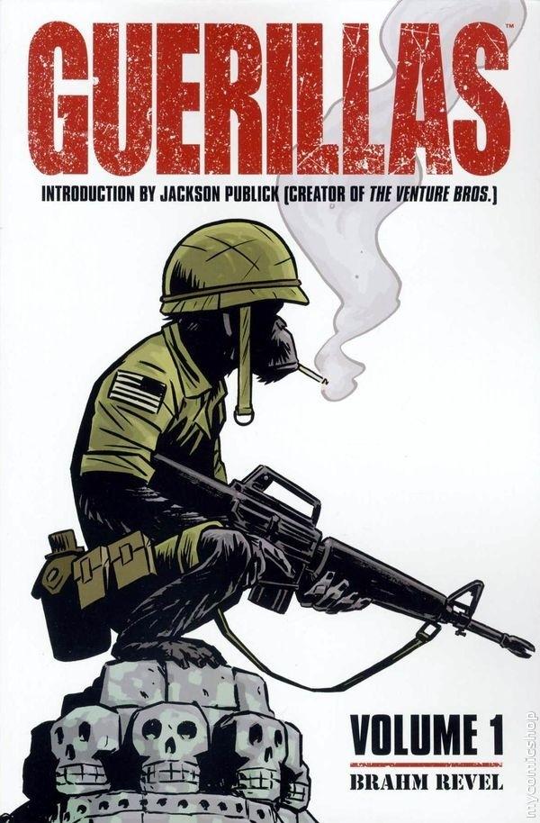
GUERILLAS VOL. 1
Written and Illustrated by Brahm RevelPublished by Oni Press
Reviewed by superhero
Every once in a while you come across a book that makes you think “holy cow, that’s a fantastic idea.” Then you read the book and it is a story that is so well beyond what your expectations of the book were that you are absolutely blown away it. GUERRILAS is such a book.
When I saw this book in a rare trip to a comic shop I couldn’t resist that cover. I mean, c’mon, chimpanzees fighting in the Vietnam War? That’s an idea that’s just golden. But I’ll admit, I saw a primate with a machinegun and I thought I was going to get something that was a lot more, um, funny book-like. I honestly didn’t expect to get a comic that is as thoughtfully and intelligently done as this book is. This is not a funny animal book by any means. It is a seriously told and deeply affecting story of one particular soldier in the Vietnam War and a military experiment gone wrong. I really don’t want to say much more than that regarding the plot because I don’t want to spoil this book for anyone. This is a book worth going into cold, without any knowledge of it whatsoever, so that you can get as much out of it as possible. I will say this about the book: once I picked it up I could not put it down. COULD. NOT.PUT. IT. DOWN.
Since I don’t want to particularly talk about the story what I will talk about is the art. There’s an introduction to this book by Jackson Publick (one of the co-reators of the severely awesome Venture Bros. TV show) in which he goes on and on about the fantastic artistic talent of the creator of GUERILLAS, Brahm Revel. I can only say here that I 100% agree with everything Mr. Publick states in his introduction. Revel is amazing. His brushwork is…I don’t even know if I can find a positive enough adjective for it. His storytelling is perfection. Each page is like a little prize each and of itself and I just loved Revel’s work to pieces. As an artist who’s never fully become comfortable with a brush I have to say that my envy was off the charts. Revel is amazing and I will state here publicly that I will absolutely pick up any other comic book work Revel ever does. I have become a super-fan. I’m watching you, Revel.
So yeah, GUERRILAS is absolutely fantastic from beginning to end. But the surprising thing is that it’s made me re-discover Oni Press in a big way. If GUERILLAZ is the type of quality I can expect from Oni Press then I’m going to get up off of my ass and start getting some more Oni books. Oni should be commended for putting GUERILLAS into the world and I’m thankful to them for putting a book like this out into the universe. Bra-freaking-vo!
Discovered as a babe in an abandoned comic book storage box and bitten by a radioactive comic fan when he was a teenager, superhero is actually not-so mild mannered sometime designer & cartoonist, Kristian Horn of Los Angeles, California. He's been an @$$hole for three years. Some of his work can be seen at www.kristianhorn.com and check out his blog at www.parttimefanboy.com.
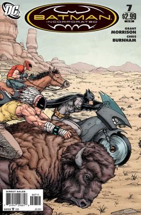
BATMAN INCORPORATED #7
Writer: Grant MorrisonArtist: Chris Burnham
Publisher: DC Comics
Reviewer: Optimous Douche
It’s been a few months since I’ve personally checked in on Bruce Wayne’s global gallivanting, so what better time to get back in the saddle than with this tribal one-off that brings Bruce to an Indian Reservation in America’s beautifully depressed southwest?
As much as I love this title and have enjoyed every adventure as Bruce has travelled to the Far East and Europe to keep filling out his org chart for his vigilante LLC, I still can’t sever that one thread of disbelief that has been lingering since Bruce announced this venture at the end of RETURN OF BRUCE WAYNE.
Batman always walked the razor’s edge between savior and vigilante. He’s always been able to sidestep due process and other constitutional niceties because Gotham was a unique city and Gordon was a unique police commissioner. It made Batman and his relationship to both Gotham and Jim Gordon special. The deeper and deeper we get into BATMAN INC. though, it seems that every law professional in the world would be pleased as punch to have their very own Batman. It hasn’t really been discussed in past issues because all of Bruce’s past recruits hid behind secret identities. If you don’t know who the guy is, it’s kind of tough to stop him. However, Bruce’s newest recruit in his ever expanding diversity quota to appease Batman Inc. Human Resources, is out in the open. Man-of-Bats and his sidekick son Raven wear masks, but everyone knows who they are under the mask. And everyone, including Johnny Law, is A-O.K. with this. It offends my willing suspension of disbelief, but this issue is so damn spectacular in design and execution I would not forsake one page because of my hyper-literal views.
The cover alone is worth the price of admission to this book. I can see wafts of Frazer Irving’s influences, but this truly was a collaborative effort as the credits indicate. I love Frazer Irving, but I also appreciate how his cohorts solidified his dewy dream-like style. I wanted to buy, ride…then probably eat a buffalo after viewing this piece. This is one of those rare spectacular covers you wish came with a dangle to blow into to make it poster size.
Once inside the book, the art bonanza continues. I never heard of Burnham before, but he is a name I will not soon forget. Dare I say, there are slight whispers of a Quitely style to his work, minus the ugly heads. And his attention to detail is spot fucking on. There ain’t a panel in this book that takes place in the Matrix Ready-Room void of white space. Thank you Chris.
The story can be best described as SCALPED, the PG-13 version. The Native American experience is an unenviable one. Since being moved to reservations, their story has been one of a dwindling pride with each passing generation. This victimization has led the majority to simply stop trying in life, except Man-of-Bats that is. A doctor by day and crime fighter/good Samaritan by night, Man-of-bats is my favorite bat-copy to date. Morrison damned effectively conveyed the frustration Man-of-Bats has for his own people’s malaise and his rage towards his people that would try to profit from that sense of non-being. If any of the bat-clones to date should have their own series, Man-of-Bats is the man.
Another reason I find this bat-tale so damn interesting is Man-of-Bats’ sidekick, Raven. I would have to check my mental rolodex, but the only other Robin knock-off I can think of with any prominence is Squire and she’s just friggin annoying. Raven may have a bit of whiney kid to him, but his whining is such a stark ideological contrast to Man-of-Bats you know this kid would have been kicked to the curb if he wasn’t Man-of-Bats’ son. Man-of-Bats is a doctor during the day who likes to help everyone. Rave, only cares about helping those that help themselves. Man-of-Bats cherishes his ethnic pride, Raven wants nothing more than to escape the reservation and join the Titans. It made for some great banter and gave an extra level of tension to the book beyond the gang that’s pushing dope on the reservation.
It looks like the impending reboot will be the final death toll for BATMAN INC. While part of me is sad to see the title go since Morrison has been writing the hell out of it, another part of me knew the party would end eventually because as soon as a vigilante is legitimized by society at large - they become a cop.
dot.comics presents…
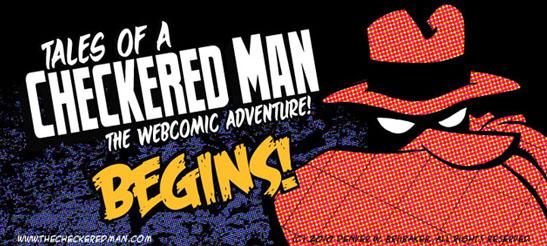
TALES OF A CHECKERED MAN Webcomic
Writer: Denver BrubakerArtist: Denver Brubaker
Reviewer: Lyzard
With newspapers seemingly on their way out, like so many things, it is up to the Internet to keep up tradition. Without the funnies in the Sunday newspaper, comic strip readers can now turn to their favorite web comic for respite. TALES OF A CHECKERED MAN is a fun ode to the strip form of comic telling.
Started April 5, 2010, with an update every Tuesday and Thursday, TALES OF A CHECKERED MAN follows a hero sans superpower. Think Batman…just not as awesome. Our hero has acrophobia and is more likely having a mid-life crisis than a deep need to serve justice. But he’s all Exotic City’s got.
TALES OF A CHECKERED MAN must be read from the beginning. The strip is a continuous storyline, unlike other web comic strips like PENNY ARCADE or PHD that allow readers to jump in and out for the most part. TALES OF A CHECKERED MAN is broken up into sections (such as “Dark Prelude” and “Weird Tales”). By going to the Archive section of the website, readers can find where one section begins and another ends. However, despite the breakup, events in a previous section affect the plot and characters in latter sections. But with most of the strips being three to four panels long, it won’t take you long to catch up on the adventures of our checkered caped vigilante.
Though it is a comic strip you have to keep up with, the ease of catching up and the simple nature of the strip makes up for it. This isn’t as if J.J. Abrams did a comic. What I liked most about TALES OF A CHECKERED MAN was the tone. The panels for the most part fit the same structure of serious to serious to funny. Simple, yet well done. The nice little twist at the end is what adds humor to the comic, as well as the artwork.
As for the drawings, Checkered Man and the Clerk are the best designed characters. For some reason, Joey, Penelope, and Sgt. Mulveny all seem to be drawn poorly in comparison, with the roommate Dougy in the middle. Poorly may be the wrong word here, because it is not that they lack artistic merit. They merely seem to be drawn by a completely different artist. That being said, if you do come across a strip that looks completely different, there are several guest author/artist strips.
You can tell creator Denver Brubaker knows his comics and that this is his “love letter to masked mystery men, caped-crusaders, classic adventure pulps and traditional newspaper strips.” The strip may have its weaknesses, such as drawing out singular ideas for too many strips. But as the comic advances, these mistakes adjust themselves. TALES OF A CHECKERED MAN has been around for over a year now and Brubaker has made real progress with his work. So give it a shot and give TALES OF A CHECKERED MAN Webcomic the time that it deserves to win you over.
Lyzard is actually Lyz Reblin, a film student at Chapman University. Lyz’s love for comics stems from an internship at Dark Horse Entertainment as a freshman, which may explain why some of her favorite comic book writers are Gerard Way and Steve Niles. You can find her on Facebook, but only if you follow her band: Castle Town Convicts (possibly a Zelda reference?).
Proofs, co-edits & common sense provided by Sleazy G