
Ahoy, squirts! Quint here with a nice interview for your Mother’s Day weekend. Tyler Stout is a name that geeks from all over the world instantly recognize and associate with a new breed of poster artists that have grown to prominence over the last 5 years, thanks largely to the Alamo Drafthouse’s Mondo offshoot and places like Gallery 1988.
After 5 years of doing posters for the Drafthouse, Mr. Stout just recently journeyed to Austin to actually see a movie at one! It was a Mondo secret screening of Akira where they unveiled an attendee-only exclusive Stout poster and everyone went crazy for it.
The man’s a rock star, but in person he’s anything but. Quiet, but enthusiastic, geeky but not nerdy… in other words, he’s a dude I get along with.
Although publicity shy, I was able to talk him into a nice-sized interview about his influences, his work and thoughts on the business at large. There’s some detailed discussion on his process and thoughts on some of his specific posters as well as a very interesting rundown of movie’s he’d like to do posters for. One of his dream projects is particularly out of left field.
Hope you enjoy the chat!
Quint: When I interviewed Drew Struzan about his own movie poster influences he was like “I liked movies, but I wasn’t really super hooked on them. I wasn’t addicted to poster art. It was more that I was an artist and working in ad agencies which paid well and that’s kind of how it went.” Is that similar for you or did you grow up loving the Drew Struzans and the John Alvins and the Bob Peaks?
Tyler Stout: I definitely grew up associating those with the movies, so you would be like “Oh course, BIG TROUBLE IN LITTLE CHINA, that looks amazing.” A lot of those I wasn’t even thinking of them as artwork, you just think “That’s the photo of the movie” and then, of course, it’s (about finding out) how they do movie posters.
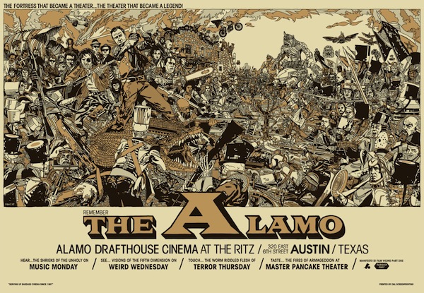
What got me into posters was I came in from the rock music. I guess they call them “rock posters,” but the bands that I work for usually aren’t like rock bands I guess, but like I was a big fan of Frank Kozik and so I grew up really admiring his stuff and collecting his stuff in the 90’s. I kind of came to collecting a little bit late, I was in my teens and in comics before that. I was wanting to kind of get into music posters and so I started doing that in late high school, and went into college and kept doing them and then just kept doing music posters and got into movie posters from that. Rob Jones asked me to do something for the QT Fest and that’s when I first started them.
Quint: I remember those, which one was your first poster?
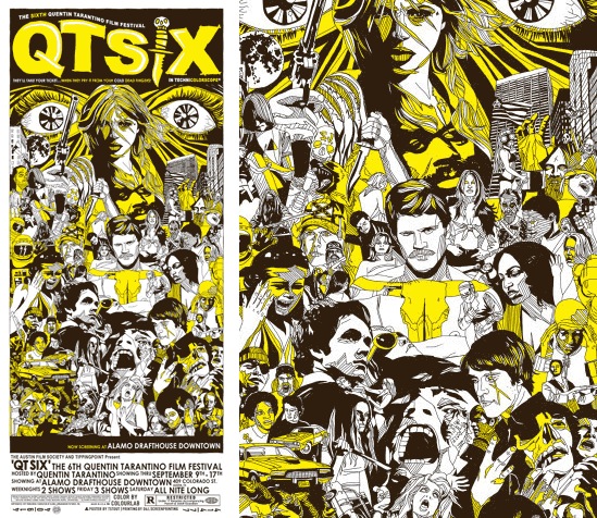
Tyler Stout: I think it was QT Fest 6.
Quint: Was that the FRIDAY THE 13TH one?
Tyler Stout: It was the one right before that. It was like yellow and brown….
Quint: I think I have it. I bought it. I remember when they were there. I for sure bought the Friday the 13th one.
Tyler Stout: Yeah, that was the first one. I kind of started from there.
Quint: That’s cool. So Rob knew your stuff from your music posters?
Tyler Stout: Yeah, Rob and I were kind of in similar circles just doing music posters and he was friends with the Alamo guys and went to a lot of things involved with the Alamo. He basically helped set up this entire movie posters (thing) that the Alamo does, that was Rob Jones at the beginning of that before Justin (Ishmael, head cheese of Mondo). Of course they are huge into it now, but he was one of the ones that I talked to first.
Quint: I love watching Mondo grow. It’s very much like watching Tim League’s success with the Alamo, seeing it start small and then growing into this trendsetting giant. Now the Mondo poster look, whether it’s you or Olly Moss or whoever, it really feels like that’s influencing a whole new trend in art, like all of the Gallery 88 stuff. Everything just seems to be growing at a crazy fast rate; especially when Justin came on board. It seems like he took it from “Okay, we are going to do kind of these show specific things” to this massive audience going after real licenses like Star Wars. I think it’s fascinating. What’s it like to be on the inside of it? I’m watching this from the outside, but you guys are the ones really starting this new revolution of geek art.
Tyler Stout: (Laughs) Well, I’m sure it would be a lot different for a new poster artist the Alamo just started working with, they probably have a completely different way of working with those people, but for me they’ve kept it, which is awesome, they’ve kept it really the same way for me as it was at the very beginning. They just give me deadlines and say “Do the poster.” It’s really easy. There’s not a lot of pressure. If I started getting caught up in reading what people say about me and stuff, then I get really stressed out just because of the expectations like “What’s his next going to be?” I get really worried, so I try to just keep doing them job to job and just do stuff that I think looks good, so it’s actually still pretty fun. It’s great working with the Alamo guys because they are very protective and with weird things like bootleg copies showing up on eBay… it’s not a huge thing one way or another, but the Alamo is really good about just having my back.
Quint: They’re protecting their artists.
Tyler Stout: Absolutely, yeah. And I never worry about getting in trouble with the movie studios. Of course they get licenses, but any kind of stuff people email me that I can just be like “Here, talk to the Alamo.” It’s nice as opposed to being completely on your own or I’ve read Drew’s book, because I read everything that Drew Struzan puts out…
Quint: Oh man, his last book… it was so incredible.
Tyler Stout: It was amazing, but you read the stories and it’s awful the experiences he’s had and you are like “These people that don’t understand his genius…” and that they are trying to art direct him into the ground. A nice thing about the Alamo is that its all completely separate from that and very little of what we do… at least my experience has not had a lot of art directing stuff.
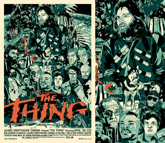
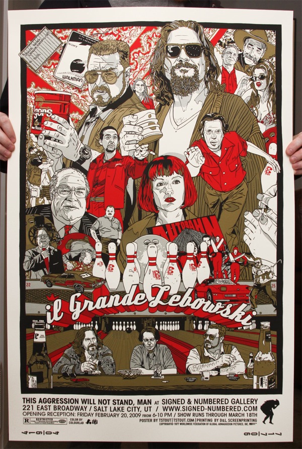
Quint: I was going to touch on that. I see a lot of people trying to do what Struzan did, but the sense of layout is something that Struzan was incredibly strong with and most young poster artists don’t quite have a handle on that aspect of poster art. In the design of your posters, your best stuff I find is your best laid out posters. When I think of your MONSTER SQUAD poster, when I think of the INGLOURIOUS BASTERDS poster and your THE THING poster and your BIG TROUBLE IN LITTLE CHINA poster… it’s all about the design of the layout even more than the artistic renderings of the people on the poster. How much time do you put into that process versus the actual execution of it?
Tyler Stout: These things, they come together so weirdly and organically, where you watch the movie and you’re like “What would I like to see?” I collect a lot of books on posters from the sixties and the seventies… Everyone is like “Oh, the Tyler Stout style,” but really it’s the same style that people have been doing forever! I mean there’s nothing new about what I do… other than screen printing, which is kind of a new process, but other than that it’s the same “I want to show a bunch of stuff that really encapsulates the movie for you.”
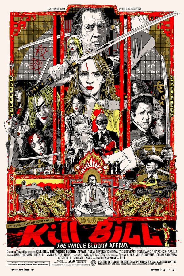
The design and framework, like on the KILL BILL one I was just thinking about the movie and how many references there are to other movies and I thought “What’s my favorite martial arts poster of all time?” That would be ENTER THE DRAGON, so you basically look at that layout and carry that layout over into your poster, just because it seemed kind of referential of that in a cool way. I was hoping it’s not like “Oh, he ripped off ENTER THE DRAGON,” I’m hoping people will be like when I did a Flight of the Conchords poster that was kind of like a remake of a Beastie Boys… It was not meant to be like “I hope nobody catches this.” I was hoping people would be like “That’s awesome.”
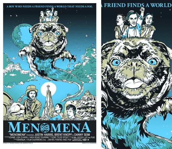
Quint: I saw another one that you did that was THE NEVERENDING STORY poster.
Tyler Stout: Yeah, right. For Menomena. they were like “Let’s have that sort of thing.” So you are hoping to be referencing your favorite artist that you would never in a million years compare yourself to. Hopefully people know that I don’t think I’m anywhere near any of those artists.
Quint: Well THE NEVERENDING STORY one was quite a clear homage. They had a GHOSTBUSTERS one as well, right?
Tyler Stout: Yeah, I did that one too. That’s a lot of their ideas, “You do movie posters” and I’m friends with them, like “How about it we do us as BEETLEJUICE!” I’m just like “Okay.” They’re kind of into that stuff.
Quint: That’s cool.
Tyler Stout: It’s fun. It’s hard to think about design because you do what you think looks good and you keep redoing it and redoing it and you are like “Okay, it’s starting to come together” and sometimes you have to start over. The posters that people never see are the ones that you are like “There is no design to this” or like a lot of it comes down to the same basic design where you do like the pyramid design where it’s a tiered sort of approach as opposed to everything having the same weight.
I went to school as a designer and so it wasn’t in illustration, it was more like the relationship that everything has towards the next thing and all of those old posters they all have it. If you look at any of the exploitation posters and some of them were really poorly done, but even the ones they make now, like the Japanese ones with everything thrown in there, there’s a neatness a beauty to that where you are just like “That looks really cool,” like the main character is in the poster like five times and all of these different things. I don’t know, it’s something that I like looking at.
Quint: I’ve always been drawn to movie art, it’s part of the magic of cinema to me. I’ve talked to a lot of exec type people about the lost art of the movie poster and they pull those numbers out and focus group data about how modern audiences don’t want art posters. I’m like “That didn’t hurt INDIANA JONES 4’s box office, did it?” People accept floating heads, because that’s all they see. I think the studios are going to have to start taking a more artful approach to their marketing because we’re at a certain point, a crossroads in theatrical exhibition… we are looking at everything going digital and film being fazed out. Soon the theatrical experience will be viewed like a Blu-Ray Plus experience at the theater and a regular Blu-Ray experience at home. If all posters keep looking like fucking DVD covers I think they are eventually going to have to start doing things like what the Alamo is doing and furthering the audience experience, increasing the showmanship of seeing a movie at a theater. So I point to the Mondo posters and go “Look at how crazy popular all of these are. They can have almost any poster out and it will sell out within an hour. It will sell out within five minutes and you know why? The demand is there. It’s there because that’s what the fans want. That’s what people who go to movies obsessively, over and over again, want.”
Tyler Stout: Absolutely. They really respect their audience, Mondo. They respect that people want it and are smart enough to get it as opposed to all of these movie posters you see, you kind of assume that they are thinking “You’re not smart enough to know anything more. All you need to know is Bruce Willis is in this movie,” so you have a big picture of him wearing a military hat or something and you are like “Okay, it’s a war movie with Bruce Willis.” You could show more than that and it wouldn’t turn people off. It’s not like “Oh, I would have gone if I would have just seen a picture of Bruce Willis, but since I see him fighting at the bottom, I don’t want to go now…” It doesn’t make any sense, I just think it’s kind of lazy.
Quint: Which is odd because even doing a photo and photoshop type poster, you can still do an amazing design. The first DIE HARD poster is not a huge giant work of art, it’s a photo poster, but they make it iconic.
Tyler Stout: Absolutely and even like… I had a ROBOCOP poster up at home and you are like “This took some serious work to get the right scene and the right pose and all of those things.” It’s an iconic poster and they don’t even do that nowadays, it would be a close up of the face.
Quint: I’m starting to see the next generation of filmmaker kind of embracing that more old school style. Not even so much like “They look like Mondo posters,” but embracing that making an icon with the poster. You see a little bit with the MOON poster. I think you are starting to see it come back and you had the stall when Guillermo Del Toro and Frank Darabont who will always force Drew Struzan to do something for them.
Tyler Stout: You still see it, it’s just from people who have nothing to lose by doing it and only something to gain, like the DEAR ZACHARY. It’s completely illustrated and you are just like “That looks awesome” and you wouldn’t want to see anything else other than that. Much like a lot of movies nowadays you kind of think, “I think they are kind of afraid to take a chance,” they are kind of making this safe movie that will be appreciated in the most markets and these smaller ones are like “We can do whatever we want,” but then they do really cool ones.
Quint: The problem that I’m seeing with a lot of that though is that you are seeing art posters only on like the worst, cheap exploitation shit that comes out. So I’m worried that that’s going to evolve into you see an art poster, it’s either going to be old or it’s going to be z grade junk.
Tyler Stout: HOBO WITH A SHOTGUN, which isn’t junk at all, but the poster absolutely represents what the movie is.
Quint: It’s a perfect poster, but again the only ones that can get away with it are the Magnet releases, the small schlock movies..
Tyler Stout: Yeah, it definitely seems like as everything else isn’t working, they will try to find new things. I don’t know. I think Mondo is definitely the place to be. They are the easiest to work for, for me. I can’t imagine going through a major studio and them not wanting to take a chance on all of these different things and you are just like redoing it and redoing it. For me it would take all of the fun out of it, so you would have to really get back towards studios trusting their artists.
Quint: I think if Drew Struzan was coming up today, he might not have ever wanted to retire. He could do the studio thing and have all the nightmares associated with that, but take the money and then he could have his creative freedom with something like Mondo and reach an audience. Have you worked with people who have a been a lot more hands on and it’s not worked as well for you?
Tyler Stout: Yeah, I have worked with people like that. You hear people who write books and they say “My editor is the best thing that ever happened to me because they really shaped this thing into something you wouldn’t have thought of” and I have worked with people, because I do a lot of freelance illustration as well, not as much anymore, but I used to do a ton of it, and I would have friends that I worked for who really are “This doesn’t look good, what if we tried this” and they will make those changes and it actually will make it better, but then there’s people where they don’t like anything and you keep starting over and you’re really feeling something and saying “This is really good” and they are saying “It’s really bad.”
It really makes you think “I don’t know what I’m doing here and I am so far removed from what’s going on that I shouldn’t be doing this poster, because whatever they think is good is the opposite of what I think is good.” There’s a designer that I follow and he was saying the reason he got out of doing design and just moved straight into doing art and art installations and stuff is that even designers, people don’t consider them artists, and I don’t consider myself anything (laughs), but he was saying “As a designer you are still creating something and you are saying this is what I think looks good” and because there’s so many rounds of revisions and you are throwing away stuff that will never be used again, it would be heartbreaking for anyone else to say “This is awesome” and someone else saying “No.” You can’t use it for anything else a lot of times and it’s just the amount of wasted ideas and energy and all of that sort of stuff where you are focusing and spending your time on something and then it’s just being thrown away would be really discouraging and kind of burn you out and just being like “I can’t do this. I’d rather just paint as a hobby.”
A lot of us get into this just because you like doing it and it’s something you would do for fun anyways, but when people take that and give you money for it and then they start having an influence on what you do, it’s an easy way to get burned out and just be like “I don’t want to do this anymore,” because it’s not fun. It’s taking the best thing in the world for you and it’s turning it into something that you are losing sleep over and you are getting really stressed about and stuff. It’s nice to work for people that kind of understand the pain of revisions. I still do revisions with Mondo, you know Rob will definitely tell you what he thinks and I have changed things, because “This doesn’t look like that person at all…” And so I will change them and stuff. It’s good to have people that are telling you what they think of their stuff.
Quint: If you can trust them in that their motives are for the art and not for some commerce reasons… It’s good to have people pushing you.
Tyler Stout: Yeah, if they are just kind of saying “I don’t know what I think about this, but I think the people above me won’t like it.”
Quint: Well Rob’s also an artist, so it’s not like having an accountant tell you that 14 year olds didn’t like this kind of color on this person in a Sherman Oaks poll.
Tyler Stout: That is the easiest thing in the world, to get feedback and art direction from another artist who you greatly admire because then you are like “They know what they are talking about” as opposed to like someone who you are like “Let me see your portfolio and see what you have done, so that I know that you know what you are talking about.” Not to be mean about it, it’s just that you definitely respect people in your field that are better than you, which for me is a lot of people! (Laughs) The world! It’s a lot easier to take their opinion than someone who’s doing it to justify their paycheck, which you hear a lot about people just saying “I have to make some sort of a decision so that this is my poster that I’m having an influence on” and saying “Whoever, oh yeah he would have done it completely differently, but I made him do it like this!”
We’ve done things in the past where you will turn in a really bad first revision and then they will come out with all of their changes and then you do a really good second revision that you really wanted to do and then it will be like “Yeah, see? I knew I could get it out of you.” Then they feel like they had an influence on it and it was their ideas. There is a lot of heartbreak, I guess.
Quint: How do you make your posters? What kind of process is it? Does it start as a sketch and then go to the full design? Is it hand drawn or do you work in the computer? Is it a little bit of everything?
Tyler Stout: Yep. The way that works best for me is we do thumbnails and sometimes I present those to the client and sometimes you just kind of pick the best one and then for the stuff that I do, usually I’m referencing photos just because I can’t draw a lot of people out of my mind, so you research the movie and you research the best thing and you kind of come up with a layout. It used to be that I would pencil everything by hand and then ink it in Photoshop and then it gets a little technical, but you take it into a program called Illustrator that’s all vector and you can move things around really easily and that’s not always the way I do it, but now I do have a thing called a Cintiq where you can draw directly into the computer. It takes away a step.
Quint: Makes things go a little faster?
Tyler Stout: Yeah, like so on that AKIRA poster I worked on it for a week and so it was just kind of a thing that you had to turn around really quickly.
Quint: Does it at some point feel like it becomes pieces of a puzzle, where you have little bits that fit together to make one large design? For Akira, were you like “I need Kaneda to have this pose, I’m going to draw it and lay it in where it fits best?” That kind of process?

Tyler Stout: Yeah. People are always like “I really want to buy an original!” and I’m like “You can buy a bunch of little originals, but there’s no master original.” Unfortunately I put everything in pieces and then when I take it in the computer, I assemble it in a way that I think looks best. You can be like “That guy doesn’t look best there,” so on that AKIRA one I actually pretty much designed it the way it came out, but I’ve done other ones where this guy will be over here and then you will say “I don’t like him there” and you will put him over here and you will kind of move things around.
Now with digital stuff, you kind of have that freedom to move all of your pieces around and what it ends up like on the computer you haven’t seen it on paper, other than your thumbnails, but sometimes your thumbnails have completely changed from what you think works on the final version looks good.
Quint: Have you ever had one of those experiences where you are like “Oh man, this is coming together great” and then it prints out and you are like “That’s all lopsided…” and it doesn’t look good on paper?
Tyler Stout: Yes. (Laughs) Many, many times…
Quint: Is that when you are like “I need to go grab some razor blades and sip vodka?”
Tyler Stout: Because of Mondo a lot of people are like “These are the next great movie posters,” but it’s such a different process in terms of… like I never see my posters full size until they are finally printed. I mean you are working on thumbnails and small stuff and so by the time you see something weird like that, it’s way too late to change it. You’ve seen it screen-printed and screen printing is a whole process. You send them the films and they start to print out each ink and stuff like that and I have… I don’t know about a Mondo poster, but I have before done a poster and the client was like “We don’t like that” and then they will completely screen print it again with changes, but it’s very cost prohibitive, so we usually just hope we get it right the first time. It would be really easy to sit down and go through my entire portfolio and say “This is what’s wrong with this one” and just keep going back. There’s very few…
Quint: Is there one that you are particularly embarrassed about?
Tyler Stout: (Laughs) It’d be easier to say “Which one are you particularly proud of?”
Quint: That’s my next question, but I would like to know both.
Tyler Stout: I think you do the poster and you really like it, otherwise you would be like “I don’t want to do this, just cancel the whole event because I can’t turn this in and put my name on it.” So you are feeling it and you are liking it and saying “Okay, this looks good” and you send it. Then you start looking at it and really thinking about it and being like “Man, I really wish I had done this differently” and so then you stop liking it. If people come and say “Actually we really like that. That’s actually one of your best posters,” then you’re like “Oh, okay maybe I’ll like it again!” So some of them…
Quint: Specifics man, specifics!
Tyler Stout: My INGLOURIOUS BASTERDS is not one of my favorite posters, unfortunately…
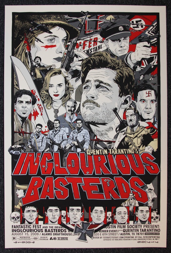
Quint: Really? Why not?
Tyler Stout: Man, I don’t want people that love it be like “Now that he mentions it… That actually does look really funny!” Just the composition, like the guys in the front I really like and then, of course, there’s the Brad Pitt face and I’m like “You know, I would have done him differently” and some of the ways the grays printed… We just printed flesh color on this AKIRA one where you are like “That actually looks cool to have all of the skin a certain color as opposed to white and then two different grays.” The grays on that one, for me, are not perfect. That has nothing to do with my screen printer of course, that all lays on me, but that’s just one of my little pet peeves where you have trouble looking at it like “That poster… I’d do it a little bit differently.”
I remember when we did that poster we did it all and it’s a very elaborate process to get it screen printed and then we get it delivered to Mondo on time, they have the screening and they are like “Everyone loves it” and then Rob calls and he’s like “Now that I’ve seen the movie…” And I had to make the poster without seeing the movie, so like I put all of those faces at the bottom thinking “These are the Inglourious Basterds, these are the main characters” and they are in the movie for like split seconds and he’s like “I’ve seen the movie, these are the people you should put down there…” I’m like “Rob, it’s already printed! We’ve done it already.” “Yeah, but what if we did your version for your site” and I’m just like “I want to be done with it.”
Quint: Okay, well what about proudest?
Tyler Stout: I’d probably say THE THING, just because it’s my favorite movie, so it was awesome to work with those (characters). It’s very simple in terms of like the characters are just the best character shot and the colors turned out really perfect even though I originally designed it to be kind of green. I don’t know if you remember online it was kind of green looking, but the poster itself is actually kind of blue.
Quint: That’s cool. Does it make a difference for you to work on a movie that you really love? Do you get more pumped about it? Do you find that you do more creative things when it’s something that you grew up loving?
Tyler Stout: Yeah, I mean with Mondo they let me kind of pick my movies, so you are only really working on movies you like. They will be like “Well I love ROBOCOP, of course I’ll do a poster for it” as opposed to a movie that you are lukewarm on like BEVERLY HILLS COP 3 or something.
It’s interesting working on a poster for any movie, you being to feel like you’re kinda connected to a movie in some way, which is a completely false feeling. I was 5 years old when The Thing came out. But still, the reason I do a lot of this stuff is to feel closer to these movies I love. Which sounds weird when I say it out loud. But I mean, who hasn’t listened to The Thing commentary and fantasized about being there with Russell and Carpenter, up there in the snow, part of an all guy crew. It just seems so legendary.
Quint: Now I’m going to throw some specific posters of yours at you and get your thoughts. Let’s start with the Star Wars posters. I have to imagine these were greatly anticipated by you. Did you design them all to hang next to each other or just to be their own contained image?
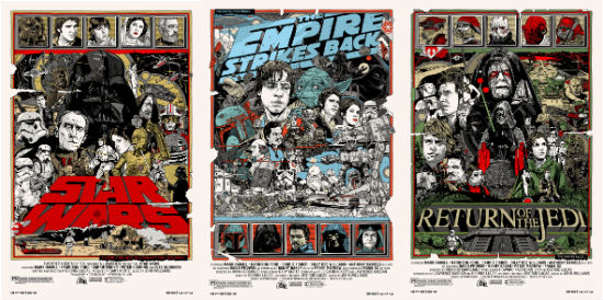
Tyler Stout: I was actually a bit reluctant to do those, Star Wars films have some of the best poster art in the history of poster art, in my opinion. It’s easy doing stuff for films like Robocop or Monster Squad, since you’re able to bring something different to the table than the original artwork does. But in the case of Star Wars you’re going up against some classics. I tried my best to do something that captured my idea of Star Wars. Time will tell if I succeeded or not but it was one of my more difficult assignments.
Regarding them hanging next to each other, I did want them to appear as all one series, but at the same time somewhat able to stand on their own, so I don’t have imagery continuing from one poster to the next, but I do repeat some of the same sorta icons and layout decisions.
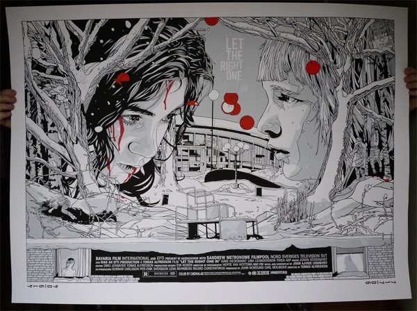
Quint: Let the Right One In - It's more sparse than most of your posters. I like that it's cut almost in half with the middle of the poster almost a dividing line between the two kids. This wasn't a Mondo piece, right? How did it come about and what made you change up your style for this particular title?
Tyler Stout: That wasn’t a Mondo piece, you are correct. I’m friends with the UK company, Allcity Media, that does a lot of poster designs for movies. They’ve done some really classic stuff, posters for Moon, Four Lions, Dead Mans Shoes, The Red Riding Trilogy. They put on an event that had artists re-doing posters for some of their clients and asked me to be a part of that show.
Style-wise I guess it just seemed natural to do something like this, most of Let the Right One In seems to revolve around these two characters, and the atmosphere and setting seemed to play a big part of the film as well. So it just ended up that way. Most of my ‘explosion’ posters happen because I want to include everything I like about the movie in the poster. In this case, I still included a lot of references to the film they’re just a bit more subtle, I guess.
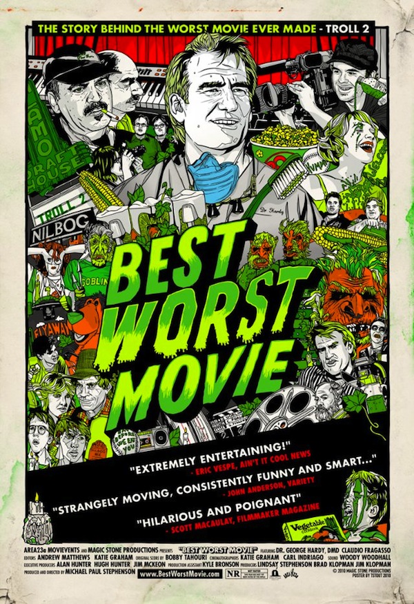
Quint: Best Worst Movie and Hell Ride - What's it like to actually walk into a theater and see your art? Freak you out? Give you a big head? Freak out your big head?
Tyler Stout: (laughs) I dunno, I don’t really consider myself an actual movie poster artist, I do commemorative movie posters for films that I like. It’s a bit like fantasy football in other words. I just happen to get movie studio permission for it. But in a few cases, Hell Ride, Best Worst Movie, The FP, I’ve been privileged to be able to work on actual movie poster artwork, and it is indeed a trip.
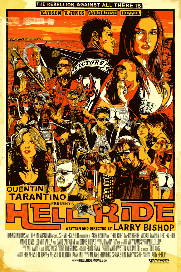
In the case of Hell Ride, they sent me scripts and photos from the movie as it was filming, and it was just fun being apart of that. But on the flip side, it took me over a year to get paid for the Hell Ride poster, and I’m going on a year on getting paid for Best Worst Movie, so I gotta be honest, I prefer Mondo movie posters. They’re more professional.
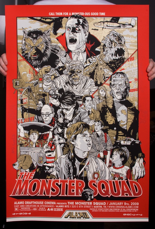
Quint: Monster Squad - You know you'll never be able to top this one, right? So great and one of my personal favorites of yours. Any memories of putting this one together?
Tyler Stout: It’s hard separating my memories of making the poster from memories of the movie itself, I watched it so many times while doing the poster. I still remember all the artwork tacked up on the walls in the treefort, and just wishing I was there with Rudy and Fat Kid and the guys. Really captured a fun time in my life growing up. With Wolfman.
On a sidenote, Michael Faustino (aka Eugene) emailed me wanting to get a copy of the poster, which I thought was pretty cool.

Quint: Robocop - Did you approach this one differently knowing it was going to be printed on real metal?
Tyler Stout: I'm sure Rob Jones, one of the minds behind Mondo, probably came up with that idea. It was either print on metal or print on sheets of cocaine splattered in human blood. And coke wreaks havoc on registration, its like printing on sand. Sweet, sweet sand. Like they say at Dairy Queen, ‘we eat our mistakes.’
Quint: What likeness has been the hardest for you to pull off to your satisfaction? Whose face do you hate with a passion?
Tyler Stout: So so many. Harrison Ford for one, I have a really hard time with his face. Just one of the many reasons I am in awe of artists like Amsel and Struzan; they capture his face so perfectly. I don’t really hate anyone’s face, I just hate the way I draw them.
On my Robocop poster for instance, I couldn’t really do justice to Officer Lewis’ face, so I ended up leaving her out of the poster. The joys of deadlines. Though if I ever do a Robocop 2 poster, it’ll just be her face. Well, her and Tom Noonan of course.
Quint: What movies are you dying to do a poster for? And when you do the Indiana Jones trilogy can you promise me a fucking badass Temple of Doom poster?
Tyler Stout: The easy one would be Escape from New York, which, along with Big Trouble In Little China and The Thing, is one of the 3 best movies ever made. I couldn’t do it justice, but I would like to live in that world for a while.
As for Indiana Jones, well again, you’re going up against some of the best movie posters ever made, not something I'd blithely wander into. Now a poster for Night of The Comet, on the other hand, or Night of the Creeps? The Hitcher would be a pretty rad one. And of course, one of the greatest movies of all time, Deep Rising. The original poster for that is not great. I could really do something with that one.
Hope you guys dug the chat! I don’t know about you guys, but I want a Tyler Stout Night of the Creeps poster so bad! Hell, a Tyler Stout Deep Rising poster is also badass, but I think me, Tyler and about 3 other people, including Treat Williams, would want one.
Keep an eye on Mondo for the latest in badass geek art, including work by Tyler Stout, Olly Moss and their rogues gallery of talented artists. There’s also Tyler’s own website, www.tstout.com, where you can see every poster he’s ever done and keep up with his latest work.
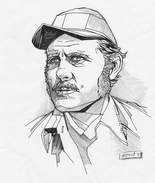
One final bit... Not more than a week after conducting this interview I checked my mailbox and found a flat package from Tyler Stout. I opened it to find a sketch, done in pencil and ink, of noneother than Robert Shaw as Quint. I didn't want to come off as a braggart by including this image originally, but talkbacker stark_for_president made a good point in that it does show Stout's hand as an artist and puts down the notion that all he does is work in the computer.
So, I'll close with that image, a wonderful piece that is being framed at this very moment and will have a place of honor up on my wall.
-Quint
quint@aintitcool.com
Follow Me On Twitter
