
@@@ AICN COMICS REVIEWS! @@@
| Issue #45 | Release Date: 3/30/11 | Vol.#9 |
(Click title to go directly to the review)
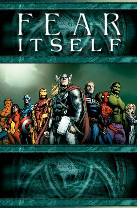
Advance Review: FEAR ITSELF #1
THE WALKING DEAD #83
JIMMY OLSEN #1
THE SKY OVER THE LOUVRE HC TPB
AMAZING SPIDER-MAN #657
NONPLAYER #1
JIM SHOOTER’S BLOG
CALIGULA #1
KOLCHAK THE NIGHT STALKER FILES #1
JUSTICE SOCIETY OF AMERICA #49
Big Eyes For the Cape Guy presents BIOMEGA Vol. 3-5
Indie Jones presents THE ANTHOLOGY PROJECT Vol. 2
 Advance Review: In stores today!
 FEAR ITSELF #1
Writer: Matt FractionArt: Stuart Immonen
Publisher: Marvel Comics
Reviewer: Ambush Bug
As far as events go, I’m not the biggest fan. Usually they are overblown faux-epics that tout big changes to the status quo, but rarely deliver. Having read most of the epics from the big two over the years, I do have to say, I’m a bit over the whole deal.
Then again, if a good premise comes along, I’m willing to check it out. With FEAR ITSELF, Matt Fraction delivers a pretty strong springboard in order to launch this spring/summer’s major Marvel crossover. For one thing, I am appreciative that Bendis has stepped down to allow someone else to handle this. Not that I’ve hated the way Bendis has handled some of the previous crossovers, but I think it’s nice to get a fresh face playing with Marvel’s major players for a change.
In the first issue of FEAR ITSELF, Fraction plays with the different characters of the Marvel U well. All of his riffs on Steve Rogers and Tony Stark and Thor are spot on. Their interactions, which, let’s face it, is what we’re all tuning into this one for, are the best part of the book. These three characters are written as if they’ve known each other for years. They’re friends who have gone through a lot together and that history is conveyed well in the few scenes Fraction dedicates to these relationships.
The threat presented in this book is a good one. Casting the new Red Skull as one of the big bads here is a good move to elevate the character to the iconic status of her pop. Now, I’m not sure the character has what it takes to remain one of the top big bads of the Marvel U, but Fraction does a good job of embracing the characterization Ed Brubaker established in CAPTAIN AMERICA for the last year or so and work it into this bigger story. I also like the idea of new and different hammers falling to earth for others to possess. Though it’s reminiscent of Thunderstrike and Bloodaxe from the DeFalco era of THOR, it still is epic enough to warrant this crossover. I like the idea, but it’s a bit too close to the different shades of Green Lantern rings over at DC to call itself an original one.
If anything, the only thing that seems off is something I have a notion will happen and really has nothing to do with this issue at all. It seems that fear is going to be the major theme present in this crossover with each hero experiencing their greatest fear. This sounds an awful lot like a series of alternate reality stories and if there’s one thing I hate, it’s alternate reality stories. I’m all for a WHAT IF? every now and again, but hinging a crossover around it immediately makes me lose interest. Nothing loses my interest more than realizing that the story I am reading doesn’t count. I could be way off and the stories sprouting from this crossover may not be alternate reality / fears acknowledged realities, but something tells me this crossover will reek of it. If that’s the case, I’ll skip the crossovers, thankyewverymuch, and just read the series proper.
Stuart Immonen supplies a rock solid set of panels in this issue. His straight forward, yet fluid forms are appreciated not only in the action scenes, but the talkity ones as well. Immonen is a professional who makes all panels count, no matter what the action in them.
FEAR ITSELF is interesting to me in that I know next to nothing about it short of the fact that more hammers seem to be falling to earth, the central story revolves around Thor and his Asgardian family, and that the Avengers are somehow involved. The first issue moves quickly and provides enough drama to hook the reader in to at least be hungry for more. If that “more” is alternate reality tales, I’ll pass. But if there’s more to it, I may give the entire FEAR ITSELF run a try. As it is, I am impressed with Marvel who finally seems to be getting their shit together and is actually highlighting Thor and Cap in a time when their movies are coming out. This is an improvement from the day and age when the Hulk didn’t even appear in his comic when the films came out and Iron Man was an unrecognizable half-man/half-machine when his film hit the screens. At least they got it together to realize that if a movie is coming out about a hero, he should at least be front and center in the comics.
The new face heading this crossover, the strong art, the solid story, and the focus on Thor and Cap are all positives building a strong argument that FEAR ITSELF may very well be a solid crossover. Time will tell, but so far so good.
Ambush Bug is Mark L. Miller, original @$$Hole/wordslinger/reviewer/co-editor of AICN Comics for over nine years. Support a Bug by checking out his comics (click on the covers to purchase)!


Check out THE DEATHSPORT GAMES’ Facebook Page
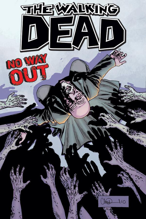
WALKING DEAD #83
Writer: Robert KirkmanArtist: Charlie Adlard
Publisher: Image Comics
Reviewer: Optimous Douche
The mother of all spoilers lies ahead so tread cautiously, trade waiters. Well, knowing Kirkman I’m sure there’s more shock and awe rattling around his furry noggin, but let’s just say I’ll be unveiling the most major event to happen in WALKING DEAD since the end of the famed prison arc.
This series has never been about zombies. Yes, their shuffling undead husks provide palpable danger for the beautiful people the beautiful people, but the zombies are not the story. Like “Star Trek” with their weekly slew of interchangeable alien foils, the aliens weren’t what mattered; it was how the crew of the Enterprise dealt with them that kept a young Optimous coming back week after week. Likewise with WALKING DEAD. This is Rick’s story, and as readers what we care most about is what Rick cares most about.
I personally hate zombie stories. They are one of the most ridiculous horror creatures ever created. Only en masse do they provide any sort of real threat. Picking on a lone zombie is the same as the motherfuckers in grade school that would pick on the special education kids. Challenge yourself, people--c’mon. Kirkman has always been wise to recognize the ridiculous nature of these creatures; throughout this series the shit only truly hits the fan when the zombies are congregated.
And congregated they have. For anyone that thought when our wayward travelers reached their new Stepford community we were in for another prison arc, think again. “No Way Out” has never fallen into the same malaise and when the roamers started to gather outside the ramparts of this little slice of apocalyptic heaven, we all knew the end was nigh. With the walls breached in the last issue, it is now skate or die time. Kirkman and Adlard make each moment of this issue count. We learn Rick is merely human and while he serves to protect, he’s going to protect his own first and foremost--even at the expense of sacrificing others. The wheels continue to fall off as Douglas Monroe, the once leader, now namby pamby of this community, poises a gun at his head ready to pull the trigger rather than become zombie food. And there is the perfect segue for our BIG SPOILER.
Here’s a riddle for you, “What’s 4’6”, wears a cowboy hat and will never be able to watch a 3-D movie?” That’s right folks, young Carl is our latest victim in the WALKING DEAD saga. The guys at my local comic shop warned me to sit down for this one and boy were they right. If it’s not too soon, yes young Carl gets his eye shot out. And it wasn’t by some lame Red Rider BB gun either. Adlard does a great job of creating mass confusion as Monroe starts scatter shooting the zombies once he comes out of his little suicidal hidey hole. As a reader, you are as completely immersed in the confusion as the characters. Right there is a testament to Adlard’s ability to create better POV’s than the blowjob channel on RedTube. The actual shot with Carl’s eye missing, actually fuck that, the kid lost a good quarter of his face was one of the most gut wrenching images I ever watched in comics. Certainly I have seen more brutal things displayed on the comic page, but never for a character that I love this dearly.
I’m not sure if Kirkman has an end-game in mind for WALKING DEAD, but I offer caution now. While I have grown to like some of the ancillary characters throughout this run, Rick and his family is always where my heart lies. After the loss of Lori, Rick started to become unhinged (ring ring); if Carl goes I see Rick moving into the realm of completely bat-shit crazy. That will only sustain for so long before he takes himself out of the equation or someone else does the job for him. I’m sure if Kirkman wanted to kill Carl off, he wouldn’t have left him breathing at the end of this issue. Although I have to wonder if perhaps Adlard should have scaled back on the size of the hole in Carl’s head, I understand shock value, but judging by the size of that hole, Carl will lose the ability to perform basic math or place anything in a logical order.
WALKING DEAD: if you want a true sucker punch to the soul, look no further.
Optimous has successfully blackmailed fellow @$$Hole BottleImp into being his artist on Average Joe. Look for Imp's forced labor on Optimous brain child in mid-2011 from COM.X. Friend Optimous on FaceBook to get Average Joe updates and because ceiling cat says it's the right thing to do.
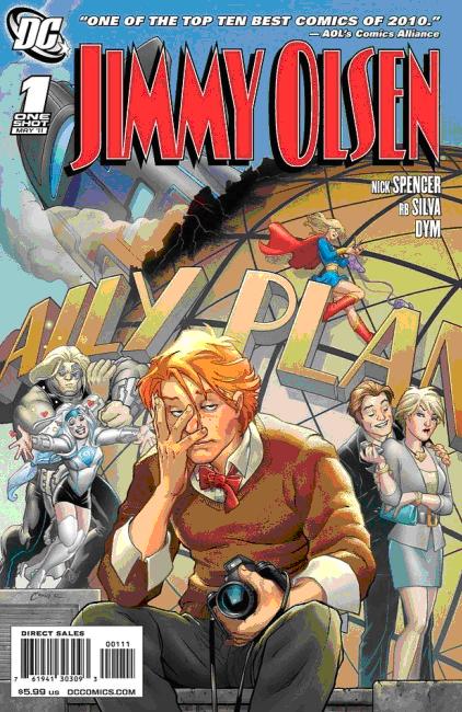
JIMMY OLSEN #1 One Shot Special
Story: Nick SpencerArt: R.B. Silva, Dym, Dave McCaig
Publisher: DC Comics
Reviewer: Majin Fu
After spending the last few years slumming off, it’s no surprise in the beginning of this comic to find Jimmy Olsen has become a little complacent due Superman’s absence. The forever young photographer has been handled pretty poorly the last few years, and if I was starting to look like a joke, I’d lay low too. Fortunately, this comic shows that Jimmy Olsen has nothing to hide. What began as a backup story for ACTION COMICS is now a single cohesive whole that any fan of the character, or Superman in general, may enjoy.
To give away the story would spoil the fun, so I’ll just give you the bare essentials: after getting unceremoniously dumped by his girlfriend Chloe Sullivan, Jimmy must once again picks up the torch as a reporter for the Daily Planet without relying on any help from the big blue Boy Scout. He also has his own new nemesis in the form of Sebastien Mallory, the uber-douche assistant to Lex Luthor. That’s right: Luthor has his own Jimmy Olsen to fawn over him. How adorable.
For a character whose identity is so heavily based on his role models and parental figures, it’s refreshing to see Jimmy Olsen finally do a little growing up. Superman has no speaking lines, and has only two appearances in the book in person, so the spotlight is solely on Jimmy. The book doesn’t shy away from Olsen’s goofy Silver Age roots, but Olsen himself receives enough of an overhaul that his plight and his goals seem completely relevant to the contemporary reader, whether it’s apathy and excessive video gaming, new responsibilities at the workplace, or just girl troubles. Jimmy’s character isn’t the only thing that improves, as he sports a longer hairstyle that makes him look more modern, and every inch of his book shines with a polish and kinetic energy that makes it one of the best looking books of the year.
This is an absolutely gorgeous comic. Before Jimmy Olsen, I honestly had no idea who R.B. Silva was, but after seeing his work here I will definitely be keeping an eye out for more work from the Portuguese talent. Characters are wonderfully expressive, sporting distinctive details and always exhibiting the most appropriate body language. Dym’s inks are intricate, and the coloring is just about perfect. The art works to enhance the abundant dialogue, as well as lending the action some extra oomph. I also loved the use of onomatopoeias in the story. Whether it’s a “Swoosh!” trailing from a red cape, or a knock at the door, sounds are given overwhelming visual power and it really makes the book pop.
As good as this book looks, it wouldn’t be nearly as much of a success without a good story, and Nick Spencer delivers. Dialog is crisp and consistently witty, with lots of little moments and asides to really flesh out the characters (I loved Perry White’s reading). The comic also has a very self-aware quality that adds to the appeal. By having Jimmy Olsen alluding to his many transformations or dropping a simple movie reference, the story draws on a broad spectrum of inspiration, so you never get bored flipping through the massive story. Mr. Spencer’s been having a good year with this and T.H.UN.D.E.R AGENTS, not to mention MORNING GLORIES, and I wish him well on his semi-exclusive contract with Marvel, even if it sadly means we won’t get to see more of him and Silva on Jimmy Olsen.
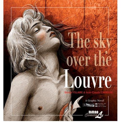
THE SKY OVER THE LOUVRE HC TPB
Written by: Jean-Claude CarriéreIllustrated by: Bernar Yslaire
Published by: NBM Comics Lit
Reviewed by: superhero
THE SKY OVER THE LOUVRE is one of those gorgeously illustrated French graphic novels. You know the kind I’m talking about. It’s the kind of graphic novel art that makes you look and think “why can’t all American comics look this good?” There is an artistic quality to this book that is unrivaled in a lot of comics that you see in the shops these days. Each page is illustrated with a sketchy yet highly polished style that is just wonderful to look at. Every page is almost a work of museum art in itself, which is fitting as this edition would seem to be the American translation of a series of graphic novels originally commissioned by the Louvre itself.
As fantastic as the art is, I wish I could be as complimentary about the story itself. I can’t say the book isn’t engaging, because it is. There’s some interesting stuff going on in THE SKY OVER THE LOUVRE. It’s a compelling look at hypocrisy and obsession during the French Revolution. The only problem is that this particular edition is being sold and marketed to an American audience. It discusses some key events that occur during the French Revolution without any real explanation of who the main players are and what events are occurring around them. I’ll admit that most of my dissatisfaction with the story is probably due to my own ignorance regarding French history. I mean, maybe I’m one of those “ugly Americans” that didn’t pay enough attention in European History class but when a story refers to characters as “Robespierre” without any real explanation as to who he was and why he was so important then you may find some of your readers across the pond a bit mixed up as what is going on in the story. It’s obvious to me that Maximilien Robespierre is probably as famous in France as Thomas Jefferson is in the U.S. but some of us over here might need a bit more in depth explanation as to what his importance was to events than just being quickly introduced to his character and letting the story proceed.
I was able to piece things together without having to resort to a Wikipedia search every couple of pages, however. The story wasn’t that vague. I was able to figure out who was who and what they were doing but other readers might not have the patience to sit and figure everything out. THE SKY OVER THE LOUVRE is trying to be a bit more “highbrow” than your average comic book. It’s obviously not shooting for the superhero comic book crowd.
Which I think is its greatest weakness. Much of it reads like a textbook. A lot of the incidents within the book are described through narration and not particularly shown. This was surprising to me because the writer, Jean-Claude Carriére, is apparently a highly accomplished screenwriter. You’d think that maybe he’d know the cardinal rule when writing for a visual medium: show, don’t tell.
In the end I think that THE SKY OVER THE LOUVRE is a graphic novel that’s aimed at a specific reader. It’s a beautiful book but one that’s been created for a particular niché. So I will say that if you are into French history or art history this may be the book for you. Otherwise, I’m not sure that THE SKY OVER THE LOUVRE will speak to everyone.
Discovered as a babe in an abandoned comic book storage box and bitten by a radioactive comic fan when he was a teenager, superhero is actually not-so mild mannered sometime designer & cartoonist, Kristian Horn of Los Angeles, California. He's been an @$$hole for three years. Some of his work can be seen at www.kristianhorn.com and check out his blog at www.parttimefanboy.com.
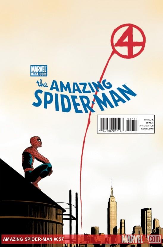
AMAZING SPIDER-MAN #657
Writer: Dan SlottArt: Marcos Martin, Ty Templeton, Publisher: Marvel Comics
Reviewer: Henry Higgins is My Homeboy
Night Night, Johnny…
Spider-Man finally has to deal with the death of Johnny Storm, and it's about time. The last mention of it was the great meeting between Peter and Franklin, and it's nice to see follow up on it. Peter and Johnny always had one of the most entertaining relationships in Marvel. It's nice to see the look at their relationship done with a recurring sense of familiarity, giving the book a bittersweet scene. The book, save a few mistakes here and there, is a great look at the friendship, and the way it plays out the memory of Johnny.
Writing: (5/5) This issue is fantastic, simply put. Slott has one of his best issues since taking over the series. The relationship between Johnny and Peter is explored and exploited. It's well written and fun. The issue also plays well in an exploration of the relationship shared between Peter and Reed. It makes sense to play on the scientist angle, and it's a fun direction to take. Each memory really has fun with the scenario, and it's a solid way to look at the connection between the two sides. The assembled characters play out the depression effectively and the book is brilliant at looking at the memory of Johnny. Nothing stands out as weak. The book is an entertaining and moving read.
Art: (4/5) With four artists, it wouldn't be surprising for this issue to have no consistency or falter about at some point. But the team does a solid job of conveying a great sense of memory and giving each story a solid sense of bittersweetness. Martin has the most scenes in the book, and deservedly so. The art in his segments is strong. A number of solid shots (especially in the first few pages) really go a long way, and makes up for most of its small mistakes.
Templeton, playing to the more basic story, has a fun time with a simple camping story. It conveys a great sense of humor and humility, while still having a slight twinge of melancholy. Spider-Man and Human Torch's little prank war is beautifully simplistic and fun, exactly what the scene requires. The Thing looks great in the course of the story, and is drawn beautifully (his little sad walk is great in a relatable sort of way).
Plati is probably the weakest of the art, but it's still not bad. It features some lesser moments (such as the fight scene against the Fearsome Four), but the earlier moments work. Spider-Man moves fluidly, and Johnny moves well in a fun panicky way. The fight scene itself and Sue at times isn't great, but the scene plays well for most its run.
Caselli has probably the best of the art in the issue. It feels the most like its own separate FANTASTIC FOUR issue, with great little moments (Reed's face during conversations, Spider-Man taking pictures) mixed with solid action beats (Spider-Man and Reed going all about to fix the ship) that gives this segment a memorable sense of style.
Best Moment: The rapport between Peter and Johnny in each scene.
Worst Moment: Maybe missing some time that should have been spent on Johnny and Peter exclusively.
Overall: (4/5) A very quiet, very enjoyable read. Bittersweet and sad, it's a great way to reference the relationship in a good way.

NONPLAYER #1
By Nate SimpsonPublisher: Image Comics
Reviewed by Johnny Destructo
Now this is how you start a comic series. Nate Simpson has released onto the world a fantastic bit of comic booking with NONPLAYER #1. I was hesitant, opening a book that's clearly to do with online gaming, because...well...it's just been DONE, and I'm lucky enough to not have been sucked into the life-murderer called WoW (thus far). But the art in this book is nothing short of astounding. It's honestly the only reason I even picked this book up, but I'm glad I did. It's Jamie McKelvie and Geoff Darrow combined, with stunning color work. This is Nate's first comic, but he's a fella to keep an eye on.
We start off on an alien world filled with unfamiliar wild-life, and as the audience, are witness to the personal conversation of a King and his Queen, when assassins strike! However, it's obvious from the dialogue almost immediately that these invaders are avatars of players participating in a kind of MMORPG. But that's...not right, is it? I mean...we, as the viewer, were just privy to the intimate relationship between the royalty of this world. What's really going on here? Is this really just a game or is something else afoot?
As someone who isn't really into the whole fantasy thing of elven assassins, the reality bit of the story takes place in the future, where dudes in giant mech suits collect the neighborhood trash...something for everyone! Also, I can't help but imagine Felicia Day as the adorable tamale delivery girl, which makes it all the more lovable as far as I'm concerned.
Everything in this issue is quality. The set-up is established, a mystery is introduced, and the art gives the other comics on the shelf a run for their money. If you're looking for something new to pick up this week, this is $2.99 very well spent...even if you aren't a gamer.
JD can be found hosting the PopTards Podcast, discussing movies, comics and other flimflam over at www.poptardsgo.com, graphically designing/illustrating for a living, and Booking his Face off over here.

JIM SHOOTER’S BLOG
Writer: Jim ShooterArtist: It’s a blog
Publisher: The Intertubez
Reviewer: Optimous Douche
So why did Marvel launch the SECRET WARS? The answer: toys. Do Jack Kirby and Stan Lee froth at the mouth when they get within a one mile radius of each other? The answer: no. Was Hank Pym always a wife-beater, or was he simply drawn that way? The answer: drawn.
How did I come about this Oracle-like wisdom about this revered time period in comics? Well, JIM SHOOTER’S BLOG of course (http://www.jimshooter.com/)While I'm a little too young to remember Shooter’s tenure as the editor-in-chief of Marvel, any comic fan worth their salt knows the rumor mill that came with his successful but controversial time in the chair during the 1970s.
Megalomaniacal levels of control, a hair-trigger temper…the list goes on and on surrounding the great Shooter’s foibles. And like all humans we gloss over all the good because the bad is so much more tantalizing. But what if the bad wasn’t really that bad? We’ve heard Marvel’s story behind things like creator rights, crossovers and their subsequent PR spin on such events. Did anyone ever get the Shooter skinny? Perhaps Shooter dripped and drabbed this information in interviews over the years, but I’ll be damned if I ever read these nuggets of goodness way back when they were controversial or if I could find them today.
Shooter could honestly charge money for this experience: an entertainingly descriptive recount of his time leading some of the world’s most revered characters is the stuff that people pay thousands of dollars to hear in person. If you were actually President of the country that number jumps to six figures. Personally I would rather hear from a man that actually created something versus someone that merely helped us slide into a state of patriotic malaise.
I haven’t had a chance to traverse every blog post yet, but I’m truly waiting for some deep insight into the time period when I fell in love with Shooter’s work – the Defiant days. For anyone that doesn’t know Shooter, start now. Everything the industry is today can be tangentially tied back to his decisions. For anyone that knew Shooter, remember there are two sides to every story.
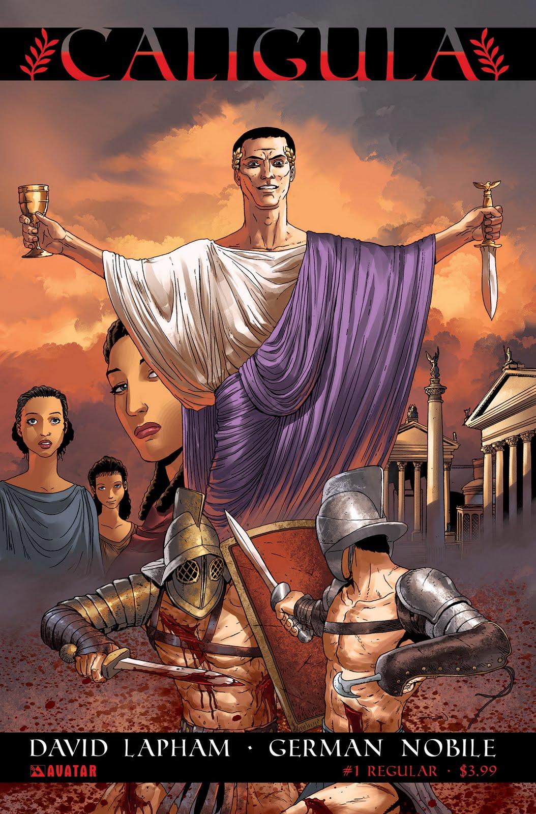
CALIGULA #1
Writer: David LaphamArt: German Nobile
Publisher: Avatar Press
Reviewer: Ambush Bug
Y’know, not that I was asking for a Caligula story, but if I were, I’d be happy as a clam in…something a clam likes that it was being released by a company like Avatar. Out of all of today’s publishers, Avatar embraces the balls to the wall, over the top, taboo fucking attitude like no other company out there. Sure, Garth Ennis’ CROSSED and Moore’s NEONOMICON helped a ton to push this company toward a path where few dare to tread, but the fact that the company seems to be fully embracing the extreme is something refreshing.
Though not all of Avatar’s books follow the same motto, the ones that interest me the most are the ones who push the boundaries of good taste and moral comfortability. Though my first interest in David Lapham came from his stint as writer of TERROR, INC (a favorite character of mine), it wasn’t until I read his CROSSED miniseries that I realized that Lapham is a debaucherous visionary worth following. After reading CROSSED FAMILY VALUES, I knew this writer was one I needed to keep my beady little eye on. When I heard Lapham was going to be taking on CALIGULA, you’d better believe I beat feet to my local comic shoppe to request the series be put on my pull list. No one writing modern comics today can write more disturbing comic books than David Lapham these days. He seems to have fully embraced the pole that flies the freak flag and works to out-do himself with every issue he spews out.
Though I believe I have seen Bob Guccione’s CALIGULA, not a lot of it stuck into my head. I know it was an exercise in sex and violence. Coming into this new series, I was reminded not of the classic film starring Malcolm MacDowell, but more of recent forays into Roman debauchery HBO’s ROME and Stars’ SPARTACUS. Much like those two TV series, CALIGULA’s story is strong and steeped in history, but made all the more tantalizing by injecting heavy doses of blood and sex to titillate those less interested in heavy character development and themes. SPARTACUS is the lesser of the two TV series because it relied more on the spectacle, the blood and sex, than ROME, which seemed more meatier issues such as story, history, and politics. If anything, CALIGULA leans more toward SPARTACUS than ROME in that it is much more about the shock and awe. That’s not to say that there is no story here. Lapham knows how to weave an enthralling tapestry and spreads it out well in this issue, it’s just that the attention to the sex and gore is very much front and center here.
Not for everyone for sure, but those who found themselves unable to turn away from the gladiatorial depravity of SPARTACUS and those missing the Shakespearian scandal of ROME would not want to miss CLAIGULA from Avatar. If you’re a fan of these series, the sex and gore won’t offend. If you are faint of heart and easily offended, then you probably have already learned to steer clear of ROME and SPARTACUS and more than likely do that same for most of Avatar’s books as well. Different strokes, I guess. Personally, I am always astonished and though somewhat shocked, always entertained by what David Lapham has to offer. CALIGULA follows suit.
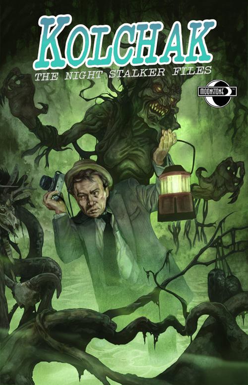
KOLCHAK THE NIGHT STALKER FILES #1 SWAMP THINGS PART ONE
Writer: Chris MillsArt: Jaime Martinez
Publisher: Moonstone Books
Reviewer: Mr. Pasty
Ah, the art of the slow build. I don’t see it much anymore in comics these days but when I do, I simply relish it. Unfortunately, our industry trends no differently than music or film; everything new seems to be loud and in your face. But not Carl Kolchak, not by a long shot. Kolchak is a throwback to an era when reporters and dicks wore tan trench coats, matching fedoras and spoke with a slow and determined delivery that harkened back to the matter-of-factness of Phillip Marlowe. Having run its course by the early seventies, I wasn’t old enough to catch the KOLCHAK movies and television series during their initial run, but the SyFy and Chiller channels have brought me up to speed in recent years. For the uninitiated, Kolchak was an investigative reporter out of Chicago who had a nose for sniffing out the strange and mysterious – even paranormal – stories the authorities couldn’t otherwise be bothered with. If it sounds like a precursor to “The X-Files”, it is, and there’s a winning reference to Fox Mulder that is just one of many Easter eggs in this fantastic and intelligently written book.
KOLCHAK the comic is an extension of KOLCHAK the television series. He’s still chasing the unexplained, but this time he’s doing it in Miami and not in Chicago after an embarrassing string of incidents sent him limping from the Windy City with his tail between his legs. He takes whatever gig he can find, which just so happens to be at a fictional tabloid designed to resemble the supermarket shelf shocker known as the Weekly World News (1,000 pound baby, Bat-boy, etc.). They hardly do anything that constitutes journalism, but the editor-in-chief is hoping that Kolchak can bring him the best of both worlds. He’s in luck, too, as a menacing mass of mayhem is loose in the Florida Everglades and it’s already claimed three victims.
Because we only see the “monster” twice, we’re not really sure what to make of it. It’s presented in shadows and in blurry movement at the book’s beginning and end to complete the Kolchak narrative and reward the exposition with action bookends. It compliments the story by adding layers of mystery and intrigue, but more importantly it’s a testament to the skill of writer Chris Mills, who exhibits enough confidence in his writing to abandon the rat-tat-tat delivery. I also appreciated the faith he put in the reader. I don’t need 47 pin-ups or exploding planets to keep turning the pages if the writing compels me to, and every panel of KOLCHAK is like a visual escalator. I’m being taken to my destination with little to no effort. All I have to do is stand there and look around.
That gave me ample time to enjoy the artwork of Jaime Martinez, who continues to dazzle me with his unique palette. I particularly enjoyed the way he played with his reds and browns, muting the overall look and casting an ominous tone over the story. It was a risky endeavor against the bright landscape of Miami and betrays the greens of the Everglades, but he commits to his vision and it works. In fact, everything works here. The writing is sharp and unapologetic in its references, the tone is just right and Martinez is a breath of fresh air. I can usually find one or two things to nitpick in any review but KOLCHAK is a rare exception to the rule. Cover to cover this book proves that you can have your comic and read it too. Highly recommended.
Web heads who can’t get enough of Mr. Pasty’s word vomit are encouraged to watch him operate as Nostradumbass over at MMaMania.com here. Love, hate and Mafia Wars requests should be directed here.
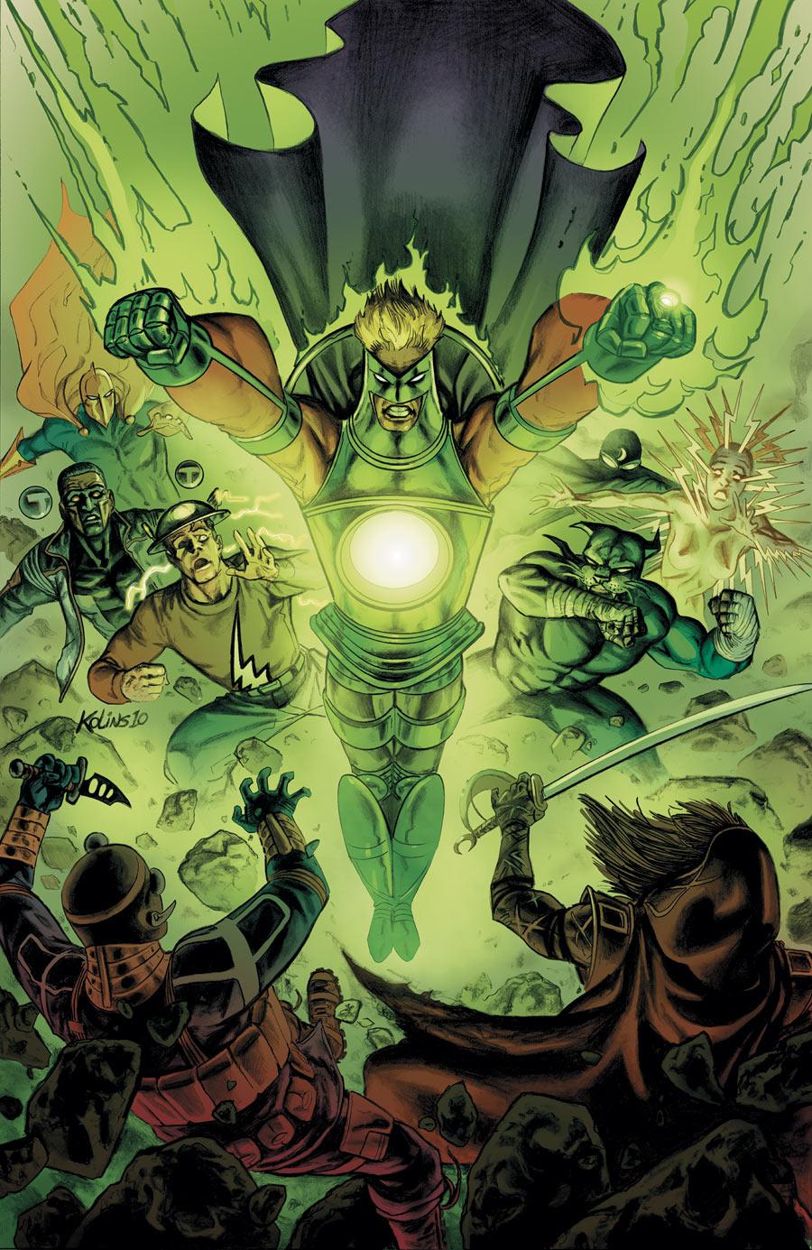
JUSTICE SOCIETY OF AMERICA #49
Writer: Marc GuggenheimArtist: Scott Kolins
Colorist: Mike Atiyeh
Published by: DC Comics
Reviewed by: BottleImp
I can’t believe I’m saying this, but maybe Roy Thomas was on to something when he consigned the Justice Society to Limbo back in the ‘80s. At least when the JSA was fighting a never-ending battle against the Norse gods of Ragnarok the reader didn’t have to watch it over and over again each month.
Maybe that’s a little hyperbolic, but it sure feels to me like JSA is repeating itself ad nauseum. Over the last year the plotlines have all followed roughly thus: the team is doing something uninteresting amongst themselves. The team is attacked by some mysterious menace. The team finds out that said mysterious menace is somehow tied in with the Justice Society’s A) rogues gallery from the past 60 years or B) a Nazi-engineered WWII plot. There are a bunch of cameos from non-JSA superheroes as the writers apparently find the JSA roster to be boring as shit. The team triumphs over a previously nigh-unbeatable menace in the span of a few pages, leaving more room for talking instead of, y’know, SHOWING the action. The team goes back to dicking around and waits for the next mysterious menace to show up.
With this latest story arc climaxing with a mighty “meh,” it has become clear to me that Guggenheim (as well as other writers before him) just doesn’t know what to do with the Justice Society. I think the problem is that unlike other superhero teams such as the Justice League or the Avengers, the Justice Society has super-strict membership guidelines. To join the JSA you must either A) be a miraculously still-active hero from the 1940s or B) have the same name as a mercifully deceased hero from that same decade. And yes, I know that Lightning is an exception to that rule, but I’m going to lump her in anyway, seeing as how she looks like Johnny Thunder’s Thunderbolt. Plus she got killed last issue, so, whatever. With little to no wiggle room on which characters to use and the same old tired roster of two-dimensional Golden Agers, it’s no wonder that this title has been low on energy—half the lineup should be living down in Del Boca Vista with the other retirees. Something is desperately needed to jumpstart the sluggish storytelling, because Guggenheim is getting no help from the art department.
Oh, the art. I know I’ve harped about this before, but I hate hate HATE the current choices being made on this title’s visuals. Using color in a fully-rendered manner CAN make linework appear more painterly, but it requires a very specific pairing of coloring ability and a certain slightly more photorealistic drawing style. Kolins’ drawings, however, tend towards more skewed proportions and cartoonish facial expressions. Without traditional inking to add clarity and definition to his pages, Kolins’ work takes on a soft, almost blurred quality. Add in Atiyeh’s heavy-handed colors, and the art becomes even more flabby and indistinct, leaving us with a smudgy mess that reminds me more of the kind of drawing you find in a middle-school sketchbook rather than a professional body of work. It’s ugly and ineffective, and I wish that someone at DC would fix it.
Lest I get too negative, I will say that I’m glad that Kolins took a whack at giving the Golden Age Green Lantern a new look. The “Living Lantern” costume makes sense, seeing as how Alan Scott himself contains the Starheart (which is the equivalent to his power battery, for all you young’uns out there)…I just wish that a little more revising had gone into the design process. The end result is a little too “guy walking around in a giant lantern suit” and not enough slick superhero, especially the goofy flared-out waist and purposeless “lantern handle” that is somehow attached to his back… well, damn, it looks like I went negative again, despite my best intentions.
Oh, well, maybe Scott’s new Lantern togs will somehow lead into a more energetic direction for this series, or at least one where the JSA does more than simply waiting around for Nazis super villains to attack them and/or cause massive property damage. Because if that’s all this old super-team is good for anymore, it really is time for them to look into the condo scene down in Florida. Or even a nice Götterdämmerung up in Asgard.
When released from his Bottle, the Imp takes the form of Stephen Andrade, an artist/illustrator/pirate monkey painter from the Northeast. You can see some of his artwork here. He’s given up comics more times than he can remember. But every time he thinks he's out, they pull him back in.

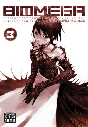
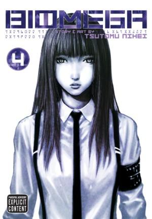
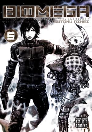
BIOMEGA Vol. 3-5
By Tsutomu NiheiReleased by Viz Media
Reviewer: Scott Green
Sales figures suggest that there are people whose manga purchases are largely limited to the best sellers... the fans of NARUTO and the like. Beyond that, observationally, manga appears to be largely bought by manga fans.As someone who'd like to think that they possess an understanding of what media people would like, I believe that the reason for this is not so much that manga lacks broader appeal as it is that manga's a loser in the battle for the attention and funds of the potentially interested. After being looked or ruled out in dollar-to-entertainment calculation, there are plenty of audience that manga could speak to or entertain who give the medium little considerations.
BIOMEGA is held up, both by critics and its publisher, as an example of manga that could appeal to consumers who generally direct their allotted entertainment resources towards video games.
Speaking of allotting time, I read plenty of video game reviews and listen to plenty of podcasts dedicated to the subject, but, honestly, I spend very little of my time actually playing video games. I do believe that I follow the industry and conversations about that medium to the extent that I have some understanding of what gamer look for and how games appeal for their attention, but I imagine that there's plenty of room for my opinions to be contradicted.
 I both agree and disagree that BIOMEGA deserves to be a paramount manga recommendation to gamers.
The position is far from baseless. BIOMEGA author Tsutomu Nihei focuses on a sort of biomechanical horror sensibility that has long complemented video game shooters. It's little surprise that he was the manga creator tapped to produce a Halo comic for Marvel. BIOMEGA features a lone, armed motorcyclist sent alone (apart from female, holographic AI) into a space-zombie infected plague-zone, in which he fights creepily apron clad, boned head hulks and the like. And, the icing on that cake is a consciousness in the body of bear, armed with sniper rifle who acquires a hook-hand.
At issue, for better and worse, BIOMEGA is a Nihei work through and through - with all the double edged qualities along for that ride.
If you aim find manga in which you can open a book to any arbitrary page and be certain to find something to give an action sci-fi junkie a strait hit, you can't beat BIOMEGA. Nihei's gift is his mastery of creating landscapes of cyclopean structures that truly appear to dwarf human beings, populating them with disconcertingly mutated inhabitants, and then sending lone, armed anti-heroes down the immensity. Disembarking with all the gear into landscapes that embody the definition of “alien”, Nihei reconfigures elements common to a popular genre of video games into a form that takes full advantage of the freedom afforded by manga. In practice, you couldn’t ask for a more spectacular manga based on a guy with a gun.
The work is reminiscent of plenty... both inspirations and of works that probably or definitely didn't inform Nihei's writing, but which BIOMEGA still calls to mind. My first impression of the series was "Terminator/Kamen Rider enters a cyber-Lovecraftian zombie haunted town." (Checking the back of the book so as to avoiding revealing more that cover states) 'In a bid to remake the planet according to her design, Niarudi—Matriarch of the DRF (Data Recovery Foundation) —has unleashed the Reverse Morphic Polymer. This substance triggers a radical transformation of the Earth, preparing it for “restoration.” ' This enables Nihei to not just build out the biomechanical horror haunted cities of the manga’s early chapters, but to really inflate his imaginative vision to vast, sci-fi scales. As things get reconfigured, and not just a cityscape or domed Mars colony, but Star Trek sized objects turned more alien, the backdrop begin looking like am astronomical scale version of the fungal forests of Miyazaki's NAUSICCA. At the same time, as the synthetic, megacorp operative hero progresses into the madness, if there was stream of Lovecraft work that I'd compare the spiraling odyssey to, it'd be the trek into more fractured landscapes of his Dream Cycle.
 The trouble is that BIOMEGA is too free. In that, the unbound story becomes a bad read. It’s not just a weak story serving as barely sufficient tendons, holding together thundering visual booms. The narrative is actively problematic.
Freedom from emotion initially seemed to benefit the manga. Here was a cold juggernaut storming the halls of terror. The demeanor of the protagonist was so at odds with the world swallowing threat, that it was if this hero was settings his sights on the very concepts of disease and corruption. Since BIOMEGA is based around this, the problem became, not so much that the manga was underwritten as lacking. It became a matter of an immovable object versus an unstoppable force, both of which are, after a fashion, showy. Neither of which has much personality. The spectacle persists, but there’s nothing to lack onto.
Beyond an appreciation for BIOMEGA consistently looking exceptionally cool, it is difficult to muster much enthusiasm for what the armed mannequin is doing in his battle against all sorts of horrors. The blow by blow bits are comprehendible, but a larger sense of what he’s doing is illusive. It doesn’t feel like he’s driving events. For that matter, it doesn’t feel like his adversaries are either. After reading volume 5, I had no idea that the series was about to wrap up in its sixth.
More than conforming to some narrative structure, BIOMEGA moves like it is subject to where Nihei’s thoughts wander. It’s imaginative stuff, but imaginative in a way that suggests what must be floating around the head of the kid sitting in the back of a classroom, staring off into the middle distance. There is an expectation of at least an illusion of agency from modern video game. BIOMEGA’s lack is an issue in the manga series and would be in a game as well.
If you’ve seen FINAL FANTASY: ADVENT CHILDREN, BIOMEGA is like that, but more so...visually resounding, in theory attractive to gamers, but lacking the character or narrative hooks to really engender enthusiasm. BIOMEGA is an attractive object with a surface that’s too polished. Applying words like “smooth” or “polished” to BIOMEGA is out of sorts with a manga series defined by its broken, cancerous landscape, but that’s the issue here. Anything that might allow the manga to be really grasped on to has been blasted off.
Scott Green has been writing for AICN ANIME for over nine years. If you like what you see here and love anime & manga, be sure to check out his latest AICN ANIME column every week on AICN.

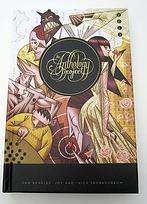
THE ANTHOLOGY PROJECT Vol. 2
Writer(s): Lots of FolksArtist(s): The Same Folks
Publisher: Lucidity Press
Reviewed by Humphrey Lee
What I like most about this gig, honestly and truly, is that I get to talk about comics that I love. I know we @$$holes have the reputation out and about on the Internet for our snark – snark out of love, I swear – but I like to do these couple hundred words a week because then I get an opportunity to talk what I think of as good comics. Creative comics, clever comics, comics that do an established character justice, the occasional event comic that actually gets it right in regard to its content, et al. And that is why, probably more than anyone here, I tend to partake in the anthologies the most, because of the creative and clever bursts they work in.
The first ANTHOLOGY PROJECT came across my desk a few months ago after a bit of a sabbatical from them. Now the first review I do after a couple months of horrible, terrible, mind-numbing amounts of academic paper writing is another volume of TAP and it’s a welcome transition back into this side job. Because the review writes itself, which is why I spent roughly half the time with that personal aside to lead in. The first TAP was a great production, from the hardback construction to the contents within. And while I cannot attest to the physical design – the book has yet to come out, after all – the contents within are just as strong with this outing as they were previously.
The key to a good anthology, besides tapping those clever and creative veins, is hitting some sort of emotional nerve as well. Even if it’s just in the little smile you get from that cleverness, or those little ditties of loss, whether it be of love or innocence or, hell, why not both that gives you that little pause. About a dozen of those, with their own unique storytelling and artistic styles, that still have enough in common to transition through each other to keep the flow going. TAP Vol. 1 did it and I’m glad to say that there seems to be a tradition forming with this second volume.
I will admit, not as many stories in this volume worked for me as they did in the first. Each tale has its own merit, of course, either from an art or style or abstract attempt at something, but I just did not quite get the hits from this as much as I remember the last one. But that’s me being a nitpicker. Not everything can be a homerun, nor should it be, as I should not expect to have every story be in my wheelhouse. It’s the gamut you run with these collections and, overall, THE ANTHOLOGY PROJECT has been a great endeavor. For those curious, it was solicited in the March PREVIEWS (yeah, I know, it’s April. Blame the 50 some pages I wrote for my MBA the past month that kept me away) on page 297. The content is there and I assume the packaging will be too, given how beautiful the last volume was. If you like these creative jaunts like I do – and I know there’s a lot out there to choose from – then this is one of those fabled ones that you can’t go wrong with.
Humphrey Lee has been an avid comic book reader going on fifteen years now and a contributor to Ain't It Cool comics for quite a few as well. In fact, reading comics is about all he does in his free time and where all the money from his day job wages goes to - funding his comic book habit so he can talk about them to you, our loyal readers (lucky you). He's a bit of a social networking whore, so you can find him all over the Interwebs on sites like Twitter, The MySpaces, Facebookand a Blogger Account where he also mostly talks about comics with his free time because he hasn't the slightest semblance of a life. Sad but true, and he gladly encourages you to add, read, and comment as you will.
Proofs, co-edits & common sense provided by Sleazy G