
@@@ AICN COMICS REVIEWS! @@@
| Issue #44 | Release Date: 3/23/11 | Vol.#9 |
(Click title to go directly to the review)
Advance Review: NANNY & HANK Vol.1 Tpbk
OUTLAW TERRITORY Vol.2 (Review Part 1 of 2)
Advance Review: KICK-ASS 2 #2
MARINEMAN #4
FABLES #103
Advance Review: UNDYING LOVE #1
ULTIMATE COMICS SPIDER-MAN #156
Advance Review: FLY #1
BAD DOG #4
Advance Review: ULTIMATE X #4
Big Eyes For the Cape Guy presents JORMUNGAND Vols. 2-6
Indie Jones presents…
CHEAP SHOTS!
 Advance Review! In stores in April!
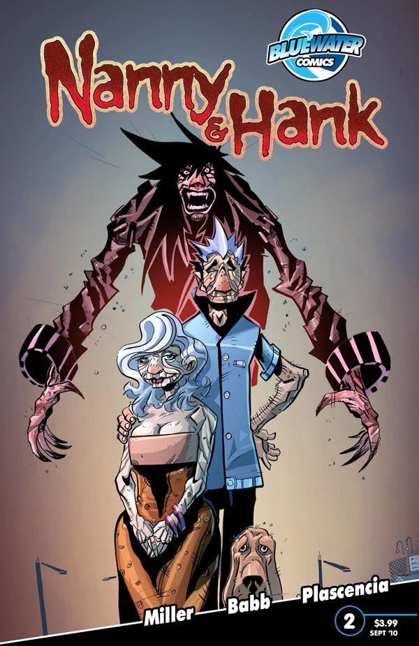
NANNY AND HANK Vol.1 tpbk
Order it here!Writer: Mark L. Miller (Ambush Bug!!!)
Art: Steven Babb
Publisher: Bluewater Comics
Reviewer: superhero
A while back I reviewed the first issue of NANNY AND HANK. You can read that review by clicking here. If you don’t feel like going over my thoughts on the first issue I’ll be happy to give you the Reader’s Digest version. I liked it. Very much. I though the book really had a good premise, some interesting characters, and unique artwork. I was very curious to see where the whole thing would go. NANNY AND HANK’s first issue did what a first issue is supposed to do: it got me intrigued. So when I got a chance to check out the trade paperback I was looking forward to reading it. The first issue had left things hanging a bit (Again, as all good first issues should) so I wanted to check in again on ol’ NANNY AND HANK and see what the twisted mind of our fair leader, Ambush Bug, had decided to put them through.
Well, I gotta say, this was a really fun read. The TPB of NANNY AND HANK fully delivers on the promise of the inaugural issue. Everything that was established in the first issue is here: warm and identifiable characters, creepy and humorous vampire antics, and a solid, unique story. It’s one of the better vampire stories I’ve read in a while. NANNY AND HANK remains a vamp story with something different than your normal bloodsucker tale. Its two lead characters are not your average vamps and it’s not just because they were “turned” in their twilight (pun intended) years. They are vamps that have a close knit bond that is rarely seen between characters in horror books. They have been married for years and just when they are expecting to fade away into their golden years they are each cursed by a vampire bite. So what this distinctive book gives us is a tale of two people who love each other dearly and have to figure out how to live a normal existence while navigating all the trappings of being a vampire.
It’s this twist that makes NANNY AND HANK worth reading. I can’t say that NANNY AND HANK is scary per se but it is endearing. Which is a quality that you don’t come across in something that’s supposed to be a horror book. I’m sure lots of people out there would prefer to have nothing but blood and gore in their frightfests but I think NANNY AND HANK presents something a bit more valuable. It gives us two protagonists we can root for, care about and feel sympathy toward. It’s a different take on your typical, “I got bit by a vampire” tale in more ways than one and it’s a pleasant read all the way through.
I do have to say that I still have a bit of a love/dislike for the art of the book though. I think that Steven Babb’s style is just fantastic in its own unique way but I think that his technique is getting in the way of his being able to tell a straightforward story. Obviously Babb’s work is not meant to be scrutinized in a way I would analyze someone like say, Bryan Hitch or George Perez. His work is far too stylized to be looked at in that way. But I think that perhaps his art might be a bit too “cartoony” for its own good. Honestly, I don’t mean to be mean but I really think that some of the characters looked a bit too much like, well, muppets in some panels. I personally don’t know if that’s the style I’d go with for this type of book. In the end Babb does deliver, however. His artwork is so unique that it does end up pulling you into the story. As a matter of fact I’d go so far to say that in some sequences it adds to the twisted feel of the book. I just still think that many of the more serious or poignant moments tend to be lost a bit because of the artists style.
I can’t close out this review without mentioning the colorists, Kamui Ayami and Ivan Placenia. The palette for NANNY AND HANK is beautiful. I just had to say it. While Babb’s style just jumps off the page the color in this book impressed me in its ability to set the mood for the book. I just loved the look of every page and part of the credit for that goes to these terrific color artists.So in the end NANNY AND HANK turned out to be a great read. I’m glad I was able to see how the story turned out. The first issue hooked me in and the trade delivered from beginning to end. NANNY AND HANK is a terrific little horror tale that creeped me out and warmed my heart at the same time. Nice job.
Discovered as a babe in an abandoned comic book storage box and bitten by a radioactive comic fan when he was a teenager, superhero is actually not-so mild mannered sometime designer & cartoonist, Kristian Horn of Los Angeles, California. He's been an @$$hole for three years. Some of his work can be seen at www.kristianhorn.com and check out his blog at www.parttimefanboy.com.
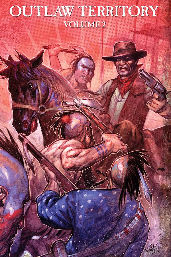
OUTLAW TERRITORY Vol.2
Writers/Artists: VariousEditor: Michael Woods
Publisher: Image Comics
Reviewer: Ambush Bug
There aren’t enough Western tales comics out there today. That’s why original graphic novel anthologies like OUTLAW TERRITORY are something worth getting behind. I broke my last review of this massive anthology project into two parts and I think I’ll do the same again this time around. Looking through the list of talent this book has between its covers indicates how everyone has a cowboy story in them. It’s to editor Michael Woods’ credit that most of the short stories chosen for this volume are well written and varied in both style and subject matter. Some are light hearted. Some are gritty. Some are action packed. Others are more heady. If you’re a fan of the genre, this is a book that you need to have.
Let’s take a look at the first 15 stories of this book:
Bleeding Cool.com’s Rich Johnston leads the book off with “Rustling Up Business”, a farcical tale of a man setting events into motion that pay off in a punch line I won’t reveal here. This light-hearted yet somewhat blackly comedic tale was a fun way to start things off with, especially with Tom Fowler’s fun art.
“Cherokee Bill” switches gears immediately by telling a multi-faceted tall tale of the many origins one bad man may or may not have. This story, written by Shannon Eric Denton, is richly illustrated by the expressionistic style of Kelsey Bryan Shannon.
Len Wein brings us “Cold Blood”, a tale of wilderness survival and retribution. The twist at the end came a bit out of left field, but the tale itself is thrilling and made memorable with straight forward illustration by Alfio Buscaglia, who has a gift for drawing faces which shines brightly in this story.
One of the darker and coincidentally one of my favorite reads of the first 15 stories is “The Strongbox”, written by Michael Woods and drawn by the exquisite Rafael Albuquerque. It’s a story of two children who want to be outlaws and find their wishes unfortunately coming true. This theme is later revisited in A. Freeman, M. Bernardin, and D. Lafrance’s “Death of an Outlaw”, a heartbreaking tale of a wannabe villain whose fascination with dime store novels proves to be deadly.
“The Whores of Trinidad Need Witnessing To” by Alex Wilson stands out due to a great twist ending and some originally slanted artwork by Rick Lacy. I loved Lacy’s panels in this story which features a surly cowboy, a stagecoach, a child, and a flask.
A case of mistaken identity is the backdrop for “The Face on the Poster” by writer Christopher Mills and classically strong artist Joe Staton. While some of these stories seem to end too soon, this one hits all of the right notes and ends with a nice twist.
“The Brothers McKenzie” was a fun and adventurous romp as two arguing brothers find themselves in the middle of a standoff between two gangs of bad guys. This story felt like an episode of a series and the characters are written to have a lived in/comfortable feel as if they’ve been developed for a long time and had many stories told about them. A lot of fun, this little story was (by Pete Doree and awesome art by Shawn SLEEPER Phillips).
Possibly the most whacked out, bug nuts story is “They’ll Bury You Where You Stand” by Jeremy Barlow and Dustin Weaver. This one takes the cake as far as the most hauntingly insane story of the first half as a stranger rides into town to save the day. Cliché? Sure. But what happens next certainly isn’t. Dustin Weaver’s unconventionally detailed panels make this story a standout. Just a fantastically warped tale!
Mike Baron tells a tidy little tale of a man who won’t let a bandit get away with stealing his horse in “Wild One”. The highlight of this one is Val Mayerik’s art featuring some great visuals of horses.
“Say You’re Dead” is a poetic and visually striking nugget by Kathryn and Stuart Immonen. Although it took me a read or two to get the entire story, the visuals made it a joy to read through a few times. This is a more heady tale that leaves most of the storytelling up to the visuals, which are breathtaking. Immonen’s use of color (especially the color red) in this one is amazing.
John Whalen and artist Werther Dell’edera bring us “Bring Me the Head of Joaquin Santiago”. I loved this tale of a bandit who won’t let his legend die and goes on a killing spree to save his not-so-good name. Santiago is on a quest that I wouldn’t mind following beyond this little snippet of story.
“The Making of a Legend” by James Patrick tells an account of one man who happens upon the status of Western Legend and tells it in a way that is instantly appealing. This fun take on an age old tale is nicely written complimented perfectly by Dan Duncan’s gritty artwork.
Josh Wagner’s “The Score of the Century” is a fun yet somewhat dry tale of three characters telling the story of their greatest score. The twist ending is a lot of fun and art Jose Jaro is someone I want to look out for due to his unique human forms, luscious women, and fantastic facial expressions.
The last story I’ll cover in this first half of OUTLAW TERRITORY, “The Wheel Turns”, is another poetic tale of the cycle of vengeance. We’ve all read something like this before--one violent act begets another--but here writer D.K. Stockton milks this concept for all it’s worth with a determined protagonist and a story that feels like it’s being driven into your soul.
I’ll be back soon with a look at the second half of this awesome anthology. You aren’t going to find a better selection of Old West stories out there. These are stories of gritty passion and gun metal gray adventure. OUTLAW TERRITORY Vol. 2 continues the tradition of telling the finest western stories from some of the finest writers and artists today.
Ambush Bug is Mark L. Miller, original @$$Hole / wordslinger / reviewer / co-editor of AICN Comics for over nine years. Support a Bug by checking out his comics (click on the covers to purchase)!


Check out THE DEATHSPORT GAMES’ Facebook Page
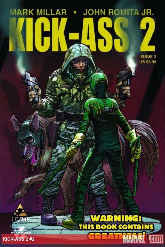 Advence Review! In stores today!
KICK-ASS 2 # 2
Writer: Mark MillarArt: John Romita Jr. (pencils), Tom Palmer (inks)
Publisher: Marvel Icon
Reviewer: Johnny Destructo
Let's be honest: even as reviewers, it's nigh impossible to pick up certain books without some sort of pre-conceived notion. As I picked this issue out of my stack with the thought of reviewing it I already had my first sentence typed out in my head. Something akin to "I know I'm usually known as the Mark Millar apologist, but even I something something negativity, done with it, so on etc." I had already "decided" that after all this time, and due to the lateness, and the awesomeness that is the movie, I'm bored with KICK-ASS as a comic series. Whelp, eff that crap in the face. Lateness be damned, I had a bastard of a good time with this one!
We get to learn a little more about the super-hero team that Dave is invited to join and we go out with them for their first night on patrol. Kick-Ass also gets a new buddy-in-tights to hang out with who is just as much a loser as he is. Though I have to say, Kick-Ass isn't the hero of this issue for me (though, was he ever really the hero of his own book to begin with?), that title sits on the shoulders of Colonel Stars, the ex-mafia, cuss-word-hatin' mofo who runs this outfit. Of all the "heroes" on this new team, Stars seems to be the only one I'd really want coming to my rescue if I were in any peril. Even though coming up with this character was as easy as going "I'll make him literally the exact opposite of Hit-Girl", he's still just as lovable. I mean come on...a girl that talks like a mafia hitman and a mafia hitman that hates cursing? I don't think Millar really strained himself on this one. Oh and a special shout-out to the Millarworld version of Krypto The Super-Mutt. Sophia is one mean bitch, and I love her.
On the art side of things, this issue looks the best of the entire run. The reason? Well, I'm gonna give it to Dean White for his magnificent colors. Every single panel in this book is vibrantly illuminated and my eyes literally bounced from image to image, taking it all in as quickly as possible. It's almost too much, if that's possible. I like that he clearly started off painting underneath the inked layer, but then afterwards went back and painted OVER the inked layer as well, giving the work an almost visceral feel throughout. This may be the most colorful book on the stands right now.
If you thought you were done with KICK-ASS just because of the lateness, I promise you, you're not.
JD can be found hosting the PopTards Podcast, discussing movies, comics and other flimflam over at www.poptardsgo.com, graphically designing/illustrating for a living, and Booking his Face off over here.
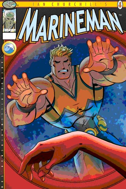
MARINEMAN #4
Story/Art: Ian ChurchillPublisher: Image Comics
Reviewer: Majin Fu
I almost forgot what it was like seeing a hero slowly discover what they’re capable of, continuing to push their limits along with each new challenge. Batman can face someone like Darkseid because he has spent so much time battling evil that he knows precisely what he’s capable of and where his limits begin and end. In an industry inhabited primarily by longstanding characters, we rarely get to see someone fresh on the scene figuring out just how strong they can be. In this issue, we get to see the protagonist Steve Ocean do just that, and it’s exhilarating.
I originally picked this up because I am a huge Aquaman fan and I was curious to see a new take on the nautical hero. Unlike Aquaman’s DC universe, the world Marineman inhabits is not much different from our own, meaning there are no other supernatural characters to speak of, which makes his feats of strength and prowess underwater all the more awe-inspiring. MARINEMAN has been slowly building up its title character, finally giving us an origin story in the last issue. Some may be turned off by this decompressed style, but it has given the characters room to develop naturally, and actually seems to be building up to a bigger mystery. The addition of human characters like the sassy Charlotte “Charlie” Greene adds another human layer to this story that continues to separate this comic from Aquaman and strengthens the general narrative. I found Steve and Charlie’s budding interest much more believable than Aquaman and Mera in “Brightest Day”, mostly because they talk and behave like real people, and her original disinterest in him gives their relationship a stronger arc. I honestly came close to dropping this title just because I was just so poor, but with this issue hinting at greater things to come, I will definitely stick around to see what’s next.
Ian Churchill has a very clean, clear style that maintains the all-ages tone of the book. The under (and above) water effects are also excellent, from the way the lights bounce off the characters in the dim depths to the hundreds of tiny bubbles, to the splaching of sea foam as Marineman rockets to the surface. Churchill and Alex Sollazzo should also be commended for their coloring work, which is vibrant and varied. This is a beautiful book with a lush style that’s just different enough to distinguish it from the rest of the superhero set.
The book also comes with supplemental interviews with real-life marine biologists at the end of every issue. It’s a nice touch that maintains the more grounded nature of the comic and draws the interests of the book’s characters into the real world. It also makes it more apparent that this is a book aimed at a younger audience, which I sadly don’t think it is reaching. This is a comic you can pick up for your children, nieces or nephews, and show them how incredible and amazing the ocean can be. I will admit this issue strays from that vision to focus on more on said mystery aspect of the story, but if you manage to check out earlier issues you can see what I mean. MARINEMAN is a solid book for readers of almost any age, with sumptuous art and an intriguing cast of characters. Maybe the @$$holes aren’t the intended audience for this book, but that doesn’t mean we could all use a little more heartwarming heroics in our read pile, a subject which is far too lacking in today’s cynical world of antiheroes.
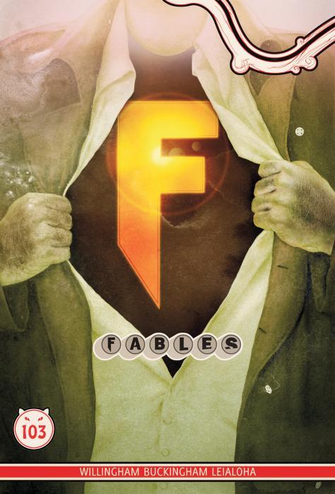
FABLES #103
Writer: Bill WillinghamArtist: Mark Buckingham
Publisher: DC Vertigo
Reviewer: Optimous Douche
The pantheon of public domain characters worthy of gracing FABLES’ pages is vast, but far from infinite. After all, the Brothers Grimm only lived for so long and the foibles of man that their characters embody or thwart are also finite. Basically I never expected to be reviewing 103rd issue of this book. I thought this after reading the first trade; I mean, how long could the Ham’s play the “fish out of water” joke? But Willingham built sustainability with the overshadowing threat of the Emperor from the home worlds. That mystery and the ensuing war to overthrow this tyrant took the book clear through to issue 75. Once again I was at a worry point…now what? Will we go back to the soap opera of the Fabletown denizens’ relationship strife? A little bit, but Willingham took little time to build up the next great threat. Enter Mister Dark, the embodiment of all things…well, dark. With a decimation of Fabletown and exodus to the Farm, FABLES breezed through another few years of great storytelling. A few issues ago, the culmination of the Mr. Dark time came to a close, or so we thought. And yet again I worried. Well, it appears I need to stop worrying, because Mr. Dark ain’t going anywhere. In fact, his continued presence is taking the book in a direction I never would have expected. Issue 102 introduced the modern equivalent of a Fable – The Super Hero.
No, you will not be seeing the real life manifestation of The Justice League or the X-Men, because for as long as an imagined property can bring in money, it will not enter the public domain. What Willingham has quite masterfully done, though, is pay service to Super Hero lore, while still staying true to the might, magic and mythology that has made FABLES the top-hitter in the Vertigo line-up.
I love Ozma, or to speak more specifically, I love the vestige of a child spouting out the words of a several hundred year old salty biatch. The little princess is a new addition to FABLES mythology, but she has become a fast favorite, especially when she tried to take over the witch’s council from the equally salty Totenkinder.
Pinocchio has been a favorite of mine since the beginning of this book. Horny, foul-mouthed and in love with all the sins of the Mundy world, he is again another childlike vestige that behaves in ways that a child (and most adults) shouldn’t. The current storyline would have been good enough with the recognition that the spandex set is our true modern-day equivalent of mythology or “fables”, but the odd couple dynamic of Ozma and Pinocchio joining forces to form this team is a delectable icing in the cake. Pinocchio rolls around in a wheelchair, because…you know, all guys that form a super hero team need a wheel chair. Nice nod to the “other” camp there. Ozma begrudgingly dons a cape and flirty skirt, because…well since Pinocchio is the only comic expert in the FABLES kingdom and he’s a pervert, all women on a super team need to dress moderately whorey.
These of course are some of the surface guffaws; others include a hilarious (and at times truly adorable–looking at you, Bo Peep Sheep) recruitment drive and a nice little tryst between Bigby, Snow White and some sentient trees. The latter laughs were a definite set-up for old rivals to begin beating their war drums again.
While not the perfect place for new readers to start drinking the FABLES kool-aid (if one could call fantastic art and top notch writing kool-aid), but issue 102 and this issue are a good enough start for this deep mythology. You won’t be wading into the shallow end, but certainly not jumping into the deep canon abyss either. If you’ve tried FABLES before but it wasn’t your cup of tea, I’m not going to try and sway you otherwise. However, I think this arc in particular will speak to all comic fans. So even if you don’t stay for the long haul, enjoy Buckingham’s eye candy as you are shoved through the fourth wall of comic collecting.
Optimous has successfully blackmailed fellow @$$Hole BottleImp into being his artist on Average Joe. Look for Imp's forced labor on Optimous brain child in mid-2011 from COM.X. Friend Optimous on FaceBook to get Average Joe updates and because ceiling cat says it's the right thing to do.
 Advance Review! In stores today!
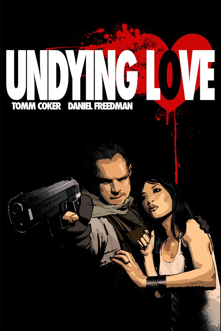
UNDYING LOVE #1
Writers: Tomm Coker & Daniel FreedmanArt: Tomm Coker
Publisher: Image Comics
Reviewer: Johnny Destructo
Before even starting this issue, I felt a tinge of familiarity when I saw the name Tomm Coker. I had trouble placing it before remembering that back in October, I favorably reviewed a film called CATACOMBS, which was written and directed by one Tomm Coker. Sure enough, these Tomms were one and the same. Turns out he had also penciled Judd Winick's fantastic vampire mini-series BLOOD & WATER back in 2003. Daniel Freedman was the editor for “Catacombs”, and the two came up with this story while editing the film. Even before researching all of these tidbits, the first issue of this series felt cinematic in a very positive way.
In a world filled to gagging with vampire stories like “Twilight”, it's refreshing to see a return to badass bloodsuckers, and to have western monsters mixed with eastern demons and Chinese folklore is even better. The contemporary western vampire is something to fear when the lights go out, but I have to say that the Chinese version always seemed a bit silly to me. Fangless and unable to move without hopping...yes, that's right. Hopping. It's always come across as more laughable than anything else.
Enter ex-American Military man Jon Sargent and his love, the mysterious Chinese woman named Mei. We join them on their quest to find a cure for Mei's...condition, as they meet resistance most unnatural on their trek to Hong Kong. As any fan of vampire lore is aware, the only cure for the undead is to find and kill the one who chomped down on them to begin with. But what happens when said vamp is one of the oldest and most dangerous vampires of all time? And just what is the lovely Mei hiding?
Some vampire lovers might balk at the idea that mere guns can dispatch the undead creatures of UNDYING LOVE, but like the man says "Whoever wrote the book on killing vampires...never shot one with an automatic weapon." I'll take vampires that die by bullets over ones that glitter in the sunlight any day. However, all of this would be mindless action to me, if not for the core of the story: love. This first issue doesn't linger too long on the love story between Jon and Mei, but it's still palpable throughout. The risks Jon takes to protect his loved one, from fighting off a gaggle of Chinese warriors, to feeding Mei his own blood, the love comes across, and immediately put me on their side. I want to see them succeed, but I'm gonna have a hell of a time watching them struggle, if this issue is any indication.
Tomm Coker's art is, for the most part, stylistic and snazzy stuff. But, the problem befalling most with this sort of photographical style (see also: Tim Bradstreet & Alex Maleev), is that some of the action-packed panels can come across as a bit static, or lacking in fluidity. It looks more like people posing for a scene than the artist actually capturing the action of the scene. That's just nit-picky though. Overall, this book looks great and is off to an excellent start!
Forget “Twilight”, this is a vampire romance that I can actually get behind. 7 more issues of this? Gimme!
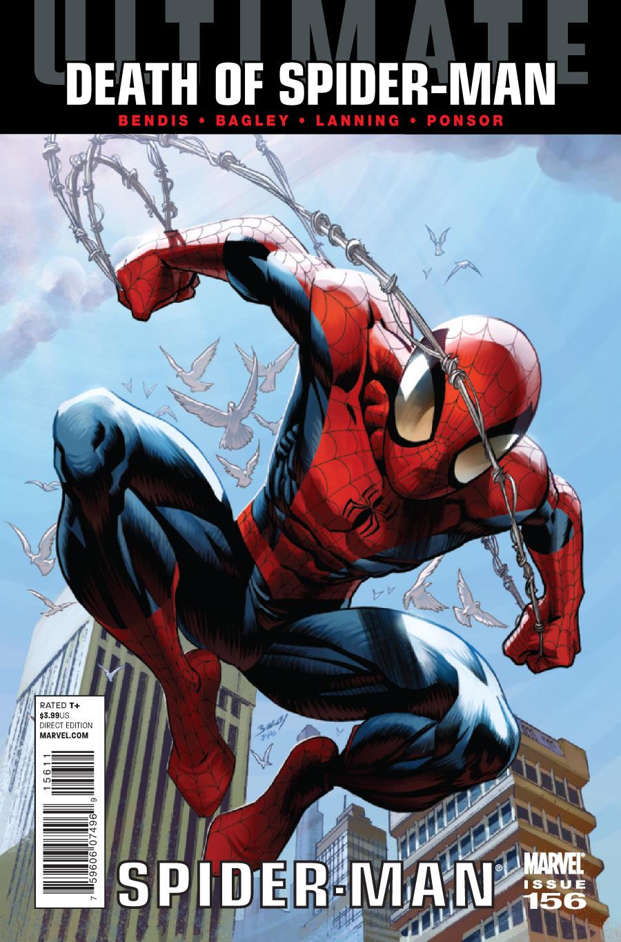
ULTIMATE COMICS SPIDER-MAN #156
Writer: Brian Michael BendisArt: Mark Bagley
Publisher: Ultimate Marvel Comics
Reviewer: Henry Higgins is My Homeboy
So, This Is How It All Ends…
ULTIMATE SPIDER-MAN. Not too long ago, I wrote a review for the 150th issue, and how much I loved it and this series. Knowing now that this may be the end, it's slightly disconcerting. But at least the issue is a solid issue to properly start it off.
Writing: (4/5) With the enemy revealed, the story starts off with a good solid threat early. The resurrection of Norman is a good idea. It gives this Norman another go (he always comes so close to being a great villain, only to lose it at the last second), while also forcing us to again, question the Oz formula. The formula did revive Norman in 616, but this is the Ultimate Universe, and the Ultimate Spider-Man at that. There's a reason behind it. His escape, on the other hand, rings hallow. We've seen this escape, almost exactly, before. You'd think SHIELD would have learnt by now that one of Norman’s things is "it's easy for him to escape". The Six itself is reintroduced as well, and it just reminds me how much I love the Ultimate Universe, or at least the Spider-Man side of things. Electro and Doctor Octopus are fantastic in what little they do, Sandman looks great, and Kraven and Vulture are....Kraven and Vulture. Not exactly sure why out of all the Ultimate rogues he's fought, Vulture was given the step up. It's a little out of place, with how almost unimportant he is in this universe. To be honest, I can't even remember why or how he was introduced. I had imagined Scorpion, the clone of Peter Parker, would have made a solid choice for the last spot, but I digress. The rest of the book, mainly focusing on Peter//MJ, followed by Captain America speaking to Peter, are extremely well done. It's just good to see Peter and MJ happy again. I've missed that. It was nice. This relationship, especially the Ultimate one, is among the cutest, best attempts I've seen at the "Teenage Superhero In Love" trope, and it's always full of charm and the like.
It segues into the arrival of Captain America, and the two have a talk about death. The scene is well written, if a little overdramatic. Peter's dealt with a great deal of death, and understands it. It makes Captain America come off too critical and a bastard (but that may in fact be the point), though, it is way to over the top in terms of "Peter Parker may DIE next issue!" sort of writing.
Art: (5/5) Mark Bagely’s back.
Look....I love every artist they've had for this series. Every one has been just fantastic...but this is Bagley. The action sequences, the consistency, the settings, the faces, the characters themselves.....everything is just amazing. Spectacular and all.
Best Moment: Peter and MJ in the coffee house.
Worst Moment: The Vulture?.....huh.
Overall: (4/5) A great issue, with a few problems here and there. I'm really hoping this is a cheap publicity ploy. I love this series far too much.
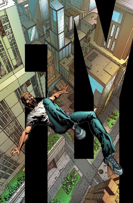 Advance Review! In stores in June!
FLY #1
Writer: Raven GregoryArtist: Eric J
Publisher: Zenescope Entertainment
Reviewer: Optimous Douche
Aside from the lovely comments in the TalkBacks each week, FLY is the perfect embodiment of why it’s so fucking cool to be an Ain’t It Cool @$$hole. To get my hands on a book, a really really great book, two months prior to release is a dividend well worth conjuring up a few thousand words each week. Yes, you will all have to wait for this book to hit the shelves so feel free to call me Optimous Cocktease now. Generally I wait closer to release dates, but I couldn’t get FLY out of my head, so your suffering is my catharsis. Thank you.
If you only know Zenescope as the Cheesecake Factory, well frankly you’re wrong. Yes, the women come scantily clad in most in most titles, but if you can turn off your lizard brain and focus on the actual storytelling, you’ll find Zenescope offers much more than T&A. Case in point: FLY #1. In fact you will find nary a nip-slip or butt flash anywhere in this title. The same high-quality art one would expect from Zenescope is still in place, but Zenescope stretched beyond their wheelhouse and it’s a market diversification move that makes my hands bleed from clapping so hard at their courage.
Drugs offer one thing: an escape. A respite from the harshest realities life has to offer. I’ve often believed there’s no such thing as a bad drug, merely bad users. As with all of life’s delicacies, everything should be done in moderation. Before you get on your high horse and tell me to go back to the crack house, check the latest stock prices for MERCK and PFIZER. They make drugs to be taken in moderation to make life better. Billions of dollars in annual revenue don’t lie, drugs can be beneficial.
FLY takes the metaphorical bliss that comes from getting “high” and smacks it firmly in the literal. What if there was a drug that bestowed the power of flight on all who consumed it? What would one do to get the next fix so they could remain untethered from the cruel mistress that is gravity? Lie, cheat, steal…kill? Most likely all of the above. Fortunately drug abuse in the real world usually makes you less powerful, so once you hit the true addict stage the only physical damage is to yourself and the only emotional damage affects those closest to you, not the populace at large. But a drug that could induce flight and had a shorter half-life than blow cut with baby powder would affect the world ways we couldn’t imagine. Fortunately though, writer Raven Gregory could imagine such a world and use his immense talent to bring this fictional scenario to life.
Gregory takes a very interesting approach to this book, starting first with the effects of addiction before tripping into the introduction of the actual drug itself. I truly don’t want to ruin one moment of this book so I’m going to skip the panel-by-panel replay. Suffice to say, though, Gregory looks at this new world from the micro as opposed to the macro, focusing on two different stories of how FLY affected the marriage of one couple and empowered a young high school student so he would no longer be bully fodder. Each moment and scene is rife with action; Michael J’s pencils keep even the quiet moments alive, vibrant and most importantly moving.
My only true critique comes in the form of how the artists approached the flashback scenes that provide context around our two protagonists. Switching from the detailed lines and lush colors of present day into the black & white light lines of yesteryear was at first jarring and then ultimately disappointing. While I applaud Zenescope for breaking with tradition, one can push the line too far and the flashbacks did that for me. There are certain expectations that come with a company’s given brand. While I think Zenescope was wise to pull back on the T&A, I have to wonder if they are pushing the envelope too far. It’s a bold move to be sure, but one I fear that would not only ostracize their base, but most comic fans in general. We loves our color in comics and when books do make the stylistic choice to go sans color they usually make up for it in hyper-detailed panels. These flashbacks not only skip the color, but look almost half-completed compared to the beauty that is every other page in this book.
As a writer Gregory hooked me a long time ago with his WONDERLAND series. Now Gregory has me hooked as an honest-to-God comic originator. I can’t wait for more of FLY and to see how the rest of the world has changed beyond the two focal points in the first issue.
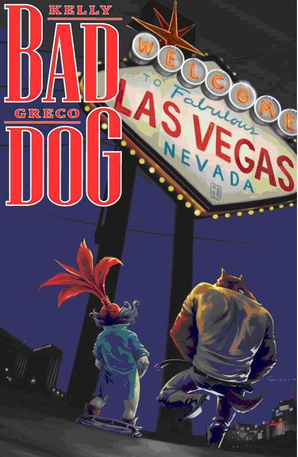
BAD DOG #4
Writer: Joe KellyArtist: Diego Greco
Publisher: Image Comics
Reviewer: Majin Fu
If you’ve been reading this series from the beginning, happy birthday! You are now a year older. Did you fulfill any of your resolutions? Is that stubble finally growing in? How’s the new girlfriend? How does it feel to be that much closer to death?
What do you do when faced with your own mortality? Some start a bucket list; others adopt healthier eating habits and begin exercising daily. Most usually get a little drunker and look a little older. When an alcoholic bounty hunter wolf-man named Lou is faced with this same issue, he calls up his Samoan attorney named Wendell and they venture off to Vegas, drugs in tow. Sure, that sounds exactly like FEAR AND LOATHING IN LAS VEGAS, a fact that the wolf-man seems to be aware of in this very issue, but believe me that’s where the similarities end. Besides the obvious difference in medium from Thompson’s novel, this comic has a supernatural twist, and an unexpected sense of humor. A werewolf and his wily midget attorney aren’t the most likely comedy duo (okay, maybe a little), but together they make for some of the most hilarious dialog I’ve read in…well, the last year. There is also a blink-and-you’ll-miss-it sub-plot about missing girls that will likely be resolved in a later issue, but more on that later.
The story teeters between freewheeling comedy and the darker side of life in a very compelling way. You don’t have to remember anything that happened in previous issues, either. The characters are so fully realized, from their expressions and posture to their dialog, that it’s easy to get absorbed in what’s going on without having to worry about what they were doing last issue. Despite the extended snout and fur, the lead character is intensely human in how he thinks and acts, as are most of the characters. Because of this, the sense of humor displayed here is both absurd and oddly heartwarming, depending on the scenario. For example, the opening scene shows said dog-person talking to a bagged head in a refrigerator. It’s goofy at first, but quickly turns to a chilling discussion of the seven deadly sins. This is of course followed by a page brimming with naked women.
It sounds like I’m giving away the plot, but I’m just scratching the surface. This is a dense comic, with dialogue and multiple narrations streaming across splash pages. It’s a little predictable, but the comedic beats and the witty dialog keep the whole thing feeling fresh. Greco’s painterly style, creative layouts, and the occasional psychedelic background give the whole comic an overtly happy tone, despite the main character’s obvious self-destructive behavior. This is a perfect merging of style with content, which to me has always been the ultimate goal for comics.
I like this comic so much, that I was honestly just happy when this issue came out. That said, delays in comics suck, especially when the comic is actually consistently enjoyable! I know nobody’s perfect, and I’ve had my share of @$$hole dropouts (hehe) but I’m sure delays in comics aren’t helping the comic industry’s reputation for adolescence. Hopefully, the presence of a cliffhanger in this issue portends a quicker release for the next issue. The little hints throughout this issue (I’m lookin’ at you milk carton) and the addition of a mysterious new villain seem to hint at a larger story, which I would be happy to patronize if it is released in a timely fashion. This is good comics people, so dust off that pull list and scratch in BAD DOG for old times’ sake.
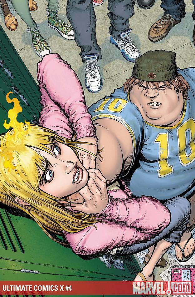 Advance Review! In stores today!
 ULTIMATE X #4
Writer: Jeph LoebArt: Arthur Adams
Publisher: Ultimate Marvel Comics
Reviewer: Johnny Destructo
It seems it's a big week for late books. And while I gave a pass for KICK-ASS 2, issue 2...I'm not entirely sure I can do the same for ULTIMATE X #4. June 16th, 2010. That was the day issue #3 was released. I could have met someone, got pregnant and given birth in the time it took for the next issue of this series to come out. If I was a sexy lady. A sexy lady who didn't love abortions. And you know how I've been going on and on about the greatness of the Ultimate Universe because things seem to change in a seemingly permanent way? I don't think that killing off characters and then introducing their offspring who just so happen to have the same basic powers really counts. All you're really doing is just taking the character and changing their name.
Granted, I like that this picks up (sorta) where Ultimate Spidey left off with the previously mutant-hating, now a mutant herself Liz Allen. But oh, look. The Blob has a son, who is basically....the Blob. Wow. Clever stuff. We're really covering new ground on this one.
The part that annoyed me the most, though, was the tag-line for the next issue: WHAT IS ULTIMATE X? MAY 2011. The first issue hit shelves on Feb 3, 2010. Are we really supposed to still give a crap what Ultimate X is 13 months after the question is first asked? Really? How about the next issue's tag-line be: ON TIME! PROMISE! That might get me excited, but I doubt it.
The saving grace of this book HAS to be the art by Arthur Adams, though. It is worth every penny just to look at this stuff. He does an absolutely beautiful job here and it gets sexier the longer I stare into its....ahem. It's good stuff, is what I'm saying.
I tend to be lenient on late books because I know that once it's collected into a TPB, no one is going to care about when each issue hit the shelves. It'll just be an awesome collection. But I'm not entirely sure this is going to be one of them. Ultimate Wolverine is dead. Replaced by another guy with Wolverine's claws. The Blob is dead, replaced by The Blob. Quicksilver is de...oh wait. No he isn't.
But hey, the art is pretty! That's enough....right? Meh.

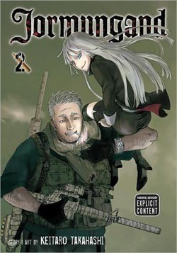
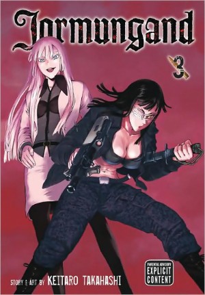
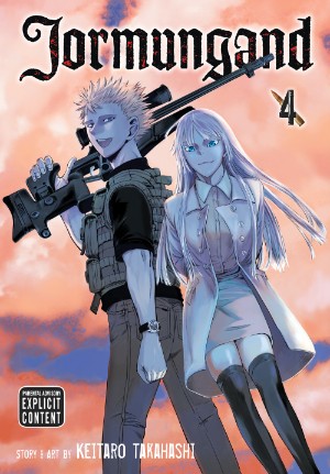
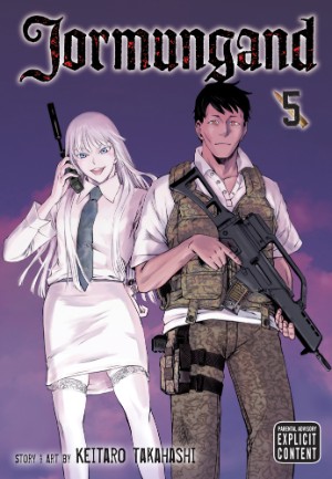
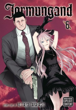
JORMUNGAND Vols. 2-6
By Keitaro TakahashiReleased by Viz MediaReviewer: Scott Green
JORMUNGAND takes the renegade special operations team, aligns it with a more mature answer to the sort of spirited team of rule breakers found in manga like ONE PIECE and sticks it on a current globalized, way past Cold War, War on Terror, China ascendant moment for a guns blazing action manga that has pronounced problems, but feels sufficiently sharp.
Jonah, a cold, brutally skilled ex-child soldier loathes violence and the industry built around it. Yet, when he's removed from the battle field, he still find himself in midst in conflict trade. Brilliant, unconventional arms dealer Koko Hekmatyar manages to add Jonah to her extraordinary cadre of bodyguards and field agents, comprised of former Finnish Rapid Deployment Force, Bersaglieri, Japanese Self Defense Force, Mafia and the like. Jonah finds the arms business complicated by Koko's group's adherence to their own code of ethics. They're willing to kill, and they are selling weapons, but they're also adamant in tossing out convention in favor of what they believe is right.
The various continent crossing ventures or battles generally span the course of five manga chapters, and the gambits more often than not feature plenty of manipulation along with the chases and fire fights.
 Jonah and the rest of Koko's employees face off against various exotic strike teams, a roguish/borderline rogue CIA agent and his info broker partner, and a Chinese front company with similar interests and expertise. Koko is a scion of global commerce royalty and is subject to some sibling rivalry with her brother, waged in the shipping/arms business and probably devoting into the manga's overarching conflict.
And, the values, both mercenary and ethical, do play into the missions. While Koko and company race against rivals to lock down deals on munitions or drones, they also take contracts to smuggle Doctors Without Borders surrogates called “Outspoken Doctors for Human Rights” into a war zone while also dealing with the conflict's aggressors.
Keitaro Takahashi goes about JORMUNGAND's business with messy verve, and the manga is both served and undercut by its imperfections.
In its handling of its characters and in its sentiments, the precise depth of JORMUNGAND's ambitions is difficult to gauge. The manga opens with an author's note to the effect that "my first story is about arms dealers. It's a rather serious topic, but while I draw I'm always smiling and having a lot of fun." The follow-up is deadpan expression of concern about violence's real implications, and at the same time, even when confrontations are solve by outmaneuvering the adversary, the pay off for the reader is more often than not a muscular woman flinging herself into a knife fight or a dramatic shot from a sniper rifle.
Koko's team is comprised of people with families, adult-ish relationships or other mature-ish views of the world, and yet, they have a not-quite G.I JOE colorfulness to them. And, that pales next to some of the people/group with which they butt heads, as the manga offers an urban foot chase/fire fight with a girl (as in she's young, not as in calling a grown woman "girl") in a cowboy hat with Daredevil sense who refuses to wear underwear, and another young female opposing strike team member who wears a necklace of razor blades as she hops around with a bayonet affixed shot gun, teamed with an executioner hooded hulk who attacks Koko's operatives with a bolt cutter.
 That sort of half cocked willingness to lay on some nonsense is one of the instance in which the approach serves the manga. The type of action in which Jormungand trades is not easily conveyed in manga/comics. No matter how many speed lines are etched in a panel, sudden shifts of velocity needed to convey impactful high speed chases and gun battles is rarely effectively worked in sequential art. The measured success of work arounds, focusing on set up and consequence, attitudes or short hand often invites thoughts of how neat the action would be if adapted into a full motion medium.
Akihiro Ito's Geobreeders is an unexceptional boring guy with exotic girls action series, made exceptional because, better than just about anyone else (I'd include GUNSMITH CAT's Kenichi Sonada), Ito can pull off a automotive stunt in manga and give it near cinematic impact. That I remember this otherwise not to good manga, released by now defunct publisher Central Park Media six year ago speaks to how rarely this type of action is really well project into manga.
No Ito level talent, Keitaro Takahashi conveys action with a lot of close ups and instants. The steering wheel getting spun, the gas pedal being slammed down, the cars screeching around. These shots are never too removed from a characters face, with their expression, whether cold or battle rage fired, directing the reader's response. This doesn't wow with complexly laid out sequences, and there isn't too much give and take to tussles, but steering the vibrant characters with bold strokes this way does prove effective.
JORMUNGAND doesn't fracture realism too far beyond what a Bourne movie would. In the scheme of manga, we're not talking the abandon of CRYING FREEMAN's submarine knife fights, and JORMUNGAND does try for a notable air of somewhat straight credibility. Beyond that degree of measuredness, as it flails its limbs, part of what helps the manga maintain a foot planted on the ground its attention to details. There's probably an audience of scrutiny prone military geeks reading this manga in its Japanese publication, and JORMUNGAND does apparently have the aim of meeting their expectations. The way that the characters wrap their guns in white tape before trekking onto a snow covered field or even how they fill out their clothes with credibly muscled bodies lends the manga a sense that it's at least trying to conform to reality.
>If JORMUNGAND is indulging in the spectacle of battle, and the manga certainly is, that should undercut, or at least complicate, the manga's suggestion that it is offering a serious meditation on subjects like the arms business or global conflict.
Whether JORMUNGAND is being hypocritical or unsuccessful, the manga is not convincingly offering much of a worked out consideration of violence's appeal to the reader, the real consequence of violence or the possible relationship between the two. To its credit, JORMUNGAND isn't lecturing or chiding the audience reading for the guns and gunfire. However, as it shoots from the hip, if it's trying to subvert their expectations, it isn't too smartly.
After that message from the author, Jonah introduces the manga, and he stands as its quiet conscious/soulful judge. Yet, it's no mistake that each of the book's covers feature Koko paired with a member of her crew. Her oddly shaped thinking and oddly shaped ethics are the primary molds for shaping the manga. Its stories are mostly structured around her manic thinking and often lateral solutions to the challenges of the arms business. Those other figures on the covers go off on their own directions, but, those directions are always set in an orbit pulled by the cult of personality around Koko.
 While there is continuity in JORMUNGAND, with returning adversaries and semi-adversaries or unfinished business being later resolved, there's little apparent focus on the long term or gathering momentum. Instead, JORMUNGAND looks to find substance in those five chapter stories and in those characters revolving around Koko. When it comes time for the manga to prove its thoughtfulness, it offers familiar tracks of redemption and the ironic circles of revenge. Disappointingly, the ragingly free thinking crew aren't given the opportunity to overthrow the conventions. Even with Koko's circuitous plans in the mix, JORMUNGAND never manages to demolish the genre enough to crack open a jagged look at the implications.
I'm not convinced that JORMUNGAND would be better if it were stripped of the pretence, but I am convinced that it is not as provocative as it might have been if it would more able to work in more thoughtful moral and political considerations. As it stands, it's a nicely weirdly looking, nicely exotically populated modern action serial: enjoyable, particular, but, by the expectations it sets out, underachieving.
Scott Green has been writing for AICN ANIME for over nine years. If you like what you see here and love anime & manga, be sure to check out his latest AICN ANIME column every week on AICN.

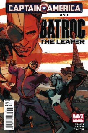 CAPTAIN AMERICA & BATROC THE LEAPER #1 One-Shot
Marvel Comics
Out of all of Captain America the one shots and miniseriesCluttering up the shelves, this was the one I knew I would be purchasing. There’s something unbelievably hokey about Batroc the Leaper, but also unbelievably endearing. Sure, lesser writers have made him a joke, but Kieron Gillen is not one of them. In this single issue, Gillen elevates Batroc from lame to awesome from the very first page without really making any drastic changes to the established character. Likening his skills with that of parkour acrobatics is a thing of genius and though the hows and the whys of the reasoning behind Bucky Cap’s visit to Paris is a bit convoluted, I really didn’t give a shit because each and every scene with Batroc in it was both endearing and fascinating. I love it that he prides himself not by beating Captain America in a fight, but merely that he has simply fought him before (and has found a way to profit off of that). The art by Renato Arlem is equally top notch as his simple forms and attention to musculature and movement prove to be perfect to illustrate this tale about a mercenary who, after reading this one-shot, deserves to be taken a bit more seriously. Fantastic issue! - Bug
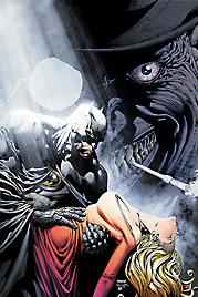 BATMAN: THE DARK KNIGHT #2
DC Comics
I have to be honest with you, I completely forgot about this comic. Is it me, or is this comic horribly late? I just feel like I read the first issue of David Finch’s Batman series quite a while ago. But as I read through it, I had a nice ah-ha moment, where I found myself reminded that this really is a fun comic that, out of all of the Bat-books, fully embraces the many bizarre heroes and villains of Gotham and highlights them. Batman is merely one of the players Finch uses to tell this tale. Somehow he squeezes in the Demon, the Penguin, Killer Croc, someone who looks like a new female Robin, and what looks to be a possessed Ragman into one single issue without it feeling crowded or convoluted. For that simple fact, this series is worth following. Now they just need to work on keeping on schedule… - Bug
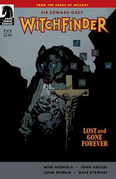 SIR EDWARD GREY - WITCHFINDER: LOST & GONE FOREVER #2
Dark Horse
Mignola and Arcudi pull off a work of genius plucking their Sir Edward Gray character out of the usual Victorian England and placing him and the occult he battles in a new setting—the Old West. Set to this western backdrop it not only highlights the iconic nature of the character, but it puts a great twist on the witch as his foe. There’s also a fun segment documenting Grey’s early years that proved to be quite surprising. Being new to the character, I found this segment to be my favorite in the issue. John Severin continues to give this book a classic Western feel with his etching-like/finely detailed style. Love this series which combines Western standbys with horror in new and exciting ways. - Bug
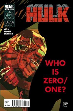 HULK #31
Marvel Comics
If a year ago you would have said that a comic starring the Red Hulk would become one of my favorite monthlies from Marvel, I’d have kicked you in the taint. But under the pen of Jeff Parker, Red Hulk is one of the best books Marvel has to offer. Not only is there spot on characterization and fantastic developments to those cha