| #21 | 10/13/10 | #9 |
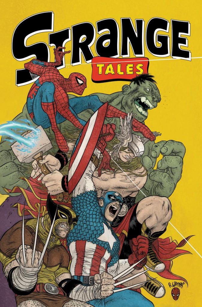
STRANGE TALES II #1
Story: Rafael Grampa, Kate Beaton, Frank Santoro, Dash Shaw, Shannon Wheeler, Jillian Tamaki, Jeff Lemire, Kevin Huizenga, Jhonen Vasquez, Gene Yang, Nick Gurewitch Publisher: MAX Comics Reviewer: Majin Fu
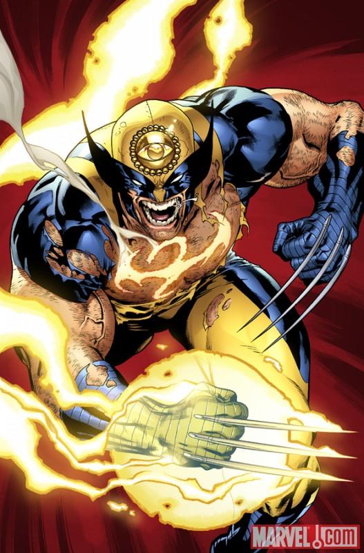
I missed the first STRANGE TALES anthology because at the time I had to pass due to financial woes. The premise was intriguing enough, but I was jobless, and my appetite for food usually outweighs my lust for literature. Oh what a fool I was! For those who have been trapped in outer space for years while a Skrull impersonated them on Earth, I’ll give you the update. STRANGE TALES MAX collects some of the finest artists and writers from the indie comics scene and locks them in a Guatemalan prison until they can come up with some kind of story which utilizes characters from the Marvel Universe. The results range from bloody opera to old-fashioned cartoons. It’s a potent combination that makes for one of the best reads of the year.I have been a fairly verbal opponent to overpriced comics, but I can tell you right now that STRANGE TALES II is worth every penny they are asking for. There isn’t a single story here that breaks 8 pages, but that does not mean there is a lack of substance. R. Grampa knocks it right out of the park with his Wolverine story, in which all the various healers of the Marvel universe tear each other to shreds in the ring, only to heal up and do it all again the next day. Like the best Wolverine stories, it’s a romance. Grampa’s style resembles Paul Pope, and is just as visceral, but maybe more precise? He did that gorgeous cover too.
There’s a nice mix of serious and comedic, and something should be said of the editing. The organization of the stories creates a nice balance so you never feel worn out from one specific style. For example, Wolverine’s aforementioned slaughterhouse is followed by a confession from Frog-Man’s lucky son, which is as silly as it sounds. The rest are as follows:
The Silver Surfer story cuts right to the heart and soul of the character, but the art is too archaic for my taste.
Spider-Man gets an excellent idea on how to keep Kraven from kreepin’ on him all day.
Dazzler’s yarn is deliciously trippy, with a surprisingly creepy second to last panel.
Shannon Wheeler shows us with an old-school flourish how the Red Skull just can’t seem to stand in the way of capitalism, no matter how hard he tries.
Spider Man escapes a confusing Mysterio trap. This had some nice layouts, and appropriately confusing art. The follow-up allusion to the first movie was funny too.
Wolverine and Silver Surfer get in a fight!
Jeff Lemire does Man-Thing (one of my favorites).
Jhonen V. of JOHNNY THE HOMICIDAL MANIAC fame shows Wolverine at the park.
And I won’t spoil the last one, ‘cause that joke was too perfect for words.
If none of that sounds fun to you (how could it?), then I suggest you give this a pass. I will admit some of the stories aren’t as strong as others, but the good ones more than make up for the lesser pages. This is just fun, energetic creating from some exciting and fresh voices. Not supporting such a thing would be a mistake indeed.
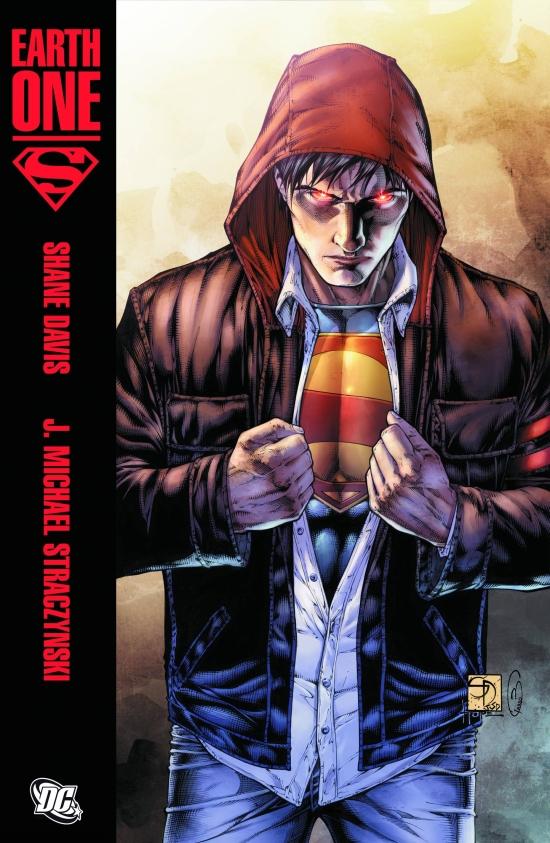
SUPERMAN: EARTH ONE Vol.1
Writer: J. Michael Straczynski Art: Shane Davis Publisher: DC Comics Reviewer: Optimous Douche
Reset...Thank you, DC. Even though this masterful retelling is being touted in the marketingverse as "accessible to new readers" (which it is), as a man that has followed the adventures of Superman for the past thirty years, this is the first time since I picked up that very first issue I felt such an electrical charge of elation, glee and wide-eyed wonder coursing through my body.
Yes, we've seen Superman resets countless times over the years in the form of Elseworlds, SECRET ORIGINS, and the former love of my life ALL STAR SUPERMAN. But this is different. This is not simply Superman’s famed rocket veering off course; EARTH-ONE possesses a fierce conviction to present our actual universe. And therein is the secret to its sheer power over the page.
The main DC universe (Earth-Prime) stopped being our world back in 1938. And that’s OK, it is what it is, shame on us for constantly trying to pull it back into “reality”. Comic fans are impossible to please; we bitch in clear choruses that things are becoming stale, yet turn into rabid dogs when a writer breaks from a character’s norm (c’mon, we all remember the cacophony of FU’s thrown at mullet Kent). No matter how many Crises or collapsings of canon DC throws at us, Earth-Prime can’t change; it has become a universe as real as our own that gains renewed sustenance from a perpetual return to the status quo. The current issues of “SUPERMAN walking” are a prime example of this phenomenon. How new and exciting can anything be in a world that knows at all times gods walk among us and the universe is an endless sea of sentient life and miracles? I don’t think Superman is walking out of guilt from the cancer lady or losing New Krypton; shit, I would take a stroll for a year if I knew I had to spend eternity as a thirty year old boy scout.
I’ve repeated time and again in this column that DC has needed this reset to save Superman from his eternal corn husks and awww shucks existence…and to save us readers. As much as I loved SECRET ORIGINS and ALL STAR SUPERMAN, they are still a representation and deconstruction of Earth-Prime canon; they are essentially my father and my grandfather’s Superman. SECRET ORIGINS strictly adhered to the Donnerverse. It was a world that was already ahead of our own by the time Superman appears on the scene. Lex Luthor was already building Metallo for God’s sake…there’s nobody in our world building sentient robots; the smartest robots we have are Roombas and that annoying dancing robot from Honda.
ALL STAR SUPERMAN stayed away from Donner, but again it was based firmly in a world that is not our own. A world where there are hippy space researchers and ray guns that can perform miracles. An expedition to the sun? Please, we can’t even get our shit together to get back to the moon. These were both amazing adventures, but they were firmly steeped in past fiction. EARTH-ONE represents the future of Superman, and sales figures willing, the future of how we consume comics. JMS has created a brilliant breathing world of consequence and DC is delivering this vision in epic scope. Now if you have some kind of sullen emo hatred of Superman, there are no words that will convince you to read this book. But if you love comics and more importantly want to witness the genesis of what could be the next great comic universe (with the right care and nurturing), then get ready for a trip to EARTH-ONE.
Earth-One is simply real. It is a world that was unprepared for Superman and recognizes that his existence is a new genesis for humanity. Earth-One has known nothing fantastic, it lives alone in the universe, and its inhabitants are uninspired drones living in an endless cycle of work, rinse, repeat…die. Sound familiar? Good, now you are in the right frame of mind to meet Clark Kent.
Are there tropes in this origin? Yes--it's Superman. Stop asking stupid questions. I mean you if you decided to rewrite the story of Jesus, at some point he would have to die and come back to life, otherwise all you would be writing is the story of a guy with a beard that likes bread. Tropes abound, but JMS elevates these tenets of the Man of Steel beyond the dated parodies they’ve become in Earth-Prime. Essentially JMS does what he does best; he delivers the “why” behind the what. There are things we can explain today that two generations ago were the stuff of science fiction. What makes Kryptonian technology so advanced? Well, it’s not “just because”, or the fact crystals not only heal old hippies, they are also the data storage device of choice by disco aliens. Instead we see Kryptonian technology rewrite what we know about nanotechnology and the sub-atomic universe. When Siegel and Shuster put the big S in tights oh so many years ago, the circus outfit worked since that's where you went to see flights of fancy. JMS takes even this small passé element and puts an explanation in place that makes more sense than any past attempts at modernizing Supe’s duds. Why did Clark end up at the Daily Planet? In our grandparents’ day it was explained with gumption and a grin, and that worked for them, that was how you selected a career back then. A wee bit of innate talent coupled with some hutzpah and — poof — you were a reporter. As any twenty-something today knows though, career paths are not that clear, especially when that twenty-something has the ability to do anything he wants. Clark becomes a reporter out of necessity instead of a shoe-horned juxtaposition to his mild-mannered personality. Hell, even Clark’s horrific use of glasses as a disguise, while still a bit silly, is explained poetically. Hide the man…not the hero.
The best reimagining in this story, though, comes straight from the heart of the origin itself…the destruction of Krypton. I would be performing a grave disservice to the creators of this book and to fans if I gave away how this all transpires in the book. I will say, though, it gives Superman a level of purpose we have never seen before and sets the stage for an epic battle in future books. It is also a direct representation of the attack fear we all felt on 9/11 -- magnified on a cosmic scale, of course.
Shane Davis delivers an absolute eye-gasm of imagery. Yes, I literally came out of my eyes at the first sight of Metropolis, a city in as much decay as every other American city. There was simply not one wasted panel in this book. Each moment and character were modernized just enough to reflect today’s world without ever bleeding into being trendy for the sake of simply being trendy (I’m looking at you on that one, Superboy circa 1993).
Now, of course Davis had some help. A large part of this fluidity can be attributed to DC’s courage in presenting SUPERMAN: EARTH ONE as an epic 128 page story. Some will balk at the $20 price tag, but to those naysayers I ask you to pull out a calculator before you start your campaign to save the floppies. Your average comic these days delivers 22 pages of actual story for about $3.00 a pop. For two extra bucks you can avoid any advertisements, wrap your hands around an indelible hardcover that seems to come alive as light refracts off the cover, and most importantly this is a TRUE 128 page story that is not hampered by being a collection of 22 page story-arcs. Let’s face it, all books these days are written with trade packaging in mind. Back in the day a trade was something special: it signified that a book sold out in such quantities that the only cost effective way to get it into readers’ hands was via the trade. These days though, the trade market is trouncing the floppies. As consumers we have voted with our wallets that we want a complete and holistic story. SUPERMAN: EARTH-ONE is that story from start to finish. It is a true representation of Freytag’s coveted pyramid, not five Herve Villechaize-size pyramids with each midget storyline wrestling to be the best exposition, the best climax and the best finale. Trades and floppies have been battling for years and both have suffered as a result; please end this pointless battle, DC, you’re our only hope.
I’ve already heard rumblings that compare EARTH-ONE to Marvel’s Ultimate line; please for the love of God stop comparing books before you read them. From day one in the Ultimate universe the world was already transformed into a science-fiction fantasy land. Spider-Man did not beget S.H.I.E.L.D. in the Ultimate universe. Humanity was already way more advanced than we are today. EARTH-ONE truly captures the “oh shit” experience we would all have if one day we turned on the television and there were reports of a man flying across the sky. As they say in the opening pages of the book, this is real.
My mind is spinning with the possibilities of EARTH-ONE’S future, not just as a story, but also as a publishing model. I can say without reservation that I would love to see an endless cycle of serialized graphic novels to start filling the shelves. It would be a win-win for the publishers and the readers. Publishers could cut their operating costs and we as readers would be spared the filler stories between great story arcs. As for EARTH-ONE itself, imagine the Green Lantern of our sector having to act as almost an undercover cop to avoid scaring the masses. Plus it would be interesting to see how the Guardians deal with the events that closed out EARTH-ONE: SUPERMAN. Imagine the Flash having to always operate at top speed, not being able to take time out to eat a freaking hamburger while in costume. Imagine a Justice League that actually came together again for a purpose as opposed to simply existing because well…there’s always been a Justice League. I implore whatever powers that be who are reading my words to care for and tend to this universe…it can become something truly extraordinary.
Now it’s time to bring on the Bat. Mr. Johns and Mr. Frank, you have your work cut out for you, gentlemen…
Optimous has successfully blackmailed fellow @$$Hole BottleImp into being his artist on Average Joe. Look for Imp's forced labor on Optimous brain child in mid-2011 from COM.X. Friend Optimous on FaceBook to get Average Joe updates and because ceiling cat says it's the right thing to do.
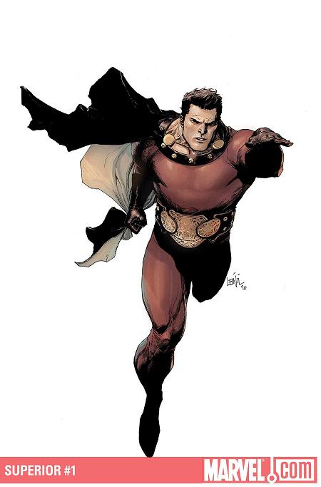
SUPERIOR #1
Writer: Mark Millar Art: Leinil Yu Publisher: Marvel Icon Reviewer: Johnny Destructo
I'm ok with being the odd man out. But being the odd man out in a hobby/lifestyle FILLED with odd men out, well...damn, I guess I'm ok with that too. The A$$hole offices quickly filled to overflowing with a$$bile after I mentioned that I'd be reviewing this book. Amidst the din, I almost felt bad for even thinking about writing a positive review of this book. Of course, if people hate Millar so much, I'm not quite sure why they buy his books. When I decided Ron Zimmerman was the antichrist of comics, I stopped buying his books.I'm the first to admit that I love most of Millar's work and look forward to his books hitting the stands. That's not to say I lose sight of the obvious. This book is the movie BIG mixed with DC comics' Captain Marvel, with MS and a talking monkey tossed in. So far. It's a simple conceit, for sure, but just because something has been done before doesn't mean it can't be done again, and can't be FUN.
And that's just it. I've said it before, but I think what Millar is trying to do with most of his stories is convey a sense of fun. An almost friendless teenage kid with multiple sclerosis who only has comics and movies to look forward to for the rest of his life is chosen by aliens to receive one wish for one week. This wish isn't even spoken, it's plucked from within and made reality (much like the Ghostbusters' Stay Puft Marshmallow Man). The first thing that enters his head is the superhero Superior, but not only that, apparently it's of the actor who plays him in the movie. That in itself is an interesting twist. It would be a little awkward for me if suddenly I was transformed into Christopher Reeve's Superman for a week (but also, exceptionally awesome).
This is a fun story that feels slightly more innocent then his previous works and I'm looking forward to Millar exploring that. You might compare it to Captain Marvel, and you'd be partly right, but here's the thing. I hate Captain Marvel. But so far, I'm digging Superior. So for me it's already one up on Cap. It's got elements of BIG? Sure thing. But I loved that movie! No matter how I spin it, I just like this book. I do have one gripe though. What the hell vomited all over the cover of this book? That is just a horrible combination of colors. Good god. I was afraid to pick it up from the stands for fear that I might get some on my fingers. Blargh. But on the plus: monkey in a space suit! Come ON!!
Overall, It's just good old fuckin' fun. Enjoy it, or don't. I know I will. And I'm ok with that.
JD can be found hosting the PopTards Podcast, discussing movies, comics and other flimflam over at www.poptardsgo.com, graphically designing/illustrating for a living, and Booking his Face off over here.
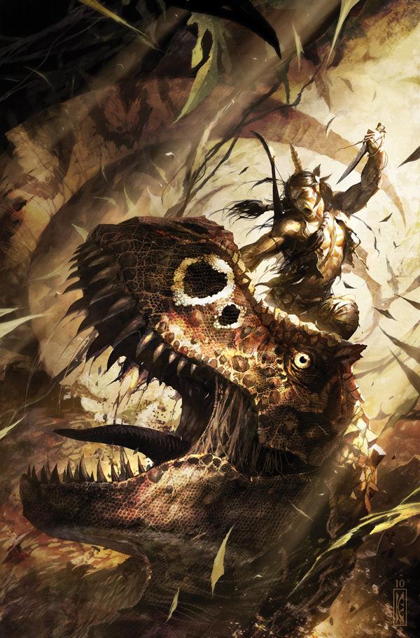
TUROK, SON OF STONE #1
Writer: Jim Shooter Art: Eduardo Francisco Publisher: Dark Horse Reviewer: Ambush Bug
I was a huge Valiant fan back in the day. Unlike Image and a lot of the other companies that were birthing new universes in the nineties, Valiant was the one that stood out with strong stories, mythic characters, and most of all, cohesiveness within their titles. Out of all the companies, for a short while, Valiant seemed to be getting things right. They had a small number of well written titles, amazing characters, and some of the best writers in the biz. Problem was, as usual, the company expanded and crumbled inward due to its own weight and lack of solid foundation. Still, when I think of the nineties and the comics I loved, I can't help but think of ARCHER & ARMSTRONG, TUROK, SHADOWMAN, and ETERNAL WARRIOR.Dark Horse has slowly been bringing back some of the cornerstone characters of the Valiant Universe which in turn were solid characters from the early Gold Key comics. Though they don't have the rights to some of my favorite characters from Valiant, the thought of Jim Shooter returning to SOLAR, MAGNUS, and TUROK was pretty exciting when I heard about it at last year's SDCC. Having read SOLAR MAN OF THE ATOM and MAGNUS ROBOT FIGHTER, my excitement sort of faded. The art on MAGNUS is too old school for my tastes and really put me off of the story. But to tell you the truth, out of all of the Valiant books, I was probably least interested in Magnus, so it was no surprise that I didn't take a liking to this title. SOLAR, on the other hand, I was a fan of. But for some reason, the first issue of that new series seemed uninspired. The by-the-book origin seemed old hat with not much by way of interesting or fresh ideas for new audiences. In the end, having read two premiere issues, I was beginning to write off this new Gold Key resurrection.
Then I saw TUROK on the shelf last week and decided to take a chance on it. Given that TUROK was one of my favorite characters in Valiant's stable, I couldn't resist the temptation to give it a shot. And where SOLAR is too old school story-wise and where MAGNUS is too artistically old hat, TUROK is surprisingly just right.
This first issue is a retelling of Turok's origin and how this Native American warrior ends up being transported back in time to the age of the dinosaur. Though little is explained as to the origins of the bizarre storm that sweeps Turok away to the past, the adventure is of the highest magnitude here and even though this book touts a massive 48 page count, the depth of the adventure that occurs between the covers of this book had me wondering if they snuck in a few extra pages.
This issue really gives Shooter an opportunity to prove that he still has what it takes as a writer. More so with this issue than with MAGNUS and SOLAR, this story exudes excitement. There seems to be a vibrancy that isn't present in the other series. Then again, who wouldn't be excited to write stories about Native Americans fighting dinosaurs?
Included in this issue is a reprinting of TUROK's first Gold Key issue which follows the same sort of plot point-by-point, but after reading the two versions of Turok's origin, the decisions Shooter made to update the story (amping up the adventure and relationship between Turok and his young ward) make a lot of sense. The original story focuses a lot on the introduction of different species of dinosaurs, but in this post-JURASSIC PARK age, most readers don't need this type of dino lesson.
The art by Eduardo Francisco is another reason this first issue is such a success. Francisco has a classic quality to his art, reminiscent of early Gold Key art, but his attention to camera angles and panel placement makes for a more modern look. Francisco's style also harkens back to Rags Morales' style from the Valiant series. There's a Russ Heath style going on here and given how good his stuff matches with the tone of JONAH HEX, you can imagine that Francisco's art is a perfect match for this Old West-style character too. I especially like Francisco's depiction of the various battles that go on in this issue with arrows, spears, and hatchets flying through the air and slicing though flesh and bone. Francisco's depiction of dinosaurs are top notch too, which proves that he's a versatile artist who can draw animals, backgrounds, and human forms with equal excellence.
I was about to give up on this new line of Gold Key relaunches from Dark Horse, but I'm glad I took a chance on TUROK, SON OF STONE. It's definitely a series I will be following and Shooter seems to be having a blast with this one. With the art and writing being top notch, I'm not giving up on this line yet. SAMPSON is up next, so we'll see if Shooter can go 2 for 4 with these new Gold Key rehashes.
Ambush Bug is Mark L. Miller, original @$$Hole / wordslinger / reviewer / co-editor of AICN Comics for over nine years. Support a Bug by checking out his comics (click on the titles for purchasing info)! MUSCLES & FIGHTS VOL.3 & MUSCLES & FRIGHTS VOL.1. VINCENT PRICE PRESENTS: THE TINGLER #1 and #2 (interview, interview, preview, & review) VINCENT PRICE PRESENTS #20 WITCHFINDER GENERAL (preview, review, in stores now!) NANNY & HANK miniseries #1, #2, #3, and #4 (interview, interview, interview, preview, & review, in stores October 2010! Check out the NANNY & HANK Facebook Page!) Zenescope’s upcoming WONDERLAND ANNUAL 2010 (in stores in October!) THE DEATHSPORT GAMES miniseries #1, #2, #3, and #4 (in September Previews Order #SEP 100860, in stores in November 2010! Check out THE DEATHSPORT GAMES Facebook Page!)
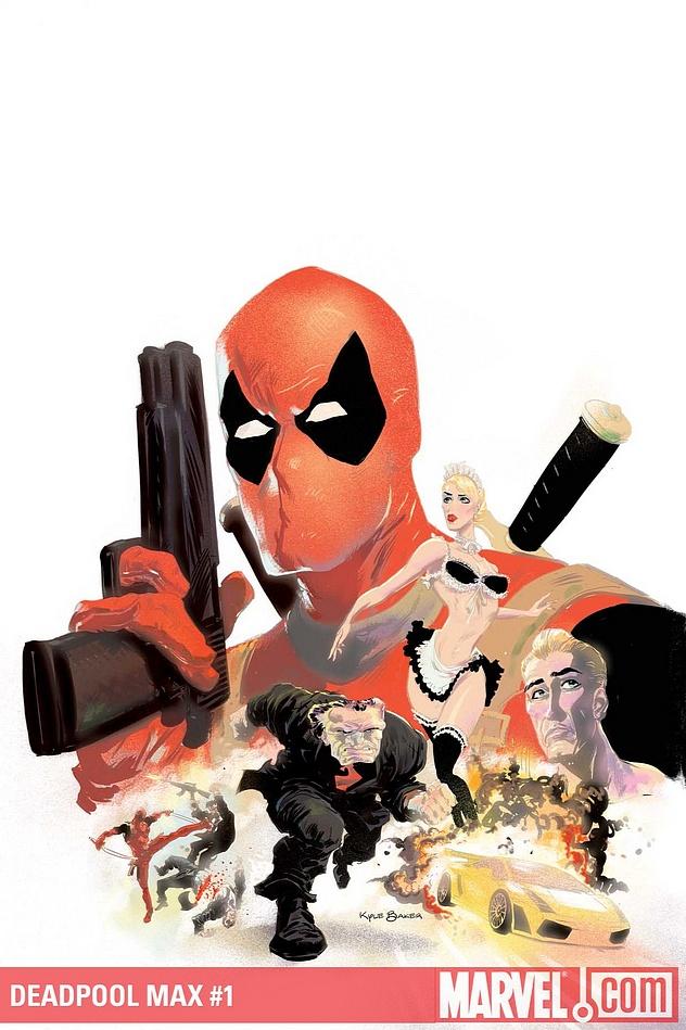
DEADPOOL MAX #1
Story: David Lapham Art: Kyle Baker Publisher: MAX Comics Reviewer: Majin Fu
Deadpool defies rationalization in the best way possible. The original character is so crass, demoralizing, and irrational that he hardly seems a good role model for children. Putting it simply, he’s a mercenary/assassin that will take any dirty job. The story of his newly published MAX title embraces this aspect of the character so completely, and with such reverence to what the character symbolizes that I can’t help but smile while reading. Deadpool is an illusion of fatality that simultaneously brings about death, a force of nature. One of my favorite panels in the entire comic has Hammerhead screaming in frustration at Deadpool’s headless, dismembered body while three goons look on uncomfortably. As the plot thickens, and you figure out what’s really going on, it just gets funnier.The story is narrated via Bob, the hopeless runt of undercover espionage who will take it up the back end to get into the bowels of Hammerhead’s crime syndicate. Hammerhead is presented as a more paranoid version of his normal self, but he’s just as dangerous and prone to head-bashing as ever. Deadpool is purposefully left on the backburner for most of the issue, but it works to his benefit. When he finally strikes, it’s a glorious gorefest the likes of which could never be seen in a normal Deadpool comic, even though that’s basically what he does. What do you think the swords are for anyway, makin’ sushi?
Even the cover embraces the complete adult nature of the comic with a sense of humor. It looks like a movie poster for some hard R action movie, complete with explosions, babes, and cars.
I am a big Kyle Baker fan, particularly his work on Plastic Man, so I picked this up mostly to see his next project. I was not disappointed. Baker has a penchant for switching up styles nicely. In this issue you get a healthy dose of noir, a little mafia movie, Looney Tunes, and some “Kill Bill” for good measure. His style is perfectly suited to the ridiculous comedy inherent to the characters, and his facial expressions, especially for Bob, are so spot on that they just enhance every comedic beat.
For those who are sick of getting beat over the head with unwarranted Deadpool books but still like the character, this is the book you’ve been waiting for. David Lapham plants seeds for what I expect will be a hilarious, gut-wrenching romp that could go on for months. It’s sadistic, it’s depraved, and it’s got crumpets. It’s Deadpool with a capital D for damned good read.
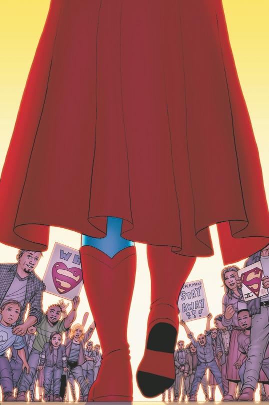
SUPERMAN #703
Writer: J. Michael Straczynski Art: Eddy Barrows (pencils) & J.P. Mayer (inks) Publisher: DC Comics Reviewer: KletusCasady
I don’t care what Geoff Johns says, Superman has got to be one of the hardest characters to write. He’s been around for so long that pretty much everything that can be thrown at him has been, thus increasing his inability to be defeated. The biggest challenge is how do you put the most powerful superhero ever is a situation that creates suspense for the reader? J. Michael Straczynski has caught A LOT of shit for his first two issues of SUPERMAN and I can understand why, but I think you have to give him a few issues to get comfortable before you can call for everyone to burn all of JMS’s work. Honestly, this could be a very daunting task regardless of how much you wanted to write this character your entire life. Basically what I’m saying is, cut the man some slack. This issue isn’t bad; I think it’s good but I won’t say very good, but definitely better than the last two issues.Going forward with the “Grounded” storyline Supes is confronted by Batman (Dick Grayson) about his disapproval of his pilgrimage. This part of the story has a good war of words which is really the best part of the issue. I love how confident Superman always is against Batman and for Dick to talk to Superman like that is great because if you’re going to be Batman you might as well go all the way and confronting Superman with a cease and desist threat takes some balls.
Nothing really of too much consequence happens in this issue: a weird fight with a trucker, a chit chat with Batman, and some more Superman slander from a teacher who may have acquired a piece of Krypton. I think what JMS is trying to do here is build Superman from the ground up (pun intended) because Superman has really lost his luster. I don’t know anyone that’s excited about Superman as a character and I think that’s mostly because no one can really connect with him and since he can do so much, really the only thing interesting about Superman is him losing. Batman said it best in INFINITE CRISIS, “You haven’t inspired people since the day you died.” I think this still holds true. I mean the last big Superman story was pretty much erased by the time it was done. Geoff Johns did some cool Superman stuff but at this point anything with his name on it people are buying. Sure there have been some good miniseries with Superman but his ongoing saga just really isn’t that interesting anymore. He’s the most powerful superhero; he’s got the girl…what’s next?
In this issue, JMS seems to be talking to the audience when Superman says “Ever since I’ve started this, people have been making jokes about it, ‘What’s Superman doing in the world of the average guy?” JMS is basically saying, since when is Superman helping the common man become a bad thing? I think his goal here is to show Supes on the ground level of things with average people, helping with average problems. This way when he does fight something out of the ordinary it seems that much more fantastic, similar to the way Superman was seen early on. Maybe he’d save a cat in a tree earlier in the day and a few hours later he’s on another planet fighting some gigantic alien. I do agree though, 8-12 issues of Superman walking around middle America helping kids build soapbox cars, telling people they have cancer, and feeding people’s pets while they’re at work would get old pretty soon but I trust that JMS has something up his sleeve. I will say that Superman saying “fondle” was a little bit jarring for me.
The artwork in this book is definitely the best stuff Eddie Barrows has drawn and I commend him for coming a very long way from COUNTDOWN TO FINAL CRAPFEST (that series was awful) but I still feel as though this book would be better suited for a different artist. Comic books like SUPERMAN (BATMAN, SPIDER-MAN, AVENGERS, X-MEN, etc.) should have the best artist available and no offense to Barrows but I find it hard to believe he’s the best artist they could find. There’s nothing terrible about the art really but there’s nothing really exciting about the art either and that might be part of the problem people have with this book…that it’s just not exciting.
I do believe JMS has something good in store but I feel as though he’s doing a similar thing that he did with THOR (albeit not as well), where he’s just trying to reestablish Superman to modern readers. I think his approach is jarring because for the last few years Superman has been very formulaic and action packed and to now have a writer that wants to put the brakes on that style and do something different can be a pretty abrupt change.
Yes, I’m playing Devil’s advocate, so I’m not just saying it to be different. No, I don’t believe this is the best DC book on the stands this week but I don’t think it’s the worst either. I will say that Superman is being discussed more in the talkbacks than ever before and to DC that’s a win because it means you care. So no matter how much you bash this comic, the fact that you are talking about it at all means a lot more than saying negative things about it. If you want to read a Superman comic that’s taking an alternate route than what’s been done the last few years, I’d recommend it to you. But I’d keep your expectations low…at least for now.
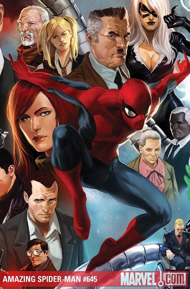
AMAZING SPIDER-MAN #645
Writer: Mark Waid Art: Paul Azaceta & Matthew Southworth Publisher: Marvel Comics Reviewer: Henry Higgins is My Homeboy
Shit gets real.This issue of AMAZING SPIDER-MAN goes in an always fun direction, sending Spidey in a darker turn where he doesn't make any jokes. It would be much more effective, though, if this wasn't following “The Gauntlet”, where Peter does the same exact thing at the end. But somehow, it manages to not feel tired.
Writing: (3/5) The question remains, why doesn't Peter just destroy all his enemies this effectively? Then again, Peter has kind of lost it, similarly to how he went mental at the climax of “The Gauntlet” and wiped out the Kraven family. Most of the dialogue is poorly written, especially some of the funny little "quips". "Where are you calling, Atlantis?" is a lame line that wouldn't pass in a Saturday cartoon. The idea of Spider-Man going this dark this quickly may seem out of character, but to having this right after both “The Gauntlet” and “One Moment In Time”, it translates much better than if it had just come out in between the Doctor Octopus and Chameleon stories. The end of the issue is very uneven and unexpected, which detracts heavily from the issue. It just comes so out of left field.
Art: (3/5) Still not a huge fan of Paul Azaceta’s art, but it does have some more consistency than the last few issues; even if that means consistency being subpar. The scene where Tombstone attacks MJ and Menace is fun to read, and while the art isn't perfect, it is very unremarkable. Peter’s face is especially hard to understand. As a matter of a fact, the faces for most of the characters are poorly designed. Almost every character has at least one panel where they look off. When there's less attention on the faces, however, the action makes up for it. The arrival of the Goblin Glider is great, the panels with Spider-Man in the shadows are great, and they sell the threat of a scary Spider-Man. The big time action moments are fantastic, such as Spider-Man lifting up a dock to get a hold of some rogues. On the last page, though, the art as well as the set up just doesn't work. The shot just isn't nearly as effective as it could be in the hands of a better artist.
Best Moment: Spider-Man tipping over the dock. That's a brilliant reference to AMAZING #33.
Worst Moment: The Lizard. Yeah, that was a fun twist…
Overall: (3/5) Though the issue reads better than some of the past issues of this storyline, it's still not perfect, by any means.
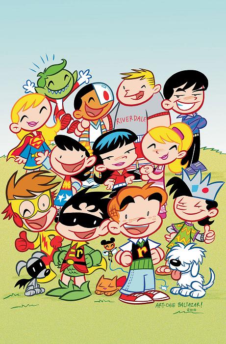
TINY TITANS/LITTLE ARCHIE AND HIS PALS #1
Writer: Art Baltazar, Franco Artist: Art Baltazar Publisher: DC/ Archie Comics Reviewer: Lyzard
Comic purists have always fought against the laymen’s view that comics are just for kids. Apparently, most of the public doesn’t read comics like CROSSED or they would know this not to be true. But that does not mean that comic companies do not make comics for this market. A few weeks ago I reviewed one of DC Kids’ comics, BATMAN: THE BRAVE AND THE BOLD. I found it completely underwhelming. But this time, with TINY TITANS/LITTLE ARCHIE AND HIS PALS #1, though for an even younger age group, they have shown a better example of how to write a juvenile comic book.The book tells a tale of mistaken identity. At the downtown drycleaners, the clerk gives Mrs. Andrews and Alfred the opposite clothes. This leads to Archie and Robin wearing each other’s outfits, resulting in the Tiny Titans meeting up with Archie’s gang.
Now this comic is way below my reading level, but I have young enough second cousins that would love this comic. It is also a comic parents can read with their kids without wanting to gag themselves from its banality. Older readers will enjoy the appearances of numerous DC characters. There are of course the big names like Batman (who is treated like a PEANUT adult, headless, but without the mwawawa) along with some lesser known names like Solomon Grundy and Slade aka Deathstroke the Terminator. The writers are inventive in how they introduce and deal with the villains, especially because they are such sadistic characters in the adult comic world. Their portrayal in this kid comic is ironic.
The art reminded me of CAPTAIN UNDERPANTS, a series that was popular when I was the right age to read it. But I don’t mind this style because both sources fit the target market’s sensibilities. The artist even takes advantage of the classic Archie style, keeping some of the elements and colors used for these particular characters. However, there is one artistic choice I doubt the artist will make. When Nickelodeon did the FAIRY GODPARENTS/JIMMY NEUTRON crossover, they had both Timmy Turner and Jimmy Neutron drawn in both styles of their universes. It was fun to see little Archie and his pals drawn in a different way, but I would like to see the same with the Tiny Titans. Have them drawn in the style of an Archie comic. However, since Art Baltazar is a DC artist and the comic is first and foremost a DC Comic working with Archie Comic Publications, I doubt I’ll be able to see this come true in the second issue.
For those adults who want to indoctrinate…I mean introduce DC into the lives of their young children, I see no better start than Tiny Titans. It will acclimate them to the characters they’ll come to grow with and love through the years. So while you are reading the ultra-violence of Mark Millar, your kids can enjoy the fun in TINY TITANS/LITTLE ARCHIE AND HIS PALS #1.
Lyzard is actually Lyz Reblin, a film student at Chapman University. Lyz’s love for comics stems from an internship at Dark Horse Entertainment as a freshman, which may explain why some of her favorite comic book writers are Gerard Way and Steve Niles. You can find her on Facebook, but only if you follow her band: Castle Town Convicts (possibly a Zelda reference?).
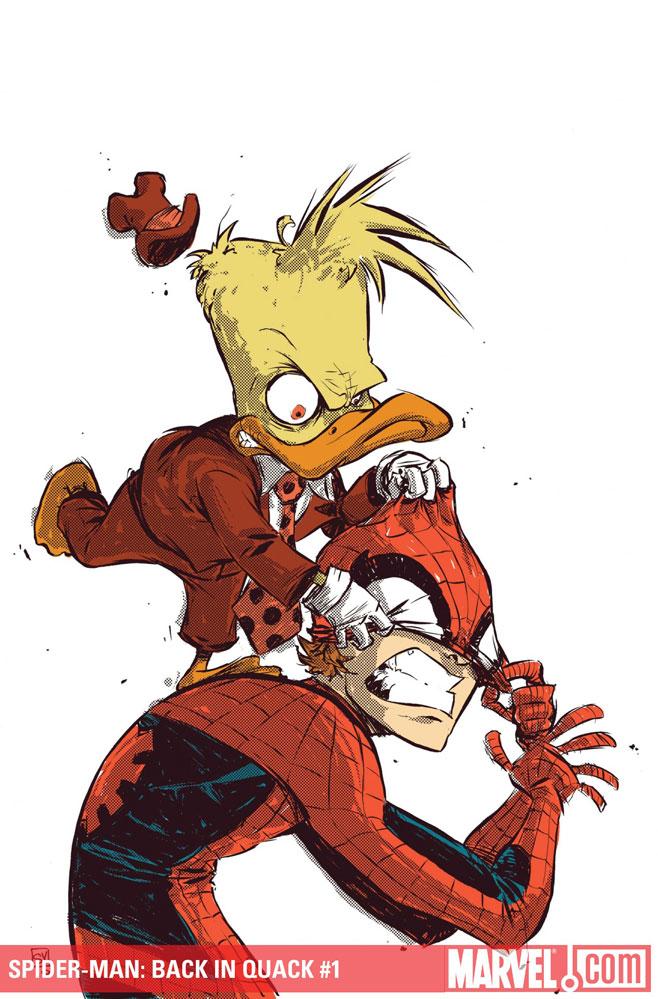
SPIDER-MAN: BACK IN QUACK #1 (One-Shot)
Story: Stuart Moore Art: Mary Brooks, Ray Height, Joe Suitor Publisher: Marvel Comics Reviewer: Majin Fu
Howard the Duck is the best character in the Marvel Universe, and that’s a fact Jack. Except for the whole duck thing, he’s a perfectly normal guy that just wants to get by in life with the rest of the hairless monkeys. In the context of the Marvel Universe, with all the crazy costume fetishes and epic battles, his existence becomes more humorous. Plus, he’s got a killer club of nemeses, like Doctor Bong and Bessie the Hell Cow. Now depending on who you ask (or who’s writing him), Spider-Man is no slouch in the laughs department either. So it seems perfectly logical that combining the two would produce comedy gold, right? Hell, they did it in HOWARD THE DUCK #1 with marvelous success, and that was over thirty years ago!This is the most humorless comic featuring Howard the Duck I have ever had the misfortune to read. That’s not to say there aren’t any jokes; it’s just that none of them are funny. This is more akin to the movie of the same name. It’s trying too hard, the pacing’s all off, the artistic direction is just not there, and Howard just looks freakin’ weird. My first quip is a shallow one I will admit, but where’s Howard’s suit? The duck has style, with the hat to prove it. The cover by Skottie Young (which is easily the best part of this comic btw, way ta’ go Skottie!) shows him in his suit, but the rest of the book is apparently too hip and modern to follow, uh…suit. Taking away his signature duds and putting him in casual attire is the first mistake. The next was covering his façade with a smiley face helmet and limiting his character, speech and all, until the second half of the comic. It’s like putting Thor in a Hawaiian shirt and having him talk like a Jersey boy for a whole issue, and then changing him back when it’s too little too late. It doesn’t help that the main story has two artists for a one-shot and their styles don’t quite mesh.
The plot is dismal, and far too cynical. There is social commentary like the old Howard books, but it’s hardly subtle, and far too political to actually be funny. The dialog is littered with one-liners that stumble instead of soar, and there are way too many in-the-moment jokes that will be dated within a year.
The additional Man-Thing story is so drastically different in tone that it can be a little jarring. However, the story is too vague and the conclusion just feels weak. The art is serviceable but like the story, is rather bland. There are a few eerie compositions that work for the Man-Thing, but it’s been done better in other comics.
On paper, this sounded like a really fun read, but in execution, it falls short of even the lowest expectations. To top it off, there is nothing here to justify a four dollar price tag. I never thought I’d see the day where I recommend anyone pass on a Howard the Duck comic, but here it is.
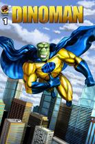
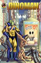
DINOMAN #1 - 2
Writers: Ben & Jeff Cohen Artist: Jeff Cohen Publisher: Brain Food Comics Reviewer: Optimous Douche
I noticed a strange and disturbing trend at this year’s Wizard World…doppelgangers. All throughout the “lunch table booth” indie area, a slew of creators stood side-by-side with uncanny resemblances to one another. It wasn’t every table, but a majority of them were occupied by these freaks of nature that call themselves siblings. As an only child I simply don’t trust people that share facial features and personality traits. I mean…c’mon…get your own fucking face and personality — stop sharing, freaks! This natural untrustworthiness of the individuals makes me instantly skeptical of their work as well. However, when Ben & Jeff Cohen wrote me last week, finally believing that I actually do write for Ain’t It Cool News and I’m not just some guy who is proud to call himself Douche, I couldn’t turn down the chance for A) a free comic and B) to uncover whether these unnatural creative wonders can actually craft a book better than a single writer.DINOMAN is creative, but make no mistake that one needs to firmly implant forked tongue into scaly cheek before reading. DINOMAN is equal parts comic reverence and lambasting. While Dinoman’s origin is a trope, an evil government program infuses human and dinosaur DNA, what Dinoman accomplishes after this origin is the stuff of pure (yet still reverent) comic mockery.
Issue one introduces us to DINOMAN after he has already broken free from his government captors. He chooses my home city of Philadelphia to set up camp and begins his life as the Dino-version of Clark Kent. By day he dons a pair of glasses and a moustache to become mild mannered construction worker Jose Valenzuela Rodriguez-Valiento Manuelo Valiz. Do the glasses and moustache hide the fact the fucker is built like Ivan Drago, has a face that looks like it was flattened by a vice grip and he has three fingers? No, but that’s what makes it funny. Everyone buys this lame disguise in the same fashion that a pair of glasses has been able to confuse the entire DC universe for the past 75 years. Again holding up the comic funhouse mirror to the medium, Dinoman completely destroys a bank when trying to thwart a robbery. Does the bank manager rush over with thanks and praise? Hell no, just like in the real world he wants to know who will fix his damn bank. Granted these elements are not great in supporting the concept of infallible heroes, but I think we all moved past that dream 25 or so years ago. Issue one closes by introducing us to Dinoman’s nemesis Lex..sorry…reflex…Mr. Bag Face Bob. Now, before you think you’re watching an episode of the Gong Show, it should be noted that Bob’s Bag appearance is not a fashion choice, but a birth defect. Even if you don’t find humor in this, the Brothers Cohen should get a whopping gold star for originality.
 Issue two gives us more insight into the nefarious bagged figure and his ultimate plan to take over the world. To say more would give away the true charm of this book – the humor. And Bag Face Bob’s plans are downright hilarious. I will however say that the Cohen Brothers once again borrow from DC mythology to introduce a clandestine fellow crime fighter that has taken on the mantle of an animal for their superhero moniker. It can fly without having wings and the filthy little fuckers are also very close to a rat, their tales are simply bushier.
The books have a few flaws. The art is accomplished, but not up to the caliber we have all become accustomed to from the big houses. However, the rendering are in the top 10% of what I have seen from the indie market. The pacing is spot on and there is some damn clever use of panel layout. The devil is always in the details and I think with a little hard work and gumption, Brother Cohen can surmount this minor speed bump with the grace of Kenyan long jumper. Fun, fresh and full of some damn sharp dialogue, DINOMAN may not overtake the world, but this is one iguana I am proud to call a native son to my hometown.
NEW AVENGERS #5
Writer: Brian Michael Bendis Art: Stuart Immonen Publisher: Marvel Comics Reviewer: Henry Higgins is My Homeboy
This cover sums up everything I ever wanted when I was nine.Decompression is a funny thing. Five issues in and we've had a lot of revisionist history and events explained. The New Avengers, after spending most of last issue in extended fight scenes, spend most of their time explaining the plot. While it's a fairly well written, it's not perfect, and if detracts from the flow of the issue.
Writing: (3/5) Most of the issue is spent elaborating on past plot holes, which makes for a less than interesting issue. While some points are worth a lot of interest (namely the presence of the Ancient One, which goes against most of the character’s continuity) are explained quickly and passively, others take far too long. The Doctor Strange history lessons, while needed, are done rather slowly. The Iron Fist scene from last month, which closed out the issue with Iron Fist opposite Doctor Strange, is answered in a throw away moment and never spoken of again. Even if the moment annoyed me last month, the completely superficial nature of how it's explained just bothers me to no end. The end of the issue is such a nine year old dream come true, which explains why it's such a great visual. The idea is also an interesting take on the classic "One man vs. one man, for the fate...of the world!" trope, as Bendis just gives everyone’s power to one person. The dialog is, as always, well done and fun to read. What Bendis does well, he does really well. But when his great dialog is used almost solely to explain plot holes, it loses a great deal of its splendor.
Art: (4/5) Immonen is, as usual, just completely on his game here. The art for many of the scenes, especially the first two sequences, are just incredible. Doctor Strange and Wong's short lived battle with the thieves is miraculous, and makes me want a proper Doctor Strange series all the more. The following pages and the designs for Brother Voodoo's brother and his fall in the other world a treat to see. Immoen is utterly brilliant here. Some shadows (especially on Hellstorm in a few moments) and faces don't play well, but almost all of the art in here is great.
Best Moment: Doctor Strange and Wong just....just being fucking fantastic.
Worst Moment: Iron Fist saying, "Yeah, sorry about all that."
Overall: (3/5) While the art is incredible and some sequences are written at Bendis’ usual standard, much of the back-story is rushed, uninspired, and forgettable.