
| #18 | 9/22/10 | #9 |
ASTONISHING X-MEN: XENOGENESIS #3
Writer: Warren Ellis Artist: Kaare Andrews Publisher: Marvel Comics Reviewer: Optimous Douche
ASTONISHING X-MEN is the closest thing I’ve ever had in life to an abusive relationship. I love Warren Ellis, I truly do; even his super-delayed series like SUPERGOD still keep me enthralled month after month. The man could shit in a box, etch the word steampunk on the turd and I would still gladly plunk down $3.99 for the pleasure of wafting the fumes. Oh wait I did...the GHOST Boxes mini. XENOGENESIS plays no such skullduggery by padding the piece with a text presentation of the material I just read, but it does have its own missteps...and yet I keep coming back because I know one day it will love me.Despite the fact ASTONISHING and its new spin-off XENOGENESIS have art that makes me quake with anger, enters and leaves continuity more often than Lindsay Lohan and rehab, I still love Ellis in the driver seat of an X-tale. But that’s what an abusive relationship is like; the modicum of good makes you blind to the rest of the trespasses against you.
I’ve resigned myself to the fact that ASTONISHING is once again out of continuity. I say resigned not because of my own feelings; I truly am not some mealy mouthed fanboy that tracks the chronological order of fictional universes with meticulous detail...I have a hard enough time remembering the details of my own life. However, I am perpetually confused on the nature of this subsection of a subsection of the X-verse. But I think Marvel is even more confused. This book has less purpose in this world than Kristen Stewart.
When Whedon was writing, it was clearly stated ASTONISHING was not in continuity, but then fucking Kitty Pryde disappears Slim Pickens style and POOF: she is gone from the X-Mythos all together. Colossus same deal…resurrected in ASTONISHING and next thing you know he’s now the ghost humper on Utopia. When Ellis took the reins of ASTONISHING proper it looked like some clear decisions had been made that all X-titles would fall together…ASTONISHING…UNCANNY and X-MEN would all make the move to San Francisco and the present day…that lasted about six months…or two issues of ASTONISHING. Again, I’m fine with out-of-continuity stories; I covet Elseworlds and have two boxes of WHAT IF? But you can’t pick and choose, guys. You can’t tell stories that clearly defy everything going on in the other titles and then siphon out the good parts for the main continuity’s gas tank. Oh wait! This is the same company that just made Peter Parker a fat couch potato and Mary Jane a mongoloid. Never mind…with schmucks like me out there plunking down the ducats you can do whatever you please. And whatever they please is the grab bag of non-consistent style and tonality that is XENOGENESIS.
From a story perspective XENOGENESIS is everything we expect from Ellis. You get a sci-fi ghost box parallel universe tale involving some new mutie kids in Africa that are exploding. This issue then reveals the infusion of some MI:13 mythology. Again…nice! Ellis also continues to covet characterization delivering dialogue that pops off the page with equal parts danger and humor. It’s all there…until you get to the art.
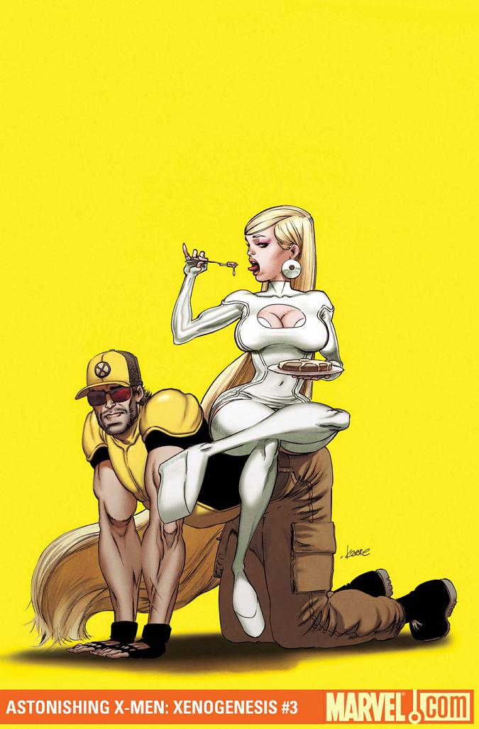
I don’t claim to be an art aficionado and I also always try to remember that art appreciation is subjective…beauty is in the eye of the beholder so to speak. But sweet Jesus on a cracker I can’t get past how mismatched Andrews is for this book. Other reviewers are praising his work for the humor it embodies, and that would be great if this wasn’t a story about EXPLODING BABIES and AFRICAN WARLORDS (no those aren’t new comics coming out, just some emphasis). I mean maybe some folks find that stuff funny and I would love to have a beer with those people, it would make me feel like I’m actually a sane person for a few minutes. Some other reviewers have likened Andrews to Quitely, and I would agree if Quitely decided to draw after taking five valium washed down with a fifth of Jack Daniels. I really liken Andrews to the Liefeld phenomenon, because that was the last time I saw gross anatomical monstrosities praised and stroked by the masses. Seriously, there were panels in this book where Emma Frost’s neck looks like it will snap in half trying to carry her bulbous Chinese head (oh yeah did I mention Emma Frost is an Asian blonde in the ASTONISHING universe?). Then there’s Cyclops and Beast who developed the tertiary mutation of their neck and shoulders becoming one body part and…you know what, fuck this. There’s more, but I think I made my point.
Again I realize this is all subjective, but the art choices for ASTONISHING go right back to Marvel not having a clue as to what this book should be. Personally I kind of like Bianchi’s work on ASTONISHING proper, I just make sure I read it in a well lit room. I also know I am part of a select few that will admit to liking his work. Why on earth would they continue to throw artists on ASTONISHING that so clearly polarize the comic audience unless Marvel just simply doesn’t care and is willing to ride the Ellis name alone? And if Marvel doesn’t care, why should we?
Well…because it’s Ellis. So even if the sand box is half full (or empty depending on how you look at things), it’s still a chance to go play with Ellis. I’ll just choose to stay with the dialogue bubbles and try not to look at any ASTONISHING title as part of the big picture.
Optimous has successfully blackmailed fellow @$$Hole BottleImp into being his artist on Average Joe. Look for Imp's forced labor on Optimous brain child in mid-2011 from COM.X. Friend Optimous on FaceBook to get Average Joe updates and because ceiling cat says it's the right thing to do.
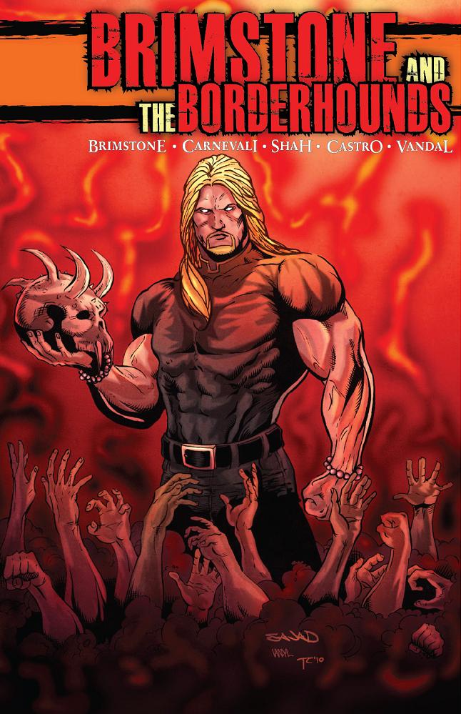
BRIMSTONE AND THE BORDERHOUNDS #1
Writer: Marcello Carnevali Art: Sajad Shah (pencils) & Alan “Vandal” Chickering Publisher: Hound Comics Reviewer: Mr. Pasty
What is BRIMSTONE AND THE BORDERHOUNDS? Well, I wasn’t quite sure myself when I first got word of this new offering from “Brimstone,” the popular East Coast wrestler whose resume reads like a wiki of 80’s trivia. My first instinct was to pass this off as just another celebrity cashing in on his notoriety to stroke his own ego. Or maybe even worse, maybe it was trying to ride the coattails of WWE HEROES, the well-intentioned but poorly-executed comic from the gang at Titan.Fortunately, I was wrong on both counts.
Trying to make an argument in favor of checking this one out is sure to be a tricky endeavor. I don’t want to give away too much of the story because this isn’t storytelling 101 – it’s the honors class. Opening page one is akin to tumbling down the rabbit hole and what could be better as a reviewer than to find undiscovered territory? No zombies, no Nazis, no licensed properties looking to squeeze those last few drops out of a tired franchise. Nope, this is an artist’s imagination put on paper. You know, imagination, that thing we used to use before we started plugging in to get our daily fix.
And any comic that opens with a verse from GRAVEDIGGAZ is a fucking 10 in my book. (Pasty Trivia #347: 6 FEET DEEP is known as NIGGAMORTIS in Europe. Can’t imagine why they didn’t keep that title in the States.)
Back to BRIMSTONE. What happens to your soul when you die? Would you be surprised to know that it’s already been booked for service in one of several afterworlds? Yep, the powers that be have drafted you for their fantasy team and you can only hope that you end up playing for the winning team. And just like any competitive league, not everyone ends up where they’re supposed to. Some jump ship, many get traded, others just stick around and try to make life miserable for their owners. Unfortunately this system is set up like THE FIRM (sans Wilford Brimley). You don’t just walk out on your boss. And when you do, expect to be pursued and brought back -- dead or alive.
So who gets tasked with skip tracing? You guessed it, THE BORDERHOUNDS. Leading the team is none other than BRIMSTONE himself, though I found his animated doppelganger way better looking than the real thing – and I’m sure Brim won’t disagree. I know if I was appearing in a comic book I would have hair like Gabriel Aubry and not John Locke. Anyway, it’s not just THE MOST DANGEROUS GAME in hell. It’s a multi-dimensional mind fuck, as everyone from Earth to Valhalla tries to keep the balance before the whole system collapses.
That’s what makes this book an exciting debut. When I wrapped the initial read, all I could think about was not just what was presented, but all the little mini subplots that my mind created from being teased with such an expansive universe.
Fortunately the art is able to keep pace with the storytelling. Shah does a great job of capturing a world on the brink without drowning in it a palette of drab colors and pushy shadows. The characters are what you’d expect them to be. Heroes are slender and muscular, villains look like they’re straight from a Leone western and every girl is the kind you would fuck on the first date (and not regret it in the morning).
The best compliment I can give BRIMSTONE AND THE BORDERHOUNDS is that I’m already harassing the author for issue number two. I’m excited to see how the story unfolds while learning more about the major (and even minor) players. It’s been such a long time since a series has been able to generate those kinds of feelings and its entertainment value cannot be overstated. I know it’s only issue number one and they have a long way to go, but if this was a nine inning baseball game, BRIMSTONE AND THE BORDERHOUNDS would be a first pitch home run.
Web heads who can’t get enough of Mr. Pasty’s word vomit are encouraged to watch him operate as Nostradumbass over at MMaMania.com here. Love, hate and Mafia Wars requests should be directed here.
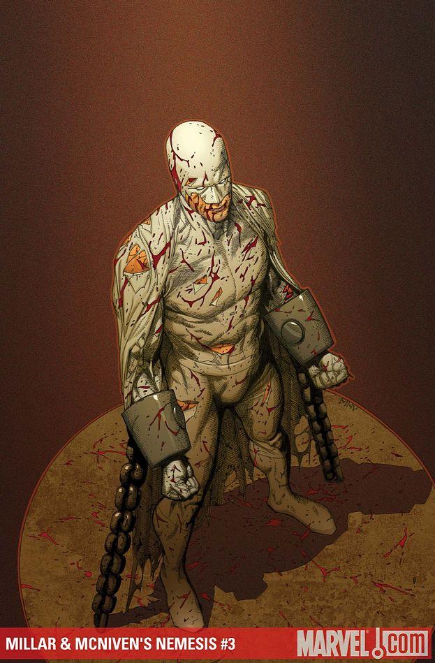
NEMESIS #3
Writer: Mark Millar Art: Steve McNiven Publisher: Marvel Icon Reviewer: Maijin Fu
Reading any contemporary comic, I am always fascinated by how each book reflects the times. Just as works like THE DARK KNIGHT RETURNS and WATCHMEN are forever tied to the mid-80s, complete with Cold War paranoia, NEMESIS seems to be tied directly to the post-Dark Knight adulation of Batman. Reading NEMESIS, I can’t help but feel Millar is channeling certain aspects of current culture, and then stretching them until they become an oblique caricature of something once familiar. This simplification of the reverse of Batman is timely indeed. In the summer months I have gradually become disillusioned with the mainstream superhero comic book. The heroics which defined my own moral values and inspired me as a child deteriorated into visions of ruthless killers and anti-heroes. At some point it just began to feel false. It felt wrong. NEMESIS is the poster child of this new development. If comics really do reflect the times, then what does NEMESIS say about us?Nemesis is the Anti-Batman. He’s a character who lived to see the cruelty of his own parents and as a result has dedicated his life to making the entire world feel scared; to make them feel like they will never be good enough, because at some point some psycho in spandex is going to crash an airplane into your home, or set your dog on fire, or beat daddy to death with a club just for doing his job. He overtly seeks stable, well intentioned individuals and systematically destroys their lives. Hell, he slaughters a Japanese James Gordon in issue one. How is this inspiring? Is it even supposed to be? Probably not. Then what is its purpose? How is this fun?
For one thing, NEMESIS also seems to be a dark reflection of Oprah, as shown in one particularly goofy scene. While humorous, this was a bit too wacky for me.
The centerpiece of this issue, in which Nemesis singlehandedly beats 97 prison guards armed with batons, is a violent tour de force that really drives home how much the critical success of this comic depends on Steve McNiven. Each panel is exquisitely composed and choreographed, with simple motion lines to enhance the savage movements of Nemesis. It’s an extremely bloody sequence, which makes it all the more shocking when he shows up later in a totally clean costume. If I had any complaints about the art, it would be the inconsistencies of Nemesis’ eye holes I noticed while reading through all three issues again, but that’s an easy fix for the trade paperback.
The notable lack of colorful nemeses in lieu of one very normal-looking police officer offers a stark contrast to the twisted image of Nemesis. I also appreciated the total confidence as he was wheeled into prison. Still, the character’s sadistic edge can go a little overboard at times. How you enjoy this comic really depends on whether or not you can accept the simple nature of the main character, which is made more difficult by the presence of a far more conflicted Chief Morrow, the main foil to NEMESIS. The dynamic between these two characters is what really drives the plot, and when NEMESIS finally makes his move on Morrow and his family, it is one of the more effective scenes in the series so far.
The main character leaves a sour taste in my mouth, but that’s probably what Millar was going for. Still, I can’t say I find much to like in this book besides the art. The Anti-Batman is more of a gross oversimplification than a character with any real depth. I admit I am curious to see how NEMESIS’ big finale will play out, but I am mostly looking forward to this story coming to a close.
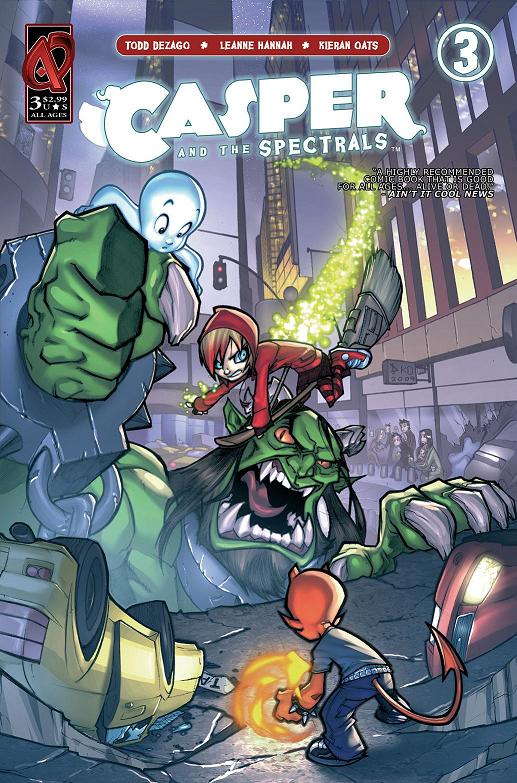
CASPER & THE SPECTRALS #3
Writer: Todd Dezago Artist: Leanne Hannah Publisher: Ardden Entertainment Reviewer: Professor Challenger
"A-HA HA HA HA HA!! Friends?!? FRIENDS?!?! You are either a very foolish or a very brave little ghost -- but you amuse me so I'll let you speak and save the destroying you instantly for later!!" -- VolbraggI've thrown positive reviews CASPER'S way for the first 2 parts of this 3-part series, so I feel a sense of duty here to tackle the conclusion. For all the complaints over the years about the lack of substantive comic books out there geared for the younger reader, it really is not the case anymore. There are excellent comics being published every week that are not only appropriate for kids, they are actually good and can be enjoyed by adults as well...if they can check their cynicism and sarcasm at the door.
Ardden's CASPER & THE SPECTRALS has consistently been one comic I have faithfully promoted ever since I picked up the first issue just on a lark. I occasionally just grab a comic off the stands that I didn't know existed and give it a go. Usually, the result is disappointing and I never think about it again. Occasionally I get a pleasant surprise and CASPER was one like that -- a very pleasant surprise. The characters of Casper, Wendy, and Hot Stuff (along with their supporting casts) are updated for the modern era but faithfully retain their personalities and their childlike nice-ness and naivete. The beautiful character designs by Pedro Delgado are also faithful to the original Harvey Comics but with a more modern and angular animation-style design.
The "Spectrals" are the three major races of supernatural beings (Ghosts, Witches, and Devils) who live in segregated dimensions. Casper, Wendy, and Hot Stuff are all lonely among their own kind and find themselves drawn together despite their differences. Just as their friendship is growing, circumstances unfold that unleash a horrible monster called Volbragg who threatens to destroy their worlds and the world of the humans. In this final chapter, we see a bit of political conflict between Casper, Wendy, and Hot Stuff on how to tackle the menace. Casper wants to try and make friends withe Volbragg and Wendy just wants to take him down. Hot Stuff ultimately decides to be Casper's backup and inadvertently learns some key information that helps.
What we have here is another good comic book with a fine conclusion that demonstrates that even people with different ideologies and opinions can find ways to work together to confront common threats. In the end, it is the similarities and not the differences that draw us together. But the differences are what give life that spark of excitement and unpredictability.
I like the fact that the universally positive messages in this comic book come through the story and the characters and not page after page of preachy word balloons. The art in this issue is handled not by Pedro Delgado, who drew the first 2 issues, but someone new to my radar named Leanne Hannah. Her style is very similar to Delgado already, so she is able to pick up where he left off without a jarring shift in tone to the art. Her art has a charm all its own though, and I would like to see more of her work.
Hats off to Ardden for this series, and I look forward to more with these characters. I'm still waiting for that STUMBO THE GIANT comic though....
“Prof. Challenger” is actually Texas graphic artist and lifelong reader of comics, Keith Howell. He really digs Green Lantern, most recently completed the cover art for the upcoming book THE WORLDS OF PHILIP JOSÉ FARMER, and has contributed award-winning art, design, and editing to a number of books and magazines. He occasionally updates his website at at profchallenger.com and welcomes feedback from readers, both pro and con, but if female please include an attached pic in a tasteful state of undress. Thanks for all the fish.
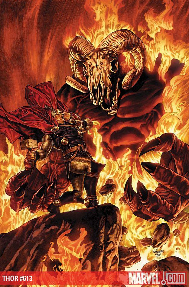
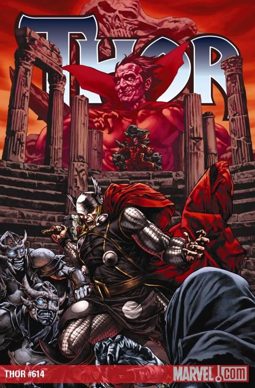
All Things THOR PART II: THOR #611-615
Writer: Kieron Gillen (#611-614) & Matt Fraction (#615) Art: Rich Elson (#611, #613), Doug Braithwaite (#612, #614), & Pascual Ferry (#615) Publisher: Marvel Comics Reviewer: Ambush Bug
Last week, I checked out a few miniseries Marvel had to offer focusing on everyone’s favorite Asgardian Avenger. This week, I continue my glimpse at Thor by focusing on the last few months’ worth of books from his ongoing series. THOR is in a bit of a transitional period after another Bendis-helmed event, this time called SIEGE. Basically, all you need to know is that Asgard, which was floating over a cornfield in Middle America, was destroyed during SIEGE. Loki was torn to bits. Thor’s exile from Asgard was declared null and void by Balder, the new King of Asgard. And Volstagg is still fat.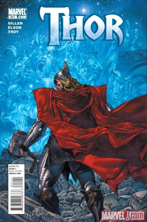 After SIEGE, Kieron Gillen assumed the writing position at THOR. Though much of his run was mired by crossover-itis, the four issues which ended his run on the book gives us a clear example of how Gillen, unattached to any over-hyped event, would write a THOR comic. I think most have a distaste for Gillen’s run because a) coming off the heels of JMS’ pretty fantastic run, he was in a tough position to take the reigns and b) SIEGE took up most of Gillen’s run, miring the book in Big Picture continuity, which often leads to the book losing it’s own identity. I think that happened here, but the issues I am focusing on in this review show that Gillen had what it takes to make a pretty good Asgardian story.
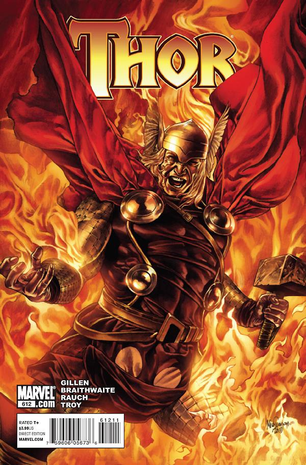 The strengths of this story lie in the fact that Gillen is often too smart for his own good. He has a true gift for classical, mythic language, a must for a THOR book. I’m not talking about getting all of his “Thee’s” and “Thou’s” in the right places. I’m talking about coming up with terms such as Tyr of Battles and things like that. Gillen has a gift for that classic type of Nordic-speak that automatically tells you that this is a fantastic journey. Thor could be walking to the market for fried goat udders on a stick and Gillen would have a way of making it sound like a mythic adventure.
Gillen’s final arc is a decent one. As Thor and the rest of the Asgardians pick up the pieces of a fallen Asgard, a phantom appears to them claiming to be Hela and asking for Thor’s help. A deal was struck before Loki was torn asunder at the end of SIEGE involving Hela’s claim over her own Hel, a troop of cursed, cannibalistic Valkyrie, and scourge of all living and dead, Joey Quesad—I mean, Mephisto. Soon, it is revealed that because of a curse upon them, these cannibals can only attain nourishment from the souls of Asgardians, a detail which protected the Asgardians because the death-eaters were not allowed in Hel. But after a deal struck between Loki and Mephisto, Hela had to move Hel into Mephisto’s hell, thus allowing the death-eaters a loophole and enabling them to chew as many Asgardians as they wished.
 If after reading that last paragraph you’ve scratched a hole in your head, don’t be too hard on yourself. The comic reads a final exam question in a pre-law class. Gillen makes the story way too complex. Not too complex to follow, but when every character has to basically explain their actions and what lead them there in every issue, you may want to pare down the twists and complexities a bit. Don’t get me wrong; I could follow the story, but it gets to the point where you ask yourself why you care about all of these twists, especially when it all ends with Thor slicing the death-eaters to bits with a magic sword.
Gillen does deserve some credit for making a deliciously evil Mephisto to act as both Hector and Waldorf in this story, sitting back and watching this complex tale unfold. He even comments a few times how complicated the plot is. Quesada should pay Gillen to ghost write the Mephisto parts whenever he wants to screw with Spidey again.
 The art in this art is done by two talented artists; Rich Elson and Doug Braithwaite. Both artists deliver good panels in this arc, but their styles are vastly different. So while it was appreciated that Marvel had the forethought to give the arc to two artists to keep the book on schedule, the story would have read better if the artists had a more similar style. The design of the death-eaters and some of the other demons of hell are especially original and devilishly gorgeous.
One thing I noticed in this story is that there is nary a thought balloon or caption showing the reader that this is a THOR comic starring Thor. Sure there’s a lot of stuff happening and Thor is front and center in the action, but this is a story about Hela and the death-eaters more than Thor’s. So after reading the entire story arc, I was itching for another writer to come aboard and give me a story with Thor as the focal point and not the blunt object to be aimed at whatever monster threatened Asgard for the moment.

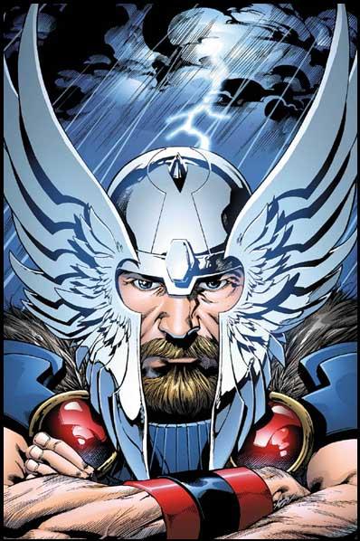 I guess I’m spoiled. I had the privilege to buy each and every issue of Jurgen’s “Death of Odin”/“Lord of Asgard” epic from a few years back. That story was THE Thor story, fulfilling Thor’s destiny, moving him into the position of being King of Asgard, and finally having Thor accomplish everything his father had been preparing him for by banishing him to Midgard back when Thor first appeared. Though this epic arc was plagued with inconsistent art, the story was solid from start to finish, starring a Thor which felt like a real character. A character that evolved and grew in the panel through a series of tragic events which brought out the humanity and heroism that fans of Thor had always known was in him. Damn I loved that arc. But I digress…
So going into Matt Fraction’s first issue on THOR, I had been satiated by the action and fine gift for language from Gillen’s run, but yearned for a story about Thor. Did I get it?
Uhmmmm…no.
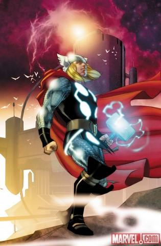 I’d like to say this is the dawn of a new and exciting era for THOR under Fraction’s pen. But this first issue reads like a throwaway issue of THE ORDER, a comic which relished in setting up scene after scene where a character is talking to an unseen person, only to have a big reveal at the end. THE ORDER gained Matt Fraction tons of lauds, but I found it to be overly talky, almost aping Bendis’ style without the bald one’s gift for turning a phrase. Fraction’s THOR is a talky sumbitch. A scientist talks to a person off camera on and on and on. Some of it is foreboding. Most of it is repetitious and irrelevant, seemingly to make room for an entire page of talking heads in order for the next page to be a splash of what looks to be a new race of gods coming up on the horizon. Then it’s back to the scientist talking some more and a big reveal joke at the end which falls utterly flat because of the heavy handed dialog delivered throughout the issue.
And apart from Thor saying and doing things in the rubble of Asgard that Gillen said in the previous arc when Thor was standing in the rubble of Asgard, we don’t get a lot of Thor, the character.
This is only the first issue of Fraction’s run and even though I hate it, it appears that first issues are not supposed to be substantial any more. Fraction seems to like to hear his fingers tap on the keypad. It’s abundantly clear in this issue which talks like a tween on a new phone. Here’s hoping things pick up in future issues. But the panels by Ferry are fantastic, so there’s that.
Being a lifelong Thor fan, even the issues I covered in this review, though possessing many faults, were still entertaining. I fear I’ve read the best THOR story ever with “Lord of Asgard”, but I’ll still get the comic in hopes that another story comes along to put up on the shelf with that one.
Ambush Bug is Mark L. Miller, original @$$Hole/wordslinger/reviewer/co-editor of AICN Comics for over nine years. Support a Bug by checking out his comics! MUSCLES & FIGHTS VOL.3 & MUSCLES & FRIGHTS VOL.1. VINCENT PRICE PRESENTS: THE TINGLER #1-2 (interview, interview, preview, & review) VINCENT PRICE PRESENTS #20 WITCHFINDER GENERAL (preview, review, in stores now!) NANNY & HANK miniseries (interview, interview, interview, preview, & review, still available to order in Previews Order #JUN10 0824, in stores Sept 2010!) Zenescope’s upcoming WONDERLAND ANNUAL 2010 (in July Previews Order # JUL10 1200, in stores in September!) THE DEATHSPORT GAMES miniseries (in September Previews Order #SEP 100860, in stores in November 2010!)
PILOT SEASON: 39 MINUTES #1
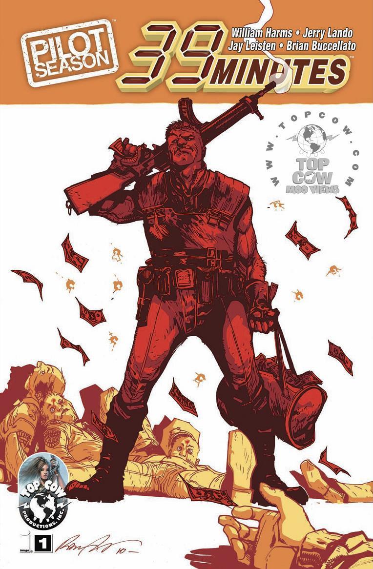
Writer: William Harms Penciler: Jerry Lando Inker: Jay Leisten Publisher: Top Cow Reviewed by Johnny Destructo
Having recently watched THE ROCK, JAIL BREAK Season 1, A-TEAM and THE LOSERS, I can definitely say I've seen this type of story before. Military men wrongfully put away in prison to rot by corporate or political fat-cats. It doesn't seem to be getting boring though! There's something about watching a convict get a chance to do right, while hopefully taking down the people who put him there to begin with, that just blows my skirt up. This is almost exactly the background plot to THE ROCK (which is still an awesome movie, btw), but our Sean Connery is a man named John Clayton, an ex-marine that looks suspiciously like Jesus. A coming plot twist, methinks. His job is to track and bring down a team of politically connected "contractors" who have taken to robbing the shit out of small towns. It's a joy to watch them do their thing with precision and calculated ruthlessness.Here's the what-what on the art front. I didn't realize that the penciler was as strong as he is until I saw his sketches at the end. The work was really strong and realistic with a hint of stylization that made me take a closer look. Sadly, the actual story art was inconsistent and pretty weak at times. I'm wondering if maybe the inker isn't an appropriate match for this art. Or maybe the penciler just took more time with his sketches then the actual panel-work. Either way, I'm interested to see where this is headed, provided it makes it to issue #2.
This first part of the story is a contender up for review in Top Cow's PILOT SEASON, a sales-based voting system wherein the #1 with the most copies sold gets to continue their story. I think this is a pretty cool idea, but the problem for me is that sometimes I need a second issue before I can give a series the yay/nay. I'm still on the fence for this one, especially since there are other contenders to read before making up my mind. The problem here is that all of the stories I listed above have some charm, some wit...and most of all...fun. This is a straight-up, bad-ass heist story. For my taste, it needs a bit more spark, but it's still a solid first ish.
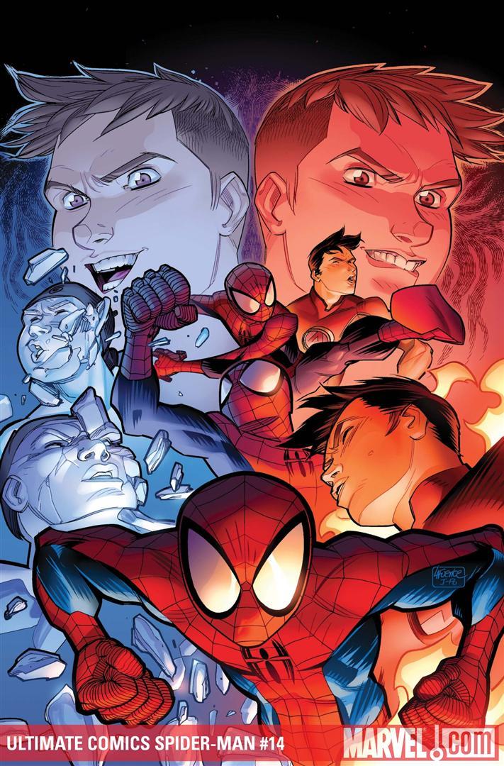
ULTIMATE COMICS SPIDER-MAN #14
Writer: Brian Michael Bendis Art: Lafuente Publisher: Ultimate Marvel Reviewer: Henry Higgins is My Homeboy
The Chameleon arc finishes up this issue, and is almost an indication of the story overall. It has its faults, and at times feels anticlimactic, but the story is great overall.Writing (4/5): Bendis follows his usual writing style with this issue. The basic trappings of his show up (lack of a good climax, villains faltering), but the good also appears, namely his dialogue and supporting cast. This issue has some fantastic Human Torch and Iceman scenes, where the Chameleon twins get decked. The two work brilliantly together, with Bobby pointing out shapeshifters and eventually freezing the pair of them. Another appearance of Carol Danvers is always welcome (though I may be in the minority of liking the Ultimate version of her), and I still like her being snarky to monsters. And Jameson! Jameson is alive! And he knows! You have no idea how much that dynamic change excites me.
The climax, though, falters. We have no denouncement about MJ and Gwen gives Peter an utterly cold stare as he gets home. But, seeing how she knows it wasn't Peter, the moment feels out of place. The Chameleons, though taken down in a cool manner (I fucking love Iceman and Torch) feels as if it wasn't worth it. It seems underwhelming, going from one of them holding both heroes back to them just taking them both out.
Art (5/5): Lafuente is spot on, as usual. When Chameleon opens fire on Johnny and Bobby, the design is fantastic. Chameleon stands outside of the panel, Johnny melts the bullets…it's the little touches like that that are brilliant. The design for the female Chameleon is utterly fantastic and creepy. As she shifts into Peter's face, it's just so unsettling. Teeth slowing forming, hair peeking out. It's so great. I owe Lafuente a cake or something, he's just utterly great.
Best Moment: Torch taking out the oxygen from one of the Chameleons. That's just cool. And Jameson!
Worst Moment: Chameleon's lame lines are back. Yay. "Hot mama!" ...Yeah, he's a major threat. Strikes fear into the hearts of men, he does.
Overall (4/5): The arc was good overall, and this issue follows up on that. A great issue.
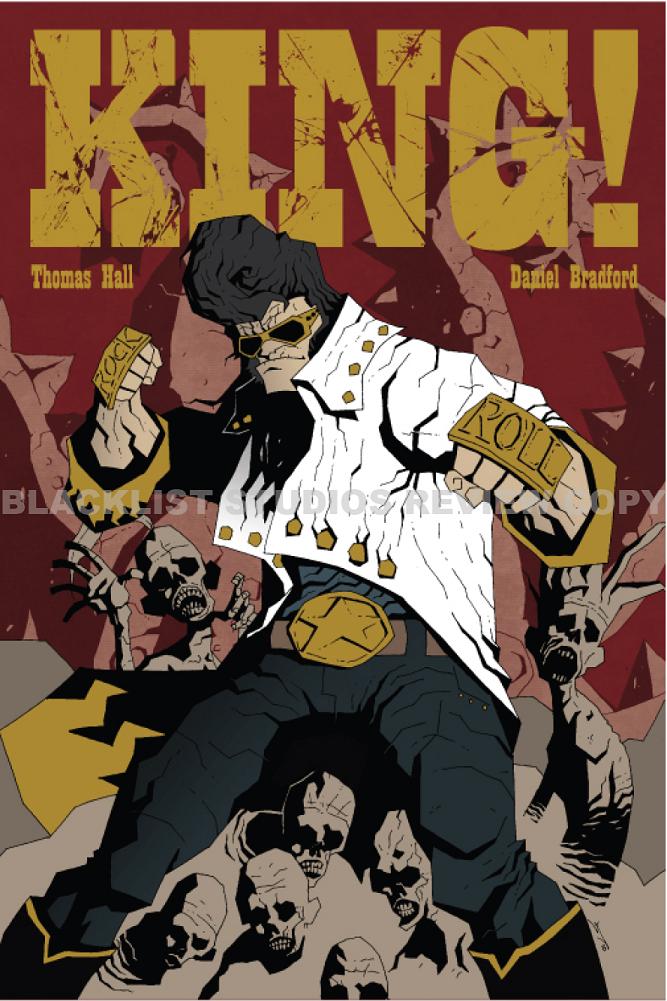
KING! #1
Writer: Thomas Hall Artist: Daniel Bradford Publisher: Blacklist Studios Reviewer: Lyzard
KING! And don’t you forget the exclamation point. The comic tries to be as big and bold as its title. But it’s not the king of independent comics, though I think in time it could possibly earn its place in the royal family. However, one must be patient to appreciate the positive qualities hidden away in the comic, because they take their time to reveal themselves.The comic follows the title character fulfilling a job of killing a group of demons and their queen. This is not the real king of rock and roll, Elvis, but an Elvis impersonator. But the only reason why I know this is because of an article on io9.com and the fact that I went onto Blacklist Studios‘ website. In a world full of supernatural beings, I found it possible that King really was Elvis Presley, maybe brought back from the dead or something. Too bad it’s not true, because I would have found that more interesting than an ex-Elvis impersonator and Mexican wrestler Jessie King, whose full name is never revealed in the comic either. However, the Mexican wrestler part is in the short comic at the end of the issue.
So, once I found out who Jessie King really was, I re-read the comic. Didn’t get any better the second time. The jokes are not funny, though the comic tries to be darkly humorous. The only time I laughed is when King orders “peanut butter banana burritos with bacon and extra cheese…” a dish after the true king’s own heart and another reason why I thought he truly was Elvis.
I’ll give the artwork some credit, which was clearly inspired by Mike Mignola. I could have seen some of the panels pertaining to the demons in a HELLBOY comic. But the character designs also have the rough, jagged look of the setting. Though this keeps the characters within the same universe as their background, I feel like they didn’t pop off the page as well as they might if they were a bit softer and more cleanly designed. The color palette is bland, but it fits the story so I didn’t mind it.
I was wrong to say that the jokes didn’t work. As the comic progressed, I did chuckle somewhat. Once the demons arrive the story really kicks it into high gear. The reaction of the bystanders is great, from pure terror to a fear induced paralysis all in dichotomy to King’s calm and cool.
As the book itself, not the story, continues there are even more laughs to be had. There is a short comic entitled “SUSHI OR NOT SUSHI (THAT IS THE QUESTION, BABY!)”. This is where you find out about Jessie King’s background as a wrestler and also as a sushi chef. In a short span of panels, there are more successful laughs than their full-length comic.
It takes awhile for KING! to hit its stride, but once it does, it deserves its exclamation point somewhat. If one were just to flip through it at the comic book store, the action comes too late to get their attention. However, the premise is quite original, though the characterization isn’t clear. I’d like to see more craziness like SUSHI OR NOT SUSHI, because that revealed more about the character and the tone of the comic than the actual story.
Lyzard is actually Lyz Reblin, a film student at Chapman University. Lyz’s love for comics stems from an internship at Dark Horse Entertainment as a freshman, which may explain why some of her favorite comic book writers are Gerard Way and Steve Niles. You can find her on Facebook, but only if you follow her band: Castle Town Convicts (possibly a Zelda reference?).

HULK #25
Writer: Jeff Parker Artist: Gabriele Hardman Publisher: Marvel Comics Reviewer: KletusCasady
It was about 3 am when I stumbled home drunkenly Wednesday night and there was an unusual pounding in my head “hulk, Hulk, HULK!!!!” My anticipation for this issue had some how found its way into my hazy drunken subconscious. As I walked in my room, I planned to lay down and get a measly 4 hours of sleep before work but I heard that pounding again, “hulk, Hulk, HULK!” this time I mistook it for another more familiar pounding “puke, Puke, PUKE!” but I knew that wasn’t the case. So I decided to stay up and feed the voice inside my head and upon reading this comic drunkenly on my porch a friend approached…with a box…full of every trade paperback of PREACHER (I love living downtown) and it was a sign I had made the correct decision. In all fairness I had more fun with this book drunk than I would have sober but when is this not the case when copious amounts of alcohol are involved BUT this issue is awesome. I had a damn good time Wednesday night with this issue and I laughed and loudly expressed my love for this comic much to the chagrin of my neighbors.I have read this issue since then, so don’t fret and I liked it just as much as the first time I read it. I know this is their first issue and all but damn they’re off to a good start. I’m not sure whose idea it was to have the Red Hulk work for Steve Rogers but I really like it. Who would respect/obey Steve Rogers more than a military general? It just makes sense to use the Red Hulk as clean up guy for the superhero community; he had his time as the bad dude who was kicking ass and taking names with no respect for the superhero community and now its time for him to redeem himself. Before I go on I’d like to say to all automatic naysayers of Red Hulk or Jeph Loeb, leave your bias behind and give this title an objective look because this is damn good comics and it would be a shame for someone to overlook this issue because of their disdain for a previous writer’s work.
With that said, Thunderbolt Ross is really the most fleshed out that I’ve ever seen him and I actually feel sorry for the guy. As the Hulk explains, “After years of trying to get rid of the Hulk…it’s all you have left…just like me,” The first page is a whopper and the great dialog continues thoughout the book: “I don’t need an edge, I’m the Hulk.” Dialog such as this had my drunken self highly entertained and amped up at 3 am and just wait till you get to the part with Iron Man. I’ve read a few issues of AGENTS OF ATLAS and was surprised at how quickly I decided that I’d at least be reading the next few issues; there’s something about Parker’s characterizations that just grab you immediately and won’t let go. That same feeling comes across in this issue where everyone is interesting; it’s not like some books where the main character is all you care about and everyone else is just window dressing. Steve Rogers, Banner, Hulk, Ross, Red Hulk & Iron Man all shine in this issue and I thought to myself…please put this team on AMAZING SPIDERMAN, maybe not now but soon.
The art is really good and the preview art they showed a few months back of Hardman’s Red Hulk (now my desktop background) convinced me that I needed to check this issue out. The artwork is a mix between Mitch Breitweiser, a little Doug Braithwaite, a smidgen of Patrick Oliffe, and a dash of Michael Lark. What sets it apart from those artists is the color palette thanks to Bettie Breitweiser (any relation?); I guess the best way to describe it would be to say that it’s a cool color palette meaning the colors are all pretty pale but still very vibrant at the same time, I guess this is referred to as analogous color (thanks wiki). If you compare this art to any other book the differences will immediately jump out at you, which is not bad thing.
This book kicks ass in more ways than one. The dialog is sharp, the art is awesome, and the character interactions seem spot on. I know this is the first issue but this is ONLY THE FIRST ISSUE! The next one has Thor and that’s going to be a fight for the ages. Even if this story arc is the only good one Parker and Hardman put together (doubt it), it’s worth a gander. I love the colors in this issue, I mean the line work is great but the colors really set this book apart from other comics on the shelf. It seems most comics have really bold colors (with exception of Steve Dillon and a few others) and there’s nothing really wrong with that but going with a different approach is a welcome change. The bottom line…This book can kick your favorite Marvel book’s ass!
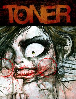
TONER # 5
Written, Illustrated and Published by: Jonathan Wayshack More info found here! Reviewed by: superhero
I think I may have found my pick for best artist of 2010. It’s that simple and the art in TONER is that amazing. Jonathan Wayshak’s black and white inked art is some of the most dynamic and brilliantly crazy artwork I’ve been exposed to since reading Sam Kieth’s THE MAXX in the early nineties. In all honesty it’s more like Sam Kieth and Bill Sienkiewicz mated and spawned some insane lovechild. From the moment I laid eyes on the cover of this book I knew that I was in for something artistically stunning and I was not disappointed when I got to the interior pages. Each page in this book is like a breath of electrically charged air. Waychak’s style is so eclectically and terrifically beautiful but I could not help but stare at each page in awe as I tried to take in the genius that was the artwork in TONER.Honestly, I cannot express how pleasantly surprised I was when I opened TONER. So often I go to conventions or drift through the indie section of a comic shop and am disappointed by a cover that shows promise of something new and impressive to find an interior that is less than inspiring. Artistically, TONER did not disappoint. The interior fulfills the promise of the cover’s impressive design and I was pleasantly thrilled by TONER’S look as a whole.
While the look of TONER is impressive a lot of readers may be challenged by the lack of a real compelling narrative. TONER consists of the first part of what seems to be a multi-part story along with an amusing short story in the back of the book. I have to say that I did find the opening story to be a bit lacking but it’s one of the very few times I’ve actually seen the artwork of a book able to transcend what is a less than perfect story. The originality of the art style in TONER does the heavy lifting and helps the book transcend its slightly weak storyline.
But TONER really doesn’t end up about being about the story because, if I haven’t said it enough, the art of the book is everything. It’s an impressive showcase for the illustration talent of Jonathan Wayshak. In the end it is much more of an artbook more than anything else and, in my opinion, is beautifully produced and well worth the cover price of $7.95. If you know anything about my stance on the price of comic books these days you’ll understand that the end of that last sentence is high praise indeed.
Discovered as a babe in an abandoned comic book storage box and bitten by a radioactive comic fan when he was a teenager, superhero is actually not-so mild mannered sometime designer & cartoonist, Kristian Horn of Los Angeles, California. He's been an @$$hole for three years. Some of his work can be seen at www.kristianhorn.com and check out his blog at www.parttimefanboy.com.
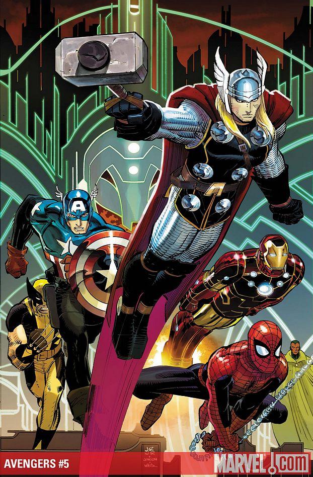
AVENGERS #5
Writer: Brian Michael Bendis Art: John Romita Jr. Publisher: Marvel Comics Reviewer: Henry Higgins is My Homeboy
The future's so brig...well, okay, that's a lie.It's a bit odd, seeing how much I've been enjoying NEW AVENGERS and how much I've been waning on AVENGERS, to find that the latest NEW AVENGERS wasn't great while this new issue of AVENGERS is pretty cool. A lot of the things I've railed on in the past with this title have picked up tremendously and though it's not perfect it's still a good read.
Writing (4/5): Bendis hits the epic idea with more focus and ability with this issue than in previous issues. The future portion is really well done, taking a page from Rip Hunter’s playbook by having a long time line to work with. It does feel like a swipe, but it's still well done. The dialog between the heroes in the future is well done as well. The present, on the other hand, falters here and there, with Hawkeye panicking more than he should, but the moments with Thor are great.
Art (4/5): Romita’s art is utterly fantastic here. The scene early on when Thor battles Galactus is brilliantly done. You can actually feel the boom when Thor hits the giant. The faces and body structures are better here as well, specifically with Iron Man. The contrast between future Tony and present Tony is well done, differentiating between the two easily but seeing the two as the same person is very clear. There are some art missteps here and there (the group shot of the future Avengers and Kang's face stand out), but overall it's very good.
Best Moment: Thor taking on Galactus. That's how you do "epic and big" Bendis, you made me eat my words.
Worst Moment: Kang The Conqueror is kind of bitch. I don't much think he's supposed to be that much of one.
Overall (4/5): The issue is well done, and steps up from last issue.

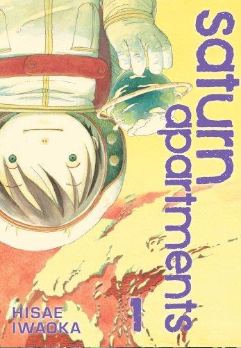
SATURN APARTMENTS Vol.1
By Hisae Iwaoka Released by Viz Media Serialized online here. Reviewer: Scott Green
Before creating AKIRA, Katsuhiro Otomo worked on the psychic horror DOMO: A CHILD’S DREAM, in which a young girl with telekinetic powers faced off against an old man whose mind deteriorated into a child-like state. What complemented the deranged threat to make the manga chilling was its sprawling "rabbit hutch" apartment complex setting. Every scene was claustrophobically framed by the concrete and windows of the housing project. Neighbors were everywhere in the tightly wound social ecology. Not a traditional haunted house, and not simply a place to live, the apartment complex had its own imposing presence. Minus the psychics, SATURN APARTMENTS imagines this has a future for our species.In order to allow Earth's environment to recover, humanity has emigrated to an artificial satellite orbiting 35 kilometers above the planet's surface. It's tellingly described as an "apartment complex" that residents are born in and never leave. Organized by social order, the cylindrical environment is class stratified, with the working class living at the bottom, the upper class living at the top and the middle as public space, used for functions like schools (which do require tuition).
Mitsu's mother died shortly after his birth. His father died on the job, working as a window washer. Encased in a protective suit, scrubbing the satellite apartments; exterior, Mitsu figures that his father became transfixed looking at the Earth below, cut his tether and gave up. Still, upon graduating middle school, Mitsu follows in his lost father's footsteps, taking work as a window cleaner.
To place SATURN APARTMENTS in the constellation of working-person sci-fi manga released in North America... compared to Sebastian Junger-ish Planetes, about a crew employed removing orbital debris, Saturn's muted view of the science and especially the personalities contrasts with Planetes' hot-head peppered cast. There is tension in SATURN APARTMENTS, but even at its most pronounced, it's at some contemplative remove.
At the other end of the spectrum, there's Aria, an almost pastoral about a girl who aspires to be a gondolier on a terra-formed Mars. In the case of Aria, the calmness is the manga's raison d'être. With plenty of people looking after Mitsu, Aria and SATURN APARTMENTS overlap in their sense of community. Both are concerned with work. Both are also more involved with living than struggle. Yet, Saturn is more concerned with working through reconciliation than the small pleasures that drive Aria. It might not be ostentatious, but SATURN APARTMENTS’ residents are grappling with finding the meaning of their work.
Though SATURN APARTMENTS’ vision of the future is stylized, it isn't idealized. Mitsu is engage in dangerous, dirty work. He enters the occupation knowing that it could cost him his life, and winds up mostly trying to please the finicky well-to-do's on the upper levels of the complex. Though not the subject of consternation, the social stratification of Saturn Apartments is neither just nor is it a meritocracy.
Defined by location and look, SATURN APARTMENTS is quiet, low key, and most importantly, situated at a Small, sad remove from Earth. Creator Hisae Iwaoka is part of the superlfat art movement, with her “Tokyo Girls Bravo” exhibit curated by the much talked about pop artist Takashi Murakami. Superlfat ideas about what lies beneath cute design inform Saturn Apartments. Iwaoka's child or dolls like characters are simple and charming, but still able to express complex sadness. The reaction provoked by this stylization is as significant to the manga has its views of the planet Earth filling the horizon from outside the colony. Speculation about how humans might relate to living in space has proven to be fertile ground for manga like Saturn Apartments. As much as the narrative explores the sentiments and lives of Saturn Apartments' residents, the way in which those people are illustrated speaks volumes.
Scott Green has been writing for AICN ANIME for over nine years. If you like what you see here and love anime & manga, be sure to check out his latest AICN ANIME column every week on AICN.
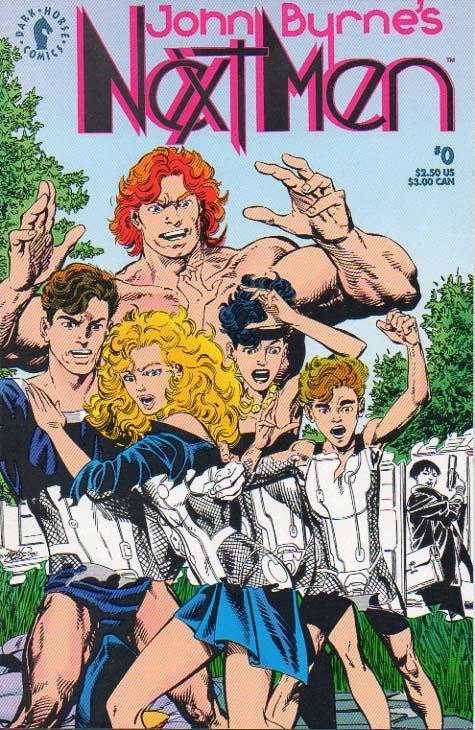
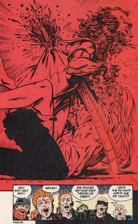
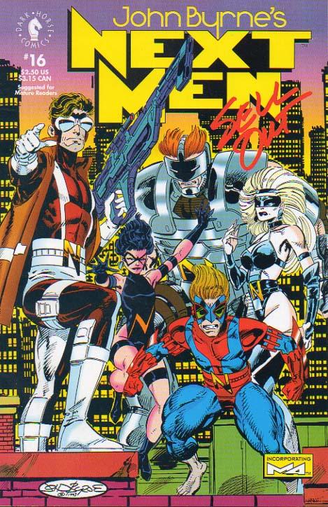
JOHN BYRNE’S NEXT MEN
Issues 0-30 (1992-1994) Written and Drawn by: John Byrne Published by: Dark Horse/Legend Reviewed by: BottleImp
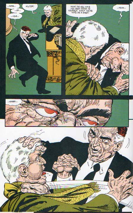
The comic book landscape of the early 1990s is usually looked upon as something of a disaster zone, and not without good cause. Image Comics exploded onto the scene with all of its posturing and hype, driving the comic book speculation market into frenzy. People who had never before purchased comics (let alone read them) were suddenly buying multiple copies of these hot new “investments.” Marvel and DC responded to this threat to their market dominance by playing copycat, and soon their publications too were teeming with grim ‘n’ gritty, steroid-injected, gun-toting antiheroes, drawn with as much hatching and scribbling linework as possible, while the paramount elements of story, character and composition were generally left by the wayside. Well, we all know that before long the Big Boom became the Big Bust, and comics are still recovering from the damage that the speculators’ market created. But amidst all the noise of the ‘90s, we must remember that there were some very good things happening, albeit in a more quiet manner. Along with Rob Liefeld’s YOUNGBLOOD and Jim Lee’s DEATHBLOW, these years also saw the emergence of Mike Mignola’s HELLBOY, Frank Miller’s SIN CITY…and JOHN BYRNE’S NEXT MEN.The premise of the series is nothing particularly original—another variation on the old “government creating its own superhumans” plot—but Byrne crafted his series in such a way that NEXT MEN neatly avoids falling into cliché. For example, none of Byrne’s superhumans adopt code names or fancy costumes (well, they kind of do…but only for Byrne to show the reader how NEXT MEN is NOT the typical superhero team). Some of their powers also come with negative physical side effects. Nathan is gifted with an expanded range of vision, but his eyes have become freakishly large, and he must wear special glasses that can limit his sight so that he does not become overwhelmed. Jack is super strong…so strong, in fact, that he must wear a restraining exoskeleton to keep him from accidentally destroying everything around him. Bethany is invulnerable to harm, but also unable to feel the normal sensations of touch or temperature; her skin even becomes bleached as sunlight is unable to penetrate it. Danny is super-fast, but his leg muscles are hyper-developed to the point of absurdity. Only Jasmine, granted amazing acrobatic ability, is physically unchanged.
 The manner in which these characters discover their powers also sets NEXT MEN apart from the standard. In Byrne’s world, the United States began their “Next Men” program in the 1960s to endow humans with superhuman abilities by altering embryos while they were still in the womb. Once delivered, the babies were then kept in sleeping states as their developments were monitored. While asleep, the test subjects lived in a virtual reality dubbed “The Greenery,” an idyllic pasture where they grew, were educated and conditioned, and had their powers emerge. So the introduction of the reader to the Next Men mirrors the Next Men themselves waking up to an unfamiliar world, and as the characters discover more about themselves and what is happening around them, we’re right along for the ride learning the same information.
It’s tempting to try to assign influences to NEXT MEN—the virtual reality of The Greenery brings to mind the artificial comic book world that served as programming in Alan Moore’s MIRACLEMAN, for instance—but at the end of it all, the comic is more “John Byrne” than anything else. Byrne’s views and opinions come through his characters, and the result is a wonderful combination of action, intrigue and genuine drama. NEXT MEN is slapped with the “Mature Readers” label, and it’s not just because people are having sex or getting holes punched through their chests (they are). There is a thoughtfulness to the story and the characters that is hard to find in most superhero comics, and for all the violence and bloodshed there are equal parts of philosophy and real, heartfelt emotion.
 I’m not going to lie; there are a few negatives to this series. The central story arc involves a time travel paradox, where a character from another of Byrne’s comics (the miniseries 2112, set in that same year AD) named Sathanas is sent back from his time to the 1950s, where he becomes instrumental in developing the Next Men program for shadowy reasons of his own, which are revealed by issue #30. This use of a character from a different comic works well, because Byrne gives enough of a background on Sathanas so that the reader doesn’t necessarily need to have read 2112 to understand what happens in NEXT MEN. However, later in the series two more characters pop up and the reader is informed that they first appeared in Byrne’s book THE WHIPPING BOY. Unlike Sathanas, these two are never fully explained, and worse yet, they are totally inconsequential to the plot. I got the feeling that Byrne was just trying to get more people to buy THE WHIPPING BOY, instead of using those characters to enhance the comic. Also, Byrne begins a back-up feature in issue #7 called M4, which eventually becomes an integral part of the NEXT MEN series’ climax. My problem with this is that the majority of this back-up feature seems to exist in its own little world, and at the end feels rushed and crammed into the main plotline. I wish that Byrne had integrated the M4 story into the context and storyline of NEXT MEN so that the resolution of the two plots felt more natural, and less mashed-together.
And one more thing: John Byrne is one of my all-time favorite artists. He’s the first comic book artist where I remember sitting down and trying to emulate his drawings. I think he’s a consummate storyteller, and a superb figure artist. But I wish that he hadn’t done his own inking here.
 Byrne’s work always looked crisper when inked by someone else—probably his most famous collaborator was Terry Austin—and this is because Byrne’s penciling was much more finished when he had to pass the art to another person for inks (he says so himself in one of NEXT MEN’s letter pages). When inki