The Pull List
(Click title to go directly to the review)
Bug looks at All Things THOR!
SKULLKICKERS #1
IDES OF BLOOD #2
HOWARD LOVECRAFT AND THE FROZEN KINGDOM OGN
GREEN LANTERN: EMERALD WARRIORS #2
TIME BOMB #2
THE MIGHTY MEAT GAYZER #1
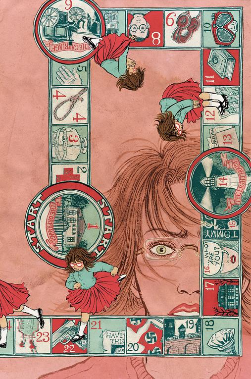
THE UNWRITTEN #17
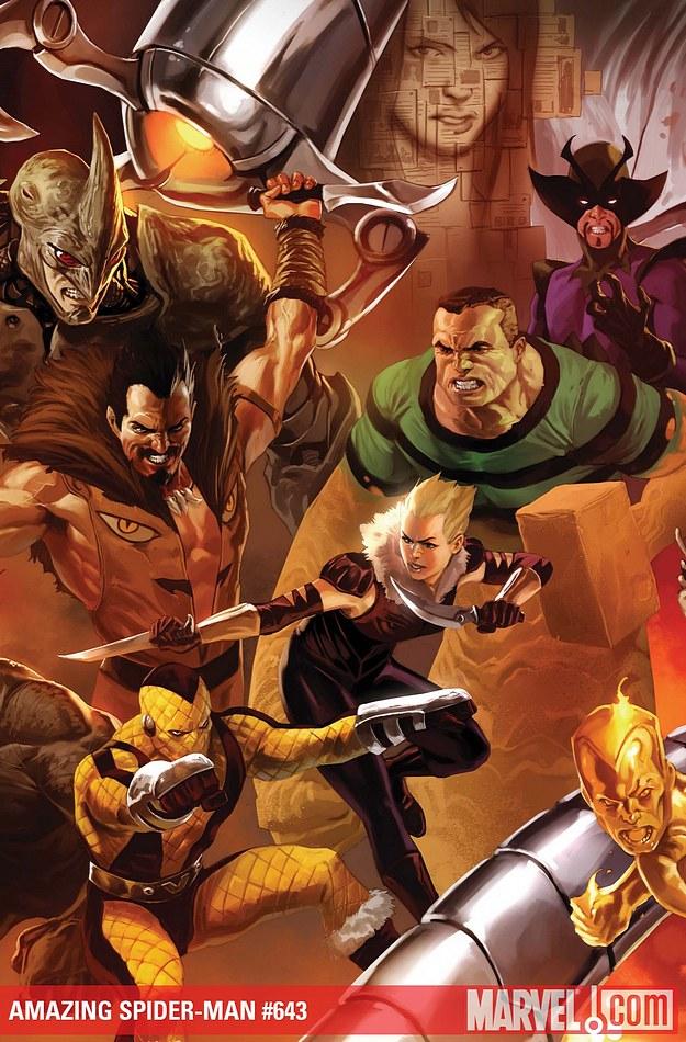
AMAZING SPIDER-MAN #643
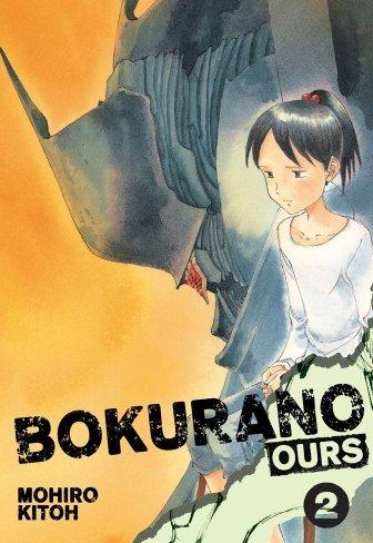
Big Eyes For the Cape Guy presents BOKURANO: OURS Vol.2
Indie Jones presents…
All Things THOR
Publisher: Marvel Comics
Reviewer: Ambush Bug
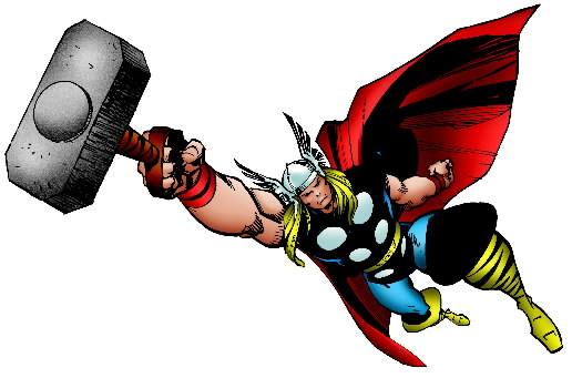
So I was browsing the comics racks the other day and has anyone noticed that there are a shitload of THOR books out there right now? I understand that Marvel wants to create a buzz around the star of one of their big movies coming out next year, but even so, there's a lot on the racks. So being the eager reviewer that I am, I decided to pick up a few of the THOR miniseries, specials, and new series to separate the wheat from the chaff; sort of separating what books should be residing on the golden thrones of Asgard, and what books deserve to be flushed into the bowels of darkest Midgard, so to speak. Thor has always been a character near and dear to my heart. He's the noble warrior with daddy issues and is tough enough to pull off a winged helmet and not look ridiculous. There seems to be a THOR book for just about everyone these days; ranging from an all ages book to a mature audiences one. Let's start with the youngsters and work our way up:
THOR: THE MIGHTY AVENGER #1-3
Writer: Roger Langridge
Art: Chris Samnee
Intended Audience: For kids and the kid inside you biting and scratching to get out.
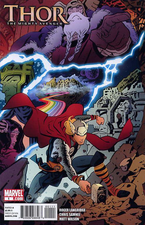
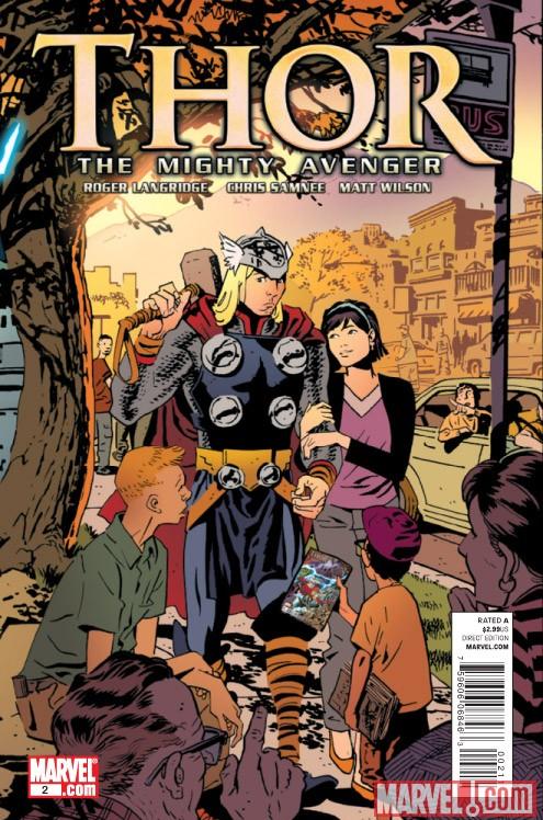
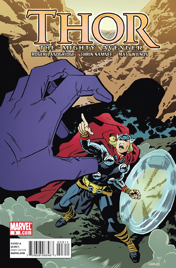
Though I didn't know it when I read through the first three issues of THOR: THE MIGHTY AVENGER, this series seems to be geared more toward Marvel's all ages line. Roger Langridge has been doing a bang-up job writing and drawing BOOM!'s MUPPETS SHOW book, so seeing his name on the cover immediately raised my eyebrows. He's retelling Thor's first days on modern Earth and the first time he meets Jane Foster. There's a bit of reimagining going on, but seeing as how this is supposed to be a story taking place in the kiddie Marvel U, I guess liberties can be taken. Though Marvel could have been a bit clearer with how this book fits into the grand scheme of things. I only surmised that this book is part of the youth oriented line by the "Next Issue" page which featured more of Marvel's youth oriented books. Being someone who rarely crosses over to this neck of the Marvel forest, I was a bit annoyed by this, but the book was refreshingly fun, with the story focusing on Jane Foster as this mysterious tall, blond stranger falls into her life. Langridge keeps the action crisp and doles it out in heavy doses in this book as Thor regains Mjolnir just in time to battle a frisky Mr. Hyde. The story is funny and light, but well done enough to not dismiss it as kiddie fare. I'll probably be continuing to read THOR THE MIGHTY AVENGER, even though it isn't necessarily stationed in Marvel 616.
THOR: FIRST THUNDER #1
Writer: Brian J.L. Glass
Art: Tan Eng Huat
Intended Audience: Folks who pick up all things Thor.
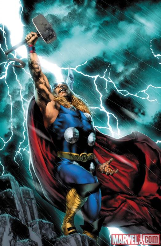
This first issue dropped last week and is the first of a five part retelling of JOURNEY INTO MYSTERY #83 as told through modern creators. Out of all of the books I picked up in my Thor shopping spree this week, if I had to leave out one, I'd probably do it to this one. Not because it's necessarily bad, but because a) it's over-priced at $3.99 justified by the inclusion of the original THOR story and b) because it really doesn't stand out as anything spectacular. There's nothing necessarily wrong with it though. Huat's art, especially his scenes with the Rock Men were pretty nice and hyper-detailed. The problem with these retelling miniseries Marvel seems to like putting out is that they are just unnecessary. The additional material added rarely adds to the myth. In this issue, writer Glass also gets Thor into a predicament where he must turn into Donald Blake in order to reach a falling mountain climber. Of course, we all know Thor can fly, so why does Thor necessarily have to change into mortal Robert Blake to reach his cane down to the damsel? The answer is to further the plot along, but in the end it makes very little sense when you look at the amazing powers your hero has. Glass does seem to understand the core character of Thor in that he highlights the daddy issues of the Mighty Avenger and how that mirrors the issues Donald Blake has as well. It looks as if this miniseries is going to delve into this a bit more to add a bit of heft to the origin. Props have to go to Huat though in his grueling depiction of Loki imprisoned with tree roots growing out of his eyes. Loved those final pages. Though it looks pretty and reads by the book, this is a pretty forgettable miniseries that I doubt I'll return to, though I may give the second issue a glance to see if things pick up.
THE RAGE OF THOR #1 One Shot
Writer: Peter Milligan
Art: Mico Suyan
Intended Audience: Those who like their Thor reads on the more sophisticated level.
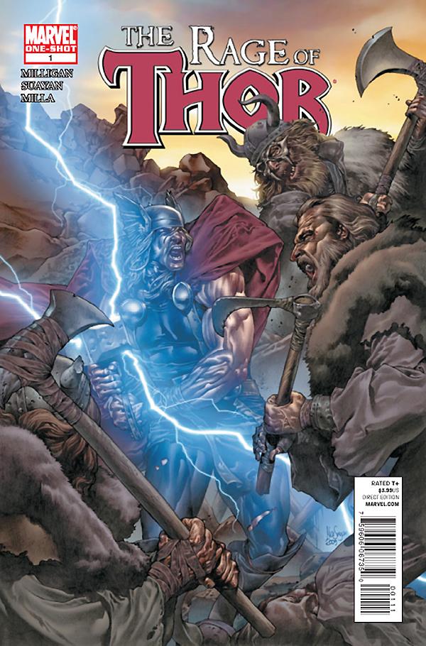
Loved this issue written by scribe Peter Milligan. As I said above, Thor's got daddy issues and Milligan knocks this story out of the park centering on the rage than can stem from his problems with pop. Some of the coolest stories center on Thor as a youth before Donald Blake. This story does that as Thor deals with never living up to his father's expectations by leaving Asgard and starting a new life on Earth. He shacks up with a peasant woman and child, wards off marauders while hiding the fact that he's a god. Here, Thor is more like the Hulk, trying to fit, but rarely doing so. He is able to live with the mortals for a short time, but Surtur and his responsibilities to Asgard pull him back in. Milligan does a great job of highlighting Thor's attraction to Earth while offering a solid glance at a man torn between two worlds. The art by Mico Suyan is equally awesome, with his bloody battle scenes with splatter droplets and heads rolling making this a slightly more mature read, but it's the heady subject matter of Thor's rage and issues with his father that make this a more adult read than the past two books looked at here. Though things are tied up into a bow at the end a bit too tidily for my tastes, this is a solid Thor story that gets both the character and makes an all new story out of it.
THOR: FOR ASGARD #1-2
Writer: Robert Rodi
Art: Simone Bianchi
Intended Audience: Those who like their Asgard with a little bit of stank on it!
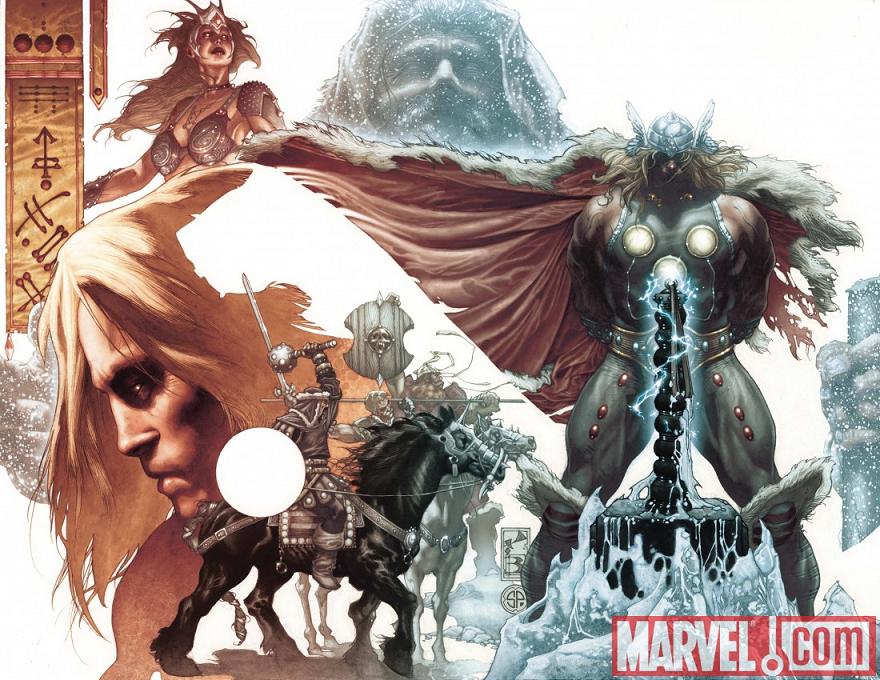
What this story lacks in heft as with RAGE OF ASGARD, it makes up with some gorgeous art from Simone Bianchi. This is one of those ambiguous titles that seems to teeter on the edge of 616 continuity yet seems to follow its own path, the story is strong enough to make me not care much about all of that. Odin seems to be alive in this story and off on some quest, suggesting this may be another TALES OF ASGARD style story set in Thor's past, but there seem to be references to the current "Siege" storyline in this one and Odin was dead when that happened. Finishing the first issue, I was concerned about where this fit in, leaving me with that head-scratchy feeling. But it sure is purty! Out of all of the books, this is by far the best looking, with Bianchi doling out some art that is less murky than his ASTONISHING X-MEN stuff, though not lacking in dynamic angles and vivid uses of background and detail. By the end of issue two, it's clear that this is an outside of continuity story in that Thor is sans Mjolnir, seemingly working to get the worthiness to wield it back. Had there been some type of explanation where this all fits, some of the confusion could have been avoided.
 And that's my main criticism of all of these THOR books. If there are going to be this many books out there on the racks with THOR in the title, it would benefit Marvel to have some kind of staff meeting or icon indica or something to understand just how all of them fit rather than just putting them all out all willy nilly and leaving it up to the reader to figure out how it all fits together. Sure some might say, "Who cares?", but if I spent half the issue in more than one of these comics trying to figure out which Thor this was exactly, I'm sure others have faced this quandary as well. One would think a simple explanation or caption box at the beginning saying this is a kid-friendly "Marvel Adventure" story, or a "Tales of Asgard" times-past story, or one steeped in current continuity would help folks like me who would like to know how it all fits before buying it. With Marvel's obsession with labeling their titles with "Heroic Age" and "Siege" and the like, you would think they'd want to do something like this to clear things up for a market that is hard to gain attention in anyway.
 Aside from that, one thing is for sure, folks at Marvel understand how to make a good Thor story and what Thor is all about. Each of these comics acknowledge the character of Thor, his strengths and weaknesses to one degree of effectiveness or another. Thor's daddy issues are on the forefront of most of these stories, and while I find that a fascinating subject, one may argue that it's one that may get a bit old, especially if there are twenty titles on the stands dealing with the same issue. But each of the four books I looked at today have their strengths and tell the take of the Thunder God from distinct angles, which is appreciated by this Bug. While Langridge's THOR THE MIGHTY AVENGER's strengths lie in the writer's flair to tell a fun all ages story, Milligan's THE RAGE OF THOR acknowledges the complexity of the character for the more sophisticated crowd. For the newbs who first heard of Thor from the leaked comic con footage for the movie, I can see where something like Glass' THOR: FIRST THUNDER origin retelling would be worth checking out, while long-time readers may find it repetitious and unnecessary. And for those of you who just want to see Thor kick @$$, you can't go wrong with THOR: FOR ASGARD's brutal imagery and dedication to the barbarism of both Thor and the world of Asgard.
  So I guess there's a Thor for everyone here out on the stands right now. Marvel is the king of hype and over-exposure so expect more THOR-related material over the next year. If they keep making it at this quality, though, it looks like I'm going to be checking out a lot of it.
I'm currently catching up on the last few issues of THOR's regular series so when the new issue drops, I'll pop back in and give a cent or two on how Kieron Gillen wrapped up his run and how Matt Fraction's first issue on his new run turned out. So stay tuned, Wingheads!
Ambush Bug is Mark L. Miller, original @$$Hole / wordslinger / reviewer / co-editor of AICN Comics for over nine years. Support a Bug by checking out his comics!
MUSCLES & FIGHTS VOL.3 & MUSCLES & FRIGHTS VOL.1.
VINCENT PRICE PRESENTS: THE TINGLER #1-2
(interview, interview, preview, & review)
VINCENT PRICE PRESENTS #20 WITCHFINDER GENERAL
(preview, review, in stores now!)
NANNY & HANK miniseries
(interview, interview, interview, preview, & review,
still available to order in Previews Order #JUN10 0824, in stores Sept 2010!)
Zenescope’s upcoming WONDERLAND ANNUAL 2010
(in July Previews Order # JUL10 1200, in stores in September!)
THE DEATHSPORT GAMES miniseries
(in September Previews Order #SEP 100860, in stores in November 2010!)

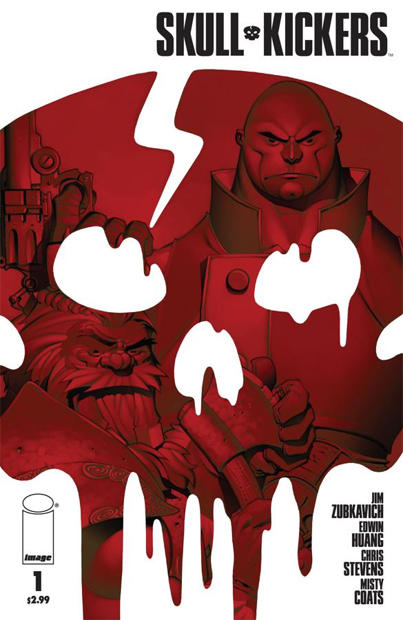
SKULLKICKERS #1
Written: Jim Zubkavich
Illustrated: Edwin Huang, Chris Stevens
Publisher: Image Comics
Reviewer: Optimous Douche
From 2007-2009, I would close my eyes each night and SKULLKICKERS would run through my head over and over again. “How could this be Optimous? The book just hit the shelves today you fucking idiot! ” Well my little comic fan, you see, I’m partially schizophrenic and I’m an only child. This double-trouble combination of solitude and voices running through my head has set a life-long pattern of not just playing with toys and games, but crafting full epic stories around these play-time activities. This was even the case with my two year World of Warcraft addiction. Each night I, the hulking heart-of-gold monk, and my cousin, the drunken surly dwarf, would shun instances and quests in favor of exploring the world and fucking with the masses therein. SKULLKICKERS embodies every bit of that fantasy world we created, right down to SKULLKICKERS’ two main characters being a surly dwarf and a calm yet still ass-kicking monk.
Also, just like Warcraft, SKULLKICKERS is a thematic amalgam of almost every geek trapping that sets our Twitter feeds atwitter. Aside from being exceptionally written and drawn, the greatest joy in SKULLKICKERS is that you never know what world you will be thrust into when you turn the next page. Just when you think things are going in a D&D direction, someone pulls out a “Pirates of the Caribbean” style sidearm. Just when the language leads you to believe you are in middle-Earth, sarcasm oozes out of the next dialogue bubble. Even the presentation makes you go WTF, but in a grand and glorious way. The first insert page (or it could be the cover, forgive me for having to live my life in preview PDF versions of books) is an homage to the days of Kirby: complete with a frayed treatment of the cover so it looks like it has been tucked inside a long-box sans Mylar for the past thirty years. Even the cover price is tabulated in cents instead of dollars. This homage alone lets you know you are reading a book for comic fans by comic fans…and what follows continues to raise that bar even higher.
I would like to introduce you to the protagonists of the book, but we never learn their actual names. That’s OK because Zubkavich does such a masterful job of fleshing out their personalities so that just like a one-night stand; names simply aren’t important. I truly wasn’t kidding in my Warcraft tale; on one side of this head banging partnership we have the surly dwarf filled with the same Napoleonic rage as a short man drunk in a bar. This little fella is pure id, a testosterone filled rage machine ready to rumble even in casual conversation. On the other side of the equation, adding a much needed Zen balance to the team is what I can only call a monk at this point. For those that don’t frequent the world of D&D or its copycats, a monk is an ass kicker that only pulls out the fisticuffs when necessary. Now, I’m calling him a monk, but keep in mind this was never implicitly stated in the book itself. But show a dork a bald pacifist that can kick ass when necessary and that dork will either say monk or Jean Luc Picard.
Set within a sleepy hamlet our two protagonists open the tale battling an overweight werewolf. Within two pages, we learn everything about our star players. This is simply good storytelling and good comic crafting. Writer and artists meld their skills to let this opener deliver the exposition in a fun light hearted manner, never trying to overproduce the words or the art. All too often with new titles we are laden with so much explanatory text you feel as though you are reading stereo instructions. Our dwarf simply relies on brute force and a cunning mouth; our monk uses tactics and his brain to defeat the nefarious beast. One well pieced of silverware within the beast and we flash forward to tomorrow.
All right, I’m not going to give away the whole book because everyone who loves comics should buy SKULLKICKERS (assuming you can find it, I’ve already heard rumblings of a shortage). Let’s just say the rest of the book exponentially picks up the momentum of the first few pages from both story and art perspectives. Zubkavich continues the tale by introducing pompous aristocratic foils that are trying to unravel the assassination of a lord (a funny and gruesome assassination I might add). Obviously our dwarf and monk are the only two men for the job. The art continued to dazzle me page after page; again I have to invoke Warcraft because this is how I always imagined the game were it not done in CG. Huang and Stevens also remember that backgrounds, especially when you are introducing a new world to readers, are almost as important as the characters those backgrounds are built for. These guys succeed in spades on pacing, structure and the sheer beauty that can be the comic medium when done correctly.
How much did I love this book? Well, I will be doing an Optimous first in my three plus years of reviewing. Normally I skip buying issues I get as PDFs simply so I can divert those funds to a book I haven’t read yet. Not the case here…I want...no…make that…need a copy of this book in my hands. Reading PDFs sucks ass and I would be doing myself a grave disservice to not experience this book as originally intended.
Until the book SKULLFUCKERS comes out, SKULLKICKERS will remain my favorite book with word skull in the title.
Optimous has successfully blackmailed fellow @$$Hole BottleImp into being his artist on Average Joe. Look for Imp's forced labor on Optimous brain child in mid-2011 from COM.X. Friend Optimous on FaceBook to get Average Joe updates and because ceiling cat says it's the right thing to do.

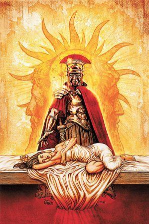
IDES OF BLOOD #2
Writer: Stuart Paul
Artist: Christian Duce
Publisher: DC WildStorm
Reviewer: Lyzard
Too many words! That was my first thought reading the second issue of IDES OF BLOOD. Last time I complained that the comic was too wordy, more prose than action. Nothing has changed between issues. I didn’t see any improvement in the artwork either. It is possible that nothing was altered between the two books, in either the amount of words; written or the style of the art, and that I have just grown tired of this particular comic too quickly.
IDES OF BLOOD #2 picks up soon after where IDES OF BLOOD #1 left off. Our “hero”, the vampire Valens, brings in the supposed Pluto Kiss Killer. Caesar then promotes him to senator, the first vampire ever to receive such an honor. Just as Valen’s “life” seems to be moving along, he is framed for the murder of his master, Caesar. Now he is on the lam, attempting to clear his name and find the true killer of the Emperor.
Story-wise, I found this issue much more interesting than its predecessor. The writer didn’t have to spend the whole time setting up the world and characters and instead could jump and stay right in the action. That being said, I find the first page to be a real turn off. About twenty speech bubbles, all in one page, filled with flowery dialogue. I have always been in the camp of less is more, but apparently Stuart Paul is not of this belief. He gives his characters monologues. Again, if this was based on Shakespeare’s Julius Caesar that would work, but it isn’t. Also, though it never references Willy’s work, there are numerous other allusions like in the last book, but this time with erroneous connections. Aphrodite is a Greek goddess, not Roman. To use her name while using the Roman name of Hades (Pluto) seems to be inconsistent to me.
As for the artwork, again many reds, but also several shades of orange and much black as well. Sometimes it was too dark, difficult to tell characters apart. I blame this both on the character design and the colorization. Also, several lines of dialogue seemed to be put with the wrong person, making the comic hard to follow. Particularly on page two, where Cassius and Antony are talking, it was difficult to decipher who was supposed to say what despite the speech bubbles. I will have to say that there are some nice visual cuts from panel to panel, with similar yet different enough drawings. The biggest problem I have is how human the vampires look. Now, I’m a vampire fanatic. I know the range of looks they can have. I’m not asking to go so far as Radu in SUBSPECIES, but maybe a little something like LOST BOYS or BUFFY when they vamp out. In IDES OF BLOOD, the only way you can tell who is a vamp is from their just protruding fangs. You can’t tell in the eyes or anything else, just the fangs which do not always appear. It’s just like Milla Jovavich in ULTRAVIOLET; they are not always there.
I cannot say if IDES OF BLOOD #2 is an improvement over the start. For everything I found better, I found something else to disappoint me. I love ancient Rome and vampires so this comic should be knocking me out of the park, but it isn’t. Instead, I feel the need to not read anything for a while after it, so that my mind can absorb all the wordiness from the comic.

HOWARD LOVECRAFT AND THE FROZEN KINGDOM OGN
Writer: Bruce Brown
Artist: Renzo Podesta
Published by: Arcana Studios
Reviewed by: BottleImp
The downside of being an H.P. Lovecraft junkie is that after awhile, the majority of Lovecraftian fiction (whether prose, film, or in graphic form) tends to blend together into a vaguely noxious stew of moldy old books, gibbering monsters just outside the human mind’s ability to comprehend, and tentacles, tentacles, tentacles. Sometimes—mostly after reading some half-hearted pastiche that manages to include every hoary cliché, right down to the chant of “Cthulhu f’tagn”—I think that the only reason I keep on sloughing through the genre is to find those rare gems of work in which some new twist has been added to the Lovecraft Mythos. With HOWARD LOVECRAFT AND THE FROZEN KINGDOM, Bruce Brown and Renzo Podesta have given the Old Gent a spin that I never in a million years would have thought would work: HPL and Cthulhu as a Boy and his Dog. The end result is not entirely successful, but there are still some good things going on here.
For the first sixteen or so pages, the story is a pretty much by-the-books blend of horror and suspense, as a young Howard Philip Lovecraft visits his father in a lunatic asylum and is admonished to destroy a certain evil book that his father wrote. Naturally, upon returning home that night young Howard proceeds to read the forbidden book (disregarding dire warnings in the best Lovecraftian fashion) and is transported to the Frozen Kingdom, where he is immediately set upon by a tentacled monstrosity that bears more than a passing resemblance to HPL’s infamous Elder God. Like I said, all very by-the-book. But here’s where the comic strikes out for new ground.
The tentacled creature does not kill Howard, but rather has its life saved by the boy, thus becoming Howard Lovecraft’s servant/friend/pet (even to the point of Howard dubbing the creature “Spot”). From here on out, the book takes a much lighter tone as Howard and Spot continue their adventures in the Frozen Kingdom of R’yleh.
That’s right, the Kingdom is the same sunken city named in HPL’s “The Call of Cthulhu.” There are more Lovecraft references sprinkled throughout the comic: the boy king of R’yleh named Abdul, Dagon, even the way in which Howard is transported from his bed to the Frozen Kingdom brings to mind stories from Lovecraft’s “Dream Cycle” such as “Through the Gates of the Silver key.” But these references are more like seasoning to enhance the flavor of the story, and Brown neatly avoids the trap of going overboard with the spices.
Where this book falters slightly is in the uneven blend of humor and horror. There are certain aspects of both that shine; the dynamic between Howard and Spot is genuinely funny and warm, and the scenes of more traditionally Lovecraftian horrors are depicted well. But side-by-side, the two attitudes don’t quite gel. It’s tough to get that mix right without seriously overbalancing in one direction—offhand, the best successful example I can think of is Jeff Smith’s BONE—and while FROZEN KINGDOM never falls flat, this dichotomy of tone keeps the story from achieving its full potential.
This division is mirrored by Podesta’s artwork. His creatures are wonderfully drawn and crackle with energy, but his human figures are less effective. The cartoony style in which he draws Howard is especially frustrating in that the face changes drastically from panel to panel, sometimes looking well-drawn and “on-model,” but at other times looking not so much stylized as clumsy, and on a few panels even Muppet-like. When Spot and the other horrible creatures are rendered so well, I wish that Howard had been given the same care and attention.
Even with these shortcomings, FROZEN KINGDOM still gets a good grade from me based solely on the fact that it’s something different bobbing on the sea of Lovecraftian dreck that permeates the horror genre. If you’re a licensed Lovecraft lover like myself, this comic is definitely worth checking out.
When released from his Bottle, the Imp takes the form of Stephen Andrade, an artist/illustrator/pirate monkey painter from the Northeast. You can see some of his artwork here. He’s given up comics more times than he can remember. But every time he thinks he's out, they pull him back in.

GREEN LANTERN: EMERALD WARRIORS #2
Writer: Peter Tomasi
Art: Fernando Pasarin
Publisher: DC Comics
Reviewer: Henry Higgins is My Homeboy
Why does it always have to be snakes?
EMERALD WARRIORS is an interesting book. It has some concepts and scenes that are brilliant, while others seem tired. By virtue of the quality of the book, the series is off to a good start, but it may need some new ideas to really stand out.
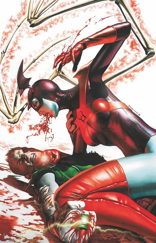
Writing (3/5): The issue also does a small splinter off to look at Arisia and her lingering guilt over Sodam Yat. The scene plays well, with her nightmare over Sodam returning playing out well. The Guy scenes are lacking, mostly because they don't add a lot to the book. Guy is curious as to what he'll be remembered for, because he's about to do something questionable. Unfortunately, that was the crux of the first issue, so it just seems overstated here. Killowog’s moment with a new fawning rookie is well done, and I'm excited to see more of Killowog in this light. The scenes featuring Sodam are very hit and miss, with portions of it (the snakes stealing the minds and eyes are thoroughly creepy), while others...aren't (the base motivation speech is nothing special).
Art (5/5): The artwork is top notch here. Fernando Pasarin is utterly brilliant in this issue. The nightmare sequence is brilliantly drawn, especially the page spread of Sodam exploding. It's horrifying. When Pasarin wants to get scary or creepy; he pulls it off extremely well. Look no further then the mind snakes, which are incredible and very very VERY offputting (but then again, I fucking hate snakes, so that might be it.). The faces stand out, especially Killowog in his scene with a new rookie.
Best Moment: I love Salaak. He gets maybe three lines, but that's more then enough.
Worst Moment: Guy essentially repeats what he said last month, which is a bit annoying.
Overall (4/5): A solid book. Here's hoping it stays on this high run.

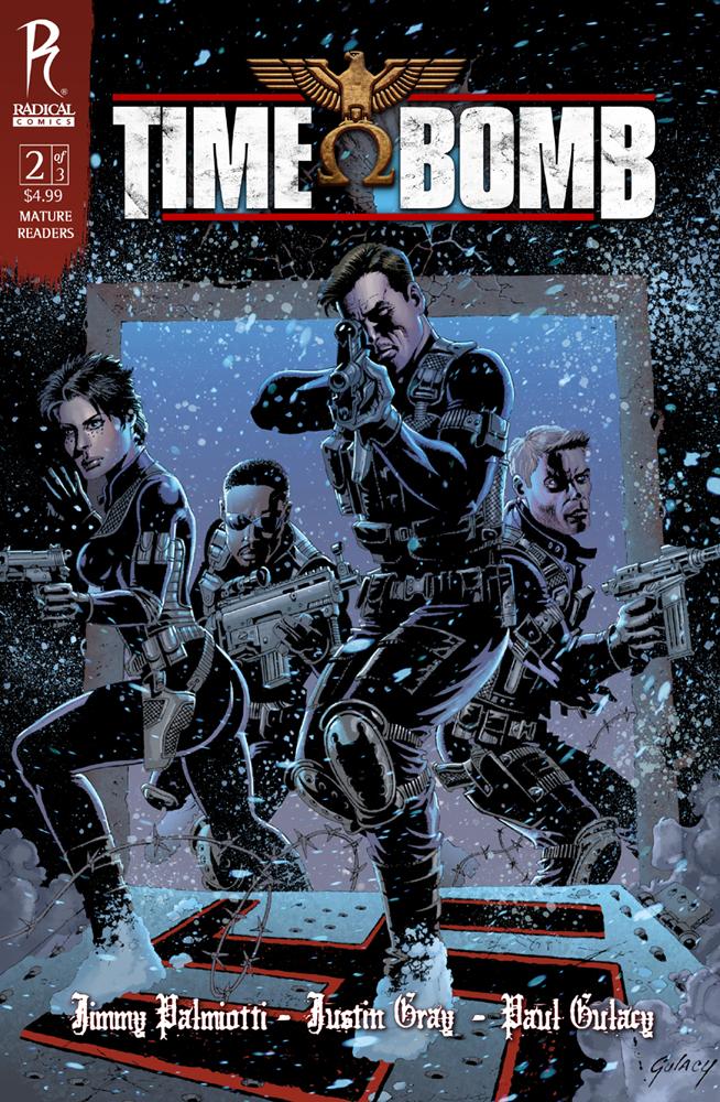
TIME BOMB #2
Writers: Jimmy Palmiotti & Justin Gray
Artist: Paul Gulacy
Publisher: Radical Comics
Reviewer: KletusCasady
I mostly picked up this comic for two reasons: the first is that Paul Gulacy is doing the artwork and I’m a big fan of his. The second is that I wanted to review a book that few people are thinking about…now the second reason would have panned out except for the very final page of the book that has a quote from AICN, obviously indicating someone else has reviewed the first issue thus making my attempt to pick something a little more obscure null and void; I’ll have to dig deeper next time. Well I’m here now so I might as well tell ya’ll what I think. I chose not to read the first issue even though I’m pretty sure we have it in the shop but I thought I’d try this issue by itself in order to see if it could stand on its own legs without the crutch of previous issues to help it along.
The issue starts off with a bang literally as a group of 3 armed men and 1 woman infiltrate a Nazi concentration camp in what I believed to be a very general heroic liberation of prisoners by a few brave souls (not that there’s anything wrong with that). Then we learn that wasn’t really their main mission and they must press on towards Berlin. After the first few pages we get some pretty good characterization that lets us know what kind of folks we’re dealing with and that they’ve probably been working together a while. This issue is great in building tension and I found my self immediately concerned with this group of folks even though I had no idea what they were up to, however they were shooting Nazis which made it easy to be on their side. This book takes more turns than the “Houston 500” and with every few pages there’s a new challenge for these characters to over come. The best thing a single issue of a comic can do is not only keep you invested in the story but make you want to track down the previous issue (or issues) as well as anticipate the next issue and this comic did both. I won’t reveal the whole thing behind this story but I image that if you read the first issue you already know. Even though I’d like to read the first issue, I really don’t think it’s necessary. This isn’t to say that issue is bad but this one gives you all the tools you need to be invested in this story. In this issue, we don’t who these people are or who they work for but does it really matter? I actually wish more comic book movies would start the way this issue does, already engaged in action and allowing the exposition and story give you the background information, rather than having to waste an entire movie on an origin story.
Anywho…the art in this book is great but I’m also a huge fan of Paul Gulacy. He draws the creepiest looking people and it’s mostly the eyes and they way they bulge and seem to be cutting the page and looking directly in to your tattered soul, we’ll at least that’s how I felt. The only other artist working now that I can compare him to is Eduardo Risso (100 Bullets) mostly because of the way he draws his eyes in a similar manner as well as the use of shading on or around the face to show a deeper or more intense moment. I also like Gulacy because while most of his panels are pretty straight forward, there are some pages (like page 26…Mexican standoff) that look really awesome in an overlapping style that gives you a good 360 degree idea of what the writer is trying to show the reader.
This issue is really good and I couldn’t help but think this would make a cool low budget movie and the way their pumping out movies from comic book properties, I supposed that’s not too far fetched. Palmiotti, Gray & Gulacy are some damn good story tellers and know how to get a reader not only invested in the story but produce cool moments that keep the action flowing. Gulacy’s contribution to the book is really the icing on the cake because up until now I really haven’t felt much of the art that has come out of Radical comics. Most of their stuff is Clayton Crain-ish (not a fan), where it looks badly computer generated to the point where I’m immediately turned off and don’t end up giving the story a chance. This issue is great and if someone explained the story to me I’d probably pass but I’m glad I picked this up and actually read through it and that’s mostly due to Gulacy’s on the art. I agree with the review of issue #1 that this seems to be the best book/ highest profile book Radical has put out thus far. None of the previous Radical books have really piqued my interest even though I’ve thumbed though most of them. TIME BOMB definitely has my attention (maybe it’s the piles of dead Nazis) and I definitely planning to read the next issue.

THE MIGHTY MEAT GAYZER #1
Writer: Josh “Bile” Cantrell
Art: Brian Myers
Publisher: Creator's Edge
Reviewer: Mr. Pasty
In SUPERMAN: RED SON, the man of steel crash lands in Ukraine instead of Kansas and hilarity ensues. Well, not really, but it’s interesting to ponder the fate of our favorite superheroes had they been born under (or for) different regimes. That’s the premise for THE MIGHTY MEAT GAYZER, a parody of many things super, including Lois Lane’s cream machine in another bizarre offering from Creator’s Edge Press.
Meat Gayzer is the son of King Teste, who must put the little lad in a meat-shaped ship and send him off to earth to save him from the attack of Queen Cockburner, who fired her Estrogentomic missiles at the Gayzer planet and blowed it up real good. Lil’ Meaty lands in what looks like San Francisco and gets adopted by a pair of heavyset lesbians who rally against skirts in the workplace. Don’t ask.
So as luck would have it, Mom and, uh, Mom, get gunned down Uncle Ben style (Parker, not the racist rice). As Meat becomes a man (complete with square jaw and five o’clock shadow), his powers begin to develop and in order to fight crime he must hide himself from the world by masquerading as a lowly hot dog vendor named Ricky Rodlog. Meanwhile, Queen Cockburner has managed to find her way to earth to exact her revenge. Fortunately for her she doesn’t need to break out of a plate-glass prison first but how will she deal with Meat’s new powers? For those of you keeping score at home, his hidden fortress is called “The Glory Hole.”
If none of those silly details or sexual innuendo appeal to you, then THE MIGHTY MEAT GAYZER probably isn’t for you. Well, I should say it definitely isn’t for you. There’s nothing here that I would consider laugh-out-loud funny -- nor do I think that was the intention. It’s an amusing take on the superhero genre and offers plenty of gratuitous sex jokes/gags including a pin-up of Meat Gayzer tenderizing his chops.
The art is sufficiently ugly, adding to the zaniness of the whole endeavor and while I don’t think it will be cleaning up at the next comic book awards ceremony, it should provide jaded readers with a few laughs as it goofs its way though a series of hokey adventures. It’s worth picking up simply because it’s not like anything else you can find cluttering up the shelves these days. That’s a recurring theme with Creator’s Edge Press, and one I’m growing quite fond of.
Web heads who can’t get enough of Mr. Pasty’s word vomit are encouraged to watch him operate as Nostradumbass over at MMaMania.com here. Love, hate and Mafia Wars requests should be directed here.

THE UNWRITTEN #17
Writer: Mike Carey
Artist(s): Peter Gross and Ryan Kelly
Publisher: Vertigo/DC Comics
Reviewed by Humphrey Lee
You know that “Holy Shit! That’s Brilliant!” moment that every great comic has to make you realize it is just that great? Well, actually, there have been a pretty good amount of those so far for THE UNWRITTEN, but this trumps them all for sure. Carey and Gross (and LUCIFER cohort Kelly) have outdone themselves this time, playing not only with the comic book format but also with a literary device dear to the child in us all.
Maybe it has something to do with expectation; due to my being really busy in my home life – full time work, just got hitched (and she likes comics!), working on my MBA, etc. – I’ve been finding myself only getting to the LCS a couple times a month. This time around, I had roughly 30 books to read this week because of this hair-pullingly (if I still had hair) frustrating schedule. You know what happens when you read almost three dozen books in a couple days? You realize how damn by the numbers some of them tend to be each month. So, when something like this issue comes along, already having a fantastic pedigree of being one of the best new titles the past couple years, but also with an exciting, excellent play on the format, that will really wake you out of your meandering stupor.
So, yeah, the gist of this issue was that it was a “Choose Your Own Adventure” tale. Three paragraphs in, you figure you should mention that. In getting close to two decades now of reading comics, I can honest to god say this is the first time I have seen this in play. You’d figure it’s a no brainer right, but that’s the glory of it as you play along, because once your brain starts to wrap itself around pulling off this motif in the comic book format, well, my hat’s off to Carey and Gross. They truly are a pair of mad genius bastards. It’s one thing to set up that story in general, giving enough variation in the story to make it worth going through once or twice - a luxury this format sadly did not give much leeway with, but it was enough – but to also incorporate the elements we’ve grown accustom to with comics, I’d have to assume is kind of logistically daunting. And bold, considering how it was done in this issue – with two pages of this “adventure” per page of comic, done horizontally, and that you would go into this knowing people would be seeing multiple pages at once. You have to be extra engrossing to keep the attention of the reader, so as not to totally shatter the illusion, and it worked remarkably well for what it was.
Not only was this just a plain old good time, and a somewhat nostalgic one at that, it was also very relevant to what Carey and Gross are doing here, and true to the literary tapestry that THE UNWRITTEN is. We got a significant amount of character work in here, as this mystery adventure went to great lengths to unravel the background of key character Lizzie Hexam and her relationship with lead Tom Taylor and his father. And, making use of all its extra pages, it continued the plot forward as well, getting the band back together so to speak so the story can thankfully progress. Not that I find anything going on right now terribly boring mind you, but I tend to get tired of the “filling in the gaps” issue followed by the “now lets get on with it” issue. Having both knocked out at once, and in such a delightful fashion, well, it’s a shining example of why this is easily one of the best things I am getting in each month. The fact that with three dozen books I could have talked about - all really good mind you, I like to think I don’t buy “bad” books - this was really the only one that warranted rambling praises over for near 700 words. THE UNWRITTEN is everything for the jaded comic book soul wrapped in an adult version of everything about the Harry Potter ilk that makes us feel like kids again. Sick, sick kids that probably should be psychoanalyzed, but kids nonetheless, and it is glorious to behold.
Humphrey Lee has been an avid comic book reader going on fifteen years now and a contributor to Ain't It Cool comics for quite a few as well. In fact, reading comics is about all he does in his free time and where all the money from his day job wages goes to - funding his comic book habit so he can talk about them to you, our loyal readers (lucky you). He's a bit of a social networking whore, so you can find him all over the Interwebs on sites like Twitter, The MySpaces, Facebookand a Blogger Account where he also mostly talks about comics with his free time because he hasn't the slightest semblance of a life. Sad but true, and he gladly encourages you to add, read, and comment as you will.

AMAZING SPIDER-MAN #643
Writer: Mark Waid
Art: Paul Azaceta
Publisher: Marvel Comics
Reviewer: Henry Higgins is My Homeboy
But you're not supposed to be thick anymore!
The next part of "Origin Of The Species" follows up on last issue pretty closely, in the sense that it's not very good. The story is slow and it's only the second issue. While it is better then the first part, it's still not good.
Writing (2/5): There's not a lot to say about this issue’s writing that I didn't bring up last issue. The humor (or moreover, attempts at humor) are weak and fall flat. "Baby's first bob and weave" is the best line. Yeah. Inconsistencies and logical problems persist throughout the book. The army of villains decide to watch Doctor Octopus hold some people hostage, instead of help get rid of Spider-Man or anything. And Electro threatens to blow up a hospital. Wasn't he a street level folk hero a couple of months ago? Even if we know he wasn't, the people of New York don't. You'd think he'd be smart enough to not burn that bridge, though Spidey does utilize his intelligence to beat Sandman and Electro, which is always a plus.
Art (2/5): The art in here is better than last issue. I maintain, though, I'm not a fan of how Azaceta's art--especially how he does faces and bodies. But the shots he provides for Spider-Man webbing around town are pretty cool; notably, the page where Spider-Man falls back from the helicopters and swings away. But there's no improvement on the people out of costume. They either look incredibly weird (like Carlie), or not like faces at all (MJ in the opening page).
Best Moment: "Yoink!" actually being a sound effect. Not as good as THE INCREDIBLE HERCULES’ sound effects, but worth a laugh.
Worst Moment: We've spent the last year or so of Spider-Man doing the Gauntlet, upping the villains threat levels, powers, and brains. And now they're back to being thick. Great…
Overall (2/5): The book: while marginally better then it's predecessor, ASM still isn't a good read. It could and should be better given the creative team, which is the most annoying part.

BOKURANO: OURS Vol.2
By Mohiro Kitoh
Released by Viz Media
Serialized online at Sigikki
Reviewer: Scott Green
If you connected the dots between the two Mohiro Kitoh manga released in North America, BOKURANO: OURS and SHADOW STAR/MUKURO NARU HOSHI TAMA TARU KO/NARUTARU, the picture that immerges is that of a manga creator who cracks popular anime/manga formulas with the sledge hammer of violence afflict by and to children.
In this case, "sledge hammer" is not necessarily intended as a negative assessment. It's not so much a lack of subtly as it is intent to catch the audience in the impact.
Mohiro Kitoh's MO has a cruelty to it. He employs an instantly recognizable, distinctive approach to stylizing his characters. Beyond the expected simplified abstraction, body shapes are fairly realistic. However, with the exception of emphasized contrasts, the forms have childlike litheness... as if none of preteen/teens subjects overeat. For example, One of the cast engages in manual labor, so he has slightly more pronounced shoulders and larger arms on a body that is as far from action hero build as your average school kid's. This thinness can convey youthful innocence, but it also conveys vulnerability. The slight physically is a tenant of the operating principle of Kitoh manga. Sell the reader on something tangible... limbs and postures that are reminiscent of a real people. Then, exploit that empathy. Working from that, Kitoh aims to hit hard and takes no chances in making his manga affecting.
15 children, almost all adolescents, take an educational summer outing to the sea side. There, they wander into a cave in which a strange man sells them on testing out a game in which they'll be mecha heroes. "Pilot a giant robot to defeat enemies! The planet Earth will be attacked 15 times! But a giant robot will rise to Earth's defense! A black colossus! Layer upon layer of armor! Unparalled strength! An indomitable goliath!" The man, later given the moniker Kokopelli, doesn't exactly win over the crowd with this speech, but he does manage to get them to put their hands to a contract.
An expression of mixed relief and regret crosses his face as he passes the work of guiding the crowd onto a a floating, grinning mascot creature called Koyemshi (dung beetle). Evangelion flipped the act of piloting a giant robot, making it a burden rather than an empowerment. Even in that light, the toll of piloting a robot in BOKURANO: OURS is remarkable.
Kitoh has expressed some interest in giant robot material, and he pulls off a remarkable sense of scale. These are true city topplers engaged in titanic duels. But, here, even more than in a work like Neon Genesis Evangelion, the mecha trappings are an means an not and ends. The manga's not even really a commentary on the genre. The genre is an instrument. Kitoh is not so much deconstructing the giant robot story as using it as an industrial grade excavation devise to drill into human nature.
If there is a manga/anime story telling crutch that Kitoh's unscrewing, it's the explaining the deployment of personalities through single, identifiable defining factors. Think of the manga you've seen in which one trauma explains nearly everything about how a character developed their personality.
BOKURANO: OURS has a large roster of characters, but one child pilots the robot at a time, and when they do pilot it, it's them alone. It's one on one, like an individual sport. In front of their peers, In a cityscape ring, they alone are responsible for besting their foe. Kitoh works from how stressful and revealing that sort of one-on-one match can be. In stepping into the conflict, for the most part metaphorically, this cast is laid naked as they're forced to put their lives on display in front of the rest of the pilots.
For example, the children are taken into the cockpit of their giant robot, which has been outfitted by chairs from their bedrooms. In that moment, the self conscious teens lose the ability to hide details about their lives from each other. Their economic situation and home lives are opened up. On has an executive chair... another has a floor cushion... "pretty ghetto man!" "what kind of life do you live anyways?"
The pattern that the manga has settled into by volume two sees about three chapters dedicated to each child as they're thrust into the pilot chair. It opens with the circumstances in which the character lives, offering a window into their world view. Then, piloting the mech proves to be a defining challenge. It magnifies their behavior to giant robot scale and puts on onus on them to act out their views with lives on the line.
In BOKURANO, the crux of how the characters define themselves and approach any given challenge is shaped by their family, or more specifically, their parents. A father is a merciless executive; a father is missing, leaving care of the younger children to the subject; a mother unapologetically supports herself through prostitution. Beyond being stuck with the momentous burden of piloting the mech, they all believe that they are making their own decisions. And, they are. Yet, their parents inform every aspects of these subjects' lives, from the chair they sit in to how they sit in it.
For anime/manga, these aren't new situations and they aren't new character types. Prostitute mother, associated alienation. Been done. And, three chapters doesn't open the manga to long, developing explorations of multiple facets. But, that's the grist that Bokurano needs.
Popular, successful manga work formulas while attempting to keep their characters interesting. The mechanisms are arranged to keep the reader involved. Bokurano, which runs in the more creative freedom driven anthology Ikki, turns that on its head. It makes it a point to be hard on its audience. It's more interested in working the characters than working the attention maintaining formula. Kitoh gives all appearances of taking the characters seriously, with aims towards significantly testing them. Cast members are not catalysts in this process. Kitoh has no compunction against grinding them up in the process. In fact, he sets out to do just that, inflicting memorable bruises on the audience along the way.
An adolescent’s idea of how the world should work and how they should behave in that world acts as one gear, grinding against far more terrible plot machinery. That it is forced and that the whole giant robot business is a conceit is leveraged in putting an edge onto the jaggedly sharp character studies.
BOKURANO: OURS moves from one character's view to another, seldom validating or invalidating any. By its unfair design, there is an extent to which what the characters think doesn't matter. Yet, it is not as nihilistic as it might sometimes sound and might sometimes seem. Nor is it tragedy porn. While Bokurano is not classifiable as horror, like a lot of horror, it is in part an exercise in masochism on the part of the reader. The question is, towards what end? There is credible seriousness here. Kitoh is careful to make it all cohere. Every detail about the characters is complementary in illustrating who they are, and it is possible to get caught up in their stories. Still, towards what end? It's the Icarus factor in evaluating manga. The more apparent ambition the manga has, the more scrutiny it invites. I've been told that I'm too critical of Hiroki Endo's EDEN IT’S AN ENDLESS WORLD, and that's because I think the violent, political sci-fi has remarkable ambitions. I don't think BOKURANO is just indulging in an exercise in trampling everything under a giant robot's feet. With the heaven weigh of its premise defining the parameters, as staggering as its character based stories can be, if the pieces don't have some cumulative significance, the pieces will not be enough. It is set up in such a way as to need its own point of view, and so far, no such statement has emerged.
Scott Green has been writing for AICN ANIME for over nine years. If you like what you see here and love anime & manga, be sure to check out his latest AICN ANIME column every week on AICN.
Hey folks, Ambush Bug here with another episode of Indie Jones. This week, my pal, Imp, checks out a little indie, then I come back with a pair worth seeking out. Enjoy!

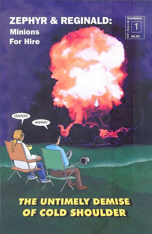
ZEPHYR & REGINALD: MINIONS FOR HIRE #1
Dandelion Studios
In spirit (and especially in the first issue, which reads more like a collection of one-page gags than a plot), this comic reminds me of TOO MUCH COFFEE MAN and other semi-underground humor strips. The jokes that come from the titular duo as they slave away in the laboratories of various supervillains range from the groan-inducing (while employed by the frost-themed Cold Shoulder, Zephyr and Reginald assault the reader with a barrage of temperature-centric puns) to the pretty funny (Zephyr discovers superheroine ‘Lectric Lass’ secret identity but is unable to tell his employer what it is—not because of any secret reason, just because he doesn’t know how to pronounce “Grzywynski”). The downside to this series is the artwork, which also brings to mind the underground comic strips, but for all the wrong reasons. I wish that the art was a little less “middle school sketchbook” and a little more polished, because that would really go a long way towards selling the humor. You still might want to check it out if you’re in the mood for a lighter look at the world of super-villainy. -BottleImp
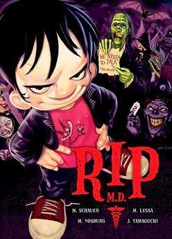
 RIP MD is near perfect. I say near because the art is fantastic; with original and distinct designs that border realistic and cartoony, with the best qualities of both carrying a jovial wit, which never baulking on making the subject matter truly scary. And the story by Mitch Schauer is told in a clear and concise manner, taking on a sort of fairy tale tone in the beginning that sort of fades by the end. The book on the whole is kid-like in tone, but told with sophistication that one used to see in old Loony Tunes. Yes, near-perfection is this story centering on a small child who isn't scared of monsters; instead he sees them as in need of help rather than decimation. I say they near perfection because a book that stars a kid providing counseling for monsters should pay a little more attention to how therapy works. Having more than a passing interest in psychology myself (I'm a licensed professional counselor when I'm not doing this comic book thing), I found this book to be a missed opportunity. Had he creator done a bit of research and used a bit of psychological theory in this story it would have given this story a little more heft. As it reads, it feels more like a well filmed/well acted TV show set in a hospital, only the writers / director / actors didn't know anything about medicine. This is a fun rompy adventure, drawn beautifully, but lacking in substance. Hopefully, if there's another volume of RIP MD, the creator will do a bit more research and have his monster counsellr do a bit more counseling. - Ambush Bug

HARBOR MOON OGN
By Ryan Colucci & Dikran Ornekian (writers) & Pawel Sambor
Arcana Studios
I've got to give this book props for not telling your typical run of the mill werewolf story. The framework here is part noir and part Western as a stranger walks into town in search of the man who hurt his paw...(get it? werewolf story? shot paw...ohhh, nelly, I need a drink...). This is a nice genre mixing story where familiar aspects of horror, Western, and noir are dusted off and made new again by mashing them all together. This 100 + page is well paced and I was surprised how fast I whisked through it. Artist Pawel Sambor does a pretty fine job with mixing computer enhancements with his sketches though sometimes Sambor's characters look similar to each other. He makes up for it in spades when he draws the werewolves in all of their hairy and toothy glory. All and all, this is a refreshing take on the lycanthrope genre. - Ambush Bug
Editing, compiling, imaging, coding, logos & cat-wrangling by Ambush Bug
Proofs, co-edits & common sense provided by Sleazy G
Ad by Prof. Challenger


 And that's my main criticism of all of these THOR books. If there are going to be this many books out there on the racks with THOR in the title, it would benefit Marvel to have some kind of staff meeting or icon indica or something to understand just how all of them fit rather than just putting them all out all willy nilly and leaving it up to the reader to figure out how it all fits together. Sure some might say, "Who cares?", but if I spent half the issue in more than one of these comics trying to figure out which Thor this was exactly, I'm sure others have faced this quandary as well. One would think a simple explanation or caption box at the beginning saying this is a kid-friendly "Marvel Adventure" story, or a "Tales of Asgard" times-past story, or one steeped in current continuity would help folks like me who would like to know how it all fits before buying it. With Marvel's obsession with labeling their titles with "Heroic Age" and "Siege" and the like, you would think they'd want to do something like this to clear things up for a market that is hard to gain attention in anyway.
 Aside from that, one thing is for sure, folks at Marvel understand how to make a good Thor story and what Thor is all about. Each of these comics acknowledge the character of Thor, his strengths and weaknesses to one degree of effectiveness or another. Thor's daddy issues are on the forefront of most of these stories, and while I find that a fascinating subject, one may argue that it's one that may get a bit old, especially if there are twenty titles on the stands dealing with the same issue. But each of the four books I looked at today have their strengths and tell the take of the Thunder God from distinct angles, which is appreciated by this Bug. While Langridge's THOR THE MIGHTY AVENGER's strengths lie in the writer's flair to tell a fun all ages story, Milligan's THE RAGE OF THOR acknowledges the complexity of the character for the more sophisticated crowd. For the newbs who first heard of Thor from the leaked comic con footage for the movie, I can see where something like Glass' THOR: FIRST THUNDER origin retelling would be worth checking out, while long-time readers may find it repetitious and unnecessary. And for those of you who just want to see Thor kick @$$, you can't go wrong with THOR: FOR ASGARD's brutal imagery and dedication to the barbarism of both Thor and the world of Asgard.
  So I guess there's a Thor for everyone here out on the stands right now. Marvel is the king of hype and over-exposure so expect more THOR-related material over the next year. If they keep making it at this quality, though, it looks like I'm going to be checking out a lot of it.