| #12 | 8/11/10 | #9 |
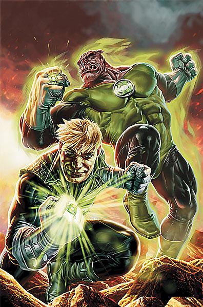
GREEN LANTERN: EMERALD WARRIORS #1
Writer: Pete Tomasi Art: Fernando Pasarin Publisher: DC Comics Reviewer: Henry Higgins is My Homeboy
Let's play good cop, bad cop, giant space monster from hell cop.Coming out of “Blackest Night”, we've had the(admittedly huge) cast split into three separate series. GREEN LANTERN still focuses on Hal Jordan and his recruitment of the various other Guardians, and CORPS still centers around Kyle and the events surrounding the low level Lanterns. With WARRIORS, we have the introduction to Guy Gardner’s arc which, if it weren't for Larfleeze, would be the most interesting part of the Green Lantern universe. The lead off is strong, if a little slow. It introduces the aspects of the series, the basic tone of the run, and sets up plot threads to be followed up on later. It's may not be magnificent, but it does everything a first issue should.
Writing 3/5: This series seems to be going the CORPS route, and gives us multiple lead characters. Guy Gardner is the main focus for this issue, which is always a positive. Peter Tomasi has a great handle on Guy, and it's obvious why he lifted him from CORPS for this series. Guy was the best part of that run, and he plays up the loud prick role perfectly in this series. He's a cock, but he knows it, and he doesn't much care. At the end of the day, he stands as one of the good guys. But he does recognize the gray area he's entering into, which deeply troubles him. It's a nice dynamic. The idea is that with the right prod, Guy could start to go villainous. Maybe a prod resembling the Red Lantern powers he temporarily picked up in “Blackest Night”, which show up towards the end.
Ganthet joins up, still running about as a Lantern, and will be Guy's partner for this series. Ganthet provides more of the same, still providing the cryptic warnings and all that. It'll be interesting to see his role once the series begins proper. Atrocitus rounds out the main cast, and does his usual song and dance. "The Guardians and their Lanterns will die for their sins", you know the play. It hasn't been played to exhaustion yet, but hopefully this series can introduce a new role for him to play. One page does appear in the middle of the book, really with no context, but it's welcome all the same. It sets up the return of a certain character, who I'm actually excited to see return to play.
The scripting is strong, if a little lacking. Not many stand out lines, though a few do work (notably, a Guardian asking what "Punking" is), but nothing notably bad either. The characters feel spot on, but could use some fleshing out.
Art 4/5: One of the best things about Green Lantern is and always will be the freedom it presents. Space ships exploding, giant green constructs of whatever the artist feels like, it's brilliant. This issue meets up with that quota, giving out an assortment of interesting constructs, and fantastic shots. The scope of everything, the design, it's all fantastic, though some of the finer details, mainly Guy's facial reactions, are a mixed bag. Some work well, while others seem strange and off putting.
Best Moment: The Guardians questioning the meaning of the word "Punking". I just like the idea that at least one Guardian of the Galaxy will seek a definition for this strange word, come across the program, and love it.
Worst Moment: The dark future event Ganthet sees in the Book of Black is Guy and Kyle brawling. Which would be more exciting a prospect if it hadn't already occurred multiple times in the last two years or so.
Overall 3/5: A fairly good start to what is hopefully another brilliant Green Lantern run.
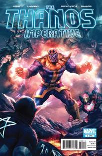
THE THANOS IMPERATIVE #3
Writers: Abnett & Lanning Artist: Miguel Sepulveda Publisher: Marvel Reviewer: JNCNDAC
I can overlook a lot of stuff: my ever expanding waist line, the personal hygiene or lack thereof of some of my co-workers, the United States Budget deficit, the price of tea in China but I cannot for the love of Stan Lee overlook crappy artwork, especially when it takes away from what is another magnificently mighty Marvel entry in a crazy cosmic comic chapter of Thanosian proportions. That’s right, kids -- I am on a rant of ridiculous rapidity.As most of you know by now I love me some Thanos and I love me some old school comic story telling. I love most everything those darlings of demented demagoguery Abnett & Lanning can dish out, but I gotta tell ya, Miguel Sepulveda, your art…how do I put it politely…stinkawiff. Ok to Jar Jar. It’s awful, and so was he so maybe that is a good description; either way it is dreadful, downright rotten. It starts off ok, sorta Gene Colan-ish, but then it gets muddy & heavy lined & don’t even get me started on how this guy draws faces! Abnett & Lanning have been using this every other issue or so, swap out with Brad Walker & Sepulveda, but this time at bat he is striking out big time. It is so bad that I had to go back & check if it was the same artist from the last two issues. It is and I don’t know what went wrong but it stinks and the worst part about it is that I am already 250 plus words into this review and the art is so atrocious I haven’t had a chance to talk about the story, which is great by the way. Please in the name of Jack Kirby get somebody, anybody, except maybe Rich Buckler, to handle the chores next time out.
OK I feel a little better, you? Ok, the story: Lots of good connections to my comic reading past; I am digging that only the android life forms in this Cancerverse are all that is left of its Marvel Age and so are leading the subversive revolt. Of course I have a very large place in my heart for the Vision, so I am enjoying his use. It was way cool to see ISSAC again. These guys must have a man crush on all things Jim Starlin. The fact that they are tying this in to Captain Marvel’s Death is just fantastic, I know it is going to end Marvelously & If they throw in Pip the Troll & the Inbetweener I will die & go to heaven, or a alternate realty inside the soul gem, whatever. If they would just send Sepulveda to another dimension this comic would get a 10 out of 10. As it is, unfortunately the art work is so bad it is to the point of actually diminishing the story because an epic of these cosmic stature demands an artist that can capture the cosmic in ways that are clearly beyond Mr. Sepdulveda’s pencil.
STINK #1
Writer: Chuck Messinger Art: Kurt Belcher Publisher: Creator's Edge Reviewer: Mr. Pasty
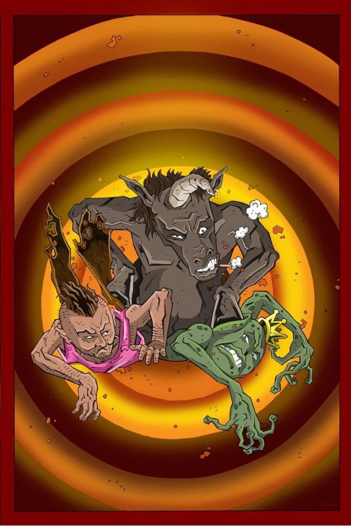
Ever put down a comic and think to yourself, “What the fuck was that?” Only to pick it right back up and read it again cover to cover? No? Well, have you ever done mescaline? STINK is one of those books that comes along way too infrequently. The kind that somehow manages to breathe new life into an industry that consistently pumps old ideas into new art just to make a few bucks by feeding the rag shop grazers. STINK is not a glass of port you sip while watching Skinemax. It’s an ice cold beer you greedily devour after mowing the lawn on a hot day.I’ve always been a huge fan of THE WIZARD OF OZ. Of course I’m referring to the celluloid classic though I hear the allegories in Baum’s 1900 masterpiece are worth exploring. Anyway, STINK is kind of a post-apocalyptic WIZARD, with a couple of eccentric characters trying to navigate their way through a world that doesn’t make a lick of sense. Along the way they meet a collection of zany characters, one more fucked up than the next. What immediately struck me about the direction of STINK is how carefully crafted it is. I mean let’s face it, you’re being asked to commit to a narrative that follows the daily exploits of a shit-talking unicorn, a pixie that looks like Chester the Molester, and the WB frog if he was jacked up on steroids and addicted to porn.
That kind of cast, especially in book one, screams “anything goes,” and for the most part it does. But I mentioned how well it was crafted because I think it’s worth noting that Messinger doesn’t fall into the trap of one-upsmanship. If you open with a trio like the one I just mentioned, it sets the bar fairly high. Where do you go from there? This story could have easily burned itself out by trying to outdo itself with every new character introduction. It doesn’t need to and fortunately Messinger has the restraint to keep this thing from turning into an animated circus or WONDERLAND roll-call. Instead, he introduces his cast and then lets them have the floor for the better part of the book and despite the absurdity of the entire premise, it finds a way to work, mostly because of its ability to connect with the reader.
Part of that connection has to do with the absolutely terrific work of Kurt Belcher. His art is beautifully ugly, colorful and jagged with just enough weight to reflect a world in recovery. I particularly enjoyed his faces as most of them are frozen in some sort of awful state of affliction, which I suppose makes sense under the circumstances. Everything just seems to fit. I would have been so disappointed to see a female heroine show up with big boobs sporting a giant ray-gun because it has no place here. A lot can happen to the world and its inhabitants after a nuclear holocaust and for the sake of this story, a lot does. But like Messinger, Belcher knows how to engage his readers without offending them. You eventually get the heroine (if she indeed is), but probably not in the way you’re expecting.
And that’s the key to success for STINK. You get a lot of things you’ve seen before in movies, comics and even dreams. Just not in the way you might expect. I like being surprised because it happens so rarely these days in comics. And it wasn’t the outrageous material that surprised me but how well it was handled. That’s the difference between connecting the dots and storytelling, which these days seems more and more like a lost art. Bottom line? STINK doesn’t.
Web heads who can’t get enough of Mr. Pasty’s word vomit are encouraged to watch him operate as Nostradumbass over at MMaMania.com here. Love, hate and Mafia Wars requests should be directed here.
SUPERMAN #702
Writer: J. Michael Straczynski Art: Eddy Barrows (pencils) & J.P. Mayer (inks) Publisher: DC Comics Reviewer: Professor Challenger
One of the accusations I hate seeing thrown around at people is the claim of "racism." So, I am loathe to do it here, so I am going to instead hurl a charge of "stupidity" at JMS for writing this comic book and to DC for publishing it. Were I not intent on reviewing this comic I would have tossed it after about 5 or 6 pages. For review purposes, I forced myself to finish it. This comic is so awful that I don't even think a review here can be long enough to truly get across all the problems with it.The basic gist of the plot, so as it is, is that in this second part of the "Grounded" story arc, Superman continues walking across America to reconnect with the little people and today he strolls on into Detroit. Oddly enough, he is not being followed by our paparazzi. That right there puzzles me. Everyone seems to know that Superman is doing this but, yet, the media has enough self-control to just send Clark Kent along to write about Superman's journey. Really? Really? Also, oddly enough, the Detroit that Superman walks into has little to no street traffic, so he can walk down the middle of roads without having to avoid cars. It's almost like a bizarre dream. While in Detroit, the main plot involves Superman dealing with illegal immigration through the most subtly metaphorical episode since...oh....STAR TREK and the planet torn apart from racial strife over which side of the face was white and which was black. Or maybe I should mention the Sneetches? Either way...its a "club-the-reader-over-the-head" style story that irritates the hell out of me.
In this case, however, Superman encounters a SPACE-alien family living in Detroit disguised as humans. After they unsuccessfully attack him without justification with a huge giant robot (that somehow fits inside their modest little wood-frame 2-story in urban Detroit), Superman decides to preach to them about illegal immigration and then they argue back that he's just as much an alien as they are. What? Hem. Haw. Superman says it's not the same, but he's going to let them stay there at least until he figures out what to do with them. Because, you know, Superman is the American immigration czar and controls the lives of any alien immigrants he comes across.
He's not?
Well, then he must be a superior-minded pompous ass who's using his position and powers as a threat to this family. But surely Pa Kent taught Superman not to be like that. I must be reading this story wrong. But wait...
Superman later encounters an old, bald, toothless African-American man who lost his union job when the factories shut down. Argh. Then he kinda has a heart-attack and brilliant Superman avoids the hospital and flies the man to the alien immigrants from earlier in the story. See? Superman has figured out how to extort technology out of them. They have advanced technology there that can heal the old man. Of course, there's no reason for him to have assumed that their technology would work like that on a human, but let's not dwell on that. And let's not dwell on the implications of Superman arbitrarily deciding to save the life of one old man through extraordinary means while ignoring the many others. I guess that's one of the moral conundrums of "playing" God versus "being" God. But I mentioned that Superman extorted the technology out of the aliens. Basically, what Superman does here is demand that they use their technology to heal the old man and then require the aliens to use the billions of dollars worth of gold that they brought with them to Earth to reopen the factories and develop their advanced technology for use by us humans. So, everything is so syrupy sweetly wrapped in a bow. The aliens are after-the-fact "paying" for the right to immigrate here. The old man is healthy again and working at the new factory...as are his former co-workers. New technology is being developed and built to help further our society. And Superman can stand back and smile at another story of the great white savior who knows what is best for the lesser folk and he can start walking off into the sunset....while a menacing Batman looks on. Aren't we all happy now?
Oh...did I forget to mention what happened at the beginning of the issue that made me want to throw the comic away? Yeah, I did. That's the sequence whereby urban black youth (looking to be age-ranged from about 17 to 22) are shown playing basketball. Because, y'know, black kids like to play basketball. And there's one nerdy kid there with his nerd haircut, glasses, and a baggy basketball jersey hanging on his skinny body. Because, y'know, nerds are skinny and wear glasses. The other players, all teh kewl type buff, bald, tatted, etc., mock the nerd and won't let him play because obviously...well...obviously he sucks. Superman steps up in his increasingly un-heroic way and offers to play ball against all of them...including the nerd (who looks suspiciously just like Steve Urkel...because...y'know....all nerdy black kids look like Urkel). The ball players, though, surely aren't stupid. Right? That would be racist to portray them as STUPID street-talkin' basketball players in urban Detroit. So, they make sure and get a promise from Superman that he “ain't gonna fly”. Ah! Now they done gone and beat Superman in the game of street-smarts. Now it's all fair! Five or six street basketball players against Superman and his...super-strength, super-speed, invulnerability, heat vision, etc. Shoot yeah. That's fair. They look so smug because they know that since Superman “ain't gonna fly” then he'll be “E Z pickins”! So....Superman proceeds to use his powers (except for flyin') against these guys and easily defeats them and then, in that demeaning way that a parent might act with a child, he lets Urkel knock the ball out of his hand. And these adult men are so stupid that not a one of them challenges that. They just start treating Urkel like a basketball star because he knocked the ball out of Superman's hand. And Superman looks on in smug self-satisfaction.
The great white savior strikes again.
“Prof. Challenger” is actually Texas graphic artist and lifelong reader of comics Keith Howell. He really digs Green Lantern, most recently completed the cover art for the upcoming book THE WORLDS OF PHILIP JOSÉ FARMER, and has contributed award-winning art, design, and editing to a number of books and magazines. He occasionally updates his website at at profchallenger.com and welcomes feedback from readers, both pro and con, but if female please include an attached pic in a tasteful state of undress. Thanks for all the fish.
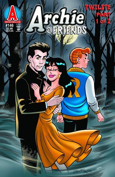
ARCHIE & FRIENDS #146: TWILITE PART 1 OF 2
Writer: Angelo Decesare Artist: Bill Galvan Publisher: Archie Comics Reviewer: Lyzard
I’ll admit that Archie Comics is a guilty pleasure of mine. Having collected JUGHEAD DOUBLE DIGESTs since middle school, I’ve enjoyed escaping the sometimes over-sexed and ultra-violent state of present day media. Do I enjoy comics like KICK-ASS? Of course, but sometimes I need a break. What I have always enjoyed about Archie Comics is their timelessness. But that is not always the case these days. Rarely, but more often now than in the past, the writers have taken on current events and pop culture. One example is the upcoming issue with President Obama and Sarah Palin coming to Riverdale High to pick candidates for School President. Another example is ARCHIE AND FRIENDS #146: TWILITE PART 1 OF 2.The comic is obviously a take on the (inexplicably) highly successful “Twilight” saga. Even if you haven’t read or watched anything to do with “Twilight”, having a vampire named Edwin will not escape your attention as a spoof. But the comic takes on more than just “Twilight”, it also quickly satirizes another film: “Cloudy With a Chance of Meatballs”. Though I don’t mind the overall arcing spoof, I think picking films such as the animated food tale will only hold back the legacy of this particular book. What I love about old Archie comics is how I do not need to know pop culture dating back to Archie’s inception to get the jokes.
Personal prejudices aside, ARCHIE AND FRIENDS #146 is not like “Vampires Suck”, where direct plot moments are taken from “Twilight”. Instead of having a Bella character come to Riverdale High, we have Ivan and Jared. Ivan is your typical shady, bad-boy character, while Jared seems like your normal teenager. But both hide a terrible secret, that according to Ivan could put “the entire town of Riverdale…in grave danger!” The end of the book reveals Ivan’s secret, but Jared’s is still up in the air. If they are going to follow the Twilight books/films, maybe Jared will be a werewolf. But I’m leaning more towards evil vampire.
I’ve never really paid attention to the artwork in an Archie Comic…until now. I found it extremely repetitive. Also, last week when I reviewed NANCY IN HELL, I argued that the drawings were overcomplicated. ARCHIE AND FRIENDS #146 has the opposite problem, where at times it is oversimplified. A mouth missing here, lots of closed eyes (ignoring Jughead, that’s his trademark), much more simplistic and basic in its style. The color scheme was too traditional for the subject matter --bright, bold colors that did not ring true for the horror material being spoofed.
But the story and artwork are what readers of Archie have come to expect. There’s no sex, or violence, just good, clean fun. Is it cheesy? About as much as the burgers at Pop’s Chocklit Shoppe. Vampires are overdone today (this coming from undead aficionado) but it seems that Archie Comics is just jumping on the bandwagon. They bring nothing new to the mythology. Hopefully in Book Two there will be some surprises and twists that even I don’t see coming.
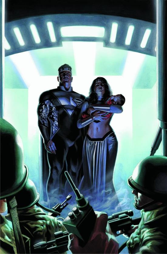
THE LAST FAMILY OF KRYPTON #1
Writer: Carey Bates Art: Renato Arlem Publisher: DC Comics Reviewer: BottleImp
The wonderful thing about DC’s Elseworlds comics is that by placing the stories firmly outside of the boundaries and strictures of continuity, the writers and artists are free to explore, alter and just plain fuck around with the status quo. There have been great Elseworlds comics (THE GOLDEN AGE, KINGDOM COME, and THE NAIL, to name just a few of my favorites), and there have been not-so-great stories told under this banner (my nominee for the worst Elseworlds comic is BATMAN: CASTLE OF THE BAT, in which The Batman mythos is mashed up with Frankenstein’s Monster…yeah, it’s just about as bad as it sounds). Having read the first third of this new Elseworlds miniseries, I’d have to place THE LAST FAMILY OF KRYPTON somewhere in the middle.Actually, the basic twist of the plot—having not just Kal-El but child AND both of his parents rocket to Earth to escape their doomed homeworld—reminds me more of DC’s “Imaginary Stories” that were once a mainstay of the Superman and Batman titles during the 1950s and ‘60s. Like those tales of old, THE LAST FAMILY takes a seemingly minor detail and expands upon it exponentially. The Kryptonians arrive on Earth in a much more direct fashion than the “real” Superman did; Jor-El and Lara immediately make their history and desires known to the world’s population. Cary Bates goes on to show the effects that this meeting of cultures produces over a short span of years, ranging from the obvious technological advancements made with Kryptonian science and the slightly humorous, “self-help” style cult of “Raology” spread by Lara.
Bates manages to merge several different interpretations of the Superman myth in this series, and, for the most part, he is able to blend these elements fairly well. There is the obvious influence of the Richard Donner movie, right down to quoting Marlon Brando verbatim in Jor-El’s thoughts on his new home. “They can be a great people. They wish to be. They only lack the light to show them the way.” There are the nods to the Imaginary Stories, as I’ve said, and also to Superman’s history as it was revealed in the SUPERBOY comics, which finds Clark Kent and Lex Luthor as schoolmates in Smallville. John Byrne’s revamp of Superman from the 1980s is present in some capacity, as Jor-El’s detachment from his wife in favor of spreading Kryptonian science across the Earth recalls Byrne’s imagining of a Krypton that placed emphasis on the rational rather than the emotional. There is even a touch of the Bruce Timm/Paul Dini SUPERMAN cartoon—the El family’s spaceship (and later their skyscraper) is run by an artificial intelligence referred to as “B”…three guesses what that letter stands for, and the first two don’t count.
Renato Arlem provides nice visuals to go along with the words, although he seems to be one of those artists who likes to use photo shopped images for backgrounds rather than drawing them from his reference. The buildings of Metropolis, the classrooms of Smallville—even cars and trees—all have that slightly speckled look of photographs that have been run through a “poster edges” filter on the computer. There’s nothing wrong with that technique per se, but in this case the backgrounds can tend to get too busy with detail and can clutter up the panels in some places. And another thing about Arlem, and this is totally a personal preference thing, whatever floats your boat—he gives Lara an absolutely enormous, Kim Kardashian-sized ass.
I must also point out the cover of this comic. When I first saw it, I automatically assumed it was Alex Ross, based not only on the painting technique but also the lighting and look of the faces of Jor-El and Lara. Looks very similar to Ross’ Superman and Wonder Woman paintings, right? Well, it turns out that the artist is NOT Ross, but Felipe Massafera, an artist whose work I am unfamiliar with, though I’m betting we’ll be seeing a lot more of him. I’m not a big fan of such an obvious aping of one’s style, but at least Massafera picked a good artist to steal from.
So far, THE LAST FAMILY is a decent read, though it lacks the emotional intensity of some of the better Elseworlds stories. Maybe it’s due to the fact that the twist is such a small one from the established continuity, or maybe this series just needs a little more time to reach its payoff. But even as a middle-of-the-road comic, THE LAST FAMILY makes a hell of a lot more enjoyable Superman story than, say, James Robinson’s recent run.
When released from his Bottle, the Imp takes the form of Stephen Andrade, an artist/illustrator/pirate monkey painter from the Northeast. You can see some of his artwork here. He’s given up comics more times than he can remember. But every time he thinks he's out, they pull him back in.
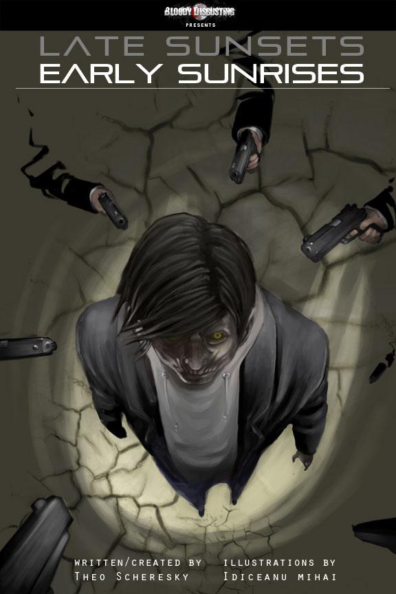
LATE SUNSETS, EARLY SUNRISES #1
Writer: Theo Scheresky Art: Idiceanu Mihai Publisher: BloodyDisgusting.com Reviewer: Ambush Bug
BloodyDisgusting.com is tossing their mangled hats into the comic book making ring as site editor Theo Scheresky offers up a post ( and pre-) apocalyptic tale of crime and horror. It's not exactly necessary for someone who likes horror to be good at writing it. In this case, though, Scheresky is both. LATE SUNSETS, EARLY SUNRISES is proof positive that a little genre bending and some strong ideas can still go along way.The premise for LATE SUNSETS, EARLY SUNRISES is a good one. Nodding to many noir-ish tales, our hero Will Morris is a gardener for a wealthy crime boss who falls for the boss' wife. The two steal some cash and then make their way out of Vegas. Think you've heard this story before? Sure you have. But writer Scheresky pulls the rug out from under you by having the end of the world occur as these events are going on. Will wakes up with a hole in his head and is told by a shadowy figure that he is one of the undead and his girlfriend is one of the all the way dead. In order to rectify this situation, Will must kill 99 evil men. And that's where the fun begins.
Remember when SPAWN first came out and it had that little clock counting down to...something? I didn't stick around that title long enough to find out what the countdown was leading to, but was fascinated and immediately enthralled by the ticking clock premise. Here, Scheresky uses that count down plot device to hang some real tension. Though he doesn't want to, Will must kill, and kill, and kill in order to save himself and his girl. Artist Indiceanu Mihai does a nice job of making the countdown look bloody and gruesome as the death toll numbers splatter up from the victims as Will blows them away. Mihai's art style is painterly and fluid, giving the story a ghostly feel. She also has a gift for vivid and varied camera angles which she uses for maximum shock value and tension building effect.
Though somewhat reminiscent of the old TV series BRIMSTONE (a favorite of mine), LATE SUNSETS, EARLY SUNRISES is original enough to make me want to check out future issues of this six issue miniseries. It's an original slant on the noir genre with some nice zombie and vampire bits tossed in to spice things up. This first issue is a strong one, leaping into the action, then taking the time to explain what's going on later in the issue. LATE SUNSETS, EARLY SUNRISES #1 is available free to members of BloodyDisgusting.com and available for all later this month. Be sure to check out this original and well-scribed horror yarn.
Ambush Bug is Mark L. Miller, original @$$Hole/wordslinger/reviewer/co-editor of AICN Comics for over nine years. Check out his ComicSpace page for his entries in the MUSCLES & FIGHTS VOL.3 & MUSCLES & FRIGHTS VOL.1 anthologies. Bug was interviewed here & here (about AICN Comics) & here & here (on VINCENT PRICE PRESENTS: THE TINGLER #1-2). Bug’s latest comic is VINCENT PRICE PRESENTS #20: WITCHFINDER GENERAL (available in June’s Previews Order # JUN10 0825) on sale in late August. Bug was also interviewed here & here about his upcoming original vampire miniseries NANNY & HANK (available in June's Previews Order #JUN10 0824) due out in late August. Bug also has a 10 pg story in Zenescope’s upcoming WONDERLAND ANNUAL 2010 (in July Previews Order # JUL10 1200). Support a Bug by checking out his comics!

INCREDIBLE HULK #611
Writer: Greg Pak Pencils: Paul Pelletier Inks: Danny Miki Cover: JRJR, Janson & White Publisher: Marvel Comics Reviewer: JNCNDAC
Where to begin, where to begin? Oh! I know, for all you Petulant Peters out there I will make it easy for you.Story is a 10.
Art is a 10.
Cover Not so much.
Ok, good bye you can go now. See ya, ba bye, don’t let the door hit you on the way out.
The rest of you Merry Marvelites, Distinguished Competitors & Independent others, let’s talk some HULK. Some Holy Hannah How about dat Hulk! If ya like smashing Hulk, you get it, you like you some Peter David, ID, Ego, Super Ego, check, you got it, you like some outstanding artwork of incredible astuteness you will be covered, speaking of covers, if you hate JRJR you get that too…. A Cover….By JRJR…That you can hate, cause it’s weak and for a Hulk comic and weak = bad. Really that is the only bad thing I can say about this issue. This issue deserved a MUCH better cover.
And now a word about the writer…
It is as if Greg Pak said, “Eeeeh, watch me paste these pathetic palookas with a powerful, pachydermous, percussion pitch” ok, Bugs said that, but it is true! Mr. Pak has pitched perfection with this issue. Why? I’m glad you asked. This title has been kind of a little under the radar of late; ever since World War Hulk and the ensuing Red Hulk abbondanza it has been meandering a bit. The newest story line returning the Leader to the mix along with other big brains WAS a good story until the Hulked Out Heroes crapola. Said meandering is now over and it is in my humble opine that we have just turned a major corner in the life of the Jade Giant and that my friends is no easy task. This character has at times suffered from the same thing that has made the movies a difficult sell. I mean, how long can you keep people’s attention with “Hulk Smash”? If ya think about it ol Green Jeans has had this problem from his inception, canceled after 6 issues, inserted into the original Avengers line up with a hope that he would catch on, and when he did it was childlike “Hulk smash!” that droned on and on for almost 20 years! Then Peter David came along and picked up all the loose ends and gave us his epic turn on the title giving us the shattered personality due to a abusive childhood -- good stuff, that. Ever since then I am sad to say the title floundered until “Planet Hulk”, a great storyline based on the gladiator movie motif, again good stuff. Then “World War Hulk”, eh, lots of smashing, but not really moving the character along anywhere exciting. BUT now, wowza!
And now a word about the artist…
Paul Pelletier. Positively Powerful Paul Pelletier with that way cool I am channeling Todd McFarlane at times artwork. You know the shot, the one were the character’s face is in shadow and all we see are the teeth or the eyes, love it, uses it well & he can draw some smashing! We get a throw down of epic epicness, page after page of pulse pounding pounding. Not to mention earth shattering shattering, If you are still with us oh Petulant Pete THE…ARTWORK…IS REALLY GOOD…, I LIKED IT…A…LOT.
The beauty of comics is that as a story telling medium, we forget, in this microwave age of give me everything now that comics are at their best when stories are allowed to percolate. Slowly simmering to a sauté of something bigger than the whole, Greg Pak knows that & we now know it too. He has reached back to that Peter David era and tied it all up in a nice little gamma radiated bow. It could have really gone nowhere and been forgettable, all this son of Hulk crap -- what was next, Hulk Dog, Hulk Cat & Hulk Gerbil? Hmmmm a green gamma radiated gerbil, it just might work. Anyway, as I was saying, it could have gone south very easily but Great Gamma Greg is not going south he is going forward and I really don’t want to spoil it for anyone out there who hasn’t been reading this title, but he brings this issue to a startling conclusion that I did not see coming & in the same breath sets the Hulk off on what could be a fascinating journey of discovery, or it could really suck and they could cancel the title again and create purple Hulk. I was especially intrigued by the acknowledgments on the back page and can’t wait for the next issue.
If you have been turned off by the lameness that was the tie-ins to this latest Hulk mini crossover, and it was LA LA LAMMME! Hulked out heroes, puh-lease spare me. But that is a review of a different color. Do yourself a favor and check this title out, I think Mr. Pak is about to give us something special.
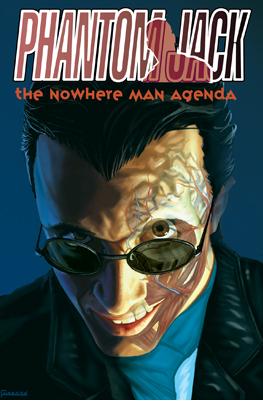
PHANTOM JACK: THE NOWHERE MAN AGENDA OGN
Writer: Michael San Giacomo Artists: Andy Belanger , Andy Finlayson and Sean McArdle Publisher: IDW Publishing Reviewer: Optimous Douche
When I'm reading the last panel of a book through the milky haze of my girlish tears...to be affected to that level...well, that's pretty much the best you can ask for from paper and ink. But I shouldn't have been surprised; I've loved this series in concept and execution since San Giacomo slid the first collected edition across the table at me during Wizard World Aught Something so many years ago.PHANTOM JACK is a phantom, but there is nary a stitch of spandex to be found in these pages. During the first trade we learned that after a freak chemical accident, cub reporter Jack Baxter is bestowed with the gift of turning invisible at will. A pretty handy trait, as the first volume (set circa early 2000s) led Jack on a journey to the Middle East and a foot-to-balls confrontation with one Saddam Hussein. What struck me about the first book was how real the "newsroom" angle came across. A quick Wikipedia search told me that the authenticity came from the fact that San Giacomo is a reporter first and a comic writer second, although neither takes a back seat to the other from a quality perspective. That was then; this time around there is less of a focus on Jack the reporter and more so on Jack the man as San Giacomo traverses a much darker path (yes, darker than meeting someone who has committed mass genocide) and offers a sense of closure to the series that was one of the reasons for my river of tears at the end.
Make no mistake, while I loved NOWHERE MAN I came into the story with the rich history of the first trade saddled to my cerebellum. Does this mean a new reader won’t enjoy this continuation? No, because it is a well crafted comic. Plus San Giacomo was smart enough to provide a Reader's Digest version of the first book's events and characters. Now, will new readers be affected by the new trade? Tough to tell. PHANTOM JACK'S allure rests in San Giacomo's deep characterization of not only Jack, but also the development of his once friend and now douchetastic foil that was introduced in the first trade. NOWHERE MAN is a continuation for both characters: Jack the moral beacon and Vinnie the moral wasteland.
The select few that were blessed to read the first trade thought Vinnie's fate was sealed shortly after he and Jack received their powers. San Giacomo was able to take what appeared to be a throw-away moment in the first book and transform it into the foundation for this new tale. It was the kind of twist we love as comic fans, all of which was orchestrated by the perfectly named clandestine government organization Miscellaneous (so named because that's how their funding appears on various government budgets). Miscellaneous realized Jack was far too moral to be an invisible agent of destruction and let him go on with his life as a mild mannered reporter. Vinnie, however, was just the sort of scumbag the government was looking for. So while Jack thought he was dead all these years, Vinnie was actually globetrotting around the world performing the dirty deeds that only an invisible man could.
And therein lies the rub. Apparently invisibility comes with a price. That price is the rapid degeneration of your internal organs. Jack was always A-OK, because he only used his powers sparingly and his internal mushy stuff learned to adapt to this new power. Vinnie...not so much. Through over use of his power and the chemical abuse that comes with too much money and idle time, Vinnie is dying much sooner than his maker intended. To get a new lease on life, Vinnie pulls on Jack's heartstrings in a game of cat and mouse that will ultimately lead to Jack becoming an involuntary organ. Vinnie does not get Jack's organs in the end, yet this book does not end anywhere near to what I would call "happily." However, San Giacomo does keep you guessing though right up until the last panel. While I think this story could go on indefinitely I am not the writer. So while I was crying over Jack's ultimate fate, I was also deeply saddened to see one of the best comic concepts I've ever come across also draw to a close. But what do I know? I also once thought there was no return for Vinnie either.
Sadly, most people will think PHANTOM JACK is the $19.95 a year phone service from Radio Shack. You know, the one that plugs into any phone jack. That's the unfortunate reality of today's comic landscape; the world where the mighty marketing dollar can perform fantastic flights of fanfare heralding subpar material while innovative ideas like PHANTOM JACK are left to be carried Douche-of-mouth. Through publishing hand-offs and other traditional comic publishing fuckbaggery, this series is the ugly step-child that is neither ugly nor should be ignored. This is actually a mine of pure comic gold and thankfully IDW was able to recognize this for THE NOWHERE MAN AGENDA and saved it from the infinite delays that plagued the first trade.
When you go to Amazon to buy this book, do yourself a favor and get the first trade as well. It will not only deepen your enjoyment of NOWHERE MAN, but perhaps it will give me a few comrades in arms to petition San Giacomo to reset the story of PHANTOM JACK with all new tales.
Optimous has successfully blackmailed fellow @$$Hole BottleImp into being his artist on Average Joe. Look for Imp's forced labor on Optimous brain child in mid-2011 from COM.X. Friend Optimous on FaceBook to get Average Joe updates and because ceiling cat says it's the right thing to do.
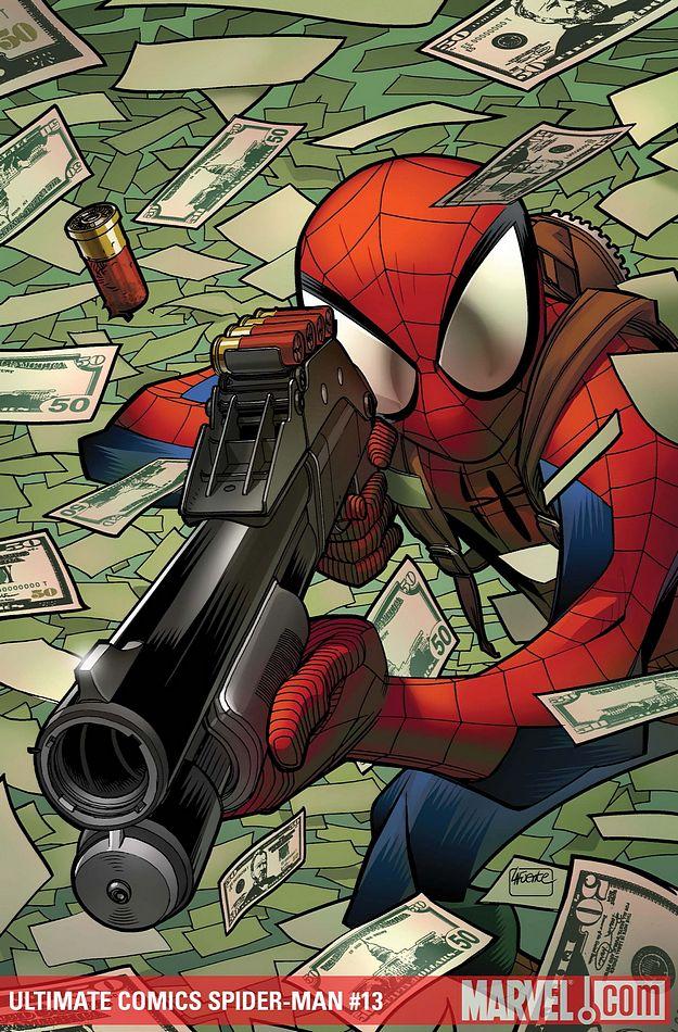
ULTIMATE COMICS SPIDER-MAN #13
Writer: Brian Michael Bendis Art: David Lafuente Publisher: Ultimate Marvel Comics Reviewer: Henry Higgins is My Homeboy
Oh ULTIMATE SPIDER-MAN, I'll never doubt you again.What a difference one issue makes. I railed on last issue for its lackluster villain, overplayed story, and tired writing. This issue ratchets up the villain by revealing his partner, lets the story hit some unexpected beats, and all around, is just brilliant. Alright, Chameleon still has his moments of annoyance, but the storyline picks up considerably, which is very impressive for a story that has been retold numerous times over the years.
Writing 4/5: While last issue had multiple scenes with the supporting cast, this issue focuses on Chameleon, his partner, J. Jonah, and Peter. And despite some troubles with Chameleon, every character works. They sell the scenes, playing up the humor and the horror brilliantly. Chameleon gets an early scene to himself, wearing Spider-Man's suit and tech. While it does have some very silly moments (he's quite fond of the word 'stupid', isn't he?), he makes up for it with a great little moment of trying to webswing. He, of course, fails miserably, slamming into two buildings. I got a huge laugh out of it, and Chameleon ends up taking MGH to use it properly, and robs a bank in front of a crowd. He stays confident and fun to read, before becoming downright frightening in one panel. The scene helps to offset his partner, revealed as the Chameleon’s sister, who provides us with the horror aspect of the issue. Jameson and Peter are tied up when a woman walks in, and holds a gun to Jameson's head. And she has no face. It's just a blank slate. Followed by her morphing into Jameson. Holy fuck, that's going to be my night terrors for the next three weeks. And then she casually puts a bullet into Jameson's head. This is a version of Chameleon I could get behind. Unsettling, casual, and memorable.
I hope the shot was fake, mind you, because I'd really like this version of Jameson to remain in the cast. He's provided some good moments over the course of the series, and in the Ultimate universe, he isn't thick. He figures out Peter is Spider-Man. That's a good twist on their relationship, and I rather hope he remains a part of the cast. Peter doesn't get much in here, but what he does have, works as well. He snarks, he tries to remain calm, while clearly closing in on his limit. The supporting cast gets literally one page, but it's brilliant. Bobby, Gwen, and Johnny discuss Spider-Man "robbing" the bank. Aunt May immediately knows it's not Peter, tells the boys to "suit up", and go find the real Peter. Have I mentioned lately how much I love this version of May?
Art 5/5: Lafuente has become one of my favorite artists in the business, and if you need proof why, take a look in this issue. The faces, the designs, the spreads, they all work, every single one. The issue opens, like last time, with a page shot of Chameleon assuming Peter’s life. The smile Chameleon has on when he puts on Spidey's mask is so deliciously evil, so creepy, you can't help but be worried and excited for the rest of the issue. The whole issue, whenever we flash over to Chameleon, it's worth a look. Just the expressions he has let you know we're not dealing with Peter, and it's such a well done part of the comic. You don't need dialogue or exposition, you know that's not Peter.
The layouts are just magnificent. The physical humor is spot on, notably the first hit into the wall. The panel of Chameleon jumping out of the window references the first arc, as Chameleon has to sell that it's Spider-Man doing this. It's such an iconic Spider-Man thing to do, it's just brilliant. The next spread, of Chameleon taking down coppers left and right, next to a shot of him admiring his handiwork. It's brilliant. And of course, his sister. You have this fit woman come out, corset and jean shorts, no face. That's just creepy. Followed by two panels over, she goes Clayface on us, becomes Jameson. Holy fuck. I don't need any other scene of her, I'm sold on the premise of her as a villain. I immediately want more down the line with this character.
Best Moment: Either goes to the swinging into walls sequence, which still makes me chuckle, or the spread of Chameleon’s rampage. That was just brilliantly done, no other words for it.
Worst Moment Chameleon still has a tendency to talk, and it doesn't always work. Notably, his whole "stupid" monologue.
Overall 5/5: This is one of the reasons ULTIMATE SPIDER-MAN is one of my favorite titles. Well done characters, brilliant artists, fantastic writing.

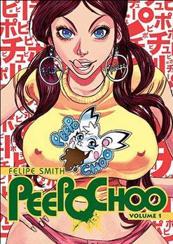
PEEPO CHOO Vol.1
By Felipe Smith Released by Vertical Reviewer: Scott Green
Felipe Smith's incendiary MBQ got a bit lost in the wild expansion and contraction of manga in North America. I felt that the violent, satirical rapture announced Smith as the kind of artist whose bandwagon you want to be on early. Unfortunately, my hopes/predictions didn't really pan out, and MBQ became a work that some had high regard for, but which was never really been widely read.Instead, Smith went on to what some would call "live the dream." He moved to Tokyo where he created a manga for publishing powerhouse Kodansha's Morning Two anthology - an eclectic collection of unusual works, including Natsume Ono's (NOT SIMPLE, RISTORANTE PARADISO, HOUSE OF FIVE LEAVES) American police series COPPER , Hikaru Nakamura's comedy about Jesus and Buddha as roommates - SAINT YOUNG MEN and Ching Nakamura's GUNJOU.
PEEPO CHOO is the kind of work bound to evoke comparisons. By no means is it derivative. It's ferociously its own beast. However, thinking about it gets blocked out in terms of other narratives and modes of storytelling.
PEEPO CHOO's banner characteristic is its maniacal culture clash comedy. Beyond Smith's unmistakable flare, as it series was running in Japan, it garnered talk among manga followers for how it handled humor based on assumptions fostered by reductive cultural/linguistic understanding. Specifically, it granted an American geek his wish of travelling to Japan, then it bathed in the disastrous misstates spewed out. Erica Friedman has explained how, in its original language, the geek "renders Japanese into something utterly alien that only special people can understand and is, without fail, a phrase that enrages any American fan who has through sheer effort learned any Japanese. Japanese is not, obviously, a random, bizarre, incomprehensible language".
There's a supposedly true story that's been adapted as Densha Otoko. A geek prevents a young woman from being harassed on a train. He then goes to popular message board system 2ch for advice on how to pursue a relationship. And, with the internet's help, the couple finds happiness. Maybe it's really true, but in its popularity and its many TV/film/manga interpretations, that story has been thrust into the realm of fairy tale. It's the shared hope of geeks and those concerned about geeks, that a wall off introvert can integrate into normal society with the right nudge.
PEEPO CHOO is another fairy tale concerning geek hopes. Rather than the idea that with the right happenstance, a geek can be made happy, it's that in the right context, a geek can find kindred spirits and validation.
However, unlike Densha Otoko, it's not of the wave a magic wand, set things in order sort, but of the darker, classic variety... featuring obscures rules, fantastic lands, and a somewhat earnest, somewhat foolish hero. And, it's quite dangerous, full of violence of the more "oh no!" rather than "f' yeah!" variety.
That explicit danger draws in another point of comparison. The tapestry of colorful people in and just outside its violent circumstances calls to mind a sort of a geek variant Guy Ritchie movie. North America has gotten a sample of the kind of gruesome, grinder of violence that seinen manga can offer... BERSERK, GANTZ, BLADE OF THE IMMORTAL, BASILISK, ICHI THE KILLER in the form of its live action adaptation. There are a lot of parties criss crossing PEEPO CHOO. A few of them are willing in eager to engage in a bit of seinen brand ultraviolence: sticking fingers in eye sockets, disemboweling and so on.
Milton is from a crowded household in the South Side of Chicago. He leaves his family looking like a semi-respectable student, then, once outside spotting range, he takes off his glasses, puts a bandage on his face and a bandanna on his skull, skews his hat, throws on a White Sox jacket and adopts a hard expression. A train ride away, he ducks into a donut shop, leaps into the bathroom, and changes that attire for baggy white shorts, a "P" emblazoned jersey and a floppy eared cap. He leaps up and down, puts his ankle behind his neck and declares "Howdy Sir Milk Dog! Peepo Choo!" See... Milton is a hard core, self defined otaku.
Rather than attend school, he's been working at a comic shop.
His manager, or rather the guy whose work he does, Jody, hates geeks of all stripes. Jody's thing is sex. Day and night, barking insults at the nerd or alone in his room, he's attached to some form of pornography. And that smut become the basis for the wild stories of imagined experiences with which he enthralls the worshiping customers.
And, Enyo's Game, Comics and Collectable's owner is ex-con, Gill, a hulk with a saw blade mustache who combs out his Mohawk and looks dauntingly semi-respectably when he's not out on non-enthusiast consumer business.
Business takes Gill to Japan. For Milton, it represents an opportunity to dive into a culture he knows of and worships via the comedy adventures of mascot character Peepo Choo. For Jody, it represents the prospect of getting strange in a land that he holds out hopes works like the plots of his porno fantasy.
The course of this American trio is evidently heading in the direction of a trio of Japanese counterparts. There is Rockstar, formerly Takeshi, Morimoto, the adopted protégé of a yakuza big brother who seems to have cooked his head by massive consumption of American gangster stories; Reiko Kawamori, a teen pin-up queen who seems to be add odds with everyone despite being an object of adoration, and "Butt-Ugly" Miki Tanaka, a bullied girl who finds some escape in grotesque/cute loli-goth curios.
PEEPO CHOO is millimeters away from being luminously fun. There's a glint in its eyes as it launches one charged, cartooned image after another. And, Smith serves that up with a remarkable command of the medium.
You can argue about distinctions between original English language manga versus Japanese manga, and whether those arguments are useful or appropriate. In this case, the conversation truly doesn't seem very relevant. Smith's work doesn't need much comparison to Japanese or American comic book traditions because he has an understanding of how comics work that allows him to tell stories in his own way.
Some artists have a real grasp of how a reader’s attention moves from panel to panel page to page. For example, among her gifts, Rumiko Takahashi is a master of this, selling gags in the paced transition from one panel of Ranma to another or shock in the flip of a page in her horror manga series MERMAID FORREST.
Comics/manga can rest on isolated ideas. A gag is presented on one panel of a comedy. An attack is presented on one panel of an action story. Plenty of respected creators come up with concepts that connect to their audience well enough that these snaps shots are more than sufficient. The boldness of Smith's characters and situations could have stood alone. But, he is also able to embellish it with a command of how reading the manga flows. Peepo Choo's gags are given more impact by the discernable beat in the delivery of lines and interaction between characters.
Big, brash, and boisterous, full of potential for vicarious thrills, PEEPO CHOO could have been tremendously fun. It's not, and not just because it's exceptionally nasty business of grotesque propositions.
Add BIG FAN to the list of stories that PEEPO CHOO calls to mind. With the internet; with the glut of media out there; There's the notion that if someone surrounds themselves with selected ideas and trapping they can be what they want to be. The heated argument from North American enthusiasts about whether the extensive baggage attached to the term "otaku" can be pruned off and a person can/should identify themselves as one is a demonstration of this idea. For many of PEEPO CHOO's characters, this adoption of an identity isn't just a matter of how they spend their private time, it's how they project themselves and hope to interact with the world.
And here, all that runs into a brick wall. The characters' escapism and their coping mechanism come face to face with authentic reality. In the way that its gory violence is exceedingly confrontational, the shattering of what these wannabes erect around themselves is equally a broadside on the reader. The prospect of the violent characters meeting up is cringe inducing, but the prospect of Milton and Jody walking into a Japanese city also looms like psychological torture porn.
This is more an assault than a subtle discourse. Shoving out foul caricatures, PEEPO CHOO crowds the reader with a host of characters, all of whom are in some respect, disquieting. There's no apparent control group; no counter example that the reader can acknowledge has their business together. So, it all compounds itself into one brutally ugly picture.
No one comes out looking well, but geeks come in for an especially brutal brow beating in this savage aversion therapy, with their fantasies warped into hairy, misproportioned sexualized images. Jody might later have his knees cut out from under him, but that doesn't make his rant about the unified wants of warring anime and comic geek factions any more caustic. The titular POKEMON-ish mascot critter of the title might not seem like the kind of anime to be the object of a teen geek's obsession, but its absurd juvenileness is very much at home with the series' argument.
Exactly how dire PEEPO CHOO's world view really is remains to be seen. At the end of volume one, it looks to be on a rather nasty precipice. Specifically, Milton is seldom more sympathetic than when he's pouring over PEEPO CHOO anime, trying to teach himself the Japanese language... and on some level, even he knows the results of this method of learning are bound to turn out disastrously. More generally, the landscape it's sketching is offering few non-pathological avenues for personal satisfaction.
On the other hand, as dangerous as this fairytale's dark forest might be, maybe Milton can navigate it towards reward.
A volume in, I respect PEEPO CHOO more than I enjoy it. The craft is exciting, but it's intentionally abrasive. I like abrasive and I like provocative, but I also feel that the qualities put an onus on a work, as they're liable to take out its bottom if not carefully applied.
Caustically amusing Milton is a difficult center to hold the story. While there is room to shift here, the inclination is to withhold investment in the character until he shows some sign of being more than the butt of the joke. At the same time, the manga doesn't foster reader sadism. It is difficult to like disliking this cast. Don't let the unpleasantness hold you back. Smith is skillfully, provocatively exploring some relevant ideas. Just, as amazing as it is to watch him do it, if even neither violence nor the message offends you, PEEPO CHOO is still decidedly prickly.
Scott Green has been writing for AICN ANIME for over nine years. If you like what you see here and love anime & manga, be sure to check out his latest AICN ANIME column every week on AICN.

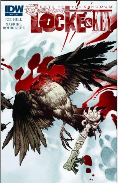
LOCKE & KEY: KEYS TO THE KINGDOM #1 IDW Publishing
Okay, can we please, PLEASE get on with the plot? I appreciate the stylings of this issue, what with the tribute to Bill Watterson’s CALVIN & HOBBES in both Bode Locke’s witty and philosophical internal monologue and Gabriel Rodriguez’s cartoony, CALVIN-esque pages, and the page format is certainly interesting, but come ON! Another key? Don’t we have enough keys already? It’s the start of the fourth volume in this series; I think it’s time for Joe Hill to start taking the multitude of plot skeins and start winding them together into a single plotline. Sigh…this is why this series is so much more of a satisfying read in collected editions rather than month-by-month; at least in the collected volumes you can actually feel like you’ve experienced an advancement of the plot, rather than running into a cul-de-sac. -Imp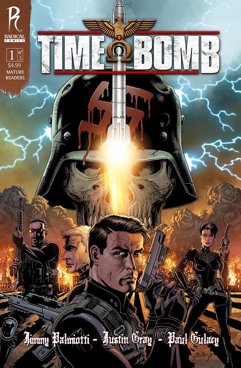
TIME BOMB #1 Radical Comics
This is the type of comic book a comic fan jaded by the same old same old longs for. A mash-up of sci fi and the DIRTY DOZEN with heavy helpings of the coolest aspects of both. A Doomsday device is uncovered in an abandoned Berlin bunker unleashing a bomb containing a plague that will kill the entire planet in 72 hours. An abandoned military project involving time travel seems to be the only hope. Trouble is, the tech is tricky and when a military team is assembled to take out the bomb before it was discovered, they soon realize that they’ve been zapped to the heart of WWII. Written by uber-scribes Jimmy Palmiotti & Justin Gray, this story only teases with just enough sci fi to be fun without over explaining or lingering on things like paradoxes. Once the team is shot into the past, it’s pure action movie with a team of crusty pros with modern weapons facing down Nazis. This book is pure gold and far and above one of the best comics Radical has ever produced. To top it all off, the crisp and distinctive style of Paul Gulacy brings Palmiotti and Gray’s words to life. Just fantastic comic booking going on in this issue and I can’t wait for issue #2. - Bug