
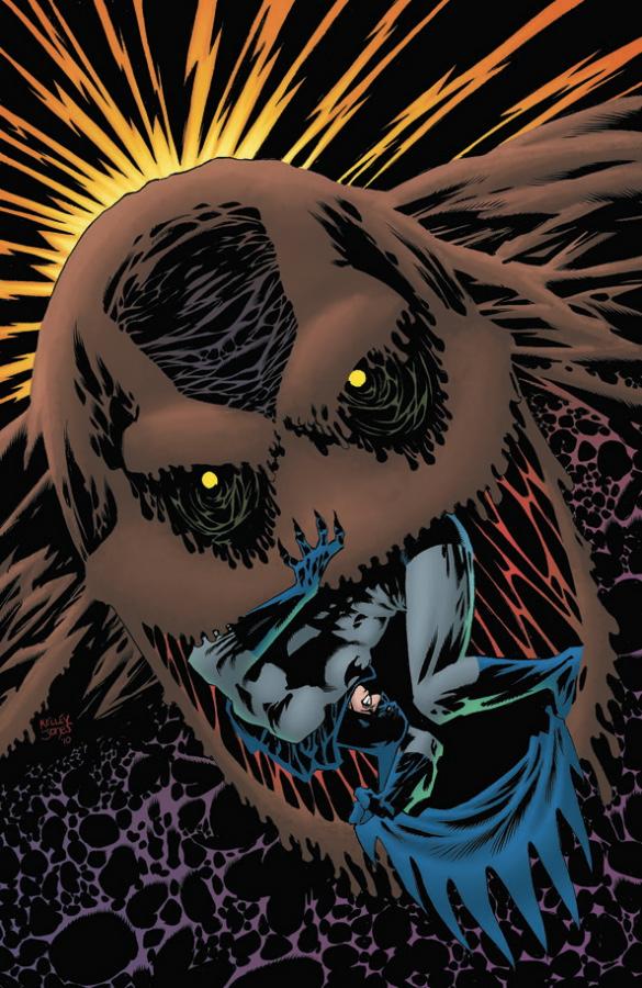
| #6 | 6/30/10 | #9 |
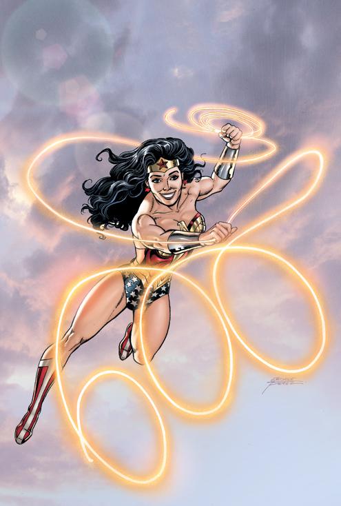
WONDER WOMAN #600
Writer: Lots of peoples Artist: Even more peoples Publisher: DC Comics Reviewed by Humphrey Lee
Another change in the status quo, another uproar from the fanbase. Must be just another week in the world of comics. While on the road this past week (what better way to spend the 4th of July?), that seemed to be all I gathered out of this milestone issue hitting the shelves. Obviously I’ll get to that in a moment, which was more or less the biggest deal of this issue, other than one of comics’ biggest icons hit the fifty year mark with her own book. Fact of the matter is, that such a big event, that such a high profile character, could probably stand to have a little shaking up when her big moment is more or less a glorified SECRET FILES.Now, I’m not dismissing this issue, I’m not saying there’s not good stuff in here, but if anything, it’s somewhat indicative of what tends to happen when you are dealing with a character this long lived, this iconic, etc. Basically, you start to focus more on what the character represents, not what the character is. Every story in here, more or less, tries to play up some aspect of Diana – her compassion, her ability to bring people together, her mission – but really none of them just had a story about Wonder Woman. The closest we got, and probably the best story in this set, was actually the piece written and drawn by Amanda Connor, but even that was somewhat bogged down by cheap jokes at her naiveté of pop culture, even though the best WW stories, at least that I have read, typically show her at least decently integrated into the modern world. And I think that is how we end up here, with an extra thick piece of Wonder Woman action, and most of the stories are just little one offs with pin-ups in between, and then a sample of the big show, J. Michael Straczynski’s upcoming run. And that’s where the fun begins…
“WTF SHE’S WEARING PANTS?!?” Seriously, we’re going to get hung up on that? Because that’s the worst thing that can happen when such a high profile writer tries to put their stamp on a character of this importance. As I more or less just said above, sometimes these characters and how they are handled, especially because they are handled by so many, can almost appear schizophrenic. If JMS has a direction for her, then more power to him. If he likes her in pants as he takes her through the wringer of his design for her, lord bless him and keep him as long as it shows up on time and does the character due diligence by letting her show her said character.
And, for the record, I actually kind of like the get up. It’s not as gaudy as some outfits I’ve seen, and if practical is what JMS and Don Kramer – who I think showed his best work with these couple pages btw – are going for, then I think they succeeded. But come on though, enough acting like someone shat in your cereal for something that we all know is going to be temporary. It’s been years though (and no offense to those who have handled WW in the interim), pretty much since the Greg Rucka days of handling the character that is has felt like she had direction while also being written both as the icon she is but with a relatable side. If JMS can pull that off, she can wear all the pants he wants her to. “If” is the big word though. That’s the thing about these characters though; sometimes a writer pulls off something great with them that gets their name put on the short list of “definitive runs”, but most times they become “just another run”, something fun to maybe hunt down in dollar bins at a local convention. Guess we’re about to see how JMS is going to fare with that gauntlet thrown down in front of him.
Humphrey Lee has been an avid comic book reader going on fifteen years now and a contributor to Ain't It Cool comics for quite a few as well. In fact, reading comics is about all he does in his free time and where all the money from his day job wages goes to - funding his comic book habit so he can talk about them to you, our loyal readers (lucky you). He's a bit of a social networking whore, so you can find him all over the Interwebs on sites like Twitter, The MySpaces, Facebookand a Blogger Account where he also mostly talks about comics with his free time because he hasn't the slightest semblance of a life. Sad but true, and he gladly encourages you to add, read, and comment as you will.
And now for another opinion on
WONDER WOMAN #600
Story: Gail Simone, Amanda Conner, Louise Simonson, Geoff Johns, J. Michael Straczynski Art: Adam Hughes, George Perez, Nicola Scott, Ivan Reis, Guillem March, Greg Horn, Francis Manapul, Phil Jimenez, Eduardo Pansica, Jock, Scott Kolins, Don Kramer Publisher: DC Comics Reviewer: Majin Fu
It doesn’t get more iconic than Wonder Woman. For decades, she has been the prime feminine force in comics. WONDER WOMAN #600 is a celebration of her legacy, a collection of fun stories, and a whole lot of gorgeous eye candy. If you are a true Wonder Woman fan, this one’s a no-brainer, so I’m going to write this review for the skeptics. I never bought a Wonder Woman comic before this one. Kitty Pryde was always more akin to the type of woman I like in comics; someone learning to deal with their power that was usually in over her head. I like Wonder Woman, but I have trouble finding consistency in her personality among the multiple interpretations from multiple writers and artists, though I did like the recent animated movie.The issue kicks off with an introduction from Lynda Carter. I have a distant but fond memory of watching her on the T.V. show. Putting her in a live action setting allowed fans to see a more realistic interpretation, and Carter obviously has a good grip on the character she was playing. My only complaint is her picture doesn’t show her trademark gams. Those legs made believing she was a goddess easy.
The first actual story, “Valedictorian,” is by Gail Simone. This shows just how important Wonder Woman is as a leader of the female cape community. The ending is a nice contrast to the opening that also grounds the story by reminding readers what makes Wonder Woman isn’t her might or accessories, but her heartfelt concern for the people around her. George Perez handles the chaos of the battle and he more personal moments just as well in the art, with a really nice second-page spread.
Amanda Conner writes and draws the next story, where Wonder Woman gives Power Girl some cat advice. It’s a lighthearted sequence with a few good laughs. Again, this story drives home how Wonder Woman’s penchant for thoughtful advice as well as her feminine touch distinguishes her from her similarly iconic cohorts like Batman or Superman.
The next story is the most straightforward, with Wonder Woman and Superman working together to save the day from some clown named Nikos Aegeus. It works because it’s so simple, and it’s fun seeing these two work together. Louise Simonson writes and Eduardo Pansica draws.
The next section, written by Geoff Johns with art by Scott Kolins, serves as a segue between the more iconic Wonder Woman we already know and the alternate Diana being introduced in the JMS run. The art has a decent painterly style, but the frequent comparisons and especially the last two pages were confusing and don’t do a good job of explaining the transition into an alternate dimension. This was the weakest of the lot.
Finally we have the new Wonder Woman, introduced by John Michael Straczynski and drawn by Don Kramer. The tone is a noticeably darker than the rest of the book, depicting an alternate dimension where Diana must hide in the sewers and battle kamikaze gunmen. The strongest part of this story is Diana’s meeting with the Oracle, who explains the nature of the alternate timeline she inhabits. It’s a serviceable introduction, but may still not be enough to convince others to jump on the Wonder Woman train.
The last two pages consist of Jim Lee explaining and attempting to justify the costume change and JMS discussing his new direction he is taking Wonder Woman. I personally found the change in costume a superfluous and superficial method of marking the change in the writer, but the actual costume design doesn’t bother me much. It’s obviously designed by a comic nerd (with the padded jacket and tight pants) and strips Wonder Woman of her more iconic look, but it’s to service the story as well, so I can accept it. JMS is obviously taking steps to bring Wonder Woman to a more expansive audience. I only hope this drastic shift in direction can draw in more readers.
This issue also features several pinups from some of DC’s premiere artists. Some of this work is so good it justifies the price tag alone. I especially liked the ones by Adam Hughes and the meticulous, two-page character celebration by Phil Jimenez (who put out equally impressive work in the latest ASTONISHING X-MEN).
Oh and there’s that same preview for ACTION COMICS #890 that appeared in SUPERMAN #700, in case you missed it.
This is a fun comic that truly celebrates the character and reminds fan why Wonder Woman has had such a prolonged presence in comic books. This was in my opinion the best of the anniversary issues for the big three. It features a wealth of gorgeous art, a few fun stories, and a peek in the new direction the character is going. If you need to get just one Wonder Woman comic for your library, this one will do you justice.
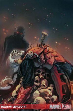
HEROIC AGE: THE DEATH OF DRACULA #1 (one shot)
Writer: Victor Gischler Artist: Guiseppe Camuncoli Publisher: Marvel Comics Reviewer: KletusCassidy’s little sister
Dracula?!?! Really?!?!? I mean I am totally Team Edward but he wasn’t even IN this comic…I thought he was related to Dracula but they don’t even mention that. I just want to say I love vampires but not the scary vampires that like kill and stuff in this comic. I like my vampires sparkling, in high school, with no shirt on.I wasn’t surprised to see “main stream” vampires in this book because that’s what all the cool kids are into. This is so lame, I mean Dracula…he’s like totally old and stuff plus he like totally fought Neo in that one movie about that slutty girl with red hair.
The art work in this book is nothing like the movies I like…its too dark and intimidating. The vampires look like they would kill you if they saw you in a dark alley and I don’t like that. There were also too many different types of vampires…I mean isn’t America the only place with vampires? I don’t get it. I hated all these different types of vampires and how they had different powers and junk…I mean I thought vampires had cute eyes that change to a beautiful auburn spring color when their mad or sad not red ones that peer at you though the darkness waiting to strike at a moments notice.
Vampires are not the mob and they totally approached this comic like they were, the vampires I like talk about their problems over dinner with their shirts off crying and the hurt that I see in Edward’s eyes is what’s really scary to me because he just wants to be loved, not kill his dad to gain control of these ugly, violent, hipster vampires with bad hair.
The artwork was too scratchy and scary it looked like these vampires had been living for decades when we all now vampires didn’t exist before NEW MOON (at least no cute ones). The bottom line is these aren’t real vampires because there are too many different kinds of them, they look scary and I wouldn’t kiss any of them...but let’s just say if a certain group of super powered mutants fought them, they’d probably have their hands full...but what ever…bring on the Wolves!
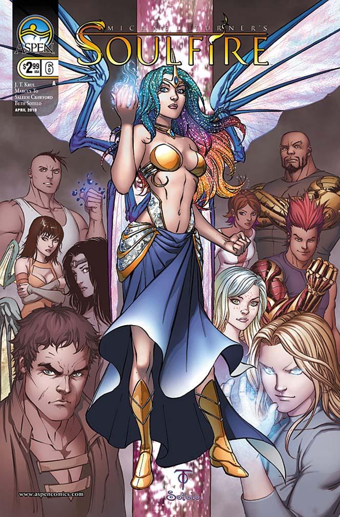
SOULFIRE #6
Writer: J.T. Krul Art: Marcus To Publisher: Aspen Comics Reviewer: Mr. Pasty
What would happen if the Teen Titans were in cahoots with a bunch of Sectaurs in an effort to try and stop the bad guys from Lord of the Rings before getting arrested by the Techno Union droid army? Well, you might have something like SOULFIRE, a muddled comic book based on the universe created by the late Michael Turner.This is a book that is in dire need of a strainer. Now let me say that while I didn’t particularly care for it, I wouldn’t categorize it as an offensive offering. More like “excessively busy.” There’s a lot going on here, perhaps too much, as the forces of magic try to battle the forces of technology. And all the youngsters wear their angst on their sleeves. Little Johnny Whinesalot is dumping on his shrink because he’s hitting his magical puberty and can’t cope. So he gets kidnapped by robots. Elsewhere, a slutty-looking Tinkerbell talks turkey with a wannabe Hawkman about some hapless dragon that was captured by a very bad man. How do we know he’s bad? Well, for starters, he has a pointy goatee like Ming (or Jim Neidhart) and clomps around in a full length robe.
I think this is my problem with SOULFIRE. Every character looks like they were peeled from the pages of the comic book writer’s handbook and Colorformed right onto the pages in various poses. You would think Mr. Visaki is handling the pencils here because every heroine is blessed with giant breasts. Far be it from me to complain about a pair of tits, but the excessive cleavage look has been over for a long time. The rest of the art is competently executed but it just feels so sterile. I actually prefer the “cartoony” look but aside from a few bottom-up angles, Marcus To doesn’t really give us anything out of the ordinary, which probably could have made this book a little more functional.
As it stands, most of the characters look and sound out of place. The dialogue is flat, the pencils are bland and there are just too many genres crammed into one book. I like magic, I like technology and I like big breasts. I also like beer, wine and scotch, but I don’t mix them together either. Perhaps if the contrast in elements was spread out a little farther it might have felt a bit more plausible. As it stands, it looks like a masquerade ball on the set of “Timecop”.
Final word: Not since the end of “Bill and Ted’s Excellent Adventure” has the stage been littered with so many cohesionless characters. If you like Aspen Comics, skip SOULFIRE and check out the much better MINDFIELD.
Web heads who can’t get enough of Mr. Pasty’s word vomit are encouraged to watch him operate as Nostradumbass over at MMaMania.com here. Love, hate and Mafia Wars requests should be directed here.
JUSTICE SOCIETY OF AMERICA #40
Writer: Bill Willingham Penciler: Jesus Merino Published by: DC Comics Reviewed by: BottleImp
Let me preamble my review with this caveat: I am a big fan of DC’s Golden Age characters. Their funky, sometimes goofy costumes, the simplicity of the characters’ names and powers—it all hearkens back to a simpler time when comic books were written and drawn for kids who craved action and adventure. On a personal level, I love the fact that DC has continued using the original Green Lantern, Flash and Wildcat to tell stories while introducing a cast of second- and third-generation heroes who carry on the legacies of those gaudy, four-color icons. On an abstract level, I would prefer to read the adventures of Hourman and Dr. Fate rather than those of Superman or Batman.But on a critical, absolute level? DC needs to fucking clean house, ‘cause those Golden Age characters and their descendents are dying where they stand, and JSA writer Bill Willingham is the one pulling the trigger.
I had been getting this vibe from the series ever since Willingham took over writing chores; it seemed as if the threats that the JSA faced never really inspired any tension. No matter how dire the circumstances or how intricate the plotlines, the comic read more like it was a synopsis of a story rather than the story itself. As the series progressed under Willingham’s direction, one particular facet of his writing emerged as the main source of this lack of excitement: the narrative caption.
I’ve brought up this point in past reviews of this and other series: comics are a visual medium, and as such, they work best when the story is presented in a “show, don’t tell” manner. Unfortunately, Willingham seems to favor the “tell, don’t show” technique, because JSA has become nothing so much as a collection of inner-monologue narrative captions, describing action that is occasionally depicted, but more often than not a lazy way of providing exposition and characterization. I gave him the benefit of the doubt in the last couple of issues, because the narration actually made sense in context of the plot—an aged Mr. Terrific relating the history of how the Nazis took over the world, while he worked with other heroes to try to overthrow their regime. The captions were essential for the reader to understand the story.
Here? Not so much. We get pages and pages of inner commentary from the newly-rejuvenated Obsidian which (I think) are meant to give the reader insight into his character, but are presented so clumsily as to do little but slow down the action taking place on the visual side of things. That’s the real downside of Willingham’s over-reliance on this storytelling technique; by having characters mentally describing the action as if from some future point, any sense of in-the-moment excitement is lost and the comic becomes a rather boring story of a story, when just reading about the story itself would have been infinitely more entertaining. Try it for yourself, if you have this issue—read the comic, but skip over all the black Obsidian narrative captions. See how much more fun that would have been? Shit, Willingham could have even included some of this information without disrupting the flow of the action if he had spent the time and actually worked the exposition into the narrative rather than ham-fistedly plonking it right in the middle of all the goings-on (one need simply look at any of the comics over at Marvel written by Dan Abnett and Andy Lanning for excellent examples on how to accomplish this).
An even more egregious use of this “tell, don’t show” mentality is the final page setup for the next plotline. A JSA member is incapacitated by a strange meteor—how do we know this? Because Willingham tells us (via narrative caption, of course). “It started with a meteor fall…it directly affected [him] in some way.” Great job ramping up the tension there.
The tragic side to this mess is that Jesus Merino is doing a kick-ass job on his side of the equation. His drawings are detailed without being cluttered, his page compositions are usually dynamic, and his overall technique is a wonderful blend of Silver Age action melded with modern sensibilities. It’s unfortunate that any drama or excitement generated by Merino’s artwork is beaten into submission by Willingham’s dull, lumbering prose.
As if the current writing wasn’t enough, the next few issues of JSA will be a crossover with JUSTICE LEAGUE OF AMERICA, scripted by James Robinson—a writer whose recent work has been mediocre at best, in my opinion. Last straw for me; I’m not hanging around anymore to watch these characters that I once loved die a slow, lingering death due to an excess of crappy exposition. I’m not one for constant reboots, but at this point, I think a big creative shake-up is the only thing that can resuscitate this terminal patient.
When released from his Bottle, the Imp takes the form of Stephen Andrade, an artist/illustrator/pirate monkey painter from the Northeast. You can see some of his artwork here. He’s given up comics more times than he can remember. But every time he thinks he's out, they pull him back in.
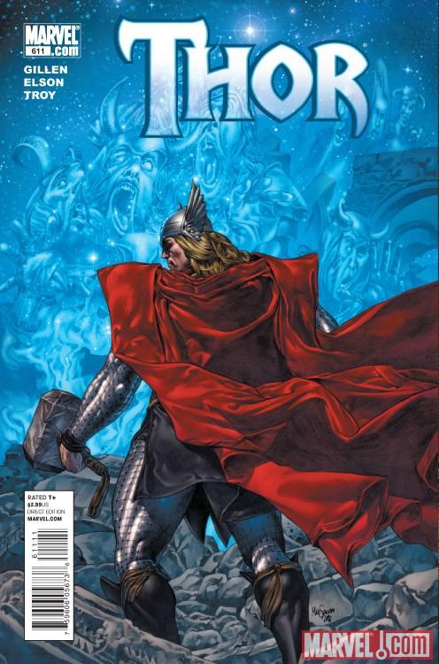
THOR #611
Story: Kieron Gillen Art: Rich Elson, Andy Troy Publisher: Marvel Comics Reviewer: Majin Fu
Despite being an essential component to the event, Thor and his fellow Asgardians went through a bit of a rough patch during “Siege”. However, one of the best parts of the story was the SIEGE: LOKI one-shot. If you missed it, Loki made a deal with Mephisto to give Hela a new Hel for dead Asgardians to kick it and in exchange Loki gave Mephisto control of the Disir. These former Valkyries of Bor eventually became evil and were cursed to eat the souls of Asgardian dead, yet were also forbidden to enter the realm of Hela.Now that “Siege” is over and Loki’s dead, Mephisto seizes the moment to instill some carnage into Hell, giving the Disir permission to enter the new Hela, and endangering all the Asgardians who died while living on Earthrealm. The story’s not as confusing as I may have made it sound. Kieron Gillen does a great job of juggling the plot in a way that each scene is clear, concise, and moves the plot forward while also retreading important points for those who might have missed them. He also shows in this issue just how well he can voice a large range of characters, nailing everyone from Mephisto to Thor. Dialogue is especially important for books like Thor because the characters have a dialect more ancient than what is commonly used in the Marvel universe. While writers like Brian Michael Bendis have shown a lack of competence in capturing this unique voice, Gillen shows he is more than capable of crafting a script that respects the individual characters and their language.
Reading the Loki one-shot is not a pre-requisite for understanding this issue, but it’s highly recommended, mostly because it (in this reviewer’s humble opinion) was the best of the “Siege” one-shots. Loki’s gone now, but his presence is felt throughout the issue, both in a eulogy held for him by his brothers, and the chaos that plagues the realms of Hell. If I have any complaint about this book, it pertains to a certain discussion in the middle over the issue of the king. I thought this was already settled in past issues, and I wish the Asgardians could have more respect for Balder as their leader after he helped pull them through “Siege”.
The Disir are a unique nemesis for the gods of Asgard with a ferocity rarely seen before in the THOR comics. Rich Elson continues to handle the artistic duties, and he’s still doing a fantastic job realizing this fantastical world. The plot at times calls for some especially imaginative violent imagery and he does not disappoint. Take, for instance, a burning skeleton delivering a foreboding message, or a pool of blood springing to life.
If you can’t tell yet, the story can get pretty gruesome at times. Andy Troy capitalizes on this with his coloring, which does an excellent job of setting the mood for each sequence, while remaining consistently dynamic. The palette shifts with the mood, guiding the reader through the feelings of the various characters, and finally instilling the last few pages with a deep sense of foreboding.
Thor was a bit disappointing during its tie-ins with “Siege”, but it’s improved a great deal now that the dust has settled and the focus has returned once again to the God of Thunder. In the next issue: to Hell!
ACTION COMICS #890
Writer: Paul Cornell
Artist: Pete Woods
Publisher: DC Comics
Reviewer: Optimous Douche
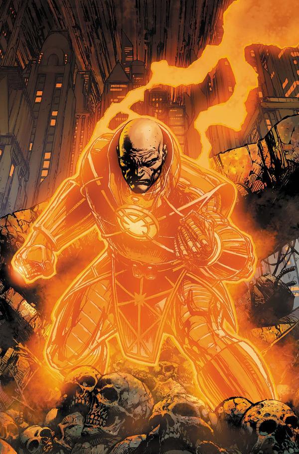
Hmmm…it took me a long time to conjure up this review of Lex Luthor’s intrusion into his chief nemesis’ title. I love everything about this book in concept. Lex’s modern-age mantra of humanity’s savior, versus a “mwhahaha” moustache twirler, has made him one of the more interesting villains…well, anywhere. His time spent with the orange ring during “Blackest Night”, with his id running wild, was a sheer pleasure to behold. The fact that he was going to continue that quest post “Blackest Night” was one of the best uses I could think of for the character since Superman will be going all “Caine” for the next year as he soul searches across America. Why I can’t I say I loved this issue? What deflated my elation from sheer rapture, to OK…not bad? What else you got?
Part of it is simply the “foreplay effect”. You all know this phenomenon, when the tease is better than the deed itself. We started self-foreplaying orange ring possibilities the first time Larfleeze and Luthor were in the same room together. Then there were the slew of teasers adjoined to…pretty much every DC title over the past few months. Finally, there was this issue’s cover with Lex standing proudly inside Orange battle armor amidst some very foreboding looking concrete. Everything in our minds was telling us this title would turn Lex and Larfleeze into the “Two Coreys” of cosmic gluttony and debauchery.
So when you get an issue of Lex “thinking” about being a ring-wielding bad ass instead of actually doing it, part of your wonders if this story climaxed before it even got started. Cornell writes sharp dialogue and clearly gets every minute of this book. Some of it just feels soulless, though. Much of this issue is spent inside Lex Laboratories, with Lex lamenting the past few months and scheming on ways to once again be reunited with his “precioussssssss.”
Instead of having Lex monologue his upcoming ring grab, he is followed around by…Lois Lane. Most long-time Superfans, though, will know right off the bat this isn’t the real Lois Lane. Mind control…alternate universe…roofies? All possibilities; sadly she’s no more than an android, the high-tech equivalent of a blow-up doll built for some good ole intellectual mind-fucking. She plays the part of a conscience quite well, as Lex assassinates a scientist for bitch-slapping him, and we are treated to a computer simulation splash page of what our world would be like if Lex could adorn his hands in all the colors of the ring wielding rainbow.
Again, all fine and fun stuff especially when rendered by Woods’ skillful hand, it just all felt far too expository in nature for long-time readers. I understand every story arc needs a certain amount of set-up; I’m just not sure set-up for the being that is Luthor was the best approach (let me know in the TalkBacks or shoot me an e-mail, I truly am curious if I’m being too hard on this book).
So, will longtime readers reap any rewards from this issue? Sure, if you suffer from Scoleciphobia. My big bad Optimous spoiler of this issue is that Mister Mind returns to thwart Luthor’s space sojourn with Robo-Lois. Yeah, after months of epic ass-kickery we are treated to a character that was probably conceived from the bottom of tequila bottle.
There were so many things done well within this issue I almost feel bad for being so blasé towards its existence. It clocked in at 32 pages, making the $4.00 cover more than justified (relatively speaking) and Cornell has a crisp manner of delivering dialogue that clearly shows he is an embedded writer in conversational driven mediums. This arc has possibilities; issue 891 will have to show me way more action, though, unless DC is willing to change the name of the book to TALKING COMICS.
Optimous has successfully blackmailed fellow @$$Hole BottleImp into being his artist on Average Joe. Look for Imp's forced labor on Optimous brain child in mid-2011 from COM.X. Friend Optimous on FaceBook to get Average Joe updates and because ceiling cat says it's the right thing to do.
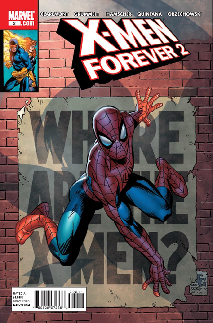
X-MEN FOREVER 2 #2
Writer: Chris Claremont
Artist: Tom Grummett
Publisher: Marvel Comics
Reviewer: KletusCassidy
When this comic first came out, it seemed kind of like a dumb idea to me. Okay so we’re going to go back to ‘91 and tell the stories that Chris Claremont always wanted to tell…no thanks. At this point while Claremont is pretty much the godfather of the current incarnation of the X-Men, I didn’t really seem to care to hear his (possibly) rejected X-Men tales. I know the guy has written some of the most iconic and memorable X-men stories, legendary shit like “The Dark Phoenix Saga”, X-MEN w/ Jim Lee, “Days of Future Past”, “God Loves Man Kills”, not to mention he helped created some of your favorite X-men related characters (Fuuuckkk it just occurred to me that I am reviewing another X-book…shit…well…this is last one I swear…NO MORE MUTANTS!). Now it seems as though he’s like the weird old uncle who always has these amazing stories to tell, that your parents sit in the den and let him ramble on by himself when company is over, and every once in a while you wander in and listen to a story...and find your self completely captivated by it. I know that the guy’s a legend (that’s for you, goose) and I love all of his older shit, but when I see his name on something newer (EXILES) with an artist I’m not particularly in to, I just don’t really have the desire to pick it up…but if you put Andrew Garfie…I mean Spider-Man on the cover…I’ll at least give it a try.
The cover to this issue is awesome (see above) and if you have a slight affection for the Web Head and the X-Men, I would be surprised if you didn’t at least flip though it so see what was going on. There’s some wild ass shit happening in this title; Wolverine is dead, Beast is making out with Jean Grey, Nick Fury might secretly be in charge of the X-Men and Professor X and Magneto have a love child called Pragneto…shit…is…crazy.
I’m always intrigued by the covers for this title and the artwork isn’t terrible it’s just that if the last big X-Men titled thing you did had Jim Lee on it (I need a check on that) everything else is about seventeen steps down. The premise of this story is a pretty fun one. After fighting the Avengers, the X-Men retreat into the mansion and it gets blown to bits thus prompting the Daily Bugle’s excitable editor to fiend for photographs from our friendly neighborhood Spider-Man’s alter ego which thrusts our Web Head to spring in to action as 1 part photographer/1 part concerned super citizen thus beginning our story.
What I like about this issue is its old school feel and the fact that it’s a pretty logical approach to the events in this story. Also this Spider-Man felt like the guy I fell in love with as a kid; adventurous, smart and not wallowing in self pity and guess what?!? his Spider sense actually worked. I swear if I read one more issue of ASM where his Spider sense doesn’t go off…I’m writing a stern letter laced with anthrax!!!! I’m kidding I don’t have access to that stuff…yet…no really I’m joking…but don’t do it again!
My one complaint is that the recap page spoiled a mystery that was going on in this book and the reveal at the end was kind of ruined because of it…now I guess if I had read the previous series (or issue) than I would have already known but had I not had it spoiled, I would have already set aside $3.99 for the next issue (I’m going to read it anyway but y’know). The artwork wasn’t bad, it’s got kind of an old school feel to it, there’s nothing flashy about it but it gets the job done…that’s what I tell the ladies when I drop trou.
I recommend this issue to people who like old school, cool, confident, non emo Spider-Man. I recommend this title to people that want to read something outside of the current Marvel Universe where really anything can happen. I image this can be kind of freeing to some writers because there’s no restrictions on what you can do but you also run into the problem that I faced when I first heard about this series which was that if it wasn’t in continuity than it wasn’t on my radar.
I never really liked Grummet’s art too much but it looks pretty good here even though there are some muddy parts but that looks more like a colorist or inker problem (and spidey looks Damn good!). I think if people read an issue they may get into it because the ‘90s was a fun era for comics (yes I know there was some bad stuff) and I really dig some of these old school costumes, Thor, SHIELD agents and all of the X-Men all look cool and remind me of a simpler time…I don’t know what that means but it just kind of flowed. I recommend everyone just pick up an issue of this and see if you like it…if not then Bug will refund all of your money…he told me so.
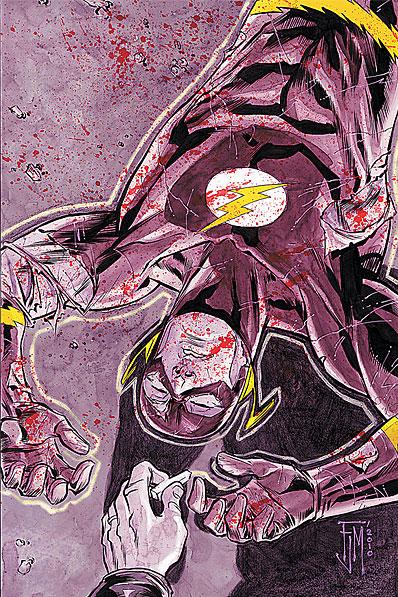
FLASH #3
Writer: Geoff Johns
Art: Francis Manapul
Publisher: DC Comics
Reviewer: Johnny Destructo
Where all my Flashes at? I'm ok having Barry Allen back, I guess, as needless as it may be...but what of Wally and his annoying children? Max? All the rest of the quick'ens? When this series rebooted I was hoping the point was to deal with the Flash "family", but now I assume the point is to firmly reestablish Barry and his place in the DCU with his lady Iris. Actually, now that I think about it, this series would be cool if it had rotating story arcs, first with Barry, then with Wally, and so on...but it looks like it's going to be solely Barry's book. Speaking of ole Bow Tie, he's in a spot of trouble with the reverse-rogues from the future, or The Renegades, who've traveled back to arrest Barry for supposedly killing one their own. Also making an appearance is the recently resurrected Digger Harkness, a.k.a Captain Boomerang (I'm pretty sure he worked his way up from Private in the Boomerang army, hyuck hyuck. Ahem.)
...Sigh.
Soo...yeah. Turns out that Digger is finding out that being back from the dead comes with a perk or two. One of which is that he's able to create boomerang-shaped energy constructs out of thin air. Pretty bad-ass, considering throwing boomerangs isn't at all bad-ass! So of course he busts out of prison and makes an appearance later on to save Barry's bacon.
Let's talk art for a second. I didn't know how I felt about Francis Manapul coming in as artist for this series. I wasn't sure his art was dynamic enough or energetic enough or properly showcase what The Flash is capable of, but this is damn fine stuff. His brush work mixed with the colorist’s water...um…colors, make for a visually engaging read.
I'm of two minds about this book. Well, three. Three minds. It's only 3 issues in and the book is already starting to feel repetitive. Coffee shop, Barry at work, getting abused for being the star, fight future rogues, barely get away. Repeat in different order. However, it's a far cry better from the last Flash series, which was almost painful. This one is fun, smart, and beautiful. So while the story has a mild case of skipping record, it's still quality stuff that's keeping me entertained and I know that Johns will really get things going next issue. If I have faith in any comics writer, it's Geoff. And while I haven't been clamouring for the return of Barry (I always took his to be one of the untouchable deaths), I am hopeful to see where Johns is going to be taking him as a character. Considering he's always on the run, I'd hate for Barry to be stuck in one place. I hope this series keeps him moving in different directions with the pace that his name implies.
JD can be found hosting the PopTards Podcast, discussing movies, comics and other flimflam over at www.poptardsgo.com, graphically designing/illustrating for a living, and Booking his Face off over here.

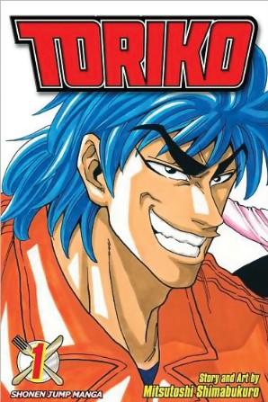
TORIKO Vol. 1
By Mitsutoshi Shimabukuro
Released by Viz Media's Shonen Jump Manga Line
Reviewer: Scott Green
TORIKO pulls its apparent recipe from a number of manga sources. There are two obvious ingredients, and a couple other influential (and no less significant in the scheme of manga, but more subtly present) flavors.
The eponymous hero of TORIKO is a mountain of muscle, along the lines of what you'll find in martial arts manga from the likes of KEISUKE ITAGAKI, works such as BAKI THE GRAPPLER or GAROUDEN; which is to say, muscled to an almost grotesque extent, corded and bulging from feet to neck, built through training with maniacal intensity. While this character is in fact a martial artist of sorts, the endeavor towards which he turns his prowess relates to a drastically different type of manga. North America has seen a bit of foodie manga. OISHINBO is the straightest example. This is a bit different than cooking manga, like IRON WOK JAN or YAKITATE JAPAN. In foodie manga, the protagonist goes to some length to find some editable, explains what they're eating, then offers an extravagant reaction as they consume it. Basically, Toriko is the Brock Lesnar of food connoisseurs.
In the opening pages of TORIKO, the Gourmet Hunter hero karate chops off the bottom of a bottle of Maker's Mark bourbon and pours the 50 proof contents into his mouth; cracks a branch off a cigar tree and snaps his fingers to light it; casts a van sized grasshopper into a river; as he yanks his fishing line out of the water, his bus sized clawed crayfish-cod catch is grabbed by an even more gargantuan five tailed eagle. Toriko snaps the rod down, stunning both fish and bird.
Toriko is commissioned to bring in dangerous meats such as the garagara gator and fight off other mega-mega-fauna such as the four armed troll kongs to get at rewards like the fruit of a rainbow tree, with juice so concentrated that one drop could flavor a swimming pool full of water. He feasts on the proceeds, but also uses the experience to seek out foods worthy of filling the empty slots in his life's full course menu.
In that pursuit, Toriko's search for the most delectable foods takes him through a landscape that is like a cross between Willy Wonka's Chocolate Factory and the rationality free world of the original DRAGON BALL. However, though this Gourmet Era is populated by the Akira Toriyama style free rein of imagination that inspired the current generation of manga hits like ONE PIECE and NARUTO (particularly their early parts), Toriko himself is a shonen throw back to an older model of the genre. As opposed to Luffy or Naruto proclaiming that one day they will be the best, like FIST OF THE NORTH STAR's Kenshiro, who starts his manga as the true successor of unstoppable martial art Hokuto Shinken, on the first page, Toriko is already the best.
The manga punctuates the exaggerated machismo of Toriko taking his knife and fork shaped hand attacks to the Gourmet Era's fantastic bestiary with exposition concerning the threats and rewards of braving the wildlife for fantastic edibles. It's absurdity-driven manga. There isn't much apparent room to grow Toriko as a character. Nor does there seem like much intension for the plot to be taken seriously. The appeal is seeing the next inspired bit of weirdness Toriko will have to contend with to get his meal, then the over the top display of ecstasy as he consumes it.
Who wouldn't want to check out a concept as gleefully demented as TORIKO? Beyond execution that lives up to its promise, there is plenty of room for Mitsutoshi Shimabukuro to run here, and volume one shows no signs of the manga wearing out its welcome. However, Toriko going toe to toe with titans he hopes to eat is amusing and not fascinating, and in a way that suggests that graphic novel collections might not be the best vehicle for this particular manga.
This would be perfect for reading in an anthology. Its wackiness would be an ideal palate cleanser; something to read between manga that are sometimes too serious for their own good, like BLEACH and NARUTO. As a meal in and of itself, a volume of TORIKO is nice to have around, but as a comfort food distraction rather than anything sustaining. It's a problem shared by other static manga in North America's graphic novel driven industry. As fun as it is, there's nothing developing to propel towards the next volume. To anticipate more, you really need to have a deep affection for the material.
The manga's teen rating is another non-optimal factor. With the violence, the alcohol, and the tobacco, it makes sense, but the dinosaur punching imagination of this manga is something that young readers might really latch onto.
Scott Green has been writing for AICN ANIME for over nine years. If you like what you see here and love anime & manga, be sure to check out his latest AICN ANIME column every week on AICN.

Ambush Bug here with more stuff you may overlook if your tastes are solely mainstream. Check out these indie goodies!
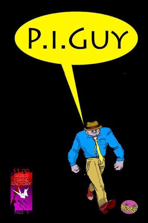
P.I.GUY #1
By Scott Beecher
Paper Crane Factory
Order here.
Definitely not for everyone, but this naughty little romp of a comic was worth a laugh or two when I cracked it open. Filled with raunchy humor and crude language, the comic reminded me of the early days of the SPIKE & MIKE short film festivals I used to go see drunk with my buddies all the time. Crude and crass, sure, but creator Scott Beecher also has a pretty good sense of humor and a talent for tossing his characters into extremely mad situations. Though this comic is about as random as they come, those with an off kilter sense of humor may be interested in checking this one out.
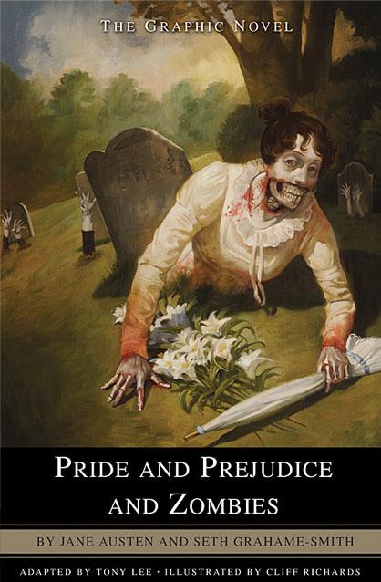
PRIDE & PREJUDICE & ZOMBIES OGN
By Jane Austen & Seth Grahame-Smith
Adapted by Tony Lee & Illustrated by Cliff Richards
Del Ray/Ballantine Books
Sure you may have read the bestselling novel and you may be waiting for the big budget film adaptation of this fantastic read, but while you’re waiting and hungering for more Victorian zombie gold, you can sink your chompers into this graphic novel bringing Seth Grahame-Smith’s prose to life. Cliff Richards does a fantastic job of drawing images that are both scary and eloquent at once. Adapter Tony Lee doesn’t leave out much of this classic tale of aristocracy, love, relationships, pride, and of course, the flesh eating dead. Making the little debutantes ninja warriors adds another layer of fun to Austen’s classic tale. Though Grahame-Smith hit paydirt with this book and its follow-ups, this was the one that started it all. This 200 plus page comic was a surprisingly quick read and one I won’t forget. Where most comic book adaptations often fail, this book harnesses the same magic of the story in its original form and improves on it by giving images for Grahame-Smith’s clever and hilarious mash-up of romance and horror. Highly recommended.
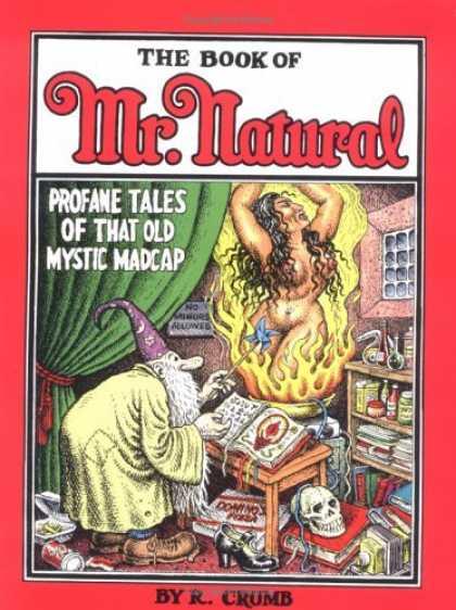
THE BOOK OF MR. NATURAL HC GN
By R. Crumb
Fantagraphics Books
R. Crumb’s new collection of stories following his wandering old man named Mr. Natural is pure and uncut Crumb. The art is as it always is surreal, crisp, and grimy all at once. As Mr. Natural wanders too and fro showing off both his philosophical and horn-dog sides in equal doses, Crumb’s stories teache us about simple meanings of life and the simple pleasures we all shouldn’t be afraid to explore. Wandering madman? Sex crazed maniac on the loose? Serene, all knowing monk? Mr. Natural is all of these things wrapped in a pillowy beard and yellow muumuu. Not for kids, squares, or the literal minded, this is a must for Crumb fans and those who tend to look at life a little differently from the norm. Produced in a beautiful hardbound copy by one of the most respected indie comics companies in the biz, Fantagraphics. They know Crumb is a graphic storytelling god and have packaged this collection as such.
Ambush Bug is Mark L. Miller, original @$$Hole / wordslinger / reviewer / co-editor of AICN Comics for over nine years. Check out his ComicSpace page for his entries in Cream City Comics’ MUSCLES & FIGHTS VOL.3 and MUSCLES & FRIGHTS VOL.1 anthologies. Bug was interviewed here & here (about AICN Comics) and here & here (on his VINCENT PRICE PRESENTS: THE TINGLER comics). Bug’s latest comic is VINCENT PRICE PRESENTS #21: WITCHFINDER GENERAL (available in May’s Previews Order # MAY100828) on sale in July. Fanboy Radio recently interviewed Bug about it here. Bug was also interviewed here & here about his upcoming original vampire miniseries NANNY & HANK (available in June's Previews Order #JUN100824) due out in August.

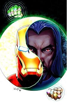
THE INVINCIBLE IRON MAN ANNUAL #1
Marvel Comics
Matt Fraction switches gears from his sometimes slowly paced normal run on INVINCIBLE IRON MAN and gives us a one-and-done tale of one of Iron Man’s baddest baddies, The Mandarin. Fraction offers a surprisingly poignant and potent look at The Mandarin as he kidnaps a filmmaker and his wife and forces him to make a big budget biography flick of his life story. The concept has been done before, but Fraction treads down this familiar tale with confidence here as the lines between the Mandarin’s reality and the world around him grow further and further apart. Through this story, one gets to understand the motivations of this egomaniacal madman. In the end, this is a tale of psychological horror, as one powerful man shoehorns the world he’s constructed in his own mind into the real world. The result is one of the best Mandarin stories I’ve ever read. I have to admit, the Mandarin has always been cool to me, but up until now, he’s really been nothing more than a hand model with a bunch of cool power rings. Fraction fleshes out the madness holding those rings and elevates the Mandarin to major threat status. Though Iron Man doesn’t appear in this comic, his presence is ever felt. In a time when Annuals are often filled with toss away stories seemingly done as an afterthought, this is one Annual that matters and has me looking forward to reading more Mandarin stories by Fraction in the main Iron Man title. - Bug
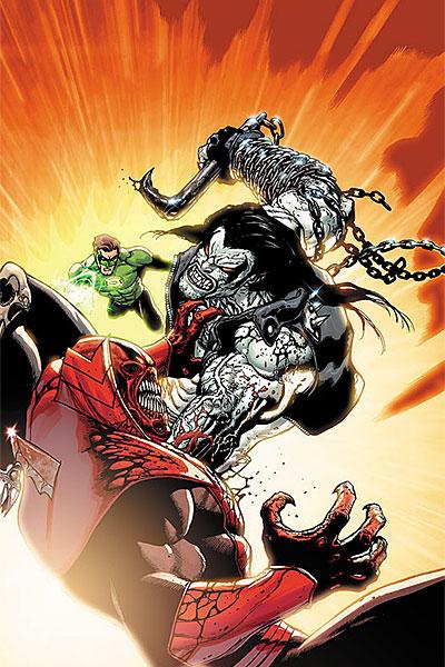
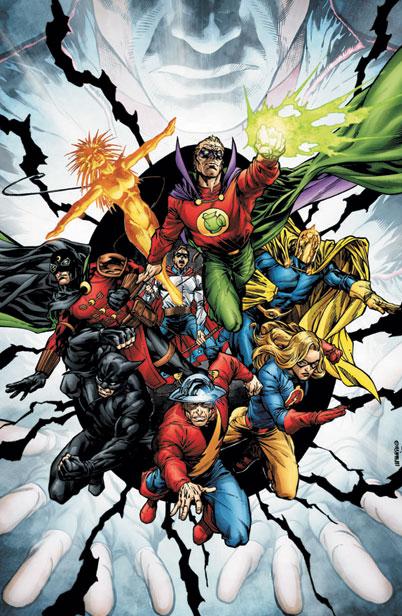
GREEN LANTERN #55
DC Comics
Though Johns does a good job of making this slugfest issue interesting, it’s Doug Mahnke’s art that takes center stage here as Lobo squares off against a quartet of Lanterns. The results are bone crushing and devastating and I loved every bit of rubble and panel of carnage. Talkbackers take note: though the boxing glove doesn’t appear, Hal manages to knock Lobo’s block off with a viciously drawn pair of brass knuckles in this one. For that alone (with a little help from the hilarious backup focusing on the Dex-Starr the Red Lantern Cat), this is a winner of an issue that reads more like a done in one than most Lantern books do lately. - Bug
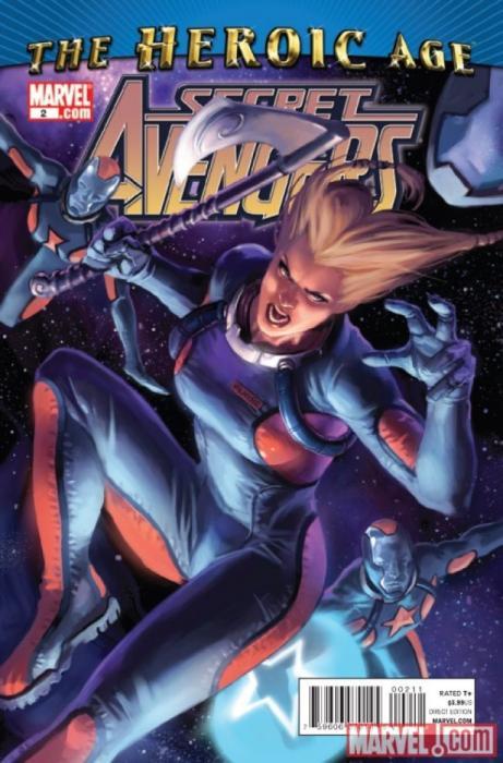
SECRET AVENGERS #2
Marvel Comics
Though in a perfect world this comic would be called SECRET DEFENDERS, if you have to pick up one Avengers comic out of the gabillion out there today, SECRET AVENGERS is the one. Brubaker channels his inner Abnett & Lanning and lines this comic with enough old school cool to please the die hard zombies, and enough fun character and attention to scene to entertain those who started reading comics within the last ten years. Brubaker uses a mismatched cast of characters and bounces their personalities off of one another in the same vein of A&L’s GUARDIANS OF THE GALAXY. Even the annoying Ant-Man gets some moments to shine and it’s good to see War Machine written well too. And finally, Moon Knight is being characterized as a formidable hero. I love these second tier characters Bru is playing with and the art by Deodato is some of his best. The pacing, the character, and the cool: it’s all there for you to enjoy. This book towers over all other Avengers books right now. - Bug
JOKER’S ASYLUM: CLAYFACE #1
DC Comics
Though not as powerful as some of the other installments of this JOKER’S ASYLUM series of one-shots (the Mad Hatter one from a few weeks ago is hard to top), this entry about Batman’s muckiest of foes is still pretty strong. Even Kelley Jones, who I’ve lost a bit of affinity for in recent years due to a loss of edge and form to his work, offers an ooky and moody look to this tale of a washed up actor who becomes an icon for washed up actors all over the place. A decent horrific premise by writer Kevin Schinick. The story structure of this comic follows the predictable path as all of the other one shots, namely, the bulk of the story is for the villain to shine and show off how nuts they are, then Batman swoops in to save the day. But still, with the plot applied to the varied characters in Gotham’s Rogues Gallery in creative and unique ways, it’s a well tread story that worked for me. - Bug
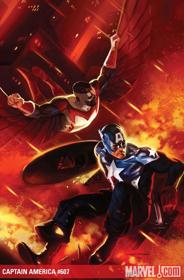
CAPTAIN AMERICA #607
Marvel Comics
After about a year of this book reading like filler, finally, it seems this comic is getting back on track. In this issue, Bucky is feeling the weight of being Cap and having a bit of trouble carrying it. It doesn’t help that Baron Zemo and his Nazi pals are out to get him. There’s a whole lot of character to be enjoyed in this book, but it’s not folks sitting around working their pie holes over coffee and gazing at their navels. Bucky, Black Widow, and Steve Rodgers have some extensive bits of dialog here (much like some of the other Avengers books out there), but the difference is that Bru understands that comics aren’t a static medium. He has this dialog occur on the battlefield or, my favorite, in a training room battling robots. This highlights how bad@$$ these characters are that they can effortlessly take down a training robot or balance on a balance beam AND have an intelligent and heartfelt conversation at the same time. Anyone have Bendis and Romita Jr.’s address? I’d like to send them this example of an exciting comic. – Bug
Editing, compiling, imaging, coding, logos & cat-wrangling by Ambush Bug
Proofs, co-edits & common sense provided by Sleazy G
Ad by Prof. Challenger