| #3 | 6/9/10 | #9 |
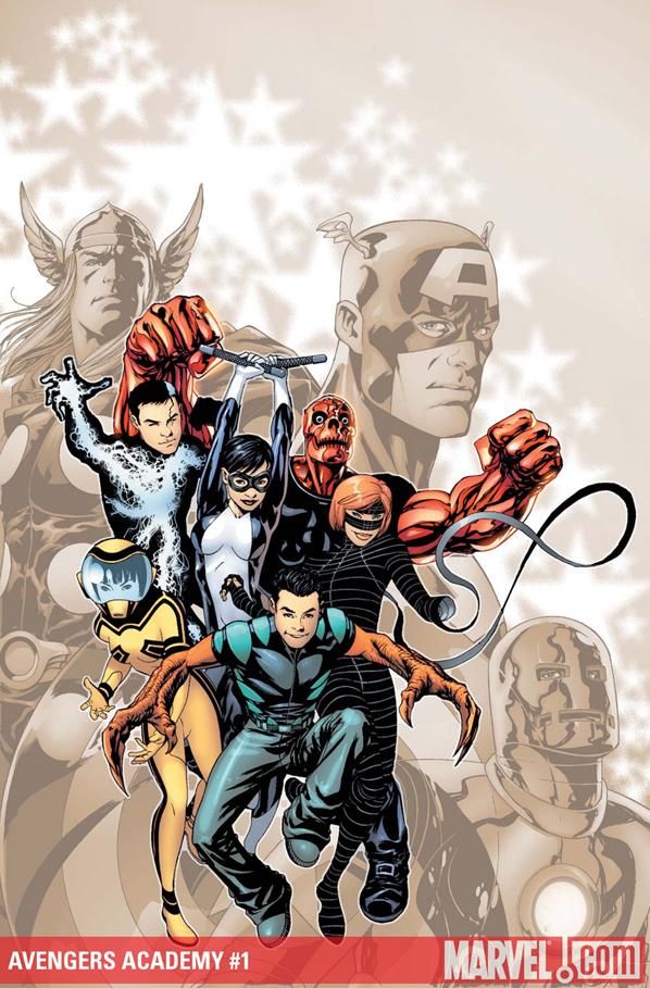
AVENGERS ACADEMY #1
Writer: Christos M. Gage Art: Mike McKone Publisher: Marvel Comics Reviewer: BottleImp
I have a confession to make. I purchased this issue fully expecting to…well, not hate it, hate is perhaps too strong a word, but definitely dislike it. Underwhelmed by it—that’s better; I bought this comic fully expecting to be underwhelmed by it. The premise of a rag-tag group of fledgling heroes, gathered together by experienced elders, trained to be the next generation of superheroes…it’s just so played by now. I mean, from the 1960s through today, this setup has been used so often in so many incarnations that it’s become cliché. The original X-Men, the varied permutations of the New Mutants, X-Force, X-Factor, and back to the semi-recent return of the Xavier School as setting (beginning, if I’m not mistaken, with Grant Morrison’s run on the X-MEN title)…let’s face it, we’ve seen it all before, and the only difference has tended to be the powers, abilities, and the one or two token deformities of the young, inexperienced heroes. The one truly different aspect that AVENGERS ACADEMY seemed to have working in its favor was that the usual collection of tortured, melodramatic mutants has been replaced with tortured, melodramatic superhumans whose powers were either accelerated or forced upon them by Norman Osborn back when he was pretending to be a good guy.(I have another confession to make. I never read any of the DARK REIGN, INITIATIVE, or SIEGE books, and so have only the most vague notions about what the whole Norman Osborn thing was about. Actually, I was surprised that the character had been either resurrected or ret-conned so that he had never been killed—I’m still not sure which. But I digress…)
So yes, I picked up this comic book with a negative opinion partially formed and gaining more mass and volume as I read. Tortured melodrama? This issue’s narrator and reader surrogate, the solid-to-gaseous-state-girl codenamed Veil, learns that her body’s molecules will inevitably begin to lose cohesion, and she’ll discorporate into nothingness. Hazmat, who can emit toxic levels of radiation, must constantly wear a containment suit so as not to poison everyone around her with her powers. Mettle is a big red skull-faced metallic guy. So yeah, there’s the typical amount of drama and pathos that usually accompanies this situation. But as I read on, I found things that I almost grudgingly liked about the series.
The roster of elder heroes doesn’t read like your typical “young heroes” comic. Instead of the Captain Americas or the Thors (or in the case of DC’s JUSTICE SOCIETY titles, any character who was created before 1940), AVENGERS ACADEMY has a mixed bag of second and third-stringers for its teaching staff—Hank Pym, Tigra, Justice, Speedball, and Quicksilver. I was intrigued, and frankly, I was happy to see that Speedball was back to being Speedball again, even if he still was emotionally torn up from his time as Penance (the details of which I have to thank wikipedia for), and that Quicksilver was going to be put to good use again, even if it wasn’t by Peter David (in my opinion, the first and only writer so far to actually give him a fully-realized personality beyond just being a dick).
Now it’s time for the SPOILER! moment. So here comes the SPOILER!, so if you don’t want your reading enjoyment to be SPOILED!, please skip to the end.
Turns out, these young heroes aren’t being tutored because they’re the best and the brightest of the new wave. No, these are the kids who raised the most red flags in their evaluations, the ones who have the most dangerous powers, the ones whose mental states place them just shy of being sociopaths—they’re the equivalent of the kids who set fires and torture small animals for fun. AVENGERS ACADEMY is in actuality a way for the elder heroes to keep an eye on these loose cannons and if possible, turn them into something positive.
With this simple yet elegant twist, Gage turned my opinion on this series around. When you think about it, the notion that young people who have been gifted/cursed with extra-normal abilities would be all sunshine and farts is laughable—I mean really, who here doesn’t think that it would be far more likely for a kid with super-strength to use his powers to rob a bank or kick someone’s ass than to use that ability for a more benevolent purpose? All of the sudden the choice of the elder heroes makes sense, seeing as how all of them have had similar issues with walking the path between darkness and light. Gage also hearkens back to what I always thought was the most bizarre Avengers lineup, that of Captain America with the three reformed criminals: Hawkeye, Scarlet Witch and Quicksilver. I would love to see the reasons behind that incarnation explored more within this title, seeing as how the circumstances in both that era of the Avengers and the Academy share that touch of the Dark Side.
McKone’s artwork is easy on the eyes; he’s got a clean style that works well with the script. I do have a couple of nits to pick, though. First off, I would love to see a bit more variation in the facial expressions. There are a lot of different emotions on display in this issue, but none of them (apart from the excellent smugness that McKone draws on Osborn’s face) really register in the expressiveness of the faces. Second, the costumes of the characters are a mixed bag (and again, since I didn’t read any of the titles leading up to this one, I’m not sure if these designs are McKone or someone else). I love Hazmat’s graphic, black-and-yellow radiation-symbol motif, and likewise Striker’s outfit—the electricity lines on flat black; an homage to Neal Adams’ similar motif for the X-Men’s Havok? Veil’s look is…different, but okay. But Mettle and Reptil both go the street clothes look, and Finesse’s leotard is, well, a leotard. What I’m missing is a bit of the iconic superhero look.
And lastly, I know that women in comics are 99.99999% of the time drop-dead gorgeous, but when the writer goes out of his way to describe a character as being flat-chested and wearing thrift-store clothes, and insinuating that this girl is a member of her high school’s lower echelon of coolness, the artist should at least try to make an effort to illustrate those ideas—not just take the easy way out of slapping glasses and a ponytail on a drawing of girl who looks like Scarlett Johansen.
Nit-picking aside, this issue was a pleasant twist from the old “mentor/student” standby of the comic book world, and it’s nice to see that teenage angst isn’t just for mutants anymore. I can’t say that I’m 100% sold on the series yet, but this first issue gives me enough reasons to stick around and see how this skewed cliché develops.
When released from his Bottle, the Imp takes the form of Stephen Andrade, an artist/illustrator/pirate monkey painter from the Northeast. You can see some of his artwork here. He’s given up comics more times than he can remember. But every time he thinks he's out, they pull him back in.
Special Advance Review! In stores in August!
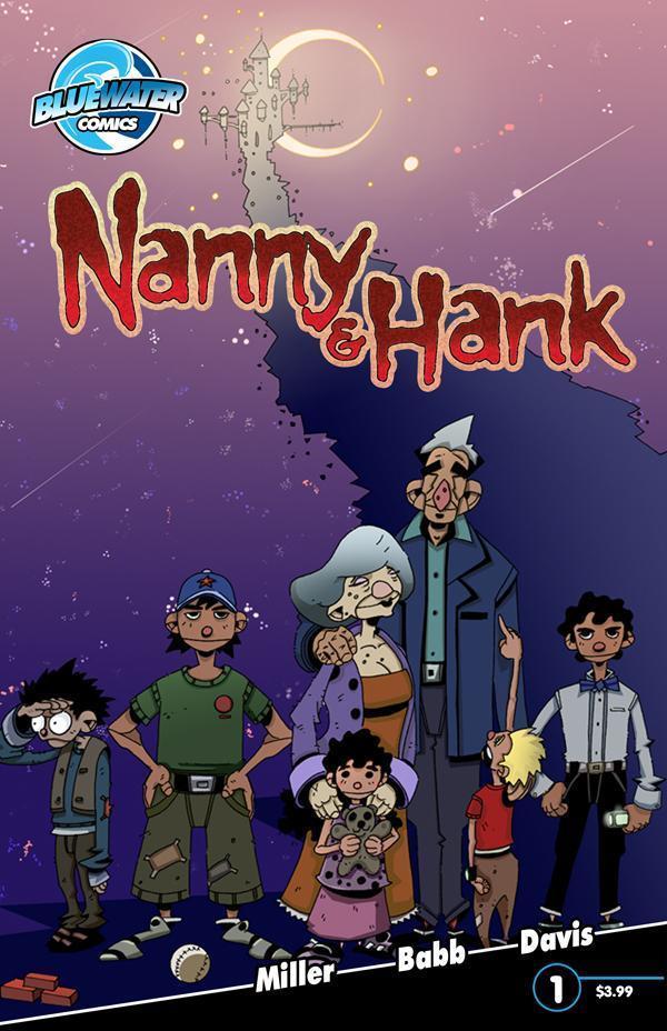
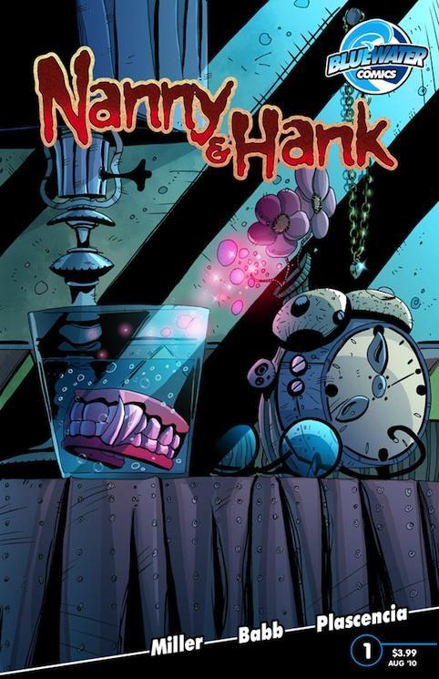
NANNY & HANK #1
Writer: Mark L. Miller Art: Steve Babb Publisher: Bluewater Comics Reviewed by: superhero This book can be ordered in June’s Previews Order #JUN100824
It’s not often that I come across a vampire idea that seems original to me. Granted, the idea of sparkly vampires walking around in daylight seemed pretty unique but walking around in daylight sort of cancels out the concept of a vampire to me so I don’t know if I’d consider the TWILIGHT “vamps” original. Then again, I’ve never read the TWILIGHT books or seen the movies so I can’t judge TWILIGHT too harshly. I’m only going by what I’ve heard…but what I’ve heard doesn’t sound too good.When Ambush Bug a.k.a Mark L. Miller gave me a slight hint about what NANNY & HANK might be about at Comic Con about a year ago I just know that my instant reaction was, “Now, that sounds interesting.” Back then, it was just an idea that he was trying to see if he’d develop with someone else and as we all know, ideas tend to fall apart and not necessarily manifest into art as cool as the initial thought that spawned them. I’m happy to say that NANNY & HANK is a great first issue that’s got me reacting as positively as I did when Bug first started a sentence with, “It’s about…” almost a year ago.
What’s it about? Well, ever since the LOST BOYS it seems that almost every new vampire that’s come down the pipe has been one of the B.P.’s…the Beautiful People. They’re all young and toned and hot and…well, you get the idea. It makes it seem that almost every vamp has been turned in the prime of their lives. When they were at their best. Almost every modern vamp (with an exception of a couple here or there) just looks like they are forever 21…ready to pose for the next Abercrombie and Fitch catalog at the drop of a hat. But what if…what if you were turned when you were in your golden years? What if you were made into a bloodsucker at age sixty, seventy, or eighty? What would that be like? Would it, for lack of a better term, suck or would it be like revisiting your youth all over again?
 This is the idea that seems to be at the heart of NANNY & HANK and it’s one that is really fascinating to me. As a culture, we’re obviously obsessed with youth and most fiction that involves any kind of immortality basically freezes its subjects in their late teens to early twenties. But what if you were stuck at an age when you were supposed to be starting to think about the end of your life rather than just beginning it? What would that be like? That’s a great question and it looks like one that’s going to be explored in the pages of NANNY & HANK.
Miller does a great job of setting us up with this first issue. In so many vampire dramas, the person that the vampire was before they are turned is ignored. Their history is gone the moment they are changed. Like they never had a life before they were switched. With an elderly vampire it’s impossible to ignore the life that came earlier…because they’ve already lived so much of it. It’s because of this that NANNY & HANK comes across so well. By making the two leads an elderly couple settling into their sunset years we are able to imagine two full lives lived and it makes the book very touching and sweet when they interact with each other. In much of the vampire lore that I’ve read many of the vamps were people with not much to lose or with little desire to deal with the lives they were leading. In NANNY & HANK we’re given two people who obviously love each other and have a stake in each other’s lives. They enjoy their lives together which, to me, makes them unique in vampire fiction. It’s the lead characters that make NANNY & HANK such an interesting read and Miller should be congratulated for fleshing them out so well. There are some great character bits in this book and it makes the story all the more believable. This is the most poignant vampire story I’ve read in a while…if ever.
I
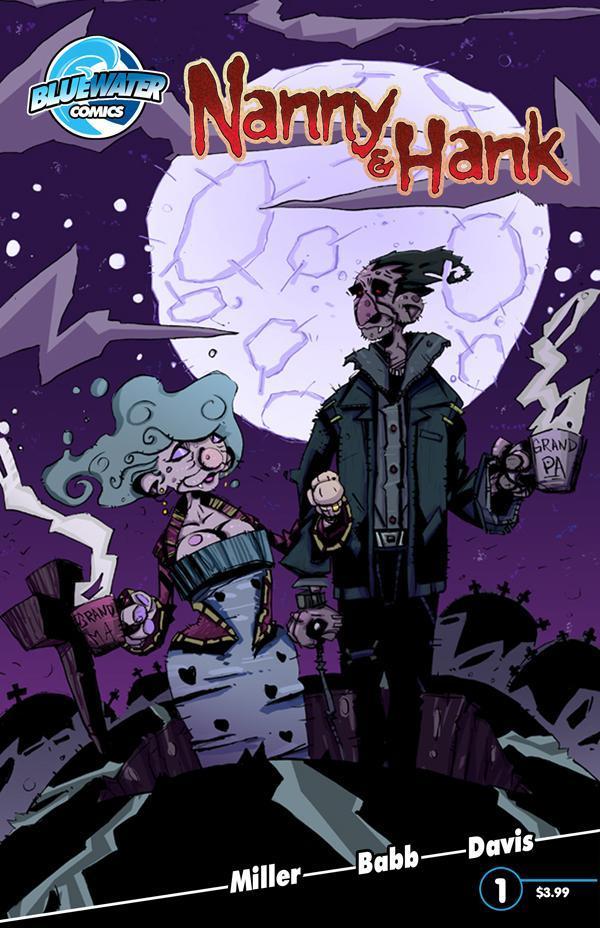 It’s a poignancy that’s almost lost, however, because of the artwork. Don’t get me wrong…I love this artist’s work. I’m just not sure that it’s the right style for this book. Steve Babb’s style is cartoony and original but some of the key emotional moments tend to get a bit lost with the flair that Babb adds to his pages. The art style of NANNY & HANK is bit more style than substance. It doesn’t take away from the story completely; I just felt that there were some moments that could have been better served with a more straightforward artistic approach. But make no mistake, Babb is a fantastic cartoonist. His style is like nothing I’ve ever seen and at the very least his pages pop. The mix of artwork and color in NANNY & HANK make for some really nice looking visuals.
So all in all NANNY & HANK is more than worth reading. Not only is the story original but the artwork is as well. NANNY & HANK is all around a different kind of vamp book and if you ask me that’s a good thing.
Discovered as a babe in an abandoned comic book storage box and bitten by a radioactive comic fan when he was a teenager, superhero is actually not-so mild mannered sometime designer & cartoonist, Kristian Horn of Los Angeles, California. He's been an @$$hole for three years. Some of his work can be seen at www.kristianhorn.com and check out his blog at www.parttimefanboy.com.
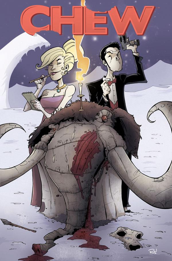
CHEW #11
Writer: John Layman Art: Rob Guillory Publisher: Image Comics Reviewer: Humphrey Lee
About a year ago I fell in love with a fresh new book about a guy with an ability that I had never heard of and honestly still haven’t bothered to figure out was a real word in all the time since. As this book is always wont to remind you, Tony Chu is a Cibopath, which gives him sort of a psychic insight into the life of whatever it is he eats, plant or animal, and has also been a hell of a hook for this title since the start. For ten issues now, hijinks have ensued, gorily comedic events have occurred and Tony Chu has fallen in love, much like my adoration for this title. Issue eleven here, the first date between our sometimes unwillingly cannibalistic protagonist and his love interest, Amelia Mintz, proudly keeps up the tradition year one has established.What has really carried the momentum of this book is that as it has sort of flourished since its inception, so has Tony Chu. After a couple crazy adventures, one partner almost dying and another betraying him, the once timid beat cop has now become a bit of a full-fledged badass in his current job with the FDA. His new confident stand, though somewhat awkward, is greatly reflected in the book. I mean, shit, now we’re dealing with a villain that can gain knowledge from those he “consumes” and is so self-important about it he’s presenting himself as a vampire. If that isn’t over-the-top in both comedic value and kind of intimidating at the same time, then I don’t really know what is. And it works exceptionally for this book and what it is.
As Tony grows and as the scope of the book grows with it, so do the characters that make up this world. Really, every element in this is in sync which is why it always has a fresh energy to it. Tony and his adventures get more bizarre and unnecessarily, but amusingly, gory while the side characters and their little moments each issue take some weight off of just that main conceit. The developing relationship between Tony and his handler at the FDA, and how that has cooled off thanks to a Strasburg-like curve ball of Tony’s partner hooking up with the feverous prick is the exemplification of the kinds of WTF moments that keep this book popping. And as long as this keeps popping, and I have no reason to believe it won’t at this point, then I will always be here to keep singing its praises as one of the best books I am currently reading.
Humphrey Lee has been an avid comic book reader going on fifteen years now and a contributor to Ain't It Cool comics for quite a few as well. In fact, reading comics is about all he does in his free time and where all the money from his day job wages goes to - funding his comic book habit so he can talk about them to you, our loyal readers (lucky you). He's a bit of a social networking whore, so you can find him all over the Interwebs on sites like Twitter, The MySpaces, Facebookand a Blogger Account where he also mostly talks about comics with his free time because he hasn't the slightest semblance of a life. Sad but true, and he gladly encourages you to add, read, and comment as you will.

NEMESIS #2
Writer: Mark Millar Art: Steven McNiven Publisher: Marvel Icon Reviewer: Johnny Destructo
"Aye, I know....fookin' COOL, right?"I imagine that's the reaction that Millar goes for when he writes things like MARVEL KNIGHTS SPIDER-MAN, OLD MAN LOGAN, and his new creator-owned follow up to KICK-ASS, NEMESIS. Only the second issue in, and already there are some bad-ass sequences. This installment tells the brief origin story of our bizarro Batman, and make no mistake, this IS the opposite of Batman in almost every way. Decked out in all white, with a high-tech white car that expels a "bat-pod" type motorcycle when needed, tons of gadgets and money, with a huge batcave-like lair. He's not even trying to hide it; much like the Superman gone bad stories over in Mark Waid's IRREDEEMABLE, here we have bad-Bats. And it's pretty awesome. Brimming with over the top bad-assery, this book is just a fun read! It's entertaining to see the two hyper-intelligent enemies go toe-to-toe. And the best part is the whole reason I love it when creators can play with our most recognizable comic-character archetypes. Unlike in Batman books where we know that Bats will win out over the Joker every time, I have no idea how the boogens this book is going to end. And that is a great feeling! Part of the problem with iconic characters is the fact that their stature as icons in a way neuters the tension of their stories and automatically down-scales their fictional peril. No such worry with a book like this. This story can go anywhere and can be anything Millar wants it to be. And you can sense the amount of pure fun Millar is having writing this.
Same with McNiven. Keeping with, for the most part, wide open panels, crisp line work that's heavy on the detail, but not overbearing, I wanna have sex with Steve's inkwell. The colors are for the most part quality, but I think it does the pencils a disservice at times (sorry Dave McCaig). Just like in a movie, my belief is that a good score goes unnoticed, while a bad score is entirely obvious, Dave's colors put a hurting on Howard Anderson's face in the "Anderson Foundation" scene. Poor old man Anderson looks like he's 2 steps away from shambling off the page and eating my brains as a fully-turned zombie. I understand that he was just trying to be thorough with his coloring, but the maze of whites, grays and dark grays on every lump of Howard's face is just too much. Otherwise, the colors are consistent and attractive. I kind of wish whomever had done the colors for the McNiven cover had done the interiors though. There is a level of color detail on the outside of the book that doesn't follow through into the panels contained within. But that's just nit-picking a quality read.
Aye, Mark. It IS fookin' cool.
JD can be found hosting the PopTards Podcast, discussing movies, comics and other flimflam over at www.poptardsgo.com, graphically designing/illustrating for a living, and Booking his Face off over here.
BOOSTER GOLD #33
Writers: Keith Giffen Artist: , J.M. Dematteis, Chris Batista Publisher: DC Comics Reviewer: Optimous Douche
I can’t express all the ways I have hungered for this issue. Oh wait, I’m a verbose douche; of course I can explain the ways. Since the start of Booster’s new direction as a chronological Maytag repairman, I would close my eyes at the end of each issue, find the brightest star in the sky, and hope beyond hope itself that the next issue would concoct a mission that would bring Booster back to the glory days of JUSTICE LEAGUE INTERNATIONAL. Well thank you Jiminy Cricket, because 33 made all of my wishes come true and so much more.I’m glad my wish didn’t come to fruition earlier. Katz and Johns did a great job setting the stage for Booster’s new direction in the face of the impending FINAL CRISIS during the title’s first year. The next year and a half was a series of highs and lows, with Booster partaking in one off missions that didn’t exactly dazzle or disappoint, they were just sort of meh. The blessed year three though brought back my hands-down favorite creative team from my childhood, the men who made Booster and Blue Beetle characters worth caring about, the Grandfathers of Bwahahaha – none other than the great Giffen and Dematteis. Their masterful fusion of heart and humor in comics served as a template in my corporate communications career and in all of my personal musings. I try desperately to never let the Fanman side of me bleed into reviews, but while I’ve been honored to speak with tons of creators since I started spewing on Ain’t It Cool, these are two men I would give my left nut to meet or simply exchange e-mails with. Welcome back gentlemen you have been missed.
/fanboy_gushing_off
So why did Booster go back to the glory days? In what I can only describe as a nostalgic crossover panacea, Booster is looking to unravel the global mind-wipe performed by the recently resurrected Maxwell Lord in JUSTICE LEAGUE: GENERATION LOST. And since none but a select few can remember the vile doings of Lord in the present, Booster hops into the Rip Hunter way-back machine to find evidence of Max’s existence in the past. A fun plot to be sure, but as with all things Giffen the true beauty of his pieces is found in the characters and the moments he delivers.
This was almost like two different books, and I’ll give the guys credit for this being by design (even if it wasn’t). The first part of the tale, before Booster travels back in time, is firmly embedded in the current DC universe. We live in dark times, an age of cynicism if you will, and DC has evolved their stories to fit that tonality. Skeets’ dialogue is as acerbic as it ever was and Booster is still a man child, but the world is clearly the new DC. Now, once Booster dons his old costume and ends back in the late 80s, it was like the first time I read JUSTICE LEAGUE 1, the issue with that infamous cover of all the heroes staring at us, almost daring us to read on. This was all old school, even down to the self-deprecating credits, which I have always read and cherished. But what’s most important is that this section also acknowledges the passage of time. I almost want to punch Steven Spielberg in the face for introducing the term “trapped in amber” into the public psyche. It’s a tag that DC gets hit with often and I find it quite unfair. This issue is a prime example that their universe has evolved without forcing us poor readers to read the continued adventures of “Old as Fuck Man”. While Booster is sleuthing in the old JLI headquarters he passes J’onn J’onzz who senses a difference in Booster’s psyche. When Booster challenges J’onn in an attempt to keep his ruse alive, J’onn also points out that Booster’s hair is a different style and that he is suffering from early male pattern baldness. Now, sure in real-time Booster would be pushing fifty at this point. I get it, but these are comics and we all know real time must be slowed if not halted. In my opinion this was a perfect way though to exhibit that time has passed without angering the wrathful Gods of Continuity. Subtle, yet brilliant.
The rest of the issue focuses on what evidence Booster will bring to the table and offers some great JLI moments to be relived. I also have to mention that I almost welled up with a slight tear when Booster saw the old room he shared with Beetle and lamented to Skeets, “This is the only place I ever considered home.”
Needless to say, I’m smitten with Booster and I’m also smitten with the bleed into the events of JUSTICE LEAGUE: GENERATION LOST. Now that my wish of seeing the old JUSTICE LEAGUE alive again has come true, when I look up at tonight’s sky I am going to ask my favorite star for DC to give Giffen and Dematteis another shot at writing an in-continuity team book. I am a greedy douche and I do not want this reading goodness to end with this arc.
Optimous' book AVERAGE JOE is being published by COM.X. AJ is a tale that explores what our world would be like today if everyone was gifted with super human abilities in 1938. The guys are looking for top shelf art talent to partner with on this project. Reach out to Optimous on FaceBook for further details.
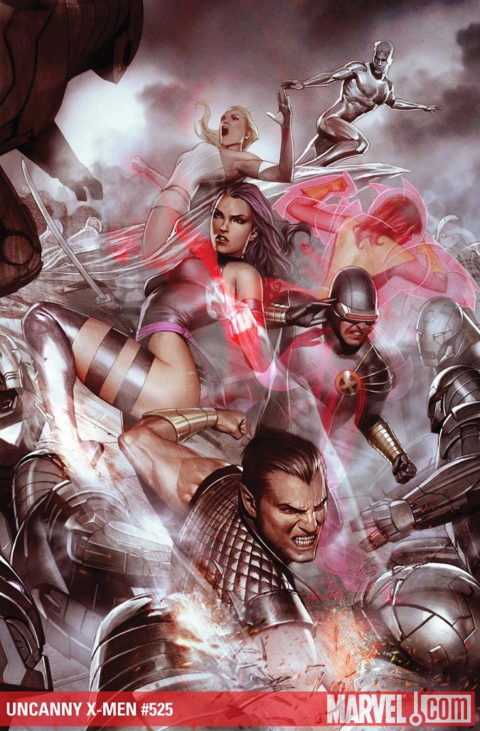
UNCANNY X-MEN #525
Writer: Matt Fraction Art: Terry Dodson Publisher: Marvel Comics Reviewer: KletusCasady
I have been waiting a long time for X-MEN to be this good. Up to about 3 or so years ago I couldn’t care less about the X-men. There were too many to keep up with, I’d open a book and realize I didn’t know anyone much less care about what happened to them. The Scarlet Witch was the best thing to happen to mutants since Wolverine first popped those claws and called somebody “Bub”. The appeal of mutants were that they were persecuted, chased and most time hated but they had pretty much become one of the fastest growing populations thus rendering their initial appeal null and void (maybe not null and void but you know where I’m going). Now they have their backs against the wall and it makes for some good ‘ol X-fun, X-ass kicking, and X-treme badassery (don’t worry I got more).At this point in our “Second Coming” crossover event, X-Force accompanied by Cable and Cypher has gone into the future to shut down the Nimrod Mastermold and they apparently don’t have any way to get home. Nimrods are still looking to X-terminate all life within the Red Balloon (what a boring movie!). The X-science club is still stuck outside but is receiving help from Earth’s Mightiest Heroes and then some with not much luck. Cyclops has a fuck of a plan Z, I mean this idea is wild, dangerous and highly unpredictable but at this point he doesn’t have much choice. Oh yeah Hope hates Cyclops.
I actually like Cyclops more and more with every issue I read; he is one of the few comic book characters that has actually matured and became something better than his past self which was a whiny prick with a hot girlfriend. I felt really weird that Professor X was no longer in charge of the X-men because I couldn’t imagine the X-Men without the X (see what I did there?); it was like when Jordan retired and I just couldn’t imagine basketball with out him. This has proven to be really smart move by the X-writers because now Cyclops has become a well rounded character and Prof X doesn’t have to be this one dimensional character that he’s been for a number of years.
Also I am now fully convinced that Matt Fraction can (and should) be writing every character in the Marvel Universe. None of the dialog feels out of place, from Mr. Fantastic being almost giddy about the challenge to get into the red dome, to Bucky trying to be like Steve and take charge, to Thor not wanting to give up even though its killing him, everything just feels right which is a huge accomplishment when dealing with a cast this size. The meeting for this story line must have been one of the most fun Marvel meetings ever because everyone is bringing their A game and it seems like the writers are really into this story and it really shows, every issue before this has left me thinking “Ok they’re fucked,” until the next issue when I’m like “Ok now they are REALLY fucked.” Basically what I mean is the ante is upped every issue to the point where I really don’t know how there are going to get out of this. I know they will cause they gotta fight vampires or some shit next but logistically I don’t know HOW it’s going to happen and I like that.
Terry Dodson does a pretty darn good job on art; there are a few panels (page 9, Thor has a pig face!) where things look a little muddy but I don’t think there have been any delays and I can barely draw a stick figure so I can let it slide plus the panels with action (Namor fighting 2 Nimrods, Iceman throwing one out of a window, or any of the action in the future) are pretty stellar. This issue has a lot of carnage and things are getting worse for the X-men but things are getting so much better for the readers. The more shit hits the fan the more I like this book.
Matt Fraction is awesome and he is writing some badass X-Men tales and I hope he’s on this title for a while (not sure if UNCANNY is getting cancelled) because he’s got great ideas and great ways to execute those ideas. Science is an important theme for the X-men and Fraction comes across to me as a science geek (see CASANOVA & INVINCIBLE IRON MAN) so most of his stories seem so natural to me and his dialog is always good. When Rogue is told to keep Hope safe she replies “Cross my heart,” SHE’S GOT AN X ON HER CHEST. Little things like that that may not seem much to other people but they make me smile and give me a deeper appreciation for Fraction’s attention to detail. Terry Dodson’s art work isn’t my favorite of the X-artists but his action is really good but sometimes faces come across kind of weird (see pig face). Am I the only person who digs Greg Land? I know there’s a lot of hate but I like his shit, porno faces or not it looks cool to me.
Anywho…if you’re not reading this for fear of some X-cavation of old X-Men ideas and stories, stop it, put down the gun and pick up this issue. If you haven’t read any X-books in the past 5 years this one will at least make you curious as to what happens next and if not…hmm I didn’t have anything for that…damn. Just read the damn book you won’t be disappointed.

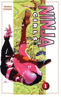
NINJA GIRLS Volumes 1-3
By Hosana Tanaka Released by Del Ray Manga Reviewer: Scott Green
It has to be said, NINJA GIRLS does what it says on the tin. You certainly can't complain of false advertising here. Wanna see buxom young women in exotic, skintight outfits smash baddies with super ninja powers? You're in luck. If you want to see risqué women in peril, bondagey stuff, you're good to go. If you want, skin and sex, you might be disappointed. The manga stops just short.NINJA GIRLS, aka RAPPI RANGAI, ran in SHONEN SIRIOS, an anthology dominated by moe or bishojo manga, with cute girls integrated into various genres from sci-fi/fantasy to horror like PRINCESS RESURRECTION. Here, the girls are the chief attraction. It's a bit naughty... a key scene involves the characters stripped to their undergarment, tied up and imprisoned while one of the ninja girls bleeds from a leg wound... until an orgasmic burst of excitement allows her to break her bounds. And, the manga is a bit kinetic... Tanaka doesn't pay much attention to panel to panel transitions or composition in the fights and as such the choreography is basic, but zip tones and inks are used well with the fleshy characters to give scenes of things hitting each other some pop.
NINJA GIRLS opens with the manga identifying itself as being set in the Sengoku, also known as the Era of Warring States, the chaotic period prior to Japan being unified under the Tokugawa Shogunate. One of the clans wiped out in the contests of power was the noble Katana. The lord committed suicide. His household was exterminated. In the wake of this tragedy, the Katana's vassals went out searching for remnants.
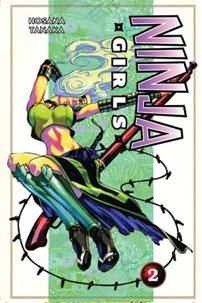 Raizo lived as a poor orphan, ostracized from his village due to the horn growing out of his head, seen by many to mark him as a demon. Guided by his mother's spirit inhabited memorial tablet, which reacts by tipping over or occasionally correctively striking him, Raizo barely contains his rage and disappear. On day, he finds a woman in shapely armor washed up on the river bank. He's aroused, but he manages to carry her home, pump the water out of her chest, give her mouth to mouth, take off her wet clothes and pour some sake into her mouth to warm her up. Yeah, that's the sense of humor at work here. As Raizo begins to notice how many bladed weapons she had secreted in her clothes, the woman wakes up, and isn't too please to discover her unclothed, boozed situation. Fortunately for Raizo, her maidenly rage is calmed when the misunderstanding is cleared up. Turns out, Kagari almost drowned herself in a reed snorkel, ninja hiding related miscalculation. Her view of Raizo further shifts when she discovers the horn on his head. Rather than the mark of demonic heritage, the horn is proof Raizo is a remnant of the Katana bloodline. Fired up by his proximity, Kagari can shift into Shintaigo god body mode and waste some newly arrived adversaries. So, Kagari swears allegence to Raizo, as does relatively elder, busty, one eyed sharp shooter Kisarabi and androgynous, s&m-y trapster Himemaru. Together, they plot to restore the Katana as a substantial household under Raizo... marriage alliance seeming to be a solid option for achieving the aim.
If you don't think you'll like a manga that exists to showcase heavy chested ninja girls getting tied up by or smacking around other ninjas, there's no reason why you'll like this one. The faults of a manga like this can't be anything but apparent. Narrative, well constructed characters or concepts, anything thoughtful for that matter... they're not in the offering. And yet, if you are inclined towards the material, you can appreciate how NINJA GIRLS is careful not to stagnate or irritate.
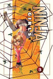 Raizo is a bit spine-possessing as anime/manga characters in his circumstances go. Despite being all surface, there's plenty of energy radiating from the rest of the cast as well. The story quickly scootches in and out of situations. It set on tapping substories for less than a volume's length, with troubles related to a given potential bride set up and resolved in less than a hundred fifty pages. Volume three for example, introduces a mess of Yagyu, the famed family of sword masters that yielded the adversaries of Lone Wolf and Cub and the semi-historical legend Jubei Yagyu, inspiration for a host of anime, manga, novels and video games. A succession fight tournament and a preamble encounter with the ninja girl's master are worked through by the volume's conclusion. Without being perfunctory, the manga gets through a set of excuses for extravagantly revealing new costumes and dismembering fights with freakish foes, wraps it up and is ready to present something new before too much thought distracting can be applied.
NINJA GIRLS is spectacularly unapologetic. In no way does it veil its low minded intensions. It's gladly trashy. I could name plenty of junk manga I'd rather see released in North America, but I'm still glad this one has made it over. I'm glad the avenue to this low field in the diversity of manga hasn't been closed off.
Scott Green has been writing for AICN ANIME for over nine years. If you like what you see here and love anime & manga, be sure to check out his latest AICN ANIME column every week on AICN.

Hey folks, Ambush Bug here with another trio of indie flavored comics to satiate taste buds gone numb by the monotony of the mainstream. Enjoy!
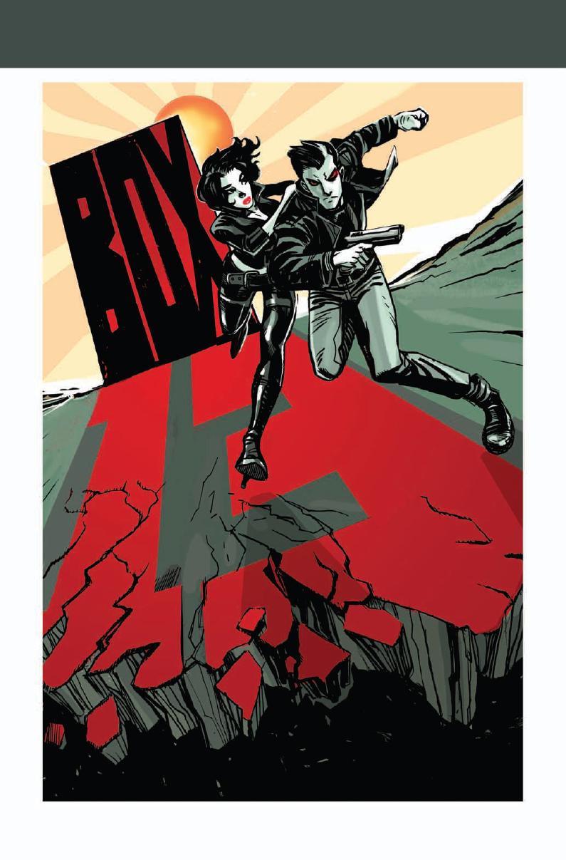
BOX 13 OGN Red 5 Comics
Following the tradition of thrillers such as THE MANCHURIAN CANDIDATE and the BOURNE series this book follow a writer of spy fiction and his action packed adventure that occurs when he is presented with a box with the number 1 on it at a book signing. The events that occur after that mundane start are filled with adrenaline as the pages and panels fly by at lightspeed in this 120 page graphic novel. Writer David Gallaher knows how to amp up the tension aided by the fantastically kinetic panels by artist Steve Ellis. This is a pretty great read -- an adventure story that keeps the chase going from beginning to end.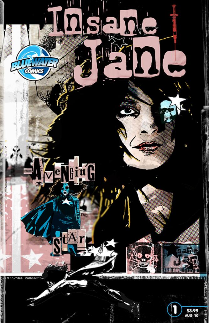
INSANE JANE: AVENGING STAR #1 Bluewater Comics
This book reminded me a lot of Morrison’s ARKHAM ASYLUM in that the narrative takes place in a mind unhinged where what is real is all in the eye of the beholder. Is Jane a super heroine trapped in a mental hospital or is she just bug-nutz crazy? The fun is in the mystery here as the lines between what Jane sees and what is really happening blur and bend. The true standout in this book is the art by an artist known as GMB. The graphic / mixed media quality of his art makes this a truly surreal read. I really enjoyed the layered art and the tiny details GMB adds to each and every panel. This seems to be a very cool miniseries by Darren G. Davis and Zach Hunchar.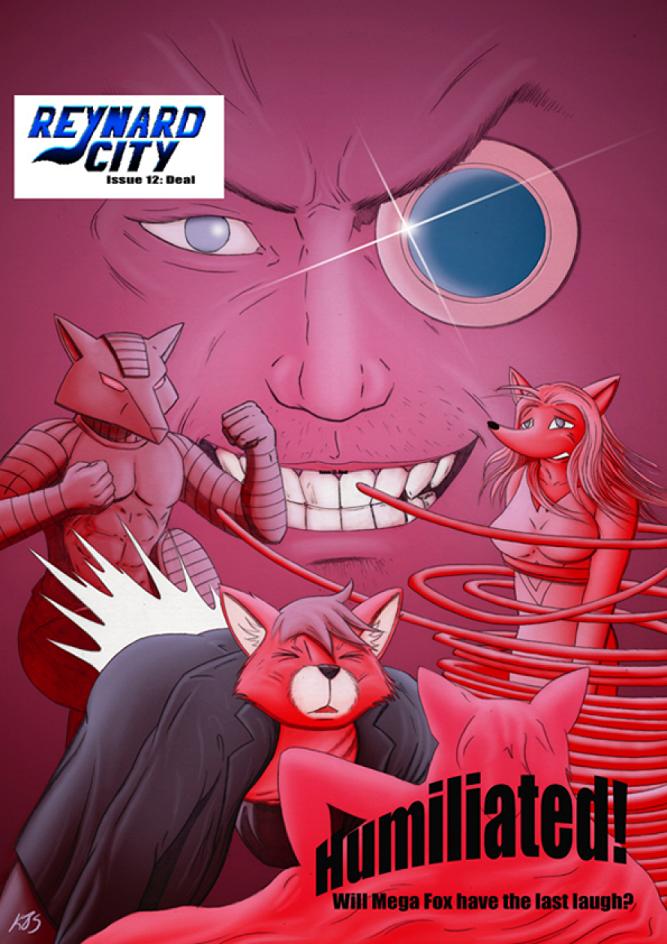
REYNARD CITY #12 Reynard City/Polycomical
More surreal goofiness ensues and if you’ve read any of the 12 issues of REYNARD CITY, you know what I mean. The folks behind this book seem to be having a great time melding anamorphic superheroes with fun super powers and super hero traditions. But all of it is done with a sort of madcap lunacy that one could only find in an independent comic. Not for the literal minded, REYNARD CITY is a challenging but ultimately fun read and worth seeking out if you’re interested in something out of the norm.Ambush Bug is Mark L. Miller, original @$$Hole / wordslinger / reviewer / co-editor of AICN Comics for over nine years. Check out his ComicSpace page for his entries in Cream City Comics’ MUSCLES & FIGHTS VOL.3 and MUSCLES & FRIGHTS VOL.1 anthologies. Bug was interviewed here & here (about AICN Comics) and here & here (on his VINCENT PRICE PRESENTS: THE TINGLER comics). Bug’s latest comic is VINCENT PRICE PRESENTS #21: WITCHFINDER GENERAL (available in May’s Previews Order # MAY100828) on sale in July. Fanboy Radio recently interviewed Bug about it here. Bug was also interviewed here & here about his upcoming original vampire miniseries NANNY & HANK (available in June's Previews Order #JUN100824) due out in August.

THE BUZZARD #1 Dark Horse
Though things with the Goon seem to be stalling a bit, Eric Powell shows he still has what it takes when it comes to writing and drawing a compelling story. Though the Buzzard’s tale is a bit more somber than what some would expect from the writer of THE GOON, it does have a whole bunch of monsters, carnage, and of course a wide-eyed kid taking the brunt of most of the abuse. Powell’s art in this one will fill the eye-stomachs to near bursting capacity with its sumptuously textured and shaded art. Powell and artist Kyle Hotz team up for a back up feature focusing on Billy the Kid and his gang from the miniseries that is fun, but somewhat difficult to follow because it doesn’t really introduce readers to many of the characters. Sure Powell and Hotz teamed up to bring a miniseries before with this cast, but that was a while ago and a recap or at least a floating head section at the beginning would help set the stage. Still, Hotz’s spindly and wiry characters are fun to look at. All in all, a very pleasing issue. - Bug
SECRET SIX #22 DC Comics
This series is shaping up to be my pick for Best Ongoing Series of the year. After a bit of stagnancy last year, this year’s run started out with a team up with Ostrander and a return of the Suicide Squad. Now, Simone follows that with one of the grittiest and white knuckle armchair clutching arcs I have ever had the pleasure to read. Catman goes on a rampage in search for his son’s kidnappers. There were moments in this arc that literally took my breath away, which is something given the amount of comics this jaded comics fan has read. Simply one of the best series on the racks and the conclusion to this arc is filled with so many amazing scenes that I am almost jealous of those who haven’t experienced it yet. Damn good storytelling with Simone writing at her best. - Bug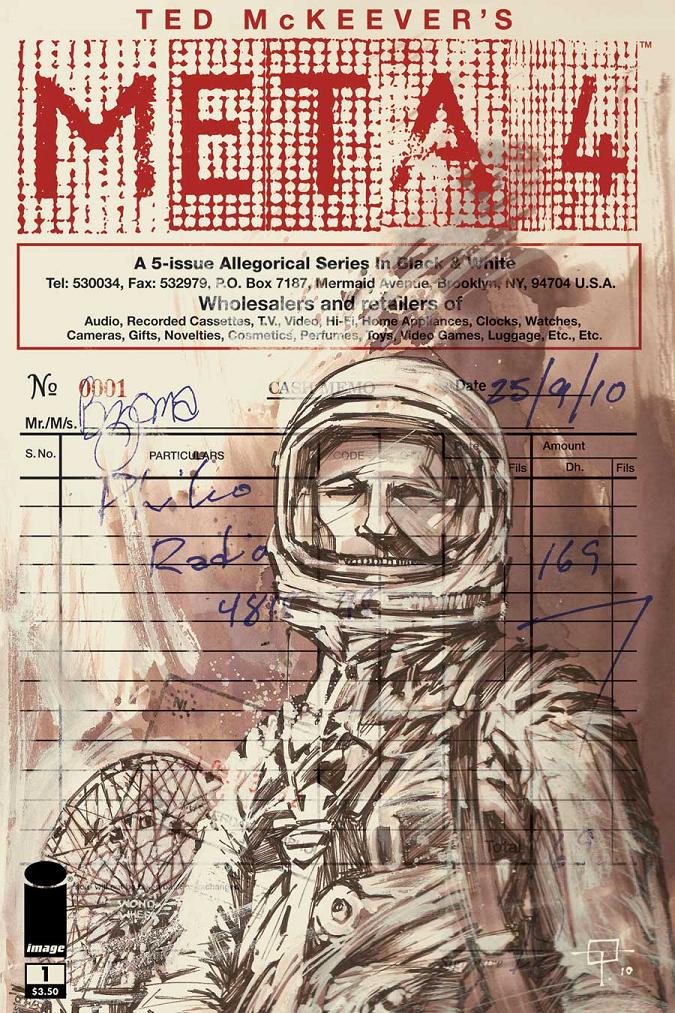
META 4 #1 IDW Publishing
Either you love Ted McKeever’s art or you don’t. There doesn’t seem to be a middle ground. I’m in the “love it, Love It, LOVE IT!” camp. There are only a few artists today that I devour each and every issue of when I see their names on the cover. Ted McKeever is at the top of that list. His characters are emotive and gestural. His landscapes are stark, industrial skeleton frames. His themes vary from horror to sci fi to noir to intense drama. But there’s always that gritty, grimy, guttural style that I can’t get enough of. In META 4, a man in an astronaut suit wakes up in what looks to be a broken down Coney Island-type wasteland populated by a haunting Santa Claus, a pimp, and a hooker. Much violence and mystery ensue. Surreal and wholly original, METRA 4 is the perfect book for someone who wants to read a story that falls out of the norm. Can’t wait for issue #2. - Bug
SOLOMON KANE: DEATH’S BLACK RIDERS #4 (of 4) Dark Horse
This was a damn fine miniseries featuring Robert E. Howard’s dark Puritan. Though at times the book became a bit redundant, especially with the writer Scott Allie’s overuse of the sound modifier “BAM!” (I mean, the book uses BAM! for everything from a door slamming, to a fist punching, to a kick, to a sword hit…how about a BLAM! or a WHAP! or even a FWOMP!), you can’t deny Allie’s love for the original material and the quality of the thick and moody lines of artist Mario Guevara. Here’s hoping we get to see more Solomon Kane some time soon and that Scott Allie and Mario Guevara will be the creative team behind it. And maybe a few less BAM’s… – Bug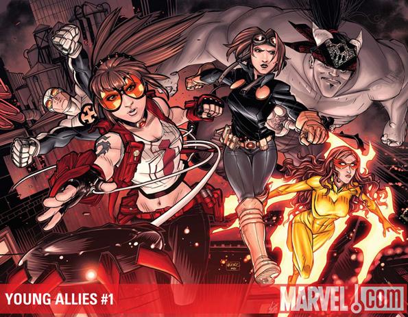
YOUNG ALLIES #1 Marvel Comics
Not that there’s particularly anything wrong with this book (OK, Firstar deserves to be in the Avengers, not the Allies), but there’s not a lot standing out with this one either. The new villains introduced in this issue are kind of one note, though I do like the name The Bastards of Evil. But with such stellar series as NEW WARRIORS, NEW MUTANTS, RUNAWAYS, and YOUNG AVENGERS under their belts, I tend to expect a bit more when it comes to young hero team books in the Marvel U. So far, this is just another team thrown together simply because they were at the same place at the same time. This is one of those books I’ll stick with for a few issues, but if it doesn’t kick my @$$ in the next few issues, I’m out. David Baldeon provides some pretty strong art, but the light tone of his panels don’t really match with the carnage that the Bastards of Evil enact in this issue. I hate to call “meh” out of the starting gate, but that’s kind of what I muttered after finishing this one. - Bug