
| #27 | 11/11/09 | #8 |
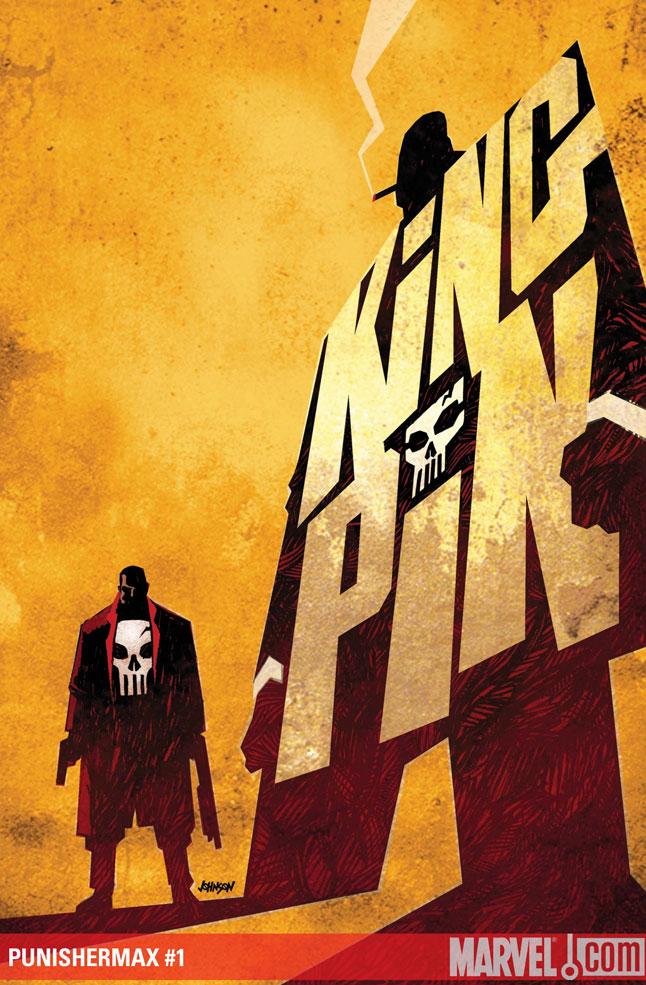
PUNISHER MAX: KINGPIN #1
Writer: Jason Aaron Art: Steve Dillon Publisher: Marvel Max Reviewer: Mr. Pasty
When I saw that PUNISHER MAX was hitting the shelves last Wednesday, I remember thinking “Another series? When did THE PUNISHER become the LAW AND ORDER of comic books?” It was a response similar to the one I had in 7-11 way back in Spring of 1985 when I discovered WEB OF SPIDERMAN mashed into a wiry spindle. I remember thinking “Meh…I can barely keep up with AMAZING and SPECTACULAR.” I finally got on board with issue #7 (because it featured the Hulk) but I never forgave myself for missing out on issues 1-6. After all, the long box in those days consisted of that grainy two-page ad for a comic book warehouse in Indiana.So basically that’s a very long-winded way of saying I wasn’t letting KINGPIN #1 get away from me no matter how many PUNISHER books they’ve been shoving down my throat in the past year or so. It was the right move. Since the Kingpin first appeared in 1967, a lot of us have probably missed the boat on his rise to power. For me, he’s always been one of those key players in the Marvel Universe despite remaining an enigma for so long. I always seemed to catch him at opportune times, but again, the history of Wilson Fisk was something I had to learn about after the fact.
PUNISHER MAX gets its hands dirty with an unflinching account of the Kingpin’s rise to power. Of course, the genesis of such a major character can only be revealed so much in just one issue, but so far I like what I see. There are recognizable elements here from his current state of employment, his family ties and of course his imposing physical presence. Those familiar themes make it easy to slip right into the story and truth be told, Jason Aaron handles it brilliantly. While this is clearly a Punisher book, the focus is primarily on Fisk. What I like is that he’s presented as a fairly one-dimensional character in the beginning, and then Aaron gingerly peels back layers to reveal a startling complexity to the man behind the mobster. The book also establishes him as Frank Castle’s equal, if not superior, right off the bat. One thing that annoys me about so many graphic novels is that “Hollywood” ending. They try to hold you in suspense by placing the protagonist in precarious situations but you know in the end everything turns out okay. I don’t get that feeling here, partly because it’s a MAX comic, but mostly because the Kingpin is such a bad motherfucker.
It’s actually refreshing because it’s almost like a role reversal. Fisk is so thoroughly realized that it’s Castle who looks like the one-trick pony. Of course none of that would matter much if the art wasn’t up to snuff and Steve Dillon delivers (again). One thing I’ve always admired about Dillon’s work was his obsession with facial expressions and gratuitous close-up shots. It was one of the calling cards of Sergio Leone and Dillon handles it just as flawlessly. I can almost imagine him grinning as he brought a scene to life that involves a criminal underling getting his eyes popped out of his head. Ouch.
I went in to PUNISHER MAX: KINGPIN #1 with low expectations and that’s because the shelves have been saturated with books that continue to try and find a unique way to tell and re-tell the story of Frank Castle. By instead focusing on the rise of Wilson Fisk, Aaron and Dillon have found a fresh and exciting way to keep The Punisher relevant while simultaneously breathing new life into a character that hadn’t become stale – just overlooked. An absolute must-have.
Final Word: If you don’t enjoy PUNISHER MAX: KINGPIN #1, you probably have no business reading a PUNISHER title in the first place. Both creatively satisfying and technically proficient, this is the first time in many moons I’ve read a PUNISHER book without feeling nostalgic for Garth Ennis.
Web heads who can’t get enough of Mr. Pasty’s word vomit are encouraged to watch him operate as Nostradumbass over at here. MMAmania.com. Love, hate and Mafia Wars requests should be directed here.
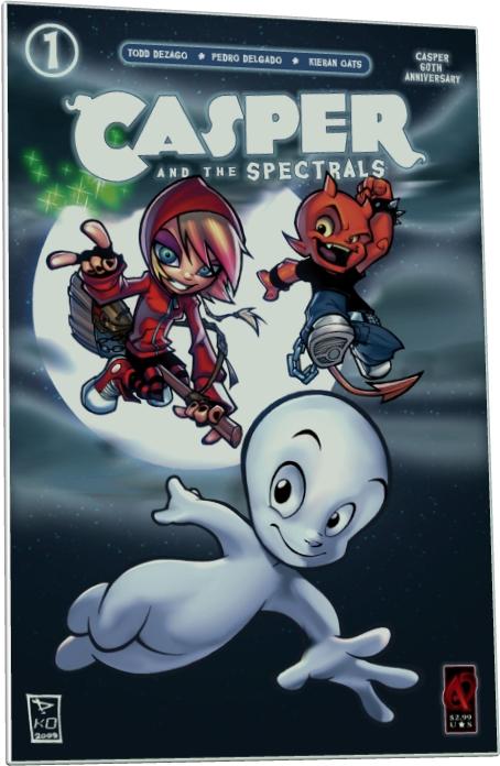
CASPER AND THE SPECTRALS#1
Writer: Todd Dezago Artist: Pedro Delgado Publisher: Ardden Entertainment Reviewer: Professor Challenger
“Oh, Man… This is gonna be good!” -- Hot StuffHow the hell does THIS happen? CASPER AND THE SPECTRALS was my favorite comic last week! What????
Yeah. I’m a freshly turned 43 year-old and a CASPER comic book was my favorite comic book. I thought this thing was a total blast. Ardden Entertainment has come up with a concept that makes the Harvey supernatural characters actually work for me. Sure, when I was little I had some CASPER comics, some WENDY THE WITCH comics, but I really got a kick out of the HOT STUFF comics because, of course, the little devil was always doing things to get himself into trouble. So, I see this comic on the stands and I notice Wendy, Hot Stuff and Casper all there on the cover but…Wendy kind of looks almost cool and Hot Stuff….isn’t wearing any diaper anymore but baggy jeans and a black t-shirt. And I’m thinking I need to take a look at this and then pass it on to my daughter.
Instead, I’m holding on to it. Ha!
Ok. Here’s the basic premise. In the original Harvey comics, these characters rarely if ever crossed over with each other. I think Casper and Wendy occasionally would. But for this new series, the folks at Ardden have conceived of a fun way to tie them all together with an almost FABLES-like idea of these different supernatural worlds all co-existing within our normal human world but obviously on some kind of different dimensional plane. The ghosts all live in “Ghostburg,” witches in “Witch Way,” devils in “Deviland,” goblins in “Goblin Gulch,” etc. These creatures are not necessarily malevolent but they have to regularly make efforts to scare us normal humans because our fear powers their “fear-ometer” devices that help keep them all safe from a big bad monster they keep imprisoned by fear.
So, that’s the simple setup in which the reader is introduced to the Ghostly Trio (Fusso, Lazo, and Fatso) attempting to train their nephews Spooky and Casper in the art of scaring humans. Spooky (disappointingly NOT sporting his classic derby hat) embraces the fun of scaring people. Casper, however, is saddened by all of it because he just wants to be friends with everyone. So, he takes off on a search to find friends and he meets Wendy, a most dissatisfied little Witch in training who also doesn’t understand why they need to scare people. The two of them hit it off and then run into Hot Stuff, who is causing quite a lot of mischief in Deviland and does not seem to quite understand or care about the fact that others can get hurt from his jokes.
And that’s about it. It was solidly written and funny. The characters are sharp and modern but still innocent enough that a parent can feel fine putting this comic into the hands of any aged reader. Todd Dezago is the writer and should be given credit for retaining the proper voices for each of these characters while not making them sound dated.
I am absolutely in love with the artwork of the artist, Pedro Delgado, who hails from Spain. Prior to this comic book I had never heard of him, but after reading this I am a true fan of his work. His character designs are sheer perfection at balancing the original classic Harvey look of the characters but “cool”-ing them up for the new millennium. Wendy is so cool looking with her hoodie and high-top tennis shoes and high-tech broom. Hot Stuff is particularly sharp in his new look that includes the spiked wrist bands and chain belt. Even Casper has a slightly less hydro-cephalic goof look to him and seems just more of a stylized species of ghost. The Ghostly Trio look exactly like they should…only better than ever. Delgado nails this comic from the first panel. Excellent use of the printed page with most of his pages utilizing a full page graphic in which individual panels are placed on top and include the background effectively as a framing device but also a panel itself. Bold, thick outlines on the characters evoke the old Harvey classic look but the style is a more angular and modern look. Even the digital color work by Kieran Oats is a true collaboration with Delgado seamlessly working together to beautiful effect.
Support this comic book so that Ardden and Harvey will keep it going and maybe they’ll even let this creative team tackle Richie Rich. I’d love to see how they could take that and run with it, too. And can Stumbo the giant be far behind? I think not. Unless you are a jaded, unhappy cynic, buy CASPER AND THE SPECTRALS and I guarantee you will enjoy it.
Prof. Challenger, a.k.a. Keith A. Howell (the "A" stands for "Awesome"), is a lifelong comics fan with a super-human ability to annoy people. He is also a graphic artist himself and a paralegal instructor. Samples of his artwork can be found on his website here. He hails from the great state of Texas and just wants you to know that even though he doesn't know you, he loves you.
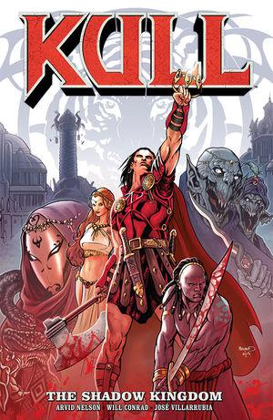
KULL: THE SHADOW KINGDOM TPB
Writer: Arvid Nelson Art: Will Conrad Publisher: Dark Horse Reviewer: Ambush Bug
I've been getting my Robert E. Howard on lately, catching up on some CONAN's and my upcoming review of SOLOMON KANE. It's been a fun couple of weeks reading through all of these classic barbarian and savage adventures. First, props has to be given to Dark Horse. Adaptations of Howard's classic characters have been plentiful, but few have been as faithful and entertaining as the stories coming from this publisher. It's great to see that while DC and Marvel are busy making modern myths, Dark Horse is showing the same kind of gumption with classic stories of adventure.I didn't get a chance to pick up KULL in the original miniseries form, and having read a couple of these Dark Horse trades, I'm beginning to see the appeal of trades. I'm a monthly title buyer myself, but there's something to be said about sitting down with one big volume and getting the whole story at once. Not that I'll ever convert to just trades, but I want to acknowledge that there is an appeal.
As far as KULL is concerned, I have to admit, I knew little about the character. Or at least, I thought I knew little about the character. After reading the book and the forewords and afterwords, I realize that I knew more about Kull than I thought. I didn't know that major portions of 1982's CONAN THE BARBARIAN flick were lifted not from Conan's history, but from Kull's. The history of being a slave, the villains being snake-shape-changers, even entire lines were lifted from KULL stories rather than CONAN's. So my attraction to the character of Conan made the reading experience of this trade all the more entertaining. And while comparisons between Conan and Kull are discussed at length in the words from the creators in this book, after reading the story, it is pretty clear that they are as distinct as they are awesome characters.
KULL: THE SHADOW KINGDOM follows Kull in his first years of being king. He is being taught about manners, politics, and all things regal associated with wearing the crown. Kull on the other hand would rather be in "the shit." Across the back cover, the heading reads "More comfortable with a sword than a scepter." and that point is rung home clearly in this book as Kull charges into battle and swings his sword or axe first before asking whether it's the kingly thing to do. Arvid Nelson (who did the REX MUNDI series, another book I need to catch up on) captures the complexity of a man trapped by his own aspirations. It's clear Kull wanted to be a conqueror, but he lacked the foresight to see what all of that conquering would lead to. The blank stare in his eye during regal matters and Kull's flight to brutal action any time an incident occurs is indication that in Kull's head, he's a warrior first and a king second, though there is some evolution in this story alone as Kull realizes the advantages he can have wearing the crown.
The best compliment I can make to this book is that I related to the main character. Sure, Nelson humanized this barbarian and no, this doesn't mean he neutered him. Kull's still one of the baddest of the badasses as evidenced by many, many panels and pages of barbarian glee in this book. But I couldn't help but be reminded of my own role as @$$Hole Editor here at AICN. When we first started out here at AICN, there were ten equal moving parts, ten little @$$Holes running around and spouting off about comics. After a time, it was clear that in order to keep things going, there had to be an organizer. Though the idea of a King @$$Hole was poo-pooed by a bunch of radical rabblerousers from the Talkbacks, someone to herd the cats was often needed in order to make sure we had a consistent column. Now, out of those original ten Holes, I definitely don't think I was the one most qualified, but after over eight years, I am one of the few who remain, so the job went to me. But like Kull, I definitely would rather be doing my thing in "the shit" swinging my critical barbarian axe at the Big Guns when they dazzle or drizzle my fanboy expectations, rather than putting out internal fires, coordinating previews and interviews, and worrying whether the plethora of links and images work in any given column. So I don't review as much anymore, which is frustrating, but again like Kull, I've found that leadership, though often times costly to what one thinks is enjoyable, can be enjoyable in itself.
But enough about me. This is a kick ass book and one definitely worth reading if you're a fan of things of the barbarian nature. On top of Nelson's fantastic characterization, you've got Will Conrad's art making Kull look both regal and savage often in the same panel. There are some large panels of barbarian coolness that had my eyes popping and jaw dropping. But at the end of the day, this book served its purpose: to bring Kull out from Conan's shadow and show how damn cool a character he is on his own. Mission accomplished. KULL: THE SHADOW KINGDOM definitely stands strongly on its own.
Ambush Bug is Mark L. Miller, reviewer and co-editor of AICN Comics for over eight years and one of the original @$$holes. Check out his comic book shorts from Cream City Comics’ MUSCLES & FIGHTS VOL.3 and MUSCLES & FRIGHTS VOL.1 on his ComicSpace page. Bug was interviewed here and here at Cream City Comics and here and here about his latest comic from Bluewater Comics, VINCENT PRICE PRESENTS: THE TINGLER #1-2. Look for more comics from Bug in 2010 from Bluewater, including VINCENT PRICE PRESENTS WITCHFINDER GENERAL, ROGER CORMAN PRESENTS DEATHSPORT, and the just announced vampire miniseries NANNY & HANK.
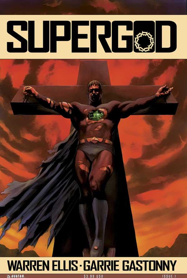
SUPERGOD #1
Writer: Warren Ellis Artist: Garrie Gastonny Publisher: Avatar Press Reviewer: Optimous Douche
If SUPERGOD had hit the stands November 2008 as opposed to 2009 I would have tattooed Ellis’ name across my cock as a sign of adoration for the deconstructive goodness of this book. Why? Well because one year ago, we had yet to see the likes of THE MIGHTY and IRREDEEMABLE; books that portrayed super-humans as a detriment to society as opposed to our collective saviors. These days, though, the idea of super-humans as WMDs has become somewhat standard fare. This is not to say that SUPERGOD is unoriginal. Ellis does give the deconstruction of super-beings his standard and unique flair, but as I flipped through each page I couldn’t help but feel a glitch in the Matrix, an overwhelming sense of “I’ve been here before.”Essentially the book takes the position that superheroes are our ultimate demise as exhibited by a lone scientist that opens the book sitting next to the River Thames with London burning in the background. High on pot and the stench of Armageddon the scientist provides exposition into this world by recording the events that led to our destruction for posterity’s sake.
Where Ellis marks the piece with his unique signature is naturally in his crisp and filthy dialogue, but also by taking the stance that superheroes are created – not born. Also, that each hero created by separate nations as WMDs were viewed as Gods as opposed to science experiments gone awry. This is probably not a big surprise considering the title and the enormous cross on the cover. It does how ever give us a different bend on why superheroes might kill. Where IRREDEEMABLE and other deconstructions have gone with the emotions of the disgruntled and betrayed the “heroes” of SUPERGOD simply don’t care.
If this sounds like a Greek tragedy you wouldn’t be too far from the mark. Retribution of the Gods has been around since man began the tradition of storytelling. However, this being comics and all, Ellis shitcans the idea of a masked chorus and infuses some good old-fashioned science fiction mumbo jumbo to garnish the piece. And really there is no one better at making you believe that this shit is plausible. The most inventive of these test-tube Gods had to be England’s fumble into creation. Imagine the Fantastic Four had all of their humanity stripped away, were fused together, sprouted mushrooms and induced manic masturbation whenever someone is within their presence. Well, I thought it was pretty cool..
Gastonny paints some damn pretty pictures, from the aforementioned two-page splash of a decimated London right on through to the culling of the Indian population by their God creation Vishnu. There’s been a lot of talk recently about taking a step back from the modern hyper-stylized art style to help cut the cost of each issue. Personally, I think this bad idea. If the quality is in place I will gladly pay for it, where I get my panties in a bunch is a $4.00 price tag for sub-standard material.
I love British creators for the very same reason I read BBC news over any of the American outlets: basically a view of my homeland from the outside in and an overarching broader perspective of the entire World. It didn’t surprise me that the greatest villain of this crop of created Gods comes from the States. Do I think America is evil? Hardly. Do I think we are always innocent and altruistic? However, when a comic has you asking questions about your nation’s place in the world, whether you agree or disagree with the author at least the book made you think. At the end of the day, what else can you ask for from a literary piece?
When Optimous Douche isn’t reading comics and misspelling the names of 80’s icons, he “transforms” into a corporate communications guru. "What if the whole world had superpowers? Find out in the pages of Optimous’ original book AVERAGE JOE. Read the first full issue on Optimous’ New Blog and see original sketches by fellow @$$hole Bottleimp. If you are a publisher or can help these guys get AVERAGE JOE up, up, and on the shelves in any way, drop Optimous a line."
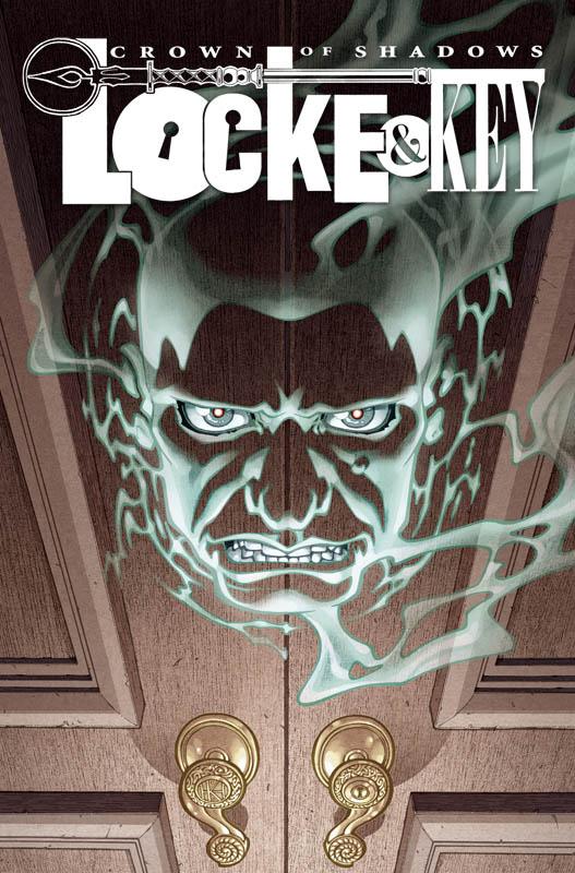
LOCKE & KEY: CROWN OF SHADOWS #1
Writer: Joe Hill Artist: Gabriel Rodriguez Published by: IDW Publishing Reviewed by: BottleImp
I’ve come to realize that one of the things that separate an engrossing story from a bland one is the sense the reader gets of the world in which the story takes place. The best stories, whether in books, films or comics, manage to impart a feeling of a fully-realized universe surrounding and supporting the plot. The worst (or at best, the most mediocre) simply concern themselves with presenting the action to the audience. On the one hand, we have works like Tolkien’s RINGS saga, with a setting complete with mythologies, histories and even languages. On the other hand, we have what I think of as disposable works such as Dan Brown’s DA VINCI claptrap—interesting enough to read once, but there’s no real depth to the story that makes you want to go back to that world. In comics, the sense of a deeper underlying world has been achieved in the mainstream superhero books though a sheer mass of continuity (or in DC’s case, continuities) piled together over the decades. But with the horror-skewed LOCKE & KEY, Joe Hill and Gabriel Rodriguez have managed to create an intriguing, multilayered world from the very first issue. This month LOCKE & KEY begins its third volume, and surprisingly, the focus is not on the Locke family.Remember Sam Lesser? The kid who killed the Locke children’s father way back in the first volume of the series, the kid who ended up going through the ghost door and left without his body? Well, Sam’s back in this issue…at least, his spirit is still hanging around. Hill masterfully tantalizes the reader by filling in a few of the blanks as to how Dodge (aka Lucas Caravaggio, aka the well woman) was able to contact Sam and use him to carry out his plan while at the same time revealing a whole new facet of the mystery. Just what the hell IS that thing on Dodge’s back, anyway? But new developments aside, one of the things that makes this issue such an intense, enjoyable read is Hill’s fleshing out of Sam’s character. Sure, he’s a psychotic, sociopathic little shit (or was, before he died), but Sam is also smart…smart enough to not fall for Dodge’s bullshit twice. Against all logic, knowing what Sam was responsible for, I still found myself rooting for the creep. Maybe it’s just the “lesser of two evils” argument (and hey, that might have even been the reason for Sam’s surname), but it still boils down to Hill creating a rich, multihued tapestry for his world rather than settling for simple black and white.
Credit for this feeling of a fully-rendered world must be given to Rodriguez as well, ‘cause I’m not sure that there’s another artist who could capture so well both the mundane details of day-to-day life and the horrific and fantastic elements of the story, and have them blend together so seamlessly. Just check out this issue—the spirit battle between Dodge and Sam dances across the page with streams of dynamic energy, while their more earthly (yet horrific) battle for control of Dodge’s body is grounded in reality by the attention to tactile details. It’s a fantastic juxtaposition that really showcases Rodriguez’ skills.
If there is any negative element about this series that I could nitpick, it’s that LOCKE & KEY is not especially new-reader friendly—only the barest “Previously in…” is given, and anyone buying this issue thinking they were getting in on the beginning of the story is in for an unpleasant surprise. LOCKE & KEY definitely is a more satisfying read in a collected format, though as long as the reader is up to speed with the previous issues, it still works fine as a serial. My advice to any readers who have been on the fence about reading this title: the first two volumes are available in trades, so it’s not too late to play catch up. And if you like a good mystery, great artwork, and characters that defy easy categorization, what are you waiting for? Open yourself up to LOCKE & KEY!
When released from his Bottle, the Imp takes the form of Stephen Andrade, an artist/illustrator/pirate monkey painter from the Northeast. You can see some of his artwork here. He’s given up comics more times than he can remember. But every time he thinks he's out, they pull him back in.
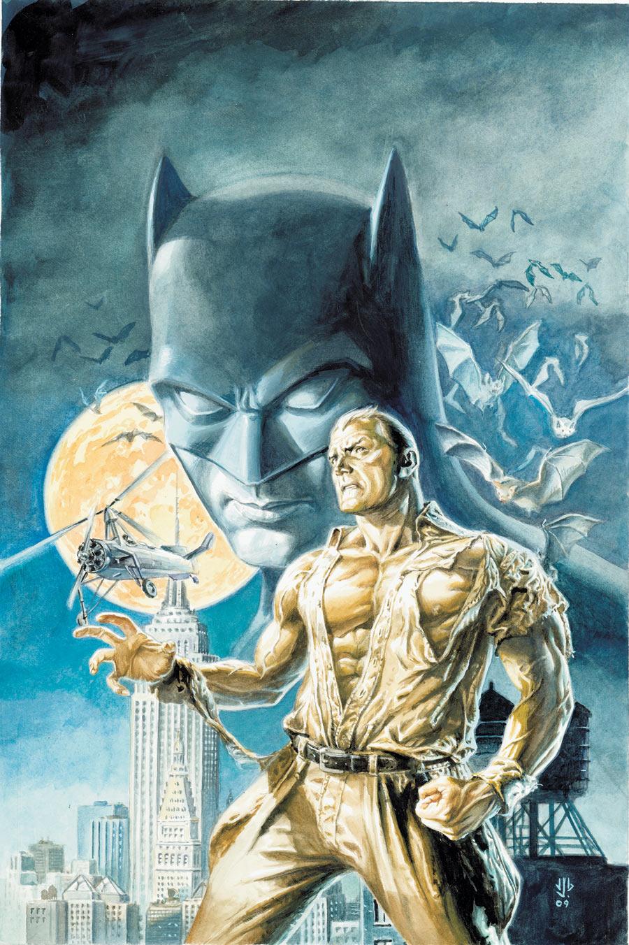
BATMAN/DOC SAVAGE SPECIAL #1
Writer: Brian Azzarello Artist: Phil Noto Publisher: DC Comics Reviewed by Humphrey Lee
Sad to say, but I have never been all too familiar with the Doc Savage character. I have more known of him than actually read about him. Hell, I’ve read more comic book issues featuring Doc Brass, Warren Ellis’ PLANETARY homage to the character, than I’ve read of Doc Savage himself. And, for as long as I have read comics and been interested in more pulpy heroics such as his – an interest tempered by the aforementioned PLANETARY and books like TOM STRONG – I have always hoped someone with a taste for these high adventure comics would come out and give us a modern run on such an iconic character, so I could finally get at least a taste of why he is held in such high regard. I did not expect Brian Azzarello to be that person to bring back such a character, but after reading this issue, I am already anticipating his foray into the Pulpverse more than any other 2010 project I can possibly think of.I will admit, I was honestly not completely sure what this project was about until I read this. I knew this was going to be more of a “retro” kind of issue and that Doc Savage was going to see some more penning afterwards. I did not know that he and the Bat and an entire cavalcade of adventurers and spirit gum users were going to be included, and now I am overcome with glee at this revelation. It was only a matter of a couple pages and a pistol wielding Batman to know that this is a world I am ecstatic to see someone playing in; that we are going to see characters like The Spirit and The Blackhawks in the mix is just cocaine icing on an orgasm cake.
Focusing on the issue at hand, there is just so much to love. Like I said, the Retroverse (two Verses in one review!) that this is playing in is an exciting one. The glitz and glamour we all associate with that time period, the feeling that the future has something strange yet exciting in store for it. There’s some fisticuffs, a murder mystery, some very terse yet playful dialogue. It’s everything I could hope for and more. There’s a great atmosphere here, and it also plays on those little historical fanboy twinges I tend to get where we get to see a more or less green Batman, or a lowly beat cop James Gordon, with a Commissioner’s title not even a thought in his brain yet. To keep with the phrase coining, it’s almost “Retro-porn”, and I am more than glad to partake in it.
If there is one thing that is a shame though, it is that when this book moves into its FIRST WAVE mini-series next March, Phil Noto won’t be coming with. Mind you, I will never complain about getting Rags Morales art, but Mr. Noto has been fucking killing on everything he’s been doing lately, and this issue was no exception. There’s something about his soft lines that really makes a comic pop, and it worked so extravagantly well with this kind of pulp adventure. What really does it, I think, are the colors which, if I am not mistaken, Mr. Noto does for himself. And it gives everything such a brilliant luster, but not with any real glossiness to it, and there’s never any overwhelming amount of brightness. There are great separations and everything is so distinct that it makes each page look so full without a crowded sensation. It’s just fantastic stuff and it’s a shame we only got it for an issue.
No matter what your tastes in comics, this is some exciting stuff and it’s looking to get even better when it is in full swing next year. Already we have two of the most iconic characters in all of comics being very well-represented, and it’s in a setting that deep down I think every one of us has a soft spot for--a harkening to simpler times if you will. And I think, given what is going on in the world today, and how big and overwhelming the really mainstream Big Two comics are becoming, something on the “simpler” side is just what we could use right now.
Humphrey Lee has been an avid comic book reader going on fifteen years now and a contributor to Ain't It Cool comics for quite a few as well. In fact, reading comics is about all he does in his free time and where all the money from his day job wages goes to - funding his comic book habit so he can talk about them to you, our loyal readers (lucky you). He's a bit of a social networking whore, so you can find him all over the Interwebs on sites like Twitter, The MySpaces, Facebookand a Blogger Account where he also mostly talks about comics with his free time because he hasn't the slightest semblance of a life. Sad but true, and he gladly encourages you to add, read, and comment as you will.
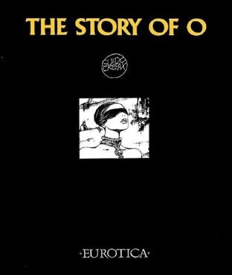
THE STORY OF O HC GN
Writer: Pauline Reage Artist: Guido Crepax Publisher: NBM Comics Lit/Eurotica Reviewer: Professor Challenger
“O realized that through the medium of her body shared between them…they attained something more mysterious and perhaps more intense than an amorous bond…a union of which the very conception was arduous.” -- The Story of OTo review hardcore erotica of the sort like THE STORY OF O is a challenging task, at least for me. It is easy to approach something like this with a flippant adolescent mocking tone. But, as far as I’m concerned, that does a disservice to the artist’s intent in something like this. For those who may be unfamiliar with the story itself, the original prose version of THE STORY OF O was first published in the 1950s and was a shockingly explicit and brutal yet also sensual and erotic examination of sexual submission. The story was so shocking, in fact, that the French government attempted to suppress it. In the most graphic of details, this misogynistic story involves a man’s deliverance of a series of progressively more degrading, painful, and humiliating sexual abuses to his mate. Through these acts of bondage, pain, and shame he breaks her spirit and reduces her to his complete and utter will-less sexual slave….even to the point of having her branded with his initials.
Even in these more “open” times with all forms of pornography available to anyone with access to the internet, the story is still shocking in the extent to which the writer…a woman herself…dove headlong into the deepest parts of the human sexual dark places. It is a dirty thing to read. It is harsh and mean and twisted. After each new level of abuse that O endures, her husband makes her tell him she loves him. If she reaches a point of enjoying the pain or abuse, then the abuse is increased until she breaks again. It is a story of depravity and how such debasement can be twisted into love.
Ultimately, while the original novel itself is a classic of erotic literature because of the times in which it was first published, this graphic adaptation by Guido Crepax is a classic itself even though it was not originally published until the 1970s. Crepax, who passed away in 2003, was an amazing Italian comic artist who tore down barriers in his commitment to using the comic book form to tell truly adult stories. In his attempts to liberate the European world of comic art in the 1960s and 1970s from the emphasis on childish content, he boldly stepped up and tackled sex and pure erotica as his own emphasis. From his own original character Valentina to adapting classics of erotica in graphic form, he established himself as a master of the sexual genre and comic art medium. Crepax’s adaptation of THE STORY OF O is widely considered his magnum opus….and with good reason.
In this review, I’m not going to attempt to give an opinion on the “story” because that would be akin, in my opinion, to reviewing a Classics Illustrated adaptation of…say…A CHRISTMAS CAROL… and actually taking time to talk about Charles Dickens’ efforts in writing the original story. So, I will let the story stand on its own and I’ll let each reader determine his or her own degree of comfortability with it. Instead, let me address what is paramount in this new hardbound complete collection of Crepax’s adaptation…which was originally serialized…and that is Crepax’s efforts here as illustrator of Pauline Reage’s story.
First of all, the Eurotica imprint of NBM Publishing has done a beautiful job of packaging this book together. Crepax’s work is entirely in stark black and white, as befits the story itself, and the book designers have utilized his work in crafting an attractive black cover with a gorgeous small panel of O’s face blindfolded and with a chained collar on her neck. It is perfectly symbolic of the overall theme of the book itself and slyly provocative enough to catch the casual observer’s eye with its placement surrounded by so much blackness…once again the use of black also symbolizing the harsh darkness of the world the reader is about to enter. The subtle and unique circular signature of “Guido Crepax” is also positioned on the cover so that those who know the name also know what they are about to encounter within the pages of this book. The end papers are almost entirely black except for a series of 1” x 1 ½” panels running horizontal from end to end to where they almost look like a series of frames from a film. The panels present O performing graphic sexual acts of submission and guide the reader to turn the page where the next two pages are entirely white except for an ever so subtle profile image of O’s face with her open mouth and extended tongue directing the reader to turn the page and start the story.
Crepax is a master storyteller and he wields a lyrical brush. His style is beautiful with a nouveau tendency towards elongated bodies and necks especially…but not grotesquely so. The smoothness of his brush work just glides across the page in most instances and only in the most intense moments does he allow his work to get rough and scratchy. It usually flows beautifully and sensually…especially in those moments of tenderness usually reserved for moments of woman to woman love-making. When the misogynistic men are raping and abusing O, his work gets harsher and it makes for an interesting contrast in emotional impact.
I found his storytelling in panels to almost be a class in and of itself in how to deliver information to the reader. As graphic as he gets in showing all forms of sex and brutality, what is also fascinating are his artistic choices in what he chooses NOT to show and leave to the reader’s imagination. Such decisions are what make this work so effective from an artistic perspective. This is not a happy work. It is not a joyful work. It is something that should shock the reader’s sense of propriety and what’s right. It should even generate disgust and anger at moments. And yet, the beauty of Crepax’s art somehow makes it palatable and I found it to be something I couldn’t put down…and have gone back to a number of times to look at his approach to presenting progression and movement. Crepax uses minimal line work at times when he wants the reader to feel more sensual and then heavy and harsher linework when he wants the reader to be repulsed and shocked.
He utilizes very little actual dialogue in this adaptation; instead he delivers the narrative primarily through pictures. He takes an approach to the page that never follows the standard comic book panel format but completely shakes it up with utter inconsistency in panel choices. Indicative of the trauma that O is undergoing in her life, the reader is never allowed the reliable precision of the standard 6 panel comic book page. Through it all, however, one thing never changes and is reliable….O is never less than always beautifully sexual. Crepax makes sure that her sexual beauty draws the reader’s eye even when the heart or mind might want to pull away from the events that are unfolding.
Guido Crepax truly was a master storyteller, and while he may have focused his talents in an area that many are afraid to go, if you can handle the content, Crepax’s THE STORY OF O is actually a must-have for those who love graphic storytelling in all its many forms.


AKIRA Vol.1
By Katsuhiro Otomo Released by Kodansha Comics Reviewed by Scott Green
On April 28, 1952, Japan regained sovereignty following its post World War II occupation. The 50's began a decade in which Japan began supplanting destruction and scarcity with industrial strength. In 1956, manga artist Mitsuteru Yokoyama channeled this evolution in TETSUJIN 28-GO (localized GIGANTOR), the story of orphan Shotaro Kaneda, whose father left him the radio controlled steel girdered titan Tetsujin 28. Where Tetsujin was once intended to be used as a weapon of war, under Shotaro's control, he became a hero a new age of science and machinery.By 1964, Japan had emerged as a technologic and economic power, a transformation celebrated by the 1964 Tokyo Olympic Games. Beyond this established national pride and success, the 60's were also a decade that saw the rise of student protest movements, the likes of which famously informed the works of Mamoru Oshii, such as PATLABOR, JIN-ROH and BLOOD: THE LAST VAMPIRE: KNIGHT OF THE BEAST.
Katsuhiro Otomo, born in 1954, chose to offer a bleak reflection of those changes in his seminal AKIRA. His Tokyo was bombed out in the opening instants of World War III. Rebuilt in the following four decades, by 2030 this Neo-Tokyo is about to resume its place among the global capitals with a new Olympic Games. Yet, it is marred by a blast crater that's become an irremovable part of the urban anatomy. As Susan Napier famously stated in “Anime: From AKIRA to HOWL’S MOVING CASTLE”, "psychoanalytically, the crater may be read in terms of the both the vagina and anus." And, despite the neon and skyscrapers, the city is not a locale that has been fixed by an urban revival, as seen in it's opening pages in which a gang of youth bikers from the dive bars, detention centers and orphanages screech down derelict highways, past abandoned barricades, towards that crater.
Otomo's Shotaro Kaneda is among that group, an astute, yet reckless 15 year old, able to snatch a gun and point it at the needed hostage without hesitation, able to ferret out and hide critical information, and also prone to hitting on any girl in sight and diving out of second story windows. And, Otomo's Tetsujin is among the bikers, Tetsuo Shima - who serves as the gang's tentative slowpoke, but who is fated to becomes a raging Frankenstein's Monster.
The third element of AKIRA's Tetsujin 28 trinity is Colonel Shikishima. Named for Professor Shikishima, former assistant to Shotaro's father and ally to the boy, Akira's Shikishima is a barking military officer whose project is about to blow up in the face of that gang. Trying to assert himself in the pack, Tetsuo pulls his motorcycle into the front as the group barrels down the unused, blackened highways. Catching the form in his headlights, Tetsuo pulls off to avoid hitting a shriveled boy like figure with the number 26 branded into its hand. Before the bike can hit the child, the machine explodes. As Tetsuo convulses on the pavement, a pair of uniformed men pull up, mean mug Kaneda and Co., radio base, and remove Tetsuo from the custody of the dumbfounded bikers.
What happens next is not easily distilled. Tetsuo is in and out of government custody, rapidly developing psychic powers. Kaneda is in and out of his ramshackle vocational school, searching for Tetsuo between biker gang rumbles, hitting his home bar and chasing an anti-government terrorist girl into danger.
I assume that the AKIRA anime isn't as widely seen now as it was in the VHS days, where it was king of the Blockbuster shelf. Yet, the 1988 feature, which not only raised, but largely established the profile of anime for adult audiences, is still probably useful as a point of reference for many North American genre fans.
That anime was adapted by Otomo during the run of his AKIRA manga. Though it was Otomo translating his own work, the latter part of the Akira manga is substantially different from the ending of the movie - something also found in the comparison between Hayao Miyazaki's NAUSICAA anime and manga. While there aren't the fundamental differences to be found in later parts of the manga, the first book is certainly reconfigured. For example, the battle against the gang of drugged out, face painted Clowns take place later and for different reasons than in the movie.
Like the animated movie, the manga is dizzying. No human force governs the action with anything close to definitive authority. Everyone is going on about how time is of the essence. Kaneda moves through this world with sly cockiness, but he's getting bloodied by authorities and locked into rooms like the kid he is. The Colonel might be cooking the budgets and leading the nation by its nose, but he's still cut off at the knees by the likes of Kaneda, not to mention scrambling to keep up with the dynamic situation. The terrorists know more than they should, but are still often mistaken and reduced to confused tools. Politicians thinking that they are working all sides are still fumbling through comically encumbered committee meetings.
AKIRA's illustration keeps pace with its frantic narrative. With an eye towards the thin lined details of European artists like Moebius, the rush through the painstakingly realized environs of Neo-Tokyo inhabits the brink of overwhelming. Nothing is spared as Otomo commits to capturing the trash, graffiti and broken down buildings as the seedy parts of town elbow in on the glitzier and more industrial districts. It's the 80's urban technopocalypse writ large. Though many works have been inspired by the approach, few, if any, have equaled it. Something like EDEN: IT'S AN ENDLESS WORLD might update the ingredients of AKIRA, but not with the full impact of its forbearer.
AKIRA barrels down this crowded channel, with the 400 pages of the first volume screaming with motorcycles hurtling down highways and hovering gun platforms blasting through sewers. Otomo both manages and accentuates the action with a directorial eye towards staging. AKIRA may be manga's king of speedline use, but Otomo bolsters that visible velocity with a keen understanding for lighting and angle that makes the movement look comprehendible and feel genuine.
With the on again, off again efforts to turn AKIRA into a live action movie, fans of the anime and manga are often left asking "why?!" and "how?!" Landscaped between the bomb crater and the Olympic stadium, Akira is definitively Japanese. The manga delves deeper into native concerns as it draws in the subject of imperialism, such that those who have finished the manga may regard the prospects of a Hollywood AKIRA as a real head-scratcher.
I'm indifferent to the notion of an American produced live action AKIRA; not inclined to look forward to it, or rail against it. Yet, while I'm not convinced that the producers WILL do an effective American AKIRA, I do think that they CAN do an effective one.
During the last round of talk about the movie, it was stated that the story would be transplanted to a version of New York City, rebuilt with Japanese money - presumably to capture the aesthetic of the manga. I'd go a different route. I think a relevant AKIRA should have foreign involvement distant and looming rather than present.
9/11 and terrorism certainly cast a shadow over the consideration of the proposed setting of a rebuilt New York City, but it might be the Great Recession that has brought about the proper cultural moment for an American Akira. While it is borderline offensive to compare the current state of the US to anything like the post World War II rebuilding that informed AKIRA, more Americans than any time in decades can identify with Akira's dystopian take on that re-ascendance. On one hand you have a broken system, with the crumbling school system, crumbling infrastructure and rampant disorder. On the other, you have the powers that be in the throes of the urge to move past the crisis, call the problem fixed, and mark the success with something like AKIRA's Olympic games (or stock market rebound). The story's youth heroes are institutionalized in the vague hope that they'll learn to conform and toe the line. Yet, without much to do, many prospects or a viable opposition with which to rebel, all that remains for them to do is drop some pills and tour the destruction.
Find a lead with enough charisma to reflect Kaneda's spark and you have yourself an effecting movie. Think of it like Richard Kelly's CHILDREN OF MEN.
Back to the concrete from the what if...
This release adds a new chapter in the storied English language publication history of AKIRA. The manga first hit the US with the 1988-1995 run by Marvel Comics' Epic label, commenced the same year that the anime movie was sweeping the international scene and colorized by the Otomo selected Steve Oliff. The work was serialized across 38 issues, which were collection into 13 paperbacks and six hard covers, and it featured tribute art from the likes of Dave Gibbons and John Romita, as well as a Warren Ellis written tribute story.
During the crest of North America's manga boom, Dark Horse picked up the license and from 2000 to 2002 released it with a new translation in a format that more closely adhered to the Japanese original - six black and white (with opening color pages) volumes.
Then, Dark Horse's publication went out of print, a sign that suggested a confirmation of the chatter that AKIRA's Japanese rights holder, Kodansha, would be entering the North American manga publication market.
In fact, that rumor has come to pass this fall.
Kodansha is one of the major manga publishers/licensors, whose anthologies include notable shojo - Nakayoshi (SAILOR MOON, CLAMP's CARDCAPTOR SAKURA and MAGIC KNIGHT RAYEARTH, Tezuka's PRINCESS KNIGHT), shonen - Weekly Shonen Magazine (AIR GEAR, FAIRY TAIL, SAYONARA ZETSUBO SENSEI, SCHOOL RUMBLE, LOVE HINA) and seinen Afternoon (OH MY GODDESS!, PARASYTE, BLAME!, BLADE OF THE IMMORTAL). Dark Horse apparently lost AKIRA and GHOST IN THE SHELL in the transition, but continue to release works like OH! MY GODDESS and BLADE OF THE IMMORTAL, and have acquired the rights to Kodansha's CLAMP releases, including CARDCAPTOR SAKURA, MAGIC KNIGHT RAYEARTH and CHOBIT (formerly released in North America by Tokyopop). In turn, TOKYOPOP's relationship with Kodansha appears to have been severed with the fate of works like INITIAL D, BECK: MONGOLIAN CHOP SQUAD and the various GTO spin-offs in question. Del Rey still releases numerous Kodansha titles, and has also picked up a few formerly released by Tokyopop (SAMURAI DEEPER KYO). In fact, Del Rey Manga's parent Random House has partnered with Kodansha, and begun handling the distribution and marketing of Kodansha Comics.
In their venture into the English language market, Kodansha doesn't seem to be quick to lay down new road. Beyond AKIRA and new editions of Masamune Shirow's GHOST IN THE SHELL, the only material that they've so far indicated plans to release is the upcoming GHOST IN THE SHELL: STAND ALONE COMPLEX manga, which include Masayuki Yamamoto's GHOST IN THE SHELL: STAND ALONE COMPLEX - Tachikoma na Hibi, based on the comedy shorts starring STAND ALONE COMPLEX's Tachikoma AI tanks and Yu Kinutani's adaptation of the anime.
The Kodansha release of AKIRA is a minor upgrade of the Dark Horse one. It's another six volume distribution - the next two volumes are planned for January and April 2010. The same localization is used. Paper quality is a bit better, leading to a noticeably thicker book. I gave away my limited Dark Horse hard cover, so I'm not sure how the paper quality compares to that iteration. There's a new introduction by Katsuhiro Otomo, but the original prose is less than a half dozen sentences.
The Kodansha GHOST IN THE SHELL lacks the pages of cyborg Motoko Kusanagi's stoned, Sapphic vacation activities that were excised then re-added to Dark Horse's releases of the material. There's no reason to be ambivalent about the Kodansha AKIRA release. It's just not urgent. If you haven't read Akira, I'd tell you that it's bookshelf manga, a classic deserving of its reputation that warrants a place in any library of manga, regardless of how large or selective the collection may be. If you own the Dark Horse release, Kodansha offers little reason to replace what you have.
Scott Green has been writing for AICN ANIME for over eight years. If you like what you see here and love anime & manga, be sure to check out his latest AICN ANIME column every week on AICN.

Bug here with some more indies to spice up your bland mainstream comic book reading endeavors. Check ‘em out. It’ll make you feel good!
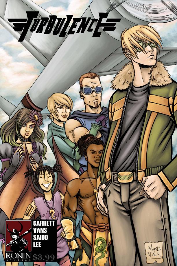
TURBULENCE #1 Ronin Studios
It’s been a while since I’ve read a story about an honest to gosh newbie super hero cutting his teeth and learning the ropes. This is one of those stories. Sure, Turbulence isn’t a super hero name that’ll strike fear in the hearts of villains and readers alike, but that’s kind of the point here. Writer Chris Garrett illustrates pretty well how tough it is be a hero and even make a proper entrance of a super hero. New territory isn’t blazed with this book, but it is a fun ride. The internal criticism and low self esteem was somewhat refreshing to read since most mainstream heroes are either winking at the reader or sneering at him for liking comics in the first place. The straight forward approach to TURBULENCE is fun and worth checking out.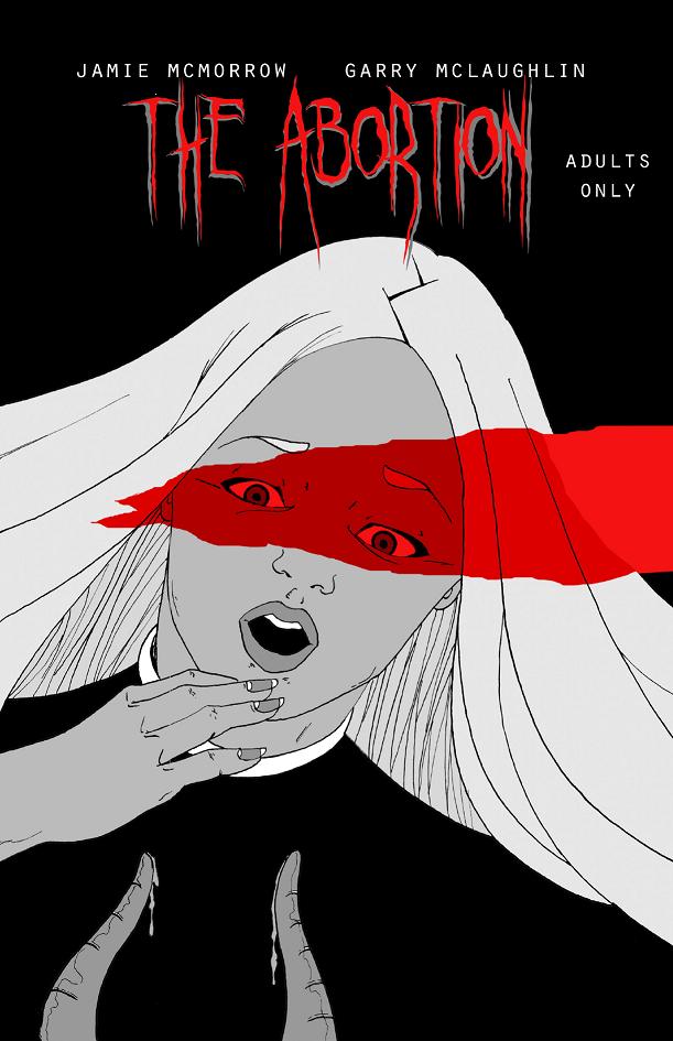
THE ABORTION #1 Dreaming Designs
Though subtle this book is not, THE ABORTION is a pretty fine exercise in horror comic booking. Writer Jamie McMorrow offers us a chilling tale of excised unborn retribution as a fetus escapes an abortion clinic and searches for its parents with murder in mind. Though categorizing this one as pro-life would kind of go against what occurs after the abortion here, there definitely seems to be some kind of abortion stance talked about here. I’m not about to bat that beehive, but I can say that the tension leading up to the meeting and the gory meeting itself of the parents and their unwanted spawn is pretty effective. This is a silent tale, so the panels are heavily reliant on the capability of artist Garry McLaughlin’s ability to translate McMorrow’s words. McLaughlin does a great job of doing so, making this uncomfortable little tale all the more wickedly wince-inducing. But horror isn’t supposed to make one comfortable, so by that regard, this book is a success and I’m looking forward to seeing more from these two creators in the future.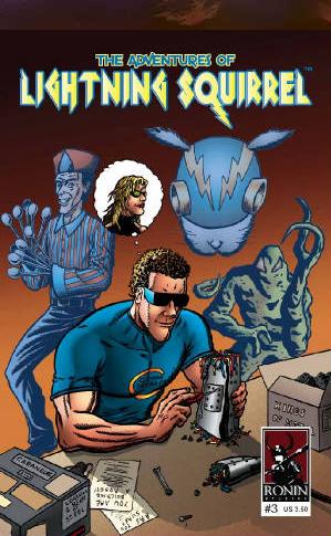
THE ADVENTURES OF LIGHTNING SQUIRREL #3 Ronin Studios
Part of the fun of indie comics are the wacky characters people come up with. If you’re looking for some of the wackiest indie comics have to offer, then look no further than THE ADVNETURES OF LIGHTNING SQUIRREL. In this issue, our rhyming tree rat with ‘lectric powers takes on a trio of villains: a walking pile of radioactive sludge, a guy with ice cream scoopers for fingers, and a super genius. Not much by resolution goes on in this issue, but the issue does serve as a great set up teaser for what looks to be a battle royale in the next issue. Creator Jeffrey F. Kupnis offers up indie super hero fun in a tiny little furry package.FREEDOM FEDERATION #1 Bag and Board Studios
More indie super dude action continues in this premiere issue of FREEDOM FEDERATION. Seems everyone wants to create a comic book universe these days. But oftentimes, it seems people are going about it in a sort of backwards way, creating interesting characters but forgetting about things like story. Too many times, first issues seem to serve as ways to showcase fleshed out characters that first took shape in sketchbooks and dreams. But I often look for more than just a new cast of skewed versions of iconic characters. It takes more than that to impress me. I’ve read too many. That’s why I liked FREEDOM FEDERATION. Sure, there’s a new cast of supes to get to know here, but it seems like writer Chris Knall has a bit of a story going on here. I like the textured narrative at play in this book and a lot of the art by Ben Granof holds promise. An impressive first issue, that’s what this one is.
Rebel Base Books
Our final entry in this week’s Indie Jones section is even more indie super dude action. But instead of wasting time with some sort of narrative and history and fleshing out the world these superheroes live in, Kevin Cornell and Matthew Sutter, the creators of THE SUPEREST, just jump in and focus on what everyone reading comics just wants to see anyway: super slug fests! This book is simply a succession of one cool comic book character idea after another. As each page is turned, they explain how the last superhero fell to the current super hero’s power. The ExorCyst is defeated by Lancer Lots (who is a knight who lances boils) who is defeated by Iron Maiden (whose pointy grip pierces armor) who is defeated by PetriFred (whose heart is made of stone) who is defeated by Sinmate (who crushes everything including stone with his mighty sledgehammer) and so on and so on. Get it? It’s the Rock, Paper, Scissors of the comic book set. Every new hero beats the last. This was an extremely fun read, full of great ideas and ones not so great but certainly chuckle inducing. The creators even encourage readers to make up their own battle to see who is the Superest in the afterword. This is a very cool comic and a cool coffee table book for any comic book fan. Check out theSuperest.com for more THE SUPEREST coolness.
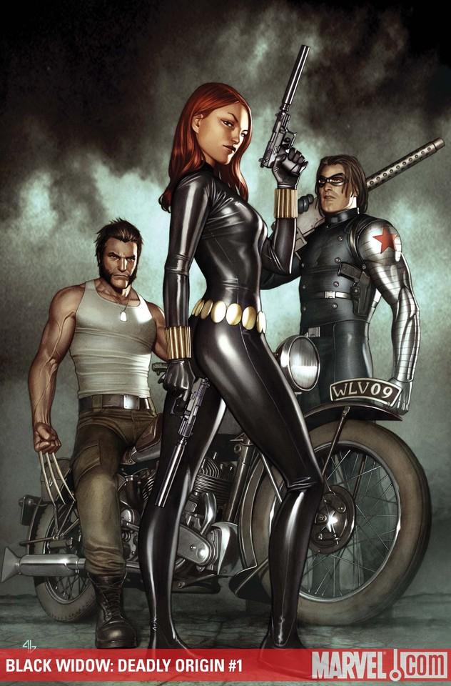
BLACK WIDOW: DEADLY ORIGIN #1 Marvel Comics
I really wanted to like this book. I like Paul Cornell. I like Jean Paul Leon. I like Tom Raney. I also like peanut butter, popcorn, and ice cream sandwiches. That doesn't mean I like them all at once, though. The juxtaposition of Raney and Leon's art was just too disjointed for me and despite Paul Cornell's usual rock solid writing, the art distracted me to a point that I couldn't ignore. My distaste for this book could also come from the fact that there are way too many Marvel miniseries out there right now and I was on the fence buying this one for that very reason. So a decent story these days has to be damn awesome for me to justify second issue purchase. Here we get a decent story and fine art (albeit vastly different from each other from page to page), but in this day and age, when there is so much on the shelf, if it ain't awesome or show the potential of awesome, I am most likely going to take a pass. Widow fans will like it, but if you're on the fence like I am, there's nothing in here so far that makes this a must read. - Bug
R.E.B.E.L.S. #10 DC Comics
See, I told you guys to check out this comic. Whereas NOVA is Marvel's answer to GREEN LANTERN, R.E.B.E.L.S. is DC's answer to GUARDIANS OF THE GALAXY. Anyone digging that awesome series will definitely want to check out Vril Dox and his misfit crew of roughnecks. Sure, last issue's introduction of Captain Comet and Adam Strange was a bit rocky, but it was necessary to get them on the team for this issue. Finally, Vril has a pair of characters on his team strong enough to challenge him. The drama goes into overdrive in this issue as both the Black Lanterns and the Starro barbarians attack with Vril and his crew in the middle. The final page is a shockeroo with a capital EROO and definitely has me biting all the nails I have in anticipation for next issue. - Bug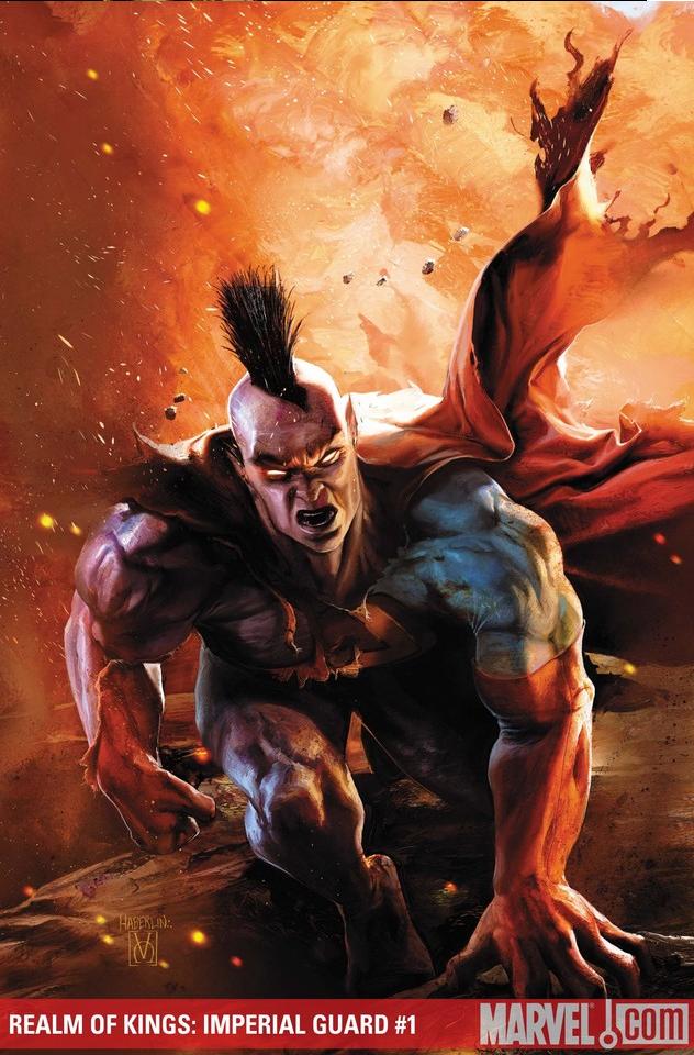
REIGN OF KINGS: IMPERIAL GUARD #1 (of 5) Marvel Comics
Now, I'm not going to say this issue was a dud. It wasn't. It had some great Gladiator asskickery and the rest of the Imperial Guard had a chance to shine too. The ending, as well, was pretty damn cool. But for some reason, that glisten that resonates from most of Abnett and Lanning's work on NOVA and GUARDIANS OF THE GALAXY was a little dimmer in this issue, leading this Bug to think that the writing team supreme may be stretching themselves a bit thin. Still far above most of the other cosmic books out there, but IMPERIAL GUARD wasn't as majestic as I was hoping mainly because of a lack of characters I could relate to. The abundance of bickering aliens and the lack of my familiarity to them didn't help. With the introduction of some characters I am more familiar with at the end of this issue, I'm hoping to get more involved next month. - Bug