
| #8 | 7/1/09 | #8 |
CAPTAIN AMERICA: REBORN #1
Writer: Ed Brubaker Art: Bryan Hitch & Butch Guice Publisher: Marvel Comics Reviewer: Stones Throw
“… Steve Rogers has come unstuck in time.” “Poo-tee-weet?”January 2005. Ed Brubaker’s CAP series began and over the course of fifty-one issues it managed to press through worthless crossovers like HOUSE OF M and CIVIL WAR with its own better-planned and far superior story. The resurrection of Bucky as Winter Soldier, his turning away from that identity and back towards Steve Rogers, the death of Captain America, and Bucky becoming a new Cap were all a natural progression in Bru’s over-arching story that to their great benefit took place in the title character’s book. CAPTAIN AMERICA was the voice in the wilderness proving that big things still happened in monthly comics, putting character over “event” for the past five years.
It was now July 2009. We were getting the most important arc since the “Death of Captain America” in a separate miniseries drawn by THE ULTIMATES’ Bryan Hitch.
At some point in the mid-Nineties, Mark Waid wrote the opening of KINGDOM COME that would get ripped off for the opening of the series that regular Cap artist Steve Epting has been jettisoned off onto (previewed within).
It was 1944 in the Marvel Universe. Captain America leapt over a landing craft, yelling “Let’s go kick these Nazis all the way back to Germany!” In 2001 Mark Millar wrote the sequence that probably inspired this. At Normandy in 1944 there wasn’t any Captain America. Sixty-five years later the anniversary of the D-Day landings reminded the public of this, making the opening of CAP: REBORN and its narration (“Always the first into battle … always leading the way …”) feel pretty cheap and tasteless. Missions behind enemy lines, I can take, but the image of those men in the landing craft is just too ingrained.
In a slow news week in 2007, CAPTAIN AMERICA (vol. 5) #25 was able to grab headlines and morning news-space, prompting a rush on comic shops not seen since the Death of Superman.
Back in 2009, despite a million one BIG-@$$ EVENT minis, the House of Ideas was lacking a central “event series” to peg its summer on.
In the 1940s Captain America adventures were largely set on the home front. In the Sixties Stan and Jack, both of whom had lived through the war, avoided such problems by using characters like Zemo and Strucker.
In May 2008, the Robert Downey, Jr. IRON MAN movie was released and became a hit. In the comics, Tony Stark was quickly shifted from his job directing S.H.I.E.L.D.
Bryan Hitch sat at his drawing table. Flipping through the pages of Ed Brubaker’s script for CAPTAIN AMERICA: REBORN #1, he decided to do away with the wings on the side of Cap’s head and give the guy a helmet instead, just like in THE ULTIMATES. This contradicted previous flashbacks in Brubaker’s CAP series and made Steve look like a pussy, since he also drew a sixteen year old Bucky standing next to him wearing nothing on his head but a domino mask. Still, Hitch’s art was excellent in an action-packed storyboard fashion, even though he chose to put Cap in a pose no one but an action figure would strike, and drew an occasional really odd face. Seriously, that wasn’t a pillar of the Marvel U getting shot in the second panel, it was a nervous looking Archie Andrews!
In summer 2009, another meaningless crossover raged through the Marvel U, this time involving Norman Osborn, the new director of H.A.M.M.E.R. My CAP comic book had to include two of the most foul characters in the Marvel Universe (Green Goblin and Venom), who between them had more deaths, clones, resurrections, Goblin babies, ret-cons and offspring symbiotes than I’d have ever wanted to count, reminding me that comic book death and rebirth is seldom well handled. Oh, and an ugly god of war.
On Wednesday, July 8th a Talkbacker furiously typed, “Stop fucking around and review the damn comic book!”
Six months from now, I’ll likely look back on CAP: REBORN as another quality installment in Brubaker’s CAPTAIN AMERICA saga, by far Marvel’s best continuing series for the last few years, even though the first issue was more about “the event” (discovering that Steve Rogers is unstuck in time) than “the character”. Even so, I’ll ask myself why it couldn’t have been part of the regular title and regret the involvement of the latest iteration of the Avengers. And wonder why the hell Bryan Hitch chose to draw Hank Pym’s stanky man-feet on show.
So it goes.
So it goes.
JUSTICE LEAGUE: CRY FOR JUSTICE #1
Writer: James Robinson Art: Mauro Cascioli Publisher: DC Comics Reviewer: BottleImp
Wary. Conflicted. On-the-fence. Those were my feelings when I first heard about this Robinson-scripted series some months back. See, I was a big fan of James Robinson’s work. STARMAN, THE GOLDEN AGE, WITCHCRAFT, LEAVE IT TO CHANCE—all great comics, all showcasing wonderful combinations of characterization, dialogue, plot and mood. But his recent writing on SUPERMAN…well, let’s just say that it’s no STARMAN. So I was (justifiably, I think) apprehensive of this new JUSTICE LEAGUE miniseries. Was it to be the return to quality comic book making that I had hoped for?While it’s still waaay too early to give a concrete answer, I’m happy to say that CRY FOR JUSTICE seems to fall more in the realm of the above-mentioned earlier work than in the current SUPERMAN doldrums. The crux of the series is fairly simplistic—superheroes deciding to actually mete out justice against the villains who have murdered and escaped judgment time and again—so a lot of the weight of the storytelling is going to fall on the characters and their interactions. And so far, so good. The iconic characters of Green Lantern and Green Arrow come across as individuals with their own personalities and manners of speaking; there’s none of the cookie-cutter dialogue that turned me off SUPERMAN. And better still, Robinson has fleshed out the ranks of his team with some of the more obscure heroes of the DC Universe, thereby playing to one of his greatest strengths: the ability to take a character who is virtually a blank slate (such as the blue-skinned Starman or Congorilla) and make the reader care about what happens to him. Anyone who’s read STARMAN or THE GOLDEN AGE knows what I’m talking about—they’re the comics that elevated third-stringers like Will Payton and Simon and Kirby’s Manhunter to equal the likes of Batman or Superman. I’m looking forward to seeing more of Mikaal Tomas (who was used to great effect in the pages of STARMAN) and seeing what Robinson has in store for the former Congo Bill.
On the visual side of things, Mauro Cascioli provides exceptional artwork. Though his style (painted? Or penciled with digital paint? I can’t really tell) will draw the obvious comparison to Alex Ross, Cascioli’s work is slightly more stylized and less reliant on photo reference. In other words, it’s more comic book-ey. Since this issue has been mostly people standing around and talking, it still remains to be seen how well this style will work for more action-oriented scenes, but all in all this issue has it going on when it comes to good visuals and an exquisite color palette.
Yep, I enjoyed this comic. There’s just one little problem…
Last week in our “Shoot the Messenger” column @$$hole extraordinaire Optimous Douche told of his conversation with DC honcho Dan DiDio regarding the price hike of DC comics from $2.99 to $3.99. DiDio asserted that the comic buyer would be compensated for this by getting more content in every issue—as is the case with DC’s current “Second Feature” titles. However, CRY FOR JUSTICE has no “Second Feature.” It has 22 pages of actual story, just like all the $2.99 DC titles. And EIGHT FUCKING PAGES OF UNESSENTIAL BEHIND-THE-SCENES BULLSHIT. Eight pages of what, under normal circumstances, would be described as “filler.” Eight pages of 18-pt text and reprinted art (some of which came from this very issue) that could have easily been condensed. There is no need to include images of old Congo Bill comics or Cascioli’s pencils—save it for the inevitable trade paperback! And the two-page “Origin of Congorilla” comic sequence is ludicrously unnecessary.
Bottom line: stop screwing your readers, DC. If you’re going to promise more comic for more money, you can’t just blow up what should have been no more than two pages, max, spread it over eight pages and call it more content. Shame on you, DC.
But aside from the dirty business end of things, I’m looking forward to the rest of this series… although maybe I should just wait for the trade so I don’t raise my blood pressure with every “content-filled” issue.
When released from his Bottle, the Imp takes the form of Stephen Andrade, an artist/illustrator/pirate monkey painter from the Northeast. You can see some of his artwork here. He’s given up comics more times than he can remember. But every time he thinks he's out, they pull him back in.
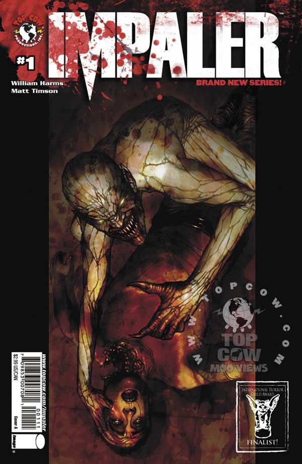
IMPALER #1-3
Written by: William Harms Art by: Matt Timson Published by: Image Comics/Top Cow Reviewed by Ryan McLelland
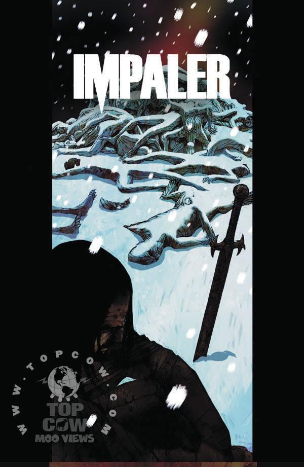
There's going to be some spoilers here so for those who haven't read the first volume of IMPALER then you are S.O.L. in SO many different ways. IMPALER is perhaps the best vampire comic ever to hit comics and Volume 1 saw the streets of New York invaded by vampires during a horrible blizzard. Series hero Vlad Tepes, the man known for starting the vampire legend, had teamed up with the local cops to subdue the menace. Then the military freaked out and decided it was best just to nuke New York City.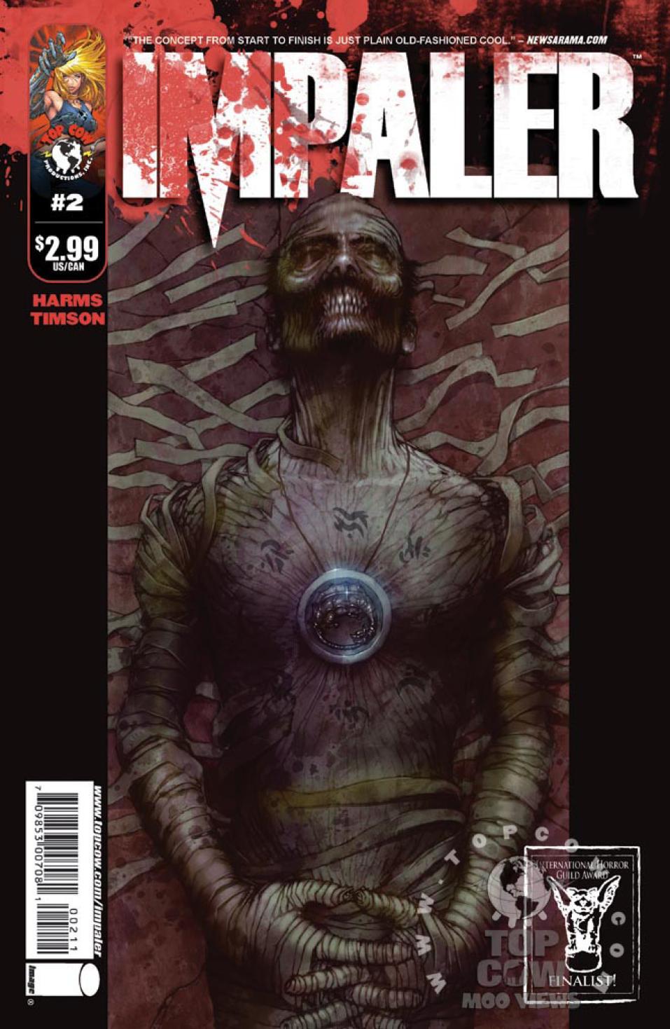 The next part of the IMPALER series kicks right back off with a story that sucked me right back in thanks to the amazing writing skills of William Harms and the unbelievable artwork of new series artist Matt Timson. Panels literally jump off the page at you causing the book to almost flow together as a film (a sensation I haven't had while reading a comic in a long time...the last maybe being Mike Kunkel's HEROBEAR AND THE KID). These are some nasty vampires looking to decimate anything with a pulse and the feeling of terror never stops coming, just like most great horror novels or films do.
So it's post-nuking but everything is still going to hell. Vampires are still running rampant and the military is now focusing around New Jersey and Philadelphia in efforts to stop the vamps. The book follows the military and Vlad, who has survived the nuclear blast and is still looking to kill a whole lot of bloodsuckers - joined by Victor, a NYC detective who joins Vlad in the chase.
 For a book about vampires these issues don't have alot of them in it. Say what? I'll put it this way - the vampires in IMPALER are entirely vicious and out-to-kill. When they spring into a panel there is nothing but mayhem, blood, and death. It's a character driven book where you really fear the vampires and fear what may happen to the characters 'hunting' them.
Vampires are hot right now - but nothing is hotter than IMPALER. Hands down one of the best books on the market today and too bad that seems to be a big secret. Get your grubby little mitts on the collection then head over to here to the first three issues. IMPALER adds so much to the vampire mythos that you may not look at them the same after reading this. I know it has changed how I want to see my vampires portrayed.
Ryan McLelland has worked in movies and comics journalism for the past several years before joining the @$$holes here at AICN. Ryan’s comic work has already graced comic shelves with Arcana’s PHILLY, WISE INTELLIGENCE, UPTOWN GIRL, and THE SENTINELS ANTHOLOGY. He rarely updates his blog but when he does it can be read at www.eyewannabe.com. The first issue of his new WISE INTELLIGENCE miniseries can be found here.
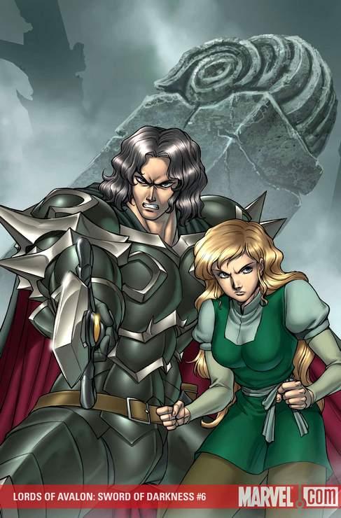
LORDS OF AVALON: SWORD OF DARKNESS #6
Writer: Sherrilyn Kenyon Art: Tommy Ohtsuka Publisher: Marvel Comics Reviewer: Mr. Pasty
As an author, Sherrilyn Kenyon has experienced a truly remarkable career in publishing filled with incredible highs (#1 New York Time Bestseller) and incredible lows (living out of her car in Columbus). Where does LORDS OF AVALON fall in this wide spectrum of success and failure? Probably somewhere in the middle.I accept that as a man, I view the world a certain way. I like to think that I’m slightly more evolved than your typical ass-grabbing fratboy, but I still see things through testosterone-colored glasses. In fact, last week’s review of the Brian Reed-penned RED SONJA has only further established for me the marked difference in how men and women tell a story driven by female protagonists/antagonists.
Having said that, this swords and sorcery book reeks of estrogen. One of the central themes is Merewyn’s fear of losing her man because she starts to age prematurely while he remains young and nubile. Apparently a woman of higher rank has placed a spell on Merewyn that wrinkles her faster than Walter Donovan when he drank from the false grail. She spends at least a page or so whining about her looks and how Varian, the man in question, will no longer love her or bang her because she looks like a prune and has kitty litter between her legs. Naturally he does what any man would do and rebukes her fear of rejection by taking her into the woods and making love to her wrinkly ass anyway. Then poof! She reverts back to her young self under the power of medieval sex.
Folks, welcome to the twisted logic of LORDS OF AVALON.
The book does have a certain amount of charm and I can’t discount the elegant simplicity of Tommy Ohtsuka’s artwork. But there are so many distractions in this story that continually prohibited any suspension of my increasing disbelief. For example, three triplets are on the run from the evil queen. Their names are Merrick, Derrick and Erik. That’s way too close to Huey, Dewey and Louie, allowing my peanut brain to wander off to MAGICAL QUEST where the Quack Pack must fight King Pete – and it was very hard to come back. I also felt like the book was very noncommittal on the character design, almost like it was easier to just Frankenstein a bunch of different but established looks together and call it a day. Lord of the World of Warcraft I think is an apropos description.
In the end, LORDS OF AVALON is one big magical mess. Imagine EXCALIBUR if it were directed by Meredith Baxter-Birney instead of John Boorman. I grabbed this book hoping for a unique and compelling re-imagining of the Camelot universe. What I got was an episode of FRIENDS with pointy ears.
My Rating: 2 BFF’s out of 5.
Web heads who can’t get enough of Mr. Pasty’s word vomit are encouraged to see him operate as Nostradumbass over at MMAmania.com. Love, hate and Mafia Wars requests should be directed here.
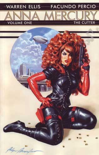
ANNA MERCURY VOL.1 HC
Written by: Warren Ellis Art by: Facundo Percio Published by: Avatar Press Review by: Baytor
Bod bless Warren Ellis for helping put Avatar Press on the map. A lot of creators sit around online bitching about the state of the industry, so it was refreshing to see a creator spend so much time and effort to build a home for the work they want to do. He took his growing stature at the major companies and went out and forged a relationship with a company that seemed beneath his pay grade, which seemed odd at the time, because what he was doing there would have seemed right at home at Vertigo or Wildstorm. A few years later, the shenanigans surrounding THE BOYS and LEAGUE OF EXTRAORDINARY GENTLEMEN proved that a DC imprint wasn’t the artistic safe-haven that many imagined it to be.Which doesn’t have terribly much to do with ANNA MERCURY, apart from explaining why this book is a full-color hard cover collection featuring some kick-ass art by Facundo Percio. It exists because Warren Ellis helped changed the rules of the game, because he took a chance on doing some B&W comics with not-ready-for-prime-time artwork all those years ago.
First things first, this is a Warren Ellis mini-series so standard Warren Ellis rules apply. There will be a tough-as-nails female lead who will shoot you through the face as soon as kick you in the balls; she will not be obsessing over what happened on GOSSIP GIRL last night; and, most importantly, she will make stuff ‘splode. She also tends to look like a drag queen, but that’s kind of intentional.
The basic set-up involves nine worlds in invisible orbit around Earth. Don’t worry if that sentence doesn’t make much sense to you, because the book points out that it didn’t make much sense to anyone in their world until the 1970s, despite these worlds being discovered in 1943 by the U.S.S. Eldridge during the infamous Philadelphia Experiment. That incursion was viewed as a religious event on one of the worlds and our leaders have been sending agents there trying to minimize the damage of that accidental encounter ever since.
Enter Anna Mercury, who is one of the best agents, because she’s more than a little mad. She’s got one hour to prevent genocide on that world and she’s armed with two pistols and a device that allows her to bend reality around her…the only drawback being that she’ll ‘splode if she runs out of power. As is the case with most Warren Ellis books, underneath the bad attitudes are good people who sincerely care about saving lives and making the world a better place. But, mostly, it’s about stuff ‘sploding.
Ellis has carved out quite a niche for himself doing high-concept, high-action, bad-mannered, intelligent stories featuring distinctive visual hooks and ANNA MERCURY is no exception. It’s fun, it’s cool, and he's got a wide-open premise for exploration and action. It even features some hints of what's to come, so I eager await a second volume of this series.
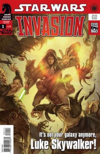
STAR WARS: INVASION #1
Writer: Tom Taylor Art: Colin Wilson Publisher: Dark Horse Comics Reviewer: Matt Adler
This comic has an interesting provenance. In the late ‘90s, Dark Horse, longtime publisher of Star Wars comics, planned to do a storyline in their books that had the far, far away galaxy of STAR WARS face its first invasion from outside the galaxy. But licensed comics are often subject to the vagaries of corporate infighting, and around this time, a new publisher, Del Rey, was given the rights to publish Star Wars novels.Lucasfilm has always been very strict about insisting on a single, unified STAR WARS universe, which means that all STAR WARS spinoffs, whether they take place in television, books, comics, or videogames, must agree with each other (and even more importantly, must agree with the movies, which are considered the “true canon”). Unfortunately, this becomes even more complicated when different companies have to coordinate their respective licensed products with each other.
Such was the case when Dark Horse was compelled to sit down with Del Rey and discuss their proposed storyline, to ensure it did not conflict with Del Rey’s plans. To the surprise and dismay of the editors at Dark Horse, Lucasfilm decided to take the storyline they’d developed away from them, and give it to Del Rey to publish in novel form instead. Even though Dark Horse had already begun planting the seeds of the event in their comics, they quickly soured on the notion of participating in the event any further, given their loss of control, and the fact that Del Rey planned to take the story in a completely different direction. So, all plans for the Invasion in comics were shelved.
Fast forward about 10 years to 2009, and Del Rey’s invasion storyline had already been completed 6 years prior, in a 19-part novel series called “The New Jedi Order”. The series, though controversial in some quarters, proved a sales success, and fans still showed an interest in it even after its completion. By this time, old wounds had apparently healed enough that Dark Horse decided the time was right for the Invasion to come to comics. Hence the book that is the subject of this review. So how does it stack up with the novels?
Well, for starters, it’s not an adaptation. Dark Horse has instead chosen to tell tales “around” the time of the invasion, from the point of view of (at least some) characters we have not seen before. This is not an unreasonable decision; given that the storyline involved the invasion of an entire galaxy, it’s entirely plausible that there might be some interesting stories mined out of planets that we had not seen covered in the original storyline.
From the point of view of someone who has read the novels, the main thing I was looking for from this comic is its handling of the villains. The most compelling aspect of the novels was the Yuuzhan Vong, a race of alien invaders from another galaxy unlike anything the STAR WARS universe had ever seen. The books were filled with descriptions of a ruthless, unstoppable armada made up of creatures tattooed from head to toe, who made ritualistic self-mutilation a mainstay of their society, used bizarre biotechnology wherever the normal STR WARS universe used mechanical objects, and perhaps most mysteriously, seemed to have no presence whatsoever in The Force. So what could the comics do with creatures that were so visually compelling and frightening even in words alone?
The answer here is not much. The artist here draws them as pretty conventional movie monsters, definitely not anywhere near as creepy or revolting as the descriptions in the novels would suggest. They run around looting and pillaging, but they simply aren’t scary. The writer too disappoints, not giving them any opportunity in this first issue to show off abilities or technology that would make the reader think “This is something different and deadly.” The rest of the story too is pretty by-the-numbers, with fairly generic characterization and few truly dramatic or intense moments. It’s not aided by the art which is a little rough, but without any particularly interesting stylistic quirks to make up for it. All in all, it’s a little surprising that for what should be a fairly major launch of a new Star Wars comic, the effort and the creative team turned out to be so lackluster. One has to wonder whether Dark Horse’s heart is really in this.
BOOM! KIDS
Reviewed by Liam ‘The Kid’
Note: ‘The Kid’ is 8 years old and has been doing reviews on his own site since August of 2008. And you can now follow the kid’s daily ‘adventures’ on Twitter.One of my favorite comic companies right now is Boom Kids. A lot of times when people make comic books that are supposed to be for kids only they can be pretty boring. They’re usually sillier than the regular comics that have Batman or Spider-Man and the adventures that they have aren’t as cool as what happens in the real books. Some kids comics like Marvel Adventures Spider-Man and Tiny Titans are really good because they’re funny and have some good action in them but I’ve read a bunch of comics that people suggest for kids that really aren’t that good.
Boom Kids has a lot of comics that are supposed to be good for kids and that adults will like too. I think I’ve read all the Boom Kids books or if I didn’t read it then my brother, Ethan did. They do a really good job of coming up with some fun ideas for stories. Since I don’t have one comic to review this week (Batman and Robin #2 was the best book last week but someone else is reviewing it) I am going to do mini reviews of all the Boom Kids books.
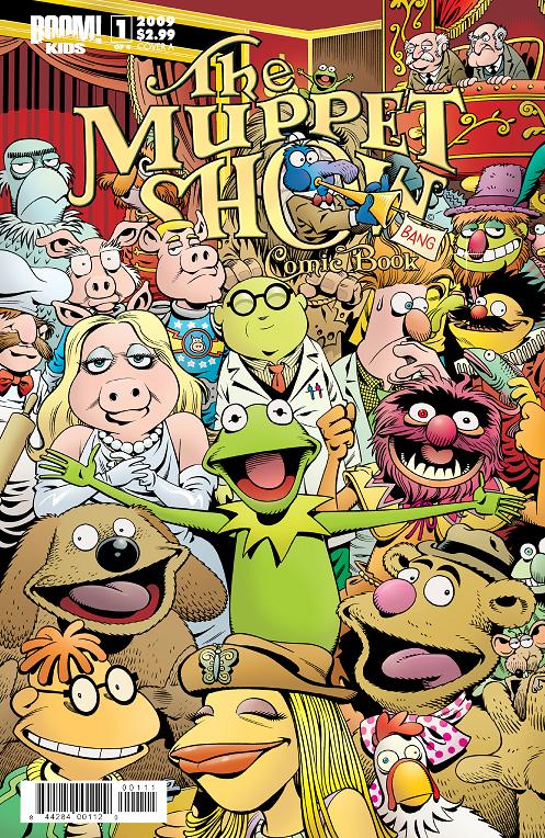
MUPPET SHOW Written and drawn by Roger Langridge
THE MUPPET SHOW is a really fun comic. I never watched the television show of the Muppets but I saw the movies. The comic takes place on THE MUPPET SHOW and has a lot of different stories going on at the same time. Kermit is trying to make the show go good and no one ever listens to him. They also do the Pigs in Space action story and have really funny parts with the chef and the scientist and his lab partner. Those are always my favorite parts. I like the old men who just complain about everything, too. THE MUPPET SHOW is my favorite Boom comic because it has a lot of different smaller stories in the comic which is better to read.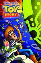
TOY STORY Written by Dan Jolley & drawn by Chris Moreno
TOY STORY was a really good movie and the comic is just as good. Buzz and Woody are the main characters but they show a lot of the other toys, too. The piggy bank and dinosaur get the most things to do but other characters are in the book like the slinky dog and Bo Peep and the green army men. I like in the first issue that everyone is jealous because they think there’s this cool new toy but it’s really just an air freshener. Toy Story is probably the funniest of the Boom comics.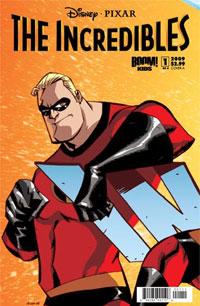
INCREDIBLES Written by Mark Waid & drawn by Marcio Takara
I didn’t like the INCREDIBLES movie that much but I got the comic anyway. The comic is a lot better than the movie was. Mr Incredible lost his powers but he’s still trying to stay a hero even though he can’t do much. I like a lot of the crazy battles that happen in the comic like the one at the zoo and the other one with the giant alien robot. They came up with some pretty interesting battles for the Incredibles to have and it makes the book better. I also like that they spend time on other characters besides the Incredibles like Frozone. He’s the best character in the book.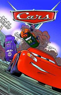
CARS Written by Alan J Porter & drawn by Albert Carreres
I didn’t like the CARS movie, either and the comic book reminds me a lot about the movie. I know it’s pretend but I don’t think that cars that talk are very interesting. My little brother really liked the movie and collects all the toys and he liked the comic a lot more than me. He likes how they spend a lot of time showing all of the different cars and letting cars besides Lightning McQueen have things to do. So I guess if you really like the CARS movie you’ll like the comic book. He thinks so.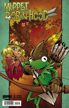
MUPPET ROBIN HOOD Written by Tim Beedle & drawn by Armand Villavert Jr
I think having the Muppets do Robin Hood is such a great idea. A lot of the Muppet movies have all of the characters doing different stories like Scrooge and Treasure Island and Wizard of Oz so doing Robin Hood makes sense. Kermit is Robin Hood because he’s like the leader of the Muppets and Robin Hood is the leader of his group and all of the other Muppets show up as different characters from Robin Hood. My favorite character in this comic is Gonzo because he’s really crazy. I don’t know how to explain it but he just makes no sense in the comic and says and does all of this weird stuff that makes it kind of funny. It’s like he wants to get captured or hurt. He’s weird. There is more action in this comic than the regular Muppet book but it’s also pretty funny, as well.They also have pictures at the end of their comics for FINDING NEMO, MONSTERS INC and WALL-E so I guess they’re going to be doing those as comic books too. If they do, I’ll read those, too.
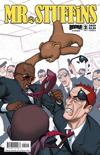
MR STUFFiNS Written by Andrew Cosby & Johanna Stokes & drawn by Axel Machain
MR. STUFFiNS isn’t a Boom Kids book but it does come out from Boom and it’s one of the best comics that I’ve read so I wanted to mention it. MR STUFFiNSis about a teddy bear who gets a special chip put in him that turns him into a special secret agent who is a great fighter, too. It’s a really silly idea but it’s so fun to see the parts where the teddy bear is just beating on the bad guys or using weapons and stuff.Boom has a lot of great comics for kids and grown ups and so far I’ve liked all of the books that they have come out with and think that most kids would like these books too. I gave copies of THE MUPPET SHOW and CARS books to kids in my class and they were all really happy to get them and liked them a lot.
BATMAN & ROBIN #2
Writer: Grant Morrison Artist: Frank Quitely Publisher: DC Comics Reviewer: Optimous Douche
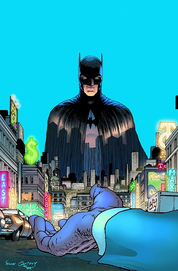
Wow, talk about a dynamic fucking duo! No, not Dick and Damian (anyone else think this still sounds like the title for gay porn), they are still getting their sea legs as the protectors of Gotham as we’ll explore in a minute. No, my expletive praise is showering down on the heads of Mr. Morrison and Mr. Quitely, a team that has yet to do wrong and seems to have the uncanny ability to resuscitate even the most tired titles and comic characters. While I was one of the harshest critics of FINAL CRISIS, I would never be so arrogant to call Morrison a hack, nor as this book and ALL STAR SUPERMAN indicate a one-note wonder. Anyone who has read Morrison’s non-mainstream titles like DOOM PATROL and INVISIBLES knows that this guy lives on another plane of existence. Quitely, though, seems to be Morrison’s Patronus, his cute little spirit animal that is able to bring the big M back to a state of normality and greatness. There are no disjointed concepts like misogyny pancakes and Nazi pantyhose to be found in a title when these two work together. I don’t know why they gel so well, but for anyone that was put off by Morrison’s work outside of his Quitely team-ups, don’t let that stop you from basking in the glory of these two - you are only hurting yourself.Everything in this title was meticulously timed and crafted, from the characterization of the new Dark Knights (who are not so dark) to every beat of action that left me enthralled and thirsting for next month’s installment. Right from the opening page as Dick Grayson sits on the stairs of the new Batcave under Wayne Tower, beaten and downtrodden, you know that he will never be Bruce Wayne and that’s A-OK in my book. Bruce Wayne was never human; the same event that made him Batman stripped away all facets of humanity. Dick by contrast is all too human articulating every ounce of self-doubt and loathing that has come with taking on the august mantle of The Bat. Does this tragic flaw make him a better Batman, well not yet, but in time I think it will certainly make him more interesting than his predecessor.
Dick’s sullen shoulders are the result of a botched rescue at Gotham’s Police Headquarters. In response to a Bat-Signal from Commissioner Gordon, Damien and Dick (there that’s better) arrive to bleed some information out of Mr. Toad on his recent crime spree. The interchange between Gordon and his men after the dynamic duo leave the rooftop to respond to an emergency call inside the building was priceless if not a bit mistimed. Phrases like “Wasn’t Batman taller” and “That’s not his usual voice, but I do recognize it” acknowledged the fact that the costume alone does not make the hero. I say mistimed because Gotham’s finest were having this conversation after the emergency call came through, but fuck it, it’s comics, for the yucks alone I’m willing to roll with it. Once inside the building where Mr. Toad’s circus freak friends are seemingly trying to bust him out of jail Quitely renders some of the best action fight scenes I have ever seen. Every acrobatic tumble and smattering of drywall moved with such a natural grace I thought I was watching a movie. I could hear every snap and crumble inside my head. As the tussle ends with four policemen and Mr. Toad lying lifeless, you know you are reading a book with real consequences where perhaps the heroes will not always save the day. This sort of “real-life” approach is something one expects from an indie title, but always lacking inside the universes of the BIG TWO. I applaud DC for allowing Morrison to take this sort of no-nonsense approach to a story that is clearly going to be imbedded inside ongoing continuity.
The scuffle at the police station was essentially botched because Damien and Dick have yet to gel as a team. Damien’s arrogance and unbridled hatred for Dick is at the epicenter of the discord. I’m having a hard time wrapping my head around Damien. Twenty years ago we all voted unanimously to keep douchiness outside of the Batcave with the DC 900 number campaign that allowed the Joker to wail on Jason Todd like a piñata. If you strip away Damien’s DNA he is Jason, but ten times worse. Don’t get me wrong, I like the dynamic of mentor and petulant learner that is developing between these two, it just seems like an odd choice. It makes me wonder how long Damien will truly be around. This dynamic also allowed for some wonderful scenes between Alfred and Dick after Damien storms out searching for Mr. Toad’s killers. It’s eminently clear that Alfred now calls the shots until Dick is ready to man-up and truly carry the mantle.
After their run on X-MEN and ALL STAR SUPERMAN I was ready to read anything that Morrison and Quitely teamed up on. Now after reading the second issue of BATMAN AND ROBIN, I am sending out a clarion call to both DC and Marvel to let these guys have a crack at all of the comic chestnuts. If you want to save comics, guys, I think the work of these two is the magic formula; you will certainly get my money.
When Optimous Douche isn’t reading comics and misspelling the names of 80’s icons, he “transforms” into a corporate communications guru. "What if the whole world had superpowers? Find out in the pages of Optimous’ original book AVERAGE JOE. Read the first full issue on Optimous’ New Blog and see original sketches by fellow @$$hole Bottleimp. If you are a publisher or can help these guys get AVERAGE JOE up, up, and on the shelves in any way, drop Optimous a line."
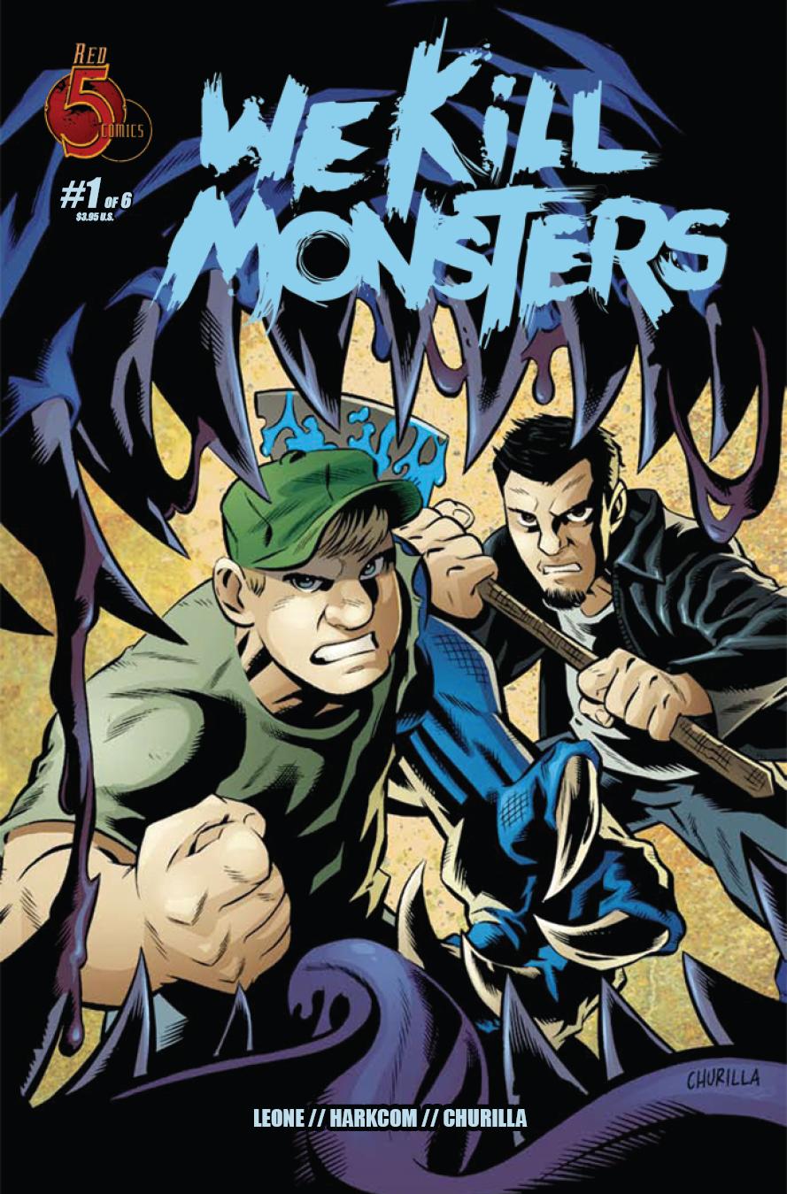
WE KILL MONSTERS #1
Written: Laura Harkcom, Christopher Leone Art: Brian Churilla Published by: Red 5 Comics Reviewer: superhero
Well, this is a fun little horror romp. There’s nothing incredibly special about this book. It’s very much like other entries in the monster hunting genre. This particular story is about two brothers who run an auto mechanic shop. One night they come across something incredibly bizarre and it pretty much looks like it’s going to change the course of their lives forever. Like I said, there’s nothing particularly unique or different about this book. If you’ve read something like TOMB OF DRACULA or are into BUFFY THE VAMPIRE SLAYER you’ve seen stuff like this before. The thing is that books like the aforementioned properties are very good company to keep. And while WE KILL MONSTERS hasn’t achieved that sort of potential just yet it looks like it could build up to something that could be just as entertaining as either TOMB or BUFFY.This first issue is pretty much just setup for the rest of the series and it moves along at a great pace. The standout for me was the cartooning work of artist Brian Churilla. His work reminds me of early Kieron Dwyer but with a bit of a more refined line to it. It’s his work that really got my attention here. His storytelling is spot on and his style is fun and breezy yet able to portray enough intensity for this particularly creepy action tale.
The first entry of WE KILL MONSTERS was interesting enough that it left me curious for more. The problem is…well, the price tag. As I said, this issue moves pretty fast and is a very quick read. I’m not saying anything bad about the content of the book as the story moves along at just the perfect pace but four dollars for this introductory chapter seems like a bit much. As much as I love independent books and I understand the costs of self-publishing I have to say that I’m probably going to wait for a trade edition for this particular title. It’s not that I don’t think that WE KILL MONSTERS is worth paying good cash for, it’s just that I think that potential fans are going to be turned away from a good book because of its cost. I know I am. It’s too bad, because I think that the WE KILL MONSTERS crew has some talent here. I just think that its talent that would have been better displayed in a graphic novel format and not overly priced monthlies.
Discovered as a babe in an abandoned comic book storage box and bitten by a radioactive comic fan when he was a teenager, superhero is actually not-so mild mannered sometime designer & cartoonist, Kristian Horn of Los Angeles, California. He's been an @$$hole for three years. Some of his work can be seen at www.kristianhorn.com.
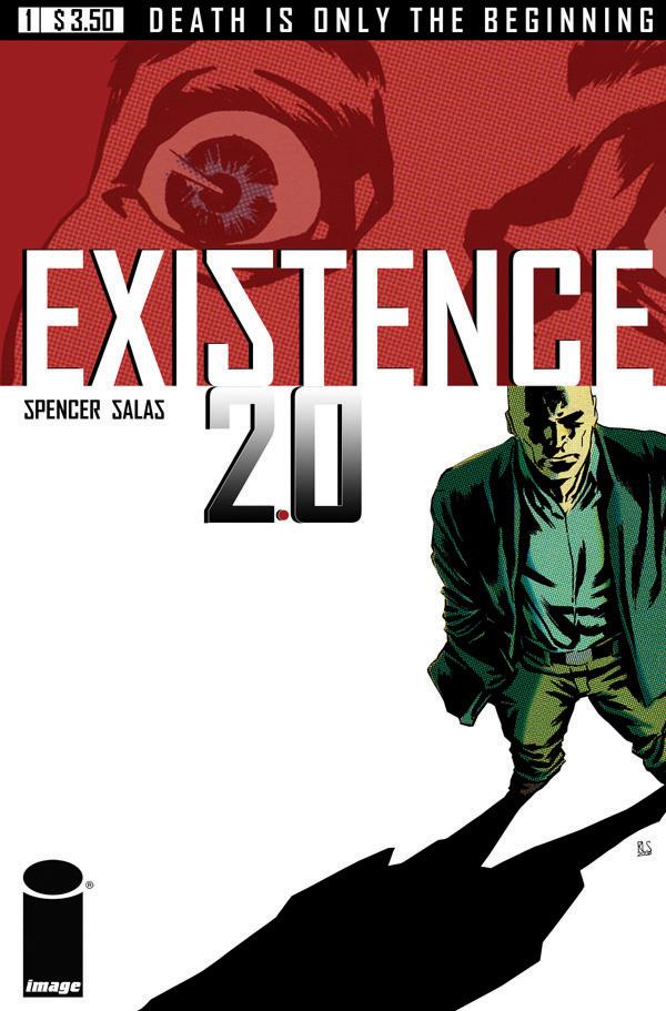
EXISTENCE 2.0
Writer: Nick Spencer Artist: Ron Salas Publisher: Image Comics Reviewed by Andrew Goletz
I don’t do many reviews anymore. I limit my commentary on comics to a few words here and there every week about the latest comics that I enjoyed (or hated). But every now and then a project comes along that you’re so impressed by that you want to shout out to anyone who will listen or care, “you NEED to read/watch/listen to this.” EXISTENCE 2.0 is such a project.The story is simple enough. A physicist is murdered by a hitman and his consciousness is transferred to the body of the killer so he has to solve his own murder. The comic itself is narrated by the main character, Sylvester Baladine, who is running out of time. Not only was he murdered, but the people responsible for putting the hit out on him have also kidnapped his daughter. Sylvester isn’t necessarily a likeable guy. People don’t seem to be all that pleased whenever he’s around and it becomes obvious that there is more to ‘Sly’ than meets the eye. He’s got more to his past that most people know about and as he inhabits the body of the man who tried to kill him Spencer and Salas shine a little light on what other talents Sly may have.
There’s action. There’s intrigue. Its crime noir mixed with a little bit of sci-fi and pulpy adventure. Spencer’s dialogue is sharp and smart with a little bit of wit mixed in for good measure and I can’t say enough great things about Salas’ art. His style looks like it’d fit right in on a CRIMINAL or SLEEPER. One other thing that really stuck out when reading this book was the color choices. Coloring is an art that often gets ignored. If it’s bad, you complain about it. If it’s good you expect it to be that way but the choices made here with colors give the book a different dimension and make it even more of a visual treat. When you try a first issue from an unproven creative team you’re looking for something to keep your attention and leave you craving more. This team succeeds. The action starts from the very first page and the twists and turns throughout the narrative will hold your interest until you sadly realize that the issue is over.
I want to address the power of the team behind this comic. Both are new to the industry and this is their first big published work. The temptation could have been there for either one of them to try and overshadow the other with either dialogue that’s over the top or splash pages that resemble pinups instead of complimenting the story. Reading the book you get the real sense that these two are working together on telling the story, not just doing separate halves of the same job. Ed Brubaker and Sean Philips on SLEEPER, Brian Bendis and Alex Maleev on SAM AND TWITCH, Grant Morrison and Frank Quitely on FLEX MENTALLO: early pairings of fan and critically acclaimed comic book teams. Remember when you first read those comics and thought that there was something more to your liking the book than simply words and pictures? EXISTENCE 2.0 isn’t on the level of those teams yet, but you can certainly see the foundation being laid right before your eyes. There’s an energy to the book that extends beyond the page and you can just tell that you’re reading the beginning of something special. The book is scheduled as a 3 issue series to begin with. If sales warrant it, there will be more. Regardless of whether there is more EXISTENCE 2.0 on the horizon I would almost guarantee that this is a creative pairing that you’re going to see on a fan favorite title one day. Pick up a copy next Wednesday, July 3rd and be able to say, “I remember reading Spencer and Salas’ first comic way back when”. 32 pages for $3.50 is considered a bargain now and if you don’t feel the same way about the book after you read it think of how fun it will be to come to the talkbacks next week and slam me.
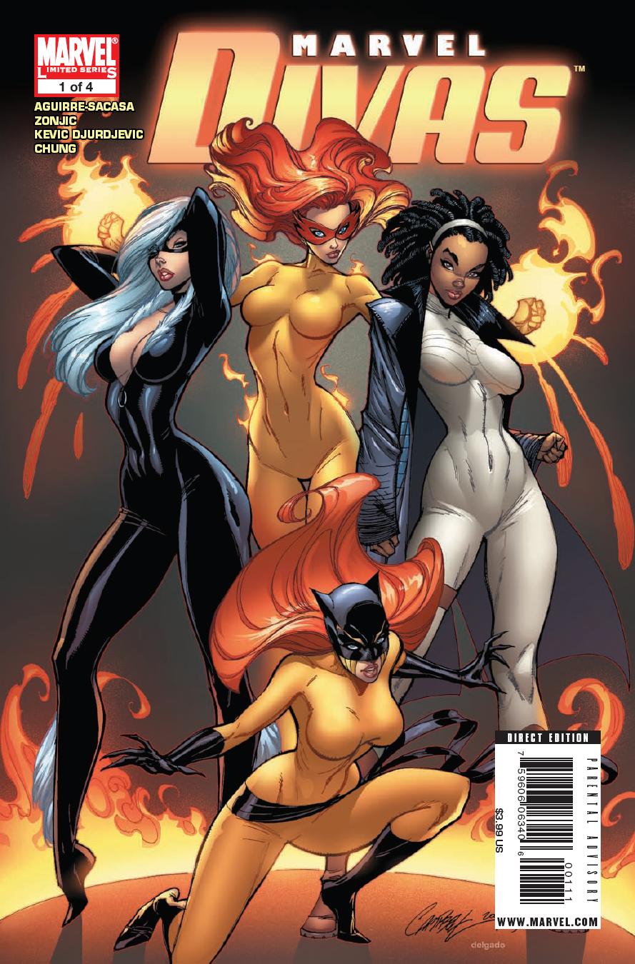
MARVEL DIVAS #1
Writer: Roberto Aguirre-Sacasa Artist: Tonci Zonjic Publisher: Marvel Comics Reviewer: Rock-Me Amodeo (with a little help from the rest of the @$$Holes)
Midnight at the Talkback League of @$$Holes HQ. Ambush Bug and Sleazy G fight over a packet of Funyuns. Another self-published comic has been successfully foisted off onto Superhero. The mysterious ritual known as “Dibbage” begins…ROCK-ME AMODEO (ROCK-ME) (for it is he): Dibbing MARVEL DIVAS #1 – reminds me why I hated “Sex and the City.”
OPTIMOUS DOUCHE (OPTIMOUS): Wait, I'm trying to wrestle with the fact you actually bought it. Please say Marvel sent it as a review .pdf ...
HUMPHREY LEE (HUMPHREY): Is that the book with the Greg Landed Cosmo cover on the front and written by Joe Q's current shoe shine boy? Who could resist that?
ROCK-ME: What can I say? I’m still trying to get in touch with my masculine side.
Actually, I can’t resist a book with Patsy Walker. I was thinking T&A. But it’s gossip, dishing and pedicures. Kind of like “Outshined.” It was looking California. But I’m feeling Minnesota…or maybe Manhattan…
AMBUSH BUG (BUG): What sucks about it is that it really wastes an opportunity for characters like Firestar and Captain Marvel who don't have other series going for them. And also, those are not the characters I would associate with the word diva. Hellcat, maybe. Black Cat, ok. But Firestar and Monica Rambeau (Cap Marvel) always were pretty down to earth and wholesome.
Storm, M from X-Factor, Namora from Agents of ATLAS, Dazzler, even She-Hulk or Dakota North (former model)...those are divas.
Uhm...why are we talking about this again...Gotta go do man stuff.
STONES THROW (STONE): Monica Rambeau is a sad indictment of female characters in comics. She’s gone from leading the Avengers under Roger Stern to being seen as just another available woman to be shoved into a random miniseries. Seriously, when frickin’ SHE-HULK was Marvel’s best written comic in years starring a woman, what does that say? I like how they sell it as “getting in touch with your feminine side”, as if anyone without a Y chromosome was reading it. And as if it didn’t have a completely crass and objective view of women.
But then so did SEX AND THE CITY and apparently the chicks love that.
In conclusion, shame on you, Rock-me! But I’m looking forward to the review.
ROCK-ME (lights a cigarette): Actually, the thing that kind of sealed the deal for me, regarding Monica, was remembering how selfless she was in Avengers, long time ago. I LIKED that person. But she’s dishing with her gal-pals, and says something like, “So I was down in New Orleans after Katrina, helping to clean up the mess you white folks left…”
WTF? I know that Caucasians are the only people it’s okay to say are racist, but this really struck me as out of character for her.
In fact, all of these characters seem to simply be shoe-horned into some kind of plot. I can almost hear the narration going on in “Carrie Bradshaw”s whiney voice…
Like the AICN advert goes, it seems like just another author’s lame attempt to push their self-seeking agenda…whatever that is.
BUG: I really started following the Avengers right about the time Monica was introduced. She was awesome. Really the only black female character who wasn't royalty or a criminal. It's too bad no one knows what to do with her at Marvel.
OPTIMOUS: They didn't even have the decency to have them pillow fight once in underwear. What the hell are comics coming to?
STONE: Yeah, GOTHAM CITY SIRENS was much better in that regard.
HUMPHREY (downing another whisky): This needs to be a Roundtable methinks, just to fuck with everyone.
Fade out.
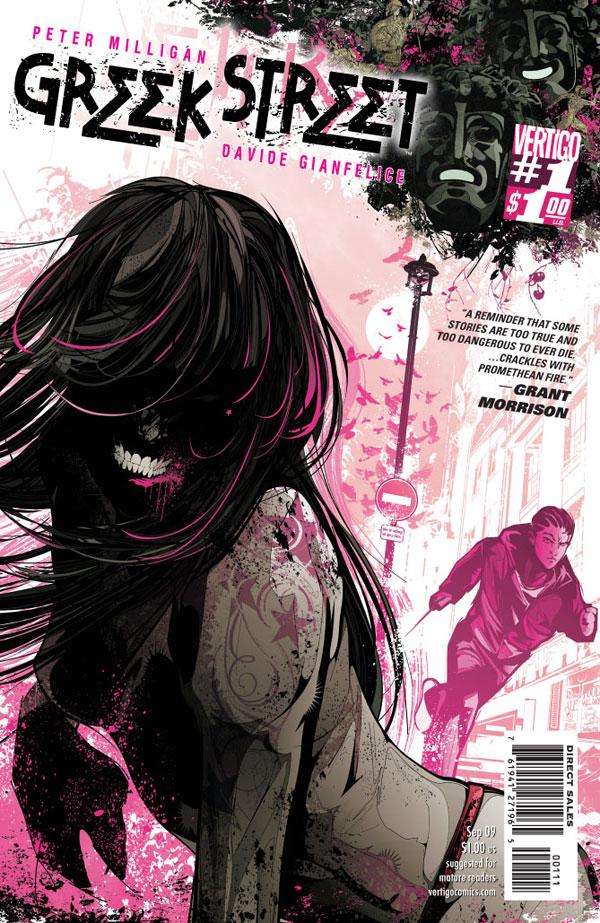
GREEK STREET #1
Writer: Peter Milligan Art: Davide Gianfelice Publisher: DC Vertigo Reviewer: Humphrey Lee
The "old stories" come alive is the name of the game in this new ongoing from Pete Milligan and Vertigo. GREEK STREET, for those not aware (like I wasn't before this book came out), in the real world is a stretch in London, in Soho, that is apparently a very ethnic area. GREEK STREET, the comic, is a "re-imagining" I guess you would say of old Greek myths and legends playing out in modern times with the aforementioned location as the backdrop. It's also the next in line in a push of Vertigo books designed to try and get some readership going by starting out with over-sized and under-priced debut issues; a great maneuver on their part because it seems that its been a trial to get attention to and sustain it on these new ongoing outings from the line as of late. Think of this, though, as an ongoing version of THE INFINITE HORIZON, except with an infinitely larger amount of tits and 100% more mother humping. Ah, the old stories and their understatedness...As you can imagine by that commentary, the main story of this book starts out very Oedipal. Young Eddie, a two-bit hood, seems to be our lead for the moment, or maybe for the series even, but obviously this title is young and we have no clue if these characters are going to be around for a while or if this book is going to use a rotation of protagonists. Really, this time around, there's actually just a ton of players being introduced, from Eddie to Mr. Furey, the owner of Furey's strip club - which also seems to be like a character itself given how much action revolves around it and the girls within - and a big man in the area in general, to uh, some girl in an attic that's a bit nuts (supposedly our Oracle) and on and on. There's a ton to digest with this first issue, as you can imagine given its size, and in this case I actually am not sure that those extra pages were such a good idea.
Now, what I mean by that - and here's where I'm going to put on the Critical Hat - is that I think this book would have been better served if maybe it had spread itself out more. I don't know if maybe Mr. Milligan got caught up in all the extra space he had to establish his book and figured he needed to get those who picked it up as much info as possible to get acclimated to it or what, but I think in the end this got overloaded. There're just so many elements introduced here, some with almost little or no background or depth to them, that I think it would have better served the book to "slow burn" us for a couple issues. The main story is on Eddie, and he does get a fair amount of scene time in the book like he should, but then you get a fairly excessive amount of jumping around from scene to scene to scene with each only getting a limited amount of time to play themselves out. Even Eddie's incestuous horizontal polka with his mother that left him in an orphanage when he was younger seemed to play out too fast as it went from him talking to her in a bar to their drunkenly going back to her place to the reveal of her being his mom to her having an accident and dying all in the span of five pages. Really, and I don't know about you, but when it comes to the shock and horror of tipsily slipping it to the woman who brought you into the world, a handful of pages seems to be a little on the light side, y'know? That whole bag of WTF could have played itself out for one 22 page debut issue methinks while everything else got spotlighted in their own issues until everything lined itself up, or at least that's how I see it.
Now, not to be completely down on this book, I think all that above is probably my biggest complaint of this, and it really could just be boiled down to a pacing complaint. I do think the book has a great atmosphere to it, almost an aura really, that surrounds it. It feels "magical" even though I'm not entirely sure if there's going to be anything more or less supernatural going on, or whatever term you wish to use for it. The back-end previews of this book that have been running throughout all the Vertigo titles the past few weeks would have me believe so, but that's kind of what I was getting at above: I got more about the players in this book out of a preview spelling it out for me than I did reading the issue itself. At the least, though, this has all the makings to be a good, even great, underworld drama (of the criminal element kind, not the fire and brimstone one) because obviously we know there's going to be a lot of tragedy and buckets upon buckets of blood spilt. The side characters will need to step up and carry the book a bit more, methinks; I don't think Eddie is strong enough a character to carry enough page time himself and make us care, but it is early and there might be some strength of character under all that confused little boy in a man's exterior. There does look to be a lot of gang and territorial intrigue at play here, plus a murderous side plot that could pan out as something pretty devious as well, but again, to beat that horse even deader, we really didn't see enough of those to know what they mean.
I still do remain optimistic that the Old Stories have a lot of life left in them to make the pages of GREEK STREET jump to life. Honestly, the big gripe that I had that dominated this review is the same one that I had for THE UNWRITTEN, another brand new Vertigo book, and all it took was a second issue of that to slow things down and expand all these concepts that were thrown at us rapid fire with the debut of it to make me throw my unmitigated support behind that title. I think the same can, and will, happen here. It really does have the base elements that make a good story down: sex, violence, mystery, and - something I've neglected to mention up to this point - fantastic interiors under the pencils of Davide Gianfelice, a large contributor to that aura I said earlier lent so much to making me really feel this book. Hopefully GREEK STREET follows in the same vein and becomes a place that I can't wait to revisit month in and month out, and not just another rundown and shoddy area that you pump the gas a little harder to run on by.
Humphrey Lee has been an avid comic book reader going on fifteen years now and a contributor to Ain't It Cool comics for quite a few as well. In fact, reading comics is about all he does in his free time and where all the money from his day job wages goes to - funding his comic book habit so he can talk about them to you, our loyal readers (lucky you). He's a bit of a social networking whore, so you can find him all over the Interwebs on sites like Twitter, The MySpaces, Facebookand a Blogger Account where he also mostly talks about comics with his free time because he hasn't the slightest semblance of a life. Sad but true, and he gladly encourages you to add, read, and comment as you will.

ESCAPE FROM WONDERLAND #0
Written by: Raven Gregory, Joe Brusha, and Ralph Tedesco Art by: Daniel Leister Published by: Zenescope Entertainment Reviewed by: Ryan McLelland
I love alot of Zenescope's line, especially these WONDERLAND books. They take our sweet ALICE IN WONDERLAND premise and just kick the living shit out of it. They do it well and the art is just so appealing to the eyes. The series is a trilogy with RETURN TO WONDERLAND & BEYOND WONDERLAND already having hit shelves. Now comes the final act ESCAPE FROM WONDERLAND and I hope that the book doesn't come to suffer from trilogyitis.This issue doesn't slam action right in your face but actually acts as a bridge from the second series to the third. Calie, our blonde heroine, returns to her old home looking for a pathway to Wonderland. Why would she go back to the horribly violent place she ran from? Turns out those not-nice fairy tale creatures have stolen her baby and now she's ready to do anything to get her back. Every journey has its first step and this is our lead-in to what is coming with #1.
For those interested in the series this issue is a great place to get your feet wet. The intro story is quite short but the rest of the book has a great look at the characters who make up the WONDERLAND series. One look at the Cheshire Cat and you realize what this series is all about.
With a $1.99 price tag this a great cheapie to pick up and suck you right in. ESCAPE FROM WONDERLAND looks to be a powerful end to the series and #0 gets you in the mood for what is coming next.
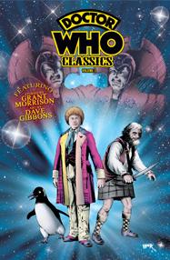
DOCTOR WHO CLASSICS VOL 3
Story by: Grant Morrison, Steve Moore, Steve Parkhouse Art by: John Ridgeway, Bryan Hitch, Dave Gibbons Published by: IDW Publishing Reviewed by: Baytor
When I was a kid, STAR WARS was my favorite comic. My dad refused to take me to see the movie the first year it was out, so I had to wait until it was released in 1978 to finally see what everyone else had been raving about. The Marvel comic was my life-line, although years later I would be amazed at how little the comic resembled the movie, featuring giant carnivorous bunny rabbits and Wild West shoot-outs in the cold vacuum of space.Of course, my childhood memories of DOCTOR WHO are no where near as good. Back then, Doctor Who was played on PBS, which made the horrible mistake of presenting all their offerings as if they were good for you. This was back in the Dark Ages when you had to journey five miles, through the snow, up-hill, both ways, to change the channel, so it was a good thing there were only 10 channels to choose from. The point being, sooner or later you’d end up watching anything just out of sheer boredom, so that’s when I gave DOCTOR WHO a shot.
God, I hated it. This wasn’t quality science fiction like BATTLESTAR GALACTICA & BUCK ROGERS, this was a hammy actor running up and down cheap corridors being menaced by a guy wearing tights and a bull head, without so much as a hint of roller disco. How can you have proper 70s science fiction without roller disco? Such was the suckiness of this single experience that I didn’t watch another episode until the new series premiered with “Rose”, which I loved…and I even went back and revisted the old series and learned to look back at the cheap sets and microscopic budget with love, although “The Horns Of Nimon”, my first-ever Who experience, is still ass.
But I’m drifting.
The old Marvel UK DOCTOR WHO comics resembled its television counterpart about as much as STAR WARS resembled its. Freed from the microscopic budgets of the BBC, the stories took on a scale that often seemed at odds with the televised version and embraced a sense of whimsy that even Tom Baker at his most silly couldn’t match. Think Colin Baker in that rainbow colored suit is bad, wait until the comic teamed him up with a shape-shifting penguin. Personally, I kind of liked him, but a lot of fans hated him almost as much as Bonnie Langford’s Mel.
The third volume in the DOCTOR WHO CLASSICS series not only continues the adventures of the fourth Doctor, but reprints the entirety of Grant Morrison’s work on the character (three tales clocking in a whopping 48 pages). The best is the slightly trippy “Culture Shock!” which is about the 7th Doctor helping out a society of micro-organisms and featuring some rather forgettable artwork by Bryan Hitch. My least favorite was “The World Shapers” which is basically a continuity wet-dream, featuring the return of an old companion (Jamie), the return of a villain not seen since the early 60s (the Voord), the explanation of an old bit of continuity (“Planet 13”), and the secret origin of a classic villain (the Cybermen). All of which might have made a good