

| #33 | 2008 | #7 |

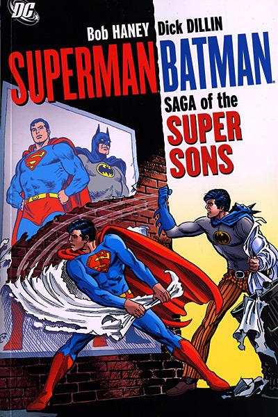
SUPERMAN/BATMAN: SAGA OF THE SUPER SONS TPB
Written by Bob Haney Art by Dick Dillin and others Published by DC Comics Reviewed by Stones Throw
“I can’t believe they’re our fathers—they’re both so young and right on--!” – Bruce Wayne, Jr., WORLD’S FINEST #215Since Superman and Batman both have kids in their titles at the moment, DC has seen fit to reprint these mid-1970s issues of WORLD’S FINEST where the Kid of Steel and the young Dark Knight Detective team up to get away from their over-bearing dads. Of course, Superman’s son in the current continuity is actually the offspring of exiled Kryptonians General Zod and Ursa from their period of captivity in the Phantom Zone (gives a new meaning to “kneel before Zod!”, I suppose) and Batman’s sprog is from a long out-of-continuity Mike W. Barr story in which he slept with Ra’s Al Ghul’s daughter Talia, but in these issues they’re the real deal: there’s no explanation that this is set in a parallel universe or if it’s an imaginary story (well, as Alan Moore said, all comic books are imaginary stories) and Superman and Bats are both seem to be their usual ages, so we’re left to consider the possibility that Superman and Batman secretly did have kids. The fact that their wives’ faces are, like Ray Winstone’s schlong in BEOWULF, never seen, raises the disturbing yet hilarious idea that the two heroes were keeping women on the side while swinging with Lois Lane and Vicki Vale.
The basic structure these adventures take is Superman Jr. and Batman Jr. journeying around together and coming across suspicious ghost towns or crimes that need solving. The hilarious thing about this is that it’s all set against a mid-70s DC Comics idea of youth culture, which wasn’t quite as progressive as the dope-smoking Marvel of the day. The Super Sons are rebelling against their dads because of “the generation gap” (like, “But the generation gap’s still there! You weren’t straight with us! We’re off to find some laughs! See ya, super-dads!”, or, “Man, I’m down with the same old problem…generation gap, super-style!”). However, I have to credit the book with a somewhat realistic depiction of teenagers. For example, in the first story in this collection, the Super Sons are annoyed that their dads won’t let them do any costumed crime fighting, so as a test run Superman dives into the ocean and shakes the San Andreas fault, using the ripple effect to create a temporary, duplicate Sparta City so the kids can have a go at taking down its main mobster Rocco Krugge. Naturally, the kids fuck up and are captured by Krugge’s men. Okay, when I said “somewhat” realistic, I meant “not at all”.
Some continuity gaffes were spotted: in the first story, Batman Jr. tells us that he only recently found out there was more to his dad than Bruce Wayne the shallow playboy, but later on in flashbacks we see Bruce returning home in costume when Bruce Jr. is a little kid. Either Li’l Batman thinks his pop has some weird sexual preferences or something’s kind of screwy. Actually, something’s kind of screwy both ways. I also dug Batman telling his son that to take down criminals “you must have evidence! You can’t play vigilante!”
The dynamic is one that works, though. Hipster “Bruce the lover” Batman Jr. and the slightly less headstrong Clark Kent Jr. contrasted with their reserved, conservative dads. There was one story I particularly liked where the four of them go to the new age therapy retreat ENOYREVE in order to sort out their relationship and are subjected to modern counseling methods like primal scream therapy. Clark Kent Sr. is hesitant to cut loose, and when encouraged to, sends a tree flying. Then, the image of Bruce and Clark being forced to dance with their swingin’ sons (“some of the world’s most masculine men dance together in joy and comradeship! DANCE!”) is just too funny. Naturally, an escaped android, BIO-X7, also happens to be staying at the retreat and fathers and sons are forced to put their differences behind them to bring him in.
It should be said that as stupid as some of these stories are, the stupidest one collected here is from 1980 and written by Denny O’Neill, which cleared up continuity by revealing that the Super Sons were computer simulations in the Fortress of Solitude. Dig the final panel of Superman and Batman sharing a tear after their sons are forced to return to the computer program because they were altering the nature of reality. Yet Bob Haney brought the Super Sons back in 1999’s ELSEWORLDS 80-PAGE GIANT, which had some great art from Kieron Dwyer and dealt with Superman Jr. having to step into his father’s shoes after the apparent death of Superman. I don’t want to venture too far into SPOILER territory, but his last words were “another few million miles and these atomic and hydrogen missiles will be detonated harmlessly…”
ARCHER & ARMSTRONG: FIRST IMPRESSIONS HC TPB
Writer: Jim, Shooter, Bob Layton, Barry Windsor-Smith Art: Barry Windsor-Smith Publisher: Valiant Comics Guest Reviewer: Ryan McLelland
Not since Batman & Robin has a more important duo hit the comic world than Archer and Armstrong. The Valiant comic book hit its stride right with its first issue thanks to the storytelling of co-creators Jim Shooter and Bob Layton along with the phenomenal art of co-creator Barry Windsor-Smith. It was innovative from the start as the book launched with a zero issue (instead of an issue 1 which nearly all comics start with) and a limited edition gold cover variant for collectors. The series introduced two characters who were key players in Valiant’s past, present, and future but most importantly the book was one thing above all: the best buddy team book of all time.It’s no surprise that Valiant Entertainment has chosen as its third deluxe hardcover to reprint the first seven issues of ARCHER & ARMSTRONG. While the previous hardcovers harkened back to the very early days of Valiant Comics ARCHER & ARMSTRONG: FIRST IMPRESSIONS brings together seven of the strongest issues ever put to print along with an all-new story by Jim Shooter and a new cover by infamous artist Michael Golden.
ARCHER & ARMSTRONG helped pave the way for many of the new Valiant titles by bringing together much of the old with the new. The old is Armstrong – an immortal who has walked the Earth for thousands of years. One of three such immortal brothers roaming the Valiant Universe, Armstrong is the guy who seems to fumble along in history, usually looking for the big party, and always one to tell stories of days long gone. He is hunted by a malicious group called The Sect who thinks Armstrong to be evil incarnate.
Archer, on the other hand, is a simple boy who finds out he is a Harbinger - a person born with extraordinary powers. After nearly dying by the hands of his parents he goes forth into the world on his journey, training with the most brilliant martial artists, and forging his powers into becoming a near unstoppable force. On his journey of revenge the two collide in Los Angeles and find a common enemy in The Sect. Drugged, blindfolded, and kidnapped the two find themselves trying to escape an enemy while trying to get to know each other. Is the man Archer is talking to who keeps babbling truly thousands of years old, is he truly just a bum with a mental problem?
This story is brought together brilliantly by Barry Windsor-Smith who would write and draw most of Archer and Armstrong’s early run. Windsor-Smith was already a legend in the comic world thanks to runs on comics like X-MEN and CONAN THE BARBARIAN when he came to Valiant but quickly saw his career resurrected to a superstar status thanks to his work on Valiant books like ARCHER & ARMSTRONG. Should there ever be a high point to his career one can easily look at his entire run on ARCHER & ARMSTRONG to note that the master storyteller was truly at his peak.
Valiant is going all out with their newest hardcover thanks to an all-new re-coloring of these classic issues, a dust jacket drawn by Golden, and the new all-new story by Shooter with artists Sal Velluto and Bob Almond. With ‘The Formation of the Sect’ Shooter goes back into Armstrong’s past to finally reveal why The Sect has been chased by the shadow organization for hundreds of years.
Updates like the new story and new coloring have readers new and old clamoring for these hardcover collections. ARCHER & ARMSTRONG: FIRST IMPRESSIONS truly delivers the goods from its very first page until the last where you can’t believe what a wonderful trip you’ve just taken with these two magnificent characters.
Ryan McLelland has worked in movies and comics journalism for the past several years before joining the @$$holes here at AICN. Ryan’s comic work has already graced comic shelves with Arcana’s PHILLY, WISE INTELLIGENCE, UPTOWN GIRL, and THE SENTINELS ANTHOLOGY. He rarely updates his blog but when he does it can be read at www.eyewannabe.com
ANNIHILATION CONQUEST #6 (of 6)
Writer: Dan Abnett and Andy Lanning Artist: Tom Raney, Wellington Alves Inker: Scott Hanna Publisher: Marvel Comics Reviewer: Rock-Me Amodeo
Most people have nothing but praise for this series. But over the course of the next 1000 words or so, I’m going to point out the myriad serious flaws that have just ruined this for…okay, I’m completely kidding. I love this book!What’s not to love? This series has succeeded on so many levels, it’s not funny, except when it wants to be funny.
On a logistical level, it’s been a triumph, with the culmination of the WRAITH, STARLORD and QUASAR mini-series moving seamlessly into the main series. And NOVA, the newest A-lister in the Marvel galaxy, has also moved the series forward. I was thrilled to see him AND the Technarchy as the cavalry.
On a character level, I enjoyed knowing the back story of so many of the characters. It’s an amazing accomplishment on the part of the writers that I know (and care) so much about people that were barely C-listers two years ago. Some (like Wraith) I still can’t really muster much emotion for. But some (like Bug, Peter Quill, Mantis, and Rocket Raccoon) are simply begging for their own book (which is coming!) And some arguments, I have found, can be ended simply by me adding, “I am Groot” to the end of any statement.
And some characters, like the ever-arrogant High Evo-douchanary, really need a come-uppance and a cosmic pimp-slap. Man, I would love to see that day, but I know that the reason I feel that way is because of the excellent character development in this series.
The artwork was also excellent. Raney did most of it, Alves put in a few extra pages for framing the story, but Hanna’s inks gave the whole thing consistency, and both artists are great: panel to panel to panel, well-done and finished. Someone(s) took their time, and it shows.
I could go on and on, citing all the neat little moments: Nova telling the troops “It is critical that you pay attention at this time!” Groot’s last act of sacrifice. Mantis getting clocked. Nova arriving on the scene. Warlock arriving on the scene. And on and on and on.
You really, REALLY are missing out if you didn’t pick up this series. You’re really missing out if you aren’t getting NOVA. I’m guessing you’ll kick yourself if you miss the first few issues of GUARDIANS OF THE GALAXY (especially if a certain “One who knows” shows up.) We’ll see.
But for the time being, this was a brilliant end to an exceptional book, as pure a comic book experience as you are likely to get. Do not argue with me. I am Groot.
ALL STAR SUPERMAN #12
Writer: Grant Morrison Artist: Frank Quitely Publisher: DC Comics Reviewer: Optimous Douche
What is left to say about this title that hasn’t already been bandied about by my fellow @$$holes, other reviewers and the mainstream media? What accolades could I bestow upon a team that have not only brought their A++ game to every chapter of this series, but have gone the extra mile to slice open their creative arteries and hemorrhage genius into every fucking panel for twelve issues straight? Hmmm, well maybe I did just say it.With any other title, a three year wait for the closing chapter in a twelve issue series would be inexcusable, and as a reviewer I would gladly use my coveted pulpit to stoke the fervent flames of fandom ire. But this isn’t just any character; this is the foundation for the thousands of comic books that have fueled fanboy imagination since the Great Depression. Nor has this series been just a casual rehash of the Superman mythos, but rather one of the most imaginative and concise reconstructions to ever seep into my over 50 long boxes. Where Morrison is often thought of as the guy that blows up continuity with every stroke of his keyboard, for ALL STAR SUPERMAN he not only held to canon, he coveted it. Everything you have ever loved about Superman can be found in this series without ever becoming mired in continuity nits or inconsequential details. Three years, pshaw, I have been waiting a lifetime for this book.
Whether associated with a movie property, a post-crisis reboot, or simply a mini-series, the question as to whether Superman’s origin and following history needs to be retold for new readers or movie watchers is always under debate. After all, who doesn’t know Superman? Hell, I think I even remember a scene in “The Miracle Worker” when Helen Keller grunted “uperman” right after “water”. In most retellings there are precious minutes or pages wasted with flowery exposition spewed out by a marble mouthed Marlon Brando or conveyed by countless images of crumbling crystalline spires spelling out the doom of Krypton and the subsequent hurdling of baby Kal-El into the cosmos.
Now try this: Doomed Planet. Desperate Scientists. Last Hope. Kindly Couple. With these four simple phrases on page one of the series’ first issue, Morrison set the tone that there would be no waste, fluff or padding in this series. In regular continuity it took the better part of thirty years and hundreds of issues for Clark Kent to reveal his identity to Lois Lane, where Morrison embodied the awkwardness of their relationship and subsequent reveal all in one glorious issue. In another issue that brought this callous stalwart reviewer to tears (not counting issue 12, don’t worry I’m getting to it) was the relationship between Superman and his adopted earth parents. Again, while I have a Superman continuity encyclopedia firmly embedded in my cerebellum there was nothing I had to recall. Superman is dying, he loves his parents and he is about to lose the only man he ever could truly call Father. The moment when Jonathan Kent did pass was superb, heartfelt and garnished with enough of a Sci-Fi twist to keep even the most callous hearted reader riveted to the page.
Quite simply, every moment in this series was superb.
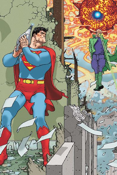
I have always been a zealot defender of Frank Quitely’s art work. Whenever contrary arguments would arise, like “It’s ugly”, I would be the first to chime out on message boards defending the fact that the human form is far from perfect. But there’s more to his art, and unfortunately it took me until this issue to have my grand epiphany as to why I find him so damn compelling. If I had to sum it up in one word it would be “expression”. With each panel Quitely contours the facial lines to convey the true emotion the writer is trying to convey with his words. In many comics these days you can see the heads of characters superimposed from panel to panel, never changing, never truly trying to embody the emotion of the writers’ words. Books that leverage a manga or anime style seem to convey too much emotion turning tepid anger to gaping open mouthed rage. Quitely subtly conveys each beat of emotion in the book. At the very beginning of issue 12, Lex Luthor floats above a blown apart piece of the Daily Planet juiced to the gills on superserum. As he is spewing forth his evil rant on how the world is going to change under his reign, there is one moment when the words coming out of his mouth are filled with loathing for the believed fallen Superman. With one gnarled snarl on Lex’s face I realized why Morrison and Quitely were given the freedom to tackle this monumental title.
Before I extend over my word count and I’m forced into serving the standard @$$hole penance of grooming Schleppy’s taint hair for a month, I should say that issue 12 was possibly one of the best endings in comic books and within the Superman mythos. Naturally, Superman saves the day by defeating Luthor and reviving our fallen life bearing star. But it is far from a happy ending. The supposed death of Superman 15 years ago, with the endless mini-series that followed, cannot even begin to compare with the emotion Morrison put into the final pages of ALL STAR SUPERMAN.
Morrison and Quitely not only revived my interest in Superman, but also my faith in comic books. While I have made no secret of my love for the work Johns is doing in the regular Superman titles, he has the unenviable task of toting a full Samsonite luggage set of continuity, complete with steamer trunk, into each of his stories. Morrison and Quitely were simply asked to dive into a light carry-on tote of history, paying reverence to what was important, and then being allowed to move forward in their own direction. The comic world is all the richer as a result. I can only pray that the Superman S on the last page that was delicately inverted and contoured into a 2 means that we will see more of this title sooner rather than later. Regardless of what the future might hold, thank you, gentlemen, for a landmark series.
When Optimous Douche isn’t reading comics and misspelling the names of 80’s icons, he “transforms” into a corporate communications guru. Optimous is looking for artistry help, critical feedback and a little industry insight to get his original book AVERAGE JOE up, up and on the shelves. What if the entire world had super powers? Find out in the blog section of Optimous’ MySpace page to see some preview pages and leave comments.
PROJECT SUPERPOWERS #2
Plot, Covers and Art Direction: Alex Ross Plot and Script: Jim Krueger Art: Carlos Paul Colors: Debora Carita Publisher: Dynamite Entertainment Reviewed by: BottleImp
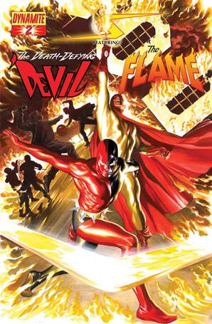
After my negative review of the last issue of this series, I swore not to waste my money on it again. And yet, when I saw that cover with the Golden Age Daredevil (here called the Death-Defying 'Devil to avoid copyright problems) standing next to Lou Fine's Flame, bright in their Alex Ross-rendered glory, my resolve melted and I had to shell out three bucks to see what Ross and Krueger would do with these classic characters. And I'd LIKE to tell you that unlike issue #1, this comic was brilliant, brimming with an astounding story and incredible artwork......but that would be a lie.
If anything, this issue was even worse than the last, and for all the same reasons. Number One: lack of character development. The Black Terror, freed from the Urn of Pandora in which he had been imprisoned for the past seventy years, repeatedly asks, "Where's Tim?" Nowhere in the story is the reader clued in as to who Tim is--you have to look at Ross' character sketches in the back of the issue to learn that Tim is the Terror's sidekick. That's some sloppy storytelling, my friends. Number Two: dialogue that has about as much life as a dry old grandma fart. Most of the characters speak in language so uncomfortably stilted that it could have been cribbed from George Lucas' script from Episode II. Here's some examples: "A machine. That's all this is. All you are." "Yank, this is the luckiest day of your life... You're lucky, Yank, because you get to live one more day." "I promised his mother I would look out for him. Return him to her. And even though I clearly can't do that because, obviously, she can't still be living... What kind of monster would I be if I didn't make certain Tim was okay? What kind of monster?"
Aside from being awkwardly written, the script also has the random quality of a book report written by a kid with ADD. "All I know is that something's going on with my friend Jet...the Green Lama. Who suddenly seems to have taken himself out of the fight. Jet claims to be in touch now with the meta-natural world. I call him 'friend' because he's the only one here who doesn't want me dead." What?! Did Krueger write this while on a Nyquil bender? Another one of my favorite nonsense lines: "Not sure I want to turn my back on you, Carter. But I don't want you goin' a head [sic] of me, either." All this bad writing drew my attention to another problem: the lack of variety in the lettering. Granted, nobody wants to see a comic being written like issues of FANTASTIC FOUR from the '70s, where EVERY! sentence! ends with an EXCLAMATION POINT! But when a character is clearly drawn as yelling, shouting, or even just in a stressful situation, whatever he or she says should reflect that intensity. 99% of the text is lettered all the same weight, and ends with a period, giving all the dialogue the intensity of a mid-afternoon tea party.
Reason This Book Blows Number Three: Paul's artwork (which might have been fine as he pencilled and inked it, as I said in my review of last issue) is ruined by overzealous computer coloring that saps almost all the solid black from the artwork. Look, comics are a graphic medium, and the organization of solid black areas on the page is integral to moving the reader's eye through the story. By taking away these important visual stopping points (as well as almost all the defining black line work) the artwork is reduced to a jumble of color without strong definition. Panels and pages that would otherwise be easily scanned through become more vague and bland. I know they're trying to emulate Ross' art, but it just isn't working.
I get the sense that this whole project came into existence because Ross wanted to get his jollies by re-imagining some of his favorite Golden Age characters. The story was obviously a secondary consideration. But after three issues of crap, I can't see why anyone would want to stick around for the rest of the series if the only point of interest is Ross' designs. I know that I'm done with it. And if next month rolls around and I'm even the slightest bit tempted to pick up #3, I pray that cannibal midgets gouge out my eyes and ravenous goats gnaw off my hands before I waste another three bucks.
When released from his Bottle, the Imp takes the form of Stephen Andrade, an artist/illustrator/pirate monkey painter from the Northeast who's given up comics more times than he can remember. But every time he thinks he's out, they pull him back in.
THE ALL NEW ATOM #25 (last issue)
Written by Rick Remender Art by Patrick Olliffe (pencils), John Stanisci (inks) Publisher: DC Comics A lament set to the lyrics of Elton John's "Candle in the Wind" by Ambush Bug
Kooks crawled out of the woodwork Whatever spewed from Simone's brain And those tiny little quotes were cool, Even made Byrne seem…not so lame.
And it seems to me…you lived your life Like an Atom in the wind. Never knowing…where to shrink to When bad sales set in. And Remender tried to save you. He wrote the best that one man can. But your series ran out far too soon, You tiny, Asian man…
Low sales were tough The toughest foe that you have ever faced. Although Chronos and Giganta fell, You were no match for fanboys' bad taste.
COUNTDOWN kind of sucked, But you fought on anyway. Only to find that Robinson… Wanted Palmer… In the new JLA.
So goodbye Ryan Choi From the young man on the 52nd Earth Who sees you as something more than a fill-in, For that whitebread…Ray Palmer.
And it seems to me…you lived your life Like an Atom in the wind. Never knowing…where to shrink to When bad sales set in. And I would have liked to read more But I was just one fan. Your series ran out far too soon, You tiny, Asian man…
Ambush Bug is Mark L. Miller, reviewer and co-editor of AICN Comics for over seven years. Check out a five page preview of his short story published in MUSCLES & FIGHTS 3 (AVAILABLE NOW at Muscles & Fights.com.) on his ComicSpace page. There you can also see a five page preview of his short story in MUSCLES & FRIGHTS! Bug was recently interviewed here and here at Cream City Comics.
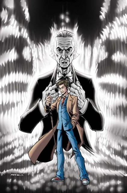
DOCTOR WHO: THE FORGOTTEN #1
Tony Lee: Writer Pia Guerra: Artist IDW: Publisher Vroom Socko: Yes, we know who you are.
In the interest of full disclosure, let me say that I am a fiend for Doctor Who, a complete and total fiend. Why yes, I do own a sonic screwdriver. Certainly I knit my own Tom Baker-style scarf. The theme for my Con sketchbook is… you guessed it. I will watch any and every story, with anyone as the Doctor. (Sure, after any viewing of Revelation of the Daleks I have to watch the whole of The Young Ones just to remind myself that Alexei Sayle is genuinely funny, but still.) Hell, I even read Doctor Who fanfic! Well, not ALL fanfic. Well, really just one. But it’s a GOOD one.What does all of that mean for this comic? Mainly that I caught nearly every Easter egg that writer Tony Lee and artist Pia “Y the Last Man” Guerra crammed into the corners. And that I was instantly able to come up with a short list of viable villains who could be the mysterious man in the shadows… But I’m getting ahead of myself. The story begins with The Doctor and Martha Jones finding themselves in a museum filled with memorabilia from The Doctor’s past adventures, including one room where the outfits of his past incarnations are on display. It’s here that The Doctor suddenly finds that he has no memory of the time prior to his current incarnation. But with some prodding from Martha and an examination of some of his old belongings, a few memories start to trickle back.
So basically this is all an excuse to showcase the various prior Doctors for a comic reading audience that might have never even heard the names William Hartnell or Patrick Troughton. If the book was merely an introduction to the rich history of the character, or a Reader’s Digest examination of the character, it would make for a passable story, if a bit dull. Thankfully, Lee and Guerra have nailed The Doctor down to a tee, the first and the latest. Their rendition of the original Doctor is especially fun. He’s overbearing, worrisome, and absolutely fed up with that idiot Chesterton he and his Granddaughter have been saddled with. That the scenes featuring him reference other storylines without seeming forced or out of place is just icing on the cake. The nod to Pyramids of Mars is especially deft.
Is this any sort of earth shattering storyline that will redefine The Doctor? Lord no; that’s Steven Moffat’s job. But it is a charming ode to the origins of one of the longest running tv characters in SF history. And it’s being made by creators who clearly know and love the history they’re representing. And oh my giddy aunt, am I looking forward to the next issue. I just HAVE to see what Pia Guerra’s Jamie McCrimmon looks like.
Vroom Socko, aka Aaron Button, spends the time he isn’t reading comics or watching Doctor Who wandering the streets of Portland, Oregon. If you see him, approach with caution; he startles easily, and he may be armed.


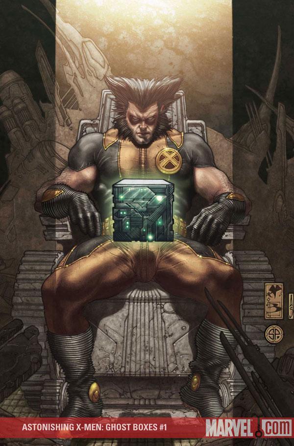
ASTONISHING X-MEN: GHOST BOXES #1
Writer: Warren Ellis Artist(s): Alan Davis, Adi Granov Publisher: Marvel Comics "Reviewed" by Humphrey Lee
I apologize for this "review" right now. Those expecting me to come in here and dissect this comic and discuss material like what I thought it achieved and where it's going and how its role in fitting into the main AXM story Ellis has created and etc etc...well, you ain't getting it because I didn't read it. I had planned on it; even had it on my pull list and everything. Showed up to the store, went to my box and there it was as I flipped through my pile and then its pages to take in the art, something I was really excited by when I read the solicits and saw two of the best in the field, for varying reasons. But then I noticed something. That there wasn't much art in this book, from either of these esteemed gentlemen. Likewise, not much story either, just a lot of so called "bonus" material. And then I double checked the price tag and thought... wow, that's a lot of balls. I mean, when they solicited this book, I did recall there was a price increase, but I also saw that there was to be 48 pages of material. Material that I was under the assumption would be, y'know, FUCKING EXTRA PAGES OF STORY AND NOT SOME BULLSHIT COPY/PASTE JOB OF A SCRIPT THAT SOME/MOST COMICS WILL JUST FUCKING GIVE YOU FOR FREE BECAUSE THEY ACTUALLY GIVE A SHIT WHILST ALSO NOT FUCKING TAKING AWAY SIX PAGES OF MATERIAL FROM THE NORM AND CHARGING YOU FOR THE FUCKING RIGHT TO DO SO!!!.... ah...so much better...
Listen, I understand times are tough all around, just like I understand that, quite frankly, this is just a comic book and nothing to get worked up about. Unlike things that are actually pertinent and/or essential in life, I can just put this back on the shelf and be done with it. But at the same time, the idea that someone thought they could cut back on six pages of story, give us "extras" that can be found for free in, well hell, in the back matter of pretty much any of Warren Ellis' creator owned products, and then have the audacity to charge another dollar for it...it's just working on a plane of asininity that I can't really fathom. And really, Marvel's pricing schemes of late are something that has really pushed on my nerves and this brought it to the forefront. I'm looking at you, "$3.99 books that have no extra pages, just a cardstock cover". And y'know, I get it sometimes. I really do. I've got a Bachelor's in Business Management, I understand something about bottom line and margins and insert whatever jargon, but for fuck's sakes you're really leaving some people out in the woods here. Give a couple extra pages here and there, or at the least keep the page count the same and give us bonuses. Last I checked, DC is giving us an extra page count AND that nifty little cardstock cover (you know, the thing that was on all the ULTIMATE titles just a handful of years ago when they were still $2.25 with no added cost? Those things…) for an extra buck, why don't you, y'know, price competitively?
Oh, that's right. You don't think you have to. Because readers will buy it anyway, most times without even noticing. And you're right, they won't. Which is why SECRET INVASION is a buck more with nothing but that little stock cover to bolster the increase, despite the fact that it's the highest selling title right now by a large margin. Which is why you get something like the last issue of GHOST RIDER that put material that is normally, and should really, be relegated to Handbook style specials and not put in the back of the monthly with the assumption the reader will want to read it and pay extra for it. Which is why now all your collections go to that lovely "Premiere" Hardcover format first, which AT THE LEAST are just as expensive as the issues themselves, if not moreso, pretty much negating half the reason people trade wait to begin with, which is to save a little scratch off the cost of buying it monthly since they have the patience to wait for it. But it's okay, this title/issue in question only has double the readership of, say, THE BOYS complete with advertising and everything, so of course it needs to take away six pages of content for an added cost. Just the cost of doing business, right?
But this is just comics. Nothing to get worked up over. It's only entertainment; a luxury at best. Honestly, besides incidents like this, I've had a lot of good will going for Marvel recently. I love books like NOVA and GUARDIANS OF THE GALAXY and pretty much everything Brubaker writes, and I've been damn well please to see them recognizing talent like Matt Fraction, and giving guys like Jason Aaron and Rick Remender and Jonathan Hickman some spotlight. I don't even mind their events for the most part, even though I think they need to happen less frequently. I just don't get where this nonsense is coming from, and how they think it's not going to bite them in the ass. I'm also angry at the fans, though, for not voting with their dollar and calling them on this shit, but that's a whole ‘nother rant. And again, for those of you who wanted a review of this book, which I'm sure had some good Ellisonian one-liners and kind of confusing but still highly intriguing techno-babble, I apologize. It looked really pretty I saw as I flipped through it. That's about all I've got. It's just the cost of doing business though, I guess.
Cheers...
Humphrey Lee has been an avid comic book reader going on fifteen years now and a contributor to Ain't It Cool comics for quite a few as well. In fact, reading comics is about all he does in his free time and where all the money from his day job wages goes to - funding his comic book habit so he can talk about them to you, our loyal readers (lucky you). He's a bit of a social networking whore, so you can find him all over the Interwebs on sites like Twitter, The MySpaces, Facebookand a Blogger Account where he also mostly talks about comics with his free time because he hasn't the slightest semblance of a life. Sad but true, and he gladly encourages you to add, read, and comment as you will.
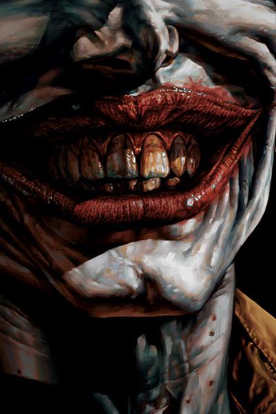
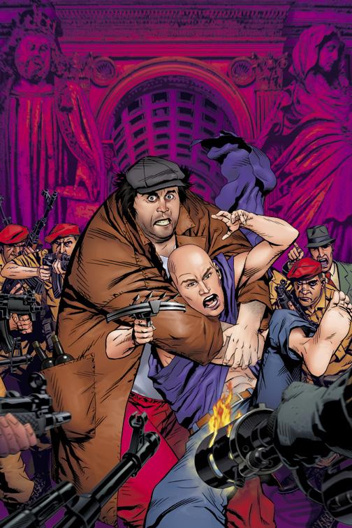
JOKER HC GN
Writer: Brian Azzarello Artist: Lee Bermejo Publisher: DC Comics Reviewer: Ambush Bug
JOKER opens on a pretty implausible premise--that the Joker, after crippling the Police Commissioner's daughter and countless others in Gotham City and abroad, is released from Arkham Asylum. But once you get past that, there's a pretty damn good story here.Despite the far-fetchedness of the spark that causes this wildfire of a story, writer Brian Azzarello delivers what may be my favorite Joker story since THE KILLING JOKE. Is it better than THE KILLING JOKE? Well, that's debatable and I plan to pose my side of the argument here.
As I read JOKER, I couldn't help but feel as if I had read this story before. I'm not saying Azzarello is repeating himself or copying a previous Joker story, but I couldn't help but feel as if I had seen a film with pretty much the same premise. Sure enough, after a bit of research, it seems Azzarello may be paying homage to quite a few classic noir/crime films that you may still be able to catch if you're lucky enough to be flipping through cable some Sunday afternoon. Much of WHITE HEAT, Jimmy Cagney's classic gangster film, was paid homage to in this comic. Here, the Joker could easily be stunt cast as Jimmy Cagney or E.G. Robinson, not only in the way Azzarello writes him, but as artist Lee Bermejo draws (and sometimes paints) the title character. But much like Brubaker's CRIMINAL, Azzarello seems to be lifting some of the cooler moments from classic gangster films and fitting them into a new comic book story. Except in JOKER's case, I think even more so.
I don't want to say Azzarello's choice to do this was a mistake, but I do think that it was a minor distraction, seeing some of the characters Azzarello chose to work with act in and out of character as they seemed to fit into the writer's story. Even recent noir films like BRICK prove to be somewhat influential in Azzarello's re-imagining of the Riddler, who looks and acts like the twisted character The Pin played by Lucas Haas in that amazing film. The fact that KILLING JOKE was a story that never guided my attention elsewhere to ponder "what movie is that from?" gives it a leg up over JOKER.
But enough of the film noir retrospective, was the story compelling?
Yes, it was. Unlike Azzarello's previous villain opus, LEX LUTHOR, he chooses to stay out of the Joker's head and instead give the perspective of the book to a gangster hopeful by the name of Jonny Frost, an albino who idolizes the Joker so much that he wants to be him. Frost turns out to be a really cool character, someone you can almost like despite the fact that he is a criminal. He's the closest thing to a good guy you're going to find in this book.
Oh, did I forget to mention that Batman barely makes an appearance in this book? He factors in. Whether he's there or not, the Joker still references him with the type of adoration/respect/fear that is representative of the complex relationship shared by Batman and his arch nemesis. I liked the fact that this isn't the Batman's story, but the Joker's. It plays to the strengths of both characters to have Batman offstage for this one. The fact that Batman can still have a prominent role in this book without really making much of an appearance is a testament to Azzarello's writing.
The fact that Azzarello is trying to put his own stamp on Batman's rogue’s gallery is both annoying and intriguing. When the idea is good, like casting Croc as more of a muscle-bound thug gang-banger than a monster in the sewers, it's good. But when it's bad, as with the just-plain-weird look and change to the Riddler character as a twisted man with a bum hip and tattoos on his belly, it's bad. I get it. E. Nigma is twisted up like a question mark, a look that may be interesting if used on a big screen adaptation. But Azzarello's choice to re-imagine characters instead of telling a story with the iconic characters is yet another reason why this book falls shy of being better than THE KILLING JOKE.
There are some truly grisly scenes that will make this one of the classic Joker tales, though. Some of the stuff you see in this one, especially a horrific sequence that takes place in a strip club, will go down as among the coolest and most heinous comic book moments of the year. We often see the Joker battling Batman or teaming up with some other villains to form a secret society. Rarely do we get to see the Joker in his own environment when he's the Big Kahuna. Watching the Joker enact vengeance towards the vice lords he entrusted with his money while in Arkham is a gory and fascinating thing to behold.
Also strong is the relationship Azzarello sets up between Joker and Two-Face. One of the weaker moments of THE DARK KNIGHT film was the relationship between these two villains. Here Azzarello fully realizes the differences between the two, casting them as complete opposites of one another--Two-Face representing order in numbers, specifically two, while the Joker embodies absolute chaos. Two-Face has a great monologue with Frost in this book that is probably the most interestingly written treatment of Harvey Dent that I have ever read. Just a great, great character set up here and unlike Croc and Riddler, it's the iconic Two-Face we are seeing here and not some re-imagining of the character, which makes it all the more cool.
One of the more annoying things I noticed about this book is the Joker's insistence of calling the Penguin by the name Abner. Now, I don't know if this is some obscure reference that I'm not getting, or if maybe Azzarello just doesn't know that the Penguin's name is Oswald Cobblepot and the editors never caught it. Either way, the Penguin figures prominently in this story and to call him by a different name and not explaining it is simply annoying to no end.
Artist Lee Bermejo is a genius. His dark lines slice through and smother all but the faintest slivers of light, giving every scene a dank, dismal feel. His quiet panels of the streets of Gotham are so filled with mood you can cut it with a knife. The aforementioned depiction of the Joker as Cagney and Robinson gives the Joker an ominous and dangerous tone, more so than the stretched grin of any artist that's drawn the character before. Yes, this is the Morrison/Ledger scarred face Joker, which is somewhat irritating since this seems to be the new status quo for the character, but nevertheless, Bermejo's characters, panel placement, and especially the angles make this an epic accomplishment. Bermejo also provides some very nice painted or softly colored panels here and there throughout the comic. If I have one criticism, it's that Bermejo teases us with this technique. I'm sure it would have taken forever, but I would love to have seen the entire comic done in this painterly style.
I know it's unfair to compare this book with THE KILLING JOKE, but given the subject matter and the hype surrounding this book comparing it to the classic Joker tale, these comparisons will inevitably be made, so why not address them here? I'm sure Azzarello doesn't really give a crap about the comparisons and wants the work to stand on its own. But if JOKER fails in any way it’s due to a need either by the author or the artist or maybe even the editor to put their own personal stamp on existing characters rather than using these icons themselves. That and the heavy influence of plot points of other gangster films cause this book to fall short of the accomplishment the much more original THE KILLING JOKE was. But that was one of the best comics of all time. This is simply one of the best Joker stories in years. In and of itself, JOKER is a fantastic read. The story is compelling, especially the gut-wrenching showdown at the end of the book, and the art is mouth-wateringly good.
Go into this wanting to read the best Joker story ever and you may be disappointed. Go into this one wanting to read a good story and you will be blown away. JOKER is available in stores today and it's highly recommend you seek it out.
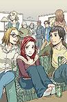
SPIDER-MAN LOVES MARY JANE #3
Writer: Terry Moore Drawings: Craig Rousseau Publisher: Marvel Comics Reviewer: Jinxo
How can Terry Moore make the reality of RUNAWAYS feel so false and then make the reality of SPIDER-MAN LOVES MARY JANE feel so spot on authentic? This issue really just tells the story of a typical rainy high school day. That’s all. And yet it’s great stuff. As an adult I’ve mostly worked in buildings where you wouldn’t know if it was raining or sunny out. But I remember back to those Midwestern rainy school days, where whatever you were doing was underscored by the constant thrum of the rain and every once in awhile you jumped out of your seat and everything stopped for a second with a big crack of thunder… having to figure out how the hell to get home without getting thoroughly soaked. Meanwhile the teenage drama continues on around you. It’s all very small scale stuff compared to alien invasions but also stuff more easy to identify with if the writer really captures the reality of it, if he makes it ring true. Moore does that here.Equal props to Craig Rousseau’s drawings (I love that his credit is listed as “Drawings”). Where the Runaways characters look very rubbery and cartoony, the characters in SPIDER-MAN LOVES MARY JANE have an appealing simplicity of style. It gives you the feel of something Mary Jane herself might draw. It feels honest if that makes sense.
This has been a year of nonstop huge company-wide crossover events so much so that… I find it hard to find standout stories to recall now because it seems like everything was some subset of a larger “epic” instead of a unique autonomous story. I’m picking this review of this book because in a year of giant bombastic stories that were all noise and fury interrupting everything else… this was a little issue – and the title in general - that really sells you a believable slice of reality, small character stuff that actually draws you into that world instead of throwing everything at you but the kitchen sink in multiple titles to the point of overload. In the end I don’t know that I fully cared about most of the aspects of Secret Invasion (although I do like where it has lead) or Final Crisis (sometimes hit, sometimes miss) or… Trinity (“Let’s even write Batman, Wonder Woman and Batman out of the epic centering on them! What a good way to put everyone to sleep!”). But, go figure, I actually care about some teenager hurting MJ’s feelings and screwing up her reputation.
You go Limo Girl!
Jinxo is Thom Holbrook, lifelong comic book reader, and the evil genius behind poobala.com. He may appear cute and cuddly but if encountered avoid eye contact and DO NOT attempt to feed.
SALVATION RUN #4
Writer: Matthew Sturges Penciller: Sean Chen Publisher: DC Comics
PUNISHER WAR JOURNAL #16
Writer: Matt Fraction Artist: Howard Chaykin Publisher: Marvel Comics Reviewer: Sleazy G
I don’t normally compare and contrast two issues so directly in my reviews, as I prefer to focus on the positives or negatives of an issue without muddying the waters too much. In this case, though, these two issues share such similar themes and characters it makes sense to pair them up. Unlike in the fight that is the centerpiece of SALVATION RUN, however, I think there’s a pretty clear winner in this throw-down.First, though, why the comparison? Well, here’s the thing: both of these issues focus on has-been primate-based villains trying to step up and rehabilitate their reputations. They choose different paths to do so, with considerably different results. In the case of WAR JOURNAL the results feel inevitable, logical, and a bit depressing. In the case of SALVATION RUN the results feel unnecessary, ill-considered and annoying as hell.
I’ve read all of Matthew Sturges’ work at DC thus far, and he’s been doing a job that ranges from solid if a little dull (SHADOWPACT) to highly entertaining (JACK OF FABLES). He stepped in to take over SALVATION RUN with issue #3 when Bill Willingham had to step aside, so I don’t know how much of the story is Sturges working from Willingham’s plot and how much is original work. Since Sturges works so closely with Willingham so often, though, I suspect the events of this issue were Willingham’s idea. This is fortunate for Sturges, as it somewhat deflects the blame for my reaction, which ranges from disappointment to disgust.
Look away now, folks, if you don’t want me to ruin the outcome of this issue for ya: on the alien world of SALVATION RUN, there’s no Gorilla City, so we’re headed straight for SPOILER CITY. Spoilery spoiling ahead, so turn back now if you’re too afraid of the savage yet brilliant spoilers that inhabit this great capital of spoiler society.
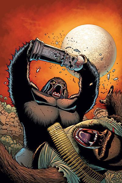
The centerpiece of this issue is a battle between Gorilla Grodd on the one hand and Monsieur Mallah and the Brain on the other. And don’t get me wrong, it’s a real slobber-knocker of a battle. Two big, angry gorillas beating the holy hell outta each other is good comics, and Sturges does a good job with characterization throughout the issue. But by the end of the battle, Grodd has beaten Mallah to death with Brain’s containment unit, leaving the two dead in each others’ arms. Well, Brain hasn’t got arms cuz he’s a brain, but…y’know.
And then, just five panels later, Grodd—whom Mallah shot several times point blank in the chest—is kicked off a cliff (presumably, but not definitively, to his death) by the Joker.
No. Just no. Look, This isn’t CRISIS or CIVIL WAR or anything. Ten years from now, nobody’s going to be looking back at SALVATION RUN as a seminal moment in comics history. I understand the book needs a villainous body count, but it seems to me it should probably have been some of the bland, faceless, unimportant villains nobody gives a shit about. Let’s face it—the DCU wouldn’t be any worse off if the frikkin’ Body Doubles bit it. Hell, it’d probably be an improvement. There are some others on the planet that could stand to go, too, to be honest. But Grodd is frankly too important a character in too many characters’ mythologies to go in such a dismissive and pointless manner. Maybe he’ll be back, maybe he won’t, but this was a lousy way to handle things.
Far worse in my estimation, however, is the treatment of Mallah and The Brain. We’re talking here about a couple of the most offbeat, unique, fun characters in the DCU: a talking ape who runs around like he’s in the French Foreign Legion (the inspiration for Van Damme’s “Lionheart”, I believe) and happens to be in love with a guy’s disembodied brain in a jar? That’s the kind of batshit creative fun that comics need more of, not less, and to have them punked out like this is just another waste of characters who had far more potential alive than they got the chance to exercise in a pointless death in one of a dozen miniseries tied to a three-year event. I appreciate Sturges’ desire to give them a poetic, touching exit, but frankly it occurs over too few panels to have much impact, and it was a bad decision all around. The DCU just got a little less interesting and a little less fun, and it bums me out to no end.
But on to the good: PUNISHER WAR JOURNAL. It’s a done-in-one story that pauses to follow up on recent events in the title. A while back, Frank Castle blew up a whole bar full of third-rate Marvel costumed villains just to let them know he hadn’t forgotten about them while he was busy MAX’ing it up. There was no way they could all be dead, but it did leave one wondering just what condition they were left in, and we get a look at the aftermath here. It follows The Gibbon around, and it turns out things aren’t going so well for him: his wife Princess Python is now blind and harangues him constantly, he no longer looks like a primate (and instead just looks like a meathead who got his face worked on with a pipe), and he’s attending survivors’ meetings for all the battered villains who were in the bar that day.
The Gibbon’s life sucks, and he knows it. He’s a miserable sad sack, and he sees only one way out: get a gun and go after Frank Castle for some payback. So in between meetings and replacing his wife’s dead snake without telling her, he goes through the process of secretly getting false papers so he can buy a gun legally (he’s surprised to find nobody involved questions him or cares). But something else happens: this depressed mope sees a lousy pimp who’s always beating on his girls, because the Gibbon has to pass them on the street every day, and he starts to really hate the guy. We see this poor, downtrodden failure of a man, and we see him start to care about somebody else’s problems, and we see him start to see things the way Frank Castle does. The Gibbon comes to realize some people are bastards who prey on the helpless, and he starts to work up the nerve to go all Travis Bickle on this asshole pimp.
And then The Punisher appears from out of nowhere and ices the pimp just before The Gibbon works up the nerve. Poor guy is close enough to get spattered, but didn’t get a chance to follow through. And now he finally has the shot he wanted at Castle, and he can’t take it. He actually gives the gun to the Punisher and slinks back home to give his wife her snake. This might have been the opportunity to show him feeling just a little bit better about himself, or give a wry smile of acceptance, or laugh at the coincidence of it, but no: Fraction makes the decision to have The Gibbon end up even more beaten than he was before the confrontation, a pathetic wreck with no one he can share his pain with.
This, folks, is how you take a low-level, primate-based villain and make people care about them. By the end of this issue I found myself relating to The Gibbon, a character I hadn’t thought twice about in…well, ever. Fraction built him up, gave him a little back story, and left the character far more appealing than he found him. It’s good writing, good for the characters involved, and good for the Marvel Universe. Which is why, although I have to admit SALVATION RUN #4 was well written, I feel it was ultimately misguided and inferior to PUNISHER WAR JOURNAL #16: one took the opportunity to build a character up in a way that strengthens him and the story around him, while the other took appealing, interesting characters and brought them to a sudden, pointless end that belies their potential.
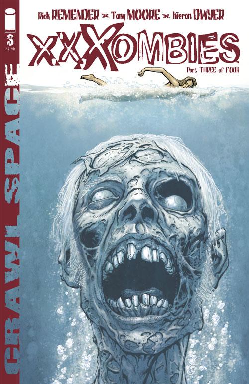
CRAWLSPACE: XXXOMBIES #3
Writer: Rick Remender, Tony Moore, & Kieron Dwyer Art: Kieron Dwyer Publisher: Image Comics Reviewer: Rock-Me Amodeo
I’m familiar with the zombie package. Evil corporation + graphic gore and horror + T&A = modest money-making package.CRAWLSPACE has managed to exploit the niche cultures of zombies and porn to create a unique twist on a very over-exposed market. But halfway through the comic, we see zombie neo-natal nurses feasting on newborn infants. Even as I write this, I’m wincing, and I say, “Enough.”
Are our emotions so seared that this is what we need in order to feel anything other than boredom? Are we THAT addicted to distraction that we confuse revulsion with entertainment? “Well, it got a reaction, so it must have been good!” Regurgitation is a reaction. So is cardiac arrest. Should we imbibe things that cause these reactions in a simple effort to feel something, anything? That’s just stupid.
You might say, “Well, it’s just a comic book, so how can it be bad?” But some lines really are not meant to be crossed; I don’t care how “over the top” it is. What’s next? Raping pets? Putting children in shredders? Pets raping children in shredders?
No. I’m not entertained, I am voting with my dollar, and I got my money back. Just because it’s “only” a comic doesn’t excuse the vileness of it.
There’s good and there’s bad. It’s like bodily fluids. Some, like blood, give life. Others pass out of the body like the excrement they are. Only a fool would see no difference. If you want to latch onto this book like the two girls on one cup, be my guest.