

| #30 | 12/4/08 | #7 |
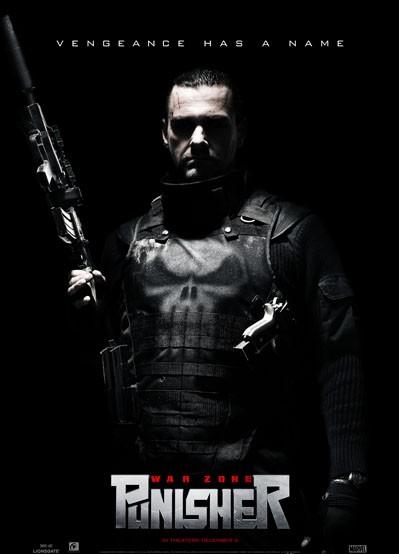
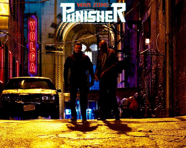
PUNISHER WAR ZONE Motion Picture
Directed by Lexi Alexander Starring Ray Stevenson as Frank Castle AKA The Punisher Co-Starring Ambush Bug as the Reviewer AKA the Punished
Let’s me break it to you gently, folks: PUNISHER WAR ZONE is not the best of movies. I’ve read very few reviews on this site or anywhere else, and it appears that a lot of people are preferring to turn their head and make believe that this movie doesn’t really exist. We’ve had it good this year, what with IRON MAN and INCREDIBLE HULK. Even WANTED wasn’t bad. And for the first time, we have a comic book movie, THE DARK KNIGHT, in contention for a Best Picture nod. That’s a pretty damn good year for comic bookdom. Who’s to blame folks acting as if PUNISHER WAR ZONE never happened, as if some Mephistophelian forgetting spell has been cast over all of geekdom?But PUNISHER WAR ZONE did come out last weekend. And I gathered up a few friends, including @$$Hole editor Sleazy G and a flask full of rum, and set out to see it last Saturday night. Like I said, PUNISHER WAR ZONE is not the best of films. It’s not even the best of the three PUNISHER movies. I struggled for quite a while to muster up enough to say about the film, as evidenced by the rambling nature of this intro. To be honest, I really can’t express anything more than disappointment towards the film. I wanted to like it, but even after turning off that lobe of my brain that houses all of the PUNISHER comics I’ve read through the years, this is still a mediocre film.
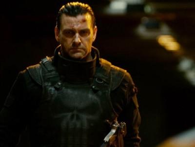 You can’t fault the latest actor to wear the skull t-shirt, Ray Stevenson, for the mess. He’s doing his best and his performance is a capable expression of the guilt, anguish, and sorrow needed to make this role more than just a carbon copy revenge flick. He’s a big man; an imposing presence, and believable as a man who left a bloody war only to find more horror at home. His hopes and dreams were shot down right in front of him and every blank stare he gives the camera screams that he wishes he were right there in the ground next to them. There’s a scene where Stevenson attempts to clean his family’s headstone. He conveys real pain in a scene that could easily be over the top. He’s able to give enough emotion to make Frank seem real, but only for a moment.
Another good thing about this film is that they spend only a few moments on Frank’s origin. Too many comic book films spend too much time recapping the origin. We know the origin. Show us something we don’t know about the character, something that justifies a big screen treatment. So that’s another in the plus column for this film.
Unfortunately, that’s about it on pluses.
 Over the top is a term that could describe this film in a nutshell. The makers of this film are very conscious that they are making a comic book movie. The reason IRON MAN, INCREDIBLE HULK, WANTED, and especially TDK worked so well is because they not only took the material seriously, but staged these stories as if they were taking place in the real world. Sure, in the real world, you can’t curve a bullet, an engine strong enough to power flying armor would probably blow up instantly, and gamma radiation on a human would most likely turn one into the Incredible Lump of Sludge rather than a raging roid-monster, but after those factors are accepted by the audience, everything else makes sense in the film. Audiences have proven to suspend their disbelief if the fantastic is reacted to realistically in the world it occurs in.
THE PUNISHER is a comic book rooted in reality. Frank Castle has no powers. Most of his villains don’t either. And the reaction Frank has to the death of his family is extreme, but understandable in a simplistic sort of way. Garth Ennis’ run on PUNISHER MAX (which just came to an end) was a series of story arcs heavily dependent on high drama and even higher action. Insight was shed into Frank’s inner thoughts, and the comical element that permeated Ennis’ previous PUNISHER series under the Marvel Knights label was all but gone. Ennis’ PUNISHER MAX stories were some of the best PUNISHER comics ever written. Hell, they were the best stories Ennis ever wrote (arguably even topping PREACHER since that story was waaaay too similar to Ennis’ HELLBLAZER run). Instead of using these books as inspiration, PUNISHER WAR ZONE takes the far inferior Marvel Knights version as inspiration for tone.
 Instead of telling an action yarn in the real world, the makers of PWZ tell a story placing the most non-fantastical character in the Marvel Universe into the most unreal of settings. I shit you not, this film looks as if it were envisioned by Joel Schumacher; a name that should never, ever be associated with comic book movies ever.
Ever!
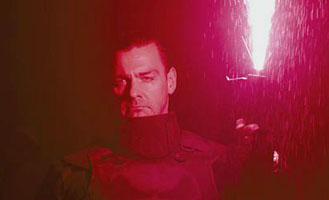
Every scene in this film is lit with some form of neon lighting. Punisher’s first appearance is lit by the fluorescent pink glow of a flare. In every scene, there’s a pea green or bile yellow light. In the third act, when Punisher goes to church, it’s lit by giant neon crucifixes. The alleyways and subways are lit with sludgy yellow and green glow. And no one looks around and says “What the fuck is up with all of this neon?”
 This neon film is shot in a world where a man loaded from nose to ass with handguns and rifles can walk down a street and not call attention to himself. A world where asylum doors are still opened with one of those foot long skeleton keys seen in old chiller movies. A world where a food processing plant also has an open pit for grinding glassware with a plank conveniently placed above it for the villain to fall into. A world where people try to have a serious conversation in the Church of the Electric Christ. Lexi Alexander filmed this film in an illogical, comic booky world. A world where anyone questioning the logic of the more outrageous elements was more than likely told “it doesn’t matter, this is a comic book movie. Logic’s not necessary.”
Don’t get me started on Dominic West. I love the Joker as much as everyone, but he is not every comic book villain. I don’t know how West can kick so much @$$ as McNulty on THE WIRE, and get the character of Jigsaw so wrong here. Apparently, both he and the lighting guy on this film were required to watch Schumacher’s Batman films before shooting because West is doing a spot on impression of Tommy Lee Jones’ Two-Face here. There’s a scene where Jigsaw is recruiting an army of thugs where he high steps down the street in such an animated manner that I thought it was Sherman Helmsley under all of that bad make up.
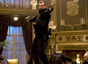
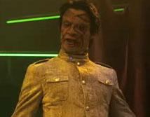 There are brief moments of cool in this film that are immediately followed by scenes so lame that it negates them. The film doesn’t know when to quit when it’s ahead. After a decent montage of violence featuring Frank infiltrating a mobster mansion and taking out a number of guests at a dinner table in a silent yet chaotic manner, Frank displays trapeze skills never seen before this film, hanging upside down from a chandelier and twirling in a circle to shoot everyone in the room (must’ve learned that move in ‘Nam). There’s only one “get up and cheer” badass scene where the Punisher deals with a crook that a cop is about to handcuff at point blank range with a shotgun, but it’s preceded by Over-the-top Villain #2, Doug Hutchison’s Looney Bin Jim (don’t call him that, though, cause he’s kuh-ray-zee!) smashing every plate in the house for no real reason other than the fact that he’s kuh-ray-zee! On a side note, Hutchison’s performance in this film is painful with his clichéd handling of Hollywood crazy. He starts out in the same place he was left at the end of GREEN MILE as a slobbering vegetable, but soon spirals into someone who just does random shit for no reason other than the fact that he’s kuh-ray-zee! That’s why he meows at rival gangs, eats kidneys straight from the gut, smashes mirrors with his face, shoots the heads off of dolls, et cetera, et cetera, yawn. If you asked the makers of this film what psychological ailment Looney Bin Jim suffers from, you’ll most likely get the response “it doesn’t matter, it’s a comic book movie”--a mantra for this film.
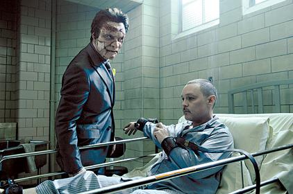 There was a bit of a ruckus a while back about the director of this film and how the studio treated her during and after this film was made. I know nothing about that. What I do know is that bad decisions were made with this film from the get go and Lexi Alexander sure isn’t innocent here. It may not be all her fault. The actors mugged for the camera. The lighting guy went nuts with the neon. The story was pretty weak to begin with, as was the Marvel Knights source material it was taken from. But the film she made was not a good one. It was made in a way that made it apparent it was coming from a director who saw the source material and the medium it is from as something lesser that what it could be. IRON MAN and THE DARK KNIGHT were made by people who understood the characters and wanted to make a good movie first, not just a comic book movie where logic is secondary to camp.
PUNISHER WAR ZONE doesn’t belong in this year, a year where some of the coolest comic book films were made. It’s the way comic book films used to be made. I’d say it’d be interesting to see Stevenson play Frank Castle in another PUNISHER film (he was one of the few good things about this movie), but as long as the makers of these films are using Ennis’ joke of a Punisher from his Marvel Knights run as inspiration and dumbing down material because it’s “just a comic book movie”, I’m really not interested in seeing another.
 If you want to see a good Punisher film, I say rent DEATH WISH or TAXI DRIVER or hell, even DEATH SENTENCE and squint so that the leads look like Frank. Or maybe check out Dolf’s PUNISHER film since it had Lou Gossett Jr. in is which means it’s filled with Lou Gossetticity (BTW, the guy playing Lou Gossett Jr. in this film pales in comparison to the real thing).
PUNISHER WAR ZONE could have been either raw and emotional like Kevin Bacon’s DEATH SENTENCE or Charles Bronson’s DEATH WISH or over-the-top violent, yet played real like last year’s JOHN RAMBO. Instead we get a fantasy, Technicolor yawn of a movie. This is both a fan of the comic AND a fan of cinema talking. This movie fails on both levels.
Save your money, stay home, and read the following PUNISHER MAX trades. They guarantee satisfaction.

BATMAN #682
Written by Grant Morrison Art by Lee Garbett and Trevor Scott Published by DC Comics Reviewed by Stones Throw
OK, I didn’t think R.I.P. was particularly good, but this is. Really good. I find that what Morrison does in this one issue (to be continued next month) is what he failed to do across the whole event that preceded it: condense his obvious research and affection for some classic, forgotten Batman tales and his ideas on how to progress the character into a single, cohesive narrative that actually adds something to our understanding of the Caped Crusader, and reads really, really well to boot. As a result you’ve got my favorite single issue Batman comic since the Joker hijacked a car and kidnapped Robin in Paul Dini’s Christmas issue of DETECTIVE COMICS a couple of years back.Alfred is the loose chain linking together this series of snapshots from the career of Batman, taking us approximately up to 1968 and the O’Neill/Adams reinvention (that and the “grim’n’gritty” years follows next issue). But it’s a lot more than a simple post-event history of the Bat. Morrison’s basic idea is to take the whole of Batman’s publication history (seemingly including the TV show, and I’m sure other multimedia iterations to come) and treat it as the singular experiences of one man. So the picture that emerges is a kind of scary but remarkably cohesive portrait of the obsession and dedication that drives Batman, with many of the off-hand but compelling insights into the character of an icon that we’ve come to expect from Morrison since ALL STAR SUPERMAN.
Like, what happens when Batman, like all pro-athletes, gets injured beyond what painkillers and grit can substitute for? I was reading the J.H. Williams III co-written BATMAN: SNOW the other day and pondered that exact question. It’s in here: turns out he goes to the circus and is struck by the murder of two acrobats, orphaning their only son.
Seriously, after the excess of BATMAN R.I.P., this issue is a lean and stripped-back examination of what really makes Bruce Wayne tick. What would years of fighting crime every night do to a man? Says Alfred:
“All you want to do is fight, on and on. After a while, all you want to do is feel the thrill. The adrenaline burn.
I dig that kind of detail. Morrison takes the graphic quality of Frank Miller’s Dark Knight and adds a level of detail that makes that interpretation seem more disturbing than admirable. Like in WATCHMEN how you can imagine how Rorschach really stinks, despite the attitude. This issue is also funny as hell, in some places. While Alfred’s lecturing Bruce on the inadequacy of his “problem-solving micro-sleeps”, Batman dozes off, waking up to say: “Of course. Doctor Death was supplied by Apex Chemical.”
Ever wondered what would have happened if a bat hadn’t flown through the Wayne Manor window at that precise moment? Get ready to meet Mothman, the Caterpillar, and even—oh yes—the Curtain.
There’s a five-panel summary of Batman’s fate if his parents hadn’t’ve been killed that’s as concise and haunting as anything in R.I.P. was diffuse and without impact. I can only compare it to the similar power of the first five panels of ALL STAR SUPERMAN # 1.
The issue as a whole is like emerging from the confusion of a bad dream with some really bizarre ideas in it, into a morning that puts them into some kind of sense. And that’s my only problem with it. The ending—which is brilliantly jarring, linking Morrison’s work on the title into the still-ongoing FINAL CRISIS—suggests the whole thing may have been a dream. No matter how good this issue was, I resent having comics sold to me under false pretenses.
Still, give me another issue of BATMAN this good and I might reconsider.
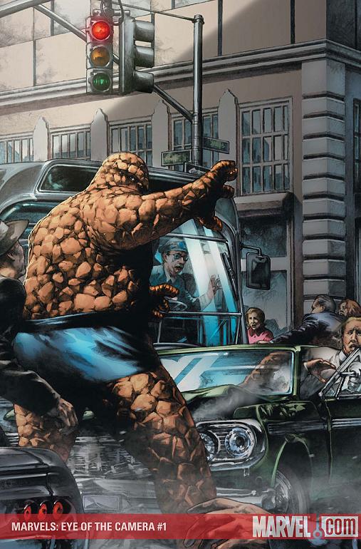
MARVELS: EYE OF THE CAMERA #1 (of 6)
Writer: Kurt Busiek Artist: Jay Anacleto Published by: Marvel Comics Reviewed by: BottleImp
I’m willing to wager that everyone reading this review knows the original MARVELS miniseries…even if you’ve never read the comic, you’ve seen the paintings by then-relative-unknown Alex Ross. MARVELS introduced Ross’ photorealistic style to the comic-reading masses and catapulted him to super-stardom (in both comics and mainstream illustration). For the first time we saw the four-color heroes of old—Spider-Man, the Fantastic Four, Captain America—as real as you or I. Alex Ross’ pages captured the otherworldliness of the superhero and grounded it firmly in the reality of the everyday man. Ross’ artwork was integral in achieving the tone that Busiek set in his story--namely, the sense of wonder at seeing the impossible. Now we have a sequel to that groundbreaking miniseries again written by Busiek, but no Ross. So how does it measure against its predecessor?I think it’s pretty damn good. Busiek is once again focusing on Phil Sheldon, the photographer from the original series, and telling the story through his eyes (hence the “eye of the camera”). This time around Busiek dives into the history of the Marvel Universe at the start of the 1960s with the birth of the Fantastic Four. As before, the superheroes are rarely seen within the comic pages—instead, Busiek focuses on the impact that they have on society and the common man. There’s a great scene where Sheldon is contemplating the implications of superhumans and mutants: “The heroes are human—transformed, yes but they’re us, they’re people—and the mutants are the next wave, the beings that’ll make us obsolete? Or are they two facets of the same thing? Was humanity…ending?” The end of this issue flashes forward to an older Phil Sheldon closer to our own time, so it looks like Busiek might be tackling some of the more recent Marvel stories in subsequent issues.
There’s only one real problem with this miniseries, unfortunately, and it has to do with public perception. I think that there will be some who won’t buy this series because there’s no Alex Ross—and I can understand that point of view. Anacleto’s pencil renderings are nice, and definitely stand out from the average comic art, but they don’t bring the story as close to the real world as Ross’ paintings did. And though Anacleto doesn’t seen to slavishly rely on photo reference the way Ross sometimes does, his figures lack some of the dynamism that made the characters in the original MARVELS pop off the page. But I have a feeling that it’s kind of a “damned if you do, damned if you don’t” situation—having Ross or another photorealistic painter on this series would make it feel more like a rehash of the original series rather than a sequel.
In any case, EYE OF THE CAMERA is still a good read, and one that (so far) can be enjoyed and understood without having read MARVELS. I recommend picking this comic up if you’re craving a change of pace from the everyday spandex set.
When released from his Bottle, the Imp takes the form of Stephen Andrade, an artist/illustrator/pirate monkey painter from the Northeast who's given up comics more times than he can remember. But every time he thinks he's out, they pull him back in.
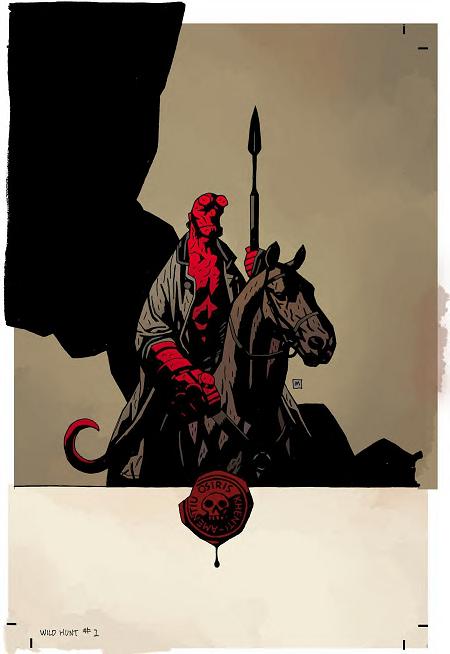
HELLBOY: THE WILD HUNT #1 (of 8)
Written by Mike Mignola Art by Duncan Fegredo Published by Dark Horse Comics Reviewed by Stones Throw
It’s been almost an embarrassment of riches for a HELLBOY fan in the months since the movie, which I honestly think was the best pure genre flick of the last, say, five years. Never thought I’d be genuinely excited for an adaptation of THE HOBBIT. There was Mignola and Richard Corben’s great and creepy three-part miniseries THE CROOKED MAN, which was probably the most properly scary Hellboy yet, and then best of all, some new Mignola-drawn material in last month’s IN THE CHAPEL OF MOLOCH. Now it’s back to a big ol’ miniseries drawn by Duncan Fegredo, who’s like a slightly looser Mignola anyway, so you barely notice the difference.This follows on from last year’s DARKNESS CALLS, which I didn’t catch, but that’s no handicap. More than anything else, Mignola’s current HELLBOY stories remind me of THE ESSENTIAL FANTASTIC FOUR, volumes three and four or thereabouts, when Lee and Kirby were really kicking unholy @$$. Not your Galactus trilogies per se, but stuff like the introduction of Diablo where they can start in media res and it doesn’t matter whether you’ve been reading since # 1 or you’ve never seen a Thing before, the characters and situations are so strong you can’t help but get swept up.
Huh, I used two foreign terms in that previous paragraph. Nice going.
FANTASTIC FOUR # 30 began with the FF on holiday in Eastern Europe. Spells trouble right away. HELLBOY: THE WILD HUNT # 1 begins with Hellboy lodging with two creepy old gals in Italy (is this picking up from IN THE CHAPEL OF MOLOCH? Or DARKNESS CALLS?). He receives a creepily-sealed letter calling him to England. Mignola’s perception of England is stuck permanently no later than the 1950s. Turns out some giant-huntin’ is underfoot, with an ancient order that lists among its members Trevor Bruttenholm, Hellboy’s pop. The aesthetic is kind of similar to Del Toro’s great film, which also featured fairies and the British Isles.
The juxtaposition of the laconic, cigar-chewing Hellboy hunting with these old British assholes in animal masks and ceremonial dress would alone be enough, but Mignola and Fegredo top it with the coolest and most shocking cliffhanger I’ve yet to see in a HELLBOY comic. Hellboy’s fights are usually a pretty routine case of the pulp hero getting in over his head and managing to scrape through by a combination of luck and gritted teeth. It’ll be interesting to see how he gets out of this one.
On my reading list: HELLBOY: DARKNESS CALLS. On yours: HELLBOY: THE WILD HUNT #1.
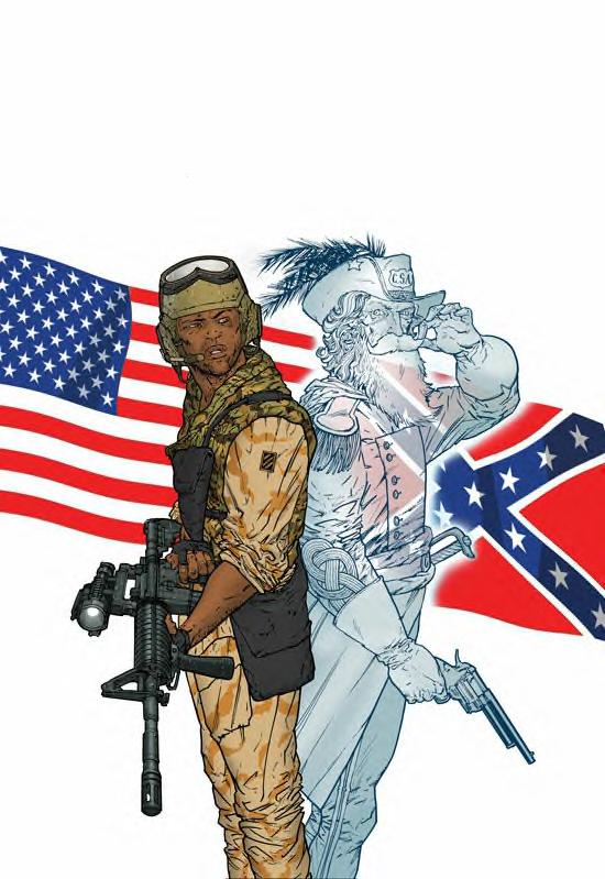
HAUNTED TANK #1 of 5
Writer: Frank Marraffino Artist: Henry Flint Publisher: DC Vertigo Guest @$$Hole Reviewer: steverodgers
Every summer when I was a kid we went to Maine. Maine meant two things to me: eating lobster and going to my uncle’s antique shop, which was essentially NARNIA to an 11-year-old. Right next to the doorway was a stack of comics, including DC 80-page giants, and for whatever reason the stack never changed (apparently I was the only person who went to that shop who was at all interested in G.I COMBAT). Every summer I would buy a few issues at a reduced price (you don’t stay in business by giving away comics), go back to the cabin, and for the rest of the vacation--between bowl after bowl of cool ranch Doritos and dead lobster dipped in butter--I would read and re-read tales of America’s fighting men as they bravely fought their way through a century of war. It was great stuff.GI COMBAT was an anthology war book with great covers by Joe Kubert. The best of it were the HAUNTED TANK stories, where the ghost of the Confederate General J.E.B Stuart helped guide his descendant Lieutenant Jeb Stuart and his tank crew through WWII. The only person who could see the General, as I remember it, was Lt. Stuart--which never seemed to bother any of the crew too much-- as they traveled all over Africa and Europe with a Confederate flag on the back of their tank. Definitely a comic best enjoyed by an 11-year-old.
When I saw the first issue of the new HAUNTED TANK mini-series, I was over-the-moon with nostalgic, fat-kid delirium. The new series takes place during the initial phases of Operation Iraqi Freedom in March 2003. Everything is pretty much the same as the original series, except Lt. Stuart is now an African American (Jamal not Jeb this time) and really not about to put up with any Confederate bullshit, and the ghost of General Stuart is now less-inclined to cryptically lead our heroes through enemy lines as much as he wants to (and does!) rain down hot death on anyone foolish enough to be palling around with Saddam in the desert. The tank crew is also less professional than the old series and they manage to get in a bad way twice in 22 pages. Bullets fly, however, and our guys make tracks, and much of it is played for laughs as our tank crew (a diverse, bickering bunch) tries to stay alive and make sense out of the gentlemanly horse-riding Confederate ghost riding next to them in the dust.
Marraffino writes a tightly packed war story that introduces General Stuart by the 4th page and gets better and better as the book rolls on in bringing the laughs. I was initially irritated with everything being written in an affected dialect, in particular the southern and positively Thor-like General Stuart, but by the end it started to click for me, and I had a true guffaw moment on the last page.
The art is solid. You are able to follow the tank battles and everything looks genuinely military. It’s my understanding that drawing horses is just about the most difficult thing for an artist to draw (unless you’re Rob Liefeld, then I’ts feet, of course) and Flint gamely draws a horse on every other page. My one issue with the art, however, is that all of Flint’s people tend to have a little bit of the crazy eye.
The new HAUNTED TANK is a fun update. I was happy to be able to plow through any nostalgia and enjoy the comic on its own terms. The only downer for me is my own middling war fatigue, be it movies, books or comics (or the real thing for that matter)–I just need a break. That, however, is my own hang up. If it’s one you don’t share and you want some haunted, sometimes funny, contemporary war action complete with head explosions and J.E.B. Stuart’s ghost protecting our fighting men by happily machine gunning enemy combatants into tiny bits and lopping off their heads with his saber, well, you know where to look, and HAUNTED TANK won’t disappoint.
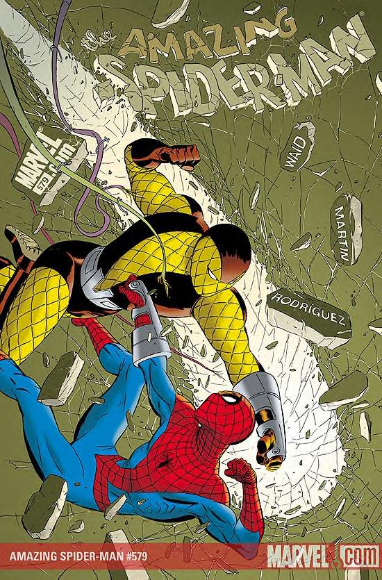
AMAZING SPIDER-MAN #579
Written by Mark Waid Art by Marcos Martin Published by Marvel Comics Reviewed by Stones Throw
J. Jonah Jameson has a father who’s not hooked up to some kind of machine? Seems to me Jolly JJJ’s been de-aged a bit to coincide with Spider-Man’s new Satan-given youth.All the way back in AMAZING SPIDER-MAN # 1, Jonah had a son who was already a top astronaut, suggesting he was at some point in his sixties, which is where I’ve always pictured ol’ Flattop. Hell, in YOUNG AVENGERS that TV guy who was always late on his scripts played with the idea of a JJJ in his seventies, suggesting he could remember Bucky’s death in WWII and that was why he hated the idea of teenage superheroes. In this very title he was a recent heart attack victim.
Still, this two-issue story from the Marks was so good that I can overlook any age-fiddling that might have gone on. When I look back at the more memorable stories over this first year of BRAND NEW Spider-Man comics (which is what, thirty plus issues? Credit to Steve Wacker at the very least), my favorite writers have been guys like Zeb Wells or Joe Kelly who’ve moved beyond the standard Spider-Man palette and introduced more contemporary influences, whether in those Mayan snow-monsters in Zeb Wells’ first arc or the cyber-punk, WE3-influenced chase that kicked off Joe Kelly and Chris Bachalo’s recent Hammerhead two-parter. Come to think of it, both those stories had the talented Chris Bachalo on them. Hmm. Anyway, Waid’s such a good writer that he can paint with the primary colors and it doesn’t seem like recreation. Metro Cards and roving news teams supply the modernity; the Shocker taking out a hit on a jury and Spidey lifting large weights in unashamed Steve Ditko style gives it that neo-classical flavor.
Then Marcos Martin, I think, is already in the pantheon of great Spider-artists. He could well be this generation’s John Romita Jr. People have talked about the Steve Ditko and Tim Sale influence, but he’s bringing just as potent a European styling to this iteration of Spider-Man. It’s kind of like having Hergé or Albet Uderzo on the wallcrawler: Awesome.
Great action, art that is honestly beautiful, a tense, DIE HARD type situation, and a cool, subtle use of the classic Spider-Man belt-torch. You can’t go wrong. Plus it’s strongly hinted that we’ll be seeing a return to the J. Jonah Jameson Sr. plot in Mark and Marcos’s future issues that should explain the deal a bit more. It’s left here with a beautifully understated and even slightly sad conclusion with a character who’s more often a punchline.
The ONE MORE DAY conclusion and subsequent BRAND NEW upset a lot of people, me included. And yes, maybe the present stories do lack some of the depth that they might have had with a more mature resolution of Parker and Mary Jane’s marriage. But only a fool would pass up something this good.
ENDER’S SHADOW: BATTLE SCHOOL #1
Writer: Mike Carey Artist: Sebastian Fiumara Publisher: Marvel Comics Reviewer: Optimous Douche
Tread carefully into ENDER’S SHADOW because it is a dark, lonely and confusing place if you blindly pick this title off the shelf without first traversing the pages of ENDERS GAME from a few weeks ago. Even those that have read ENDERS GAME (the comic) might be asking themselves why they should give a hill of beans about Bean, the poor orphan with an uncanny mind for playing out possibilities. Carey and Fiumara paint a ghostly landscape and I loved every single page in this title, but keep in mind that as a fan of Orson Scott Card’s source material my recommendation is more tainted than chicken left out on the counter over night.My mind had pages upon pages of source material to fill the holes of questions that should rightly be asked by anyone unfamiliar with this haunting future. What was the Formic War? Why is the Netherlands strikingly similar to post invasion Baghdad? Why is the military performing what appears to be IQ tests? And once again, what is the significance of this waifish and wizened beyond his years orphan that sits on the cover?
The theme of children ravaged by war is not a new one, but it has not been made this real and prevalent since the last time Sally Struthers asked me to give up my morning coffee. With hallow cheeks and distended stomachs, Bean and the other children of Rotterdam scour for nourishment in a country still reeling from the last alien invasion of earth. With rations scarce society’s veneer is stripped away and food goes to the strongest, while forcing those that are smaller to travel and fight in packs in an effort to overcome the mastodons so innocently named bullies. This food chain seems unbreakable until Bean conjures a plan to use the system to his advantage. Like Ender Wiggen, Bean is a master strategist with a mind that can develop tactics with almost precognitive ability. When Bean’s group of vagabonds hires a bully to serve as a protector, he uncannily predicts the macabre outcome at the outset.
Again, those that know Bean’s fate at the end of this series will have a deeper love and understanding of the events that transpire throughout the course of this origin tale. We can also fully appreciate the choices made on the tonality of this book. Where Ender’s tale is filled with vibrant colors and rich pencils, Bean’s story is more subdued. He is the boy that would have been Ender if Ender had never been. The choice for washed out hues on the colors and hazy pencil lines helped drive home the point that Bean’s story, while vital, will never hold the same ground as Ender’s tale. Alas, ‘tis the fate of poor Bean.
When Optimous Douche isn’t reading comics and misspelling the names of 80’s icons, he “transforms” into a corporate communications guru. Optimous is looking for artistry help, critical feedback and a little industry insight to get his original book AVERAGE JOE up, up and on the shelves. What if the entire world had super powers? Find out in the blog section of Optimous’ MySpace page to see some preview pages and leave comments.
SUPERGIRL: COSMIC ADVENTURES IN THE 8TH GRADE #1 (of 6)
Written by Landry O. Walker Art by Eric Jones Published by DC Comics Reviewed by Stones Throw
The character of Supergirl has been one DC has struggled with since her inception some time in the 1950s. Hell, you can practically set your watch by the reboots and relaunches on her main DC universe title. Who wants to bet she’ll get through FINAL CRISIS without at least another new direction under the cape?On the one level, a young, energetic and female counterpart to the Man of Steel is a valuable asset for any comic publisher to have. But her mere presence diminishes Superman’s uniqueness, not to mention leaving writers and artists with the tricky question of just what the hell is Supergirl meant to do that Superman can’t much better, with about 50,000 more readers?
More to the point, isn’t that origin a little too tragic and creepy for a character designed for the benefit of young girls?
Landry “O.” Walker and Eric “just Eric” Jones at least have an answer to the last question in this new animation-style number. Supergirl’s not another cataclysm survivor here, but rather an escapee from a moon colony that got sucked into a pocket dimension when the motherland exploded. Sort of a Bottled City of Kandor situation crossed with the Martian Manhunter’s origin. So the dynamic is more that of a kid wreaking havoc while staying away from home than the usual sleeping princess motif. Do they even say she’s Superman’s cousin? It wasn’t made clear in my opinion.
I’ll admit I found the opening a bit jarring due to the way it differs from the usual origin story, though there is the odd funny line (“I can see through everyone’s clothes! I don’t want to see through everyone’s clothes!”). I don’t know how it would read for the target audience of fresher young kids. Actually, why am I even reviewing this? I’m not a Supergirl fan. Who the hell is, for that matter?
How it appeals to the kids DC wants to be reading this, I can’t say. I will say that Eric Jones’s art was clear and energetic, the jokes usually connected and it’s probably the most likeable take on a difficult character to get right since the Bruce Timm/Paul Dini animated series.
That J.G. Jones cover for FINAL CRISIS #3 was pretty good, too.
SUPER HUMAN RESOURCES #1-3
Writer: Ken Marcus Art: Justin Bleep Publisher: Ape Entertainment Reviewer: Ambush Bug
Anyone who has ever worked in an office environment will attest to the fact that most of the workplace conflict happens in the Human Resources Department. It’s where all of our gripes are processed, our benefits are granted; it’s where everything about your job that doesn’t happen to actually have anything to do with your job takes place. The people working for that section of the company must be stable, considerate, and knowledgeable about not only their own job, but the responsibilities of everyone else in the organization.Because this place is the hub of the wheel that is a workplace, it’s the perfect target for some comedy. Ken Marcus realizes this easy target and hits a bullseye in his miniseries from Ape Entertainment called SUPER HUMAN RESOURCES.
 Part THE OFFICE, part DAMAGE CONTROL, all fun. This comic takes the mundane day to day tedium that is working in a corporate environment and applies it cleverly to super heroes. Not only the heroes get benefits in this world of ties and capes; SHR is a place where heroes and villains alike meet, not to fight gratuitous slugfests, but to discuss insurance coverage, benefits, paychecks, and vacation days. As I read this comic, I felt the same way I felt upon watching the first hour of OFFICE SPACE. Mike Judge captured the claustrophobic and repetitious banality of office life so perfectly and so hilariously in that film, you knew he had to have worked in an office like that once and hated every minute of it. I got the same feeling reading Ken Marcus’ first issue a new employee is introduced around the office. The fun part is seeing the clever jobs these fantastic characters are assigned to in this sterile environment.
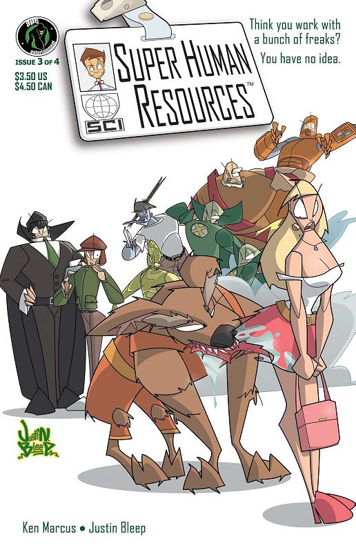 Zombie receptionists. Robots with confidence issues. A reclusive employee in the basement who takes his work and training way too seriously. And a copy machine bent on world domination. Issue one follows Tim, our eyes and ears as we get to know the office and all that goes on. He’s a new employee, eager to learn and please, but clueless as to what he’s in store for. Part of the fun is seeing everyone else go along as if things were business as usual, while Tim is flabbergasted at the myriad of superpowers and weird goings on that happen from one day to the next.
Issue two features an office party where more characters are introduced, an office romance may be forming, and Zombor is surprised! Marcus seems to have an endless supply of cool characters and twisted plotlines for Tim and his officemates. Issue three focuses on another office tradition, Secret Santa, but of course, at SUPER HUMAN RESOURCES, not even that is easy.
Seek out SUPER HUMAN RESOURCES from Ape Entertainment. The art by Justin Bleep has a manic, Kyle Baker PLASTIC MAN feel to it with all of the exaggerated reactions and designs. It’s a fun comic that despite not being set in the real world is all too familiar to those who ever had to sit in a cubicle all day and call it work.
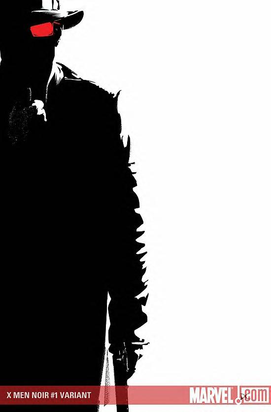
X-MEN NOIR #1
Written by Fred Van Lente Art by Dennis Calero Published by Marvel Comics Reviewed by Stones Throw
He couldn’t get over it. The comic book had no reason to exist. All those editorial page clues, the moody adverts…it had all come to nothing. Just another cheap ELSEWORLDS series.They used to run a pretty good outfit there at the House of Ideas. When did things sink this low? When did an ELSEWORLDS concept that those schmucks at DC would have knocked off in one issue ten years ago become acceptable grounds for 2-3 separate series?
How the hell did this happen? In annoying pot-boiler fashion, that’d be my first reaction to X-MEN NOIR. The one factor that got me to take another look was the involvement of Fred Van Lente, writer of cool books like COMIC BOOK COMICS and ACTION PHILOSOPHERS and, uh…WOLVERINE: FIRST CLASS. The guy took a goofy concept like Hercules and Amadeus Cho taking over the Incredible Hulk’s book and made it a comic that, well, lots of people say is worth reading. I should probably get round to taking a look too sometime. Are any trades out yet?
The thing about Elseworlds is once you’ve fit all the famous characters into olden-times approximations, there’s still a story left to sit through. Like Alan Moore as the Beatles or Judd Winick as Phil Collins it’s the kind of thing that’s more fun to think about than actually read. Here, Quicksilver is the rookie cop on his first night on the beat in New York. His father’s the corrupt chief of police, running the “Brotherhood”, a mysterious cult-like inner circle. Professor X is the controversial, imprisoned head of a reform school and Jean Grey’s just been fished out of the Brooklyn River with mysterious claw marks on her body.
The one element of inspiration is the inclusion of the original Angel, one of Marvel’s legit pulp heroes from MARVEL MYSTERY COMICS #1 back in 1939, as a caped crusader and classic noir protagonist investigating the “X-Men” for himself. I can see these types of characters being weaved in through the other books in the series. Otherwise it all just fades together. The bit where he gets ambushed by Hank McCoy at a deserted Xavier School is almost straight out of Neil Gaiman’s Elseworlds series, 1602.
Still, it’s certifiably better than the upcoming SPIDER-MAN NOIR. If ever there was a character less suited to the noir style than the X-Men, it’s our friendly neighborhood Spidey.
It was a fair cop. The muddy art hid it well, but underneath the make-up the book was just another ELSEWORLDS imitation.
What a crying shame.
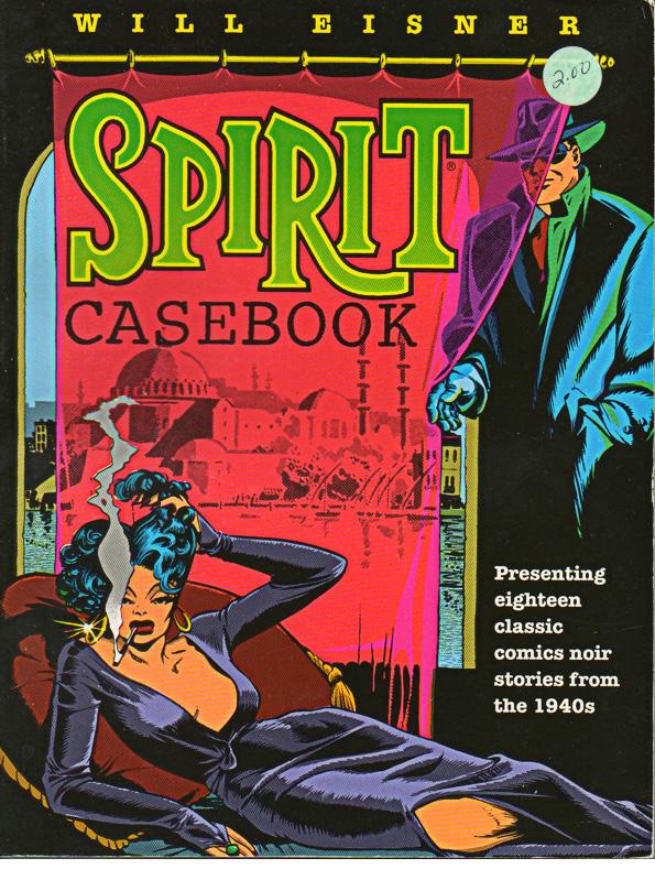
SPIRIT CASEBOOK TPB
Written and drawn by Will Eisner Published by Kitchen Sink Press Picked up for $2.00 Reviewed by BottleImp
 Once upon a time on Main Street in Northampton, Massachusetts, there stood the Words and Pictures Museum. Founded by TEENAGE MUTANT NINJA TURTLES co-creator Kevin Eastman, the museum housed an impressive collection of original artwork that ranged from mainstream masters such as Kirby and Buscema to avant-garde and underground creators like Vaughn Bode and Richard Corben. Unfortunately the museum hit tough times—this was before the SPIDER-MAN movie rekindled mainstream interest in comics, and the TMNT resurgence came years too late—and was forced to close. The building still stands, though now it houses offices and a cell phone dealership. But when the Museum was in operation, it also boasted a wide array of comics, graphic novels and trade paperbacks. I was fortunate enough to pick up this Spirit collection published by Kitchen Sink (also now defunct) at a summer sidewalk sale for the princely sum of two bucks. I had heard of the Spirit, and seen a couple of stories reprinted in anthologies, but this was the first time I got a good look at Will Eisner’s signature creation—and man, was it good.
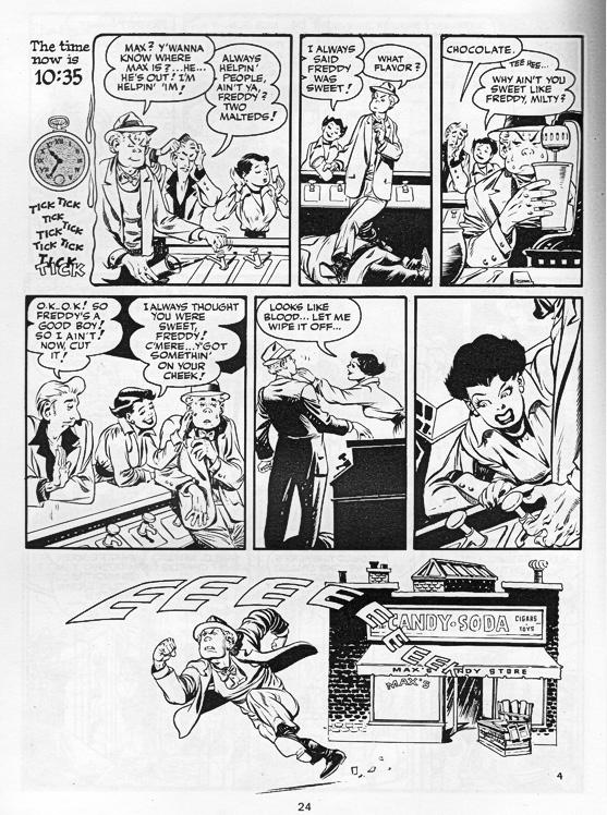 DC recently published a couple of trades to coincide with the forthcoming SPIRIT film (more on that later) which contain most of the stories found in the SPIRIT CASEBOOK, but if you can get your hands on the Kitchen Sink collection, I highly recommend it. First, it’s slightly oversized—about 8 1/2” x 11”—so you get a much better view of the artwork. It’s also printed in black and white—no coloring—to let you see Eisner’s mastery of light and shade without any hindrance.
And make no mistake about it, Eisner was a master. It’s not for nothing that the industry’s highest honor is named for him. Eisner used ink as a compositional element, letting heavy areas of black help draw the reader into and through the story.
 This collection features some of his trademark intricate, often-imitated-never-duplicated splash pages. His page designs were sometimes simple, sometimes radical (especially compared to the average comic book page of the 1940s), but his panels were always arranged in such a way as to be invisible—you never get bogged down by the man’s technique, but your eyes are guided across the pages by Eisner’s layouts. And his ability to tell an intriguing story in a span of a mere seven pages… let’s just say that in today’s day and age of twelve-part miniseries and endless one-shot tie-in issues, many writers could take another look at Eisner and learn that more pages does not necessarily a better story make.
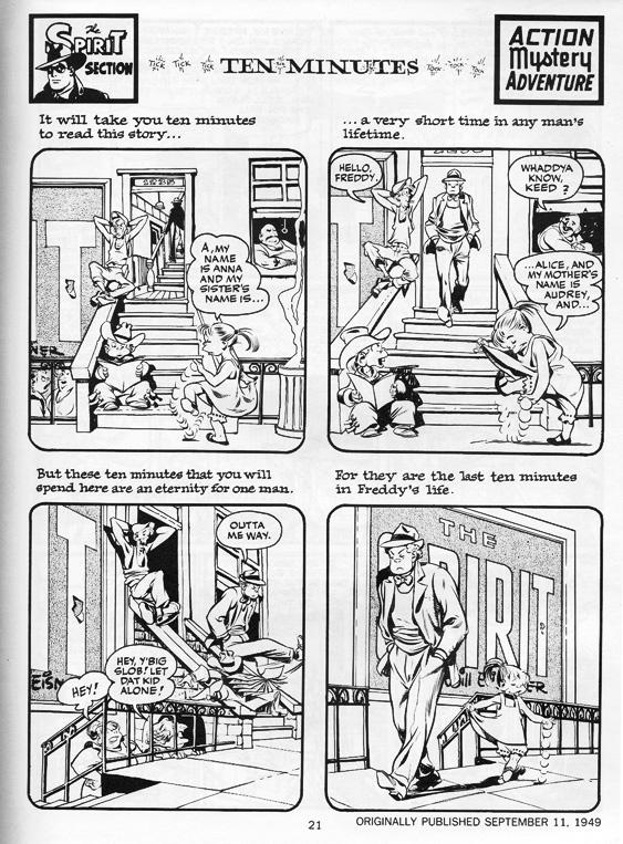
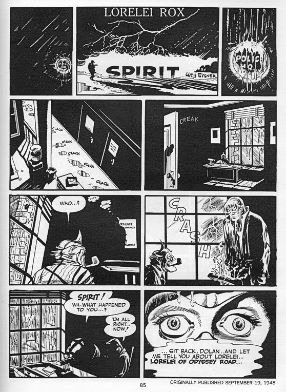
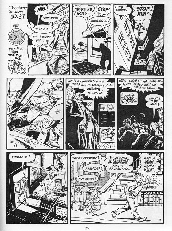 SPIRIT CASEBOOK includes the famous “Gerhard Shnobble” story about a man who could fly, “The Visitor,” which deals with beings from outer space, the fantastic noir lighting of “Lorelei Rox,” and my personal favorite, “Ten Minutes.” This last story is so well drawn that the text is almost unnecessary—you could just as easily follow Freddy’s story just by reading the facial expressions, body language and emotional tones set down in Eisner’s artwork. In short, this is a must-have collection for those who appreciate well-crafted comics.
Which brings me to THE SPIRIT movie soon to be released…
 Will Eisner wrote in the introduction to this collection, “The Spirit was for real; he was human, made of flesh and blood and therefore killable… [he] stuck to the role for which he was originally designed—a middle class crimefighter.” From the trailers I’ve seen and the snippets of review I’ve read from test screenings, this down-to-earth middle class hero is not what the movie is about. Frank Miller, despite being a friend of Eisner and (supposedly) having great respect for Eisner’s creation, is not making a movie of Eisner’s Spirit. Miller is doing what Miller apparently only knows how to do anymore: ludicrously over-the-top dialogue spoken by ludicrously over-the-top caricatures as they cavort in front of a green screen. In other words, SIN CITY.
 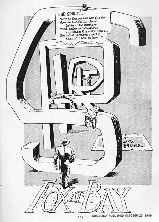 Eisner’s SPIRIT is as much about the everyday people of the city as it is about the title character. His work has an earthiness that makes it stand apart from the normal muscle-bound supermen. Miller’s movie looks anything but earthy.
Look, if you are a fan of SIN CITY and are desperate to see another movie just like it, fine, it’s your eight bucks. But don’t think that the movie you’re watching represents what Eisner’s SPIRIT is all about.
And if like me you’re a fan of THE SPIRIT comic book, please please PLEASE don’t go to see this movie—not even if you’re just going to see how much of a train wreck it is. This movie NEEDS to fail at the box office…because that’s the only way that we can stop Frank Miller and those like him from “improving” or “updating” the works of the masters by pissing all over them. Just check out some of the pages from this collection, compare them to the movie trailer, and you’ll see what I mean.

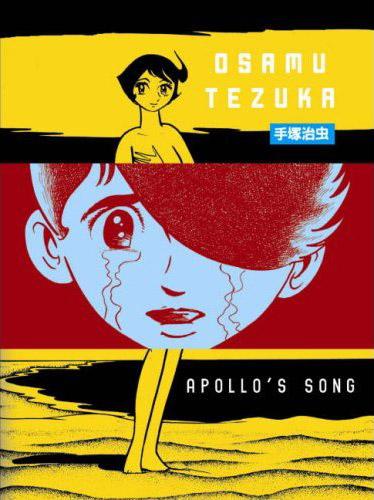
APOLLO’S SONG
By Osamu Tezuka Released by Vertical Reviewed by Scott Green
If I were planning to select a shelf of manga to stand as a testament to the potential of the medium, I'd be sure to include APOLLO’S SONG. If I were going to pick a stack to lend to someone who was interested in reading manga for pleasure, I'm inclined to think that I wouldn't add APOLLO’S SONG.The manga is structured around the visions of profoundly damaged teenager Shogo Chikaishi. Born to a prostitute who lacked a maternal attachment to her child, he began exhibiting violent rages when confronted with images of close knit families or romantic couplings. After an assault on a chicken coop led to the discovery of his attacks on living animals, Shogo was committed to a psychiatric institution.
Upon receiving electric shock treatment, Shogo experienced a vision of a Pallas Athena-like marble statue. The goddess informed him that, in punishment for disdaining love, he shall love one woman again and again for eternity, but every time, before the two are united, one shall perish. From there, in and out of the hospital, in hypnosis and in hallucinations, Shogo experiences cycles of tragic romance.
There's a commanding notion of Osamu Tezuka as an artist and innovator. The cartoon self-portrait of the big nosed guy in the black beret persists as an avatar for a force that was instrumental in shaping anime and manga, and was responsible for creating enduring characters like ASTRO BOY and BLACK JACK. Tezuka could tell a story in manga as well as any artist could in any medium. If you open up MW, you immediately launch into a desperate chase scene. It's chillingly immersive, and you're thinking about the tension of the moment being depicted, not the artist involved or the effort that went into depicting that moment. I wouldn't call reading something like his intense World War II tragedy ADOLF a "pleasure," but it is exquisitely compelling. I don't qualify my recommendations for Tezuka works like BLACK JACK or DORORO. I've given people who don't regularly read comics or manga copies of ODE TO KIRIHITO. APOLLO’S SONG is different. In this case, the pleasure of reading the manga is seeing Tezuka operate as a creative force.
Tezuka produced over 400 volumes of manga in his lifetime. Looking at a manga like APOLLO’S SONG, its quality not the quantity that is incredible. You can almost see Tezuka furiously combining ideas and reacting to concerns. His ability to draw connections and develop ideas is stunning, as is his committment to realizing these chimeras on the manga page. It looks like the product of a mind that was consistently pulling in new ideas and trying out new permutations.
In this case, we're looking at manga from 1970. Pink film was becoming a full fledged industry. Like America, Japan was seeing a protest movement and a sexual revolution.
Tezuka demonstrated a need to be at the forefront of a movement, and the zeitgeist was clearly fomenting in Tezuka's thoughts in 1970.
The year before, he wrapped up SWALLOWING THE EARTH, about Zephryus, the woman who used her sexual appeal to take revenge on the world's men. In this period, the same anthology, Big Comic would see the 1972 premiere of Tezuka's AYAKO, about the tribulations, incest and sexual violence visited upon the Tenge family during post World War II reconstruction.
In the middle of the 1970 serialization of APOLLO’S SONG, Tezuka would begin work on MARVELOUS MELMO. This manga, and later anime, was created with sexual education in mind. Following her mother's death, God gave Melmo magic candy pills that would allow her to transform back and forth between the body of a 9 year old and a 19 year old (also, turn into an animal). Tezuka is famous for reusing character models and types across his works. Doubtlessly, it's not coincidental that the Venus figure on the cover of Apollo's Song and Shogo's doomed love is the mature Melmo.
1970 would also be the year that Tezuka would produce and direct CLEOPATRA, an animated film released in North America as an X.
Tezuka's body of work embraced both sides of a dichotomy. There was compassion for humanity and its perseverance, and at a same time, exasperation with crimes that the species committed against itself, and ways in which it hindered that push to survive. APOLLO’S SONG concerns the split dichotomy between love and biological procreation. There's the imperative to produce offspring, and then there's all the social packaging with the entire spill over into crimes against oneself or others. And, APOLLO’S SONG looks to a divide between hope and pessimism.
There are complex relationships in Tezuka's dialectics, but, that does not mean that he balances the opposing forces. Tezuka's stories have viewed the Holocaust among other black moments in modern history; they've imagined biblical disasters and the end of humanity. Though I'm missing key points of comparison in my familiarity with his work (the above mentioned Ayako for one), I have to say that I can't think of a Tezuka manga that left a darker impression than APOLLO’S SONG. "Nature divides us into males and females. We come together and create offspring for posterity... As long as the world exists, men, women and their children they bear will repeat the endless drama day after day..." The act of procreation has rarely sounded so Sisyphusian.
The rub is that Tezuka expresses these ideas through downright strange fables. There's Shogo as a World War II German soldier. Shogo as a pilot, marooned with a haughty young photographer on an island with animals who ferociously protect each other rather than conform to the natural food chain. Shogo as an assassin in a future where humanity has been replaced by genderless clones.
On one hand, it's captivating to watch Tezuka act as Dante, envisioning infernal punishments for Shogo. In the Dante model, Shogo's situated in something like one of the middle circles of Hell. His crimes are partly of his volition and partly as the result an intrinsic weakness. We can sympathize with him, but at the same time, his punishment does seem to conform to some universal law, and the terms of that punishment become a source of fascination.
On the other hand, it's tempting to cast these stories in an ironic light. It's a very unmediated manga, as if Tezuka was rapidly working from mind to hand. The prologue, "Union of the Gods," opens with a horde of heroic looking men racing towards a queen in a less than subtle metaphor. From there, it stays pitched and unrestrained. The melodrama. The society of Disney animals. At issue, it's mixing a serious tenor with motifs that have become comical. A fable of a robot maid crushing her master to death with a hug has a kernel of profundity, but, from a modern perspective the elements have become associate with camp.
The artistry of APOLLO’S SONG is fantastic. Tezuka labored to create a vision that would engrave itself in the reader's mind. As campy as a 70's sci-fi future can be, the image of Mount Fuji turned into a level plateau by rationalist minds or Tokyo turned into a necropolis are powerfully rendered. Whether it's a World War II era train yard or a remote mountain lake, the craft in Tezuka's work is breathtaking. Because modern perspective shades many of the elements with an ironic hue, attention is drawn from Apollo's Song to its creation. Reading the manga, it's difficult to divorce the work from thoughts of its context and author. Apollo's Song is remarkable in every way, but not necessarily an engrossing reading experience.
Scott Green has been writing for AICN ANIME for close to seven years. If you like what you see here and love anime & manga, be sure to check out his latest AICN ANIME column here.

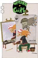
UPTOWN GIRL #67
Written and Illustrated by: Bob Lipski Published by: Uptown Girl Comics Reviewed by: Ryan McLelland
UPTOWN GIRL has remained one of my favorite indie comics since I discovered it during its ‘early teens.’ Now the book is about to hit 70 and fade away from a monthly format to move into bigger and better things – most likely graphic novels. It’s a true end of an era, especially for all those fans of the book who love reading the adventures of reporter Uptown Girl, cynical Ruby Tuesday, and free-spirited Rocketman. Writer/artist Bob Lipski keeps his characters simpler, as if you were watching a cartoon like THE SIMPSONS rather then reading an actual comic book.UPTOWN GIRL #67 pokes fun at artists who become famous overnight, being the next huge thing, only to fade off into oblivion. Here it is Rocketman who become a famous artist by building a catapult then accidentally launching paint at a building. Someone sees the mess, decries it ‘art’, and suddenly Rocketman is being paid to make more ‘art’. Soon enough half the city of Minneapolis is covered with this hideous art and it couldn’t go away soon enough.
There’ve been a number of ‘villain-of-the-week’ issues of UPTOWN GIRL lately where Uptown Girl and her crew seemingly off the baddies as they appear, so this issue is a much welcome break. Rocketman steals the show as dim-witted yet loveable characters usually do but the underlying plot really strikes true in today’s era of everyone wanting to become famous really quickly without paying their dues. This ish is just another great issue in a long list of great issues and I could never say enough about this ve