
| #23 | 10/15/08 | #7 |
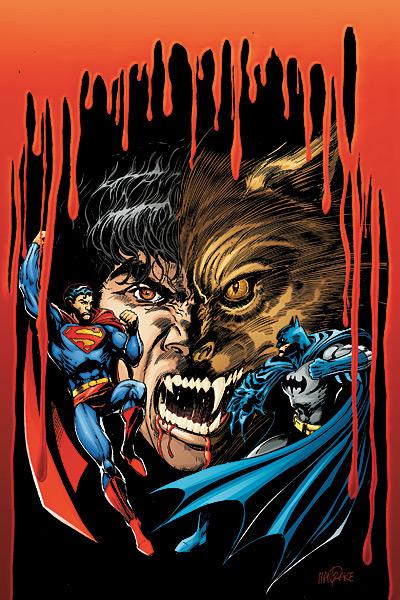
SUPERMAN & BATMAN VS VAMPIRES & WEREWOLVES #1
Written by: Kevin VanHook Art by: Tom Mandrake Published by: DC Comics Reviewed by: Ryan McLelland
Very much winning coolest title of the month, SUPERMAN & BATMAN VS. VAMPIRES & WEREWOLVES is the kind of title I’m ready to jump all over. Just in time for the Halloween season we have the Caped Crusader and the big S ready to take out some werewolf baddies? How can you make a story like this interesting, though? Superman is Superman – isn’t fighting a vampire sort of beneath him, or do the magical aspects of the undead come into play?The big “pro” here are the vampires and werewolves as bad guys or, at least, supernatural creatures with their own agendas. Stationed in Gotham City they are immediately spotted by Batman, though the vigilante doesn’t seem to have the know-how to stop someone who can walk through walls. The detective in him takes over as he tries to figure out what kind of creature he had been tracking and what can maul a body as horribly as the blood stained corpse that lies at his feet.
The big “con” of the book is Superman, or the lack of. While he is featured in the title and on the cover, Superman is nowhere to be found inside the book. Strangely enough, Wonder Woman cameos fighting a blood-thirsty vampire in a brawl that lasts over five pages. Why is Wonder Woman here and not Superman? I’m not too sure. Perhaps it is all a bit of foreshadowing.
The book doesn’t suffer from the puzzling lack of Superman and SUPERMAN & BATMAN VS. VAMPIRES & WEREWOLVES is a fun, taut thriller perfect for the Halloween season. It’s great seeing a book like this instead of having your old run-of-the-mill rogues’ gallery showing up. VanHook and Mandrake seem to be having great fun with this book and it’ll be quite interesting to see where this miniseries goes in the future.
Ryan McLelland has worked in movies and comics journalism for the past several years before joining the @$$holes here at AICN. Ryan’s comic work has already graced comic shelves with Arcana’s PHILLY, WISE INTELLIGENCE, UPTOWN GIRL, and THE SENTINELS ANTHOLOGY. He rarely updates his blog but when he does it can be read at www.eyewannabe.com
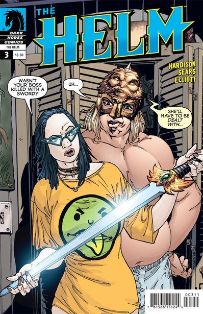
THE HELM #3 (of 4)
Writer: Jim Hardison Artists: Bart Sears & Randy Elliott Published by: Dark Horse Reviewed by: BottleImp
I was pretty harsh in my review of the last issue of this series, I admit it, but I did not write what was written out of any maliciousness or ill will. Much like Eric Cartman hitting a small animal with a stick, I did what I did in the name of tough love. THE HELM #1 felt so fresh and funny that my expectations were set pretty high for #2, which unfortunately did not meet them. And now with #3?First off, I’ll just say that this issue works better than the previous one. There is less of the one-note gag of the Helm berating Mathew and more of a focus on advancing the plot (a plot, incidentally, which seems a little too sprawling to be neatly wrapped up in the remaining issue of this series…but I guess I’ll have to judge that point next month). The storyline also takes a turn down a more serious path with conflict between Mathew and his girlfriend Jill regarding the Helm, leading to an ominous (and well-executed) cliff-hanger of a final page. But still…
Maybe the blame for my lack of enthusiasm for the way this series has progressed lies with me rather than with THE HELM’s creators, but I can’t help feeling like the promise of the first issue was never delivered upon. There was such a great sense of zaniness in the first meeting of Mathew and the Helm that I expected the rest of the story to continue in that superhero convention-skewing vein. Hardison obviously wanted his story to go in a different direction (which is of course the sacred right of the creator), but I can’t help thinking of what could have been rather than what is. Humorous superhero comics (at least well-written ones) are few and far between, and I was really hoping that THE HELM would be a shining star in that sub-genre, rather than a footnote.
But putting aside my preference for that humorous aspect of the series, there’s one more thing about THE HELM that I have to point out. There is a maddening sense of incompleteness here—sometimes I feel like I’m reading a Cliffs Notes version of the story rather than the story itself. I’ve no doubt that some of this will be resolved when the series wraps up in its final issue, but I still have the sense that the world of THE HELM is rudimentary—a stage made up of cardboard facades with no structure to support them. Maybe this is due in part to the four-issue length, and a six-issue miniseries would have allowed for a more fully-realized backdrop. Like I said in my last review, the comic seems like an outline that could use some fleshing out.
Again, I’m not being critical out of spite, but out of love. I still think the premise and setup of this series is pure gold…I just would love to see that gold invested wisely (maybe even in an ongoing series?) so that it would yield some high-interest return.
When released from his Bottle, the Imp takes the form of Stephen Andrade, an artist/illustrator/pirate monkey painter from the Northeast who's given up comics more times than he can remember. But every time he thinks he's out, they pull him back in.
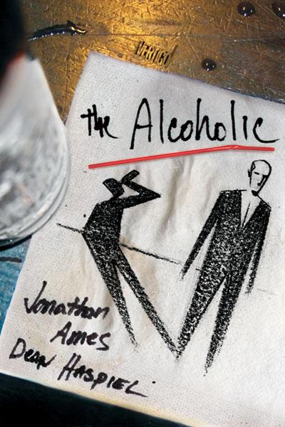
THE ALCOHOLIC OGN
Writer: Jonathan Ames Artist: Dean Haspiel Publisher: Vertigo/DC Comics Reviewed by Humphrey Lee
As an avid reader of all things Vertigo, I've tried to do my damndest to keep up on their periodical releases of Original Graphic Novels (OGNs) that have been streaming out from them for the past several years. Just like with the monthly series the imprint produces, it's rare that I find any of these to not be worth the time and money investment. Sure, most of these tend to fall in the "middling" area, becoming the kind of read that was nice for an enjoyable afternoon walk through and that you put back up on the shelf possibly to revisit in a few years at a slow time - your CAIRO's or SILVERFISH's and SLOTH's and so on - but still worth the effort all the same, especially when you occasionally get something classic like PRIDE OF BAGHDAD or IT'S A BIRD out of the pack to really show you how these can pay off if you're willing to give them a try.Well, THE ALCOHOLIC here is a might bit better than middling, though it's definitely not a PRIDE OF BAGHDAD. At the end of the day, it's just another great installment of this line of OGNs that has rarely disappointed me.
THE ALCOHOLIC is a story about a man so real he has to be fake, Jonathan A., who is, as they say, "a real piece of work." A writer by nature and desire, Jonathan A. is as confused as they come - sexually, commitmentwise, socially - which makes him a walking disaster of a man as he tries to deal with all his conflicts and awkwardness, let alone the titular addiction that plagues him throughout his life as well. What really makes this book work while it plays out, through the words of the Jonathan A. in front of us, is how dreadfully upfront he is in describing his life and inadequacies to us. The brutal honesty of his life and the situations he's found himself in because of his somewhat destructive and gullible nature make everything so horrifyingly hilarious until you sit back and think about how, well, how fucked up these events kind of are. Watching as Jonathan goes from sexual confusion and inadequacy as an adolescent, combined with his reliance on substances to confront those and the world around him and seeing how it all culminates in a man still trying to find himself as he nears middle age really does makes THE ALCOHOLIC a fantastic exercise in demonstrating human weakness and drama at its finest.
All that said, though, there were a couple points of this work that I thought were a little off. One is that I think parts of this book, and Jonathan's life experiences that show up, may have been a little too much. We already have possible homoerotic tendencies, alcoholism, adequacy issues, drug use, abandonment issues due to his parent's deaths, and on and on and on...and then there's a problem with flatulence at one point due to his tension. Really? After all that, all the deep issues, we basically work our way down to bowel problems from it all to go with it? Sure, it leads to some funny bits, as something like that usually tends to do, but with everything already piled up as is I really don't see the need to go towards material like that. Also, it seemed to me like some of the spoken dialogue was more an afterthought than anything, that the word balloons in some of these conversations were more there just to get through a couple seconds of a scene than to really drive any of it. More a nitpick than anything of course, but given how word heavy this book is from the captions already, it just seems futile to fill it with some verbal minutia. I wasn't exactly thrilled with some of the real life events pushed into the story as well, but I mean more the Monica Lewinsky appearance than anything. Ames’ use of the 9/11 attacks was a very poignant one, of course, and he did well to have his own Jonathan A. take stock of his life and that around him, but the Lewinsky spot seemed more there for an anecdotal sex joke than for any real point. Again, all little nitpicks, but these are few things that took me out of an otherwise captivating personal tale.
Getting back to the positives of THE ALCOHOLIC, I have to sing high praise of Dean Haspiel's pencil work. I've always been a fan of his, mostly from exposure to his corroborations on Harvey Pekar's comics, but his style of cartooning is a perfect match for a work like this. Doing what a cartoonist does best, everything is rendered down to the perfect point of "detailed simplicity". Just the right number of lines are put into each of the scenes to pull of the mood in the setting, or the emotion on all the characters faces, or the right shading for atmosphere (with big ups to Lee Loughridge for dropping the grays); just the right amount of everything is put into each panel for them to be at their most effective and then move on. Add in a little creativity with the panel work to stop them from looking a little too standard with a little overlapping here and a dab of juxtaposition over here - just enough to give the eyes a curve ball to look at but nothing overly liberal to completely distract- then you have yourselves pitch-perfect art to go with the story being told, an event that always makes an already good read even better.
Just like its lead, THE ALCOHOLIC isn't perfect by any means, but it'll draw you in just the same. Jonathan Ames has made Jonathan A.'s life such a train wreck of emotion you can't help but feel sorry for him and pity him while at the same time chuckling at the kind of foolhardy situations he finds himself in because of his transgressions. THE ALCOHOLIC will show you just how dark things can get and just how quickly they'll come to drown out the light if you let them, all while making you HAHA! at the absurdity of it all. This is life at its most unhinged, and it's at least worth that afternoon to watch unfold, for better or worse, for your viewing pleasure. Pop the top and enjoy.
Humphrey Lee has been an avid comic book reader going on fifteen years now and a contributor to Ain't It Cool comics for quite a few as well. In fact, reading comics is about all he does in his free time and where all the money from his day job wages goes to - funding his comic book habit so he can talk about them to you, our loyal readers (lucky you). He's a bit of a social networking whore, so you can find him all over the Interwebs on sites like Twitter, The MySpaces, and a Blogger Account where he also mostly talks about comics with his free time because he hasn't the slightest semblance of a life. Sad but true, and he gladly encourages you to add, read, and comment as you will.
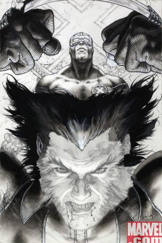
ASTONISHING X-MEN #27
Written by: Warren Ellis Art by: Simone Bianchi & Andrea Silvestri Published by: Marvel Comics Reviewed by: Ryan McLelland
If there is one true astonishing quality about the newest issue of ASTONISHING X-MEN it is the art: Simone Bianchi’s artwork is jaw-droppingly phenomenal. When combined with the ink wash process I think you’ll be hard pressed to find a prettier Marvel book out there. I almost dare anyone out there to pick this book up, look through, and not buy it.The fault in the book lies with Warren Ellis. It’s hard to talk badly about Ellis since he’s a comic book writing God. However, this particular issue stands as a “fill in the reader” about so much plot that you are nearly bored to tears by the end. This issue starts after the fight with Subject X and most of the issue has Beast, Wolverine, and Cyclops trying to figure out what is going on with a mysterious box and where the X-Men are going next.
I’m one of those readers who can stand to have all this plot boiled down into three to four pages and get back into some sort of action. However, Ellis is taking his time unweaving his story, which could be fine if you were picking up this storyline as a trade paperback but not-so-good when you are picking the comic up as a single entry. Don’t get me wrong – the plot itself, focused on alternate Earths and mutants from those realities, is really top-notch. I just wish the issue featured a bit more UMPH.
Overall the issue has some ho-hum writing that is coupled with artwork so amazing it almost makes me wish that I was an artist. The team-up of Ellis and Bianchi is a perfect fit, even if it is taking Ellis a bit longer than it should to get where he is going.
FINAL CRISIS: LEGION OF THREE WORLDS #2
Writer: Geoff Johns Artist: George Perez Publisher: DC Comics Reviewer: Optimous Douche
In my opinion a true comic aficionado can revel in forgotten times of the medium and truly appreciate story telling from different eras; I am not that type of fan. I see comics as perpetually evolving, and while I’ll be the first to call out a creative team that completely boggles canon, that should never be mistaken as a desire for comics to have the voice or tonality of the golden age, silver age or any age other than the one we are in.I want to throw this caveat out there because it’s important to know that my knowledge of the Legion of Super Heroes couldn’t fill a midget quilter’s thimble. The Legion’s heyday occurred during a time in comics that my modern jaded sensibilities find utterly unreadable. However, after Johns’ phenomenal run resurrecting Legion in the pages of ACTION a few months ago, I tried desperately to flip through some downloaded silver age stories of Superboy and his escapades with the far-flung superheroes of tomorrow. As expected, the experience was a retro groan-inducing affair of bad puns and campy dialogue. But that doesn’t matter; like his turn on ACTION, Johns has once again taken staid stale characters and reinvigorated them with a new life all their own. Even without any knowledge of Legion’s history, LEGION OF THREE WORLDS (LOTW) is an amazing title. I’m also going to be so bold as to say that from a purely visceral comic perspective this is the best thing to seep out of FINAL CRISIS to date.
In the rare instances when Johns gets bad press, most of the critiques fault him for being more heady than head strong. The gripes usually come from those comic fans that want their teeth kicked in on every panel and a little less focus on the special hallmark moments that comprise a hero’s personal life. If you’re one of these adrenaline charged, testosterone fueled readers, LOTW is a non-stop buffet of ass kickery. This is not to say the book doesn’t have a focus on character; long-time fans will appreciate the power struggle between the Legion’s three founding members Saturn Girl, Live Wire and Rokk. While all the nuances of this struggle will be lost on those that haven’t truly followed Legion throughout the years, non-fans will understand the sheer emotion of this argument simply because it takes place when the world is facing certain Armageddon.
I dug up FINAL CRISIS not to incite Morrison’s league of devout denizens, but rather to show that story and action can be married successfully prior to the third or fourth issue of a series. Personally, I like FINAL CRISIS, but I can also buy into the incessant Internet chatter that kept wondering when “something” was going to happen. LOTW is able to bring the action, story and heart for two reasons: lots of panels and a brilliantly judicious use of splash pages. Johns may get some flack for trying to cram too much on to the page, but with the heavy task of trying to bring together the three different good Legions, three different Evil Legions, a mound of exposition, hundreds of characters and a story that spans several millenniums I’m not going to fault him. In fact, Perez deserves monumental praise for making each stuffed page easy to read and follow. Also, by breaking away from the five to six panels per page standard, as a reader you are taken aback by the splash pages instead of simply glossing over them or thinking the writer to be a lazy shit.
My final thought on this book is how enamored I have become with Superboy Prime as a villain. Once a petulant douche, he has become a big bag of evil on par with some of DC’s greatest super villains. This kid has a serious chip on his shoulder and while I can’t wait to see it knocked off in the climax of this book, I hope and pray that Superman does not listen to the Legionnaires’ request to ice Superdouche permanently and he becomes a mainstay foil for the future.
When Optimous Douche isn’t reading comics and misspelling the names of 80’s icons, he “transforms” into a corporate communications guru. Optimous is looking for artistry help, critical feedback and a little industry insight to get his original book AVERAGE JOE up, up and on the shelves. What if the entire world had super powers? Find out in the blog section of Optimous’ MySpace page to see some preview pages and leave comments.

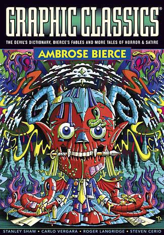
GRAPHIC CLASSICS VOLUME SIX: AMBROSE BIERCE – 2nd Printing
Authors: Ambrose Bierce (with a piece by Mort Castle) Editor: Tom Pomplun Publisher: Eureka Productions Adapters and Illustrators: Rod Lott, Florence Cestac, Reno Maniquis, Dan E. Burr, Stan Shaw, Mark A. Nelson, Steven Cerio, Michael Slack, Shary Flenniken, Nick Miller, Antonella Caputo, Mark Dancy, Neale Blanden, Jackie Smith, Dan O’Neill, George Sellas, Todd Lovering, Devon Devereaux, P.S. Mueller, Chad Carpenter, Every Geradts, Roger Langridge, Simon Gane, William L. Brown, Anton Emdin, Lance Tooks, Lisa K. Weber, Johnny Ryan, J. B. Bonivert, Annie Owens, Milton Knight, Carlo Vergara Reviewer: Squashua
Some of the smartest, most satirical and bloodthirsty work in American history was scripted over one hundred years ago by former Union soldier turned journalist writer Ambrose Bierce, and Graphic Classics has collected 140 pages of it in their latest (re)release, GRAPHIC CLASSICS VOLUME SIX : AMBROSE BIERCE (Second Edition).The point of the GRAPHIC CLASSICS books is to repackage classic fiction in a comic book style and represent it to today’s audience. Sometimes this is straightforward, as is the case here with “That Damned Thing” and “The Monk and the Hangman’s Daughter”, but other times they’ve been reinterpreted--most notably, Bierce’s fable “King Log and King Stork”, which applies as bitingly against the administration of today as it must have a century ago. With excerpts from “The Devil’s Dictionary”, “Bierce’s Fables”, and nine full-length stories, this book is packed with easily accessible content. The sheer cornucopia of art styles applied here is…
…
I can’t believe I said that.
…
Let’s get serious. When I start using words like cornucopia, my internal thesaurus has hit a wall. Ambrose Bierce wrote a bunch of great shit over a hundred years ago, and I simply can not and will not review his writing; that’s a job for a Rhodes Scholar, which I am not. The only things to review here are the presentation (as I’ve done), the content choices (I’ve only been exposed to “That Damned Thing” before this book, and it came out just fine here in comic book format. “Hangman’s Daughter” is a pretty awesome plunge into insanity though, and I highly recommend it), and the art. And as you can see with that tremendous list of illustrators, there’s a fuck-ton of art styles to review. It’s a daunting task. Some of it is fantastic, others are ok, and there are maybe one or two styles that simply do not appeal to me. And while all of it is presented in the standard black and white of the Graphic Classics line, certain portions might have gone over better in color. Overall, I recommend this book if you enjoy reading intelligent fiction; the selection here is entirely palatable, and the $12 price point is spot on for this economy, making it a potentially excellent stocking stuffer for the upcoming holiday season.
Kuax'kua plucks and strums the fibre electric between worlds, writhing in amorphous ecstasy with each pulsing nanobyte of digitized information. A fount of queries and feedback cloaked as an unassuming sass-imbued avatar, this shapeless servitor scribes only of that which fuels its emotion, driving all observers to a slow and inevitable madness.

Hey folks, Ambush Bug here with another edition of dot.comcs. In Vroom Socko’s report from the Dark Horse Event at Portland State University (which was posted in this week’s SHOOT THE MESSENGER column), Vroom reported that Dark Horse Publisher Mike Richardson talked at length about webcomics and how to make a profit from it. Richardson said that in webcomics, the money is in collections of successful webcomics. Some creators are listening and compiling their online doodlings into a trade paperback format. I hear some even make a bit of cash doing so. Being Dark Horse, a comic book imprint whose name goes hand in hand with quality, they have chosen a few comics to collect under their own label. Below is a sampling of two of Dark Horse’s online compilations (THE PERRY BIBLE FELLOWSHIP being another one of high quality). I had a chance to check out these compilations and wanted to urge you all to read the reviews, take notice, maybe purchase one of the collections, and be sure to follow the links for some free comic bookage. Enjoy.
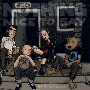
NOTHING NICE TO SAY OGN By Mitch Clem Published By Dark Horse Website: www.mitchclem.com/nothingnice
Ahh, the elusive term, “punk”. As soon as a definition is assigned to it, there are bound to be leather clad punkers who deny the accuracy of said explanation. And, more than likely, those same punkers won’t hesitate to label you as a poser or sellout for trying to do so. Occasionally tip-toeing on the fringe of punker-dom, I run into the types of people that populate this book: so concerned about setting themselves apart from the status quo and smashing clichés with a steel-toed boot, yet all the while becoming more and more like the stereotypes and institution they say they abhor. I would never try to play this one cool and say that I recognize all of the bands referenced in this book (I do know some of them though, and have even been to a few of their concerts!), but that type of expansive knowledge of the punk scene isn’t really necessary to enjoy this often hilarious series of webcomics about people who take maintaining and representin’ their way of life way, way, way too seriously.
Mitch Clem often casts himself in this webcomic and is never afraid to make fun of himself and the punkers who populate this book by making all of them the butt of some of the funnier jokes. Clem skates the tightrope by honoring and staying true to his punk roots, while respectfully making fun of them at the same time. If you’ve ever scoffed at a hipster’s ridiculously tight jeans or wanted to smash in the face of someone who categorizes hanging around a coffee shop as a hobby, you’re bound to find something to laugh at in NOTHING NICE TO SAY.
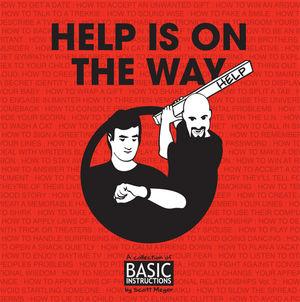
HELP IS ON THE WAY: A COLLECTION OF BASIC INSTRUCTIONS By Scott Meyer Published by Dark Horse Website: www.basicinstructions.net
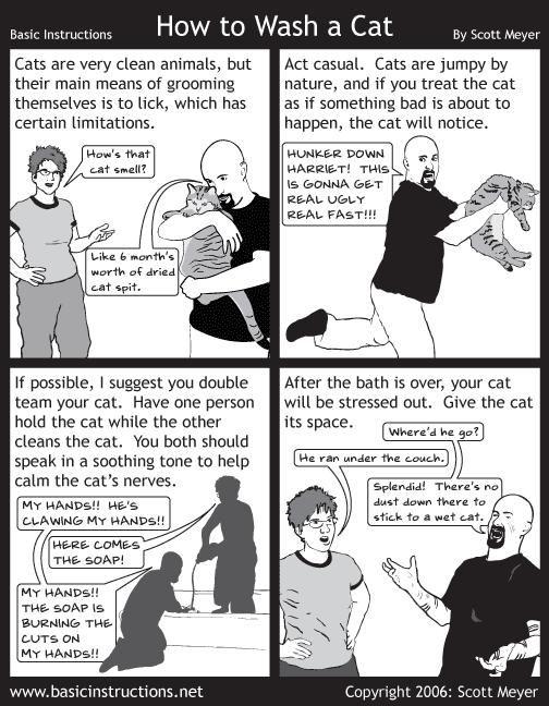
How’s this for a recommendation? This book is a must for anyone attempting to do anything ever!I know humor is subjective and as soon as I knight this webcomic with the esteemed “Funny as Shit!” title, someone is bound to speak up in the talkbacks that they don’t think it’s funny, but fuck it. This webcomic is funny as shit. I laughed like I had a troll made of feathers dancing across my belly at this comic. Scott Meyer traces photographs and writes some of the funniest basic instructions ever to grace the printed page or the pixilated screen. It’s all here. Ever wonder how to deal with a compliment? It’s in there. How to call in sick? It’s in there. How to display your baby? How to make a memorable Halloween costume? How to be a gentleman cat burglar? It’s all in there. Maybe you want to wash your cat? Well, check out how below.
So kudos to Dark Horse for figuring out how to make a profit in webcomics. Here’s hoping that collecting online comics will be both lucrative to the creators and shed some much needed light on the genre of webcomics.
Ambush Bug is Mark L. Miller, reviewer and co-editor of AICN Comics for over seven years. Check out a five page preview of his short story published in MUSCLES & FIGHTS 3 (AVAILABLE NOW at Muscles & Fights.com.) on his ComicSpace page. Bug was recently interviewed here and here at Cream City Comics about indie comics, his own artistic process, the comics industry, and other shades of bullsquat. Look for Bug’s follow-up this Fall in MUSCLES & FRIGHTS!
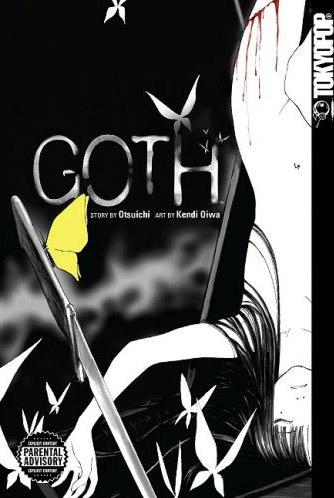
GOTH
Story by Otsuichi Art by Kendi Oiwa Released by TOKYOPOP Reviewed by Scott Green
"He has a tendency to constantly seek darkness in people, just like me. We crave cold, delicate aspects of human beings, like murder or torture. People like us are usually called GOTH. However, there's still a part of him that doesn't overlap me. People who like blood and guts are different from those who enjoy death cries."GOTH offers the sick thrill of witnessing people tempt profound danger, akin to watching someone pet a lion. It's puts the "graphic" in graphic violence and looks on with interest.
When revealed in the manga's post script, it's not entirely surprising to learn that GOTH was partially inspired by an Angelina Jolie profile's reference to her collection of execution equipment. The manga's chronicle of twisted crimes works recursively, operating on the reader's dark fascination with people indulging in their own dark fascinations.
Only, in this case, that dark fascination is not simply a tour of someone's knife collection. The GOTH manga ran in SHONEN ACE. This is an anthology that is largely known as a home for anime-to-manga adaptations, such as the manga incarnations of SAMURAI CHAMPLOO, EUREKA 7, BLOOD+ and NEON GENESIS EANGELION. Never the less, SHONEN ACE manages to publish rather dark manga titles like WELCOME TO THE NH and MPD PSYCHO. Like MPD PSYCHO, GOTH's rabbit hole of serial killers desposits the reader into the midst of some severely grisly, decidedly explicit crime scenes.
Last October (10.2.07), Variety reported that SPLINTER CELL game writer JT Petty had been tapped by Fox Atomic to write and direct a film based on Otsuichi's novel GOTH.
From Variety "Described as a gothic love story, the project revolves around two high school teens from opposite sides of the tracks who are forced to come together to take down a serial killer in their hometown."
Well, that's vaguely like the novel that Kendi Oiwa adapted into manga. If you squint, their profiles kind of look similar. If you consider their full form, they seem profoundly different. It's as if someone suggested a DEXTER adaptation premised as a police blood-splatter expert/outsider on a trail of a serial killer. Personally, I'm not taking bets on the likelihood of this Hollywood version of GOTH coming to fruition, but I'd also say that a faithful adaptation would have as slim a probability of seeing the light of day as a faithful adaptation of BATTLE ROYALE.
GOTH might not be quite as incendiary as RAPEMAN or as outrageous as VIOLENCE JACK. However, a key aspect of its premise concerns teens seeking out and discovering grotesque crimes, not for the sake of justice or prevention, but to walk in the footsteps of killers and victims. The ostensible hero of the piece is collecting "souvenirs," like a knife shown cutting off a woman's breast, before her heart was removed and nailed to a tree along with her intestines and uterus. Regardless of whether or not the violence was recast as PG-13, there's an amorality and a sense in which the events are merely a confused preamble to the protagonists' own, dark adulthoods, that would never make it past studio decision makers.
There's a theory that felines interpret the smell of catnip as a sort of super-prey. If that's the case, Yoru Morino could be called a catnip for human-predators, and one of the dark souls that she has attracted is classmate Itsuki Kamiyama. Kamiyama spent his childhood tearing apart dolls and painting "blood" on their faces. Consequently, he understands the ability to hide abnormalities. That ability to mask his passions and fit into normal social circles might explain why he was drawn to the "weird loner" Morino, whose demeanor of indifference is betrayed by scar across her wrist. When a "Wrist Cutter" begins terrorizing their community, Kamiyama decides to find the serial mutilator, stage a confrontation between the "Wrist Cutter" and Morino, then take her scarred wrist for himself.
Though it's been published in English by TOKYOPOP, I haven't read the GOTH novel. From what I understand of Otsuichi's (the pen name used by horror short story writer Hirotaka Adachi) original, it's an oblique work, mark by unexpected shifts in perspective. If the novel called to be pieced together, then the manga is more about enticing morbid curiosity.
Kendi Oiwa adapts five of Otsuichi's six GOTH shorts, with two of those stories conflated into the manga's finale. Especially in that double-shot ending, GOTH calls attention to our lack of knowledge of exactly who we're watching or what we're seeing. In the manga version, there is some deception on the part of the author, and there is plenty of deception on the part of the subjects. However, it's rapidly moving, and symbolism laden imagery aside, it's largely objective. It might not be entirely explicit, but it's not punctuated in such a way as to encourage a consideration of the clues either. Rather than actively reasoning thorough the scenarios, the response to uncertainty is to read on, and maybe give matters a second though in retrospect.
Part of the morbid voyeurism of GOTH is a function of wanting to see Morino and Kamiyama act out their roles, but that's without the expectation of benefiting from the observation. Even if the stories build to a revelation of sorts, GOTH never really upsets our notions of Morino and Kamiyama. Nor does it lead us to believe it would do otherwise. If you're watching a frog and a scorpion cross a river, you don't expect introspection on the far bank.
Emphasize by its single volume length, the manga's point of interest isn't so much watching these characters evolve or reveal themselves, as it is watching their instincts in action. Beyond GOTH's gorehound quotient, what's captivating about the manga is its leads' compulsion to dart into the path of atrocity. The average person might have the inclination to snap a quick look at a traffic accident, but GOTH extrapolates that into a Cronenbergian obsession.
Otsuichi and Kendi Oiwa are skilled at painting images of disturbing people in disturbing situations, but, to draw a contrast to SHONEN ACE compatriot MPD PSYCHO and its creator Eiji Otsuka, there isn't really a social critic between the Otsuichi and Oiwa. GOTH's violence is spectacle violence. It's effecting. It's chilling to read. But, it's not employed as a scalpel.
There is a note of exploitation in the work. GOTH's Morino is not entirely defenseless. One executing element of the characters' instincts is the way in which Morino responds to threats. That said, GOTH has no compulsion against sexualizing peril. Morino is bound frequently and stripped once. The approach falls a bit closer to pulp mag woman-in-danger than erotic grotesque, but given a particular chapter illustration featuring Morino tied up in a corset/garters, blindfolded, gagged and collared, the intension is anything but ambiguous.
In that sexual element, in maggots and mutilation, and in the character pathology, GOTH is offering something at which to gape. There's no denying that it succeeds at this presumptive aim. It's not Hiroshi Hino or Suehiro Maruo , but there are specific panels that push the envelope about as far as it will go.
The most significant lost opportunity might have been the chance to point a finger at the audience. The subject matter certainly opened the door for such an effort. Rei Hiroe's BLACK LAGOON manga is a stunning action series. Sunao Katabuchi's anime adaptation inherits the exhilaration of that violence, but also questions the characters, and by extension, the viewers response to violence. Witnessing the anime's gun blazing front woman do her thing, the anime's point of view character mutters "I don't know what broke to make her like this, but I must be broken too if I'm standing here praising her destructiveness," indicting himself and the viewer in the process. If GOTH could have found a moment to step back and question itself...GOTH wouldn't be the same if its characters, particularly Kamiyama, weren't so sure of themselves, but without directing its provocation towards any end, it loses some weight.
Scott Green has been writing for AICN ANIME for close to seven years. If you like what you see here and love anime & manga, be sure to check out his latest AICN ANIME column here.

ALL AMBUSH BUG EDITION!

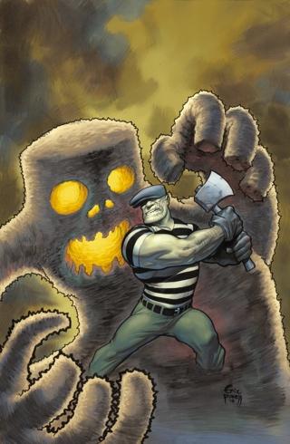
THE GOON #28-29 Dark Horse Comics
The highlight as always to this comic is Eric Powell’s art. The guy just keeps getting better and better. I expect this time next year, Powell’s art will reach utter perfection where his pictures caress the inner eye and brain lobe and all of it smells and tastes like bacon. Until then, Powell will have to settle with subtle coloring that makes the book like a softly lit black and white movie. Despite the beauty of Powell’s work, the story continues to be as abrasive as ever. In these two issues alone, you have donkey abuse, a child who is treated like a dog, an abrupt meeting between a head and a log, and the usual brutality that the Goon has doled out in each and every issue of this series. The shift from one-shots to an ongoing story is the only thing that concerns me with this title. THE GOON was veering towards self parody with the one-shots, but now it seems the book is so steeped in its own mythology that some kind of character synopsis or floating heads feature or plot synopsis on the front cover seems somewhat necessary. At the end of issue #29, I have to admit that I had no idea who the lady is that shows up on the last page. I’m sure I’ve seen her, but taking into consideration that I, like many readers, read quite a few books every month, the writer shouldn’t assume we know everyone that has ever been in an issue of THE GOON before. Even a vague reference to the lady earlier in the issue would have helped with the impact that final page should be packing. But since I didn’t know who the hell the dame was, the effect was less than “meh” inducing. I love THE GOON, but it needs to tighten up a bit and be more friendly to the casual and new reader these days. - Bug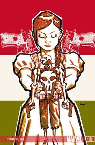
THE PUNISHER #63 Marvel MAX
This books continues to impress. Like many, I was leery of this title when Ennis left, but new writer Gregg Hurwitz is continuing to write an uber-dark and gritty Punisher tale. Dare I say it that Hurwitz even improves on Ennis’ style by turning the focus on Frank instead of the villain of the arc that Ennis liked to center upon? There’s a decent villain here, but he’s sticking to the background for the moment, making him all the more ominous. The lack of humor in this story is appreciated too, as is the art by Laurence Campbell, who splatters his pages with thick blacks that make every panel look like a cross between an ink blot and the remnants of a murder scene. This PUNISHER MAX is in good hands. - Bug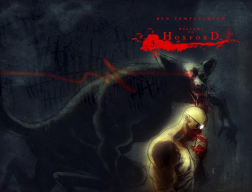
WELCOME TO HOXFORD #3 IDW Publishing
Another grisly outing from Ben Templesmith, who looks like he’s taken notes from his stint with Warren Ellis on FELL. The way many of the pages are broken up into the nine-panel schema makes this book seem a lot like FELL in that there’s a lot packed into one issue. Sometimes, though, the way these pages are set up, Templesmith’s surreal images get muddied up a bit, but never to the point where I didn’t know what was going on. This is a real nail-biter of story, as a social worker finds herself trapped in a privately owned prison filled with America’s most dangerous inmates and guarded by what looks to be mutant werewolves. If you’re looking for an original Halloween thriller this year, WELCOME TO HOXFORD is the one that stands out above the rest. Brutal, gory fun. - Bug
CAPTAIN BRITAIN & MI 13 #6 Marvel Comics
This is another one of those peculiar titles that makes me wonder why it came to be and how it is surviving in this dog eat dog environment out there in comics today. Like THE INCREDIBLE HERCULES, this book was spawned from a big event and instead of ending with that event, it just still keeps on going. There really aren’t any gigantically popular characters in the book (I guess the most popular is Blade and we all know how successful his comic book outings are), but somehow, some way, this book works. Although the addition of Blade to the cast is a bit odd, the rest of the cast is pretty fun. I’d especially like to see more of Captain Midlands, who looks to be a camouflage version of Captain America for England. Seeing the smarmy Pete Wisdom order around the Black Knight and Captain Britain is pretty fun. So far so good with this series. I hope it forms the same type of fan following HERC has and sticks around for a while. Leonard Kirk’s artwork is sure to be a draw and Paul Cornell seems to know what he’s doing in the writing department. Now if only we could get Captain Britain’s costume back in his first costume with the facemask, baton, and lion on his chest, this book would be cooler than cool. - Bug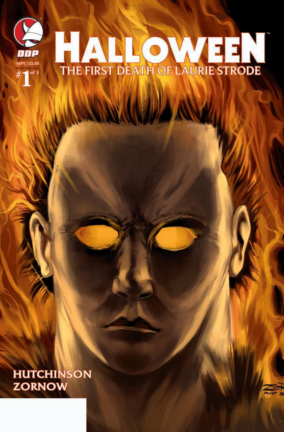
HALLOWEEN: THE FIRST DEATH OF LAURIE STRODE #1 Devils Due
The adaptation of the 80’s horror icons onto the printed page has been hit and miss through the years. I guess that’s why I want to mention this book since it seems to be getting things right. Not only does it tell a nice “untold” story that fits into the HALLOWEEN mythology, it is drawn in a way that is reminiscent of the original film. Like all comics, the heroine, Laurie Strode, is skinny and buxom, but this time around the artist actually seems to be trying to make her look like Jamie Lee Curtis’ bookish final girl. The panels are grainy and somewhat faded as well. There’s an especially simple panel of the streets of Haddonfield early in the book that captures the foreboding mood of Carpenter’s original film. It looks as if writer Stefan Hutchinson has done his homework in this direct sequel to HALLOWEEN II. - Bug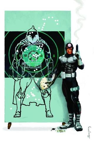
MOON KNIGHT #23 Marvel Comics
I think that with the addition of ENTOURAGE writer Mike Benson to this title, the quality has risen in leaps and bounds, but that that doesn’t mean that this isn’t a frustrating read. The most frustrating thing, other than artist Mark Texiera’s tendency to draw his characters overly top heavy to the point of making them look like they are about to tip over, is that this book suffers from the old “The image on the cover does not happen in this book” syndrome. On the cover we have Bullseye marveling over his out-of-character less than accurate shots on a Moon Knight target. Is Bullseye even in this issue? Nope. Just as Venom wasn’t in the issue a few issues back when he was on the cover. Editor’s note: give the guy who does the covers the number of the guy who is writing and drawing the book so they can chat and touch base, mmm’kay? Problem solved, and you’ve taken care of the frustrations of the shitload of readers who bought this book thinking they would see Moon Knight fighting Bullseye. - Bug
BATMAN & THE OUSIDERS #12 DC Comics
Have you ever just kept on buying a comic only because it seems like it’s about to have its last issue and then that last issue never really came? I know this book has been through the ringer what with Judd Winick ass-writing it, then showing a bit of promise when Chuck Dixon took over, only to have DC blow it and honk Dixon off the title after a mere ten issues. Now Frank Tieri is writing and his action/intrigue-centric writing style is fitting for the title, but with every issue posing the question “Will the Outsiders break up over this latest tragedy?”, it makes me ask the question, “Will the Bug stick around for another issue?” The answer, sadly, is yes, because of that itchy feeling that this title is about to be over with and the completist in me can’t walk away till it’s done. Tieri, I guess, is qualified to make this an interesting read, but he hasn’t done it yet. That’s paired with the continuing annoyance of everyone in this title (and every other DC title not written by Johns or Morrison) flitting over the whole BATMAN RIP crap simply because no one knows what the fuck Morrison is doing with the DCU and is afraid to do anything with any characters that Morrison or Johns don’t write in fear that they will mess things up further. I can’t wait for Morrison to pop out of his peyote tent long enough to finish this RIP/FINAL CRISIS shit, so that DC can come out of the holding pattern it’s been in for the last few months. - Bug
