
| #22 | 10/08/08 | #7 |
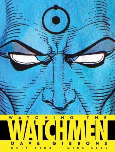
WATCHING THE WATCHMEN
Words and art by Dave Gibbons Design by Chip Kidd and Mike Essl Publisher: Titan Books Stones Throw watches WATCHING THE WATCHMEN
CBR had a recent poll asking fans and bemused Googlers how they’d feel about more WATCHMEN, the responses ranging from “only if DC are prepared for bloody fanboy jihad” to “yeah, what’s WATCHMEN anyway?”. I voted in what turned out to be the least popular field, “only if Dave Gibbons were involved”. What can I say? I’m all for tarnishing legacies, and WATCHMEN’s is about as sacred as they come. Plus Gibbons is probably my favorite comic book artist still working. Actually, this puts me in mind of another poll I clicked on, “how is the rising price of gas affecting your comic book purchases”. The most popular response was “not at all, I don’t own a car”, which made me think of a million Comic Book Guys finally feeling smug.Anyway, my point is, I suppose, that so much has been said and written about WATCHMEN (which, on the record for a moment, I’m still gonna say is the best ever mainstream-produced comic book series), that unearthing buried gems about the series is a task even the world’s smartest man would furrow his brow over. Or that might make Dr. Manhattan clench his buttocks in exertion. However, this book’s saving grace is the fact that all the text (bar a short, insightful contribution from colorist John Higgins) is provided by artist and co-creator Dave Gibbons, who proves illuminating on the genesis of the series and the fallout after its release. Add the masterful design by Chip Kidd (whose books on the histories of Batman and Superman with Les Daniels are essential reads for any comic book fan) and you’ve got a book that’s a snug enough fit next to that copy of WATCHMEN.
The first seventy or so pages focus on the beginnings of WATCHMEN in amazingly comprehensive detail—everything’s there, from Moore and Gibbons’ virginal doodles, early character sketches and marketing ideas to photos of Moore’s proposal and first script. Of particular interest/curiosity: Rorschach’s original full body blot suit (looks a lot more like a creepy figure skater than the bane of the underworld), Gibbons’ note that the Comedian was modeled after Groucho Marx, the clown look having been taken by Batman’s Joker, and the revelation that Nite Owl was based on a superhero Gibbons created as a teenager (new to me). There’s also some pretty nice history of the artist’s early days at DC and run-ins with guys like Julie Schwartz and Dick Giordano. From there, the book moves into a pretty steady pattern of Gibbons’ pencil-and-marker-pen thumbnails (drawn for every page of each issue) set against the occasional finished page for comparison.
As I was flipping through I thought it slightly curious that there wasn’t more art at a more advanced stage. That’s explained in the penultimate chapter, though, entitled “But Then…”. Dave Gibbons doesn’t own any of the original 336 pages of WATCHMEN, having sold them all as the series was being published.
I reckon that warrants repeating: Dave Gibbons doesn’t own any of the WATCHMEN artwork. Man, that just about knocked me over. In one of the book’s wittiest lines, he comments that he knows “there’s no use crying over spilt milk, but then spilt milk doesn’t appreciate in value a hundred-fold in twenty years”.
It’s those kinds of details that make this book a truly worthwhile and interesting read. How about how, in the days before fax or even FedEx reached England, Alan Moore’s scripts had to be ferried by taxi cab the fifty or so miles to Dave Gibbons’ house? Or DC editor Mike Carlin’s hilarious re-dialoguing of Rorschach’s death scene? Or just one example of the astounding and never-equalled amounts of effort put into the book, Gibbons’ map of how Laurie’s “Nostalgia” perfume bottle falls across the background of stars visible on Mars—not something you’d notice in the panels spread out across #10, but the kind of detail that separates WATCHMEN from thousands of lesser books? Perhaps my favorite snapshot from Gibbons’ personal files was the note sent by then-DC design chief Richard Bruning after #1, congratulating Moore and Gibbons on “the finest comic book yet produced”.
Is it essential? Well, no, but then the only thing that’s truly essential is the original twelve issues, and even those are secondary to stuff like food and gas. What this is is a lavishly produced art book that managed to enhance my already-considerable appreciation of THE WATCHMEN and its artist Dave Gibbons, and a more than fair start to the WATCHMEN overload that’s sure to accompany Zack Snyder’s upcoming film.
And since no one asked, my most optimistic prediction for the movie is that it’ll at least be interesting to see the graphic novel on the screen.
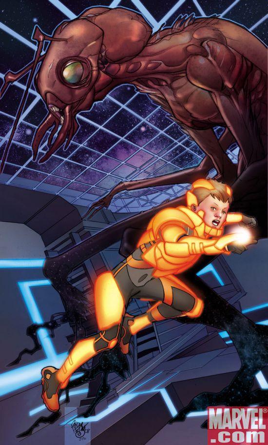
An @$$HOLE 2 in 1 Review: ENDERS GAME: BATTLE SCHOOL # 1
Writers: Christopher Yost and Orson Scott Card Artist: Pasqual Ferry Color Artist: Frank D'Armata Publisher: Marvel Comics Reviewers: Optimous Douche & BottleImp(The wordy dynamic duo)
OPTIMOUS DOUCHE (OD):Reading this comic adaption of Card’s first chapter in the Ender saga was like a condensed homecoming for me. The first time I peered into the tragic life of Andrew “Ender” Wiggen, acid wash jeans were king, my parents thought the cassette “License to Ill” would irreparably damage my soul, and girls had bangs so high that they could disrupt flight patterns coming out of Newark airport. It was 1986, I had bled the well of Isaac Asimov’s “future-history” novels dry and I desperately needed a Sci-Fi outlet during my summer break. The cyclops at my local book store recommended “Ender’s Game”, because as he put it, “This kid is pretty fucked up, kind of like you.” With that ringing endorsement how could I ignore this title? Naturally the allegorical woes of modern society that Card was trying to extrapolate into the future escaped me at the time, but it didn’t matter. The frightening future he painted of earth under siege by an alien species had enough Sci-Fi techno goodness to make me read the book three times that summer. It was also pretty damn terrifying to view an earth that was so desperate for battle fodder that children were being trained for battle while still in elementary school.BOTTLE IMP(IMP):It’s funny; I have a completely different experience with the source material, having finished reading it for the first time just before I saw that this comic book was being released. Lately I’ve been on a vintage sci-fi kick and have been scouring used bookstores and flea markets for some of what the genre has to offer. I had heard of ENDER’S GAME but knew nothing else about it, though I had the preconception that it was more of a kid’s/young adult’s book (this came from a cover I had seen that was clearly geared towards a younger market—a cutesy, curly-haired Ender in a space suit in front of Atari-esque graphics). I was purged of this erroneous notion within the first few pages. ENDER’S GAME is brutal, visceral and unrelenting. I was concerned about how well this quality would translate to Marvel’s adaptation, but so far I’m impressed with how closely the comic book sticks to Card’s Hugo-winning novel, right down to dialogue in long speeches and quick exchanges alike. What do you think of the series so far?
OD:Based on the first issue, I’m hooked. My memory of the source material is a bit fuzzier than yours, Imp, but in this case it doesn’t matter. This is the type of story that just simply works as a comic book. You have a protagonist in Ender Wiggen with a mysterious destiny (a la Harry Potter), Machiavellian manipulation by the adults in the world driving him towards that destiny (a la Harry Potter), and an unwillingness to embrace that destiny and just be a loved normal boy (a la Harry Potter? You know what, I think Card needs to sue J.K.). It’s this simplicity that allows the story to transcend any medium (I’ve been hearing rumbling s about a movie), unlike say THE DARK TOWER where the story is simply too complex to truly get the material when taken out of a prose format.
IMP:You’ve hit the nail square on the head—when you get right down to it, the plot is simple yet profound. I’m looking forward to seeing how future issues handle Ender’s development at Battle School, though… so much of what Ender goes through is internal as well as physical. But we can both agree that so far the comic is working fine on the story level. But the artwork…
OD:Yeah, it felt very warm and hazy. Damn interesting tonality for the pages when Ender beats the crap out of the bullies. Valentine looked exactly as I had envisioned her from the book: gentle, soft, a living embodiment of Ender's warmth and compassion. Peter - I have to admit I envisioned Peter looking like a monster when I read the book as a kid, standing 12 feet tall and with fangs. Am I insane in thinking that Peter's wretchedness was far more intense in the book?
IMP:I don’t know about that; the comic book version still comes off pretty nasty to me. But yeah, the character designs are great, but I’m not so sure about the coloring. Frank D’Armata’s painted tones are exquisite, but a little TOO exquisite, if that makes any sense. His fully rendered figures and backgrounds make every panel feel like a perfect little jewel—which is great for the quieter moments, but I think the action sequences get sapped of some of their dynamism and sense of motion. All of those little highlights and shadows are a little TOO perfect, giving the sense of a frozen snapshot rather than a moment of movement. This is a problem that I’ve seen before in painted comics (Alex Ross tends to fall into that trap sometimes), and I wish that it wasn’t the case here. I almost wish that this series were colored in the more traditional way to let Pasqual Ferry’s great stylized designs carry the story without being covered up so much.
OD:OK, you caught me. I’m a painted picture whore. Like a toddler transfixed by a set of dangling keys, I drool and coo every time a brush stroked panel passes in front of my eyes. I see what you mean about the freeze-frame nature of this style, but it’s easy for me to bring panels to life in my head since I’m borderline schizophrenic.
In my final analysis, ENDERS GAME is a great story and Yost has done a faithful job adapting it into the comic medium. For those that have never read any of the books, you are in for an amazing read. If you are like me and have read all of the books in the Ender’s saga, you will appreciate the innocence of the opening pages and be slightly saddened to know what pain and suffering this young man will face over the next 3,000 years (No, Ender is not immortal; Card just takes a no bullshit approach to faster than light travel).
IMP: Since both of us are already familiar with Card's novel, I would love to hear what readers of this comic who are just coming fresh into this story think of the overall package. But even knowing how the story will turn out, I'm definitely going to stick with this series-- as long as Yost and Co. can keep faithful to the themes of Ender's story, it'll be a winner.
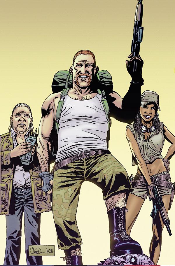
THE WALKING DEAD #53
Writer: Robert Kirkman Artist: Charlie Adlard Publisher: Image Comics Reviewer: Ambush Bug
Wait a minute. A WALKING DEAD issue that wasn't a five minute read? What's going on here!??!!For the last few issues (and quite possible since the beginning of this series), THE WALKING DEAD has been notorious for being one of those books that occasionally seems to be overly-padded in order to squeeze out 22 pages. Gigantic double splash pages. Repeated panels. All the tricks used in order to make the page count. It's a good damn thing that the story is written so well, otherwise I would have beat feet away from this book long ago.
But this is one of the best written ongoing series out there. Despite some storylines that dragged ass (most recently with the multiple arcs that took place in the prison), the book is consistently well written and well drawn. Sure, the schedule is wonky. Fans of the series know that you could get three issues of WALKING DEAD one month, then none the next. But hell, that's the independent scene, folks. Again, because this is such a well written series, I am willing to forget all of that and just savor the book when it does come out.
The reason why I decided to review this book (a book that I think I've reviewed more than any other here at AICN throughout the years in either full or cheapie form), is that this was one of the most satisfyingly full issues of the series to date. In this issue, we get a lot of talky, but it's good talky. It's important conversations between cast members that definitely forward the plot and spend just enough time to flesh out some already well fleshed out characters. In this issue Rick, Michonne, and his son are reunited with other survivors of the prison arc who fled before the shit hit the fan in issue #49. The reunion is filled to the brim with mixed emotion as the group is happy to see the survivors, but others are heartbroken that they are the only survivors of the prison massacre. Kirkman handles the duality of this situation well and Adlard, as usual, deftly juggles the emotions on their faces to increase the drama. Of course, some new cast members show up just when the dust is starting to settle and Rick, who was just kicking himself for his adventurous side, is once again faced with a challenge whether to stay and keep what's left of his family safe, or go on a new quest to try to get to the bottom of all of this zombie business by following these new survivors to Washington DC.
This really is one of my favorite WALKING DEAD issues so far, and it has everything to do with the fact that it actually seemed like Kirkman wasn't trying to eke out an issue by using every old comic book stretching sequence he can imagine. Kirkman is a good writer, but WALKING DEAD has often been a source of frustration with me because he isn't afraid to fluff up an issue just to make it to the end. The reasoning behind the WALKING DEAD's penchant for snail-pacing and stretching? One can only speculate. I think the issue here is Kirkman's writing style. It would appear that Kirkman writes with specific beats in mind. Every writer does, but as exemplified by his use of cliffhangers, it appears Kirkman knows exactly how he wants an issue to end. It just seems hard to get there sometimes. And sometimes there is so little that happens between beats that splashes and silent/repeated panels are needed. I'm sure it's a common predicament for comic book writers. If it didn't happen so often, I wouldn't take so much issue with it.
The use of ten page letters pages doesn't help but make the content seem dinky either. I know it's quaint for Kirkman to take the time to publish and answer each and every mailing he receives and I'm sure it's satisfying for fans to see their stuff in print. But to me, especially in one of the aforementioned stretched issues, to get to the end only to see page after page of text, it's more than frustrating.
But the only reason I am mentioning all of this is because that type of stuff isn't present in this issue of WALKING DEAD. I hope this is a trend that continues after this one and this issue isn't a fluke. Maybe since Kirkman's extremely public exodus from Marvel occurred, he had more time to focus on THE WALKING DEAD. Whatever the reason, this was one of the best and most fulfilling WALKING DEAD issues to date. Keep it up, Kirkman. This issue made me fat and happy.
Ambush Bug is Mark L. Miller, reviewer and co-editor of AICN Comics for over seven years. Check out a five page preview of his short story published in MUSCLES & FIGHTS 3 (AVAILABLE NOW at Muscles & Fights.com.) on his ComicSpace page. Bug was recently interviewed here and here at Cream City Comics about indie comics, his own artistic process, the comics industry, and other shades of bullsquat. Look for Bug’s follow-up this Fall in MUSCLES & FRIGHTS!
THE TWELVE #8 (of 12)
Writer: J. Michael Straczynski Artist: Chris Weston Published by: Marvel Comics Reviewed by: BottleImp
Please disregard my review for the previous issue of THE TWELVE.Everything I wrote about the story getting boring and predictable—forget about all that. Because this issue is a page-turner through to the very end and left me angry that I’d have to wait at least another 30 days until the next one.
I think that THE TWELVE ran into a small case of what is known in the theatre as “Act II Problems.” All the characters had been introduced, the mystery was set up, and then…a lot of backstory. I’m as much to blame for the apparent lull in the story as JMS is, though. Each time one of the twelve superheroes’ stories was told, I pretty much assumed “well, that explains that one… on to the next.” Within this issue we see JMS begin to draw these separate character strands together and tie them onto the main thread of the murder mystery as we head into Act III. Ramping up the tension are glimpses of new riddles…case in point, the Fiery Mask. The Mask’s origin had been retold in an earlier issue, wherein he claimed to have gained his powers through the experiments of a mad scientist’s zombie-creation machine. At the time I thought that JMS was just showing how wacky those Golden Age comic scripts were, and took the Mask’s story at face value. I should have known better once I had read JMS’ take on the REAL origin of the Rockman…
What else to say? The plot is churning ahead once more, Weston’s artwork remains impeccable, the sense of tension that had ebbed has returned with even greater force—you probably know what I’m going to say next.
If you haven’t yet jumped on board this series, GO BUY IT. The earlier issues have been released in second printings and issues 1-6 have already been published as a hardcover trade, so you should have no trouble finding it at your local comic shop. I suppose you could just wait for the inevitable trade of the second half, but frankly, I can’t take stand the suspense. I recommend this series as required reading for any comic book fan—don’t miss out.
When released from his Bottle, the Imp takes the form of Stephen Andrade, an artist/illustrator/pirate monkey painter from the Northeast who's given up comics more times than he can remember. But every time he thinks he's out, they pull him back in.
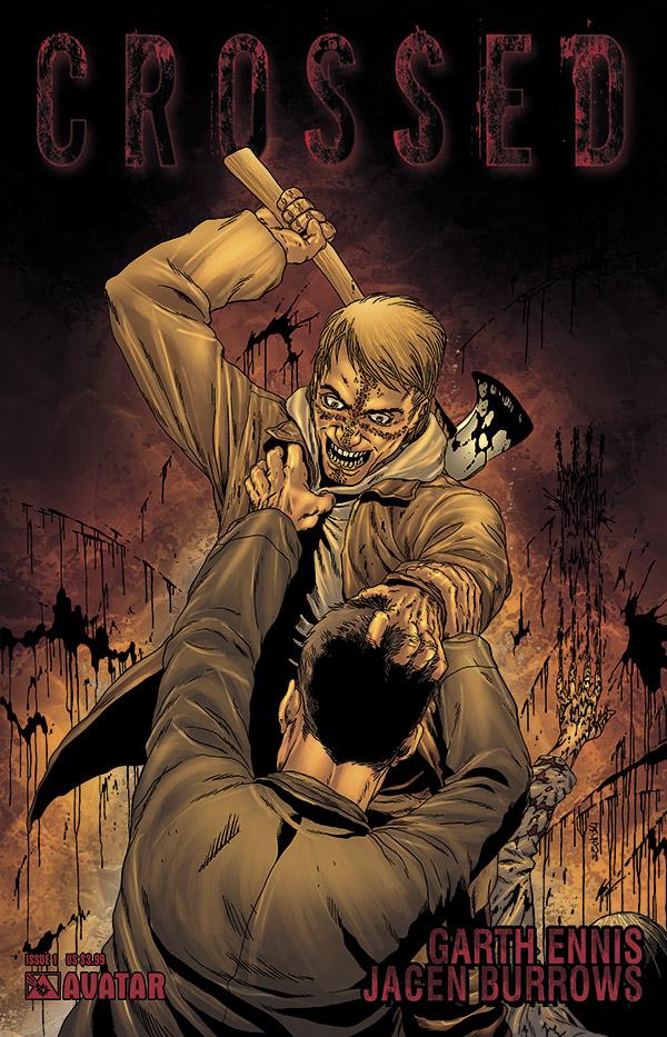
CROSSED #1
Writer: Garth Ennis Artist: Jacen Burrows Publisher: Avatar Reviewer: Ambush Bug
Now, I know Garth Ennis has been pretty verbose in denying that CROSSED is a zombie book. And I guess, technically, he's right. It's not a zombie book in the sense that it doesn't appear that this is a book about people rising from the dead to eat other people.But the genre that this book falls under is definitely survivalist fiction, like most zombie fiction. And whether or not it's zombies, nuclear war, vampires, viruses, or out of control girl scouts that cause the apocalypse, a lot of those stories are similar in that man is boiled down to his basic elements and all that we know it is utterly destroyed. Everything society uses and takes for granted comes back and slaps them in the face, be it our reliance on cell phones and computers or the convenience of having an all night bodega right around the corner whenever you need Dr. Pepper or Slim Jims. Take that all away, and you have an interesting story, as proven with THE WALKING DEAD, 28 DAYS LATER, I AM LEGEND, and here in CROSSED.
I have talked before about the schizophrenic nature of Ennis' writing. There's the reserved and serious storyteller and the guy who likes to tell ass-rape jokes in church just to get a rise out of people. Both personalities are interesting at times. Both can also be tedious. Here, Ennis doles out a little of both in CROSSED and after reading both the 0 issue and this first issue, I have to say, it's one of my favorite Ennis reads out there. The entire issue is somber and well written, peppered with enough nice moments of character to make us like this band of survivors. All in all, it's a tightly structured story that accentuates Ennis' best storytelling talents.
And then, for fans of the more crass nature of THE BOYS, Ennis doles out the money shot scene of a mother and father being raped by the violent hordes of whatever-they-are with their little daughter being chopped to bits in the background. Not a scene I'd show Great Auntie Ambush Bug during post-Thanksgiving discussion this holiday. A bit stomach churning. Definitely offensive. Most likely going to piss off some of you more sensitive types. Typical Ennis.
Don't get me wrong. I liked the book, but I can't recommend this book if you are sensitive to violence and horror. The book delivered on what it promised: a brutal tale of society's fall and man's attempt to survive. Just keep it away from kids and lovers of kitties and rainbows.
Jacen Burrows depiction of carnage is jaw-droppingly good. He's definitely a talented artist and not afraid to draw extreme and violent imagery. His work is finely detailed so every organ and blood splatter is depicted in high-def glee.
If you're looking for answers, there are none here in this issue. No one knows why normal people are bearing burnt crosses on their faces and killing and fucking (in no particular order) just about everything in sight. And I kind of like it without an explanation, too. Although it shies away from being called a zombie book, there's not a lot of difference between CROSSED and your typical zombie fare on the shelves save for two important facts: one, Ennis' steadfast stance that this isn't a zombie book and two, that fact that it is much better than 95% of the zombie books out there in the shelves.
AVENGERS/INVADERS #5
Writers: Alex Ross & Jim Krueger Pencils: Steve Sadowski & Patrick Berkenkotter Publishers: Marvel and Dynamite Reviewer: Jinxo
This issue is the definition of hit and miss. There are parts that really work for me and then others that are just off. Let me start with the off stuff so I can end on the positive. First of all, the art is really middling. What is going on? There is a fight panel toward the start that looks less like people actually fighting and more like figures posed as if fighting while really standing still. And don’t draw Wolverine with his claws crossed over his face if the result is it makes him look like a cross eyed weenie. Looking at that shot somehow I expect the next scene to be Wolverine running around in fast motion to the Benny Hill music. And there are weird character beats. For instance, Spider-Man seems to have gone a bit crazy, taking his joking a little too intensely seriously. Deaf heroine Echo makes a jokey comment about Spidey and he rushes her and slaps a hand over her eyes that seems a bit much and a creepy invasion of personal space. When Wolverine has to tell you “That’s enough” and pull you off a handicapped girl, the joking has gone seriously wrong. After that happens the rest of his patter just comes off a bit less fun.On to the good. There are big arcs here spanning across decades dealing with serious stuff that really work. Iron Man having to face the man he killed/will kill (time travel is so confusing) Steve Rogers, Captain America. Cap has some good dialogue more cutting to Iron Man than he could ever realize. Then you have the new Captain America, Bucky Barnes, confronting the WWII Bucky Barnes with young Bucky really not understanding who he is talking to. Some of what the older Bucky tells his younger self could have interesting implications to the fabric of the Marvel universe if the writers don’t wuss out. And then you have the original android WWII era Human Torch, coming face to face with SHIELD’s android Life Model Decoys, denied the free will and rights he himself has. They add quite a dramatic emotional overtone to his origin and his power. Up until now I mostly thought of the original Torch as more of a heroic footnote. The Human Torch who wasn’t even really human from way back when. This issue gave me something real to connect with on this character.
On the whole, though, the good stuff in this issue for me is powerful enough to outweigh the bad and recommend this book. Spider-Man might be acting like a nut job, and the art might not be the greatest, but there’s big stuff going on here both emotionally and plot-wise.
Jinxo is Thom Holbrook, lifelong comic book reader, and the evil genius behind poobala.com. He may appear cute and cuddly but if encountered avoid eye contact and DO NOT attempt to feed.


MANGA SPOTLIGHT: OCTOPUS GIRL Vol. 1
By Toru Yamazaki Released by Dark Horse Reviewer: Scott Green
OCTOPUS GIRL is a peanut and chocolate meeting of Junji Ito (UZUMAKI) style grotesque and Usamaru Furuya (the cult, older audience strip manga SHORT CUTS) ugly social humor. Think of it as manga Troma through a series of almost stream of conscious connected stories. The results would be hilarious, if the subtext didn't drain the joy out of life. It is almost as if someone like Michael Haneke filtered the material, and though they didn't explicitly drain the humor, they instilled something very bleak below the surface. There's vomit, mucus and flayed skin but the social deadness has a soul sucking emptiness that's more disturbing than the cute teen who turns into a slimy cephalopod.Takako or "Tako"/"Otopus" is a favorite target for brutal bullying because she's a "super-cute goody two-shoes". Local stress relieving activities include tying Tako up, gagging her, and jumping on her chest until her lunch comes out her nose. This was taken too far when Taka was force-fed her namesake, invoking an allergic response. The immediate reaction is profuse vomiting, but that night she dreams of an octopus creature... and the following day she wakes up a human head on an octopus body. Problematic, but less so after a bit of a skewed LITTLE MERMAID retelling (closer to Anderson's than Disney's) leaves her with the ability to assume a human body.
Yamazaki capitalizes on manga's flexible ability to shift emphasis. He utilizes small, tight panels and linework for the gag material, especially when playing off teen cuteness. These quickly establish the gags' setups and the vapid hammyness of the characters. As matters get twitchier and edge their way towards the grotesque, the panel sizes increase, the ink gets thicker and the lines wilder. The gorier the results, the more the narrative slows down to allow onlookers a full view of the nastiness.
Not everyone is going to love the manga's frozen examination of humans on meat hooks or with their chest cavities opened or centipede bite welts. For those who do get a charge out that sort of close eying of the unacceptable, the deeper bite comes from the series' view on society. What's most disturbing is that it will not acknowledge its cruelty. It paints a picture of an empty world where people rip each other for the slimmest amusement. Any sort of human attachment is depicted as a product of self interest or of naiveté, childish infatuation or blindly misreading a situation.
The violent turn-arounds of the gags are calculatingly disheartening. Other violent comics or animation have played with the idea of being trapped in a cycle of pointlessness. In OCTOPUS GIRL, it isn't so much as small cycle as it is the entire human experience. The stories are dominated by pointless cruelty where the sociopathic violence stems from pure capriciousness. There's a boredom and mundane indifference torture and evisceration. With her new amphibious life, Taka has vast freedom, but she seems trapped in an over insular world where everything turns to shit and she's continually stumbling on humanity's nastiest impulses. That she always smiling and thinking positively is almost more horrific.
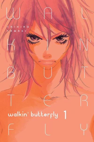
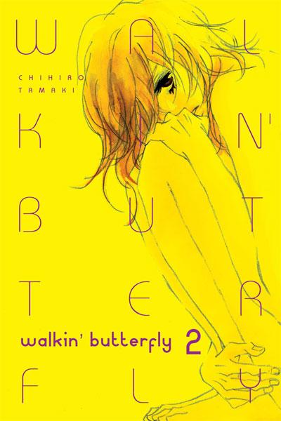
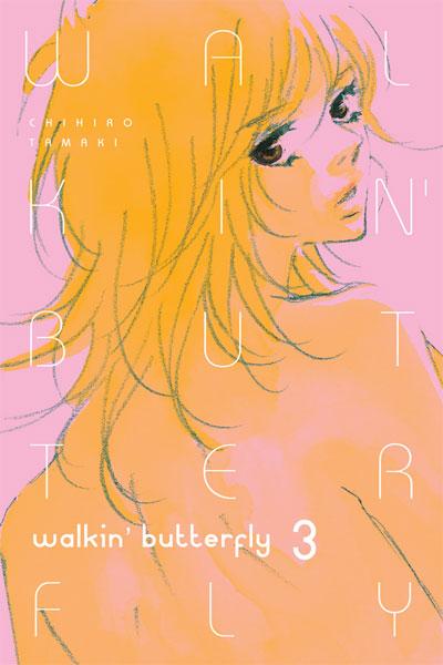
WALKIN’ BUTTERFLY Vols 1-3
By Chihiro Tamaki Released by Aurora Reviewer: Scott Green
There is plenty that is disquieting about fashion modeling... there's the notion that the person, in some sense, becomes an object for displaying the clothing... There are the disorders that often accompany the profession. These extra-textual considerations are likely to shade a reading of WALKIN’ BUTTERFLY. Yet, while these reservations are going to apply to a manga in which an awkward tomboy metamorphoses into a runway model, gathering the courage and certainty to present oneself on a stage for the world to see proves to be a useful platform for WALKIN’ BUTTERFLY to tell the kind of human, relatable story that shines when told through josei manga.As much respect as manga receives in North America for its mature content, specifically mature manga, written for upper teen or adult audiences, has faced difficulty penetrating the market. Some business manga has been published. Some alternative and gekiga have been cheery picked. Manga for late teen/older male, seinen audience (BLADE OF THE IMMORTAL, GANTZ, BERSERK) were some of the earlier manga published into the comic market, and the genre has maintained a presence. If any of these crack the shoujo (younger female) and shounen (younger male) dominated best seller lists, it tends to be seinen, with a BATTLE ROYALE sneaking in after the new NARUTO, BLEACH, DEATH NOTE, ect.
Then, there's the story of josei manga, or "ladies" titles, typically written for older teenage female readers or young women. Unlike shoujo, which generally depict young women in scholastic environments contending with the drama of maintaining their relationships, in josei, if the heroine is not attempting to juggle establishing the relationship that is expected to persist throughout their adult life with establishing a career, then the character is at least pressured in that direction.
Given its audience, subject matter and tone, josei manga has inspired comparisons to "chick lit." Unfortunately the success of chick lit prose has eluded josei, which has frequently not received much publisher support, sales support or fan support. A number of publishers, most notably Tokyopop (HAPPY MANIA, Erica Sakurazawa's works, TRAMPS LIKE US) have released josei titles, but pushes like Tokyopop's vapor-imprint "Manga After Hours" and inroads into the chick lit markets never really happened. (For talk on the fate of Manga After Hours, read this conversation )
Beyond the outreach efforts, josei has faced difficulty establishing itself as a brand among North American manga readers. On one hand, there has been confusion about what constitutes a shoujo manga title versus a josei title versus a seinen title, exacerbated by the prominence of titles that are difficult to pin down without looking at the anthology in which they were initially published (for example Honey and Clover or Nana). On the other, the genre was introduced to North America through some particularly divisive titles. Moyoco Anno's evil anti-rom-com HAPPY MANIA is one of my favorite manga series, but if you look at the user rating on Anime News Network, rarely will you see a title with feedback so evenly distributed between admiration, loathing and indifference.
While many North American manga publishers have taken a tentative approach towards josei, Aurora is by design an outlet for the genre. In fact, they are an affiliate of Ohzora Publishing, the home to Japanese anthologies HALEQUIN, MELLOW MELLOW, MIST MAGAZINE and RENAI REVOLUTION. From their mission statement "Aurora Publishing, Inc. is dedicated to creating manga of the highest artistic quality with the highest entertainment value for females of all ages...
 Japanese manga originated as entertainment for children, and eventually developed into entertainment for youth. It has expanded to include such a wide array of diverse genres that it is now enjoyed by adults, young and old. One of the reasons why Japanese manga has been so successful is because it uniquely describes human emotions...”
Sex and romance have roles in WALKIN’ BUTTERFLY, but they are not quite as pronounced as they might be in other josei. However Chihiro Tamaki's manga is, in part, driven by the adult pressures of profession and relationships. As a child, as an adolescent, and now as a young adult Michiko felt ostracized by her exceptional height. The manga opens with Michiko working on the greasy undercarriage of a car while her mind wonders to being rejected as a "Gulliver" by a would-be high school boyfriend. This particular day doesn't prove to be a boost to her self confidence either. Pair of customers walk into the mechanic shop and start teasing Michiko about her pro-wrestling potential. Her temper flares and she sends the guys packing. This isn't exactly seen as appropriate employee behavior, and Michiko is given a brisk, unceremonious send-off. She storms home to her mother's beauty parlor/apartment, where her mother expresses exasperation over Michiko's fits, and puts in a few jab about selling Michiko to the circus.
After a bender of self destructive behavior and soul searching, Michiko takes a pizza delivery job out of sheer necessity. Following some harassment by a new co-worker who kids Michiko about her athletic potential, she takes the business' moped and zips off to take the pizza to a random auditorium. She arrives to find tall women bustling around, dressing in flashy clothes, and receiving make-up application. With everyone preparing for a fashion show, the organizers assume that Michiko's a late replacement, and get her outfitted and made-up with moments to spare. However, on her way out to the runway, the fashion designer whose work is being showcased, stops Michiko, accusing her of being an "ordinary amazon" rather than a model. After forcing her way onto the stage, Michiko proves the designer right. The sea of faces observing the runway transform into a horror movie field of specters, and Michiko bolts.
The runaway incident proves to be the final existential straw.. a final rejection that she can't abide by. In response, Michiko dedicates herself to earning a spot in the world of modeling, and a spot in one of the designer's future showcase. In a sense, this is the sort of "I'll be the best ..." that drives a hefty share of manga from shounen fighting tournaments to mahjong titles. And, WALKIN’ BUTTERFLY inherits many of the tropes of these stories, from an eccentric mentor to the Karate Kid random tasks.
As opposed to a manga in which the protagonist strives to beat an opponent, win a competition or achieve a prestigious post, WALKIN’ BUTTERFLY pegs its goal towards Michiko's personal acceptance and her relationship with the designer. These are soft targets. The flood walls could break at any arbitrary point, and some epiphany could bridge a divide in any stage of Michiko's journey to her goal. Author Chihiro Tamaki's challenge is to keep the progression a matter of natural evolution and not a journey defined by sudden obstacles and forced regressions.
While Michiko manages to achieve some mastery over her fate as a model, Tamaki still has her reacting to stimuli entirely outside her control. Ultimately, Tamaki succeeds in keeping the manga character driven rather than plot driven, but by necessity, this keeps WALKIN’ BUTTERFLY brief. By the end of the three volumes that were read for this review, it feels like time to put the pieces in place for a finale or risk straining credulity. And, Tamaki manages just that, ending WALKIN’ BUTTERFLY in volume four.
 What makes WALKIN’ BUTTERFLY a compelling story is that though it's heroine is physically unusual, though she stumbles into rare opportunities, her struggles are universal. The manga's emphasis is not that Michiko is a diamond in the rough. It's that she has to get past herself. She has to stop blaming her height and ignorant reactions to that height for her counterproductive behavior and self-distain. You might not be interested in fashion or the particulars of Michiko's history, but, in practice, it's not a niche story, and it's told affectingly through the expressiveness of manga.
If there's one complaint about Aurora's otherwise admirable release of WALKIN’ BUTTERFLY, it's that the title could have benefited from the inclusion of cultural notes. Aurora does not seem adverse to producing supplemental material for the manga's North American release. Volume one features what appears to be an original interview with the manga's creator, but beyond that, the release does not explicitly bridge differences between its original audience and its North American one. By no means does the manga wash away its native cultural context, and the experience of the characters in WALKIN’ BUTTERFLY talk to the struggles of Japanese models on the international scene. The translation receives high marks for the natural quality to the dialog, but a noticeable element is that there are some minor bits, such as song lyrics, that emphasize the familiar rather than represent something more literal and explain it through foot notes or end notes. Since visual references can't be handled in this way, some might be lost in translation. While the chief traditional reference, an unfinished daruma, can be sussed out from the context, the significance of Michiko's allusion to classic shounen manga, such as FIST OF THE NORTH STAR and especially the boxing title ASHITA NO JOE, might be more allusive.
Scott Green has been writing for AICN ANIME for close to seven years. If you like what you see here and love anime & manga, be sure to check out his latest AICN ANIME column here.

FINAL CRISIS: REVELATIONS #3 DC Comics
I have to admit, I’m still a bit ambivalent on the main FINAL CRISIS book. It intrigues me even as it confuses the hell out of me. But FINAL CRISIS: REVELATIONS is really working for me. I might not understand the whys and wherefores but clearly it’s end of the world time, and not in the standard science fictiony way, but in old school Biblical Apocalypse style. To see a world thrown into darkness, where friends and heroes are robbed of free will, where those still with free will are forced to question their faith in a God who could let such madness run wild, to see evil that looks pretty damn evil… it’s unsettling. And in this case at least in the small scale I get what’s going on, I follow what is going on with the characters and really give a damn what will happen to them. I wish I could say the same for the main CRISIS book. - Jinxo
SECRET INVASION: INHUMANS #3 (of 4) Marvel Comics
Man, these SECRET INVASION titles are hit and miss. This one, though, seems to be a winner, possibly because the Inhumans are just always damn cool and partially because the story of Black Bolt's involvement in all of these past big Marvel events (WORLD WAR HULK, SILENT WAR, ILLUMINATI, and now SECRET INVASION) makes for an interesting springboard for a miniseries. Other than Triton succumbing to Aquaman syndrome by shuttling him off to a water-world simply to give him something to do, this series is good in that it highlights the intricate weirdness that goes along with being an Inhuman. I'm glad Marvel is keeping the caliber high when it comes to this royal family. - Bug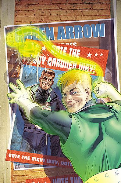
DCU: DECISIONS #2 (of 4) DC Comics
Trash, but in the best kind of way. There’s no way this series could fail to be worth a read. DC heroes trying to track down a (seemingly completely generic) serial killer gunning for the Presidential candidates while fighting amongst themselves over political alignments? At the very least it’s a cool historical anomaly. My only hope is that Winick and Willingham don’t rely too much on shock revelations of heroes’ political leanings and instead focus on the action adventure with the gloriously overblown subject matter they’ve got going for them. Could be a classic, but the Green Arrow/Green Lantern fight was a little lazy. - Stone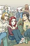
SPIDER-MAN LOVES MARY JANE #3 Marvel Comics
How can Terry Moore make the reality of RUNAWAYS feel so false and then make the reality of SPIDER-MAN LOVES MARY JANE feel so spot on authentic? This issue really just tells the story of a typical rainy high school day. That’s all. And yet it’s great stuff. As an adult I’ve mostly worked in buildings where you wouldn’t know if it was raining or sunny out. But I remember back to those Midwestern rainy school days, where whatever you were doing was underscored by the constant thrum of the rain and every once in awhile you jumped out of your seat and everything stopped for a second with a big crack of thunder… having to figure out how the hell to get home without getting thoroughly soaked. Meanwhile the teenage drama continues on around you. It’s all very small scale stuff compared to alien invasions but also stuff more easy to identify with if the writer really captures the reality of it, if he makes it ring true. Moore does that here. Equal props to Craig Rousseau’s drawings (I love that his credit is listed as “Drawings”). Where the Runaways characters look very rubbery and cartoony, the characters in SPIDER-MAN LOVES MARY JANE have an appealing simplicity of style. It gives you the feel of something Mary Jane herself might draw. It feels honest if that makes sense. - Jinxo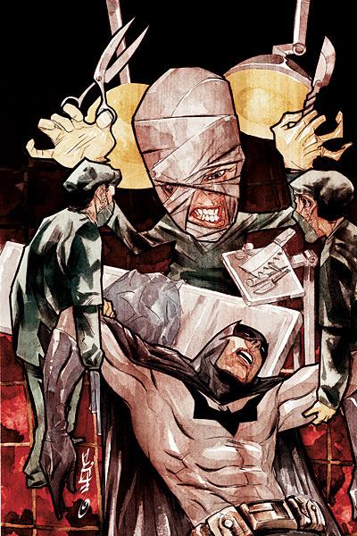
DETECTIVE COMICS #849 DC Comics
I don't think I have enjoyed one story featuring the villain Hush, until now. I guess the right writer can make any character interesting. And Paul Dini certainly shows he's the right man for the job here. Dini really doles out the thrills, pitting Bruce Wayne's childhood friend against Batman and Catwoman. Being one of the few villains who actually knows Batman's secret identity, Dini is able to make Hush truly formidable here, using an especially devious and interesting means to make Batman's life awful. The art by Dustin Nguyen helps a lot here. His lines seem scratched onto the paper, all ragged and sharp, which is fitting for the villainous doctor. All in all, a really great Batman tale is unfolding here. And bonus, unlike Morrison's jaunt into trippy-dippy land in BATMAN proper, you can actually follow the narrative here. – Bug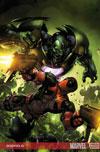
DEADPOOL #3 Marvel Comics
Ahhh. Another really enjoyable bit of SECRET INVASION. Oddly, though, this storyline didn’t merit the big SECRET INVASION cover banner. What’s up with that? Where is the love for mighty Marvel’s mercurial Merc? I mean this guy not only manages to do more hardcore damage to the Skrulls than most of the A-listers, he also at the same time manages to freak them out and make them look like idiots, all the while making me grin like an idiot. It won’t happen but the greatest ending to this whole invasion would be all the heroes in the Marvel universe being at a loss and then freaking Deadpool sends them all packing while making it look literally insanely easy. – Jinxo