
| #13 | 7/30/08 | #7 |
ARCHER & ARMSTRONG: FIRST IMPRESSIONS HC TPB
Writer: Jim, Shooter, Bob Layton, Barry Windsor-Smith Art: Barry Windsor-Smith Publisher: Valiant Comics Guest Reviewer: Ryan McLelland
Not since Batman & Robin has a more important duo hit the comic world than Archer and Armstrong. The Valiant comic book hit its stride right with its first issue thanks to the storytelling of co-creators Jim Shooter and Bob Layton along with the phenomenal art of co-creator Barry Windsor-Smith. It was innovative from the start as the book launched with a zero issue (instead of an issue 1 which nearly all comics start with) and a limited edition gold cover variant for collectors. The series introduced two characters who were key players in Valiant’s past, present, and future but most importantly the book was one thing above all: the best buddy team book of all time.It’s no surprise that Valiant Entertainment has chosen as its third deluxe hardcover to reprint the first seven issues of ARCHER & ARMSTRONG. While the previous hardcovers harkened back to the very early days of Valiant Comics ARCHER & ARMSTRONG: FIRST IMPRESSIONS brings together seven of the strongest issues ever put to print along with an all-new story by Jim Shooter and a new cover by infamous artist Michael Golden.
ARCHER & ARMSTRONG helped pave the way for many of the new Valiant titles by bringing together much of the old with the new. The old is Armstrong – an immortal who has walked the Earth for thousands of years. One of three such immortal brothers roaming the Valiant Universe, Armstrong is the guy who seems to fumble along in history, usually looking for the big party, and always one to tell stories of days long gone. He is hunted by a malicious group called The Sect who thinks Armstrong to be evil incarnate.
Archer, on the other hand, is a simple boy who finds out he is a Harbinger - a person born with extraordinary powers. After nearly dying by the hands of his parents he goes forth into the world on his journey, training with the most brilliant martial artists, and forging his powers into becoming a near unstoppable force. On his journey of revenge the two collide in Los Angeles and find a common enemy in The Sect. Drugged, blindfolded, and kidnapped the two find themselves trying to escape an enemy while trying to get to know each other. Is the man Archer is talking to who keeps babbling truly thousands of years old, is he truly just a bum with a mental problem?
This story is brought together brilliantly by Barry Windsor-Smith who would write and draw most of Archer and Armstrong’s early run. Windsor-Smith was already a legend in the comic world thanks to runs on comics like X-MEN and CONAN THE BARBARIAN when he came to Valiant but quickly saw his career resurrected to a superstar status thanks to his work on Valiant books like ARCHER & ARMSTRONG. Should there ever be a high point to his career one can easily look at his entire run on ARCHER & ARMSTRONG to note that the master storyteller was truly at his peak.
Valiant is going all out with their newest hardcover thanks to an all-new re-coloring of these classic issues, a dust jacket drawn by Golden, and the new all-new story by Shooter with artists Sal Velluto and Bob Almond. With ‘The Formation of the Sect’ Shooter goes back into Armstrong’s past to finally reveal why The Sect has been chased by the shadow organization for hundreds of years.
Updates like the new story and new coloring have readers new and old clamoring for these hardcover collections. ARCHER & ARMSTRONG: FIRST IMPRESSIONS truly delivers the goods from its very first page until the last where you can’t believe what a wonderful trip you’ve just taken with these two magnificent characters.
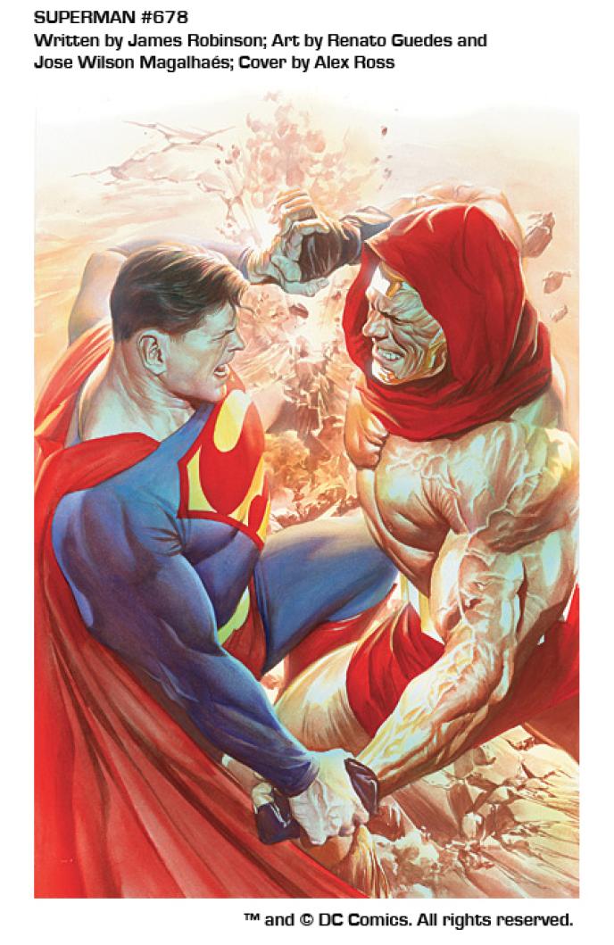
SUPERMAN# 678
Writer: James Robinson Penciller: Renato Guedes Published by: DC Comics Reviewed by: BottleImp
(Before any Talkbackers blast me for reviewing a book that’s been out for two weeks already, I’d just like to pre-empt my review by saying that I realize that this is late, but I was unable to submit this for last week’s column and I just have to get a few things off of my chest regarding this title. And what else is the internet for, if not egotistically proclaiming one’s own viewpoint as superior?)So here’s the deal with James Robinson’s SUPERMAN: I don’t think Robinson actually wants to write SUPERMAN. I think he’d be more comfortable writing a BRAVE & THE BOLD or DC COMICS PRESENTS kind of series. Why do I think this? Because his Superman is written badly—not the SUPERMAN comic as a whole, but the character himself. The plot is getting a little more interesting; we get to learn a little of Atlas’ back-story and how he came to Metropolis through some pretty nifty flashback sequences (rendered in a nice Kirby pastiche, unless some of these panels are reproductions of Kirby’s FIRST ISSUE SPECIAL Atlas artwork—I didn’t see any credit given to the King, so I’m assuming that it’s Guedes’ homage), and we’re given a small mystery in the shadowy military man who sets Atlas upon the city, but Superman himself is as flat and lifeless as the paper on which he is printed.
Anyone who has a passing knowledge of Robinson’s work knows that the man loves obscure characters, and this seems to be what this run on SUPERMAN is all about. Robinson has written Atlas as a much more engaging character than Superman, Lois Lane, Jimmy Olsen or the still-faceless, indistinguishable-from-one-another officers of the Metropolis Science Police (if Robinson is trying to make this part of Supes’ supporting cast as fully rounded as he wrote the O’Dare clan in STARMAN, he needs to tell Guedes to draw their damn faces clearly so the reader can tell them apart). Jimmy’s dialogue is annoying as hell, and out of character—he speaks in pseudo-philosophical sentence fragments that recall Jack Knight’s thought captions in STARMAN, only more disjointed. And Superman…
This isn’t the smart, charismatic Supes that we’ve seen as written by Kurt Busiek or Geoff Johns. Robinson’s Superman seems more like a thick-headed brawler, almost more of a Guy Gardner-esque thug type. When he’s fighting Atlas in the streets of Metropolis, he’s not fighting with intelligence—he’s slugging it out like a bully on the playground. Robinson’s interest clearly lies less in developing his title character and more in fleshing out the near-nil characterization of the all-but-forgotten Atlas. That’s why I fell that he’d be more comfortable at the helm of a title like B&TB…at least there Robinson would be able to fulfill his love of the DC fourth-stringers without having to worry too much about writing the flagship characters.
As for the artwork, I liked it a little better than the previous issue—there are a couple of nice splash pages and action shots (as well as the aforementioned Kirby clones), and the “ground beef” coloring on Atlas’ skin that bothered me so much last time has been toned down a little. I’m still not 100% sold on the muted color palette, but for the most part it looks okay. I’m going to give this series one more issue, but if something interesting doesn’t happen with Supes or Atlas (and if I STILL can’t tell those damn Science Police apart) I’ll be dropping SUPERMAN and spending my cash on more enjoyable fare.
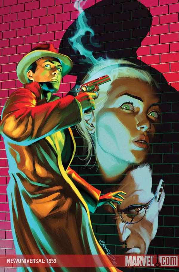
NEWUNIVERSAL: 1959 #1 (ONE-SHOT)
Writer: Kieron Gillen Artist: Greg Scott (with Kody Chamberlain) Publisher: Marvel Comics Reviewers: Squashua and Ambush Bug
Editor’s Note: This review is a compilation of two cheap shots done by two different @$$Holes. Both @$$Holes mistakenly reviewed the same book. Usually, in this instance, the two reviewers would have to fight it out in a cage surrounded by attack lemurs in order to see who’s review gets to make it to the column. Since our attack lemurs came down with a slight case of gout, we decided the only fair thing to do was run both reviews. They may overlap. They may redundify. They may differ. Have no fear, the attack lemurs are being treated as we speak and this will most assuredly not happen again.I wasn't going to pick this up. Nine times out of ten, every time a story switches writers, as a reader, I get burnt. Man, am I glad I picked this up. NEWUNIVERSAL1959 takes the super-hero analogues we're introduced to in Warren Ellis' re-imagining, and sets them square the late 1950's with an incredible amount of success. We watch the US government manage the fallout from "The Fireworks of 1953" (the pre-White Event White Event), and witness both the origins of Project Spitfire, and how they thwarted this particular incursion into real-space. Rather than act immediately, Spitfire decides to quietly analyze the situation through the lens of evolution, almost like a Meercat Manor, but with meercats who would tear your lungs out if you thought badly about them. The tone and sensibilities of the late '50s is an ever-flowing undercurrent felt throughout the plot and rendered exquisitely via the art, prevalent not only in the clothing styles and technology, but even in the manifestation of the '59 Justice. And to alleviate any lingering doubts, the semi-fan-groused inclusion of an Earth-555 Tony Stark ended up being quite natural to the story. Overall, 1959 is an excellent book, able to stand on its own or as part of the overall epic that is NEWUNIVERSAL; it's the next evolution in super-hero comics. - SQUASHUA
I approached this one shot with caution. I’ve been somewhat interested in how Ellis’ NEWUNIVERSAL is turning out, but again, the delays are really killing the momentum of this title for me. Should more of these one-shots come out, that may sustain the interest, but the work here turned in by writer Kieron Gillen is decent enough. As a stand alone, this is a pretty morbid tale that involves the last time the White Event occurred and how the government responded to it. Gillen does a decent job of keeping the ball Ellis reimagined rolling but adds little to the mythos that couldn’t have been summed up (and has been summed up, I believe) in a few panels of the regular series. Greg Scott (I believe this is no relation to the former @$$Hole by the same name, but I could be wrong) is a surprise here. Like Sal Larocca from the NEWUNIVERSAL series, Scott has a tendency to make his characters look almost too much like the Hollywood stars the artist is referencing. This stunt-casting pencil work is often very distracting, but Scott tones it down a bit compared to his previous work at BOOM! Studios. All in all, a decent read, but other than the guest appearance from a guy who has made waaaaay too many guest appearances in the last two years throughout the Marvel titles, it regretfully turns out to be a forgettable stand-in for the ongoing series. - AMBUSH BUG
Well, there you have it. Two views. One review.
No attack lemurs were harmed in the making of this review.
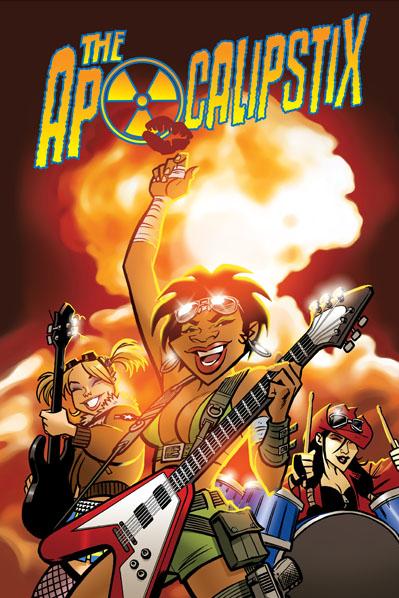
THE APOCALIPSTIX V1
Words: Ray Fawkes Pencils: Cameron Stewart Publisher: Oni Press Reviewed by Humphrey Lee
THE APOCALIPSTIX is a rarity of a comic book: something that lives up perfectly to its billing. "Josie and the Pussycats meets Mad Max" is the claim this book makes and that right there describes it better than I could. THE APOCALIPSTIX, in my opinion, is falling in line with such other band/music-thematic titles from Oni like BLACK METAL and the always popular SCOTT PILGRIM in that it is just one of those works that is there to have as much fun romping about as it can. The premise alone should tell you that: an all girl rock trio survive nuclear holocaust and continue to live in the post-apocalyptic world the only way they know how to: Rocking. As you can imagine, hi-jinks ensue.Once this book gets past the first couple pages of setup it immediately moves into the same kind of tone I like from my music: fast and dirty. Perfectly honest, if there was any major down point I guess I would hang on this book, it's that it is a shockingly quick read. Start to finish, I'd be amazed if this took me twenty minutes to consume. But there's a good reason for that as the brunt of what drives this book are its visuals, and considering those are coming via the talented hand of Cameron Stewart that's a big motivation to give this little ditty another once over as soon as you finish.
THE APOCALIPSTIX definitely hits on all the notes you'd expect to see in a book where the keywords involved are "music", "nuclear", and "apocalyptic". You've got your fair share of vehicular violence, Insects of Unusual Shape and Size (thank you “Princess Bride”), and of course your frantic Battle of the Bands finisher. The cast is an enjoyable gathering of femininity too, with your strong lead Mandy, the ditsy Dot rockin’ the long neck, and the mostly quiet (because no one can understand her) badass Megumi on the drums. They're definitely a fun little troupe, and play well off each other and fit the hyper-kinetic pace of the book as well.
The real star of the show though, like I mentioned earlier, is definitely the visuals. The main selling point of this book would definitely be the ass-kickery, and Cameron Stewart brings that here in spades. Definitely more SEAGUY than THE OTHER SIDE as we're more in cartoon territory here than anything ultra-realistic, it's the thrill of watching the girls kick some Sand Pirate ass, or battle a hive of irradiated ants, and whatever other over-the-top mischief these girls find themselves in that keeps the pages flipping. And seeing just how much he can cram in each page and panel what with all the ruins to view and the explosions and rabid crowds that despite the "end times" still just want to see a kickin’ rock show - this book is a visual feast. The man definitely knows his instrument.
More a pleasant distraction than anything given how relatively short it is, THE APOCALIPSTIX is still a great fix if you're in the mood for something fun and that doesn't take itself terribly seriously. Cool setting, cool characters and some great, explosive art. Definitely worth the old look-see as you're sitting about between your SCOTT PILGRIM fixes. (And, because that's as good a segue as any, for those of you who are in the Toronto, Ontario area you can get an early dose of THE APOCALIPSTIX later tonight, August 6th. Details here. )
Humphrey Lee has been an avid comic book reader going on fifteen years now and a contributor to Ain't It Cool comics for quite a few as well. In fact, reading comics is about all he does in his free time and where all the money from his day job wages goes to - funding his comic book habit so he can talk about them to you, our loyal readers (lucky you). He's a bit of a social networking whore, so you can find him all over the Interwebs on sites like Twitter, The MySpaces, and a Blogger Account where he also mostly talks about comics with his free time because he hasn't the slightest semblance of a life. Sad but true, and he gladly encourages you to add, read, and comment as you will.
Be sure to look out for a Q & @ with Cameron Stewart on APOCALIPSTIX in this Monday’s AICN Comics News: Shoot the Messenger column by Humphrey Lee
JUSTICE SOCIETY OF AMERICA ANNUAL #1
Writer: Geoff Johns Art: Jerry Ordway (pencils), Bob Wiacek (inks) Publisher: DC Comics Reviewer: Ambush Bug
After reading many a Geoff Johns book, there are two things I know about Geoff Johns. He loves introducing new characters in interesting ways AND he seems to love the concept of multiple Earths in the DCU.Now, I'm all for introducing or reintroducing characters in the new DCU. It's one of the reasons I've been a dedicated JSA follower since the beginning. I love the sense of history and tradition that Johns does so well in this book in both of its incarnations (first as JSA and now with this new JUSTICE SOCIETY OF AMERICA series). Crimson Avenger aside, Johns does a good job of taking an old character and injecting the cool back into them. Or maybe he's injecting cool into a character that has never been cool.
The problem here is that it seems Johns loves reintroducing these new/old characters so much that sometimes it takes place of moving the actual story along. I used to work as a doorman/security in a neighborhood bar. My (extremely intellectually stimulating) job was to let people in the door and greet them in a courteous manner. Their first few steps in the place were crucial because that often set the tone for the rest of the night, so I would make sure to greet the regulars by name and a handshake and try my best to make the newbs feel at home too. The frustrating part of the job was when one person after another would come in, filling the bar to the gills, thus making for a cramped and not-so-fun experience for all. My job was to regulate that so that, even though there may be a line out front, we didn't have too many people in the bar.
The problem with Geoff Johns' JUSTICE SOCIETY OF AMERICA is that it's in need of a proper doorman. Again, I love all of these characters Johns is introducing, but there are just way too many of them bumping around each other and now, in this JSA ANNUAL, we've got a whole new team of characters ripe for a Johns-ing. Tis being a team from Earth 2 makes it a bit more understandable because it looks that the teams will be at odds soon rather than joining up, but still, the bar is pretty crowded, folks.
What I've realized, though, after complaining about JUSTICE SOCIETY OF AMERICA's penchant for collecting team members, is that it really has just been a showcase for new characters so far. Not until the latest Gog storyline has the team had to function as a workable unit and this overcrowding situation is being addressed somewhat in the book lately, which is much appreciated. It does get a bit confusing as to what personality flaw/trait/curio each character has in this book due to the large cast. But as long as these introductory stories stay strong, then I'm willing to forgive Mr. Johns for packing the bar so full.
And the stories have been strong. Strong enough for me to actually like a story involving a multiple Earth. I'm not a fan of the 52. To me, 52 versions of one set of characters (to borrow a term from across the comic book company pond) makes my head hurt, Stretcho. Sure, we get the fun of Superman of Earth 23 sneezing and Superman of Earth 41 saying, "Bless you!" But after that it gets a bit redundant to me.
Johns, though, has made this Earth 2 story interesting to me. I guess it has to do with the fact that he doesn't have multiple versions of characters interacting with each other (at least not yet). He's got Power Girl fresh from being wished away by Gog, showing up on Earth 2 just in time for a bit of drama to unfold with her old friend Huntress. The story is paced well with Power Girl's appearance causing massive confusion to the Justice Society Infinity, which is comprised of most of the members of Infinity Inc. (not the Steel-led version one, but the one from the old INFINITY INC ser--oh forget it). There are some cool moments between Huntress and Power Girl illustrating how close they were before Power Girl vanished to Earth 1. And the twist towards the end sets the stage for what looks to be a battle of the titans. There was a moment there that I thought the Huntress was going to get all L-WORD with Power Girl, which would have been fine, but I'm glad Johns didn't go this way because I think it would have amped up the melodrama to a level that makes the eyes roll. Having the Huntress simply miss her friend is pretty dramatic enough. Plus this issue has a Johns-written old Joker in it, which makes the comic worth the purchase alone.
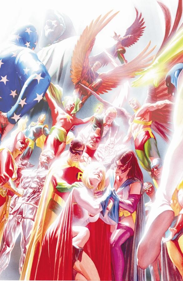
Still honoring the sense of tradition that permeates this book, Johns opens a new chapter and it's a chapter I'm willing to get into despite my feelings about multiple Earths. Maybe Johns will sway those negative thoughts. His love for the DC Silver Age is pretty infectious, especially with Jerry Ordway's phenomenal pencils and Bob Wiacek's crisp, clean inks. The art team peppers in old standby shots such as floating heads, and who doesn't love a good team shot with the entire cast sitting around the table debating about stuff that superheroes debate about around a table?
 Speaking of art, there's a kick @$$ Earth 1 roster shot of the current JSA highlighting more character and fun and a boatload of comics combined. I believe it's Dale Eaglesham, although it's uncredited in the book. This double page pin-up is poster worthy and reminds me of the double page splash from JLA #195 (original series) that, as a kid, I ignorantly tore from my comic depicting both the Justice League and the Justice Society when they took on the Ultra-Humanite, the Mist, Ragdoll, Psycho Pirate, and a bunch of other DC villains. I hung that bad boy up with pride on my wall as a kid and I’m damn near tempted to embrace my inner child and mush my inner comic book collector in the face and hang up the pin-up from this issue on the wall too.
I've always been a fan of Geoff Johns and probably will be as long as he puts pen to paper. Although I've given the current JUSTICE SOCIETY OF AMERICA a hard time, that doesn't mean that the comic and stories aren't great. Sure, there are too many members. Sure, the Gog storyline is kind of spinning its wheels. But the care Johns puts into the traditions that the DCU is built upon is present on every page and greatly appreciated by this fan. This Annual is another testament to both Johns’ strengths as a writer and the typical style you would find in any Johns-penned book.
Ambush Bug is Mark L. Miller, reviewer and co-editor of AICN Comics for over seven years. Look for his first published work in MUSCLES & FIGHTS 3 (AVAILABLE NOW!) at Muscles & Fights.com. Check out a five page preview on his ComicSpace page. Bug was recently interviewed here and here at Cream City about indie comics, his own artistic process, the comics industry, and other shades of bullsquat. Look for Bug’s follow-up this Fall in MUSCLES & FRIGHTS!

H.P.LOVECRAFT’S HAUNT OF HORROR #2 (of 3)
Adapted and Illustrated by: Richard Corben Published by: Marvel MAX
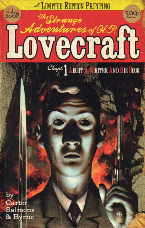
THE STRANGE ADVENTURES OF H.P. LOVECRAFT: CHAPTER 1
Writer: Mac Carter Pencils and Inks: Tony Salmons Cover and Colors by: Adam Byrne Published by: Mac Carter, Jeff Blitz and Adam Byrne Reviewed by: BottleImp
I am an H.P. Lovecraft junkie. I have a shelf chock full of paperbacks collecting his works, as well as several anthologies that feature Lovecraftian fiction by writers both new and old. The worst of these stories are much like the lesser writings of Lovecraft himself: somewhat formulaic (a student of the macabre is drawn into a world of dark secrets and alien dimensions, he sees something indescribable that threatens his very sanity, and crisis is nearly avoided…or is it?), somewhat predictable, and somewhat boring. The best Lovecraftian fiction accentuates the sense of cosmic horror and mystery that pervades the Old Gent’s best work (in tales such as “Dreams in the Witch-House,” “The Rats in the Walls,” and the grandiose “At the Mountains of Madness”). And it’s a good time for Lovecraft fans who happen to be comic book readers (somehow I think that those two circles overlap quite a bit), because there’s a lot of Lovecraft out there, from BOOM! Studios’ CTHULHU TALES and FALL OF CTHULHU to the titles I’m reviewing for this week, which tend to get Lovecraft’s ideas right more often than not.Richard Corben’s grotesque, slightly cartoony characters and his textural hatched-style drawings are a wonderful match for Lovecraft’s writing, but this series keeps leaving me a little cold. Part of the problem was mentioned in my fellow @$$hole’s review of HofH #1—the inclusion of the original text for each story means that there’s less space for Corben to showcase his artwork. It’s not a problem with the shorter tales which were inspired by Lovecraft’s poetry—in fact, I like that the reader gets to see how Corben used these short verses as a springboard to a (slightly) more fleshed-out horror tale. But with the longer adaptations, in this issue being “The Music of Erich Zann,” multiple pages are wasted on the original text (seven pages in this case) that would have been better served in the visual adaptation. The narrator in “Zann” looks out onto a scene of unimaginable cosmic horror at the climax of the story…and this image is reduced to less than half a page. The shorter stories fare a little better, since as I mentioned they’re more “inspired by” Lovecraft than “adapted from,” but I still would have liked to see more emphasis placed on the artwork than the source material…comics ARE a visual medium, after all.
Later contributors to the Lovecraft “Cthulhu Mythos” would often include H.P. himself in their tales, either in oblique reference or as an outright character. Such is the case with THE STRANGE ADVENTURES OF H.P. LOVECRAFT, which, following a prologue depicting the death of Necronomicon author Abdul Alhazred, dives right in to Lovecraft’s world of the 1920s. There are some real details of Lovecraft’s life presented here--his two elderly aunts with whom he lived, the lackluster reaction his strange stories would receive from the pulp magazine publishers--and then there are the invented bits: a love triangle with a vivacious librarian and a wealthy bachelor, an encounter with the famed Necronomicon in a university library, and Lovecraft’s inevitable realization that the monsters he thought were fiction are all too real.
As I said, putting Lovecraft in the middle of his stories is nothing new, and it’s a shame that Vertigo published the similarly-themed (thought more Freudian and psychosexual) LOVECRAFT hardcover only a few years ago—the comparison between these two works will be inevitable, although it seems as if Carter is going for more of a “men’s adventure magazine” feel with this series rather than anything so cerebral. Despite the familiar set-up, I really liked this book—Salmons’ loose, somewhat scratchy artwork reminds me alternately of Matt Wagner and Teddy Kristiansen, and fits perfectly with the slow-building tension and sense of horror that Carter builds up through this issue. Byrne’s color palette adds the final touches of gloom to the Providence streets, as well as the horror that is only beginning to emerge through Lovecraft’s mind.
I picked up this comic from the creators’ booth at the San Diego Comic-Con—we chatted a few minutes about Lovecraft (what else?)—but I have yet to see it on the stands at any comic shop. Hopefully this title will be published in wider circulation before long—we Lovecraft junkies like to feed our monkeys as often as we can, and THE STRANGE ADVENTURES OF H.P. LOVECRAFT is good food indeed.

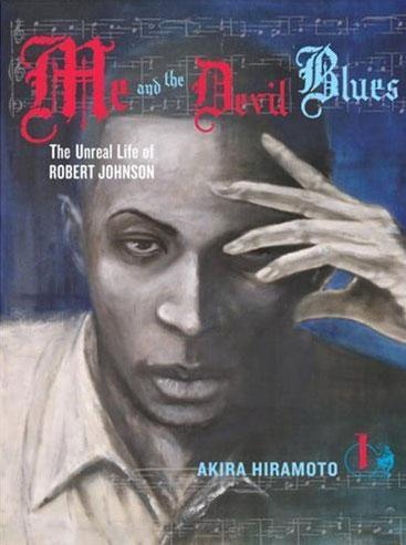
ME AND THE DEVIL BLUES: THE UNREAL LIFE OF ROBERT JOHNSON
By Akira Hiramoto Released by Del Rey Manga Reviewer: Scott Green
ME AND THE DEVIL BLUES becomes a phantasmagoric odyssey through a landscape of sorrow and punishment, but in it's early chapters, it fails to answer the concern as to whether a manga retelling of the Faustian legendary life of influential Blues musician Robert Johnson would offer anything beyond the unexpected pairing of subject and medium.Hiramoto's manga opens with a mythic history of the Blues as the story percolates out of the hazy blackness, starting with its birth in PARADISE LOST. In a small, wooden structure that looks like the last dwelling on earth, situated on a barren landscape, Robert Johnson pulls himself out of sleep to answer a knock at the door. An expressionist face in the blackness greets him by moaning back "It's me... I've come for you."
Then, he's woken up into his real world, and this time, he's greeted by his exasperated, pregnant wife haranguing him. The day does not improve when his arrival at the field is met by his sister striking him with a leaping kick before berating him. "RJ! You about to be a daddy, and just look atcha! A man who don't work ain't no bettah than trash!"
The entire journey, from the time "RJ" spent in his home community, yearning to be a Blues man, to his pact with the devil and his later wanderings are abstract. RJ's visions of temptation bleed into his reality, smearing his sense of time and of himself, but beyond that, the people with which he interacts are frequently more shades than solidly defined individuals. Certain Blues men and his unlikely road-mate for the manga, Clyde Barrow, share RJ's depth, but much of the rest of the world seem to be merely playing out parts. At home, there is his hefty, church avowing sister and her cowed husband... the petite, flirtatious woman with the imposing, violent husband and so on. On the road, he stops in one inhospitable community with its own strict sense of judgment, then another.
The mythical currents in the story of Robert Johnson open doors for ME AND THE DEVIL BLUES. If RJ is a Blues Gulliver or Pilgrim, metaphorically washing up on the Southern equivalent of an island of the Cyclops is a compelling way of working with the fantastic without turning the manga into fantasy. However, race and racial sensitivity are dicey issues especially when the framework is constructed by an outsider. Regardless of the amount of reverence that went into creating ME AND THE DEVIL BLUES, opening the manga with caricatures, and caricatures with a racial dimension, is problematic. Especially in the first chapter, when events have not begun to give RJ something substantial to react to, seeing lines like "we was s'posed to hit the juke, remember?," not knowing the linguistics of the time and place, the dialog itself provokes a "I just hope this was careful, and correct" sentiment. At least from the standpoint of an American reader, the manga could have benefited from starting from a more naturalistic footing before making its descent.
Once RJ starts literally and figuratively moving down the road of the Blues player, the character and the manga assume the intrigue of mystery. Jordan falls sway to the pull of the Blues, though it isn't something that he can intellectualize or rationally understand. At the same time, the charisma behind the character in the manga is the impenetrable intensity behind his gaze and yearnings.
Reading ME AND THE DEVIL BLUES is a lot like staring at someone who is staring into the distance. Akira Hiramoto abandons genre accessibility. The drive to be the best is frequently its own justification in manga. That's not simply restricted to POKEMON, NARUTO, and other children's/adolescent manga. Business, golf, mahjong, pachinko, just about any endeavor that can hold someone’s interest has its own manga series, and in many cases, the impetus is "I'll be the best." In contrast, RJ's story is not so reducible. Nor does Hiramoto lay out an explicit alternative. In a telling scene, Clyde and RJ spend a night at a campfire, but as they pour out their souls, their thoughts are hidden, half formed or in the words repeated quotes. When the pair do match thoughts, it takes the form of a metaphor rather than something explicitly articulated.
ME AND THE DEVIL BLUES is a seinen manga, which ran in the anthology AFTERNOON, home of intelligent, violent titles like BLAME!, EDEN, BLADE OF THE IMMORTAL, PARASYTE, and SHADOW STAR, as well as older-ish audience comedies like OH! MY GODDESS and GENSHIKEN. For thoughtful seinen, DRAGON BALL Z explicit exposition is not entirely expected, but it is not entirely alien either. For example, Manji, the scarred, stray cat ronin protagonist of BLADE OF THE IMMORTAL is far from gregarious and far from a philosopher, but he does explain his history and his thoughts. Generally, a smart seinen is going to offer its reader a clear guidepost pointing out the direction to ponder.
Like VAGABOND, Takehiko Inoue's manga version of the fictional biography of the great swordsman Miyamoto Musashi, ME AND THE DEVIL BLUES seeks to step into the head of an innovator whose genius is tied to his unconventional mind. Inoue used images to slow down the thought process, until the beading sweat and crackling synapses of Musashi and his rivals could be seen. Hiramoto takes an approach where he leaps into expressionism or alternatively, realism that is less abstracted than most manga, paired with telling eyes. Whether it is trying to read into the eyes of the characters or the wild representations of their thoughts, it's easy to drown in the images present by ME AND THE DEVIL BLUES.
ME AND THE DEVIL BLUES offers far more than the novelty of seeing manga retell the story of a famous Blues musician. It is something other than fact and other than the stories told through Johnson's music. Yet, evoking the tension of the time and place as well as Johnson's personal demons, it still arrives at something effectively similar to the spell of Johnson strumming his guitar. Despite any broad missteps, Hiramoto offers something sublime in the soulful eyes of his subjects.
Scott Green has been writing for AICN ANIME for close to seven years. If you like what you see here and love anime & manga, be sure to check out his latest AICN ANIME column here.

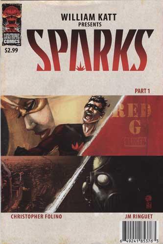
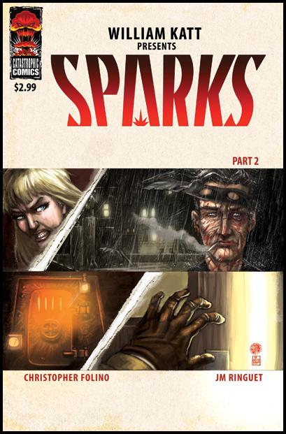
SPARKS # 1 & 2
Created by: William Katt and Chris Folino Art by: JM Ringuet Published by: Catastrophic Comics Reviewed by: superhero
I have to admit, much of what's chased me away from comic book reading in the past several years has much to do with how dark many of the books out there have become. Yes, it's true that I appreciate an AUTHORITY or an ULTIMATES as much as the next fanboy but when the darkness of those books happens to bleed into the so-called mainstream comics it just starts to drive me a bit crazy. It's not that I don't like dark comics, but I feel that there's a place for that kind of storytelling. And it's not necessarily in the pages of AMAZING SPIDER-MAN or SUPERMAN.However, if you're like me and you do appreciate a solid, moody take on super heroes every once in a while then SPARKS would definitely be a book to check out.
SPARKS tells the tale of a young man with a dream. His dream is to become a top crime fighter in the big city. From the moment he loses his parents (in a particularly tragic and gruesome origin tale) he knows that it's his destiny to be a super. To fight the good fight. And he does. He makes his way to the big time and becomes the champion of the oppressed that he always wanted to be. He's the idol of millions, he's got the respect of law enforcement and, hell, he even captures the heart of the city's gorgeous super heroine. Everything's going great for him…and wouldn't you know it? That's exactly when his world gets turned to shit.
And that's precisely what makes this book work. It's obvious from the opening pages that this is not going to be some kind of happy go lucky super hero tale. Heck, just looking at the art will tell you that. SPARKS is what happens when the super hero fantasy goes terribly wrong. That's what makes it interesting. As bad as things get in mainstream books or even stuff like the aforementioned AUTHORITY you know that you're never going to see a corporate owned character really get put through the paces. That's where SPARKS gets its strength from, in the fact that the storytellers give you the feeling from the first issue that things could go anywhere in this book. And they do. If you don't get the feeling that things aren't bad enough after reading the first issue then just wait 'til you get to the second issue. SPARKS will make you wonder just how much horrible stuff can a hero go through before he just can't take anymore.
But that doesn't make the book unreadable. As a matter of fact it makes it strangely compelling. What kind of hope can a hero find who's had everything taken away from him? That's the question that makes me want to keep reading SPARKS. The story is well crafted enough that it reads like what it's supposed to be: super hero noir done right.
A lot of what helps sell the feel of the book is the artwork by JM Ringuet. From the opening pages you can see that you are in a world that is pretty much different than many of the comic books out there. The mood that Ringuet sets is a gloomy one but it fits the story's needs perfectly. I did have some issues with the characters seeming a bit stiff in some places but at the same time the style of the character renderings seemed to work within the context of everything else on the page. Any anatomical problems I had with the people in the story were obliterated by the beauty of Ringuet's digital paints. This guy is one to keep an eye on.
So if you're looking for something dark yet entertaining, much like THE DARK KNIGHT, the SPARKS is a book to put on your pull list. Hell, my monthly pull list is tiny these days but I'll be e-mailing my shop to get them to hold SPARKS for me. I'm just dying to see how it all turns out.
Discovered as a babe in an abandoned comic book storage box and bitten by a radioactive comic fan when he was a teenager, superhero is actually not-so mild mannered sometime designer & cartoonist, Kristian Horn of Los Angeles, California. He's been an @$$hole for three years. Some of his work can be seen at www.kristianhorn.com.
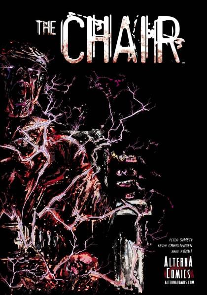
THE CHAIR OGN
Writer: Peter Simeti Artist: Kevin Christensen Publisher: Alterna Comics Reviewer: Optimous Douche
“Hey ya Torquemada what do you say?” “I just read THE CHAIR and it is A-O.K.”I dredge up this obscure Mel Brooks musical reference from “History of the World” because were THE CHAIR written several hundred years ago, the evil grand designer of the Spanish Inquisition would definitely have had a copy on his nightstand next to his severed head bead pan.
THE CHAIR didn’t sit well with me, nor should it sit well to anyone that claims to possess a modicum of sanity. Simeti paints a nightmarish landscape that takes the reader through the same agonizing mind raping as the main character. Richard Sullivan is a man serving time for…take a guess…a crime he did not commit. Immediately, though, the author avoids the entrapment of cliché by unveiling a prison of hellish atrocities. The guards are a Gestapo regime that serves an even crueler master. Piss pancakes for breakfast, the lopping off of limbs, and electrified bars make you wonder if this title is set in the real world or in some alternate dimension where the ACLU was never formed. Ultimately you find out the answer, but as with any good “reveal” you need to take the journey to fully appreciate the destination.
The book is strongest when Simeti crafts the pages like a Penn & Teller magic act, shifting between perception and reality without ever letting you know which is truly skewed. However, I really would have liked to have had more of that. It felt as though there was a little too much time developing the nightmare face of the prison in the beginning. Granted it gave artist Christensen the chance to show his strong spot (more on that in a second), but I got to the point where I wanted to know what the point was.
Christensen scratches into the page with charcoal ferocity in every panel where pain and suffering can be found. The use of unconventionally shaped text boxes adds to the eeriness to the dialogue and thoughts, which was a huge help in the thought heavy beginning of the book. I only really had two small issues with the art: one, too many people look like Liono of the Thundercats, Secondly, every man’s physique and build are the same, the perfect V torso sans love handles.
I enjoyed THE CHAIR and the twist it delivered to complete the story. Sure, this was depressing as hell from start to finish, but hey, we all need a little dose of unreality from time to time.
When Optimous Douche isn’t reading comics and misspelling the names of 80’s icons, he “transforms” into a corporate communications guru. Optimous is looking for artistry help, critical feedback and a little industry insight to get his original book AVERAGE JOE up, up and on the shelves. What if the entire world had super powers? Find out in the blog section of Optimous’ MySpace page to see some preview pages and leave comments.
Hey folks, Ambush Bug here. This week’s edition of Indie Jones presents…unearths a silent and violent comic, a comic strictly for the kiddies, one to tingle your spine with fear, and an awesome road movie in comic book form. Enjoy!
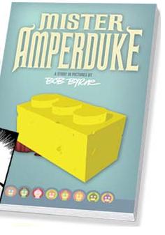
MISTER AMPERDUKE OGN Clamnuts Comix
Man, I love me a good silent comic and this is, in fact, one good silent comic. Not only does a good silent comic highlight art by omitting all of that space that normally would be blocked out by annoying word balloons, but it also highlights good writing. To communicate without using a word? Now that takes some talent. And Bob Byrne seems to have that in spades. Byrne has taken a simple story about a man who loves his Lego collection to a whole new level. Seems these Legos are actually alive and the main character, Mr. Sherman Amperduke, takes the role of God to these tiny block-like people. When Mr. Amperduke's brat grandson catches an especially devious looking bug called a Nechradon, all hell breaks loose in the tiny Lego village. It's CLOVERFIELD meets TOY STORY as these little toys battle this rampaging monster with everything they've got. The tension in this story is extremely high with the Nechradon tearing the village and the people in it to shreds. Lives are lost, carnage is unleashed, with Mr. Amperduke doing everything he can to save his little village from a big-little monster. Byrne, who also draws the book, never fails to add cool details like the sinewy insides of the broken toy men and the detailed blocks of Legos piled upon one another to make the structures of the town. This is a fun story, but also a tragic one because you really get to care about these little guys and seeing the disgusting monster tear people and things apart becomes a heartbreaking thing to behold. This was one of the strongest comics I've read this year. Anyone looking for something different and wholly original should seek this one out. Highly, highly, highly recommended.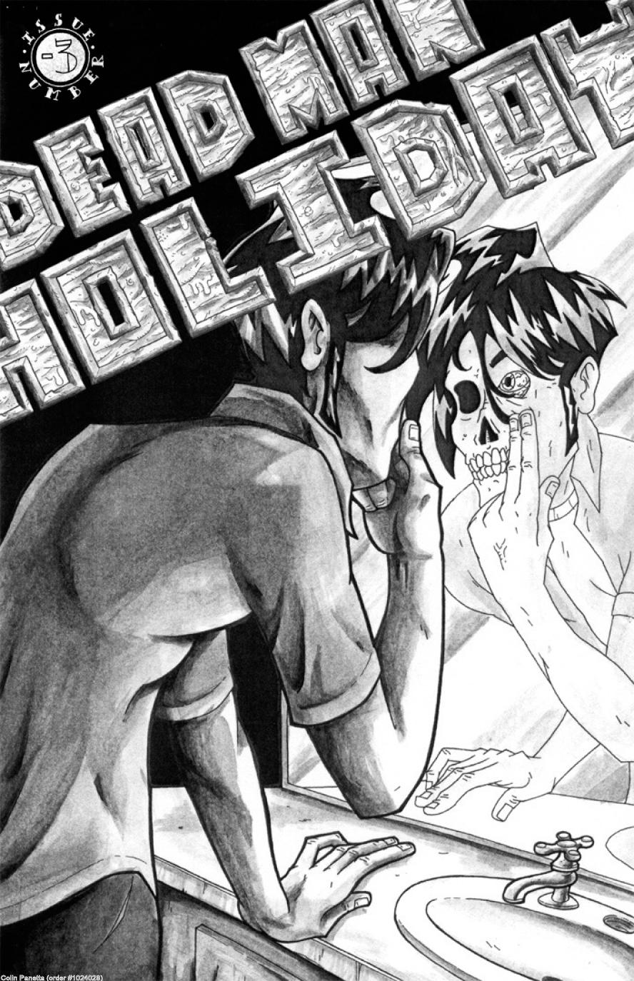
DEAD MAN HOLIDAY #-3 www.deadmanholiday.com
DEAD MAN HOLIDAY is prefaced by the author who proclaims that there really isn’t any personalized and sincere horror out there today. I tend to agree. This is one of those labor of love self-published comics that don’t get a lot of attention. That’s a damn shame and it’s also what Indie Jones is all about. I found this gentle blend of sci fi and horror to be a pleasant surprise. There are some really tense moments throughout this comic, especially a super-creepy scene with a costumed skeleton that just won’t seem to go away. The book started out with a weird set of silent pages. I’m not sure what that was all about. It kinda reminded me of a David Lynch film…I’m not sure what it is I’m seeing, but I’m fascinated nevertheless. The rest of the story follows an adventurer through a post-apocalyptic flooded land where he runs into a boss that says “I love you” all of the time and the aforementioned skeleton that won’t quit creepily following our hero. This black and white single issue is a very capable piece of work. There are enough quirks and attention to detail by the writer Colin Panetta to make this comic stand out from the herd as something with a lot of thought put into it. That type of passion makes this book worth reading and I encourage this artist to continue with this. I’m interested in seeing where it’s all going.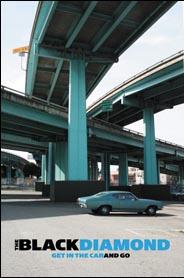
THE BLACK DIAMOND TPB AIT/Planet Lar
With the DEATH RACE movie coming out soon, you may want to bone up on your high octane racing stories with this book. But unlike that film, which really doesn't look that good to me, this book is entertaining from start to finish. Set in the near future, when overpopulation and violent crime has reached a high point and the fast paced world just isn't that fast enough anymore, comes THE BLACK DIAMOND, a set of interconnecting skyways where the rules of the road are go fast, get out of the way, or be blown out of the way. What writer Larry Young has created is a framework to build a whole slew of stories upon, as illustrated by various artists in the back-up features. It's a highway with no rules. There is no speed limit. And it's populated by gearheads, bikers, and gangs of road warriors. This spells trouble for Dr. McLaughlin, who has to use the highway to make it across the country ASAP in order to rescue his wife. I especially like the trippy ending of this over the top road movie of a book. In that final chapter alone, artist Jon Proctor earns his artistic wings of accomplishment with his stunning splash pages and iconic imagery. This book is presented here for the first time in color, so you can soak in an entire palette of color whole feasting on this cerebrally and visually satisfying treat.
JACK AND THE BOX HC OGN Toon Books, RAW Junior, Little Lit Library
I got three hardcover books from TOON BOOKS recently and when I cracked them open, I really didn't know what to expect. I chose Art Spiegelman's JACK AND THE BOX first because...hello?...MAUS, anyone? To my surprise, this is a kids’ book, and not a bad one at that. It's sweet and sincere and straight-forward and everything I'm not used to in a comic. As I was reading it, I was waiting for the punch line, but it never came. This is just a sweet book geared towards young kids and filled with humor that I imagine kids would find extremely funny. The story is pretty simple as it follows Jack as he discovers a box with a funny clown inside. The clown scares Jack over and over by jumping out. But it's not a scary or creepy book. It's definitely suitable for young readers, plus it is written and drawn by one of the most influential creators in comics. If you're looking for comics to introduce your young ’un to, this is where you should look. I could see parents reading this book to their children before bedtime over and over again. If you're a comic fan and have kids, you've got to check this one out.Remember, if you have an indie book that needs to be discovered by Indie Jones, be sure to zip an email to your favorite @$$Hole to have them give it a look. If you’ve sent in a PDF or hard copy of a comic to Indie Jones or dot.comics, fear not, it will be covered in a future column, we’re just a bit backed up right now.

REIGN IN HELL #1 DC Comics
Not sure about this one yet, but I've read enough Keith Giffen books to make me stick around to see what the "hell" develops with this one. Seems Satanus is challenging Neron for the throne of Hell, by promising freedom to all of Hell's lost souls. Of course, Neron isn't happy about it, so the two decide to have a tickle fight...OK, they don't do that, but Giffen does lay out a pretty nice battlefield with two formidable armies at each side and ready to fight. Tom Derenick's pencils are good and it's especially nice to see the choppy inks of Bill Sienkiewicz over the top of them. But I'm not a hundred percent sure about this one yet. I did love the back-up story by Giffen with art by Stephen Jorge Segovia. It's a stylistic yarn about Dr. Thirteen as he's feeling the effects of the war in hell on earth. But the coolest thing about this back-up was the appearance of both Ralph and Sue Dibney as ghosts. I'd pay good money to see these two ghostly detectives in their own ongoing series. With Plastic Man bouncing around the DCU, Ralph Dibney started to become redundant, but now that he's trying to solve mysteries as a ghost with his wife, a new puff of life has been breathed into the character for me. Here's hoping we see more ghostly Ralph & Sue, if not in this miniseries, then in something else real soon. - Bug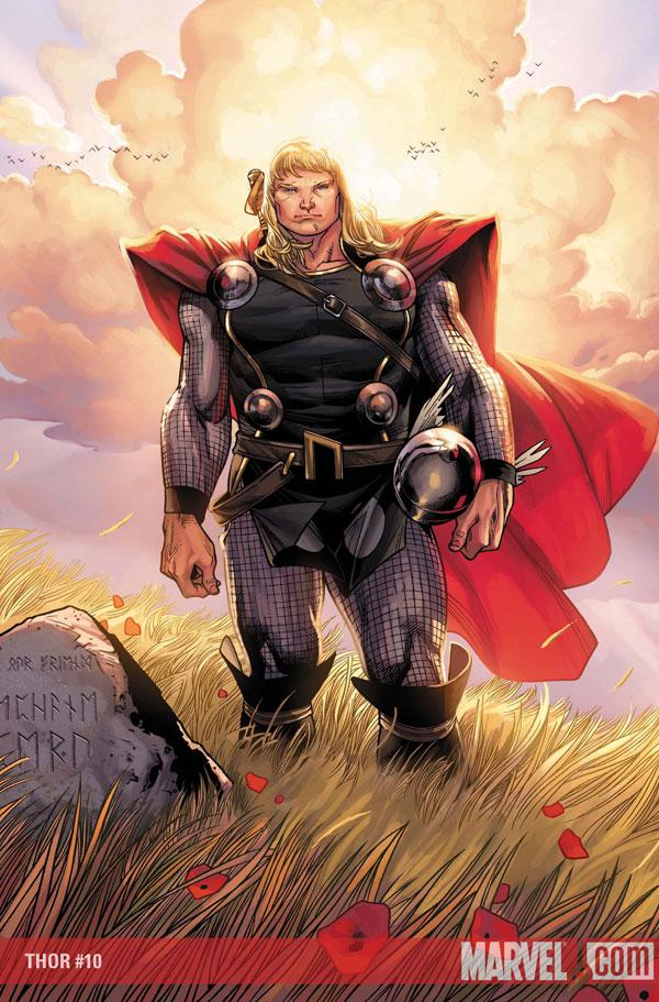
THOR #10 Marvel Comics
Veddy, veddy interestink, Meester JMS. In this issue, you introduce quite the sticky wicket. I'll hold back on the revelation for you folks who don't like spoilers, but the plot point introduced here is the first indication that JMS has something up his sleeve more than just the resuscitation of the fallen gods storyline. I like this development, mainly because the character in question has been kind of a bore since...well...forever. This new fact about this character's lineage and that connection to Thor looks to be the beginning of new troubles for the Thunder God. This book continues to be one of the best Marvel has to offer. - Bug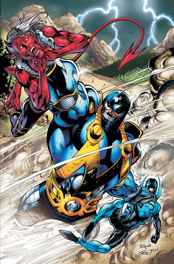
TEEN TITANS #61 DC Comics
It took me a while to warm up to this title, but I think Sean McKeever is finally hitting his stride. Which of course, is a bit ironic since I believe he's not long for this book. Or maybe I'm wrong here. Either way, I liked this issue which focused on the differences and similarities between Blue Beetle and Kid Devil AKA Red Devil. Although we've seen this type of story before and it does sort of play out in a by-the-numbers sort of way, McKeever made the dialog fun and the reason why these two heroes don't get along pretty believable. I'm not saying this is a shelf-burner of an issue, but it runs circles around that other TITANS book on the shelves right now. - Bug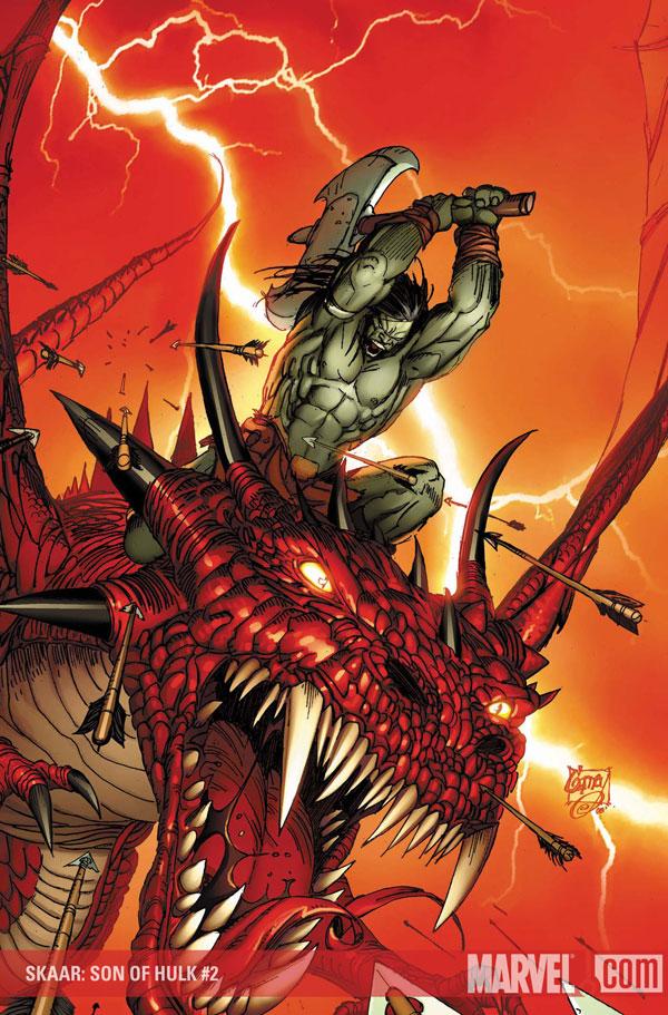
SKAAR - SON OF HULK #2 Marvel Comics
Every time I say "SKAAR!" I have to scream it and I am compelled to follow it with a hearty "YARRRR!" Don't know why. This is a fun comic, in the tradition of Conan. Writer Greg Pak is having a lot of fun developing the mythology and geography of this alien world the Hulk spent a year in back during his run on "Planet Hulk." While this issue lacks the punch of "Planet Hulk" and the familiar characters cameo-ing through occasionally, it makes up in the brutality department thanks to Ron Garney's spectacular panels. I'm going to stick with this series for a while to see what develops. I know Pak doesn't want to blow his load right from the beginning, but I'm hoping a trip to Earth or at least some kind of interaction with Nova or the Silver Surfer or the Guardians of the Galaxy will come sooner rather than later. Right now, I'm having a hard time since there's no real character to care about or identify with in this series quite yet. - Bug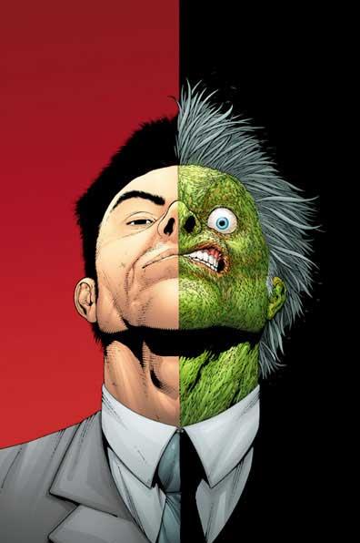
JOKER'S ASYLUM: TWO-FACE #1 DC Comics
This comic is worth mentioning because it is the only issue of JOKER'S ASYLUM worth reading. It's not that the concept of "the choice" stand-off is anything new when it comes to a Two-Face story. That's basically what every Two-Face story always boils down to which is why the character lacks the flair of some of Batman's other villains. No, what makes this story stand out is the way it ends with an audience participation/choose your own ending style. It made this book kind of fun, thanks to writer David Hine's clever words and Andy Clarke's capable artwork. If you have to buy one JOKER'S ASYLUM book, this is the one to pick up. - Bug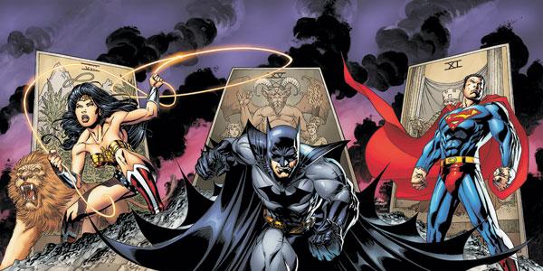
TRINITY #9 DC Comics
Hate to say it, but this will be the last issue of TRINITY I purchase. I also hate to say I told you so, but this comic suffers from the problems that made me reticent to pick it up in the first place. One, I have no idea when this story falls within the regular DCU. Batman is certainly not suffering from the insanity Morrison is currently putting him through. Superman hasn't suffered the loss that is currently going on in his title. And Wonder Gal isn't really that reflective of the way Simone is writing her in her own title either. So this is basically an ongoing, self contained story that isn't reflective of what is going on in the regular DCU. OK...fine...but that doesn't make up for the fact that it's been pretty damn boring as well. Seeing the three most powerful characters in the DCU slug it out against an alien version of Master Blaster from THUNDERDOME for six issues isn't my idea of an epic story. Sure writer Kurt Busiek may be taking his time before showing all of his cards, but when you are talking about a year long commitment, you should start out of the gates with a barn-burner. This wet match of a start hardly gives me hope that anything more than mediocre is what Busiek and Bagley have in store for us. The story may be leading somewhere down the line, but with nine issues under its belt, it's failed to pique my interest. So sorry, Bags and Busiek. I love you guys' work and I hope to enjoy future collaborations and individual works, but you lost me with this one. - Bug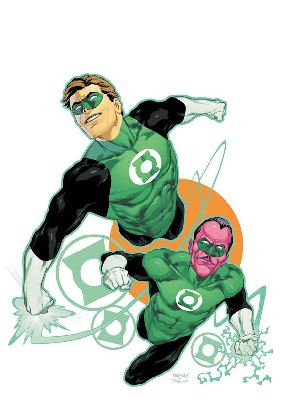
GREEN LANTERN #33 DC Comics
Finally, we're getting into some un-tread territory with this issue. For the last few issues, Geoff Johns has been retelling the definitive origin of Hal Jordan, a story I've read quite a few times. But it wasn't really until last issue that the story started to unveil anything new or interesting. Now that Johns has broadened the scope of Hal's story, I'm once again excited again about GL. All through these last two issues, you see the makings of the different Corps of the Spectrum from the birth of Hector Hammond and his ties to a certain color, to William Hand (later known as Black Hand) who looks to be a pivotal character in the upcoming "Blackest Night" mega-event. If you haven't checked this series out yet, you're pretty much an idiot. But if you are unfamiliar with Hal Jordan, you should scrape through the back bins for the beginning of this arc for a good jumping on point. But now, those of us who have waited through the retelling finally get something new to sink our teeth in and Johns and artist Ivan Reis certainly serve up a delectable dish for us to dine on. Bug