
| #2 | 5/7/08 | #7 |
X-O Contest Winners!
Hey folks, Ambush Bug here. Before Optimous Douche reviews the X-O MANOWAR: BIRTH HC TPB, I wanted to pop in and announce the winners of the X-O MANOWAR Contest we ran a week or so ago. Here’s the list of the winners…
Runners up win a copy of X-O MANOWAR: BIRTH
Five Second Prize Winners win a signed edition of the trade by the creators.
Finally, the Grand Prize (a signed copy of the book with a sketch by the creators) goes to…
Congratulations to all of the winners…
But wait, you say. We announced that there would be 15 runners up and only ten were listed. Well, that’s because, sadly, not too many of you guys participated in this contest. So I’m going to give one last chance for the first five lucky people who email me their pick for the next Valiant Hardcover they want to see reprinted in this format. DON'T FORGET TO INCLUDE OUR MAILING ADDRESS! Email me here and win. It’s that damn easy.
And now, on with the review…
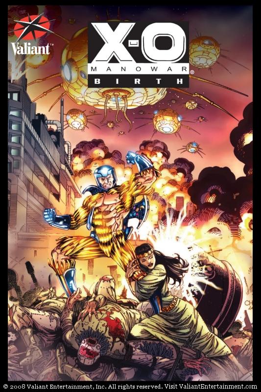
X-O MANOWAR: BIRTH HC TPB
Writers: Jim Shooter & Bob Layton, Artists: Barry Windsor-Smith, Joe Quesada Publisher: Valiant Reviewer: Optimous Douche
Most comic book aficionados will agree that the early 90s was a veritable shit storm of bad ideas. Countless polybags, card inserts, multiple covers, nonsensical crossovers and issues with sub par material virtually collapsed the entire industry.Then there was Valiant.
While the major houses were focused on increasing sales volume and Image was launching the age of anatomical monstrosities, Jim Shooter and company were laying the foundation for one of the most complex, intricate and well crafted universes to ever grace the stands of local comic shops.
Valiant hooked me from the very beginning. Being a mild obsessive compulsive it wasn’t the individual resurrected Gold Key titles like X-O, HARBINGER, SOLAR, ETERNAL WARRIOR and ARCHER & ARMSTRONG that intrigued me. Don’t get me wrong: the dialogue was sharp and witty, and the rendered realism of the characters was a refreshing departure from “the beautiful people, the beautiful people” that were being sketched in other comic books, but it was the continuity.
This universe was tighter than a nun’s vagina, and for a universe that covered all of human history from the beginning of civilization to the far distant future, this cross pollination of content was no easy task.
The first six issues of X-O MANOWAR, which can be found in this beautifully reprinted hardcover (along with a few other goodies) are a perfect example of this meticulous attention to a detailed universe and “ahead of its time” storytelling.
X-O kicks off seamlessly from the pages of its sister title SOLAR. Aric the barbarian is a man unstuck in time, cryogenically frozen for 1600 years and resurrected in the early 1990s. He awakens aboard a ship of spider-alien invaders; with the help of a mysterious cell mate and a diversion by Solar, he finds a way to abscond with the spiders’ most advanced version of X-O Armor, the Manowar class. This “good skin”, as Aric calls it, his barbaric mind only able to relate a technologically advanced war suit with a bear pelt, allows him to escape from the invader’s ship and lands him on a planet Earth very different than the world he once remembered. This is the “what”, the “how” is a story unto itself.
I mentioned earlier, during my schoolgirl adoration of Valiant’s continuity, that the actual storytelling was a feat unto it self and truly ahead of its time. From characterization to the actual dialogue, the foundation laid down by the team at Valiant resonates even today; in fact, I often wonder if today’s superstars could be telling their stories in the fashion they are without these books paving the way.
It seems today that a piece can’t be socially relevant or accepted without the insertion of a token homosexual character. Well before “Queer Eye for the Straight Guy” made fat mid-western hausfraus accept the gay culture, Valiant took the bold steps to make a gay character a pivotal focal point of the X-O story with Aric’s right hand man Ken. However, unlike Marvel with Northstar, Valiant didn’t turn this into a media event, nor did they feel the need to let Ken’s sexuality define the character. At his core this human turncoat in the spider-alien organization is an opportunist, only taking sides with Aric once he realizes that this barbarian is going to lay waste to the entire spider-alien organization. It’s easy for a writer to craft stereotypes, but instead of having Ken sachet across the panels humming show tunes, they made him into a real character complete with foibles and other personality traits apart from his sexuality. This was damn brave way back in 1992.
I will admit that Valiant’s art is not to the liking of everyone, especially to those that weaned themselves from their mother’s teat to the sour milk found in the breast of early 90s Image. I liken what Valiant brought to the table to the renderings of Frank and Quitely. Nothing was hyper-stylized, everything felt real. Valiant valiantly portrayed characters’ flaws and wasn’t afraid to show the weathering that Father Time inflicts on all of us.
In addition to chronicling issues 0-6 of the original X-O series, updating the colors and laying out the book on today’s high gloss paper as opposed to the toilet paper of yore, Layton completes this saga with a brand new prequel tale showcasing the rise of the Spider-aliens, leader, Lydia. This is a nice denouement, but it’s also a bit of tease.
I’m thrilled that Valiant is reissuing and enhancing all of their old titles in hardcover. I offer two suggestions, guys: go ahead and skip the deluxe edition of H.A.R.D.corps, but seriously consider a reprint of UNITY. I would also be ecstatic if you could once again resurrect these characters with new ground breaking stories.
In the tarnished crown of early 90s comics, Valiant was the jewel that sparkled with the beacon of promise that comics could still be great.
When Optimous Douche isn’t reading comics and misspelling the names of 80’s icons, he “transforms” into a corporate communications guru. Optimous is looking for artistry help, critical feedback and a little industry insight to get his original book AVERAGE JOE up, up and on the shelves. What if the entire world had super powers? Find out in the blog section of Optimous’ MySpace page to see some preview pages and leave comments.
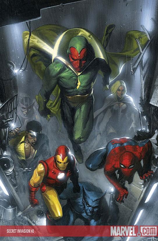
SECRET INVASION #2
Writer: Brian Michael Bendis Art: Leinil Francis Yu (pencils) & Mark Morales (inks) Publisher: Marvel Comics An @$$Hole Two in One Review from Ambush Bug & Squashua
AMBUSH BUG (BUG): The Bug liking a Bendis helmed event issue? Are you kidding me? I know, I know. It’s hard to believe, but it’s true. I really liked this issue of SECRET INVASION. There were tons of little moments in this issue that struck me as cool such as the tiny moment where the “fake” Iron Man acknowledged the “fake” Captain America as the leader of the crew of heroes discovered in the Savage Land in the last issue. And most of all I really liked the focus on Hawkeye.SQUASHUA (SQUASH): Look, I don’t know the guy all that well. I probably shouldn’t even be writing this review. I’ll bet Bendis got him wrong in the eyes of the uber-fan and the dude is completely out of character here or he’s actually a Skrull, but with Ares going all Admiral Ackbar screaming his lungs off for people to not fight and the Sentry chowing down on multiple-personality Kryptonite (that tired trope again?), this non-fan thought Hawkeye, sorry, Ronin was fucking awesome.
BUG: Well, I do know the character (one of my first comics ever was the one with Hawkeye shooting Ant-Man towards the reader on the cover of an AVENGERS issue) and Bendis didn’t do a bad job characterizing him at all in this issue.
SQUASH: Clint’s a bow guy, right? He’s the Green Arrow of Earth-616? And for weeks, all he’s done is sword combat; bladed hand-to-hand. You know, Wolverine’s job. Or Echo’s job. Or either Power Man or Iron Fist’s job if you drop the swords from the equation. So where does that leave a semi-talented non-powered human? That’s what Hawkeye finally realized this issue as he complained through the fourth wall, took down his counterpart, picked up his bow and quiver, and threw himself into the woods where he belongs, sniping choice competition out of play like an ADD-addled Robin Hood. Even when the artist forgot to add the arrow to his drawn bow, Ronin was in the right place, doing what he does best.
BUG: Yeah, I had a lot of fun following the Hawkeye developments through the whole melee. And yes, it was frustrating as hell after sitting through the last Hawkeye series that turned out to be a miniseries due to god-awful sales where the writers thought it was a good idea to take away Hawkeye’s bow and arrow, then getting excited about his return, only to have him drop the bow again in favor of nunchakus and swords. It was a long buildup, but the payoff was pretty impressive.
SQUASH: But see, that was all build up to the main event, the trigger that motivated Clint into action: his Black Canary, Mockingbird, showed up and threw his feelings into overdrive. Clint fights his way to his love, who is sitting with a deceased Classic Skrulleye (it just looked like Ronin knocked Classic Skrulleye out; maybe someone else killed him), and passes her the comic book equivalent of the codeword kids and parents use to clear a “Stranger Danger” situation. Though I didn’t know them, the reunion of this couple brought a tear to my eye, my heartstrings were pulled, and for a mere moment I felt compassion. Then the subterfuge took hold. Were they themselves Skrulls? A mere panel later, Wolverine echoed my doubt; certainly they had some form of mind reading through genetics. Or is Wolverine a Skrull, trying to casting doubt across the situation?
BUG: Plot holes aside, it was a well written scene. A trite melodramatic, but effective nevertheless. Even the possibility of having Mockingbird back in the mix almost makes this whole Skrull business worthwhile. And that’s the main problem with this event. The way they are doing it is kind of rough. Bringing back old characters, fixing mistakes that should have never been made, painting themselves out of corners. But the end result will most likely make for interesting stories for the Marvel regime to re-fuck up at a later date.
SQUASH: Who killed Classic Skrulleye? Who is a Skrull? Did they take Tony Stark out of the battle simply so he could have a moment to reflect his movie by building new armor out of scrap mutate technology? How can you tell that the Young Avengers are hanging out with the Runaways in Manhattan during an alien invasion without a playbook? What secret weapon is the Skrull Queen hiding inside her enormous Spider-Woman tatas? Will Echo get jealous of their relationship, or will Hawkeye and Mockingbird just screw around when her back is turned (SHE’S DEAF)? This issue assured me that even though it really was simply one big fight scene, it was a fight scene containing oodles of interesting content that I didn’t find to be filler in the least.
BUG: Man, you’re full of questions. And I am too. Bendis did a good job with this issue. It’s confusing at times, but I guess it’s meant to be. I feel Bendis is much more in his element with this paranoid/noir-ish tale of mystery than other big events that got away from him like HOUSE OF M. He doles out suspense and tension very well. Bendis is also getting to know his characters a bit better and they’re starting to sound distinct from one another rather than just all sounding like Bendis. Considering that, SECRET INVASION, so far, is leaps and bounds better in the characterization department than Millar’s CIVIL WAR. Bendis is letting the characters guide the story and not the other way around as Millar did. For that, I’m impressed at the growth I’ve seen in Bendis as a writer.

RANN-THANAGAR HOLY WAR #1
Writer: Jim Starlin Artist: Ron Lim Inker: Rob Hunter Publisher: DC Comics Reviewer: Rock-Me Amodeo
Wait, wait, don’t tell me: before it’s over, someone is going to die. Maybe.I love Jim Starlin and most everything he does. He’s huge. I bought every issue of Epic’s DREADSTAR. Every issue of WARLOCK. Every issue of everything he ever touched that had Thanos in it. Heck, I even tracked down SPECIAL MARVEL EDITION #15 (first appearance of Shang-Chi) and recently lauded his efforts in DEATH OF THE NEW GODS.
And though Starlin actually has a broad range for storytelling, over the years, I’ve watched him become famous for three things:
hugely religious under/overtones,
hugely cosmic odysseys, and
killing people. Over the years, the number of heroes he’s killed could easily be described as, well…huge.
Thus we enter into the war between Rann and Thanagar. Excuse me, the holy war. That means that instead of people calling each other “mook” “creep” and “bitch” we get “sinner” “unbeliever” and “harlot” (or, if the setting is Latveria, substitute “cretin” “imbecile” and the recently added “cow.”) Threats and epithets are similarly modified in terms of damnation, praises and so forth. Oh, and for every religion, for every faith of any sort, only the ignorant are sincere. The sincere believers are easily exploited. And everyone at the upper-levels is an evil SOB, doing exactly that, for the power.
Likewise, on the “cosmic odyssey” front, we’re seeing characters that are seldom on the same planet more than a few issues at a time, with the relative obscurity that will allow for some significant development. The stakes are high enough to get a lot of players, big and small, involved: Adam Strange. Hawkman. Comet. Starfire. Starman (Prince Gavyn, with Will Payton’s memories? Hope someone remembers that…) These are all great, and mostly under-utilized, characters. You can see most of them on the cover, and as well-written as the first issue is, the whole story should be a good read.
Truth be known, I really enjoyed this story the first several times I read it. I’m not talking about the book. I’m talking about the STORY. And that’s the problem I have with this. For example, I was blown away by Adam Warlock and the Church of the Universal Truth.
I hung on every word of DREADSTAR and his struggles with Lord High Papal and the Instrumentality. Same basic themes. It was excellent.
I picked up the lets-milk-this-Gauntlet-thing miniseries INFINITY QUEST. Same basic themes. It was pretty good.
I picked up MYSTERY IN SPACE, which introduced us to Lord Papal on a diet and the church of Whatever It Is. Same basic themes, and less than impressed, I was.
Now we have this. The story is well written. It doesn’t seem like an attempt to cash in on Marvel’s recent cosmic triumphs, as DC has put some serious artistic capital into “cosmic” lately themselves. This series may well pull it all together.
Also, Ron Lim’s art is excellent. Some inkers make him seem appear quite cartoony, but Rob Hunter’s inks add a grit and heft that I have always known Lim had. Some sequences feel like Starlin might even have sketched the roughs before Lim started, and that is a compliment to all three men. No complaints there.
But the story…okay, last digression: some stories, I can’t get enough of. Stories of redemption, where the hero, or even the villain, finally turns it around. Or when children are involved, I’m a sucker for stories where the dad gets to be a hero to his kids. I’m a sucker for stories where the really, really bad guys get what’s really, really coming to them (like the first couple years of PUNISHER MAX, for example.)
So if Starlin’s Same Huge Story (religion bad, cosmic scenery, heroes possibly dying) is your scene, that’s cool. That’s cool. I get it. And maybe this will only have the first two elements, like many of the stories I listed above. But still, after reading the beginning of this story, I cannot help but wonder if it’s the same one I’ve already seen five or six times. And despite the action and good dialogue, I think I’m a little bored.
The story may take some completely fantastic turn, and Starlin is an excellent writer who has surprised me a hundred times over. But if it’s exactly what it looks like, then I’m going to be disappointed.
How disappointed? Well, hugely disappointed, of course. We’ll see.
Dante “Rock-Me” Amodeo has been reading comics for thirty-five years. His first novel, “Saban and The Ancient” (an espionage/paranormal thriller) was published 2006. He began writing for AICN Comics in 2007 and his second novel (“Saban Betrayed”) is due 2008. He’s often told he has a great face for radio.

AVENGERS/INVADERS #1 (of 12)
Plot: Alex Ross and Jim Krueger Script: Jim Krueger Pencils: Steve Sadowski Color: inLight Studios Publisher: Marvel (in association with Dynamite) Reviewed by: BottleImp
I must be a glutton for punishment. I was severely underwhelmed by the way that Ross and Krueger’s JUSTICE miniseries just sort of petered out, and I sloughed my way through three issues of their abysmal PROJECT SUPERPOWERS before finally giving up that series as a loss. And yet, having been burned by Ross and Krueger before, I still shelled out my three bucks for this comic. Like a moth to the flame, or a slack-jawed yokel to a Nascar race, I was irresistibly drawn towards it. And maybe it’s just because I still have the sour taste of PROJECT SUPERPOWERS in my mouth, but d’you know what?AVENGERS/INVADERS isn’t half bad.
The plot is yet another variation on the whole “heroes plucked from their own time” thing that was the basis for PROJECT SUPERPOWERS (as well as the infinitely superior miniseries THE TWELVE) that finds the Invaders (a World War II team comprised of Captain America and Bucky, the Sub-Mariner, and the Human Torch and his sidekick Toro) transported from 1943 Italy to modern-day Manhattan. They drop into the middle of a fight between Spider-Man and the Thunderbolts, confusion ensues, yadda yadda yadda, and the Invaders retreat to try to figure out what’s happened to them. What makes this a little more interesting than your standard comic book time-travel storyline is that since the original Captain America is now dead (at least for the time being), the reappearance of Steve Rogers has a pretty big impact on Spider-Man and others, and it’ll be interesting to see how that plays out.
Krueger’s writing is still pretty shoddy—check out this set of narrative captions from “Bucky’s War Journal”:
Caption 1: “…we’re on this ass-backwards mission to steal something called the Ordnung Zeitgeist from Monte Cassino.”
Caption 2: “That translates to mean: Operation Time Ghost.”
Caption 3: “That’s the Ordnung Zeitgeist translation.”
Caption 4: “Monte Cassino is a monastery in Italy.”
Talk about being repetitive. And his dialogue still feels very forced and unnatural—sort of George Lucas-ish. Krueger’s Spider-Man banter makes him come across as more of a middle-school kid with ADD rather than a witty adult. But at least the characters are written as having individual personalities— Krueger seems to work better with established characters (such as Spidey and the iconic DC heroes in JUSTICE) than when he has to develop personalities from scratch (as one can see from the one-dimensional superheroes in PROJECT SUPERPOWERS).
Sadowski’s artwork is pretty nice, and the coloring complements the pencils without getting overly muddy or busy. My one gripe with the art is that the storytelling can get a bit confusing—not sure if that’s Sadowski’s fault, or if the blame should be split between Sadowski, Ross and Krueger. For example, there’s an old man making random observations about superheroes during the fight in Manhattan. It wasn’t until I read the comic a second time that I made the connection that he was the same man as one of the young soldiers from the WWII sequence (at least, I think it’s the same guy—they both have glasses, but other than that, they don’t look especially alike). I think that a clearer sense of the action and pacing would make this book more exciting.
So all in all, not horrible. Twelve issues seems like a lot of space for what looks so far like a pretty basic story—I’m willing to wager that this series will have the same problems as JUSTICE did: a bloated storyline with an ultimately fizzling ending, but a little part of me wants to be surprised by Ross and Krueger. Maybe they can make this one work…or maybe it’s all an insidious plot by Marvel to have this WWII Steve Rogers reclaim his mantle as Captain America in the modern day. Stranger things have happened…*cough*BrandNewDay*cough*
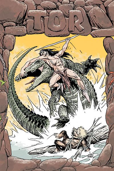
TOR #1
Written & drawn by Joe Kubert Publisher: DC Comics Reviewer: Ambush Bug
This book was like breathing a breath of fresh air in a shitstorm. I'm very frustrated with DC at the moment. The fact that there was a year-long pause between events filled with a maxiseries and a bunch of spinoffs that lacked in both purpose (other than to suck money out of my wallet) and quality has jaded my once feverish passion towards the DCU. I used to love what DC was doing. I felt the better quality product was coming from this company compared to the other guys. What a difference a year can make.Despite the mountain of FINAL FINAL FINAL crap DC is pouring out right now, there are a few diamonds in the rough. TOR is most definitely one of them. This book made me smile bigger and wider as the pages turned--so much that by the time I finished it, my grin was so wide I could taste my ears. This single issue has reinvigorated my passion for DC. It's proven to be that soft voice in my ear that whispers "everything is going to be ok."
TOR is a caveman story. It follows a simple wanderer who crosses paths with a little monkey boy, a giant crocodile, a tribe of monkey people, and a monster. Content-wise, you're going to be filled after reading this one. In the first 22 pages of this miniseries, Tor has taken quite a journey already. The issue introduces us to Tor himself, sets up a pretty fun and exciting situation, and leaves us on a cliffanger of the most cliffhangerest of proportions.
The writing is extremely strong too. Joe Kubert is a master at his craft. Not only do his pictures pop (we'll get to that in a bit), but he completely understands how pictures and words can work together to tell a story. No caption is redundant. It only adds texture to this comic where no words are spoken.
I especially like the first few pages dedicated to developing the character of Tor. There's a scene where Tor is faced with a dilemma. He can either run in fear or even apathy or Tor can stay and be a hero. Tor's actions depict what may be the first heroic act and it's a doozy. I also enjoyed the panel describing the functionality of the world's first mullet. It had me rolling. Business in the front and party in the back was never explained with so much sense or eloquence.
The art. Well, it's Joe Kubert. One of the modern masters of comic book art. What do you think it's going to look like? It's phenomenal. The postures the characters take are fluid and natural (just check out the way the arm is naturally extended around the mouth of the dinosaur on that cover above). There's a weight to the characters. The juxtaposition of background and foreground are phenomenal. This is a labor of love of the artist and it shows.
I'm excited to read the rest of this miniseries. It's filled with excitement and lush imagery in every panel. The writing is crisp. The characters are fun. And it doesn't have all of the baggage from any type of Crisis. Highly, highly, highly recommended.
Ambush Bug is Mark L. Miller, reviewer and co-editor of AICN Comics for close to seven years. Look for his first published work in MUSCLES & FIGHTS 3 (AVAILABLE NOW!!!) from Cream City Comics.
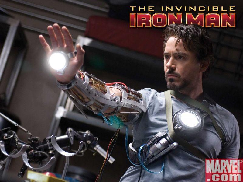
THE INVINCIBLE IRON MAN #1
Writer: Matt Fraction Penciler: Salvador Larroca Publisher: Marvel Comics Reviewed by Humphrey Lee
The first I'd ever heard of Matt Fraction was a couple years back via a column he and Joe Casey did for Comic Book Resources. The name of it escapes me (and search bars fail me) but much like the majority of columns on that site it was always well worth the read. When I saw he also wrote comics it was just a matter of time before I had order myself a copy of his LAST OF THE INDEPENDENTS OGN and pre-ordered the first issue of CASANOVA. And after reading those I had no choice but to ask the man via the Interwebs if he'd be interested in letting me interview him for our little corner of the net here, something I pretty much never do; mainly because I suck at them. Throw in his FIVE FISTS OF SCIENCE with all those excellent works already devoured and I knew I had a new writer whose material I would always at least give a look-see. At the least, I owned him what with the horrible injustice I did the man with that piece of tripe interview I just mentioned from oh so many moons ago (seriously sir, even I marvel at how bad I fucked that up for you. Sooo sorry!).Oh yeah, found it. It was "The Basement Tapes". There in the Archives. Dur. Go read it after you're done with this. Anyways...
And now here we are. Our boy is all grown up and getting to debut a new series for the character that has been dominating the box office for almost two weeks now, Iron Man. And just like I've come to expect from the Fractor, it delivered. Not that I wasn't expecting it to, but at the same time I kind of wasn't. Obviously we know that the man underneath the armor, Tony Stark, has hit a much larger role than we've ever seen from him. Fitting for sure, especially with his history as a "futurist", but also kind of daunting to write because of all that added attention. The amount of books we're already seeing him appear in is pretty staggering, let alone with his own book to carry, an Avengers team to co-lead, and that Director of SHIELD title he has now. At the very least it's made the character a little inconsistent with how he's depicted post-CIVIL WAR.
Well in INVINCIBLE here, this is definitely IRON MAN.
Sure he's still got to carry the weight of the world on his shoulders, but we're a little more introspective with the man those belong to here. A little dab of the playboy here, a glimpse at the boy inside still marveling at something like a space laugh, something you'd figure someone who has seen as much as he has would take for granted. Thanks to that film we're even getting more Pepper Potts now, which I'm extra happy for because I thought we'd see her fade into the gulch of wasted potential alongside THE ORDER, another Fraction series, though that was cut painfully short. He definitely knew there he had a nice and plucky supporting player to work with, and here she does wonders albeit briefly.
Besides establishing just what version of Tony we can expect to see here, a good bit of this issue was to set up his new big bad, something else I wasn't sure what to expect because if there's any knock I'd have with IRON MAN books, it's that his talent pool of arch-nemeses leaves a bit to be desired. Fraction and Co. take what is probably the best route here to establish a new villain but one with ties to the past in Ezekiel Stane. I'm sure that last name rings a bell. And quite the malicious little bastard he has turned out to be. Smart, sadistic, and with a chip on his shoulder. Should prove to be a very interesting foil in the upcoming months for sure.
Obviously this isn't just the Matt Fraction show; there's still the very capable and oft times downright impressive art of Salvador Larrocca at hand as well. The detail is there, the lines are smooth and make the Iron Man armor look very impressive, and there's some really good flow between the panels. He definitely depicts the scattered amounts of chaos throughout this issue very well. There are a couple little stumbles here and there though, but not terribly much. A couple little instances where a facial expression really didn't convey anything at all, or was way too enlarged for the head it was on, or the opposite. That could be cause for concern but they seem more like hiccups to me than anything else. By and large the art is pretty stellar.
So, all that happened. There's a new IRON MAN book on the market and it's off to a really, really good start. Matt Fraction is still churning out hits like I always thought he would. Larocca's still a hell of an artist and seems to have kicked his "facial swipe" habit, which is good to see. The same formula that made the movie a hit with the casual fans is here again to make this a sure hit with the die hards and hopefully catch some spillover from the feature film. It definitely couldn't have happened to a better character, and it sure as hell is the enthusiastic pat on the back for a job well done that this creative team is well on its way to earning. Congratulations to all.
Humphrey Lee is a long time AICN reviewer and also a certified drunk whose claim to fame is making it up four steps of the twelve step program before vomiting on steps five and six and then falling asleep on steps one through three. Also, chances are, he's banged your mom (depending on the relative hotness of said parental figure) and is probably the father of one of your younger siblings.
THE TEXAS CHAINSAW MASSACRE: RAISING CAIN #1 (of 3)
Writer: Bruce Jones Artist: Chris Gugliotti Cover: Dave Taylor Publisher: Wildstorm Reviewed by: BottleImp
Let me first say that I am not a TEXAS CHAINSAW MASSACRE fan. I think the original movie has its merits, but the most effective thing about it is the “documentary” feel that came from the low budget filming. I thought the remake was pretty bad, and the prequel even worse. Normally, I wouldn’t even look twice at a comic based on the movies. However, a friend of a friend was involved in the production of this series, so I thought I’d take a look at it and give them a little free publicity.The story begins with Leatherface and his cannibal clan carving up some unwary travelers for dinner. They return to the house just in time to see the birth of the two newest members of the Hewitt family, Cain and Abel. Their mother, Henrietta, apparently still has a couple of brain cells working and decides that she can’t raise babies in the midst of a nest of people-eaters and tries to leave. Her family tries to stop Henrietta, her babies are separated, and the end of this issue sees Cain found by a couple of redneck kids. I’m assuming from the title of the series that the following issues will focus on Cain’s new home life.
The Hewitts presented here are clearly based more on the remake of TCM—they have the same over-the-top cartooniness to them, rather than the more creepy demented feel that the family had in the original film. Gugliotti’s designs are a good match for the unrealistic tone—his characters are very stylized and grotesque. However, the coloring of the comic often detracts from the drawings. The majority of the pages are handled with a very limited color palette, and a lot of the color is on the dark side. This emphasis on dark colors tends to obscure the action—this is especially true of a splash page of Leatherface on page 5; even when looking at it in strong light, it’s hard to make out exactly what’s going on. It also doesn’t help that the backgrounds are often never clearly established. I’m still not quite sure where Henrietta is supposed to be when she’s running away from her family.
Between the copious amount of blood and organs flying around and some of the dialogue that Jones writes (my personal favorite: “Shit cakes and fried scrotums… bitch went and squeezed a pair o’ damn twins!”), this comic has more in common with a Troma film than with TCM, and it’s definitely not going to be for everyone. However, if you like quirky artwork and the sight of two inbred rednecks fighting over who gets to eat the afterbirth, then TCM: RAISING CAIN just might be your cup of tea…or cup of placenta, as it were.
THE MIGHTY AVENGERS #13
Writer: Brian Michael Bendis Artist: Alex Maleev Colorist: Matt Hollingsworth Publisher: Marvel Comics Reviewer: Rock-Me Amodeo
Okay, I didn’t get the memo. Did any of you get the memo? You know, the memo that explained how, for the next few months, it doesn’t matter what the title is on the cover?‘Cause when I first read this, I was a little peeved. After all, there was only one Avenger in NEW AVENGERS (an image of Spiderwoman.) And there’s only one Avenger in MIGHTY AVENGERS (Ares, for a panel or four.) I mean, I suppose the thought must be that we’ll buy anything as long as it relates.
I felt like I was tuning into The Truman Show. “Doesn’t matter if he’s sleeping, working, picking his nose,” cackles the producer, “they’ll still tune in, heh, heh, heh!” But when I tune in to THIS channel, I would like to see some Avengers, thank you very much. I felt abused.
But then…but then…I re-read it. And I re-read SECRET INVASION #2, which was chock-full of Avengery goodness. And I let myself enjoy Maleev’s art. And I do love a good “assemble the team” story, though it seemed a little rushed at the end (but not so rushed that we couldn’t get an excellent scene with Layla Miller, whom I like more and more.) My extreme dislike was turning into something much nicer: slight annoyance. I can live with that.
So here is the new status quo: every title that Bendis is writing is his palette for this Skrull thing, at least for the duration. I will cut the guy some slack as long as he keeps my interest.
And Bendis has, so far, kept his end of the deal.
I did notice that enough time had elapsed between the first scene and the last one that Nick Fury regained his Caucasian-ness and grew his hair back, but you know, maybe he was wearing a skull cap in the first scene. No big.
So what’s going to happen to our little troop of caterpillars? I have no idea.
All I know is that I really WANT to know. And along the way, I got to see some excellent artwork with fully realized backgrounds and wonderful coloring and…well, despite my best intentions, I liked it.
ACTION COMICS ANNUAL #11
Writers: Geoff Johns & Richard Donner Artist: Kubert Publisher: DC Comics Reviewer: Optimous Douche
When I first heard the rumblings about a new Superman movie way back in the early 2000s I was elated. The fact that the movie was not going to be a reboot, but rather a continuation of the second Superman movie, sent my mind spinning on all of the cool new things the digital age would bring to the movie while still holding reverence for the brilliance of the first two films. Then the film came out.While I didn’t hate “Superman Returns”, I couldn’t for the life of me figure out why Singer and crew made the story such a convoluted mess. Why did Superman leave for five years? Krypton blew up, that’s a staple of the Superman mythos. What the hell was he looking for, a Kryptonian hanging out on a chunk of planet like “The Little Prince”? Lois and Clark have a child with super powers? I guess Supersemen is still potent despite Superman being stripped of all powers when he makes sweet, sweet, super love. I understand James Marsden has been dubbed the whipping post of movie relationships, but was Richard truly necessary?
I invoke “Superman Returns” in this review because ACTION ANNUAL 11 is everything that movie should have been and more. Epic storytelling combined with grand scope imagery that not only jumps off the page, it bitch slaps you and calls you Sally. Quite frankly, if the rumors of a new Superman movie are true and Warner Brothers doesn’t leverage this creative team, they would be making a mistake comparable to “Superman III: The Fall of Richard Pryor”.
Being a story guy at heart, I don’t generally lead off reviews by focusing on the art. I know my flaws; I am closer to autistic than artistic, and the closest I ever came to studying art theory was when I slept with an art major in college for a week. Even still, while I know nothing about what makes for good art, I know what I like and what moves me. Kubert is not only a comic artist; he is a master, based solely on this issue. I wish I had the resources and the energy to frame every panel of this book to hang in my man-cave.
Right from the cover, Kubert doesn’t waste an ounce of real estate in this conclusion to the Last Son saga started in ACTION proper. I don’t know if it was an editorial or art decision to have the front cover minutia (e.g. The DC logo, price, creative team) written in Kryptonian when you hold the book upside down, but it was damn clever, and made me spend more time with a cover than I have in years. This is also the first time where I have seen an annual format used to its full potential. Generally these are just bloated tomes of regular format; however, more pages do not always equate to a better book. Kubert uses all of the space afforded him with sweeping panels that cross pages and stir the imagination. Every two page splash embodies the horror of what would happen to a city if it was ruled by those that viewed humanity as gnats. Pay close attention to the two page spread towards the end of the book you need to flip horizontally, it would be monumental to see this shot on the big screen.
Characterization: We’ve known for a long time that Johns and Donner get the characters in the Superman mythos. Donner is of course the master of Superman tales for thirty plus years and I have yet to find the chink in Johns’ storytelling armor when it pertains to Supes. But with this one book, both gentlemen brought every ounce of reverence and creativity penned up inside of them.
Lex Luthor can be one of the most complex villains in comicdom. Too often, though, writers take the easy way out and portray him as a man bent on destroying Superman because he is more powerful or simply because he gets in the way of Lex’s schemes for financial gain (i.e. “Superman Returns”). Bullshit. At his heart Lex is a humanist and to a certain extent a xenophobe. He hates Superman for the same reason the Romans hated Jesus. Superman is an upset to the status quo of humanity being at the top of the food chain. Superman also stops us from relying on our own wherewithal. We don’t need to excel as a species because we could never be as great as the Blue Boy Scout, so why should we even try? Every panel oozes Lex’s disdain for the Kryptonian invasion force and the fact that he needs to partner with Superman (and other rogues) to topple Zod’s army. Yet he unflinchingly goes there to save humanity. Likewise, I loved Superman’s bravado towards the fact that Lex’s weapons might stop Zod, but it will be a cold day in the Fortress of Solitude before they would ever stop him.
Lex is also best when portrayed as a victim of circumstance. Despite the fact it was his ideas and resources that ultimately allowed Superman to topple the Crips of the Phantom Zone, credit instead is given to Chris Kent. This was an amazing twist, which actually makes you empathize with the bald bastard for a brief moment.
I’ve gushed about Johns’ writing in review after review, but this book was truly something special even for Johns’ immense talent. I can only guess that Kubert and Donner bring out the best in the man. I would love to see someone do an interview with these three greats on how they fed one another’s creative juices and if there is anything more in store for the future. Buy it, read it, bag it. This is a book that will remain indelibly burned into the cerebellum of any comic fan that is lucky enough to read it.

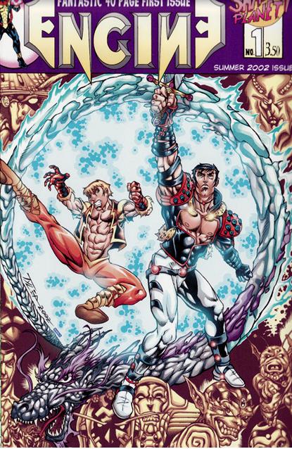
ENGINE Online Comic
By Tim Tyler Website: www.drunkduck.com/Engine Reviewer: Ambush Bug
Again, I bring you the opportunity to read comics for free! Free, I tell you. This time, we’re moving our meeses to The Drunk Duck online comic website , a hub for online comics for all sorts of tastes. My apologies to Tim Tyler who sent me a link to his online comic ENGINE quite a while ago. Being swamped with real life mumbo and AICN jumbo, I just got around to reading every page of ENGINE in one sitting.Turns out, this is the best way to enjoy this story, because it’s one of those bold strokes storytelling epics that deserves to be digested in big chunks. The story jumps to three locations following 1. a missing pirate Han Solo type of sorts who turns out to be not so missing, 2. an apprentice and master fighting a giant Celestial-like robot-thing, and 3. a powerful evil lord planning something world-shattering and evil. These cheesy descriptions don’t do the scenes justice, though. Tyler pops back and forth between the three plots and makes their eventual intersection highly anticipated and cleverly developed. Elements are definitely borrowed from STAR WARS, Silver Age super-hero comics, LORD OF THE RINGS, and martial arts films. But this isn’t one of those “throw something against the wall and see what sticks” sort of reads. It’s a fully realized universe with interesting characters and an expansive plot.
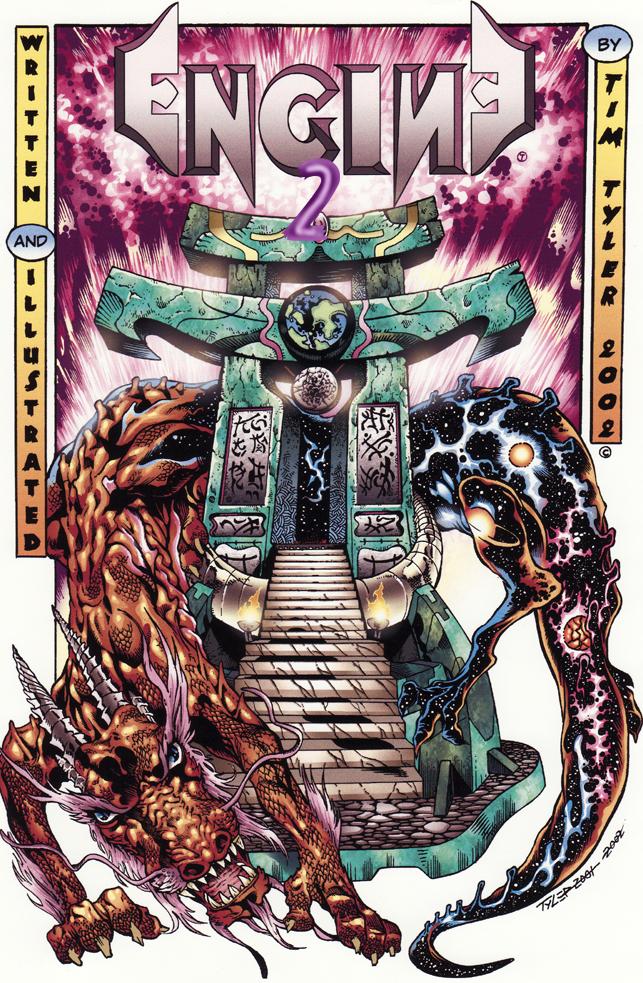 Aside from the epic scope of the story, the true highlight of this webcomic is the art. To say it is Kirby-esque is just about right. Tyler himself talked about his Kirby influences when he emailed me the link. There are plenty of highly detailed, yet boldly lined characters bursting into each other and COMIN’-AT-CHA!!! from the panel. Tyler incorporates quite a few splash pages in this book, but never did I get the feeling that this was a gratuitous gesture. Tyler’s story simply calls for splashes with all of the fighting, shocking twists, and exciting events occurring in the story.
All in all, this is a webcomic that I plan on clicking back to as the story develops. About three full issues are finished, so if you start on page one, be sure to reserve a bit of time to play catch up. Not sure when new pages drop, but this is definitely a comic worth revisiting. Plus, as always with dot.comics, the damn thing is free, so there’s no excuse not to check it out. Just follow the above link and click through the pages of ENGINE. There are a lot of hidden treasures floating out there in the internet—ENGINE is one of them.

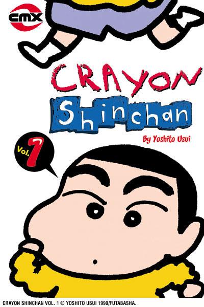
CRAYON SHIN CHAN
By Yoshito Usui Publisher: CMX Reviewer: Scott Green
One way to explain comedy is "the disparity between the ideal and the actual." The first of Yoshito Usui's CRAYON SHIN CHAN short manga immediately engages that divide. It opens with mother Mitzi Nohara cooking in her kitchen. She realizes that she's missing ingredients for the meal, so she calls her five year old son Shinosuke, or to use the diminutive "Shin-chan", to send him out to the store. When he replies "I can't right now! I'm drawing," she pictures herself soft-selling him by praising his work, and then suggesting that he run the errand for her. Instead, when she goes to see his work, she finds the precociously vulgar kindergartener with his pants down, drawing an elephant face on his groin.Through this child with no concept of empathy screwing up the laundry, pissing on the floor, aggravating the fast food counter worker and so on, the manga is able to laugh at the expense of flaws in the nuclear family and the imperfect joints in social composure. Especially for an irreverent minded audience, Shin Chan's ruthless assassination of social mores is consistently grin-worthily, and when it twists the knife or catches an unexpected jab, it's laugh out loud funny.
The manga is structured around three page stories that generally run on a theme. For example, the first volume features about 20 pages on swimming: swimming at school, in the public pool, on vacation, and finally in a back yard kiddie pool. Each of those three page stories demonstrates Shin Chan, actively winding up his victim (dropping trou, probing strangers with explicitly personal questions) or otherwise acting as a catalyst for acute stress (being very present when his parent wants to get intimate, performing typical loud kid's activities when his father is trying to work.)
To reiterate a point made in the recent AICN piece on the SHIN CHAN anime, saying that Shin Chan is the fool who sends-up middle class composure might be overstating the case, but there is an element of satirical subversion in this dervish who upends polite social order by introducing sex and bodily functions into any situation. On one hand he's a ravenous consumer of material excess and a devout media junkie who can't separate fiction from reality; on the other, he's often quicker to see through BS than others.
Part of what makes SHIN CHAN a uniquely amusing comic device is that he'll speak loudly to demand attention, but he rarely yells out due to emotional outbursts. Nor does he snicker or otherwise sadistically acknowledge his mischief. Instead, he'll nonchalantly introduce himself with a "yo" and then commence the trouble making. As such, he pushes other people to cross the same social boundaries that he tramples over. Whether it is rage, vanity or lust, he drags the flaw into the open. Some of the best running gags in the series concern the fits that people throw in response to Shin-related stress.
The CRAYON SHIN CHAN manga makes for an interesting counter point to the anime. In addition to the differences in media, CMX is starting at the beginning, where as FUNimation is starting their release of the anime years into the run.
Though FUNimation has stretched the humor in their localization of the SHIN CHAN anime by inserting button-pushing barbs about sex, politics, religion, drugs and so on, according to Clement and McCarthy's Anime Encyclopedia, when SHIN CHAN was adapted for Japanese television in the 90's, airing on a 7:00pm time slot, 68% of its viewers were under age 12. As a result, the anime cast Shin Chan in the role of perennial antagonist for the Japanese PTA, which sited the show as a cause for a generation of rude children. In contrast, Yoshito Usui's original CRAYON SHIN CHAN manga ran in WEEKLY MANGA ACTION, a seinen anthology for older teenage/young adult males that ran Monkey Punch's LUPIN III, the story in which the notion of a gentleman thief is devolved into a MAD MAGAZINE inspired gag comedy full of attempted rape and attempted murder, Kazuo Koike and Goseki Kojima's pulp samurai fiction LONE WOLF AND CUB, and even the introspective look at the atomic bombing of Hiroshima a decade, then a generation after the event, TOWN OF EVENING CALM, COUNTRY OF CHERRY BLOSSOMS. Because it was written for older readers, the manga does not operate like one of those animated movies that tries to work on two levels, goofy for the kids and sly for the adults. When Shin starts camping in the porn magazine racks of a book store, or asks random women about their pubic hair, the implicit assumption is that any reader understands the gag.
Without his drawn out child meets old man voice or the kinetic sequences in which he's bouncing around, waving his naked rear, the Shin Chan of the manga has a lighter presence than his anime equivalent. Instead, he exudes a demonic Zen from under his huge eyebrows. While other children might throw temper tantrums, Shin acts as a catalyst for getting other people to react. He might be the star of the show, but he can be as much a device as a personality.
It is self evident that three page stories are shorter than most manga chapters and longer than 4 panel strips (also called 4 koma or yonkoma). Many manga like SHIN CHAN, that similarly present short, mundane situations, such as AZUMANGA DAIOH or LUCKY STAR, use the 4 koma format. That applies a regimented beat to the manga. There's always a linear progression of introduction, development, climax, conclusion. Three pages for a SHIN CHAN gag is still short and quickly consumable but that extra space allows more complete exchanges within the premise of the particular story. Given that the center piece of SHIN CHAN is people losing their composure, the rapid back and forth is the manga's key dynamic. The reader quickly picks up on Shin's repertoire, and knows he's going to irk the subject victim of the story. Yet, because of this element of chaos, the manga can be predictable and still provoked shocked laughter. For the same reason, the manga does not labor to trump itself and it does not get into a war of escalating previous interactions. Each is its own acute crisis.
Apart from the Hawaiian, English subtitled airing of the anime, localization has consistently been a concern with North American releases of CRAYON SHIN CHAN. The CRAYON SHIN CHAN manga was previously released in North America by the now defunct ComicsOne label. The chief problem with that release was that its heavy localization was not handled gracefully. Talk of pop stars and Oreo cookies was intrusively out of place for a story that was obviously Japanese. Six volumes into their release, ComicsOne also began using localized versions of the character names. While FUNimation's handling of the anime is far from literal, the seams are not as apparent as they were in the ComicsOne translation. The CMX version still references Jessica Alba and such, but the compromises to improve the accessibility of the dialog are minor and generally, it reads likes a less labored effort, where the changes do not distract from the content. The premises of jokes are kept intact, as are the names, down to minor and incidental characters.
There are several running jokes in the manga that aren't in the FUNimation version of the anime, either due to the fact that FUNimation started the series from a later point, or because of the changes introduced in their localization. The former category includes Shinobu, a local college student who is serially subjected to Shin Chan antics while she's working part time jobs, usually culminating in her rage getting her fired. An example of one of the gags that the FUNimimation adaptation supersedes, but which CMX maintains, is that the principal of Shin Chan's kindergarten is a burly looking guy with a mustache and loud, tacky jackets. Everyone kind of thinks he looks like a yakuza gangster. As always, Shin Chan is the one to address it loudly and directly, pointing to the guy and yelling "it's the yakuza" while the other children run in fear, or responding to instructions to form a line by loudly wondering "what if he's herding us to be sold to a foreign nation?" If you watch the Japanese audio/English subtitled episode on the DVD release of the anime, there's a reference to this. (This may have been employed in later episodes of the FUNimation English audio adaptation as well, I've only seen the first 13 episode DVD set.) While the particular joke is taken to an excessive degree in a few cases, it's still a bit more subtle and credible than the heavily accented FUNimation version.
Essentially, CRAYON SHIN CHAN is a great, harmless outlet for anti-social sentiment. There are works of seinen manga that try to recapture the innocence and wonder of youth--the award nominated, yet inexplicably hard to find YOTSUBA&! for one. Then, there's CRAYON SHIN CHAN, which delights in youth's guilt free rampages of unfettered ego.
Scott Green has been writing for AICN ANIME for close to seven years. If you like what you see here and love anime & manga, be sure to check out his latest AICN ANIME column here.
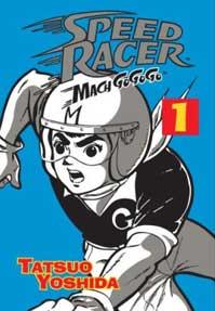
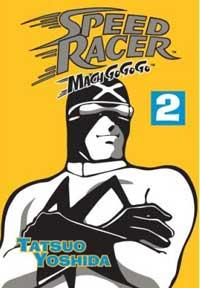
SPEED RACER: MACH GO GO GO Box Set
by Tatsuo Yoshida Released by Digital Manga Publishing Reviewer: Scott Green
Digital Manga Publishing's (DMP) collection of SPEED RACER offers brilliantly fun pop art in a beautiful collection. The entire run of the manga is collected in a two volume set housed in a box bearing the design of the racing series' famous Mach 5 car. It boasts the sort of iconic, retro look that a long time SPEED RACER fan would want from their definitive collection of the material: nicely what it is, of its time, without applying anachronistic sentiments. Panels and pages are arranged in the original Japanese right to left, which might make the collection difficult for some non-manga reading, SPEED RACER fans, but beyond that, the reproduction and localization is clean and clear. Especially factoring in the manga's age, with the quality of its ink and paper, it's great looking printing. With touches like translating the sound effect illustration next to, in the style of, the original Japanese the adaptations offers a very transparent localization.For fans of manga, it is welcome to receive this sort of well preserved time-capsule release, but the rationale owes less to SPEED RACER's artistic merit than it does the title's enduring niche in American culture and its regular revivals.
SPEED RACER was part of the second wave of modern manga, after ASTRO BOY, TETSUJIN 28 and 8-MAN, contemporaneous with LUPIN III and before the major works of Go Nagai. Anime had already become a factor in the market. Everything was fresh, up and running. SPEED RACER took to that with what has been credited as part James Bond gadget-mobile, part VIVA LAS VEGAS and parlayed it into a feverish petrol-sport merry-go-round. Bouncing, hurtling cars were tearing up the road with a hurricane of speed lines in their wake. In fast pages it was sending packs of cars ripping around mountain bends, where the slow or dull were doomed to plummet and explode.
I wanted to say that there is a brief moment, earlier in SPEED RACER, where the manga was not quite campy, where it dealt with a real context and concerned itself with the Japanese automotive industry trying to assert itself on the world stage. However, when I returned to the first volume, and opened up the first chapter, I found that it didn't quite open with Pops Racer trying to protect his engine innovation and east-west-cooperation. Of course, it opens with Speed Racer himself burning rubber on a fantastic race track, before skittzing off with visions of Pops barking reprimands ringing in his head.
The manga version of SPEED RACER might be slightly lighter on the gadgets than the famous anime, but in terms of two fisted automotive adventure, with blind driving, sailing over cliffs, thrown wrenches, punches and bodies, the SPEED RACER manga speeds towards craziness at full throttle. SPEED RACER might not be artistically enduring, but the way its earnest white hat protagonist will pick up a tommy gun and start blasting at assailants, or the way that his father will start throwing fists when his work is maligned, or even a bound, old man hostage will bite his captors demonstrates a boy's exuberance that still makes SPEED RACER memorably fun.
SPEED RACER can be exciting, but it's not surprising. Unlike what Osamu Tezuka or Shotaro Ishinomori were frequently attempting, it wasn't parlaying the entertainment into something touching or significant. Despite multi-chapter stories, the manga does not have the continuity associated with popular boys'/shonen manga of recent decades. Pops Racer built an incredible car that Speed wasn't ready to use in racing competitions, but with Pops fuming, under the knowing eyes of Mom and girlfriend Trixie, Speed was going to use that car to compete in some wacky race, usually encountering the mysterious Racer X along the way. There's at least an effort to always have Speed going to some far off place, racing strange people under stranger circumstances.
 Especially deep into the manga, the results are inconsistent. The Alpine Race with its Car Acrobatics team and handicap driving final leg is wonderfully outlandish, but some of the convolutions don't pick up excitement with their swerves.
The manga collection is positioned more for the bookshelf of the SPEED RACER enthusiast than the manga archivist. It opens with personal history mixed with behind the scenes from Peter Fernandez, the voice and pen behind the work to localize Tatsunoko Production's 1967 anime “Mach Go Go Go” as “Speed Racer”. Then, the translation precedes to use the names familiar to American audience since the animated series hit American TV: Speed Racer rather than Go Mifune, Trixie rather than Mitchi, Rex Racer aka Racer X rather than Kenichi Mifune aka Masked Racer. It's a trade-off between representing Speed Racer's significance in American pop culture, and Mach Go Go Go's in the manga tradition, and it's a trade-off between cleverness in one language and another. Both the original Japanese and the American adaptation are heavy on puns. The Japanese plays with the homonym "go" as Japanese for 5 and "go" as an English word, while the American adaptation has fun with names like Tongue Blaggard and Lightfingers Klepto.