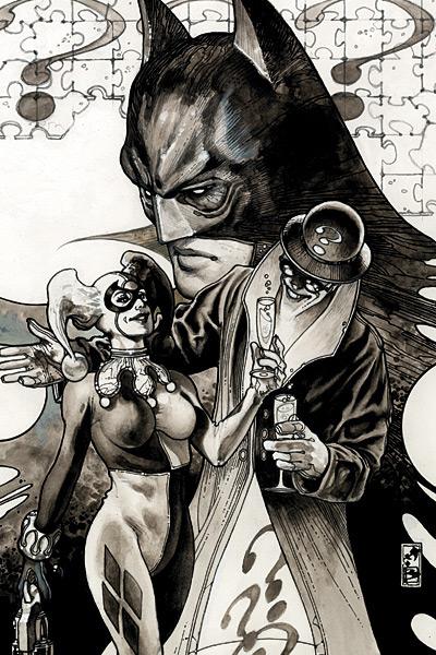

| #22 | 10/03/07 | #6 |
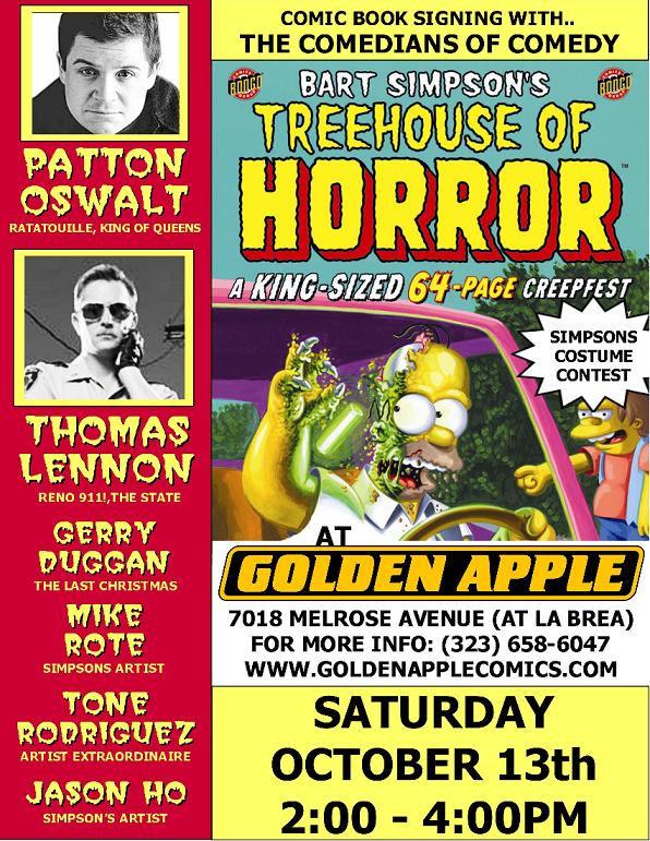 Hey folks, Ambush Bug here. @$$Holes-by-proxy Patton Oswalt, Gerry Duggan (THE LAST CHRISTMAS), Thomas Lennon (RENO 911), and friends asked me to pass on to you all that they will be on hand signing babies and kissing copies of the latest issue of BART SIMPSON’S TREEHOUSE OF TERROR at Golden Apple Comics in Los Angeles, CA this Saturday October 13th. Those guys all contributed stories to the book and they wanted me to send a welcome out to any Talkbackers in the area encouraging them to pop in, pick up a copy of the book, and say hey. Too bad I’m scheduled for monitor duty this weekend at @$$Hole HQ or I’d pop over to that one too. Click on the image for details.
Anyway, let’s roll with them thar reviews!
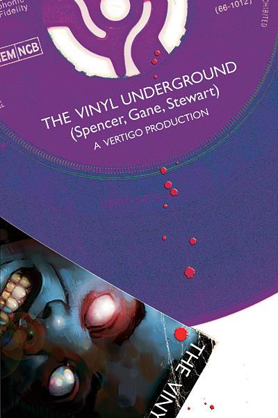
THE VINYL UNDERGROUND #1
Writer: Si Spencer Penciller: Simon Gane Publisher: Vertigo/DC Comics Reviewed by Humphrey Lee
Coming across the advanced preview of this book via various Comic Con Panels this past summer my first reaction to THE VINYL UNDERGROUND (henceforth referred to in this review as TVU) was to cross my fingers and quietly repeat to myself "Please don't be a PHONOGRAM rip off. Please don't be a PHONOGRAM rip off." From the outside it looked to have some largely shared story elements like the magic/occult based plot with a music theme and plucky young and hipster protagonist, etc. Thankfully that's not the case here, though, sadly, unlike PHONOGRAM which is high amongst the quality of comics I've read this past year, this first issue of TVU is somewhat average.The main character in TVU is one Morrison Shepherd: son of a deceased, high-profile soccer player (errr, "football" player. Forgot, this is in the UK) and a bit of a tabloid punching bag given his heritage and the kind of acts he's performed to kind of dirty up the family name. Morrison is also combined with a very, VERY colorful cast of cohorts including Perv, a psychic ex-con and Leah King, a blonde bombshell who does online, virgin porno and is a hell of a dead person investigator. Yep. Anyways, Morrison and his playmates have apparently been hitting the pavement ever since Morrison got out of a stint in rehab and solving some very dirty cases in the underbelly of London, leaving vinyl records after their exploits.
And that's where we are with this first issue of TVU, lots and lots of set up, some bits of raunchiness, and the start of the first murder mystery we'll be seeing this group of misfits tackle. Now, this debut isn't bad by any means, but it lends itself to the term "ho-hum" quite too much for its own good. A term I like to use in cases like this is that it definitely has a bad case of "pilotitis". "Here's the plot, here's the characters, here's some T&A and a bit of the old ultraviolence to keep you going aaaaaaaaaand now here's the lead into the next issue, please buy it, thanks" is what I got out of this, and that's pretty much how it read.
Now, was that indeed enough to keep me going for the next issue?
Sure.
I mean, if anything TVU is quirky and eccentric enough to at least make me curious as to see just what the book and characters are capable of no doubt, but it doesn't exactly leave me chomping at the bit with anticipation and it's kind of a case where I'm just too lazy to cancel my pre-order with my LCS so why the hell not continue? And at least one thing that this book does have going for it is that it's inked by Cameron Stewart, which is about as good as you can get next to being purely penciled by him. Not to undermine Simon Gane at all, apparently there's a lot of talent there if his base pencilling already lends itself well enough to Stewart's "mere inking job" making it a very nice facsimile of one of the most talented visual storytellers in the medium today. Plus the panel layouts are absolutely perfect, but at the same time, I think the fact that I'm talking about Stewart's inking job in this comic so much lends itself to my point about the book itself not being particularly memorable. These things take time though, especially with Vertigo books, so I'm more than willing to give it the benefit of the doubt and just in time to hopefully recommend you guys a trade buy later on down the road, but for right now this ride has already started off a little bit bumpy.
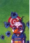
HOWARD THE DUCK #1 (of 4?)
Writer: Ty Templeton Art: Juan Bobillo (pencils) & Marcelo Sosa (inks)
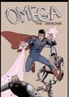
OMEGA THE UNKNOWN #1 (of 10)
Writer: Jonathan Lethem with Karl Rusnak Art: Farel Dalrymple Publisher: Marvel Comics Reviewer: Ambush Bug
Looks like last week was Steve Gerber week at Marvel, with a pair of new miniseries debuting starring two of his most famous creations. I always liked Gerber’s stuff. A quick jaunt over to his Wikipedia page and you'll find that he had a hand in creating quite a few characters from the 70's that are still popular today. His concepts were often out there and always creative, yet had an edge and a humility to them that was hard to find in comics of old. Many of Gerber’s characters weren’t necessarily heroes, but characters that found themselves in situations where they were forced to dig deep and find something good within themselves to survive. Although I’m going to have to wait a bit longer before my favorite Steve Gerber creation is re-imagined (FOOLKILLER), it’s good to see Howard the Duck and Omega the Unknown on the stands once again.Many people are going to shrug and say who gives a shit when passing these books on the shelves. Old-schoolers are going to see that Gerber’s name isn’t attached to these books and possibly scoff at the fact that someone is going to try to come along and “hip-‘n-trend-ify” these characters. With the resurgence of seventies icons Iron Fist, Luke Cage, Shang Chi, and even Deathlok (now appearing in NEW AVENGERS), it was just a matter of time before these offbeat characters had the dust balls knocked off of them.
Comic book newbs may recognize Howard from his less-than-fantastic film. Or maybe they won’t know who the hell these characters are at all. Although familiar with Howard, I have to admit, I know very little about Omega the Unknown myself. To the old schoolers and the newbs, I have to say, “Forget the past. These two books are definitely worth checking out.”
First and foremost, it was great to see the acknowledgements to Steve Gerber in the credits of each book. It gave me faith that those doing these new series possibly read those old stories and took some inspiration from the fun that leapt from those titles.
My favorite of the two was definitely HOWARD THE DUCK. Sadly, I felt the MAX series that came out a few years ago was a bit too somber and downright acidic for my tastes. The Howard from that series was down n’ out and had a pretty low outlook on life. I left that series feeling drained and down myself. This issue, though, is the exact opposite. Writer Ty Templeton doesn’t change up the character of Howard one bit, but does change the tone to a more quirky and fun one. Howard still grumbles and calls all of the humans hairless apes. He still complains a lot, drives a taxi, and waddles through life in the dumps, although he doesn’t have that much to complain about since he gets to feather-bone the lovely Beverly, his long-time girlfriend and aspiring actress. Tongue is firmly planted in feathered cheek throughout this entire story as Howard picks up a fare in his cab of two vacationing businessmen who have just returned home from an unsuccessful duck hunting trip. Of course, the two men are thrilled to find Howard and go on a hunting excursion through the streets of Cleveland. The plot is crazy enough to work. It’s somewhat self-aware, yet the book has the same kind of goofy humor that permeates shows on Sunday night Adult Swim. You know the kind. The kind so-called sophisticates scoff at and say is stupid, while those in the know watch it anyway and laugh their asses off. Adult Swim is the new Three Stooges. Either you get it and like them, or you act all uppity and don’t. I’m in the liking it category and maybe that’s why this book entertained me so much.
What really sold me about this book was the art. Juan Bobillo brings his herky-jerky stylings from the pages of SHE-HULK and gives Howard a look that is both new and refreshing without abandoning the characteristics that make Howard the offbeat icon that he is. Bobillo does a great job of making the bland invigorating. With little detail, he is able to communicate the shape and form of the image in vivid detail.
My only complaint: DON”T THINK I DIDN’T NOTICE THAT HOWARD WASN’T SMOKING HIS TRADEMARK STOGIE IN THIS ONE, MARVEL! That mandate on non-smoking characters still stinks on ice.
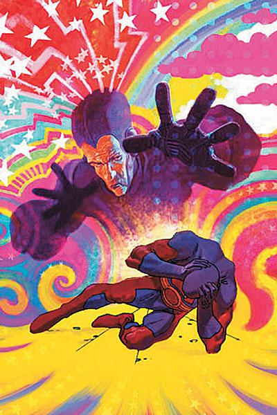
Now, OMEGA THE UNKOWN is one of those titles that is really going to separate readers. If you are of an open mind and are willing to take in an offbeat story with artwork that is probably better suited for the indie market, you will probably enjoy this book as I did. If you are a tried and true Marvel Zombie who can’t scroll fast enough past my little Indie Jones section every week in this here column, then you may not necessarily dig what writer Jonathan Lethem and artist Farel Dalrymple are doing here. This is definitely another offbeat story in true Gerber fashion. And although I don’t know for sure, since I don’t remember the original series one bit, I’m pretty sure it deviates pretty far from the original concept. Or maybe not. From what I remember, though, the original OMEGA THE UNKOWN was a pretty straightforward super hero yarn with the enigmatic character appearing on the scene and being mistaken for other heroes of the era. In this book, we center on an odd teenager named Alexander who talks like a robot because, well, he was brought up by robots. But he doesn’t know this yet. Until the events of this issue, he thinks living in seclusion and being home-schooled by his parents is normal. It isn’t until a disastrous car crash that he finds out that he isn’t like other kids and his parents aren’t the people he thought they were. What happens after that is old school comic book fun. Robot aliens show up. A cocky hero named The Unparalleled Mink works his expositional muscles. A caped figure shooting beams of power from his hands swoops in and fights furiously. And somehow it all makes sense to the young lad.Reading this, one may wonder why I said that this book may be a hard sell. What separates this book from pretty much every other comic Marvel churns out these days is the art. It’s edgy and sketchy and dare I say, sloppy. Characters are often stiff and sometimes lacking in detail. At times, the art seems crammed into the panel. Sometimes proportions are off. Sometimes inconsistencies in detail like the Mink’s mask disappearing and reappearing on the same page occur. And you know what? I loved every panel. This was the first time in a long time I felt as if I were reading something raw from Marvel. The company has a tendency to produce slick and conventional artwork. Lines are definitely defined and precisely precise. Looseness is rarely a descriptor for Marvel art. Here we have a mainstream story told in an indie manner that you don’t get to see coming from Marvel and I loved every page of it.
But some of you won’t.
I’m just warning you.
And the thing is, I doubt either of these two books will appeal to the fans of mainstream Marvel. And that’s pretty ok in my book because it shows that Marvel is branching out and taking some risks for a change. For the last few years, Marvel has been publishing some of the best miniseries around, focusing on offbeat characters and providing some extremely strong storytelling. HOWARD THE DUCK and OMEGA THE UNKOWN are just the latest examples of this and I strongly recommend you pick them up, read them with an open mind, and soak in the goodness.
ALL NEW ATOM #16
Written by Roger Stern Art by Mike Norton and Trevor Scott
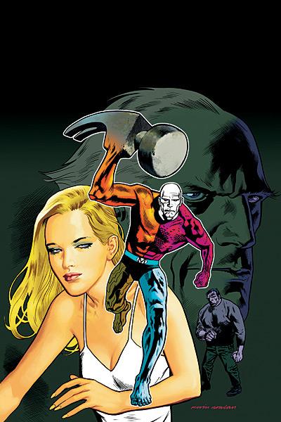
METAMORPHO YEAR ONE #1 (OF 6)
Written by Dan Jurgens Art by Jurgens and Jesse Delperdang Published by DC Comics Reviews by Stones Throw
Hey all. Well, I’m through the trial period (and I still maintain that making me scratch out reviews with my finger nails had no practical merit), so now comes the hazing. Ouch! In between paddling, the @$$Holes saw fit to toss me a few comics to look at.Remember decompression? It was all the rage a few years back. Now only Marvel tie-in crossovers and hoary old has-beens like Warren Ellis and Brian “Michael” Bendis do it. But, like Ambush Bug said in his review of THE UMBRELLA ACADEMY, today’s anti-decompression, or as I call it, non-dull storytelling (and I leave the multi-part stories that have come to be known as “arcs” out of this) seems mostly to take the form of either gonzo “throw a load of insane shit at the wall and see what sticks” madcappery or single issue vignettes that smugly flaunt their done in one-ness at you, while not really telling much of a story in their 22 pages. This seems to be the vogue for the interlude issues we get in ongoing books while the regular artists gasp for breath after producing five issues on the trot.
Recently, DC seems to have been taking a more back-to-basics storytelling approach, with varying degrees of success. This is admirable in a lot of ways, although I’m not sure if it always sufficiently appeals to today’s audience. When it goes right though, they feel kind of like Marvel in the 70s and 80s. They’re even employing a lot of the same guys. Marv Wolfman, Steve Gerber, Jim Shooter, even thought he started at DC. Luckily they have writers like Geoff Johns and Grant Morrison to keep things fresh too.
Last but not least, Roger Stern, who for me is one of the best pure superhero writers there has ever been. I can’t speak for the other old-timers’ efforts, but I certainly enjoyed Stern’s issue of the ATOM, which is a textbook example of how to do a full story with set-up, conflict and resolution in one issue. In fact, it felt a lot like a Bronze Age Marvel comic. Ivy Town’s being switched back to the 1970s (personal ground for Rog, maybe?) with all the residents becoming hippies and it’s up to the Atom (I’ll leave off the “new” part, since I think he’s already become one of the most well-defined new characters in recent years) to discover why. As is usual with the ATOM, it was a load of fun and it’s a credit to regular writer Gail Simone, and Grant Morrison I suppose as the idea-smith behind the concept, that the transition to a fill-in writer was so seamless. In fact, I didn’t even notice Simone wasn’t writing this issue until I glanced back at the credits. Besides lacking a certain snarky wit, this fit right in. Mike Norton’s fantastic, capable artwork helps too.
 Okay, Prof. Challenger’s handing the paddle to Ambush Bug so I guess it’s a good time to collect my thoughts on METAMORPHO YEAR ONE. It isn’t a done in one, but it’s a good example of the straight forward, simple approach when it doesn’t work.
 My knowledge of Metamorpho finishes after some appearances in the Justice League, one of Neil Gaiman’s most affective issues of SANDMAN and his none-freakier appearance. It’s funny how Marvel is known for having freaky characters like the Thing and the Hulk who are actually quite aesthetically pleasing, while over at DC characters like Metamorpho or the Martian Manhunter are pretty ugly to look at on the page. I’m gonna put that down to the way they’re normal-shaped guys, just with really weird colors and textures. Anyway, who could pass up a book with that cover?
Like I was saying, I couldn’t tell you much about the guy beyond powers or appearance, so maybe I’m not the target audience for a book like this. I doubt Rex Mason was a reality TV host previously, but the transition seemed well handled, even though “Treasure Quest” isn’t like any reality show I’ve ever seen. Seems more like a cross between Indiana Jones and TIME TEAM . He co-presents the show with a preserved caveman called Java. In comics, cavemen are always much bigger and stronger than humans today, even though in reality they were much smaller. Show us a 4 ft tall caveman for once! He wouldn’t be so good at lifting stuff, but he could probably slyly punch enemies in the nuts.
Rex says things like “That’s the thing about reality TV. The more human tragedy you give ‘em, the more they eat it up” while attempting crash landings. There’s also a wealthy villain who’s got it in for him and a shallow girlfriend and not much else. Hey DC, this might have been passable twenty years ago, but it doesn’t cut it today. Just think what a Grant Morrison could do with the concept. TV, Egyptian mythology, a handsome, famous guy who becomes a freak. File this under “Retellings/Missed Opportunities”.
Ouch!
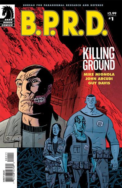
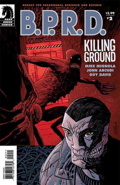
B.P.R.D.: KILLING GROUND #1-3
Writers: Mike MIgnola & John Arcudi Art: Guy Davis Publisher: Dark Horse Comics Reviewer: Ambush Bug
My experience with HELLBOY and the B.P.R.D. is limited to the HELLBOY film. The original HELBOY series dropped right around the time of the big comics boom of the nineties where every company had a new batch of heroes and a new universe for them to run around and do comic book things. While I dibbled and dabbled with Image and Valiant and some of the other universe big-banging into motion during this time (hell, I even got the Dark Horse Universe stuff with BARB WIRE and GHOST), I simply didn’t have enough time or money to check out HELLBOY. And I have to say I am kicking myself for the whole thing because while all of those other characters and universes have come and gone, HELLBOY still seems to be chugging along strong.But still, I stayed away from HELLBOY, thinking that the beginning of the story has already been told and that I missed out. I figured if I tried to dive into the universe, it would require the purchase of many a trade paperback or worse yet, a full-on hip-deep dive into the back bins for old issues. I enjoyed the movie immensely. I immediately was able to chime with characters and understand the universe (being a Lovecraft fan helped). I had an interest in the comic, but due to my previously stated reservations, I stayed away from the book.
 Recently, I had the chance to read the first three issues of the new B.P.R.D. miniseries KILLING GROUND. This story picks up as the team is briefing about previous missions and revelations that more than one member of the team has ties to Nazis in their past, a wendigo has been delivered, Liz the firestarter is having bad dreams and is more unstable than ever, Johann now inhabits a massive human body and for the first time has all-too-human desires that are hard for him to control, and a mysterious bearded man is on a collision course with the agency. That’s a whole lotta stuff going on in only three issues, but the story never feels cramped. It feels like a large machine, with the gears all clicking into place. The structure is solid and pacing is great since it actually feels as if “stuff happened” when you finish each issue.
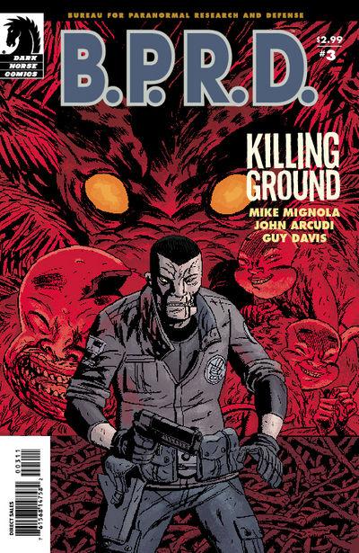 What impressed me the most was the fact that, with just the little intro page consisting of short paragraphs dedicated to each B.P.R.D. member, and only my experience with the film being the only experience I have had with the Hellboy Universe, I was still able to follow the story for the most part and understand what’s going on. This is a testament to the strong storytelling skills of Mignola and Arcudi. These guys have created some amazing and fascinating characters. I’m sure time has been spent introducing and developing these characters, but reading these three issues, it also seems as if that has happened long ago. Now, we get a story with the characters just being their characters. It’s nice to see a story that doesn’t revolve around cheap writing gimmicks like a death or an introduction. The characters simply are and the story happens around that. And the best part is that those of you who have never picked up a Hellboy book (like me) will be able to enjoy it as well.
I hate to resort to the obligatory “single mention of art in a review,” but I could probably focus an entire review on the art of Guy Davis, whose simplistic yet acutely detailed designs make this all the more of a pleasure to read. This book is a winner and although I am kicking myself for discovering the comic book universe version of Hellboy so late in the game, I am enjoying the hell out of it now.
SCALPED #10
Writer: Jason Aaron Penciler: R.M. Guera Publisher: Vertigo/DC Comics Reviewed by Humphrey Lee
Slowly but surely this comic has been inching its way up my reading list, and this current arc, "Casino Boogie", has been highly responsible for that occurrence. At first I thought this book was a little too amped up and wantonly excessive for its own good, like it was trying to scream as loud as it could "THIS BOOK IS BLOODY AND VIOLENT AND HAS A LOT OF TITS AND SWEARING AND SHIT JUST PLEASE FUCKING BUY IT!!!" And, well, it is all those things, but beyond that is a lot of pure human nature that does very well in contrast to all those things I mentioned in capital letters and, well, it actually lends itself to it, just like in real life. And this issue is a perfect example of how brutally human the world and society this book is set in can be as it is a one-and-done story about a teen on the Rez, trying to earn his way out of a life he despises.What is so good about this particular issue is that it perfectly nails all those moments, those glimpses of the future we all have at one time where we all say "Fuck this place, I fucking hate this, I'm getting the fuck out of here" and where they always lead us. Dino is just another teenager on the Reservation, but unlike all those around him who seems to have no ambition to stop wallowing in the filth, poverty, and decay that has become the Rez, he has decided it's more than past time for him to go out into a world that can't contain him as far as he's concerned. But reality is a harsh bitch and Dino has been slapped with that revelation more than enough, just like he's backhanded with another one at the end of this issue that is absolutely perfect given how things on the Rez tend to unfold. This issue was a very nice treat I must say.
As for the art, well, I've been critical of it before but I'll admit it is definitely improving. The bigger of the two main complaints I had about the art chores on SCALPED was that it was far and away too overloaded with black ink that positively drowned out most of the lines and muddled up the pages way too much, something that has been reined back tremendously and it shows. It could be better but at least now I can make out characters way better than I could before. Speaking of which, that was my other main concern with the artistry here is that the lines could have been a lot tighter, a lot more formulative if you get my drift, and again they've improved in that regard. Characters and scenery are much more defined and it makes following the story visually a lot easier, which is key in issues such as this, or when this book does ramp up the action.
All in all SCALPED has gone from a book I wasn't too sure of to something that is nearing the top third of my reading stack (and I read a lot of good books if I say so myself so this is a very solid compliment). The way this book can bounce back and forth from adrenaline high to emotional depth is very masterful indeed, but consistency from here on out is the name of the game, as is capturing the proper balance between both those concepts that are making this book more and more of a must read each month. If these past five issues have been any indication of Aaron and crew's ability to reconcile these things into a riveting read, then Vertigo's got another hit on its hands...

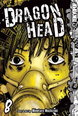
DRAGON HEAD VOL.8
Story and Art: Minetaro Mochizuki Publisher: TokyoPop Reviewer: Ambush Bug
I’ve written a lot about DRAGON HEAD. I’ve written about how I first became interested in the book after reading a review by fellow @$$Hole superhero and being at first concerned that the premise was very similar to one of my own stories, then being relieved that it wasn’t that similar at all, and finally feeling invigorated having partaken in my very first manga experience. I’ve written how the book is very similar to the TV show LOST in that as the narrative goes on, more questions than answers are supplied to the viewer. I think I also wrote a review about how surprised I was with the cultural differentiation I noticed with this book in the way that children are treated as adults and the fact that nothing and no one is truly safe in this story. I’m sure I wrote one that was chock full of big @$$ praise in the geekiest of fanboy mannerisms. And finally, I think I tried to turn a lot of you on to manga by suggesting that DRAGON HEAD is the perfect gateway drug for CAPE GUYS to dive into the world of BIG EYES. All of these things I said are still true about DRAGON HEAD.But the things is, in none of those books have I once mentioned the word “hope.” And I think the main reason for this is the fact that these kids are in such a hopeless situation. The world as they know it is no longer. The sky is filled with ash. Most of the people are gone and the people left behind look more like demons than anything else. Was the cause of this catastrophe a natural disaster, a man-made disaster, or something not of this earth? No one knows the answer to that and as the group of children get ever closer to their destination of Tokyo, from the sights and sounds and experiences that they have taken in over the last eight issues, “hope” is a word that’s going to be farther and farther from their minds.
I myself was overcome with dread as I read this eighth volume of DRAGON HEAD. Separated from his group once again, Teru is beaten by the elements, starving, dehydrated, hallucinating, and at his physical and mental end. And then something happens in this book that I don’t think has happened yet in this comic.
There is a full page splash of black with only Teru’s narration that instilled something in me. It is just a few words:
“However…this signal…had quite a different meaning.” ”One…I wouldn’t discover until later…much later…
This little bit of storytelling instilled a bit of “hope” in me as the reader. Teru is looking back and telling this story, so hopefully this means that he makes it to a safe place; a safe enough place to sit back and begin the narrative. I have to admit, eight issues in and I was pretty much overcome with a feeling of dread. These kids have gone through so much that looking back on the entire series is emotionally taxing since I have come to care about the well being of writer Mochizuki’s main characters. To have them go from one dire situation to a worse one made it evident to me that nothing good would come of this story.
But that one page in this issue gave me hope. I could be wrong, but it’s enough to let me believe that things might be ok for the characters of this story. It’s a testament to Mochizuki’s masterful writing that I have become so invested in Teru and the rest of the cast. It’s a wonderful read and I find myself rushing home and ignoring all of my CAPE GUY books in favor of this BIG EYE read. If you haven’t checked out DRAGON HEAD, seek out a copy from TokyoPop’s website. If you have been reading it, welcome back old friend. You, like me, know that this is one of the best manga—scratch that—one of the best comics around.

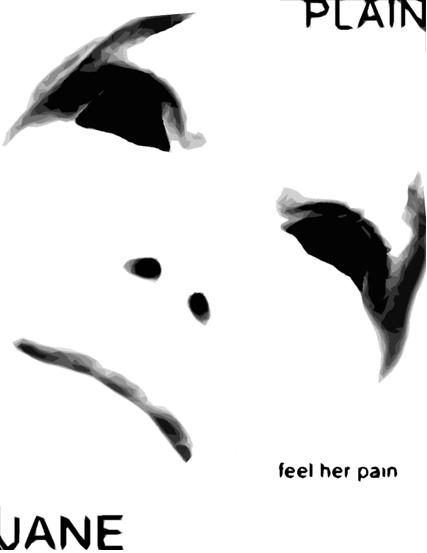
PLAIN JANE BOOK ONE OGN Revenge Comics
Much like THE CROW and KABUKI before it, this is a moody bit of revenge fiction in illustrated form. Credit has to be given to writer/illustrator Mazen Hasan who has not only designed an original looking character in Jane, but has a pretty deft eye when it comes to making the page look original and aesthetically pleasing as well. This book is not for the faint of heart. Jane is a rape survivor. The heinous crime has left her damaged on the outside (her face was scarred terribly leaving her with an emotionless and eyeless visage, hence the name) and also on the inside. This tortured soul lives only to relive her assault and inflict the same type of pain onto those who prey on others. Hasan gets points for creative uses of word and thought balloons as well, incorporating them around the image or having them interact with the characters in the panel. At times, the pages are weighed down with word balloons and the poetic speak can be occasionally pretentious, but all in all, this is an incredibly effective book when it comes to conveying emotions such as dread, sadness, and outrage. – Ambush Bug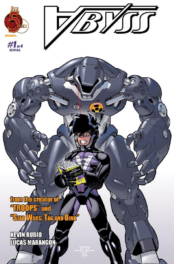
THE ABYSS #1 Red 5 Comics
This was a nice, straight-up super hero yarn that doesn’t take itself too seriously yet uses superhero clichés as springboards for a more modern and interesting take on the genre. It starts out with a normal kid named Eric who finds out his long-thought-dead father is a super villain and isn’t too comfortable with that. I liked the conflict between father and son in this one where the main character’s morals are tested against his familial ties. The art is pretty sharp too. Nice action scenes. Cool robot and costume designs. From story to art to premise, this is one well put together comic book and it hits the shelves next week. - Ambush Bug
SPACE DOUBLES #1 Th3rd World Studios
This double feature flipbook was a treat to read and a must-see for sci fi/horror fans. Story one, RED RAIN, does a great job of capturing the excitement and adventure that was once attributed to space travel. This was a horrific tale in the same vein as WAR OF THE WORLDS where a group of astronauts discover life on the moon…and it’s not friendly. This tale is well paced by writer Mike Raicht and beautifully drawn by artist Alecia Rodriguez who has also designed some mean aliens for this one. Story two, PROJECT: OBEAH, is a good old fashioned zombies in space tale when an experiment goes awry and may prove to be the end of the earth as we know it. Both stories have impressive production put into them and nice artwork. The stories are a bit breezy, but are effective short stories that would satiate the appetite of any fiend for sci fi/horror. - Ambush Bug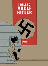
I KILLED ADOLF HITLER OGN Fantagraphics Books
With a title like that, you have to stand up and take notice. This was probably the best book I read this week. The writer/artist known only as Jason answers the hypothetical question: if you had a time machine and had a choice to go back in time and kill Adolf Hitler, would you do it? Jason’s answer is yes, but only if you lived in a world where hitman is a legal occupation and you were hired to do so. This is an extremely poignant and heart-felt read about love, life, the passing of time, and of course Hitler. The tale is told simply and almost matter-of-factly as if the concept of time travel and the legalization of the hitman industry is commonplace. What adds to the story is the fact that the characters themselves are humans with animalistic characteristics. They all kind of look like Goofy; lanky, dog like characters who walk unright in a cartoonish and simple fashion. But by the end of the story, one realizes that this story is anything but cartoonish and simple. There are many, many memorable panels and sequences throughout this original graphic novel. There is an earnestness in the emotionless faces of these characters who live in a fantastical world but have all too human feelings despite of it. This is a great achievement in comics booking. – Ambush Bug
EXILES #99 Marvel Comics
In case you hadn’t gotten the memo: EXILES has jumped the shark, the jetty, the shore, and the entire adjoining continent. What a great book this used to be. It’s still pretty – Clayton Henry has seen to that. But with the team spread out and lost in the time/space/universe continuum, Claremont just can’t help himself: Sabertooth’s endless (and 70’s-esque) monologuing. Or exposition from characters who have an “uncanny” ability to see to the heart of a matter, even thought they just arrived on the scene (ala Spidey-2099’s companion.) Or the end of every scene with some sort of dramatic cliché. Or the attempts to make us care about characters we’ll never see again. Heck, I barely care about the characters I see every time I pick up this book anymore. Please, can we find a new direction? A new writer? Or a new reader? I loved this story the first 10 times I read it in X-MEN, but it’s tired, and so am I. - Rock-Me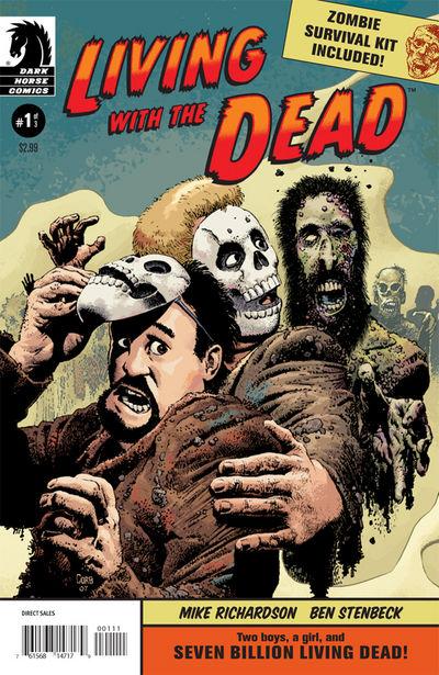
LIVING WITH THE DEAD #1 Dark Horse Comics
If you know me, and most of you do, y’all know I’s likes me some zombie comics. I know there’s been an overabundance of zombie comics on the shelves, and it’s often hard to separate the wheat from the chaff when it comes to quality zombie fiction when looking at all of the decomposing faces and fingers on the shelves, but this one brought a smile to my face. It follows two rogues as they try to survive during the zombie apocalypse by making their trips out into the zombie-filled streets limited to only when the need for looting is necessary. The two (who resemble OF MICE AND MEN’s Lenny and George) are a likable pair who live by a set of rules and know that deviation from those rules means being chomped on by zombies. What sets this apart from the rest of the zombie books out there is the fact that humor is a major part of the action. The guys wear a zombie mask and spout the words “BRAINS!” or “FLESH!” and have found that this has worked as a way to fight off the zombies. This joke was used to great effect numerous times as the two find themselves in a toothy zombie situation and simply mutter “BRAINS!” and the zombies turn and lose interest. I’m not sure if this joke can last throughout the entire miniseries, but it worked effectively enough in this issue. A dame shows up towards the end of this issue, and of course that means trouble for the two guys. All in all, this was a fun romp of a zombie comic. As an added bonus, this issue provides you with your own Zombie Survival Kit to cut out and stow away until the inevitable zombie apocalypse occurs. - Bug
TALES OF THE SINESTRO CORPS PRESENTS CYBORG SUPERMAN DC Comics
Bear with me for a minute here. I set these hastily-scheduled SINESTRO CORPS WAR tie-ins to rights a few weeks back when I said that they felt pretty unnecessary to the larger story. This one has elements of that, although it’s more of a catch-up on the Cyborg Superman’s history, which isn’t necessarily a bad thing given that Hank Henshaw’s motive in joining the Sinestro Corps - so that the Anti-Monitor, probably the multiverse’s most powerful being, will finally put him out of existence - has been one of the most interesting nuggets of Geoff Johns’ story. Still, I couldn’t help thinking that this would have worked better as a text page in the back of GREEN LANTERN or a five-page back-up story or something. A 22 page explanation of an interesting, secondary character arc tends to rob it of some of its magic. But we then get to the last eight pages and I’m forced to eat my words as some major shit occurs, namely the beginning of the mother of all smack-downs between the JLA and the Sinestro Corps that I eagerly awaited in my earlier review of this storyline. Thing is, I expected to see it first in the main title, not an extraneous one-shot that might’ve been under the radar for a lot of folks. Way to steal Johns and Ivan Reis’ thunder, DC. That guy can’t catch a break when it comes to events. I’m tempted to blame editorial for putting it out too early without considering proper chronology, but then I noticed the “To be continued in GREEN LANTERN #24” blurb…so yeah, I guess they are to blame. – Stone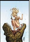
SHANNA THE SHE-DEVIL: SURVIVAL OF THE FITTEST #3 (of 4) Marvel Comics
Have you ever almost got into a car wreck or almost been caught masturbating or some such event that makes your heart go beating in your chest, your body break out into a cold sweat, your eyes alert, your brain pump adrenaline while your whole body tenses up and is shocked into action? Well, reading this book is kind of like that. This is truly one of the most bad@$$ miniseries of the year. Shanna kicks so much dinosaur/pirate/Nazi caveman/gangster/sabertooth tiger @$$ in this issue, my head was spinning when I put the book down. There’s so much shit in pursuit our would-be heroes in this issue that it seems to be pouring from one panel to the next. Although my frustrations that Shanna’s past hasn’t been touched upon in the last two miniseries she starred in (where’s Ka-Zar? Where’s Zabu? Where’s her baby?) persist, this book has so much action from cover to cover that I find myself not giving a shit. Last week, I scanned the racks and noticed a helluva lot of jungle girl comics on the shelves these days. Don’t get me wrong, it’s nice to see a chick with her bathing suit area covered in nothing but animal hide, but most of those books are nothing but fluff. This miniseries, though, is hardcore action through and through. Palmiotti and Gray have another hit on their hands. - Bug