| #18 | 8/29/07 & 9/6/07 | #6 |
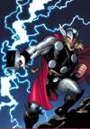
THOR #3 ADVANCE REVIEW – IN STORES TODAY!
Writer: J. Michael Straczynski Art: Olivier Coipel (pencils), Mark Morales (inks) Publisher: Marvel Comics Reviewer: Ambush Bug
Let’s get right to it.This is a great issue.
THOR #3 contains a showdown that has long been coming, a slugfest between two titans with a lot of bad history between them, and an ending that is both touching and exciting. I’ve had some reservations about some of JMS’ material recently, but he seems to be giving his all to this series. This book seems to be a perfect fit for JMS’ tendency for high concept work, yet the book doesn’t forget to add some memorable little scenes and bits of character. After three issues, I have to say that I am deeply enmeshed in the character of Thor again.
And that’s a pretty easy thing for me to do. You see, I’ve followed Thor’s comic for ages. I hopped onto the title at the tail end of Simonson’s classic run (I think it was actually a “Mutant Massacre” issue that got me hooked) and I kept with it all though the Defalco THUNDERSTRIKE years and then on through the Jurgens LORD OF ASGARD era. I even stuck through Oeming’s crappy ending to the THOR series, although for the life of me I don’t know why. With the exception of the ending “saga” of Thor, the book has always been at the top of my reading stack when I get home from the store. Needless to say, these last few Thor-less years at Marvel had me missing the big guy. So I’m glad JMS is bringing his A-game to this title and look forward to reading more of it.
Now, that doesn’t mean that there aren’t a few problems to this book that need to be mentioned.
First and foremost is the treatment of Tony Stark, not only in this issue, but recently all across the Marvel U. Marvel has painted one of its brightest as one of the bad guys. Iron Man’s another favorite character of mine and I hope Tony will come out of this whole mess a changed man who learned from his mistakes and have no doubt he probably will rrrriiiiiiight about the same time the movie is set to come out next summer…that is, if the powers that be know what’s good for them.
Anyway, I understand that everyone wants to see Tony get his @$$ handed to him and boy-o-boy does this happen in this issue, but how many times are we going to have to see this happen? In one month’s time, Tony has been smashed by the Hulk in WORLD WAR HULK, he just got his @$$ handed to him by Spider-Man last week in the first issue of ONE MORE DAY, and now we get a thorough @$$-handing by Thor in this issue. Granted, the battle between Thor and Iron Man in this issue is by far the best of the three, but I’m actually starting to feel sorry for the poor guy and although I don’t want to see him characterized as a control freak fascist, I also don’t want to see the guy be treated as a punching bag by the entire Marvel U either. Here’s hoping that there’s a road to redemption leading to the reestablishment of Iron Man as a hero in the very near future.
The second thing about this issue that has to be mentioned is the fact that the plot for this THOR series is far from original. The old “Gods have been stripped of their powers and memories and now walk among the land of man” schtick has been used just recently as punishment for the Amazons in the recent AMAZONS ATTACK mini-event.
And at the end of 52 when Black Adam was stripped of his powers.
And in Neil Gaiman’s ETERNALS miniseries.
AND the same concept was used with the very same Asgardians waaaay back in the last JOURNEY INTO MYSTERY title from the nineties.
But as with the Iron Man vs. whoever fight, although the concept may tread down “been there/done that” territory, very few of the aforementioned “Fallen Gods” stories have been worth a squirt of piss. It may not be a new concept, but damn if JMS isn’t writing the hell out of it and making it leaps and bounds better than all the rest.
Like I said, this is a great issue and I am fully behind this series especially with the amazingly beautiful artwork my Olivier Coipel, whose work seems to double in goodness with each and every issue. Although you may have seen the events in this book occur in other books, I doubt you have seen it look and read this well. THOR #3 drops this week and I definitely recommend you pick it up.
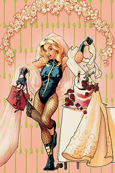
BLACK CANARY WEDDING PLANNER
Writer: J. Torres Artists: Lee Ferguson, Karl Story, Christine Norrie Publisher: DC Comics Reviewer: Rock-Me Amodeo
Yes, I know I’m gonna get a world of crap for this.Yes, this is a girly comic book for a girly wedding. It talks of planning, catering, wedding dresses and honeymoons: all things that most guys would never care about in a million years.
Until you’re the one getting married. And then, at least for the sake of avoiding an argument, you’re involved. Perhaps even interested. Hey, it happens. And despite the fact that many of us have already been there, I know that I’m gonna get a world…nay, a multiverse’s worth of crap for saying that I liked this book, but you know what?
I liked this book.
And not just with my keen married eye did I enjoy it. The artwork was anywhere from good (okay, a few weak panels) to great: I lost track of which artists did which pages, but there was a good mixture of solid work and out-and-out eye-candy.
I liked the banter, the give and take. I liked the fact that Dinah Lance is a competent and complicated woman who is taking on a task that almost every woman finds daunting. She was neither clueless nor indomitable, but very human. I love the way (thank again, Gail Simone, for your spectacular run on BIRDS OF PREY) that Black Canary (along with Barbara/Oracle) has turned into one of most richly layered characters in the DCU.
I also liked the fact that Oliver Queen had something to contribute in the way of ideas and usefulness. Men are often portrayed as buffoons in these situations, but it’s a sad and overused cliché. Major style points, as Gail might say, for Torres painting a realistic picture of two mature adults.
In real life, the organizational chores of getting married are like a baptism of fire (and a possible blueprint of how the marriage will function afterwards.) Not every guy is a disinterested shmuck, and if the couple works together and survives…well, it’s a real accomplishment. Reading this story gives me an idea that Ollie and Dinah really do have strengths and weakness that compliment each other. (The menu selection scene, for example, was classic: nuanced and not overstated.)
At one point, Dinah chastises Ollie for being too involved (out of frustration for her feeling she had done as much as she felt she needed to do) and told him to “man up.” And he ignored that as the frustrated jab it was, and continued doing what he could, helping out in some areas, butting out in others. Like a mature man would. Good for him.
It strikes me as ironic that many comics arriving with a “MATURE” label are often sophomoric displays of adolescent fantasies. And sometimes, that is exactly what the audience wants. But as lighthearted as this was, I daresay it was more mature, in the real sense of the word, than most things I read.
AMAZING SPIDER-MAN #544
Writer: J. Michael Strazynski Penciler: Joe Quesada Publisher: Marvel Comics Reviewer: Jinxo
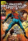
Okay, I just raked Spidey over the coals last column but since this issue answers many of the complaints I had I figured one more go round was called for. My biggest complaint with “Back In Black” was the fact that with Aunt May dying, Peter just took her to a regular hospital without trying to use all his superhero contacts to try and help save her. With this issue Peter starts doing just that. He starts marshalling resources he should have been bringing together months ago. So that’s good. I like what the “One More Day” plot is doing. But the problem still is, again, this is plot that should have started rolling months ago. Instead we got a summer of filler first. Beating up and faux threatening the Kingpin was more important than Aunt May. Beating up J. Jonah Jameson took a higher priority! It’s crazy!Okay, to be fair I’m sure the detour to “Back In Black” to promote “Spidey 3” was an executive decision and not something the writers really had much control of. But that doesn’t change the fact it was a dumb move. Aunt May dying is a ticking clock scenario. Essentially pausing the clock for months and months defeats the drama of the situation. Yes, in comic book time it hasn’t been too long but for the readers it is. For me “Back In Black” just means that, for me, “One More Day” has to be that much better to succeed.
I’ll put it this way. Way way back a friend and I went to a convention (ironically where JMS was appearing). For dinner we went out for pizza. The restaurant gave us breadsticks to chomp on until our pizza came. Only the pizza took FOREVER to arrive. By the time it did arrive we were so annoyed and practically full that to redeem the situation that pizza really needed to be spectacular. Just above and beyond just “good”. I’ve been eating breadsticks all summer. I’m about full up. I’m annoyed. JMS, this had best be one amazing and spectacular pizza.
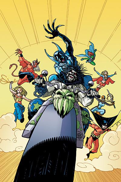
BLUE BEETLE #18
Writer: John Rogers Artist: Rafael Albuquerque, David Baldeon, Dan Davis Publisher: DC Comics Reviewer: Squashua
I am so disappointed in this book, you have no idea.There I was, having read the latest issue of BLUE BEETLE, and I was happy. I thought, "hey, that wasn't bad at all for a crossover, maybe I'll review it". And then I did something that I do for every book I review - I re-read it and researched the latest buzz about the book.
And that is what killed my originally glowing review.
Blue Beetle (Jamie Reyes) and his pals arrive to see the brand new Texas spaceport around the same time that the Teen Titans (in disguise) arrive to check it out as well. Both groups have been alerted by their respective sources that the forthcoming rocket launch will be sabotaged by an alien entity. Cue the inevitable pre-team-up fight, then the appearance of Lobo.
The highly entertaining teen-snark and semi-witty character interaction masks a major problem: the plot is actually haphazard at best, hindered by what appears to be a complete breakdown of communication between the writer and the artist.
First, there is a scene where a blonde girl wearing a high-necked school tie tells Robin that she's disguising them and clouding everyone's mind; obviously it's supposed to be Miss Martian, who actually has no incentive to say these words, as she's busy acting goofy, red-headed, loose-necktie girl not two panels prior. The naysayers might call her out for being Raven, but if it is, she isn't seen for the rest of the issue.
Second, during the fight scene, there's the obligatory "Titans Together" splash page with the Titans attacking Lobo, with all the human-level fighters (Robin, Ravager) up front against this Superman-level threat, while Supergirl, Wonder Girl, and Miss Martian bring up the rear. They're at least half a mile away from the rocket launchpad, but in the immediate next panel, the entire group is under the rocket booster.
Third, what really gets me, is that in this week's TEEN TITANS, which I saw a preview image of at Newsarama (I'm the guy named Squashua who posts in their forums!), there are at least two pages completely recreating scenes from this very issue; the aforementioned splash page as well as one of Blue Beetle conversing with the flying super-babes.
Oh shit. I figured it out. I wrote this review, and THEN I started filling in the artist and writer names before I sent it in. Rafael Albuquerque took a very thick pencil to draw any page that renders the battle outside of the rocket launch facility. He's the one to blame for the poor rocket booster transition. David Baldeon and Dan Davis drew the interiors, with very tight character designs; they're the ones to blame for not properly rendering whomever it was that was disguising the Titans.
This issue of BLUE BEETLE suffers from major plotting problems (there are more beyond those that I point out). As with TEEN TITANS, I flip and flop as to whether I want to read the title, and with the "The Reach" plotline going nowhere, I'm sad to say I'm near dropping it, though I might page through the “Sinestro Corps” crossover in the shop because I'm a sucker.
SHE-HULK #21
Written by Dan Slott and Ty Templeton Art by Rick Burchett and Cliff Rathburn Published by Marvel Comics Return address: stones_throw
Dear Dan Slott:So this is it, huh?
Well, first off I want to thank you for creating a truly original Marvel series that consistently entertained me for a good three years, and hopefully will continue to do so even after you’ve left. Along with RUNAWAYS, SHE-HULK was a shining light of freshness among all the other humdrum superhero books out there. I reckon you’ve laid the foundations for a strong series that should continue for a long time.
Oh, and thanks for all those classic single issue slices of Marveldom. You know the ones: #2, 3, 4 (both volumes), those last four Paul Pelletier-drawn issues of volume one, #5 vol. 2 … and this one, I suppose. It was cool how even though it’s a special “farewell” issue there was still great, heartfelt character work and how you had me guessing right up to the final page. Neat.
Big ups for writing one of the all-time great Spider-Man guest stars (#4, vol. 1).
Thanks but no thanks for the second half of volume two which got overly convoluted and messy. Okay, maybe that was the sub-par art, not you. I suppose no one can be lucky enough to get a Bobillo or Pelletier every time. I’m thinking you had a load of cool stuff you wanted to do but with one thing and another and tie-ins to WORLD WAR HULK and CIVIL WAR it didn’t quite come off. Kind of sucks that you had to wrap it all up in three issues to boot.
So you’ll be heading over to the wall-crawler now? Good luck on that. If one guy can sort out ol’ Peter Parker it’s you. I’m just hoping it’s SPIDER-MAN/HUMAN TORCH / THE THING instant-classic Slott and not AVENGERS: THE INITIATIVE / later SHE-HULK issues phoning-it-in Slott. Don’t let me down.
Be sure to give my regards to Peter David.
Your pal,
Stones Throw
P.S. So all those continuity snafus at Marvel in recent years were because of some idiot who couldn’t read a Marvel Universe Handbook entry and an A hole that let ‘em get through? Pretty clever, Mr. Slott! Pretty clever indeed.
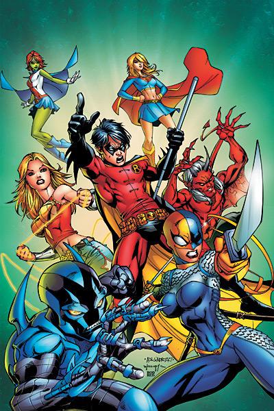
TEEN TITANS #50
Writers: Sean McKeever, Geoff Johns, Marv Wolfman, Todd Dezago Pencils: Randy Green, Mike McKone, George Perez, Todd Nauck Inks: Andy Lanning & Sandra Hope, Marlo Alquiza, George Perez, Lary Stucker Publisher: DC Comics Reviewer: Loodabagel
Okay, apparently Wally West is once again in the real world and Jericho, the lamest Teen Titan ever, is no longer on the team. Awesome. I should take 8 months off more often. Think how much money I would have saved on AMAZING SPIDER-MAN if I hadn’t subscribed through the last two years. I didn’t expect them to keep doing crossovers! Really!Anyway, it was great to get back together with my friends The Teen Titans. Having smartly taken the majority of this year off, this issue was like a big welcome back get together for me and the kids. It seems that most of the characters have been busy dealing with lousy stories and haven’t bothered to develop much since I last checked. Thanks guys. Not only that, but this not only entertained me, but had me excited about the next issue with the return of some of my favorite villains who just so happened to get me into this book in the first place. Not many comics can do that to me anymore.
Way to go, TEEN TITANS, you are officially awesome again. I mean, Jericho’s gone, sexual tension abounds, Sean McKeever is making me less sad that he left SMLMJ and the new artist seems pretty good. The only real flaw is a bizarre guest appearance by Blue Beetle. (Kid, this book is celebrating its 50th issue; can’t you horn in some other time?) What’s not to love?
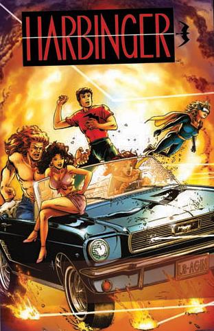
HARBINGER: THE BEGINNING TPB
Writer: Jim Shooter Art: David Lapham & Bob Hall Publisher: Valiant Entertainment Reviewer: Ambush Bug
Reading through this trade was like meeting an old dear friend that I hadn’t seen in ages. We may not have talked or thought about each other in years, but when we meet again, it’s as if no time had passed and we pick up right where we left off. That’s the feeling I felt as I turned every page of this trade paperback collection of the first eight issues (including the zero issue) of Valiant’s hit HARBINGER series from the early nineties. I bought the books when they first came out but they’re bagged and boarded somewhere in a box at home. I had all but forgotten why I fell in love with the Valiant Universe in the first place. Many of you folks who regularly read this column have never picked up a Valiant comic, but I encourage you to do so. In the early nineties, when Image was busy making purty pinup books with little or no story, Valiant focused all of their efforts on producing some of the most solidly written and tightly woven universes in comic book history. In many ways, Valiant was like the oft scoffed at New Universe (a line of books that I have a special affinity for). It was a world not unlike our own, where mystical and sci fi things started occurring with greater frequency as time went on. But where the New Universe was our world exactly until the White Event, the fantastical forces at work in the Valiant Universe has a meticulously mapped out history. When you read a Valiant book, you felt as if some pretty brilliant minds came together and developed an all encompassing story that reached far into the past and further into the future. You felt as if you were a part of something big.HARBINGER was not my favorite Valiant comic. I’ll leave that honor to SHADOWMAN with THE SECOND LIFE OF DOCTOR MIRAGE coming in a close second. But I do remember reading the stories collected with great fondness. And as I re-read the issues, I realized that the book possessed all of the qualities that X-MEN and TEEN TITANS had in their prime. It was a quality that only a few books seem to have these days (RUNAWAYS and YOUNG AVENGERS being among them). These stories capture youth and imagination and sprinkle it in throughout the entire story. It follows a group of rogue Harbingers (what mutants are called in the Valiant U) as they try to cope with their new powers, cope with each other, and stay out of the clutches of the diabolical Toyo Harada who may possibly be the most powerful Harbinger on the planet. Well, except for Sting, a young man who has recently discovered his powers and is finding out that these powers seemingly have no limit. Sting uses his powers to track down others like him and eventually a team of outcasts form their own “Anti-Harbingers” team whose goal is to expose Harada and protect others like them from being exploited or worse.
The book looks great with the new digital re-coloring. There is a new depth and richness that adds and doesn’t cover up the already solid artwork. I don’t remember the old issues very much, but what I do recall is a kind of flatness to the artwork. The new effects really make the characters pop off of the page without making it look too showy or too laden with computer generated Turner-vision like re-coloring techniques.
This collection of stories really does collect the best of the HARBINGER series. The formation of the team and the first battles the team has against Harada were by far the most memorable. And the book also served as a great tour guide to the Valiant Universe, introducing HARBINGER readers to other characters in the universe like Solar and X-O Manowar. Through the eyes of these often naïve and well written characters, we got to see the wonders this universe had to offer as if for the first time. I understand why Valiant chose this book to be the first to re-publish for the new masses. It’s the perfect starting point for newbs to the Valiant U and a wonderful refresher course for those who haven’t thought of the rich characters and enthralling stories in years.
Due to some kind of legal issues, this book can only be purchased directly through Valiant. You can reach them here. It’s definitely a worthwhile investment. Thanks again to all who participated in the contest. From the turnout, it looks as if there are fans still lurking about, hoping for a relaunch of their favorite Valiant properties. Here’s hoping that more collections such as this are on the way and that this is the beginning of a new Valiant age. I, for one, can’t wait.
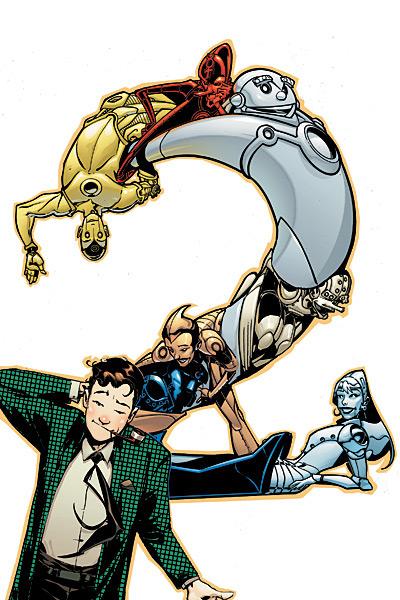
METAL MEN #2
Writer/Artist: Duncan Rouleau Publisher: DC Comics Reviewer: Prof. Challenger
Wow! This comic was one of those that I had serious reservations about. At heart, I’m a comic geek purist and when I first saw some preview drawings for the series, I kind of balked at the designs for those crazy robots. But now, after having read through the first two issues and just fallen in love with the art, I’ve got to eat crow on my earlier reservations. This is one of those nearly perfectly designed comics. The enjoyment factor I’ve experienced so far is akin to the surprise thrill of the AGENTS OF ATLAS mini-series from Marvel last year.The cover designs are simple but clever, featuring all the Metal Men along with their creator, Doc Magnus. The Metal Men are contorted together to form the image of the numeral for each issue’s number (which is a brilliant idea forward-looking to the cover images as chapter fronts for the inevitable book collection of the series). And joy of joys, he breaks the mold of the current boring state of comic book covers by including word balloons with the characters addressing the reader, breaking the fourth wall. Thumbs up on that. I hope to see more of that type of thing once again.
Longtime comics readers will already be, at least peripherally, familiar with the usual Metal Men suspects – Gold, Mercury, Lead, Iron, Platinum (Tina), and Tin. But I guess in these enlightened days, the male-to-female robot ratio seemed a bit imbalanced so now DC has added another female robot, Copper, to the mix. And she’s actually a rather seamless insertion into the group dynamic. If I did not know otherwise, I would not realize she’s a relatively new addition to the group.
I completely dig the characterization of Doc Magnus throughout what I’ve seen so far. Even though the story time jumps from present day, to the past, to the future, to the far past, and back to the present, I’m impressed by how Rouleau makes Magnus true to his past checkered sportscoat Silver Age appearances but also incorporate his latest appearances in 52. Thankfully, DC has yet to bow to the politically correct Nazis out there so we get to see Doc puffing away on his classic smartguy pipe prop.
Now, to evaluate the writing overall, I’m not sure where Duncan Rouleau’s contributions and Grant Morrison’s contributions overlap or separate. Which makes it difficult to give credit where credit is due. The comic book says it is based on ideas by Grant Morrison, which makes me think the broad strokes are primarily his. If so, then one can assume that the following are all coming from the diseased and twisted imagination of Morrison: the insanely strained friendship relationship between Doc Magnus and Dr. T.O. Morrow is his, the ancient Philosopher’s Stone as the true basis for the robots’ sentience, billionaire crazyman Solomon Kahn as the manipulative money behind Magnus’ original robot work, The Robot Renegades (Warbox, Body-X, Manhunter-Lud, and L-Ron), and of course the adrenaline-inducing The Death-Metal Men! Morrison is an idea machine.
I think that imagining a connection between the mythical Philosopher’s Stone is pure, unadulterated genius. It’s one of those ideas that I can’t believe was never explored before. Solomon Kahn is a grisly little bandage-wrapped “Mr. Burns” with a more than obvious riff on Citizen Kane as well. Of the Robot Renegades, I just have to say that slapping that eyepatch onto a Manhunter robot and naming him “Lud” is, once again, pure genius. But the killer moment was that last page introducing Dr. Morrow’s evil version of the Metal Men; The Death-Metal Men was something utterly transcendent in its perfection. I am befuddled by the degree of imagination poured into just the concepts and ideas found in this series. It’s hard to believe it’s only into its second issue, but it makes me anticipate great stuff for the next six issues.
So, how does Duncan Rouleau do with these big ideas? Honestly, he has knocked it out of the park in both his script but also his graphic narrative as well. I love how the omniscient narrator tells the story in a voice distinct from the characters. In fact, the narrator talks directly to the reader. It’s a breath of fresh air as a narrative choice. Also, as befits such a conceptually complicated premise for the series, Rouleau does not shy away from packing this series (both issues I’ve read so far) with dense storytelling. Lots of dialogue, lots of varied panel designs; i.e., the ancient past is told in widescreen panels, but many of the modern rollicking Metal Men scenes are told with many smaller panels layered on top of larger panels. Rouleau varies up the page layouts so that no page is static. And he fills each page with tons of detail. Lush and gorgeous art throughout the book that just pops with color and texture provided by Moose Baumann. Baumann is one of the top colorists working in the industry today and his work on METAL MEN is, in my opinion, his finest work yet. I really thought there was no way he could top his work on GREEN LANTERN, but here it is. Baumann is an artist at the top of his game. Rouleau is someone I’d never heard of before this comic, so I had to google him to find out he’s one of the creators of the BEN10 cartoon (which I’ve never seen) and a handful of comics. So, he’s another like Darwyn Cooke, apparently, who’s coming to the comics field from a career in animation. Well, his style is vastly different than Cooke, but nearly on par with me from a pure admiration standpoint.
I could go on, but suffice to say the art in this series is enough of a reason to buy it, but the writing’s pretty good too. Rouleau’s accomplishing a number of things here in that he’s setting up a mystery (and presumably a solution) for exactly how Doc Magnus’s robots really gained sentience. I would guess this is brought on by a DC geek-style query about how that could happen since T.O. Morrow’s robot, Red Tornado, had to have an outside intelligence invade his circuits to give him sentience. Rouleau’s also approaching the characters as if they’ve already been around for years, but flashing back to Magnus’s youth so that old and new readers can see how the Metal Men came about. This also allows him the opportunity to flesh out Magnus and Morrow’s friendship so that when Rouleau flashes back to the present or the future with the later, insane, Morrow, the reader has a feel for the history and relationship between the two. Then there’s the rather absurd pyramid-headed guy that’s somehow involved in all this (I’ll give that one to Morrison). I’m not sure what’s going on with that guy, but he’s intimately involved in all this ancient Atlantis-Solomon Kahn-Metal Men stuff.
I get so jaded and sick of the misguided garbage that comes out of the two big corporate heads of the comic industry nowadays but…every now and then an unexpected pearl appears and knocks my socks off. METAL MEN is the pearl right now. I recommend it highly.
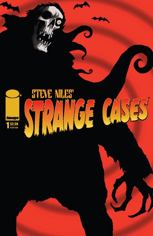
STEVE NILES’ STRANGE CASES #1
Writer-Dan WIckline Artist-David Hartman Publisher: Image Comics Guest reviewer: Loodabagel
Okay, bear with me. The date on this book says August, but it just appeared in my store today. Did they screw up? Was there a last minute delay? I don't know what was going on, but I know it never got reviewed here. Curious, I flipped through it to see if it was a stand alone story. At first glance, it seemed like an occult type version of FELL. (judging by the cover price) but after reading it...The thing is, this wasn't a stand alone comic, but there was absolutely no mention of a "next issue" at the end. Instead there's an ad for "STRANGE CASES on the PSP!" Unsure of what I had purchased, I now felt a little icky. Had I been tricked into buying a video game tie in? Well, it's something like that. The comic itself is alright. Just some good old fashioned fun. As of now, STRANGE CASES is a four issue limited series and the same thing available on the page is also available in Playstation format. I would recommend the paper, but that's just me. I'm old fashioned like that. I prefer to read stuff without a glare.
Can I recommend it? Sure, why not. This thing isn't going to blow anybody's mind, but you'll get a good dose of gory fun, some cheesecake and quality artwork by David Hartman to boot. There are those of you who'll buy this no matter what, thanks in part to the name on the cover, but that guy's only acting as executive producer. The writer is one Dan Wickline, and he's pretty good too.
The story revolves around a group of monster hunters who've been hired by this mysterious guy to kill some monsters for a lot of money...you get the idea. There's some variations on old characters here, but I think that's more because The Adventures of Buffy, Van Helsing and those two guys I'm not familiar with would've been a bit stale. These aren't "cheesecake adult f-ed up fairy-tale" variations on the characters, just ones meant to keep things interesting.
At first, I was really disappointed that Mr. Niles wasn't writing this; I've never actually gotten aquainted with his work, so I wouldn't know what to compare it to, but at $2.50, why not just go out and buy it already? It's better than a lot of that crap we're dedicated to (except for those of you who are dedicated to Steve Niles horror-y comics. Read some X-Men crossovers, ya losers.)
And it turns out STRANGE CASES is a four issue limited series, and apparently the issues are stand alone. Doesn't read like it, but they are. Whatever. Happy hunting. Make of it what you will. STRANGE CASES is a nice guy. I liked him at first, but then he made a really racist joke. Apparently it was in good taste though. So he's back in my book after that little scare.
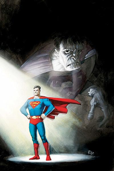
ACTION COMICS #855
Written by Geoff Johns and Richard Donner Art by Eric Powell Published by DC Comics Reviewed by stones_throw
Like hanging around playgrounds and creeping out the parents? Or maybe you’ve got kids of your own - a niece or a nephew or a son or daughter who might like Superman but couldn’t sit through Bryan Singer’s stanky movie? Well, friends, I can happily say this is the perfect comic to give ‘em.Seriously. See, while to older or more @$$Hole-ish tastes this may suffer in comparison to Grant Morrison and Frank Quitely’s definitive and hilarious rendition of Bizarro World a few months back in ALL STAR SUPERMAN, or seem a little slight on story, kids won’t care about any of that. They’ll just see one kick@$$, fast-moving, enjoyable as all hell comic.
No filler, sorry, build-up. No internal monologue. No “who is Superman?” moralizing. Just a stoic, familiar Superman kicking Bizarro butt. There’s a level of storytelling economy here that we rarely see today. In the first five pages Bizarro’s ambushed the Kents in their Smallville farmhouse, kidnapped Pa Kent and left Ma Kent to explain what’s happened to Superman, who jets off across the universe to rescue him. What’s more there’s absolutely *no* entry-level knowledge required, although I’m sure it ties into Donner and Johns’ other issues immaculately and it doesn’t exist in its own bubble like the MARVEL ADVENTURES line. Really, how many modern comics can you say that about? At a time when literally every Marvel title requires you to have read CIVIL WAR (don’t bother) and DC’s counting down to FINAL YEP FINAL THIS TIME WE REALLY MEAN IT NO FOOLING NO PLEASE COME BACK WE HAVE FAMILIES TO FEED CRISIS, this bucks the trend wonderfully. Know who Superman is (and who doesn’t?) You’re set. Don’t know who Bizarro is? Even better! That way he’ll still be creepy and mysterious.
I tend to class myself as a Marvel guy who mostly prefers DC these days, but growing up, because the first Marvel I ever read were the first issues of all the main characters and a big ol’ guide to the Marvel Universe, it was the DC heroes that gave me that feeling of wonder and mystery which is what I think lures new readers in. Like, I knew who Galactus was before I’d read any comics he appeared in, but when Adam Strange or the Legion of Superheroes or the New Gods would show up I’d be rapt with the endless possibilities and sheer joy of the superhero genre because I wasn’t quite sure who they were and they were still new and mysterious to me. That’s something I think Johns and Donner capture here superbly, kind of similar to what Morrison and Quitely have done on the amazing ALL STAR, but on a more easily accessible level. Bizarro and the Bizarro World isn’t mapped out for the reader or fully explained – it’s a creepy distortion of Superman’s world and it feels new and mysterious.
The art - - do I need to talk about the art? You’re reading THE GOON, right? (And if not, why the hell not?) Powell does a great job. I thought he was a bit mismatched for the SUPERMAN: THE MOVIE-inspired inspired Fortress of Solitude but when we get to Bizarro World he really cuts loose. Not a complaint, but he’s homaging Kirby in a few panels, which is fine, but based on his work on THE GOON I’d love to see him go crazy, solo, on a more Golden Age, less standard version of Superman in the future.
Anyway, great book. For me, DC’s Superman line has been pretty consistently good since the last big @$$ crisis (bar a few issues of Busiek and Pacheco’s SUPERMAN) and this is one of the best so far. I’ll admit that the simplicity and lack of gimmicks didn’t quite click with me at first but on re-reads I found it stuck with me and entertained me in a way few recent comics have. This is one you’ll want to read and re-read, folks…but more importantly, think of the kids! I doubt there’ll be a better opportunity from the big two’s main lines all year.
MS. MARVEL #19
Writer: Brian Reed Artist: Aaron Lopresti Inker: Matt Ryan Publisher: Marvel Comics Reviewer: Rock-Me Amodeo
Okay, Marvel (that’s Comics, not Ms.), we’re still waiting. You said Carol Danvers wants to become one of the top-tier, A-rated players. And I’m assuming you would like to see her climb into the ranks of world-class heroes in terms of stature (and, uhm…sales!) But then you send her up against the Puppet Master? Are you for real?And slapping a spank-fest Greg Horn cover on the whole thing doesn’t really help the bid for legitimacy. Much as I love Horn, I’m sure his covers are great for sales, but not for being take seriously. We’ve seen this done before; I think it was called SHE-HULK. And anyway, we’ve already got a semi-serious jiggle-palooza out there this week called SHANNA THE SHE-DEVIL #2. So can we build some brand distinction here?
Let’s talk supporting cast. I knew we were in editorial trouble when I read the first page, which described Aaron Stack/Machine Man as “sociopathic.” Is he anti-social? Sure. But a sociopath? I’ve worked with too many, and most of them were very slick - until you pushed their buttons, and then they wouldn’t think twice about taking you out.
Aaron Stack may be an asshat, and he exhibits a distinct Ellis-crafted sense of the absurd (which Reed continues pretty well), but he’s no sociopath. I do like his inclusion in the book, but I really want to see how he’s going to serve to advance the title character. Will he help her grow or will he just be the obnoxious comic relief?
Sleepwalker I can take or leave. When I see odd characters appear for an issue or two and then vanish (*cough* SHROUD *cough*), it makes me wonder if Marvel is about to lose licensing rights on some property if they don’t appear like once a decade or something. (Hey, next issue – the return of El Aquila! Kidding.) And it’s the writer’s job to make sure their appearance doesn’t seem like the addition of a second appendix. So Sleepwalker is helping track Masters. Good. Let’s see what else he can do for the story.
Speaking of which, the story itself begins like an overlong stay at the Exposition Hotel. Around the middle of the book, we get to see Ms. Marvel taken down by Tigra. Tigra, for cryin’ out loud! Doesn’t look like anyone’s bringing their A-game.
Things finally start taking off on the last four pages, but the majority of it, and the possible resolutions of this storyline, leave me feeling underwhelmed.
When I think A-game, I think cosmic. I think aliens (hey, look – a Skrull!) I think Dr. Doom or Magneto (before he was emasculated) or Ultron. I think about the way this book restarted about 18 months ago, and I think it started with a great premise. But I don’t see that premise being advanced here. Maybe I’ll get that when MIGHTY AVENGERS comes out. But this was a book that had a great direction, and it seems to have lost its way.
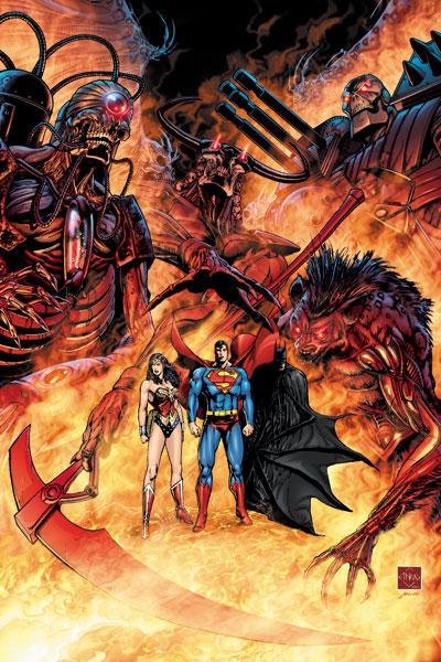
52 AFTERMATH: THE FOUR HORSEMEN #1
Writer: Keith Giffen Artists: Pat Oliffe (pencils)/John Stanisci (inks) Publisher: DC Comics Reviewer: Prof. Challenger
Bleh.Don’t you just hate it when you pick up the wrong comic?
I thought I was grabbing the latest COUNTDOWN issue but inadvertently grabbed this thing. Didn’t realize it till I got home. Figured…what the heck, never heard of it but it’s got Superman, Batman, and Wonder Woman on the cover. I’ll just give it a go. Maybe it’ll be great!
Instead I endured what may be the worst comic starring those three characters since that final issue of INFINITE CRISIS. It’s like zombies, stupid people, convoluted global politics, and a lot of talking heads and dramatic poses.
I don’t have a clue what I read. Hard to follow. Characters were all just sullen, mad, depressed, or zombiefied. Interspersed Bible verses from The Book of Revelation just added to the confusion. And I still don’t have a clue how those stupid Terminators on the cover tie into the zombies.
What a mess.
Apparently, and I repeat – apparently, this is supposed to make some kind of sense if I read 52 (which I gave up on after about 6 weeks). I dunno. It seems to me that it’s just a horrid debacle of a comic book and I can’t imagine that reading 52 would make it any less horrid.

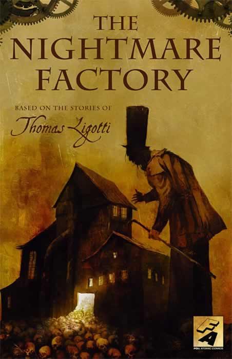
NIGHTMARE FACTORY OGN
Four Short Stories by Thomas Ligotti Words adapted by: Stuart Moore & Joe Harris Art by Colleen Doran, Ben Templesmith, Ted McKeever, & Michael Gaydos Publisher: Fox Atomic Reviewer: Ambush Bug
Both Vroom Socko and stone’s throw have mentioned recently that compilations are a mixed bag. Like music albums, you often find that you like one or two of the songs, but it is hard to have that same level of goodness throughout. Fortunately for me, I found this compilation of four short stories by Thomas Ligotti to be entertaining from start to finish.Many of the comments from last week’s column have compared Thomas Ligotti to Poe and Lovecraft. I’m not sure this is entirely accurate. This is not to say that Ligotti is not a good writer, but it seems as if Ligotti owes a lot of his writing to the works of Poe and Lovecraft and pays homage to them quite a bit. Granted, this is my first experience reading Ligotti’s works, but there are an awful lot of references to familiar Poe/Lovecraft territory in this book in regards to ancient monsters and sacrifices set in small towns and tales of redemption morphing the ordinary into the extraordinary. Ligotti himself admits the similarities and homages in the introductions he provides to each short story. If anything, Ligotti is quite talented in bringing modern day metaphysics to these Poe and Lovecraftian themes, which in and of itself is putting a personalized stamp on his own brand of horror. Many of the stories depicted in this book delve deeply into the mind and how much of a terrifying effect it can have to our own realities. This book will definitely have you questioning the world around you, looking over your shoulder, and losing trust in your own perceptions. These tales of terror exude waves of paranoia and pathos from every page and panel. It doesn’t help that it has some of today’s best horror artists providing the panels.
The first story, “The Last Feast of Harlequin”, is adapted by Stuart Moore (words) and Colleen Doran (art). This is the most Lovecraftian of the bunch, involving the Conqueror Worm itself and a small town festival. What I enjoyed about this one was the fact that it unabashedly follows a misinformed person and does a brilliant job of illustrating how one person’s perceptions can be so skewed to ignore the harsh realities of the world. Colleen Doran’s artwork is truly scary, a trait that comes out especially in the faces of the tortured souls that inhabit this eerie story.
Story two is called “Dream of a Mannikin” and thematically, it may be my favorite of the bunch. Ben Templesmith provides the art and Stuart Moore returns with the words. This story revolves around a curious visit to a psychologist’s office by a mysterious woman. What starts out as a bizarre tale of dreams and nightmares turns into one man’s struggle to have his own existence acknowledged. All of us long to be noticed and loved. The true horror that runs deep to one’s soul occurs when that longing is not recognized. That terror is at the center of this wonderfully written and beautifully drawn story.
Visually, though, “Dr. Locrian’s Asylum” is my favorite. I’ve always had an affinity towards Ted McKeever’s skewed and wonderful artwork. His panels always look worn and tattered. Lopsided figures shamble across the page, yet they somehow embody a sense of honesty and beauty. This story of one town’s decision to tear down the local asylum and the haunting ramifications of that decision is chill-inducing to look at. McKeever’s images of the ghosts of the asylum are haunting. This is a wonderfully drawn piece of fiction with words by Joe Harris that resonates off the page.
Although not my favorite piece, the final story, “Teatro Grottesco” is a memorable and bizarre trip into a metaphysical nightmare. One man struggles to investigate and test the limits of reality with Morrison-esque results. Michael Gaydos offers some pretty vivid imagery, especially a haunting sequence involving a shrinking man the protagonist meets in an alley. This is, by far, the most “out there” story of the bunch. At times, it lost me, but the ending is a powerful one and a fine capper to the end of this book.
There isn’t a story in this book that doesn’t have the highest amount of professionalism added to it. Fox Atomic really has put together a special compilation and this is by far the best book the company has published to date.
We are still running our THE NIGHTMARE FACTORY “Send in your Nightmares” Contest. Details can be found here and ten lucky winners will receive a copy autographed by Thomas Ligotti himself.
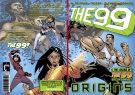
THE 99 SPECIAL – ORIGINS
Writers: Naif Al-Mutawa, Fabian Nicieza (with Nabeel Mohan) Artist: John McCrea (with Jason Dennis)
THE 99 SPECIAL – FIRST LIGHT
Writers: Naif Al-Mutawa, Fabian Nicieza Artist: John McCrea (with Jason Dennis) Publisher: Teshkeel Comics Reviewer: Squashua
Two weeks ago, I walk into the comic store and Brian behind the counter hands me my stash. Flipping through the books, I pull out something I definitely didn't order: THE NINETY-NINE SPECIAL - ORIGINS. "Bri, what's up with this?""Oh, the publisher or marketer or whatever is pushing us to put this book into our stores. That's a free book we received, so since we have no time to read it or get a handle on it, I put it in your pile. Figured you could give it a review and let us know if it's worth getting."
Ah, the perks of letting your Friendly Local Comic Shoppe know that you review comics for a well-known fan news website. I agreed to take a look and I quickly formed an opinion, but I didn't immediately write a review. I figured I'd let it fester. Then last week I was back at the shop and Brian threw yet another book in my stash, THE NINETY-NINE SPECIAL - FIRST LIGHT.
Brian grinned sheepishly and shrugged, "They're like Nigerian spammers."
THE 99 is the tale of 99 noor stones: mystic gems imbued with the knowledge and power of the ancient library of Baghdad. If you connect with one of these gems, you get super-powers. And there's a benevolent agency dedicated to finding all of the 99 and using them for good, to "change the world". And there's an evil Vandal Savage industrialist-type who has a long and storied history with the over 700-year-old stones; his goal is to use them to "choke [the world] into submission". And then there are the 99, who are all having their origins right about now; each getting a different ability based on the noor stone they connect with: telekinesis, super-strength, ability to see truth and control light, etc.
Basically, it's like a slightly tame Islamic iteration of the "Heroes" TV show. Now, I'm not saying there aren't real world situations: the first hero we meet got his powers from stepping on a landmine; the second one is kidnapped and tortured into an origin story, but the graphic nature of these situations has been toned down to a PG-13, if not PG level. There's a lot covered in these two books - in ORIGINS, we get the unique history of the stones themselves and introductions to our chief protagonist "Dr. Ramzi", our chief antagonist "Rughal", and the first modern noor stone hero, "Jabbar".
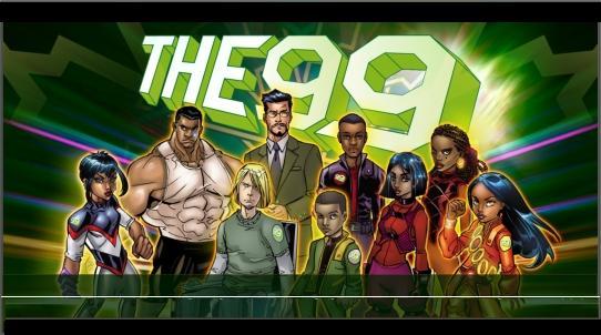 The art swings back and forth between beautiful and mediocre. I was a fan of McCrea during his HITMAN years, but something here doesn't sit right with me. At times, it's like he can draw a face and he can draw a body, but he can't draw a face ON a body. Other times, especially during the noor stone origin sequence, the rendered pictures are very pretty. A couple things do stand out as irritating: whomever has control of the Photoshop editing tool needs to stop putting light blooms on every single piece of metal in every panel, and whomever is designing the technology should not be using a classic Nintendo Game Boy as an artistic reference for a handheld computer.
Beyond the "everyone's abilities stem from myths originating from the Islamic religion" schtick, there is nothing groundbreaking here that I haven't seen before. Yes, we get unique heroic names like "Jabbar", "Noora the Light", and "Darr the Afflicter", and in these issues they beat on the military, some terrorist kidnappers, secret government agents, and even some gangstas yo, but this is broad audience material. I can see THE 99 becoming very episodic in nature; each issue involves solving yet another problem to add yet another new member to either the good guy or bad guy group. Or the next issue explores the history of one of the 99 noor stones as it changes hands over a long course of time. I see where this is going. I've seen it before, and the "gotta catch 'em all" attitude is not for me.
I told Brian to order a couple of issues and push it to the younger crowd. Maybe it will be a hit with general audiences, but I don't see this book flying off the shelves.
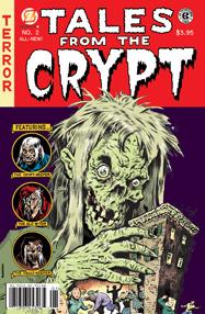
TALES FROM THE CRYPT #2
Written by Jim Salicrup, Neil Kleid and Fred Van Lente Art by Rick Parker, Steve Mannion and Mr. Exes Published by Papercutz Reviewed by stones_throw
I've been reading the TALES FROM THE CREVICE reviews with interest lately, because while I agree with Vroom Socko that even the best anthologies usually contain a crappy story to spoil the average (and that DREAM CORRIDOR and BATMAN BLACK AND WHITE are the best of the best), for some reason there's just something I like about an anthology comic. Landmark issues of an ongoing book where a host of stories appear are often my favorites of the year. Maybe it's going through the issue and deciding which story's best, or being pleasantly surprised by a stand-out that I like. Or the idea of a bunch of writers and artists working together on similar subject matter. Or maybe my TV and processed food-produced attention span just appreciates the lower page count.Anyway, Papercutz - a self-professed "graphic novel publisher for tweens and teens" headed by former Marvel editor Jim Salicrup - has revived one of the best-loved anthology books, EC's TALES FROM THE CRYPT with...mixed results. Yep, this is one of those conflicted reviews. The good first up: both of the stories in this edition are average or above. The first one's a simpler tale that leans towards the laughs while the second is actually a pretty effective creepy story from Fred Van Lente, currently writing the SUPER-VILLAIN TEAM-UP miniseries at Marvel. If horror anthologies are your thing, you could do a lot worse than either of these tales.
The big problem facing this book is the art. EC built its reputation with legendary cartoonists like Harvey Kurtzman, Wally Wood, Jack Davis and Marie Severin, but the art here ranges from unremarkable to pretty horrible and completely mismatched for the story. I don't understand fans who say that story is more important to them than art. My enjoyment of a comic is always influenced by what I feel about the art and how well it matches the story.
The ideal for a completely enjoyable comic book should be good writing and good art working in unison for the story. If the art's nasty, as in this issue's second story, it's likely to affect what I think about the comic overall and there's no way I could offer a full recommendation of the book.
Furthermore, there's a good few artists I enjoy so much that I'll follow their work regardless of the writer (JH Williams, Darwyn Cooke and Kyle Baker come to mind).
The art in the first story here is pretty inoffensive, although it has a pixellated quality which makes me think it's been blown up past its original size. Second story though...whoah, Nelly! This looks like a Cartoon Network show, only not as good. The characters are ridiculously exaggerated and the coloring is Day-Glo bright. (Example: http://www.papercutz.com/crypt/cryptcom1_preview_pg1.html) There's no way this art fits a horror book and it's a credit to Van Lente's writing that the creepiness of the story can actually shine through.
Salicrup's said that back in the 50s it wasn't adults but kids who were reading EC comics, and that Papercutz are trying to appeal to the same audience with this book. That's certainly admirable but even if the book skews younger (and the second story, concerning a *SPOILER*suicide bomber entering Hell*END SPOILER* ain't all that kid friendly), horror is still all about atmosphere and so the art and its style is a vital part of the mix. There's a letter printed here from an old-school EC fan who says "horror can be funny, but it's got to look scary" and I have to agree. It's a disservice to quality chillers of the type that Van Lente's written to saddle it with such poor, atmosphere-killing art.
I can see a place for a book like TALES FROM THE CRYPT in today's market where horror books seem to be undergoing a revival and THE WALKING DEAD is a best seller. I think a lot of name writers would jump at the chance to do a one-off creepy tale. But even if Papercutz have more of a "Simpsons Halloween Special" tone in mind (and especially if they're interested in competing with other horror anthologies like Boom! Studios' ZOMBIE TALES and DC's returning HOUSE OF MYSTERY), they need to invest in artwork that's capable of setting an appropriate tone for horror. Salicrup worked at Marvel for twenty years, surely he has some connections?
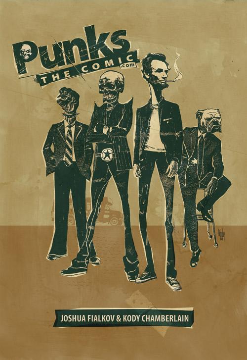
PUNKS THE COMIC: SUMMER SPECIAL #1
Writer: Joshua Fialkov Artist: Kody Chamberlain Publisher: Digital Webbing Reviewed by Humphrey Lee
PUNKS THE COMIC is what would happen if NEXTWAVE was actually a Sunday night cartoon on Adult Swim. That is to say, it's awesome. Just awesome. PUNKS features such characters as a humanoid body with a fist for a head that uses signs to talk, a character named Dog that has a bulldog face (well duh!), and Abe Lincoln. Yes, Abe Lincoln. And Abe Lincoln is the best new character of the year, yes he is.Now, what's this book about, you're asking, with its cast of crazy characters and dead historical figures? Fucked if I know and shame on you for asking! Come on, does any of that sound like there's some sort of coherent storyline going on? Of course not, but just like any (good) episode of, say, “Aqua Teen Hunger Force”, it doesn't have to make sense, it just has to be hilarious. And PUNKS is all sorts of hilarious. Between Morrissey cracks, ethnic stereotypes, alien invaders in a station wagon, and a mid-issue "interview" with Rick Remender Out of Fucking Nowhere! this comic cannot help but be hilarious just like a midget in leather chaps couldn't help but be the same.
As if the comic itself couldn't be crazy enough, the "clip art" that Kody Chamerlain uses here in PUNKS helps enhance the oddball experience. What I mean by "clip art" is that PUNKS uses panels made up by actually cut out pictures arranged to make all the characters, settings, etc. Very unique and unusual, but very creative and entertaining as well which is pretty much exactly how this book should be described.
PUNKS is crazier than Britney Spears with a heroin needle and a Cabbage Patch doll, but ever the moreso entertaining. The sooner we get more of this the better, unlike the aforementioned Ms. Spears. I'm not sure you could find a better deal out there for just $5 right now...well, okay, except for maybe Britney Spears...sorry, had to do it. Cheers...

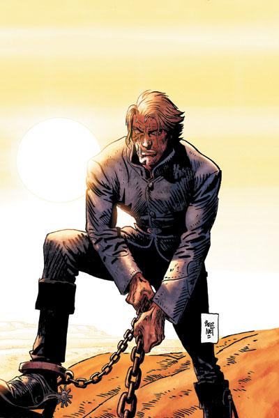
JONAH HEX #23 DC Comics
This was my favorite read of the week. Jordi Bernet is back back back! The legendary European artist’s sheer storytelling skill is best demonstrated in two silent, beautifully simple panels in which Jonah Hex casually amputates this issue’s narrator’s arm. Palmiotti and Gray match his art with another rock-solid, done-in-one slice of haunting Western badassery. I haven’t been a regular JONAH HEX-er but I’ve got a feeling I’ll be sticking around from now on. – Stones ThrowTHE MARVEL TAROT Marvel Comics
Man, why can’t those crappy MYSTIC ARCANA one shots be as cool as this MARVEL UNIVERSE style one shot? Informative. Entertaining. Highlighting an area of the Marvel Universe that hasn’t been spotlighted in quite a while. This book is written through journal entries by MYSTIC ARCANA hero Ian McNee, a Marvel U version of Vertigo’s Tim Hunter character and relative newb to the more occult and mystical side of Marvel. Some of Marvel’s coolest and most underused magical characters are given their own entries in Tarot card form. The insight into the characters and foreboding snippets of possible future storylines had me interested in some of these characters for the first time in years. Avoid the MYSTIC ARCANA one shots at all costs (at least the ones out so far), but pick this one up if you want to learn more about those darker corners of the Marvel U. – Bug