
| #3 | 5/9/07 | #6 |
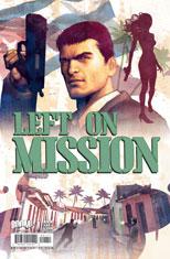
Hey folks, Ambush Bug here. When we at AICN Comics screw up, we’ve gotta fess up to it. Last week’s column had a review of a book called LEFT ON MISSION. I accidentally got A-happy called it LEFT ON A MISSION. Sorry about the confusion and hopefully that doesn’t stop you from picking up this most excellent spy comic from BOOM! Studios this week.
And now…
we bring you…
REVIEWS!
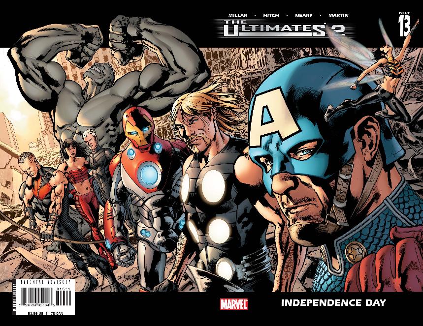
ULTIMATES 2 #13 Advance Review & 5-Page Preview
Writer: Mark Millar Artist: Brian Hitch Publisher: Ultimate Marvel Comics Reviewer: Sleazy G
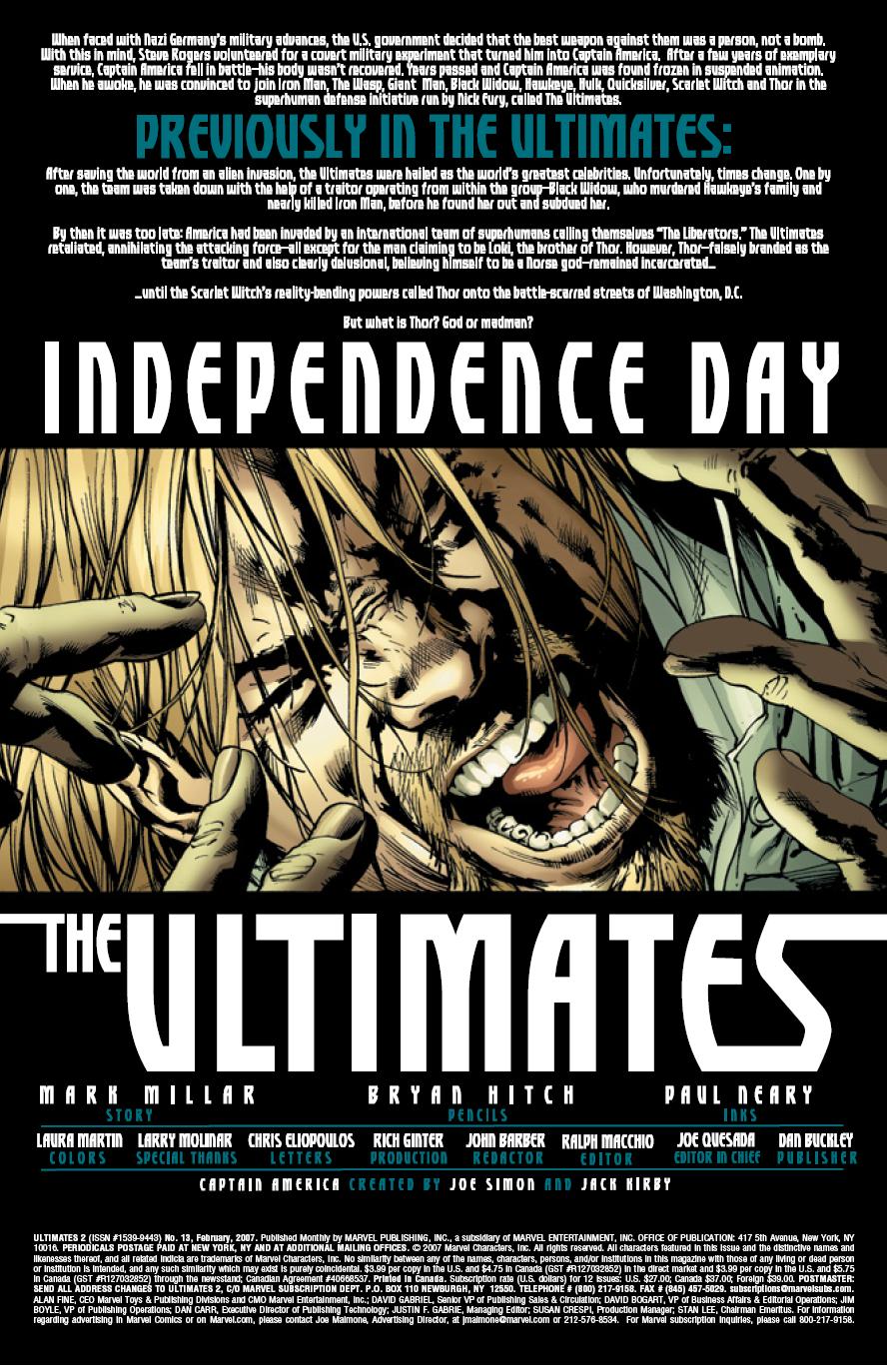 Look, let’s get this outta the way right up front: ULTIMATES VOL.2 #13 is late. Really, really late. We all know the delays on this title have sucked, we’re all annoyed, and we’re all sick of it. A lot of people are going to be asking “was it worth the wait?”, but as pissed as I am about the delays I can’t help but feel it’s an unfair question. So instead let’s talk about the question we really want the answer to: “Is it any good?”
And that answer, not surprisingly, is “yes and no.” Mark Millar is one of those writers who I find pretty exasperating. He has a lot of good ideas, and he can write some fantastic scenes, and he’s got quite the wit. But then he’ll do things that are in entirely the wrong voice or mindset, things that just don’t fit with the rest of the story he’s telling and can be pretty jarring when the reader stumbles over them. It’s also pretty apparent at this point that his stories tend to be, well, shallow. Lots of flashy high concept on top, some good action scenes, but nothing particularly suited for deep analysis—in fact, the more you think about it the less it’s going to appeal to you. Much of what he writes is obviously intended to be blockbuster style, which is fine, but it often leaves me wanting more. This issue definitely tends more towards his strong points, and I liked a lot of it, but he still can’t help but trip up in a few places.
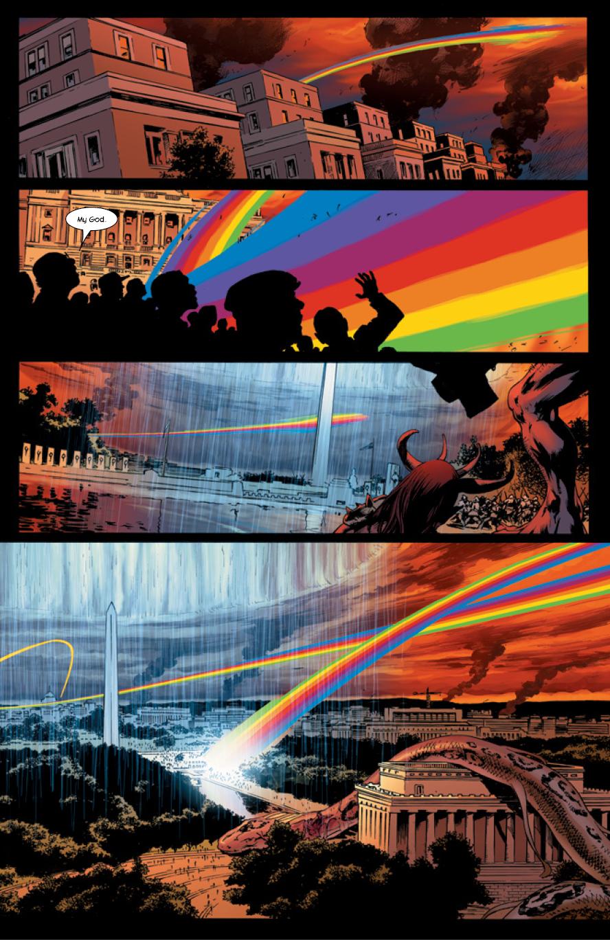
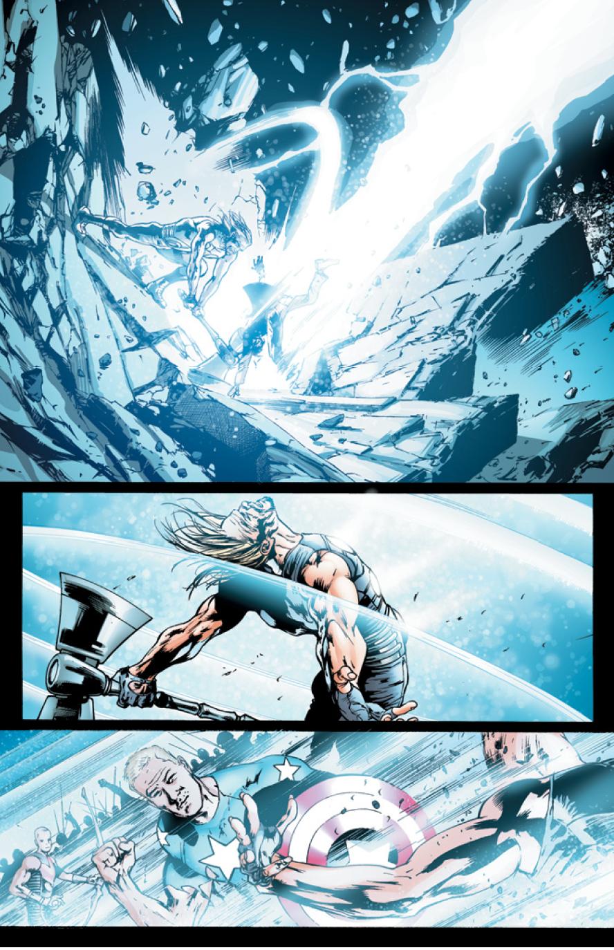
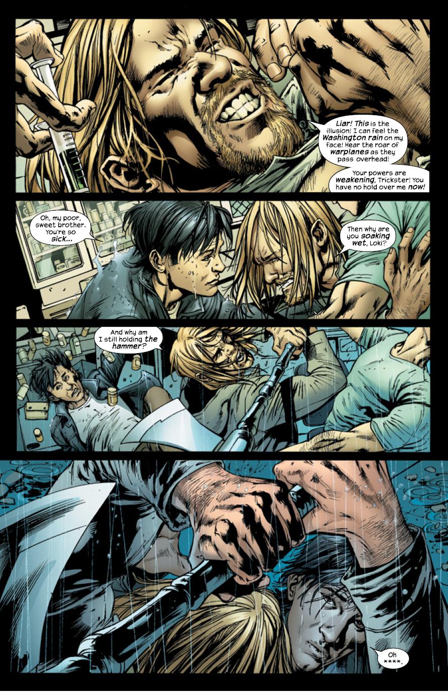 Enough with the vague commentary, though—let’s get to the meat of it. I may not have liked this issue as much as some of the others in VOL. 2, but I can honestly say #13 is far cooler than any of them in all of VOL. 1, and far better than VOL. 2 #12. Despite Bryan Hitch’s phenomenal art, I found myself bored by big splash pages of spaceships/Iron Man-armored dudes/giant spandex guys. This issue, though? Much cooler. Why? One word: Thor. Thor’s “is he a lunatic or a god” thing plays out pretty much the way we all knew it would, but that’s not a criticism: seeing this guy rally his forces is impressive as hell. Giants, serpents, Norse warriors, frost giants, trolls…good stuff. All of ‘em beating the hell out of each other in the middle of Washington, D.C. while the rest of the Ultimates try to keep up? Great stuff. All of that drawn by Bryan Hitch? Perfect. A lot more fun, and a lot more impressive visually, than much of what these two cooked up with the Chitauri, that’s for damned sure.
 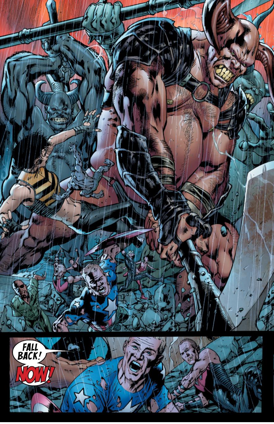 As for that eight page spread you heard about? Yeah, it’s pretty kickass. It looks great, and I love the way Quicksilver keeps turning up over and over again to show how quickly he’s moving through the battle. Sure we’ve seen it all before over in FLASH, but y’know, there’s a reason for that: when it’s done well, it’s a lot of fun. And when the battle’s over, and everything’s quieting down, and all the lose ends are being wrapped up, we get another last-minute glimpse of badassedness from Hawkeye. Somebody we thought was dead pops up again in his scene, and it, too, ends on a pretty freakin’ cool note.
See, that’s the thing: I like a lot of what Millar does, because I understand he’s going for just that: cool. A specific, Hollywoodized, “hell YEAH!” kinda cool. The kind where you see a movie, and some dude’s head gets punched, and then it blows up and spatters the hero’s face with blood, and you’re like “oh shit! SWEET!” And let’s face it, you all know exactly the kinda cool I mean, and that’s why we’re all here, and it’s what Millar is often about. And, in this issue, he’s on top of his game for the most part, and a lot of it works.
 And then in creep his bad habits: the smirking potty humor and the pointless scenes shoehorned in where they don’t belong because, well, we kinda forgot to work ‘em in better. Case in point: I know ULTIMATES is supposed to be a darker, edgier, more extreme AVENGERS. I know we’re supposed to have left some of our expectations behind. But I doubt I’m the only reader who thinks having Iron Man reference “lady-boys” at one point (those exact words, yeah) is a bit much in a book that doesn’t have a MAX label. I mean, come on, y’know? “Ha, ha, look at me—I’m Mark Millar so I can say ‘lady-boy’” in a Marvel comic! Ooooohhh, I’m soooo clever!” It just reeks of schoolboy immaturity, and considering it has exactly not a fuckin’ thing to do with the rest of the story because the Ultimates are never attacked by a team of transsexual Thai hookers, it really should have been cut by an editor. Debate over subject matter aside, Tony Stark’s comment just made the character seem more smarmy than charming and didn’t ring true, which should have been reason enough to jettison the line.
 Second case in point: remember like a year and a half ago, when there was an issue of VOL. 2 where Captain America visits a chick he used to date back in the 40’s, only now she’s really old because she isn’t a Super-Soldier who got frozen in a chunk of ice for a few decades? Well, the last four pages of this issue are of Cap with her back in the 40’s right before he leaves to head overseas. They have nothing else to do with the rest of the story—no thematic links, no references, no real foreshadowing or commentary, no sense of bringing everything together. They just fall with a dull thud. After so much kickassery, you’re left thinking “what the hell was the point of that?” And then you realize that, well, Millar’s probably got to work something in to tie his run to the one Jeph Loeb is about to start, so we get this boring-assed scene dropped on us out of nowhere. It has no real resonance and doesn’t inform or improve the story at all—it just leaves you sitting there going “meh”. Millar’s capable of better than this kind of rushed, sloppy writing, and it’s not like he didn’t have six months to rewrite the scene, so it’s just unacceptable. Hardly a fitting denouement for his run on the title.
Still, the art is amazing as always, and the final throw down is a lot of fun. To be honest, ULTIMATES VOL.2 #13 is much better than I was expecting. If you’ve been enjoying THE ULTIMATES all along, you’re gonna love this issue. If you’ve been waiting a bit more reservedly to see how it ended you may be disappointed in a few places like I was, but overall it’s a pretty entertaining read. ULTIMATES has had some great moments and some rough spots, but this final issue is a strong one to wrap the title up on.
Y: THE LAST MAN # 56
Written by: Brian K. Vaughan Pencilled by: Pia Guerra Published by: Vertigo Comics Reviewed by: superhero
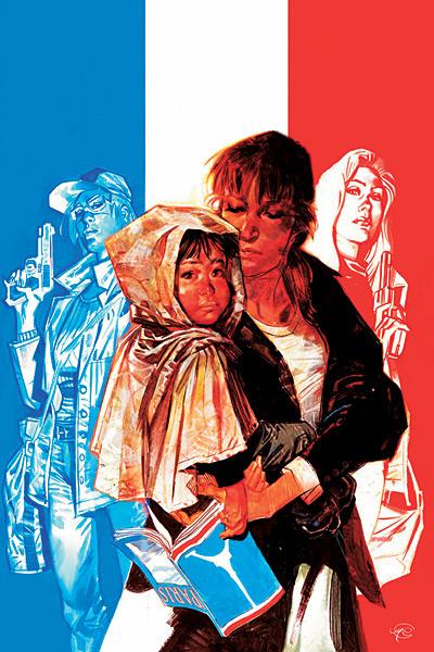
With this issue the protagonist of Y: THE LAST MAN, Yorick Brown, finally completes the one essential journey that he's been on since the beginning of this series. It should be a powerful issue. It should be an issue that grabs you and affects you in some way. Unfortunately, this issue, the issue where Yorick finally tracks down his beloved Beth, ends up having all the emotional resonance of a discarded Hallmark card.Boy did Vaughan drop the ball on this one.
Honestly, I'm just out and out dumbfounded by Y: THE LAST MAN lately. For the past year or so the book has just stumbled. Revelations about key events or characters that have taken place have come across as forced. This was once a series that almost surprised me at every turn and made me care about its characters more than almost any other comic book series I've ever read. Lately, though, it's just found itself meandering from one installment to the next without any kind of focus to it. And in this issue we get the reunion we've all been waiting years for, the reunion that Yorick has been waiting years for, and the buildup to it lacks any kind of intensity at all.
Look, when it was revealed that Yorick survived the plague because of monkey poop I stuck with the book. When the origins of the plague that wiped all of the tripod humans off the face of the planet was revealed and it made most fans go…"Wha…huh?" I stuck with it. But now, now that this book comes to the moment most of never thought we'd get to it craps out on us???
I don't know man…I just don't know.
I mean, I love Y: THE LAST MAN. I've loved this book for so long. I want to accept it for what it is. I want to just have trust in the way it's going. But this issue, this issue is making me feel like the end run of this title may just destroy all the good will I've had for this book over the years. I'm hoping, praying that things pick up here but I just don't know…I'm seriously starting to lose my faith in Brian K. Vaughan and Y: THE LAST MAN and that's just sad. I mean, what the hell's gonna happen next? Is the Earth just going to spin off of its axis and fly into the sun??? If the remaining installments of Y are anything like this one then it might as well because I honestly don't want to live in a world where the final run of Y: THE LAST MAN just ends up sucking.
NOVA #2
Writers: Dan Abnett & Andy Lanning Art: Sean Chen & Scott Hanna Publisher: Marvel Comics Reviewer: Ambush Bug
You won’t believe how excited this book made me. It is so refreshing to see a character done right at Marvel for a change. Richard Rider AKA Nova the Human Rocket has been away from Earth for a while fighting the surprisingly great ANNIHILATION WAR. In the first issue, we caught up with Rider and saw that he had spent little downtime since the war ended. Basically, he’s been keeping himself very busy after taking on the responsibility of the sole bearer of the power of Nova since the Xanadarian Nova Corps was wiped out in the Annihilation Wave. Rider bonded with the Xanadarian Worldmind, which is basically the sum of all of the power of the Nova Corps. Noticing that months of cleaning up the mess of the Annihilation Wave was taking its toll on Rider’s sanity, the Wolrdmind took it upon itself to assign some down time. Not taking no for an answer, Nova arrived on Earth at the end of the first issue.Issue two picks up with Rider returning home. I can’t tell you how happy I am to see a character in the Marvel Universe with both parents. Too many characters have a dead father or mother or uncle. Not all super heroes have to have the deaths of their parents be the prime motivator in their superheroic actions. I know that the appearance of Rider’s parents automatically places targets on their heads, but I hope they remain intact and stick around for a while. Rider grew up a lot during the Annihilation War. It would be good to see the interaction he has with his family now that the boy has returned home a man.
A lot has happened on Earth while Nova was away. He missed the entire CIVIL WAR and the events leading up to it. In this issue, Rider catches up with the current status quo in the Marvel U and he’s being very wary about it all. A meeting not only with Iron Man, but with former New Warrior Justice, only prove to confuse Rider more as to whether or not he wants to register. Iron Man gives him a day to decide. Of course, all hell breaks loose when an old foe, Diamondhead, shows up. A nice little battle ensues. As Rider is cleaning up after the fight, he finds that his status as hero no longer carries the same weight as it used to. Even though Nova wasn’t there for the New Warrior’s battle with Nitro that caused the death of so many innocents and was the spark that lit the CIVIL WAR in the first place, the public still sees him as guilty by association. I was happy to see so many topics addressed in one issue. Abnett and Lanning definitely are paying attention to continuity with this book. They know Nova has ties all over the Marvel U and seem to be addressing them all from old foes to the fact that Nova’s former girlfriend, Namorita, was one of the New Warriors who died at Stamford.
One complaint I have about this series has more to do with the first issue than this issue, but there was an awful lot of the talkie and little walkie in that issue. Nova spent most of the issue whining about his life to the Worldmind. The Worldmind, in turn, nagged Nova for the entire issue for him to take better care of himself. The nagging and whining lessened in this issue, but I can’t help but be annoyed by the Worldmind, who to me, probably sounds like a more robotic C-3PO. I did like the snippet from this issue where the Worldmind scares the shit out of Rider’s father when he takes control of his body while sleeping and decides to channel surf in the living room. It was a creepy scene and Rider’s father acts accordingly.
Sean Chen’s artwork is top notch and the perfect fit for this title. He does great action and never fails to make the facial expression interesting and unique. His depiction of Nova’s newly tweaked costume, which at first I didn’t like so much, was more to my liking in this issue. Scott Hanna’s inks only add to the artistic experience, making the panels leap and bound in all the right places.
I can’t say enough good things about this issue. Cool characterization. Continuity is noted. Long-standing questions are being addressed. And the issue is not short on action. Plus the inevitable battle next issue with a certain popular set of criminals turned government agents will prove to be very interesting given the fact that one of them used to be a fellow New Warrior. If you missed out on ANNIHILATION, but are curious about what’s been going on with the Marvel U other than that crappy CIVIL WAR thing, check out NOVA. It is very new reader friendly, while embracing what has come before as well.
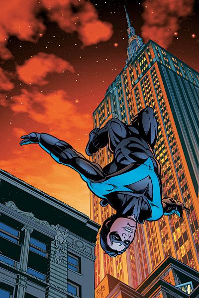
NIGHTWING #132
Write: Marv Wolfman Artist: Paco Diaz Publisher: DC Comics Reviewer: Rock-Me Amodeo
Thus ends the saga of the “Bride and Groom.” People died. Lives were changed. And heads were scratched – what exactly was accomplished here? I dunno.Let’s start with the strengths – Marv Wolfman is Marv Wolfman. Except for the occasional sacchariny turn of dialogue, the guy is a writing legend. But I’m just not feeling it here, dawg. Maybe I expect more because he’s so good. But it was…uhn, “pitchy.”
New artist Paco Diaz can draw. There are a few wacky muscles and angles and such (nothing as bad as Liefeld, thank goodness) but overall, it’s engaging and nice to look at.
Oddly, my biggest complaint, besides feeling that all these deaths mean absolutely nothing except to make us want to care, is the tactical aspect of the book, especially in this issue.
See, when a hero reacts, he has to take what he can get, and it’s easy to hang plot devices off that scenario. We expect it and accept it, generally. But Dick is mounting an assault here. That means he proactively calls the shots. You would think.
Has he or has he not been trained by one of the finest tacticians in the DC universe? So why he is leading himself, and a bunch of other folks, into close quarters with an energy leech and a mind controller? This should have been a titanium netting and sleep gas – 2 pages max. Somehow, these losers have been stringing him along since he ran into them three issues ago. And the strategic precision he evidenced last year, while playing Henry Higgins to Rose Wilson’s Eliza, was completely missing here.
I was excited about Marv coming aboard and, and out of fanboy respect, I stayed with it. But I think I’ll check in with this book in a few months and see what’s going on. Let me know if I miss anything.

AMAZING SPIDER-ASS (er…MAN) #540
Writer: J. Michael Strazynski Artist: Ron Garney Publisher: Marvel - The Corporation known for making money, pissing people off, crossover churning, and publishing RUNAWAYS. Guest Cog Reviewer: Loodabagel, not the baddest mofo on the internet, but I’d say he’s in the top 20.
Lucky me, I didn’t even have to open the book before my trip into comics agony began. Right on the cover, someone was nice enough to supply me with an image colored with a crayon. The prime suspect would be that Matt Milla character who colored the insides of this book, but I don’t like to point blame where it doesn’t belong. I remember a while back when Salvador Larocca started doing his own inks. He’s improved since then, but the point is, it looked like he brushed over his pencils with a Sharpie. The lines were crazy thick and you could actually see the marker lines on the page. This cover looks worse than that. Good thing it’s just the cover. Whatever. It sucks.Open the book and it’s not much better. There’s some more of the boring whining and laughable tough guy talk that came with last issue, but JMS was nice enough to leave out the death threats for a few pages. Perhaps he was trying to give us a false sense of hope, tricking the readers into believing that he realized the error of his ways. Nope. Sorry kids. This story still smells like Punisher-Lite and it still tastes like a shit sandwich.
But I exaggerate. There are actually three good pages in here where Spidey interrogates a gun runner in a rather well drawn, Cockrum-esque sequence. So that makes for 1/7 of a good story. The rest of the time, Spidey’s busy brooding, removing his mask, and saying stuff like “I am going to kill this man. Then I am going to rip his head off and eat his brains. Then I am going to go to his funeral, kill his friends and family, and eat their brains too.” Also, he’s nice enough to point out ironies for us. Thanks for the heads up, Spidey. I sure wouldn’t have figured that one out without your help.
Of course, what would a bad JMS comic be without a heavy-handed speech about cowards? Don’t worry. There’s like 3 of ‘em in here.
Symmetry. Ain’t it something? I know people who like to use a certain word all the time. It’s kind of a mini-catchphrase to them. I spent a few weeks saying “anagram” every chance I got, but than I realized the word I meant was “acronym” and it put a shameful end to my anagram dropping. Our good pal JMS seems to be having one of those love affairs with “symmetry.” Hey, I can deal with it. But when you’re really trying to rip a comic, you gotta rip, ya know? I’m sure he’ll be over it by next month. But after seven years, a guy’s style can get really irritating. If he had sprung this type of soliloquy on us back in ’02 (and he probably did) I would’ve enjoyed it. But the poor guy’s way past his due date. I remember back when Kevin Smith was going to take over back in 2000-freaking-4. JMS’s flag has long since flown. He’s out of ideas. He’s out of stories. He’s just been coasting on crossovers for two years. I can picture him now:
“Guys, I’m out of stories. I used to make this title refreshing and exciting, but now I just suck.”
At this point Joe Quesada and his partner-in-crime Avi Arad would cackle and blow cigar smoke in his face (they stole the cigars from Wolverine, by the way). Quesada will then go announce stuff like “Dan Slott” and “Jeph Loeb” just to watch the fanboys squirm with excitement. I bet he’s got a fanboy aquarium. He doesn’t tap on the glass, but he writes bulletins and shows ‘em to the fanboys to freak them out. His bulletins usually read something like “Bendis is working on something awesome, but I can’t tell you anything about till, like, 2010.” Or “there’s an awesome new creative team coming onto SPIDER-MAN. You’ll love ‘em.” Of course, he loves to talk about ULTIMATES 2. “Issue 13 is totally coming out this month, guys.”
I’ve gotten away from the point. My apologies. The point is this: when you go to pick up your comic books, whatever you do, do absolutely not buy AMAZING SPIDER-MAN #540. Unless it is free. And if it’s free, you have to be an absolute completist to pick it up. Believe me; this crap will be in the quarter bin by this time next year. Get SPIDER-MAN LOVES MARY JANE instead. This “Back in Black” story is such a disgusting abomination of the comic book, I will personally come to the homes of everyone who paid money for this and kick their ass. Well maybe not, but I urge you not to pick this up. I mean, for all of those of you who cried “character-rape” during CIVIL WAR, this is like 10 times worse. Oh my god, it makes SPIDER-MAN 3 look like SPIDER-MAN 2, STAR WARS, and LORD OF THE RINGS rolled into one. Well, maybe not that much. But this comic does make SPIDER-MAN 3 look better. Maybe you should read it before you watch the movie.
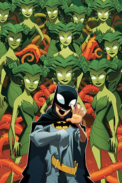
THE BATMAN STRIKES #33
Writer: Jai Nitz Art: Chris Jones & Terry Beatty Publisher: DC Comics Reviewer: Ambush Bug
It's becoming a tradition that these books geared supposedly towards kids (I'm talking specifically about this book, and Marvel's SPIDER-MAN LOVES MARY JANE and MARVEL ADVENTURES: THE AVENGERS) actually are telling some of the most entertaining stories on the racks involving these iconic heroes. Some may argue that these characters have been condensed down to their purest form for these "kiddie" books, but it shows as a testament to these strong and iconic characters that, despite the fact that they are written to be told to a wider audience, they do make for some terrific reading.One of the things I like about these stories is the fact that they are continuity free. There are a few givens: Batman's parents were murdered, he has a pair of sidekicks named Robin and Batgirl, a butler/father figure named Alfred, and a cave filled with an arsenal of weaponry for urban combat. These are established facts, but from there, the writers can go just about anywhere, as writer Jai Nitz does with this tale.
In THE BATMAN STRIKES #33, Poison Ivy is on the rampage. She escapes one battle with the Caped Crusader and his sidekicks, and infects Batman with a de-aging serum. Soon, Batman is younger than Robin and Batgirl. What makes this story fun is the fact that writer Jai Nitz seems to really get the characters of Batman and his supporting cast. This book is filled with nice moments where Robin suddenly feels a bit superior to the de-aged Batman and Alfred can't help but show affection towards the boy he remembers taking care of years ago. These are heartwarming and fun moments. This premise (a pre-teen Batman story) may seem campy and ludicrous in one of today's mainstream books, but it works in this format, and that's why I like reading these types of stories.
At times, I've built a soapbox and chirped on it for hours on end about continuity and its importance in comic books, but every now and then I am reminded that sometimes (as is the case with these more kid-oriented books) continuity free isn't such a four letter word. Sometimes, they can be downright fun.
IRON FIST #5
Writers: Matt Fraction & Ed Brubaker Artists: David Aja, Travel Foreman, & Derek Fridolfs Publisher: Marvel Comics Reviewer: Rock-Me Amodeo
There’s a couple different ways to shoulder the story-telling chores of iconic characters. One is to redefine, and we’ve seen that recently with the Hulk as Conan, or Madrox in a comic-noir styling. Another way is to deconstruct and reconstruct, done in varying degrees of success in the “Plotlines: Dis-assembled” and “Meh-Day” events.Then there is a third way, where previously ignored elements are mined, “richly and deeply,” to paraphrase something on the splash page. The character grows in power, mythos and general butt-kickery. And I know, I know - eventually, it has to end, or else everyone would be Galactus or The Spectre; but done well, it’s a fun, fun ride.
Welcome to Iron Fist, circa 2007, folks. I love where this book is going.
The book has already paid homage to some of Claremont/Byrne’s better work (the visual tracking of Iron Fist’s movements in a single panel; the history; and of course, it’s still one of the only things I can think of that tells the story in second person.) But now it’s building on that, and exploring what the Iron Fist really is, and Kun L’un, and all sorts of other things.
The artwork is beautiful. Where did David Aja come from? I’m hoping that their usage of other artists (for flashbacks) is just a cool approach, and not an indication that Aja draws with Hitch-ean speed, because it’s really nice stuff. I suspect he’s doing his own inking, too - the whole package is tight. For instance, on page seven, check out the chains hanging on the train. Look at them. Then notice that he drew the freaking shadows of the chains…AND accounted for the direction of the lighting.
The whole book (Aja’s parts, anyway) is like that. For real.
The writing is nice, too, flashing between past and present, though I confess I’ve never been impressed with Davos as a villain. If you remember, he’s got the dragon with no wings on his chest because he couldn’t hang tough. In lieu of ringing some kind of mystic bell (to get his wings…get it?) he’s going to just kill Iron Fist. Okaaayyyy…but the writing is so well done, I’m not bored.
On this issue, my only real regret was that the underground station was so stinking cool…I mean it was like MYST cool…that I WISH we could have explored it a lot more before it got blowed up.
Overall, my hope is that we really DO find out just how powerful Danny could be. We’ve seen this before - remember Spiderman and Ezekiel? That “you have no idea what your powers can do” kinda stuff? Well, its been 6 years, and except for sprouting a spike out of each hand (which I guess makes him…lets see, doing the math…an additional third as interesting as Wolverine), I’m still waiting.
Please, let us find out what Danny can do before I become Arthritic Fist. But for now, I’m definitely on this ride.


THE END web comic
Website: theendcomic.com Reviewer: Ambush Bug
I’m a novice when it comes to webcomics. Reading comics on my computer screen is vastly different from flipping through and actual comic. The texture of the pages. The weight of it in my hands. The tangible aspects of it all. The curmudgeon in me wants to rock back and forth in my rickety rocking chair and yell phooey at all of these new fangled webcomics.But I can see the appeal of webcomics. First and foremost, they are free. There’s something about free that’s appealing to me, especially when the cost of comics seems to be rising and rising. Webcomics also are easily accessible if you have an internet connection. You can read them whenever you want and there’s no need for polybags or longboxes.
A link for THE END webcomic wound up in my inbox a while back. It was an interesting read; a horror/fantasy/noir genre type story. What impressed me the most about this webcomic is the fact that the creator (I believe the creator’s name is Tommie Kelly) has made a fully realized and multi-textural world. There’s an entire mythology mapped out in this story, starting with a plague that hits the world’s population, and resulting in a police state type scenario and people developing immunities and super powers. The fact that the creator took the time to plot out an entire backstory before page one impresses me. My old college writing professor used to say, write an origin story. Get it out there on the page. Now, toss it out and write what happens next. That’s where the interesting stuff happens. And to a degree the old coot was right. Origin tales are fun and all, but stories can be much more than that. The writer of THE END seems to feel the same way.
And this is quite a dark read. The website allows you to either read a quick synopsis of the story so far to catch the reader up right away, or allows you to click on the archive and read the story first hand. So far, four chapters and a prologue have been completed. This seems to be a fully realized tale, done in a professional and patient manner.
The comic is not without its faults. The artwork is slightly flat in areas, but some panels are more fleshed out than others. There is little variation in line work. Everything is done in thick dark lines which sometimes end up leaving the panel too dark and garbled to fully understand the action taking place in them. But for the most part, the art clearly moves the story along.
The wrier does a good job with dialog though. There is some pretty heavy text being spewed by the all too serious characters, but somehow the writer pulls it off. There’s an eloquence and poetry to the way things are said that I found to be engaging.
All in all, this is a web comic worth checking out. Again, you can’t complain about the price of these things. If you’re looking for some time to waste at work, click on the website and read a few issues. It doesn’t hurt to give it a gander and, like me, you might find it to be an entertaining read.


”SHENANIGANS” OGN
Writer: Ian Shaughnessy Penciler: Mike Holmes Publisher: Oni Press Reviewed by Humphrey Lee
“SHENANIGANS” is like almost every random 80's comedy I've ever seen; it's got a pretty quirky albeit not terribly unique story, characters that are about the same, and some genuine heart to it to differentiate it a little, but not so much that it succeeds at separating itself from the pack. In a nutshell, eh, this turned out pretty okay.Our main character is a guy named Holden. A little bit on the geeky side, has a little bit of slacker in him, tends to be a complete fuck up with the womenfolk. After a little bit of a falling out with his current girlfriend he happens to "imbecile" his way into meeting the girl of his dreams, Casey. But as things seem to be moving along just fine with this new gal things hit a snag: Casey takes on a new tutoring job which ends up leaving her and Holden almost no time together, and puts Holden in a predicament because all of Casey's new clientele is made up of jocks, freaks and geeks all trying to give her the moves. And that's when Holden puts in the zany idea of impersonating another person in order to buy up all her time in order to spend more of it with her. Hilarity ensues... well, occasionally it does.
Now, I don't want to be overly critical on this story, because it was entertaining on the overall and I like the effort put forth, but it really did have too much of that "been there, done that" weighing it down. The thing is, while you don't see this kind of premise so much (especially in comics) it usually ingrains itself into your memory when it does that, for good or for bad, you always get that feeling of "I've been here before" when you immerse yourself in it. There's a standard set of clichés that always, always, always comes with it, and there's a bit of them apparent in this story too. Like at about the halfway point where Holden gets so preoccupied living the double life that his factual single life almost never spends time with his girl, or even the old standby of himself and his other self being on two dates at the same time in the same place with pretty much the expected outcome. It's just a little much and draws you out of the story.
So why was this still entertaining despite the big glaring flaw? It really does have a lot to do with the characters. While they're not exactly a breath of fresh air themselves, you still give enough of a damn about them to see if they make it through this big fork in their relationship and come back together in the end. Holden really does channel a lot of the qualities that I think your more comic reading, video game playing slacker types tend to see in themselves, and Casey is definitely the kind of catch we all like to hope we can snag one day. And sometimes Holden's rather extreme failings can be so oddball funny you can't help but laugh out loud which does even out pretty well with the moments where you'll probably glaze over what should be a funny bit if you hadn't seen it a dozen or so times before. And there's some amusing side characters too, like the barkeep that ends up helping Holden with his dual identity despite his better judgment, though they're not given as much screen time as they probably should be to keep things fresh and flowing well.
The art from Mike Holmes for “SHENANIGANS” is a pretty nice treat, though not without its own little problems. Overall the art is very sound, with great facial cues and great expressions and a whole lot of energy to it. The thing that bugs me about it is, well, for some reason none of the character's eyes have pupils and it looks really damn odd. I don't know why, maybe it's just a stylistic choice, maybe it was just a detail that they thought could be dropped to get this to print faster or something (don't ask me, I'm just theorizing) but it really does draw your attention away from the story at hand because it's just so random. Sometimes it just gives this weird glowing eye effect that you'd expect to see maybe in a tense modern zombie movie scene or on the cartoon characters on the front of a Gorillaz CD, but here it just looks, well, weird. But if you can get past that, the art is pretty top notch. Like I said earlier: facial expressions, story flow from panel to panel, all that you expect from good storytelling art is here in full effect.
”SHENANIGANS” is the first time in a long while that I can't go hog wild over an Oni book. Maybe I'm just spoiled by all the LOCALs and WASTELANDs and SCOTT PILGRIMs I've been getting from them, but this is a little too on the mediocre side for me to really recommend it. This is a classic case of Opportunity Cost as the always half-in-the-bag student in me that earned his Bachelor's in Business four years ago would say to prove he occasionally paid attention in class. It's a fun enough read that I think if the opportunity presents itself to give it a try that it wouldn't be a waste of time to do so, but then again, that time (and money of course) could be spent reading so much more engaging material, or even stuff that succeeds better on just a pure entertainment standpoint, all just from the same publisher alone, let alone with the sheer amount of material that is released upon the comic reading elite from around the industry. Sometimes that's just the way it is.
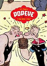
POPEYE VOL.1: “I YAM WHAT I YAM”
Writer: E.C. Segar Artist: E.C. Segar Publisher: Fantagraphics Reviewer: Jinxo
I love the history of comic strips. Just fascinates me. But until now I haven’t had the chance to really dig into a comic strip classic: Popeye. Mostly I knew him from how most folks know him, the cartoons. As to the comic strips, I knew what was said about them. “Oh, Popeye from the cartoons is nothing like the comic strip Popeye. That was where he really shined.” Some of that talk came from around the time of Robert Altman’s Popeye musical. “Some people won’t like the film because he based it more on the classic comics than on the cartoons.”With Fantagraphics releasing the first in a collection of the original Popeye comic strips readers can finally see for themselves if all the talk was true, if the comics are all they were reported to be. So far I am through the first year of the daily strips and…I am impressed. It’s kinda weird. The cartoons DO in fact color the view of these characters. It’s like having grandparents. You grow up with them and love them and you assume you know them. Then you discover, hey, they had lives before you were even born. They did and went through things you never imagined. Suddenly you see them in a whole different light. That’s what reading these books are like. The hype is true. Popeye was more than a spinach addict with violence issues and bad taste in women.
Actually, the first surprise is that Popeye’s world existed for a full decade(!) before Popeye himself. The comic strip THIMBLE THEATER trudged along a good long time before stumbling on the sailor who became its star. The collections start with the plot that introduces Popeye, the previous decade worth of strips likely never to see print. Likely that’s for the best but it does leave me curious about what came before.
As to the characters and the stories, they are different from the cartoons. But I have to say, if Altman was trying to capture the flavor of the old comics in his film I think he missed the mark. The characters and stories in the original strips are very different from his film as well. The cartoons were almost all about Popeye and Bluto/Brutus fighting over Olive and Popeye eating spinach to win the day. Altman’s film presented the characters as all living in this small, self contained village cut off from the world. All the characters seemed caught up in there own silliness and blind to the world around them. Of particular note is Olive’s brother Castor Oyle. The Altman film shows him as big, tubby and a bit of a simpleton. All of this is way way off.
While there is violence it certainly isn’t all about fights. And the players in THIMBLE THEATER weren’t removed from the real world as in Altman’s film but clearly were meant to reflect it in its own cartoony way. Also unlike Altman, the original characters were not oblivious to what went on about them. Self involved, yes; oblivious, no. Castor Oyle is the biggest surprise. Instead of a big dope of a supporting player, he’s a short fireplug of a character. More than anyone he resembles “Seinfeld”’s George Costanza. He’s willing to go to crazy lengths to make his schemes work. If there is danger, Castor is the first one to knock people over to get away from it. Still, you like him anyway. With George they could just let him be trouble through and through. Maybe just to play it safe, as greedy and bad as Castor is he also has a decent side. Sure, Olive’s boyfriend tries to rob them of all their money. And Castor sets a trap to kill the guy. But in the end, realizing the guy is broke, Castor gives the guy a huge sum of money even by today’s standards. Actually, “Seinfeld” might be the perfect comparison. I’m not saying if you like “Seinfeld” these books will knock you out. But they both have a similar sensibility. They are both the real world, only bigger and sillier with characters that are just horrible and yet somehow likable.
And what about Popeye? He’s a badass. He just is. He comes in as a sort of odd sailor Castor Oyle hires to help them sail to a gambling resort. He comes in as this odd looking freak. Now in the cartoons it seems we are meant to believe Popeye is somehow presentable and that Olive is somehow hot. Not in these. Right off the bat people are telling Popeye that something bad must have happened to his face, and Popeye’s first words to Olive aren’t about her beauty, it’s about how homely she is. Even one of Olive’s suitors admits she is one homely chick. Where the other characters look okay on the outside but are horrible inside, Popeye looks horrible on the outside but seems the only one truly good on the inside. When everyone else cowers in fear for themselves, Popeye is always looking for a fight…with someone who has it coming. And no spinach at all. Bah! We don’t need no stinking spinach. He’ll kick your ass regardless. Popeye is sort of Wolverine if he was designed by Jim Henson. He’s beaten and rough looking, he smokes and curses but he’s also good at heart and surprisingly unkillable. Seriously, in his first fight Popeye is shot sixteen times! And not in a “the bullets bounced off him” way. He’s got sixteen slugs in him and he still gets up from dying to bop the bad guy in the jaw one more time. He is the man. You can see why he became so popular. I actually have a growing affection for the phrase “Blow me down!” It’s constantly used as a capper to the strip. You get the final panel joke and then, sometimes almost without any logic, Popeye will just say, “Blow me down!” It’s the comedy of repetition. They just keep doing it so much that it starts being funny because they keep doing it.
These old strips might not be everyone’s cup of tea. A lot of the time they are enjoyably silly and amusing, not laugh out loud funny. But I find them very addictive. I also admire the lengths Segar would go to with his stories. With current comics, maybe they’ll run a few weeks at most with a running plot or gag. In these strips Segar runs and runs with gags and plots. The opening plot in the book is Castor making a bet that he can kill an unkillable bird. There are then six weeks worth of gags with Castor trying to murder this animal! That’s commitment to a non-pc gag. I am also very impressed how the plots slide seamlessly into each other. So far I haven’t hit a point where the running plot ends outright and a new one starts. They always smoothly dovetail into each other. Castor tries to kill the whiffle bird. This incredibly makes the whiffle bird love and stay with him. Then others want the bird for some mysterious reason, causing trouble for Castor. Then the solution to the mystery of the whiffle bird sets Castor and company on the road to their next adventure and so on and so on…
Can I also say, it’s a nice looking book. Showing it to people where I work, seeing the cover alone they would just blurt out, “Cool!”
One thing to be warned of…these strips were written in the 1920s so, occasionally, some heavy duty stereotypes do pop up. Not often. I’ve read a year of the daily strips and about four instances have popped up. But you should be prepped for when they do. You hit them and just go, “Holy crap! What the hell were they thinking!?!?” Then the story moves on and you thank God Segar didn’t decide to run with those bits for six weeks.
Here is maybe the biggest compliment I can pay this book: I initially didn’t want to tell the @$$holes I was going to review this book until I had read it cover to cover. Only I wanted to have it ready for review this week. In the end, I realized fully reading this book would require more than a single week, not just because of its length but because I realized I really didn’t want to rush through this book. I want to take my time and really enjoy hanging out with this crusty old sailor. Blow me down!
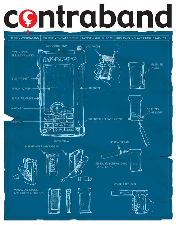
CONTRABAND #1 Published soon by Slave Labor Graphics
Sometimes a book comes along and just knocks you in the gut. IN a good way, mind you. CONTRABAND is a story set in the very near future. Reality TV has grown to massive proportions and technology has advanced to match it. Everything can be recorded with camera phones and immediately uploaded to websites for all to access. Privacy is an obsolete concept and the public has grown hungry for the next shocking thing and their fifteen minutes of fame. This story is a smart and scary vision of where we all may be headed. At times, the story can get a bit techy, but it only disrupts the momentum of the story slightly. I found the tech-speak to be extremely interesting because it is such a major part of the story. This Orwellian tale is not to be taken lightly. You can tell the writer has done his research. According to writer TJ Behe’s bio, he’s a digital creator who has worked for the BBC, Playboy, and MTV, so it looks like he knows what he is talking about. The art is equally powerful in its simplicity. Artist Phil Elliot does a great job of evoking powerful imagery with very few lines. Despite the attention to technology, this story has a lot of heart. There is a passion for the material and a moral lesson beneath it all. This is the type of story that will make you think about yourself and the direction humanity is going with its addiction to technology, voyeurism, and fame. You can check out a preview of this book on the creator’s ComicSpace page. - Ambush Bug
2 GUNS #1 BOOM! Studios
This book kept me guessing until the end. It was a good looking, easy talking read by artist Mat Santiolouco and writer Steven Grant. Grant’s expertise at writing action stories is evident in this one. There are double and triple crosses going on throughout this entire issue. Focusing on a pair of guys who are planning on robbing a bank, I wasn’t sure what to expect with this one, and I found myself pretty taken aback by the shockeroo ending. This is a comic where anything seemingly can happen to these characters and no one is safe. I like a comic like that. - Ambush Bug
RAISE THE DEAD #2 Dynamite Entertainment
Damn, this is a surprisingly good miniseries. I’ve gotta admire this story for the fact that it is a straight-forward zombie story with no real gimmicks or twists or anything. It’s just a bunch of human survivors trying to get from point A to point B. What makes it cool is the fact that it is filled with zombie attacks interspersed with LOST-like flashback sequences of the survivors. The story sort of plays like the old fable about the five blind men and the elephant, where each knows a snippet of information, but none of them are seeing the big picture. This is a textured and surprisingly well done addition to the zombie comics genre. The artwork by Hugo Petrus and Marc Rueda is nice and gory as well. To top it off, this miniseries has some of the coolest zombie covers ever put to print. - Ambush Bug
HUNTER’S MOON #1 BOOM! Studios
James L. White wrote the hit movie RAY, but writing a hit movie doesn’t always mean that one can do good comics. In this case, though, it does. White writes a nice story about fathers and sons. There’re a lot of exposition and getting-to-know-you bits in this issue, but it proves to be effective because of the emotional punch in the last few pages. Stuck in the middle of the woods, no contact with the outside world, and no real idea what is going on, a man named Linc’s plans for a nice hunting trip with his son soon turn into a desperate fight for survival. I’m not sure if the race issue is going to come into play, but the fact that Linc and his son are African American in a Southern wilderness and the foreboding run-in with the police at the diner seem to indicate that it will. Art by Dalibor Talajic is expressive and does a fine job of illustrating the vast wilderness. This is an emotional and interesting beginning. - Ambush Bug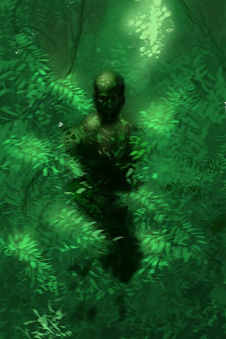
GAMEKEEPER #2 Virgin Comics
This book is BAD @$$. It’s a simple story of a man who used to be the best there is at what he does, but now just wants to live a peaceful life as the gamekeeper on a secluded farm in the mountains of Scotland. He takes care of the land and brings in food for the small community living on the private estate. Then for unknown reasons a squad of mercenaries show up and start killing people. Soon, the Gamekeeper must do what he does best once again. This book reminds me of FIRST BLOOD in many ways. It’s a one man killing machine, silently defending his home. It is beautiful in its simplicity. The action sequences here, written by action comics guru Andy Diggle from a concept by action movie guru Guy Richie, stand out as memorable and rank off the chart on the cool-o-meter. Add some gritty linework by Mukesh Singh and this is one of the best action books on the shelves right now. Highly recommended for those who like their action with the hardest of cores. - Ambush Bug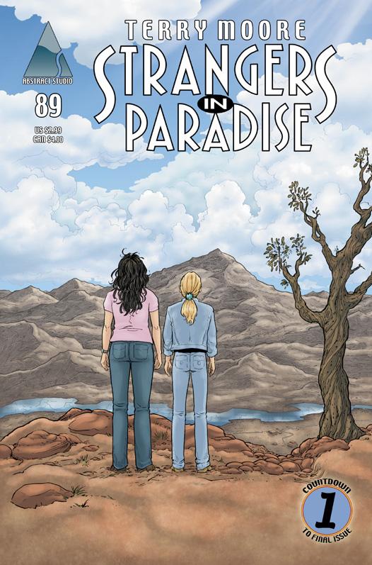
STRANGERS IN PARADISE #89 Abstract
A solid issue. It brings to mind all the writers, comics, etc who say that by using curse words only rarely you gain impact when you do use them. SIP has always been about sex and relationships but it has also always had certain set boundaries. With one issue to go, Terry Moore lets you know it is for real almost the end by punctuating this issue with moments that ignore the boundaries. Not saying there are orgies and cursing galore. Just a couple points where you go, “Did I really just hear that? Did I really just see that? Really didn’t expect to ever…” A fun, flirty slap in the face to say, sadly, the party is almost over. - Jinxo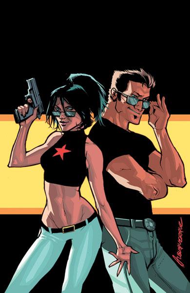
COVER GIRL #1 BOOM! Studios
BOOM! Studios’ ties to Hollywood have never been more evident than they are with this issue. Set in the City of Stars, this book follows a starving actor as he tumbles into stardom when he rescues a beautiful and mysterious woman from a car crash. Reading this book reminded me of the Robert Altman flick THE PLAYER in that it tells a tale of how the Hollywood machine works its magic. The Hollywood in-speak runs rampant. Image is everything. This book does a great job of mapping out how to build a better star in Hollywood. Of course, things aren’t all great for our would-be hero, Alex Martin. Ramifications of the act that brought Alex the stardom in the first place seem to be playing out, putting the rising star in danger. In order to maintain his man’s man appearance, his agent gets a hot bodyguard to look after him. This looks to be a very fun book. The characters have a lot of personality and the inside Hollywood stuff is something new and entertaining to see in a comic. - Ambush Bug
UNIQUE #1 Platinum Studios
Tales of alternate realities and physics usually make my head ache. I like my stories a bit more grounded. UNIQUE snagged my interest, though, due to the everyman point of view the story is told from and the, dare I say it, unique premise regarding alternate realities and the like. OK, here goes. Everyone who has ever read Robert Frost’s poem or any DC comic knows that there exist alternate realities. In this story, though, there are those known as Uniques, people who do not have counterparts in these alternate realities. They are unique in that there is only one of them. Jon Geoffries is one of these Uniques - or maybe he’s just nuts. This is a surprisingly down-to-earth tale of cosmic proportions. I enjoyed reading this 48 page premiere issue a lot, especially since it caused limited head-scratching. If you like your cosmic mumbo-jumbo in bite-size doses, this is the book for you. - Ambush Bug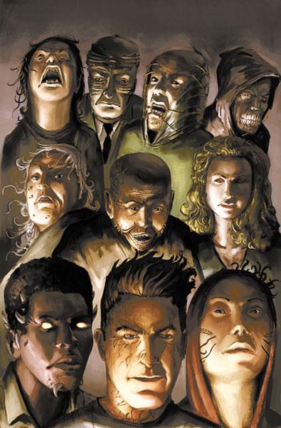
DOMINION #1 BOOM! Studios
Yet another first issue from BOOM! Studios this week. This time it’s an INVASION OF THE BODY SNATCHERS type dealie as the beginning narration suggests that an ancient form of biological warfare is unleashed from space onto my place of residence, Chicago. Normal human beings find themselves with destructive and repulsive powers and rampage out of control. This issue does a good job of hyping the paranoia of the onset of this attack as the transformation of individual humans to out of control monsters is depicted over and over. There is a slight contrivance where an off-duty cop knows just what to do to fight a specific monster, but I can get past it due to the strong plot and nice gritty artwork by Tim Hamilton. I really like the ugly look of the transformed humans too. The last monster in particular is especially cringe-inducing. Now that these monsters have been introduced, I look forward to getting to know them and seeing them interact more in upcoming issues. - Ambush Bug
COUNTDOWN #51 DC Comics
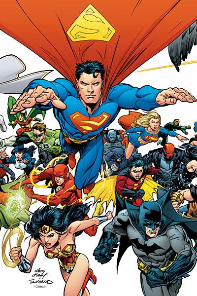
Can’t let this one get by without at least giving it a cheap shot. I would’ve given this one a more extensive review, but there really isn’t much here by way of content. Don’t get me wrong. Stuff happened. But I’m just not sure if I like it or not. Maybe I’m still reeling from the lackluster ending of 52 and I wasn’t really given enough time to recover. This is supposedly the beginning of yet another something big for the DCU, but after reading this issue, I was overcome from the from the top of my bald noggin all the way down to that piddy that runs all the way home with a feeling of utter “meh.” I’ll be following this maxiseries, but the excitement has been diluted due to the fact that the Big Two have been on event overdrive for way too long now. - Bug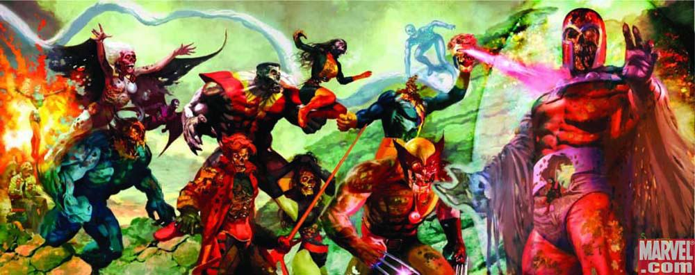
MARVEL ZOMBIES: DEAD DAYS #1 Marvel Comics
Yeah, I think this franchise is officially out of steam. Just last week I was remarking on how much I'm enjoying the new mini-series about teaming up our favorite spandex-clad-supertypes-turned-flesh-eaters and the hero of the EVIL DEAD series of movies, Ashley J. Williams. And now I know why: because that book tends to be a little more "lets throw this at the wall and see if it sticks" while this main story of zombification has become a little to matter-of-fact and lost its sense of humor. Now it's just capes eating capes and some more Chicken Little-ing (y'know, "the sky is falling"). It is kind of cool to see how this all went down; why the superhero community and the world ended up falling to it, what kind of effort did they put forth, and there's even a pretty unexpected twist as to the Fantastic Four's part in all this (seeing as how they're the first of this kind we saw way back when in UFF). Sure, this is kind of fun in a sick and depraved sort of way but honestly it's gotten to that point where I'm asking myself "do I really need any more of this?" and I just can't really find reasons to say yes anymore. - Humphrey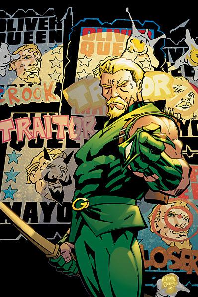
GREEN ARROW #74
DC Comics
First STRANGERS IN PARADISE and now another second-to-last issue. I swear I’m not trying to write about every last issue of a cancelled series. But after the last smack down review I figured I should give credit for a much improved issue. In this one the art is solid and the story moves. We get a good extended action scene which is exciting, easy to follow and brings a classic arrow back into play. I would almost say there is so much violence that I want to ask “where’s the love?” But quite frankly, Ollie puts a whole different sort of shaft to work for an impressive number of hours. On top of all that there is a setup for one final mother of a blowout. I say again, Winick should always write like every issue is the last. Way more fun. - Jinxo