| #53 | 3/21/07 | #5 |
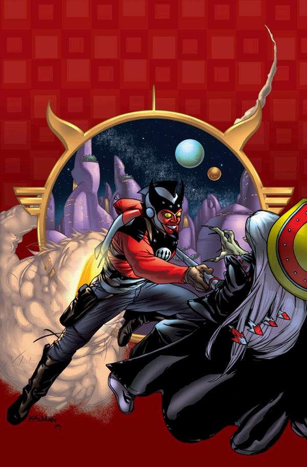
AQUAMAN: SWORD OF ATLANTIS #50
Writer: Tad Williams Artists: Shawn McManus (pencils)/Walden Wong (inker) Publisher: DC Comics Reviewer: Prof. Challenger
ENOUGH -- My head is splitting. -- MeraYeh. Mera pretty much sums up this comic book in that quote above.
Reading a comic should not be a chore. This comic was a real chore to read. I had to force myself to finish it. Why? Because I wanted it to get better. But it didn’t.
What is so damn difficult about producing a successful AQUAMAN series? I’m serious. Someone enlighten me. What makes the concept so intrinsically impossible for writers and artists to consistently deliver good stories and good art? Peter David is probably the only writer who ever succeeded at all, and most of that success was predicated upon shocking the reader with scenes like a school of piranha chewing Arthur’s hand off. But, as usual, even David ran out of interesting stories to tell about the character and the series ran out of steam. Since then, it’s been round-robin time with each new creator-team bringing a new “vision” of the character...and failing.
And I always give the new team a chance to win me over. For some reason, I keep hoping against hope and rooting for the character to succeed. Busiek and Guice started off really strong, but inexplicably the series quickly started gasping for breath. I have no idea whether it was Busiek losing interest or Guice not delivering, but something behind the scenes happened. The series started running late, the issues started losing any emotional impact, guest-artists appeared. I dropped the book.
So now DC has dropped a famous fantasy novelist, Tad Williams, into the writing chair and paired him with artist Shawn McManus. On paper, an excellent choice. In execution, an unfortunate disaster.
Let me reiterate that I really wanted this book to be good. But, for the life of me, I can not recommend it. It may be one of the worst comics I’ve read in a long time. When reviewing mainstream comics, there’s a big difference between a poorly executed comic book (like this one) and a comic that is well-executed but horrible in its effect upon characters and/or continuity (like CIVIL WAR and its ilk).
Part of the problem with AQUAMAN #50 is that the team of Williams and McManus do not compliment each other. In fact, McManus seems completely out of his comfort zone. His art is so inappropriate for the book that I’m not entirely sure my review would still be negative if it had a different artist attached. And I say this from the perspective of one who generally loves McManus’ art. However, working with the undersea venue and the pre-existing character designs for these characters, McManus veers the art into such a cartoony vein that it distracted from the writing rather than just tell the story. He seemed very uncomfortable with the more “realistic” characters and also unsure even how to draw such characters as the Dweller. It’s distracting as a reader to see what appears to be an artist floundering around inconsistently from panel to panel and page to page trying to capture the characters and flow of the story.
At the same time, Tad Williams just writes, writes, and writes some more to the point where I just wanted to yell at the writer to stop the words and let the visuals carry some of the story. It may be great writing--for a serialized novel. For a comic book, it was awkward to the extreme. His attempts at humor completely fell flat, which may have been the fault of the artist (I can’t honestly assess). The substitution of the squid-guy for King Shark as “New Aquaman”’s sidekick was forced and clumsy.
I know this is negative, but the truth is that I can tell that the writer and artist are trying hard to produce something good. I’ve just got to say that this first outing did not succeed at all, and if I were a casual reader, it would not persuade me to pick up the next issue. And isn’t that the ultimate, bottom-line goal of every issue of an ongoing series? To make the reader want to buy the next issue?
This comic failed on all counts and I feel bad for the creators. It was so wrong, in so many ways, that I’m not sure how to fix it. But my first suggestion would be to bring in an artist with a more realistic style who is experienced at crafting sword and sorcery fantasy worlds. Is Tom Yeates still around and working?
HELLBLAZER #230
Writer: Andy Diggle Penciler: Leonardo Manco Publisher: Vertigo/DC Comics Reviewed by Humphrey Lee
There's fresh blood on the writing chores on what I guess you would call Vertigo's "flagship" title so I figure it's time to give old Johnny boy a look over and see what the new guy on the block (THE LOSERS' Andy Diggle) has to offer. And what he has to offer, apparently, is kind of a tried and true approach to the character, but a good intro nonetheless.By now if any of you have ever read a HELLBLAZER story, you should know by now what to expect, at least from our title character John Constantine. Constantine is your ultimate con man. The guy who has always got what you want, or can get you what you need, at any price. But when dealing with the charming, trenchcoated Brit, what you get doesn't always turn out to be what you bargained for. But occasionally even the man with all the solutions gets himself in way over his head, and that is where the fun lies with the character.
Like I said, Diggle starts us off with a yypical Constantine scenario: John has apparently done something kinda stupid and because of it he's ambushed and now finds himself bound to the post of a pier with tide coming in and one pissed off gangster type sadistically watching him as he edges closer to his demise. Basically, this is Diggle flexing his muscles and showing us that he knows how these stories are supposed to roll, and that he knows how the character is supposed to work; his scheming and planning, and how he worms his way out of any situation, no matter how badly against his favor. The story unfolds like you'd expect it, with John stalling away and getting into the skull of his captor and would be murderer, and with a simple but effective twist at the end to put the ball back in his court. And with Manco's art helping to push it along, this all feels like home. His moody and I want to say "dirty" pencils really are the perfect atmosphere for this book, and really help along Diggle's script as he tries to capture the essence of John. As much as I love Dillon's work on the character back when he and Ennis were putting Johnny boy on the map, I honestly think that now in Manco's almost three year tenure on this title his variation of the character has become my definitive version of him.
Now this is all well and good, as Constantine still continues to be one of the most complex and innovative characters comic books has ever seen, but the key to a run on a character that has seen some very classic and innovative ones is to put him in situations or against beings or powers that he hasn't faced, all the while adding just that extra little layer to the character in its wake. Ennis put him up against the mother of all baddies in the Devil himself, and also showed him his mortality more than he had ever experienced before. Azzarello tapped into his remorseful side and his uncanny sense of duty while he plodded through some of the dirtiest and seediest haunts in backwoods all over America.
And Mike Carey took a little bit of the character's soul by showing him the life he could have had if he hadn't gotten mixed in this crazy world of his in the first place. So, again, it's great that Diggle in one issue can show me that he knows how the inner workings of the book should go; now it's a matter of pulling in that special "epic" feeling some of these defining runs have produced and do something that will leave his mark on the title, and the character himself. But there's a lot of promise being shown here, and already a lot of my apprehensions are laid to rest. Now it's just time to sit back and see what's delivered.
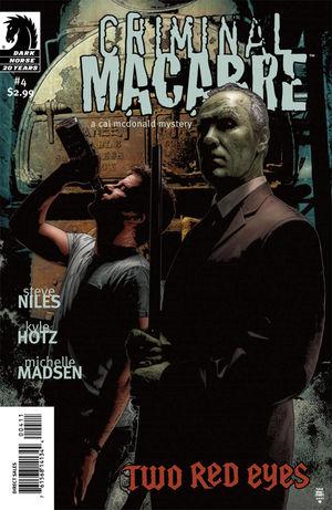
CRIMINAL MACABRE – A CAL MCDONALD MYSTERY: TWO RED EYES #4
Writer: Steve Niles Artist: Kyle Hotz Publisher: Dark Horse Reviewer: Ambush Bug
I literally screamed HOLY SHIT when I put this book down. It is that good. Next year, when I’m rooting through all of the books I have read throughout the year to pick out the Best Single Issue for the @$$ies next year, this book is going to be on top of the list. Quite simply, down and out paranormal detective Cal McDonald and his ghoul buddy Mo’Lock curb-stomp the hell out of the original Nosferatu in such a brutal and vicious way that I was literally stunned as I leafed through the pages of this issue.But I’m getting ahead of myself here.
This issue brings to a close the first arc in the new Cal McDonald ongoing series. Cal is a detective that happens to fall into a lot of mysteries involving vampires, werewolves, zombies, ghouls, and all sorts of monsters. He can’t help it. It’s just the kind of shit that happens to him. To deal with this constant barrage of horrors, Cal is most often drunk or fucked up on some kind of mixture of alcohol and illegal/pharmaceutical drugs. I came to know the character of Cal McDonald from his first miniseries entitled CRIMINAL MACABRE drawn by Ben Templesmith. Since then, I have read most of Cal’s adventures in both prose and comic book form. Recently Cal’s adventures, particularly the last miniseries (SUPERNATURAL FREAK MACHINE), seemed to have lost their bite. The hard nosed detective seemed to be edging more into self parody territory and I feared that the character was beginning to lose the edge that attracted me to the character in the first place. And then came the CRIMINAL MACABRE ongoing series from Dark Horse to reassure me that Cal McDonald is truly one of the coolest characters in comics once again.
Writer Steve Niles scribes a most powerful story as a boat carrying the original Nosferatu crashes into a California harbor. His goal: to find Cal McDonald and make him pay for killing so many of his kind. In order to get to Cal, the legendary vampire steals his ex-girlfriend. Meanwhile, Cal has been hospitalized and for the first time in years, his system is completely drug-free. And this issue lets everyone know that a drug-free Cal is not someone to be fucked with.
The sheer brutality of the fight scene between Cal, Mo’Lock, and the Nosferatu and the outcome of the entire issue is one of the coolest fight scenes I have seen in recent memory. All of the old vampire-killing clichés are utilized, but done so in the hurried, brash, and no bullshit manner that one has come to expect from Cal. All of the brutal action is rendered beautifully by Kyle Hotz. I’ve followed Hotz’ work for a while. He’s hit a nice stride after his run on miniseries like THE HOOD and ZOMBIE over at Marvel, but this is a career high for this rising star of an artist. Hotz outdoes himself by gently mixing the horrifically surreal with searing realistic imagery. There is a whole movement over the last ten years that have followed the Bernie Wrightson way of artistry. Eric Powell, Kelley Jones, even Mignola. But with his work on this issue, Hotz has skyrocketed to the top of the list of this type of horror artist. Unformtunately, the editorial page at the end says that this is Hotz’ last issue. Here’s hoping he’ll be back soon on this title. Cal and Co. has never looked better and I’ll be sure to seek out whatever Hotz has planned for the future.
CRIMINAL MACABRE is one of those issues and series that may be overlooked by those who solely follow the big two. Some may be a tad sick of seeing Steve Niles name on the cover of a book these days. He has oversaturated the horror market these days with offerings of varying quality. But I can tell this property is something very close to Niles heart. It shows that he’s putting forth his best stuff for this series and it’s much appreciated by this fan who was losing faith in the character, but whose faith was solidified once again with this first amazing arc.
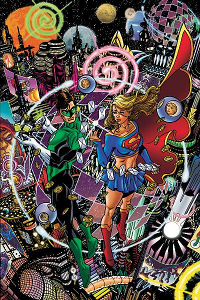
THE BRAVE AND THE BOLD # 2
Written by: Mark Waid Pencilled by: George Perez Published by: DC Comics Reviewed by: superhero
Supergirl? Is that you? I mean, I didn't recognize you. I mean…I can't see your ribs, your eyes don't look like they were plucked from the head of a kewpie doll, and, well, you actually look like you have some muscle tone on you. Your arms and legs don't look like twigs anymore…damn, girl, have you been workin' out? I was gettin' worried about you. For the past couple of years you've been looking like an anorexic with bad breast implants. I'm so happy to see how good you're looking!OK, enough of that nonsense.
But it is true that it's great to see an artist of George Perez's caliber drawing Supergirl as she should be drawn. I actually wish I had been in the room when Perez made his pact with Satan just so I could convince Perez to let me leech off the deal just a little bit. I mean, c'mon, Perez can freakin' DRAW! If this issue doesn't prove it to you then you are blind and stupid. Perez has always been one of the best (if not the best) and this issue shows why. Sure his artwork is incredibly detailed. Sure his imagination just spills out all over the page. But what impresses me the most…what has always made Perez the man as far as I'm concerned is his layout. His panel progression and constant experimentation on the page with his storytelling is out and out fantastic…and it's a space tale like this that brings his strengths to the forefront. I mean, a story that takes place on a casino planet is the perfect setting for Perez to flex his artistic muscles and he proves in this one issue alone that those muscles are Hulk-sized indeed. Every page is terrific to look at and just made me smile as I turned the pages. Perez, sir, you are a god and I will say right here without shame that I love you. Man, it just doesn't get any better. Yes, it's true. I have a George Perez man-crush.
But THE BRAVE AND THE BOLD # 2 isn't just Perez's time to shine. Mark Waid does a great job crafting a comic book tale that has enough of a silver-age quality to embrace the silly trappings of the super-hero genre without making them seem silly. Waid does what so many other professional writers at the big two are unable to do: he makes super-heroing seem as fun as it used to be without letting it get too corny or overly gritty. THE BRAVE AND THE BOLD is a mainstream superhero book that has enough modern touches without making it seem like it's forgetting what it is: an adventure book. In this comic the adventure is turned up to eleven and it's just all-out fun. This type of book is why I started read comic books in the first place and as long as they keep making books like this I'll keep reading them. B AND B is rare among the big two these days. It's self-contained adventure that isn't trying to be more than it is and I'm thankful for that. For someone who's fed up with crossovers and mainstream superheroes trying to act like they're going to educate me with some deep political statement this book is a breath of fresh air. Sure, I could have dealt without the characterization of Supergirl as a complete airhead but, hey, if I can at least have someone drawing her correctly then I'm not gonna look a gift horse in the mouth. The overall quality of this issue is enough to make me look past that little quip…especially since Supergirl seems to redeem her Hillary Duff ways by the end of the issue. Either way, THE BRAVE AND THE BOLD has got some great talent working on it and as long as Perez is drawing and Waid is writing I'll be buying.
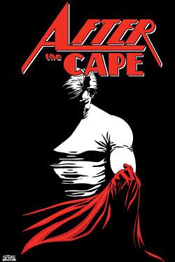
AFTER THE CAPE #1 (of 3)
Writer: Howard Wong w/ Jim Valentino Penciler: Marco Rudy Publisher: Image Comics Reviewed by Humphrey Lee
A little ditty from Image that I ordered cause it had a solid premise, AFTER THE CAPE is a book I think I want to like more than I really did. That "solid premise" I referred to is that of a "retired" superhero and what his life has been reduced to in order to survive like the rest of us do day to day. He's got a wife and two kids to feed and is willing to, and has gone to, some pretty drastic and basically criminal stakes in order to do so. The problem with it all is the execution. Again, solid premise, and there is some genuine emotion in there when we see our lead, Ethan, having the occasional breakdown and dealing with a personal issue that has not only ruined his life as a masked avenger, but also interferes with his current life as well. But there's some really forced dialogue in here; some stuff that is very expository, or that feels like it's trying too hard to come out as powerful and rife with emotion. Sometimes it does pack a punch, but it tends to be more often than not marred by a little cliche here, or some stifling wording there, or just overachieving.Another mixed bag is the art. Now this I can firmly say is actually really, really solid art, but it's really, really solid art in Black and White when it's obvious it really needed to be colored. There's some good use of negative space and some shading here and there, but for the most part it's just base pencils, using heavy blacks in places to make the panels feel more full. There's a flashback scene in the middle of this book, going back to Ethan's costumed days and showing why he was kicked off the superteam he was on, where basically the only way to denote it's a "flashback" (besides the character being in costume of course) is instead of being in Black and White, it's in Black and Grey. Now, its obvious that this book wasn't exactly something that was going to be lighting up the charts, hence the decision to pull back the colors, but really, the same crowd of us that decided to try this at the normal $2.99 were also probably going to give it a go if the price had just been bumped the extra fifty cents or whatever to put this in the color form it really needed and I honestly think was meant to be in originally. I could be mistaken on this of course.
This isn't a bad book by any means, but I see this going in the way of "wasted potential". It really is a strong premise, and I can see a rollercoaster ride of emotions pouring out of this in the next two issues of it, but the scripting doesn't have the same pull that the overall story does and it causes the book to fall flat too often. Add that to the lack of color this really did need, and this just feels like half of a potentially great comic. I really wish this could be given a second chance since with these oversights reconciled I feel this book had such a great chance, but alas, I guess it's not to be.
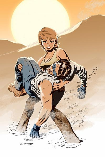
THE SPIRIT #4
Writer: Darwyn Cooke Artists: Darwyn Cooke (pencils)/J. Bone (inker)/Dave Steward (colors) Publisher: DC Comics Reviewer: Prof. Challenger
“I’m gonna do my job. Now get moving or I’ll SHOVE THAT HAT SO FAR UP YOUR BUTT your kidneys will sing Happy Trails. ” Silk Satin (CIA)Would it be ironic if THE SPIRIT took the Eisner Award this year for best series?
Darwyn Cooke is headed that direction.
Reading THE SPIRIT for the last 4 months just drives home how different Cooke is as a comic book creator to other mainstream folk. Comparing his efforts on THE SPIRIT to pretty much every best-selling series out there right now is about like comparing the novels of Ernest Hemingway to John Grisham. One of those writers is extraordinarily popular and sells millions of copies of everything he writes and the other is (and will be) recognized universally as one of the “great” writers of all time.
So what’s the primary difference between the two? Grisham is an excellent writer. He knows how to write what people like to read and he does it very well with a constant eye towards his intended audience. Hemingway, on the other hand, literally sweated and bled every word he put to paper. He lived and breathed his writing, hoping others would like it but driven to write regardless of audience expectations. The connection to the reader in Hemingway’s writing is there because it is infused with his soul. Grisham’s books reveal an author detached emotionally from most of his writing and who simply works to structure his writing according to audience expectations. I think it’s the difference between someone who lists his occupation as an “author” and someone who is wholistically a “writer.”
Cooke clearly falls into the Hemingway category. When I read his comics now, it seems infused by his personality and heart. There is obvious thought given to each and every panel and word on the page. It makes his work an absolute joy to read. And this issue is no exception.
This issue’s story involves more machinations of the mysterious terrorist “The Octopus” and the seemingly buffoonish Hussein. It also features another sexy and dangerous love interest for The Spirit in the form of CIA Special Agent Silk Satin. The story starts in media res as The Spirit and Satin are trudging through the desert. How they got there and how they are going to get out is the meat of the story. The scenes in the desert deserve a special shout-out to Dave Stewart for his outstanding coloring work. His efforts really contribute to the mood by evoking a hot and dry atmosphere perfectly. The creative use of cactus shadows on the standard double-sized title page was amazing.
Each issue so far has featured a different female to spar with The Spirit, but in Silk Satin, Cooke introduces someone new that I think could headline her own series. Cute, spunky, sexy, and tough, Satin is a winner. Cooke develops Hussein nicely as more than just silly comic relief as well. Hussein points to one of the things Cooke is doing so splendidly in his efforts to make THE SPIRIT work as a series set in the 21st century. He is rather boldly incorporating Middle Eastern characters and terrorism as a driving plot force for the series. And he does it with a respectful balance of humor and danger. Hussein enjoys the vices and freedoms of this country but hides a definite cunning and deceitful nature behind the veneer of a naive foreigner in a strange and confusing land--that’s right, he’s the “Unfrozen Caveman Lawyer” of this series.
Pure excellence. Darwyn Cooke is proving month after month why he deserves to be mentioned in the same breath as comics’ historically great artists like Wally Wood, Reed Crandall, and, yes, Will Eisner.

GENERAL JACK COSMO PRESENTS #1
Writer: Araron M. Shaps Letterer: Dave Rothe Reviewer: Squashua
General Jack Cosmo and the Werewolves from MarsArtist: Nate Lovett
Hadrian Hillard, Gentleman Barbarian
Artists: Dave Goldring and Sonny Leader
Frontier Terror: The Red Ranger
Artists: Andrew Froedge, Jamie Snell, Sonny Leader
American Eagle and the Golden Star
Artists: Gabe Pena, Dave McCaig
A little known book from a fledgling studio is due to come out in May. General Jack Cosmo Presents (or GJCP for short) #1 is a quarterly 56-page anthology, and stories be damned, it has some of the most eye-catching artwork I've ever seen. The visuals are top-notch, with an extremely fine attention to detail. A different artist draws each of the four stories in this title and yet they all came out equally beautiful. Sure, some of the damsels in distress have boob jobs and there's one waitress with Down's Syndrome, but otherwise oh my god, the art and the coloring are fantastic. There's one full-page spread of General Jack Cosmo, a retro-styled Adam Strange type with some sort of sci-fi devil motif going on, diving into a battle amongst bird-men and cat-people and tentacle-faced alien Huns, duking it out throughout a pagoda city rife with well-armed, jet-packing, blue-skinned humanoids. It's truly epic.
One thing I don't normally review is the lettering, but I have to mention it because it stands out from other books I've read; captions are set aside with character logos, font sizes are appropriately exploited for emphasis, and speech balloons are contorted depending on who's speaking. There's a mechanized Frankenstein beast whose balloons are framed in cogs and a gorilla mastermind whose speech is grizzled on a black background. And the sound effects feel like a part of the art. There's no KLUDD here.
GJCP delivers three short stories, book-ended by the exclusive, less serious, slightly cartoon-y, and fourth wall-breaking General Jack Cosmo tale, which weaves its way around them as a framing device. The first story is some serious gothic kooky fun with Hadrian Hilliard, the Gentleman Barbarian, who politely takes down a sinister society set to subjugate civilization, with all the action a tactful barbarian would need. There's no lesson taught here, only thick adventure. Ridiculous? Yes. Outlandish? Sure. Fun? Definitely.
Next up is The Red Ranger, a “Lone Ranger” type working his way through a supernatural wild west. We witness him execute a few errant werewolves, demonstrating what a cool cucumber he is, but other than being a character showcase, there isn't much substance story-wise. As an exhibit for his own title, I'm sure this story sets up a larger tale, but other than some fantastic art, there's not much else to go on.
The final story is an eight page preview of the upcoming AMERICAN EAGLE AND THE GOLDEN STAR, a tale about two retired super-heroes traveling cross-country. The story is an artistic wonder that sets up their first meeting with the titular General Jack Cosmo himself, and explains a bit about his origins. It's an excellent few pages, almost overflowing with cool "Flash Gordon-esque" ideas, which the framing device then takes ahold of and, unfortunately, doesn't let go.
The ideas in the text are fast-flowing. Martian werewolves, gentlemen barbarians, zombie Hindu demons, musketeer cyborgs, and retired super-heroes--GJCP does not let any stone go unturned. The featured world feels like The Tick but with a tad less silly.
This book is a fun read and for 56 pages at $3.50, considering how much crap we get from The Big Two, is worth it for the art alone. The only downfall of this book is the General Jack Cosmo framing device, which starts out alright, but later becomes almost preachy in its sales push, which is understandable for a first book from a company getting its feet wet, but for me, that doesn't hit the right notes. I highly recommend, if nothing else, at least checking out the art over on MySpace. Be forewarned; the MySpace page has some ripping tunes playing.
Remember, if you have an Indie book you’d like one of the @$$holes to take a look at, click on your favorite reviewer’s link and drop us an email.

THE PUNISHER PRESENTS: BARRACUDA #2 Marvel MAX
Ennis gets to go hog wild with his unstoppable creation, the nigh-indestructible Barracuda. In this issue, the B-Man shows that he’s not as dumb as his employers think as he crosses and double crosses all of the parties involved. It’s fun seeing Garth let loose like this. ‘Cuda is a character that seems ripped from PREACHER. This miniseries looks to be another laugh-filled gross-out, vulgarathon from the guy who made it ok to do so. - Bug
ARMY@LOVE #1 DC Vertigo
I wanted to sit back and really delve into this book and give it the full review that it probably deserves, but I just couldn't when it came to it. Why you ask? Because I really, really just don't know what I think about it yet. Part of me is in love with the premise of the book, that being Veitch's satirical look at the state of American warfare and where it "could" be in the next few years, but it's the execution that gets me. The problem is that this is pure and literal satire. Every page is teeming with "in your face" and it's just something I'm really not used to. I'm used to, and pretty much prefer, a more nuanced mechanic. Something that just takes its jabs when it can, and you occasionally have to work to get. There are exceptions, obviously; PREACHER and TRANSMETOPOLITAN both had their moments of just pure, unadulterated and unfettered satire, but they also had a very "every man" sense of humor to go with them that kept you entertained while they got on their soapboxes. ARMY@LOVE is just...odd. I really can't put it any other way. It's an odd approach to things and it's going to take some getting used to. I'm not saying that this is a bad book by any means, but it's going to take some time to pull me into its world. And I legitimately hope it does, because Rick Veitch has produced some very transcendent work in his time, but right now I'm a little more skeptical on this book than I expected to be when I first envisioned reading it. Still though, only the first issue and so much more ground to cover and it's different enough that I still recommend a try because it might simply work more for you than it did myself. Here's to hoping it's just a case of "pilotitis" as I like to call it. - Humphrey
X-FACTOR #17 Marvel Comics
This, noble readers, is the only X-book that matters. Peter David shows that he’s at home again and continuing another stellar run centering on a character with multiple personalities. This time, though, instead of the jade giant, we’re talking about the one man army, Madrox The Multiple Man and his team of mutant detectives. David mixes JLI interpersonal relations with noir mystery and mutant mayhem of the old school order. There’s no X-book out there like this one, which is probably why the X-books are in such a sad state these days. David is doing what no other comic creator has been able to do in a long time…he’s making me care about mutants. In this issue Madrox tracks down another one of his wayward dupes, annoying twat Layla Miller once again pontificates about knowing stuff (although the character is surprisingly less annoying under David’s playful pen), Rictor and Wolvesbane get into a load of trouble, and an honest to gosh mystery begins to unfold. Sick of mutants? Me too. But Peter David’s X-FACTOR is the surefire cure for that. - Bug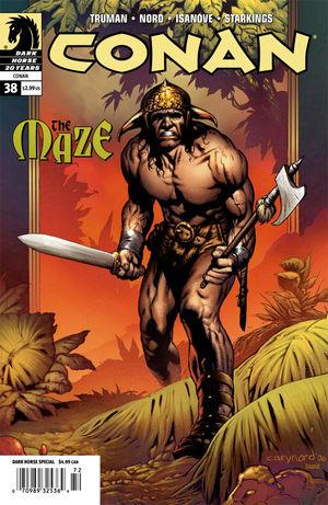
CONAN #38 Dark Horse
For some reason, the Conan story that has stuck with me the most from the Marvel days is the one adapted in this issue. Originally a short prologue to Robert Howard's “Rogues in the House”, this tale of retribution, honor, loyalty and friendship has been retold masterfully by Tim Truman and Cary Nord. This is my favorite issue of CONAN to date. -- Vroom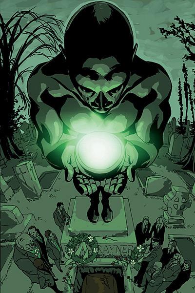
ION #12 DC Comics
Well, the last issue of ION came and went. What happened? Well, the big mystery hinting at the mastermind behind all of the weird shit and conflicts with former and alternate universal villains that Kyle has been battling throughout this entire miniseries is never revealed. Kyle obviously has something to do with COUNTDOWN and the Monitors, but no answers are found here, just ominous nonsensicals. Marz does deliver with what he does best--that is, telling a tale of the human side of Kyle Rayner. There’s a nice moral Kyle learns from this heart breaking final issue--one that his predecessor had to die and be reborn to learn, showing that Kyle is just as much (if not more) of a hero than Hal ever was. Being a Kyle fan, it was nice to see this series focus on a hero that was overshadowed by those who are afraid of moving forward in the DCU. It’s too bad that the confounded mysteries that were presented in the series couldn’t come to some kind of resolution though. - Bug
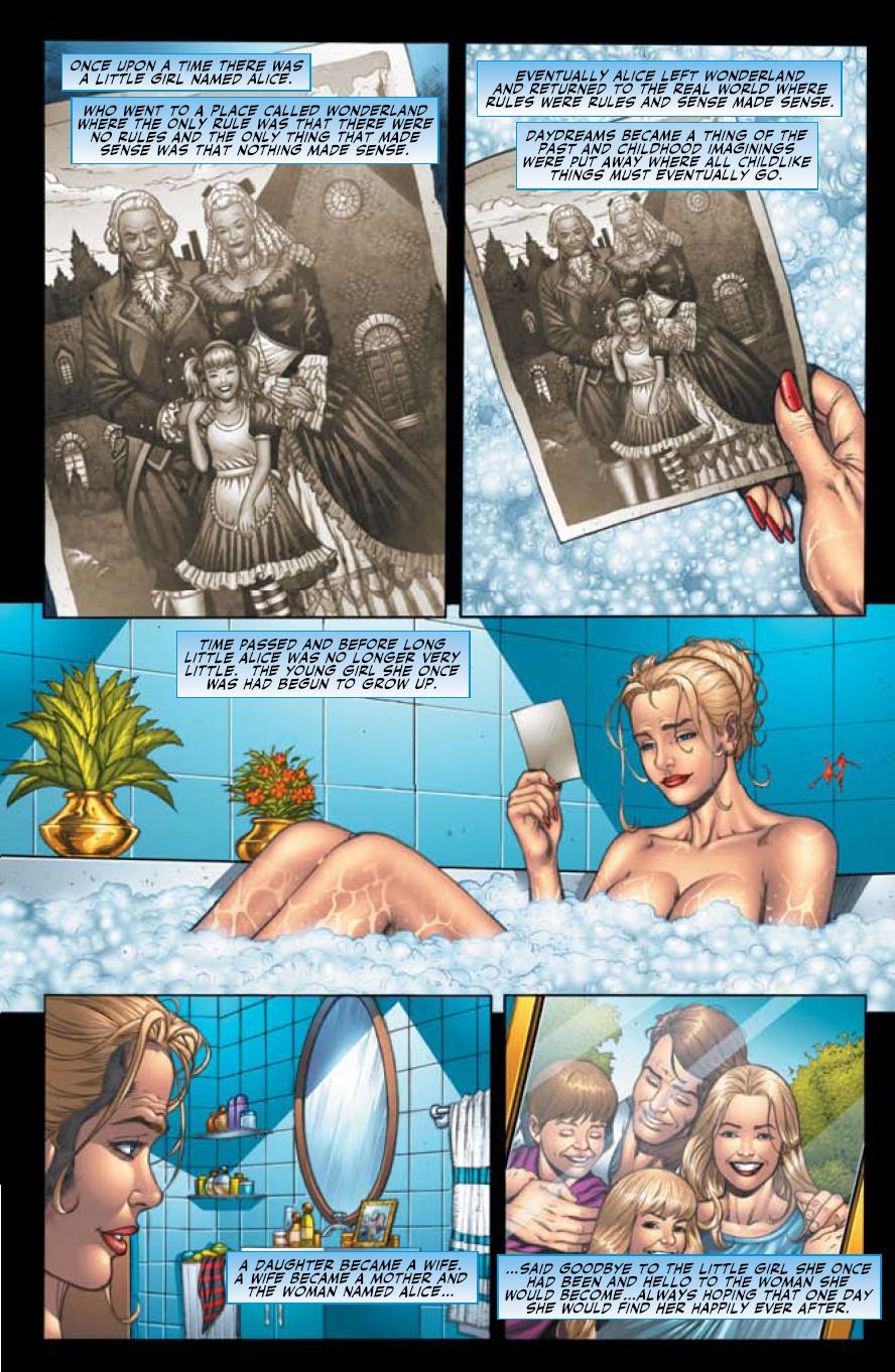
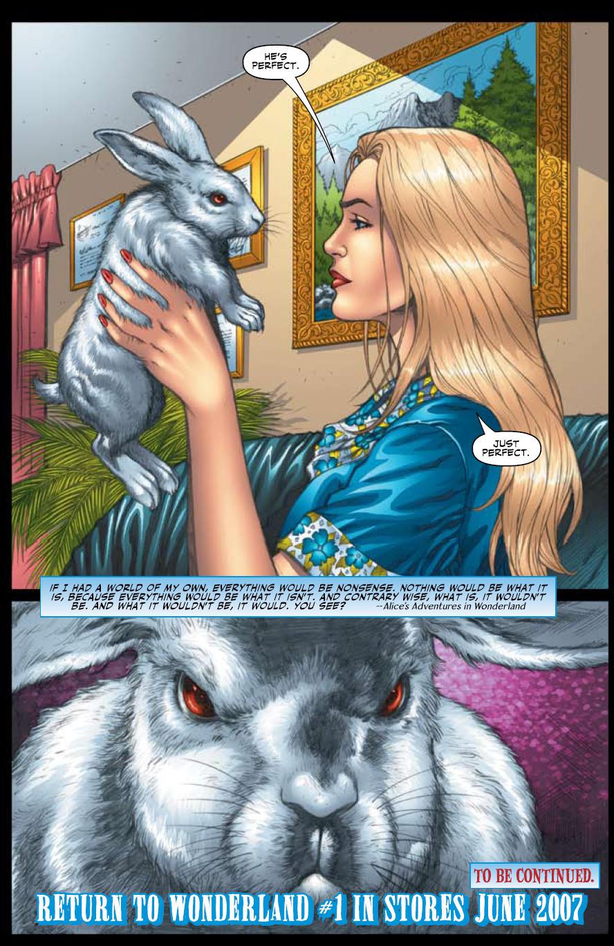
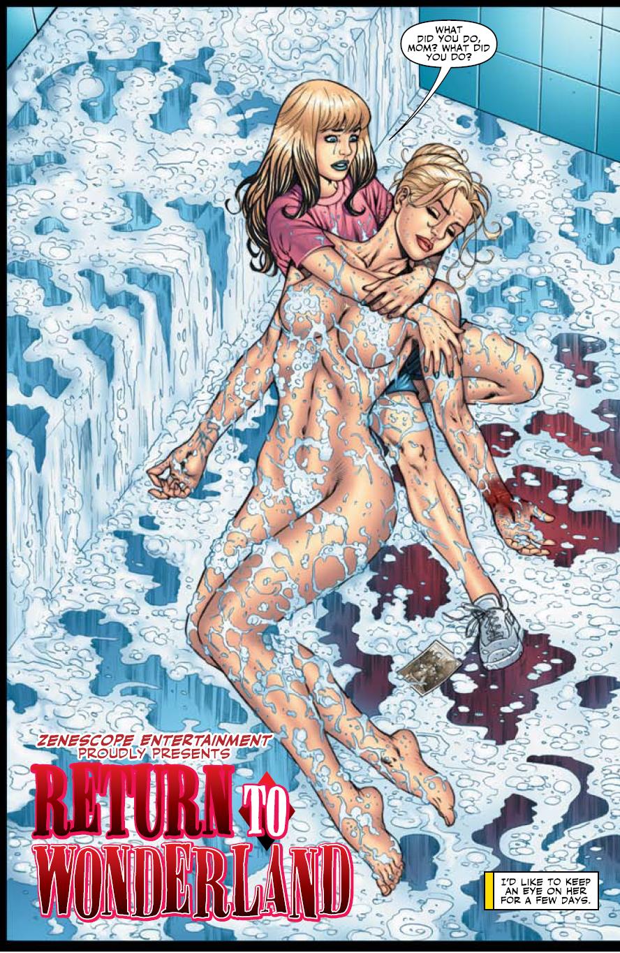
Hello all, Vroom Socko here. A couple of weeks back I had a chance to take an early look at a comic due out later in the year: RETURN TO WONDERLAND. The story is about a grown-up Alice, how her life has changed since her adventures, and what happens when her teenage daughter falls down the rabbit hole. The writer is Raven Gregory, friend of the column and all around pimp. You might remember the Q and @s we’ve done in the past on the subject of his book THE GIFT. Well, it’s about time for another, don’t you think?
Vroom Socko: Everyone from Disney to Jefferson Airplane to American McGee to Alan Moore has adapted or drawn inspiration from “Alice in Wonderland”. Why do you think this story has such an impact, and what drew you to the idea of writing your own Alice story?
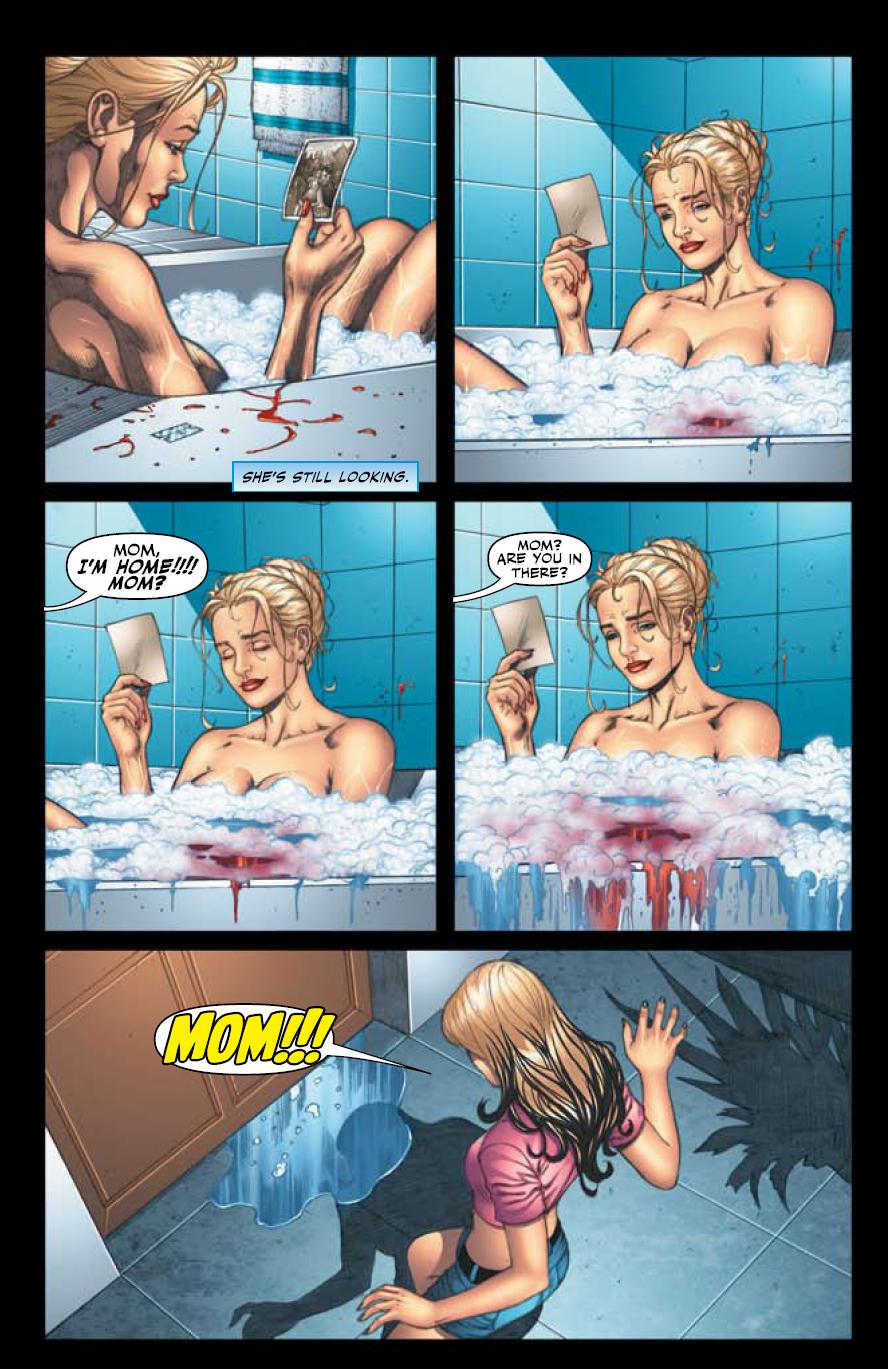 Raven Gregory: I think it has to do with it being the ultimate horror story wrapped up in a cute little fairy tale package. There's something so innocent yet so ominous and terrifying about it that people just can't help but have an affinity to the material. But it's probably different for each creator. For me though...it's all about the horror story...the story of a little girl's descent into madness.
As for what brought me to adding to the Wonderland mythos that was all Zenescope's idea. They had been planning on doing some of the more well known fairy tale stories as their own independent maxi/mini series and they were happy with the work I did with them on the first issue of SE7EN so I was offered the gig. After spending a couple months immersed in all things Wonderland I came to them with the idea of doing this story as a modern day sequel take off the original tale following Alice's daughter Calie and her journey into Wonderland to discover what has caused her mother to go insane and the true origin behind what Wonderland "really" is.
There's some stuff in this book, even before we head into Wonderland, that is phenomenally fucked in the head. You're no stranger to this sort of writing, of course, what with THE GIFT and SE7EN on your resume. Where does your affinity with the macabre come from?
No idea. It's just there. I'm pretty sure if I wasn't a writer I would probably be in therapy right now and for the rest of my life. But suffice to say, there is some crazy shit floating around in my head at any given point in the day, so me writing a dark twisted version of Wonderland kinda makes sense in a nothing makes sense kind of way.Are the original Lewis Carroll novels your primary inspiration, or is it more impacted by the Disney vision, or simply the communal cultural idea of Alice?
 Everything and anything became fodder for the story. The novels, the animated films, the symbolism, the drug references, the creators and the real life characters from which the story was based on all play a big part of where this story came from. I think even Lovecraft found a way to slip his otherworldly tentacle fingers into the pie at one point in the story. It was really an ethereal mind trip of an experience writing and coming up with this tale.
Do you ever worry that some parents’ group is going to make your life a living hell for "sexing up and darkening a children's story"? Not that I'M complaining, mind...
Not really. I'm sure I'll get a lot of shit once the book is out there...but as long as I know that my heart was in the right place when I wrote it I'll sleep fine at night. Beyond all the horror and darkness there's more than quite a few moral lessons and themes that run through the series. But it's more of things that would apply to this day and age instead of the more innocent time during which the novel was conceived.