| #11 | 7/12/06 | #5 |
(Click title to go directly to the review)
SUPERMAN # 654
GHOST RIDER #1
52 WEEK TEN
THE ESCAPISTS #1
THE EXTERMINATORS #7
Big Eyes for the Cape Guy presents PROJECT X CHALLENGERS: CUP NOODLE
Big Eyes for the Cape Guy presents TRASH V.1
Indie Jones presents WASTELAND #1
Indie Jones presents SHARK-MAN #1
Indie Jones presents FLIGHT VOL.3
Indie Jones presents THE SHAOLIN COWBOY #6
CHEAP SHOTS!
Tales From the Crevice features QUANTUM & WOODY

SUPERMAN # 654
Written by: Kurt Busiek
Pencilled by: Carlos Pacheco
Published by: DC Comics
Reviewed by: superhero
Finally.
Finally, it’s happened.
Finally, a truly great-in continuity Superman story.
I can’t believe it’s happened but it’s true. Kurt Busiek and Carlos Pacheco have crafted one of the greatest SUPERMAN stories in a long, long time.
See, I’ve been a Superman fan for years. But as Quentin Tarantino said in KILL BILL VOLUME 2, I’ve been more a fan of the mythology than anything else. Ever since I was tyke, I loved the idea of Superman and then when I saw the first Richard Donner film it sealed the deal. Seeing Christopher Reeve soar through the skies in SUPERMAN: THE MOVIE made me a Superman fan for life. While kids were freaking out over Star Wars, whipping out their lightsabers made of mop handles, I was busy strapping bath towels around my neck and jumping off of living room coffee tables. My mom still loves to tell stories to any stranger who’ll listen of how her son would run around the house with a blanket draped around his shoulders, causing chaos at every opportunity, while screaming “Sooooooperrrrmaaaaannnn!” at the top of his lungs.
Yes, I loved Superman for years. That is until I actually started reading comic books seriously in my early teenage years. Because, let’s face it, to a thirteen year-old who was being exposed to the X-Men and Spider-Man for the first time the Superman comics at the time kind of, well, sucked. Sure there were some great stories here and there like that great anniversary issue where Luthor gets his battle armor and Brainiac goes all Doctor Roboto…but for the most part the Super-comics were a snore-fest compared to a lot of the stuff Marvel was pumping out. Yeah, I’d pick up a Superman book every once in a while during those years but it’d be a rare occasion. So for a while I’d be a fan of the idea of Superman but not actually really care that much about the books he appeared in.
Enter John Byrne. In 1986 Byrne re-vamped Supes for a new generation and, in my humble opinion, saved Superman from becoming completely obsolete. For the next several years or so the Byrne Superman books revived the character for me in a way that I though was impossible. Not only that but he gave us some of the best Luthor stories ever written. Don’t believe me? Just track down issues number two and nine of Byrne’s SUPERMAN book and tell me that those aren’t some of the best Luthor stories you’ve ever read. Of course, that era did have its missteps but most of those were due to the companion book to Byrne’s re-launch, ADVENTURES OF SUPERMAN (Can you say Bibbo? UGH.) For the most part the Byrne era was pretty solid and it absolutely restored my faith in the character.
But then Byrne left. While that didn’t mean that the Superman books went immediately right into the toilet (I actually remember a pretty good Roger Stern/Kerry Gammil run in there somewhere) it wasn’t long before that was to be the line’s destiny. Before you knew it, it was the ‘90’s and the darkest era of comics was upon us. It hit Superman like a ton of Kryptonite. It was during this era that I actually dropped any and all Superman books I’d been reading. It was an era of Doomsday and Funerals for a Friend and Electric Blue Xanadu Superman. Yep, the Superman books had become crap and it killed me. So much potential just gone, completely wiped away. It was truly a bad time to be a Superman fan.
But in the past several years DC had been bringing some great talent onto the “S Books” so I started picking them up on a regular basis. Sure there were some interesting concepts here and there but for the most part they’d just end up being convoluted junk. Loeb, Azzarello, McGuiness, and Lee would all fail in their aspirations to make the Superman books great. One after another great talents in the comic industry would just fall before the corporate might of DC Comics/Time Warner’s expectations for the character. No one seemed to know how to write the books worth a damn. Sure, Joe Kelley had a really good run on ACTION COMICS but even that got completely absorbed into the ridiculousness of the rest of titles in the line. And while I’ll always be thankful to Jeph Loeb for bringing back “mad scientist Luthor”, for the most part the S-Man has had some pretty tired in-continuity storylines as of late. The books were so bad that the only place you could go to get great Superman stories was in an Elseworlds book or by watching the Timm/Dini animated series.
But have no fear, true believers, because Busiek and Pacheco are here to save us all. Because, despite the slightly disappointing movie, Superman really has returned.
I don’t really know where to start with my praise for this book. It’s perfect. Perfect in every way. For the first time in I don’t know how many years, I’m actually excited to read the mainstream SUPERMAN book!
To tell you the truth I was a bit nervous about Busiek writing SUPERMAN after his recent underwhelming run on JLA. I was wrong to be nervous. Busiek has gotten everything right here. Everything. For years and years it seems like so many writers haven’t been able to write about all of the aspects of Superman’s life without making things seem forced or hackneyed. To me it’s seemed like so many writers have focused more on how Superman’s history restricts them instead of just going along with the whole bag of tricks and seeing where it might take them. For so long writers have complained about Superman’s power level, about him being married, about his lame villains. So many creators have just whined and bitched about how Superman is impossible to write, how uninteresting he is.
Busiek’s been able to throw all of that out of the window. He seems to have taken on all aspects of Superman and just said, “Bring it on!” This issue touches on everything in Superman’s life and just makes it work. Not only does it work but it flows seamlessly. Busiek focuses on everything from his marriage to his work life to his adventuring all in one issue. He does such a great job of it that for the first time ever everything just seemed to fit. Clark’s troubles don’t seem forced upon him, they seem organic to the character and the story. The adventuring doesn’t seem like average typical super-hero derring-do, there’s a scope to it. For the first time since Lois and Clark got married the marriage stuff worked.
This is the point where I have to stop and write about Lois Lane for second. For years and years Lois Lane has been written as a ball-busting selfish bitch. There has been no warmth to the character, nothing for fans to care about. For the longest time no one knew how to write a strong willed independent female character who just happened to be married to Superman. So, because of that lack of understanding, Lois was just made out to seem self centered and, quite honestly, completely unsympathetic. I know that I would find myself asking the question, “Why in the hell would Superman marry this woman?” If she wasn’t condescending to him she’d be too busy with her own stuff to even care what was going on with her husband. Was this the woman worthy of Superman’s love? I gotta tell you, there were plenty of times I was hoping he’d just dump her and move on. She didn’t deserve him. Chuck Austen touched on this a bit during his run in ACTION COMICS but he left the book before the issue could be fully explored.
Luckily no one needs to address it anymore because in one story Busiek has figured out how to write Lois Lane as she should be written. For the first time I believed that Lois actually cared about her husband and what he was going though. For the first time in the pages of any Superman book I saw the give and take of an actual marriage taking place. Busiek understands what marriage is and he’s incorporated that understanding into his fleshing out of his Lois Lane. This is the first time I’ve ever read a Superman book and actually felt that Lois had a living, breathing heart and actually cared about Clark Kent beyond the fact that he was Superman. Not only that but that Lois could be the woman that Superman would want to come home to. And no, you perverts, it’s not because she greeted him at the door dressed in lingerie…it’s because of the sentiment behind her actions. It’s the words that Busiek put in her mouth that made me finally believe in a Lois Lane that Superman would marry.
But of course, we can’t forget the visuals either. Pacheco has made Lois Lane quite possibly one of the sexiest women in comics in this issue alone. Reading this issue reminded me of the first time I saw an ad for the LOIS & CLARK TV show with Terri Hatcher as Lois Lane. When I got a look at Hatcher in that ad my mind finally got what Superman would see in Lois Lane…at least physically. With this issue of Superman Pacheco makes Lois, well, just gorgeous. Not only that but fashionable. Hell, she’s practically cosmopolitan! So while Busiek excels in bringing life to Lois Pacheco brings it home by, um, literally fleshing her out.
But drawing a sexy Lois isn’t Pacheco’s only achievement in this book--far from it. Pacheco gives Superman himself the dynamic appeal that’s been missing from him from, since, well…forever. Pacheco’s masterful art gives the whole book a sense of life that’s rarely seen in a comic book much less a Superman book. I mean just look at his Superman! He seems almost three dimensional! Pacheco’s figure drawing is impeccable. Superman’s muscles flex and bend and respond to the force applied to them. His cape blows in the wind effortlessly and gracefully. If Superman were real this is what I’d want him to look like! Pacheco draws a Man of Steel that has a touch of the fantastic and believability at the same time. Not only that but it seems like Pacheco never met a background he didn’t like! His panels are full of them and they look perfect! It seems like I can look at a Superman book and see an actual world in its panels. Pacheco is the perfect artist for this book bar none.
So what else can I say? This, to me, was probably one of the better comics I’ve ever read in that it’s gotten me excited about Superman as a comic-book character again. As I said before, that hasn’t happened since the Byrne era. Hopefully these two will be able to keep breathing new life into Supey-baby for a long time to come and leave me with a bunch of Superman stories that I’ll treasure until the next creative team comes along and trashes this run’s potential. Why am I so sure that the next team’ll be a disappointment? Because if this issue is any indication of how good Busiek and Pacheco’s run is going to be…well, filling their shoes is going to be next to impossible.

GHOST RIDER #1
Rider…I mean writer: Daniel Way
Art: Javier Salteres & Mark Texeira
Publisher: Marvel Comics
Ghost Reviewer: Ambush Bug
Well, it's time to flip the mattress on my bed, which also signals the time for another GHOST RIDER relaunch. Seems every few years, Marvel tries to dust off the old tried an’ trues for an all new all different relaunch. Blade, the Defenders, Moon Knight, Heroes for Hire. All of these 70’s characters, rebooted with new creative teams and new directions. The problem is that the market isn’t like it was back in those days. Back then, comic book concepts didn’t really have strong premises, rather, they jumped on trends. Because of this, a comic based on trends like blaxploitation and kung fu movies didn’t have that iconic or time-everlasting feel that concepts like “With great power, comes great responsibility” did and still do. They rode the wave of popularity for a bit, then faded away. Some comics relied on cool visuals alone. This being a visual medium, it makes sense that some comics get by with strong stories, while others rely on eye candy to get sales. Sometimes a visual comes along and hits you on a visceral level of coolness and that, I think, is why Ghost Rider is as popular as he is.
There’s something about a bad@$$ on a motorcycle with a flaming skull for a head that punches you in the nuts and has you asking for more. It definitely is one of those designs that grips the rebellious teenager in oneself and makes one let out an exasperated “cooool!” upon feasting one’s eyes upon the visual. Problem is, if the story doesn’t match the visual, all you’re left with are pretty panels and in this day and age, that ain’t enough for a good comic book. At least not a comic book I want to buy on a regular basis.
And that’s the job of every first issue on the shelves today. Something should happen in the first issue that makes you want to buy that comic on a regular basis or that book, more than likely, will not be around for long.
Marvel clearly doesn’t understand this. And this issue of GHOST RIDER is proof positive of that.
In this new first issue of GR, we basically get a rehash of the first scene from Garth Ennis’ last attempt to make Ghostie interesting. Ghost Rider is racing demons to a doorway in Hell which leads back to Earth. He loses again and Lucifer (who, this time, looks like LEGEND’s Darkness) belches forth a big ol’ He-Man laugh to drive the dagger deeper. Along the way, Ghostie runs into Slimer from the GHOSTBUSTERS, who has a plan to dig out of hell. We get more lies from the Prince of Lies and in the end, without a real explanation, Ghost Rider finds himself bursting out of the ocean with a bunch of zombies or demons or whatever.
Marvel’s new go-to Golden Boy writer Daniel Way is writing this relaunch. I’ve noticed that, with Way’s books in the past (I’m talkin’ about HULK and WOLVERINE here), I’ve been able to follow the storyline much better by reading the last issue recap pages at the beginnings of the books than reading the actual story. Way seems to have some interesting stories to tell, but doesn’t really seem to have a firm hold on how to translate them cohesively onto the page. Large gaps in logic and rushed scenes are the main problem here. Way, like many others in the industry, seems to build up to the “big cool scene” rather than using that scene to elaborate on an evenly-paced story that looks cool AND makes sense. Story does not seem to take precedence here. The failure to clearly communicate the leap from Hell to Earth in the closing pages of this book is proof that Way found it much more interesting to show extended demon racing scenes and splashes of a laughing Lucifer than to explain the hows and the whys Ghostie ends up on the mortal plane again.
I do give Way credit for paneling out a nice “cooool!” scene as Ghost Rider is forced to hearken back to his carnival stuntman days and drive his bike over a fiery crevasse. Very cool scene indeed, but not enough to save this book.
What really turned me off with this book is the editorial on the last page. On that page, there’s a promise for something new and different. Ghostie will be firmly planted in the Marvel Universe, interacting with all sorts of heroes and villains. We, the readers, will be taken to all sorts of new and exciting places in the issues to come. The thing is, none of this was delivered in the first issue. And, I’m sorry, a promise from editorial is not enough to get me to come back for a second issue.
Sure there’ll be those who say, “You can’t pass judgment on a series based on a single issue!”
And to that, I say, “Fuck you, you psychologically conditioned and genetically spliced lemming-sheep.”
In this day and age, when there is so much to choose from on the shelves…when comics cost so much…after so many lame relaunches to the character…the first issue of a GHOST RIDER series had better have me at HELL-o or I’m going to be motoring down the highway to the next comic faster than you can say “Show me the Mephisto!”
A note from editorial promising something that doesn’t even peek its head up in the first issue gives me no confidence in a book. I don’t have the time or the money to “wait a few issues to see if it’s any good” which has become the new mantra for those who like to be called Marvel Zombies and those who Marvel Editorial refer to as “Suckers, gotcha again!”
If it doesn’t impress in the first issue, I’m gone and so should you be. Why not use the first issue as an example of what is to come in this comic? With the editorial promise that the series will be planted in the Marvel U, this first issue didn’t give me any indication that this was going to happen. What we did get was some convoluted series of chase scenes that, I guess, ends up on a beach in, what I gather from the editorial page, the Marvel Universe.
I wasn’t too impressed by the art either, which was the biggest draw I felt to this book when I heard who the art team was going to consist of. Javier Salteres and Mark Texeira were the team that (next to Ploog) made the Ghost Rider the iconic symbol which decorates many a righteous arm of rockers and bikers around the world. When the 90’s relaunch of this series hit, this was the team supreme, but having seen both artists’ work since this series hit, it became clear to me who the stronger artist was between the two. Without Tex’s inks, I always found Salteres’ work to be pretty weak. It was one of those cases where the best results came from the collaboration—a reliance on both artists’ strengths to save the other. Salteres seems to have a good handle on proportion, something I’ve always found to be a problem in Tex’s solo work. Tex’s figures often have extra long bodies (a detail that was especially evident when he was drawing the short-n’-stubby Wolverine like he was an NBA point man). But the detailed coolness of the Ghost Rider and crispness of the characters and action belonged to Tex in that old series. He’s the one that made the pictures pop with his inks. In this book, the thrill is gone. Ghost Rider is still sporting his 90’s costume, but the battle ram motorcycle has been replaced by a simple Harley design with a skull on the handlebars. It all just seems so uninspired, especially with the use of iconic movie characters like Slimer and LEGEND’s Darkness as templates for other characters in the book. The crisp grittiness that permeated from the first issues of the 90’s GHOST RIDER book from the same team just hasn’t seemed to age well over the last decade.
I don’t even want to get into the fact that Ghost Rider is using Johnny Blaze’s voice. The character has been through more permutations than the Hulk. I don’t know which is according to status quo any more since we’ve had Danny Ketch, Zarathos, and Johnny Blaze all providing the voice of the Ghost Rider over the years. Not much of GR’s history is touched upon, something a character with such a convoluted background may want to have touched upon in an intro issue. None of that occurs. There’s a race. A Slimer. A lie from a Tim Curry wannabe. And then POP! Ghostie’s in the Marvel U with very little explanation. Not a very good first impression.

52 WEEK TEN
Writers: Johns, Morrison, Rucka, Waid, and probably some Giffen
Artists: Giffen, Batista, Palmiotti, Jadson, Sinclair & Fletcher
History of the DCU Writer: Jurgens
History of the DCU Artists: Lanning, Napolitano, Cox & Major
Publisher: DC Comics
Reviewer: Squashua
Greetings, students. I made a soap opera analogy last week in regards to 52, and I’ve referred to my comics as "my soaps" on occasion when having to explain my obsession to others. The serial nature of both soap operas and comic books is quite similar, but with the weekly ensemble 52, I’ve never seen the analogy so clearly. In both, you’re given many different storylines and characters, enough that they might not even get addressed in any particular episode. Is every story entertaining? Well, that depends on your taste and the writers involved, but at least in 52 there’s something for everyone.
In this week’s soap, we continue exploring Black Adam’s political agenda, check in on how life is treating a powerless Clark Kent (and how life isn’t treating a flagellating Booster Gold), and once more visit the cell of Professor Morrow for, based on his allusion, the final time.
Black Adam, sporting a black version of Captain Marvel’s traditional cape, has gathered powered and non-powered representatives from various countries for his Dubya-Approved "Bizzarro UN". Even Serpentor’s mistress is there. I heard they made her from the DNA of Abigail Williams, Erzebet Bathory, Lizzie Borden, Cruella DeVille, Helen of Troy, Eva Braun, and a couple strands from Scarlett Johansson’s hairbrush. Dude, she’s evil. The beautiful and strong-willed Intergang refugee, Adrianna, makes a scene that sends off all sorts of "I’ve seen this sort of move before" signals. And we Talkbackers here at AICN know a plant when we see one. It’s well played, but I view her interference and coy attempts to influence Black Adam as the acts of a calculating manipulator. And who in the DC Universe (1) seems to have a finger in every 52 plot thread, (2) has access to Intergang, (3) is a master manipulator, and (4) has attempted to influence the course of humanity before? I’ll let you mull that over.
Homework Assignment #1 - Research the post-Crisis origins of Egg-Fu.
The other main plot thread involves Clark Kent investigating Supernova. Clark’s still not used to not having powers, and it shows in his productivity at work. With the prior history between Perry White and Clark Kent, I would never have seen their interaction coming had it not been so telegraphed, but this is a New Earth and we still don’t have a defined past, only a basic framework (as seen in the History of the DCU backups). With John Byrne’s MAN OF STEEL, Perry White and Lex Luthor grew up together. In BIRTHRIGHT, Mark Waid established that Clark Kent and Lex Luthor grew up together. We’re working with a completely different dynamic. This storyline is entertaining, so there’s nothing to worry about here. Clark pulls a classic "Lois Lane" move for the sake of journalism, and learns a bit about Supernova and his teleportation (or banish into the annals of time) powers.
I’m probably in the minority, but I’m actually not interested in figuring out who Supernova is. I’ve heard theories ranging from Lex Luthor to a parallel Booster Gold, Rip Hunter, Booster being both Rip Hunter and Supernova, and Earth-2 Superman, which does make some sense if you consider the reference to The Daily Star and other factors. The artists have been semi-ambiguous regarding Supernova’s gender; even though he’s been presented artistically as a male from a distance, but he could easily be female (I’m looking at you, Ronin from NEW AVENGERS). It would be nice to see a new face or a previously non-super identity under that mask. Jimmy Olsen, anyone?
Homework Assignment #2 - Locate Supernova in KINGDOM COME.
Booster appears for four panels with at least enough text for one entire comic book, which I certainly don’t mind, and his tale is provided with a direction. Will Magnus and T.O. Morrow continue their meetings, the writers (or artists) being a little ham-handed with some book names, and for some reason I can’t shake hearing the “The Golden Girls” theme song.
Overall the artwork is very evenly detailed; there’s not one eyeball out of place (unlike other weeks), and other 52 readers. have pointed out "surprise line" usage making a comeback. Speaking of eyes, page 12, panel 6 proves Adrianna is obviously related to the Afghan woman from NATIONAL GEOGRAPHIC.
History of the DCU this week took 3* pages to summarize the last 8 months of DC comics... to be concluded next week, when they summarize the last month of DC comics.
I don’t count panels featuring Donna Troy angsting over history, which total to 1 page.
All in all, this was definitely much more entertaining than last week.Homework Assignment #3 - Plot out the entertaining vs. boring issues of 52 to determine some sort of pattern.
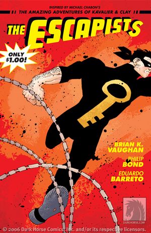
THE ESCAPISTS #1
Writer: Brian K. Vaughan
Penciler(s): Philip Bond w/ an assist by Eduardo Barreto
Publisher: Dark Horse
Reviewed by Humphrey Lee
If there is one problem I have with this comic it's that it makes me pissed at myself that I never picked up the ESCAPIST anthology book that Dark Horse has been putting out for the past couple years. If this is the kind of quality I'm been missing out on (given that this first issue here is apparently a reprint story from one of said anthology issues) then apparently I've missed some of the best comics of the decade thus far. It also serves as a reminder that I still haven't found the time to finish my copy of THE AMAZING ADVENTURES OF KAVALIER & CLAY. Apparently, this comic exists to just make me feel like an ass. But it's still excellent nonetheless.
THE ESCAPISTS here is a comic book for those that love comic books, and oh boy do I love comic books. Instead of telling his own pure Escapist tale, Brian K. Vaughan (never, never forget that second 'a' in Vaughan) in THE ESCAPISTS is actually telling the tale of a young man named Maxwell Roth, an aspiring comic book writer with a large sentimental attachment to the long forgotten character of The Escapist, and who is trying to revive the character for modern audiences. That right there is one of the largest appeals of this book to me, in that Vaughan is taking the opportunity to kinda create an "alternative universe" I guess you could say where the fictional creative duo of Joe Kavalier and Sam Clay are just as real and relevant as our own Superman creators Jerry Siegel and Joe Shuster. Maxwell Roth's love of the iconic figure known as The Escapist mirrors a lot of the same feelings I personally have towards some of our very own comic icons. As does his respect for the independent artists he's hoping to follow in the steps of, the Harvey Pekars and R. Crumbs and so on (and yes, there's a ton of name dropping in this comic, but I really don't see much of an issue with this other than it should motivate readers not familiar with these writers to go out and get acquainted with them).
This issue does a great job of not only giving us the relevant back story we need on The Escapist and his creators but also quickly establishes Max Roth's character and introduces his cohorts for the project he has in mind. The events that transpire towards Max reaching his goal are very entertaining and some great slice-of-life material. There's some great moodiness and drama, as well as a few good chuckles as Maxwell actually works his way to owning the rights to The Escapist, and then as he encounters his hopeful artist Case Weaver and a rather unusual fellow named Denny Jones who will become one of his best friends and The Escapist himself in a unique way. And of course there's some great Philip Bond art to move it all along. Bond has always been one of my favorite "under the radar" artists ever since I first saw his stuff via Vertigo and more specifically THE INVISIBLES. I love his character designs and I especially love the "tightness" of his art. There's no sloppiness whatsoever to his lines and it gives everything such a great definition that makes it very pleasing to the eyes. And I know it's rare that anyone ever compliments the colorist, but the fantastic color blendings and separations done on the part of Dave Stewart help along the art tremendously too and deserve a note in all this.
THE ESCAPISTS is not only a perfect love letter to comics, but it's also pretty much a perfect comic. You've got a great cast of characters, lush scenery and background, fantastic art, a heartfelt story, and a bit of history behind it all. Oh, and it's only a dollar. I never mentioned it was a dollar did I? Well, yea, it's a dollar and it's pretty much the best comic I've read in the past month. If you can't be bothered to lay down a measly bill to enjoy this great story, there really is no hope for you and I'd advise you to find a rather large rock and a bridge. Now it's time to get off my ass and go find all the anthology issues. Cheers...

THE EXTERMINATORS #7
Writer: Simon Oliver
Penciller: Tony Moore
Inkers: Ande Parks, Sean Parsons, Tony Moore, Brian Buccellato
Letterer: Pat Brosseau
Publisher: DC Vertigo
Reviewer: Squashua
As if there wasn’t enough strange ass mystery from DC with 52, Simon Oliver comes out and gives us a kick of intrigue right in the crotch with Vertigo’s THE EXTERMINATORS.
Nazis, exploding coworkers, lesbians, scarabs, evil megacorporations, luchadores, strange artifacts, dominatrixes, entomologists, resurrection, euro-glasses-wearing bookish babes, armies of vermin, and fluorescent mega-drugs. I’m having PREACHER flashbacks sans vampires, but Oliver is no Garth Ennis. Instead, he comes across as a kinder, gentler Garth Ennis with 45% less food fucking and 85% less religious fervor. I mean, I’m sure he can top Ennis some day, like maybe if he tosses in a group of devout Catholic furverts yiffing their brains out, but only if he can keep it outside the context of an S&M club. You hear that, Oliver? Furries in church!
We’re already one chapter in on the "Insurgency" storyline, but it’s not insular; new readers can easily catch up with the quirky cast. Roaches are systematically taking over the town while our protagonist and his significant other go their separate ways. Henry probes the mystery surrounding a strange Nazi artifact with the aid of a pizza-munching archaeologist, while Laura probes other women with the aid of her rug-munching manager. Quality time is spent building a non-physical relationship between Henry and bookish vixen Page, while the latter half of the issue has Henry and partner Stretch tracking down their oddest coworker: thrill-seeking, bug-eating Kevin. He’s taken extermination out of the workplace and to the stage, and not in a good way.
I’ve been reading THE EXTERMINATORS since issue one, and the story has been consistently good. While this was not a stand out issue by any stretch of the imagination, it’s definitely worth picking up, if not for the writing then for the art. Indie sweetheart Tony Moore is on hand, penciling every minute detail. No one can draw a puddle of piss like Tony Moore - just check out page 2! Of course, he totally misses out on the reflections, but we’ll let him slide this time because of page 4’s most excellent depiction of hot bi-racial lesbian action with chocolate on top! And boy howdy, Page is sporting some perky titties at the top of page 13. Seriously though, every character in it is distinctly rendered, designed with individual characteristics that if you put them all up against a silhouette lineup, you could easily tell them apart. There is an air of grunge throughout the series; everything feels gritty and dirty and relatively unclean, except when it comes to most corporate scenes. There may be some inner meaning or possibly I'm just padding this paragraph with flavor text. Either way, I noticed and I like it.
The only drawback to this issue was a slight logic jump involving guns and Laura in a leather miniskirt taking on a gigantic gangster. I couldn’t tell if that was a flashback or an analogy for "risking it all." I guess only time will tell. Definitely pick up this issue if you’re following the story and even if you’re new, you can jump right in.


PROJECT X CHALLENGERS: CUP NOODLE
Creator: Tadashi Katoh
Publisher: Digital Manga Publishing
Reviewer: Dan Grendell
"Inside that Cup Noodle is contained the philosophy, Time Is Money."
I've long touted manga as a format where you can find interesting stories about just about anything. CUP NOODLE is an incredible example of that. Would you expect the story of the creation and marketing of a new food product to make a good comic? Probably not. And yet it does, because it tells the tale of people who care about what they are doing, who have triumphs and tragedies, relationships with each other, and who work together toward a goal. It isn't the subject matter that really makes a story like this great - it's the drama.
CUP NOODLE describes the invention of the first pre-cooked, take-along meal that required only hot water to heat. Development began in 1970, with numerous obstacles in the team's path including creation of a new container, manufacture of molds that would produce noodles just the right size to fit the container but also sized to cook properly in the allotted time of three minutes, and discovery of the proper ingredients to include with the noodles. Also important was the use of the then-new freeze-drying technique for the vegetables and shrimp. After all that work, Nissin Foods had to try to market the new product to a surprisingly hostile, traditional public.
Hard work, dedication, and pride pushed the teams at Nissin through to succeed admirably, and the product known as Cup Noodle (Cup O' Noodle in the West) now sells over 8.2 billion worldwide annually. Stockpiles are kept for emergencies all over the world - a food that requires only hot water to eat is perfect for most emergencies - and new flavors appear all the time, all due to the initial work of the people who pushed to make it happen.
Katoh's art here is workmanlike, reminiscent of an earlier age of manga when lines were clear and backgrounds few and far between. It doesn't really stand out in any way, but it does the job. The only real place Katoh shines is when he draws Momofuku Andou, the man behind Cup Noodle - there's an energy there that is missing from many of the other characters, an emotion that the others lack.
CUP NOODLE is an odd but fun read, and one I very much enjoyed. It looks like the next PROJEXT X line manga is SEVEN ELEVEN, and I'm curious about that one too.

TRASH V.1
Creator: Sanami Matoh
Publisher: Tokyopop
Reviewer: Dan Grendell
"Hey, what's a penguin doing here?"
A penguin. No, not a talking penguin, that would be stupid. Just a penguin. Named Bobby. Living in New York, working for an odd-jobs crew that also steals stuff on the side. He isn't their pet or anything like that. Bobby just does his share of the work, occasionally says "Gah" like a proper penguin should, and minds his own business. Never mind how he survives in the heat of New York. Don't overthink it, you'll ruin it. Just enjoy it.
Bobby isn't the main character in TRASH, by any means - he's a background kind of thing. But it's that kind of quirkiness that draws me to a comic. Matoh doesn't make a big deal out of Bobby being there, he just is. People deal with it. They kinda freak at first, like you would if a penguin walked up to you, said "Gah", then cleaned your windshield, then they get on with the plot. And I love that shit.
The real story of TRASH involves the nephew of a mob boss who gets tangled up with Trash Company, the outfit Bobby works for, and has misadventures with them, even hiring on to work for them despite his protestations. He does his best to help his friends and his cousin along the way, and the stories are fairly entertaining but not really anything to write home about, to be honest. I honestly wouldn't have given this manga a second look if it weren't for Bobby.
Matoh does a good job switching between action and comedy without losing the train of either one. His art really helps that along, with a slightly cute feel but not so much that when the action rolls in it feels out of place. In the same vein, even during action scenes quips and comedic bits don't run against the grain. It's a fine line to walk, and Matoh does it well.
TRASH is a fun read and worth checking out if for no other reason than Bobby. Putting that penguin in was genius.


WASTELAND #1
Writer: Antony Johnston
Artist: Christopher Mitten
Publisher: Oni Press
Reviewed by Dave Farabee
Having grown up in the years just before the Cold War wrapped, I gained a special affinity for post-apocalyptic yarns. From ROAD WARRIOR to TERMINATOR to the post-nuke dream sequences of DREAMSCAPE, they all had a special bite for the kids of the 70s and 80s because…shit, we thought they were gonna come true! Maybe not the particulars – the rise of Skynet’s skeletal robots or Australia’s bondage-bikers – but the end of civilization in general? Yes. Quite possible.
Alas for the heyday of scary-ass futurism, it all came crashing down with the collapse of the Soviet Union. Even ruined the potency of James Bond, though Roger Moore had already primed that pump.
But have you noticed? The world is scary again. America’s at a PR low with the world. The Middle East is in full-on powder keg mode. Reality TV is still going strong. Probably as good a time as any to see if the post-apocalypse can still fire the imagination.
In WASTELAND, our hero comes from the same school as Clint’s “Man With No Name.” In tattered cowboy hat and duster, he makes his way through a desert terrain “somewhere in America.” It’s 100 years after an as-yet vaguely defined disaster called The Big Wet. The desolation – all-important for this genre – is ably conveyed by the brambly art of Christopher Mitten. Reminds me a touch of the grey-toned art of Charlie Adlard in THE WALKING DEAD, but weedier, less noir. When the scavengers of this world (“Sand-Eaters”) set upon him, I had one or two issues with Mitten’s action sequences (“So that floating white circle is a muzzle flash? Oookay.”), but I was still in the moment. Lots of energy there, and writer Antony Johnston lets Mitten’s visuals do the talking for a good 8 pages of rough ‘n’ tumble action. If that seems like some serious decompression, keep in mind that even though this opening issue is no more expensive than a 22-pager, your $2.99 actually gets you a whopping 48 pages!
Damn good deal.
Despite the fast-paced opening and our hero’s seeming use of telekinesis, I wasn’t particularly intrigued till the intro of fresh-faced but foulmouthed Abi and her hometown of Providence. She’s the sheriff of the population-250 shanty town, and naturally enough that’s where our Man With No Name turns up. Actually, we do get his name – Michael – but he’s effectively an enigma. He is what he does, being short on personality save for the prerequisite brusqueness of the wanderer-type. In fact, his mystery is that he can’t remember his past at all, and likewise has no clue as to how he got his low-level telekinetic powers. Abi’s in the same boat, it turns out, though sporting healing powers in lieu of telekinesis. Chicks always seem to get the more passive powers, don’t they? But Abi’s a motormouth compared to Michael, and her combination of pragmatism, heart, and swearing (“Goatshit!”) makes her more fun to watch.
Another part of the appeal of post-apoc scenarios is just settling into them - finding out what’s what, how people survive, what the threats are, and how humanity manages to keep kickin’. WASTELAND builds its world slowly, starting with the threat of the Sand-Eaters – hmm, is that English they’re hissing? Seems it is. In Providence, we learn that currency still exists, that literacy’s a rarity, that there are other cities out there, and that there’s even a new religious society – the Sunners. Johnston builds on the setting with a flavorful text travelogue of the Wasteland on the issue’s last page. There’s also a full-service website, sporting character bios, a preview of the entire first half of the issue, and even a WASTELAND soundtrack. I got a particular kick out of the soundtrack stuff. Johnston’s original theme for the series, a slow-burn electronica outing, had me happily recalling the PC game series FALLOUT, and it’s backed by iTunes links to a dozen other tunes to fill out the playlist. There’s even PDF art for a jewel case inlay if you want to burn the tracks onto a CD – fuckin’ cool! Granted, the soundtrack’s a bit heavy on the goth/metal side, but still…fuckin’ cool!
Before issue’s end, Johnston’s built an intriguing mystery around a letter, a looped recording in a mysterious language, and the seemingly linked pasts of the two main characters. There’s also a big action sequence with creepy Sand-Eaters galore. I still had some issues with the panel-to-panel clarity of Mitten’s artwork, but overall I found his style really grew on me during the course of the issue. The world he draws has personality and detail, though it’s his accomplished use of white space that impresses most. And his characters are distinct and iconic, with just enough western cool that WASTELAND’s vision doesn’t feel too gloomy.
Really, given the page-count and the cheap price, there’s no reason to pass this one by if you’ve got any love for the ol’ Mad Max milieu. Johnston still needs an issue or two to convince me he’s got enough innovation to distinguish his End Times scenario, but there’s certainly enough going right that I’m excited. If the real world will just keep from ending for a few more years, I’d like to see where WASTELAND in going.
Big honkin’ preview here.

SHARK-MAN # 1
Written by: Ronald Shusett, Michael Town and Dave Elliott
Art by Steve Pugh
Published by: Thrill House Comics
Reviewed by: superhero
Aqua-Who?
Namor? I heard he was a pussy.
All aquatic superheroes are lightweights compared to SHARK-MAN. Or at least their comics are.
For the most part superheroes who have underwater adventures have always struck me as pretty much a bore. I mean what do they really do anyway? They breathe underwater, have super strength, and maybe talk to the fishes on a good day. Oh, and sometimes they throw temper tantrums when they feel that those pesky land lubbers have wronged them in some way. Yeah, for the most part, underwater heroes are pretty much lame when you think about it.
That is, until SHARK-MAN came along.
SHARK-MAN has done what few hydrated heroes have been able to do for me. It’s captured my interest. Not only that but it’s actually impressed me. The world presented within the pages of SHARK-MAN is uniquely original yet combines all of the best elements of stuff like Batman Beyond, Jaws and Blade Runner into one great little package. The story here is tight and moves at a great pace even though it’s pretty much average as far as superhero/sci-fi stories go. What really makes the book stand apart from the crowd is the absolutely fantastic artwork.
The look of SHARK-MAN is absolutely breathtaking. I actually can’t remember the last time I looked at comic artwork and was just stunned by it. The only times I can remember feeling like I did when I got a look at SHARK-MAN was the first time I laid eyes on Alex Ross’ art in MARVELS or seeing the artwork in Humanoid Press’ book THE METABARONS. Seriously, the artwork here takes comic-book illustration to a whole other level and it’s worth the purchase price alone. Page after page in this book had me just slack jawed with amazement as I just had to sit and take in the Steve Pugh’s phenomenal artwork. It’s unbelievably beautiful. Pugh’s painted work here is just fantastic and I just couldn’t say enough about it in this column. This guy is the type of artist all other artists look at and think “Damn, I wish I was that good.”
It’s Pugh’s work that makes SHARK-MAN completely stand out. Not only are his panels absolutely beautiful to behold, but his layout and storytelling sense are perfect as well. And his design! Dammit, it’s just fantastic. Everything in the pages of this book just looks cool as hell. From SHARK-MAN’s costume to his vehicle to the city he lives in, everything is just a fantastic spectacle thanks to Pugh’s imaginative illustration work. Without Pugh, this book could have been just a run-of-the mill superhero story but because of Pugh SHARK-MAN becomes something much more. It’s a true work of artistic genius. I’m sure many people out there will think I’m exaggerating but if they actually end up looking at the book they’ll realize that, if anything, I’m not giving Pugh enough credit. This guy is a superstar and I hope this book gets him the recognition he deserves.
I hope to Poseidon that this book finds an audience. Not only that but I hope it becomes a gigantic hit. It’s an indie book that deserves accolades from fans and critics alike. Screw an Aquaman movie. If Vincent Chase of HBO’s ENTOURAGE were to play his cards right he’d be begging his agent to let him play SHARK-MAN because that’s a movie that’d kick Spidey’s box office record for sure.
FLIGHT VOL. 3
Writer: Various
Penciler: Also Various
Publisher: Ballantine Books
Reviewed by Humphrey Lee
Any time a new volume of FLIGHT comes out it's a cause for celebration. The previous two volumes of this anthology series have been some of the most emotionally moving, visually riveting, smile inducing, and just plain amazing comics I've had the pleasure of reading and are a highlight of a trade paperback collection nearing almost 400 volumes now. Though as we all know by now not all good things can last, and with this latest volume of FLIGHT, well......okay, I'm just kidding. This newest collection is really damn good too. Admittedly I'd say it's the weakest of all the collections thus far because I think there's not as much diversity as the previous ones. Also, there's a little too much "cutesy story about animals or monsters" or whatever that tends to permeate through this volume, and some of these stories don't have the same dramatic and emotional flair as the ones that came before them. But there's still a lot of creative talent that has put forth what is still one of my favorite purchases so far this year, despite being somewhat diminished. Some of my personal highlights are:
"Underworld" by Michel Gagne. So okay, this one is actually a cute animal and monster story, but the visuals are too amazing to not note. Tons of energy and great flow to the art, and really unique monster designs. Even though Gagne's work is pretty much all wordless, I'd still buy entire comics of just his art: it's that good.
"Polaris" by Azad Injenjikian (wow, that's a harsh name) is a very tragic tale about a little girl who actually levitates a few inches off the ground. You think this would be cool, but it's actually just a point of ridicule she endures from her peers because it makes her different from them. It's a story of hope and cruelty, love and loss, and will bring back some rather unpleasant memories for any one of you that has ever felt like an outsider (and since you all read comics, I'm sure you've felt like this at least once in your life). I didn't say they were all nice stories, but this is still an engaging one.
"The Iron Gate" by Kazu Kibuishi is the story of two young boys who grow up to be two young soldiers in a war. It's a great story of camaraderie and adventure that ends in a very shocking and unexpected way. This might be my favorite of all the tales told in this book.
"Conquest" by Becky Cloonan is short and to the point, but absolutely glorious to behold. A seven page Viking funeral that features absolutely stunning art, this is a great exhibition of who I believe to be one of the most talented and underrated artists in the business.
And those are just a few of the more interesting stories out of nearly three dozen within this book. There really is something for almost anyone, but like I said before this particular collection didn't seem to explore as much as Volume Two before it, which is pretty much hands down the best of these collections. If you've never bought a volume of FLIGHT before, well then this might not want to be your first since it's not a prime example of what this series is and can be all about. But if you're already a supporter of this project then I really don't need to the reiterate to you what this series is all about, and that is showing us just how we can push the genre of comics past the preconceived notions most people, including comic readers themselves, have of what comics could and should be.
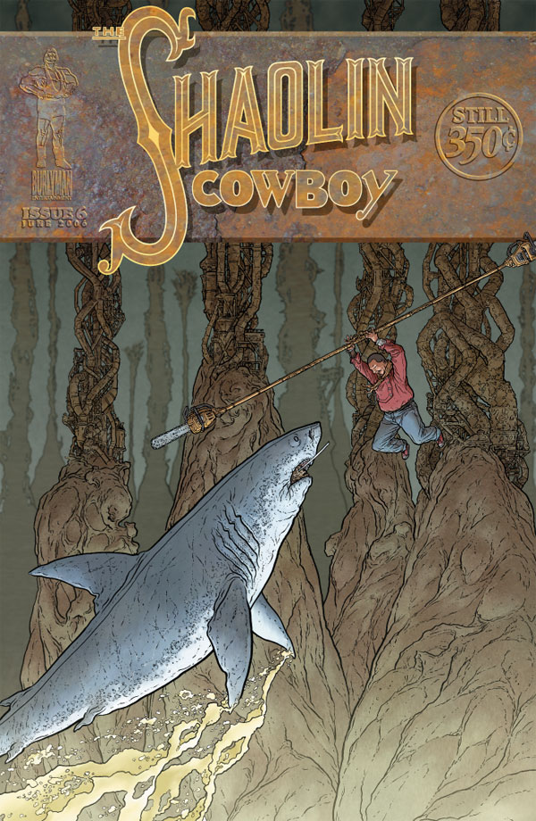
THE SHAOLIN COWBOY #6
Words and art: Geofrey Darrow
Publisher: Burlyman Entertainment
Reviewer: Ambush Bug
Sick of the same ol’-same ol’ shit in comics? Try this series out. I know the shipping schedule may be wonky. I know that many a moon passes between each and every issue Burlyman Entertainment seems to publish, but I can’t hold the creators of this series or the company at fault because of the sheer creative output each issue this company produces has between its covers.
Take, for example, the latest issue of THE SHAOLIN COWBOY. Issue six starts out with our hero, the Shaolin Cowboy, making his way through a dank sewer system found inside a dragon that swallowed him in the previous issue. The cowboy is riding the rotted carcass of a cow as if he were some sort of twisted gondolier, steering this peculiar vehicle with a staff with running chainsaws on each end. Birds of prey scavenge around the scene picking apart dead bodies and other forms of grue floating along the grimy surface. The Cowboy is poised, ready for action, and waiting. All of a sudden, a giant great white shark leaps from the slime towards our hero; in its toothy maw, a demon’s decomposing head, sporting the Cowboy’s missing samurai sword in it’s own madness-jabbering mouth.
This is what happens on the very first page of THE SHAOLIN COWBOY. All of that detail…all of that insanity…in three panels of a comic book. You’d be lucky to get something that creative in ten issues of a regular series, and this first page is just the beginning of another prolonged action sequence in a series which features pretty much nothing but that, issue after issue.
Some may fault this series for being light in the plot department. I have to disagree. It’s not a fault that we’re six issues in and the semblance of plot has only peeked its head to the surface. That’s not what this series is about. THE SHAOLIN COWBOY is more of a stream of consciousness thread of dreams and nightmares and imaginings. There’s a never-ending assault of visual thrills in every issue, all of it anchored down by a hero who faces everything with a zen-like blasé attitude that assures you that he’ll get out of this nightmare alive and take you with him to yet another psychotic head-trip in the next issue. Creator Geof Darrow takes the detail of each panel to the limits of intricacy. The expansive full page shots detail miles of landscape littered with iguanas, corpses, warriors, and whatever Darrow can cook up in that sick brain of his. It’s the type of detail that borders on insanity and yet assures you that you are witnessing the work of a visual genius.
I read each issue of THE SHAOLIN COWBOY at least twice. Once for the story. That takes less than five minutes. Then I go back and scan the panels for things I may have missed and I always find some. This sometimes takes hours. I don’t do that with any other comic. THE SHAOLIN COWBOY isn’t monthly. I don’t think it’s humanly possible for it to be so detailed and so out there if it were. And if the book’s uneven distribution schedule gives Darrow and Co. more time to continue to tell these unforgettable tales of nail-your-nutz-to-the-wall action, then so be it.
Remember, if you have an Indie book you’d like one of the @$$holes to take a look at, click on your favorite reviewer’s link and drop us an email.
Remember, if you have an Indie book you’d like one of the @$$holes to take a look at, click on your favorite reviewer’s link and drop us an email.


WOLVERINE: ORIGINS #4
Marvel Comics
Man, Steve Dillon’s art is really bad in this issue. I don’t know what it is, but so far, I haven’t been impressed at all with his art on this series. If this is your first opportunity to see this guy’s work, I feel sorry for you. The cool facial expressions and vivid, yet simple panel structure which made the entire PREACHER series a visual treat is nowhere to be seen. This is especially evident in his depiction of Captain America who, in some panels, looks more like the 98 pound weakling Steve Rogers was before taking the Super-Soldier serum than the symbol of heroism for the Marvel U. The story’s ok, but Way seems to be doing the same thing with each issue. Wolverine meets someone who he has to fight. They fight. Wolvie wins having survived something that he probably shouldn’t have (even with his healing factor). Then at the end of the issue, someone bigger and badder appears for a fight. This is action leading to more action motif is much like the aforementioned SHAOLIN COWBOY except without the imagination. - Bug

WALKING DEAD #29
Image Comics
Is it possible to get too gritty in a zombie book? I cut my teeth on Romero’s DAWN OF THE DEAD before I was ten years old, but even so, the repeat rapes and beatings heaped upon the recently introduced character of Michonne are hard to stomach. There’s a certain exploitation vibe to giving her captor – Philip - so much dialogue exulting in her helplessness. And WALKING DEAD’s never shied from nastiness, but it’s never been an exploitation book either. Beyond that, it’s still a harrowing issue, definitely the lowest ebb ever for our leads. Some good creepy turns, especially with Philip’s daughter, and I’ve got increasing respect for Charlie Adlard’s art on the book. I just hope it’s not in service to Michonne’s fate for much longer… - Dave

BATMAN: LEGENDS OF THE DARK KNIGHT #208
DC Comics
I can’t really give much praise to the story which focuses on the Batman’s broken promise to “Never let things get personal.” It’s a bit tired and since for the last ten years everything Batman has done has had a personal tone to it given the dick-headedness the character has been enshrouded in concerning his relationship with Robin or Nightwing or Oracle or Commissioner Gordon or Two-Face or Joker or whoever, it isn’t a real accurate mantra for the Caped Crusader to take. But the selling point for me is the artwork. Ariel Olivetti is doing some amazing stuff. He makes the Batman look girthy and scary. His villains are truly vile. The action is communicated with tensed muscles and bold movements. This is one of those eye candy stories where the captions and word balloons just get in the way. - Bug

TRUTH, JUSTIN & THE AMERICAN WAY #3
Image Comics
Remember the late 70's, early 80's? Scott Kurtz and Aaron Williams do and continue to remind us with their completely retro series. In this issue, our everyman homage to The Greatest American Hero has to take on his daily grind while adjusting to both his super-costume and a confrontation with the FBI agent and his new partner, a very expensive man. The story is very fun and flies right by like a modern (read: good) version of a period television dramedy in animated format. This feeling is aided by artist Giuseppe Ferrario, who has got to be the bastard lovechild of a Don Bluth / Phil Foglio tryst. Each panel is like a beautiful animation cell from an unreleased cartoon. My favorite contains an angry Justin hurtling towards the reader post-car collision. I can't recommend this series enough; from Justin's goofy buddies to his future bitchy girlfriend-in-law, it doesn't take itself seriously and yet manages to stay away from being childishly silly. That is, except in one area. The cameos and references to the era were amusing in the first two issues, but there are an increasingly larger number of references per issue, and they are starting to encroach on the story. It's occasionally amusing to catch a William Katt (or is that Kirk Cameron?) panel appearance or a trivial Different Strokes reference, but when you're beat on the head with an obnoxious Archie Bunker and the "Say, Jim!" pimp from Superman, one can feel pressure from the fourth wall against one's anus. These Easter eggs are dangerously near "CAPTAIN CARROT animal-pun" levels and fast approaching undigestible "Piers Anthony's Xanth pun" heights. Overall, pick up the book; I'm sticking with it as long as it doesn't get too overloaded with nostalgia. - Squashua

ANNIHILATION: SILVER SURFER #4 (of 4)
Marvel Comics
For me, SILVER SURFER was the most promising of the ANNIHILATION preludes, but it ends with a bit of a thud. I like Surfer’s return to Galactus’ fold and his characterization throughout has been exemplary, but Thanos’ scheming is mind-numbingly oblique and there’s simply not a memorable climax to be found here. Stuff blows up, the Surfer kicks some ass, various powerful entities say portentous things…but in the end, it all feels like the prelude it is. I turn the final page unsatisfied, my previously waxing enthusiasm for ANNIHILATION now on the wane. - Dave