
| #10 | 7/6/06 | #5 |
(Click title to go directly to the review)
UNCANNY X-MEN #475
JONAH HEX #9
INVINCIBLE #33
52 WEEK NINE
YOUNG AVENGERS #12
THE ALL NEW ATOM #1
SIDEKICK #1
TEEN TITANS #37
THE THING #8
O.C.T. #1
Comics Catch-up: JSA #82-87
Big Eyes From the Cape Guy presents FOOL'S GOLD V.1
Big Eyes From the Cape Guy presents QWAN V. 2 & 3
Big Eyes From the Cape Guy presents OLD BOY V.1
Indie Jones presents…
CHEAP SHOTS!

UNCANNY X-MEN #475
Writer: Ed Brubaker
Artist: Billy Tan
Publisher: Marvel Comics
Reviewed by Dave Farabee
By all rights, I shouldn’t have liked this issue.
Ed Brubaker’s drift from crime comics to superhero stalwart for Marvel has left me wringing my hands, even as I’ve been forced to admit he always brings the craft. What’s more, his recent X-MEN: DEADLY GENESIS set the stage for his UNCANNY run, and DEADLY GENESIS revisited bad ideas ranging from the “third Summers brother” to Professor X as asshole to the classic “let’s kill a team member for shock value!”. Then there’s artist Billy Tan, straight from the land of Top Cow. Unclean! And how can you have a workable X-Men team with Polaris, Rachel Summers, and Havok onboard? Aren’t they non-characters most of the time?
So, yeah, I kinda dug it.
Fuuuuuuuuuuuuuuuuck.
Let me start by saying that one of the things that got the issue off on the right foot for me was that, while there were plenty of references to stories I’d never read, it was still an easy thing to fall into. In Egypt, Polaris is alone and on the run from a hit squad backed by a big ol’ mecha-lookin’ thing. Brubaker gets his Claremont on with captions like, “Lorna Dane, also known as Polaris…running, not for fear of her life…but for fear of what it’s become.” And during the course of the story, I find out Apocalypse did something or another to her recently, but the specifics weren’t important. It was enough to know her powers were a little wonky and she was on the run.
Same goes for Rachel Summers. Never knew much about the character other than the fact she was Cyclops’ and Jean’s daughter from the “Days of Future Past” future, but apparently the Shi’ar recently effed with her. News to me, but easy to roll with. Rachel still seems to be mostly the same character she was last I saw her in the 80s (Shit. I’m old.), albeit a little less angsty, a little more upbeat.
It’s a good case for the “illusion of change” school of superhero writing. You take readers through dramatic ups and downs, highly suggestive of the changes you get outside of serial fiction, but ultimately you keep ‘em recognizable--and so comfortable for the longtime reader to return to.
Even the revelation of Xavier’s “dark secret” from DEADLY GENESIS isn’t necessary for the reader to be familiar with. I read that mini, but if I hadn’t, I’d still get the key information that Xavier was on the outs with Cyclops and that there was a lot of tension at the X-Mansion. We’ve seen similar arcs, and that’s not a bad thing as long as a good story stems from it.
The meat of the issue is a quiet but very enjoyable rallying of the troops by Xavier. Many an X-writer comes in ready to shake things up and create a DIRECTION (sound the trumpets!), but Brubaker’s story flows organically. Xavier approaches a number of X-Men with the intent of mending fences and surreptitiously planning a mission, and these scenes convey a pleasant warmth of friendship even as they provide the necessary exposition on recent events. In short, Xavier wants to take responsibility for Vulcan (the “third Summers brother”), and he’s going to need a team to do it. His choices this go-round:
Nightcrawler – Always a favorite, and I love when he puts aside his issues with Xavier, throws him a grin, and asks, “So what fire are we jumping into next, then?”
Havok – Seems to be the surrogate Cyclops, and given how shoddily Cyclops has been written over the last 20 years, he might just end up outdoing his bro.
Warpath – Thunderbird’s younger brother still has issues, and Brubaker reminds us that he once tried to kill Xavier himself, but there’s a nuance to his exchanges that suggests he’s moving past the old days of just being the “pissed off Indian.” Still, he’s the group’s tough guy and scrapper, and I like his new vibranium fighting knives.
Polaris – A bit of a cipher at this point, and generically beautiful, I think she’ll be the toughest character for Brubaker to energize. A tragic past is just too common with the X-Men to be a mark of distinction.
Rachel Summers – If Havok is filling the Cyclops role, Rachel’s definitely filling the role of her mother. I like the pixie-ish enthusiasm artist Billy Tan gives her visually.Speaking of Tan, to my surprise he impressed me here. Like David Finch (NEW AVENGERS), he’s an artist borne of the Jim Lee 90s, but who appears to have evolved into something more interesting. Actually, I’d take either Finch or Tan over Jim Lee, but that’s a debate for another time. Tan’s biggest issue is a certain similar, pinched quality to his faces. His action’s quite good, though, and backed by the slick computer colors of Frank D’Armata, his costumed X-Men have an appealing energy to them. I can work with this.
As for the writing, it’s interesting – Brubaker really is penning the kind of story I wish Chris Claremont had evolved to be able to create. It “feels” very Claremont with its mixture of action, angst, and tenderness, but modern too, and devoid of the Claremontisms that now overshadow the qualities of Chris’s work. Is it what I’d call a righteous application of Brubaker’s talents? I may be past the point of angsting over such stuff. Brubaker’s got a straight crime book coming soon from Marvel, and anyway, this old school X-fan is willing to admit Marvel’s mutants still offer a special appeal when done right.
Brubaker…he’s doing ‘em right.
And he’s sending his team of X-Men into space for the next year’s worth of stories, so if I don’t like what’s going on in the other X-books or with the whole CIVIL WAR thing (a very safe call), UNCANNY should be protected by its exotic locale. And space for the X-Men means the Shi’ar – cool. And the Starjammers – cool. Hell, I even just realized we’ll have an X-book with no Wolverine for a year – fucking cool.
So alright, dammit, it looks like I’ll be seeing the ex again. A trial thing, mind - no expectations, no commitments. But she’s lookin’ pretty hot.

JONAH HEX #9
Writers: Justin Gray & Jimmy Palmiotti
Artist: Tony DeZuniga
Publisher: DC Comics
Reviewer: Prof. Challenger
Since I've been pretty hard on DC for awhile coming off INFINITE CRAPFEST, I think it's only fair to shout it from the rooftops when DC gets it right. From that dramatic black and white cover with spot red color to the last panel, this was as good as it gets. When the nominations go up this year for 2006, JONAH HEX #9 gets a nomination from me for Best Single Issue Story.
It's a ghost story. But it's also pure Jonah Hex, which means it is brutal, shocking, moral and moving. I dare say that this series is one of those rare occasions where the current writers are doing Hex better than his original writers. This story picks up with Hex having just been ambushed by Apaches and he's about as close to death as you can get without disappearing on into the white light. Alongside Hex is a little girl he calls Adeline who helps him pull out the arrows and bandage himself up as best he can. Then the two of them ride away to the first home they find, an Indian medicine man. Before Hex passes out, he mutters to the armed shaman "Shoot me if ya like…but give the child some…water."
Only the shaman notices there is no child.
While the old medicine man works his magic healing, Hex dreams back to that time in the past when he first met Adeline and her mother. Events get out of hand like they do so often when bounty hunter, Jonah Hex rides into town and Adeline winds up dead and her mother blames Hex. The story plays out in a tale about what grief and a need for revenge will do to someone's soul. The story also offers us a glimpse of the heart that's buried beneath Hex's viciously scarred face.
I actually felt an emotional twinge as I read this story and even when I reread it. Artistically, has there ever been an artist more suited for Jonah Hex than Tony DeZuniga? I believe he was the primary artist on most of the original JONAH HEX comics back in the 70s. Back then, there was more of a company-style polish to his work. But the grit and raw energy he brings to Hex today far surpasses his work from back then. I don't know if he's the new regular illustrator for JONAH HEX, but I hope he is. Luke Ross was a fantastic choice to get this series restarted, but as good as he is, I felt his art was almost too…pretty…for Jonah Hex. It would sometimes sanitize the darkness of the writing, whereas DeZuniga embraces the darkness and gives us a harsher and more believable world for Hex to ride around in. Oh yeah, and that cover by DeZuniga is powerful stuff. I can't believe that wouldn't get the attention of the casual shelf surfer out there. Perfect creative choice to go with DeZuniga's black and white art except for the bloody swing of Hex's sword which is quite red. A striking design and damn good comic.

INVINCIBLE #33
Writer: Robert Kirkman
Penciler: Ryan Ottley
Publisher: Image Comics
Reviewed by Humphrey Lee
There's a reason why I enjoy superhero comics like MANHUNTER, and RUNAWAYS, and even INVINCIBLE here to the more upper-tier character books like whatever Super, Bat, or Spider-Man titles you normally find on the shelves, and issues like this particular one of INVINCIBLE sum it up perfectly. No, I'm not trying to make this some sort of elitist manifesto against mainstream superheroics. I have several Batman statues and a rather large hunk of Spider-Man back issues that prove I dig my franchise characters too. But there's a big difference in the inherent entertainment I draw out of an issue of INVINCIBLE or any of the titles I mentioned above compared to the guys who dominate the top 20 spots of the monthly sales charts. What is this difference?
It's because pertinent events with actual ramifications actually happen to the characters in these kinds of books. There's no status quo to be upheld, there's no "passing on of the torch" so the writers don't have to keep the book accessible to the guy following their run. They just get to take their characters and write the stories they want for them and progress them like they naturally should. And that's exactly what INVINICIBLE 33 does and does spectacularly.
Just after returning from a rather abrupt reunion with his father in space, Mark Grayson now finds him facing down the rather insidious revenge of Angstrom Levy, a man who was deformed in the chaos of one of Mark's past battles. Angstrom has it in bad for Mark and isn't afraid to use anything and everything he can to get to him, including his mother and newly found half-brother. As seen in the pages of MARVEL TEAM-UP this past winter, Angstrom's main plan is to use his dimension jumping abilities to run Mark through a gauntlet of dangerous and foreign environments to slowly wear Mark down before killing him in front of the very family he's panickedly fighting so hard to get back to. But Mark is a little more resilient than Angstrom thought, and when things get out of hand, they really get out of hand. And now Mark is way over his head yet again.
INVINCIBLE is always a treat whenever it comes out, and this issue is not only no different, but sets a pretty high bar for future issues of the title to compete with, which is something given the high quality standard each issue usually achieves. You really just never know what kind of obstacles or revelations Kirkman is going to put our hero through in this title, whether it's more down to earth subject matter like situations with school or his girlfriend, or the usual superhero fanfare like having to deal with an alien invasion or super-powered despots. No matter what it is it all comes smoothly and rarely feels forced (the matter of his half-brother being one of the few exceptions IMO) and you just legitimately don't know sometimes how Mark is going to react to it. Just like in our own lives, you never know how you're going to deal with certain circumstances when they come up. We all know that chances are Batman is going to have some random contingency plan, or Superman is just going to super-strength his way out of whatever comes his way, and that there's certain lines they're not going to or aren't allowed to cross. I can't tell you how Mark is going to react to the new dilemma he's been put in, but I can tell you I can't wait to see it unfold.

52 WEEK 9
Writers: Johns, Morrison, Rucka, Waid, and probably some Giffen
History of DCU Writers: Jurgens and Rapmund
Pencils: Shawn Moll
Inks: Tom Nguyen
Publisher: DC Comics
Reviewer: Squashua
What do you call an Adam Strange with no eyes?
No eye Adam Strange.
Meh. The joke works better with "deer".
Remember last time when I jokingly commented about a cover spoiling the contents of the book? That's not the case this week. Nope. In fact, we're given a cover of Devilance chasing down the space-bound heroes. And what's inside?
Half a comic's worth of Steel and Natasha Irons duking it out. Right down to the page that has the staples in it.
My S.O. watches soap operas. For the last few months of her favorite soap, there's been some mean guy buried alive in a park. We figure that either he'll eventually make his way out and become a "better person", or he'll die and get written out and the producers will stop paying the actor. She fast forwards through those scenes. I don't blame her.
I'd like to fast forward through the Steel / Natasha scenes.
But I won't. That's what I'm here for, I'll take the punishment so you don't have to. I'll review. Anything. For you. Mmm, baby. Yeah. I'll review it. No matter how much it hurts. Uh huh. Slap it. Yeah. You like that, hmm? Oh yeah. I'll review it hard for you. Mmm.
To summarize these scenes, we've got Steel and Natasha and Lex Luthor and a whole purple/green Lex Luthor homage thing going here in a very rushed-feeling half-comic. And that's not the fast-forwarding talking. It's your typical, "I'm rebelling but maybe I'm mind controlled, and maybe your opinion is the wrong one," fight scene. The art seems repetitive, with multiple brick wall backgrounds, and there is something seriously wrong with the way Natasha's head is drawn. Her face, her positioning, it's all off-kilter. Like the way the majority of those Justice League: Elite characters were drawn. It's as though someone said, "Set her body facing right, but turn her head 160 degrees to the right. And jockey that chin." Not my cup of tea.
Of course, I'm not just a reviewer, I'm a conspiracy theorist following the bigger picture of this 52 business (Egg-Fu for the win!) and I'm paying attention to these derivative scenes so you don't have to. Mmm. Me reviewy, reviewy. So hot. Notice the power sparks around Natasha's hands, clue-seekers? No, not the multi-colored lights in the sky; those are fireworks, it's Independence Day. Take a look at her hands, then check for identical ones in last week's comic or next week's cover. Speculation may commence.
The rest of this issue is our space-bound heroes taking on a gigantic edition of Devilance the Pursuer, looking a lot less Jack Kirby than he did in his prior two appearances. There's a fight scene, but it's somewhat vague. Animal Man does something, but it's not entirely clear exactly what that is he does. Adam Strange acts useful even though he can't see what he's doing. And Starfire utilizes super-strength. I didn't know she had that power. Hints are dropped foreshadowing the appearances of Lobo and Ambush Bug.
Now, some of you might question why Devilance is so huge. That's because he's a New God. All the New Gods are huge. Tremendous. If you go straight to Apokalips or New Genesis directly from Earth, you will be approximately the size of a bug to the New Gods. That's why they travel with Boom Tubes. Boom Tubes are size regulators. It's nice to see some consistency in continuity hasn't been left behind. The last time this idea was used was during Peter David's SUPERGIRL run.
The last part of the story portion of this week's 52 covers the ongoing drama of The Question and Renee Montoya. That vague sentence pretty much summarizes it. A little satisfaction is given to those wondering how The Question's gadgets work, there's a very butch woman in the second panel of this story (on a page with a 9 panel sequence! Yay, Giffen!), and we get the first appearance of a brand new One Year Later hero that no one ever could have possibly expected… SPOILERXBXaXtXwXoXmXaXnXSPOILER! And that's it.
In the History of the DCU backup we finally definitively learn that OMAC was created by Batman as a response to discovering his memory loss during IDENTITY CRISIS. This means that between the end of IDENTITY CRISIS and the loss of Sue Dibny and the start of 52 where Ralph Dibny is still mourning the loss of his wife, Batman had enough time to create a satellite, get it hijacked by Max Lord, see the world seeded with OMAC nanobots… see where I'm going here? Now that is some inconsistent time compression, and didn't we just read this stuff? We have to relive it in summary? At least the post-Crisis History of the DCU that was produced in the 1980's was a slightly more entertaining read. This is just dullsville.
So in summary: 52 - Week Nine, nothing really happens. Happy Independence Day. Conspiracy theorists can attempt to tally the fireworks explosions to 52. Be here next week for Black Adam, Supernova, and Booster Gold. Me review you long time.

YOUNG AVENGERS #12
Writer: Allan Heinberg
Artist: Jim Cheung (pencils), Livesay with Jim Cheung, Dave Meikis, and Mark Morales (inks)
Publisher: Marvel Comics
Reviewer: Ambush Bug
One comic.
24 pages of story.
One double splash page and five single splashes.
So, I’m about to start about my misuse of the splash page rant, now, right?
WRONG!
Comic book world, take note. Sit up in your chairs. Eyes front. Hands at ten and two. Pay close attention because this single issue of YOUNG AVENGERS should be the blueprint on how to properly use a splash page in comics.
Yes, a large percentage of the pages of this book are dedicated to showing one single image, but the images chosen and how they relate to the story is what makes this issue special.
You see, the splash page has gotten a bad rap over the years. Too many times, it’s looked at as lazy comic booking and I have to say, I’ve read my share of pin-up books to know that this is probably the case with 90% of all books with splash pages in them. I don’t know how many times I have seen a splash of a hero jumping off a roof into the camera, or flying into a camera, or a full page shot of a building or the earth or multiple earths or multiple flying earths with buildings or flying buildings jumping off multiple earths into the camera. To me, this isn’t anything spectacular other than a spectacular way to waste my time and money.
With the beginning shot of Captain America holding a wounded Patriot in the middle of a battle that involves the Kree, the Skrulls, and both New Avengers and Young Avengers (waitaminnit, ain’t that, like, redundant or sumthin’?), I knew I was in for a visual treat of a comic. And that’s what I got.
With this first shot (not technically a splash because there are three panels at the bottom of the page), you are immediately thrown into the action and given a full view of the battle that continues throughout the rest of the issue. But we aren’t treated to an actual splash (a double-pager, none the less) until a bit later. And I have to deem this double-page splash worthy because it is the moment that this series has lead up to since it began…the Young Avengers and New Avengers joining forces to fight a common cause. In this page, every Avenger, Young and New (ugh!), is displayed beautifully by artist Jim Cheung, who has been lingering on the edge of stardom for ages (I remember his work on X-FORCE fer chrissakes!), but has turned up his artistic wattage to super-nova for this series.
But it isn’t until after this double-splash that some of the best use of the splash page is put to print. For the next six consecutive pages, one splash occupies the left page, while six panels dissecting the action taking place within the panel are stacked across the right. This is the comic book equivalent of the MATRIX-like camera pan which spins three-hundred and sixty degrees around the action taking place, offering the audience a chance to see what is going on in every inch of the scene. In one giant splash, you see a handful of Avengers (enough with the Young and New crap), then the panels to the right zoom in and show the intricate and important interactions that are going on amidst the chaos.
This effect completely placed me into the scene. It makes the action seem all the more intense and the establishing splash to be all the more important in setting up the character and story development going on. These aren’t throw away pin-ups. They are pages which show a final battle in a grand sense that establishes a truly powerful scene.
It isn’t until much later in the book that another splash appears. It’s probably the least important one of the book, involving the introduction of one character’s new costume, but since a lot goes on in that panel as well I’m willing to look past it.
I’m even willing to look past the final ensemble splash with the team together and ready for the world because it is, after all, the last panel of this “season,” which does nothing but tempt and tease us for YOUNG AVENGERS: SEASON TWO.
This is a really great comic and one of the most surprising series of the year. I was one of the many who hated the idea of this book when it first surfaced, but now find myself invested in this book more than any other in Marvel’s stable. Strong storytelling. Twists galore. Interesting characters which, any one of them, could carry an entire story arc on their own. And then there’s that beautiful artwork.
Artwork and artists don’t often get the nods they deserve in reviews. It’s often hard to put how one feels about a picture into words. It’s much easier to talk about misuse of character or bad decisions by editorial or how a story twist took you by surprise. But after reading this book, it was the art that struck me first because it wasn’t spectacle for spectacle’s sake. The use of splash highlighted the story, offered an establishment for the characters to spring forth from, and showed this reviewer that a whole lotta splashes don’t always mean a bad thing.

THE ALL NEW ATOM #1
Writer: Gail Simone (with “ideas and concepts developed by Grant Morrison”)
Artist: John Byrne
Publisher: DC Comics
Reviewed by Dave Farabee
“NEW” AVENGERS?
Ha, THE ALL NEW ATOM laughs at your old newness! Merely “New” isn’t new enough, Avengers. “All New” is where it’s at. “All New” still has its new car smell. “All New” won’t spoil for another two weeks. “All New” can be returned within 90 days of purchase!
And now that the titular shininess of THE ALL NEW ATOM is established, we’ll henceforth be calling it simply “THE ATOM.” Turns out “New” in front of any title is, frankly, silly, and that goes for “All New” too. Even when it’s accurate – and this is a new guy wearing Ray Palmer’s old shrinkin’ belt – it’s still just silly.
But the good news is that it’s good – a pleasant surprise after the teaser story in the recent BRAVE NEW WORLD special failed to intrigue. The teaser had piled the verbiage too high, put up a visual barrier with too many skewed Neal Adams-y layouts, and for me hit a pet peeve by tagging a little atom symbol at the beginning of every narrative caption from the hero. The caption thing’s a common practice, but it drives me nuts. If you need a superhero’s symbol floating in front of his every word to tell me who’s talking, you’ve got too much talking going on. Don’t abuse the symbols. Iconography is these guys’ stock in trade, but you can still overdo it, still cause it to lose its currency.
None of these problems is present in ATOM #1, however, which has most everything I’d want in the first issue of a superhero comic. Going against tradition, it actually opens with its cliffhanger – a scene captioned “One hundred days from now” of the JLA (and seemingly the world) defeated by armored baddies who could be human or could be alien. The choice of tenses in their speech is especially curious: “We have warning you. We have kill any sentient who is not cooperate.” Either the earth has been conquered by Borat from DA ALI G SHOW or I’m guessing this might be one of the story elements “based on ideas and concepts developed by Grant Morrison” (per the book’s credits).
Fun set-up, in any case. There’s one other quick teaser of an old man being mauled by small dogs (sub-plot #2!), but shortly thereafter we meet the (all) new Atom. He is Ryan Choi, a young, Chinese-born academic setting up shop as nuclear physics professor in DC’s fictional city of Ivy Town. Ivy Town, for them not immersed in DC lore, is the setting for most of the adventures of the best-known Atom, Ray Palmer. Unlike cities Gotham, Opal, and Keystone, it’s currently short on a defining identity – and I’m kind of hoping one of the book’s secondary goals will be to establish one. Certainly, Gail and artist John Byrne take steps to play up the quirkiness of Ivy University, likely to be the book’s core setting.
Much of the issue follows Choi settling into the university. We learn he’s been corresponding with Ray Palmer since childhood, and will be taking his old position, old office, and old house. The dean turns up his nose at Palmer’s costumed adventures, but I was thankful we got minimal detail on precisely what curtailed them – the unsavory, sometimes inane events of the influential IDENTITY CRISIS miniseries. Instead we get Byrne doing a fine job creating a lived-in, comfortable look for the campus as Gail intros a host of oddball fellow professors whose first interactions with Choi come about during a poker game. They’re all of ‘em characters, ripe for Gail’s trademark witty scripting, and the game a clever device to establish them outside the dusty realm of academia. It seems they’re not only to be the book’s main supporting players, but the scientific support team behind Choi’s adventures as the Atom.
Speaking of adventure…
Yes, we do get some shrinkin’ action in the first issue! No need to spoil the series of cryptic clues that sets it up, but Choi does stumble across Palmer’s shrinking technology – only to accidentally set it off with no preparations. He ends up nekkid, an inch tall, and standing in the middle of a house that might could use an exterminator. Gail’s full of ideas here. A shirt sliding off a desk creates a slipstream that nearly pulls Choi to his doom. A phone’s power cord becomes porous enough from miniature perspective to be a makeshift beanstalk. Yes, and a torn off shirt label is enough material for Choi to cover his nekkidness. “This is the most important experiment I’ve ever been involved in,” he muses, “I can’t do it with my guy stuff hanging out!”
I figure it’s got to be a tough job to draw the Atom’s adventures at shrinky-size, because you want to emphasize his smallness, but you can’t do so at the expense of some traditional “cinematography.” That is, you still need close-ups, medium shots, etc. so the hero can take center stage. For the most part, Byrne finds a good balance in this, but I found myself wanting more of the wild perspective stuff to make the Atom’s world a bit more visually unique. There’s a panel of Choi looking up at a microscope that looms crazily overhead and Byrne really knocks it out of the park. I’m hoping to see more strangeness like that as the series progresses.
My only real complaint about the issue is Ariel Olivetti’s painted cover of GIANT-ANGRY-ASIAN-MAN-WHO-WILL-SMASH! Nice enough painting, but doesn’t so much speak to the youthful, inquisitive, decidedly non-angry depiction of the character within.
What you’ll get if you pick up THE ATOM #1 is just a damn good superhero kickstart. The writing is dense, with meta-contextual quotes from scientists and thinkers sprinkled among what’s already plenty of talking, but the net effect is that it feels filling, not crammed like BRAVE NEW WORLD. There’s another seeming positive effect of Gail’s talky script: Byrne’s sometime over-reliance on non-orthogonal layouts are wholly replaced by a more traditional layout sensibility. Who knows, maybe Byrne’s just waiting for Choi to put on the costume before breaking out the wild stuff, but this reader found the ol’ 90° discipline to be a visual comfort.
Right now, I’m thinkin’ THE ATOM is the strongest debut to emerge from DC’s INFINITE CRISIS. Can’t quite pin down why it trumps the surprisingly entertaining new BLUE BEETLE or the not-without-its-charms relaunch of WONDER WOMAN, but it just seems to have the most potential of all of them, the most neat stuff.
Which is cool. Been wanting to see if anyone could really make a go of the perilous “shrinking hero” concept.

SIDEKICK #1
Writer: Paul Jenkins
Penciler: Chris Moreno
Publisher: Image Comics
Reviewed by Humphrey Lee
Eddie Edison's life sucks. Destitute pizza delivery boy by day, sidekick to one of the most powerful but cornball and borderline retarded superheroes on the planet by night. The only highlight of his life in between getting ripped off by customers and barely surviving his crime-fighting endeavors due to his cohort Mister Excellent's incompetence is the fact that he's schtupping his wife on the side. But eventually Eddie realizes that he's been getting stiffed when it comes to the rather lucrative financial benefits to being the sidekick of one of the world's most popular superheroes, and decides it's time to play the field a bit in the superhero community.
SIDEKICK is an extremely fun book, if not but a little flawed. I've read quite a bit of Paul Jenkins' work in my comic reading career, but I had no clue he has such a dirty sense of humor. And SIDEKICK revels in it and is all the better for it. Lots of chuckles abound as we watch Eddie go through the motions of his shitty life. Having to deal with a moron the level of Mister Excellent as he just barrels headfirst into any situation without a second, or hell, even a first thought makes for some great visual gags. And like I said, the book has a rather filthy tone to it too and makes for some rather, uh, visceral moments like when Eddie's stripper girlfriend shows up at his place. I really don't want to know what the rubber ducky was doing there... Bad Little Monkey indeed. There are a few jokes that fall flat, but that's the chances you take with books like these. But on the whole the gags kept a smile on my face and were well worth the three bones this book cost.
And as far as the full package goes, the visuals held up their end of the bargain too. I've "known" Chris Moreno for quite a bit (isn't the internet wonderful?) and I've seen him work his pencils in many ways and he works good magic here in the pages of SIDEKICK. The art is appropriately "cartoony" for lack of a better term. Perfect uses of the kind of elements that make this kind of artwork what it is, the big facial expressions like unbelievably wide-eyed looks of shock and horror, big shit-eating grins for added comedic effect, and just nice little background details around the scenery to make the book feel much more full and lively (Seriously, what the hell is that rubber ducky doing there?). This was just a perfect example of the artist complementing what the writer wanted to go with his words.
SIDEKICK is definitely more of a "guilty pleasure" type book, but the key word there is "pleasure". Laughs were consistent, the characters were wonderfully whacked out, and the art gave it all really great energy. I'm kind of glad this is a mini-series though, because I do think this type of story could wear on me after a while, but I'm assuming the five issues of this we're going to get will be a very enjoyable ride. Definitely a book to at least give a look over if you have some spare time at your LCS.

TEEN TITANS #37
Writer: Geoff Johns
Artists: Tony Daniel (pencils) & Kevin Conrad/Norm Rapmund(inks)
Publisher: DC Comics
Reviewer: Prof. Challenger
As I said in my JONAH HEX review, this week I'm giving DC props for some of what they're doing that's right. I really wasn't sure immediately when TITANS jumped ONE YEAR LATER. But, now that we've hit issue 37, I gotta say Johns and Daniel have started hitting their stride with the new status quo. I mean this was some messed up story the past few issues with the Doom Patrol and the Brotherhood of Evil. But it all works together to tie back into the death of Superboy, which Johns has been using effectively in TITANS as a trigger for some solid character development with the core team members.
What's also so good about this story arc is that Johns has somewhat restored my broken faith with how effectively he reintroduced the Doom Patrol back into the mix of continuity. He accomplished in three issues what two recent failed DOOM PATROL series have been unable to do. He reintroduced a Doom Patrol made up of the original members, Mento, and additional new members. But he did so within the actual concept of the series rather than just superficially acknowledging the concept. The Doom Patrol are supposed to be "freaks" who don't just function outside of normal society, but feel alienated from normal society. In Johns' version of the Patrol, and he may actually be picking up on an idea fostered by Grant Morrison but I can't recall, the Chief is a sociopathic, narcissistic, manipulative control freak who actually caused the "accidents" that turned them all into freaks. Now he sits around and feeds their insecurities so that they will obey his direction and not leave him alone.
In last issue's surprise, and disturbingly funny, climax Monsieur Mallah helped Brain transplant his…brain…into a cloned body which looks a bit like one of those creepy melon-headed aliens from STAR TREK'S "The Menagerie." Well, if they ran around in a ridiculous looking supervillain costume with a flared collar and cape. Johns pulls out all the sadistic, yet funny, stops here with Mallah and The Brain, including Brain inviting the love of his life Monsieur Mallah (a male ape by the way) to come kiss him. Hmmm….let me see…so, The Brain is not only "gay" he's also got a thing for animals….and yet…uh-huh…there it is on the cover. It is pretty small now, but it is there: "Approved by the Comics Code Authority." OK. If gay bestiality isn't cause to raise an eyebrow at the "Comics Code Authority," I ask you just what is? Either way, I got a chuckle out of it.
But, really, the fight with the Brotherhood of Evil is only a small part of this month's issue. The bulk of the comic is really focused on the personal struggles of the characters. Each one of them gets a nice shining moment, and even a big shocker moment at the end that I won't spoil for you. Very soap opera-ey, but hey, you get rid of the tights, capes, and powers and comics really are just soap operas in pamphlet form.
Anyway, I'm digging what Johns and Daniel are doing right now. They gave us a glimpse of some of the new characters who tried being Titans during the ONE YEAR AGO time, and I basically just wanna know who the red-haired, green-skinned hottie in the Martian Manhunter outfit is. Tony Daniel improves with every issue. The cover with a pinup of Kid Devil is outstanding and that worms-eye splash shot of Wonder Girl flying on page 3 is just delicious. There are times where some of his figures are a little stiff or the expressions aren't…well…that expressive, but I like his stuff and look forward to each month because he improves his storytelling and his basic drawing each month that passes.
I have one question though: Why does the cover say "Hell Hath No Fury…Like Kid Devil!" when the title of the story is simply "The NEW Teen Titans: Part 4" and Kid Devil doesn't do one blasted "fury"-driven thing in the whole comic? Just wondering.

THE THING #8
Dan Slott: Writer
Kieron Dwyer: Artist
Marvel Comics: Publisher
Vroom Socko: All In
All good Things…
This is the final issue (for now) of this series, and man alive does it end with a blast. For starters, there’s Kieron Dwyer drawing damn near every superhero Marvel has participating in the first ever Poker Invitational. The opening has something like half a dozen tables going. The poker, however, is only a framing device for a hodgepodge of shorter stories, each one better than the next. The best one from a Dwyer fan standpoint is one featuring everyone’s favorite goofball alien The Impossible Man. It’s only three or four pages, but you can clearly see that Dwyer’s having fun with this section.
Now Dan Slott, he’s having fun throughout the entire issue. There’s the various gags around the poker tables, the running joke that is the Great Lakes Avengers, and a hilarious switcharoo over who wins the tournament. The Thing also manages to have a crazy team-up with Squirrel Girl, and let’s face it--what story involving Squirrel Girl ISN’T crazy? Then there’s the final storyline. It wasn’t silly, it wasn’t balls to the wall action packed, and it wasn’t earth-shattering madness. What it is, is one of the sweetest moments the character has ever seen. I won’t dare spoil it here, but it’s a moment that actually managed to bring a tear to my eye. It’s damn perfect.
Is there anything that isn’t perfect? Well, the Arlo subplot that’s been running through the title is resolved a little too pat for my tastes, but seeing that this is the final issue I wouldn’t hold that against the book. There’s also the ending, which is funny and all, but it ventures a little too close to Mallrats territory for my tastes.
So is this the end for Dan Slott’s Thing? Who knows, Marvel did give Slott’s SHE-HULK a second chance, and the rumor is that if next month’s TPB collection does well we might see another resurrection in Slott’s future. In any case, Slott is a writer that has the perfect style for the superhero genre, and I’ll consider myself lucky if he’s given any new book from the House of Ideas. I’m personally rooting for a Post-Civil War relaunch of Avengers West, actually.
But that’s in the future. When it comes to the here and now, there’s a fun as all getout book sitting on the stands that it’d be more than worth your while to pick up.

O.C.T. – OCCULT CRIMES TASKFORCE #1 (of 4)
Writers: David Atchison with Rosario Dawson
Artist: Tony Shasteen
Publisher: Image Comics
Reviewed by Dave Farabee
A few years back, Kirsten “Mary Jane” Dunst threw out some ideas for a new Spider-Man direction:
“It would actually be really interesting if SPIDER-MAN died. Why doesn't the superhero ever die? I think if Mary Jane was alone, pregnant and he died, she could give birth to a spider baby and carry on the series with another young boy or something like that.”Comic readers are still in recovery. In fact, Dunst’s words put the industry on a permanent state of alert against Hollywood hotties involving themselves in comics. And so it was I approached O.C.T., a concept developed by Rosario Dawson, with guns drawn. You know Dawson as Gail from SIN CITY, Naturelle from Spike Lee’s superlative 25th HOUR, and for general nekkidity in Oliver Stone’s ALEXANDER. She seems to have some geek cred in interviews, but cred can be faked. Trust no one!
But you know what? O.C.T. is kinda fun. It’s familiar territory – a police division for the supernatural - but packs enough neat ideas and slick art to earn Dawson and her collaborators a pass. And I should note that it’s not actually Dawson doing the writing but newcomer (at least to the best of my knowledge) David Atchison. Dawson’s mainly on the concept/plotting side and also lends her likeness to the lead character, Detective Sophia Ortiz. Surprisingly, and pleasantly, while the sepia-toned art is photo-referenced, Dawson’s not made up to be a Top Cow-style hottie. In fact, there’s no T&A at all. Realism’s the order of the day, and Dawson’s Sophia Ortiz pretty much looks like a normal cop.
With slightly above-average hair.
Our intro scene to the character has her investigating a noise complaint, only to stumble into some supernatural nastiness. The photo-derived art here is slick on the surface, but trips a bit during action sequences. When Ortiz breaks the door down, for instance, it looks more like she’s just leaning on it. Here’s where you want some judicious motion blur effects or, though they’re shunned in some overly serious quarters, sound effects. Ortiz survives the encounter, but a special crime unit takes over investigating the scene, kicking her out without any explanation or even questions about what she’s seen. It’s the weakest part of the book because of the jumbled action and the reader realization that the total violation of cop protocol with Ortiz’s dismissal is about the last way a secret unit would stay below radar.
It gets better when we see a bit of Ortiz’s downtime as she experiences a mysterious suspension. She talks to her mom on the phone. She gets bills. She bundles up against the Manhattan cold. A nice little bit of humanity.
A few days later, those same bums who were walking all over her crime scene suddenly transfer her to their division: the O.C.T., or Occult Crimes Taskforce. I was a bit put off by the reveal that Ortiz’s deceased father was a member of the O.C.T. back in his day (it’s part of what convinces her to join), but given the force’s magic dealings, I can see how family lines might actually be important. Still, feels a bit cliché in execution.
More interesting is Ortiz’s actual indoctrination into the O.C.T. The story moves along at a brisk clip as she learns that Manhattan sits on a gateway to another realm, which on one level feels a bit “Hellmouth”-ish, but per the text training manual in the back of the comic, actually comes with the fun explanation that that’s why the Indians sold the island for so cheap in 1626. Payback, paleskins. And it’s one of several entertaining ideas in the book, from a mace-type spray that makes the intangible tangible to informants with demon faces on their bellies to police badges that not only block enemy spells, but act as foci for spells the officers themselves are taught. There’s always a certain charm to this phase of genre stories where the trainee learns what it takes to survive in a world that’s much stranger than he thought. And if O.C.T. isn’t the most original concept to be found, it still manages that charm quite nicely.
Dialogue’s solid. A little uninspired here and there, but solid.
The art, despite the aforementioned issue with action, is actually above average for the school of comic artists deriving visuals directly from photos. The characters don’t look overly posed, the freakish stuff (like the guy whose head looks like a skinned horse head) pops quite nicely, and the sepia-and-sickly-green color palette lends it the surreality it needs.
A few months back, reviewing the revival of the mystery comic MAZE AGENCY, I had to reluctantly admit that as a representative of the mystery genre, it was pretty good…for a comic. I hate to use that phrase, because comics can absolutely match the peaks of other mediums, but sometimes it’s accurate. Would I have rated MAZE AGENCY highly if it were a TV show or a prose story? Not really. But as a comic, where its genre’s more of a novelty, it gets a few points for going against the grain. And right now that’s where O.C.T. is. Pretty entertaining horror/cop outing…for a comic. Certainly better than expected, so definite congrats to Dawson and friends on that, but it’ll need a bit more before it can get more than a casual recommendation.
It does get that though, and I expect to keep up with it for its well-realized take on magic and rather nice visuals.

JSA #82-87
Writer: Paul Levitz
Artist: George Perez, Bob Wiacek, Jerry Ordway, Rags Morales, Luke Ross, Dave Meikis
Publisher: DC Comics
Reviewer: Squashua
JSA #82
Do you know who the Gentleman Ghost is? Do you care? It turns out that Batman and Superman fought him back in the Golden Age at one point and it was a pretty classic battle even though we're not quite sure who else besides Power Girl remembers it and why.JSA #83
Oh, here's why we're hearing about the Gentleman Ghost: we're going to be subject to his cockney-accented word balloons and origin for the next five issues until the JSA is reset. We'll get action involving most modern JSA'ers being unable to hit the Gentleman Ghost while only a couple can actually make physical contact with him. When will we find out why this happens and the true nature of the Gentleman Ghost? Probably in issue #87. The rest of the issues are filler.JSA #84
Yep, filler. Back in the day, this sort of tale would take half an issue and we'd get a Plastic Man backup story. Shame on you.JSA #85
Isn't Power Girl ever going to learn that she can't hit the damn Gentleman Ghost? I guess that she has to try to hit him at least once an issue. This pacing reminds me how dull the "Hypothetical Woman" arc from the JLA CLASSIFIED issues is. Take that as a hint. At least we find out that even if you've been erased from continuity, your ghost hasn't been. That fact helps make that Deadman-meets-Pre-Crisis-Supergirl's-Ghost Christmas story feel officially justified.JSA #86
In these paced-for-trade issues, all the actual ramifications take place within the final issue. Especially in a 6-issue arc, these "middle issues" are just filler for you to waste your hard-earned money. Also, the middle issues pretty much reiterate what's been said before in the prior issues, but with maybe a little added information. JSA truly ended at issue #81, or #82 if you're really a stickler.JSA #87
Just like the final JLA arc before they cancelled the series for a re-launch, JSA went out with a whimper. I guess the brownstone is a bit destroyed and everyone is somewhat disillusioned, but I don't understand how this calls for a team redux. It's not like it hasn't happened before. If you're really jonesing for some JSA action, go read CHECKMATE for your fix. It's a much more entertaining read.

FOOL'S GOLD V.1
Creator: Amy Reeder Hadley
Publisher: Tokyopop
Reviewer: Dan Grendell
"Is it fate that all girls are drawn to jerks?"
So, a common manga romance plot has a girl/woman (or sometimes boy) fall for a jerk, only to ignore the person who would treat them right, then finally see the error of their ways (or maybe not). Really, this isn't just a manga thing, it's endemic. PRETTY IN PINK was the example most people I knew would bring up, but there are plenty. It was common wisdom as I grew up - girls date jerks. The stories just played on that.
FOOL'S GOLD takes that idea and turns it a bit. Sure, girls date jerks - until one of their own points out how many eligible non-jerks there are, and they form an anti-jerk union. That's basically what happens here, when high school sophomore Penny - clothing designer, sewing maven, and single girl - gets tired of seeing her best friend dumped on by her lame boyfriend. When the chance to run the geology club comes, Penny takes it, and turns it into a secret Girl's Club where they discuss who in school is actually fool's gold - all looks but really worthless.
The club takes off and Penny's popularity skyrockets. The jerks in the school find themselves dateless. Without knowing why, Penny's handmade fashion line takes off, and everything seems to go swimmingly. She even lands a boyfriend of her own. But when her best friend moves and a member of the club, jealous of Penny, reveals its secrets to one of the boys, what will the future hold?
I didn't find the plot here to be too hard to buy once you accept that, although there are women who are jerks just as much as guys, the jealous club member is intended to represent that subset for story purposes. Hadley has created a clever idea here with strong women taking charge of their lives, and I can respect that, especially as she's careful not to imply that all guys suck or anything like that. In fact, she's speaking just as much for those many guys who get a raw deal from girls who ignore them for lameasses as she is for the girls who take crap from said lameasses.
The artistic focus here is a lot on the costuming, as can be expected in a manga where the main character makes all her own clothes and sells her designs to other people. Hadley is quite inventive in this regard, and it was always interesting to see what the characters would be wearing next. The characters themselves were always drawn technically well, though a sense of movement and emotion was missing - it often felt as if I was seeing a drawing of dolls or mannequins. This did little to detract from the overall impact of the manga, however. (Preview here)
FOOL'S GOLD is an excellent first outing for Hadley, and I look forward to more work from her in the future. An impressive performance.

QWAN Volumes 2 & 3
Created and Illustrated by: Aki Shimizu
Published by: Tokyopop
Reviewed by: superhero
In my review for the first volume of QWAN I was just wildly enthusiastic about the book. I even went so far as to compare it to the incredibly popular manga series NARUTO.
I was wrong. QWAN is better than NARUTO. Way better.
With these volumes QWAN jumps into the pantheon of all time great manga books for me. Volumes two and three are that good and that fun. It’s true.
Volume two continues the QWAN saga as the major players finally reach the emperor’s palace in search of the Essential Arts of Peace, a scroll that could reveal the mystery behind Qwan’s arrival on Earth as well as what his ultimate purpose in life might be. While not much of Qwan’s origins are actually revealed in this particular volume we are treated to the history of Daki, the insect princess. The story behind Daki’s origin was fascinating to me as it was filled with equal parts mystery and sadness. Creator Aki Shimizu does an amazing job in this volume of interweaving bits of the past with the adventure taking place in the present. Throughout this volume there is an underlying betrayal that is ultimately responsible for much of the events occurring in the book and the tale Shimizu weaves is a heartbreaking and fascinating read. As I read the second volume I couldn’t help but feel sorry for the insect princess who is ultimately revealed to be nothing but an innocent pawn in a game that is much larger than she could ever have imagined. Much of the back story is somber and even creepy at times but there is still enough room left for action. As a matter of fact, the one big combat sequence that occurs in the book actually mortally wounds a major character in the book. By the time I’d finished the second chapter of QWAN I was ready and willing to consume the third volume of the story.
Volume three did not disappoint. While I was obviously impressed with the first two books this one was the chapter that just pushed the book toward greatness for me. So much great and wacky stuff happens in volume three of QWAN that I find it hard to express my enthusiasm for it. Just when you think you know where the story might be going or you think that it might be setting into a typical manga adventure storyline the author ends up throwing you a huge curveball. In volume three a major villain gets such a horrifying comeuppance that I actually ended up feeling bad for him. If that weren’t good enough, the quest for QWAN’s origins (try saying that three times fast) ends up taking the protagonist to an almost Alice in Wonderland dimension that I can only call Mustache World. Yes, you read that last line right, Mustache World. See what I mean? Wacky.

But it’s not so wacky that it takes away from the enjoyment of the story. That’s what’s so great about this series for me. It can be compelling fight for your life combat one moment and the next the lead character is dropped onto a planet where, if you don’t have a mustache, you’re pretty much the scum of the earth. That, to me, is the genius of QWAN. At its beginning it seems like it’s going to be nothing more than lighthearted anime fare but what you get as you go on is some really fun and fully developed storytelling. In the sea of manga books out there QWAN really is a shining jewel. Sure, it’s an eccentric shining jewel but it’s a jewel nonetheless.
And don’t even get me started on the artwork. It’s beautiful. The line work, the storytelling, the pacing--it’s just all around great. Yes, it does somewhat look just like a lot of other manga out there but there is something so subtle and clean about Shimuzu’s art that I just fell in love with it. As a matter of fact the art won me over so much that I can’t wait to pick up the first volumes of the creator’s other books, SUIKODEN III and BLOOD SUCKER.
Before I sign off I’d like to say that according to Tokyopop’s website there doesn’t seem to be a release date for the next volume of QWAN. Years ago there was a Tokyopop book called GATEKEEPERS that I loved and was eventually pulled after only two volumes. I hope that the same is not happening with QWAN. It’d piss me off to no end to have this book end abruptly at its third volume. QWAN is so good that I’m pretty much positive that I’d go out of my way to finish the series and I’ve only done that with two other manga series before: BATTLE ROYALE and KAZAN. If there’s anyone out there in Tokyopopland reading this get up off your ass and get the newest volume of QWAN out in the stores because if any book deserves to be on the shelves it’s QWAN.
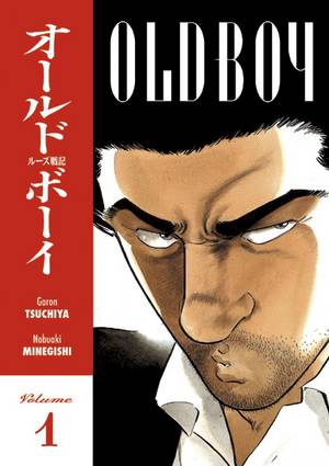
OLD BOY V.1
Writer: Garon Tsuchiya
Artist: Nobuaki Minegishi
Publisher: Dark Horse
Reviewer: Dan Grendell
"He's still got an aura about him... doesn't he give a damn about that ten-year gap in his life...?"
Most great stories start with an interesting hook, and OLD BOY definitely has that. Our hero - I'll just call him that, because we don't learn his real name in this volume and he goes by aliases like "Mister" and "Yamashita" - begins the story after being released from a ten-year stay in a single room. He has no idea who locked him there or why. He awakened there one morning after a night of drinking in Tokyo. Every day he was fed Chinese food by his captors, and each month his hair was cut. Beyond that, a television was his only companion.
During his time in the room, our hero has not been idle. The time was spent trying to keep sane, to keep human - and watching the television, to keep up with events in the world outside. Every other waking moment was taken up with exercise, producing an incredible physique by the end of his stay. His plan? To find whoever imprisoned him after his release and take revenge. For that, he would need a clear, strong mind and a powerful body.
Immediately after being released our hero finds some thugs and tests his new muscles, robbing them for a change. This gives him some money to find a place to stay and some food, where he meets Eri, a lonely waitress who invites him home for companionship. With her help, he plans his next moves, gets a job as a construction laborer, and begins searching the city for the Chinese food whose taste he knows so well.
Occasional appearances by the man who put him in the lock-up, and who is following our hero again now that he is out, give the whole vendetta a sense of history and malice, and flashbacks help explain small parts of the history behind their relationship. Much is left to interpretation, however, at least so far, and it is clear that there is a lot of compelling story yet to come. What would make a man hate so much that he would have someone locked away for ten years? Was it an attempt to crush our hero's spirit or get him out of the way? What will happen when and if they finally meet?
Minegishi's art gives the manga its own look. His choice to give our hero a Mediterranean or possibly even Middle Eastern look is an interesting one; it sets him apart visually from the main characters of so many other books, and yet he doesn't feel at all out of place. Eri as well is drawn with an odd sort of innocence that fits her character as a virgin before she meets our hero, but she starts to gain inner strength as the story progresses and this comes through well in the artwork. (Preview pages)
OLD BOY is one of