
| #3 | 5/17/06 | #5 |
(Click title to go directly to the review)
SHADOWPACT #1
CONAN #28
FELL #5
ALL-STAR BATMAN AND ROBIN #4
Big Eyes for the Cape Guy presents JUROR 13
Big Eyes for the Cape Guy presents SMUGGLER
Indie Jones presents SIX DEGREES
CHEAP SHOTS!

SHADOWPACT #1
Writer/Artist: Bill Willingham
Publisher: DC Comics
Reviewer: Prof. Challenger
This was the best kickoff for a new ongoing series by DC in years. DAY OF VENGEANCE was my favorite of the INFINITE CRISIS lead-ins and wouldn't you know it? This SHADOWPACT series that spins out of DOV is just plain up-and-down great.
I did not realize how much I missed Bill Willingham's simple artistic styling. Back in the day, Willingham's ELEMENTALS and Mike Gustovich's JUSTICE MACHINE were the choice independent upstart super-hero comics out there. It just feels nice to read a comic read by the decidedly better and more mature Willingham the writer and actually illustrated by the charmingly whimsical Willingham the artist.
While I'm still keeping my enthusiasm in check regarding the current version of Ragman, who I have such a loathing for, I totally dig the rest of the main characters. Taking them from the cover illustration: Charlton's Nightshade finally gets something to do in the DC universe. It only took twenty years. Visually, she stands out from so many other costumed heroines simply because she's the one who's not decked out in skin tights or a bustier. Oh, and Willingham draws the most attractive women's hair! Nightmaster could use a visual makeover, but at least Willingham just embraces the goofiness of his chain mail costume (check my memory someone, I think it was a Ditko design?) and runs with it. Cheers to Willingham for returning Blue Devil to his original look with the pale blue skin, simple yellow horns, and a happy-go-lucky smile on his face. Remember that Blue Devil was a fun-lovin' Hollywood stuntman when he got stuck looking like this. I for one am glad to see him return to form. Great character. Enchantress gets the extreme makeover for the book, and honestly, it was time. Her pointy-hat costume, last seen in DOV, was really a sad throwback to a different time and place. Willingham has updated her costume, dumped the pointy hat, and given her a powerful and sexy new look. And Detective Chimp may be wearing a super-hero-type uniform now, but at least he's still got that cigarette hanging out of his mouth. Take THAT, Marvel and your wussy-ass stupid editorial policy against characters with cigarettes! Hey kids, it's cool to watch Hulk rip Wolverine into two bloody pieces! But don't smoke cigarettes!!!
But I digress.
It was so nice to open up a DC Comic and rather than reading "One Year Later," I saw "One Year Ago." Clever.
Willingham establishes a scenario that logically justifies the existence of a group of characters like the Shadowpact--a magic-based threat to a small community called River Rock that deflects all attempts by the science-based heroes to deal with it. Naturally, The Phantom Stranger is the go-to-guy for the super-heroes when faced with this threat and truly, Superman and Green Lantern seem entirely more than willing to turn it over to the Shadowpact to handle. What struck me about the threat was that the whimsy of the art made the evil of the bad guys seem all the more disturbing. This evil group counterpart to the Shadowpact is merciless and sadistic in their plan to work a bloody immortality spell requiring multiple human sacrifices.
The way the storytelling unfolds is just better than I could've expected. I've read this thing four times already and each time I'm struck by something else I like. One time I'm just impressed by the body languages of the characters, next I'm impressed by the panel designs, next I'm impressed by the little details like the Character Valda who has one sock pulled up tall while the other sock has bunched itself down around her hiking boot, and so on. After the bad taste in my mouth from INFINITE CRISIS, it feels good to be on the edge of my seat anticipating the next issue of a DC comic—a first issue where I can find literally nothing to criticize.
One other thing, the first shop I went to at 11:15 am last Wednesday had already sold out of all their copies of SHADOWPACT, but there was a very thick stack of unsold copies of MS. MARVEL #3. Don't know what that exactly means, but for some reason it got my attention. Hmmmm.
Great job, Bill Willingham. And hats off to editor Joey Cavalieri for wrangling Willingham through this job. Here's to many good years of SHADOWPACT stories.
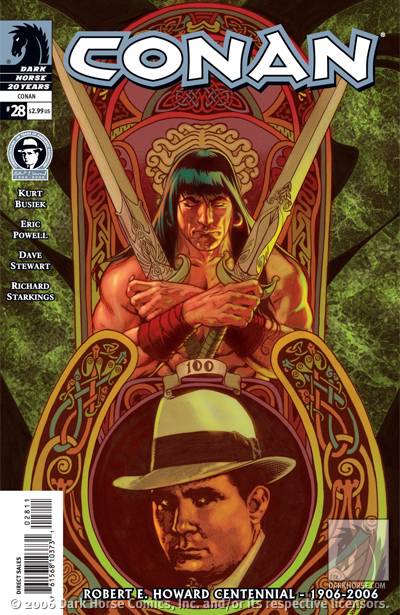
CONAN #28
Writer: Kurt Busiek
Artist: Eric Powell
Publisher: Dark Horse Comics
Reviewer: Sleazy G
I have to admit to being incredibly disappointed by Kurt Busiek’s decision to leave this title. He’s done a wonderful job of bringing Conan back with style and respect, and he’s been paired with such talented artists that this has truly been a standout book. That said, though, it’s clear that when he decided to leave he chose to pour everything he had into this final issue, and I can think of no better way for him to say goodbye to the title.
This issue, unlike many of the stories Busiek has told over the last couple of years, is not a direct interpretation of a Robert E. Howard story, and while that has bothered some purists in the past, you won’t find any of them taking issue with the tale Busiek and Powell present here. There is no mistaking what CONAN #28 is: a touching, heartfelt tribute to Howard’s work and the influence it has had on the genre. Entitled “Storyteller”, it introduces us to a young man named Rovann. Rovann lives in a small rural village, has an infirm parent and passes his days of humdrum manual labor by imagining himself in the middle of all sorts of exciting adventures. He listens to the tales of travelers and elders, then spins the yarns to any who will listen at the local tavern. The townspeople tend to think he’s a bit touched, but they spur on his performances, laughing and calling out requests for their favorites. Rovann enjoys these moments, but there’s still a sense of loneliness at the end of the day because he’s sure he’ll never get to accomplish the sorts of things he dreams of. It seems like that may be the case until Conan unexpectedly rides into his life and changes everything.
The parallels between Rovann and Howard are unmistakable as the story goes on, a fact which is underscored by Powell’s perfectly-suited art. I’ve been a fan of Powell’s distinct style for a few years now thanks to his work over in THE GOON. It translates surprisingly well to the world of Conan, and his giant batlike demons here are genuinely creepy. Most striking, though, is Rovann himself—clearly given the visage of creator REH himself. There are moments where the facial expressions are so clear, so human, that you feel like you’re looking at Howard and his best-known creation standing side by side, and I gotta say it warmed my heart. The story Busiek came up with is fantastic, but with a different artist I don’t know that it would have felt like such a glorious celebration of its subject.
That celebration is not without its bittersweet moments, of course. We witness Rovann falling to the demons alone and uncelebrated, and the parallels are unmistakable. The final page, though, is as close to perfect as it could possibly be as we see Rovann’s spirit rise up in the form of a warrior to join the others at the Great Feast. It didn’t take me long to realize what Busiek and Powell were attempting with this issue, and I have to say they succeeded admirably. I felt genuinely moved when I finished this issue, and as a result what was meant as a tribute to the life and work of a troubled but vastly influential writer is also a testament to the abilities of the creators here and the medium in general. Even if you haven’t been a regular reader of CONAN, issue #28 is an accomplishment any fan of Howard, Conan or swords and sorcery would be wise to seek out.

FELL #5
Writer: Warren Ellis
Penciler: Ben Templesmith
Publisher: Image Comics
Reviewed by Humphrey Lee
Two men in a box. That's what we get with the latest issue of FELL.
Apparently Warren Ellis loves interrogation scenes. And I love it when Warren Ellis does interrogation scenes. The first issue of JACK CROSS that came out last year from DC and under Mr. Ellis' pen was one of my favorite reads of the entire year and it was all just one extremely intense interrogation scene. Just as that was entertaining and riveting as all hell, so is this rendition of the cop drama favorite in the new issue of FELL.
What I like about this version is how Detective Fell immediately gets in the face of the perp he's locked in with. Typically, in these kinds of scenes, we get long, drug-out psychological mind games where the officer slowly pokes and prods at the suspect until they get cocky, or they slip up and spill it all. But that's not how our boy Fell works. Immediately he starts tearing into his subject and calling him out as the (for lack of a better word) pussy that he is. It's very nerve wracking in a way as it seems like it'd be the homicide cop equivalent of poking a beehive with a stick, but it creates a lot of great tension and gives us a bit of insight into the state of mind our lead character is in. And the kicker of it all is our devious British overlord actually makes our somewhat psychotic suspect a bit of a sympathetic figure while we see Det. Fell putting him through the paces. Yea, he's a nut job, but at the same time he's not someplace that we haven't all been at one time or another. Tricky bastard that Ellis fellow is.
Ben Templesmith's art is definitely one of those styles I can see a lot of people saying "it's not for me" towards, but I absolutely adore it in this book. It especially works for this book as it's somewhat "simplistic" nature really pulls in an air of claustrophobia that makes the back and forth between Fell and his subject a lot tenser. And his facial expressions work wonders and the aggression levels between these two men rise and fall and rise again to almost primal levels. I just love the overall intensity this story had and the art complements it amazingly well.
I really don't understand why more people don't buy this book. It's got great characters, an interesting backdrop, and is one of the best written and most atmospheric books on the stands. And it's only $2. Seriously people, put down the "black and white variant cover" edition of SUPERGIRL or whatever, and use that money for something much more worthwhile like this FELL comic here. And then revel in the fact that you've got not only a far superior comic, but you've got an extra buck left over to get a soda to drink while you read it. In the era of uber-hype and tie-ins galore, we could really just use a lot more books like FELL.

ALL-STAR BATMAN AND ROBIN #4
Writer: Frank Miller
Artist: Jim Lee
Publisher: DC Comics
Reviewer: Sleazy G
It’s been said by many people many times before, but it doesn’t make it any less true: this title is one of the single greatest examples of squandered potential I’ve seen out of a mainstream comic in the last two decades. In a publishing world of hemorrhaging sales and an aging and shrinking customer base, this could have been a book that opened doors all over the place for younger and newer readers. Just look at the success of ULTIMATE SPIDER-MAN, and it’s easy to see the kind of attention this book could have gotten. The first issue of ASBAR was released in close enough proximity to the BATMAN BEGINS film that with a little bit more of a marketing push—a well-managed cross promotion—we could have ended up with a near-perfect Batman book. It could have been a title that was accessible to new comics readers picking up something because they liked the movie, not to mention readers who hadn’t kept on top of the last ten years of closely-knit Bat crossovers. It could have been big, flashy, exciting, and still acceptable for the kids—who, in case you hadn’t heard, are all far more interested in playing Pong and watching Kid Video these days than actually reading anything, so we could kinda use a hook to bring them to the table. It could have been a comic book in the spirit of its sister title, ALL-STAR SUPERMAN: a book full of big ideas, a fresh approach to action, beautiful art, and most importantly a sense of fun and excitement.
Let’s look at what we got instead: a terminally late, glumly colored, dismal little exercise in egotistical wankery. We’ve got a foul-mouthed, murderous, Greyhound bustrip-slow journey through all of Miller’s worst habits. We’ve got a Vicki Vale who’s less reporter than Playmate of the Month, we’ve got a wretched asshole as our “hero”, and we’ve got a schedule that gets this book out once every three months. But hey, you guys already new that, right? So let’s talk about the new stuff we got here in issue…ummm…4? Really? Okay…Here’s what we got: We got Batman doing ignorant shit like telling his abductee to shut up enough times that I lost count, followed by leaving him in a freezing cold cave to eat rats. We got a bloody and dying, yet titillating, Vicki Vale. We got no fuckin’ sign of that Black Canary revamp we wasted a whole issue on. We got a six-page spread of the Batcave, which would be great if I was buying a goddamned pinup book, but is pretty much fuckin’ worthless since I wanted to read a goddamn story and lost 30% of the available real estate to a centerfold that’s in too dull a palette to be fully appreciated. We get one good thing—Alfred actually acting like Alfred, at least to the extent he told Bruce off, although the real Alfred would never have let things get to where they did. What we don’t get this time stands out strongly, too: we don’t get anything that has the laff value of “I’m the goddamn Batman”, and we don’t get the psychotic glee that made me actually laugh despite myself at one point in issue #2.
Y’know, I thought I was gonna stick with this title. I thought I saw a glimmer of something in the second issue that could be entertaining enough, in its own way. I was wrong. This is a book that has fallen several months behind schedule in the first four issues, something I’ve laid into the big egos at Marvel for, so why should I do any different here? It’s unprofessional as hell. The misogynistic take on the female characters is intentionally over-the-top, and I can accept that in its right place, but a Batman book sure as shit ain’t it, and wasting something like 25 pages on it so far really chafes. Ditto for the constant swearing, which guarantees that those parents I see at the store with their kid to buy Heroclix will be dropping this waste of paper right back on the shelves. Cap the whole thing off with a Batman who’s a cop killing kidnapper who then tortures a little kid by abandoning him while cold, scared and unfed, and I’m sorry, but there’s just no fuckin’ way. The entire affair is completely abysmal, and I have no qualms about calling this tripe out for what it is: the single biggest, stupidest misstep from DC Comics in memory. It feels like we’re looking at the kind of talent-wrangling I’m used to seeing over at Marvel rather than actual editing, cuz a real editor would have told Frank Miller this shit was completely unacceptable the minute the first script hit. I have no idea how this has made it through the editorial pipe at DC. As an Elseworlds series that was promoted as the most outrageous, over exaggerated take ever, maybe even with a Mature Readers tag? Sure.
Under the auspices of the All-Star line, though? Hardly, unless you mean “all star” the way it was meant when people talked about the cast of TOWERING INFERNO. Superstar characters, superstar creators, superstar train wreck. That’s what we’re looking at here, and I’m pretty much ready to look away.


JUROR 13
Writer: D.J. Milky
Artist: Makoto Nakatsuka
Publisher: Tokyopop
Reviewer: Dan Grendell
Reality is what it is.
When it all goes wrong, and you've been fucked by the only people who you care about, it's time for revenge. That's a pretty human reaction. But what about afterwards? What about after you've kicked their ass, beaten their brains out, taken your revenge in the most satisfying way so that they are hurt as badly as they hurt you? Then what? Dealing with what you've done can take a lifetime, and JUROR 13 throws a serious spin on it.
Jeremy Rosen, an insurance investigator, has recently broken up with his longtime girlfriend Dawn. Even worse, stress at work is rising as the boss turns the screws and a week-long jury duty summons keeps making him late. His best friend and co-worker, Jake, tries to cheer him up by taking him to strip clubs and bars, but it doesn't work - Jeremy is a miserable as ever and Jake starts to get fed up.
Then come the federal investigators, sniffing around work. What are they looking for? Jeremy's discoveries of some strangeness in Jake's claims lead him to believe that they may be looking at Jake, and he calls Dawn - but she convinces him he's making something out of nothing. Then, when the feds come for him, Jeremy realizes he's been played - and heads for Dawn and Jake with murder on his mind...
But it's what comes afterwards that really makes this manga. Like a good shocker film, it was a twist I sort of suspected but didn't really see coming, and one that set me to thinking. I'm not gonna spoil it here, but I am gonna commend Milky for taking just a few pages to make an okay manga into really good one. The story was clearly all leading up to the reveal, but it stands as a story on its own without it, and that's good writing.
Nakatsuka does a good job of defining the characters with the art - Jeremy comes across as harried and somewhat spineless, Jake as a slimeball, and Dawn as an icy bitch, without any dialogue at all. All of the characters fit the mood of the piece well, and there was nothing jarring - which is perfect, because if any art took you out of the mood here, the entire manga would be ruined. It's that important. (sample chapters)
This is the kind of thing M. Night Shayamalan wishes he could do in movies - a twist that really meant something, instead of a surprise for shock's sake. JUROR 13 is an eye-opener that just may make you wonder about the future.

SMUGGLER
Creator: Shohei Manabe
Publisher: Tokyopop
Reviewer: Dan Grendell
Break on through to the other side.
I really wasn't sure what to expect when I started reading SMUGGLER. Back cover copy gave me the idea that it was the story of a failed actor turned transporter for a loan shark, and it sort of is - but not really. It's more a story about the extremes that force of will can take you to, and intrigue among rival gangs. But what it mostly is is a muddle, because the artwork confuses everything. Storytelling fundamentals seem to go out the window here, so following what's going on is a pretty big task. The art's often sketchy, so telling one character from another is hard. It's a shame, too, because I think there's a cool story in there somewhere.
From what I can tell, killers Gut and Spine are hired to murder a gang boss. Kinuta, the main character, is then told, along with his boss and partner, to take the bodies from that assassination from one spot to another and get rid of them. Kinuta owes a loan shark for screwing up his pachinko operation, so he has to do what he says. Despite a run-in with some cops, the bodies are taken and everything turns out fine.
In retaliation for the murder, Gut and Spine are turned against each other, and Gut is killed. Spine is taken captive, to be killed later by another gangster, and again Kinuta is called on to transport him. Along the way Spine and Kinuta become acquaintances, and Kinuta accidentally releases the killer. While his boss tries to get Spine back, Kinuta takes Spine's place (failed actor, remember?), as the people awaiting him have never actually seen Spine. Kinuta is horribly tortured in place of Spine but never reveals his secret and convinces them all that he is a cold-blooded killer, thus finally achieving his true glory as an actor, and Spine is hunted down and killed. Confusingly, Kinuta then gets set free.
As I said, the art in this manga actively works against the story. The action sequence where Gut and Spine fight is basically incomprehensible, where it should have been badass - two super-assassins duking it out? Awesome! Well, not really. There's lots of lines, and things are clearly happening, but I don't know what they are. Character confusion was another major problem - it took me half the manga to tell the difference between Kinuta and his boss, and when I can't tell who the main character is, that's a problem.
I had to fight my way through SMUGGLER. It had some really cool ideas, but getting to them took way too much effort.


SIX DEGREES
Written, Illustrated and Published by: the brothers S.
Reviewed by: superhero
If there’s one thing I love it’s comics that are different. It’s even better if said comic is funny too. Add a little bit of weird in there and you’ll have a winning combination. Well, that’s what SIX DEGREES is. It’s a winning combination of a comic book that’s different from the norm with a dash of funny and weirdness added in for good measure.
But how the hell else could I describe this book? How do you describe a book where two seemingly regular joes hang out with the Grim Reaper himself? How do you describe a book where Death has his horse stolen, steals an old man’s floating moped, and becomes so frustrated with his lot in life that he quits the Reaper gig and becomes a receptionist? I’d say different, funny and weird don’t even begin to cover it.
But that’s what makes this book so enjoyable. It’s not like any other comic I’ve read and that’s what makes it a fun read. It’s unique and it’s original, not to mention it actually put a smile on my face.
Does anyone out there remember an old Bud Lite commercial that used to ask, “Why are foreign movies so foreign?” while in the background there was some black and white footage of a bunch of clowns dancing around in the desert? When I used to see that commercial it’d make me laugh because I’d look at the clowns and say to myself, “What the hell is that?”
Well, that’s exactly the same feeling I got when I read this book. It’s not that the book doesn’t make sense. To a certain extent it does. It’s just that it’s plain out wacky. And to me wacky is good. While I don’t know that I fully get it I sure do appreciate it.
Writer Nick S. not only fills the book strange situations but also backs them up with some equally amusing dialogue. SIX DEGREES bounces around between several events and each one is more strangely bizarre than the last. It’s a refreshingly free flowing book that really doesn’t seem to know where it’s going or what it’s saying but that’s what I liked about it. It’s not the usual structured story you’d see in an everyday comic and that’s what makes it interesting. I’m sure there are some readers out there who might find this book a little too outside the normal conventions of regular storytelling but something about it definitely clicked with me.
A lot of what helps the book out is the excellent storytelling and art by Jeremy S. The artist of SIX DEGREES seems to be using a vector based art program to illustrate the book which makes the look of it different than a lot of stuff out there on the stands. The panel to panel progression is terrific and crisp and the computer art never comes across as stiff or lifeless. As a matter of fact the artist of the book is able to illustrate facial expressions particularly well which helped flesh out the character’s personalities as well as bring to life the situations they were in.
In the end SIX DEGREES is an all around amusing book which is different in more ways than I can explain here. I’m sure some readers will find it a bit perplexing and may be turned off by it but I ended up enjoying it. If anyone out there wants to check out a book that’s stranger than the average comic book then SIX DEGREES is something you’ll more than likely enjoy.
Remember, if you have an Indie book you’d like one of the @$$holes to take a look at, click on your favorite reviewer’s link and drop us an email.
Remember, if you have an Indie book you’d like one of the @$$holes to take a look at, click on your favorite reviewer’s link and drop us an email.


MOON KNIGHT #2
Marvel Comics
Okay, so we've got another helping of MOON KNIGHT and now we've got a little bit more of a grasp on the current situation of our main man, Marc Spector. Well, okay, actually we don't, as this issue is pretty much just a recap of the fight that put him in his more, let's say "handicapable", status that was revealed at the end of last issue. And to be honest, the fight itself is glorious to watch unfold. David Finch's art reaches levels of detail, grit, and gore that 99% of the boys with the pencils at Image ten to twelve years ago would kill for. It's unbelievably brutal and shows just how much of a badass Mr. Spector was and could be. But the problem is the pacing. I don't want to say the dreaded "d" word (psst... it's "decompression”) but there hasn't been much progression in these first two issues. First issue sets up an intriguing revelation that Moonie has seen much better days, second issue we get a fight. That's six bucks for two comics that can be read in just under ten minutes. There just should be more. Especially since it really does show through that Huston has a way with words to set a very dark and gritty tone. There's just not many of them. And pretty art alone does not a great comic make. Still along for the ride right now, I just want to see more writing muscles flexed is all. - Humphrey
