

| #47 | 4/13/05 | #3 |
(Click title to go directly to the review)
BATMAN: YEAR ONE HC
IRON MAN #3
FABLES #36
THE ATHEIST #1
ACTION COMICS #826
THOR SON OF ASGARD VOLS 1 & 2
DISTRICT X #12
CHEAP SHOTS!

BATMAN: YEAR ONE (hardcover)
Writer: Frank Miller
Artist: David Mazzucchelli
Publisher: DC Comics
Reviewed by Dave Farabee
It’s been nearly twenty years since Frank Miller and David Mazzucchelli did “grim ‘n’ gritty” right and inadvertently set the stage for nearly everyone else to do grim ‘n’ gritty wrong. It was 1986 and BATMAN: YEAR ONE was serialized in the monthly BATMAN book at the princely sum of 75-cents an issue (three bucks for the whole shebang). Not the sexiest of formats – you just know it’d be a prestige format mini these days, six dollars a pop – but I have to think the off-white, slightly yellowed paper of the era was just about a perfect fit for such a decidedly pulp project. Times they do change, though, and with many a forgettable pop project getting the hardcover treatment of late, surely a story so seminal as YEAR ONE deserves one, right?
Damn right.
Now when you go to purchase this volume (as you surely must), you may have to overcome its cover beforehand. It’s designed, like the entire book, by the ubiquitous graphic novel designer Chip Kidd. Here’s a craftsman who brings class to every design project he works on, but looking at the book’s rust-colored dust jacket over a gray cover, I think he might’ve gone a little too stately this time. The end result’s like something that goes on Grampa’s dusty bookshelf, and dammit, YEAR ONE shouldn’t intimidate like that. I also wasn’t big on the addition of a new one-page prelude that’s a faux-newspaper clipping from the crime section of a sleazy Gotham tabloid. Purely superfluous.
Ah, but everything else inside is gorgeous! The paper’s high quality, but flat-finish - not that overly glossy crap - and so perfect for one of comicdom’s all-time great coloring jobs. There’re a good twenty pages of David Mazzucchelli pre-production sketches, early art samples (he was once more Neal Adams than Alex Toth!), and even a hilarious crayon-drawn Batman comic from his childhood. Plus: side-by-side pages of script and pencil art…beautiful repros of inked pages so accurately reproduced you can see the variation in the ink’s blackness…samples of pages from the original, serialized YEAR ONE with its mere 60-color palette (still gorgeous, but colorist Lewis would later repaint the entire thing for the trade paperback)…
Man, it is nice.
Art wonks and “behind the scenes” geeks are gonna love the hell out of this thing. Best of all is a new afterward from Mazzucchelli, but we’ll get to that at the end. I’m led to believe some of our younger readers out there may never have read this book that launched a hundred “year one” stories, and for their benefit, a little on the story…
The thing you need to know about YEAR ONE is that it’s as much a young Commissioner Gordon’s story as it is Batman’s. He’s just “Lieutenant” Gordon here, though, newly assigned to the hellhole of Gotham after an offscreen scandal at his previous assignment. He’s the classic noir hero, tarnished and world-weary as hell, but a white knight through and through. Of course he’s instantly at odds with the corrupt cops of Gotham, each one a love-to-hate sleazebag that ranks among the most memorable sleazebags in Miller’s very large inventory. There’s the obese, prune-faced police commissioner with his pop art collection and eucalyptus cough drops; the shoot-first-questions-later S.W.A.T. team; and Detective Flass, a hulking, grinning ex-Green Beret in serious need of a fist to the face.
Juxtaposed with Gordon and destined to cross paths with him: a young Bruce Wayne, just returned to Gotham from 12 years abroad. What surprised me on re-reading YEAR ONE is how economically Miller tells his story, skipping details with his terse scene cuts and flash-forwards, but capturing Wayne’s near-supernatural calling via evocative narrative captions. Visually patterned on a young Gregory Peck, our young Bruce Wayne is hungry to put his training to use, but he’s yet to meet the bat, yet to stumble upon power of fear over criminals. Even as Gordon takes a baseball bat beating from a pack of crooked cops, we see Wayne’s disastrously bloody first outing, and we have to wonder…can these two heroes possibly come into their own in a world of shit? Can they possibly become allies?
That’s BATMAN: YEAR ONE in a nutshell, and it’s a struggle for the ages. Artist Mazzucchelli draws the mean street of Gotham like he’s channeling ‘70s Scorsese, and I won’t lie: it’s scary. It’s dark, it’s depressing, and with Richmond Lewis’s rain-swept colors, it’s almost too much…but for the fact that Gordon and Batman rally to become such seriously badass sumbitches under pressure. You will never see a tougher Jim Gordon. You will never see a smarter and scarier Batman.
Ah, and the lines, all those wonderfully noir lines that’ll burn into your brain…
“Gotham City. Maybe it’s all I deserve now. Maybe it’s just my time in Hell.”
”I watch him and I don’t do a damn thing and I memorize every move. For future reference.”
“The tests. I pray they’re negative.”
“Your feast is nearly over. From this moment on -- none of you are safe.”
“I’m already tasting her lipstick on the cigarette…”
“I know pain. Sometimes I share it. With someone like you.”
“Once a man becomes a father he is never truly free. Listen closely…”
“Yes. Father. I shall become a bat.”I still get chills reading some of these scenes. So many of them manage to be both brutally realistic and simultaneously mythic - like a Sergio Leone western. And it’s an interesting thing to discuss with your comic-minded friends afterwards, because some of the realism might be considered questionable…if only for its repercussions on the superhero genre. Taken alone, YEAR ONE is a stunning achievement, but Miller’s brand of realism also mapped some very ugly stuff onto Batman’s world: Catwoman retconned to be an ex-hooker, Jim Gordon as philanderer, Gotham City as a city of almost palpable evil. Miller’s Batman still takes a primal joy in his work, at least partially counterbalancing this darkening of an already dark character, and yet…
Even artist David Mazzucchelli touches on the problems of bringing realism to superheroes in his new afterward, a brilliant reflection told in four pages of comic book panels. He’s clearly got some ambivalence, at one point asking outright, “Did we go too far?”, and noting the curious irony, “The more ‘realistic’ superheroes become, the less believable they are.” In the end, Mazzucchelli doesn’t have any magical answers, but I love his sublime conclusion.
And, ambiguities and all, I love this book.

IRON MAN #3
Writer: Warren Ellis
Artist: Adui Granov
Publisher: Marvel
Reviewer: Ambush Bug
Have you ever had a Black & Tan?
No I’m not talking about the breed of beagle or the name of the brutal regiment of British troops chosen to serve in Ireland after World War I. I’m talking about the delicious alcoholic mixture of Guinness and Bass Ale. Guinness can also be mixed with Harp’s Lager, making a delectable brew called a Half and Half. Tasty stuff, these two drinks. Due to the difference in density of the two beers, the Guinness floats to the top of the glass, while the Bass or Harp’s beer sinks to the bottom. When poured correctly, the top half of the drink is a dark brown, while the bottom half has a lighter amber hue. If you’ve never experienced this delicious concoction, I urge you all to give it a try. The bitter pang of the Guinness blends perfectly with the smoother lager. The two beers compliment each other (both beers strong by themselves, but made stronger when consumed together), coming together for a perfect and delicious boogaloo of tastiness in the dance floor of my palate.
I bring up this delicious beverage because in many ways IRON MAN #3 reminds me of a Black & Tan.
Now, I know the cult of Ellis is a dedicated crew. I’ve admired his work, but read very few of his comics. I quickly grew tired of TRANSMETROPOLITAN’s cynical tone. I do fondly remember his HELLSTORM and DRUID series from long ago. And I always wanted to see that SATANA story that was too nasty for the House of Ideas to publish. I can admire a guy who reads up on weird real life happenings and studies the kooky science and techno-stuff that are the bread and butter of comic books. More writers should do this. When I heard that he would be taking over the writing chores on IRON MAN, I told myself that this may finally be the writer who makes Iron Man cool again. I mean, this guy truly is one of the more creative forces in comics today. This had to be good, right?
Well, it turns out that I was wrong.
So far, the first three issues of this series have flown by at the slowest of paces. Up until this issue, there’s been a whole lot of setup and discourse and very little Iron-Manning. It isn’t until the last half of this issue that Tony suits up and repulsor blasts something. The threat has been established and painstakingly explained for three issues. Yet another failed super-soldier test subject has escaped and run amok. *ugh* Another super-soldier gone nuts. Is there another plot that has been more played out in Marvel Comics? I think not.
By the end of the second issue of this series, the only thing repulsed was me at myself for continuing to buy the title. But even though issue two wasted its entire page count on the ramblings of a Timothy Leary clone, there seemed to be promise of some Iron Man action in the near future, so I stuck around.
Which leads me back to my Black & Tan reference. You see, like the Black & Tan, IRON MAN #3 is cleanly separated into two sections. The first half of the book tortures us with more of the talkity talk which over explains stuff we already gathered from the first two over-discoursed issues. Since this issue was released so far behind schedule, a re-cap may have been necessary for forgetful readers and I guess there had to be a scene where Tony finds out what the hell is going on, but when the first two issues explain this, it is simply a waste of space for us to have to sit through it all again being explained to him on panel.
The rest of the book? Balls-through-the-wall-and-into-your-neighbor’s-living-room action of the highest caliber. I’m talking a practically wordless, no holds barred fight scene between Iron Man and the run amok Super Soldier. It’s a great sequence, rendered beautifully by artist Avi Granov. And then…the last page comes along and cuts us off right in the middle of the action.
And I was left saying, “Whatdafuh-?”
I mean, I understand cutting into the action and leaving the audience on the edge of their seats with a cliffhanger. That’s a long-standing comic book tradition. But this issue didn’t end that way. The last page comes along and the still silent fight sequence (man, do I miss the old CRASH!’es and KA-THOOM!’s) just sort of cuts off.
There are many things that are wrong with this book. The most blaring being something that has become quite common in recent Marvel comics; namely the lack of editorial presence. A decent editor would talk with Ellis and say, “Hey, you’ve gone on and on about this stuff for two issues. There’s no need for repeated dialog that will end up making us have to cut short our fight sequence in the last part of this issue.” A decent editor would tell the writer to mix the talky talk with the action instead of jarring the reader with a sudden turn around from gabfest to slugfest. An decent editor would say, “Hey, I know you are writing this to read cleanly when we sell the glossy trade, but we’ve gotta sell single issues to warrant a trade, so *try* to stick to a monthly format.” Instead, it seems Ellis was experimenting again with his writing style, cleanly separating two aspects of writing comics mid-issue and unsettling this reader in the process.
So like a Black & Tan, IRON MAN #3 is cleanly separated into two different portions. But unlike that delectable drink, consuming the final result proved to be less than savory. There’s a sudden zero-to-sixty mid-read, radically changing the tone and flow of the story. It just didn’t mix well and seemed thrown together sloppily without a care for the structure of a single issue format. I admire Ellis for what he has in his writing arsenal. The action sequence was intense and his dialog was wordy but interesting. I guess he was trying to push the limits of graphic storytelling here. He simply missed the boat with this unoriginal, over conceptualized, yet structurally unconventional, mismatched hodgepodge of an issue.
So it looks like I’ll have to wait a little longer for a writer to come along and return IRON MAN to the realm of cool. Until then, I guess, I’ll just sit back and enjoy another Black & Tan. Cheers!

FABLES #36
Bill Willingham: Writer
Mark Buckingham: Artist
DC/Vertigo: Publisher
Vroom Socko: Recruiting
Here we go! Not that I have anything against the stories being told in this title so far, in fact it’s been a longtime favorite of mine. This issue, however, has left our world behind for the Lost Realms, the world of the Adversary and his horde. This is pure fantasy, some of the first Bill Willingham’s put out since Ironwood. I’m pleased to say that much of the same sensibilities and humor are present here.
Excluding the porn, of course.
Two goblins in the service of the Adversary as tax collectors are going about their duty. Their duty being to joke and banter between each other while they extort money from peasants, of course. Eventually, their conversation turns to a mysterious highwayman who is rumored to be attacking other goblin patrols. That’s when they spot a mysterious young man in blue, holding a sword that’s making a sincker-snack sound.
This storyline, where Little Boy Blue is off on a quest to rescue Little Red Riding Hood, is certainly off to a rousing start. Willingham’s combination of playful humor and swift action is strong, solid work. It’s the sort of writing where he truly shines. But what really puts the book over the top is the artwork. Mark Buckingham has outdone himself here, especially in the scenes of Blue traversing a particularly plighted wasteland. And that final splash page? Woo HA!
Really, what more is there to say? This issue looks amazing, it plays out exceptionally, and it’s very new-reader friendly. If this installment is any indication, the Homelands arc may turn out to be the best FABLES storyline to date. Considering how goddamn good “Animal Farm” and “March of the Wooden Soldiers” are, that’s saying a lot.

THE ATHEIST #1
Writer: Phil Hester
Artist: John McCrea
Publisher: Image Comics
Reviewed by Dave Farabee
If the opening few pages for THE ATHEIST were the trailer for a movie, you can bet yer ass it’d be getting some Shyamalan-esque buzz (and I’m talking early Shyamalan, you cynics).
We open on a spiritualist playing to an auditorium of believers. He calls for quiet and claims the dead are about to speak, even as the scene cuts to his assistants in a nearby AV room, feeding him information on the crowd through a hidden earpiece. He’s a charlatan all right, but if that’s the case, why’s he suddenly veering from the information they’re feeding him?
He points to a girl his assistants realize didn’t even fill out a Q&A card to cull information from. “Evelyn,” he tells her, “Your father is here.”
She says it’s a mistake. That her father’s not dead, that he’s sitting right next to her in the audience. The AV assistants are cringing.
“He’s not your father, girl. He’s your stepfather. Your parents hid it from you, but your real father died when you were two. He’s here in the afterlife.” The girl’s stupefied stepfather stutters a nervous confirmation – the spiritualist is telling the truth. He goes on to tell the girl the usual from-beyond messages – that her father’s proud, that he’s sorry he couldn’t be a part of her childhood, and that he’ll…be seeing her soon? Wait - what does that mean? The girl panics and starts to cry. Does this mean she’s going to die soon, she asks?
“No. He says…he’s coming back.”
“They’re all coming back.”
Whew, creepy voodoo, man!
And writer Phil Hester’s not one to beat around the bush – that’s all told in just the first three taut pages of one of the creepiest books it’s been my pleasure to read all year. The startling opening leads into a series of vignettes that touch on the final words of the spiritualist, but in such twisty, oblique ways you’re liable to get the end-of-the-episode TWILIGHT ZONE chills. Once again I’m called upon to point out that Phil Hester, the fine artist who relaunched GREEN ARROW with Kevin Smith, is turning out to be a more talented writer than 90% of the guys who only write. He owned on last year’s DEEP SLEEPER and he’s got an imagination and subtlety to his horror storytelling that recalls Alan Moore’s days on SWAMP THING.
In the wake of those mood-establishing pages, we’re introduced to our protagonist, the so-called “Atheist.” It’s not a literal use of the word, but rather a nickname for a die-hard skeptic name of Antoine Sharpe. He’s a cool customer, an utterly confidant black man who’s trained himself to perceive information as patterns which lead him to the hidden truths behind paranormal claims. If all that sounds a bit vague, let’s just say the guy’s got Sherlock Holmes-level skills and the bullshit detector of Dana Scully. He’s also got the fashion sense of Dick Tracy, if the cover’s to be believed, but the book’s black-and-white, so here’s hoping banana-yellow suits aren’t a major element of his character.
The art itself is one of my few criticisms of the book. It’s not bad by any means, coming from longtime pro John McCrea (JUDGE DREDD, HITMAN), but there’s just nothing about it that stands out. It’s adequate, but compared to Hester’s script, adequate comes off as slightly disappointing. I suspect I’ll get in trouble for even suggesting this but, well…I just think McCrea’s art might’ve looked better in color. And then I’d have gotten to see Sharpe’s swank yellow suit, too!
So what precisely is he called in to investigate? That one I’ll leave readers to discover, but naturally it ties into the creepy intro. Deals with runaways, with Winnipeg (believe it or not), and with a man in a missile silo – quite the fascinating follow-through from the spiritualist’s prophecy during the intro; creativity to spare! The fear is that Hester’s just looking to take his oddball hero and break down his unique skepticism, turn him into a believer, but after DEEP SLEEPER, I suspect he’s got something more innovative up his sleeve.
So do look into it. Has something of the vibe of a Warren Ellis sci-fi outing, but faster, creepier, and delivered without the heavy-handed cynicism. I happen to really like it.

ACTION COMICS #826
Writer: Judd Winick
Artist: Ian Churchill
Publisher: DC Comics
Reviewer: Sleazy G
I was a big fan of the series THE POWER OF SHAZAM!, which ran from the mid to late 90’s. I had a passing knowledge at best of Captain Marvel, but decided to take a chance on the series, and it was well worth it. Jerry Ordway did a great job on that title, working with an admittedly goofy set of characters and managing to lend a somewhat more serious, modern approach to certain aspects of the storytelling while still keeping much of the fun and whimsy intact. I mean, with kids hanging out around a radio station when they’re not transforming into adult heroes, a giant talking tiger and an arch nemesis who is a caterpillar from Venus, how could you not have a good time? So even though I don’t normally read any of the Superman titles, I decided to take a chance on the three-part crossover featuring Captain Marvel to see what the Big Red Cheese was up to.
So far, I have to say I’m a bit disappointed but still holding out hope. After all, the reason I bought it because I wanted to see Captain Marvel—who only shows up for two pages this issue. Sure, I know, it’s a Superman title, but still, when something is sold as a team-up or a crossover, you’re left wanting a bit more. There’s another big name appearing here, though—the new Eclipso, in what is as far as I know the first appearance since the previous Eclipso died over in JSA a while back. It’s pretty clear that something Eclipso-related is going on right from the beginning since his opposite number, Bruce Gordon, has been hard at work tracking something down. We also see several people acting violently out of anger, which in theory could be tied to Eclipso. They don’t really hold true to the Eclipso M.O., though, so it’s a bit muddled: they don’t have any black diamonds in their possession to trigger anything, and rather than seeking vengeance on anyone, the first few just commit graphic suicides in public. It finally sticks with the last one, though--a doctor at STAR Labs who naturally makes a beeline for one of Lex Luthor’s green-and-purple battlesuits and takes on Superman. Which, of course, is exactly what Eclipso would do…if, y’know, either he or the woman he possessed actually had any kind of a beef with Superman. Which they don’t. Wait…huh?
Yeah, I know. A lot goes on, but it doesn’t involve the big “guest star” yet, it doesn’t maintain consistency with what we know from past appearances of the villain, and it ends midway through a punch-up that none of the three characters (Supes, Eclipso or Eclipso’s host) had any reason to participate in. I was really looking forward to this storyline, but I was left with a great big “meh.” Maybe I’ll be pleasantly surprised with the final two parts of the storyline and get a decent Captain Marvel story along the way, but I’m a lot less hopeful now than I was before reading this issue. I was expecting a story that took Captain Marvel seriously but also maintained his sense of innocence and youth, an approach that has served the character well both in his own title and over in JSA. So far, though, it’s not off to much of a start.


THOR: SON OF ASGARD Vol. 1 & 2 (TPBs)
Writer: Akira Yoshida
Artist: Greg Tocchini
Publisher: Marvel Comics
Reviewed by Dave Farabee
NOTE: these two trades sport some pretty nice art, and I linked to a ton of samples - don’t forget to click on ‘em!
I’ve been missing that big lug Thor lately.
Last I knew, the real Thor had died or become one with the universe or something that got his series cancelled (yeah, I said “real Thor,” and you know what I mean). Ultimate Thor is kinda cool, but in the end, hippies and Vikings just don’t mix. And STORMBREAKER, the Beta Ray Bill miniseries? Needs more Simonson.
So what about that new Thor series occasionally rumored?
Maybe one of these days, but the brave, new concept’s been tossed around like a hot potato between the likes of Gaiman, Straczynski and Millar, and no one seems to want it. Small wonder. Has something to do with teens gaining superpowers when Asgard explodes and shards of it land on earth. "Thor never quite seemed to fit in with the rest of the Marvel Universe," explained Mark Millar a few months back, attempting to justify rewriting Lee and Kirby. “There was always something weird about this Asgardian god hanging around super-soldiers and billionaire industrialists. This idea is a bit more real..."
Good point, Mark. It’s so vitally important that a superhero thunder god keep it real!
So.
With things looking bleak for the Founding Avenger With The Longest Hair, I decided to look back on a near-forgotten project from last year, a project I recalled having at least some fidelity to the Thor of Lee, Kirby, and Simonson: THOR: SON OF ASGARD. In a nutshell, it was “Teen Thor” – the Asgardian adventures of a young Thor and friends before they became ass-kickers of great renown. Ran as a twelve issue mini, had some phenomenal art, and the stories…well, we’ll get to that…
The leads in both volumes are the brash, young Thor, who’s yet to become worthy to wield his hammer (insert puberty joke here); warrior-babe Sif; and all-around nice god, Baldur. They each look to be in their mid-teens, and in volume one, we see that they’re whiling away their early godhood sneaking around Odin’s castle, fighting giant spiders created by sullen badboy Loki…stuff like that. Thor’s pop, Odin, decides they’re ready to put their skills and friendship to use, though, and so sends ‘em on their first quest – a by-the-numbers fantasy ditty that has ‘em going to four far-flung areas to retrieve the usual oddities (dragon scales, a giant eagle’s feather, etc) for the purpose of creating a magic sword. Loki spies from afar, creates mischief, and adventure ensues…somewhat predictably.
On the plus side, writer Akira Yoshida drops the ponderous “thees” and “thous”, giving the kids touches of modern dialogue reminiscent of Walt Simonson’s tone. At one point, Sif’s ticked that the inscription on Thor’s hammer (“…if he be worthy…”) seems to lock out participation from the ladies…
Thor: Well…it’s just a simple mistake in grammar.
Baldur: Yes, they must have meant ‘he’ or ‘she’. I’m sure the hammer’s enchantment doesn’t discriminate.
Sif (sarcastically): Verily.Pretty fun, but most of the rest of the dialogue is forgettable – about the level of decent action cartoon writing, but shy of any depth or subtlety. I do think teens would enjoy it though, and the teen bickering and romance that seems clunky to me might hit ‘em just about right. I also liked that Yoshida’s got a good feel for the characters per their classic Marvel personalities: Thor the hothead, Sif the independent, Baldur the peacemaker.
The art’s the real star of this show, though, courtesy of relative newcomer Greg Tocchini. He’s put an insane level of design into this work, worthy of one of those lush Euro graphic albums, and his characters are as detailed and colorful as the best designs in a FINAL FANTASY game. The backgrounds, from snow-swept mountains to autumn forests to towering castles look like they could have been lifted from the portfolios of Disney’s best scenery artists. Qualifier: I did have a bit of trouble with the clarity of some of Tocchini’s actions scenes, but his mixture of Bryan Hitch detail and Gene Colan dynamism won me over in the end. More samples. Again keeping the teen market in mind, I think kids’d really Tocchini’s ability to both idealize teens and capture their lankier, more relaxed moments.
Volume two is a bit sillier than the first one, but still surprisingly likeable. The first few chapters spotlight the trio of friends at Asgard’s school for warriors, introducing a few other Asgardian stalwarts to the mix: comedy-relief fat guy, Volstagg; sorcerous badgirl, The Enchantress; and the Valkyrie Brunnhilda, a direct rival for Sif. There’re love triangles, love potions, at least two catfights, and a few plot points that happen with little rhyme or reason to ‘em…but just the notion of “Asgard 90210” is somehow entertaining enough to win the day. The remaining chapters of the collection are straight action/adventure, with Thor finally earning the right to wield the hammer Mjolnir during a downright inexplicable Frost Giant attack. Yoshida really does push his luck with these forced plot points, the mitigating factor this time being the sheer visual splendor of Thor first using the hammer to fly and calling down some seriously ILM lightning storms.
I’ll put it this way: I’m still waiting for some really good new Thor material, but at a mere eight bucks a pop (for six issues), these two collections are fun, slightly campy dalliances with the Thor and the Asgard I knew. That Yoshida values the groundwork of Lee and Kirby actually means something to me, as does his uncompromised vision of heroism and friendship. Those factors and the vibrant artwork of Greg Tocchini still only add up to a qualified recommendation (teens, fantasy fans, and Thorheads only), but a recommendation it is.

DISTRICT X #12
Writer: David Hine
Penciller: Lan Medina
Publisher: Marvel Comics
Reviewer: Sleazy G
Anybody who’s read comics for any length of time is bound to have some favorites that they felt were unjustly overlooked—books that were firmly set in the mainstream tights’n’fights universes but struggled to do something different and push the boundaries a little. I’ve long missed books like AZTEK and CHASE, for example, which worked to bring in crazier concepts or focus more on character development and alternative perspectives of worlds we’ve become pretty familiar with. In more recent memory I felt the same way about BLOODHOUND, which just saw its last issue last week—a slam-bang in-your-face book about a non-powered hardass going toe to toe with para-ultra-super-whatevers who needed to be taken out. All three of those titles were cancelled before their time, and it’s disappointing they never reached wider audiences.
Well, right now you all have a chance to jump on board another title that falls into the same category as those books: DISTRICT X. This book manages to distance itself from most of Marvel’s mutant titles by putting Bishop street-level with the NYPD and yet also embraces and illuminates the weirdness, tragedy and complexity that are often overlooked in the more mainstream titles. David Hine has created an entire section of the Marvel Universe that never existed before where regular, everyday working people try to struggle and make it through their daily lives. They’ve got the same problems with their families and jobs and bills that the rest of us have but are also stuck with the additional burden of having mutations. As is bound to happen when dealing with evolutionary mutations, a lot of them are useless at best, ugly or horrifying at worst.
The most recent arc focused on the pursuit of a mutant who was abandoned by his parents when his mutation kicked in and gradually transformed into a cannibalistic monster. Sure, it’s dark and creepy, but it’s much more than that. Hine includes enough detail on The Worm’s background and his current way of life that we’re left feeling sympathy for the thing while also feeling revulsion at what it has done. It’s a complexity that is far too rare in the Marvel Universe, and it is a part of each of the last twelve issues of DISTRICT X. The people who populate this title are not role models or heroes. They’re not icons used to represent ideals. They’re real, they’re flawed and they’re wrong as much as they’re right. Hine is using what sets these mutants apart from us to emphasize the ways that they’re just like us. This is actually the same reason the X-Men were originally created, but a lot has changed in 40 years. The stories being told in DISTRICT X simply acknowledge that we live in a different time and take a more mature, more layered approach to the problem.
This issue was the last part of a six-issue storyline which will, with any luck, be collected to follow up the first DISTRICT X trade. Issue 13, however, is the first issue of a new two-part story, which means you’ve got the perfect opening to jump on and try it out for a few months. If you’re interested in a more nuanced, textured look at what life is like for all the mutants who have been overlooked, ignored and disenfranchised—and all the ways they’re just like every one of us—this is the only place you’re going to find it in the mutant titles. With the recent passing of MYSTIQUE, DISTRICT X is the best-written, most compelling book in the X-stables, and well worth taking a look at.

 ULTIMATES 2 #5 - Mark Millar can’t seem to decide whether Ultimate Captain America’s an honorable guy or the biggest douche bag in comics. Millar actually put the question to members of his board lately, innocently proclaiming disbelief that anyone would see Cap as a thug, and I’ve got to think that either Millar’s an idiot (Cap fucking takes a flamethrower to pal Thor this issue, after spouting a typically macho Millarism, no less), or he’s just laughing his ass off as fans eat up a portrayal of Cap that embodies Millar’s cynical take on America (“one day, the country’s your pal – the next…it’ll burn ya!”). Beyond that, Millar plays to his strengths this issue with a well-staged issue-long fight sequence. It’s the whole of the Ultimates gangbanging Thor after learning their teammate and friend just might be loony – great guys, huh? Millar shines on the beat downs and I’m sure he’s experiencing some sort of subversive joy at getting all the readers to rally behind his peacenik hero (I’m convinced Millar thinks of Thor as his avatar) while the rest of the team comes across as heartless military goons. It’s pretty skillful manipulation. Hey, I was rootin’ for Thor to take down the military establishment too. It’s brilliantly glitzy fluff, and Hitch’s art is slicker than slick, but it’s also beyond cynical. - Dave
 JSA #72 - Time Travel! Rain soaked combat on the White House lawn! Three different Starme... um, Starpeople from three different eras! One massive beating! Oh yeah, this is what a superhero comic should look like! - Vroom
 SEA O' RED # 1 - This fine new series from Image debuted in comic shops on April 6, but I decided to put of reviewing it at the time in favor of some serious procrastination! Written by Rick Remender, with story and layouts by Kieron Dwyer and art by Salgood Sam, we're introduced to the fun premise of vampire pirates, as if Bram Stoker and Rafael Sabatini collaborated on a script for a 1970's Marvel vampire magazine...and that is a high compliment from me! I hate realism in comics, and I'm probably the last person who would bitch about a vampire/pirate comic not being realistic, but... A vampire character is tied to a ship's masthead and sunk into the briny deep, a'right? He's supposed to be down there a long time, a'right? Wouldn't the ropes rot, with salt water and sea creatures, etc.? Wouldn't the vampire in question be able to chew through them over time? Never mind. I'm just glad there's a vampire-pirate comic at large in this world. - Buzz
 ULTIMATE X-MEN #58 - Here’s a winner of a standalone issue. It’s an all-Xavier outing drawn by PREACHER’s Steve Dillon and staged at a bank being held up by mutant gunmen. Turns out these mutants are resistant to Xavier’s mental powers, setting up just the kind of no-win situation I like as Xavier wracks his brain to outwit them before things get bloody. There’s the briefest of interludes in which one of Vaughan’s weaknesses plays out – that being a near-obsessive desire to be the guy who translates more Marvel mutants to the Ultimate Universe than anyone else – but beyond that, it’s all good. “Die Hard in a bank”…with mutants…and a great ending. I stopped buying Ultimate stuff a ways back, but this one I’ll be picking up. Don’t tell Vaughan, but I’m just going to pretend it’s about the real Professor Xavier... - Dave
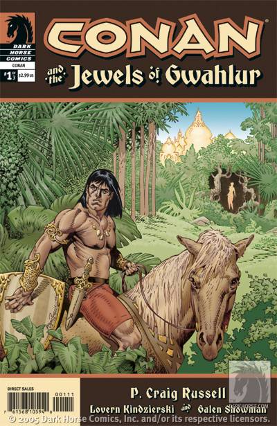 CONAN AND THE JEWELS OF GWAHLUR #1 (of 3) - Is there such a thing as a BAD Conan story? I don't think so. P. Craig Russell's adaptation of this particular Conan tale is lush, action packed, and filled with intrigue. The only thing is, I'm so used to the look Cary Nord has given the character that Russell's rendition of this world seems a little too... pretty. Thankfully, it's SO pretty I can't bring myself to say anything worse than that. - Vroom
 NIGHTWING #107 - With writing as crippled as Nightwing’s legs on the cover, Devin Grayson uses this issue to try to convince us that Nightwing can pull off a “Donnie Brasco.” And how is it that Batman’s brilliant ward convinces a pair of made wise guys that he’s their new boy? A bungled shakedown on crutches followed by a litany of the “rules” he follows as an enforcer: no kids, no killing, no cops, no capes. Curiously, instead of telling him to go fuck himself, they decide this kid’s the next big thing and bring him into the family! Meanwhile, some fine art from Phil Hester goes utterly wasted. In the woids of the vernacular: fughetabowdit. - Dave
 NEW THUNDERBOLTS #7 - There are two kinds of people out there: those who are pleasantly surprised when they open a comic and see artwork by Bill Sienkiewicz, and those who are disgusted. For the former, this issue is an excellent jumping-on point for Fabian Nicieza's fun as all hell storyline, and one of Marvel's best team books. For the latter, you might as well just stick to Garfield. - Vroom
 Y THE LAST MAN # 32 - Five words: Hot girl on girl action! So what are you waiting for? Go out and buy it! - Bug
 MK SPIDER-MAN #13 - Here it is, proof positive that not just anyone can write Spidey, never mind well. Hollywood "heavyweight" Reginald Hudlin tackles his first issue like a bad fanfic writer. "Hey, wouldn't it be cool if Peter Parker and Clark Kent both worked at the same newspaper?" Well, no, not
really. There's also a subplot about Pete having money troubles, because that's never been done before. Not to mention the equally original bit about Wolverine hitting on the red-haired wife of one of his teammates. Wow. I've never seen such hackerry. I'd also mention the work Billy Tan brings to the table, but that would mean referring to this Frankensteinian hybrid of Liefeld and McGuinness as "art." Man alive, Marvel should have cancelled this book once Millar finished his run. I may not have liked it that much, but at least I respected the people behind it. - Vroom
MK SPIDER-MAN #13 - Here it is, proof positive that not just anyone can write Spidey, never mind well. Hollywood "heavyweight" Reginald Hudlin tackles his first issue like a bad fanfic writer. "Hey, wouldn't it be cool if Peter Parker and Clark Kent both worked at the same newspaper?" Well, no, not
really. There's also a subplot about Pete having money troubles, because that's never been done before. Not to mention the equally original bit about Wolverine hitting on the red-haired wife of one of his teammates. Wow. I've never seen such hackerry. I'd also mention the work Billy Tan brings to the table, but that would mean referring to this Frankensteinian hybrid of Liefeld and McGuinness as "art." Man alive, Marvel should have cancelled this book once Millar finished his run. I may not have liked it that much, but at least I respected the people behind it. - Vroom
