
Hey, everyone. "Moriarty" here with some Rumblings From The Lab.
What can I say that I haven’t said before when introducing these guys? They are truly the red in my painting.
Yadda Yadda Yadda Jon Quixote here, blah blah blah great bunch of reviews, yadda yadda yadda better than ever I swear, blah blah blah Ron Zimmerman sucks, blah blah blah in-joke nobody gets, yadda yadda yadda love us, love us.
Moving right along…
THE POWER O' IRON MAN (TPB)
Written by David Michelinie
Story by David Michelinie, Bob Layton
Art by John Romita Jr., Bob Layton
Published by Marvel
Reviewed by Buzz Maverik
Believe it or not, even we Talkback League Of @$$hole comic book reviewers get fan mail. Here are a few excerpts from some of mine.
Timbo of Melonball, KY writes: you think you're funny, funny man, but you're not! Why can't you just write a review of a comic book instead of trying to write something funny which isn't...
The Comedian of Universal City, CA writes: ...it's because you suck! Your stuff isn't even cute. It's just stupid and so are you...
Dolly Estrada of Vortex, AZ writes: ...cheap bastard, when my lawyer catches up with you, you'll pay through the nose...
So in an effort to keep the fans happy, I'm tailoring this review of a very old Marvel trade THE POWER MAN OF IRON MAN to the style that the people say they want!
WHAM! WHAM! WHAM! "This meeting of The Li'l @$$holes Comic Book Club and Detention Survivors will now come to order! I'm Buzzy M., this is my treehouse so please do not fart in here! This week's comic is THE POWER OF IRON MAN trade paperback. Does anybody want to start?"
"Yeah, Buzzy. Why do Tony Stark and all the other guys in the book have so much hair and why is it kind of poofed up like that?"
"I showed the book to my Dad and he said Tony looked like The Disco Strangler, which he explained was a song by some old rap group called The Eagles. It's kind of funny the way Tony walks around with his shirt unbuttoned and wearing a gold chain like that. But I guess my real problem with the book is that Tony took his date to a casino that just happened to get robbed by three of Iron Man's old enemies: The Melter, Blizzard and Whiplash. What're the odds? I mean, why them? It couldn't have been Stilt Man, Batroc and The Shocker?"
"As usual, you idiots are missing the point. These are the stories where Iron Man gets drunk! I can picture him going in one of those AA meetings that your Mom always goes to:
I'm Tony S. I'm an alcoholic. It's been 57 issues, six creative teams and one relaunch since my last drink. I don't know about you guys, but do you ever feel like giving the whole world a blast of repulsor rays up the ass? I know I do. That's when I want a drink. I remember one time when I was drinking, I'd blacked out and I woke up in a bed in the sewer next to Callisto, that one eyed Morlock chick. That's when I said, Tony, you got a problem!"
"Yeah. Maybe his friends would have one of those intervention things for him like they always have for the movie stars and singers:
Cap: "In my day, we didn't have alcoholics. We had drunks! I remember one time we Invaders stormed Baron Zemo's secret fortress under the Eiffel Tower and we came across a million cases of that good Frog wine. Bucky got so drunk he made a pass at Namor and..."
Thor: "Verily, Anthony Stark, ye haveth too great a fondness for yon mead. Thou are but mortal after all."
Rhodey: "We're your friends, Tony. We care about you. When do I get to become War Machine?"
The Mandarin: "What an embarrassment you are as an archenemy! The last time we fought, you were so drunk I had to drive you home."
The Wasp: "That's nothing. The last time he backed me into the coatroom at Avengers Mansion, he was so bad I thought I was with Hank Pym!"
So there you have it! A straightforward review that should help you decide whether you want to read this classic tpb or not!
ISOLATION AND ILLUSION (TPB)
Writer/Artist: P. Craig Russell (with Steven Grant and stories adapted from H.P. Lovecraft, Cyrano de Bergerac, and O. Henry)
Publisher: Dark Horse Comics
Reviewed by Cormorant
God bless Dark Horse comics. They don’t seem to carry much industry weight these days, but they still publish work by some of the absolute finest comic creators to put pen to paper - Stan Sakai, Paul Chadwick, Scott Morse, Mike Mignola, Jay Stephens, and Frank Miller - just to name a few. And that’s not even including their excellent English-language adaptations of seminal manga like ASTRO BOY, AKIRA, and LONE WOLF & CUB. Granted, the STAR WARS and BUFFY comics sap their credibility a notch, but what company doesn’t rely on a few proven cash cows to finance the cooler, riskier stuff? And throw Dark Horse a bone – at least they’ve eased down on the Predator/Aliens/Robocop oeuvre!
The latest winning move from Dark Horse is the publication of ISOLATION AND ILLUSION, a trade collecting nine odds ‘n’ ends short stories produced by P. Craig Russell between 1977 and 1997. For my money, Russell is one of the most gifted artists in the medium. His command of anatomy biker-stomps overrated hotshots like Jim Lee, and he has a rare ability to seamlessly transition between realism and cartooniness, even within the same story. As a result, his style is difficult to describe, but if I had to sum it up in a word, I’d say it’s “baroque”. For you non-artsy types, that means it’s very elaborate, melodramatic, even ornamental, and may make insecure male readers uneasy due to its lushness of design. Likewise, the experimental nature of his comics - adaptations of operas, Oscar Wilde’s fairy tales, Kipling’s THE JUNGLE BOOK, and Michael Moorcock’s Elric novels – means that he’ll probably always fly under the radar of those comic readers who cling only to tried and true adventure comics. It’s a shame, but Russell wouldn’t be the first great artist to have worked in relative obscurity during his lifetime.
The trade opens with a story called “Dance on a Razor’s Edge”, which a little research reveals was inspired by Russell’s fascination with a Japanese author named Yukio Mishima. Mishima committed ritual suicide in 1970 following a failed attempt to take over a Japanese military base with his own private army(!), and his final moments, sword piercing his stomach, are the subject of the story. The poetic and philosophical reminiscences about Mishima’s life almost lost me, but the surprisingly wry conclusion left me very pleased with the story in retrospect. The black and white art is noirish, grim, and beautiful.
Next up is an adaptation of H.P. Lovecraft’s short story, “From Beyond”, in which a deranged scientist invents a machine which allows humans to see a world of ephemeral alien lifeforms which overlaps our own. Russell seems to have a special talent for illustrating the otherworldly beasties that Lovecraft dreamt up (see also his Elric adaptations), and “From Beyond” is a really fun showcase for those octopoid and crustacean monstrosities.
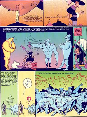
The third entry’s my favorite of the bunch, though, being based on a whimsical story called “A Voyage to the Moon” written by none other than Cyrano de Bergerac in 1657. I must admit, it came as a shock to me that Cyrano de Bergerac was even a real person and not just the character that Steve Martin played in that movie based on that play that I never read - but such is the case! He was a French soldier who was also a satirist and dramatist, and “A Voyage to the Moon” is an “Alice in Wonderland”-esque tale of a trip to the moon. There are elements of satire here, but the story is also simply a whirlwind tour of the bizarre civilization there, featuring naked, blue moon-men who communicate through body movements and music, towns on wheels, and a visit from a man who was born on the sun. It’s written with the kind of absolutely unfettered imagination that could only exist several hundred years before we knew jack squat about the moon or had even coined the phrase “science fiction”; sometimes, it seems, ignorance is bliss. Since Russell’s work is often quite serious, and he frequently uses photo-reference, Cyrano’s story is a fine opportunity for him to indulge in humor and some wonderfully cartoony cartooning..
Rounding out the first half of the book is an adaptation of O. Henry’s famous short story, “The Gift of the Magi”. For this sentimental favorite, Russell returns to his more realistic style. The retelling is quite faithful, but as I learned when reading Russell’s amazing treatments of Oscar Wilde’s fairy tales, but the visuals make the telling his own. Only an inhuman bastard or SPAWN devotee could read this story without getting a little misty.
If I have any disappointment in the book, it’s that the last few stories don’t have nearly the impact of the first few. Two are symbolist fantasies without dialogue or any text whatsoever, and while Russell’s stories often deal in symbols, these wholly dreamlike meditations on classical subjects (angels and demons, celestial cities, etc.) left me unmoved in spite of their unquestionably great art. A seemingly autobiographical tale of insomnia follows – interesting, but forgettable. The final story, “Breakdown On the Starship Remembrance”, is a science fiction fable about a romantic astronaut who finds the pragmatic reality of space travel in the future at irreconcilable odds with his childhood notions of visiting the stars. It’s enjoyable, but ran a bit florid for my tastes.
Final judgment: Despite a few lesser stories, this is still an essential collection for anyone who appreciates the talents of P. Craig Russell or, more abstractly, the potential of the comic book medium. There’s something here for just about every taste, from romantics to Lovecraft geeks, and even those stories which don’t resonate are worthy of close examination for their art alone. Expand your horizons (your superhero-fetishist friends don’t have to know).
Title: GOTHAM CENTRAL #3
Writer: Ed Brubaker
Art: Michael Lark
Publisher: DC Comics
Reviewer: Ambush Bug
You don’t have to wear a mask to be a protector in Gotham City. One might not know it from reading the various Bat-books on the shelves today, but the police in Gotham don’t just sit around coffee shops and down glazed donuts. They work their blue-badged asses off. In a city where costumed freaks run rampant in the streets, do the average, everyday beat cops and detectives stand a chance at upholding law and order? Writer Ed Brubaker dares to ask this question. Brubaker has taken the world of Gotham City, mixed in equal parts of TV’s CSI and LAW AND ORDER, threw them in a room at the Hilton, plopped some Barry White on the turntable, liquored them up real good, and had them go at till the maid knocks. The result of this cornicopious copulation is GOTHAM CENTRAL.
The first two intense issues lead us on a desperate hunt for a maniacal Mr. Freeze. The book stars Detective Driver, a dedicated police officer who lost his partner in the first arc when Freeze turned him into a cop-cicle. Through Driver, we see the series direction and unique angle. Driver has been driven to redeem his partner’s death by trying to take the freaks of Gotham City down the official police procedural way. Of course, there is a certain Caped Crusader who likes to put the kibosh on Driver’s plans as soon as he gets close. At the end of the last arc, Batman saved the day, all was good in Gotham, and everyone was happy, save for the men and women in the Gotham City Police Department. Once again, Batman did what they couldn’t do. He brought down the bad guys. And once again the cops feel ineffectual because they have to rely on a guy in tights to do their job for them. Imagine working on a job for days, weeks, months, only to have some guy with a pointy hat and a spiked boomerang come in at the end and get all of the credit. You’d get fed up pretty damn quick and so have some of the cops in the GCPD. This seems to be the prime motivation Brubaker has set up for this series and it is a good one. Not only does it flesh out Batman by providing an alternative view of the character, but it expands on THE most interesting city in all of comicdom and the people who reside in it.
Reading GOTHAM CENRAL is like watching a great episode of LAW & ORDER. As the beat cops and detectives move from one lead to the next, you can almost hear the “Bum-bum-bah-bum!” tag music that segues one scene of the TV show to the next. The investigation panels where jargon is dropped and clues are painstakingly uncovered reek of the over attention to detail seen in every episode of CSI. Brubaker knows cops. He knows the lingo. He knows procedures and statistics and details that make us tune in every week to those great cop dramas. He is without a doubt the best crime fiction writer in comics today.
Issue #3 is a testament to this. Detective Driver is paired up with a new partner, Romy Chandler. Even though Freeze froze Detective Driver’s dexterous digits in the first arc, Driver refuses to take a leave of absence. The two detectives are assigned to a case involving a murdered teen. At the same time, another costumed freak, The Firebug, is setting Gotham City ablaze. This could’ve been a very boring read. Little action happens in the first three-fourths of the book. But Brubaker uses gripping dialog, beautiful characterization, and fascinating details about police procedures to keep the interest going until the big payoff towards the end. It was a solid, solid issue that expands on the mystery and in the end, has you wishing time travel was possible so you could flash forward a month to get the next chapter.
My only problem with this book is a tiny, but important one. Since this book has a lot of plain clothes people running around, it is very hard to distinguish one character from the next. Michael Lark’s realistic, minimalist style is a perfect fit for the real world drama unfolding in this book, but his characters all look the same to me. If it wasn’t for Driver’s bandaged hands in the last arc, I wouldn’t have known who was the main character and who were the tertiary characters. Now, don’t get me wrong. I don’t want to have the cops running around in their own distinct non-costumes every issue, but it really interrupts the flow of the phenomenal story unfolding when I’m constantly asking myself, “And who the hell is this guy again?” If any comic needs a floating head roster page at the beginning letting the reader know who is who, it is this comic. Since he’s lifting from other cop shows on TV, Brubaker might want to add a HILL STREET BLUES-like group briefing meeting at the beginning of the story, introducing us to the characters on the case for that issue.
Despite my beef with the art, this is becoming my absolute favorite Bat-comic. I’d love to see Ex-Commissioner Gordon and Harvey Bullock pop up again, but the characters Brubaker is introducing us to are becoming equally interesting. This book is not flashy. It’s not out of this world. It is spandex-light, but character heavy. It takes the insanity that oozes from every pore of Gotham City and makes it realistic, gritty, real, and most importantly, a treat to read.
ULTIMATE WAR #3
Written by Mark Millar
Art by Chris Bachalo
Published by Marvel Comics
A Jon Quixote shoulder-shrug
It’s not that bad. Really.
Well, okay, the art is bad. Flat out bad. But at least this issue is an improvement over the last two in that department. At least I can tell what’s going on. At least I’m not wondering why Spider-Man is lying in the snow.
But the rest of it? It’s…okay. The series has offered up its share of cool moments. One of the few Ultimate characters I really love is Ultimate Captain America, an old-school butt-kicker of the highest order. Cap and Thor are two of the few examples (and the only ones that spring to mind…maybe Magneto as well) that read as an improvement over their mainstream counterparts – the new versions are fleshed out and updated not only in ways that make sense, but also in ways that feel fresh. And I really like the good-soldier take on Cap. Cap is obviously Millar’s favorite too, as our star-spangled anachronism has been hogging all the coolness, taking down the Brotherhood’s hide-out and issuing a chilling threat to Magneto that I can’t wait to see realized.
Of course, after 3 issues of set-up and the only hint of payoff coming in the last panel of this book, there are a lot of things that I can’t wait to see realized. Calling this mini-series Ultimate War is sort of like using “Mother of all Battles” to describe the Falklands. Do comic book writers really get paid by the page? That’s a Dickensian practice that needs to stop, because it’s gumming up a lot of titles. Maybe for a while, writers could get paid by the plot point, just until they remember that, while they may get paid the same whether they write a two-page action sequence or a dual-page splash of the President looking at a town, us readers are still paying for their work by the page.
But I don’t want to talk about pacing. I want to talk about crossovers. I want to talk about the promise of a crossover, the likes of which we haven’t seen in comics for a long time. And I want to talk about what we’ve been given.
It’s not that bad. It’s just disappointing. Really, really disappointing.
Issue #3 reads like it was stitched together from the deleted scenes of the last chapter of Ultimate X-Men. We didn’t get to see Cyclops’s death (I think…although with this art, who knows? Maybe he was wearing a Spider-Man outfit), but we do get to see Jean talk about it for a couple pages, dialogue over which my brain couldn’t help but superimpose Bryan Singer screaming “Cut!”
And we do get to hear Professor X talk about how clever he is. Of course, the pinnacle of his cleverness involves arranging a meeting with Magneto so that…Wolverine can follow him home (tee hee). Of course, Magneto outsmarts him by tipping off the Ultimates so that Iron Man can follow Professor X home. Uh, Checkmate? And of course, SHIELD and the United States Government, an organization that would obviously crumble if it weren’t for its policy of blindly following anonymous tips with overreaction and violence, sends strike force Ultimates to wipe out the X-Men, the reasoning being that the X-Men let Magneto live without telling the Government, and therefore to be brought to be justice for their sedition.
Maybe it’s just me, but while I can see that the Government’s anger towards the X-Men is at least somewhat justified, if I were a US General who looked like Sam Jackson (in some panels) and was in charge of national security, I’d probably concern myself primarily with the organization that’s blowing up bridges, and take care of the organization that kept a secret from me later, once I was sure that, y’know, the bridges were secure and stuff.
Comics in the 21st Century, kids. Two superteams can’t just meet and fight for no reason anymore. The discriminating, adult readership won’t stand for it. They demand convoluted, idiotic reasons.
Hmm, y’know what? Maybe Ultimate War *has* ventured past “disappointing” territory, and is now shin-deep in “bad.”
I kind of wanted to give Ultimate War a decent review. I liked the concept, I didn’t mind the first two issues, and I was kind of curious as to how it would play out. And I wanted to address those people that feel, in light of a few scathing reviews of The Ultimates, that we have it in for Millar, that the mere presence of his name on the cover guarantees a blistering attack from our critical cannons.
But I can’t do it. I just can’t give Ultimate War a positive review. Maybe Issue #4 will come along and blow our socks off., but as of right now, the project has to be considered, at the very least, a disappointment. There has been little War to speak of; zero interaction between the two teams, which is kind of the purpose of the “crossover;” and, frankly, the three issues of set-up just havn’t been all that interesting, and at least a little bit asinine.
JLA #77
Guest writer Rich Veitch
Guest penciller Darryl Banks
Guest inker Wayne Faucher
Published by DC Comics
Guest reviewed by superninja
If all of the "guests" above didn't clue you in, this is a filler issue. It's just a little diversion until Kelly, Mahnke and Nguyen return next month with a new story arc.
It's one of those filler issues that I find especially annoying, because it attempts an explosive story arc with big ideas that begins and ends in 22 pages. You never get time to enjoy the ideas presented because it all happens so quickly. An even bigger disappointment is that the villain introduced is actually pretty damn interesting.
"Stardust Memories" begins with the alien origin of Mnemon. As Mnemon tells us with poetic reminiscence, he was a synthesized black hole designed to record memories and memorialize them. When his benign scientist-creator placed him in a recording device, all hell broke loose. Mnemon lived up to his name: not only recording, but stealing memories at the speed of light. And as memories are stolen from the inhabitants of the planet of his birth, the alien world falls into chaos eventually resulting in its apocalyptic destruction.
Similar to the Voyager probe that had gained sentience in Star Trek: The Motion Picture, Mnemon drifts through the cosmos plucking memories and destroying galaxies, gaining information and awareness. When a wormhole opens in the emptiness and Mnemon spies Earth ripe for the picking, he passes through it. By this time Mnemon is hungry for memories like Galactus is hungry for planets. But while Galactus is a force of nature, Mnemon considers himself a master artist - destroying the universe while memorializing it.
When we get to the JLA, everything speeds up to a rapid pace and the story loses any edge it had, with the exception of the moments between Mnemon and the Atom. The JLA portrayed here don't have much in common with Kelly's JLA (Kelly's original characters Faith and Manitou Raven are notably absent until the ending). Veitch is writing the JLA here as stereotypes, but adding irrational behavior to justify cramming the story into a single issue. The very out-of-character and/or corny dialogue is also distracting throughout the issue.
Mnemon reminds me of something Morrison would've cooked up for the JLA. The artist Banks has a style lending more to Kelly's Silver Age adventure storytelling, which makes sense for continuity. But it doesn't mesh well at all with what Veitch seems to be going for here.
I'll just take a stab in the dark that the old music chestnut "Stardust" is where Veitch came up with Mnemon. The lyrics are clearly the inspiration here and the song is a part of the story.
It's too bad Veitch wasted such high ideas on a filler issue.
BRATH PREQUEL
Chuck Dixon: Writer
Andrea Di Vito: Artist
CrossGen: Publisher
Vroom Socko: Warrior-King
Apparently, this book is a rip-off.
I don’t mean the cover price of $2.95, I mean that the title character and premise have a little too much in common with Robert E. Howard's Bran Mak Morn. At least, that’s what Buzz Maverik was telling me the other night. I, unfortunately, was forced to confess that I’ve never actually read any of Howard’s stuff. Buzz then told me that the storyline of a Pict warrior who leads his people in to war with the Roman Empire is straight from Howard, as is the big badass chariot he rides into battle. Actually, when I say he told me, I mean that he wrote it down on the back of an envelope and handed it to me. And when I say he handed it to me, I mean he stuffed it into an empty bottle of Arrogant Bastard Ale and threw it at my head.
So the character of Brath Mac Garen is just Bran Mak Morn with a sigil. Ah, the sigil. I actually like the idea of all the CrossGen characters deriving their powers from the same source, but the thing just looks stupid. It’s a yin/yang symbol with Blade’s throwing knife in the middle of it, fer chrissake! And yet, I liked this book. It was a blast.
Sure, much of it was stuff you and I’ve seen before, but damn if it doesn’t have style. I’m talking John Buscema on Conan style, the battle of Helm’s Deep style, Henry V style. There’s a two-page spread on pages ten and eleven that just knocked me on my ass. It’s of a massive battlefield, with Brath’s warriors punching through the Imperial lines, buzzards circling overhead. The narration of the Imperial commander is as follows:
Soon all is chaos as the Irisian bludgeon a wound in the defenses of the First Century.
Brath Mac Garen shouts encouragement to his clansmen.
Horror is heaped on horror as the rhythmic sound roaring from the throats of the wildmen takes form.
They are singing.
That, my friends, is the exact moment I knew I was going to be buying the next issue.
Sure, it’s a rip off, but that doesn’t mean it can’t be good. I even mentioned this to Buzz, and he agreed. For some reason he brought up the Richard Connell story The Most Dangerous Game, saying that was one he was planning on redoing himself.
I think that I’ll be reading Howard’s Bran Mak Morn sometime relatively soon.
THE NEVERMEN: STREETS O' BLOOD # 1
Written by Phil Amara
Art by Guy Davis and Dan Jackson
Published by Dark Horse
Reviewed by Buzz Maverik
I missed the first NEVERMEN series. I never even heard about it until I saw the solicitations in PREVIEWS for STREETS OF BLOOD. But something about the image of three mystery men wearing fedoras, trenchcoats and strange goggles, standing around with an albino skinned villain lurking in the background grabbed me, bitch slapped me, banged my head against the floor, stuck two fingers up my nostrils and dragged around me room. I was hooked!
This is a comic book for those of us who can't afford THE SPIRIT ARCHIVES, who miss SANDMAN MYSTERY THEATER and THE QUESTION, who started buying THE WATCHMEN because of Rorschach. Images from German Expressionism and the film DARK CITY come to mind.
Guy Davis creates some amazing modern retro art here. The figures have a Golden Age simplicity, but the scope, detail and power are widescreen. Midnight City, protected by the mysterious Nevermen, is a great and fully realized character on Davis' pages. This isn't Batman's Gotham. It's more like an alternate universe, 1930s Chicago, all in big bold panels that bring us into the story.
Phil Amara's storytelling style binds us into this other world. The whole book has a feel of mystery. The three surviving Nevermen -- bookish reporter Fletcher, blue collar Aldo and cool detective Clement -- are carrying emotional scars from their last adventure, in which they saved Midnight City from the supervillain Clockwork. Now, Winterbourne, the suave, Joker-skinned son of their creator has escaped an underground tank and is uniting the city's gangsters. Amara has great gangster names: Jimmy Fingers, Mr. Match, Ahmed Trust.
And what is that winged thing on the farm just outside of Midnight City? And why does the vaguely bondage masked, steampunk cyborg vigilante type called The Murderist have all the best lines?
I'm going track down the trade for the first NEVERMEN series. Should you buy this series if, like myself, you haven't read the first volume? I'd say so! Look, before comic shops, if you didn't subscribe, you ran the risk of missing several issues of your favorite comic. When an issue finally cropped up at the convenience store, it was mysterious. You didn't know everything that was going on. And finding out was a lot of fun.
THE FLASH #194 & THE FLASH: ROGUES (TPB)
Written by Geoff Johns
Pencils by Scott Kolins; Inks by Doug Hazlewood
Published by DC Comics
A Jon Quixote Review
The Flash, as written by Geoff Johns, is perhaps the best pure superhero book on the market right now. The Flash, as drawn by Scott Kolins, is easily the best looking superhero book on the market right now – from a storytelling perspective, the man is impeccable. Together the combination is dynamite. Stories that crackle with creative energy and move at such breakneck speed that your sides begin to throb by the time you hit the staples.
So why am I dropping the title?
I’m not, you dumbasses. Why would you ask such a stupid question? Didn’t you hear me? This is perhaps the best pure superhero book on the market, and easily the best looking. And, yeah, it’s a DC Comic. I grew up as a fan of the other guys, I still consider myself a fan of the other guys, but, right now, if somebody put a gun to my head and told me that I could only keep buying from one publisher, I’d be hard pressed to give up this comic. To those who know me, that says a lot.
The fact is, when I pick up a superhero comic, whether it’s Daredevil, Captain America, or Aquaman, what I really want to be reading is what I’m getting with The Flash. Character-driven adventure stories that prove a yarn about spandexed heroes can be written in such away to appeal to an all-ages action thirsty audience without insulting the intelligence of an adult reader. It’s not that I’m adverse to different takes or new angles, and I’ll read and praise anything that’s well-done or even interesting. But, let’s face it, we all read superhero comics for a reason. We all became fans of superhero comics for a reason.
And that reason is what Johns and Kolins (and Hazlewood; inkers get no respect here, do they?) are delivering better than anybody else on a monthly basis. Classic comic-style soap opera dramatics. Great action sequences. Phenomenal visuals. Strong characters. And killer monkeys. All done about as well as they can – or at least have ever – been done. That’s right, they get the Carly Simon stamp of approval: Nobody Does It Better!
But – sigh – I don’t want to get kicked out of our little club here, so I suppose I should find something to complain about.
I don’t like the death count. I think Johns goes a little overboard with the killing, and it’s ultimately to the detriment of the comic when it comes time for pathos. In the previous trade, the villain Cicada killed dozens (hundreds? The fact checker here at @$$hole Central is on maternity leave. Thanks a lot, Bug) of people who had been previously rescued by the Flash. In the new trade, a ruptured singularity and a telepathic monkey team up to absolutely decimate an urban area about the size of downtown Ottawa, which is then followed by *another* prison break at Iron Heights that has an on-panel death count of about 10 (how do they keep finding people working there?). And that’s only halfway through the trade, and doesn’t include Meltdown’s rampage, or the Gorilla siege of the prison that’s running through the monthlies right now. That’s a lot of death. But, as a reader, I’m supposed to feel empathy for a cop with a broken back who might be paralyzed? So, yeah, I’m complaining about the death count.
I’m also complaining about the fact that sometimes the plot requires something to happen to the Flash that would never happen to somebody with the Flash’s power. The guy can move at light speed, so fast that he can zip his wife home and get back to the fight before any of the baddies even notice that he’s gone…but every once in a while he gets kneecapped by a boomerang? But, really, I blame Mark Waid; the character was probably easier to write when he could only move at Mach 1. Speed Force my ass.
But, really, that’s about it. Oh, and the pages of the trade reek like Play-Doh. What the hell is up with that? And, one time, Geoff Johns knifed my Pa in a back-alley over an argument stemming from a game of Mah-Jong.
But now I’m getting picky (although DC isn’t going out of their way to win my favor with that stank). When I have to go out of my way to find something to complain about - or make something up – you know we’re talkin’ about some good comic.
And that’s what The Flash is. I’d say that other creative teams on other superhero comics should try to emulate the accomplishments of Johns and Kolins (and that inker guy Whazzhisname), but that doesn’t do the Flash guys enough justice. Other creative teams should aspire to reach the level at which The Flash is setting the bar.
The world would really be a much better place if we had more Johnses and Kolinses. And that’s a fact!
SUPERMAN VS. DARKSEID: APOKOLIPS NOW
Written by Mark Schultz
Art by Mark McKong, Marlo Alquiza, Cam Smith, Tanya & Rich Horie
Published by DC
Reviewed by Buzz Maverik
I have no idea why I bought this comic. I know I checked out PREVIEWS, made a note to buy this one shot, but I'm not sure why. I don't care much about Superman. Darkseid is a great character and makes a good foe for Superman. I admire Kirby and his Fourth World, which my colleague Sleazy G. hates as bad as I hate Marvel's Thor. But none of these things would be enough to make me pick up this comic.
I suppose why I bought this bad boy doesn't much matter. On its own terms, it's not a bad book. Mark Schultz portrays Superman as a strategist and a leader which is great. I don't read much Supes but after tripe like DK3 with Batman calling Superman stupid, it's nice to see him portrayed as having brains as well as brawn.
The story has Superman leading all of the Kryptonians on Earth against Darkseid and Apokolips, to free John Henry Irons, known as Steel. Somewhere along the continuity, Darkseid kidnapped Steel and there's something about the Entropy force and Steel becoming the embodiment...I just skipped that crap. All I know is that if Darkseid could have prevented that stupid Shaquille O'Neal movie, I'd have been rooting for Darkseid.
Superman's team consists of Superboy, two Supergirls, something called the Eradicator (don't tell me, I don't want to know) and best of all...Krypto! Krypto rules! I always loved how Jor El and Lana sent Krypto ahead in a prototype craft which later landed in Smallville. If that T.V. show would have Krypto arrive on Earth, I might actually watch it....Okay, I wouldn't but they should do it anyway. Superman takes Kryptonians with him so Darkseid will get the idea that it's Krypton vs. Apokolips and won't take it out on Earth...Yeah, good thinking Supes. That Darkseid has always seemed like a rational soul, dedicated to fairness. Maybe Batman was right.
We've got Steel's niece in the mix, and whenever a character has a young relative of the opposite sex, you know they're going to take on the hero's identity. Someday, we'll have an X-MEN comic where Storm's cousin -- Ohohoh -- becomes Testostorm. Everything culminates in a rather boring battle.
The art was okay, even really good in one or two panels late in the fight.
I've seen worse.
Title: WONDER WOMAN #188
Writer/ Pencils: Phil Jimenez
Inks: Andy Lanning
Publisher: DC Comics
Reviewer: Ambush Bug
Sometimes the comics world is just plain ludicrous. Now I can believe that a dark world can exist across the cosmos fueled on hate and led by a gravelly headed dictator named Darkseid. I can believe a man can fly faster than a speeding bullet and jump tall buildings in a single bound. I can believe that a goddess can be made of clay on an island populated only by women and sent to the man’s world on a mission of peace. But when a scantily-clad Greek goddess shows up on your doorstep, interrupting a football game with the buddies and not one single ounce of sexual innuendo is muttered as she casually waltzes through the room in high heels and a bikini bottom, I believe the line of credibility has been crossed. This happens in the first few pages of WONDER WOMAN #188. I’ve spent many a Sunday watching football with friends and if someone ever showed up on my doorstep dressed like Wonder Woman does on the second page of this issue, the only words out of my mouth would be, “Okay guys, who ordered the stripper?”
WONDER WOMAN #188 was Phil Jimenez’s last issue. It’s been a long run. Jimenez jumped onto the title a while back and promised to take Wonder Woman into new and exciting directions. This isn’t the first time someone has tried to do this. John Byrne attempted the same thing before Jimenez’s run, but instead tortured us with story after story focusing on uninteresting supporting characters and ignoring the character of Diana. With Jimenez, I had higher hopes. His George Perez-ian style of art harkened back to the only time I can safely say that Wonder Woman was done right, a time I like to call The Perez Years. Over the last few issues, WONDER WOMAN has had more misses than hits. Jimenez has tried to define Princess Diana by putting her through one situation after another which highlights what makes this woman so wondrous. He’s cast Diana as a negotiator, a warrior, a goddess, a healer, a nurturer, a role model, and a princess. He has dissected the female archetype and tried to apply every facet of it to the character. Wonder Woman symbolizes every aspect of womanhood. This should have been an interesting way to flesh out the character.
Jimenez has also listened to the fans by beefing up the coolness quotient in the title. He brought back Giganta, the giantess from the old Super Friends cartoon. He’s amped the powers of Cheetah, Silver Swan, Doctor Psycho, and Circe. He made the invisible jet a prominent weapon in Diana’s arsenal. He even revisited the old TV show by having Diana do the Linda Carter twirl in order to change into her costume. These little details are the things fans die for. They want nods and winks to the past. They want respect for continuity. They want to know that the writer actually understands the character and what makes her cool.
So if Jimenez’s take on the character and addition of little, cool details is so intriguing, then why, oh why, do I get splattered with poopy juice every time I flip through the pages of this toilet paper rag of a book?
One explanation could come from the fact that Wonder Woman is such a squeaky clean character. Jimenez has tried to tarnish this perfect diamond of a character by having her grieve for her mother’s loss and feel jealous for mother’s success with the Wonder Woman mantle, but even in the way she deals with those flaws are over-saccharinated. I don’t want a grim and gritty Wonder Woman, but the writers depiction of Diana as she travels around her day doing everything perfectly is boring to read. In this issue, Wonder Woman appears on the View talk show, does oceanic research with a great white shark, attends a judo class, and even rides a skateboard. Sound exciting? Maybe in the hands of a dynamic writer, but Jimenez just doesn’t have it. At the end of every issue, I find myself frustrated with the Diana character because she is just too damn perfect. No one is that perfect. There’s a story there. A story dealing with what it is like to be perfect in an imperfect world. A story about a flawed individual inside a perfect shell. These stories would be fascinating to read, but Jimenez hasn’t told them.
Another problem has to do with something I have seen develop over the years in many titles. Jimenez likes to use those words. He loves them. He fills panel after panel and page after page with them. He’s wordier than an @$$hole reviewer on free adjective day. Every time I turn the page I groan to see the entire page filled with over-explanation and boring discourse. SHOW, DON’T TELL. SHOW, DON’T TELL. SHOW, DON’T FUCKING TELL. When are these writers going to get this through their thick skulls that this is a visual medium. When a page is filled with words, you’re killing the flow of the story. You’re skipping over scenes that could just as easily be played out with less explanation. And for god’s sake, you’re blocking out the one saving grace the series had going for it, the art work.
And the artwork is good. Jimenez is a notch down from Perez on the great detailed art scale. This is the ultimate compliment. Perez wrote the book on highly detailed comic art. Jimenez draws a great Wonder Woman. He draws great action. He does a bang up job at balancing high detail with great composition. If these were silent issues, I may have liked them better. But the words block out too much of what makes Jimenez’s art special. The guy should know better. Most artists hate it when the words override the composition of the art in the panel. Jimenez is doing art and words, so he has no excuse.
Issue #188 continues in the Jimenez tradition of over explanation, boring characterization, and the addition of what should be cool, but ultimately stupid little details. We see Diana lackadaisically toy with a shark. She skateboards with a starry helmet and kneepads. She shows up on an invisible cycle made from the same inviso stuff the jet is made from. And we see the introduction of Wonder Boy, an youthful admirer of Wonder Woman. UGHHHHH! Lame. Bad. Overblown. Boring. The book tries to wrap all of the Trevor subplots and they’re boring too. And no, even though it may have been hinted at, a little nookie did not occur between Trevor and Diana. The princess is still a virgin.
I had high hopes for Jimenez’s run. He seemed to be doing good stuff for a while, but I think he hit a wall right around the time Hippolyta was killed. That issue was powerful and one of the best Wonder Woman stories I have read in years. But that was last year, and for the longest time, this title has been petering off exponentially. Jimenez has been trying to explain just who this Diana character is during his run. It’s too bad we found out that the only thing she is, is boring, boring, boring. Let’s hope the next creative team can handle the character by giving her some. Character, that is.
HOUSEWIVES AT PLAY #10
Rebecca: Writer & Artist
Eros: Publisher
Vroom Socko: Perverted Bastard
The first thing to strike me about this book is that after nine previous issues, the book is now in color.
After that, well, the only thing to really jump out from this book is how bizarrely insane the story has become. The first storyline, while highly unlikely, stopped short of improbable. (Well, not too improbable.) Starting with issue eight, however, the plotline shot past improbable and hit implausible square between the eyes. But with this issue, implausible is about five miles back, and insane is coming up fast. No one would buy into the events of this issue, not even Mark Millar fans.
The back up feature is almost as bad. While this story is one that ventures back to the realm of improbable, the plot itself is so slim it’s practically nonexistent. Even for a back up, it doesn’t meet my expectations.
Sure, the artwork is brilliant, but that’s just not always enough to hold my interest. This just isn’t a book that’s going to continue to hold my interest, story-wise, even with the ending that promises a new, road trip-style storyline. This is one of the most laughable, ludicrous books on the market.
Of course, if all you want from a comic is pictures of demented lesbians having lots of kinky sex, then this is the book for you.
Eww. Kind of gives a whole new meaning to “Tales from the Crevice” doesn’t it? Hey kids, Jon Quixote here, thankful to announce that this week we have a new installment of INDIE JONES, written by the @$$hole who the critics say “Is the only reason to read that fetid compost pile of a column, why don’t they all just die an excruciating death – preferably involving giant dirty needles or starving zombie marmosets with a taste for testicles – and then we can piss on their corpses because they’ll be forced to leave Mark Millar alone dammit he’s so great!!!” (okay, I’m paraphrasing)….Lizzybeth. Take’er away, Liz!
Well, no one said this was going to be easy. It’s hard enough to write about stories and art when it’s someone’s livelihood, the way we all do here on AICN, but dissecting someone’s works of imagination when they don’t have a phalanx of producers and editors behind them is rough stuff. When I started this indie-comics project, I had no idea what it would be like to have people from across the country (and even around the world!) mailing me their pet projects, and how tricky it would be to single out pieces to write about, especially a time like now when nothing is particularly grabbing me. How to describe the comics I’ve been reading in the last month? I’ve read submissions like the deeply silly (Nostril Avenger?) Mung, a barest-of-bare bones humor comic, to a 100-page collected edition of SOULSHADOW, a sci-fi epic published out of At What Price Comics that reminded me of an 8-bit Final Fantasy videogame (whether that’s good or bad will depend on your point of view). I’ve also gotten a number of online submissions, which isn’t quite what this feature is looking for but has been fun just the same - like the saga put together by some high school students (wow, when my friends and I got bored of geometry we just skipped class).
Reviewing these kinds of comics is difficult, especially when you’re stacking them up against the professional works we @$$holes read the rest of the time. When I talk about indie comics I prefer to focus on those inspired gems that need only to be uncovered, and they are out there, but when you set those comics aside what’s left is the glut of decidedly amateur productions. These have their own kind of charm, being made for the pure fun of it, with the off-center and uncompromising sensibilities that often don’t make it through the professional publishing process. These projects are finished on pure determination, and in some cases probably large quantities of alcohol, and I can’t help but admire their efforts. But of course a comic of nil production values and total creator inexperience can’t compare to the deservedly well-known titles, and shouldn’t be. Doing so will only take away from the fun to be had by enjoying them on their own terms.
Sometimes, you can see potential in even the most unpolished productions. Take THE ADVENTURES OF JACKIE P. REYNOLDS PLUS OTHER STORIES. Bad title? Yeah. Badly photocopied pages in the vaguely storyboarded second half of the comic? Uh-huh. But the artwork is fairly promising, in the Rob Schrab vein of Disfigured Cartoon Characters, creatures looking like they just came off the rack (and I don’t mean the comic store rack) or had their heads in a vise. Someday I hope to scan pictures of the comics I’m reviewing for you all to see, but right now just picture a fantasy-veined Scud: The Disposable Assassin. The story while sort of nonsensical is kind of fun. You’ve got your naïve pumpkinheaded lead character, who encounters fast-talking criminals and, uh, legless killer bunnies on the way to a very fat dragon’s hoard. The comic itself is kind of shoddy, but the color postcards they sent with it are genuinely neat. With decent paper, more experience and a real plot they could have something - stick with it, guys!
And then there’s Action Studio Works, who have been trying to get the @$$holes to review their website, and finally sent me a copy of their KURAI TENSHI: THE DARK ANGELS for review. Unfortunately, their website isn’t working all that well now that I’m actually reading their stuff. It’s not bad - vaguely manga-inspired, mysterious ninja-army stuff. There are a few nice pages in almost solid black illustrating warriors in the dark, and it’s too bad the whole comic isn’t like that. The pages look better online than in print, which is kind of a switch. Of course, it helps to have it in color, and the images that look crammed onto a printed page look much better on the screen. Some folks might find it worth a download, if the website gets to working.
My favorite artwork sent in so far has been the pages emailed to me by a Craig Philips, with some very clean and appealing black and white images. I’ve been checking out his website and it looks like there’s much more where that came from, in all colors and varieties, but he hasn’t sent me his comic yet. Hey Craig, send me the rest and I’ll give it a full review, okay?
It’s been an interesting experience so far, and already I’m getting a much better idea of the range of comics out there in indie-land. I can’t wait to see more. So here’s the part where I beg and plead: Send us your comics! Send your friends’ comics! Steal comics and send them to us! Just email indie_comics@yahoo.com for mailing information and we’ll be happy to look at your self-published comics. There are no limits on size or content - send anything, send everything, and it will be read. Thanks to all who have participated so far.
For more Indie Jones: